

Wedding color schemes work best when you treat them as a small set of decisions about proportion, light, and materials, not as a mood board you hope every vendor will interpret the same way.
Quick answer
Most couples do well with two to three main colors plus a neutral, with one color clearly dominant, one supporting, and one used as a small accent. That is our editorial recommendation, and a common design rule of thumb splits the room roughly 60 percent, 30 percent, and 10 percent. Pick a starting point you cannot change (the venue, the season, an heirloom, a family tradition), test every swatch in the light where it will be used, and approve physical samples before anyone prints, dyes, or orders. Wedding color schemes are cheapest to change on paper and most expensive to change after linens and flowers are booked.
What wedding color schemes actually decide
A palette sounds like a purely visual choice, but it behaves more like a set of instructions. Your florist reads it when buying stems, your stationer reads it when choosing ink and paper, your rental company reads it when pulling linens, and your attendants read it when they shop for what to wear. If the instruction is vague, each person fills the gap differently, and the result is a room where nothing quite matches. Good wedding color schemes remove that ambiguity early, which is why this guide spends as much time on process as on taste.
A palette is a set of roles, not a list of favorites
The most common mistake is collecting five or six favorite colors and expecting all of them to share the stage equally. A palette works when each color has a job, and the jobs are different from one another.
The dominant color sets the tone
The dominant color is the one a guest would name if asked what color your wedding was. It usually covers the largest surfaces: linens, walls or draping if you control them, and the overall impression of the flowers. It is often a calm color, a neutral, or a muted tone, because large areas of saturated color tire the eye. If you love a bold shade, consider using it as the supporting color instead, where it adds energy without taking over. Most wedding color schemes that feel calm have a dominant color that is quiet.
The supporting and accent colors create depth
The supporting color gives the dominant one something to push against. It tends to show up in the bridal party, in secondary flowers, in napkins, and in stationery. The accent is the smallest share: a ribbon, a menu card, a candle, a few blooms, a pocket square. Accents are where a bright or trendy shade is easiest to enjoy, because a small amount can be changed or dropped without redoing the whole room. Thinking in roles also tells you what to do with a color you love that does not fit: demote it to a small detail. This is how wedding color schemes gain depth without gaining chaos.
Colors are one layer of a wedding, not the whole style
Couples sometimes use “wedding colors,” “theme,” and “style” as if they meant the same thing. Separating them makes decisions easier and keeps vendors from solving the wrong problem.
Color, theme, and style answer different questions
Color answers “what does it look like?” Theme answers “what is it about?” (for example, a garden, a library, a coastal town). Style answers “how formal and how ornate is it?” The same palette of deep green and ivory can feel casual with wildflowers and wooden tables, or formal with candlelight and silver. If your guests would describe the day as “elegant” or “relaxed” before they mention a color, style is carrying more of the message than the palette is. Our guide to wedding decor looks at those other layers in more depth. Keeping that distinction in mind prevents wedding color schemes from being asked to do the work of a theme.
Why a mismatch is easy to spot
When the palette says soft pastel and the style says black tie, or the palette says rich jewel tones and the venue is a whitewashed beach pavilion, guests may not be able to say what feels off, but photographs tend to show it. Before you commit, check that your palette suits the formality you are planning. Our notes on black-tie weddings show how much formality changes what looks appropriate, and the same palette often needs different materials at different dress codes.
Choosing a starting point you can defend
Starting with a color you like is fine, but starting with a fact you cannot change is more reliable. A fixed starting point gives you a reason to say yes and a reason to say no, which matters when family, vendors, and friends all have opinions.
Start from something fixed
Several elements of a wedding are hard to move, and each can anchor a palette. The venue’s carpet, wood, stone, or paint will be present in every photograph whether you planned for it or not.
The venue is already a color
Walk the room and look at what is permanent: floors, walls, ceilings, drapes, outdoor stone or greenery, and any strong tones in the wood. Those surfaces fill most of the frame in wide photographs, so your palette is really being added to them. A warm honey-colored wood floor sits comfortably with creams, terracotta, and olive, and it can fight with cool icy blues. A pale, neutral room accepts almost anything. If you have not chosen a venue, read our wedding venue questions list, and consider adding a question about permanent finishes and whether they allow draping or changes. Wedding color schemes that ignore the room tend to look pasted on.
Attire, heirlooms, and meaningful objects
A dress in a particular white or ivory, a groom’s tartan, a grandmother’s tablecloth, a piece of jewelry, or a color from a family quilt can set the palette without a single swatch. These anchors are useful because they have a story, and the story gives you an answer when someone asks why you chose it. They also have a practical advantage: you already own the reference, so you can carry it to a fabric store or hand it to your florist. Wedding color schemes built on an object like this tend to feel personal without extra effort.
Use the season as a filter
Season does two jobs. It affects what flowers and greenery are available and affordable, and it affects the light and the surroundings in which your colors will be seen.
Seasonal flowers narrow the options
Zola’s seasonal guide groups palettes by season: pastels such as pink, peach, lilac, and cream in spring; bold colors and full blooms in summer; jewel tones with twigs, feathers, and berries in fall; and neutral flowers accented with red and green in winter. Those are conventions, not rules, but they follow what is growing. Zola lists examples such as ranunculus in spring, sunflowers and dahlias in summer, king protea and chrysanthemums in fall, and hellebores and anemones in winter. If a particular bloom is central to your color idea, ask a florist whether it is realistic for your date. Our guide to seasonal wedding flowers goes into this in detail. Seasonal availability is one of the quiet constraints on wedding color schemes.
Weather can shift what is on offer
Zola cautions that cold fronts, long winters, heat waves, and dry spells can change when flowers bloom, so the palette you drew in the spring may need a substitution by the wedding week. Build flexibility into the brief: tell the florist which color families are acceptable, and which single shade is non-negotiable, so a substitution does not become a surprise on the day.
Honor meaning without guessing at it
Color carries different meaning in different families and cultures, and a palette that is neutral to you may carry a strong association for someone you love.
Ask rather than assume
If your family or your partner’s family has traditions around certain colors, especially for clothing, ask early and listen to the reason behind the answer. Many couples find a way to include a meaningful color as the accent or in a smaller element, such as a sash, a ribbon, or a tablecloth in one ceremony space. We cannot summarize every tradition accurately in a few lines, so the practical advice is to ask the people who hold it. Wedding color schemes that respect family meaning usually cause fewer arguments later.
Decide what you will and will not compromise on
Write down the two or three color decisions that matter most to you, and treat everything else as flexible. When a relative suggests a change, you can answer calmly because you know which choices you are protecting. This is a general planning habit more than a rule about color, and it helps with every other decision, too. Our guide to wedding planning stress has more on handling competing opinions. Protecting two or three choices keeps wedding color schemes from being negotiated away piece by piece.
How many colors, and in what proportions
The right number of colors depends on how much material you will be coordinating. A small ceremony in a garden needs fewer decisions than a ballroom reception with themed linens and printed menus.
The size of the palette
A palette can be too small to be interesting or too large to be coherent. There is no exact number that works for every wedding, but there are useful guardrails.
Two to three main colors is a reliable default
We could not verify a standards body or a survey that sets the right number, so this is our editorial judgment: two or three main colors is a sound default, and five is a practical ceiling for most weddings. A trio gives you a dominant color, a supporting color, and an accent, which is all the roles a room needs. Neutrals such as ivory, white, cream, charcoal, or natural wood can count as part of the trio, which gives you a way to build a rich look with only one or two true colors. For most couples, wedding color schemes stay coherent when the count stays small.
When more colors can work
A larger palette can succeed when the colors are closely related, for example a gradient of blush through rose to burgundy, or when the extras appear only in organic materials like flowers, where variation looks natural. The risk is that each additional color multiplies the number of items that need to be matched, and every mismatch is a chance for the room to look accidental. If you want a lush look, it is usually easier to add variety in texture and shade within one color family than to add new hues. Larger wedding color schemes need more discipline, not more enthusiasm.
Proportion: a dominant, a supporting, and an accent
Many designers use a rule of thumb that splits the visual field roughly 60, 30, and 10. We treat it as a design heuristic, not a measured standard, and we did not find a standards body that defines it. Even so, it is a useful way to check whether your palette has a clear hierarchy.
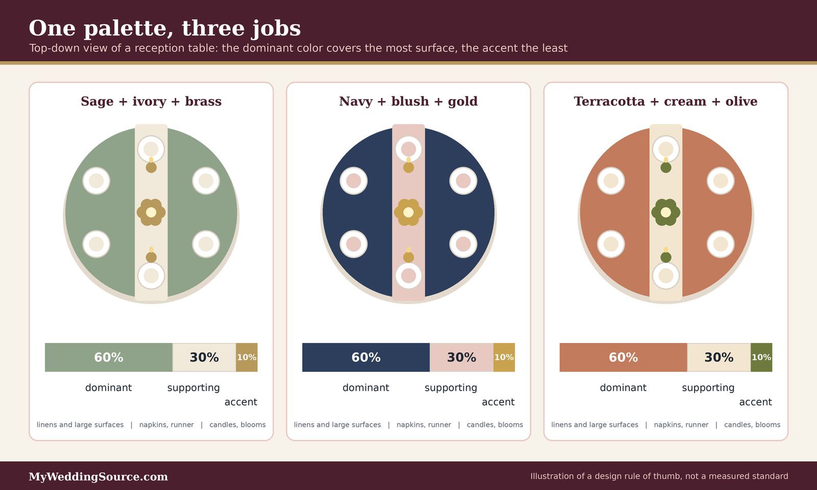
How the rule of thumb works on a wedding
The dominant color takes roughly three-fifths of the visible surface, the supporting color takes roughly three-tenths, and the accent takes the last tenth. At a wedding, “surface” is the sum of linens, backdrops, ceremony textiles, flowers, attire, and stationery. You do not need to measure it. Look at a photograph or a mockup and ask whether one color clearly leads, whether a second adds contrast, and whether the third appears just often enough to feel intentional rather than random. Used loosely, it is a quick audit of wedding color schemes, not a formula.
Neutrals count toward the total
White, ivory, cream, and natural wood are colors in a room even when they feel like a backdrop. If your linens are ivory and your chairs are natural wood, the neutral may already be the dominant color before you add anything. That is not a problem, but it does mean your first “real” color may be the supporting one, and it should be chosen with that role in mind. Counting neutrals also prevents a common surprise, in which a couple chooses three bold colors and ends up with four because the venue’s carpet is red. Honest counting makes wedding color schemes easier to balance.
When a favorite color will not fit
It is normal to fall for a color that does not belong in the final palette. The goal is to avoid either forcing it in or feeling that you gave something up.
Demote it to a small detail
A color that clashes with the main palette may still work in a very small amount: a ribbon around the programs, a ring-box lining, a hand-lettered place card, a thread in the bouquet wrap, or the inside of an invitation envelope. Small details are seen up close, where a contrasting color reads as a deliberate surprise rather than an error. This keeps wedding color schemes tidy while still honoring a favorite.
Move it out of the shared spaces
Some colors can live in places that are not part of the main picture, such as the getting-ready room, the guest welcome bags, or the late-night snack table. That keeps the shared spaces coherent and still lets you enjoy the color. If the color is important to a person rather than to you (a grandparent’s favorite, say), a small, visible gesture can matter more than a large one.
Color relationships that stay harmonious
Color theory has a long vocabulary, but wedding planning needs only a few relationships, and the aim is not to be clever. The aim is to avoid combinations that look accidental or fight under real light.
Monochromatic and analogous schemes
The most forgiving wedding color schemes are the ones built on close relatives. They are also the easiest to match across different materials, which is where most palettes break down.
Monochromatic: one hue in many shades
A monochromatic scheme uses one hue in a range from pale to deep, such as sage, moss, and forest green, or blush, rose, and wine. It looks cohesive because every item is related, and small variations in dye lot or flower shade matter less because they sit within the range you already want. The trap is flatness: without a contrasting texture or a neutral, the room can look uniform. Texture, metal accents, and natural materials add contrast without adding a new hue. Monochromatic wedding color schemes are among the easiest to carry across mixed materials.
Analogous: neighbors on the color wheel
An analogous scheme combines hues that sit next to each other, such as yellow, gold, and orange, or blue, teal, and green. It has a bit more variety than a single hue and still feels harmonious, because the colors share undertones. For many couples, an analogous pair plus a neutral is the most forgiving structure for a first palette. Analogous wedding color schemes tend to look sophisticated with little effort.
Complementary and high-contrast schemes
Contrasting colors can look striking, but they ask for more discipline. The balance between them matters more than the particular colors you choose.
Complementary pairs need unequal shares
Complementary colors sit opposite each other on the wheel, such as blue and orange, or purple and yellow. Used in equal amounts they compete, and the eye does not know where to rest. Used in unequal amounts, with one clearly dominant, they create energy. The proportion rule above is especially useful here: let one color lead, let the other appear as the accent, and let a neutral do the rest. Complementary wedding color schemes succeed or fail on proportion.
Contrast also helps guests read the room
A little contrast helps practical details too. Dark lettering on a pale card, a darker napkin on a lighter plate, and a boutonniere that is visible against a jacket all depend on contrast. We return to this in the accessibility section, where the numbers are specific. Wedding color schemes need enough contrast to be useful as well as pretty.
Undertones, whites, and woods
Two colors that share a name can look very different next to each other, and the cause is usually undertone. The best fix is to test materials side by side.
Warm and cool undertones
Most colors lean warm (toward yellow or red) or cool (toward blue). A cool pink and a warm pink can both be called blush, and placed together they can look mismatched. The simplest rule is to choose one direction, warm or cool, for the whole palette, and to compare the physical samples next to each other before you decide. A phone screen will not reliably show the difference. Undertone is the most common hidden flaw in wedding color schemes.
The white problem
White is the most commonly mismatched color at a wedding, because “white” ranges from bright blue-white to cream to a yellowed ivory. Linens, a dress, flowers, candles, paper, and a tent can all be white and still disagree. Put samples of every white item together in daylight. If they clash, choose one white as the reference and adjust the others, or deliberately choose two clearly different tones, for instance crisp white linens with cream flowers, so that the difference looks planned. Whites are where otherwise careful wedding color schemes most often slip.
Light, venue, and photographs
Color is not a property of an object. It is what your eyes (or a camera) receive after light has bounced off the object, and the light at a wedding changes from the ceremony to the reception. This is the single biggest reason a palette that looked perfect on a screen looks different in the room.
Test swatches in the place where they will be used
If you do only one thing from this guide, make it this: put physical samples in the actual space, at the actual time of day.
Check the room in daylight and in the evening
Carry fabric swatches, a paper napkin, a flower stem or a printed card to the venue. Look at them in natural daylight, under the room’s normal lighting in the evening if the venue allows a visit, and in the shaded corner where the ceremony may be held. Photograph them with and without a flash. A color that looks soft in daylight can look gray or muddy under warm indoor bulbs, and a warm cream can turn yellow under certain cool-white fixtures. Testing is the cheapest way to protect wedding color schemes from surprises.
Compare materials side by side
Fabric, paper, petals, and ribbon absorb and reflect light differently, so the same dye can look different on each. A velvet ribbon looks deeper than satin in the same color, and a matte card looks flatter than a glossy one. The goal is not that every item is identical, but that every item belongs to the same family when they sit together on one table. Materials, as much as dyes, decide whether wedding color schemes look unified.
Lighting changes the palette
Lighting design is part of your color decisions, even if you never hire a lighting designer. Our guide to wedding lighting covers the equipment; here we focus on what it does to color.
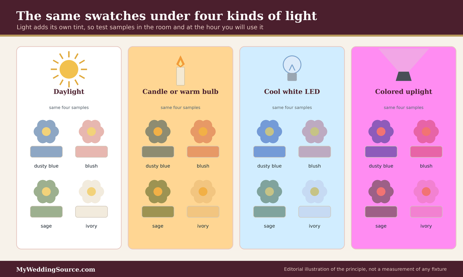
Warm light, cool light, and colored light
Warm light (candles, tungsten-style bulbs, string lights) pushes colors toward yellow and orange: it flatters creams, golds, terracotta, and reds, and it can dull blues and grays. Cool light (many LED fixtures, overcast daylight) pushes toward blue: it keeps whites crisp and can make warm tones look flat. Colored light, such as the uplights many DJs and lighting vendors offer, adds its own tint to everything it touches, and it can change the color of a white wall or a tent ceiling completely. The illustration above is an editorial drawing of the principle, not a measurement of any particular fixture. Lighting can rewrite wedding color schemes, so plan it as part of the palette.
Give the lighting vendor an exact reference
“Soft white” and “warm white” mean different things to different people. Give your lighting vendor a physical sample or a photograph of the color you want, and ask them to show you the fixture’s setting in the room if they can. A reputable vendor will understand that the point is to match your swatch, and will tell you if the equipment cannot do it. Our guide to wedding backdrops is a useful companion if the backdrop will be the largest surface lit. Treat the lighting brief as part of your wedding color schemes, not an extra.
Photographs and the edited look
Your photographs will interpret your palette through a camera and an editing style, and both add a layer of change.
Cameras and editing shift color
Photographers choose a look when they edit, such as warm and golden, bright and airy, or dark and moody, and that look moves every color a little. A pale sage can lean silver or yellow, and a dusty rose can look pinker or browner. Ask to see a full gallery, not just highlights, from a wedding with colors similar to yours. If your palette depends on a precise shade, say so in advance and ask how the photographer handles color. Our wedding photography guide has more on choosing a style. Photographers interpret wedding color schemes, so choose one whose edits you like.
Help the photographer by planning detail shots
Detail photographs of stationery, flowers, and the table are where your palette is most visible. Give your photographer the cards and ribbons early, so they can photograph the suite as a set. Our wedding photographer shot list shows how to request detail coverage without turning it into a long list of poses.
Attire, attendants, and skin tones
The people in the photographs wear your palette more than anything else does, and they are also the people with the least say in the choice. That makes it worth being deliberate and considerate.
Attendants and the cost of matching
Asking friends and family to wear a color is a request with a price attached. Emily Post notes that attendants generally pay for their own wedding attire and accessories, with flowers the usual exception, so the color you choose affects their budget as well as yours.
Choose a color that people can actually buy
A very specific shade can be hard to find in different styles and sizes, and it can force attendants into one retailer or one price range. Consider giving attendants a color family, a swatch to match, or a short list of approved options rather than a single product. Our bridesmaid dresses guide discusses mix-and-match approaches, and our guide to wedding party costs explains how the price of a request adds up. Wedding color schemes that depend on one hard-to-find shade create work for everyone.
Match exactly or stay in a family
Decide early whether attendants will match exactly or wear a tonal family, such as three greens or different styles in the same shade. Exact matching looks formal and unified, but it requires everyone to order from one source. A tonal family looks relaxed, hides small differences in dye, and lets people choose a style that fits their bodies and budgets. If you choose exact matching, ask the retailer about dye lots, which are batches of fabric that can vary slightly in shade, and ask whether everyone’s order can come from the same batch. Both approaches can suit wedding color schemes, and the choice is mostly about formality and budget.
Skin tones and undertones
A color that flatters one person can wash out another, and a group of people shares a photograph. The goal is not a perfect color for everyone, but a palette that does not work against anyone.
Undertone usually matters more than depth
Many people find that whether a color is warm or cool relative to their skin matters more than whether it is light or dark. Retailers that sell dresses often provide guidance on undertones, and it is worth asking a stylist to compare several swatches near each person’s face in daylight. This is general styling advice, not a rule, and individual preferences matter more than any chart. Good wedding color schemes leave room for these differences.
Offer a range within the family
If your attendants have different complexions, a palette with a range of values in the same family, for example light, mid, and deep, gives each person a better option than a single shade. Muted and dusty tones are often easier to wear across a group than very saturated ones, though this too varies with the person and the fabric.
The couple’s own clothing
The couple’s attire is the center of every photograph, and it is the one place where the palette can be most subtle.
Whites and ivories in photographs
Dresses come in many whites, from bright white to cream, champagne, and blush-tinted ivory. Under warm light they can all look similar; under cool light they separate. Before you commit to a flower or linen color next to a dress, hold the fabric samples together in daylight. Our guide to wedding party attire covers coordinating the full group, including the groom’s side. Wedding color schemes should be checked against the dress, since it is the largest white in the picture.
Suits, tuxedos, and accents
Dark suits and tuxedos are neutral in most palettes, so the accent usually comes through a tie, pocket square, boutonniere, or vest. Our guide to groomsmen suits and tuxedos discusses how to coordinate color and formality. A small accent that echoes the bouquet is often enough to tie the two sides together.
Flowers, decor, and where color costs money
Color choices have a price, though not always the one you expect. Some colors cost more because of the flowers or fabrics they require, and some cost more because they are harder to match.
What the surveys say
Two widely cited surveys report averages for the categories that carry most of your palette. They measure different things and use different samples, so treat them as rough anchors.
The Knot’s 2025 averages
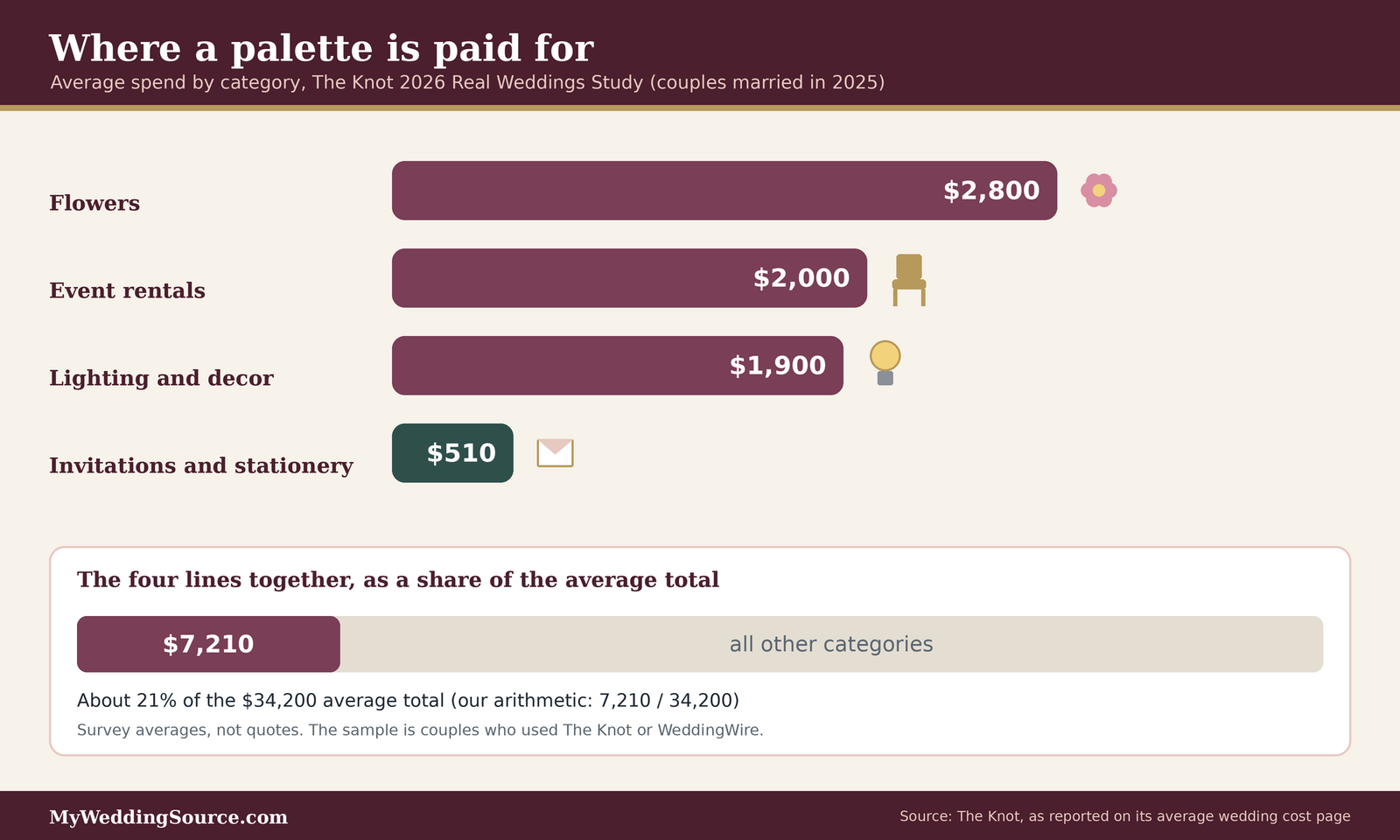
The Knot’s 2026 Real Weddings Study surveyed 10,474 U.S. couples who married in 2025, recruited through The Knot and WeddingWire membership, and reports an average total of $34,200. Within that, it reports flowers at $2,800, event rentals at $2,000, lighting and decor at $1,900, and invitations and stationery at $510. Adding the four lines is our own arithmetic: about $7,210, or roughly 21 percent of the average total. These are not quotes, and the sample is a self-selected group of couples who use those sites. These lines are where most wedding color schemes are paid for.
Why Zola’s number is different
Zola’s floral guide reports an average of about $6,300 for wedding flowers, roughly 13 percent of a total budget, from its own cost index, which is more than twice The Knot’s figure. We could not verify why the two differ, and possible explanations include different samples, different definitions of what is included, and different regions. The practical lesson is to use your own quotes, not either average, as the basis of your budget.
Where color adds cost
Color does not usually have a price tag of its own, but it influences the price through the materials you need to match it.
Flowers that match a color on demand
Zola notes that some flowers, such as peonies, gardenias, and orchids, are premium-priced, while carnations, daisies, and baby’s breath are much more affordable, and that in-season, locally grown flowers cost less than imported or out-of-season blooms. If your palette depends on a flower that is out of season on your date, the cost can rise, or the florist may suggest a substitute. The Knot adds that mixing in more greenery, using dried botanicals, choosing in-season flowers, and limiting the number and size of arrangements can lower the cost. Our wedding flowers guide explains how to compare florist quotes. Wedding color schemes that follow the season tend to cost less to deliver.
Linens, rentals, and specialty colors
The Knot’s savings guidance notes that specialty linens can push a budget up and that standard linens are a simple place to cut costs. We did not find a published national price for linens by color, so we do not quote one. Ask your rental company for the price per linen in your color, whether it is standard stock or a special order, and whether the quote includes delivery, pickup, and any cleaning or damage fees. Our guide to wedding table settings covers what goes on the table. Wedding color schemes expressed in linens are some of the easiest to price and compare.
Cost reality check
The averages above are national survey results, and none is a quote for your wedding. Floral and decor spending also varies by region and guest count: The Knot’s flower report lists $1,600 for weddings with up to 50 guests, $2,400 for 51 to 100, and $3,300 for 101 or more. The Knot’s savings guide groups floral and non-floral decor at about 9 percent of a budget and suggests asking whether each item is essential before you sign. To see where your palette fits in the whole plan, use our wedding budget calculator, and for national context read our average wedding cost guide. We do not give financial advice; compare written quotes from several vendors.
Using color to save money
A palette can also lower costs when it is built around what is available and affordable.
Choose a palette that matches the season
A palette built on flowers that are in season on your date asks less of the florist, which can keep costs down and keep the colors consistent. If the florist can use locally available stems for most of the work, the palette is easier to deliver, and a substitution is less likely to change the look. Ask the florist which flowers in your color family are most reliable for your date. Seasonal wedding color schemes can lower both cost and risk.
Reuse and simplify
Moving ceremony arrangements to the reception, as Zola suggests, repeats your palette in two places for the cost of one. Using candles, greenery garlands, or lanterns as non-floral decor can also carry the palette without flower costs. Our DIY wedding decor guide covers which projects are worth doing yourself, and The Knot cautions against last-minute DIY as a way to save. Plan any DIY with a margin of time before the wedding.
Stationery, signage, and the screen-to-paper gap
Paper is where a palette meets the most exact scrutiny, because guests hold it in their hands and can compare it with the invitation that arrived months earlier. It is also where a screen preview is least reliable.
Why printed color differs from what you saw
A screen makes color by emitting light, and paper shows color by reflecting it, so the same design can look different in the two forms.
Screens emit, paper reflects
A bright, glowing shade on a monitor often has no exact equivalent in printer ink, and even the same file can look different on two screens with different settings. Expect printed versions of vivid colors to look slightly more subdued, and expect the paper stock (white, cream, textured, or coated) to change the result. We did not verify a specific figure for how much, so treat this as a reason to ask for a proof, not as a calculation. Wedding color schemes are most at risk where screens and paper meet.
Approve a physical proof on the real paper
Ask your stationer for a printed proof on the paper you chose, and compare it in daylight next to your fabric and flower samples. Approving a PDF on a screen is not the same as approving a printed sample. Keep the proof, so you can compare later pieces (programs, menus, signs) against the same reference. Our guide to wedding invitations explains the printing choices, and our guide to wedding signage covers larger formats where color shifts are easier to notice.
Keeping a suite consistent
Invitations, programs, menus, and signs are often made at different times, by different people, and sometimes by different printers.
Name colors the same way everywhere
Keep a single color reference sheet, with a physical swatch, a name you use for each color, and any code your stationer or designer uses. When a vendor asks for the “navy,” send the reference, not a description. If you add a calligrapher or a sign maker, give them the same sheet. Our wedding calligraphy guide covers ink choices for hand-lettered pieces. A shared sheet keeps wedding color schemes consistent across vendors.
Plan the order of printing
Order pieces in batches from the same printer when you can, and if you will reorder, ask whether the printer can match the earlier run. A small color shift between a save-the-date and a program may go unnoticed, but a shift between two pieces on the same table will not. Our guide to save-the-date cards is a useful place to start the set.
Readability and accessibility
A palette should be comfortable to look at and easy to read for every guest, including people who see color differently.
Contrast for printed and displayed text
Text that is pale on pale or dark on dark is hard to read in dim light, and the effect is more serious for older guests or anyone with low vision.
What the web accessibility standard says
The W3C’s Web Content Accessibility Guidelines, which are written for screens, set a minimum contrast ratio of 4.5 to 1 for normal text and 3 to 1 for large text, and define large text as at least 18 point, or 14 point bold. These are web standards, not wedding rules, and a printed card is not a web page, but they are a sensible reference when you test a color pairing. A free contrast checker will compute the ratio for any two colors. Treat the numbers as a floor, and give extra margin for small text, metallic ink, or candlelit rooms. Readable text is part of good wedding color schemes, even if it is easy to forget.
Practical choices for cards and signs
Choose a dark, solid ink on a light, plain background for anything guests must read quickly, such as a seating chart, a menu, or a sign. Save pale, metallic, or low-contrast inks for decorative elements. Test the text in the dimmest light of the room, not at a desk. Our wedding seating chart guide covers how to make that chart easy to scan. Save the subtle tones in wedding color schemes for decoration, not for information.
Color should not carry meaning alone
If your wedding uses color to tell guests something, such as table groups, meal choices, or a route, add a second cue.
Use shape, text, or numbers as well
The W3C’s guidance on use of color says color should not be the only visual way to convey information, and recommends adding something like shape or text, so that people with color vision differences can still understand it. A table marked only by a red or green ribbon can be confusing for a guest who cannot tell those colors apart. Add a number, a name, or a symbol. We did not verify a prevalence statistic for color vision differences from an authoritative source, so we do not quote one, but the design habit costs very little.
Check the palette in grayscale
A simple test is to photograph your swatches and view the image in grayscale. If two colors that should be different become the same gray, they have similar lightness, and guests who have trouble with color differences may not tell them apart. Adjust one color’s lightness, or add a pattern, a border, or a label.
Trends without dating your photographs
Trends are fun, and they are also the part of a palette most likely to look specific to a year when you open the album later.
What the trend reports say, and what they do not
Annual color announcements and platform trend reports attract attention, but they are not wedding data.
Pantone’s color of the year
Pantone named PANTONE 11-4201 Cloud Dancer its Color of the Year for 2026 and describes it as a lofty white that serves as a calming influence. That is a statement about Pantone’s choices across industries, not a survey of weddings, and it does not tell you what couples are choosing. We did not retrieve a trend report with wedding-specific data and method, so we do not cite statistics about rising wedding colors. Annual announcements can inspire wedding color schemes without dictating them.
Be cautious with rankings and percentages
If you see a list of trending wedding colors with percentages, check whether the source says what was measured, over what period, and in which country. A figure without a method is a hint, not evidence. A trend can also be popular on a social platform and rare in actual weddings.
How to borrow a trend safely
You do not have to ignore trends. You can use them without tying your whole day to them.
Put the trend in the accent
Keep the dominant and supporting colors timeless, such as neutrals, deep greens, navy, or warm earth tones, and use the trendy shade in the ten percent: a ribbon, a flower, a candle, a napkin. If the shade looks dated in ten years, the room will still hold together. Our guide to 2026 wedding decor trends discusses how to evaluate current ideas without letting them take over. This is the safest way to bring a trend into wedding color schemes.
Ask what you would still like in a plain photograph
Imagine the palette in a photograph with no styling. Would you still like those colors on a plain wall and a plain tablecloth? If so, the palette has staying power. If the appeal depends on a prop or a filter, it may be a mood more than a palette.
A practical sequence for deciding
A palette is easier to settle when you decide in a sensible order, and when each step has a clear output.
From idea to approved samples
The sequence below is our own suggestion, not an industry standard, and the timing depends on your vendors and your date.
Gather, narrow, and test
Collect images you love, then look for what they share: a color family, an undertone, a level of contrast. Narrow to a dominant, a supporting, and an accent color. Buy or request physical swatches of each, in the real materials, and test them in the venue light. Show the set to your partner and one trusted person who will tell you honestly if it looks muddy. Most successful wedding color schemes follow some version of this order.
Write the brief and approve samples
Write a one-page color brief with names, swatches, the proportions you expect, and the details that matter (the exact white, the one non-negotiable shade). Share it with every vendor, and ask each to confirm in writing what they will use. Approve samples before anything is dyed, printed, or ordered. Our wedding planning checklist and plan wedding timeline show where these steps fall in the wider plan. A written brief turns wedding color schemes from a mood into an instruction.
What to do when something does not match
Even a careful plan can end with a mismatch, usually because of a dye lot, a flower substitution, or a printing difference.
Decide what you can live with
Most small mismatches are noticeable only to the people who chose the colors. Compare the item with the rest of the room in the light where it will be used before you panic. If it looks fine at a normal distance and the rest of the palette is coherent, accept it.
Fix the ones that matter
If a mismatch is large, such as the wrong shade of attendant attire or an invitation printed far from the proof, contact the vendor right away, with your reference and the written confirmation. Ask what remedies are in the contract. We are not a legal source, and contracts differ, so read yours or ask a professional if you are unsure. Even well-planned wedding color schemes occasionally need a correction.
Questions to ask before you finalize
- Florist: Which flowers in my color family are reliable for my date, and what would you substitute?
- Rental company: Is my linen color standard stock or special order, and what is the price per piece, including delivery and pickup?
- Lighting vendor: Can you show me this setting in the room, and match a sample I bring?
- Stationer: Can I see a printed proof on the final paper in daylight?
- Attire retailer: Will every order come from the same dye lot, and what is the policy if the shade differs?
- Venue: Which permanent colors and finishes will show in photographs, and what changes are allowed?
Questions people ask about wedding color schemes
Choosing colors
How many colors should I choose for my wedding?
Most weddings do well with two or three main colors plus a neutral. That is our editorial judgment, not a standard. A dominant, a supporting, and an accent color give a room all the roles it needs. Add more only if they are closely related shades, or limited to flowers where variety looks natural.
What is the 60-30-10 rule for wedding colors?
It is a common design rule of thumb that gives about 60 percent of the visual field to a dominant color, 30 percent to a supporting color, and 10 percent to an accent. It is a heuristic, not a measured standard. Use it to check whether your palette has a clear hierarchy.
How do I choose colors for a wedding when I cannot decide?
Start from a fixed fact: the venue’s permanent colors, the season, your attire, or a meaningful object. Gather images, find what they share, and test physical swatches in the venue’s light. A fixed starting point gives you a reason to say yes or no to each option.
Seasons, light, and photos
Should my wedding colors match the season?
They do not have to, but the season affects which flowers are available and affordable. Zola’s guide describes pastels in spring, bold colors in summer, jewel tones in fall, and neutrals with red and green accents in winter. Ask your florist what is reliable for your date.
Why do my colors look different in person than on a screen?
A screen emits light and paper or fabric reflects it, and the room’s lighting adds its own tint. Test physical swatches in the venue, in daylight and evening light, and approve a printed proof on the real paper before ordering the full set.
Attendants, costs, and accessibility
Do bridesmaids have to match exactly?
No. You can match exactly, or choose a color family so attendants wear different shades or styles. Emily Post notes that attendants generally pay for their own attire, so a flexible palette can be kinder to their budgets. If you want exact matches, ask about dye lots.
Do certain wedding colors cost more?
Color has no price of its own, but the materials can. Zola says peonies, gardenias, and orchids are premium-priced and out-of-season blooms cost more, and The Knot says specialty linens can raise a budget. Ask vendors for quotes in your exact colors.
How do I make my colors readable for every guest?
Use dark ink on a light background for anything guests must read, and avoid relying on color alone. The W3C recommends a contrast of at least 4.5 to 1 for normal text on screens, and a number, name, or shape can back up any color-coded sign.
Your next steps
Settle the palette
Choose the anchor and the roles
Pick one fixed starting point, then name your dominant, supporting, and accent colors. Write the proportions you expect. Our wedding decor guide helps you connect the palette to the rest of the room.
Test before you commit
Carry swatches to the venue and photograph them in daylight and evening light. Ask for printed proofs and fabric samples, and approve nothing from a screen alone. This protects your wedding color schemes from the screen-to-room gap.
Brief your vendors
Share one color sheet
Give every vendor the same reference with physical swatches, color names, and the details that matter. Ask each to confirm in writing. Our wedding planning guide shows where vendor decisions sit in the larger plan. One sheet keeps wedding color schemes consistent across every vendor.
Put the palette in the budget
Ask for quotes in your exact colors, and compare what each includes. For the bigger picture, use our wedding budget calculator and our guide to how to pay for a wedding. Pricing wedding color schemes early avoids surprises.
Sources & methodology
How we built this guide
What we relied on
This guide combines published cost data from The Knot’s Real Weddings Study as reported on its average-cost pages, planning advice from Zola’s floral and seasonal guides, The Knot’s savings advice, Emily Post’s guidance on attendants, the W3C’s accessibility guidance on contrast and the use of color, and Pantone’s announcement of its 2026 color. Where a statement comes from a company or a survey, we attribute it. The roughly $7,210 combined figure and its share of the average total are our own arithmetic. The 60-30-10 rule, the recommendation of two to three main colors, and the suggested sequence of steps are editorial judgment, and the infographics are illustrations.
What we did not do
We did not test colors under real lighting equipment, interview florists or stationers, or verify prevalence figures for color vision differences, retail prices for linens and uplights, or wedding-specific trend statistics, so we do not quote them. Prices are national averages, not quotes. This is not legal or financial advice. Confirm current rates, policies, and contract terms directly with vendors.
Source list
Cost and planning sources
- The Knot, Average wedding cost (2026 Real Weddings Study, couples married in 2025): https://www.theknot.com/content/average-wedding-cost
- The Knot, Average cost of wedding flowers: https://www.theknot.com/content/average-cost-wedding-flowers
- The Knot, How to save and splurge on the wedding: https://www.theknot.com/content/how-to-save-and-splurge-on-the-wedding
- Zola, How to set your floral budget: https://www.zola.com/expert-advice/how-to-set-your-floral-budget
- Zola, A seasonal guide to wedding flowers: https://www.zola.com/expert-advice/a-seasonal-guide-to-wedding-flowers
- Emily Post, Wedding attendants: https://emilypost.com/advice/wedding-attendants
Accessibility and color sources
- W3C, Understanding Success Criterion 1.4.3: Contrast (Minimum): https://www.w3.org/WAI/WCAG22/Understanding/contrast-minimum.html
- W3C, Understanding Success Criterion 1.4.1: Use of Color: https://www.w3.org/WAI/WCAG22/Understanding/use-of-color.html
- Pantone, Color of the Year 2026: https://www.pantone.com/color-of-the-year/2026