
Photo editing styles decide how your wedding looks after the shutter clicks: how warm or cool the skin is, how bright the white dress reads, how deep the shadows go. This guide compares three common looks, true-to-color, moody and airy, and gives you a same-scene grading checklist so you can judge them with evidence instead of taste alone.
Ask each photographer you are considering to show one scene graded three ways, or to show three different weddings with the same kind of light. Then run six checks on what you see: neutral colors, skin tones, whites, shadows, highlights and consistency across a set. Match the style to your venue light and your wardrobe, not only to a mood board. Put the chosen look, the delivery format and the re-edit rules in writing before you pay a deposit.
Most couples meet photo editing styles through a portfolio. A photographer’s website shows twenty beautiful frames, and the couple decides whether they like the feeling. That is a reasonable first filter. It is a weak last one, because a portfolio shows the best light, the best skin tones and the most flattering rooms, and it rarely shows how the same look behaves in your church, your barn or your windowless ballroom.
This guide is narrower than a general photography guide. It does not cover which shots to ask for, how many hours to book or how to write a shot list. It covers one decision: which editing look to choose, and how to test that choice before the wedding. The method is a same-scene grading comparison. You look at one scene in three photo editing styles, side by side, and you check the same six things each time.
A note on scope. This is general information, not legal or financial advice, and anything about copyright or contracts is a starting point for a conversation with your photographer or an attorney. Where a rule matters, the sources at the end point to the agency or standards body that publishes it, so you can confirm the current version yourself.
What photo editing styles change and what they leave alone
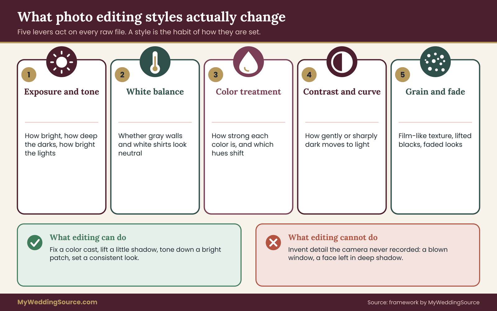
Editing is not one step. It is a chain of small decisions applied to a raw file, and a style is the name for the habits a photographer repeats across that chain. Before comparing photo editing styles, it helps to know which levers are actually being pulled.
Exposure and tone. How bright the picture is overall, how dark the darkest areas go, and how bright the brightest areas get. Among photo editing styles, airy looks lift the shadows and brighten the whole frame. Moody looks usually deepen the shadows and let the highlights stay restrained.
White balance. Whether neutral things, such as a gray wall, a white sheet or a guest’s white shirt, look neutral. Light has a color. Candles are orange, shade is blue, and some venue lights are green. White balance is the correction for that.
Color treatment. How saturated each color is and whether certain colors are shifted. A grade can pull greens toward yellow, push skin toward orange or mute reds. This is where photo editing styles most clearly show their signature.
Contrast and curve. How abruptly the picture moves from dark to light. A flat, soft curve reads as gentle. A steep curve reads as punchy.
Grain, fade and effects. Some photo editing styles add film-like grain or lift the blacks so that nothing is truly black. These are stylistic choices, and they interact with printing and screens in ways worth checking.
What editing does not change is just as useful to know. It cannot invent detail that the camera did not record. A face lit from behind and left in shadow can be lifted, but the lifted version will be noisy and soft. A window blown to pure white cannot be recovered into a visible sky. Editing works on what the light and the exposure already gave the photographer. This is why the venue matters so much when you choose among photo editing styles.
Editing is not retouching
Two words get mixed up. Editing, or grading, applies broad changes to a whole image or a whole set: brightness, color, contrast. Retouching changes specific things within a frame, such as removing a stray cable, smoothing a blemish or reshaping a shadow. A photographer may offer both, and the two have separate scopes and sometimes separate prices.
When you compare photo editing styles, you are comparing grading. Ask about retouching separately. If a photographer’s contract says “all images are professionally edited,” that sentence does not tell you whether blemish work, object removal or background cleanup is included. The questions section later in this guide gives wording for that.
Why a style is a habit, not a filter
A preset is a saved set of slider positions. A style is bigger than that. It includes how the photographer exposes in the camera, which lenses they favor, and how they handle mixed light. Two photographers can both say their photo editing styles are “airy,” and one will overexpose on purpose at the camera and the other will brighten later. The results can look similar on a bright day and very different at dusk.
This is why a single sample image can mislead. Photo editing styles are sets of repeated choices that should hold up across rooms and across the day. The comparison method in this guide asks to see that repetition rather than one lucky frame.
The three photo editing styles in plain terms
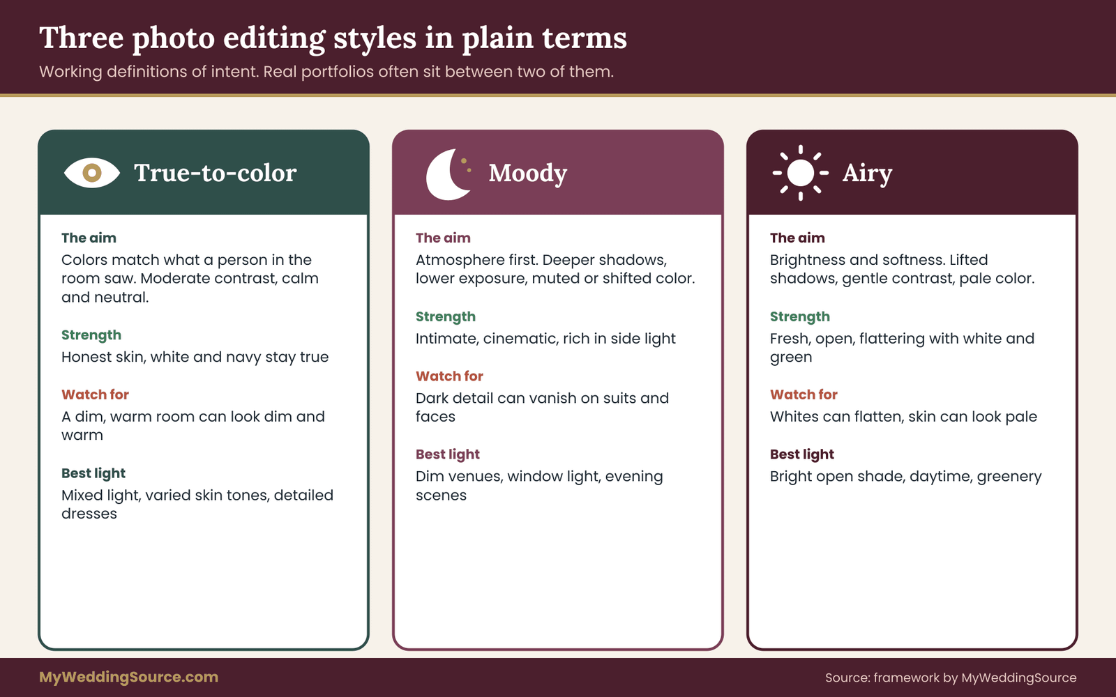
Names for photo editing styles differ from photographer to photographer, and some use “light and bright,” “dark and moody” or “natural” as marketing labels. For this guide, three working definitions are enough. They describe the intent of the grade, and real portfolios often sit between two of them.
True-to-color
The aim is that colors in the picture match what a person standing in the room would have seen. A white dress looks white, not cream or blue. A navy suit looks navy. Skin looks like skin under that light, without a strong tint. Contrast is moderate and the picture feels neutral and calm.
Of all photo editing styles, true-to-color is sometimes called natural, clean or color-accurate. Be careful with the word natural, because every photographer thinks theirs is natural. The reliable test is not the label but whether neutral objects in the frame are neutral.
The tradeoff is that a faithful picture of a dim, orange-lit reception can look dim and orange, because the room was. A true-to-color photographer will correct the cast but will not hide the mood of the room. Some couples like this honesty. Others expect a more polished, brighter look.
Moody
The aim is atmosphere. Shadows are deeper, the overall exposure is lower, colors are often muted or shifted, and highlights are held back so the picture feels intimate and sometimes cinematic. Moody work often uses side light, window light or low light as part of the look.
The tradeoff is that darkness removes information. Faces can lose detail, dark suits can merge with dark backgrounds, and a dark picture shown on a phone in a bright room can look nearly black. Printing moody images is also more sensitive to paper, ink and the room where the print hangs. None of this is a reason to avoid moody photo editing styles. It is a reason to check how it performs on your venue and your wardrobe.
Airy
The aim is brightness and softness. Exposure is raised, shadows are lifted, contrast is gentle, and colors are often pastel or slightly pale. The pictures feel light, open and fresh. Of the three photo editing styles, airy is common in pictures with white dresses, greenery and daytime light.
The tradeoff runs the other way. When the exposure is pushed high, whites can lose texture. Lace, beading, folds in a veil and the detail of a white shirt can flatten into a single bright shape. Skin can look pale or washed out, and this is more noticeable on lighter and on deeper skin tones for different reasons that the skin-tone section explains. Airy edits also depend heavily on a bright, even source of light, so they can struggle in a dark church.
What the labels do not tell you
None of these three names for photo editing styles says how a photographer treats skin, or how they handle a room with colored lights, or what they do about a dress that is ivory rather than white. Two photographers who both call themselves airy can differ more from each other than one airy and one true-to-color photographer do. So think of the names of photo editing styles as starting points for a conversation.
What matters is the behavior of the style under conditions you can predict. If your ceremony is in a stone church with small windows, ask how the style behaves there. If your reception is outdoors at sunset, ask how it handles that hour. That is the idea behind comparing the same scene: it removes the variable of luck and leaves the variable of style.
The next section explains why a normal gallery makes comparing photo editing styles harder than it looks, and why some of the difference you see between two portfolios has nothing to do with the photographer’s skill.
Why a gallery makes photo editing styles hard to compare
When you open two photographers’ galleries, you are comparing at least five things at once: the photographer’s eye, the light they happened to have, the people in front of the camera, the editing style and the screen you are looking at. Only one of those is the choice you are making: the editing style, and photo editing styles are hard to see alone. The others add noise, and the noise can be larger than the signal.
Different light. A bride photographed in a bright window at ten in the morning will look different from a bride in a church with colored glass, no matter who edits. If one portfolio is full of open shade and another is full of candlelit rooms, you are comparing venues.
Different people. Skin tone, hair color and clothing change what a grade does. A warm grade that flatters one complexion can push another toward orange. A bright grade that suits a pale dress can make a cream dress look gray.
Selection. A portfolio is curated. It shows the frames where the style worked. A gallery from a full wedding shows more of what happens at the edges of the style, in the dim corridor and the harsh midday square.
Your screen. A laptop at full brightness, a phone in dark mode and a calibrated monitor will each show a moody image differently. The same file can look rich on one screen and muddy on another. Color spaces matter too, and the sources list includes the standards body behind the color space used on most web images.
Your own mood. After forty images in one style, your eye adapts. The fortieth picture looks normal, even if the first would have looked odd. Looking at a set of images in a single sitting makes the style feel more consistent than it is.
This is why the comparison method uses the same scene. If the scene is fixed, a difference in the result comes from the photo editing styles being compared. That is the only variable you want to measure when you compare photo editing styles.
What a fair comparison needs
A fair comparison has four conditions. The same original image, or a set of originals shot within a few minutes in the same light. The same crop. The same screen and brightness setting. And a set of checks that you decide on before you look, so you do not pick the checks that favor the picture you already like.
You may not be able to get all four from every photographer. Some will happily grade one frame three ways. Some will not, because it takes time, or because they consider their grade part of their craft and not something to be demonstrated on demand. If a photographer declines, ask for three weddings with similar light, and run the checks as best you can. Later sections cover how to ask.
Where this fits in your search
Choosing among photo editing styles is one input into a larger choice. Package, personality, coverage hours and the photographer’s approach to family formals all matter, and for the formals, the wedding family photo list guide covers how to build the list so the day runs on time. The contract matters as well, and the wedding vendor contract guide explains the clauses to read before signing.
The comparison in this guide is best used after you have a shortlist of two or three photographers you already like on other grounds. As a way to weigh photo editing styles, it is a tiebreaker and a risk check, not a first filter. Using it too early means spending hours testing photographers whose availability or price would have ruled them out anyway.
Building a same-scene grading comparison
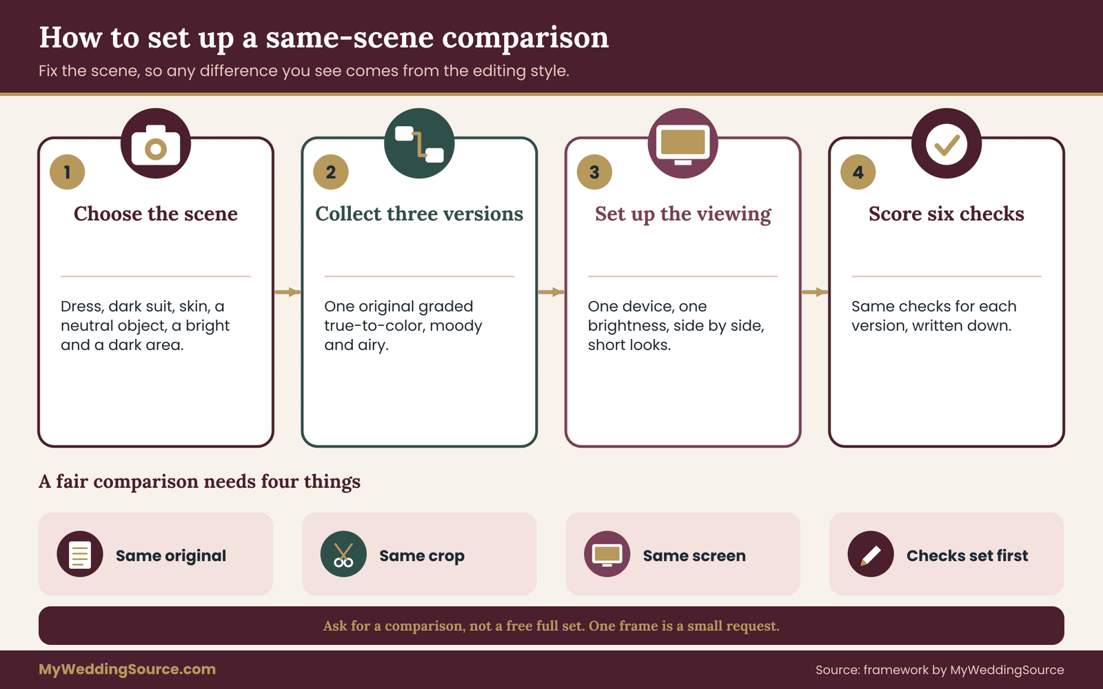
The method has four steps: choose the scene, collect the three versions, set up the viewing, and run the six-point check. This section covers the first three. The next covers the check.
Step one: choose a scene that stresses the style
A good test scene contains the things that photo editing styles handle differently. Look for a frame that includes a white or ivory dress, a dark suit, visible skin, a neutral object such as a gray wall or white tablecloth, a bright area such as a window and a dark area such as a corner. If a single frame has all of these, it is a strong test. If not, use two frames, one indoor and one outdoor.
Ideally the scene resembles your actual wedding, because photo editing styles behave differently in different light. If your ceremony is in a dim hall with warm lamps, a test scene of a sunny garden tells you little. Ask for a frame from a similar venue, or from the closest light the photographer has shot.
Step two: collect three versions of the same file
The cleanest way is to ask the photographer to grade one original three ways: a true-to-color version, a moody version and an airy version. Many experienced photographers can do this in a few minutes with their own tools, and some enjoy it, because it shows range.
If that is not possible, other sources exist. A photographer may have delivered a wedding in one style and have unedited or lightly edited versions of some frames, in which case you can see how far the look moves from the original. Or two photographers with different styles may have shot comparable light, and you can compare across them with the caveats from the previous section.
Be clear that you are asking for a comparison and not free work. A single frame is a small request. A request for an entire set graded three ways is not, and a photographer is right to refuse it or to charge for it.
Step three: set up the viewing
Decide where you will look and keep it the same. Use one device, one brightness level and one room lighting condition. If possible, use the device where you will most often see the pictures, which for many couples is a laptop and a phone.
Put the three versions next to each other, not one after another. When images are seen in sequence, the second one always looks different from the first in ways that depend on what you just saw. When they are side by side, you can see relationships between them.
Then look at each version for a short time, a few seconds, and cover the others if you can. First impressions are information too. Write one sentence per version about how it feels before moving to measurable checks. This keeps the gut reaction separate from the evidence.
A short note on preset packs and apps
Some couples ask whether they can just apply a preset or an app filter to the delivered files themselves. Often they can, and it is a legitimate way to experiment. Two cautions apply. First, a preset is built for a particular camera and lighting situation, and it may behave oddly on other files. Second, the photographer’s contract may restrict changes to delivered images, and the rights section covers how to check that. Keep an untouched original copy before you try anything.
Writing your own brief before you compare photo editing styles
Before running the check, write down what you already know about your wedding. This takes ten minutes and prevents the comparison from drifting into a vote on which picture is prettiest.
List the light you expect at each stage of the day: where the ceremony will be, what time, whether it is indoors or outdoors, and what color the walls and lights are. List the clothing: the color of the dress, whether it is bright white, ivory or colored, the color of suits, and any strong colors in attendant clothing.
List the people: the range of skin tones in your wedding party and family, because a style that works for the couple must also work for the grandparents in the family photos. And list where the pictures will live: a screen only, a printed album, framed prints on a wall, or all three.
This list becomes the filter for the six checks and for your shortlist of photo editing styles. A moody grade that is gorgeous in your photographer’s candlelit samples might be the wrong match for a daytime outdoor ceremony with a white dress. An airy grade that suits your garden might struggle in a stone church. The list tells you which checks to weigh most.
Now put it into a short sentence you can share with the photographer. For example: “Our ceremony is in a stone church at four in the afternoon, the dress is ivory, and we want the pictures to look good in an album and on a phone.” That sentence lets a photographer answer with something specific, and it tells you quickly whether they have thought about your conditions or are giving a general answer.
Wedding color choices matter here as well. If you are still deciding on your palette, the wedding color palette guide covers how colors read together, and it is worth settling the palette before picking among photo editing styles, because a muted palette and a bold grade can pull against each other.
The six-point check for comparing photo editing styles
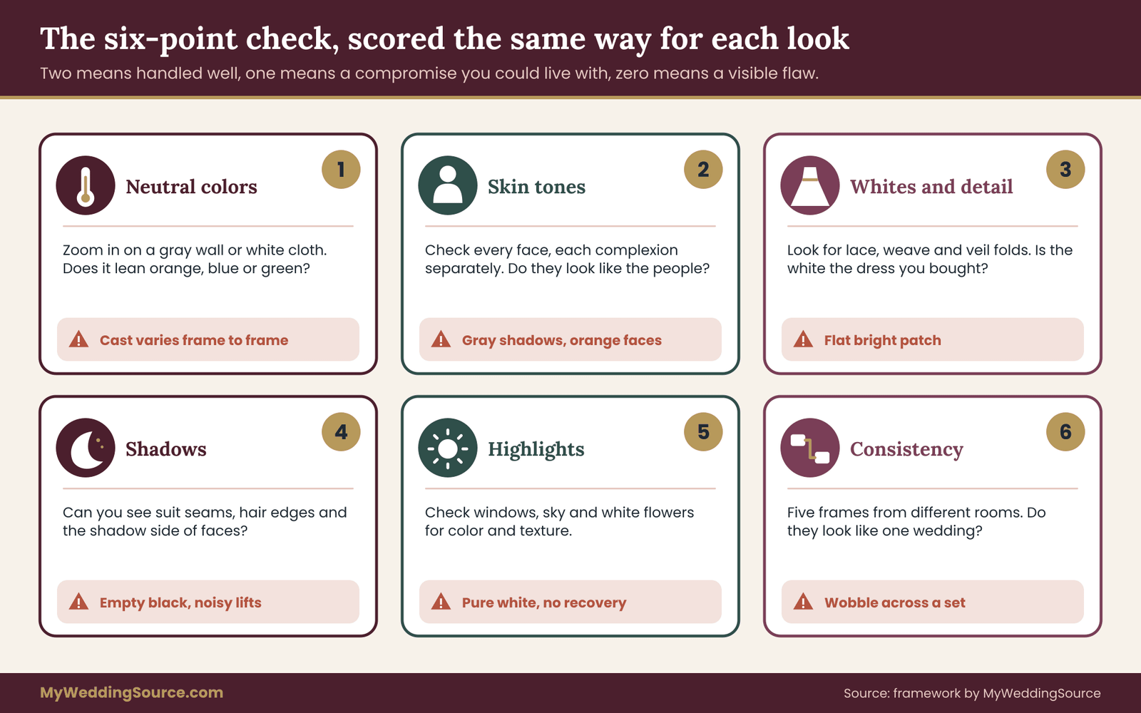
Here is the part that makes the comparison measurable. Six checks, each answerable with a look, a zoom or a simple tool, each scored the same way for all three versions. The scores are yours, for your decision. They are not an industry standard, and they do not rank photographers. They rank how each of the photo editing styles behaves on your scene.
Score each check on a three-step scale. Two means the look handles it well. One means it handles it with a visible compromise you could live with. Zero means a flaw you would notice in a printed album. Write the scores down for each of the three versions, so the comparison cannot drift as you look.
Check one: neutral colors
Find something in the frame that should be neutral: a gray wall, a white tablecloth, a concrete step, the white of a guest’s shirt in shade. Zoom in on it. Does it look neutral, or does it lean toward orange, blue, green or pink?
If you have a free photo viewer with a color picker, click on the neutral object and read the three color values, red, green and blue. For a neutral surface, the three values should sit close together. A large gap between them means a cast. Some editors show this as a temperature and tint reading instead. Treat this as a screening step and not a lab measurement, since light on a real surface is rarely perfectly neutral.
Of the photo editing styles here, true-to-color should pass this check clearly. Moody and airy versions may deliberately shift neutrals, and that is acceptable only if the shift is consistent and chosen. A shift that varies from frame to frame is a flaw, not a style.
Check two: skin tones
Look at every face in the frame, and compare with an unedited or lightly edited version if you have one. Ask three questions. Do faces look like the people you know? Is there an unhealthy tint, such as green in the shadows, orange across the whole face, or gray patches? And do different skin tones in the same frame look equally natural?
The last question matters more than most couples expect. A grade tuned for one complexion can handle another poorly. Heavy warmth can flatten deeper skin into a single orange-brown mass. A heavy lift in the shadows can turn deeper skin ashy. Strong brightening can drain color from lighter skin. When a frame includes people with different complexions, check each face separately.
A reasonable test is to ask a relative who was not at the shoot: do these look like the right people? Their reaction to a skin tone is often quicker and more honest than yours after twenty minutes of staring.
Check three: whites and fine detail
Zoom in on the brightest white object, usually the dress. Look for texture. Can you see lace pattern, the weave of the fabric, beading, the folds in a veil? Or has the area become a flat bright patch?
Also look at the color of the white. A dress that is ivory in life may look bright white in an airy grade, or blue-gray in a cool one. Decide whether the color matches the dress you actually bought. If you have a photograph taken by a relative on a phone in the fitting room, it offers a rough reference, though phone cameras apply their own processing.
This check is where airy photo editing styles are most often tested, and where true-to-color looks usually do well. A moody grade often holds white detail well, because it keeps highlights restrained, but it can make the dress look gray if the whole picture is darkened.
Check four: shadows and dark detail
Zoom in on the darkest parts: a black suit, a dark hair, the shadow side of a face, the corner of a room. Can you see buttons, lapels, the edge of the hair, the outline of a shoulder? Or has it all become one dark shape?
Moody photo editing styles are tested here. Deep shadows are part of the appeal, but there is a difference between shadows that are deep and shadows that are empty. Look for texture in the dark areas. If a groom’s suit and the dark background have merged, the picture loses its subject.
Also check for noise and color banding in lifted shadows. When shadows are lifted heavily, which airy looks often do, grain and blotchy color can appear. Zoom to full size to see it, since small previews hide the problem.
Check five: highlights
Look at the brightest areas other than the dress: windows, the sky, sunlit patches, white flowers. Is there detail, such as sky color, cloud shape or leaf texture, or is the area pure white?
An area that is pure white has no recorded information left in it. Editing cannot bring it back. If the original had the window blown out, none of the three grades will fix it, and a bright grade will make the blown area larger. Many editors have a highlight warning display that marks clipped areas, and a photographer can show you this.
Airy photo editing styles are the most exposed here, because brightening pushes more of the frame toward white. A skilled photographer protects the highlights in the camera and then lifts the rest. That is a skill worth asking about.
Check six: consistency across a set
Everything so far uses one scene. The sixth check uses five. Ask for five frames from the same wedding, taken in different places: outdoors, the ceremony room, the reception, a portrait session, a candid. Put them side by side.
Do they look like one wedding? Skin tones should be steady from room to room. The white dress should stay the same white. The overall brightness should shift only as much as the light shifted. One of the photo editing styles may look strong in a single image but wobble across a set will look uneven in an album.
This check is also the best test of how photo editing styles hold up through the hard parts of a day. Mixed light, indoor to outdoor transitions and late evening are where an editing style is stressed. A consistent set through those moments is better evidence than a single flawless portrait.
Reading your scores without fooling yourself
Add up the scores for each version. The totals are useful, but the pattern is more useful than the sum.
A version that scores two on everything except one zero has a specific flaw. Ask whether that flaw matters for your wedding. If the zero is on shadow detail and your wedding party wears black, it matters. If the zero is on skin tones, it may be disqualifying.
A version that scores one across the board is a safe, unremarkable middle. It might be the right choice if you want a calm result with no surprises, or it might feel flat to you. Return to the first-impression sentences you wrote. If you liked the feel of a version that scored low, find out why. Often a single check pulls the total down for a reason that a different shooting approach could fix, and that is a conversation to have with the photographer.
Weighting the checks to your brief
The six checks are not equally important for everyone. Go back to your written brief and weight them.
If your wedding is in a dim venue, give shadows and consistency extra weight. If your dress is detailed lace, give whites extra weight. If your guest list includes a wide range of skin tones, make skin tones close to a pass or fail check. If you plan a large printed album, pay more attention to noise and banding.
A simple way to do this without arithmetic is to mark two checks as critical for your wedding. A style must score at least one on every check and two on the critical ones. If no version meets that rule, the problem may be the scene, the venue or the lighting conditions, not the style. Then the answer is to change something in the plan, not to settle.
Treat your taste as data too
None of this means your preference does not count. It does. The checks reduce the chance of a nasty surprise, and your taste decides among the options that pass. If two versions pass and you love one of them, choose the one you love. The point of measuring is to make that choice with fewer regrets, and not to replace it with a spreadsheet.
One more note. When you weigh photo editing styles, do not try to keep every score high. Each of the photo editing styles trades one strength for a weakness, and a version that passes everything may be a version with no strong character. The checks tell you where the tradeoffs are, so that you can accept them on purpose.
A worked example of the same-scene comparison
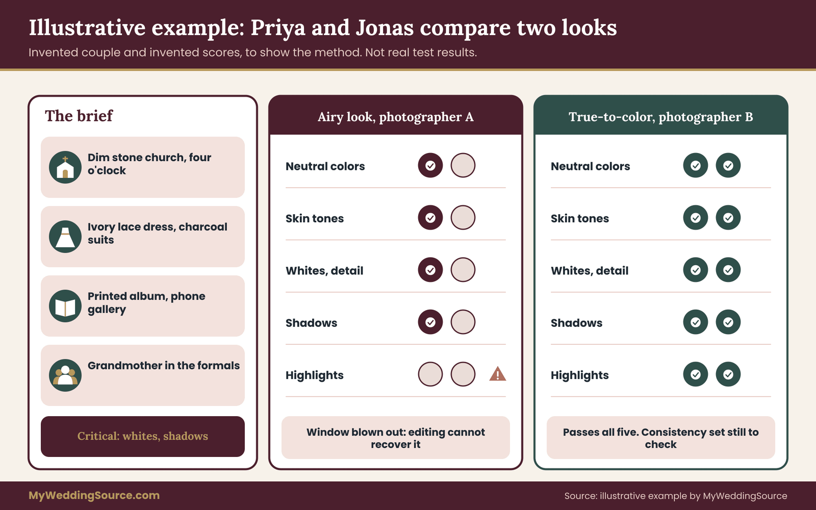
The following couple is invented. The scene, the scores and the decision are illustrative, meant to show how the method works, and they are not real test results or data about any photographer.
Priya and Jonas are marrying at four in the afternoon in a stone church with small clear windows on one side and warm wall lamps. The reception is in a garden tent, with the golden hour at the end of dinner. Priya’s dress is ivory lace. Jonas and his groomsmen wear charcoal suits. The wedding party includes people with a range of skin tones, and Priya’s grandmother will be in the family formals. They plan a printed album and plan to share a gallery link with relatives, most of whom will open it on phones.
They have two photographers on the shortlist. Photographer A describes the work as light and airy. Photographer B describes it as natural. Both are within budget and free on the date.
Writing the brief
Before looking at samples, the couple writes down three facts. The ceremony is the dimmest part of the day and the part most guests will want pictures of. The dress is ivory lace and the detail matters to Priya. The album and the grandmother’s photos matter more than any single portrait.
From these they pick two critical checks: whites and fine detail, and shadows and dark detail. They add skin tones as a near pass-or-fail check, because of the family formals.
Asking for the scene
They ask each photographer for one frame from a dim indoor ceremony with a white dress and dark suits, graded three ways. Photographer A agrees to do it for a frame from a church wedding. Photographer B offers a frame from a similar hall and says the grading of a single image takes a few minutes. Neither charges.
Both send three versions of the photo editing styles they offer. The couple opens them side by side on one laptop at the same brightness, covers two at a time and writes a sentence for each. They do the same with the phone.
The scores
The scoring below is invented to show the process. In this example, the airy version from Photographer A looks beautiful at first glance. Skin looks luminous, the room is bright and the dress is soft and white. Then the checks begin.
On neutral colors, the airy version leans slightly cool, and the stone wall has a blue tint. One point. On skin tones, faces look pale, and one groomsman with a deeper complexion looks gray in the shadows. One point, and a worry. On whites, the lace pattern has flattened in the brightest part of the skirt. One point. On shadows, the lifted blacks show blotchy noise on the dark suits. One point. On highlights, the window is a white rectangle with no sky detail, and the frame has no detail to recover. Zero. Consistency waits for the five-frame set.
The true-to-color version from Photographer B looks more subdued on first glance. The room looks as warm as it was, with orange lamps. Neutrals are close to neutral, with the stone wall a plain warm gray. Two points. Skin tones look like the people, including the groomsman. Two points. The lace is visible with its pattern throughout. Two points. The suits show their seams and buttons, though the shadows are deeper than the airy version. Two points. The window is still bright, but blue sky is visible. Two points.
The moody version of the same frame, if either photographer offers it, falls between. Whites hold detail, but the dress looks slightly gray. The suits are very dark. Skin is warm and rich but the deepest shadows lose some detail on faces turned from the lamps.
What the couple did with the result
Three things follow from the scores. First, the airy version, as graded on this frame, fails on highlights in a way that editing cannot fix, because the scene itself has a bright window. The right response is not to dismiss Photographer A. It is to ask how they handle bright windows in dim rooms, whether they expose for the window or the room, and whether they use fill light.
Second, the true-to-color version passes every check, but Priya’s gut reaction was that it looked a little plain. They decide that matters. A plain version can be warmed or brightened modestly in a later conversation with the photographer, within the limits of a faithful grade.
Third, they ask both photographers for the five-frame consistency set. Photographer A’s set holds together outdoors and in the tent but wobbles in the church. Photographer B’s set shows a calm, steady look, with the golden-hour frames noticeably warmer, which looks right to them.
They choose Photographer B, and they write one sentence in the booking message: “We would like a true-to-color grade with a slight lift in brightness for the ceremony, skin tones kept natural for everyone in the family photos, and lace detail visible in the dress.” The sentence becomes part of what they ask to have noted in the agreement, covered in the contracts section.
What this example does and does not show
The example shows a process for comparing photo editing styles: write a brief, choose critical checks, ask for the same scene, view it the same way, score it, then ask follow-up questions based on the specific failures. It does not show that airy is worse than true-to-color among photo editing styles. In a bright garden with a white dress in open shade, the airy version might have won. The scene decided, and that is the point of the method.
It also shows that the failure of one frame is a question, not a verdict. A single poor result might be an unlucky frame, or a style that does not suit that light. The five-frame consistency set and the conversation with the photographer decide which.
Matching photo editing styles to your venue light
The worked example turned on a dim church. This section gives general matches between light and photo editing styles. These are tendencies, not rules, and a skilled photographer can work against them. They do tell you where to look harder.
Bright, open daylight
Open shade and bright overcast days are forgiving for all three looks. Airy photo editing styles tend to shine here, since the light is soft and even. True-to-color gives clean, flattering results. Moody can feel heavy unless the photographer uses shadow and side light deliberately. The main risk in bright direct sun is harsh shadows on faces and clipped highlights on the dress, which no grade fully fixes, so ask how the photographer finds shade or diffuses the light.
Dim interiors
Churches, historic halls, restaurants and many ballrooms are dim. This is where moody looks feel natural and where airy looks work hardest. Brightening a dim scene in the edit raises noise and can turn warm lamp light into a strange yellow. True-to-color keeps the room as it was, with a mild correction. Ask about the camera and lens setup, flash use and whether the photographer uses added light, because these decide how much the grade has to rescue.
Mixed light
A tent at dusk, a barn with lamps and open doors, or a room with windows and colored uplighting gives several color temperatures in one frame. No single white balance suits all of it. True-to-color grading will favor skin, then let the background drift. Moody grades often lean into the mix. Airy grades often neutralize it, which can look flat. The consistency check is the best test here.
Golden hour and sunset
Low warm light is flattering for skin and often the strongest part of any gallery. A true-to-color grade will keep the warmth. An airy grade may reduce it for a pastel look. A moody grade may deepen it. Ask the photographer how far they move the warmth, because the difference between a warm evening and an orange one is a few steps of a slider.
Night and flash
Flash changes color and contrast. With on-camera flash against a dark room, skin gets bright while the background drops away, and color treatment can differ between subject and background. Check how the three looks handle a dance-floor frame, since that is where a style can break down, with blown faces or muddy backgrounds. The same six checks apply regardless of the light source.
Edge cases that break photo editing styles
Photo editing styles that pass the six checks on a typical frame can still fail in unusual situations. Most weddings include at least two of the cases below, and photo editing styles react differently to each, so it is worth asking about them before the day and not after.
A very wide range of skin tones in one frame
Group photographs put several complexions under one light, and a single grade has to serve all of them. This is where photo editing styles show many of their problems. Ask to see group frames from past weddings with a mix of skin tones, and run check two on each face individually. Ask the photographer how they handle it: some adjust skin tones selectively, some choose a neutral grade that treats nobody extremely, and some shoot with careful exposure so less correction is needed.
You can say it plainly: “Our families have a range of skin tones. Can you show us group photos where everyone looks natural?” A thoughtful photographer will have an answer and examples. A vague answer is information.
An ivory, champagne or colored dress
A bright airy grade can bleach an ivory dress to white, and a cool grade can make it look gray. A colored dress can shift hue under a strong grade, so a blush gown looks peach or a sage gown looks yellow. Bring the actual fabric color to the conversation. A swatch is useful, since a photograph of the dress is already filtered through a camera and screen.
The check is simple: look at the dress in the sample and ask whether it matches the dress in the room. If the answer changes from frame to frame, the grade is not holding the color.
Strong colored lighting
Uplighting, neon signs, a photo booth with colored lights and DJ lighting throw color across skin. A true-to-color grade will correct partway and leave some of the cast, because removing it completely would erase the atmosphere. A moody grade will often use it. An airy grade may neutralize it so much that the room looks plain. Decide in advance whether you want the party colors kept, softened or removed, and tell the photographer. The venue lighting itself is worth discussing before the wedding, and the wedding vendor due diligence checklist covers other questions to settle with vendors early.
Black-and-white and film looks
Many photographers offer black-and-white conversions of selected frames, and some offer film-style grading with grain and shifted colors. These are separate choices from the main photo editing styles. In black and white, the checks change: neutrals no longer matter, but skin tone becomes tone and contrast, whites and shadows still matter, and highlights matter more. Look for faces that keep dimension and not flat gray, and for a dress that keeps detail.
For film-style looks, ask whether the effect is part of the standard delivery or a selection you choose. Grain can look beautiful in a large print and noisy on a small phone screen. Ask to see it at both sizes.
Fast-moving candid moments
The toast, the first dance and the exit are shot quickly in whatever light exists. Photographers batch-edit these frames, and the grade often shifts between them as the light changes. Check these frames in the consistency set, because a set of candid moments reveals whether the photographer’s workflow is steady or whether each frame was adjusted separately. Neither approach is wrong, but a very uneven set will look uneven in an album.
A photographer who shoots in more than one style
Some photographers offer different looks for different clients. Ask which look your gallery would have, and ask for samples of that look. A portfolio mixing moody and airy frames tells you the photographer can do both, but not which they would do for you without being told. Settle it early, in writing.
Second shooters and multiple photographers
When two photographers shoot a wedding, their raw files may carry different colors, because cameras and white balance habits differ. Ask who edits the second shooter’s images, and whether the final set is graded together. The test is the consistency check: do frames from both shooters look like the same wedding?
Screens, prints and time: how a look travels
Photo editing styles are judged first on the photographer’s screen, then on yours, then on your relatives’ phones, and eventually on paper. Each step changes what you see. This section covers what to check so that the photo editing styles you choose survive the trip.
The screen problem
Screens differ in brightness, color accuracy and the settings people apply to them. Many phones adjust brightness automatically and shift warmth at night. Laptops vary from one model to another. A moody image that looks rich on one display can look murky on another, and an airy image that looks fresh on one can look washed out on another.
You cannot fix every relative’s phone, but you can test your own images on two or three screens before deciding. Open the three versions on your phone, your laptop and a tablet or a second computer. Turn auto-brightness off for the test. If a version only works on one screen, that is worth knowing.
Most web images use a common color space called sRGB, which is described by the International Color Consortium and the World Wide Web Consortium in the sources. Photographers who deliver web galleries generally export in this space so the colors display consistently. Ask which color space the delivered files use, and whether print files are provided in a different one. This is a short question and a normal one for a professional.
The print problem
Ink on paper behaves differently from light on a screen. Prints are generally less bright and have a narrower range of colors. Very dark images can lose their shadow detail on paper, since the darkest tones print as flat black. Very light images can lose their highlights, since the brightest tone is the color of the paper. Heavily lifted blacks, a common feature of faded and airy looks, can print as a gray haze.
If you plan to print, order a small test print before committing to an album or a wall piece. Print the same three versions of the test frame at the size you plan to use and compare them in the room where they would hang. Photo labs and album companies often offer sample prints for a small fee, and some photographers include a test print in their process. Ask whether the photographer proofs albums on paper or only on screen.
The albums and prints are also where digital file care matters. The wedding records after the event guide covers how to store galleries and keep copies, and it is worth reading before the files arrive, because a style chosen for the long term deserves a storage plan to match.
The time problem
Trends in photo editing styles change. A look that feels fresh now may feel dated in fifteen years, as faded film looks and heavy orange and teal grades did for earlier eras. This is an argument for restraint when choosing among photo editing styles, though not a rule. Many couples choose a mostly true-to-color base with a moderate tilt toward their preferred mood, precisely so that the pictures age gently.
There is also a practical point. If the style is a set of adjustments applied to the files, a photographer can often produce a different grade later from the original files, provided they still have them and the contract allows it. Ask how long the original files are kept and whether a re-grade is possible. This is a reason to choose a photographer with an archival habit, and to ask for unedited or lightly edited originals if the contract allows.
A quick three-screen test you can do tonight
Take the three versions you have. Open them on your phone at a normal indoor brightness, on a laptop at full brightness, and on a laptop at half. For each one, answer: can I still see the dark detail, does the white still look white, and do faces look right? Note the version that holds up best across the three. That is the most robust choice if your guests will see the pictures in many places.
Questions to ask about photo editing styles before you book
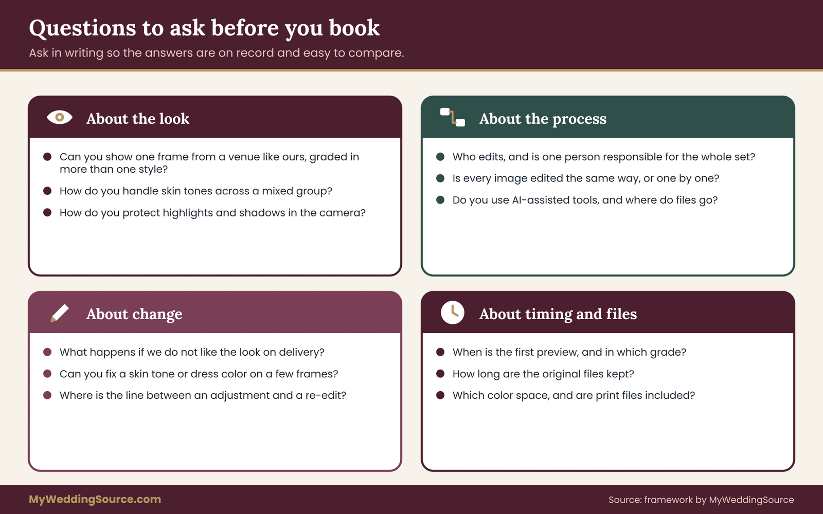
The checks give you evidence from samples of photo editing styles. The questions below give you evidence about process. Ask them in writing if you can, so the answers are on record, and so you can compare two photographers’ replies side by side later. None of them is hostile, and a professional should be able to answer each in a sentence or two.
Questions about the look
“Can you show one frame from a venue like ours, graded in more than one of your photo editing styles?” This is the main request of the whole method. If the answer is yes, you have the best evidence available. If it is no, ask the next question.
“Can you show three complete weddings in light similar to ours?” Complete galleries show the edges of a style. Ask for a ceremony, a reception and a portrait session from each.
“How do you handle skin tones across a mixed group?” Listen for specifics: how they set white balance, whether they adjust individuals, and whether they have sample group photographs. A confident photographer will show examples.
“How do you protect highlights and shadows in the camera?” Editing depends on exposure. A photographer who talks about exposing for the dress or the window is thinking about the problem at the right stage.
Questions about the process
“Who edits the images, and is the same person responsible for the whole set?” Some studios use outside editors or assistants. That is not a flaw, but it affects consistency, so ask how the studio keeps a steady look and who approves the final set.
“Do you edit every delivered image the same way, or adjust each one?” Both are valid. A batch approach is steady and quick. A frame-by-frame approach can fix more problems but varies more. The answer tells you how to read the consistency check.
“Do you use AI-assisted tools for culling, masking or retouching?” Many editing tools now include automated features for selecting images, masking subjects or removing objects. Asking is reasonable, and the answer may matter to you for reasons of quality, privacy or preference. If your contract covers image use, ask whether images are sent to outside services for processing. The wedding photography consent guide covers how couples and guests think about image use, and the same questions apply to how files are processed.
“How many images do you deliver, and how do you choose them?” Delivered counts and selection standards affect what you will see. Ask whether outtakes are deleted or kept.
Questions about change
“What happens if we do not like the look when the gallery arrives?” This is the question most couples forget. Some photographers include a round of adjustments, such as brightness, warmth or crop. Others consider the style final. Know which before you book, and find out what a revision costs.
“Can you adjust a few frames if a skin tone or the dress color looks wrong?” A narrow, reasonable request for correction is different from a request to change the style. Ask where the line is.
“Do you offer a different look for a small number of images, such as black and white?” This lets you keep a main grade you trust and still get a variation for a few favorites.
Questions about timing
“When will we see a first preview, and what is the grade on it?” Many photographers send a small preview within days. Use it as an early check of the look. If something feels off, say so then, since a style adjustment is easier on a small set than on a whole wedding.
“How long do you keep the original files?” Re-editing later depends on this. Ask for the retention period in the contract.
Sample wording you can borrow
If you would like a single message, this works for most photographers: “We are comparing a few editing looks and want to be sure we choose well. Could you send one frame from a dim indoor ceremony with a white dress and dark suits, graded in your usual style and, if you are willing, lightly adjusted toward a brighter and a deeper version? We would also love to see five frames from a single wedding in different places, so we can see how the look holds together. Thank you for the time.”
It is polite, specific and easy to answer. It also gives the photographer room to say that a particular request is not how they work, which is useful information too.
Reading the answers
A good answer is specific. It mentions light, exposure, skin tones and the conditions of your venue. A weak answer is a slogan: “We just make everything look beautiful.” Neither is proof of skill, but the first shows a photographer who has thought about the problem. Also notice how a photographer reacts to the request itself. Willingness to explain is a good sign. Defensiveness about being asked for a comparison is worth noting, though it may only mean they are busy. Weigh it together with the rest of what you have seen.
Contracts, rights and delivery for edited images
The photo editing styles you choose should show up on paper. A verbal promise of “a light and natural style” will not help much if you receive something different. This section covers what to ask to have written down, and how the rights around edited images work. It is general information. For anything specific, ask the photographer and, if the amounts or stakes are high, an attorney.
Who owns the pictures
In the United States, the person who creates a photograph generally holds the copyright, unless there is a written agreement transferring it or the work was made as an employee’s job. The U.S. Copyright Office explains the basics. In practice, most wedding photographers keep the copyright and give you a license to use the images for personal purposes, such as printing, sharing and display. Some contracts limit the use of edited images for commercial purposes, and some require credit when you share online.
What this means for photo editing styles: the edited image is generally the photographer’s work, and changes you make to it may fall under the license terms. Putting a filter on a delivered photo for your own social media is something many contracts allow. Selling prints or giving a guest permission to publish it may not be allowed. Read the license language, and ask directly if it is unclear.
What to write down about the look
Put the agreed photo editing styles in the contract or an attached note, in plain language. Useful details include the named style, such as true-to-color with a modest brightness lift, a reference to the sample frames you reviewed, and a promise that skin tones and the dress color will be kept natural. You do not need technical terms. You need a sentence you could point to if the gallery looks nothing like the samples.
Also write down the revision policy: how many rounds of adjustment are included, what counts as an adjustment and what counts as a re-edit, and what additional work costs. Add the retouching scope, so that “edited” is defined. Many photographers have standard language for this, and asking for it is normal.
Delivery details worth confirming
Ask for the file format and size of the delivered images, since a web-sized file is not suited for a large print. Ask whether high-resolution files are included and whether print releases are provided, which lets you print at a lab without separate permission. Ask for the color space of each set. Ask how long the online gallery stays available, since an expiring link is a common surprise. Ask whether you receive unedited originals, and if not, whether they are archived by the photographer and for how long.
For a broader look at contract terms such as payment schedules, cancellation and liability, the wedding vendor contract guide is a better starting point than this one, and it can help you read the whole agreement and not only the editing clause.
Samples, portfolios and your own images
Photographers often use wedding images for their portfolio and marketing. If you would like to limit that, ask for a clause. If you would like to approve certain images, say so. This also matters when you compare photo editing styles across photographers: the samples you are shown in a same-scene comparison may be from real clients, and a photographer should have the right to show them. Do not ask for, and do not share, another couple’s images without the photographer’s permission.
When you are given a comparison frame, ask whether you may keep it and share it with your partner or family. It is a reasonable use, but ask rather than assume.
What to do if the delivered gallery does not match
If the delivered images look different from the samples you checked, act early and in writing. Describe the difference in the terms you used for the checks: for example, the skin tones lean orange compared with the sample, or the dress has lost lace detail. Reference the agreed sentence and the sample frames. Ask for a specific correction, not a general redo. Most disagreements end here, because a clear request is easy to fulfill.
If it does not resolve, check what the contract says about revisions and dispute steps, and keep your messages. The wedding records after the event guide covers keeping a file of agreements and messages together, which makes any later conversation easier.
Choosing between photo editing styles: decision rules
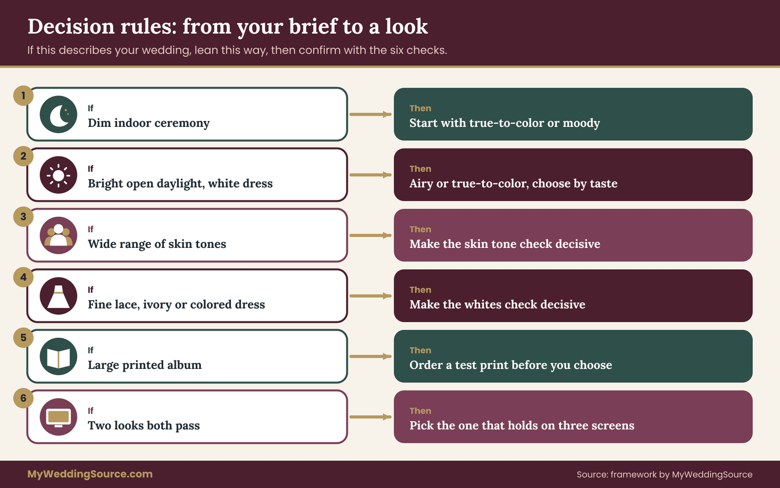
By now you have a brief, six scores per version and a set of answers from the photographer. The last step is a decision. The rules below turn the evidence about photo editing styles into a choice. They are written as if-then statements because that is how most real decisions fall out.
If your ceremony is dim and indoors, start from true-to-color or moody. Both work with the light you have. An airy look will ask the photographer to lift a lot of shadow, and the noise and color problems of lifting show up in exactly this setting. Choose airy only if the photographer shows you convincing frames from a similar room.
If your wedding is in bright, open daylight and the dress is white, airy and true-to-color are both strong. Choose between them by taste. Moody is possible but needs deliberate side light and shade to avoid looking heavy.
If your wedding party includes a wide range of skin tones, make check two decisive. A style that fails it on any face in your own group frames is the wrong style for you, however good the portfolio.
If your dress has fine detail or is not bright white, make check three decisive. Lace, beading and ivory tones are lost first in a bright grade and a cool grade.
If you will print a large album, test a print before choosing. Faded blacks and very dark or very bright grades are the ones that surprise people on paper.
If you cannot decide between two looks that both pass, choose the one that holds across the three-screen test. It is the more robust choice, since your relatives will see it on screens you cannot control.
If no version passes, change the plan, not the standard. Perhaps a photographer who can add light, a different time of day for portraits or a brighter room for the formals would solve it. Or perhaps another photographer suits the venue better.
The middle path most couples take
Many couples land on a true-to-color base with a modest tilt: slightly brighter for a fresher feel, or slightly deeper for a calmer, richer one. Among photo editing styles, this choice is easy to defend and easy to describe in a contract. It passes the six checks more often than the extremes, and it tends to age gently.
It is also the easiest to adjust later. If you want a little more brightness after seeing the first gallery, a photographer can usually move a faithful base in either direction. Moving a heavily stylized base back toward neutral is harder, since information may have been lost.
This is not a rule against moody or airy photo editing styles. A photographer whose whole body of work is airy and who shoots for it in the camera can deliver a beautiful airy gallery. The middle path is for couples who are unsure, and unsure is a reasonable place to be.
When you and your partner disagree
Partners often disagree about photo editing styles, and one prefers brighter while the other prefers deeper. Two methods help. First, each person scores the three versions alone, then you compare. Disagreements on the measurable checks are usually small. Disagreements on the first-impression sentences are bigger, and that is where the middle path helps. Second, choose which check each person controls. One partner decides on the feel and the other on the technical checks, and the photographer has to satisfy both. It sounds stiff, but it lowers the heat.
If family members have opinions, keep them to specific observations. “Grandma looks gray here” is useful. “I do not like dark pictures” is a taste you can note and move past. Decisions about who has a say in wedding choices are covered in more depth in other guides on this site, and the formals in particular are worth planning with the family photo list so the photographs that matter most to relatives are covered.
Protecting the files on the day
A good grade starts with good files. Ask the photographer how images are backed up during the day, whether the cards are copied before leaving the venue and how the originals are stored afterward. The wedding day digital contingency plan guide covers file backup and permissions on the day for the couple’s own side of this.
Your next steps
Start with your brief for photo editing styles. Write down the light, the clothing, the people and where the pictures will live, in a few lines. Pick two critical checks. Then send the request message to the photographers on your shortlist, asking for one scene in more than one grade and a five-frame set.
When the samples of photo editing styles arrive, view them side by side on one screen, write your first-impression sentences and score the six checks. Run the three-screen test on the top two. Ask the follow-up questions about skin tones, highlights, revisions and original files. Then put the agreed look, the sample frames and the revision policy into the agreement before you pay the deposit.
A few weeks after the wedding, when the gallery arrives, compare it with your samples using the same six checks. If something is off, say so in writing, early and specifically. Store the gallery and your notes together so that the decision, and the reasons for it, are easy to find.
FAQ
What are the main wedding photo editing styles?
Three working categories of photo editing styles cover most portfolios. True-to-color aims for faithful, neutral color. Moody uses deeper shadows, lower exposure and often muted color for atmosphere. Airy raises brightness and softens contrast for a light, pastel feel. Real photographers often sit between two of them, and labels vary, so judge by what the pictures do in your kind of light, not by the name.
How do I compare photo editing styles fairly?
Compare the same scene. Ask a photographer to grade one frame in more than one style, or to show similar light across several weddings. View the versions side by side on one screen and score the same six things each time: neutral colors, skin tones, whites, shadows, highlights and consistency across a set. Decide on the checks before you look, so you are not choosing them to match your favorite.
Are airy or moody photo editing styles better for a dim venue?
Neither is automatically better, but moody and true-to-color usually work with dim light, while airy asks the photographer to lift shadows heavily, which can add noise and odd color. A skilled airy photographer who shoots and lights for it can still do well. Ask to see frames from a similar room, and zoom in on the dark areas to check.
Can the photographer change the editing style after I get the gallery?
It depends on the contract. Some photographers include a round of adjustments such as brightness, warmth or crop, and treat a full change of style as extra work. Others consider the delivered look final. Ask before booking, and ask how long the original files are kept, since a later re-edit depends on them.
Will my wedding photos look the same on every screen?
No. Screens differ in brightness, color and settings, and a very dark or very bright grade shows the difference more. Test your top choices on a phone and a laptop at different brightness levels. Ask the photographer which color space the delivered files use, since most web images use sRGB, and ask for a test print before you order an album.
Do I own the edited wedding photos?
In the United States, the photographer generally holds the copyright unless a written agreement says otherwise, and most contracts give clients a license for personal use such as printing and sharing. The terms vary, so read the license language and ask what is allowed. The U.S. Copyright Office publishes the basics. For a specific situation, ask the photographer or an attorney.
What if the finished gallery does not match the samples?
Respond early, in writing, and in specific terms. Describe the difference using the same checks, such as skin tones leaning orange or lace detail lost on the dress, and point to the agreed style sentence and sample frames. Ask for a specific correction and not a general redo. Keep the messages with your contract in case you need them later.
Should I choose a style that is popular right now?
Popularity is a weak reason on its own for choosing photo editing styles. Photo editing styles change, and a very stylized grade can feel dated sooner. A true-to-color base with a modest tilt toward your preferred mood is a common compromise that ages gently and is easy to adjust. Choose the style that passes your checks on your venue and that you still like when you imagine the album in many years.
Sources
- U.S. Copyright Office
- Copyright Basics, Circular 1, U.S. Copyright Office
- The sRGB color space, International Color Consortium
- Color on the Web: sRGB, World Wide Web Consortium
- Personal archiving: preserving your digital memories, Library of Congress
- Digital formats for still images, Library of Congress
- Lightroom Classic help and color management, Adobe
- Federal Trade Commission, advertising and marketing guidance for businesses
- Consumer Financial Protection Bureau, consumer resources