
Wedding uplighting colors decide whether a ballroom looks rich and warm or leaves every guest looking tired, gray or flushed. This guide explains how colored light interacts with skin and cameras, then gives you a simple way to pick, test and approve your uplighting colors at dusk before the wedding day, not during it.
Quick answer
Use color on surfaces and keep faces in clean, warm light. Choose uplighting colors for walls, drapery and ceilings, then confirm that the same colors do not spill onto the dance floor, head table or ceremony spot. Test at the time of day your reception will actually start, with at least six volunteers of different skin tones, a gray card and the photographer’s camera. Judge faces in photos and in person, record the settings you liked, and put them in the vendor contract.
Colored light is one of the cheapest ways to change how a room feels, and one of the easiest to get wrong. A neutral ballroom turns into a deep blue lounge or a blush-pink garden with a few battery or plug-in fixtures along the walls. The change is dramatic in the vendor’s showroom photos. It is less predictable once two hundred real faces, a white dress and a photographer’s camera are in the room.
The problem is simple to state. Wedding uplighting colors are usually chosen by looking at a wall, and nobody looks at the wall for long. People look at faces. A color that makes a wall glow can drain, redden or grey a face standing six feet away, and a camera is more honest about that than your eyes are. Your eyes adapt in a minute or two. A photograph does not. That is why the choice of uplighting colors deserves more attention than it usually gets.
This guide stays on that one question: how to choose and test uplighting colors so skin looks good in the room and in the pictures. It does not cover pinspots on centerpieces, string lights or ceiling draping, which have their own guides on this site, including the one on ceiling draping approvals. It also leaves out the full lighting design of a reception, which depends on your venue and is part of choosing one in the first place, as the wedding venues guide explains.
A note on scope. This is general planning information, not legal, safety or electrical advice, and your venue and licensed lighting professionals have the final word on what can be installed and powered.
How wedding uplighting colors change the way skin looks
Start with what an uplight actually does. A typical wedding uplight is a small LED fixture set on the floor against a wall or column, aimed upward. It throws a wash of colored light up the surface, and some of that light bounces back into the room. The wall is the intended target. The room is the side effect, and the side effect is where faces are. Every one of the uplighting colors you consider behaves this way.
Colored light can only reflect what it contains
A surface looks the color it does because it reflects some wavelengths of the light that hit it and absorbs others. Skin reflects a broad range, but it reflects warm wavelengths (reds, oranges and yellows) most strongly, which is why warm light usually looks flattering on people. Under a saturated blue or green light, there is little warm light for skin to reflect. This is the physical reason uplighting colors behave so differently on walls and on faces.
The face does not turn blue so much as it loses its warmth and looks flat, gray or ashen. This is the physical reason uplighting colors behave so differently on walls and on faces.
The reverse problem happens with strong red or magenta light. Skin has plenty of red to reflect, so a red wash exaggerates it. Lighter skin can look flushed or sunburned, and shadows and blemishes become more visible. Deeper skin tones can handle some of this better, but they can also lose subtle shading when one narrow color dominates.
This is a general tendency, not a rule you can apply by skin type. Undertone, makeup, sun exposure, clothing color and the distance from the fixture all change the result. That is exactly why this guide leans on testing instead of a chart of “good colors.”
Distance and angle matter as much as color
Light from an uplight is strongest near the fixture and drops off quickly with distance. A guest standing two feet from a magenta uplight is lit very differently from a guest standing twelve feet away. A person leaning against a wall with an uplight at their feet gets light from below, which no one’s face enjoys. Light from below produces shadows in the wrong direction and tends to look theatrical, even in a gentle color.
Two practical effects follow. First, the places where people gather close to walls (bars, photo spots, coat check, the buffet line) are the highest-risk places for saturated uplighting colors. Second, a color that looks mild across an empty room can look strong in the first six feet next to the fixture. Always evaluate with people standing in the real positions, not walking around the middle of the room. The same distance rule applies to every one of your uplighting colors.
Colored light mixes with every other light in the room
A room is never lit by uplights alone. There is candlelight on tables, warm bulbs in sconces, pendant lamps, a lit bar, daylight leaking through windows at dusk, and perhaps a dance floor with moving lights. Each source has its own color. On a face, they add together, and the result is a blend that nobody designed. Your uplighting colors are always one ingredient in a mix.
Warm candles plus a blue uplight can look pleasant, because the mix is close to a gentle neutral. Warm candles plus a red uplight can look heavy, because both sources push in the same direction. A cool white pendant plus a green wash can look unwell. You will see these combinations in the venue only when everything is on at once, which is why the test in this guide runs with all the room’s lights in their planned state.
Why photos and video exaggerate color casts
Most couples love their uplighting in the room and then wince at some of the photos. That is not a mystery, and it is not a photographer’s mistake. It comes from how cameras handle color.
The camera has to pick one white
Your eyes adjust to a colored room within a minute or two and treat the dominant color as closer to neutral than it is. A camera does not adapt on its own. It records one white balance, set by the photographer or chosen automatically, and then applies it to the whole frame. If the dominant light in the frame is deep blue, the camera either records the blue honestly, which looks strange, or corrects for it, which pushes skin toward orange and everything else out of balance.
A photographer who sets the white balance to match the warm candles may make the blue wall look purple. One who sets it for the blue wall may make faces look amber. Neither outcome is wrong. They are trade-offs, and the trade-off is much milder when the colored light does not land on faces to begin with. Strong uplighting colors force this trade-off on every frame.
Saturated LED colors can overload one channel
A camera sensor records red, green and blue separately. Highly saturated LED light, especially deep blue, red and magenta, can push one channel to its limit while the others stay low. When that happens, detail in that channel is lost. In practice, photographers describe skin in saturated blue light as plasticky, flat or smeared, with less texture than skin in the same room under warm light.
The details vary by camera, but the pattern is common enough that you should raise it with your photographer rather than assume the camera will cope.
This is also why a quick phone photo of the test is useful but not decisive. Phone cameras apply heavy automatic processing that can hide or exaggerate the effect. The most useful test photographs come from the camera and lens your photographer will actually use, or a close equivalent, which is the reason the protocol later in this guide asks for them.
Video and flash add their own problems
Video lights, on-camera flash and the colored uplights all hit faces at once if a videographer or photographer adds their own light. A flash fires white light for a fraction of a second, which can restore skin tones in the foreground while leaving the background in color. Plan your uplighting colors with the video team in the conversation too.
That mix can look good, but it also means a photo and a video of the same moment can look quite different. Ask your photographer how they plan to use flash in a colored room. Plan your uplighting colors with the video team in the conversation too.
LED dimming adds one more issue. Many inexpensive fixtures dim by switching rapidly on and off, which the eye cannot see but a camera with a fast shutter or a video frame rate can. The result is banding, a faint stripe or flicker in photos and video. It shows up most when fixtures are dimmed low. A short test shoot reveals it in seconds, and it is one more reason to test with the real settings, not the full-brightness showroom demonstration.
The face-safe zone rule for choosing uplighting colors
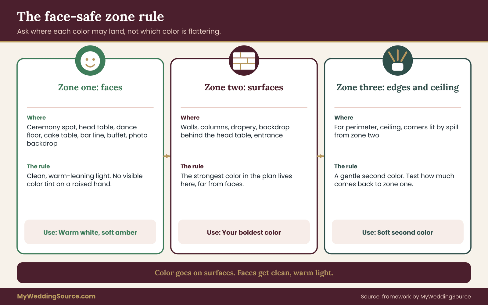
Now for the framework this guide is built around. Instead of asking which colors flatter skin, ask where each color is allowed to land. Divide the room into three zones and give each zone a rule.
Zone one: faces
Faces are the places where people sit, stand, dance and pose for long stretches. That means the ceremony spot, the head table or sweetheart table, the dance floor, the cake table, the bar line, the buffet and the photo backdrop. Zone one gets clean, warm-leaning light. Strong uplighting colors do not belong in this zone.
Color from uplights should not reach here as a dominant tint. If you can see the color of the uplight on a hand held up in this zone, the color is too strong for the zone. Strong uplighting colors do not belong in this zone.
Zone two: walls and backdrops
Walls, columns, drapery, a backdrop behind the head table and the entrance are the surfaces that uplighting colors are meant for. Zone two takes the strongest color in the plan, because no one’s skin is in the way. Even here, aim for a color that looks good on the surface, not merely a color that looks bright on camera. Saturated colors on white walls can look cheap and neon in photos. This is where bold uplighting colors earn their place.
Zone three: perimeter and ceiling
The far edges of the room and the ceiling are lit by the spill from zone two. This is the zone where a gentle second color can sit, as long as it stays out of faces. A ceiling that picks up a deep wash can make the entire room feel tinted from above, which does reach faces. Check how much of your uplighting colors in this zone return to faces.
The rule for zone three is to check, with the test in this guide, how much of its color comes back into zone one. Check how much of your uplighting colors in this zone return to faces.
What the rule gives you
The rule gives you a practical question for every color on a vendor’s proposal: which zone is this for, and how far is it from the nearest faces? A deep teal for the back wall behind the bar is a zone two decision. The same deep teal on uplights placed around the dance floor perimeter is a zone one problem. You can often keep the color you love and change where it goes. Place the uplighting colors by zone and the proposal becomes easier to judge.
The rule also protects you from a common sales pattern, in which a package includes a fixed number of uplights spaced evenly around the room because that is the standard layout. Even spacing treats the room as one zone. A better layout uses more fixtures where walls are far from faces and fewer, or warmer ones, where guests stand close.
Choosing wedding uplighting colors for a mixed group of faces
A wedding guest list rarely has one skin tone, one age or one makeup style. Your uplighting colors have to work for the oldest relative sitting at table four and the college friend in the front of the dance floor, with whatever each of them is wearing. That sounds impossible. It becomes manageable once you stop trying to find colors that flatter everyone and instead look for colors that do little harm to anyone. Choosing uplighting colors for a mixed room means looking for the least harm.
Do not sort people into types
It is tempting to build a chart that matches skin tone to color. It would be wrong, and it would also be awkward. Skin is not a single value. It has undertones, it changes with the season, and makeup and sun change it again. A chart that says “cool undertones avoid orange” gets challenged by the first guest who does not fit the pattern. No chart of uplighting colors and skin tones survives a real guest list.
Treat any such chart, including those from vendors, as a conversation starter and not as a decision. No chart of uplighting colors and skin tones survives a real guest list.
What works better is a small panel of real faces tested under the real lights. The panel does not have to represent every guest. It only has to include enough range that you notice when a color hurts someone. Six faces is a reasonable minimum for the test later in this guide. A larger panel is better, and no panel is perfect. A panel of six faces tells you more about uplighting colors than any chart.
Look for the uplighting colors that fail least
Think of color choices as a list from least risky on faces to most risky. Warm whites and soft ambers sit at the safe end. Blush and rose tints sit near them. Then come saturated warm colors such as orange and red, which are forgiving in small amounts and heavy in large ones. At the risky end are saturated blues, greens, cyans and purples, which remove the warm light that skin needs. Seen this way, uplighting colors become a ranked list of risks.
This ranking is not a ban on the risky colors. A deep blue wall behind a bar can look wonderful in photos, as long as the blue stays on the wall and faces get warm light from somewhere else. The ranking helps you decide how strict to be about the zone rule. Warm colors can leak into zone one without much harm. Cool saturated colors cannot.
Build a face-light baseline first
Before you choose a single uplighting color, decide what is lighting faces. The baseline might be candles and warm bulbs, a warm-white pendant, a few warm-white uplights placed lower on the walls, or a dedicated soft light over the dance floor. The baseline is the thing you protect. Color is added around it. Only then should you start adding uplighting colors around it.
A good baseline test is to turn off every colored fixture and ask whether you would be happy to be photographed in the room as it is. If the answer is no, adding color will not fix it, and the vendor conversation should begin with warm-white light, not with a color palette. If the answer is yes, you have a good base to build on.
Include the people who are hardest to light
Think about who will be photographed most and who may be hardest to light. A person with very pale skin may flush in red or pink light, and a person with very deep skin may lose shadow detail under heavily saturated light of any kind. Their faces are the final judge of your uplighting colors.
Older guests may have thinner skin that shows blotchiness or veins more under some colors. A couple’s wedding photos matter for decades, so the two of you are the most important test subjects of all. Their faces are the final judge of your uplighting colors.
Include yourselves in the panel, or at least a stand-in who is close to your coloring. If a bride or groom has to skip the test, consider asking a sibling or close friend who has a similar complexion, and treat the result as a stand-in, not a certainty. Photograph them in the same clothing colors you plan to wear when possible.
Ask for consent
Volunteers are being photographed, and the photos will be looked at closely and shared among a few people. Tell them what the pictures are for, ask whether they are comfortable, and delete the test images when you are done unless they say otherwise. The guide to wedding photography consent covers the broader topic of guest boundaries and image use, and the same courtesy applies on a test day.
Where your color palette fits in
Most couples pick uplighting colors from a wedding palette that already exists: florals, bridesmaid dresses, stationery. That palette is a good starting list, not a final answer. A dusty blue that looks soft in fabric can read as a harsh cyan when an LED fixture reproduces it, because the fixture makes light from red, green and blue emitters instead of reflecting it from a dyed surface. Treat the palette as a shortlist of uplighting colors to test, not a decision.
If you are still choosing hues, the page on wedding color palettes is a good place to settle the paper-and-fabric version first, and then translate it into light. Treat the palette as a shortlist of uplighting colors to test, not a decision.
Translation is a real step. Ask the lighting vendor to show your palette colors as light, on a wall that looks like yours, before you commit to any of them. Many vendors will do this from a demonstration fixture during a consultation, even if you cannot test at the venue. This step often changes which uplighting colors survive.
Uplighting colors hue by hue: what tends to work and what tends to fight
What follows is a set of general tendencies. They give you a starting list and a set of questions to ask, not a guarantee. Always confirm with the test, because fixtures, walls and faces change the result.
Warm white and amber
Warm white light in the range of ordinary incandescent bulbs, and soft amber tints near it, are the most reliable choices for rooms with people in them. They put warm wavelengths into the room, which skin reflects well, and they pair easily with candlelight. Their weakness is that they are less dramatic on a wall. They tend to look like “lit” instead of “colored.” Many good receptions use them as the main light and add color elsewhere. It is the baseline that makes the other uplighting colors safer.
One caution: very yellow-green tinted whites, sometimes called a cool amber, can look sickly. Ask for a warm white with a slight pink-leaning tint if the vendor has one, and test it.
Blush, rose and soft coral
Gentle pinks and corals are popular with weddings, and they usually behave well on skin. They add warmth and a little flush to faces without the heavy look of red. The risk is saturation. A faint blush looks lovely, while a strong pink can look like a theater gel and turn lighter skin red and ruddy. If the vendor offers dimmable intensity, a lower setting is nearly always safer than a higher one. Soft pinks are among the easiest uplighting colors to place near guests.
Orange, red and burgundy
Warm saturated colors can look rich on a wall, especially a deep burgundy on brick or wood paneling. On faces they are mixed. Small amounts can feel cozy, and large amounts exaggerate redness and make skin look hot. They also tend to flatten the uplighting colors of florals and white clothing. Use them where the zone rule says the wall is far from faces, and check the dress. Deep reds are uplighting colors for distant walls, not for the dance floor.
Magenta and purple
Magenta sits between red and blue, so it carries some of the warm light that skin reflects, and many people find it easier on faces than pure blue or green. Purple moves closer to blue and carries less. Both can make white fabric look strongly tinted, and both can change in a camera in surprising ways, because sensors handle deep violet poorly. Ask your photographer about the specific fixtures before choosing a purple wash. Ask which of these uplighting colors the camera handles well.
Blue and teal
Blue is among the most requested uplighting colors, and it is a clear example of the zone rule. A deep blue on a wall or drapery can look elegant and photographs well as a background. The same blue on faces removes warmth and can look ghostly or gray. Teal sits between blue and green and carries the same warning, with an added risk of looking unwell on lighter skin tones. Blue is the clearest case where uplighting colors need a zone.
If blue is your color, treat it as a wall and ceiling color only. Keep it away from the dance floor and use a warm light on faces. Consider mixing blue with a touch of warm light from a second source so that the total is closer to neutral where people stand.
Green and cyan
Green is the hardest uplighting color to place near people. It can make skin look sallow, and it takes the color out of lips and cheeks. Cyan, a blue-green, has similar problems. These colors work for small accents such as a plant wall, a sign or a bar back, and for a stylized look if you accept the effect on faces. For most weddings they are better left out or used sparingly. Green is rarely among the uplighting colors worth keeping near people.
White that is not warm
Cool or daylight-balanced white can seem like a safe neutral but is not always one. It is often the right choice for a modern room with white walls, and it can look clinical in a candlelit dinner. If the room’s other sources are warm, a cool white uplight adds a blue-leaning tint that mixes unevenly. As with every color here, test it with the other lights on. Even the neutral uplighting colors need the same test.

Putting the list to work
The list suggests a practical approach. Pick one dominant uplighting color from your palette, one softer supporting color, and a warm white baseline. Assign each to a zone. Then use the test to see whether the dominant color leaks into zone one in a way that harms faces. This keeps the number of uplighting colors small and the plan easy to check.
If it does, you have three adjustments to try: lower its intensity, move the fixtures further from people, or change the aiming angle to keep light on the surface. Those adjustments are covered later. This keeps the number of uplighting colors small and the plan easy to check.
Fixture quality, color rendering and dimming behind your uplighting colors
Two vendors can offer the same color name and deliver different results, because the fixtures behind the names are not equal. You do not need to become a lighting engineer. You need four or five questions and an understanding of why they matter. The same names can hide very different uplighting colors in practice.
Color rendering for the warm-white baseline
When lighting people, the warm-white fixtures matter as much as the colored ones. Color rendering describes how faithfully a light source shows the uplighting colors of objects, including skin. A common rating is the color rendering index, or CRI, which averages how a source renders a small set of test colors. A higher score generally means colors look more natural. The U.S. Department of Energy explains CRI and its limits on its solid-state lighting pages.
CRI has a known weakness. Its average leaves out some saturated colors, and one of them is a strong red, which is close to the color of lips and many skin tones. A source can post a respectable overall score and still render reds poorly. A newer measurement from the Illuminating Engineering Society, called TM-30, reports fidelity and gamut across a much larger set of colors. These numbers help with the white baseline, not with saturated uplighting colors.
A vendor does not need to quote either number, but a vendor who can explain what they use for the face-light fixtures is signaling care. These numbers help with the white baseline, not with saturated uplighting colors.
Color rendering numbers apply to white light. They tell you little about a saturated blue or magenta, which is a different kind of light. For colored light, the useful evidence is the test, not a score.
How the fixture makes color
Most uplights make color by mixing red, green and blue LEDs, and some add white, amber or other emitters. More emitter types usually means smoother mixes, better pastels and a warmer white. A fixture with only red, green and blue tends to produce a thin, cold white and harsh pastels. A vendor whose fixtures include white and amber emitters can usually explain why that matters for skin.
If your wedding palette has pastels, which is common (blush, sage, powder blue), ask to see them from the actual fixtures. Pastels are the uplighting colors where a basic fixture looks worst, and they are the uplighting colors most likely to disappoint after a showroom demonstration. Pastels are the uplighting colors where cheap fixtures show their limits.
Dimming and flicker
Dimming matters because intensity is one of your best tools for keeping color out of faces. Ask how the fixtures dim, and whether the color shifts at low levels. Some fixtures dim smoothly, and some change hue as they dim, so a soft rose at full brightness turns orange at a quarter. Lower intensity is the fastest way to tame strong uplighting colors.
Camera flicker is the other concern. A short test with the photographer’s camera at a fast shutter speed shows it immediately. Ask the vendor whether the fixtures are rated for flicker-free use with cameras, and then check it yourself. Lower intensity is the fastest way to tame strong uplighting colors.
Control and repeatability
Many fixtures are controlled wirelessly or by a lighting control protocol, and the settings can be saved. That matters because the combination you approve at the test should be the combination that appears on the wedding day. Ask whether the vendor will record the exact settings, including color values, intensity percentages, fixture positions and aiming angle. That is how approved uplighting colors become repeatable on the day.
Battery fixtures can also lose brightness as batteries drain over a long event, which can change the look between cocktail hour and the last dance. Ask about battery life at the uplighting colors you chose, since a bright setting uses more power than a dim one.
Beam shape and where the light goes
A narrow beam shoots a stripe up the wall and keeps most of the color there. A wide beam spreads color across the wall and spills into the room. For the zone rule, narrow beams are the safer choice near people. Ask whether the fixtures have a beam angle you can change, or accessories such as barn doors or snoots, which block light from leaving the surface. Beam control keeps uplighting colors on the surface they were meant for.
The test-at-dusk protocol for uplighting colors
This is the center of the guide. The protocol is a short, repeatable test you can run in an hour or two before the wedding, at the venue, with real people and a camera. It is designed to answer one question: do the uplighting colors you chose harm faces in the places where faces will be? It is a practical way to approve uplighting colors with evidence.
Why dusk
A reception room is not a lab. Windows, doors and skylights let in daylight, and that daylight changes the mix. If you test at noon with the blinds closed, you learn about a room that will not exist. If you test at midnight, you miss the daylight that will be present during dinner. Dusk shows how your uplighting colors mix with real daylight.
Dusk is the useful compromise for any wedding that starts in the late afternoon or evening, because the daylight is low, cool and fading, which is what your guests will experience. Dusk shows how your uplighting colors mix with real daylight.
Match the test to your timeline. For an event that starts at five and sits down at six, test around those hours. A late-evening reception in a windowless ballroom can be tested at any hour as long as the room is set as it will be, but a ceremony and cocktail hour may still have daylight, so test that too.
Sunset and twilight times for your date and location are available from the U.S. Naval Observatory and from NOAA’s solar calculator, so you can compare the test day with the wedding date.
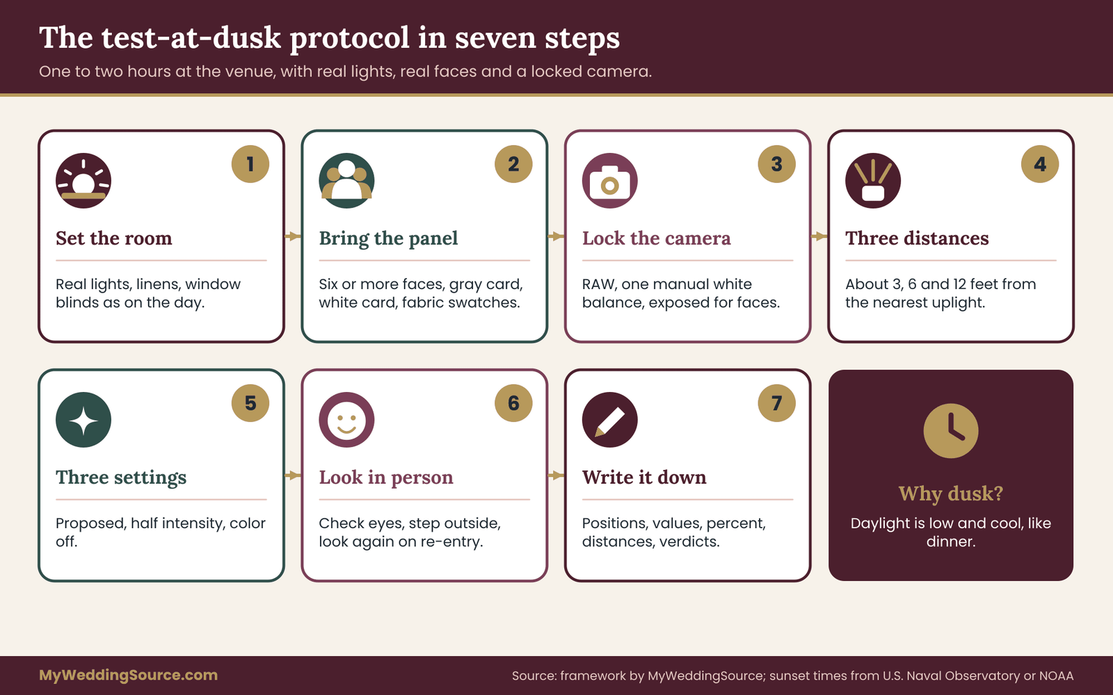
Step one: set the room as it will be on the day
Get permission from the venue for a test visit and ask what can be set up. Ask for the lighting that will be used, including candles or their battery equivalents, pendant lights, sconces and any house lights. Ask the venue to set table linens and a few place settings. The more of the room that matches the wedding day, the more useful the test. Set up the room so the uplighting colors face the same conditions as on the day.
Ask the lighting vendor to bring the actual fixtures and place them as they would on the day. Many vendors will do a short test, and some charge for the time or for an extra delivery. The questions to ask are covered later in this guide.
Step two: bring the panel and the reference
Bring at least six volunteers with a range of skin tones, plus yourselves or stand-ins. Ask them to wear what they might wear to the wedding in colors and fabric, since clothing reflects light onto faces too. Bring a neutral gray card, a white card or sheet, and if you have them, a swatch of your dress fabric and a swatch of the bridesmaid or suit color. These objects show the cast without depending on anyone’s skin. They show how the uplighting colors land on different faces.
Step three: fix the camera
Ask your photographer, or a friend with a similar camera, to shoot RAW if possible, with white balance set manually to one value and held for every shot. Set the exposure so that faces are properly exposed, not so that the wall looks good. A single locked setting is the point of the test, because you want to see what the light does to faces, not what the camera’s automatic correction hides.
Step four: shoot three positions
Light changes with distance, so test three distances from the nearest uplight on each wall: close (about three feet), middle (about six feet) and far (about twelve feet). Have each volunteer stand at each mark facing the camera, then facing the wall, then side-on. That gives nine photos per person, so use burst mode and review quickly. Also shoot the gray card, held at face height at each mark. Each distance shows a different side of the same uplighting colors.
Step five: shoot three settings
Repeat the sequence with the uplighting colors in three states: the proposed setting, the same color at roughly half the intensity, and the colored fixtures off, with only the warm baseline lighting. The “off” frame is your control, since it shows how people look in the room without color. The half-intensity frame is the quickest adjustment you can make on the day, and it often fixes a color that is almost right.
Step six: check in the room, not only on the screen
Photos can mislead in the other direction too, because screens vary and phone previews are small. Walk the room and look at each volunteer’s face in person at each mark. Ask them whether they see color on their skin and whether the spot feels comfortable. Eyes adapt, so look first, then step outside for a minute and look again on re-entry. The first look on re-entry is closest to what a guest sees on arrival. Judge the uplighting colors with your own eyes before you trust a screen.
Step seven: write it down
Record, for each setting: the fixture positions, the color (name or values), the intensity in percent, the distance to the nearest face zone, the camera white balance, the shutter speed, and a one-line verdict for each face. A single page is enough. This page is what you hand the vendor and the photographer. It turns a mood into instructions. This page turns the test of your uplighting colors into instructions.
Setting up a dusk test when the venue or vendor says no
Not every venue allows a test visit, and not every vendor will bring fixtures early. You still have options, and each one gives you part of the answer.
If the venue cannot host a test
Ask whether the lighting vendor can test at their warehouse or showroom with a similar wall color, and bring your panel there. You lose the venue’s windows and ceiling, so treat the result as a check on faces and distance only. Then ask the venue for a few minutes on load-in day, before guests arrive, to see the fixtures in the real room.
Make sure the contract gives you the right to ask for adjustments at that point. A change at load-in is cheaper than a change at cocktail hour.
If the vendor will not test early
Ask for photos of previous events in similar rooms, taken with people in them, and ask what the vendor changed on the day. Look at faces, not walls. A portfolio shot of an empty room tells you very little about uplighting colors. Ask for a short video of the fixtures at the proposed settings, shot on a phone in a dark room, and watch for flicker. If the vendor will not do any of this, treat that as information about the service you are buying.
If you can only test at the wrong time of day
A test at the wrong hour is still better than none. Close the blinds to simulate evening, turn on the lights as planned, and note in your record that the windows were covered. Then plan one more check at the start of the event, when daylight is closest to what you tested, with a standing rule that someone has authority to dim or switch off a color if faces look wrong.
Decide who that person is in advance, and write it on the timeline you share with vendors. The page on wedding vendor timelines shows how to set that up.
If your budget allows only a phone
A phone test is better than nothing, provided you lock exposure and white balance in the camera app, shoot a gray card in the frame, and compare the same face with the uplighting colors on and off. Phones apply heavy processing, so use the result to reject bad choices, not to approve good ones. If a color already looks harsh on faces in a phone photo, it will not look better in a professional one.
Reading your results: pass, adjust or fail for each of the uplighting colors
After the test you will have a pile of photos, a page of notes and some opinions. The risk now is paralysis, or worse, choosing by the photo that happened to look best. Use the decision rules below, so that every color gets a clear verdict. Use the rules below to give every one of the uplighting colors a clear verdict.

Check one: the gray card
The gray card is your simplest measurement. A neutral gray card should look gray. In each photo, look at how far the card has drifted toward a color. A card that looks slightly warm is fine, because the room is warm. A card that looks clearly blue, green or magenta tells you that the colored light is reaching that spot with real strength, and that faces there will share the tint. It shows what your uplighting colors do to a neutral surface.
Compare the card at the close, middle and far marks. If the tint fades by the middle mark, the color is a surface color and the zone rule is working. If it is still strong at twelve feet, the color is filling the room, and the room is behaving like one big colored zone.
Check two: the on-off comparison
Put the same face with the color on next to the same face with the color off. Ask a plain question: does the face with color look better, the same, or worse? Better is rare and a nice surprise. The same is a pass. Worse needs an adjustment. A volunteer who looks tired, gray, flushed or sick in the “on” photo and healthy in the “off” photo has given you the clearest possible answer. This comparison is the fairest test of any of the uplighting colors.
Look at lips, the area under the eyes and the hands. Those spots show a cast faster than cheeks do. A face can look acceptable at a glance and still show a cast when lips and hands look the wrong color.
Check three: every face, not the average
Give each panel member their own verdict. A color that works for five faces and harms one is not a pass. It is an adjustment, because the sixth person is a guest too, and perhaps a parent. If the problem face is the bride, groom or a close family member, treat it as a fail for that zone. Do not let an average hide a face that the uplighting colors hurt.
Check four: the white cards and swatches
Look at the white card and the dress swatch under each setting. White fabric is the most revealing thing in the room. If the swatch looks strongly tinted at the places where the dress will be photographed, the color needs adjusting there or you need to plan where the dress is photographed. Later sections cover the dress in more detail.
Check five: the camera’s own signals
Check the photos for the technical problems described earlier. Look for banding, flicker or stripes, which point to dimming. Look for flat, smeared skin texture in saturated colors, which points to channel overload. Ask the photographer for a quick read on the files: whether any color channel clips. Photographers can see this on a histogram in seconds.
Turning checks into a verdict
For each color and zone, give one of three verdicts. Apply the same three verdicts to all of your uplighting colors.
Pass. Faces look as good or better than in the “off” frame at every mark, the gray card is only lightly tinted, and the camera shows no technical problem. Keep the setting and record it.
Adjust. The color is good on the wall but harms one or more faces at one or more marks. Try the adjustments in the next section and test again for the affected marks only.
Fail for this zone. The color harms faces at the middle and far marks, or harms the couple or close family at any mark, even after adjustments. Keep the color only for surfaces that are far from faces, or drop it.
A verdict is specific to a zone. The same deep blue can pass for the back wall, adjust for the bar and fail for the dance floor. That is a normal outcome, and it keeps the color in the plan where it belongs.
The adjustments, in order of effort
Try the cheapest adjustment first. Most uplighting colors can be saved with one of these changes.
First, lower the intensity. A color at half strength often moves from fail to pass, and costs nothing. Second, move the fixtures further from the wall or from the guests, or aim them more tightly to keep light on the surface. Third, add or strengthen a warm-white baseline on faces, which dilutes the colored light where it lands.
Fourth, change the color itself, shifting a cold blue toward a deeper indigo, a pink toward a softer coral, or a red toward amber. Fifth, drop the color from that zone.
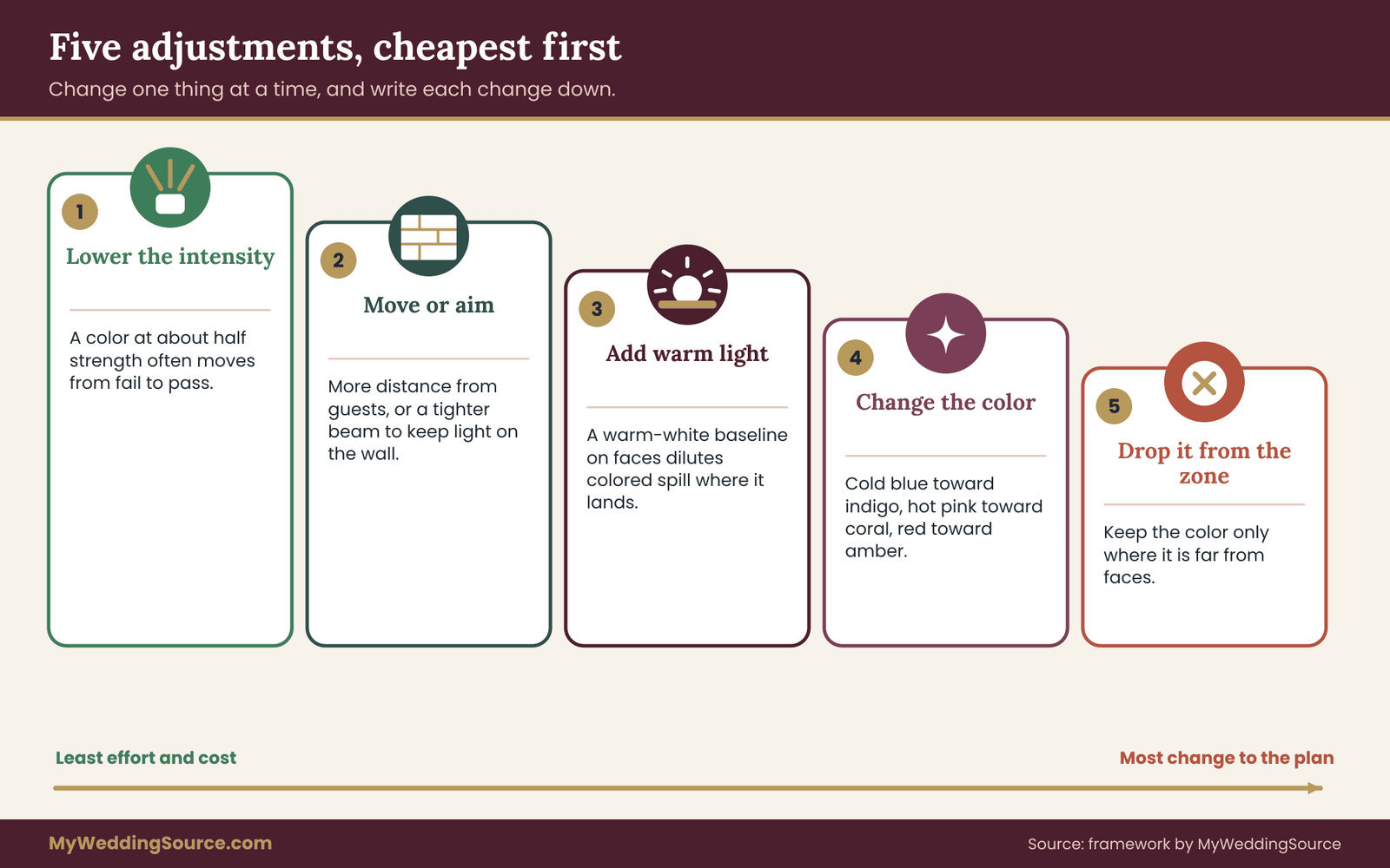
Change one thing at a time and write it down. If you change three things and the photo improves, you will not know which one mattered, and the vendor will not know what to repeat.
A worked example: a blue and gold reception with a mixed panel
The example below is invented. It is meant to show how the protocol works in practice, not to suggest that these specific results will apply to your wedding. The couple, the numbers and the room are illustrative. It shows how uplighting colors can stay while their positions change.
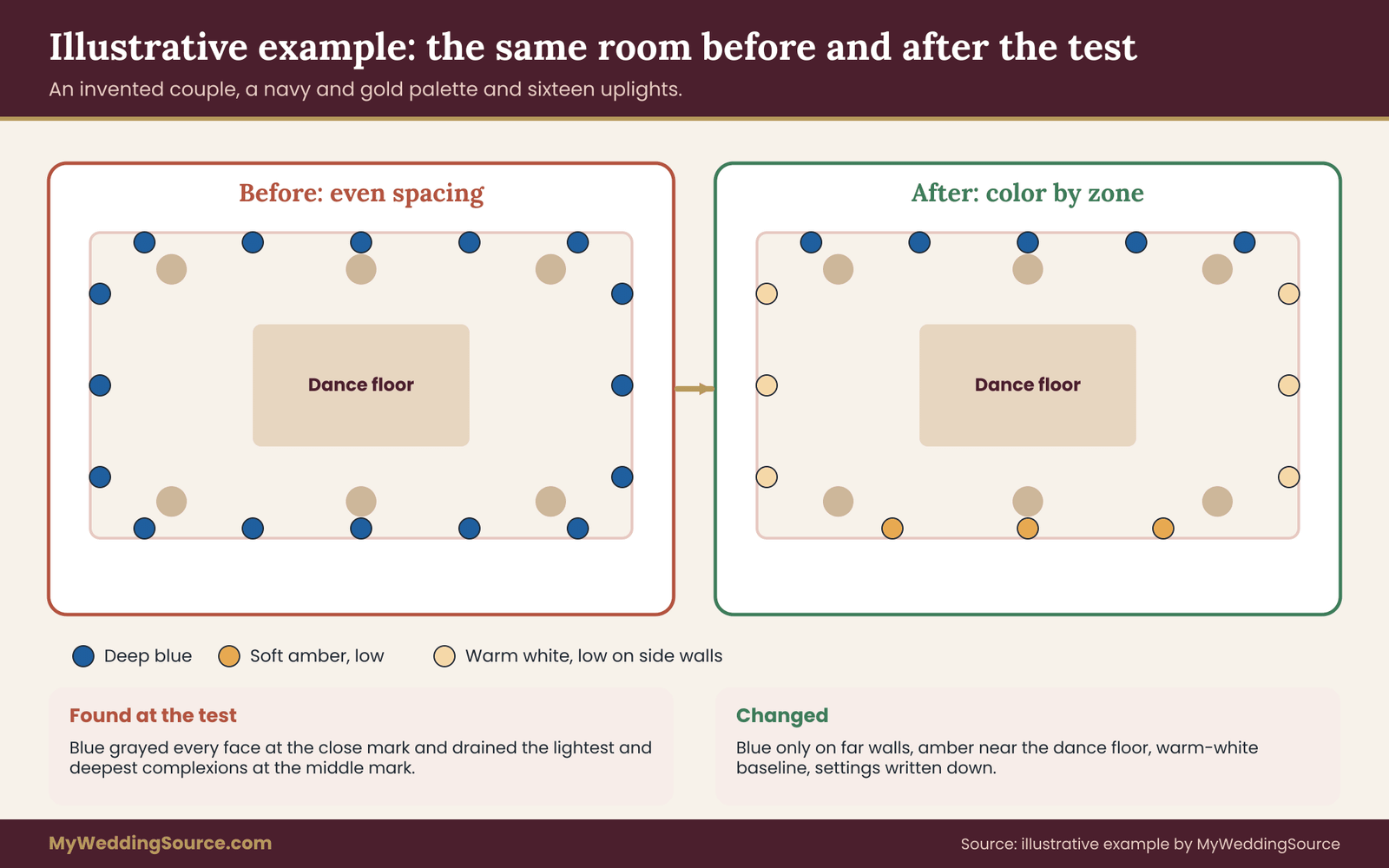
The plan before the test
Marisol and Theo are planning a reception for about one hundred and forty guests in a hotel ballroom with white walls, a low white ceiling and one wall of windows. Their wedding palette is navy and gold. The lighting vendor’s proposal includes sixteen uplights around the room, all in a deep blue, spaced evenly, plus warm-white pendants over the dining tables.
They like the blue because it matches the navy bridesmaid dresses and the stationery. They are less sure about the dance floor, where the proposal puts eight of the sixteen fixtures close to the edge. Their uplighting colors follow the palette on paper, not the room.
The test
They arrange a visit forty minutes before sunset on a day close to the wedding season, with the venue’s permission. The vendor brings six fixtures, the photographer brings her camera, and six volunteers come: Marisol, a cousin, a college friend, Theo’s father, a bridesmaid and a groomsman, with a range of complexions and ages. The room has its pendants on and the window blinds open, as they will be at the start of dinner.
They shoot at close, middle and far marks from the wall, with the deep blue at the proposed intensity, at half intensity, and off. The photographer locks white balance and exposure. Marisol brings a swatch of her dress fabric and a gray card.
What they find
At the close mark, the deep blue turns faces gray in every volunteer, and the dress swatch looks distinctly blue. At the middle mark, the effect is lighter but still visible on the lightest and darkest complexions, in different ways: the lightest face looks drained, and the deepest shows less of its natural warmth and detail. At the far mark, faces look fine, and the blue on the wall looks rich.
At half intensity, the close mark improves but is still not good. With color off, everyone looks healthy and the room looks plain. The photographer reports that the blue channel in the full-intensity files is near its limit, and the skin texture is flatter than in the warm-light frames.
The vendor’s dimming test shows a faint flicker at the lowest intensity setting, visible in the photographer’s short-shutter frames, so the team decides not to go below a certain level on those fixtures.
What they change
They move the blue to a narrower beam on the two long walls and the back wall behind the head table, which are all more than ten feet from any seating. They remove the fixtures from the dance floor edge. Around the dance floor they use a soft warm amber at low intensity that lights the wall but leaves faces warm. They add warm-white uplights, low on the side walls, to raise the baseline on faces without adding color.
They give the cake table and the sweetheart table their own warm light, and they drop the blue behind the bar to half intensity with a note that the bar line should be re-checked at start of the event. They record the settings and the distances on a single page, attach it to the vendor contract, and send a copy to the photographer.
What it cost and what it saved
The test cost the couple a vendor visit fee and an hour of volunteers. It removed eight fixtures from the proposal and replaced them with a smaller number of warm ones, so the change did not raise the vendor’s bill much, and the couple would have to confirm the final numbers.
More importantly, it replaced a layout that would have put gray-blue light on faces for the whole dance with one that kept the color they wanted on the walls. That is the typical outcome: the color stays, and its location changes.
Uplighting colors, the wedding dress, suits and tricky rooms
Faces are the first concern, and the second is everything else a camera sees. Colored light changes the dress, the florals, the suits, the cake and the room itself. Most of these have simple handling rules once you know they exist.
The white dress is the most sensitive object in the room
White and ivory fabrics have no color of their own to compete with the light, so they pick up whatever the room is giving. Under deep blue uplighting, a white dress looks blue. Under pink, it looks pink. Under amber, an ivory dress looks golden, which many people like and some do not. Strong uplighting colors turn white into a mirror of the room.
The tint is not a flaw of the dress. It is the same effect that makes a wall glow. The question is whether you want the dress to carry the room’s color in photographs. Some couples do, and treat the tint as part of the mood. Others want a clean white dress in the main portraits and accept color elsewhere.
If you want a clean dress, plan the portraits in a spot with warm-white light and no colored spill. A short list of “dress-safe” spots in the venue, such as the entrance, the head table or a corner near warm sconces, gives the photographer places to go. Ask the lighting vendor to keep those spots clear of color, or to switch the nearest fixtures to warm white for the first dance and the cake cutting.
The dress swatch in the dusk test tells you how big this problem will be. If you cannot get a swatch from the salon, a piece of white or ivory fabric of a similar weight is a reasonable stand-in, with the caveat that the real fabric may differ in sheen. If your dress is not white, for example a blush or colored gown, the effect is different and often more forgiving, though a color close to the light’s color can disappear into it.
A swatch test on a colored gown is worth the same effort as one on a white dress.
Suits, bridesmaid dresses and ties
Dark clothing hides tint but also loses detail. A black or navy suit under deep blue light can lose its folds and look like a flat shape, and a navy dress under navy light can vanish into the wall. Bright or light colors pick up the room’s color, as white does. Check how the uplighting colors treat every outfit in the wedding party.
Bridesmaid dresses chosen carefully for a palette can shift in unwelcome ways, so photograph them under the proposed settings during the test. If the group will be in matching dresses, put one dress, or a swatch, in the test. Check how the uplighting colors treat every outfit in the wedding party.
Flowers and food
Florals shift with light, too. Red and orange flowers go dark and heavy under blue or green light, because they have little of that light to reflect. Blue and purple flowers go muted under warm light. White flowers act like the dress. If florals are central to your look, bring a sample bunch or ask the florist to send a stem or two, and see how it reads under each setting. Test the flowers under the uplighting colors you plan to use.
Decide what you want the flowers to do before deciding what the light should do to them. Test the flowers under the uplighting colors you plan to use.
Food and cake follow the same rule. A white cake under blue light looks cold, and warm food looks less appetizing under green. Cake tables are a good place for warm-white light, which is also useful because cake is photographed a lot.
Ceilings and wall surfaces
The surface that receives the color is part of the color. A bright white wall shows the uplight color at full strength and bounces the most light back into the room. A dark wall absorbs much of it, and the color looks deeper but dimmer, with less spill. A shiny or reflective wall, such as glass or polished stone, throws light across the room in unpredictable ways. Textured surfaces like brick scatter light and soften the effect. The same uplighting colors look different on every wall.
Ceilings deserve special attention. A low white ceiling above a colored wash can turn into a big colored lampshade that lights faces from above. A high, dark ceiling does less. If your ceiling is low and light, test with the ceiling washed by the colored fixtures, and consider keeping the aim tight or using color only on the lower wall.
Windows, daylight and stained glass
Windows bring in outdoor light that varies by the hour, as covered earlier. Stained glass and tinted windows add their own color to the mix, and a church hall with colored glass will have its own cast on faces during the afternoon. Test when the windows are doing what they will do at your event, and ask whether the venue can close curtains or blinds if the mix looks wrong.
Edge cases worth thinking about
A sunset ceremony outdoors. Uplights are rarely used at an outdoor ceremony, but they can wash trees or a structure. At sunset the sky is already doing colorful things. Keep any added color gentle and away from the couple’s faces.
A photo booth or backdrop. These are zone one areas where people pose close to the camera. Use warm white or a very mild tint, and check it with the booth camera, which may be a phone or a fixed unit with its own processing.
A dance floor with moving lights. DJs and dance floor lighting add saturated, changing colors. Agree with the DJ that the dance floor lighting stays out of the formal photos, or that it moves to a neutral state for toasts, the first dance and the cake cutting.
Live video or a livestream. A camera set for a stream may use automatic white balance, which will chase the color changes. Ask whoever runs the stream to lock white balance, or at least to test it.
Guests with light sensitivity. Some guests find saturated, flashing or very bright colored light uncomfortable or triggering. Keep uplighting steady, without flashing effects, and consider a calmer area where guests can sit. Moving, strobing effects deserve a separate conversation with your venue and your DJ.
A very small room. In a small room, there is no far mark. Everything is close to a wall, and a strong color ends up on everyone. Lower intensities and warmer colors become much more important, and a warm-white baseline is almost mandatory.
A very large room. In a big ballroom, the opposite happens. The walls are far from the dance floor, and a strong wall color has little effect on faces. You can be bolder, and your biggest problem may be that the uplights look weak.
Questions to ask the lighting vendor, the photographer and the makeup artist
A test is only useful if the people who control the light and the camera act on it. These questions turn the test into commitments. They are written to be asked in plain language, and most vendors will welcome them, because a clear brief makes their job easier. These questions put your uplighting colors into the vendor’s hands in plain terms.
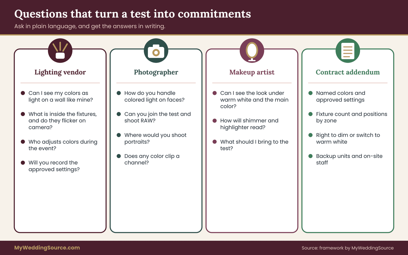
For the lighting vendor
“Can you show me my colors as light, on a wall like mine?” Ask for a demonstration of your exact palette colors, not a similar name. Many vendors name colors differently, so a “dusty rose” on one fixture is not a “dusty rose” on another.
“Which fixtures do you plan to use, and what is inside them?” You are looking for a clear answer about emitter types, dimming behavior and flicker. You do not need to judge the technical answer. You are checking whether there is one.
“Where will each fixture go, and how far is it from guests?” Ask for a simple sketch or a list of positions by zone. A vendor who can say “eight along the north wall, ten feet from the nearest table” understands the zone rule, even if they do not call it that.
“Can you test at the venue near sunset, and what does that cost?” Ask about the time, the delivery and any fee. Some vendors fold a test into a package, and some charge for staff time. Ask before you book, not after.
“Can the uplighting colors be dimmed or switched during the event?” You want a person on site who can change settings in minutes. Ask who that person is and whether they will stay through the event or leave after setup. If no one will be there, ask how changes are made.
“What happens if a color looks wrong on the day?” The answer should be a specific process, such as a reduction in intensity or a swap to warm white, with a named person who decides. A vague promise to “make it work” is not a plan.
“Will you record the settings we approve?” Ask for the color values, intensity percentages, positions and aiming notes, in writing. Settings that exist only in a technician’s memory disappear when the technician changes.
For the photographer
“How do you handle colored light on faces?” A good photographer has an answer, and it often involves white balance choices, fill light and where to place couples. This question also shows how much they want to be involved.
“Would you like to join the test?” Many photographers will give an hour of their time, and some will include it in the package. Ask whether the test shots can be taken with their own camera and lens, and whether they will shoot RAW so that you can judge the files.
“Which places in the room would you use for portraits, and how should they be lit?” Use their answer to build the dress-safe list described earlier. The guide to the wedding family photo list is a good companion, because formal group photos are where a color cast bothers people most.
“What is your approach to flash?” Some photographers bounce a flash off a ceiling, which turns the ceiling color into a tint on faces. Others use direct flash, which gives clean skin and a colored background. Neither is wrong, but you should know which will happen.
“Can you tell me if the uplighting colors are clipping a channel?” This is a specific technical question, and a photographer can answer it from a histogram. It is a quick way to learn whether a saturated color will cost detail.
For the makeup artist and hair stylist
Makeup is part of the face under the light. A bronzer that looks natural in daylight can look orange under amber, and a pink blush can look strong under rose. If you have a trial with a makeup artist, ask whether they can see the look under a few colors, for example by using a phone flashlight with a colored filter or a colored lamp, or by bringing the look to the dusk test.
The page on bridal hair and makeup planning covers trials and timing in general. For uplighting, a short check at the end of the trial, under warm white and under the main color, is enough.
Ask the artist about shimmer and highlighter, which catch colored light and can show it more strongly than matte products.
Putting the answers in the contract
Verbal answers fade. The page on wedding vendor contracts explains what a good agreement covers, and an uplighting addendum can be short. Ask for these items in writing: Written settings keep the approved uplighting colors from drifting.
- The uplighting colors, named and described, with the approved settings from the test.
- The number and positions of fixtures, with zones if possible.
- Dimming and on-site adjustment: who, when and how fast.
- The right to have a color reduced or switched to warm white if faces look wrong, at no extra charge.
- Setup, test and teardown times, and who is responsible for power and cables.
- Battery or power details if fixtures are wireless.
- What happens if a fixture fails, including backup units.
Keep the language plain. “Colors will be adjusted at the couple’s request during the first hour of the reception if faces appear tinted” is better than a clause full of technical terms.
A short script for the conversation
Here is an example of how to open the conversation with a vendor, in your own words:
“We love the deep blue in your portfolio. Our main concern is how it looks on people. Could we test it near sunset with a few friends and our photographer, and keep it on the walls if it turns faces gray? We would like the final settings written down.”
Most vendors respond well to this, because it asks for something specific and reasonable. A vendor who dismisses it, or says that “it always looks great,” may not be the right fit for a color-heavy plan.
Venue approvals, power, safety and cost logic
Lighting does not need a lot of space, but it needs permission, power and safe cable runs. This section covers the practical side briefly. Rules differ by venue, and the venue and a qualified lighting professional have the last word. Approval and power limits can change which uplighting colors are practical.
Approvals
Many venues have rules about what can be placed against walls, where cables can run, what can be attached to ceilings and which vendors may work in the room. Some require insurance certificates from lighting vendors. Ask about these early. The venue technical walkthrough is a good way to find out what power, access and approval limits exist, and it helps to compare venues on these questions before you sign.
If any fixture, fabric or decoration involves hanging, rigging, open flame or electrical work beyond plugging in a fixture, a qualified professional and the venue must approve it. Uplights on the floor are the simplest case, but cables across walkways are a trip hazard, and fixtures near fabric can be a heat concern.
The National Fire Protection Association publishes fire and electrical safety codes and guidance, and local fire authorities decide what applies in your room. Occupational safety rules from OSHA apply to the people installing equipment, which is another reason to hire a professional vendor and not improvise.
Power
Ask how many circuits are available near each wall, and whether the fixtures are plug-in or battery-powered. Plug-in fixtures need outlets and cable runs, and these can conflict with guest paths. Battery fixtures avoid cables but need charging and can fade. Either way, ask the vendor to plan around the room’s real outlet locations, and have them confirm the plan with the venue’s technical contact.
Where cost comes from
Cost depends on the number of fixtures, the fixture quality, setup and teardown labor, any test visit, delivery and on-site staff. Prices vary by region and vendor, so this guide does not quote numbers. Ask for a written, itemized quote, and ask how each line changes if you reduce the number of fixtures or add a test.
The cost logic of testing
A test costs vendor time, volunteer time and some coordination. It can lower costs in two ways. First, a test can reduce the fixture count, as in the worked example, by moving color to fewer, better placed fixtures. Second, it can prevent a change order on the day, which is usually more expensive than a planned change in advance. The cost of testing uplighting colors is small next to the cost of photos nobody likes.
Compare a modest test fee with the cost of a bad result that cannot be undone: photographs of the first dance in a color that does not suit anyone. The cost of testing uplighting colors is small next to the cost of photos nobody likes.
A test does not guarantee a perfect result. Weather, crowd size and guest clothing can still change the room. It lowers the odds of a major mistake and gives you a recorded setting to return to. That is a fair trade for an hour or two of work.
When not to bother
If your reception is in a bright room with mostly daylight, and you plan only warm-white uplights, a full test is more than you need. A quick check of the vendor’s warm-white fixtures with a photographer’s camera is enough. The full protocol earns its time when you plan strong colors, when the room is small or low, or when photos of faces matter a great deal to you. In that case your uplighting colors matter less, and a short check is enough.
Your next steps
Work through these in order. Each step is small, and the whole sequence fits into the weeks between booking a lighting vendor and the wedding.
- Write down your zones. List the face zones in your venue (ceremony spot, head table, dance floor, cake table, bar, buffet, photo backdrop), then the walls and surfaces that could take color. Add your venue’s windows and note when they get daylight.
- Choose one main color, one supporting color and a warm white. Pick them from your color palette, and treat them as a draft. Assign each to a zone.
- Ask the vendor for your uplighting colors as light. Request a demonstration on a wall like yours and ask what is inside the fixtures, how they dim and whether they flicker on camera.
- Book the test. Pick a day near the wedding season, about forty minutes before sunset, with venue permission, the vendor’s fixtures and your photographer if possible. Confirm the cost in advance.
- Gather your panel. Invite at least six people with a range of skin tones, ask for consent, and bring a gray card, a white card and swatches of the dress and the bridesmaid color.
- Run the protocol. Shoot three marks and three settings, check in person, and write down every setting, distance and verdict.
- Give each color a verdict. Pass, adjust or fail for each zone, and make one change at a time.
- Put it in writing. Add the approved settings, positions and the right to adjust on the day to the vendor agreement, and send the record to your photographer and DJ.
- Assign a decision-maker for the day. Choose one person who can ask the vendor to dim or switch a color within the first hour, and put the name on the timeline.
- Recheck at the start of the event. Walk the room when the first guests arrive and look at faces before the cameras start.
Revisit the plan after any change of venue, ceiling, window covering or palette, because each of those changes the room’s light.
FAQ
What are the safest wedding uplighting colors for skin tones?
Warm white, soft amber and gentle blush or coral tend to cause the least trouble on faces, because they add warm light that skin reflects well. Saturated blue, green and cyan carry the most risk. No list replaces a test, since walls, fixtures, clothing and makeup all change the result. Test your own uplighting colors with real faces and the photographer’s camera before deciding.
Can I use blue uplighting if I love it?
Yes, as a wall and ceiling color. Keep blue away from the dance floor, head table and photo spots, and give faces a warm-white baseline from another source. Test it at close, middle and far distances, check the gray card for tint and look at how it affects the dress. If it passes on the walls and fails near faces, move the fixtures, not the whole plan.
Why do uplighting colors look different in photos?
Cameras record one white balance for the whole frame, while your eyes adapt to a colored room over a minute or two. Saturated LED color can also push one color channel to its limit and flatten skin texture. Dimming flicker can add banding. Ask your photographer to shoot RAW and take part in the test.
How many people should I use for a test?
Use at least six volunteers with a range of skin tones, plus the couple or close stand-ins. More is better, but six is enough to catch most problems. Ask for consent, tell them how the photos will be used and delete the images afterward unless they agree to keep them. Include people of different ages if you can.
Does the test have to happen at dusk?
Dusk is the most useful time for an evening reception because the daylight is low and cool, as it will be at dinner. If your event is later and the room has no windows, any time works if the room is set as it will be. If you can only test at the wrong hour, cover the windows to simulate evening and recheck at the start of the event.
Will the dress look colored under uplighting?
Yes, white and ivory fabric picks up the room’s color. Test a swatch under your uplighting colors and decide whether you want the tint. For clean portraits, choose a warm-white spot and ask the vendor to keep color away from it. Colored gowns react differently, so test those swatches too.
Can the vendor change colors on the wedding day?
Many can, if the fixtures are controlled wirelessly and a technician is on site. Ask who will be there, how fast changes happen and whether adjustments are included. Put the right to reduce intensity or switch to warm white in the contract, with a named decision-maker on your side. Without on-site staff, changes may not be possible.
Do I need venue approval for uplights?
Usually yes. Venues often set rules for placement, cables, power, insurance and approved vendors. Anything hung from ceilings, near open flame or involving electrical work beyond plugging in needs a qualified professional and venue sign-off. Ask early, and confirm local fire and safety requirements with the venue and the authority that governs it.
Sources
- National Fire Protection Association – fire and electrical safety codes and guidance.
- Occupational Safety and Health Administration – workplace safety for installation and temporary electrical work.
- U.S. Department of Energy, Solid-State Lighting – LED lighting basics, color rendering and flicker.
- Illuminating Engineering Society – lighting standards, including TM-30 color rendition.
- CIE, International Commission on Illumination – color and light measurement standards.
- National Institute of Standards and Technology – color and light measurement research.
- U.S. Naval Observatory, Sun and Moon Data – sunrise, sunset and twilight times.
- NOAA Solar Calculator – sunset and twilight times for any date and place.
- ESTA, Entertainment Services and Technology Association – entertainment lighting and control standards.
- UL Solutions – product safety certification information.