

Ombre flowers are arrangements, bouquets or installations where color moves in controlled steps from one shade to another, such as blush to burgundy or cream to apricot. This guide gives you a plain method for planning them: choose the endpoints, set the steps, decide which blooms are natural or dyed, check availability, and get a florist mock-up approved before the wedding.
Ombre flowers look intentional when the color change is planned in steps you can name. Pick two endpoint colors, decide how many steps sit between them, and change one thing at a time, usually lightness first and hue second. Write the steps on a one-page gradient step sheet with the bloom, source and backup for each step. Ask your florist to build one small mock-up in the right light before you approve anything, and agree in writing how a missing step will be handled.
Most couples who ask for an ombre arrangement have seen a photograph of one. The photograph shows the result and hides the work: the florist sorted dozens of stems by shade, discarded the ones that broke the line, and built the piece in a controlled space with good light. A request that says only “we want an ombre look” leaves every one of those decisions to chance, and ombre flowers punish chance more than almost any other floral style.
A single wrong stem in a solid-color bouquet disappears. A single wrong stem in a gradient reads as a mistake.
This article is about the planning layer that sits underneath the pretty picture. It covers color stepping, the difference between natural and dyed blooms, how to think about bloom availability, and how to run a mock-up and approval process with your florist. It does not repeat the broader question of how shape, texture and color work together, which is covered in the guide to floral art direction for weddings.
It also does not choose your wedding palette for you. If you have not settled your colors yet, start with the guide to the wedding color palette and come back once you have two or three shades you like.
A note on scope. This is general planning information, not legal, tax or financial advice, and it is not a substitute for your florist’s knowledge of what grows and holds up in your region and month. Where a safety question arises, such as plant toxicity for pets, the article points you to the organization that maintains the reference so you can check the current entry yourself.
What ombre flowers are, and what makes them look intentional
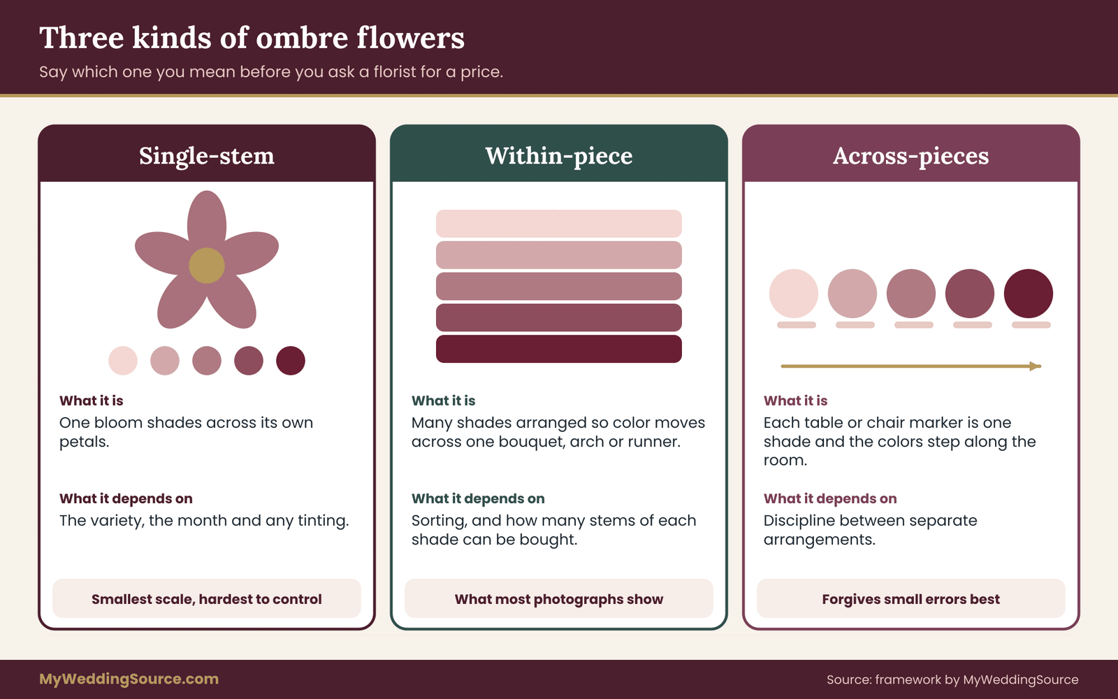
The word “ombre” comes from the French for shaded, and in floral design it means a gradual progression of color through a piece or across a set of pieces. That sounds simple, but there are really three different things couples mean when they use the phrase, and mixing them up is the first source of confusion with a florist.
The first is a single-stem gradient, where one bloom changes color across its own petals. Some roses, tulips and ranunculus do this naturally, and a florist can also create it with tinting or spraying. This is the smallest scale and the hardest to control.
The second is a within-piece gradient, where many stems of different shades are arranged so that color moves across one bouquet, one arch or one aisle runner of petals. This is what most photographs show.
The third is an across-pieces gradient, where each table, pew end or chair marker is a solid or nearly solid color, and the colors step along the room. A guest sees the ombre flowers only by looking down the length of the space.
Why the distinction matters
Each type has a different cost, a different risk and a different approval method. A single-stem gradient depends on what a variety does in your month and on how a florist treats the blooms. A within-piece gradient depends on sorting and on how many stems of each shade can be bought. An across-pieces gradient depends on consistency between separate arrangements, which is mostly a matter of sorting and discipline, and it forgives small errors better than the other two because each piece is judged alone.
When you write to a florist, say which of the three you mean, or say that you are open to any and want advice. “A within-piece gradient on the bouquet and an across-pieces gradient on the reception tables” is a sentence a florist can price. “Ombre flowers everywhere” is not.
The test for “intentional”
People use the word intentional when they want a gradient to look designed, not accidental. In practice the test is that a viewer can state the rule in one sentence. “It goes from pale pink at the top to deep rose at the bottom.” “The tables get darker as you move toward the head table.” If the rule cannot be said out loud, the eye reads the piece as a random mix, however carefully it was built.
That gives you a practical standard to hold the whole project to. Every decision in the rest of this article serves one of three goals: make the rule clear, keep the steps even, and make sure the rule survives delivery, heat, time and a substituted stem.
Two small habits help right away. First, name your endpoints in words and in swatches, not only in photographs, because a photograph shows a color as filtered by one camera and one light. Second, decide early whether the ombre flowers design has a direction that carries meaning, such as light to dark from the entrance toward the couple, or whether it is purely decorative. A meaningful direction makes later layout choices easier because it settles which end goes where.
Why ombre flowers go wrong without a plan
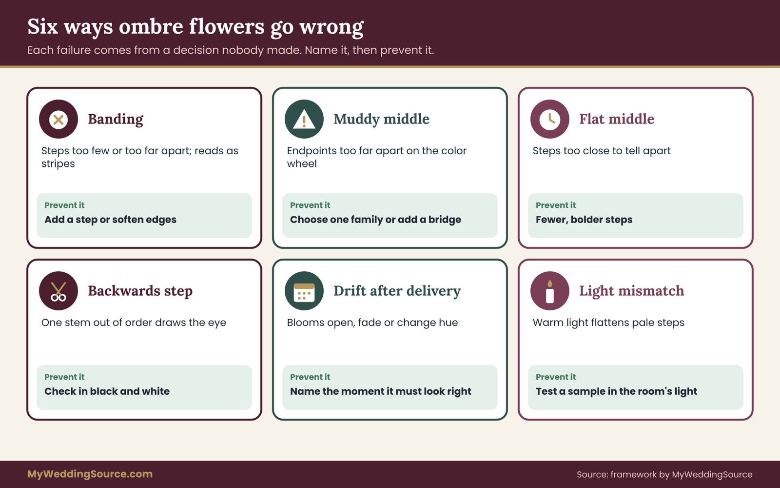
Gradients fail in recognizable ways. Knowing the failure patterns in advance is the cheapest quality control you have, because you can name them to your florist and ask how each will be prevented.
Banding. The steps are too few or too far apart, so the piece looks like stripes of separate colors instead of a smooth progression. Banding is common when a florist works only from what is available in whole bunches and the available shades are far apart. It is not always a flaw, since a bold banded look suits some designs, but it should be a choice you made and not a surprise.
Muddy middle. The two endpoints are far apart on the color wheel, so the colors between them are dull. Ombre flowers running from coral to blue-purple have to pass through something, and what it passes through is often a gray-brown that looks neglected. Choosing endpoints that share a family avoids this, and the section on endpoints below gives a way to check.
Flat middle. The opposite problem. The endpoints are close together, the steps are too numerous, and the eye cannot tell one step from the next, so the piece reads as one color with slight noise.
Backwards step. One stem sits slightly out of order, a darker bloom among lighter ones, and it draws the eye straight to the error. Ombre flowers are a sequence, and sequences make out-of-order items obvious.
Color drift after delivery. Blooms open, fade, brown at the edges or change hue as they age. A rose that was a clear pale pink in the cooler can look lighter, deeper or more ruffled several hours later. Some flowers, such as hydrangea, are well known for changing as they age. Your plan needs to say when the ombre flowers design is at its best and when it will be photographed and viewed.
Lighting mismatch. The mock-up was approved in daylight, and the reception is lit warmly and dimly. Warm light shifts pinks and corals toward orange and flattens subtle steps. The guide to flash and lighting effects on wedding color mood covers how a photographer’s lighting can change the way color is recorded.
Dye transfer and mess. Tinted or sprayed blooms can mark skin, linens and clothing if they are wet or handled. This is a practical risk, not a reason to rule out dyed stems, but it should shape where they go.
What the failures have in common
Every one of these failures comes from a decision that was left implicit. Banding comes from not choosing the number of steps. A muddy middle comes from not testing the endpoints together. A backwards step comes from not defining what “in order” means. Drift comes from not setting a time at which the piece must look right. Lighting mismatch comes from approving in the wrong conditions.
So the method in this article is mostly a process of making implicit decisions explicit, one page at a time, and getting each one agreed before flowers are cut.
How much planning is proportionate
Not every wedding needs the full process. If ombre flowers are one small element, such as a single bouquet in two shades of one color, a short conversation and a photographed mock-up of the bouquet may be enough. If they are a major feature, such as an aisle gradient across forty chair markers or a ceiling-high installation, the full sheet, a written substitution rule and a larger mock-up are worth the time.
A reasonable rule of thumb is to scale the process to the share of the floral budget that ombre flowers take and to how visible it will be. The more of the room depends on one idea, the more the plan should look like a production schedule. The guide to wedding budget planning can help you see how much of your total the flowers take before you decide how ambitious the ombre flowers design should be.
Before moving on, write down three things on a scrap of paper: which of the three types of ombre you want, where it will appear, and the one-sentence rule that describes it. If you can do that now, the remaining sections will be straightforward. If you cannot, the next section on endpoints is where to spend your time.
Finally, remember that a gradient does not have to cover everything. Many of the most convincing uses of ombre flowers appear in one or two places, a bouquet and an arch, for instance, while the rest of the floral plan stays quiet. Restraint is part of what makes a gradient look chosen.
Choosing endpoints and counting steps for ombre flowers
Everything in a gradient hangs from its two endpoints. If you choose them well, the middle largely takes care of itself. If you choose them badly, no amount of florist skill will rescue the result. This section gives a short method for selecting endpoints and for deciding how many steps ombre flowers need.
Pick endpoints from the same color family
The simplest way to avoid a muddy middle is to pick two endpoints that sit close together on the color wheel, so the colors between them are natural neighbors. Blush to burgundy stays within red-pink. Cream to apricot to terracotta stays within warm yellow-orange. Pale lavender to deep plum stays within purple. In each case the ombre flowers design is mostly a change in lightness, with a little change in saturation, and the eye reads that as smooth.
Endpoints from different families can work, but they need more care. Ombre flowers from peach to rose are close enough to behave. A gradient from yellow to pink has to cross through orange, which is a real color and can look warm and lovely, but it must be planned as a three-color sequence and not left to emerge.
Ombre flowers from green to pink cross a zone where the two colors cancel into gray, which is the classic muddy middle. If you want endpoints that far apart, plan a bridge, covered below.
Name the endpoints in three ways
For each endpoint, write down a name in words, a swatch you can hold, and a reference stem. The word is for conversation, such as “dusty rose.” The swatch is a paint chip, a fabric scrap or a ribbon, which gives the florist a physical match that does not depend on a screen. The reference stem is a specific flower in a specific variety that your florist confirms is available in your month at the right shade.
The reason for three is that each alone is unreliable. Words are vague, since one person’s coral is another’s salmon. Screens vary. A reference stem is the most reliable, but it may not exist when you need it. When all three agree, you have a solid endpoint. When they disagree, you have found a problem early.

Decide the number of steps
The step count is the single biggest lever on how ombre flowers look and cost.
A step is a visibly distinct shade in the sequence. The number of steps controls how smooth the ombre flowers design looks, and it also controls cost and complexity, since every step is a separate set of stems to source and sort.
Here is a working guide. Three steps is the minimum that reads as a gradient and not as a pair of colors with a middle. Five steps is a common sweet spot for a bouquet or an arch, because it looks smooth at a distance without requiring a huge range of stems.
Seven steps suits a long span such as an aisle, a long table or a wall, where viewers can see many steps in a row. More than seven is rarely worth it, since the eye cannot separate steps that close and you pay for sorting nobody will see.
These numbers are starting points, not rules. The real test is viewing distance. A bouquet is seen from a few feet away, so a subtle five-step gradient can read clearly. An arch seen from the back of a ceremony space is seen from further, so the steps need to be broader and may need to be fewer. The further away the viewer, the fewer and bolder the steps should be.
Match steps to the physical structure
Steps work best when they line up with something physical in the piece. On an arch, the steps might follow height, one band per level. In a bouquet, they might follow a spiral or a wedge. Across tables, each table is a step. When the steps follow the structure, the florist can build them logically and you can check them easily. When they fall in arbitrary places, the ombre flowers design looks arbitrary.
Count the physical positions first, then fit the steps to them. If a long aisle has twenty-one chair markers, seven steps of three markers each is clean. Five steps would give uneven groups of four and five, which the eye may notice as a rhythm change.
Use a bridge when endpoints are far apart
Planning ombre flowers across distant colors is where most projects need a bridge.
A bridge is a neutral or transitional element that lets two distant colors meet without clashing. Cream, ivory and soft green are common bridges, and foliage often does the job without being counted as a step. A pale, low-saturation version of one endpoint can also serve.
For example, a gradient that starts at deep teal and ends at warm apricot will pass through an awkward middle if the florist simply mixes the two. A bridge of cream flowers and silvery foliage in the center lets the eye reset. The ombre flowers design reads as teal, then calm, then apricot, which is a legitimate design and often more elegant than a forced smooth blend.
Say plainly in your brief when you want a bridge, and say which neutral you prefer, so the florist does not decide between white and cream for you.
Stepping rules: value first, hue second
Once you have endpoints and a step count, you need rules for how color changes from one step to the next. Without rules, a florist matching “a little darker” by eye will drift. With rules, every step has a purpose and the sequence can be checked.
Change one thing at a time
Color has three main dimensions. Hue is the family, such as red or yellow. Value is how light or dark it is. Saturation is how intense or muted it is. A smooth gradient mostly changes one of these per step and keeps the others steady, or changes them in a consistent direction.
The most reliable rule for ombre flowers is to change value first and let hue drift slightly. If every step is a little darker than the last, with only a small shift in hue, the eye reads a smooth line. If one step is darker, the next more saturated and the one after a different hue, the eye reads a jumble.
A quick check is to photograph the line of stems and convert the photo to black and white. If the grays step evenly from light to dark, the value progression is sound. If one step jumps or reverses, you have found the weak link before it reaches a table. Many phones can show a photo in monochrome, and that is all this check needs.
Keep step size even
Evenness is the quality that makes a gradient look professionally built. If the jump from step one to two is small and the jump from two to three is large, the eye sees a hiccup. Aim for roughly equal differences between neighboring steps, judged by eye in the black-and-white check.
This is harder than it sounds with natural stems, because available varieties do not come in evenly spaced shades. A florist might have a pale blush rose, a medium pink rose and a deep magenta rose, with nothing in between. The answer is usually to add a different flower in the missing shade, or to adjust the step count, not to force the roses to fill a gap.
Stagger the textures, not just the colors
A gradient built from one flower in several shades is cleaner than one built from several flowers, because shape and texture stay constant and only color changes. A mixed-flower version of ombre flowers can be rich and full, but each flower has a different surface, and a glossy petal next to a velvety one can make the same color look different.
If you mix flowers, assign each step a primary flower and keep the secondary flowers consistent across steps. For instance, roses carry the main color through all steps, spray roses add fullness in the same shade, and foliage stays the same everywhere. The design relationships between shape and texture are covered in the floral art direction guide, and the same logic applies here: change one variable and hold the others.
Decide how steps blend at the borders
At the border between two steps, you have two choices. A hard edge puts the last stem of one step directly beside the first stem of the next. A blended edge overlaps them, with a few stems from each step mixed into the border zone.
Hard edges read as deliberate stripes. Blended edges read as a smooth fade. Neither is wrong, but they look quite different, so choose one and tell the florist. A blended edge also forgives small color errors, because a stem that is slightly off can sit in the overlap and look like part of the transition.
Write the rules as sentences
Turn the rules into short sentences the florist can confirm. For example: “Five steps, value changes first, each step noticeably darker than the last by about the same amount. Same rose variety through the whole sequence where possible. Blended edges. Cream bridge in the middle only if needed.”
That paragraph is enough to start. It sets the number of steps, the rule for change, the consistency requirement, the border style and the bridge. The florist can reply with specific varieties and flag anything unrealistic, and the conversation becomes about particulars rather than general taste. Once the rules are agreed, the next question is where the color comes from, which brings us to natural and dyed blooms in ombre flowers.
Natural, dyed, tinted and painted blooms
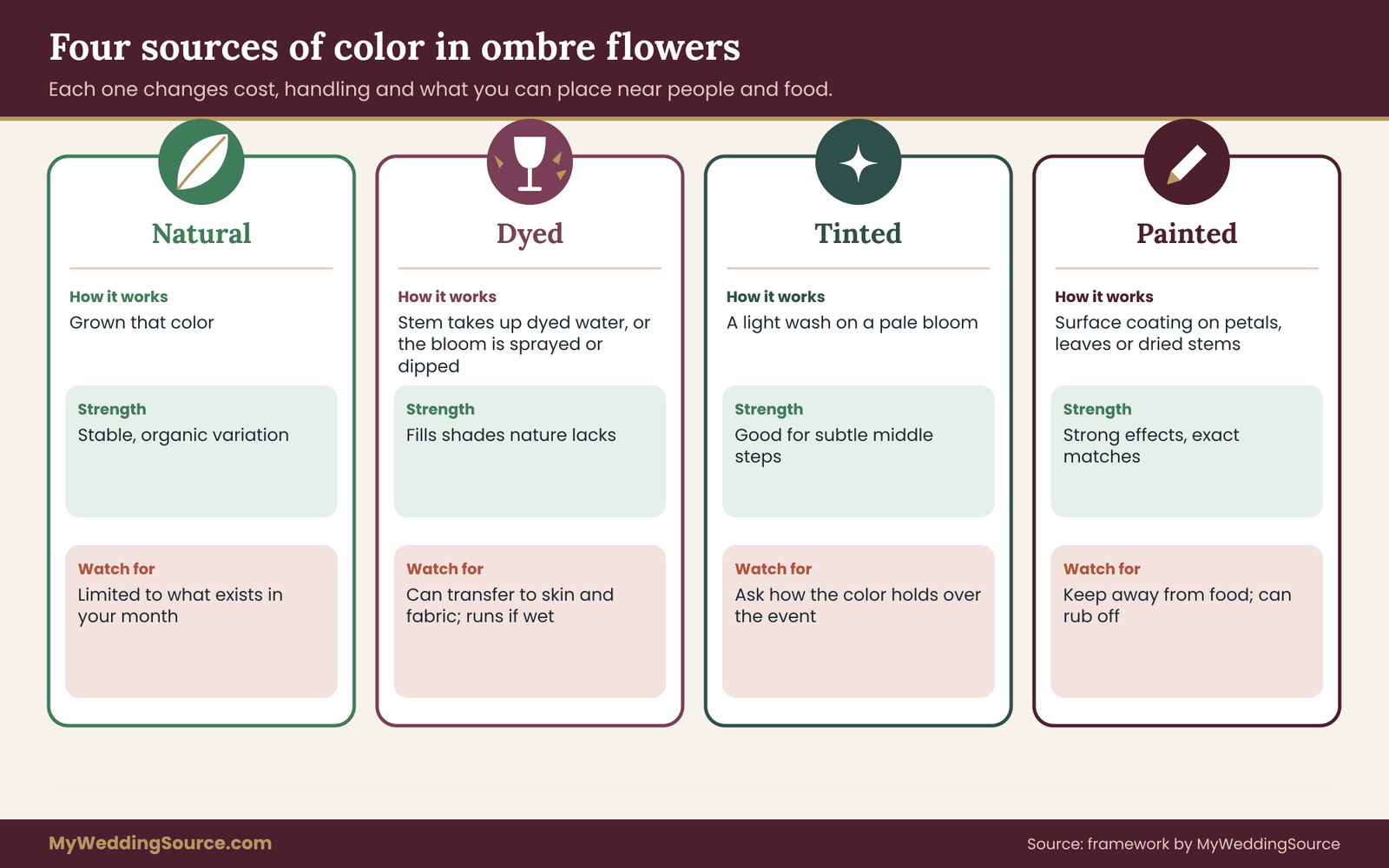
Ombre flowers can be built from four kinds of color source, and a florist may use more than one in the same piece. The difference matters for cost, for safety, for how the color behaves over time and for what you are comfortable putting near people, pets and food.
Natural color
For many couples, natural color is the safest starting point for ombre flowers.
Natural color means the bloom is the color it grew. Growers breed varieties in many shades, and a skilled florist can assemble ombre flowers entirely from natural stems. The advantages are that the color is stable and usually looks the way living petals look, with variation that reads as organic. The disadvantage is that you are limited to what exists in your month, and the shades available may not step as evenly as you would like.
A natural-only gradient is also the simplest to talk about with a florist, since you are choosing from varieties and not from treatments. If your endpoints sit in a family that has plenty of natural variety, such as pink, peach, cream or burgundy, natural ombre flowers are often realistic.
Dyed blooms
Dyed stems are common in ombre flowers that need a shade nature does not supply.
Dyed blooms are flowers that were treated before sale to change their color. One common method has the stem absorb dyed water so the dye travels into the petals, which is why white flowers such as carnations and daisies are often sold in bright colors. Another is spraying or dipping.
For a gradient, dyed stems solve a real problem: they can fill a color that does not occur naturally, such as a true blue or a vivid teal, or fill a gap between natural shades. They can also be consistent, since a supplier can dye a batch to one shade.
The trade-offs are worth knowing. Dyed color can look more uniform and sometimes more saturated than a natural bloom. It can run if the flower is wet or heavily misted. It can mark skin, fabric and linens, so you should ask whether a given treatment is likely to transfer and where such flowers should and should not go. And not every flower takes dye well, which narrows the choice of varieties. Ask your florist which flowers they would dye for your piece and why.
Tinted blooms
Tinting is a lighter version of the same idea, usually adding a wash of color rather than a saturated dye. A florist may tint a white or pale flower to nudge it toward a shade a natural stem does not offer. The effect is subtler, and a tinted bloom can look more natural than a heavily dyed one.
Tinting can be an efficient way to create the middle steps of a gradient, because you start with one pale flower and push several lots to different depths. It still has the same practical questions about transfer and about how well the color holds as the flower ages.
Painted or sprayed blooms and elements
Floral paint and spray are applied to the surface of petals, leaves or other elements such as dried stems and grasses. They can produce strong effects, including metallic finishes and exact shade matches, and they are popular for dried and preserved designs because dried material does not take up dye through the stem.
Surface coatings carry the most practical cautions. They can feel stiff or tacky, they can rub off, and they are not intended to be eaten or placed against food. If any part of your plan touches cake, a dessert table or edible garnish, say so, and keep painted or sprayed elements well away. The guide to edible flowers on a wedding cake covers what changes when flowers are meant to be eaten.
A simple comparison in prose
If you want the shortest summary: natural stems are the most reliable in character and the least flexible in color. Dyed stems are the most flexible and the most uniform, with the most transfer questions. Tinted stems sit between them and suit subtle middle steps. Painted elements suit dried and structural pieces and need the most care near food and fabric.
Questions to ask about any treated bloom
For each treated flower in your design, ask the florist these questions, and write the answers on the sheet.
- Is the color applied by dye uptake, tint, spray or paint?
- Does it transfer to skin, fabric or linen when dry, and when damp?
- Can it go in a bouquet that will be held, and in a boutonniere that will touch a jacket?
- How does the color hold over the hours of the event?
- Is the supplier able to give a consistent shade across the quantity you need?
Notice that none of these questions is a criticism. Many florists use dyed and tinted flowers routinely and know the answers. You are asking so that placement and handling can be matched to the material.
Plant safety applies to every color source
Color treatment does not change which plant a stem is, and some plants are hazardous to animals. If you have pets at home, if pets will attend, or if flowers will go home with guests, check each plant by name against a reference such as the ASPCA toxic and non-toxic plant lists, and ask your florist to confirm the botanical names.
Lilies, for example, are flagged by the ASPCA as dangerous to cats. Ombre flowers built around a plant that turns out to be a problem are a plan you will want to change early, not at delivery.
Bloom availability and ordering for ombre flowers
A gradient is only as buildable as its least available step. This section gives you a way to think about availability without relying on numbers you cannot verify, because what is in season changes by region, by year and by supplier.
Availability is a property of a step, not a flower
Couples often ask whether a flower is “available.” The better question is whether each step on the sheet has at least two realistic sources. A step with one source is a risk. A step with two sources, such as two varieties in the right shade or two suppliers for the same variety, is resilient.
That is why the gradient step sheet, described in the next section, has a column for the primary bloom and a column for the backup. If a step has no backup, mark it as fragile and decide in advance what you will do if it fails.
What affects whether a shade can be found
Several things shift availability, and you can raise them with your florist in plain terms.
Season and origin. Some varieties are grown locally for part of the year and imported the rest, and the shade or quality can differ between sources. Ask where the key stems are likely to come from at your date.
Bunch size and minimums. Flowers are often sold in bunches, and a specific shade may only be available in a minimum quantity. A step that needs eight stems may force a purchase of a full bunch, which affects cost and leftovers.
Lead time. Some shades or treated stems must be ordered well ahead, and special dyeing or tinting takes time. Ask for the order deadline for each step, not only for the whole event.
Weather and supply shocks. A cold snap, a shipping delay or heavy demand around a holiday can shift what arrives. A florist cannot control these, which is why the backup column matters.
Variation between lots. Even the same variety can arrive in slightly different shades from different growers or different weeks. Ask whether the florist will sort on arrival and whether stems from different lots will be kept in separate steps.
Work backward from the date
Timing is part of the design when you order ombre flowers.
Start with the wedding date and count back. The final order deadline is set by the florist’s supplier schedule, and the design needs to be settled before it. Between them sit the mock-up, the revisions and the sign-off. If your florist needs the final plan some weeks out, then the mock-up needs to happen earlier than that, with time for at least one adjustment.
A calm way to schedule this is to ask the florist for three dates: when the ombre flowers design must be locked, when the mock-up can be built, and when the last substitution decision can be made. Put them in your shared calendar, the same way you would track other vendor deadlines in the wedding vendor contract.
When the plan and the market disagree
Sometimes the shade you want does not exist in your month. You have four options, and none is a failure.
- Move an endpoint. Shift the dark or light end to a shade that is available, keeping the same family.
- Change the color source. Use a tinted or dyed stem for the missing step, if you are comfortable with the trade-offs.
- Change the step count. Fewer, bolder steps can be built from what exists.
- Change the flower for that step. Keep the shade and the role, and swap the variety.
Ask the florist which option they recommend and why, then decide together. Which is best depends on how much the missing step matters to the overall look. A florist who says “we can get close, but not exact” is giving you useful information, and a florist who promises an exact match without checking is a reason for a second question.
Keeping the cost logic honest
You do not need specific prices to reason about cost. Compare options in relative terms. Out-of-season stems usually cost more because of how they are sourced. Special orders and treatments add labor. Ombre flowers with many steps need more sorting time. A bouquet gradient uses few stems, so even premium stems have a small total effect. An aisle gradient uses many stems, so the same premium is multiplied.
Ask for a quote broken out by step, or at least by location, so you can see where the money goes. If the total is too high, the sheet shows you which step to simplify. Dropping a step, narrowing the range or moving the ombre flowers design from the aisle to the arch changes the cost without abandoning the idea, and you can make that choice with the numbers in front of you.
The gradient step sheet: one page to hand your florist
Planning ombre flowers across a bouquet, an arch and a room generates a lot of small decisions. The gradient step sheet is a single page that holds them in one place, so you and your florist are looking at the same facts. It is the original piece of this guide, and it works for any gradient, large or small.
What goes on the sheet
The sheet is the working document for your ombre flowers, from first draft to delivery.
The sheet has a header and one row of information for each step. The header names the location, such as “reception tables” or “bouquet,” and states the gradient rule in one sentence, the direction it runs, the number of steps and the border style. It also records the endpoint names, swatches and reference stems from the earlier section.
Each step then gets the following, written plainly.
- Step number and shade name. Number the steps from the light end to the dark end, or whichever direction you chose, so everyone counts the same way.
- Primary bloom. The flower and variety planned for this step.
- Color source. Natural, dyed, tinted or painted, using the four categories above.
- Quantity. How many stems the step needs, including a small allowance for stems that get rejected during sorting.
- Backup. A second bloom or source for the same shade and role.
- Order deadline. The date the florist must commit to this step.
- Placement. Where this step goes, such as “tables three and four.”
- Safety note. Anything flagged on a plant check, a transfer concern or a food-adjacent placement.

Why a sheet beats a mood board
A mood board shows the destination. The sheet shows the route. A mood board tells a florist what you like, and the florist must still decide how many steps, which stems and what to do if something is missing. The sheet makes those decisions visible and checkable, and it gives you a document to compare against the delivery on the day.
It also protects the relationship. When a substitution happens, and with living material one sometimes will, the sheet means the conversation is about a specific step rather than a vague sense that something looks different. You can say “step four used the backup on the sheet” or “step four was not on the sheet, so let’s discuss it,” and both are calm sentences.
How to fill it in with your florist
Do not fill in the whole sheet alone. Draft the header, the endpoints and the rule yourself, since those are your design decisions, and send the draft with a request to complete the bloom, source, quantity, backup and deadline columns. The florist knows what is realistic. Their answers are your first real data about feasibility.
A short message can carry it: “Attached is a one-page sheet for the gradient we have in mind. Could you fill in the bloom, source and backup for each step, flag anything you think is unrealistic for our date, and tell us the order deadline for each step?” This keeps the florist in the role of expert and keeps you in the role of decision-maker.
Keeping one master version
Treat the sheet as a living document with a version number or a date in the header. Every change, such as a moved endpoint or a swapped backup, is a new version, and the previous version is kept. The practice matters because a florist, a coordinator and a couple can easily be working from three different drafts. The guide to the change-order approval chain describes how to decide who can approve a change, which is useful once a sheet is in use and a substitution comes up late.
Put the current version in the contract file, or attach it as a schedule to the agreement, so it has the same standing as the other written terms. The guide to the wedding vendor contract explains what to look for in an agreement, and a floral schedule is a natural addition.
A worked example with invented numbers
The following case is invented to show how the sheet turns into decisions. The couple, the venue and the numbers are illustrative, not real, and your own quantities will differ with your design and your florist.
The brief
A couple planning an autumn wedding wants a gradient from pale blush to deep burgundy. They want three things. A bouquet with three shades. A ceremony arch that moves from pale at the top to deep at the bottom. And ten round reception tables whose centerpieces step from light at the entrance end to dark at the head-table end.
They write the rule for the tables as one sentence: “Five steps, two tables per step, lightest at the door and darkest by the head table, blended edges, cream bridge not needed.”
Step count and quantities
Ten tables in five steps gives two tables per step, which is a clean grouping. Suppose each centerpiece uses twelve focal stems of the main bloom. Two tables per step then need twenty-four focal stems per step, and five steps need one hundred twenty in total.
The florist advises ordering a small allowance for stems that will be rejected during sorting, say ten percent. Ten percent of twenty-four is about two and a half, so call it three. The step needs twenty-seven stems. If the variety is sold in bunches of ten, that means three bunches, or thirty stems, per step, which leaves three spare. The couple now knows that the main bloom costs thirty stems per step across five steps, a total of one hundred fifty, and can compare that against the quote.

The numbers are only an illustration of the method. What matters is the sequence: count positions, set steps, multiply stems per piece, add an allowance, then round up to the way the flowers are sold.
The availability check
The florist reports that the pale end and the deep end are both available as natural roses in their month. Two middle shades are the problem. One has no good natural match, and the other is available only from a single supplier.
The couple considers the four options from earlier. They decide to keep five steps, use a tinted rose for the missing middle shade, and ask the florist to name a backup supplier for the single-source shade. Both facts go on the sheet. The step with the tinted rose carries a safety note: do not use in the boutonnieres, since they sit against jacket fabric, and keep it away from the dessert table.
The mock-up
Several weeks ahead, the florist builds one table centerpiece in the darkest shade and one in the lightest, and a small bouquet in the three bouquet shades. The couple views them in the venue’s approximate lighting, photographs them in black and white to check the value steps, and notices that step three and step four look almost the same. They agree to nudge step four darker, which the florist confirms is possible by choosing a different variety.
That change would have been invisible on a flat screen and obvious on the tables. It is the main reason to do a mock-up.
The approval
The couple signs the sheet at version three, which includes the new step four, the tinted rose, the backups and the order deadlines. The florist attaches it to the order. On the wedding day, the couple’s coordinator checks delivery against the sheet, and one backup is used for a single shade, as planned. Because the backup was already on the sheet, there is nothing to argue about.
What the example shows
The invented couple did nothing unusual, and their ombre flowers still arrived as planned.
The case shows five habits that matter more than any single color choice. The couple counted positions before choosing steps. They asked the florist to fill in feasibility. They treated the missing shade as a design decision rather than an emergency. They tested a small version before committing to the large one. And they wrote down the approved version so the delivery could be checked against it.
None of these steps is expensive. They cost time and a few clear messages, and they replace the kind of disappointment that usually appears only when the flowers arrive.
Placing ombre flowers in the room
The same gradient behaves differently depending on where it sits. A bouquet is seen close up and from many angles. An arch is seen mostly from the front and from far away. A row of tables is seen along its length. Choosing the location for ombre flowers is really choosing the way a guest will read the sequence, and the plan should fit the viewing angle.
The bouquet
A bouquet is the most forgiving place for ombre flowers because the viewer is close and the piece is small. Two or three shades usually look better than five, since a hand-held bunch has little room for steps. The ombre flowers design can run in a spiral, in a wedge, or from the center outward. A wedge is the easiest to see in photographs because it presents a clear light side and dark side to the camera.
Think about the direction it will be held and photographed. A bouquet is often held in front of the dress, so the side facing outward from the body is the one a photographer will see most. If the dark end is on the inside, it may disappear against a dark dress or be hidden by the arm. Ask the florist which way the bouquet should be held and mark the front on the sheet.
Because a bouquet is held, transfer matters most here. If any stem is dyed, tinted or sprayed, confirm that it will not mark a dress or hands, and ask whether the stems can be wrapped or bound to reduce contact. Ombre flowers built from natural stems avoid the question entirely, which is a reasonable reason to keep the bouquet natural even if other pieces are treated.
The ceremony arch or backdrop
On an arch, a vertical gradient from light at the top to dark at the bottom, or the reverse, tends to look natural because it echoes how light falls and how plants grow. A horizontal gradient, with one side pale and the other deep, can look dramatic but needs the arch to be symmetrical in structure so the effect reads as chosen.
Viewing distance changes the plan. Guests in the back rows see the arch as a shape of color, so the steps should be broad and the endpoints clearly different. Fine distinctions that look elegant at arm’s length disappear at fifteen feet. Test this in the mock-up by looking at the piece from the farthest seat.
Check the venue’s rules on structures, anchoring and flame or water use before locking an installation, and bring your florist into the venue conversation. The venue technical walkthrough guide shows what to measure and ask, and a floral installation belongs on that list.
The aisle
An aisle is the longest stage on which ombre flowers can be seen.
An aisle gradient can use petals, chair markers, pew ends or floor arrangements. The most common choices are a gradient along the length, light at the entrance and dark at the altar or the reverse, or a gradient between the two sides.
A gradient along the length gives a sense of movement toward the couple. The guest in the last row sees the whole run at once and the guest walking down sees it unfold. If you choose light-to-dark toward the altar, the eye is drawn forward. If you choose dark-to-light, the effect is softer and feels like opening.
A gradient between the sides is less common and has a risk. Guests sit on both sides, so each side sees the other as a mirror, and the transition happens at the center aisle, which is exactly where people walk. It can look striking, but it should be planned carefully and tested.
For petals on the floor, remember that petals are loose and will move. Wind, footsteps and a train will blur steps quickly. Ombre flowers made of petals are the most fragile type, so it suits short runs and calm conditions and may be better as a feature near the altar than along the whole aisle.
The reception tables
An across-pieces gradient on tables is easier to build and to check than a within-piece gradient, since each centerpiece is a single shade or a short step. The risk is the viewing angle. In a room with round tables, a guest rarely sees the whole line at once, so the ombre flowers design may only be visible from a few points, such as the entrance or the dance floor.
Before committing, stand where guests will stand and ask where the gradient will actually be seen. If the answer is “from the door and from the head table,” arrange the direction so those two views are the strongest. If guests will move around, the ombre flowers design may read best as zones, such as three or four groups of tables, instead of ten distinct steps.
Use the same logic for height. Keep the ombre flowers design readable by holding height and shape steady, so that the only thing changing is color. A tall piece among low pieces breaks the visual line, and the guide to centerpiece height and sightlines covers why guests need to see across tables.
Smaller touches
Boutonnieres, corsages, cake flowers and place-card flowers can repeat a step from the ombre flowers design to link the pieces. Using the matching step for the person or place it belongs to, such as the lightest step for one family and the darkest for another, can create meaning without extra decoration. Be careful with treated blooms near food and clothing, as noted earlier, and keep anything near the cake natural and food-appropriate according to the cake maker’s advice.
Silk and rental alternatives
Fresh is not the only way to build ombre flowers.
If fresh gradients prove expensive or fragile, artificial or rental flowers can carry parts of the plan. Their color is fixed, so the ombre flowers design will not drift, and shades can be matched exactly across pieces. The trade-offs are texture and realism, and the guide to rental silk flowers versus fresh florals goes through them. A common hybrid is to build the large, hard-to-sort gradient in silk and keep the bouquet and a few focal pieces fresh.
Light, cameras and clothing around ombre flowers
A gradient is a statement about color, and color depends on light. The same ombre flowers can look like a smooth progression in a bright room and a muddy blur in a warm, dim one. This section covers how to check and how to protect the effect.
Warm light flattens subtle steps
Many receptions use warm, low light. Warm light adds yellow and orange to everything, which can make pale pinks look peach and push deep reds toward brown. Steps that were distinct in daylight can collapse into each other. If your reception will be warmly lit, make the steps broader and widen the gap between the endpoints.
The reverse can also happen. Cool or colored uplighting can shift a neutral bridge toward blue or green and make it look off. If the venue plans colored lighting, tell your florist and test the flowers under it.
Test under the real conditions
The most reliable way to learn how your ombre flowers will look is to see a sample in the same kind of light at the same time of day. Ask the venue whether you can bring a mock-up to the space, or at least photograph it near the room’s windows and under similar bulbs. If that is not possible, view the piece in a dim room with a lamp as a rough stand-in and compare it with daylight.
Photograph the mock-up with your phone in each condition and compare the pictures. You are not judging beauty so much as looking for the point where two steps become indistinguishable. If that happens under the expected light, adjust the steps.
Flash and photography
Flash can wash out pale steps and exaggerate dark ones. Photographers handle this in different ways, and some prefer natural light. Raise your ombre flowers with your photographer in advance, and ask whether the color will be recorded as it appears in the room. The guide to flash photography and wedding color mood explains how lighting choices change the look of color in photographs, and the detail photo shot list helps you plan which floral pieces to photograph close up while they are at their best.
Tell the photographer the gradient rule and the direction, and ask for a photograph taken straight on, in which the sequence is easy to see. A record of the ombre flowers as designed is a useful keepsake and a useful reference if any question arises later.
Clothing and the gradient
Wedding attire interacts with flowers. A bouquet gradient held in front of a dress sits against that color, and the contrast will change how the steps read. A pale blush bouquet vanishes against an ivory dress. A deep burgundy end stands out strongly. If your dress has a color cast, test the bouquet against it. The guide to the colored wedding dress shade test shows a way to check shades against fabric under different light, and the same approach works for flowers.
Consider the attendants as well. If bridesmaids wear a color within your ombre flowers family, the bouquets and the dresses need to agree. A bouquet that clashes with a dress by half a shade can look like a mistake even if each piece is beautiful alone.
When the gradient should be at its best
Decide the single moment when the ombre flowers matter most. For a ceremony arch, that is the processional and the photographs after it. For tables, it is the time guests are first seated and the time the formal photos of the room are taken. For a bouquet, it is the portraits.
Tell your florist that moment, since it decides how the blooms are timed. Flowers that open further over several hours may need to be a little tighter at delivery. Pieces that will sit in warmth may need cooler storage until the last minute. Ombre flowers designed for a time are much more likely to look right at that time than ones designed for no time in particular.
Mock-ups and approval for ombre flowers
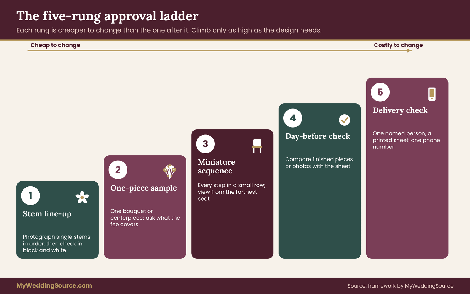
A mock-up is a small, real version of the design built before the wedding. For ombre flowers it is the most useful single step in the process, because ombre flowers are a visual relationship and visual relationships are hard to judge from descriptions. This section sets out an approval ladder with five rungs, each cheaper to change than the one after it.
Rung one: swatch and stem line-up
Every set of ombre flowers should pass this cheap first check.
Before any mock-up, compare the endpoints and middle steps as a line of single stems or color samples. Lay them on a plain white or neutral surface in daylight, in order from the first step to the last. Photograph the line, then view it in black and white to check the value steps.
This rung costs almost nothing, and it catches the most common problem, which is a step that does not sit between its neighbors. If your florist can send a photo of a line-up of the actual varieties they plan to use, you can review it without a visit.
Rung two: a small bouquet or one-piece sample
The next rung is one complete piece at small scale, such as a bouquet or one table centerpiece in a middle step. It checks whether the blooms, treatments and construction work together, and it lets you assess the real texture.
Ask whether the florist charges for the sample, and what that fee covers. A sample fee is common and reasonable since it uses stems and labor, and a clear price is better than a surprise. Ask too whether the fee is credited toward the final order, and get the answer in writing.
Rung three: a full-sequence mock-up in miniature
For a large gradient, such as an aisle or a row of tables, the most informative sample is not one piece but the whole sequence in miniature. Five small arrangements in a line, one per step, show the progression in a way a single piece cannot.
This is where you will see banding, a flat middle or a backwards step. It is also the point to view the sequence from the distance a guest will stand. Walk back from it and note where the steps stop being distinguishable. If they merge too early, the steps are too fine for the room.
Rung four: the day-before check
The day before, or at the florist’s studio on the build day, ask whether you or a trusted person can view the finished pieces before they are delivered. This is the point to check against the sheet. Walk through the steps in order, confirm the shades and note anything that looks out of sequence.
If you cannot be there, ask for photographs of each piece and of the full sequence laid out together. Photographs taken in good, even light are enough to confirm the order and to spot a stem in the wrong place. Changes at this stage are limited, but a swap of two pieces is still possible, which is far better than discovering the error in the venue.
Rung five: delivery and set-up check
On the day, someone who knows the sheet should receive the delivery. That could be you, a coordinator or a trusted friend with a printed copy and a pen. They compare each piece with its row, confirm placement and photograph the finished setup in the room’s light.
Name this person in advance and tell the florist who it is, so the delivery team knows whom to ask. If something is wrong, there should be one person authorized to raise it and one number to call. The guide to the change-order approval chain describes how to decide who can say yes to a change when the couple is busy.
How to say yes, and how to say not yet
Approval language should be specific. “This looks great” is hard to use later. “Approved at version three, steps one to five as shown in the photographs of the line-up, with the backup for step four” is clear, and a short email can carry it.
If something is not right, say what you see and what you want, without prescribing how to fix it. For example: “Steps three and four look nearly the same in our photographs. Could you suggest a way to separate them, either with a different variety or a darker tint?” The florist’s craft knowledge is the solution, and your job is to describe the problem precisely.
What to do if the florist cannot build a mock-up
Some florists do not build samples for every design, especially for dates far in the future or for large events with a busy schedule. If a full mock-up is not possible, ask for the best available alternative: a photograph of past work with a similar gradient, a stem line-up photograph, or a small sample of just the endpoints.
Be honest with yourself about the risk. Without a mock-up, you are approving a plan, not a result. In that case, simplify the ombre flowers design, add broader steps, and lean more heavily on natural stems with predictable color. Include a written substitution rule, covered next, so that a miss has a pre-agreed solution.
Substitutions, budget and edge cases for ombre flowers
Even a well-planned gradient meets surprises, because the materials are alive and the supply chain is not under your control. The goal is not to prevent every change but to make sure each change has a rule.
The substitution rule
A written rule keeps ombre flowers intact when a stem fails to arrive.
Write a short substitution rule on the sheet and agree it with the florist. A workable version has four parts.
First, protect the endpoints. The lightest and darkest steps define the ombre flowers design, so they get the most attention and the most reliable backups. If a middle step has to move, the ombre flowers design survives. If an endpoint moves, the whole sequence shifts.
Second, swap within a step by value, not by hue. If the planned bloom is missing, the backup should match its lightness first and its hue second. A slightly different hue at the right value reads as a minor variation. The right hue at the wrong value reads as a break in the sequence.
Third, never reorder steps. If step three cannot be filled, either use its backup, collapse the sequence by merging two neighbors, or ask the florist to propose an alternative. Do not let the florist fill the gap with a stem from another step, since that creates a repeat and a visible bump.
Fourth, tell the couple, in writing, before the swap becomes final. Even a text with a photograph is enough. The point is that nothing important changes silently.
When to collapse a step
Sometimes the right answer is to remove a step. If a middle shade cannot be sourced and no backup works, merging two neighboring steps and widening the transition can look cleaner than a poor substitute. A five-step gradient that becomes a four-step gradient is still a gradient, as long as the remaining steps are even.
This works best with a blended edge, because blended borders hide the join. It works least well on a bouquet with only three steps, where each step carries a third of the design. In that case a substitute at the right value is usually better than a collapse.
Budget logic when the numbers are tight
If the quote is higher than you planned, change the design in the order that costs the least visually.
- Reduce the number of steps. Fewer steps mean less sorting and fewer special orders.
- Narrow the range. Endpoints closer together need fewer unusual shades.
- Confine the ombre flowers design to one or two places. Keep it on the bouquet and the arch and let the tables be quiet.
- Move from fresh to a hybrid. Use silk or rented pieces for large, hard-to-sort elements.
- Change the color source for the hardest step only. One tinted stem may be cheaper than a premium natural one.
Ask for the quote by step or by location so the effect of each change is visible. The wedding budget guide can help you place the flowers in the context of your overall plan and decide how much of the total to spend on one visual idea.
Edge cases worth thinking about
A few situations come up often enough to plan for.
Outdoor weddings. Wind, sun and temperature change how fast blooms open and fade, and they can ruin a petal gradient. Choose sturdier flowers, plan shade, and keep delicate steps close to the time they will be seen.
Hot weather. Heat shortens the life of delicate blooms and can accelerate color change. Ask the florist about cooler storage and about which varieties hold up.
Allergies and scent. Some flowers carry strong scent or heavy pollen. If guests have sensitivities, tell the florist early, and choose varieties accordingly. You cannot promise that any arrangement is free of reactions, and a short, honest conversation with affected guests is the practical approach.
Pets and children. Check the plants by name against the ASPCA list and keep arrangements out of reach of animals and small children where relevant.
Venue restrictions. Some venues limit open flame, loose petals, water on floors or installed structures. Confirm before design decisions are final.
Reusing flowers. If you plan to move arrangements from the ceremony to the reception, the ombre flowers design has to survive the move. Ask the florist whether the pieces are built to travel, and whether the order in the new location still makes sense.
Composting and leftovers. Dyed or sprayed blooms may not suit every composting program, so ask the program or the florist before you send them. The guide to wedding floral composting covers the questions to ask.
Putting commitments in writing
Whatever you agree, record it. The sheet, the substitution rule, the mock-up approval and any fee should be attached to the contract or confirmed by email, with dates. If a florist offers a verbal assurance, ask them to put it in writing, politely and without suspicion, since a written note protects both sides from a lapse of memory.
This is not about expecting a dispute. It is about making the plan portable, so that if your florist is ill, if a coordinator takes over, or if a team member packs the van, the people doing the work have the same instructions you gave.
Your next steps
You do not need to do everything at once. Work through these in order, and stop at whatever level of detail your design needs.
- Choose the type. Decide whether you want a single-stem, within-piece or across-pieces gradient, and where each will appear.
- Write the rule. State the ombre flowers design in one sentence, including direction, number of steps and border style.
- Set the endpoints. Name each in words, hold a swatch, and ask your florist for a reference stem.
- Draft the sheet. Fill in the header and send it to your florist with a request to complete bloom, source, quantity, backup and deadline for each step.
- Check the plants. Look up every bloom by name against the ASPCA list if animals or children will be near.
- Climb the approval ladder. Review a stem line-up, then a sample, then a miniature sequence, viewing each in the room’s kind of light.
- Agree the substitution rule. Protect the endpoints, swap by value, never reorder, and tell the couple in writing.
- Name the delivery checker. Give that person a printed sheet and a phone number.
- File the final version. Attach the approved sheet to your florist agreement.
Ombre flowers reward early decisions. If you only have time for two actions, do the first and the sixth: know what kind of ombre flowers you want, and see a small version before the large one is built.
FAQ
How many shades do ombre flowers need to look smooth?
Three is the minimum that reads as a gradient, and five suits most bouquets and arches. Seven can work on a long aisle or long table where many steps are visible at once. More than seven is rarely worth the sorting, because the eye cannot separate steps that close. Viewing distance matters, so test the steps from where guests will actually sit or stand.
Are dyed flowers safe to use in a wedding bouquet?
Many florists use dyed and tinted stems routinely, but you should ask how the color is applied and whether it transfers to skin or fabric when dry and damp. Keep treated stems away from food, and consider natural stems for a bouquet that will be held against a dress. Your florist can tell you which treatment suits which placement.
Can I get ombre flowers using only natural blooms?
Often yes, especially in color families with a lot of natural variety such as pink, peach, cream and burgundy. The limit is what grows and ships in your month, and available shades may not step evenly. Ask your florist to list natural varieties for each step. Where one is missing, you can move an endpoint, change the step count or tint one stem.
What should I ask a florist before agreeing to ombre flowers?
Ask which varieties they would use for each step, whether the color is natural, dyed or tinted, and what the backup is. Ask the order deadline for each step, whether a sample is available and what it costs, and how substitutions are handled. Request the answers in writing, ideally on a shared one-page sheet.
Why do ombre flowers look different in the venue than in photos?
Cameras, screens and lighting all change how color appears. Warm, dim reception lighting can push pinks toward orange and flatten subtle steps, while daylight shows them clearly. Test a sample in similar light and photograph it in black and white to check that the steps still separate. If they merge, make the steps broader.
What happens if one shade is unavailable?
Follow the substitution rule on your sheet. Protect the endpoints, match the backup by lightness first and hue second, and do not reorder the steps. If no backup works, merging two neighboring steps can look cleaner than a poor match. Ask your florist to tell you in writing before the swap is final, ideally with a photograph.
Do I need a mock-up for ombre flowers?
For a major feature such as an aisle, a tall arch or a long row of tables, a mock-up is worth paying for because ombre flowers are easy to misjudge from descriptions. For a small bouquet, a photographed line-up of stems may be enough. If your florist cannot build a sample, simplify the ombre flowers design and lean on natural stems.
Is an ombre arrangement more expensive than a solid color one?
It can be, mainly through sorting labor, special orders and treated stems for hard-to-find shades. A bouquet uses few stems, so the premium is small, while an aisle or a room multiplies it. Ask for a quote by step or location, then reduce steps, narrow the range or limit the ombre flowers design to one or two places.
Sources
- ASPCA toxic and non-toxic plants
- Poison Control, America’s Poison Centers
- Federal Trade Commission, advertising and consumer guidance
- U.S. Consumer Product Safety Commission
- U.S. Food and Drug Administration, food safety information
- USDA Animal and Plant Health Inspection Service
- USDA Agricultural Marketing Service
- Centers for Disease Control and Prevention, allergy information
- Occupational Safety and Health Administration
- U.S. Environmental Protection Agency, composting and food waste information