
Floral art direction is the practice of deciding how your wedding flowers should look before anyone orders a single stem: the shapes, the textures and the color relationships that make separate arrangements read as one composition. This guide gives you a one-page botanical style brief and a stem distribution mood board, so your florist receives instructions instead of a folder of beautiful but conflicting pictures.
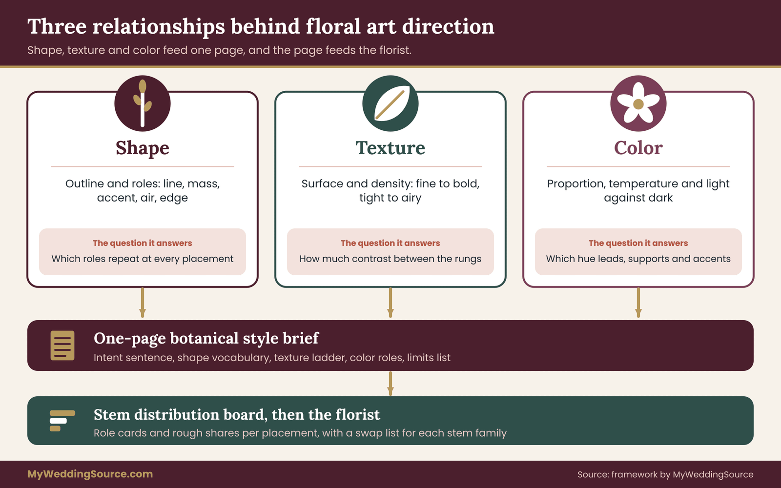
Treat floral art direction as three relationships and one board. Shape is the outline and the mix of line, mass and air. Texture is how the surface and density of petals and leaves catch light. Color is the proportion, temperature and contrast between hues. Write all three into a one-page brief, then build a stem distribution board that gives every stem family a role and a rough share of the visual area at each placement. Check the result against your season, your venue, your budget and plant safety before you approve a mockup.
Most couples approach floral art direction by collecting flower pictures for months. The pictures are lovely, and they quietly disagree with each other. One shows a tight dome of garden roses, another a loose spray of grasses and branches, a third a wall of dried pampas in dusty tones.
Each is a good image of a different wedding. When the whole folder goes to a florist, the florist has to guess which parts you care about, and the guesses tend to land in the middle, which is where nobody’s taste lives.
Floral art direction fixes that by moving the conversation from “what do you like” to “what is each flower there to do.” That sounds abstract, and in practice it is concrete.
It means you can say that the bouquet should be round and soft, the ceremony piece should be tall and airy, the tables should stay low enough to talk across, and the same three textures should show up in all of them. A florist can price that, source it and build it, and that is the whole point of floral art direction.
A note on scope. This is general information, not legal, tax or financial advice. Plant availability, safety and import rules change by season and by place, so where a fact matters the guide points you to the agency or organization that publishes it.
What floral art direction means for a wedding
Art direction is a term borrowed from design and film. An art director does not paint every frame. They decide the visual rules, such as which shapes repeat, which colors dominate and what the surfaces feel like, so that dozens of people can work on dozens of pieces and the result still looks like one thing.
Applied to flowers, floral art direction is the same job at wedding scale. You set the visual rules once, and the bouquet, the boutonnieres, the ceremony arrangement, the tables and the cake flowers all follow them.
It helps to separate three ideas that often get blended together. A floral design is a single arrangement: this bouquet, this arch. A floral palette is a list of colors. Floral art direction sits above both. It decides which designs belong together and which palette colors do which job, and it gives reasons.
Three relationships, not three preferences
The title of this guide names the three relationships that do most of the work: shape, texture and color. They are called relationships on purpose. A single rose is not “round” or “bold” on its own. It is round next to a spike of delphinium, and it is bold next to a feathery fern. Nearly every visual decision in floral work is a comparison.
Shape relationships describe the outline of each arrangement and the contrast between its parts. Texture relationships describe how coarse or fine, matte or glossy, soft or papery the surfaces are, and how densely they are packed. Color relationships describe how much of each hue appears, whether the overall mix feels warm or cool, and how far apart the lightest and darkest tones sit.
When you decide these three relationships deliberately, you can swap any individual flower without breaking the design. If a particular bloom is unavailable in your wedding week, a substitute that plays the same shape, texture and color role keeps the composition intact. That is the practical payoff, and a later section returns to it.
What floral art direction is not
Floral art direction is not a trend forecast. A list of fashionable flowers ages quickly, and it tells you nothing about whether those flowers suit your venue or your guests. Direction is about relationships, which hold up when trends move on.
It is not the same as a mood board of pretty images, although a board is a useful tool inside it. A mood board shows a feeling. A direction brief states what the feeling means in stems, shares and limits.
Nor is it a demand for expensive flowers. A tightly directed arrangement of a few affordable stems usually looks more deliberate than a loose mix of costly ones, because the eye reads repetition and proportion as intent. Budget enters the process, and it enters as one of the constraints, not as the author of the look.
Finally, it is not a replacement for a florist’s craft. Your florist knows how stems behave in water, in heat and in a van. You are supplying the intent. They supply the method, and a good one will push back where the intent and the physics disagree.
Who needs this level of planning
Not every wedding needs formal floral art direction. If you are buying a single bouquet and a few table arrangements from a florist who has a clear house style that you like, a short conversation and two or three photographs may be enough. The written brief earns its time in four situations.
First, when several people will touch the flowers: a florist, a venue decorator, a rental company, a family member who is building something. Second, when your wedding spans several spaces, such as a ceremony site, a reception room and a cocktail area, and you want them to feel related without being copies.
Third, when you and your partner like different things and need a way to settle on a shared look. Fourth, when the flowers must work around hard limits such as pets in the home, a guest with severe allergies, a venue that bans open flame or standing water, or a tight budget.
If none of those apply, you can still use the brief as a thinking tool and then hand your florist a shorter version. The work is about an evening or two, and it replaces many hours of back-and-forth later. Later, attach the same pages to your vendor contract so the florist’s promises match the brief.
The two artifacts this guide builds
Two documents come out of floral art direction done this way, and the rest of the guide teaches you how to build them.
The first is the botanical style brief. It is one page, with five parts: an intent sentence with guide words, a shape vocabulary, a texture ladder, color relationships and a limits list. The second is the stem distribution mood board. It takes your floral art direction brief and assigns every stem family a role (anchor, support, accent) and a rough share of the visual area at each placement. Together they let you hand a florist something that can be priced, sourced and checked.
Neither document needs special software, and floral art direction does not depend on any particular tool. A word processor, a shared note or a printed page with a few clipped photographs works. What matters is that the roles and shares are written down where both partners and the florist can see them.
The botanical style brief: one page, five parts
The brief at the center of floral art direction is deliberately short. A long brief invites vague language, and vague language is what a florist cannot act on. If a page feels cramped, you are probably describing taste rather than giving instructions. Move the description to your mood board and keep the floral art direction brief for decisions.
Part one: the intent sentence and guide words
Start with one sentence that says what the flowers are meant to do, using a verb rather than an adjective. “The flowers should feel gathered from a garden and arranged by someone with a good eye” is usable. “The flowers should be beautiful and romantic” is not, because every florist already aims for that and the sentence rules nothing out.
Then add three guide words that say what is in and three that say what is out. A couple might write in: loose, layered, soft-edged. Out: stiff, glossy, matching. These six words become a quick test. When a florist proposes an arrangement, you can hold it against the list and see whether it lands inside the lines.
Pick out-words you would actually enforce. If “formal” is out but you also want a tall, symmetrical arch, you have contradicted yourself, and it is better to find that on paper than in a mockup.
Part two: the shape vocabulary
The second part names the shapes that will repeat. Rather than describing every arrangement, you choose a small set of roles, such as a long line, a round mass, a spiky accent and a trailing edge, and decide which are present at every placement and which are reserved for one. The shape section of this guide explains the five roles in detail. For the brief, you only need to record which roles you want and roughly in what mix.
Part three: the texture ladder
Here you place your choices on a simple ladder from fine to bold, with a note on surface. A ladder might read: fine (baby’s breath, grasses), medium (spray roses, ranunculus), bold (large dahlias, proteas). Beside it, you note the surface you want to see: papery, velvety, waxy, feathery. The ladder tells the florist how much contrast between rungs you expect, and it prevents the common result in which everything ends up in the middle rung.
Part four: color relationships
Instead of a list of colors, this part names roles. Which hue is dominant, which supports it and which appears only as a small accent? Is the mix warm, cool or mixed? Are the tones close together in lightness, or is there a deliberate dark note against pale blooms? The color section explains how to decide each of these, and it connects to the broader wedding color palette work you may already have done for the rest of the day.
Part five: the limits list
The last part is the one most couples skip, and the one that most often saves the design. List the constraints that cannot move: the budget range for flowers, the delivery window, venue restrictions on candles, water, adhesives and installation, any allergies among the couple or guests, pets in the home where flowers will travel or be stored, and any material you do not want, such as floral foam or dyed blooms.
Write each limit as a plain statement with a name beside it. “Cats live in the apartment where the bridal party gets ready” is a limit. Add the name of whoever confirmed it, so the florist knows who to ask. The constraints section later in this guide covers how to check each one against an authoritative source.
A short example of a finished brief
Here is how a completed brief might read in miniature, using an invented couple. Intent: flowers that look gathered and slightly wild, never arranged to match. Guide words in: loose, layered, soft-edged. Out: stiff, glossy, matching. Shapes: one trailing edge and one airy line at every placement, a round mass only in the bouquet.
Texture: fine and medium rungs everywhere, one bold bloom per arrangement at most. Color: dominant warm cream, support in muted apricot, accent in one deep plum note. Limits: a flower budget range agreed between partners, no floral foam, cats at the getting-ready location, venue bans open flame.
That is under two hundred words, and a florist could start sketching from it today. This is what working floral art direction looks like on paper. The next sections show how to decide each line with confidence rather than by instinct alone.
Shape: a form vocabulary for floral art direction
Shape is the easiest of the three relationships to see and the hardest to describe. Couples often fall back on adjectives like “organic” or “structured,” which mean different things to different people. In floral art direction, a form vocabulary replaces adjectives with a small set of named roles. Florists use similar ideas in their own work, and naming them lets you and the florist point at the same thing.
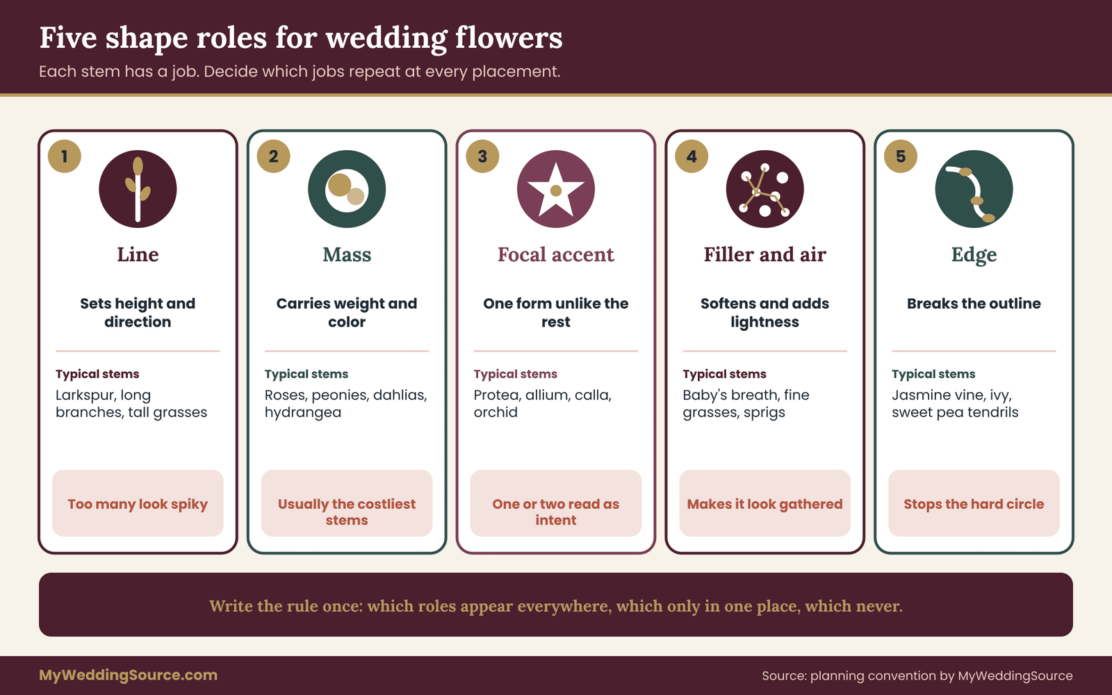
This guide uses five shape roles for floral art direction. They are a planning convention, not an industry standard, so feel free to rename them. What matters is that each one describes a job a stem does inside an arrangement.
The five shape roles
Line. A line stem sets direction and height. Think of a stalk of larkspur, a long branch, a stem of foxglove or a tall grass. Line stems pull the eye up or across, and they give an arrangement its outline. Too many lines make a piece look spiky and nervous. Too few make it look like a lump.
Mass. A mass stem is a large, rounded, solid form, such as a rose, a peony, a dahlia or a hydrangea head. Mass stems carry weight and color. They are the stems that read from across a room, and they usually account for most of the cost.
Focal accent. An accent is a form that is unlike everything around it and therefore draws a glance: a protea, an allium sphere, a calla lily, an orchid spray. One or two accents in an arrangement look intentional. Five look like a collection.
Filler and air. Filler stems fill gaps and soften transitions, and “air” stems, such as baby’s breath, fine grasses and thin sprigs, add lightness and movement. Air is what makes an arrangement look gathered rather than built.
Edge. Edge stems finish the outline. They trail, droop or spill, such as jasmine vine, ivy, sweet pea tendrils or hanging amaranthus. An edge stem breaks the silhouette so a mass of blooms does not end in a hard circle.
Choosing a mix of roles
The point is not to use all five everywhere. The point is to decide, once, which roles your wedding uses and which it avoids, and then repeat that decision at every placement.
A garden-style wedding might use line, mass, air and edge in every arrangement and skip focal accents entirely, so nothing feels staged. A modern, sculptural wedding might use one line and one accent only, with no filler, so each stem is clearly visible. A traditional ceremony might lean on mass and filler, with a single line stem for height and no trailing edge.
Write the choice as a sentence, because a floral art direction rule that can be spoken can be checked: “Every placement has an airy line and a trailing edge; mass appears in the bouquet and the head table only; accents appear nowhere.” That sentence is a shape rule. It can be checked, and it can be explained to a rental company or a cousin who is helping set up.
Repetition and variation
In floral art direction, repeating one shape role across placements is what makes separate arrangements feel related. If every piece, from boutonniere to ceremony arrangement, includes the same airy line stem, guests will register a pattern even if they cannot say what it is.
Variation keeps the repetition from becoming dull. Change the scale, the quantity or the position of the repeated role. The airy line might be a single stem in a boutonniere, a loose handful in the bouquet and a tall, branching cluster at the ceremony. The shape is the same idea at different sizes, which is how art directors keep a body of work coherent, and it is the center of floral art direction at wedding scale.
A useful test is to cover the colors with your hand and look at the silhouettes in your reference photos. If the outlines all look alike, the design feels unified. If they have nothing in common, it will read as several separate styles, no matter how well the colors match.
Scale and proportion in a room
Shape is also relative to space. An arrangement that looks right on a studio table can vanish in a high-ceilinged hall or crowd a small restaurant. When you set the shape vocabulary of your floral art direction, add the dimensions it must respect: ceiling height, table width, aisle width, how tall guests can stand before they block a sight line.
Table height deserves its own check. Many couples want low arrangements so guests can talk across the table, or very tall ones that lift above eye level. The middle height is the difficult one because it blocks faces. Your reception guest flow planning is a good companion here, since sight lines and service paths affect what height works. If you are unsure about measurements, the venue technical walkthrough guide covers how to record ceiling heights, door widths and access routes before decisions are made.
Photographs flatten shape
Cameras compress depth. A deeply layered arrangement that has a lovely three-dimensional structure in person can look like a flat blob in a photograph if the layers share a color. Strong silhouettes survive that flattening, which is one reason line and edge stems matter in photographs: they break up the outline so the shape still reads in two dimensions.
If you have a photographer, ask them about the angles from which they will shoot the ceremony piece and the bouquet. A piece viewed mostly from the front needs a strong front face. A piece that guests will walk around, such as a table centerpiece, needs an outline that works from every side.
Texture: surface, density and how it reads in photos
Texture is what separates a design that looks flat from one that looks rich, and it is a quiet half of floral art direction. It is also the relationship couples most often leave out of the conversation, because texture is hard to see on a small image on a screen. A bouquet of cream roses, cream ranunculus and cream lisianthus can have the same color throughout and still look layered, because each flower has a different surface.
Two kinds of texture
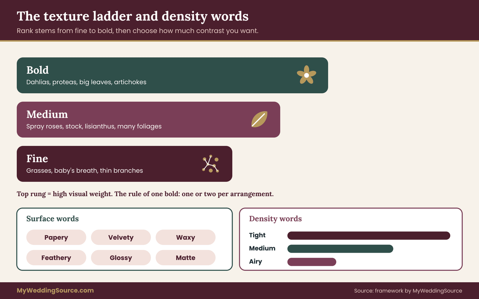
It helps to separate two things that share the word. Surface texture is the feel and look of an individual petal or leaf: velvety, waxy, papery, feathery, glossy, matte, ruffled, smooth. Density texture is how closely stems are packed together: tight and domed, open and airy, layered with gaps. A bouquet can combine a smooth surface with a dense arrangement, or a rough surface with an airy one, and each combination reads differently.
Surface texture responds to light. A glossy leaf, such as magnolia or camellia, throws back highlights, and a velvety petal, such as a rose or a ranunculus, absorbs light and looks soft. An outdoor ceremony in direct sun treats these surfaces very differently from a candlelit dinner, and a single design may look quite different in both.
The texture ladder
The brief introduced a texture ladder with three rungs. Here is how to build one for your floral art direction.
List the stems in your reference images and rank them from finest to boldest. Fine stems have small parts and visible gaps: grasses, baby’s breath, thin branches, small-flowered herbs. Medium stems are the working middle: spray roses, stock, lisianthus, many foliages. Bold stems have large parts and strong surface character: dahlias, proteas, big leaves such as monstera, artichokes and dried seed heads.
Then decide how much contrast between rungs you want. A low-contrast design draws mostly from adjacent rungs and looks calm. A high-contrast design pairs fine and bold stems directly, and looks dramatic. Neither is better; the choice belongs in your floral art direction brief. The common mistake is to want drama and choose only medium stems, which produces a pleasant but forgettable result.
The rule of one bold
A useful drafting rule is to limit each arrangement to one bold rung element, or at most two, and let the other stems serve it. A large dahlia reads as bold because it is surrounded by quieter forms. Put five dahlias together and none of them is bold anymore, because there is no contrast left for any of them to stand out against.
This is a drafting rule, not a law. Some of the most striking designs ignore it. But as a starting point it helps a couple decide where to spend money, because bold stems tend to be the most expensive and the most fragile.
Surface and finish: matte, glossy, papery, soft
Finish deserves its own line in the floral art direction brief. Many couples like the look of matte, papery and dried materials such as statice, bunny tail grass, dried palms and strawflower. Others prefer the dewy, waxy look of fresh tulips, hellebores and calla lilies. Mixing a papery surface with a soft one is one of the most reliable ways to add richness without adding color.
Be aware of finish traps as well. Glitter, paint, dye and high-gloss sprays on stems change the surface, and they also change what happens at the end of the event, because treated materials may not be accepted for composting or donation. Ask your florist what happens to treated stems afterward before you commit to them.
Density: how full is full
Density is where budget and style meet in floral art direction. A tightly packed arrangement uses many stems and costs more. An airy arrangement with visible gaps uses fewer stems and relies on structure and air. Neither is more correct, and the look they produce is very different.
Choose a density word for each placement and write it into the floral art direction brief: tight, medium or airy. A bouquet might be medium, a ceremony piece airy and a head table tight. This keeps the design coherent while letting you spend where the camera and the guests will look.
Texture in photographs and in person
Texture shows up differently in photographs than in a room. Fine texture, such as the speckles on a grass seed head, may vanish in a photograph taken at a distance, while it is a delight in person at arm’s length. Bold texture reads at every distance. If photographs are a high priority, make sure the bold and medium rungs carry the design, and treat fine texture as a bonus for guests in the room.
A good way to test your choices is the three-distance check. Look at a mockup or a reference image at arm’s length, at about ten feet and as a small phone-sized image. Note what survives at each distance. Anything that disappears at ten feet is a detail for close viewers. Anything that disappears on the phone image is a detail your photographs may not record.
Color relationships: proportion, temperature and contrast
Color is the relationship couples think they have already solved, because they have a palette. A palette is a starting list, not a relationship, and floral art direction begins where the list ends. “Blush, ivory, sage and gold” says nothing about how much of each appears, which one leads, or how bright the whole mix looks next to the venue’s walls and the bridesmaids’ dresses. Floral art direction turns the list into roles.
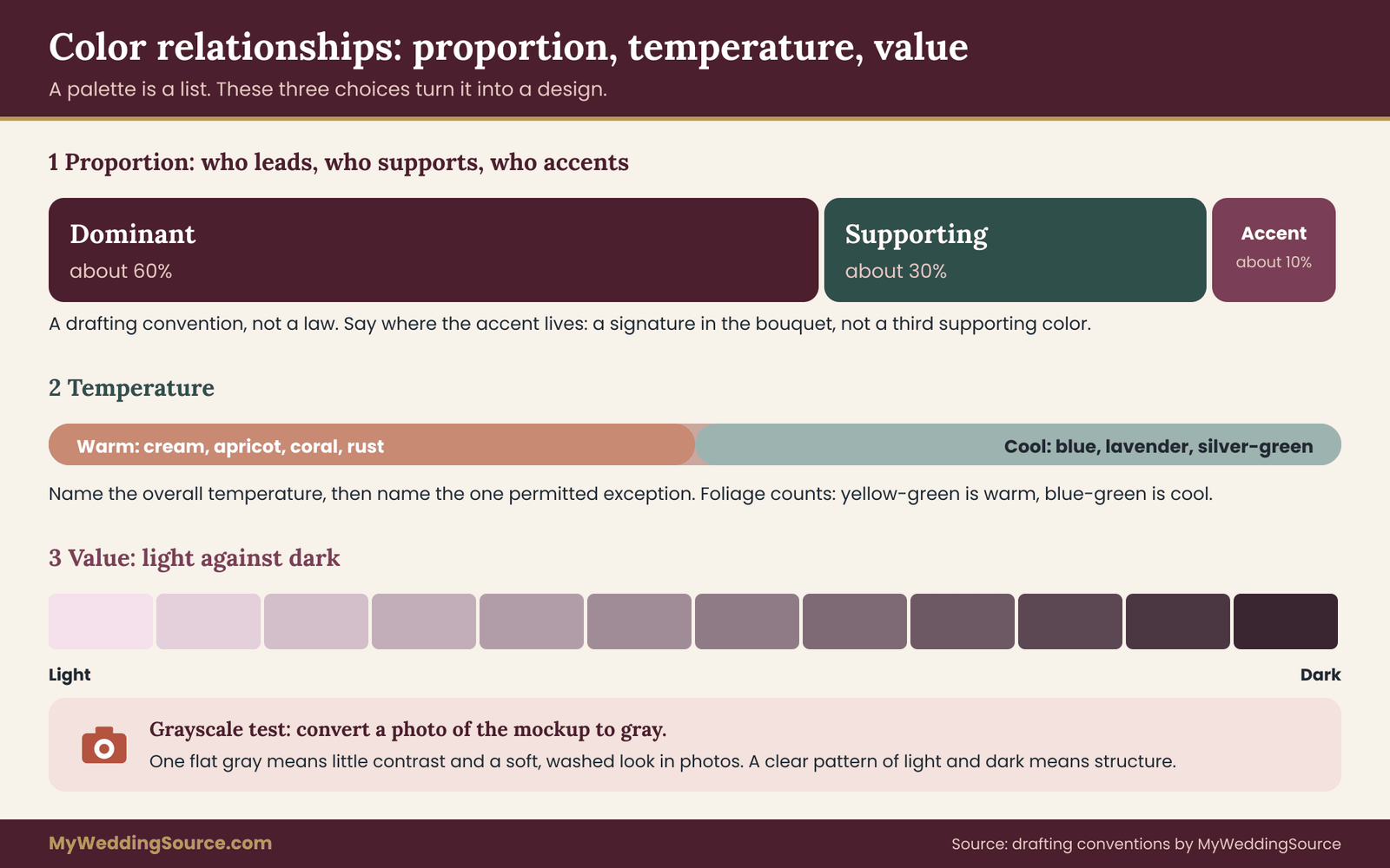
Dominant, supporting and accent
The simplest useful structure has three roles. The dominant color covers most of the visual area and sets the mood. The supporting color sits beside it at a smaller share and gives it company. The accent appears in small amounts and gives the eye somewhere to rest or land.
In floral art direction, designers often start from a rough split such as sixty, thirty and ten percent of the visible area. Treat those numbers as a drafting convention that has been passed around in design circles for a long time, not as a researched law of beauty. They are useful because they stop the most common failure, which is an arrangement in which three colors each hold a third of the space and compete for attention.
Write the roles into the brief by name: “Dominant warm cream, supporting muted apricot, accent deep plum.” Then say where the accent lives. An accent that appears only in the bouquet and the boutonnieres reads as a signature. An accent that is scattered evenly across every table reads as a third supporting color, and the hierarchy blurs.
Temperature
Warm colors, such as cream, apricot, coral, rust and burgundy, tend to feel inviting and close. Cool colors, such as blue, lavender, silvery green and bluish white, tend to feel calm and distant. Most weddings are a mixture, and the mixture is fine as long as it is chosen.
A helpful move is to name the overall temperature and then name the exception. “Overall warm, with one cool note from silver-green foliage” gives the florist a rule and a permitted departure. A design that drifts between warm and cool at random usually looks unplanned even when every individual color is pleasant.
Greens deserve their own attention. Foliage is part of the color design whether you plan it or not, and a yellow-green reads warm while a blue-green reads cool. The foliage a florist uses to fill out your arrangements can change the temperature of the whole piece, so say what you expect.
Value: light against dark
Value is how light or dark a color is, independent of its hue, and it is the relationship that floral art direction most often leaves unnamed. It is the most overlooked color relationship, and it often matters more than hue. Two pale pink flowers and a pale peach flower look related because their values are close. A single deep burgundy flower among pale ones creates a strong contrast no matter which hue it is.
Value contrast does three jobs. It creates depth, because darker tones recede and lighter ones advance. It makes shapes visible, because an outline needs a contrast to be seen. And it affects photographs, since black-and-white conversion and small phone screens both rely on value more than hue.
A quick test is to take a photograph of a mockup or reference image, switch it to grayscale and look at it. If everything turns into one flat gray, the design has little value contrast and may look soft or washed out in photographs. If you see a clear pattern of light and dark, the design has structure. Neither result is wrong, but you should know which one you are choosing.
Color and the setting
Flowers do not sit alone. They sit against walls, linens, dresses, suits, wood tables and outdoor light. A color that looks lovely on a white photography backdrop may disappear against a cream wall or clash with a patterned carpet.
Visit the venue, or ask for photographs of each placement, and decide which backgrounds your flowers will have. A pale bouquet against a pale dress needs darker greenery or a deeper accent to stay visible in photographs. A deep red arrangement against a dark wood wall may need lighter foliage. The broader shared palette for the rest of the day gives you the colors that flowers must sit beside, and your floral color roles should be consistent with it while still serving the flowers’ own needs.
Light matters too. Warm indoor lighting shifts white and cream toward yellow, cool daylight does the opposite, and colored uplighting changes everything. If the venue plans to use colored lights, tell your florist and ask about testing a sample under them.
Color traps to avoid
A few failures come up repeatedly. The first is the matched set, in which every flower is the same hue and value, and the design looks flat in photographs. The second is the rainbow, in which each color is distinct and equally strong, so there is no hierarchy. The third is a color that does not exist in a reliable fresh form in your season. Some blue, black and true green tones are rare or tinted, and tinted flowers have their own handling issues.
Ask your florist which colors are easy in your season and which are difficult or tinted. A quick conversation here saves a later compromise. Natural color variation is also real: two roses of the same named variety can differ slightly between batches, so build in tolerance and describe the look you want rather than a single paint chip.
The stem distribution mood board
The stem distribution mood board is the second artifact of floral art direction in this guide. If the floral art direction brief says what the design is, the board shows how many stems of each kind it takes to make it. It is a planning tool, not a precise recipe, and it is the part florists seem to appreciate most because it is already close to how they think.
Why a board of stems rather than a board of images
A normal mood board mixes images of whole arrangements. The problem is that a whole arrangement hides its parts. When you pin a lovely photograph, you do not know whether you are responding to the garden roses, the trailing jasmine, the color of the ribbon or the light in the room.
A stem distribution board breaks the image apart. For each inspiration image, you identify the stem families you actually like and give each a role. The result is a set of role cards. Each card has a stem family name, a picture, a shape role, a texture rung and a color role. The board then shows how those cards share the space in each placement.
Building the role cards
Begin with six to ten stem families, not forty. A design with a dozen different flowers is hard to repeat and expensive to source. Look at your reference images and your floral art direction brief, and choose the stem families that fit the guide words.
For each family, write one line: its shape role (line, mass, accent, air or edge), its texture rung (fine, medium or bold), its color role (dominant, supporting or accent) and one note on availability or handling. For example: “Spray roses: mass, medium, dominant, available most of the year.” “Scabiosa pods: air, fine, accent, seasonal.” The role card format is short enough to write in an evening and detailed enough to guide a florist.
If you do not know the names of stems, use the photographs and ask your florist to name them. A florist can look at a folder and tell you quickly which flowers appear in it and which look like stand-ins for something else.
Assigning shares
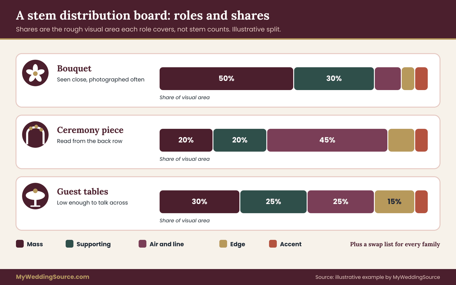
Now give each family a rough share of the visual area at each placement. Use simple fractions such as half, a third, a quarter or a tenth rather than precise percentages. Shares describe the visual area a stem family covers, not the stem count. A few large dahlias can take as much visual area as dozens of small filler stems.
A starting split for many bouquets is a dominant mass family at about half, a supporting family at about a third, and the remainder shared between air, edge and one accent. That is a drafting convention and nothing more. A sculptural single-stem design has no shares to divide, while a loose garden design may have five families at nearly equal weight and rely on their contrasts for interest.
The shares are most useful when they differ by placement. The bouquet might be mass-heavy because it is seen close and photographed often. The ceremony piece might be line- and air-heavy because it must read from the back row and survive wind. The tables might be low and dense, or airy and tall, depending on the room. The board shows these differences in one place so you can see whether the repetition is working.
The swap list
The last part of the board is the swap list, and it is where this floral art direction method pays off most clearly. For each stem family, list one or two substitutes that play the same role: same shape role, same texture rung, same color role, close in size. If garden roses are unavailable in your wedding week, the swap list says that a spray rose or a ranunculus is acceptable, because those play the mass role in the medium rung with a similar color.
In floral art direction a swap list changes the conversation about substitutions from an anxious one into a routine one. Your florist is already likely to substitute when supply changes, and a written list means the substitution follows your rules rather than their judgment alone. The contract side of this is covered in the wedding vendor contract guide, which explains how to get substitution terms written down, and you can attach your swap list to that agreement.
How many families is too many
Repeating a family across placements is what makes floral art direction coherent. Six to eight families is a workable ceiling for most weddings. Every family beyond that adds sourcing complexity, increases the chance of an unavailable stem and makes the repetition harder to see.
If your board has fifteen families, look for pairs that play the same role and merge them. Two similar white mass flowers can usually be reduced to one. Two kinds of trailing greenery can often be reduced to one. The goal is not to remove richness. It is to concentrate it so that the repetition becomes the design.
Using the board with a budget
The board makes budget conversations easier because you can see where the cost lies. Mass stems in large sizes are usually the most expensive part of an arrangement, line stems are in the middle, and air and filler are the least costly. If a quote comes in over your range, you can reduce the share of the most expensive family, replace it with a swap, or reduce the number of placements that use it.
This is better than cutting at random. Reducing every arrangement by a little often hurts the design everywhere. Cutting an entire placement or lowering the mass share in one place usually leaves the rest intact. The wedding budget guide covers how to set the overall flower line, and the board tells you how to spend inside it.
Applying floral art direction to bouquets, ceremony and tables
A brief and a board are only useful if they change what is built, and that is the test of any floral art direction. This section walks through the main placements in a wedding and shows how the same floral art direction produces different arrangements in each. The principle is repetition with variation: the same shape roles, texture rungs and color roles appear everywhere, at different scales and in different mixes.
The bouquet and personal flowers
In floral art direction the bouquet is the placement most seen in photographs and the one held closest, so it carries the most detail. It can use the full range of your board, including the fine texture and small accents that would disappear at a distance. It is also the placement where weight and handling matter, since someone has to hold it for a long time. Stem construction and hand comfort are practical questions to settle with the florist before the design is finalized.
Boutonnieres and corsages are small, so they work best as a quotation of the bouquet rather than a copy. Pick one mass or accent stem, one air or line element and a touch of the supporting color. If the bouquet has a trailing edge, a tiny trailing element in the boutonniere carries the repetition. A boutonniere that includes all five roles looks crowded because there is no room for contrast at that size.
Personal flowers for family members and the wedding party are where color roles do much of the work. The wedding party might carry the dominant color without the accent, so the couple’s flowers are the only place the accent appears. That creates a simple hierarchy that guests can read without thinking about it.
The ceremony focal point
The ceremony focal point in your floral art direction, whether an arch, a pair of urns, a floral wall or a few standing pieces, is seen from a distance and from the front. It relies on silhouette and color value more than on fine texture. This is where line and air stems earn their place, because they give height and an outline that photographs well.
Scale is the main challenge. A piece that looks full on a studio table can look thin in a large outdoor space. Think in terms of the visible area from the back row. If the arrangement covers a small fraction of what guests see, add mass at a lower level, extend the width or reduce the competing background. Check dimensions with the venue and, for installations that are anchored or hung, read your venue’s rules on rigging and load first. A venue walkthrough is the time to measure.
Wind and heat reshape outdoor ceremony pieces quickly. Fine, feathery stems move in wind, which can be lovely or distracting, and delicate blooms wilt in direct sun. If your floral art direction leans on fragile stems, plan a fallback for the ceremony such as a shaded position, a later install time or a swap to hardier stems from the swap list.
Reception tables
Under any floral art direction, table arrangements are the most numerous placement and the one where repetition is the most visible. They are also where budget goes quickly, since every table multiplies the cost. A directed approach helps: pick one table formula and vary it deliberately.
A formula might be: one container, one mass family, one air stem, one trailing edge. The variation might be height (three heights across the room), container size or the quantity of stems. The formula repeats, and the variation prevents the room from looking like a catalog. If your tables have different shapes, such as round guest tables and a long head table, the formula still applies, and the long table can use a linear version of the same ingredients.
Think about what else lives on the table: candles, menus, place cards, plates, glasses, signage, food and serving pieces. A flower arrangement that is lovely on its own can leave no room for dinner. The wedding reception guest flow guide covers how service paths and sight lines affect what a table can hold. Measure the table, and set a width and height limit in the brief.
Cake flowers and small details
Cake flowers are an excellent test of whether your design is consistent, because they are a small, high-visibility piece that must also be food-safe. Fresh flowers placed on or near a cake need careful choices, since some plants are unsuitable for contact with food.
Ask the baker which flowers they use and how they handle stems, and confirm any edible claim with the issuing source. The Food and Drug Administration publishes general food safety information, and your baker and florist should coordinate directly on which stems are safe near food.
Other small details include cocktail flowers, place-setting flowers, powder room arrangements, a welcome table and a memorial or photo display. These are good places to use a single stem family from your board, in a small quantity, as a quiet reminder of the whole design. They give the effect of consistent floral art direction without a large cost, which suits modest budgets.
Moving flowers between spaces
Many weddings use the ceremony flowers again at the reception, or move arrangements from one room to another. A piece that was designed for the front of a ceremony space may not suit a reception table. If reuse is part of your plan, tell your florist at the start, since it changes how arrangements are built, how they are anchored and what water source they use.
Moving flowers also takes labor and a plan. Who will move the arrangement, when, and where will it go? Without an answer, flowers get left at the ceremony site. The answer can be as simple as naming a person in the day-of schedule and listing the pieces and their destinations, which the florist can set up with labels.
Keeping the vocabulary consistent between placements
After you decide each placement, lay the descriptions side by side and check three things. Do the same shape roles repeat? Do the same texture rungs appear? Do the same color roles appear in the same proportions, or deliberately different ones for a reason you can state?
If one placement stands apart, ask why. Sometimes the answer is good: a large ceremony installation can legitimately use more air than a bouquet. Sometimes the answer is that a different florist or a different family member designed that piece, and it needs an adjustment. A short side-by-side check is the simplest way to catch drift before it is built.
A worked example of one formula across placements
Consider an invented wedding whose brief says loose, layered and soft-edged, with dominant cream, supporting apricot and a single plum accent. The shape rule is an airy line and a trailing edge at every placement, with mass only in the bouquet and at the head table.
The bouquet carries a round mass of cream garden-style roses at about half the visual area, apricot spray roses and ranunculus at about a third, and the remainder split among a few wispy line stems, a trailing vine and two plum accent blooms. The boutonnieres quote that with one spray rose, a wisp of the airy stem and a tiny trailing leaf.
The ceremony piece drops the mass nearly entirely, using tall airy stems, apricot in the supporting position and the same trailing vine along the base. The tables use a low container with three heights of the airy line stem, a small cluster of cream mass at the head table only, and the plum accent in one stem per table. Cake flowers use only the spray rose and the airy stem.
Each placement is different, and each is recognizably part of the same design. That is what floral art direction is meant to produce. If you were to remove the color, the silhouettes would still match. If you were to remove the silhouettes, the color roles would still match. The relationships hold the design together even when the details change, and a swapped stem from the list does not break it.
Three illustrative cases of floral art direction
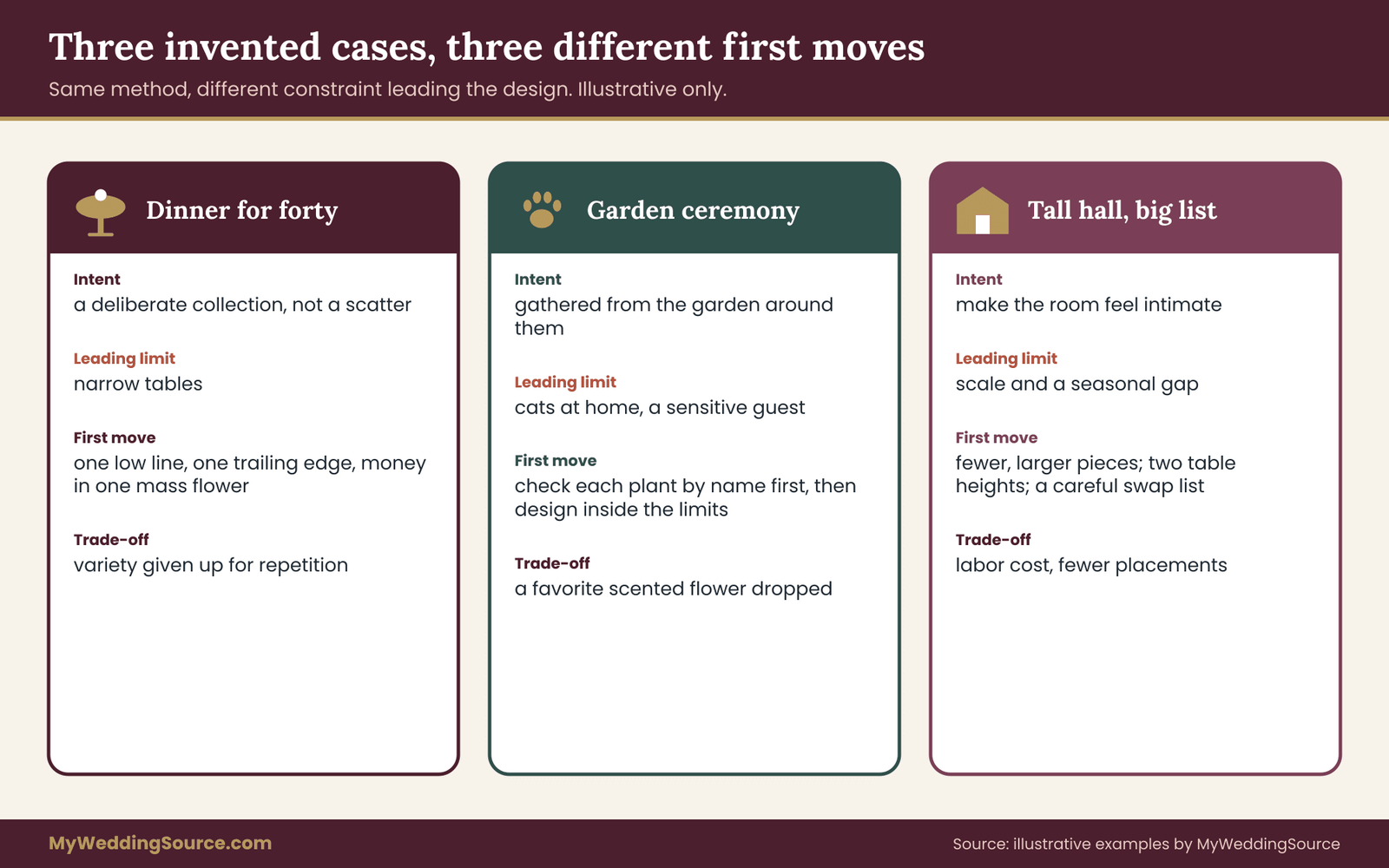
The cases below are invented. They are not reports of real weddings or real results, and none of the prices, quantities or outcomes should be read as typical. Their purpose is to show how the same floral art direction method produces different decisions when the constraints differ. Each one follows the same sequence: the intent, the limit that matters most, the decisions on shape, texture and color, the board, and the trade-off the couple accepted.
Case one: a dinner for forty with a small flower line
An invented couple, Dana and Priya, is hosting a seated dinner for forty in a restaurant’s private room. Their flower budget is small, the room has long narrow tables, and the restaurant asks that nothing block the servers or the sight lines across the table.
Their intent sentence is: the flowers should look like a deliberate collection, not a scatter. Guide words in: restrained, repeated, low. Out: tall, fussy, mixed. The limit that matters most is table width, since the restaurant’s tables leave little room beyond plates and glasses.
Decisions on shape: one role dominates, a loose line of low stems running down the center, with a trailing edge at the ends of each table. No focal accents. Texture: two rungs only, medium and fine, so the line looks soft. Color: dominant cream, supporting pale green from foliage, and one accent of a deeper rose-pink at the head of each table.
The board has four stem families: a medium cream mass flower for the base, a fine airy stem for movement, a trailing green and a short pink accent. Shares are simple: about half cream, a third green, the rest airy stems and the pink accent. The couple’s bouquet uses the same four families in a small round shape, with the pink accent slightly more visible.
The trade-off: they gave up variety and surprise to afford repetition. The result, in the way the method predicts, is a room that reads as intended because every table matches in structure, and the money is concentrated in one mass flower, bought in quantity and used in many places. Their swap list names one alternative mass flower in case supply changes.
Case two: a garden ceremony with pets and a sensitive guest
Invented couple Marcus and Elena have an outdoor garden ceremony, a reception in a tent and a getting-ready day at a home where two cats live. Elena’s aunt has told them she reacts strongly to some flowers, and she will sit near the front.
The intent is: flowers that look gathered from the garden around them. Guide words in: loose, seasonal, layered. Out: scented, formal, heavy. Because this couple has two hard safety limits, the first step is not design at all. They list the limits and check them against an authoritative source.
The ASPCA publishes lists of plants that are toxic or non-toxic to cats, dogs and horses, and lilies are among the plants it flags as dangerous to cats. They decide that no lilies will enter the home, the getting-ready location or the car, and the florist agrees to build bouquets elsewhere and deliver them to the venue.
For the aunt, they ask her which flowers cause trouble rather than guessing, and they ask the florist to avoid strongly scented stems near the front rows and to confirm what is in each placement. They do not make medical claims about which flowers are safe for allergic people, since reactions vary. They suggest the aunt ask her own clinician if she wants guidance.
Their shape and texture rules are generous: airy lines, trailing edges, one mass family in the bouquet, and fine-to-medium texture with one bold element per arrangement. Color: dominant soft green and cream, supporting dusty blue-lavender from spring flowers and an accent of white. The board lists seven stem families, each with a cat-safety check next to its name and a swap.
The trade-off: they gave up a favorite flower and a fragrant aisle. In return they removed a worry. The brief shows the limits first, so every later design choice was made inside them.
Case three: a tall hall and a large guest list
Invented couple Tomas and Keisha are holding a ceremony and reception for about one hundred and fifty guests in a hall with a very high ceiling. They want a dramatic ceremony backdrop and tables that feel luxurious without being crowded.
Intent: flowers that make the room feel intimate without hiding it. Guide words in: sculptural, generous, calm. Out: scattered, twee, matched. The limit that matters most is scale, since a room this size swallows ordinary arrangements. They also have a seasonal limit, since their date falls at the edge of a season for their preferred bloom.
Shape decisions: the ceremony piece is built around mass and line, with a wide base and tall branches that use the height. Tables alternate between two heights, one tall and slim above eye level and one low and wide, so guests can see each other across the table. Texture: strong contrast, fine airy stems beside a few bold ones, because contrast reads at a distance. Color: a dominant deep tone with a pale supporting tone, giving strong value contrast so the arrangements remain readable in a large space.
The board uses six stem families with a careful swap list because the key bloom is at risk. Shares differ sharply by placement, with the ceremony piece mass-heavy at its base and line-heavy above. The couple read the venue rules on rigging and anchoring before deciding, and they included the venue contact in the floral art direction brief as the approver for any installation.
The trade-off: the tall pieces cost more in labor and structure, so they reduced the number of placements and spent more on the ceremony and head table. The alternate-height tables reduced the number of large arrangements required.
What the three cases have in common
In all three, the couple settled their floral art direction before they chose flowers. In all three, a hard constraint came first and shaped the design instead of fighting it. In all three, the board had fewer stem families than the inspiration folder, and each family had a role and a substitute.
None of the cases required special knowledge. They required writing things down in an order that moved from intent to limits to relationships to stems. That order is the method.
An option matrix in plain prose
Floral art direction starts from a decision about approach. It helps to see three common approaches side by side. They are described in prose here rather than as a grid, because the right choice depends on how the three interact with your constraints.
Approach one: single-family restraint
This approach to floral art direction uses one or two stem families across the whole wedding, in different quantities and sizes. Its strength is repetition. It is easy to brief, easy to source and easy to repeat across placements, and it concentrates budget in a small number of stems that can be bought in volume.
Its risk is availability: if the one flower is unavailable or priced unusually in your week, the whole design is exposed. A strong swap list reduces that risk, and a florist can often suggest a close alternative.
It suits small weddings, tight budgets, formal or modern styles and couples who like quiet, deliberate looks. It is less suited to a very large room, where a single family can look thin, or to couples who love variety.
Approach two: layered garden mix
This approach uses six to eight families in varied roles, with line, mass, air and edge present in most placements. Its strength is richness. It reads as abundant and natural, and it absorbs substitutions well because many families share roles. Its risk is cost and drift: with many families, small changes add up, and without a board the design can become a collection.
It suits couples who like loose, seasonal looks, outdoor settings and styles that tolerate variation. It rewards a strong swap list and a clear shape rule, since those keep the mix from turning random.
Approach three: installation-led design
This approach to floral art direction concentrates budget and attention in a small number of large installations, such as a ceremony arch, a hanging piece or a floral wall, and keeps everything else simple. Its strength is impact at a few key moments, and it photographs very well. Its risks are labor, structure, venue permission and what happens afterward. Large installations need anchoring and rigging, and they may need venue approval, extra time for setup and a plan for removal or reuse.
It suits large rooms, couples who care most about the ceremony or a single photographic moment, and venues that already provide a strong structure. It is less suited to venues with strict rules on installation, or budgets that cannot absorb labor costs.
Choosing between approaches
You can combine approaches, and many weddings do. A common mix is installation-led at the ceremony, layered garden mix in the bouquet and single-family restraint on the tables. The brief allows this as long as the shape, texture and color relationships stay consistent, because those relationships, not the approach, tie the design together.
A simple decision rule helps with floral art direction. If your biggest worry is cost, start from single-family restraint and add. If your biggest worry is monotony, start from a layered mix and prune. If your biggest worry is the ceremony photograph, start from an installation and simplify everything else.
Constraints that reshape floral art direction: season, safety, venue and budget
Every design, and every floral art direction brief, lives inside limits. The most reliable way to keep a beautiful plan from collapsing is to check the limits before you fall in love with specific flowers. This section covers the constraints that change a design most often and says where to check each one. None of it is a substitute for a plant-specific check with the right source.
Season and availability
Availability is the limit that surprises couples most. A flower that looks ordinary in a photograph may be seasonal, imported or both, and its price and quality can change a great deal across the year. Peonies, sweet peas, dahlias, ranunculus and many foliages have defined seasons in many regions, while roses are available widely but vary in size, scent and cost.
Ask your florist which of your board’s stem families are reliable in your month and which are at risk. Your swap list is the tool for the risky ones. Where flowers travel from far away, the cut-flower trade involves inspection of imported plant material for pests, which is overseen in the United States by the Animal and Plant Health Inspection Service of the U.S. Department of Agriculture. You do not need to manage that process, but delays at the border are one reason a florist may substitute late.
Local and in-season sourcing can reduce travel, but it does not guarantee better availability for a specific date. A weather event can affect local growers as quickly as it affects distant ones. If local sourcing is part of your intent, ask the florist who the growers are and what the backup plan is if a crop fails.
Plant safety around pets, children and food
Plant safety is a limit that should be checked against a specific plant by name. Many common wedding flowers are harmful if eaten by pets or small children, and the severity varies a great deal between species.
The ASPCA maintains a searchable list of plants that are toxic or non-toxic to cats, dogs and horses, and the Poison Control network in the United States answers questions about plant exposures. Use these as your first check, and do not rely on a florist’s memory alone or on a general rule such as “all white flowers are safe.”
Common sense steps help. If animals live where flowers will be stored, built or gathered, list that in the limits section and name the stems to avoid. Keep arrangements out of reach, and have a plan for guests’ pets or ring bearers’ dogs if animals attend the ceremony. If a child may chew a stem, treat that as a safety question and check the plant.
Food contact is a separate question. Flowers on a cake or in a drink are not automatically edible, and a flower sold for decoration may have been treated with chemicals that are not meant for food. The Food and Drug Administration publishes food safety information, and your caterer or baker is responsible for what touches the food they serve. Do not guess. Ask them what they use, where they get it and how they handle it, and keep the answer in writing.
Allergies and scent
Allergic reactions to flowers are individual. Some people react to pollen, some to strong scent, some to contact with sap or leaves, and some to nothing at all. A flower that bothers one guest may not affect another, and no list of “safe” flowers fits everyone.
The practical approach is to ask. If you know a guest or a member of the wedding party has a reaction, ask what triggers it, and ask them to consult their own clinician if they want a medical opinion. The Centers for Disease Control and Prevention publishes general information about allergies.
Then tell your florist the specific concern, such as “avoid strongly scented flowers near the front row” or “no lilies at the head table because pollen stains clothing and some guests react to it.” Florists can often remove pollen-bearing parts from certain flowers and choose lower-scent varieties, and you can place the arrangements farther from sensitive guests.
Do not promise guests that your flowers are hypoallergenic. You cannot know that for every guest, and the claim is easy to get wrong. A clear note in the brief about what you did, such as “no strongly scented stems in the ceremony,” is more honest and more useful.
Venue rules
Venues have rules that change designs. Common ones include limits on open flame, restrictions on water on floors, rules about nails, tape and adhesives on walls and furniture, load limits on ceilings and beams, restrictions on petals and confetti, and required times for delivery and removal. Public spaces such as parks may have permit conditions for decorations and installations, and the National Park Service publishes information about special events in the areas it manages.
Put the venue contact in the floral art direction brief as the approver for any installation, and ask for the rules in writing. Walk the space with your florist if possible. A florist who has seen the ceiling, the floor and the loading route can design around them, while one who has not seen them will be surprised. Record those measurements before design begins.
Budget
In floral art direction, budget is a constraint, and it also teaches. A budget range for flowers is more useful than a single number, because it lets a florist propose a version at the low end and ideas for the high end. Be honest about what is fixed and what has room.
The board helps with budget in the way described earlier: you know which family is the most expensive and which placements could be reduced without harming the whole. Compare quotes on the same basis. If one florist quotes a design with many stems and another with few, you are comparing different designs, not different prices.
Ask each for a breakdown by placement, and use your board shares to see whether the designs match. The wedding vendor due diligence checklist is useful for the questions to ask before you commit to a vendor.
Do not treat a price as proof of quality or of fit. A costly design can fail your floral art direction brief, and a modest one can follow it exactly.
Sustainability claims
If environmental choices matter to you, be careful with labels. Terms such as “sustainable,” “eco-friendly,” “local” and “pesticide-free” are often used loosely. The Federal Trade Commission publishes guidance on environmental marketing claims, and its general principle is that a claim should be truthful and not misleading. Ask a florist what a term means in their business and what they can show. Does “local” mean grown within a certain distance, or bought from a local wholesaler who imports? Does “organic” refer to a certification or a practice?
Floral foam is a frequent topic. Many florists have moved to mechanical supports such as chicken wire, pin frogs and reusable structures. If you prefer to avoid foam, say so in the limits section. Your waste reduction planning work can also guide what happens to flowers after the event, and the brief is the place to record that choice so your florist builds with it in mind.
Wild-collected and protected plants
Some plants, including certain orchids, are protected under international trade rules, and the U.S. Fish and Wildlife Service publishes information about wildlife and plant trade. For most weddings this will never come up. It matters if you are asked to bring in exotic or wild-collected material, or if a decorator offers something unusual. Ask where it came from and whether any permits apply. Foraging from roadsides, public parks or private land without permission is a separate problem, and the answer is usually to ask the landowner or manager.
Handling, heat and travel
The last practical limit on floral art direction is how flowers behave. Most fresh stems need water, shade and moderate temperature, and some are far more fragile than others. Heat shortens the life of delicate blooms, and long delays between building and display shorten it further. Ask your florist how each family on your board handles heat, transport and a long day, and mark the fragile ones in the role cards.
If the ceremony is outdoors in warm weather, treat fragile stems as candidates for a different placement or a different time. If the arrangement will travel in a car, treat that as a limit on size and structure. These are not obstacles to the design. They are inputs to it, and they belong on the page before anyone starts building.
Putting the limits on the page
Return to the limits section of your floral art direction brief and review each line. For every limit, you should be able to answer three questions. Who confirmed it? Where is that written down? Which part of the design does it change?
If the answer to the second question is “in my head,” write it down. If the answer to the third is “nothing,” ask whether the limit is real or the design is ignoring it. A limit that affects nothing is either unimportant or unnoticed, and it is worth finding out which.
Briefing the florist and approving mockups
A brief is only as good as the conversation it starts, and floral art direction is a conversation before it is a document. This section covers how to hand floral art direction to a florist, what to ask for in return, and how to approve work in stages so that a surprise on the wedding day is unlikely.
What to send, and in what order
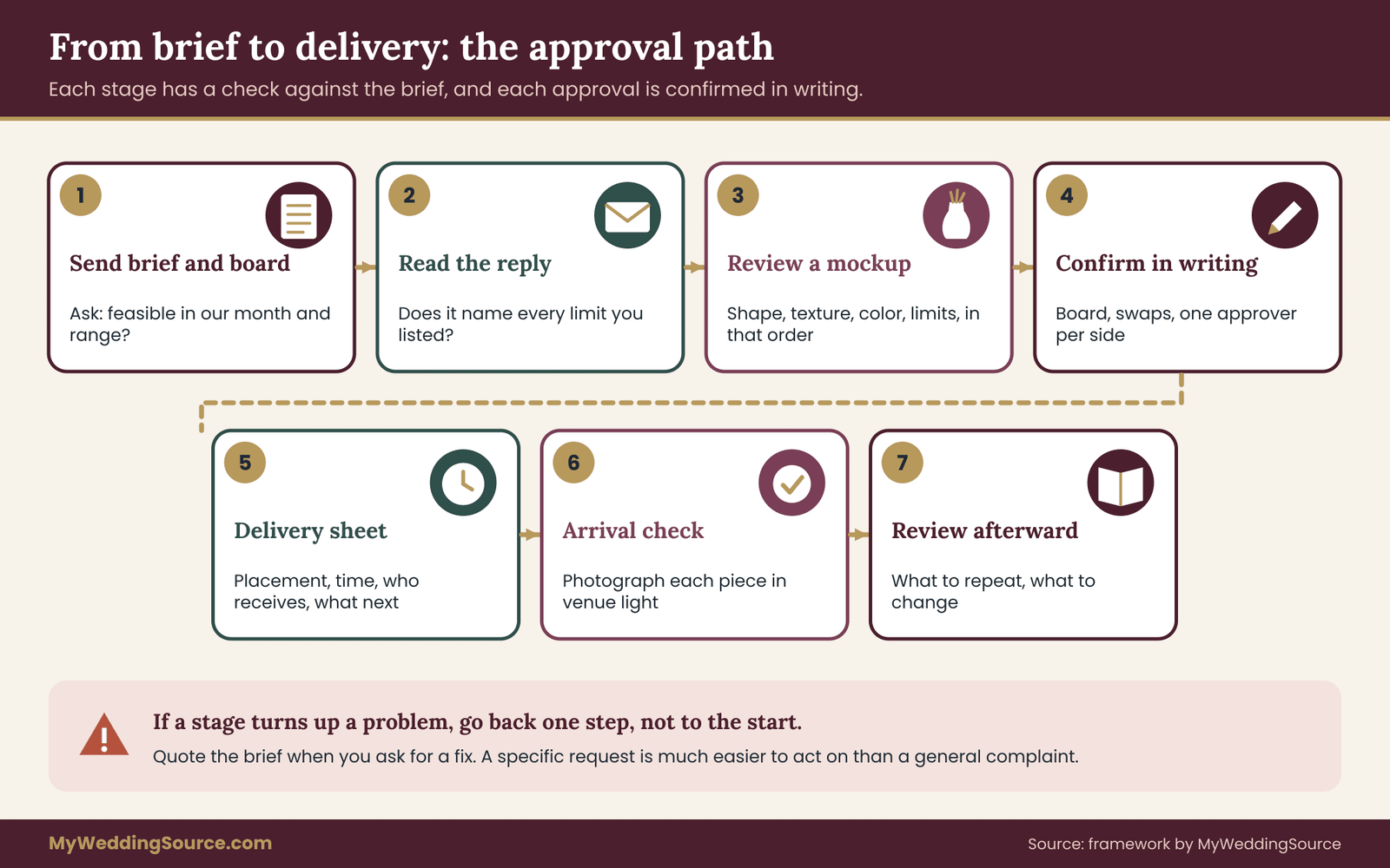
Send the one-page brief and the stem distribution board together, as the two halves of your floral art direction, with a short message that says what you want from the first reply. A good first message asks three things: whether the design is feasible in your month and budget range, which parts the florist would change and why, and what they would need to see or decide next. Avoid sending forty photographs with no explanation. The brief and board are the explanation.
Here is wording you can adapt: “We have written a one-page brief and a stem board so you can see what each flower is meant to do. Could you tell us which families are reliable in our month, which you would swap, and what you would change about the shares at each placement? Our budget range and venue limits are on the last page.”
Hold back from asking for a full quote at this stage. A florist can give a rough range from the floral art direction brief and board, and a detailed quote is better after you have agreed on the design.
How to listen to the florist’s reply
A good florist will push back on something. That is useful. If every line of the brief is accepted without comment, either the floral art direction brief is very simple or the florist is not reading it closely. Look for specific feedback: a stem that will not hold in your venue’s heat, a color that is tinted in your season, a shape that will not survive a car ride, or an unrealistic share.
When the florist suggests a change, ask what role the new stem plays. If it matches the role card for shape, texture and color, accept it and update the board. If it changes the role, discuss whether the design still works. This is the main benefit of having role cards: you can judge a suggestion on its job rather than its photograph.
Pay attention, too, to what the florist does not say. If you mention a constraint such as cats or a sensitive guest and the reply does not address it, ask again directly. A written reply that names the constraint is worth waiting for.
Mockups and samples in floral art direction
Where possible, ask for a mockup or a sample before the order is final. Some florists offer a trial bouquet or table piece, sometimes for a fee, and some will show a photographed sample of a similar piece. A mockup is the cheapest place to find a problem. It lets you test the three-distance check on a real arrangement, look at it in the light of your venue’s time of day, and compare it against the board.
When you see a mockup, review it in this order. First, shape: do the roles match the brief, and does the silhouette read? Second, texture: are the rungs and the density right? Third, color: are the proportions what you wrote, and does the value contrast work in a grayscale photo? Fourth, limits: does it respect the size, safety and venue notes?
Write your response in terms of the floral art direction brief, not the mood: “The trailing edge is too short for the table; the cream is more than half of the area, which matches our plan; the plum accent is hard to see in the grayscale photo.” That kind of feedback is specific enough to act on.
If a trial is not possible, ask for photographs of recent work that uses the same stems and a similar structure, and ask which parts of that work resemble your plan.
Approvals and change control
Treat each decision in floral art direction as a small approval. When you agree on the board, write a short message confirming it. When you accept a mockup, confirm which changes are required. When the florist proposes a late substitution, check it against the swap list and confirm in writing.
This is more than neatness. Disagreements about flowers are common precisely because “pretty” is not a measurable standard. A written chain of approvals, tied to the brief, gives both sides something to point at. A vendor agreement can include design documents, substitution terms and approval rights, and attaching your floral art direction brief and board to the contract makes them part of what you agreed to.
Name one person on each side who can approve changes, and agree on how quickly each will reply as the date approaches. A late change that waits for a decision from someone traveling is the kind of problem that written roles prevent.
Delivery day logistics
Write a short delivery sheet that lists each placement, its location, who receives it, when it arrives and who may touch it. Include the venue contact, the florist’s contact and a rough time for each setup step. Add a line for what happens to each piece afterward: move to the reception, donate, compost, return or leave for the venue.
Tell the florist about access limits that affect setup, such as loading dock hours, elevator reservations and parking. Without them, a perfectly designed arrangement can sit in a van while someone looks for the right door.
Reviewing the flowers on the day and afterward
The last stage of floral art direction is a review. It is short and it is easy to skip, and it is the step that makes the next decision easier, whether that is your own next event or advice you give a friend.
The arrival check
When the flowers arrive, compare each placement with the floral art direction brief and the board. You are not looking for perfection. You are looking for large departures that can still be corrected. Is a placement missing? Is the dominant color roughly what you wrote? Is there anything that violates a limit, such as a stem you asked to avoid, a piece that blocks a sight line or a container that is unstable?
Take photographs of each placement as it arrives, in the light where it will sit. These photographs are your record if a question comes up later, and they help you judge color in real light. Keep notes brief and factual.
If something is wrong, raise it with the person named in your approval chain at once, politely and specifically. Refer to the brief: “The tables were meant to have three heights, and these are all the same.” A calm, specific message is much more likely to get a fix than a general complaint.
Delegating the day
You should not be the person fixing flowers during your own wedding. Name a trusted person to receive the delivery, check it against the list and talk to the florist or venue contact. Give them a copy of the floral art direction brief, the board and the delivery sheet, along with phone numbers for the florist and the venue contact. That is all they need.
After the event
Within a few weeks, open the brief and your photographs side by side. Note what worked, what drifted and what nobody noticed. Pay particular attention to which shape role, texture rung or color relationship carried the design, and which parts of the floral art direction brief turned out not to matter. Two or three sentences are enough.
Decide what happens to the flowers. Donation, composting, reuse and preservation each have their own requirements, and they are easiest to arrange before the event. Keep the brief, the board, the approvals and the photographs with your other wedding documents. If you keep a file for vendor agreements, the final design documents belong in it.
What a good outcome looks like
A good floral art direction outcome is not perfection. It is a result where the main decisions were yours, the florist understood them, constraints were respected and surprises were small. You should be able to look at a placement and say what role each stem plays, and you should be able to tell a friend what you would repeat and what you would change.
Floral art direction is, at its best, a way of making fewer, clearer decisions. The stems change from wedding to wedding, and the three relationships carry over to every one.
Your next steps
Start this week with the intent sentence and the six guide words, and read them aloud to someone who has not seen your inspiration. If they can tell you what the flowers should look like, the sentence works. Then write the limits list, because it takes the least time and removes the most risk.
Next, choose the shape roles for your floral art direction, build a texture ladder and name your color roles. Build six to eight role cards, assign rough shares for the bouquet, the ceremony and the tables, and add a swap list.
Send the floral art direction brief and board to your florist with the three questions from the briefing section. Review each mockup against the brief, confirm approvals in writing and name one person to receive the delivery. Done in this order, floral art direction takes a few evenings and removes a great deal of guesswork.
FAQ
What is floral art direction for a wedding?
It is the practice of deciding the shapes, textures and color relationships of your flowers before ordering, so that the bouquet, ceremony pieces and tables look like one design. It is usually written as a short brief and a stem board that a florist can price, source and build from.
Do we need a florist to use this floral art direction method?
No, but the method is built for working with one. If you arrange flowers yourself, the floral art direction brief and board still help you buy fewer varieties and repeat them with purpose. If a florist is involved, they supply the technique and sourcing, while you supply the intent, the limits and the approvals.
How many types of flowers should a wedding use?
Six to eight stem families is a workable ceiling for most weddings. A single-family design is also valid. More than that adds sourcing risk and makes repetition harder to see. These numbers are planning guidelines, not standards, and a large venue or several events may justify a few more families.
What is a stem distribution mood board?
It is a board that breaks inspiration images into stem families. Each family gets a role card with a shape role, a texture rung, a color role and a substitute, and then a rough share of the visual area at each placement. It shows how much of each stem a design needs, not just how it looks.
How do we handle substitutions when a flower is unavailable?
List one or two substitutes for each family in advance, matching shape role, texture rung, color role and size. Ask your florist to confirm substitutions in writing against that list, and put the list in your contract or attach it. This turns a late surprise into a routine swap.
How do we check whether flowers are safe around pets?
Check each plant by name against the ASPCA’s toxic and non-toxic plant lists, and call a poison control service if an exposure happens. Lilies, for example, are flagged as dangerous to cats. Do not rely on color or general rules, and keep arrangements out of reach of animals and small children.
Can we promise guests that our flowers are allergy-friendly?
No. Reactions are individual and depend on pollen, scent, sap or contact, and no list suits every guest. Ask people with known sensitivities what affects them, share their concern with your florist, and consider placing strongly scented arrangements away from them. Suggest that they check with their own clinician for medical advice.
How do we review the flowers on the wedding day?
Name a trusted person to receive the delivery and compare each placement with your floral art direction brief and board, using a short delivery sheet. Photograph everything in the venue light, and raise any large departure at once with the approval contact. Keep notes factual and refer to the brief, so the fix is specific.
Sources
- ASPCA toxic and non-toxic plants
- Poison Control, America’s Poison Centers
- Federal Trade Commission, Green Guides and advertising guidance
- U.S. Food and Drug Administration, food safety information
- USDA Animal and Plant Health Inspection Service
- USDA Agricultural Marketing Service
- Centers for Disease Control and Prevention, allergy information
- National Park Service, special park uses and permits
- U.S. Fish and Wildlife Service, wildlife and plant trade
- U.S. Environmental Protection Agency, composting and food waste information