
A colored wedding dress is easiest to choose when you treat the shade as something you can test, not something you have to guess. This guide gives you a swatch proof: a way to match a candidate shade to your skin undertone, your fabric and the light you will actually stand in, so the dress you order looks the way you pictured it.
Pick three to five candidate shades, order fabric swatches in the real cloth of each dress, and compare them against your skin in four kinds of light: daylight by a window, open shade, warm indoor light and mixed venue light. Photograph each swatch beside your face and hands with the same phone settings, score the results on five plain criteria, and keep the shade that holds up in most lights. Then ask the seller, in writing, to supply the dress from the same dye lot as your approved swatch.
Most advice about a colored wedding dress starts with a trend report: blush this year, sage the next, a deep jewel tone after that. Trends are a fine source of ideas, but they say nothing about whether a particular green will make your skin look rested or tired at four in the afternoon. That question has a physical answer, and you can find it with a small amount of fabric, a window and a phone.
This guide is about that answer. It does not rank shades or tell you which color is in fashion. It walks through what a shade is made of, how to read your own undertone without false confidence, how to run the swatch proof, how fabric changes what a dye looks like, what to ask a seller before you pay, and what to do when the result is mixed. A worked example near the end shows the whole process with invented numbers, clearly labeled as an illustration.
A note on scope. This is general information, not legal, tax or financial advice, and garment construction, dye processes and return terms differ by designer and seller, so confirm the details with the people making and selling your dress. For fittings and tailoring after the order, the wedding dress fit and alterations guide covers the next stage.
Why a colored wedding dress is a shade decision, not a trend decision
A traditional white or ivory gown comes with a built-in safety net. Shops stock dozens of whites and ivories, stylists have a shared vocabulary for them, and almost everyone has seen a white dress in photographs, so the risks are well understood. A colored wedding dress removes that net. The range of possible shades is enormous, the names are inconsistent from one seller to the next, and the same dye can read as completely different colors depending on what it is dyed onto and what light falls on it.
That is why the usual starting point for a colored wedding dress, a mood board of dresses you like, can mislead you. Every photograph on a mood board has already been lit, edited and compressed by someone else. The color you are falling for is the color after a photographer’s choices, a screen’s calibration and a model’s complexion. When you transfer that color to your own body in your own venue, you are borrowing someone else’s conditions.
A shade decision asks a different set of questions. What is the color made of? How does it sit next to my skin, my hair and my eyes? What does it do in morning light, in evening light and under a ballroom’s mixed fixtures? What does the fabric add or take away? Is the dress I order going to match the sample I approved? Those are testable, and each can be answered before money changes hands.
There is also a quieter reason to prefer testing over trend. A trend shade is often sold in large quantities for one season and then replaced, which can complicate reordering a matching piece such as a veil, a sash or an alteration panel. A shade you have tested and documented gives you something specific to hold the seller to. If the finished dress arrives a clear step away from your approved swatch, you have evidence rather than a vague memory of a pretty photo.
None of this means you should ignore taste. If a dusty violet colored wedding dress makes you smile every time you see it, that matters more than any rule. The point of the swatch proof is narrower: it tells you which version of that violet to buy, how it will behave on the day, and what to ask the seller to put in writing.
The test also protects against a second common problem, which is deciding on a color first and the dress second. Couples often settle on a hue in the abstract, then discover that the silhouette they love is only offered in three of the colors they considered. Running the proof on actual fabrics from actual dresses keeps the color tied to a real garment.
If you are still deciding what the day itself looks like, the wedding color palette guide covers how to choose colors for flowers, linens and attendants, and this guide stays focused on the dress.
What a colored wedding dress shade is actually made of
When people say “sage” or “champagne” they are naming a region of color, not a single point in it. Four properties define where inside that region a particular fabric sits, and a fifth, the finish of the cloth, changes how those four are perceived. Learning the vocabulary makes the later steps much easier, because you can describe what you see instead of reaching for a color name.
Hue is the family of color: red, yellow, green, blue, violet and the blends between them. When you say a dress is green, you are naming a hue. Two greens can share a hue family and look nothing alike, because the other properties differ.
Value is how light or dark the color is. A pale sage and a deep forest green share a hue and differ mainly in value. Value is the property photographs preserve best, which is why a dark dress in a bright photo often looks nearly black and a pale one can wash out against a bright sky.
Saturation is how intense or muted the color is. A saturated coral is vivid and a grayed coral is soft and dusty. Wedding sellers often use words like “dusty,” “muted” and “antique” to describe low saturation. Low saturation tends to be forgiving in photographs, while high saturation can overpower skin tones and take over a frame.
Undertone is the cool or warm lean hidden inside a color. A pink can lean blue-ish and cool, or lean peach-ish and warm. Two pinks of identical value and saturation can feel completely different on the same person because of this lean. Undertone is the property people most often misjudge, and it is the one the swatch proof is built to expose.
Finish is how the surface of the cloth handles light. Satin reflects, crepe absorbs, tulle lets light through and layers of it, lace casts tiny shadows, and velvet changes color as the nap shifts. The same dye on two cloths can look like two different colors because the finish changes how much light reaches your eye.

Why does this matter for a colored wedding dress? Because each property can fail independently. A shade can have the right hue and value, but a saturation that overwhelms your complexion. It can have flattering saturation but an undertone that fights your skin. It can pass in the shop and fail in a photograph because the finish bounces light unevenly.
When you evaluate a colored wedding dress as one lump called “the color,” you cannot tell which property is the problem, and you cannot fix it. When you separate the properties, a failure points to a specific remedy: a slightly lighter value, a more muted version, a warmer lean or a matte fabric in place of satin.
It helps to practice describing color before you start shopping for a colored wedding dress. Take a few items you already own, such as a scarf, a sweater and a lipstick, and describe each using the four properties. A navy sweater might be a blue hue, very dark in value, moderately saturated and slightly cool.
A terracotta scarf might be an orange-red hue, medium value, muted saturation and warm. Doing this for a handful of objects trains you to notice undertone and saturation instead of only hue, and the habit pays off when swatches arrive and look similar at a glance.
One more property deserves mention because it affects your decision even though it is not part of the dye: contrast with your surroundings. A pale sage dress against a pale sage wall nearly disappears in photographs, and a deep burgundy dress against dark wood paneling can lose its outline. You cannot judge a shade in isolation from the backdrop it will stand against, and later sections return to that point when they cover venue light and photo testing.
Finally, keep in mind that color names are marketing and shade identity is physical, which matters a great deal for a colored wedding dress. A seller’s “blush” may be another seller’s “rose” and a third seller’s “pale pink.” If you ever need to describe your shade to a tailor, a veil maker or a seller of matching accessories, the swatch itself is the specification. Names are only a way of pointing at it.
Reading skin undertone before you shop for a colored wedding dress
Undertone is the cool or warm cast beneath your skin’s surface color, and it drives most of what you see when a colored wedding dress sits near your face. It is separate from how light or dark your skin is, and separate from whether you burn or tan. People with the same depth of skin can have very different undertones, and people with a neutral undertone sit between the two and are often well served by shades on either side.
Everyone has seen the folk tests: check whether your veins look blue or green, hold silver or gold jewelry against your wrist, see how you react to sun. These tests are not worthless, but each one is weak by itself, and they can contradict each other. Vein color depends on skin thickness and lighting. Jewelry tests depend on which metal you happen to own and what you are wearing. Sun reaction reflects melanin behavior, which is a different thing from undertone. Treat them as conversation starters, never as a verdict.
A more useful approach for choosing a colored wedding dress is to treat undertone as a hypothesis and let the swatches confirm or reject it. Start with an honest first guess using the clues below, then hold real fabric against your skin and see what happens. If the swatch proof disagrees with your guess, trust the swatch, because the swatch is the thing you will be buying.
Clue one: how you look in plain white versus cream. Hold a sheet of bright white paper and a sheet of warm cream paper under your chin in daylight. If the white makes you look crisp and the cream makes you look slightly sallow, you may lean cool. If the cream looks soft and the white looks stark, you may lean warm. If both look fine, you may be neutral.
Clue two: the color of the shadows on your face. In soft window light, look at the shadow under your jaw and around your nose. Warm complexions often show golden or peachy shadow, while cool complexions often show a pinkish or bluish one. This is subtle, so look in a mirror next to a window, not under a ceiling light.
Clue three: which of your own clothes get compliments. You probably already know which sweaters people mention. Lay those items out and describe them with the vocabulary from the previous section. If they cluster around warm, earthy colors, that is a data point. If they cluster around clear, cool ones, that is a data point too. The pattern across several garments is more informative than any single test.
Clue four: how your skin reacts beside a bright color. Hold a pure red or a pure emerald item near your face. Notice whether your skin looks healthier or grayer, and whether the color seems to glow or sit apart from you. A color that makes you look pale or tired is telling you something, even if you cannot name the reason.

None of these clues has to settle the question, and you do not need a confident label before you order swatches. What you need is a rough direction so that your first set of colored wedding dress candidates of three to five candidates includes some on each side of your guess. If you suspect you lean warm, include one candidate that is warm, one neutral and one slightly cool. The proof will sort them. People who skip this step and order five shades that are all warm are really testing one idea five times.
How hair, eyes and contrast change a colored wedding dress choice
Skin undertone is only part of the face the colored wedding dress will frame. Hair color, eye color and the contrast between them influence which shades feel balanced. This is sometimes called contrast level: the difference in value between your hair, skin and eyes. High-contrast people, with dark hair against fair skin for example, tend to carry stronger, deeper or more saturated colors comfortably. Low-contrast people, with soft hair and skin close in value, often look more balanced in softer, lower-saturation shades, though plenty of exceptions exist.
Treat that as a tendency and not a law. What it gives you is a practical reason to include one candidate that is deliberately stronger and one that is deliberately softer than your first instinct. If you assume you are low-contrast and order only muted pastels, you may never learn that a richer tone would have looked wonderful.
Hair color will also change between now and the wedding for many people, and it affects a colored wedding dress more than most expect. If you plan to color your hair, grow out a cut or let a season of sun lighten it, test your swatches against the hair you expect to have on the day. A shade that harmonizes with dark brown hair may look flat against honey blonde, and the reverse is just as possible.
If you are undecided, run the proof once with your current hair and again after any planned change, because a swatch test costs very little to repeat. The bridal hair and makeup planning guide covers the trial schedule for those decisions.
Makeup is the other moving piece in any colored wedding dress decision. Lipstick, blush and eye color all interact with the dress. A pink dress with a pink lip can read as one flat wash, while the same dress with a deeper berry lip separates cleanly. This is not a reason to rule a color out, but it is a reason to run at least one swatch test with the makeup you intend to wear. Bring the lipstick to the photo test later in this guide and include it in the frame.
Finally, consider how a colored wedding dress will sit beside other people. Your partner’s outfit, your attendants’ dresses and your family’s clothes will all share photographs with you. A colored wedding dress that is a clear step apart from your attendants reads as intentional, while one that nearly matches them can look like a mistake. If your attendants are wearing a related hue, decide whether you want contrast in value or in saturation, and test your swatch beside theirs.
The assumptions that trip people up when picking a colored wedding dress
A handful of beliefs about color come up repeatedly and cause avoidable disappointment. Naming them helps you spot them in your own thinking.
“Pale shades are safe.” In a colored wedding dress, a pale shade has more room to go wrong than people expect, because a small shift in undertone is more visible in a light color than in a deep one. A pale blush with a slightly gray lean can look dingy, while the same blush with a slightly peach lean can look luminous, and the difference between them can be a few percent of dye. Pale colors are not riskier overall, but they are not automatically safe either.
“Dark shades are slimming and forgiving.” Dark colors absorb light, which hides some detail and shadow, but they also show every crease, lint speck and uneven pressing mark, and they photograph with less visible fabric texture. A deep color in a flat light can lose its outline. Dark shades in a colored wedding dress are a style choice, not a shortcut.
“If it looks good in the shop, it will look good everywhere.” Shops usually use a particular lighting design, often bright and slightly cool, that is chosen to flatter dresses. The venue will have different light, and so will the photographer’s flash and the evening sun. Evaluating a dress in one light is like judging a paint color from a single sample under the hardware store’s fluorescents.
“The online photo is the color.” Screens differ, and product photos are edited for consistency across a catalog. The color on the page is an approximation, sometimes a close one and sometimes not. This is the main reason fabric swatches exist.
“My color name is the same as theirs.” Names are inconsistent across sellers. Never assume that two dresses both labeled “sage” are the same shade, and never describe your shade to a second seller by name alone.
“I will know it when I see it.” You might, and that is a legitimate way to shop. But your impression in a fitting room, with a stylist and a mirror and a good mood, is one data point under one kind of light. The proof described in the next section turns that single impression into several, which is why it tends to produce decisions people stay happy with.
These beliefs are not foolish. They are shortcuts, and shortcuts are useful when stakes are low. A colored wedding dress is a higher-stakes purchase, often custom-made, sometimes non-returnable, and always photographed. That is the case for slowing down to test.
The swatch proof: six steps for choosing a colored wedding dress shade
The swatch proof for a colored wedding dress is a six-step process. It uses small pieces of the actual fabric, a window and a phone. It is designed to be done over a week or two, in short sessions, without any special equipment. Each step produces something you can write down, which matters later when you talk to a seller.
The idea behind it is simple. You cannot trust a color name, a screen or a single fitting-room glance, but you can trust a physical sample that you have looked at repeatedly, in different conditions, next to your own skin. The proof replaces opinion with observation. It also leaves a paper trail: a set of dated photos and notes that describe exactly what you approved.
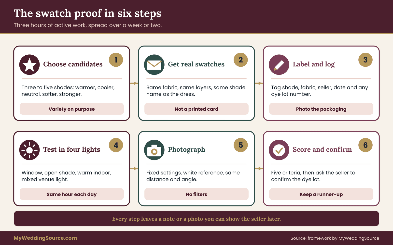
Step one: choose three to five candidates. Use your clues from the undertone section and your taste to choose candidate shades. Aim for variety on purpose: at least one warmer, one cooler and one neutral option, and at least one that is softer and one that is stronger than your first instinct. Fewer than three and you have nothing to compare, more than five and the test becomes tiring and your judgment gets worse. Keep a short list of reasons for each candidate, such as “likes the muted green” or “matches my grandmother’s brooch.”
Step two: request swatches in the real fabric. This is the step that people skip, and it is the most important. A paper color chip is printed ink, which behaves nothing like dyed cloth. Ask the seller or maker for a swatch of the exact fabric used in the dress, in the exact shade name, and ask which layers the dress contains. A dress with a tulle overlay on a satin underlayer needs swatches of both, held together in the same arrangement.
If the seller only offers a color card, ask whether fabric samples exist and whether there is a charge. Some sellers charge a small fee, some refund it against an order, and some do not offer samples at all, which is useful information in itself.
Step three: label and log. When swatches arrive, attach a small tag to each with the shade name, the fabric, the seller, the date and, if given, any dye lot or batch number. Take a photo of the packaging and any paperwork. This sounds fussy, but swatches look alike once they are out of their envelopes, and mixing them up ruins the test.
Step four: test against your skin in four lights. Hold each swatch against your skin, at the neckline for a bodice or at the collarbone for a high neck, and look in a mirror. Then repeat in each of the four lights described later in this guide: daylight by a window, open shade, warm indoor light and mixed venue-style light. Spend a minute or two in each light. Your eyes adapt, so look away at something neutral between swatches.
Step five: photograph with fixed settings. Take a photo of each swatch beside your face and hands, in each light, with the same distance and the same phone settings. Include a neutral gray or white reference item in each frame if you can, such as a sheet of plain paper. The following sections explain how to keep the camera from quietly changing the color on you.
Step six: score, decide and document. Score each swatch on five plain criteria, discussed in a later section, then choose the shade that holds up in the most lights. Write down the winner, the runner-up and what you would change about each. Send the winning swatch details to the seller in writing and ask them to confirm the dye lot, as described in the section on vendor questions.
The whole process takes perhaps three hours of active work spread across a week. It costs a few dollars to a modest amount in swatch fees, depending on the seller, and often nothing. Compare that with the cost of a custom colored wedding dress that arrives a shade you do not like: a remake or a refused return can run into the price of the garment itself. The proof is cheap insurance against an expensive mistake, and whatever the cost, the seller’s own terms should tell you what is refundable.
What to do when a shop does not offer swatches for a colored wedding dress
Not every seller of a colored wedding dress sends swatches. Large retailers, ready-to-wear brands and some bridal salons may not have samples for every shade. That does not make the proof impossible, but you have to adapt it. The options below run from the closest substitute to the most distant.
Ask for a fabric cutting from the production cloth. Some makers keep offcuts. A small cutting from a bolt, even a few square inches, works for the proof. Ask politely, and ask the maker whether the cutting is from the same cloth lot as the dress will be made from.
Try the dress on in person, and test in daylight. If the dress is in a salon, ask to carry it, or a section of the skirt, to a window or outdoors for a few minutes. Stylists are used to this request. Take photos in that light with your own phone, using the same settings across dresses you compare.
Use a similar fabric from a fabric shop when the colored wedding dress itself has no sample. A local fabric store sells yardage by the inch, often in the same weaves a gown might use. This does not tell you the exact dye of your dress, but it tells you how that general color behaves in that general cloth against your skin, which is still informative. Buy the smallest cut available, and label the fabric as an approximation.
Rely on return terms, in writing. If no physical sample exists and the dress is ready-to-wear, the fallback is a clear, written return window. Understand whether the dress can be returned after trying it in your own light, what condition it must be in, and who pays shipping. For custom or made-to-order dresses, where returns are often limited, this step matters even more, and the Federal Trade Commission’s guidance on mail and online orders is a useful starting point for what sellers must do about shipping delays.
Be honest about what you could not test. If you end up buying without a fabric swatch, note it in your records. That way, if the shade is off, you know the risk was taken knowingly and you can focus on remedies instead of regret.
Setting up a home test space for your colored wedding dress swatches
The proof for a colored wedding dress does not need a studio, but a few simple choices make the results more reliable. Think of the setup as removing variables, so that when a swatch looks different from another, the cause is the swatch and not your room.
Choose a neutral background. Sit or stand in front of a plain wall, a white door or a gray sheet. A colored wall bounces its own hue onto your face and the swatch. If the only wall available is painted a strong color, hang a white bedsheet behind you.
Remove competing colors near your face. Take off a bright top, a patterned scarf or colored glasses frames if you can. Wear a plain, neutral shirt, ideally gray or off-white, so that the swatch is the only strong color near your face. If you plan to wear your hair down on the day, wear it down for the test.
Go bare-faced first, then add makeup. Run the first pass without makeup to see what the shade does to your natural color. Then repeat the best two candidates with the makeup you expect to wear. It is a short extra step and often decides a close call.
Use a second pair of eyes. Ask a friend or your partner to look at the swatch against your face without telling them which one you prefer. People tend to see a color on someone else more objectively than on themselves, and an unprompted reaction such as “that one makes you look tired” is useful. If you can, ask someone who knows you well but has no stake in the decision.
Keep a simple record sheet. For each swatch and each light, jot down a few words: “warm, bright, slightly yellow on my neck,” or “cool, calm, my eyes look more blue.” Do not rate yet. Early notes are most useful when they describe what you see, and the scoring comes later.
Control the time of day. Natural light changes through the day, so run daylight tests within the same one-hour window on each day, for example mid-morning. If you test one swatch at noon and another at dusk, you are comparing the sun, not the cloth.
Give your eyes breaks. Color judgment tires quickly. Look at a neutral gray or white surface for a few seconds between swatches, and stop after thirty minutes. Come back the next day with fresh eyes before you make a final call.
Before you move on, check the practical details. Make sure the swatches are flat and clean, because a creased or smudged sample reflects light unevenly. Keep them out of direct sun when not testing, because strong light can fade some dyes over time. And keep them in a clean envelope, not in a bag with other fabrics, so that lint and color transfer do not alter the sample you are about to rely on.
If you are choosing among shades for a colored wedding dress that has not been made yet, treat the swatch as the specification. It will be the object you point to if the finished dress differs, which is why the labeling and logging in step three are worth the few minutes they take.
Testing a colored wedding dress swatch in four kinds of light
Light is the largest variable in how a colored wedding dress will look. The same fabric can seem warm and rich at sunset, cool and flat in an overcast courtyard, and slightly green under certain indoor bulbs. Because you cannot control the lighting on the day, you test in the conditions you are most likely to meet and look for a shade that survives most of them.
The four lights below cover the situations that matter for most weddings. Each has a purpose, and each reveals a different weakness.

Daylight by a window. Place yourself beside a window that receives indirect daylight, ideally one that faces away from direct sun. This is the closest thing to neutral light you will have at home, and it is the baseline. Everything else is compared against it. Judge value, saturation and undertone here first. A shade that looks wrong in daylight is unlikely to improve elsewhere.
Open shade outdoors. Stand outside in the shade of a building or a tree on a clear day. Open shade is lit by blue sky rather than direct sun, so it is cooler than window daylight and tends to emphasize blue and violet undertones. It also tells you how the dress will look for outdoor ceremony portraits taken away from direct sun. Warm shades can look slightly flat here, and cool ones can look especially clean.
Warm indoor light. Test under household incandescent or warm-white LED bulbs. This light is yellow, and it shifts colors toward warm. Reception halls, restaurants and many historic venues use light like this, especially in the evening. Cool shades can look dull and grayish under it, and warm shades can look richer. If your reception is in a warm-lit space, this test counts for a lot.
Mixed venue-style light. Many venues combine light sources: warm uplighting on the walls, cool overhead fixtures, colored accent lights and candles. You cannot reproduce all of it at home, but you can approximate it by turning on a warm lamp and a cool daylight bulb at once, and by standing near both. If your venue allows a visit, take the swatches there at the planned hour and test them in the actual room. Treat the venue visit as a chance to add one extra check for your colored wedding dress.
Do not rely on a single light. A swatch that excels in one and fails in three is a risky choice. A swatch that is good in all four, even if it is never the best in any, is usually a safer purchase because it will not surprise you on the day.
A note on direct sun. Direct midday sun is a fifth condition, often at outdoor ceremonies. It is bright, high in contrast and tends to wash out pale shades and intensify saturated ones. Test it if your ceremony is outdoors at midday, and keep your swatches out of it otherwise, because some dyes fade.
A note on flash. A photographer may use flash, which is cool and strong, and it can lighten some colors and flatten others. You cannot predict a professional’s lighting from home, but you can ask your photographer how they usually light receptions and portraits, and you can bring a swatch to a pre-wedding meeting.
The result of this section is not a winner. It is a set of notes: which candidates held steady, which swung, and in which direction they moved. A colored wedding dress shade that swings wildly between lights is a shade whose appearance you cannot predict, and you should score it down accordingly.
Photographing colored wedding dress swatches without fooling yourself
Your eyes adapt to light, so they forgive a lot when you judge a colored wedding dress. A camera does not forgive anything, and the photographs of your colored wedding dress are what you will keep for decades. That makes the photo test the most important check, and also the easiest one to get wrong, because phones quietly adjust color on their own.
Phones apply automatic white balance, which tries to make the scene look neutral. In practice, this means the phone may quietly pull a warm scene cooler and a cool scene warmer, so your photos of warm light and cool light can end up looking more alike than the lights really are. Auto exposure does a similar thing with brightness. To get comparable photos, you have to reduce those automatic changes.
Here is a practical method that works on most phones.
Fix the exposure and white balance if your phone allows it. Many phones let you lock exposure and focus by pressing and holding on the screen. Some camera apps offer manual white balance. If yours does, set it once, for example to a daylight setting, and keep it for all shots. If it does not, take every photo with the same framing and the same background so that any automatic adjustment is at least consistent.
Include a neutral reference in the frame. A sheet of plain white paper, a gray card from a camera store or a piece of gray cardstock gives you something that should look neutral. If the reference looks yellow in a photo, you know the photo is warm. You are not correcting the photo; you are reading it more honestly.
Keep the same distance and angle. Hold the swatch at the same place, beside your jaw or at your collarbone, and take the photo from the same distance each time. Use a tripod or lean the phone against a stack of books so that your hands are free.
Turn off filters and beauty modes. Any smoothing or color enhancement alters skin tone and fabric color. Use the plain camera mode, and turn off HDR if it exaggerates colors.
Take more than one shot. One photo can be an accident. Take two or three of each condition and use the middle result.
Review on a screen you trust. Look at the photos on the same screen at the same brightness. Phones can shift color based on night mode or auto-brightness, so set the display to a standard setting before you compare. Comparing a photo on a phone to a photo on a laptop introduces another variable.
When you review the photos, look for three things. First, does your skin look healthy and consistent in each shot, or does the swatch make your face look green, gray or flushed? Second, does the fabric keep its character, or does it flatten into a featureless block? Third, does the shade stay recognizable across the four lights? A shade that is recognizable in all four is predictable, and predictable is what you want from a dress that will be seen in dozens of settings.
If you plan to share photos with family before choosing, be careful: when you send an image, the recipient’s screen changes the color again. Use the shared photos to talk about overall impressions, not exact shade, and make the final call from the physical swatch in your own hands.
Finally, think about how the photos will be viewed later. Prints, albums and screens all render color differently, and a good photographer will edit for a consistent look. The shade of your colored wedding dress should be strong enough to survive that range. If your photographer has a recognizable editing style, ask to see a sample gallery that includes dresses in a color like yours, and check whether the color stays true.
The family photo list is a good moment to think about who will stand next to you, because a colored wedding dress will interact with every outfit in the frame.
Scoring your colored wedding dress candidates on five criteria
After the light tests and the photos for your colored wedding dress, you will have a pile of notes and a gut feeling. The scorecard turns that pile into a decision you can defend. It uses five criteria, each scored from zero to two, so the maximum for a candidate is ten. The scale is deliberately coarse. Finer scales invite false precision, and the point is to separate clear winners from clear losers, not to rank near ties.
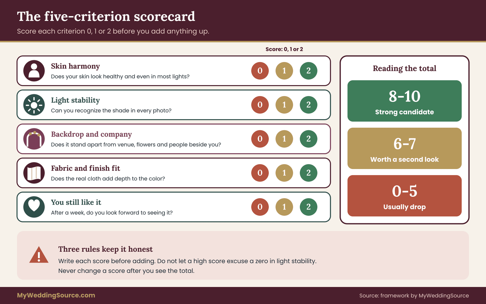
Criterion one: skin harmony. Does your skin look healthy and even against the swatch? Score two if it looks good in most lights, one if it looks good in some, and zero if the swatch makes your skin look gray, green, yellow or flushed in most conditions. This is the criterion that undertone testing feeds directly.
Criterion two: light stability. How much does the shade change between the four lights? Score two if you could recognize it in every photo, one if it changes noticeably in one light, and zero if it swings in two or more. A zero here is a warning even if skin harmony is high, because it means you cannot predict the result.
Criterion three: backdrop and company. Does the shade stand apart from the venue, the flowers and the clothes of the people beside you? Score two for clear separation, one for acceptable, and zero if it blends into the backdrop or fights something it must sit near. Use your venue photos, the flower plan and your attendants’ colors to judge.
Criterion four: fabric and finish fit. Does the shade look good in the actual cloth, in the layers the dress will have? Score two if the fabric adds depth, one if it is neutral, and zero if the finish makes the color look cheap, shiny in the wrong places or muddy. This is where the real fabric swatch earns its price.
Criterion five: you still like it. After a week of looking, do you still like it? Score two if you look forward to seeing it, one if you are neutral, and zero if you have grown tired of it. Enthusiasm that fades in a week rarely survives a year of photo albums.
Add up the points. As a rough reading, eight or more is a strong candidate, six or seven is a possible one worth a second look, and five or fewer should usually be dropped. These cutoffs are a judgment aid, not a law. If two candidates tie, break the tie by repeating the light test on the finalists with a second person present.
A few rules keep the scorecard honest. Score each criterion separately and write the score before you add. Do not let a high number in one criterion excuse a zero in another, especially light stability. Do not score candidates you tested on different days under different conditions as if they were equal. And do not change a score after you see the total, because that is how a preference sneaks back in disguised as a result.
If every candidate scores low, the problem may be the candidate set. Go back to step one, look at which criterion dragged the scores down, and choose a second round of swatches that addresses it. If skin harmony was the problem across the board, shift the undertone. If light stability was the problem, move toward a more muted shade or a matte fabric.
When the scorecard produces a clear winner for your colored wedding dress, resist the urge to keep shopping. Further searching tends to reduce satisfaction, not raise it. Write down the winner, the runner-up and the reasons, and move on to the practical steps. If your top two are close, keep the runner-up swatch in a labeled envelope, since it is your fallback if the seller cannot supply the primary shade or the dye lot does not match.
A worked example of the swatch proof for a colored wedding dress
The example below is invented to show how the process fits together. The people, shades and scores are illustrative, not data from a real couple or a real study, and your own results will differ.
Imagine a bride, call her Maya, planning a late-afternoon garden ceremony followed by a dinner in a restored brick hall. She likes the idea of a colored wedding dress and has three candidates on her list: a muted sage green, a dusty rose and a warm champagne. She has medium-light skin with a slightly warm undertone by her own guess, dark brown hair and brown eyes.
She asks each of three sellers for a swatch of the exact fabric. The sage is a crepe, the rose is a satin-backed tulle and the champagne is a matte satin. She labels each, logs the dye lot numbers where provided, and sets up a test space with a white sheet and a gray shirt.
In window daylight, the sage looks calm and keeps her skin looking even. The dusty rose looks soft but slightly pink against her cheeks, and the champagne looks creamy and warm. In open shade, the sage turns slightly cooler and looks a little gray, the rose becomes a clean pink, and the champagne loses some glow and reads close to beige. Under warm indoor light, the sage turns olive and rich, the rose warms toward peach, and the champagne glows.
When she photographs the swatches beside her face with fixed settings and a white paper reference, the pattern holds up. The sage is recognizable in all four, though it varies in how gray it looks. The rose swings the most, from pink to peach. The champagne is stable, but in open shade it nearly disappears against her skin.

She scores each candidate. For the sage: skin harmony two, light stability two, backdrop and company one because the garden greenery is close in hue, fabric fit two, still likes it two, total nine. For the rose: skin harmony one, light stability zero, backdrop two, fabric fit one, still likes it two, total six. For the champagne: skin harmony two, light stability one, backdrop one, fabric fit two, still likes it one, total seven.
The sage wins, but the backdrop score of one gives her a specific issue to handle. The garden is green. She takes her sage swatch outside and stands in front of the actual hedges at the planned hour, where she sees that the dress separates well against the dark hedge and poorly against a bright lawn.
She decides to plan the portrait spots against the hedge and the brick hall rather than the open lawn, and she asks her seller to confirm that the finished dress will come from the same dye lot as her approved swatch.
She also keeps the champagne as her runner-up, because its light stability was decent and the dress comes in the same silhouette, and she tells the seller she would consider it if the sage could not be matched.
Notice what the colored wedding dress example did and did not do. It did not decide that sage is a better color than rose in general. It found that, for this person, in this fabric, in these lights, sage held up best, and it produced a specific action about portrait locations. That is the real value of the proof: not a verdict about color, but a set of concrete decisions you can act on.
One more observation from the example. The rose scored well on backdrop and on her enthusiasm, and it still lost. That is a normal and useful outcome. A shade you love that behaves unpredictably is a shade you can sometimes rescue, for instance by choosing a more muted version or a different fabric, but you should make that choice deliberately instead of hoping the problem goes away.
If Maya truly loves the rose, her next step would be to request a second rose swatch with a slightly more neutral lean and run the proof again, not to override the scorecard.
Matching a colored wedding dress shade to your hair, makeup and accessories
Once a colored wedding dress shade passes the scorecard, the next question is how it plays with everything else you will wear. A colored wedding dress is part of a look, and parts of that look can either support the shade or fight it. The good news is that you can test these elements with your swatch before you commit.
Hair. If you will wear your hair up, you expose more of your neckline and the dress color sits close to your skin and face. If you will wear it down, the hair frames the color. Test both with your finalist swatch. A bun with a pale shade can emphasize your jawline, and loose hair against a saturated shade can soften the contrast.
A hair and makeup trial lets you see your hairstyle and makeup with the dress shade in the same session, and it is worth scheduling around the swatch so you can see your hairstyle and makeup with the dress shade in the same session.
Makeup. Choose lip and cheek colors that are in the same undertone family as the dress or deliberately contrasted with it. If the dress is a cool shade, a very warm orange lip can look disconnected, while a berry or rose lip can tie in. If the dress is warm, a cool blue-red lip can look sharp and a warm terracotta or coral can blend. Test one or two options with your finalist swatch in daylight.
Jewelry and metals. Gold, silver, rose gold and pearls all read differently against colored fabric. Gold usually warms a shade and silver usually cools it, while pearls are neutral and soft. Hold your metal and gem options against the swatch and see which look intentional. The wedding day accessories planning guide covers compatibility and backups, including how accessories interact with the dress you have chosen.
Veil and layers. A white or ivory veil over a colored dress changes the color visible through it. A sheer layer can mute or tint the shade beneath, and an ivory veil can add warmth. Test your veil fabric over the swatch, in daylight, before you buy it, or at least before you commit to the dress shade.
Shoes and bouquets. Shoes in a neutral tone usually disappear, while colored shoes become a deliberate part of the look. Bouquets should be tried against the swatch too: a bouquet that nearly matches the dress can vanish, while one in a complementary hue can look balanced. If you are working with a florist, bring the swatch to the meeting.
A final check is to assemble everything in front of a mirror in daylight, with the swatch in place of the dress, and ask a friend whether any single item draws the eye away from your face. If one does, simplify it. The aim is for the dress shade to stay the main color note, with everything else in support.
How fabric changes the shade of a colored wedding dress
The same dye bath can produce visibly different colors on a colored wedding dress on different cloths, and the difference is not a flaw. It is physics. Light that reaches the fabric is partly reflected from the surface, partly absorbed by the dye and partly scattered inside the fibers. Smooth, shiny cloth reflects more light directly, so the color can look lighter and more variable. Matte cloth scatters and absorbs more, so the color looks deeper and steadier.
That is why the swatch must be the real fabric, and why a dress made from several fabrics needs several swatches. Here is how common bridal fabrics tend to behave, offered as general tendencies and not rules, since weave, fiber content and finish vary widely by maker.
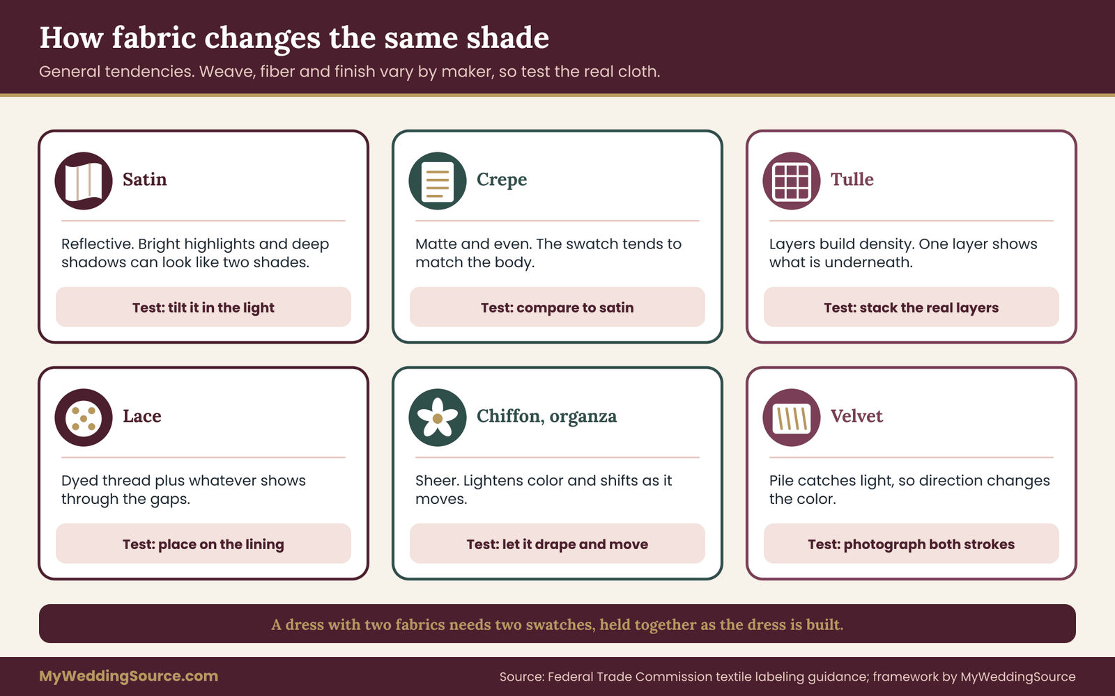
Satin. Satin has a smooth, reflective surface, and it changes noticeably with the angle of light. The folds and curves of a skirt produce bright highlights and deep shadows, so a satin colored wedding dress can seem to have two or three shades at once. Pale satins can look icy in cool light and creamy in warm light. Satin is also the fabric where flash photography can create hot spots.
Crepe. Crepe has a matte, slightly textured surface, and it tends to show color evenly. It is often described as a forgiving fabric for color because the shade you see in the swatch is close to the shade you see on the body. It absorbs more light, which can make a color look a little deeper than the same dye on satin.
Tulle. Tulle is a net, and its color depends on how many layers are stacked. One layer is nearly transparent and shows the color underneath, while several layers build a soft, cloudlike density. A tulle swatch laid on your skin will look quite different from the same tulle layered over a lining. Always test tulle with the layers and the underlayer the dress uses.
Lace. Lace is a pattern of threads and gaps, so what you see is a mixture of dyed thread and whatever shows through. A colored lace over a skin-toned lining looks different from the same lace over a matching colored lining. Ask which lining sits beneath the lace and test the combination.
Chiffon and organza. These sheer fabrics lighten colors and add softness, and the shade changes with movement. They are lovely in motion but harder to judge flat. Hold a swatch up and let it drape, and view it moving, not only still.
Velvet. Velvet’s pile catches light from different directions, so one patch can look much darker than another depending on how it is brushed. Strokes of the pile change the color visibly. Test velvet by running your hand across it and photographing both directions.
Linen and cotton blends. Natural fibers often have a slightly mottled, textured look and take dye in a softer, less uniform way. That can be a pleasing quality, and it also means that a swatch may not match another piece of the same fabric exactly. Ask whether variation is normal.
Fiber content matters too, because different fibers take dye differently. A blend of two fibers can show two slightly different colors, and some synthetic fibers are dyed with a different process from natural ones. Sellers in the United States are expected to label fiber content, and the Federal Trade Commission explains the labeling rules for textile products on its business guidance pages. Look at the label or product description and ask the seller to confirm the fiber content of the swatch and the dress, so that you know the swatch is a fair stand-in.
Two practical consequences follow. First, if your dress uses a different fabric for the bodice and the skirt, they may not match exactly even from the same dye bath, so ask how the maker handles that and look at both swatches together. Second, accessories made in other fabrics, such as a satin sash for a crepe dress, will not match perfectly. If a perfect match matters to you, choose accessories in the same cloth or plan an intentional contrast.
Questions to ask the seller before paying for a colored wedding dress
Everything you learned in the proof for your colored wedding dress is only as useful as the seller’s willingness to deliver it. A short list of written questions turns your swatch into a commitment. Ask by message or email so there is a record, and keep the answers with your swatch log. Sellers differ widely, and a clear, quick reply is a good sign while vague answers are information too.
What exactly will the dress be made from, and in what shade name and number? Ask for the fabric, the fiber content and the specific shade code, not a general color name. Repeat the name and code back in your own message so the record shows what you understood.
Will the dress come from the same dye lot as the swatch I approved? Dye lots, also called batches, can vary slightly. Ask whether the swatch came from the lot that will be used, and whether the seller will confirm the lot in writing. If the answer is that it may vary, ask by how much and what happens if the result is outside what you approved.
What happens if the finished dress looks different from my approved swatch? Ask whether you can return it, have it remade, or receive a partial refund, and who decides whether the difference counts. Make sure you understand what condition the dress must be in for a return. Where a dress is custom, ask whether a remake is possible and how long it would take.
Is there a deadline for approving the shade? Sellers often need a decision by a certain date to order fabric. Find out what the date is, and plan the proof to finish before it. Rushing a swatch test is a common source of regret.
Can I see the dress in person or in a sample before it ships? Some makers offer a sample or a photo of the actual finished garment. Even a quick video in daylight helps catch a surprise before it is final.
What are the return, cancellation and exchange terms, in writing? Read them before paying, not after. For orders placed online or by phone, the Federal Trade Commission’s Mail, Internet, or Telephone Order Merchandise Rule requires sellers to ship within the time they promise, or within thirty days if no time is stated, and to give you the option to cancel if they cannot. Rules differ for custom-made goods and for local stores, so ask the seller to state their terms and check the FTC guidance for your situation.
How should the dress be cleaned and stored, and does the color change with cleaning? Ask whether the dye is colorfast, whether the dress can be dry-cleaned or spot-cleaned, and whether any trims are likely to bleed. If you plan to wear the dress again, or to have it preserved, this matters for the color you will keep.
Can I get swatches for my matching pieces? If you are ordering a veil, a sash or a second outfit, ask whether the same shade is available and whether those pieces can be made from the same lot.
How will I pay, and how is my deposit protected? Paying by credit card generally gives you billing-dispute rights under federal law that other methods may not, and the Consumer Financial Protection Bureau explains how to dispute a card charge. Read your contract carefully, and see the wedding vendor contract guide for the clauses that matter around deposits, cancellations and substitutions. Compare the whole cost of the order with your overall wedding budget, including the cost of swatches, alterations and any remake risk.
Keep the replies. If the finished dress arrives and the shade is clearly different from your approved swatch, you will want to place the swatch, your photos and the seller’s written statements side by side. That evidence turns a vague complaint into a specific one, and a specific complaint is much easier for a seller to resolve.
Cost logic for a colored wedding dress shade test
The proof for a colored wedding dress costs money in small pieces: swatch fees, shipping, perhaps a gray card, a few hours of your time, and maybe a salon visit. Compared with the dress, these are small. It helps to think through the cost logic, without inventing figures, so you can decide how much testing is right for you.
Start with what is at stake. For a ready-to-wear colored wedding dress that can be returned, the cost of a wrong shade is mostly your time and perhaps return shipping, so a lighter test may be enough. For a made-to-order or custom colored wedding dress, the cost of a wrong shade can approach the full price of the dress, because custom goods are often non-refundable once production starts. The more irreversible the purchase, the more testing is worth doing.
Then think about the cost of the tests themselves. Swatches range from free to a modest fee, and some sellers credit the fee toward your order. A gray card is inexpensive. A second visit to the venue costs time. Add these up for your own situation and compare with the refund terms. If the total is a small fraction of the dress price and the dress is non-returnable, test thoroughly. If the dress is easily returned and cheap, test lightly.
Time is also a cost, and there is a deadline for approving shades. Count backward from the date the maker needs your decision, leaving room for swatches to ship, for a second round if the first fails, and for your own weekend availability. A testing schedule that fits comfortably before the deadline prevents a rushed choice. The fitting timeline after the order, which the alterations guide explains, shows how much room there is on each side.
Finally, consider the hidden cost of a colored wedding dress shade that is almost right. If the dress arrives a little off, you may spend on alterations, matching accessories or a different veil to compensate, and still feel uncertain. Those workarounds are real costs even when they never appear on an invoice. A thorough test up front usually reduces them.
Edge cases that complicate a colored wedding dress choice
The proof handles the usual colored wedding dress situation well. Real weddings add complications, and a few come up often enough to plan for. None of them is a reason to skip the test. Each is a reason to adjust it.
Your skin color will change before the wedding. A summer tan, a winter pallor, a recent illness or a change in skincare can all shift your complexion. If your wedding falls in a different season from your testing, repeat the best two candidates closer to the date, or hold them against skin that matches what you expect on the day.
If you plan to use self-tanner or to avoid the sun, test with that in mind. Because the dress is made months ahead, choose a shade that holds up across a modest range of skin color, not one that only works at a single peak.
The ceremony is outdoors and the reception is indoors. You will need the colored wedding dress to pass two different light environments in a few hours. Weight the lights you are most likely to see for the longest time, and give extra importance to light stability. A mid-range, slightly muted shade often handles the shift better than an extreme one, and a matte fabric is steadier than a glossy one.
You are marrying at golden hour. The hour before sunset is warm and low, and it can turn pale colors golden and deepen saturated ones. It is flattering for many people, and it also means a cool shade may look warmer than your tests suggested. If you can, test a swatch outside during the same hour in a similar season. Plan portraits for the time of day when the light is kindest to the color you picked, and talk to your photographer about the schedule.
Your family wears white or ivory. If relatives, particularly mothers or grandmothers, plan to wear light colors, a colored wedding dress will stand out strongly beside them, and that is often a nice outcome. If you want the contrast, test your swatch beside white and ivory fabric in daylight. If a family member is anxious about the choice, show them the swatch photos and explain what you tested; a calm, specific explanation usually lands better than an argument about taste.
You want a color that is close to white. Whites, ivories, creams and champagnes are colors, and the proof works for them too. In fact, near-white shades are where small differences matter most, because a slight shift can move a dress from soft ivory to yellow-looking. Test them in the same four lights, and be especially careful with open shade and flash, which can make ivory look gray or stark.
You are choosing a second outfit. A reception dress or going-away outfit in a bolder shade is a lower-stakes way to include color. The proof still helps, and you can run it with fewer lights if the second outfit will be worn only in the evening. A colored second outfit also lets you keep a traditional gown for the ceremony and play with color later.
The dress will be altered. Hemming, taking in seams and adding straps can all introduce new fabric, and added fabric may come from a different bolt. Ask your seamstress whether any new material will be used and where it comes from, and request a swatch of it. The wedding dress fit and alterations guide explains how fittings work and who to ask.
You are renting or buying preowned. A rented or preowned colored wedding dress is a fixed object, so you test the real dress instead of a swatch. Take it to a window, outdoors and into the lights you can reach, and photograph it with your settings. Remember that fabric fades and ages: a preowned dress may have shifted from its original shade, so compare it with any label or interior seam where the color is protected from light.
You are color-blind or share your decisions with someone who is. People with color vision differences may see shades differently, especially reds and greens. If that applies, rely on a second person’s eyes for the swatch test, and use contrast in value, which is easier to see, as a guide.
The swatch and the colored wedding dress do not match. If the finished dress is clearly different from your approved swatch, take photos in the lights you tested, put them beside the swatch and the seller’s written statements, and contact the seller promptly. Stay specific and calm, state the remedy you want, and follow the seller’s stated process. If you paid by card and the seller does not resolve a clear problem, a billing dispute may be an option, and the Consumer Financial Protection Bureau explains how and by when to raise one.
Your budget does not allow for many swatches. Limit the candidates to three, ask which sellers refund swatch fees, and use fabric from a local shop to approximate the shade in the cloths you cannot sample. Spend your testing effort on light stability and skin harmony, which give the most useful information per swatch.
Fitting a colored wedding dress into the rest of your wedding look
A colored wedding dress does not stand alone on the day, and the shade you choose becomes one of the strongest design decisions in your photographs. It is worth stepping back, once the shade is settled, to see how it sits within the larger palette.
Start with what you already know about the rest of the day. If you have chosen flower colors, linens and attendants’ outfits, lay swatches or photos of each beside your dress swatch in daylight and look for harmony or clashes. A dress in a muted green with a bouquet in saturated pink creates a lively pairing, and the same dress with flowers in a similar muted green can disappear into them.
Decide whether you want the dress to lead the palette, echo it, or provide a quiet contrast, then adjust the other elements to suit. The wedding color palette guide is the place to work out the rest of the colors once the dress is fixed, and it is usually easier to choose a palette around a tested dress shade than to force a dress into an existing palette.
Think about photographs as well as the live view. Colors that look balanced in person can read very differently in a frame. A bright, saturated dress shade tends to dominate a photograph, while a soft one lets flowers and faces share the attention. Ask your photographer what they have noticed about the colors that work in your venue, and bring your swatch to the meeting. A thoughtful photographer can tell you where to stand and when, which does a great deal to keep the shade true.
Keep a record of what you approved for the colored wedding dress. Put the swatch, the log, the scorecard, your photos and the seller’s replies in one folder, physical or digital. When fittings begin, bring the swatch so the seamstress sees the target color. On the day, give the swatch to whoever coordinates your accessories and flowers so they can match to it, not to a name.
Finally, accept a little imperfection when choosing a colored wedding dress. Color is difficult, light changes, and no test can promise a result under every condition. The goal of the proof is to remove the avoidable surprises, so that what remains is a small, forgivable difference and not a dress that fights you all day. If you reach the wedding with a colored wedding dress shade you tested, documented and liked for weeks, you have done the work that matters.
Your next steps
Choose three to five candidate shades for your colored wedding dress this week, including at least one warmer, one cooler and one neutral. Request swatches in the real fabric, and ask each seller about the dye lot and the deadline for approving the shade. While you wait, set up your test space with a neutral wall, a plain shirt and a white paper reference.
When the swatches arrive, label them and run the four-light test over a few days, at the same time of day each time. Photograph each with fixed settings, score them on the five criteria and choose a winner and a runner-up. Then write to the seller, ask them to confirm the shade code and dye lot, and keep every reply. Once the colored wedding dress is ordered, bring the swatch to every fitting, and use the same swatch when you choose your veil, flowers and accessories.
FAQ
How do I know which colored wedding dress shade suits my skin undertone?
Use folk tests such as veins or jewelry only as rough hints, then let real fabric decide. Hold swatches of the actual dress cloth against your skin in daylight, in shade and in warm indoor light, and note which keep your skin looking even. Choose the shade that stays flattering in most lights, not the one that looks best in one.
Do I really need fabric swatches for a colored wedding dress, or is a color card enough?
A printed color card is ink on paper and behaves differently from dyed cloth. Fabric swatches in the real material show how the shade responds to sheen, weave and layers. If a seller does not offer swatches, ask for an offcut, test the dress in person at a window, or secure clear written return terms before you pay.
Which light matters most for a colored wedding dress?
It depends on when and where you marry. Window daylight is your baseline, open shade shows cool conditions, warm indoor light matters for evening receptions, and mixed venue light approximates real rooms. Give extra weight to the light you will spend the most time in, but favor a shade that holds up across all four.
How many colored wedding dress shades should I test?
Three to five is enough for most people. Fewer than three gives you nothing to compare, and more than five tires your eyes and lowers the quality of your judgment. Include at least one warmer, one cooler and one neutral option, and one softer and one stronger than your first instinct, so the test can actually teach you something.
Can I trust phone photos to judge a colored wedding dress shade?
Only if you control the settings. Phones adjust white balance and exposure automatically, which can hide real differences between lights. Lock exposure, keep the same distance and angle, include a white or gray reference, turn off filters and review photos on one screen. Use the photos to compare candidates, and make the final call from the physical swatch.
What if the finished colored wedding dress looks different from my approved swatch?
Compare the dress with the swatch in the same lights you tested, photograph both, and contact the seller promptly with your written records. State the remedy you want and follow their stated process. If you paid by credit card and the problem is not resolved, ask your card issuer about the dispute process and its deadlines.
Does fabric really change a colored wedding dress that much?
Yes, it can. The same dye can look lighter and more variable on shiny satin, deeper and steadier on matte crepe, and softer on layered tulle. Lace shows the lining beneath it, and velvet changes with the direction of its pile. That is why you should test the exact fabric and layers the dress will use.
Is a colored wedding dress harder to photograph than a white one?
Not necessarily, but it adds a variable. White and ivory have a long record in photography, while a colored dress interacts with skin, flowers, backdrops and editing choices. Talk to your photographer about your shade, show them the swatch, ask to see sample galleries with similar colors, and plan portrait spots where the shade separates from the backdrop.
Sources
- Threading Your Way Through the Labeling Requirements Under the Textile and Wool Acts, Federal Trade Commission
- Business Guide to the FTC’s Mail, Internet, or Telephone Order Merchandise Rule, Federal Trade Commission
- Federal Trade Commission
- How do I dispute a charge on my credit card bill?, Consumer Financial Protection Bureau
- Consumer Financial Protection Bureau
- National Institute of Standards and Technology
- International Commission on Illumination (CIE)
- American Association of Textile Chemists and Colorists (AATCC)
- ASTM International
- USAGov: consumer protection