
Monogram vs illustration is the choice between two initials designed as a mark and a small drawing that tells a particular story about the two of you. This guide gives you a use-case matrix for deciding which one belongs on your invitations, your signs and your favors, plus a vendor-ready file checklist so the choice survives the trip to the printer.
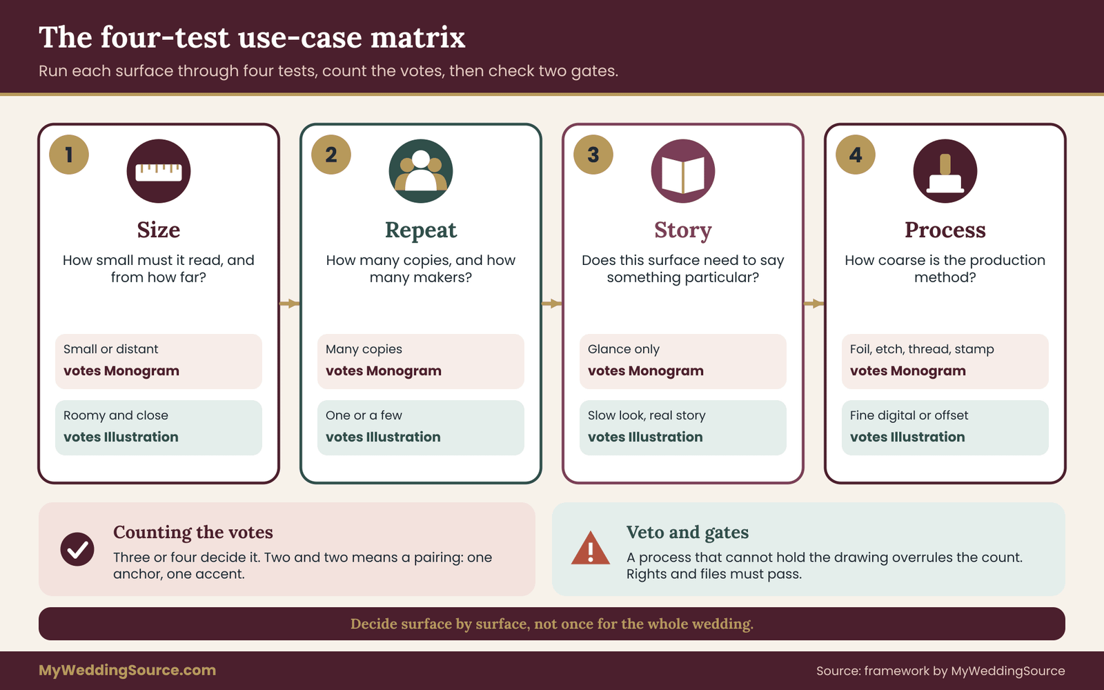
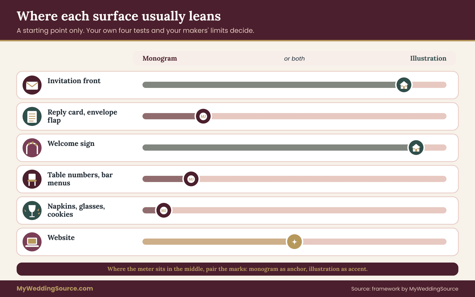
Do not decide the monogram vs illustration question once for the whole wedding. Decide it surface by surface, using four tests: how small must it read, how often will it repeat, does that surface need to tell a story, and how coarse is the production process. Small, repeated, coarse surfaces such as napkins, cups, engraved glass and cookie stamps lean toward the monogram. Roomy, one-off, story-friendly surfaces such as the invitation front or a welcome sign lean toward the illustration. Most weddings end up with both.
Couples usually arrive at this question from one of two directions. Some have a set of initials they already like and wonder whether a drawing of the venue, the dog or the first apartment would be nicer. Others have a drawing in mind and worry that it will not work on a cocktail napkin. Both worries are reasonable. Neither is solved by taste alone.
The monogram vs illustration question rewards a little planning. A monogram vs illustration decision is partly a design question and partly a logistics question, and the logistics are where most regrets begin.
This article is about the logistics of monogram vs illustration. It does not tell you what looks prettier, because that depends on you. It tells you where each kind of mark behaves well, where it breaks, what to ask a designer or printer before you commit, and which files to collect so that the person producing your napkins is not forced to guess. If you want help with the design thinking that sits behind the whole event, the guide on choosing a wedding color palette covers the colors both kinds of mark will need to share.
A note on scope. This is general information, not legal, tax or financial advice. Copyright and contract rules differ by country and by situation, and each artist and vendor writes their own terms. Where a rule matters, the article points you to the office that issues it so you can read the current version yourself.
What a monogram and a personal illustration actually are
Start with plain definitions, because the two words get used loosely and the difference matters later.
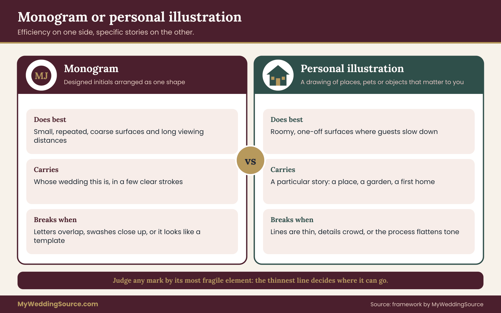
A monogram is a design built from letters. Most often it is two or three initials arranged so they read as one shape: stacked, interlocked, set side by side with an ampersand, or placed inside a circle or a wreath. The letters are the content. Everything else, the frame, the flourish, the weight of the strokes, is styling. Because the content is only letters, a monogram is compact, instantly legible to anyone who knows your names, and easy to reproduce in a single color.
A personal illustration is a drawing of things rather than letters. It might be the front of the house where you met, a loose sketch of your two dogs, a map line of the city where you got engaged, a few sprigs of flowers from a family garden, or a small scene of the two of you. The content is a picture. It can carry far more meaning than initials can, and that meaning is the whole reason people want one. It also carries more detail, and detail is the thing production processes dislike.
Those two descriptions already contain the core tension. A monogram is efficient and abstract. An illustration is rich and specific. The monogram vs illustration choice is the choice between efficiency and specificity, made again for each place the mark has to appear.
The in-between marks
Real designs blur the line. A monogram can have botanical details wrapped around the letters. An illustration can have initials worked into a sign on the little house it draws. A crest or emblem combines letters, symbols and a frame. These hybrids are common and often lovely, and they behave like whichever of their parts is more delicate. A monogram wrapped in fine vines is limited by the vines, not the letters. An illustration with a tiny lettered sign is limited by the lettering.
A useful rule for monogram vs illustration is to judge any mark by its most fragile element. Whatever is thinnest, smallest or lowest in contrast decides where the mark can safely be used. The matrix later in this guide builds on that rule. For the specific case of a family emblem, the separate guide on commissioning a wedding crest covers the brief and rights in depth, and this article stays with the narrower choice between initials and a picture.
What this guide leaves out
Font licensing for monogram lettering has its own guide, and this article touches it only where it affects the choice. Font selection for small signs also has its own treatment. Here, the monogram vs illustration question is the larger one: given the surfaces on your list, which kind of mark fits each of them, and what do you need in hand before anyone starts producing?
Why the monogram vs illustration choice is really a use-case question
Ask ten couples why they chose their mark and you will hear ten reasons about feeling. Ask the same couples a month after the wedding what they would change and the answers sound different. The napkin monogram was unreadable. The illustration was lovely on the invitation but turned to mud on the cups. The welcome sign looked empty because the monogram was too small for the board. The favor tags were printed with a version of the drawing nobody had approved.
Those are not failures of taste. They are failures of fit, the kind that decide a monogram vs illustration choice in practice. A mark was chosen for how it looked on one screen or one sample, and then it was asked to work in places it was never tested.
One mark, many jobs
Count how many places your wedding mark may appear. A typical wedding with a full set of stationery and a reception might involve an invitation, an envelope liner, a response card, a details card, a ceremony program, a welcome sign, a seating display, table numbers, menus, bar signs, napkins, cups or coasters, a cake element, favors and favor tags, a dance floor decal, a website header, a thank-you card and a social media sticker or filter. That is a long list, and every item has a different size, a different material and a different maker.
If you pick the mark based on a single beautiful mockup, you are betting that all of those jobs will turn out like the mockup. They will not. A monogram vs illustration decision made at the level of the whole wedding hides the fact that some jobs are easy for one kind of mark and punishing for the other.
Four things that change from job to job
Across all those items, four things vary the most, and they are the four tests in the framework you will use.
Size. The smallest size at which the mark must still read. A website header can be wide. A cocktail napkin stamp, a glass etching and a cookie are small.
Repeat. How many times the mark appears, and how much it matters that each appearance looks the same. A mark that shows up forty times needs to be reliable. A mark that shows up once can be fussy.
Story. Whether that surface exists to tell guests something particular, or only to say whose wedding this is. A guest book cover can hold a story. A napkin cannot.
Process. How the item is made. Offset printing, digital printing, letterpress, foil stamping, laser engraving, embroidery, vinyl cutting, screen printing and sugar stamping all have different tolerances for fine lines, tiny gaps and subtle tone.
Everything else about the monogram vs illustration decision, the style, the budget, the personality, sits on top of those four. When a couple tells a designer “we want something that feels like us,” the designer still has to answer those four questions before drawing anything final.
Why delaying the decision costs money
There is also a timing reason to settle the monogram vs illustration question deliberately. Marks are cheap to change before anything is ordered and expensive to change afterward. A designer revising a monogram for a stamp is a small task. A printer reprinting two hundred invitations because the illustration’s lines closed up is a large one. The earlier you test the mark against the real surfaces, the less any correction costs.
For that reason the first working session on your mark should include your surface list, not just your inspiration images. Bring the list of items and their makers to the conversation, even if some entries are still guesses. A designer who knows the mark must work on napkins and glass will draw differently from one who thinks it is only for a card.
The two failure modes
It helps to name the typical ways each mark fails, so you can recognize them early.
A monogram fails by being generic or unreadable. Generic, because initials alone say little about a couple, and a stock-looking arrangement can feel like a template. Unreadable, because elaborate interlocking, overlapping script letters and decorative swashes can make a monogram hard to decode at a glance, so guests who do not already know your names cannot tell what it says.
An illustration fails by being fragile or crowded. Fragile, because thin lines, soft shading and small details disappear when scaled down or printed with a coarse method. Crowded, because couples tend to add one more meaningful object to a drawing until it reads as clutter.
Neither failure is certain in a monogram vs illustration choice. A well-drawn monogram can be both specific and legible, and a well-drawn illustration can be simple enough to survive a stamp. But knowing the failure mode tells you what to test. For a monogram, test legibility and distinctiveness. For an illustration, test reduction and clutter.
The rest of this guide turns that insight into a repeatable process for any monogram vs illustration decision. First comes the matrix, with the four tests explained in enough detail to use. Then it works through stationery, signage and favors in turn, shows how to combine both marks into a small system, and finishes with rights, files, vendor questions and edge cases.
The four-test use-case matrix for monogram vs illustration
The matrix is a small decision tool for monogram vs illustration questions. You list the surfaces where your mark will appear, run four tests on each one, and let the results tell you which kind of mark leans ahead. It takes about five minutes per surface and works with a pencil.
Each test in the monogram vs illustration matrix is a question with a lean. The lean is not a verdict. It is a vote. After four votes you count them, apply a short rule, and write down the result next to the surface.
Test one: the size test
Ask: what is the smallest this mark will ever be on this surface, and will a guest read it from where they stand?
Measure or estimate the smallest real size, not the size on your screen. A mark that looks generous on a laptop can be the width of a thumbnail on a napkin. Hold your thumb against a printed copy at that size, or print the mark at actual size on plain paper and look at it from arm’s length.
If the mark must stay legible at a very small size, the vote goes to the monogram. Letters are forgiving in the sense that a reader’s brain fills in a lot from a few clear strokes. If the surface is large enough that fine detail can be seen, the vote goes to the illustration, or it is a tie when both would work.
A second part of the size test is the viewing distance. A table number is read from one or two steps away. A welcome sign is read from the walkway before the door. A bar menu is read by someone holding a glass. A drawing with lots of small elements is pleasant up close and turns into texture at a distance. In a monogram vs illustration contest at a distance, the monogram wins when the mark must announce itself from across a room.
Test two: the repeat test
Ask: how many times will this mark appear on this surface, and does each copy have to match the others?
A surface that produces many copies, such as napkins, favor tags, coasters or cups, rewards a mark that is stable under variation. Ink density changes, stamps wear, embroidery thread varies, and different machines in the same shop produce slightly different results. A simple mark tolerates that spread. A detailed one shows it.
If the surface repeats a lot, the vote goes to the monogram. If it appears once or a handful of times, such as a guest book cover, a framed print at the entrance or a single large sign, the vote goes to the illustration, because one carefully produced piece can afford the detail.
Repeat has a second meaning: how many different makers will handle this mark? If your stationer, your sign maker, your baker and your rental company will each receive the file, then each handoff is a chance for the mark to degrade. The more makers, the more the vote leans toward a mark that is easy to reproduce from the same file.
Test three: the story test
Ask: does this surface exist to tell guests something particular, or only to identify whose wedding this is?
An invitation front, a welcome sign, a guest book and a thank-you card are places where guests slow down and look. They have time for a picture. A cup, a cocktail napkin and a dance floor decal are glanced at for a second.
If the surface invites a slower look and you have something specific to say, the vote goes to the illustration. If it is a glance surface or the message is simply “this is our celebration,” the vote goes to the monogram.
Be honest about the story behind your monogram vs illustration choice. Some couples have a lovely, specific story that fits a drawing: a ferry they took on a first trip, a garden where a parent grows peonies, a house where they hosted their first dinner. Others like the idea of a personal illustration but have no particular image to draw. If you cannot name the thing the drawing would say, the story test votes for the monogram, and it is better to know that before commissioning art.
Test four: the process test
Ask: how is this item actually made, and what does that method do to fine detail?
This is the test couples skip most, and it decides more outcomes than any other. Methods differ widely in what they hold.
Digital and offset printing on smooth paper hold fine lines and soft tones well.
Letterpress presses the design into paper and prefers bold shapes with generous gaps. Foil stamping and embossing need solid areas and clean edges, and thin, closely spaced lines can fill in. Laser engraving on wood or acrylic burns tone and tends to turn fine hatching into smudges unless the artwork was prepared for it. Glass etching and sandblasting want solid shapes. Embroidery builds the mark from thread, so tiny details disappear or must be simplified by the digitizer.
Vinyl cutting needs shapes that are not too thin or too fragile to weed and transfer. Rubber stamps and cookie stamps blur at small sizes. Screen printing prefers a limited number of flat colors.
If the method is coarse or one-color, the monogram vs illustration vote goes to the monogram, or to a simplified illustration if you are committed to a picture. If the method is a fine digital or offset print, the vote goes to the illustration or is neutral.
Because every vendor and every machine differs, the process test in a monogram vs illustration decision is also the one where you should ask the maker directly rather than assume. A phrase that works well: “What is the smallest line and the smallest gap this process holds cleanly, and can you send a sample or a proof of this kind of artwork?” You are not asking for a number from this guide. You are asking for their number.
Counting the votes
Write four lines for each surface, one per test, and mark each M for monogram, I for illustration or E for either. Then apply the rule.
In a monogram vs illustration count, if monogram has three or four votes, use the monogram on that surface. If illustration has three or four votes, use the illustration. If the votes split two and two, or the tests mostly say either, use a pairing: the monogram as the anchor and the illustration as a small accent, or the reverse where the surface is large. The section on hybrid systems explains how to build that pairing without clutter.
One test can overrule the count. If the process test finds that the method cannot hold the illustration at all, the illustration is out for that surface, whatever the other votes say, unless it is simplified. That is a veto, and it is the only one.
The two gates before any vote counts
The votes tell you which side of monogram vs illustration fits. Two gates tell you whether you are allowed and able to proceed. They are pass or fail, not votes.
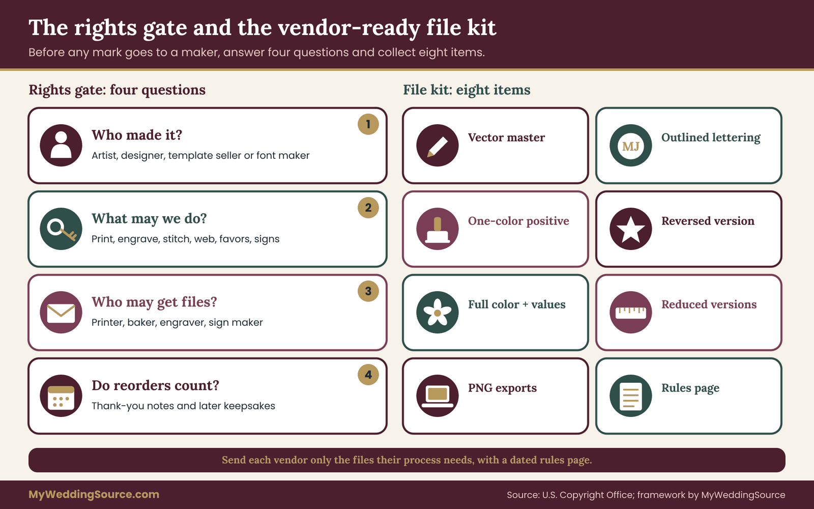
The first is the rights gate. Do you have written permission to use this mark on this surface? For a monogram made from a commercial font, that means the font license covers the use. For an illustration by an artist, that means the artist has agreed in writing to the uses you plan: printing, engraving, web, merchandise-style items such as cups and favors. Rights are covered in detail later in this guide, including the few questions that matter most for this choice.
The second is the file gate. Do you have the right file for this surface? A beautiful illustration saved only as a flat image cannot be turned into an engraving or a one-color stamp. The vendor-ready file checklist later in this article lists the files to request before the order is placed.
Surfaces that fail a gate are not rejected forever. The monogram vs illustration vote simply waits. They are paused until the gap is fixed. The gate is useful precisely because it moves the problem to a time when fixing it is cheap.
How the matrix fits with the rest of your planning
The monogram vs illustration matrix is small enough to sit inside your normal planning documents. Keep one line per surface in the same place you track vendors. When you receive a quote from a vendor, check the process test against what they actually offer. When you sign a contract, confirm in writing which files they need and who owns the production versions. The guide on the wedding vendor contract explains what a typical agreement should state about deliverables and changes, and the surface list gives you concrete items to ask for.
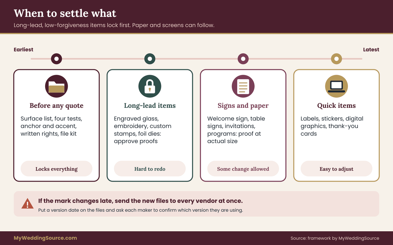
The matrix also fits your timing. Surfaces that take the longest to produce, such as engraved glass, embroidered textiles and custom stamps, should be decided first, because their process test is the strictest and their lead times are the longest. Paper and digital surfaces can follow, because they tolerate more and change faster.
Stationery: monogram vs illustration on paper
Paper is the friendliest surface for both kinds of mark, which is why the monogram vs illustration debate usually starts with the invitation. But paper is not one surface. An invitation, an envelope, a reply card and a program each have a different size, a different reader and a different production method.
The invitation front and the suite
The invitation is the one place where the monogram vs illustration story test almost always votes for the illustration. Guests hold it, read it, keep it on a fridge and sometimes frame it. The reader has time, the size is generous, and the card is produced in small numbers. A drawing of the venue, a garden or a shared landmark gives the suite a face that a pair of initials rarely can.
The size test is neutral on a standard card and the repeat test is mild, since the invitation is printed once and the same design carries across a handful of cards. The process test is where care is needed. If the invitation will be digitally or offset printed, an illustration with soft tone and fine lines will hold. If you plan letterpress, foil or embossing, the illustration must be simplified to bolder lines and clear gaps, or the monogram should take the lead on the front.
A practical monogram vs illustration pattern for paper is to put the illustration on the invitation and the monogram on the smaller cards in the suite. The reply card, the details card and the envelope liner each have less space and less need for a story, and the monogram does its identifying job there cleanly. The guide on wedding invitation printing covers proofs, quantities and printer handoffs that apply to either mark.
Envelopes and the postal reality
The envelope has a constraint that the card does not. Mail is read by machines and by postal workers, and the address area has to stay clear. A return-address monogram on the flap or the back is usually safe. An illustration that wraps around the front, runs behind the address or crowds the area near the stamp and the barcode zone can cause trouble.
For anything that is not a standard rectangle, or that is unusually thick, rigid or square, postal rules about size and handling also matter. Those rules are set by the postal service, not by your stationer, and they change. Check the current standards on the United States Postal Service website, and have a finished sample weighed and measured at a post office before the full run is mailed.
For the envelope, the usual monogram vs illustration advice is simple. Put the monogram on the flap, the liner or the back. If you want the illustration on the front, keep it well away from the address block and have the sample checked. A line drawing that stays in one corner of the envelope is much safer than a full wrap-around scene.
Programs, menus and the paper that stays on the table
Printed programs and menus sit between the invitation and the napkin. They are read at arm’s length, in a seat, with time to look. A small illustration on a program cover reads well, and the same drawing works on a menu header if the menu is printed digitally on smooth stock.
The monogram vs illustration risk with programs and menus is text overlap. If an illustration sits behind the text, contrast suffers. Keep the drawing clear of the text area, or lighten it substantially if it must sit behind.
A good test is to print one at actual size and read the smallest line aloud in the lighting of the venue. Dim reception lighting makes low-contrast backgrounds worse than they look at a desk. The guidance from the World Wide Web Consortium on contrast, published for screens, is a handy reminder that the difference between text and background matters more than the size of the text alone.
A monogram at the top of each page is a useful alternative. It ties the pieces together without competing with the text. If your program has several pages, repeating a small monogram as a running mark is a common and unobtrusive choice.
Thank-you notes and the stationery that comes later
Thank-you cards and post-wedding stationery are an overlooked surface in the monogram vs illustration decision. They are produced after the wedding, often in a smaller run, and they are written on by hand. A monogram on the flap or a small spot illustration on the front works, and the writing space matters more than the mark. Plan for them at the start, because a mark that cannot be reproduced later, because the original file is lost or the artist’s license has expired, is a loss you only discover when the notes are due.
This is another reason to keep the working files in one place. Records kept for the wedding, including final approved artwork and the license or agreement behind it, are covered in the guide on keeping wedding records.
Print method notes for paper
Because paper is made in so many ways, a short guide to what each method asks of the artwork saves a lot of trouble.
Digital and offset printing. The most forgiving. Fine lines, soft tones and small details usually reproduce well on smooth paper. Textured or uncoated stock softens fine lines. Ask for a printed proof on the actual paper if you use a textured stock.
Letterpress. The impression is part of the beauty, and it asks for deliberate shapes. Bold, open designs work best. A delicate illustration can be redrawn with heavier lines for letterpress, and a good designer will do that for you. A monogram with moderate stroke contrast is a natural fit.
Foil stamping and embossing. The design is pressed through a die, and the die has to be cut accurately. Thin lines and tiny counters in letters, like the inside of an e or a small flourish, can fill in. A monogram with heavy, clear forms works better than a delicate script. An illustration should be limited to bold shapes.
Engraving and thermography. Raised ink or recessed impressions that prefer clean, strong lines. Treat them like foil for design purposes.
Watercolor-style printing. Many couples want the look of a painted illustration. A printed reproduction can imitate it well when the file is a good scan or a high-resolution image, but the result depends on color management and paper. Ask for a proof and compare it to the original in daylight.
The paper-first test
For any paper piece, run the monogram vs illustration matrix, then run one more check: print the mark at actual size, in the actual color, on paper that resembles the real stock. Look at it in the light where it will be read. Look at it from the distance where it will be read. Then ask someone who has never seen it to tell you what it shows.
If the person can say “it’s your initials” or “it’s a little house with a tree,” the mark is doing its job. If they hesitate, the mark is too small, too busy or too low in contrast for that piece, and you have learned that for the cost of a sheet of paper.
When a monogram is the better paper choice
In monogram vs illustration terms, some paper pieces simply suit initials better. A wax seal or an embossed seal is made from a metal die and works best with a simple mark. A custom stamp for envelope flaps, a return-address stamp, a bookplate for a guest book and a tissue stamp for gift wrapping all benefit from a monogram, because the stamp is small and made once.
If your invitation suite is modest and designed to feel formal, the monogram can also carry the whole suite on its own. Many traditional layouts use a monogram at the head of the invitation and let the typography do the rest. In that case the illustration can wait for the welcome sign or the guest book, where it has room.
When an illustration is the better paper choice
In monogram vs illustration terms, an illustration earns its place when the paper piece is the one guests keep and look at. A save-the-date card that shows the place you are marrying helps out-of-town guests picture the trip. An invitation front that shows a recognizable landmark gives guests context. A welcome page in a hotel bag with a small map-style drawing doubles as a useful object.
In each case the illustration is doing a job that initials cannot do: it is telling guests where, or what kind of day, to expect. That is the clearest sign that an illustration belongs on a surface. When the picture adds information, use it. When it only adds decoration, test whether the monogram does as well.
Signage: monogram vs illustration at a distance
Signs change the monogram vs illustration problem, because they are read from farther away, in worse light, by people who are walking, holding something and talking. The size test and the process test both turn stricter. At the same time signs are the surface where couples most want a personal touch, so the pull toward an illustration is strong.
The broader system for wedding signs, covering readability, placement, proofing and venue permissions, is in the guide on wedding signage as a system. This section covers only how the monogram vs illustration choice plays out on the signs themselves.
The welcome sign
The welcome sign is the most visible piece of the wedding, and it is usually a one-off. That combination makes it the easiest place to settle monogram vs illustration in favor of the drawing. There is room, there is one copy, and guests pause to read it. A drawing of the venue, a custom map line or a garden motif gives the entrance a distinct character.
The size test does not threaten the illustration here, since the sign is large. The process test depends on the material. A painted or printed board holds detail. A laser-cut or engraved sign holds less. A sign made from vinyl lettering on a mirror or a pane of acrylic needs bold shapes with clear gaps.
Two cautions apply. First, viewing distance: a detailed drawing that looks rich at one step turns into a gray patch at ten steps, so check it from the real distance. Second, contrast: a pale illustration on a pale board vanishes in daylight and disappears under low reception lighting.
A good welcome sign often combines both marks. The illustration takes the large area and the monogram sits in a corner or below the wording as a signature. That arrangement gives the sign a story and an identity without asking either mark to do everything.
Seating displays and table numbers
Seating displays and table numbers are repeated, practical and read quickly. They ask for clarity first and personality second. The repeat test and the size test both vote strongly for the monogram, or for a very simple graphic.
Table numbers are a good example of monogram vs illustration on a small sign. If each table has its own illustration, say a different flower or a different landmark, guests have to decode both a number and a picture. That can be charming when the number is also printed clearly, and confusing when the picture replaces the number. The rule that survives most situations: the number or name is the primary information, and any mark is secondary.
A monogram at the base of each table sign, or on the back, gives the set a shared identity without competing with the number. If you do want illustrations, use one shared illustration style across all tables, and keep the drawing smaller than the number. The same logic that applies to lettering on small signs applies to marks: clarity first.
Bar menus, drink signs and directional signs
Bar signs, drink menus and directional signs are read in motion, often by guests who have never seen them before. Directional signs in particular have a job that has nothing to do with decoration: getting people to the right place. A mark on those signs is a courtesy, not a message.
Put a small monogram in a consistent corner of each sign and let the text carry the meaning. If you want an illustration, make it a small spot graphic that does not collide with the words, and keep it identical on every sign in the set. The aim is that a guest recognizes a sign as part of your wedding before reading it, and then reads it easily.
Directional arrows and wayfinding icons are not a place to be inventive. If your illustration has a recognizable style, a few simple icons in the same style, such as a coat hanger, a cup or a restroom symbol, can keep the look consistent. But those icons need to be unmistakable at a glance, and a plain, common symbol is better than a clever one.
Mirrors, acrylic and glass
Mirror and acrylic signs are popular because they look polished. They also make the process test harder. Vinyl cut for a mirror must be bold enough to weed and apply. Reverse-printed acrylic can hold detail but shows every flaw behind it. Etching and engraving on glass and acrylic flatten tone, so soft shading is lost.
For these materials the monogram vs illustration vote is naturally strong for the monogram, because its shapes are solid. An illustration can work if it has been redrawn as a bold, one-color design with open spaces. If you love a painterly illustration, a mirror is probably not the right canvas for it, and a printed board is.
Reflection is the other issue. Mirror signs reflect the room, including lights and people. Text and marks on mirrors need strong contrast with what is behind and around them, and a test in the actual venue lighting is worth a short trip.
Outdoor and venue-regulated signs
Signs placed outdoors, along roads or in public areas have rules of their own. Local ordinances and venue policies govern what can be posted, for how long and where. This has nothing to do with which mark you choose, but it affects the whole signage plan. Ask the venue and the local authority before you build the signs, and keep the answer in writing.
Weather also matters. A paper or fabric sign with a detailed illustration may curl, fade or tear outdoors. A rigid sign with a bold mark survives better. If the day is likely to be breezy or damp, test the sign material, not only the design.
The distance test for signage
Signage has one test that is almost free and catches most monogram vs illustration problems. Print the sign, or a part of it, at actual size. Stand at the distance a guest would first see it. Then answer three questions: Can I tell what it is? Can I read the main words? Do I see the mark as a clear shape or as noise?
If the mark reads as noise, there are two repairs. Enlarge it, or simplify it. Simplifying an illustration means removing the smallest details, thickening the lines and reducing the number of objects. Simplifying a monogram means opening up overlaps, reducing flourishes and increasing the gap between strokes. Both repairs are small design tasks, and a good designer treats them as routine.
Consistency across a signage set
A signage set needs a visible monogram vs illustration rule that ties the pieces together. If the welcome sign has a detailed illustration, the table numbers have a monogram and the bar sign has a different flower, guests will not see a system. They will see a set of unrelated signs.
Pick the primary mark for the set and decide how the secondary mark appears. A reliable pattern: the monogram appears on every sign in the same position and at the same relative size, and the illustration appears on a few large signs where there is room. That way every sign belongs to the same wedding, and a few of them tell the story.
What to ask a sign maker
Sign makers handle the process side of monogram vs illustration every day, and most of them are glad to answer specific questions before they start. Useful questions include:
What is the finest line or smallest gap your process holds on this material? Do you need a one-color or a full-color file? Will you convert my artwork or do you need it already prepared? Can I see a sample or a proof of a similar design? How will you protect a detailed piece during transport? Who owns the production files and the cutting templates after the job?
The last question matters more than it seems. If the sign maker creates a cutting file or an engraving file based on your illustration, that file is a derivative of your artwork. Ask for permission to reuse it, or at least confirm in writing that they will not use your design for anyone else. A sentence in the quote or contract is enough.
When signage should lean monogram, and when it should lean illustration
In monogram vs illustration terms, lean monogram on signs that are small, repeated, read in motion, made from a coarse process or placed at a distance. This covers most table signs, bar signs, directional signs and anything cut from vinyl or acrylic.
Lean illustration on signs that are large, singular, read at leisure and made from a process that holds detail. This covers the welcome sign, a framed entrance print, a memory table display and a large ceremony backdrop panel.
Use a pairing for everything between, because monogram vs illustration is not always either-or. The signs that are medium in size and read by a mix of people at different distances usually do best with a monogram anchor and a small illustrated accent. The accent can be removed if it does not hold up in a proof, and the sign still works.
Favors and objects: monogram vs illustration on small things
Favors and objects are the surface where the monogram vs illustration process test is strictest and the size test is smallest. They are also the surface where the repeat test does the most work, because favors are made in quantity. A mark that looked refined on a card can look muddy on a matchbox, a cookie, a cup or a tote bag.
Napkins, cups, coasters and matchboxes
Napkins, cups and coasters are glance surfaces, and they settle monogram vs illustration quickly. Nobody studies them. They are produced in quantity, usually by foil stamping, hot stamping or flat printing, and they are small. All four tests vote for the monogram: small, repeated, low story value and a coarse process.
An illustration can still work on these items if it has been reduced to a bold, one-color icon. A single sprig, a simple house outline or a small animal silhouette will survive a stamp where a full drawing will not. The reduction ladder in the next section covers how to get there. Without a reduced version, ask yourself honestly whether the full drawing should appear at all on these items.
Napkins add a practical point. Napkins are folded, creased and used. A mark placed across a fold or in a corner that gets tucked under a plate may not be seen. Ask the maker where the mark will fall on a folded napkin, and check that the monogram is placed where guests will see it.
Cookies, cakes and edible surfaces
Edible surfaces behave like a coarse printing method with its own physics, and the monogram vs illustration choice there is really a baker’s decision. Sugar cookies, iced cakes and chocolate pieces hold shapes, not fine lines. An imprint or a stamped monogram is simpler to execute than a drawn illustration. A piped or painted illustration on a cookie is possible, but it is handmade, takes time, and depends on the skill of the baker.
Talk to the baker before you decide. The questions are practical: Can you reproduce this design at this size? Will it be stamped, piped, painted or printed on edible paper? What is your lead time and your per-piece cost for custom designs? Can I see a sample of a similar design? Bakers vary widely in what they offer, and the answer shapes the decision more than the artwork does.
For cakes in particular, a monogram as a topper, a stencil or a small piped detail is common. An illustration may appear as a painted panel or a printed wrap if the baker offers it. In either case, the cake design is the baker’s work and has its own timeline, which is covered in the guide on the wedding cake timeline.
Engraved and etched gifts
Engraving and etching are popular for glasses, flasks, jewelry boxes, cutting boards and keepsake items. The result is permanent, which raises the stakes for any monogram vs illustration choice. The process flattens tone, so soft shading, gradients and fine hatching in an illustration may turn into blotches.
A monogram suits engraving naturally. An illustration can work if it is converted into a clean outline with solid shapes. Many engravers do this conversion for a fee, or ask you to supply a one-color vector file. Either way, ask for a digital proof or a photo of a test piece before the full run. Engraving is not forgiving, and a mistake means a lost item.
Keep the spelling and date in mind too. Engraved items tend to carry names and dates, and a typo is permanent. Have two people read the proof aloud, letter by letter, before approving.
Textiles, embroidery and tote bags
Embroidery, screen printing and heat-transfer prints on fabric each have their own tolerance. Embroidery, in particular, converts your mark into thread paths through a process called digitizing. Fine lines and tiny details are simplified or lost, and the result depends on the digitizer’s skill and the fabric.
A monogram is the classic embroidery mark, and monogram vs illustration rarely goes the other way on thread. An illustration can be digitized, but the shop may need to simplify it, and a small drawing on a pocket or a cuff can look cluttered. Ask for a digitized preview or a sew-out sample, and approve it before the order.
For screen printing and heat transfers, limit the illustration to a small number of flat colors. A watercolor wash with many tones needs a different process, such as digital printing, which costs more per item and may not suit a tote bag.
Candles, jars and packaged favors
Packaged favors, such as candles, jars of honey or small boxes, usually carry a label or a tag. The label is a paper surface in miniature, and the printing is typically digital or offset. That makes a label friendlier to an illustration than the favor itself. A small illustration on a tag or a label, with a monogram on the lid or the ribbon, is a common and sound combination.
Small labels still have limits. A label for a small jar might be only a couple of inches wide. Test the illustration at that actual size, and be ready to use a simplified version. A square or round sticker with a bold icon is easier to read and cheaper to produce than a detailed rectangle.
Digital surfaces and screens
Screens are a surface too. A wedding website, an online RSVP page, a digital save-the-date, an email header and a social sticker all show the mark at different sizes. Screens hold fine detail well at large sizes and lose it at small ones, like a browser tab icon or a phone notification.
On screens, monogram vs illustration splits by size: the monogram is the natural mark for small screen uses. An illustration works for the large header image or the background of a page. A good approach is to use the illustration as a hero image and the monogram as the small identifier, such as in a browser tab, an email signature or a social avatar.
For accessibility, any mark on a website that carries information should have a text description, and any text placed over an illustration should have enough contrast to be read. The Web Accessibility Initiative at the World Wide Web Consortium publishes plain-language guidance on both.
The cost logic for favors and objects
You do not need price figures to reason about the cost of monogram vs illustration. The structure is what matters.
Setup costs are the one-time costs of preparing a mark for a process: a stamp die, a digitized embroidery file, an engraving template, a screen. These are paid once per mark per process. Per-piece costs are what each item costs after setup. A detailed illustration usually raises setup cost, since it needs more preparation or simplification. A simple monogram often lowers it.
Total cost depends on the quantity. If you order a small number of items, setup dominates, and a simpler mark saves relatively more. If you order a large number, the per-piece cost dominates, and a method that takes less time per item matters more. Ask each vendor to separate the setup cost from the per-piece cost in the quote. That separation also tells you what it would cost to add another item later using the same mark.
The same logic applies to a plan with many different items. Every new process requires its own setup. A wedding that uses the same mark on six items made with six processes pays six setups. Reducing the number of different processes, for example by choosing foil on paper goods and one engraved gift, often saves more than choosing a cheaper favor. The guide on setting a wedding budget explains how to track these costs by category.
A rule for favors: the mark follows the object
When monogram vs illustration is still in doubt, let the object decide. Ask: what is this object, and how would a good maker normally mark it? A glass is normally etched with a simple mark. A cookie is normally stamped. A tote bag is normally screen printed or embroidered with a bold design. A paper tag is normally digitally printed.
Then choose the mark that fits that normal method. This approach respects the maker’s craft, usually produces the best result and avoids asking a process to do something unusual. You can bring the personal illustration into the object in other ways, such as a printed tag, a card tucked inside or a label on the packaging, and let the object itself carry the monogram.
Building a system: one anchor mark and one accent mark
Most couples do not need to settle monogram vs illustration once and for all. The strongest approach is usually a small system: one mark that works everywhere and one that works in a few chosen places.
The anchor and the accent
The anchor is the mark that does the daily work. It appears on small, repeated and coarse surfaces. It must be legible, easy to reproduce and consistent. In most weddings the anchor is the monogram.
The accent is the mark that tells the story. It appears on a few large or slow-viewing surfaces. It can be detailed and personal. In most weddings the accent is the illustration.
Some couples reverse the roles. If the illustration is simple, bold and instantly recognizable, a single-color icon version of it can serve as the anchor, and the monogram becomes a minor signature. This works when the drawing is a clear shape, like a silhouette of a house or a branch, and the couple’s initials are less distinctive than the picture.
Rules that keep a system from becoming clutter
A monogram vs illustration system fails when marks multiply. These rules keep it tidy.
Use one anchor and no more than one or two accents. Decide where the accent appears and write it down. Keep the color list short and shared across both marks, which is where your wedding color palette work pays off. Do not place both marks at full size on the same small item. On a piece that carries both, one is dominant and the other is a small signature.
Check the pair together. Place the monogram and the illustration side by side at the same size. If they feel like they belong to two different weddings, one of them should be redrawn so that line weight, corner shapes and level of detail match. A designer can adjust this quickly.
The reduction ladder
Any illustration you commission should come with a reduction ladder: a set of versions from full to minimal. Ask the designer for four.
The full version is the complete drawing, in color, for large surfaces. The simplified version removes the smallest details and thickens fine lines, for medium surfaces. The one-color version is a single flat color without tone, for stamps, foil, engraving and embroidery. The icon version is the smallest recognizable core, for tiny surfaces and screens.
With a ladder, an illustration can follow the monogram onto small surfaces in a reduced form. Without one, you will either leave it off those surfaces or watch a printer improvise a reduction, and the improvised version rarely looks like a decision anyone made.

Keeping the system consistent over time
A wedding unfolds over months, with orders placed at different times and sometimes with different vendors. Without a record, versions drift. Someone uses an old file, a printer substitutes a similar font or a baker traces a screenshot.
Keep a single folder that contains the final approved version of each mark, the reduction ladder, the color values and a one-page note that says which mark goes where. Name files clearly, with a version date. When a vendor asks for the logo, send the specific file for their process, not the whole folder.
Rights and ownership: who can use which mark, and where
The rights gate in a monogram vs illustration decision is simple to state and easy to neglect. For every mark and every surface, you need to be able to say who made the artwork and what they allowed you to do with it. A mark you cannot use on cups, glass or a website is a mark with a hole in it.
Who owns a drawing you commissioned
In the United States, copyright in a drawing generally starts with the person who created it. The U.S. Copyright Office explains that ownership can be transferred, and that a transfer of ownership needs to be in writing and signed. Paying an illustrator does not by itself hand you the copyright. What you usually receive, unless the agreement says otherwise, is permission to use the artwork in the ways you both discussed.
That is why, in a monogram vs illustration project, the wording of the agreement matters more than the price. An illustrator might grant a license for personal wedding use, covering paper goods and signs, but not for merchandise-style items such as cups or tote bags, or not for resale. Another might transfer full ownership. Both arrangements are normal. What you need is to know which one you have, in writing, before the artwork is sent to a printer.
Other countries have different rules, and the copyright office of your own country is the place to read them. This guide describes the general idea, not the law of any one place.
What a license should say for a wedding
A simple, clear license for wedding use answers a handful of questions in plain words.
Which marks does it cover: the full illustration, the reduced versions, a monogram, any lettering drawn by the artist? Which uses are allowed: printing, engraving, embroidery, digital use, signage, favors? Is it exclusive, meaning the artist will not license the same artwork to others, or non-exclusive? How long does it last, and does it cover reorders and thank-you cards printed later? May your vendors receive and use the files for your order? May you post the artwork online, on a website or social media? Is credit to the artist expected, and where?
None of these questions needs legal language. A short email exchange that settles them, saved with the invoice, is far better than a silence that you only interpret later. If a contract is involved and you are unsure, a lawyer can review it, and your own judgment about the cost of the problem is a fair guide to whether that is worthwhile.
Initials, fonts and what a monogram really is
Letters themselves are not owned by anyone, and a couple’s initials are not protected simply because they are yours. But a monogram is usually assembled from a font, or drawn by a designer, and both can carry rights. The U.S. Copyright Office states that typeface designs are generally not protected by copyright in the United States, while font software can be, and many font sellers license their fonts by contract regardless.
In practice, the monogram vs illustration rights question is the same for both, only shorter for letters: who made it, and what may you do with it? If the monogram was set in a licensed font, check that the license covers printing, engraving and any web use. If a designer drew it, ask for the same written permission you would ask of an illustrator. If it came from a template site or a design app, read the terms for the template, because some restrict use on items made for sale or on engraved goods.
Do not copy someone else’s artwork
It is common for couples to save a picture they love and ask an artist to make something “like this.” Inspiration is fine. Copying is not. Tracing or closely reproducing another artist’s illustration, or asking someone to do so, can infringe that artist’s copyright. It also puts your designer in an awkward position.
A good brief uses references to describe qualities, such as line weight, mood, level of detail or subject matter, not to supply a drawing to be copied. Many illustrators will say so directly, and a designer who does not raise the issue at all is worth a question.
The same caution applies to images produced by software tools. The Copyright Office has published guidance on works created with generative tools, and its position is that human authorship is required for registration. If you use such a tool to draft a mark, you may not be able to claim the same kind of ownership, and the tool’s terms govern your use. For a mark you plan to use across many vendors, a human designer with a clear written agreement is the safer path.
Trademarks and lookalikes
Interlocking initials and simple emblems can resemble existing logos. For a private wedding with a modest number of items, the risk is small. But if your mark closely echoes a well-known brand, such as a fashion house or a sports team, a printer may refuse the job, and a design that resembles a famous logo can reflect poorly on your own. The United States Patent and Trademark Office offers a public search tool for registered marks, and a short search is a reasonable precaution when your initials form an unusual shape.
The vendor-ready file checklist for a monogram vs illustration decision
A monogram vs illustration decision is only finished when the files exist. Here is the set to collect, with the reason for each. Think of it as a kit you hand to any maker, trimmed to what their process needs.
The core files
Vector master. A scalable file, usually in a vector format such as SVG, PDF or AI, with the artwork built from shapes rather than pixels. It can be enlarged to a banner or reduced to a stamp without blur. Most engravers, sign makers and embroidery digitizers start here. An illustration that exists only as a photo or a scan cannot be turned into a clean vector without redrawing.
Outlined lettering. If the mark includes letters, a version where the letters are converted to shapes, so that no one needs the font installed. This avoids substitutions and also keeps the font file itself out of other people’s hands, which matters when the license does not allow sharing it.
One-color version. A single flat color with no tone, in black. Stamps, foil, engraving, embroidery and most one-color printing start here. Request a positive version, where the mark is black on a white background.
Reversed version. The mark in white or a light color for dark materials such as a navy napkin, a dark acrylic sign or a black tote.
Full-color version. The complete mark in your chosen colors, with color values listed in more than one system, for example screen values and print values, so that the printer can match them.
Reduced versions. The simplified and icon versions from the reduction ladder, for small items and screens.
Raster exports. High-resolution PNG files with a transparent background for vendors who work in image software, and a web-sized version for your website and email.
The rules page
A short written page makes the files usable by someone who has never met you. It should state the mark’s name and version date, the approved colors, the minimum size at which each version may appear, the clear space around the mark, which version goes on which surface, and what not to do. Typical entries under “do not”: do not stretch, do not recolor outside the approved palette, do not add effects such as shadows, do not place on a busy background.
Minimum sizes are best set by testing with your real vendors rather than by a general number. Record what your maker says their process can hold, and write it on the page. That one line prevents most of the small-size failures this guide has described.
Per-vendor requests
Each vendor needs a slightly different subset. A short list shows the pattern.
A stationer or printer needs the vector master, full-color and one-color versions, and the color values. An engraver or etcher needs the one-color vector, outlined, with the size and the material. An embroiderer needs the one-color or limited-color vector, the thread colors and the garment. A sign maker needs the vector master, the sign size and material, and the color values. A baker needs the one-color or simplified version, as a reference for stamping or piping. A web builder needs the raster exports and the icon version.
Ask each vendor what they need, and send only that. Sending the whole folder invites the wrong file to be used.
Proof approval
Every item with your mark should be approved before production. A proof is a record that you saw and accepted a specific version. Save each approved proof with its date, the version of the mark it uses and the vendor’s name. If something goes wrong later, those saved proofs, together with the quote, are your evidence.
Check these items on every proof: the mark appears in the right version, at the right size and in the right position; spelling of every name and date is correct; colors match the approved values as closely as the process allows; and nothing has been added, cropped or stretched. The guide on vendor due diligence lists broader questions to ask before you hire a maker at all.
Where to keep it all
Store the kit in a folder with a clear name, a copy in a second place, and a note on who has access. Include the license or agreement, the invoice and the saved proofs. If you ever want to reorder, reuse the mark for an anniversary or hand it to a relative for a shower, the folder will be the only thing you need.
Commissioning or choosing: how to work with a designer
Whether you hire an illustrator, work with a stationer who has an in-house designer, or adapt a template, the same sequence helps with monogram vs illustration.
Start with the surface list
Before the first conversation, write your list of surfaces, the makers if you know them and the approximate quantities. Share it. A designer who sees that your mark has to reach cups, glass and a cake will produce a different first draft from one who thinks it is for an invitation.
Ask for a monogram and an illustration together, or in order
If monogram vs illustration is still undecided, ask a designer to sketch both directions for the main surfaces, and compare them against the matrix. Some designers charge for each direction. Others include a small number of concepts. Ask before you begin so that you know how many rounds are included and what an extra round costs.
If you are leaning toward an illustration, ask for the reduction ladder from the start. It is much easier for the artist to design the full drawing with the reductions in mind than to simplify it afterward.
Questions worth asking any designer
Which versions will I receive, and in which file formats? What does your license allow, in writing? Is the license exclusive? Can my printers, engravers and bakers receive the files? How many revisions are included? What is the timeline, and what happens if I change a detail late? Will you prepare versions for specific processes such as engraving or embroidery, and is that included? What credit, if any, do you ask for?
Budget and timing
In monogram vs illustration pricing, a custom illustration and a custom monogram both take design time, and the time depends on complexity. A simple monogram is often faster. A detailed illustration with a reduction ladder takes longer. Because individual designers vary, ask for a quote that lists deliverables, and leave time between the final approved version and the first order, so that surprises can be corrected without rushing.
If your budget is tight, a good compromise is a custom monogram plus a single small illustrated accent for the invitation and welcome sign, rather than a full illustrated suite. That tends to give more guest-facing personality per hour of design than a drawing for every item.
A worked monogram vs illustration example: Maren and Joaquin
The following example is invented, to show the monogram vs illustration matrix in use. The couple and all details are illustrative.
Maren and Joaquin are planning a late-spring wedding at a small garden venue. They have two ideas, and a classic monogram vs illustration disagreement. Joaquin likes the idea of a monogram built from M and J. Maren wants a drawing of the stone cottage where they spent their first summer, with a lemon tree beside it.
Their surface list
They list ten surfaces: the invitation, the reply card, the envelope flap, the welcome sign, table numbers, the bar menu, cocktail napkins, etched glasses as gifts, cookies for the dessert table and the wedding website.
The votes
For each surface they ran the four monogram vs illustration tests.
The invitation: size neutral, repeat mild, story strongly illustration, process digital printing, which is neutral. The result is illustration, three votes to none, with one neutral.
The reply card and the envelope flap: small, with little story. Size votes monogram, story votes monogram, process is neutral. Monogram.
The welcome sign: large, single, high story, painted board. Illustration on all four.
Table numbers: small to medium, repeated, low story, printed on card. Monogram on three, with one neutral.
The bar menu: read in motion, text-heavy. Monogram.
Cocktail napkins: small, repeated, glance surface, foil stamped. Monogram on all four.
Etched glasses: small, repeated across thirty glasses, permanent, with an etching process that flattens tone. Monogram on size, repeat and process, with story neutral. Monogram, and a strong one.
Cookies: small, stamped, made by hand. The baker says stamps blur at that size. Monogram, with the baker’s note recorded as a process veto on the illustration.
The website: mixed. Large header image votes illustration, the browser tab icon votes monogram. Both.

Their gates
Maren checks rights. The monogram will be drawn by the same designer who draws the cottage, so a single agreement covers both. The agreement states that the designer grants a license for all wedding items, including engraving, and that the couple’s vendors may use the files. Joaquin asks for the vector master, outlined lettering, one-color versions and a reduction ladder. The file gate passes once the designer sends them.
The result
The cottage drawing becomes the accent. It appears on the invitation, the welcome sign, and the website header, with an icon version of the lemon tree on a small sticker. The monogram becomes the anchor. It appears on every small or repeated item, from the envelope flap to the glasses. The illustration’s one-color version is used on the thank-you cards, where there is room.
The couple’s rules page names the two marks, lists the approved colors, and gives the minimum size the baker, the engraver and the printer said they could hold. When the printer later suggests a foil monogram on the invitation front as a cheaper option, they check the matrix, see that the invitation voted illustration, and decline.
What the monogram vs illustration example shows is not a recommended outcome. Another couple with the same list and a different story would make different choices. What it shows is the method: decisions made surface by surface, a veto honored, gates passed, and a short rules page that lets a maker you have never met produce the right thing.
Edge cases, timing and common mistakes in the monogram vs illustration decision
The framework covers most monogram vs illustration situations. A few awkward ones come up often enough to deserve their own notes, followed by a timeline for when to settle things and a short list of mistakes that cause the most rework.
Edge cases
Long or hard names. A monogram built from three or four initials, or from names that begin with the same letter, can become dense. If the letters are hard to separate, the monogram vs illustration balance shifts toward the illustration, or toward a simpler monogram that uses only the shared surname initial. Test legibility with someone who does not know your names.
Different cultures and scripts. Some couples have names written in more than one script, or traditions in which initials are not the usual way to identify a household. A monogram in one script may not read for relatives who use another. An illustration, or a two-script lockup, can carry the identity without asking every guest to decode initials. Ask a relative who reads the other script to check the proof.
A mark that needs to change. Names can change, dates can move and venues can fall through. A monogram that includes a surname initial may need revision if a name changes. An illustration of a specific venue becomes awkward if the venue changes. If your plans are uncertain, the monogram vs illustration choice should favor whichever mark does not depend on the uncertain detail, and long-lead items can wait until it is settled.
Pets, family and likenesses. An illustration of a pet is a very common choice and works well when it is drawn as a simple silhouette. An illustration of people, such as a drawing of the two of you or a family, raises extra points. A likeness of a real person is personal to them, so check that everyone shown is comfortable with it being printed and shared. Children and relatives who did not agree to be part of a printed mark are better left out.
An heirloom or family crest. A family emblem can be part of the mark, but its history and any rights are a separate matter. If an artist drew a family emblem, the same rights questions apply. The separate guide on wedding crests goes into briefs and reuse rights, and the short version here is to ask the same four rights questions of the emblem as of any other artwork.
Religious or cultural symbols. If your tradition uses symbols, a designer unfamiliar with them may draw them inaccurately. Ask an elder, an officiant or a knowledgeable relative to review the proof. A symbol drawn wrongly is worse than no symbol.
Accessibility. Guests with low vision rely on contrast and clear shapes, which matters in any monogram vs illustration comparison. A mark with strong contrast and simple forms helps everyone, and a decorative illustration that sits behind text can make that text harder to read. Keep information separate from decoration wherever a guest needs to read something to find their way or understand a choice.
Venue restrictions. Some venues limit what you may attach to walls, doors and fixtures, and some ban certain materials, such as adhesive vinyl on painted surfaces. A sign plan that depends on vinyl lettering or a hung banner needs the venue’s written approval. A freestanding sign avoids the question.
Shared or exclusive use. If you buy a template, other couples may use the same design. If you commission an exclusive illustration, only you will. Neither is better in general. A template is cheaper and quicker, an exclusive mark is more personal. Be clear about which you have, especially if you expect to be annoyed by seeing the same design elsewhere.
Multiple events. Weddings with several events, such as a welcome dinner, a ceremony and a farewell brunch, can use the system flexibly. Give each event a light variation: the same monogram with a different accent color, or a different small illustration from the same family, so that the events feel related without repeating.
When to settle what
Timing matters more than it appears in monogram vs illustration planning, because processes with long lead times lock in the decision.
Early, before ordering anything: decide the surface list, run the matrix, choose the anchor and accent, and settle the rights agreement. This step belongs before any quote, because quotes depend on the files.
Then, for the items with the longest lead and the least forgiveness, such as engraved glass, embroidered textiles, custom stamps and foil dies, finalize the artwork and approve the proof. These cannot be redone cheaply.
Next come signs and stationery, which tolerate more change but still need proofs. Last come the items that can be produced quickly, such as digital graphics, labels and stickers.
Because you cannot know every vendor’s lead times in advance, ask each one when they need the final files, and write the dates on your calendar. The guide on the wedding vendor contract explains how to record those deliverable dates in the agreement.
Common mistakes
Choosing from a mockup. A mockup is a photo of an idea. It shows the best case. Always ask for a sample or a proof from the actual process.
Skipping the small-size test. Many monogram vs illustration problems appear only at the smallest size. Print the mark at actual size before you commit to anything.
Asking one mark to do everything. Most weddings are better served by an anchor and an accent. Insisting on a single monogram vs illustration winner for every surface produces compromises on both ends.
Leaving rights to the end. A rights problem discovered after production is expensive. A rights question asked before the commission is free.
Sending the wrong file. A raster image sent to an engraver, a font sent to a printer who does not have a license for it, or an outdated version sent to a baker are all avoidable. Use the rules page and the per-vendor requests.
Adding too many symbols. Illustrations tend to grow. Every added meaningful object makes the whole smaller at any given size. Decide the three things the drawing is about, and stop there.
Forgetting the later items. Thank-you notes, anniversary gifts and keepsakes use the mark too. Keep the files and the license, and confirm that the license covers reorders.
Changing the mark late. Late changes ripple through every vendor. If you must change, send the new files to every vendor at once, with a clear version date, and ask each to confirm they are using it.
Your next steps
Work through these monogram vs illustration steps in order. Most take less than an evening.
- List every surface where a mark might appear, with the maker and a rough quantity.
- Run the four tests on each surface and mark the votes. Note any process veto.
- Choose your anchor and your accent, and write down where each appears.
- Settle the rights in writing with whoever makes the artwork, and confirm that your vendors may receive the files.
- Ask the designer for the full file kit, including the reduction ladder, and write the one-page rules page.
- Ask each maker for their smallest line and gap, and request a proof from the real process.
- Approve proofs in writing, save them with the invoices, and keep the kit in one folder with a second copy.
If monogram vs illustration is still undecided after step two, take the three surfaces where the votes split and sketch both options on each. Seeing the two marks side by side on real items usually settles the question faster than more discussion.
FAQ
How do I decide monogram vs illustration for my wedding?
Run four tests on each surface: how small the mark must read, how often it repeats, whether the surface needs to tell a story, and how coarse the production process is. Small, repeated, coarse surfaces favor a monogram. Roomy, one-off, story-friendly surfaces favor an illustration. If the votes split, use a monogram as the anchor with a small illustrated accent.
Can monogram vs illustration be a both-and choice?
Yes, and many couples do. Use the monogram where the mark is small or repeated, such as napkins, glasses, envelope flaps and table signs. Use the illustration where there is space and a story to tell, such as the invitation front, the welcome sign and the website header. Keep the colors shared and make sure neither mark is shown at full size on a small item.
Is monogram vs illustration cheaper one way?
It depends on the processes and quantities, so ask for quotes that separate setup from per-piece costs. A simple monogram usually needs less preparation, and an illustration often needs a simplified version for engraving, embroidery or stamping, which can add design time. Using fewer production methods across your items tends to matter as much as the choice of mark.
Do I own an illustration I paid an artist to draw?
Not necessarily. In the United States, copyright generally starts with the creator, and a transfer of ownership must be in writing and signed. Paying for the work often gives you a license to use it in agreed ways. Ask for a written license that names the surfaces, the vendors who may receive files and whether reorders are included.
What files should I ask the designer for?
Ask for a vector master, an outlined version of any lettering, a one-color positive, a reversed version for dark materials, the full-color version with color values, reduced versions for small surfaces and transparent PNG exports. Also ask for a short rules page covering approved colors, minimum sizes and which version belongs on which surface.
Will an illustration work on napkins, glasses and favors?
In monogram vs illustration terms, only in a reduced form. Foil, etching, embroidery and stamps tend to lose fine lines and soft tone. A bold one-color icon version of the drawing can work if the maker confirms it holds at that size. Otherwise let the monogram carry those items and keep the full illustration for paper and signs.
Can I copy a design I found online and have it redrawn?
Avoid it. Tracing or closely copying another artist’s work can infringe their copyright, and it puts your designer in a difficult position. Use references to describe qualities such as line weight, mood or subject, and ask the designer to create an original. For templates, read the seller’s terms about permitted uses.
When should I settle monogram vs illustration?
Before you order anything. Settle the surface list, the anchor and accent, the rights and the file kit first. Then finalize artwork for items with long lead times and little forgiveness, such as engraved glass, embroidery and custom stamps, before signs and paper. Ask each vendor for their file deadline and put it on your calendar.
Sources
- U.S. Copyright Office: guidance on copyright basics, ownership and transfers.
- U.S. Copyright Office circulars: plain-language circulars, including on works not protected by copyright and works made for hire.
- U.S. Copyright Office, artificial intelligence: the Office’s position on human authorship and generative tools.
- U.S. Patent and Trademark Office, trademarks: trademark basics and the public search system.
- W3C Web Accessibility Initiative: contrast, text alternatives and legibility guidance.
- United States Postal Service: current mailing standards, sizes and postage information.
- Federal Trade Commission: consumer protection information on custom orders and refunds.
- Consumer Financial Protection Bureau: guidance on disputing card charges and handling payment problems.
- SIL Open Font License: text and FAQ of a common open font license.
- Library of Congress, digital preservation: guidance on file formats and keeping digital files usable.