
Bilingual signs at a wedding work best when you decide which messages need two languages first, instead of translating every card and banner equally. This guide gives you a message-priority translation audit: sort each sign by what happens when a guest misreads it, translate the high-stakes ones with a second reader, and let the decorative ones stay simple.
Write down every message on every sign. Rank each one by the cost of a miss: safety and access first, then logistics, then hospitality, then decoration. Put both languages on the first two tiers, with equal weight and the same layout. Have a fluent second reader check each translation, then read the printed proofs at the venue in the real light. For tier three and four, one language plus a clear symbol, a greeter or a printed guide is usually enough.
Most couples who plan a wedding for guests who read two languages start with the pretty signs. The welcome board gets translated, the monogram gets a second line, the quote on the easel gets both versions. Meanwhile the card on the restroom door, the note about the steps to the garden and the line about where the shuttle leaves stay in one language because nobody thought of them as “signs”. Good bilingual signs start from this simple observation about what guests actually do.
That is backwards. Guests will forgive a welcome board they only half understand. They will not forgive being sent to the wrong door, or missing the last shuttle, or eating something they were trying to avoid. Good bilingual signs spend their effort where a misunderstanding costs the most.
A note on scope. This is general planning information, not legal, safety or professional translation advice. Building codes, fire rules and accessibility requirements vary by venue and place, so check anything that touches safety with the venue and the authority that sets the rule.
Why bilingual signs need a priority order
Translation takes time, costs money and takes space. Every extra line of text on a sign makes the sign larger, denser and harder to read from a distance. A sign with two full paragraphs in two languages can be less useful to both groups than a sign with a short, clear message in one.
That trade-off is the reason to rank. If you try to translate everything equally, one of three things tends to happen. Signs get crowded and the type shrinks. The budget runs out and the last signs are translated badly or in a rush. Or the couple decides it is too much and drops the second language from everything, which is the opposite of what they wanted. Without a ranking, bilingual signs tend to grow until they stop being readable.
A priority order solves this by turning an open-ended task (“make the bilingual signs bilingual”) into a finite one (“make these fourteen messages bilingual, and these twenty-two can stay as they are”).
What a sign actually does
A wedding sign has one of four jobs. It tells a guest something they must know to stay safe. It tells them something they need to know to be in the right place at the right time. It makes them feel welcome and gives the day its character. Or it simply looks nice.
Only the first two jobs are about understanding. A guest who cannot read the third or fourth kind of sign still has a good evening. A guest who cannot read the first or second kind of sign has a worse one, and sometimes an unsafe one. This is why bilingual signs are a practical tool before they are a design choice.
So the question for each message is not “who might want this in their language?” Nearly every guest would like most things in their language. The question is “what happens if the guest who reads only one of our languages misses this?”
Who the audit is for
The audit fits any wedding where guests read different languages. That can mean a couple with two family languages, a wedding abroad where local signs are in the local language, a destination weekend with international guests, or a ceremony held in a heritage language with a reception in another.
It also fits weddings that are only partly bilingual. If forty guests read one language and one hundred read the other, the audit still applies. The smaller group is exactly the one most likely to be left without help, so their needs set the safety tier. In a mixed group like that, bilingual signs protect the guests who have the fewest other ways to get help.
For a wider view of how all your bilingual signs fit together, including size, placement and venue permissions, see the guide on wedding signage as a system. This article covers only the language question inside that system.
What the audit does not decide
It does not decide how formal the translation should be, which dialect to use, or whose language goes first on the page. Those are family and design decisions, and later sections give you a way to talk through them. It also does not replace a fluent reviewer. The audit tells you where to spend review effort. It does not do the review.
And it does not decide who is welcome. A wedding with signs in one language is not unwelcoming by default. The audit simply makes sure that the information a guest needs is available in a form they can use, whether that is a second language on the sign, a symbol, a greeter or a printed card. A guest in that position can still be well served by bilingual signs on the few messages that matter.
The four message tiers
The audit sorts every message into one of four tiers. The names are plain on purpose, so you can use them in a shared spreadsheet and a vendor email without explanation.
Tier one: safety and access. Messages a guest must understand to avoid harm or to reach something they need. Examples include emergency exits that the venue marks, steps and uneven ground, wet or slippery areas, open flames and candle areas, hot serving equipment, allergen notes on food, accessible restrooms, accessible entrances and the quiet room for a guest who needs a break.
Tier two: logistics. Messages a guest needs to be in the right place at the right time. Examples include the seating chart, table numbers, the ceremony location, directions between spaces, shuttle times and pick-up points, parking, coat check, the program order, the gift and card table, and the bar or buffet instructions.
Tier three: hospitality. Messages that welcome and orient guests but whose loss does not stop them doing anything. Examples include the welcome sign, a thank-you note near the favors, a line explaining a tradition, a family tree board, a photo caption and a favor tag.
Tier four: decoration. Messages that are part of the look. Examples include a quote on an easel, a monogram, a neon phrase, a calligraphy name sign and a sign that says “love is sweet” beside the dessert table.

The tiers are not about importance to the couple. A hand-lettered welcome sign may matter enormously to you. The tiers are about the consequence of a miss for a guest who cannot read that language. The tiers describe the job of bilingual signs for the guest, not the feelings of the couple.
The rule that follows from the tiers
Here is the rule in one line: tier one and tier two get both languages with equal weight and the same layout; tier three gets both languages if there is room and budget; tier four gets whatever you like.
This is a default, not a law. A few messages sit between tiers, and a few will move depending on your guests. A sign about a dress code is tier three for most weddings and tier two for a ceremony in a place of worship with its own expectations. The next sections show how to place the borderline cases. Keep a written note of every borderline call, so the bilingual signs stay consistent across the day.
Why equal weight matters for the top tiers
When a safety or logistics sign uses one language large and the other small, the small-language reader has to search for their line. On a quick glance, in a crowd, with a child by the hand, they may not find it. Equal size and a predictable position, such as the same side every time, lets a reader locate their language without thinking.
This is the same reason road signs keep a consistent layout. A guest learns the pattern after the first two signs and then reads the rest almost automatically. A pattern that changes from sign to sign cancels that benefit. Consistency is most of what makes bilingual signs easy to read.
The audit in three passes
The rest of this guide goes through the audit in order. Pass one is the inventory: list every message, including the ones nobody thinks of as signs. Pass two is the scoring: place each message in a tier and decide its format. Pass three is the review: translate, check, print, proof and test at the venue.
Each pass is short on its own. The work comes from doing them in order. Couples who skip pass one tend to forget the small messages. Couples who skip pass two tend to over-translate the decorative ones. Couples who skip pass three tend to discover problems on the wedding day, when the only fix is a pen.
Plan about two evenings for the first two passes and then a block of time over several weeks for the review, because translators and print shops both need lead time. If you are early in planning, the wedding vendor timeline is a handy place to see when to book a sign maker and a stationer. Booking early matters because bilingual signs need review time that ordinary signs do not.
Pass one: inventory every message on your bilingual signs
The inventory is the step that most couples rush, and it is the step that decides how good the finished bilingual signs will be. The goal is a single list of every piece of text a guest will encounter between the car park and the last dance.
Walk through the day in the order a guest would. Imagine arriving, finding the entrance, being greeted, getting a drink, finding a seat, eating, going to the restroom, dancing, collecting a coat and leaving. At each step ask, “What will this person read here?” The same walk will show you where bilingual signs are needed and where a plain arrow already works.
The walk-through method
Start outside the venue. Is there a sign that says where to park? Is there a sign that tells guests which door to use? If you hire a shuttle, is there a pole sign at the pick-up spot, and does it list times?
Move inside. The welcome sign is obvious. Less obvious are the stand that says where to leave cards, the easel with the seating chart, the table numbers, the menu cards, the bar menu, the food labels and the sign that asks guests to unplug during the ceremony.
Then look at the edges: restrooms, stairs, the garden path, the coat check, the photo area, the quiet room. These are the messages that often stay in the venue’s own language and style, and they are often the ones that matter most.
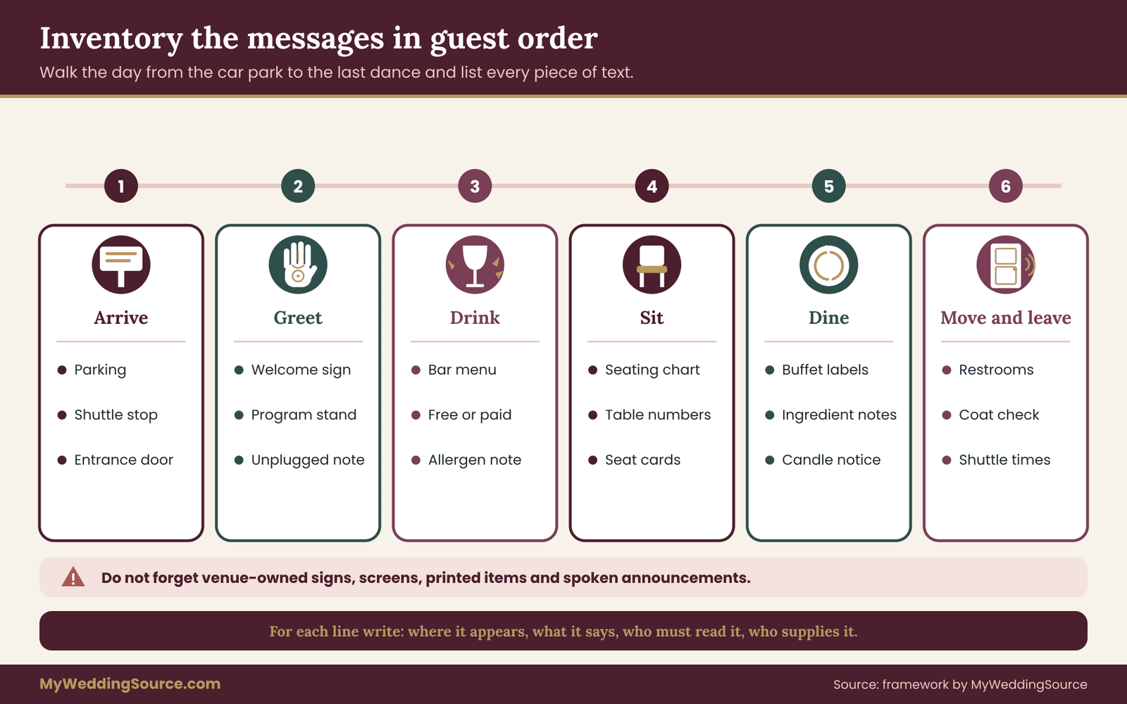
Write each message on its own line in a spreadsheet. Use five columns: where it appears, what it says in your working language, who is expected to read it, whether the venue or a vendor supplies it, and its current language. Keep this sheet open all through planning, because every later decision about the bilingual signs refers back to it.
Messages that do not look like signs
Several kinds of text work as signs without being called signs, and the inventory should include them.
Printed items count. A program, a menu card and a seat card all carry messages a guest has to read. If you are already working on a program in two languages, build one shared glossary of names and key terms and reuse it for the bilingual signs.
Screens count. A slideshow with a welcome message and a schedule is a sign. A live feed of announcements is a sign. If your venue has digital displays, note them in the same list.
Spoken messages count as a backup. The emcee who announces that dinner is served is replacing a sign. Mark these in the list so you can see where speech and print already cover the same message, and where they do not.
Venue-owned signs count most of all. Exit signs, stair signs, “wet floor” markers, room names and equipment warnings belong to the building. You usually cannot change them, but you can note them and plan around them. Treat these fixed signs as the frame inside which your own bilingual signs must work.
Messages your venue controls
Many venues have rules about what you may attach, stand or hang, and about covering their own signs. You should not cover or move a venue’s exit or safety signs. If a venue sign is in one language only and guests may need it in another, ask the venue what they can offer instead of making your own version.
Ask for a floor plan with their fixed signs marked, or take photos on a site visit. A good moment to do this is during a technical visit. The venue technical walkthrough guide covers what to measure and ask on that visit, and you can add the language questions to the same trip. Photos like these also help your sign maker size the bilingual signs for the actual spaces.
A short list of questions for the venue contact:
- Which fixed signs are in the building, and in which languages?
- Are you allowed to place a translated card beside a fixed sign, or must we ask first?
- Do you have any signs in other languages already, for example for exits or restrooms?
- Who is responsible for the bilingual signs on the day, and who can approve a change?
Adding the people who will read each message
For each line in the inventory, write who has to read it. Two answers cover most cases: “everyone” or “guests who read language B only”. A few messages have a narrower reader, such as “parents of young children” for a changing-table sign or “guests with mobility needs” for an accessible-route sign.
This column is the bridge to the next pass. A message that “everyone” must read and that carries a risk is a strong candidate for both languages. A message for a narrow group may need a different solution, such as a personal note. A short, honest reader column keeps the bilingual signs focused on real people.
How long the inventory should be
A typical wedding with a ceremony and a reception in one venue produces a list of thirty to sixty messages once the small ones are included. If yours has ten, you have probably missed the small ones. If it has two hundred, you have probably listed every table number separately. Group repeated messages together, for example “table numbers, one through twenty”.
Do not worry about the length. Most of the messages will fall into tiers three and four and will not need work. The inventory exists to make sure the few that matter are not hiding in the pile. Most of the effort on bilingual signs ends up in a small fraction of the list.
Pass two: score each message and choose a format
With the list in hand, you can score every line. The scoring takes about one minute per message once you have the habit, and it is where the audit earns its name.
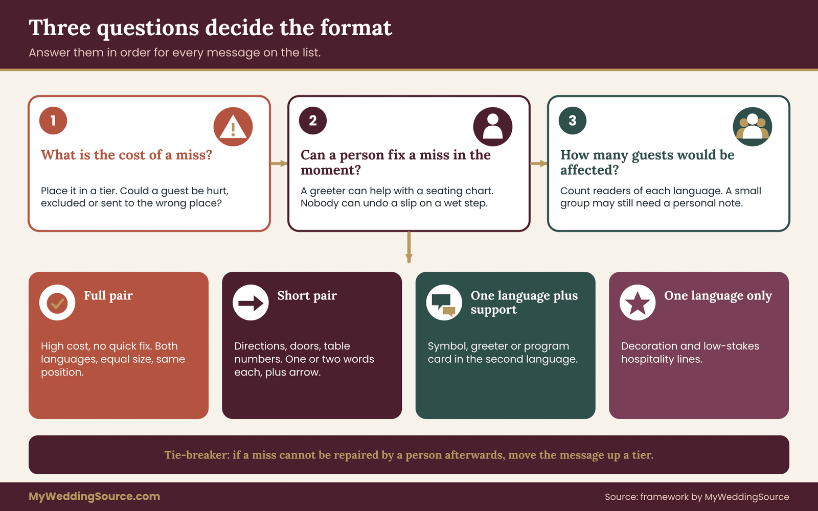
Three questions for each message
Ask these in order and write the answers beside the line.
One: what is the cost of a miss? Place the message in a tier. If a guest who cannot read the sign could be hurt, excluded from something essential or put in the wrong place at a time that cannot be repeated, the cost is high. If the worst outcome is a mild missed joke, the cost is low.
Two: can the miss be fixed in the moment? Some messages carry a high cost but are easy to repair. A guest who cannot read the seating chart can ask a greeter. A guest who cannot read a warning about a wet step cannot ask until after the slip. Messages that cannot be repaired in the moment need the language on the sign itself.
Three: how many guests would be affected? If sixty guests read only language B, a miss on a tier two message will affect many people at once. If three guests do, the cost per message is lower but the individual impact may be the same, so ask them or their family what would help. Counting readers this way shows where bilingual signs will reach the most people.
Turning answers into a decision
A message that is high-cost and cannot be fixed in the moment gets both languages on the sign, with equal weight. A message that is high-cost but can be fixed by a person can have both languages, or can have one language and a clearly briefed greeter. A message that is low-cost can stay in one language.
This produces four outcomes, and you can label each line with one of them.
Full pair. Both languages, equal size and equal position. Used for safety and for the main logistics signs.
Short pair. Both languages, but each reduced to the shortest possible form. Used for directional signs, door labels and table numbers, where a word or two will do.
One language plus support. One language on the sign, with a symbol, a greeter or a printed guide in the other. Used for hospitality messages and for borderline logistics.
One language only. Used for decoration and for tier three messages where the other language adds little. Even the one-language labels belong on the sheet, because bilingual signs work as a set.
Borderline cases and how to settle them
A few messages refuse to fit neatly. A bar menu is logistics for most guests but may carry allergy information that moves it to safety. The sign that asks for no flash photography during the ceremony sits between logistics and hospitality. A sign naming a ritual object could be pure decoration for one group and meaningful for another.
For borderline messages, the tie-breaker is the unfixable-in-the-moment test. If the miss cannot be repaired by a person after the fact, move the message up a tier. If it can, leave it where it is and brief a person to cover it.
Where couples disagree
Scoring is usually quick until the family weighs in. Someone will feel that the welcome sign has to be in both languages because it is the first thing guests see. Someone else will feel that translating the quote is unnecessary. These are both reasonable positions, and the audit does not dispute them.
What the audit gives you is a way to separate the two conversations. First settle the safety and logistics tiers, where the case is practical and easy to explain. Then, with that done, decide the hospitality and decoration tiers as a matter of taste and budget. Many couples find the second conversation much easier once the first is finished, because nobody can say the bilingual signs are being neglected.
If you are working with several households on decisions like this, the guide on sharing wedding decisions with family offers a calm way to assign who decides what.
Safety and access messages on bilingual signs
Tier one is the shortest list and the one with the highest stakes. These are the bilingual signs where a second language is closest to a practical need, not a courtesy. Each one should be checked on site, because most safety rules belong to the venue and the local authority, not to you.
Fixed building signs: leave them, then support them
Exit signs, stair labels and fire equipment markers are part of the building. They follow rules set by building and fire codes, and venues are responsible for them. Do not cover them, move them or add decoration that hides them. A bilingual wedding is not a reason to alter the building’s own safety signs.
What you can do is ask the venue how guests who read only language B will find the way out. The answer may be a floor plan in the program, a short announcement in both languages at the start of the reception, or a venue sign that is already multilingual. Many venues welcome the question because they host international events. Venue staff are often glad to help with bilingual signs near their own fixtures.
If the venue’s exit signs use a pictogram, which many do, that already helps readers of any language. Point guests to the pictogram in your announcement instead of adding a new sign.
Steps, slopes and uneven ground
A garden ceremony, a barn floor or a rooftop terrace often has changes of level that look obvious to someone who has walked there and invisible to someone arriving in heels at dusk. A small sign that says “Step down” or “Uneven ground” does real work.
Put these in both languages, short and plain, at the point of the hazard and again slightly before it so a guest can adjust. Pair the words with a contrasting edge marker where the venue allows it. A strip of high-contrast tape on a step edge helps every guest, whatever language they read.
Keep the wording to a few words. “Watch your step” is clear in English, but in another language the nearest idiom may be longer or less direct. Ask your reviewer for the shortest natural phrase, not the closest literal one. Short wording is the main craft of bilingual signs near hazards.
Wet floors, open flames and hot equipment
Candles, fire pits, torches, hot plates, chafing dishes and wet dance floors all warrant a short notice. The need for these notices depends on your setup. Ask the caterer and the venue which they would normally post, and ask whether they have a standard card you can use.
If you make your own notice, keep it to one hazard per card. “Hot. Do not touch.” in two languages is easy to read from a short distance. A paragraph about fire safety is not. If something is genuinely dangerous for guests, a person nearby is more effective than any sign, so brief a staff member to keep an eye on it. A hazard card is the simplest of all bilingual signs, and the one worth printing twice.
Food and allergen messages
Food signs sit on the edge between safety and logistics, and they deserve care. A guest who avoids an ingredient for health or religious reasons relies on the sign being correct. A mistake in translation can be worse than no translation, because it looks reliable.
For allergen and dietary notes, the caterer’s information is the source of truth. Ask for the ingredient list and allergen notes in writing, and translate from that, not from a menu description. Use plain labels such as “contains nuts” or “vegetarian”, and have a fluent reviewer check each label against the written source.
In the United States, the FDA publishes the list of major food allergens used in packaged food labeling. Those rules are for packaged products, not for a wedding buffet, but the list is a useful reference when you decide which words to include and translate. Many couples add a line telling guests to ask a server for details. That line is worth putting in both languages.
Terms for ingredients and diets do not always map across languages. A word that means “vegetarian” in one place may allow fish or broth in another. When in doubt, describe the ingredients in plain words beside the label. Careful food wording is where bilingual signs earn the most trust.
Accessible routes, restrooms and quiet spaces
Signs that point to an accessible entrance, an elevator, an accessible restroom or a quiet room are access messages, and a guest who needs them often cannot easily explore to find them. For these bilingual signs, the message has to work the first time.
Use the standard accessibility symbol alongside both languages, so the symbol carries the message even if the words are missed. The U.S. Access Board publishes the accessibility standards for permanent signs in buildings, and the ADA sets the legal framework for places open to the public. Those rules are written for permanent signage, not for temporary wedding cards, but they are a good benchmark for contrast, character size and placement. Standard symbols let bilingual signs work even when a guest reads neither line quickly.
Make the route readable as a chain. A sign at the door that says “Accessible restroom” is not enough if the next turn is unmarked. Put a sign at every decision point, in both languages, with the symbol and an arrow. If you are still choosing a venue, the guide on accessible wedding venue red flags lists what to check before you commit.
Ask guests in advance. A line on your website or RSVP, in both languages, that asks whether anything would make the day easier lets guests tell you what they need. These bilingual signs are one tool among several, and a person who answers the question is often a better tool than any card.
Children and care spaces
If you plan a space for children or for a nursing parent, the sign on its door carries information that matters to the guests who need it and nobody else. A sign that says “Family room” in both languages with a simple pictogram is enough. Do not rely on a long description.
If the space is supervised, say so on the sign, and say who to ask. If it is not supervised, say that too. A short line such as “Children must stay with an adult” in both languages avoids a misunderstanding that could be serious.
What goes on the sign and what goes in a person’s mouth
Some tier one messages are better delivered by a person than by a card. An emergency announcement, a request to clear a room, a warning that the weather is changing. These cannot wait for someone to read a sign. Brief your venue contact and your emcee on how to deliver them in both languages, and agree in advance who will do it. Bilingual signs are one layer of the plan, and a briefed person is the other.
If nobody on your team speaks both languages well enough to give an urgent instruction, ask a bilingual friend or family member to be the backup voice. A named person with a role is more reliable than a general hope that “someone will translate”.
A short check for every tier one sign
Before a safety or access sign goes to print, run it through five checks. Is it a message the venue or a code requires, and have I confirmed that I may post it? Is each language as short and as direct as it can be? Has a fluent reader who is not the translator confirmed it says the same thing in both languages? Is the symbol, if there is one, the standard one? And will it be readable at the distance and in the light of the real spot?
If any answer is no, fix that before anything else on your list. Tier one is small, and it is worth being slow here. The rest of the bilingual signs can be good enough. These ones should be right.
Logistics messages: where bilingual signs save the most time
Tier two is where most of your bilingual signs will live, and it is where a good audit saves the most confusion on the day. These messages decide whether guests are in the right place at the right time, and whether the evening flows or stalls.
The seating chart and table numbers
The seating chart is the sign most guests read most carefully, and the one most likely to make a crowd form. It is also a case where a second language adds complexity, because names do not translate.
Names stay as they are. A guest named José should appear as José in both versions, with the accent, and the same goes for every name with a diacritic or a different script. The chart should be one list, not two translated copies, because the list is made of names and table numbers. Translate only the headings and instructions, such as “Find your name” and “Table”.
If your guests read in different scripts, decide how to order names. Many couples sort by the spelling that appears on the invitation. A short note in both languages that says how the list is sorted saves guests from searching the wrong place. For the layout of the chart itself, the wedding seating chart guide covers the practical options, and the sort order should match the one you choose there.
Table numbers are short, and numerals are usually understood across languages that use the same digits. If you use table names instead of numbers, such as places or flowers, check that each name works in both languages, and that none of them means something unintended in the other. A single list, rather than two copies, keeps these bilingual signs accurate.
Directions between spaces
A sign that points from the ceremony lawn to the reception hall is a tier two message with a short life: guests read it once, quickly, often in a group. Use an arrow and a single word in each language, such as “Reception” and its equivalent, and keep the arrow large.
Where the route has several turns, put a sign at each one. Use the same two words at every turn, in the same order, so a guest who learns the pattern at the first sign never has to read the rest carefully. Repeated short bilingual signs at each turn are easier to follow than one long board.
Color can help if it is used consistently. If language A is always dark ink and language B is always a second color, a reader finds their line by color first. Keep both at strong contrast against the background, and do not let a pale color carry a language, because the weaker line will fail first in poor light.
Shuttle times and pick-up points
A shuttle sign is one of the few wedding signs where the content changes with time. Departure times, loop lengths and the last run all matter, and a guest who misreads a time may be stranded.
Write times in a format both groups read the same way. A twenty-four-hour clock avoids the morning and evening confusion that some readers have with twelve-hour notation. If you use a twelve-hour clock, write the words for morning and evening in both languages. Spell the date out in words as well, for example “Saturday” with its equivalent, rather than a numeric date that can be read two ways.
Put the same schedule in the program, on the website and on the sign, and make sure the three agree. When any time changes, change all three and tell the driver. If a change happens on the day, a person at the pick-up point should announce it in both languages. A clear schedule is one of the most useful bilingual signs you can put out.
Programs, schedules and the order of the day
The order of the day is a logistics message even when it feels like a hospitality one. A guest who knows when dinner starts knows when to take the children to the restroom, and a guest who does not may miss the toasts. If the order is on a sign, it belongs in both languages.
Keep the entries short, with the time first and the event second. “5:30 Ceremony” reads the same in both languages once the word is translated. Avoid long descriptions on the sign, and put the detail in the program, where there is room.
Bar, buffet and station instructions
Instruction signs for stations answer the question “what do I do here?” A buffet sign that explains the order, an open bar sign that says what is included and a dessert table sign that says to take one piece each are all small logistics messages.
Say plainly whether drinks are free or paid, and say it in both languages. A guest who orders a paid drink by mistake, or one who hesitates because they do not know whether it is free, is a small failure of the sign. Keep the line short: “Open bar” and “Cash bar” are clearer than a sentence. Plain instruction on bar and buffet bilingual signs prevents small awkward moments.
Coat check, gifts and photo areas
The remaining logistics signs, such as coat check, the gift and card table and the photo area, are all short labels. Treat them as short pairs. One or two words in each language, a symbol if there is one, and a position that guests pass naturally.
Where a sign carries a request, such as “Please leave cards here” or “Unplugged ceremony”, keep the tone as polite in the second language as in the first. Direct translations of requests sometimes sound more abrupt in another language. Ask your reviewer whether the polite form is natural.
Hospitality and decorative messages: where one language can be enough
Tier three and tier four are where the audit gives you permission to relax. A bilingual wedding does not need every sentence in every language, and trying to do that tends to produce signs that are crowded and tired. This section helps you decide where to translate and where to leave well alone.
The welcome sign
The welcome sign is the one message most couples want in both languages, and it is a good choice. It sets the tone, it is read by nearly everyone and it is usually short. A two-line welcome with each language given equal space makes a clear statement that both groups are expected and valued. Of all the bilingual signs, this is the one guests photograph, so it deserves the extra review.
Because it is short, it is also cheap to get right. Have it reviewed like a tier one sign, even though a mistake would not hurt anyone. A welcome sign with an error is the one a guest will notice, photograph and remember.
If the sign is large and decorative, resist the urge to make one language dominant. If you must order them, choose an order you can explain to both families, and use it consistently across the day.
Names, family trees and photo captions
Names do not need translating. A family tree board or a photo wall labeled with first names works for every reader. If you add short captions, such as “Grandma Rosa, age eighteen”, decide whether the captions are for everyone or for a particular group. A caption that is meant to be read by both groups needs both languages. A caption that is a private joke can stay in one.
Dates and places on these boards are worth a second look. A month written in words is unambiguous. A numeric date can be read two ways. If a place name has a well-known version in the other language, use the one the family uses.
Quotes, poems and readings on display
A quote on an easel or a framed reading near the guest book is hospitality or decoration. If the quote is originally in one language, show it in that language and add a translation beneath, in smaller type, only if you want guests to read it.
Poetry and proverbs resist literal translation. A line that rhymes in one language may be flat in the other, and a proverb may have no equivalent. If the text matters, ask your reviewer for a faithful version and a note on what is lost. If it does not matter, leave it in the original and move on. Where the words matter less, bilingual signs can stay simple and lose nothing.
For readings that guests will hear spoken, such as in the ceremony, the plan is different. The translation question there belongs to the ceremony itself and needs its own review with your officiant.
Favors, tags and thank-you notes
A favor tag with a short thank-you is a warm message that costs almost nothing to translate. If the favor is food, treat the label as tier one for any ingredient note, and keep the thank-you as the hospitality line beneath.
A thank-you note placed at each seat can be bilingual if the household has the language skills to write it. A couple who writes a warm line in each language usually does better than a perfect translation of a formal note. Guests read tone before grammar.
Neon, calligraphy and other decorative signs
Decorative signs are about looks. A neon phrase in one language is part of the design, and adding the other language can spoil the lines. If the phrase has meaning for one group, keep it in that language and make sure the other group does not feel excluded: a thank-you line elsewhere or a greeter who explains the meaning is enough. Decorative bilingual signs are optional, and one language is often the better design.
One caution applies. A decorative sign is still a sign. If the text is gibberish in one language, or if a word has an unintended meaning, a guest will notice. Have a fluent reader look at every decorative phrase, even if you will not translate it.
When one language and a support is better than two
For a tier three sign with a lot of text, such as an explanation of a tradition, a short description in one language plus a printed card in the other can be better than two paragraphs on one board. The card can sit in a small stand beside the sign or in the program. This keeps the board readable and gives the second group a comfortable place to read at their own speed.
Where you do this, make the card easy to find. Put a short line on the board in the second language that says where to find the card, such as “Translation in the program” with its equivalent. This takes five words and avoids the feeling of being left out. A card in the program lets bilingual signs stay light while still serving the second group.
Choosing a format for bilingual signs: full pair, short pair or support
Once a message has a tier, the next question is how to lay it out. The format affects how quickly a guest finds their language, how large the type can be and how the sign looks from across the room. There are several workable formats, and each suits a different kind of message.
Stacked: one language above the other
Stacking puts language A on top and language B beneath, in the same typeface, with a clear gap. It works well for short messages on rectangular signs, such as door labels and directional signs, where a reader scans down and finds their line.
The strength of stacking is that each line can use the full width of the sign, so the type stays large. The weakness is that the sign becomes taller. On a narrow stand, stacking two lines in each language may force the type down. Stacked bilingual signs are usually the easiest format for short messages.
To keep stacking fair, use the same size for both lines and put a thin rule or a space of at least one line height between them. Keep the order the same on every sign.
Side by side: two columns
Side-by-side signs split the width, with language A on the left and language B on the right. This suits wide signs and printed cards, such as a program or a menu, where the reader can follow a column down.
The strength is that each reader sees a clean block of their own language. The weakness is that each column is narrower, so the type is smaller than in a stacked layout of the same width. Check the reading distance. A side-by-side layout that works on a menu card held in the hand may fail on a sign twelve feet away. Side-by-side bilingual signs suit cards held in the hand more than boards seen from a distance.
Where the languages read in different directions, a side-by-side layout needs care. A left-to-right language beside a right-to-left one can be arranged so that each column starts at its natural edge, but the alignment of the headings and lines needs a designer’s eye.
One sign per language
For large messages, you can make two separate signs, one for each language, and place them next to each other or at two points in the room. This avoids crowding and lets each sign use a size and layout natural to its language.
The risk is that guests only see one of the bilingual signs, and the other group gets nothing at that spot. Use this format only where both signs are visible together, such as two easels side by side at the entrance, and never for a tier one message.
Color-coded languages
Assigning one color to each language works as a layer on top of any layout. A reader learns that the dark line is language A and the second color is language B, and can find their line quickly.
Use color as a helper, not as the only signal, because a guest with limited color vision may not distinguish the two. Always combine the color with position or a label. And check both colors for contrast against the background, as the weaker one limits the whole sign. Used with care, color helps bilingual signs without carrying the whole message.
Symbols and pictograms
A symbol can carry a message across any language. Standard symbols for restrooms, accessibility, exits, stairs, no photography and no smoking are widely understood. Where a standard symbol exists, use it and keep the words as a supporting line.
Do not invent symbols for important messages. A cute illustration of a champagne glass on the bar sign is decoration. It is not a message, and it does not replace the words “Open bar”. Symbols support bilingual signs, but they do not replace the words.
Short pair: the most useful format
For most tier two bilingual signs, the best format is a short pair: one or two words in each language, with a symbol or arrow, in a large size. It is easy to read at a glance, it fits on small signs and it leaves room for the type to be large.
The craft is in the short. Ask your reviewer for the shortest natural wording in each language, not a literal match. “Restrooms” and its equivalent are shorter than “This way to the restrooms”. Save the longer version for the program.
Choosing a format by message
As a rule of thumb, use a short pair for door labels, directions, table numbers and station names. Use a full pair, stacked, for safety notes and for a few lines of instruction. Use side by side for programs, menus and schedules on cards. Use two signs only for large welcome boards. Use one language plus support for tier three explanations. Most bilingual signs at a wedding end up as short pairs.

When you are unsure, make a quick mock-up at full size on plain paper, tape it up at the real distance and look. Whichever format reads easily from where a guest will stand is the right one.
Pass three: translation review for bilingual signs
Pass three is where the text becomes reliable. A sign can look professional and still say the wrong thing, and a wrong word on a printed board cannot be fixed with a smile. The review does not need to be elaborate. It needs to be done by the right person, in the right order, with a record. A checked translation is what separates reliable bilingual signs from decorative ones.
Who should translate
The best translator for a sign is a fluent reader of the target language who knows the region and the audience. A relative who speaks the language at home often writes warmly and naturally. A professional translator is more consistent with terminology and register. For tier one messages, use whichever of the two you trust most, and then add a second reader.
If you hire a professional, the American Translators Association offers a directory of translators and guidance on how to work with them. Ask for experience with short, public text, because signs are a different craft from long documents. Give them the context: where the sign will hang, who will read it and what the message is for.
Machine translation can give you a first draft and a vocabulary, and many people use it that way. It does not know your venue, your guests or the polite register of a region, and it sometimes produces a fluent sentence that says something different. Treat it as a draft that a person must check, never as a finished sign. For tier one messages, do not rely on it at all. A human check is the minimum standard for bilingual signs, whatever tool made the first draft.
The second reader
The rule that does most of the work is simple: the person who checks is not the person who wrote. A second fluent reader sees what the first no longer can.
Give the second reader the original and the translation and ask three questions. Does it say the same thing? Does it sound natural, as a native reader would say it? Is there any word that could be read another way? Ask them to mark problems and not fix them silently, so you can talk through the choice.
For a safety sign, a useful extra step is a back-translation. A third person, who has not seen the original, translates the finished sign back into the first language. If the result matches the original in meaning, the sign works. If it drifts, you have found the problem before the print shop did.

Register, formality and regional words
Languages have levels of formality, and a sign has to choose one. Some languages use different words for “you” depending on respect and familiarity. A wedding sign addressed to all guests usually takes the polite or plural form, and your reviewer will know which one is natural for your families.
Regional vocabulary matters too. The same language is written differently in different countries, and a word that is ordinary in one place is odd or rude in another. If most of your guests come from one region, use that region’s words. If they come from several, ask the reviewer to pick the most neutral form and to flag words that differ. Choosing the right regional words is a quiet way to make bilingual signs feel local to your guests.
Write down your choices in a short glossary: the term, the version you chose and the reason. The glossary keeps the bilingual signs consistent, so “restrooms” is the same word on every sign, and it helps a printer or an assistant who is asked to add a sign at the last minute.
Names, places and proper nouns
Do not translate names of people. Check the spelling of every name against the source the person uses, and keep accents and special characters exactly. The guide on wedding invitation printing covers proofing for names and addresses, and the same proof routine applies to a seating chart.
Place names and venue areas need a decision. If the venue calls its ballroom “The Garden Room”, you can keep the name as it is and add a short descriptor in the second language, or you can leave the name alone. Whatever you choose, use the same version on every sign and in the program. Consistent place names help bilingual signs work together as a route.
Numbers, dates and times
Numerals are mostly shared, but formats are not. A date written as numbers can be read as day-month or month-day. Write dates with the month as a word, or write the weekday and date in full. Times are less ambiguous in a twenty-four-hour format or with words for morning and evening.
Currency and measurement need the same care. If a sign mentions a price or a distance, state the unit in both languages and use the one your guests expect. A sign that says “ten minutes” is clearer than one that says a distance in a unit half your guests use rarely.
Tone and humor
Humor is the most fragile text to translate. A pun on a sign is likely to fail, and a joke that is gentle in one language can sound sharp in another. If the sign is tier four, a witty line in one language is fine. If you want it in both, ask for a new line in the second language that carries the same spirit, not a literal copy.
Warm phrases such as “thank you for being here” vary a great deal in how natural they sound. A reviewer can often offer two or three options. Pick the one a family member would say aloud.
Keep a change log
During the review, the text will change. A word will be swapped, a line shortened, a name respelled. Keep one master file and a simple log: date, what changed, who approved it. The master file is the version you send to the printer, and the log is how you know the printed sign is the approved one.
This is the same discipline used for invitation and menu proofs. If you are also managing other printed materials, using one master document for all of them keeps the languages aligned. A sign that disagrees with the program is worse than a sign in one language. One master document keeps all your bilingual signs and printed pieces aligned.
Layout, type and scripts for two languages
Good words can still fail on a bad layout. Two languages on one sign put demands on type, spacing and reading order, and the demands grow if the two languages use different scripts. This section covers the choices that matter most.
Choosing typefaces that support both languages
Check that the typeface you like includes every character both languages need. Accented letters, special punctuation and non-Latin scripts are all common failure points. A decorative script font may show accented letters in a fallback font that does not match, or may not include them at all.
The simplest method is to type the real text, with every accent, into the font and print it. If any character looks different, missing or oddly spaced, choose another font. Do this before you commit to a design, because a changed font changes the layout.
For languages with other scripts, use a typeface designed for that script, not a stand-in. Fonts for the two scripts should look as if they belong together: similar weight, similar height and similar contrast. A designer who works with the scripts can pair them. The W3C Internationalization pages explain, in plain terms, how scripts and language tagging work for text in different languages, which is useful background when you brief a designer. Pairing scripts well is one of the details that makes bilingual signs look intentional.
Size, weight and equal treatment
Different scripts look different at the same point size. A script with many strokes per character may need to be larger to read as clearly as a simple one. Judge by eye at the real distance, not by numbers, and adjust until both lines read with equal ease.
Keep the weight and color contrast the same for both languages. A common failure is a bold first language and a light second one, which quietly tells the reader of the second language that they are an afterthought. Equal weight is also a safety measure, because the lighter line will fail first in poor light.
Reading order and direction
Decide which language comes first and apply the rule everywhere. Common choices are the language of the venue’s country, the language of the person hosting, or the language of the larger group. Whatever you pick, explain it to both families early, because the order is often noticed more than the words.
If one language reads right to left, the sign needs more than a mirror image. Alignment, punctuation and the position of numbers change. Ask the designer and the reviewer to check the proof together, and look especially at lines that mix words and numerals, such as times and table numbers.
Spacing, line length and hierarchy
Give each language room. A sign that is full to the edge looks crowded and reads slowly. Leave margins, keep lines short and break lines at natural points. Use space, not decoration, to separate the languages.
Keep a clear hierarchy: a heading, then the message, then any detail. In a two-language sign, the hierarchy should be the same in both languages, so a reader moving between signs finds the same pattern.
Contrast, finish and lighting
Dark ink on a light matte background is the most dependable pairing for any language. Glossy or mirrored surfaces reflect lights and windows and can hide letters in one part of the room while looking fine in another. If you love a reflective material, use it for decoration and keep the information on a matte sign. The principle is simple: test the surface in the real light before you order. Matte surfaces are the safe default for bilingual signs that carry real information.
Check the sign in the hour it will be used. An outdoor sign read at noon may be unreadable at sunset. An indoor sign under warm string lights may look different from one under flat room light.
Worked example: bilingual signs for an English and Spanish wedding
This example is invented, and the numbers are for illustration only. It shows how the audit turns a long list into a short set of decisions. Your own guests, venue and budget will give different answers.
The couple and the day
Lucia and Tom are planning a wedding for about one hundred and forty guests at a garden venue with an indoor hall. Lucia’s family reads Spanish and some of her older relatives read very little English. Tom’s family reads English. About sixty guests are Spanish readers first and eighty are English readers first, and a few in each group are comfortable in both.
The ceremony is on a lawn with a gravel path and one step down to the terrace. A shuttle runs between a nearby hotel and the venue. Dinner is a buffet with two vegetarian dishes and one dish that contains nuts. There is an open bar for the first two hours and a cash bar after that.
They have a budget for a sign maker, a small number of printed cards and a bilingual cousin who offered to help with the translation. They also have a worry: too many signs in two languages will look crowded. Their plan was to keep the bilingual signs few, clear and well reviewed.
Pass one: the inventory
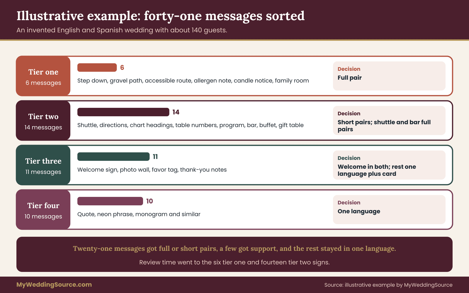
They walk through the day and list forty-one messages. Eleven are at the arrival area: parking, the shuttle stop, the entrance and the welcome. Nine are at the ceremony: the seating note, the program stand, the unplugged request, the step warning and a sign for the accessible route. Twelve are at the reception: the seating chart, table numbers, buffet labels, the allergen note, the bar sign, the restrooms, the coat check and the gift table. Nine are decorative or hospitality: a quote, a family photo wall, a favor tag, a neon phrase and a few similar items.
They add a column for the owner of each sign. The venue owns the exit signs, the restroom door labels and a “wet floor” stand. Everything else belongs to the couple or a vendor.
Pass two: scoring
For each message they ask the three questions and give it a tier.
Tier one has six messages: the step down to the terrace, the gravel path warning, the accessible route and entrance, the allergen note on the buffet, the candle notice at the dinner tables and the family room. Each of these is high-cost and cannot be fixed by a greeter in the moment, so each gets a full pair.
Tier two has fourteen messages: the shuttle schedule, directions between spaces, the seating chart headings, table numbers, the program order, the bar sign, the buffet instructions, the gift table, the coat check and the photo area among them. Most become short pairs. The shuttle schedule and the bar sign become full pairs, because a misread there costs money or a stranded guest.
Tier three has eleven messages and tier four has ten. The welcome sign gets a full pair, because the couple want it. The family photo wall keeps first names only. The quote stays in its original language with a translation card in the program. The neon phrase stays in one language, and a line in the program explains it in the other.
The venue’s own signs remain as they are. The couple ask the venue for a floor plan with exit locations and plan to point to it in a short bilingual announcement. Leaving venue signs alone keeps their bilingual signs free of conflicts with building rules.
Pass three: the review
The cousin drafts the translations. Because the cousin wrote them, the couple ask a second reader, a friend who teaches Spanish, to check the tier one and tier two bilingual signs against the originals. The friend finds three issues.
The first is the phrase “Watch your step”, which the cousin translated literally. The friend suggests a shorter, more natural phrase that guests would recognize from everyday signs. The second is the allergen note, which used a word for “nuts” that in some regions refers only to one kind. The friend suggests a clearer phrase and recommends adding the plain ingredient name. The third is the shuttle schedule, where the twelve-hour times could be misread, so they switch to a twenty-four-hour clock and add the weekday in words.
For the allergen sign, they go one step further. They send the original English note and the finished Spanish note to a third person, who translates the Spanish back into English. The result matches. They keep all three versions in the change log.
Layout and print
The sign maker prepares full-size proofs. Safety and logistics signs use a stacked layout with Spanish and English in the same size and weight, and a thin rule between them. The order is the same on every sign, and Lucia and Tom explain it to both families as “the language of the hosting side first, the other beneath, always.” The program uses side-by-side columns.
They choose dark ink on a light matte board for every information sign and keep the glossy mirror for the welcome sign only, where nothing depends on the words. They type every guest name, with accents, into the chosen typeface and confirm that all the characters display. Careful type choices kept their bilingual signs readable for older relatives.
The venue visit
At a visit one week before the wedding, they tape the proofs at the real positions, at the hour the dinner will start. The step sign is too small from the path, so they raise it and enlarge it. The bar sign is hidden by a pillar from half the room, so they move it. The directional arrow near the terrace points the wrong way when the sign is placed on the left, and the sign maker corrects it.
They also check with the venue contact that none of the bilingual signs covers a fixed sign and that the stands are allowed on the lawn. The contact approves, and they note the approval by message.
What the example shows
Of forty-one messages, they put twenty-one on full or short pairs, supported a few more with a program card or a greeter and left the rest in one language. They spent their review time on the six tier one bilingual signs and the fourteen tier two bilingual signs, and the other twenty-one took little effort.
The result is fewer signs in two languages than a “translate everything” plan, and each one is more carefully checked. Guests who read only Spanish can find the step, the buffet, the shuttle and the bar without asking. That was the goal. Fewer, better-checked bilingual signs served their guests more than a full set of rushed ones.
Verifying bilingual signs with the venue and your vendors
The last step is verification. A good plan on paper can still fail because a venue rule, a vendor limit or a bad light spoils it. Verify with the people who control those things, and keep the answers in writing.
What the venue must confirm
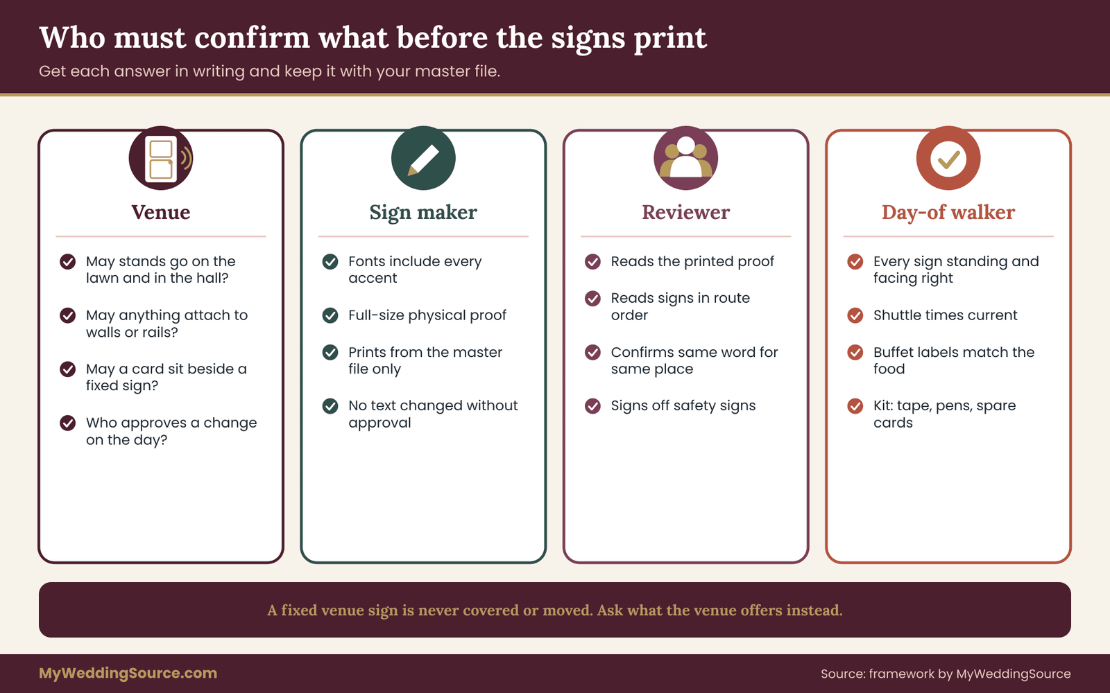
Ask the venue for written answers on a short list. May you place freestanding signs on the lawn and in the hall? May you attach anything to walls, doors or railings? May you place a card beside a fixed sign? Are there areas where signs may not stand, such as exit paths or fire equipment? Who can approve a change on the day?
Some venues restrict materials, adhesives and open flames, and some require that exit routes stay clear. If you rent the venue through a city or a park authority, rules on signs may be set by that body. The wider guide on signage covers permissions in more detail, and it is a good place to check before you order anything. The signage and venue permissions guide has the full permissions list.
What the sign maker must confirm
Send the sign maker your master file, your glossary and your change log, and ask them to print from the master file only. Ask them to confirm in writing that the fonts include every character, that the proof will be full size and that they will not alter any text without approval.
A good sign maker will flag characters that do not display and layouts that look uneven. Welcome these questions. If you hire a vendor, the wedding vendor contract guide explains what to put in writing about proofs, changes and remakes.
What your translator or reviewer must confirm
Ask your reviewer to read the final printed proof, not only the file. Printing can drop an accent, break a line badly or cut off a word. A reviewer who sees the proof can confirm that what is printed is what was approved. A reviewer who reads the printed proof protects the bilingual signs from print errors.
Ask them, too, to read the bilingual signs in order, as a guest would. A set of signs can be correct one by one and still confusing as a path if two signs use different words for the same place.
A final walk on the day
On the wedding day, someone should walk the route one more time before guests arrive. Check that every sign is standing, facing the right way and not blocked. Check that the shuttle sign shows the right times and that the buffet labels match the food that is actually on the table.
Give that person a copy of the master list and a small kit: tape, pens, spare cards and a phone with the files. The person who makes a last-minute correction should know which version is right. A small kit lets you fix bilingual signs on the spot without guessing which version is right.
Limits of the audit
The audit reduces the chance of a misunderstanding. It does not remove it. Some guests will not read any sign. Some will read the wrong one. A sign cannot replace a conversation, and a printed translation is only as good as the review behind it.
The audit also cannot tell you about your venue’s rules, your local fire and building requirements, or the needs of a particular guest. For those, ask the venue, the authority that sets the rule and the guest. And it does not cover legal documents, such as a marriage license or a contract, which have their own rules for translation and certification and should go through the office or professional that handles them.
Your next steps
Here is a short order of work that fits most timelines. Adjust the dates to your own schedule and to the lead times of your translator and sign maker.
- Build the inventory. Walk the day in guest order and list every message, including venue signs, printed items, screens and spoken announcements.
- Score each line. Give every message a tier, ask whether a person could fix a miss in the moment, and choose a format for it.
- Settle tiers one and two first. Agree on the safety and logistics signs before you discuss decoration, so the practical case is clear to both families.
- Choose your reviewers. Name a translator and a separate second reader for each language, and agree how long they need.
- Write the glossary. Record every term, name and phrase you choose, with the reason, and keep one master file.
- Check the type. Print your real text in the chosen font, with every accent, and confirm that both languages look equal.
- Proof at full size. Tape the printed proofs at the real positions, at the real hour, and change what does not read.
- Confirm in writing. Get the venue’s approval on placement and the sign maker’s confirmation on proofs, and brief a person for the day.
If you are still shaping the day as a whole, the reception guest flow guide shows how the bilingual signs fit with the way guests move from arrival to the last dance.
FAQ
Which messages need two languages first?
Start with safety and access messages, such as steps, hazards, allergen notes and accessible routes. Next come logistics signs: seating, directions, shuttle times, the bar and the program order. Welcome and decorative signs come last. The test is what happens if a guest who reads only one language misses the sign. If the cost is high and a person cannot fix it on the spot, use both languages.
Do I have to translate every wedding sign?
No. Translating everything tends to crowd the signs and stretch your review time. Translate the high-stakes messages carefully and let low-stakes ones stay in one language, supported by a symbol, a program card or a greeter. A smaller set of well-checked signs usually serves guests better than a full set of rushed ones, and it costs less to print.
Can I use machine translation for bilingual signs?
You can use it for a rough first draft, but a fluent person must check every sign. Machine translation does not know your venue, your guests or the polite register in a region, and it can produce a smooth sentence with a different meaning. For safety, access and allergen messages, use a human translator and a second reader instead.
Which language should come first on the sign?
Pick one rule and apply it everywhere. Common choices are the hosting family’s language, the language of the venue’s country or the language of the larger group of guests. What matters is consistency and that both families understand the choice before printing. Keep the two languages the same size and weight so neither looks like an afterthought.
How do I handle names in two languages?
Do not translate names. Keep each person’s spelling, accents and special characters exactly as they use them, on every sign and in the program. Translate only headings and instructions on the seating chart, such as “Find your name”. Check every name against the source the person uses, and proof the chart at full size before printing.
What if two languages make the sign too crowded?
Shorten the message first. Use one or two words in each language, plus an arrow or a standard symbol. Move longer explanations to the program or a small card. If the sign is still crowded, use one language on the sign and a printed translation beside it. A readable short sign is better than a full one that nobody can read.
How do I check a translation without speaking the language?
Use two independent readers. The first translates, and the second checks the result against the original. For safety signs, add a back-translation: a third person translates the finished sign back into your language, and you compare the meaning. Keep a log of changes, and ask the reviewer to read the printed proof, since printing can drop accents.
Do the ADA rules apply to wedding signs?
The ADA and the Access Board standards cover permanent signs and facilities, and they are not written for temporary wedding signs. They remain a helpful benchmark for contrast, size and placement. For anything about the building, ask your venue what applies, and check the current rules with the issuing agency instead of relying on a summary.
Sources
- Language access resources, LEP.gov (federal interagency)
- Translator directory and guidance, American Translators Association
- Language and writing systems, W3C Internationalization
- Web Accessibility Initiative, World Wide Web Consortium
- Accessibility standards for signs, U.S. Access Board
- ADA information and technical assistance, U.S. Department of Justice
- Food allergies, U.S. Food and Drug Administration
- Safety and health topics, Occupational Safety and Health Administration
- Codes and standards, National Fire Protection Association
- Language use in the United States, U.S. Census Bureau