
A wedding visual identity is the set of repeated visual choices (motif, type, color roles, texture and layout habits) that makes your invitation, signs, flowers, cake and website look like they belong to one event. This guide gives you a written style brief, a touchpoint inventory and a review process, so the look holds together beyond a list of colors.
Build your wedding visual identity in three layers. First write a core idea in one sentence, with three words that describe the wedding visual identity and three that rule things out. Second, choose one primary motif and one supporting pattern. Third, set type rules (two typefaces, defined jobs) and color roles (what each color does, not just which colors). Then list every touchpoint, from the save-the-date to the exit send-off, and check each against the wedding visual identity brief before anything goes to print.
Most couples start with a palette. They pin photos, find three or four shades they like, and tell every vendor “our colors are sage, cream and gold.” Six months later the invitation uses one sage, the florist delivers a different green, the cake has a third, and the welcome sign is printed in a gold that looks brown under the reception lights.
Nothing in that story is anyone’s fault. A color name is a loose instruction, and every vendor reads it through their own materials, tools and habits. A wedding visual identity closes that gap by giving everyone the same short, specific document to work from.
The idea is borrowed from brand design, but you do not need a studio or a budget for one. You need a few evenings, a shared folder and a willingness to decide things early. This article covers the wedding visual identity brief itself, the motifs and type that do most of the work, the full list of places the look has to appear, the options for getting design help, and the legal and vendor-terms questions that come up when artwork changes hands.
A note on scope. This is general planning information, not legal, tax or financial advice. Copyright, trademark and contract questions depend on your situation, so the sections on rights point you to the agencies and licenses that govern them, and you should confirm current terms with each supplier.
What a wedding visual identity is, and what it is not
A wedding visual identity is a small system of repeatable decisions. It tells a printer, a florist, a baker, a rental company and a website builder how your wedding should look without requiring you to explain it twenty times. It lives in a short document, usually two to four pages, and in a folder of approved files.
It is not a logo, although some couples do make a monogram. It is not a theme in the costume sense, where every object has to reference a movie or a place. It is not a Pinterest board either, because a board shows a mood and says nothing about what to repeat, what to avoid or who decides.
The five parts of the system
Think of the system as five parts that work together. Each part answers a different question a vendor might ask.
The core idea. What should a guest feel on arriving, and what is the wedding visual identity trying to say? This is one sentence plus a few words on each side of the line.
The motif set. Which shapes or images recur? A single olive branch, a scalloped edge, a monogram, a wave line or a plain geometric frame can all be motifs.
The type system. Which typefaces appear, for which jobs, and in what sizes and cases? This decides how readable the look is at a distance.
The color roles. Which color is the background, which is the accent, which is for text? Roles, not just names, are what keep a palette stable across paper, fabric and flowers.
The texture and finish rules. Matte or glossy, deckled or clean edge, linen or smooth, brass or matte black. Finishes often break consistency more than colors do.
What the system gives you in practice
A written identity gives you four practical benefits. Decisions get faster, because new items are checked against the brief instead of being debated from scratch. Vendors need fewer rounds of revision, because they start with the same references. Costs are easier to hold, because a short list of repeated elements is cheaper than a custom look for every item. And disagreements with family or a partner become easier to settle, because you can ask whether an idea fits the wedding visual identity brief rather than whether anyone likes it.
The same system also protects against late impulse buys. When an attractive item shows up at a rental showroom or online shop, you can test it in thirty seconds. Does it use the primary motif, support it, or clash with it? If it clashes, you can say no without feeling that you are rejecting someone’s taste.
Where this guide stops
This article does not tell you which style to choose. Rustic, modern, garden, black tie and cultural styles are all fine starting points, and the choice is yours. It also does not replace the broader work of picking shades; the wedding color palette guide covers undertones, lighting and how shades photograph. Here the question is what comes after the shades, and how to make the whole look repeatable across many suppliers.
Why color alone cannot hold a wedding visual identity together
A palette is a necessary part of a wedding visual identity, but it fails as the only part for four predictable reasons. Understanding them explains why the rest of the wedding visual identity brief exists.
Color names are not colors
“Dusty rose” is a name, and each vendor will map it to something different. Printers work from ink mixes, florists from the flowers available that week, fabric suppliers from dye lots, and bakers from food coloring. A named shade can also shift between screen and paper. Screens emit light; paper reflects it.
The practical fix is to pair each color name with a specific reference, such as a printed swatch card you hand to every vendor, or a physical sample from the supplier. A visual identity makes that a rule rather than a one-off favor.
Color does not tell anyone what to do with it
Suppose your palette is navy, blush and brass. A designer could use navy as the invitation background or as the text. A florist could make bouquets mostly blush with navy accents or the reverse. Both readings are faithful to the palette and look nothing alike.
Color roles remove the ambiguity. If navy is always text and structure, blush is always the soft background, and brass is used sparingly for accents, every vendor lands in roughly the same place.
Materials change the same color
Brass foil on a card, a brass candlestick and a brass-colored acrylic sign are three different surfaces under the same light. Matte paper makes deep colors look softer. Velvet makes them look richer. Glossy acrylic adds reflections that can wash out light text.
A wedding visual identity therefore needs finish rules alongside color rules, and it needs a plan for testing them in the actual venue light. The same logic is part of the wedding signage system guide, where readability and placement decide whether a sign works.
Color cannot create recognition
Guests recognize a wedding by repeated shapes and letterforms as much as by color. If the invitation shows a hand-drawn wreath, the program repeats it, and the dessert table card echoes it in a smaller size, guests connect the pieces without thinking about it. Two weddings can share the same colors and still feel unrelated, and one wedding can use several shades and still feel unified if the motif and type stay constant.
That is why the brief puts motif and type ahead of color in the order of work. Color is the easiest layer to change late, and the most dependent on materials and light. Shape and type are more stable, so decide them first.
A quick self-test
Before building anything, run a short test. Open the invitation, the venue’s website page about your event, and any vendor mockup you already have. Place them side by side on one screen. If a stranger could not tell they belong to the same event within a few seconds, the wedding visual identity is missing, whatever the palette says.
You can also run the reverse test. Remove the color from each item by viewing it in grayscale. If the pieces still look related through shape, spacing and type, the wedding visual identity is doing its work. If they fall apart, the palette was carrying the whole load.
How much effort a wedding visual identity really takes
Expect the first draft of a wedding visual identity to take three or four evenings: one to gather references, one to write the core idea, one to set motif, type and color roles, and one to build the touchpoint list. After that, the work is mostly checking. A wedding visual identity that is finished early saves far more time than it costs, because every later order starts from a clear brief instead of an open question.
Couples sometimes worry that a written wedding visual identity will make the day feel staged. In practice it does the opposite. When the repeated elements are settled, the rest of the wedding can be loose and personal, because guests already read the surroundings as calm and consistent. The wedding visual identity handles the visual order so that you do not have to think about it on the day.
The three-layer brief for a wedding visual identity
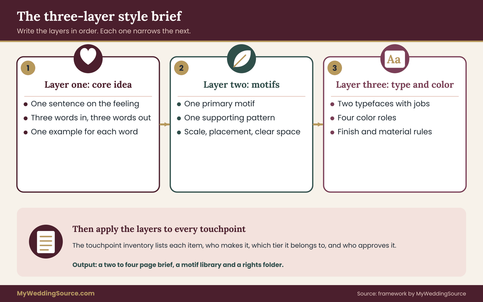
The brief has three layers, written in this order: the core idea, the motif set, and the rules for type and color. After that comes the touchpoint inventory, which applies the three layers to every item you need. Keeping the order fixed matters, because each layer constrains the next one.
The finished document should fit on two to four pages. If it runs longer, it is probably describing taste instead of setting rules, and vendors will skim it. Treat every sentence as an instruction someone could follow without calling you.
Layer one: the core idea
The core idea is one sentence, followed by two short word lists. The sentence says what the wedding visual identity should feel like and why. The lists say which words describe it and which words rule things out.
A usable core idea reads like this: “A calm garden dinner that feels hand-made, with soft greens, plain paper and one repeated olive branch.” It names a feeling, a setting, a handful of materials and a motif. It does not say “elegant” or “beautiful,” because every couple wants that and the words steer no one.
Three words in, three words out
Pick three words that describe the look and three that you want to avoid. The avoid list does more work than people expect. “Not glittery, not crowded, not formal” tells a designer more than “natural, warm, relaxed.”
Choose words that a vendor can act on. “Quiet” can guide spacing, paper weight and flower density. “Fun” is too loose to guide anything unless you pair it with an example, such as “bright accent color in small doses.”
Write each word with a one-line example of what it means in practice. For “quiet,” the example might be: “plenty of empty space around text, no more than two typefaces on any item, no patterned backgrounds behind words.” Now the word has teeth.
A short test for the core idea
Read the sentence aloud to someone who has not seen your inspiration photos. Ask them to describe the wedding back to you. If their description matches what you pictured, the sentence works. If they say “so, like a boho thing?” and you meant something different, rewrite it with more concrete nouns.
A second test is to cover the sentence and read only the avoid list. Could a vendor still avoid your dislikes? If not, the list is too vague.
Who holds the pen
Decide who writes the wedding visual identity brief and who approves changes. In many couples one partner has the stronger visual sense and the other has stronger opinions about cost and logistics. Both views belong in the document, but one person should own the file so versions do not multiply.
If parents or other family are paying for part of the wedding, decide now how their preferences enter the process. The guide to sharing wedding decision rights is useful here, but for the wedding visual identity brief the key rule is simple: input goes to the owner, the owner updates the document, and vendors only ever see the current version.
How the layers connect
The three layers feed each other. The core idea picks the motif: “hand-made garden dinner” suggests a botanical or hand-drawn element, while “crisp city rooftop evening” suggests geometry and strong lines. The motif then narrows the type, because a delicate botanical line drawing pairs poorly with a heavy display typeface. The type and motif together narrow the color roles, because thin lines and light type need more contrast than bold shapes do.
Writing the brief in this order prevents the most common failure, which is choosing three attractive things separately and discovering they do not sit together. The wedding visual identity should feel like one decision, even though you make it in steps.
Reading the venue before you finish
Before locking the core idea, read the venue’s constraints. A ballroom with ornate carpet and patterned walls will compete with a busy motif. A raw warehouse can carry bolder shapes but may need warmth added through texture. An outdoor site will change how colors read, because daylight is cooler than most indoor lighting and shifts hourly.
Ask the venue three questions. What is permanently in the room (carpet, wallpaper, wood, lighting color)? What may you hang, stick or place on surfaces? And what lighting will be on during the ceremony, dinner and dancing? Answers shape what the wedding visual identity brief can ask for. A site visit with a phone camera and a few swatch cards often reveals more than any photo gallery. The venues guide explains what to ask when comparing sites.
Setting the limits of the system
A system needs boundaries so it does not grow forever. Decide how many motifs, how many typefaces, how many colors and how many finishes are allowed. A workable ceiling for most weddings is one primary motif, one supporting pattern, two typefaces, four colors with defined roles, and two finishes.
These numbers are guidelines, not rules from any standard. A larger celebration with many separate events may reasonably carry more. The point of a ceiling is that adding something new forces a choice: either it replaces something, or it earns its place by solving a problem.
Handling cultural and family elements
Many weddings carry traditional symbols, patterns, scripts or colors that matter to the family. These are not decoration to fit around; they are part of the wedding visual identity. Put them into the wedding visual identity brief explicitly, with the name of the person who can explain what they mean and how they should be used.
For example, a family may use a particular color for ceremony textiles, or a script that must be spelled and arranged correctly. Ask a knowledgeable family member to review artwork that uses these elements before printing. A designer who does not know the tradition may reverse a pattern, misplace a symbol or use a color in a way that carries an unintended meaning.
Where a bilingual or multilingual item is needed, plan type with that in mind from the start. Some typefaces do not include characters for every language, and a fallback typeface can break the wedding visual identity on one line of a program. The same applies to accented letters in names, a point that the guide to name spelling on wedding signs treats in more depth.
What goes in the written brief
Gather the layers into a short document with these headings: the core idea sentence; the three-in and three-out words with examples; the motif set with image files; the type rules; the color roles with swatches; the finish rules; the venue constraints; and the approval contact. Add a final line saying what to do when a request is not covered: “Ask the owner before producing.” That one line prevents many surprises.
Share the brief as a PDF so formatting stays fixed, and keep the editable version in your own folder. Put a version date at the top of the page and change it whenever the file changes. Vendors will occasionally work from an old copy, and the date lets you catch it quickly.
Keeping the brief alive after it is written
A wedding visual identity is not a document that is written once and filed. Treat it as the working reference for the whole planning period. When a new vendor joins, send the current version. When a decision changes, update the page and the date. When something goes wrong, check whether the brief was clear on that point, and add a line if it was not.
Reviewing the wedding visual identity every few weeks takes about twenty minutes. Open the brief, look at the newest proofs and photos, and ask whether anything has drifted. Drift is normal, and it is much cheaper to correct in week twelve than in the last week. A short monthly review keeps the wedding visual identity honest without turning planning into a second job.
A common trap: the borrowed brief
Many couples paste a designer’s style guide from a template or a stock mockup into their brief without adjusting it. The result looks professional but fits no one. The test is whether every line connects to a decision you made. If you cannot say why a rule exists, remove it or replace it with one you can explain.
Another trap is writing the wedding visual identity brief after ordering the first items. Once the invitation exists, it becomes the default reference, and the wedding visual identity brief ends up describing what you already bought instead of guiding what comes next. If you are in that position, write the brief anyway, using the invitation as the first piece of evidence, and mark any items you would change if you could.
Motifs that carry a wedding visual identity
A motif is a shape or image that repeats. It is the part of a wedding visual identity guests remember without being told to, because it shows up on paper, on fabric, on signs and sometimes in the food. A good motif is simple enough to draw in one stroke and flexible enough to be cut, printed, stamped, embroidered or iced.
You need one primary motif and, at most, one supporting pattern. More than that and the wedding visual identity starts to look like a collage.
Where motifs come from
Strong motifs usually come from something real: a place, a plant, a family object, a pattern in the venue’s architecture or a symbol in a tradition that matters to you. A motif with a reason behind it is easier to defend when someone suggests swapping it out, and easier to explain in the program or on the website.
Avoid choosing a motif only because it is trending. Trend-led motifs date quickly, and they are also the ones most likely to appear on every competing vendor’s sample board, which makes your look harder to tell apart. The wedding trends page can help you see what is common right now, which is useful mainly as a list of what to use sparingly.
A test for a primary motif
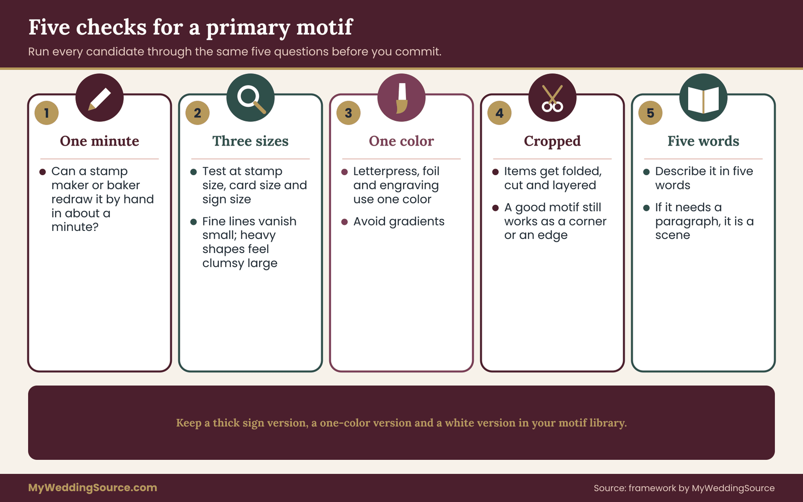
Run five quick checks on any candidate motif before you commit.
Can it be drawn in under a minute? If a stamp maker or a baker could not reproduce it by hand, it is too complex for most vendors.
Does it work at three sizes? Try it at the size of a stamp (about an inch), a card (a few inches) and a sign (a foot or more). Fine lines vanish when small, and heavy shapes feel clumsy when large.
Does it work in one color? Many printing methods, such as letterpress, foil and laser engraving, use a single color. A motif that depends on a gradient will not survive them.
Does it work on its side or cropped? Wedding items get cut, folded, wrapped and layered. A motif that survives cropping gives you a corner mark, a border or a repeating edge.
Can you say what it is in five words? “A single olive branch, hand-drawn.” If the description needs a paragraph, the motif is a scene, not a motif.
Source of artwork matters
Before you fall in love with a motif, find out where the artwork would come from. You have four routes, and they differ in cost, uniqueness and legal clarity.
Draw or commission it. A designer or illustrator creates original artwork, and your contract should state who owns it and how it may be used. This gives the most distinctive result and the clearest rights, but costs the most.
Adapt licensed artwork. Buy a license for a stock illustration or a font-based ornament and modify it within the license terms. This is the middle route. Read the license for limits on printing counts, resale and use on products.
Use public-domain or openly licensed material. Some artwork is free to use, but the label “free” means little until you read the actual terms. The Copyright Office explains that copyright protects original creative works, and that the rules on what is protected and what is not are specific.
Make it yourself. A hand-drawn or hand-cut motif is yours outright, as long as you do not copy someone else’s protected work. Scan it at high resolution so any vendor can use it.
The sections on rights later in this guide explain how to confirm each route, and how to avoid copying protected artwork by mistake.
Building a supporting pattern
A supporting pattern is a quiet repeat that fills space without competing with the primary motif. Examples include small dots, thin stripes, a repeating leaf, a simple border or a texture such as handmade paper or linen.
The supporting pattern solves a specific problem: large flat areas. Backs of cards, envelope liners, table runners and bar fronts can look empty without it. Use the pattern at low contrast so text on top of it stays readable, and never place it behind small type.
A useful rule is that the primary motif is the headline and the supporting pattern is the background. If both appear at the same strength, guests will not know where to look, and the wedding visual identity will look busy.
Motif scale and placement rules
Write down where the motif appears and how large it should be. Without this, each vendor positions it differently.
On stationery, the motif might sit at the top center on the invitation, be a small corner mark on enclosure cards and appear as a faint repeat on the envelope liner. On signs, it might sit above the heading at a fixed proportion of the sign width. On the cake, it might appear once, on the bottom tier, rather than all the way around.
Add a clear-space rule too. Keep a margin around the motif that is about the height of the motif itself, so nothing crowds it. This is a design habit from brand guidelines, and it translates well to wedding items because it keeps layouts calm.
Monograms and initials
Many couples create a monogram from their initials. A monogram can be an excellent motif, but it carries traps. Two initials in a script typeface can be hard to read, especially if the letters overlap. Test it with a few people who do not know your names, and ask them to read it aloud.
Also check whether the monogram uses a commercial font or a purchased design. Monograms made from fonts are covered by the font license, and some licenses limit use on printed goods, signs or digital invitations. A later section covers how to confirm that. If you pay a designer for a custom monogram, ask for the vector file and a written statement of the rights you receive.
Motifs across materials
The same motif behaves differently on each material. Test it before you finalize.
On paper, thin lines print well in digital and offset printing and stay crisp. In letterpress, fine lines may fill in with ink pressure, so ask the printer for a proof. In foil stamping, very small details can fail, and the printer may recommend thicker lines.
On fabric, embroidery turns detailed motifs into simplified shapes, because thread has width. Ask the embroiderer for a stitched sample before ordering a full run.
In flowers and greenery, you cannot reproduce a line drawing exactly, but you can echo its character. An olive branch motif might lead to olive foliage in centerpieces, a loose and asymmetrical arrangement style, and a muted green rather than a bright one. The florist is interpreting the motif, not copying it, so give a photo of the artwork and talk through what carries over.
In food, a motif might appear as a stamped cookie, a sugar decoration, an edible print or a plated garnish. Confirm with the baker what is possible and which food-safe materials they use. An imported image printed on edible paper counts as a use of the artwork, so the rights must cover it.
On signage, motifs become cut vinyl, etched acrylic, painted wood or laser-cut shapes. Fine detail suffers when cut, so a simplified version of the motif usually works better. Keep a second, thicker “sign version” of the motif in your folder for this purpose.
Why a small set of motifs works better
Guests do not study a wedding visual identity. They glance at it, and they build an impression from repetition. One motif seen six times in different places feels like a decision. Six different motifs seen once each feel like a collection. A restrained motif set is therefore not a limit on creativity; it is the reason the wedding visual identity registers at all.
If you feel pulled toward a second or third motif, test whether it is solving a real problem. Does the wedding visual identity have an empty area that needs filling, or a place where the primary motif looks wrong? If the answer is no, save the new idea for the honeymoon, the first home or the anniversary card.
Keeping a motif library
Create a small library of motif files, each named clearly. Include the primary motif in full color, in one color, in white for dark backgrounds, in a simplified version for small sizes and in a thick version for signs. Add the supporting pattern as a tile that repeats.
Save each in a vector format such as SVG or PDF, plus a high-resolution PNG for quick use. A vector file scales without losing sharpness, which matters when the same motif goes on a stamp and on a banner. If a designer creates the files, ask for these versions as part of the deliverables, and confirm the file formats in writing.
Label the library with a version date and a short note on rights, for example “Original artwork by [designer], licensed for wedding use.” This prevents the all-too-common problem of a vendor asking “can I use this?” six weeks before the event, with no one sure of the answer.
Type and color roles in a wedding visual identity
Type and color are the two layers most people think they have already handled, and the two where a written rule changes the most. Type decides whether guests can read anything. Color roles decide whether the look stays stable when the material changes.
The type system: two typefaces, defined jobs
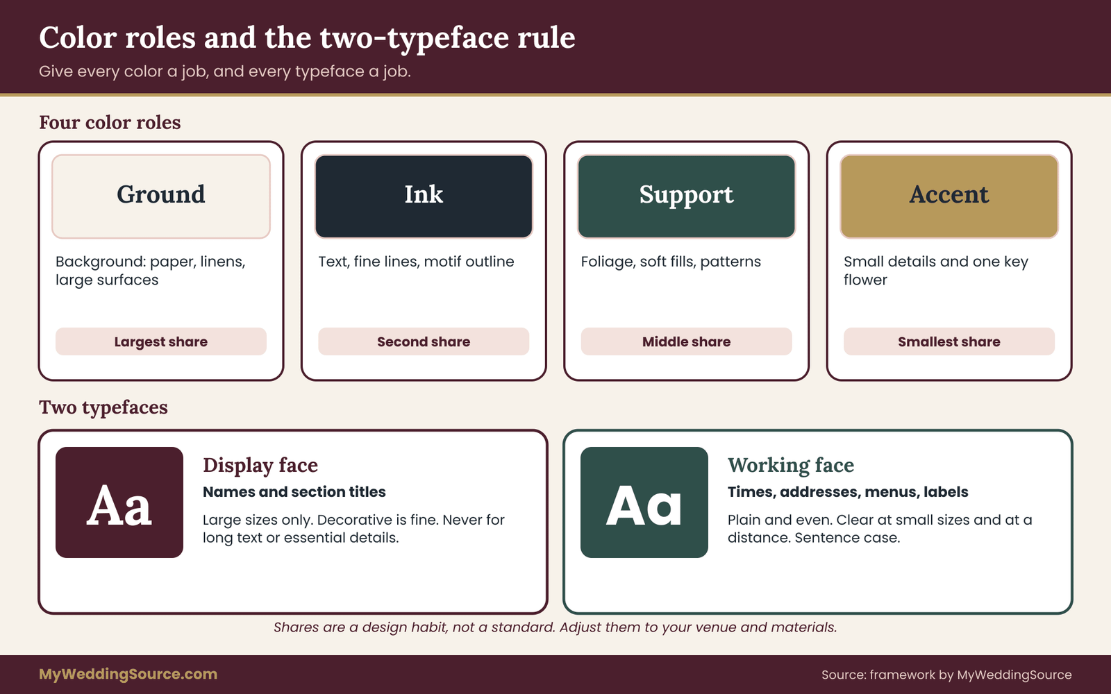
Use no more than two typefaces for the whole wedding visual identity. Give each a job. One is the display face, used for names, headings and signature moments. The other is the working face, used for details, schedules, menus and anything someone has to read quickly.
A display face can be decorative, such as a script or a high-contrast serif, because it is used at large sizes and in short bursts. A working face should be plain: a clean serif or sans-serif with clear letter shapes, even weights and good spacing. If the display face were used for a long paragraph, it would tire the reader. If the working face were used alone for everything, the wedding visual identity could feel flat. The pairing supplies both character and clarity.
Rules that make the pairing work
Write short rules for each typeface. Name the face, the allowed weights, the case (capitals, small capitals or sentence case), the minimum size and where it is used.
For example: “Display: used for names and section titles only, never below twenty points on paper, never in all capitals. Working: used for all details, never below ten points on paper, sentence case, with generous line spacing.”
Add a rule about letter-spacing. Wide spacing helps small capitals read well, but too much spacing on lowercase text slows reading. Add a rule on alignment, too. Centered text suits short invitations and signs, but long paragraphs read better left-aligned.
Scripts and readability
Script typefaces are popular on wedding stationery and are also the most common cause of illegible signs. Connected letterforms blur at a distance, and swashes can make names hard to read. Use a script only for a small number of words, at a large size, and never for essential information such as times, addresses or dietary labels.
Accessibility guidance gives a useful anchor here. The Web Content Accessibility Guidelines from the World Wide Web Consortium set a minimum contrast ratio of 4.5 to 1 for normal text and 3 to 1 for large text on screens. These are web standards, not rules for printed weddings, but they offer a measurable test you can apply to your website, your digital invitation and, by extension, your printed items.
Font licensing, briefly
Fonts are software, and each comes with a license. A font that is free to download may be free only for personal use, and printing invitations through a commercial printer or putting the font on a website may need a different license. Open licenses, such as the SIL Open Font License, generally allow broad use, but you should read the specific terms of the font you choose.
Keep a list of every font you use, where you got it and the license type. Send the list to your printer and any sign maker, since some will ask. The rights section later in this article covers monogram fonts in more depth, and the same habits apply to every typeface in your wedding visual identity brief.
Language and character coverage
Check that each typeface includes every character you need. Names with accents, apostrophes or non-Latin letters are the usual problem. A typeface missing one letter will quietly substitute a different one, and the substitution may be spotted only after printing.
Test with real data. Type every guest name that has special characters into a sample layout, and look at the result. If you plan items in more than one language, test those too. Include any fallback typeface in the wedding visual identity brief so the substitution is deliberate and looks acceptable.
Color roles: moving beyond a list of shades
Now the color layer. Rather than listing shades, assign each a role. A four-color system with roles is easy to follow and flexible enough for most weddings.
Ground. The background color, usually a light neutral. It appears behind text, as the paper color and as the main color of linens and large surfaces.
Ink. The text and structure color, usually a dark shade with enough contrast against the ground. It appears in type, fine lines and the outline of the primary motif.
Accent. The color that draws attention, used in small amounts. It appears on the motif, on small decorative details and in a few key flowers.
Support. A secondary color that fills in between ground and accent, such as foliage green or a soft tone for patterns and large floral masses.
Add proportions as a rough guide, for example ground as the largest share, ink and support in the middle, accent as the smallest. These shares are a design habit, not a standard, and you should adjust them to your venue and materials.
Writing color specifications that survive vendors
Give each role a name, a swatch and the technical values for each medium. For print, the printer will want a CMYK or Pantone reference. For screens, a hex code. For fabric and flowers, a physical sample or a photo taken in daylight.
Most color problems come from hand-offs between media. A designer picks a shade on screen, the printer reproduces it with ink, and the florist matches it to a photo of the printed card. Each step drifts a little. To limit drift, anchor everything to one physical reference: a swatch card or a printed proof that every vendor sees or receives.
Ask your printer to produce a proof on the actual paper. Paper color changes ink color, and cream stock will warm every shade printed on it. The wedding color palette guide goes deeper into undertones and lighting; here, the point is that the specification is a document, not a hunch.
Contrast and accent discipline
Contrast decides whether text is readable. Dark ink on a light ground has the best chance. Light text on a mid-tone ground, such as white lettering on sage, often fails at a distance or in dim light. Metallic ink and foil can look elegant but can be hard to read depending on the angle of the light, so keep them for decoration rather than information.
Accent discipline matters too. An accent loses its power when used everywhere. If the accent color appears on every item at the same strength, guests stop noticing it. Use it where you want a pause: a name, a motif, a small flourish.
Neutrals and the unlisted colors
Every wedding also contains colors that no one chose on purpose: the venue’s carpet and walls, the color of the tables, the guests’ clothing, the natural tone of wood and greenery. Add a short note in the wedding visual identity brief listing these fixed items and how the palette sits with them.
Take photos of the venue’s fixed colors in the light of the day you will use the room. A warm brass chandelier or a deep red carpet changes how a cool blue looks. If you see a clash, adjust the accent or ground, not the carpet.
White and black deserve a decision
Two colors cause surprising trouble: white and black. “White” can mean bright white, soft white, ivory or cream, and mixed whites look dirty next to each other. Choose one white for paper and one for linens and flowers, then check them side by side in daylight.
Black text on pure white paper is high contrast, which some couples find harsh for a soft look. A very dark brown, deep green or navy can replace black as the ink color and still hold strong contrast. Whatever you choose, test it on the actual paper.
Putting type and color together
Combine the two layers into a one-page reference that shows a sample invitation heading, a sample detail block and a sample sign, each in the right type and color roles. This page becomes the quickest way to brief a new vendor. They can see the system in action instead of decoding a description.
When a vendor produces a first draft, compare it with this page. Check the typefaces, the sizes, the color roles and the use of the motif. Mark differences on a copy and send them back in one message rather than many.
Type and color as the quiet half of a wedding visual identity
Motifs get the attention, but type and color rules do most of the daily work in a wedding visual identity. Every sign, program and menu uses them, and every vendor who touches text has to follow them. If the type rules are clear, even an item you never reviewed will probably look right, because the vendor had instructions to follow.
For this reason, spend more time on the type and color page than on the motif. A modest motif with disciplined type and clear color roles produces a stronger wedding visual identity than a striking motif with loose rules. When guests say a wedding “felt put together,” they are usually describing consistent type, spacing and contrast, not a particular image.
The touchpoint inventory for a wedding visual identity
A touchpoint is any place a guest, vendor or family member meets your wedding visual identity. The inventory is a complete list of those places, with a decision for each one. It is the tool that turns a nice brief into a consistent wedding, because it catches the items nobody remembered until the last month.
Build it as a numbered list in a spreadsheet or a plain document. For each touchpoint, record five things: what it is, who makes it, which layers of the brief apply, when it is due and who approves it.
Group touchpoints by when guests meet them
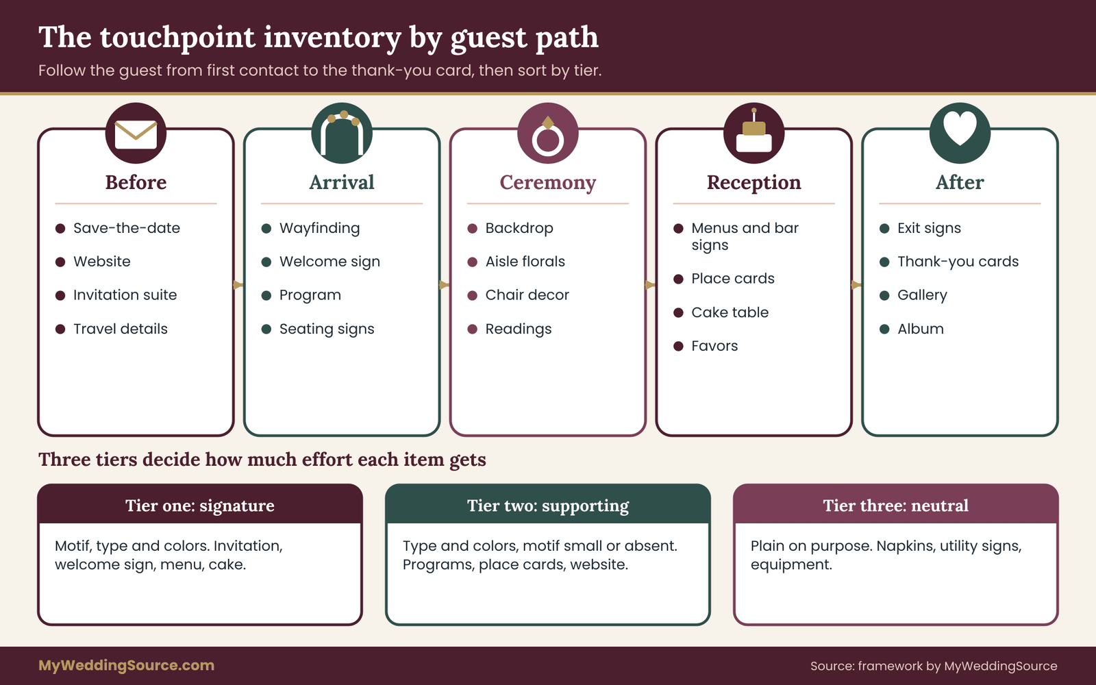
The easiest way to find everything is to follow the guest’s path. Start with the first contact and walk through to the last.
Before the wedding. Save-the-date, wedding website, invitation suite (invitation, response card, details card, envelopes, liners), digital invitations, hotel and travel information, and any welcome email.
On arrival. Parking and wayfinding signs, welcome sign, ceremony program, aisle markers, seating signs, guest book or alternative, and any gift for guests at hotels.
During the ceremony. Ceremony backdrop or arch, florals, chair decor, program, unity-ritual items and any readings printed on cards.
During the reception. Seating chart, table numbers or names, place cards, menus, bar signs, favors, cake and dessert displays, dance floor decor, photo booth backdrop and any projected slides.
At the end. Exit signs, send-off items, thank-you cards, and the photos and album delivered afterward.
Do not forget the invisible items
Several touchpoints rarely appear on a first list. Vendor invoices and contracts carry your names and sometimes your motif. The social media tag or hashtag shows your type. The photographer’s gallery page may use their branding rather than yours. Rentals such as linens, chairs, glassware and flatware bring their own colors and finishes. Staff uniforms, bartender aprons and cocktail napkins all contribute to the overall look.
Add these to the list and decide whether each one needs to match, or can remain neutral. A neutral decision is still a decision. For example: “Napkins: plain white, no print. Uniforms: black, no logo.”
Assign each touchpoint a tier
Not every item deserves the same effort. Sort the inventory into three tiers.
Tier one: signature items. These carry the full identity, with motif, type and color roles. Examples: the invitation, welcome sign, ceremony backdrop, menu and cake. Guests will photograph and remember them.
Tier two: supporting items. These carry the type and color but may skip the motif or use it small. Examples: place cards, programs, bar signs, favors and the website.
Tier three: neutral items. These stay plain so they do not fight with the signature items. Examples: napkins, utility signs, vendor equipment and back-of-house items.
Tiering controls cost and effort. A wedding where every item is signature level is more expensive and looks busier. A wedding with clear tiers looks intentional, because the plain items give the eye somewhere to rest.
Decide who produces each item
For each touchpoint, name the maker. A stationery designer, a printer, a sign maker, a florist, a baker, a rental company, an online template, yourself or a friend. Then ask what that maker needs: file formats, swatches, sizes, deadlines and rights.
Gaps appear quickly. A florist cannot read a PDF brief the way a printer can, so give them photos and a swatch. A sign maker needs vector files and the physical dimensions of the sign. A baker needs a reference image and a clear note on what can be edible. The invitation printing guide covers proofing and file handoffs for stationery in detail.
Rentals and found objects
Items you rent or borrow arrive with their own look, and you rarely control it. Chairs may be white resin or natural wood, linens come in fixed colors, and glassware has set shapes. Put these in the inventory early, because the rental catalog is often the narrowest part of the whole system.
Compare each rental option against the wedding visual identity brief using the same questions: does it match the color roles, finish and level of formality? The rental planning checklist is a good reference for timing, minimums and damage terms. If no rental matches exactly, pick the one that clashes least and plan to dress it with a tier-one item such as a runner or a sign.
Signs deserve their own pass
Signs are where most identity systems either shine or fall apart. They must be readable, correctly spelled, positioned well and permitted by the venue, as well as on-brand. A beautiful sign that no one can read from the door fails its job.
Treat signs as a mini-system within the inventory. List each sign, its message, its viewing distance, its size, its material and where it will stand. Then check the type and color rules against viewing distance. The wedding signage system guide walks through readability, placement and venue permissions, and the inventory should link to it for each sign.
Digital touchpoints
A modern wedding includes several digital touchpoints: website, email, digital invitation, text updates, a photo-sharing page and social media. They follow the same brief but need extra decisions.
Choose web-safe or licensed web fonts, and confirm the license covers web use. Use the hex codes from your wedding visual identity brief. Provide alt text for images, since screen readers use it. The Americans with Disabilities Act applies to businesses and public entities, and its website describes accessibility expectations for them; a private wedding site is not the same case, but the habits of clear contrast, readable text and descriptive alt text help every guest.
Also plan for screens of different sizes. A heading that looks great on a laptop may wrap awkwardly on a phone. Preview each page on a phone before sending it out.
Check for missing links in the chain
Walk the guest’s path once more, this time looking for breaks. Does the invitation’s look carry onto the website? Does the website look relate to the day-of signs? Do the thank-you cards still look like the same wedding? Breaks often happen at hand-off points between vendors, especially where a different person produces each piece.
If you see a break, trace it to the cause. Usually it is a missing file, a vendor who never received the wedding visual identity brief, or a rental item that was never reviewed. Fixing the cause is better than correcting a single item.
The inventory as a budget tool
The inventory also feeds your budget. Add an estimated cost to each line, then compare the total with your design allowance. Because the tiers are visible, you can see where a saving costs the least in visual impact. Downgrading three tier-two items from custom printed to simple print costs less than weakening a tier-one item.
The wedding budget page explains how to set category limits, and the inventory shows where design costs fall inside them. Keep quotes attached to each line, so you can see exactly what you agreed.
Using the inventory to protect the wedding visual identity
The touchpoint inventory is also a defense. When a relative offers to make favors, when a vendor suggests an add-on, or when you spot a charming item online, check it against the inventory. Does it fit a tier? Does it follow the type and color rules? Can it be produced in time? The wedding visual identity gives you a neutral reason to say yes, no or “in a simpler version.”
Keep the inventory visible to the people who help. A shared page that lists each item, its owner and its status prevents duplicate orders and last-minute surprises. It also shows helpers what the wedding visual identity needs from them, so a friend who agrees to make the welcome sign knows the size, the type and the motif before starting.
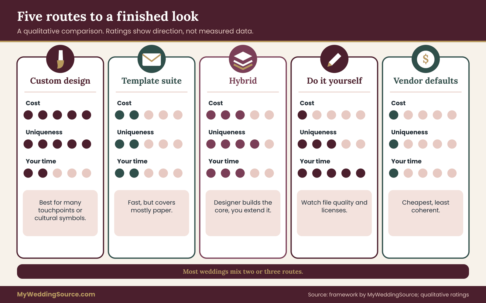
Option matrix for building a wedding visual identity
Once the brief and inventory exist, you have to decide who does the design work. There are five realistic routes, and most weddings mix two or three. Compare them on cost, control, uniqueness, speed, and how clearly you hold the rights.
Route one: a custom design from a professional
A graphic designer or stationery studio creates original artwork, a motif, a type setup and the first set of files. Cost is the highest of the five routes and varies widely by region and experience. Control is high, uniqueness is high, and rights can be clear if the contract spells them out.
This route suits couples who want a distinctive motif, who have many touchpoints to coordinate, or who have complicated cultural elements to render correctly. It takes the longest, because it includes a discovery stage, rounds of drafts and file preparation. Ask early about timelines and revision limits.
Route two: a semi-custom or template-based suite
Many stationers and online shops offer designs you can personalize with your names, colors and wording. Cost is lower, speed is faster and rights are usually limited to the purchased use. Uniqueness is moderate, since other couples may buy the same template.
The risk with this route is that the suite covers only the paper, and the rest of the wedding has to match something you did not design. Treat the purchased suite as the first piece of evidence in your wedding visual identity brief, and extend its motif, type and colors to everything else, rather than the other way around.
Route three: a hybrid, with a designer for the core and you for the rest
A designer produces the primary motif, the type pairing, the color specification and a handful of signature items. You then use those files to make or order the remaining items yourself, or hand them to other vendors. Cost sits in the middle, and the wedding visual identity stays coherent because one person authored the core.
This route works well when budget is limited but the couple wants a distinctive base. Make sure the contract allows you to use the files on the items you will produce later, and ask the designer to supply a short usage guide with the files.
Route four: do it yourself
You design with design software, an online design tool, or by hand. Cost is the lowest in money and the highest in time. Control is complete. Uniqueness depends on your skill and your sources.
The main risks are file quality, color accuracy and licensing. A DIY design built from a free font and a stock graphic can break license terms without anyone noticing. A design exported at low resolution can print blurry. Plan a proof stage for every printed item, and keep a record of where each element came from.
Route five: assemble from vendor defaults
In this route you pick colors and let each vendor use their usual style. It costs nothing extra, and it produces the problem this guide was written to avoid: a wedding with many good pieces that do not belong together.
It can work for a very small gathering with few touchpoints, or when one vendor, such as a full-service venue, supplies nearly everything in a consistent look. In those cases, the venue’s existing identity becomes your wedding visual identity, and the job is to avoid adding clashing items.
Comparing the five routes
Look at the routes as trade-offs rather than a ranking. A custom design gives the most distinctive result and the clearest rights, and takes the most money and time. A template route is quick and affordable, but it limits uniqueness and covers only part of the wedding. A hybrid spends money where it matters most. A DIY route trades time for money and asks you to take on the risks of files and licenses. Vendor defaults cost nothing extra and give you the least coherence.
Choose by asking three questions. How many touchpoints need to match? How much do you want the look to be recognizably yours? How much time and skill can you spend? If the answers are “many,” “very” and “little,” go custom or hybrid. If they are “few,” “somewhat” and “some,” a template plus a short brief is often enough.
What to ask any designer or stationer
Before hiring, ask for these things in writing.
What is included: number of concepts, rounds of revisions, file formats delivered and number of touchpoints covered.
Who owns the artwork, and what rights you receive: personal use, printing by any vendor, use on the website, use on edible items, and use on signs.
What happens to unused concepts, and whether the designer may reuse or sell them.
Whether the designer will use fonts or stock elements they have licensed, and whether those licenses allow your uses.
Timeline, deposit, cancellation and what happens if the schedule slips. Ask for the answers in an email or in the contract itself, not only in conversation.
Pricing logic without invented figures
Costs vary too much by place and supplier to give reliable averages, and no one should quote you one without a source. Instead, use a simple method. Ask three suppliers for a written quote for the same inventory, with the same file deliverables and rights. Compare the quotes line by line, noting what each includes.
Then check what a lower price removes. Often it is revisions, file formats or usage rights, which are the exact things you will need later. A cheaper quote that omits editable files may force you to pay again when a vendor needs a version.
Rights, licenses and vendor terms for a wedding visual identity
Artwork passes through many hands in a wedding: yours, a designer’s, a printer’s, a sign maker’s, a baker’s and a website builder’s. Each hand-off raises a question about who may use what. This section explains the main concepts in plain terms, and points you to the agencies and documents that give the authoritative answers.
Copyright in plain words
Copyright is a form of legal protection for original creative works, such as drawings, photographs, written text and some designs. The U.S. Copyright Office, which administers registration and publishes extensive guidance, explains that protection arises when an original work is fixed in a tangible form.
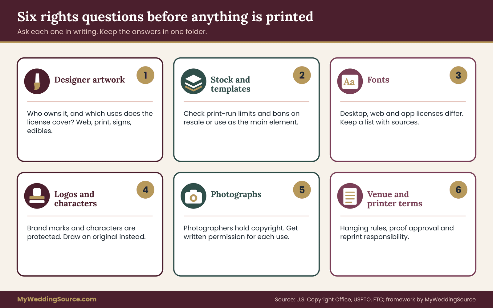
The person who creates a work is generally the initial owner, unless it was made as part of a job or under a written agreement that assigns ownership. That means a designer you hire usually owns the artwork unless the contract says otherwise, and you receive a license to use it. Read the contract to see what the license covers.
Ownership versus license
Two terms often get confused. Ownership means you hold the rights and can decide who else may use the work. A license means the owner permits you to use it under stated conditions.
Most wedding design contracts grant a license for wedding-related use. That is often enough. Trouble arises when you want something outside that scope, such as selling merchandise, using the motif for a business, or letting a relative reuse it for their own wedding. If you want more than the standard license, ask for it before work begins and pay for it in the contract.
Never copy protected artwork
The simplest rule is not to copy artwork you did not make or license. A motif you saw on another couple’s invitation, a shop’s sample or an artist’s online portfolio belongs to someone else, even if it is easy to screenshot.
Inspiration is allowed; copying is not. The line is not always bright, and the Copyright Office’s guidance on fair use explains that fair use is a fact-specific question rather than a formula. For a wedding, the safe path is clear: draw your own version, hire someone to create original work, or license the artwork you want.
Stock art, templates and online design tools
Stock illustrations and online templates come with license terms. Common limits include a cap on the number of printed copies, a ban on use in items for resale, and restrictions on using the artwork as the main element of a product. A wedding invitation printed in modest numbers usually fits within typical terms, but you should check the license for the particular item.
Online design tools often bundle fonts and graphics with their own terms. Read what you may export, print and share. If a printer or sign maker will reproduce the design, confirm that the tool’s terms allow external production.
Fonts, again
Font licenses split into desktop, web, app and commercial categories. A desktop license typically allows use on a computer for documents and printing, while a web license covers displaying the font on a website. Some fonts allow embedding in PDFs, and some do not.
Open fonts under licenses such as the SIL Open Font License are usually free to use and embed, including for printed and web use, with conditions that are mostly about not selling the font itself. Hosted font services publish their own FAQs on licensing. Keep a record of each font, its source and its license, and send the list to every supplier who handles files.
Trademarks and borrowed logos
Do not build a motif from a brand’s logo, a sports team’s mark or a character from a film. These are trademarks or copyrighted works, and using them in a way that suggests a connection can cause problems. The U.S. Patent and Trademark Office explains how trademarks work and what they protect.
A single use at a private wedding is unlikely to draw attention. Still, vendors may refuse to print protected marks, and some will ask you to confirm you have permission. Avoiding the issue is easier than arguing about it, and original motifs are usually more distinctive anyway.
Venue and vendor terms that affect the look
Rights are only one kind of term. Venues and vendors also set rules that shape what you can do with the wedding visual identity.
Venues may restrict tape, nails, open flames, confetti, balloons, free-standing signs or items hung from ceilings. Some require approved vendors for certain services. A beautifully designed ceremony backdrop that the venue will not allow is a wasted expense.
Printers set limits on file types, bleeds, color profiles, proof approvals and reprint responsibility. Many state that once you approve a proof, errors in the approved file are yours. Read the proof approval language and treat the sign-off as a legal step.
Photographers and videographers hold copyright to their images, and their contracts describe what you may do with them. If you plan to use photos on a website, in a thank-you card or in an album, check the license. The principle is the same everywhere: written permission avoids later disputes.
Advertising and endorsement claims
If a vendor offers a discount in exchange for credit, a social media post or a link, that is a commercial arrangement. The Federal Trade Commission publishes guidance on endorsements and disclosures, and its principle is that material connections between an endorser and a business should be disclosed clearly.
For a private couple, this mostly matters if you post about vendors who gave you something of value. If you do, say so plainly. Keep any such arrangement in writing, and keep it separate from the design brief.
A rights checklist in prose
Gather the following in one folder before printing begins. A signed agreement with each designer, stating ownership and license. A list of every font with its license. A list of every stock or template element with its license. Written permission for any artwork you did not create. Proof approvals from printers and sign makers. And confirmation from the venue that planned installations are allowed.
Review the folder once, before you approve the first proof. If a question comes up, ask the supplier or the agency that issues the rule, and keep the answer in writing.
Choosing a route for your wedding visual identity
If you are still unsure, start with the smallest version of the work that would give you a coherent wedding visual identity. Write the brief yourself, choose the motif, set the type and color roles, and ask for a quote on only the tier-one items. Then decide whether to extend a designer’s work to the rest or to produce it yourselves. This staged approach limits the money at risk before you know what you need.
Whichever route you choose, keep the rights questions in front of you from the first conversation. The wedding visual identity belongs to you in spirit, but the artwork, fonts and photographs inside it may belong to others. A written license for each element turns the wedding visual identity into something you can use without worry, now and later.
Worked examples and the consistency review
The three examples below are invented for illustration. They show how one core idea turns into motif, type, color roles and a tiered inventory. They are not case studies of real weddings, and the choices are not recommendations.
Example one: a garden dinner
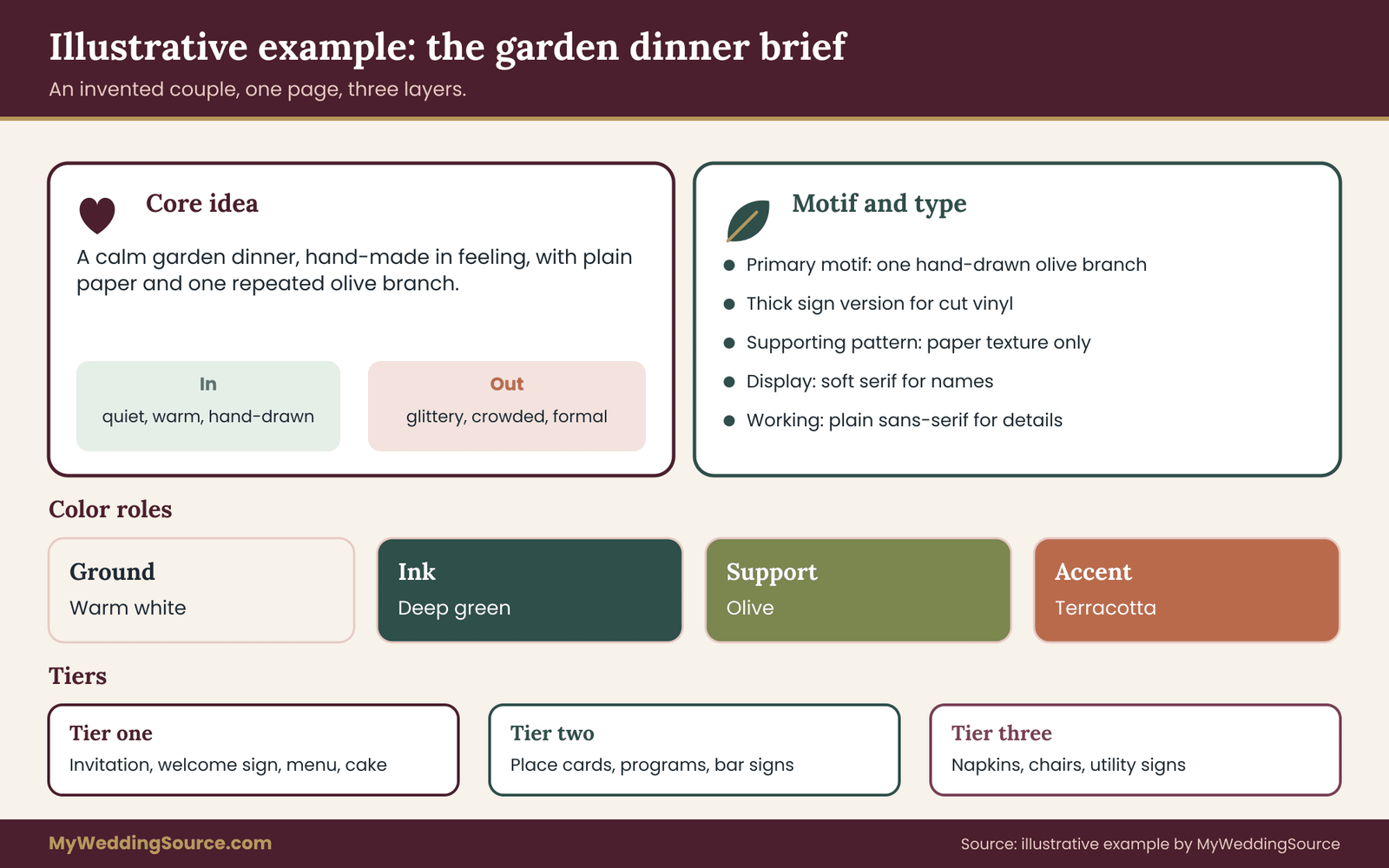
Maya and Dev are planning an outdoor dinner for sixty guests. Their core idea reads: “A calm garden dinner, hand-made in feeling, with plain paper and one repeated olive branch.” Three words in: quiet, warm, hand-drawn. Three words out: glittery, crowded, formal.
The primary motif is a single olive branch drawn by Maya’s cousin, with a thick version for signs. The supporting pattern is a faint paper texture, no printed pattern at all. Type is a soft serif for names and a plain sans-serif for details. Color roles: warm white ground, deep green ink, olive support, and a small amount of terracotta accent.
Their tiers are simple. The invitation, welcome sign, menu and cake carry the olive branch. Place cards, programs and bar signs use the type and colors without the motif. Napkins, utility signs and rental chairs stay plain. The cousin signs a short note granting wedding use of the drawing, and Maya saves it in the rights folder.
Example two: a city rooftop evening
Priya and Jordan plan an evening reception on a rooftop for one hundred and twenty. Their core idea: “A crisp evening in the city, with strong lines, dark ink and one warm light.” Three words in: clean, confident, warm. Three words out: rustic, pastel, fussy.
The motif is a simple geometric frame, a thin rectangle with one open corner, used as a border and as a cut-out shape. The type pairing is a high-contrast serif for display and a neutral sans-serif for details. Color roles: charcoal ink, off-white ground, a muted copper accent and a deep blue support.
They tested the copper accent in the rooftop’s evening light and found it read as brown at a distance, so they used it only on small details and kept all essential text in charcoal on off-white. Their signs use cut vinyl on dark acrylic, and the sign maker supplied a proof for approval. The geometric frame is easy to reproduce on the website as a plain line border.
Example three: a multicultural ceremony with two traditions
Amara and Luca are combining a ceremony that includes textiles and symbols from both families. Their core idea: “A joined celebration where each family’s symbols stand beside the other’s, with plain surroundings that let them be seen.” Three words in: respectful, bright, balanced. Three words out: themed, cluttered, token.
Instead of a single motif, they choose two small symbols of equal size, one from each family, and agree on rules for pairing them. Each family elder reviews the artwork before printing, to check spelling, direction and color use. Type is a clean serif for both languages, tested for full character coverage in each script. Color roles come from the textiles themselves: the ground is neutral, and each family’s color appears in equal measure.
The point of this example is process. They gave each symbol an owner, a reviewer and a written note on how it may be used, and they planned equal placement so neither tradition sits in the background.
What the three examples share
Each couple wrote the core idea first. Each limited motif count and type count. Each assigned color roles, not only shades. Each tested at least one risky choice in real conditions, whether outdoor light, rooftop evening light or character coverage. And each tiered the touchpoints so effort went where it counted.
They differ in style, budget and complexity. The system does not require a particular look. It requires that the decisions be written down, shared and checked.
The consistency review
Run a formal review at three points: when the first drafts arrive, before any item goes to print, and a few weeks before the wedding when everything is assembled.
At each point, lay the items side by side, physically if possible, or on one screen if not. Go through a short list of questions.
Does each item use the right typeface, in the right size and case? Do the colors match the swatch under the same light? Does the motif appear where the wedding visual identity brief says it should, at the right scale and with clear space? Are tier-three items plain, as intended? Does anything look louder than it should? Is any text hard to read at the distance a guest will view it? Are names and details spelled correctly everywhere?

The grayscale and squint tests
Two quick tests reveal problems that a close look misses. The grayscale test converts photos of the items to black and white, and shows whether contrast, shape and spacing hold up without color. The squint test means standing back and half-closing your eyes. Items that are meant to be signature pieces should still stand out, and plain items should recede.
Ask someone who has not been involved in the planning to look at the assembled items and describe what they see. Fresh eyes catch the mismatch that familiarity hides.
Fixing problems without starting over
When the review turns up a mismatch, rank it by effect. A wrong typeface on a tier-one item needs fixing. A slightly different green on a tier-three item may not. Decide what can be corrected with a small change, such as reprinting one card, swapping a ribbon or adding a runner, and what would need a new order.
Document the fix in the inventory, with the date and the person responsible. If a vendor made the error, send the approved proof or brief and ask for the correction in writing. If the error was in an approved proof, check the vendor’s terms on responsibility before assuming a free reprint.
Common mistakes
Several mistakes appear over and over. Choosing a palette and stopping there. Picking a motif that cannot be reduced to one color or a small size. Using too many typefaces, or a script for important information. Letting each vendor interpret “our colors” freely. Ordering signature items before the wedding visual identity brief exists. Forgetting rentals, uniforms and napkins. Copying a motif from another source without permission. Skipping proofs because the schedule is tight. And treating the brief as final, when it should be updated whenever a decision changes.
A subtler mistake is over-designing. A wedding visual identity is meant to reduce effort and increase calm, not to turn the wedding into a brand launch. If the wedding visual identity brief grows complicated, trim it until a vendor could read it in five minutes.
After the wedding
Keep the wedding visual identity brief, the motif library, the proofs and the rights notes with your other wedding documents. They are useful for thank-you cards, anniversary prints, albums and any later use of the artwork. They also show what rights you hold, if a question arises.
Looking back at the wedding visual identity
Several weeks after the wedding, open the brief and the photos side by side. Note what worked, what drifted and what no one noticed. A wedding visual identity is judged by how it looked in real light, on real tables, with real guests, and the photographs are the evidence. Write two or three lines about what you would repeat and what you would change.
These notes are useful if you host another event, if a friend asks for advice, or if you simply want to remember why you chose what you did. The wedding visual identity was a means to a calm, coherent day, and a short review confirms whether it did that job.
Your next steps
Start this week with three small tasks. Write the core idea sentence and the three-in, three-out words, and read them aloud to someone who has not seen your inspiration. Choose a primary motif using the five-question test, and find out where its artwork would come from. Then list every touchpoint you can think of, grouped by when guests meet them.
Next, set type rules and color roles, request proofs on the actual paper, and test one risky choice in the real venue light. Gather the rights folder as you go. Finally, run the consistency review at each stage, and update the brief whenever a decision changes. Done steadily, a wedding visual identity becomes a short document that makes every later choice easier.
FAQ
What is a wedding visual identity?
It is the set of repeated visual choices that make your wedding items look related: a motif, a type pairing, color roles, and finish rules. It is written in a short brief that vendors can follow, so the invitation, signs, flowers and cake look like parts of one event rather than separate purchases.
How is a wedding visual identity different from a color palette?
A palette lists shades. A visual identity also sets motifs, typefaces, color roles, finishes and rules for where each element appears. Two weddings can share the same palette and look unrelated, while one wedding with a clear motif and type system can use several shades and still look unified.
How long should the style brief be?
Two to four pages is usually enough. It should hold the core idea, the words that guide and rule out choices, the motif files, type rules, color roles with swatches, finish rules, venue limits and an approval contact. If it grows longer, it is probably describing taste rather than giving instructions vendors can follow.
Do we need to hire a designer?
No. A designer helps most when you want a distinctive motif or have many items to coordinate. Many couples use a template, a hybrid approach or their own work with a written brief. Whatever route you choose, confirm in writing who owns the artwork and what uses the license covers.
Can we copy a motif we saw on another invitation?
Avoid it. Artwork on someone else’s invitation, a shop sample or an artist’s portfolio is usually protected by copyright. Take inspiration from the feeling, then draw your own version, commission original work or license the artwork you want. The U.S. Copyright Office explains how protection and fair use work.
Are free fonts safe to use on invitations?
Not always. A font that is free to download may be free only for personal use, and printing through a vendor or using it on a website may need another license. Open licenses such as the SIL Open Font License are broader. Read the specific terms and keep a list of every font and its license.
How many typefaces and colors should we use?
A workable ceiling for most weddings is two typefaces, four colors with defined roles, one primary motif and one supporting pattern. These are planning guidelines rather than standards. Larger events with several separate occasions may carry more, but each addition should replace something or solve a specific problem.
How do we keep vendors consistent?
Send each one the same short brief as a PDF, a physical swatch card and the relevant motif files. Ask for a proof before production, compare it with the wedding visual identity brief, and return corrections in one message. Put a version date on the wedding visual identity brief and tell vendors to discard old copies.
Sources
- U.S. Copyright Office
- Copyright FAQ, U.S. Copyright Office
- More information on fair use, U.S. Copyright Office
- Trademarks, U.S. Patent and Trademark Office
- Web Content Accessibility Guidelines quick reference, W3C
- SIL Open Font License
- Google Fonts FAQ, Google
- Endorsements and testimonials guidance, Federal Trade Commission
- Americans with Disabilities Act, U.S. Department of Justice
- Mailing standards of the United States Postal Service, Postal Explorer