
A wedding signage system treats every sign as a small piece of infrastructure: it has a reader, a job, a viewing distance, a spot, an owner and an approval. This guide shows how to build that system, from the first inventory to the last proof, so guests find the ceremony, the bar and their seat without asking anyone.
List every sign you might need before you design any of them. For each one, write down who reads it, from how far away, where it stands, what it must say in a few words, and who approved it. Size the lettering from the viewing distance, check contrast on a printed test, place signs where guests have to make a decision, and get venue rules in writing before anything is printed. Proof the words and the physical sign separately, and test the set by walking the route as a stranger would.
Think about the last event you attended where you could not find the restroom. Somebody made that sign, or forgot to. A wedding adds pressure to the usual problems: guests arrive in dress shoes at a place they have never seen, a good number of them are older or traveling with small children, and everyone is a little keyed up. A guest who has to ask three people where the ceremony is has already had a worse afternoon than you meant to give them.
Most couples approach wedding signage one sign at a time. A welcome sign gets designed because it is pretty and photographs well. The seating chart gets designed because it has to exist. Directional signs get added when someone says, “Won’t people get lost?” By the end you have a dozen unrelated pieces in three fonts, none sized for the distance it is read from, and nobody who knows whether the venue allows tape on the wall.
A wedding signage system fixes this by starting somewhere else. Instead of asking “what signs do we want,” you ask “what do guests need to know, and where do they need to know it?” The design comes after.
What a wedding signage system is
In plain terms, it is a short document and a set of rules. The document is a sign inventory: one entry per sign, with enough detail that a printer, a rental company and a venue manager could each read it and do their part. The rules are the choices that keep the set coherent, such as one primary typeface for functional signs, one color pairing that passes a contrast test, one arrow style, one height range for mounting.
None of this has to look corporate. A well-built signage system for a wedding looks like a wedding. The guests never see the inventory. They see a handful of signs that all look related and that all answer their question at the moment they have it.
The system also protects you from the problems that tend to show up in the last week. A sign that was approved by you but not by the venue. A seating display that is gorgeous but cannot be read from the spot where the easel fits. A set of directional signs whose arrows point the wrong way because the designer drew them from the other side of the path. A wedding signage system turns each of those into a question you ask early, when the answer is cheap.
Where wedding signage fits among your other plans
Wedding signage sits between several things you are already planning. Seating decisions feed the seating display. The venue floor plan determines where guests walk. Lighting decides whether a sign can be read at dusk. Weather decides whether a paper sign survives the cocktail hour. This article covers the wedding signage itself. For the chart that tells people where to sit, see our guide to the wedding seating chart, which handles the arrangement and leaves the display to this article. For the broader timeline, the wedding planning checklist shows where these tasks usually land.
The five jobs wedding signage can do
Before you list signs, list jobs. Almost every wedding sign does one of five things, and keeping them apart helps you decide which signs you need and how much text each deserves.
Orient. This kind of wedding signage tells a guest where they are and confirms they are in the right place. A welcome sign at the entrance, the name of the ceremony site, “Reception this way.” Guests read them once, usually while walking or standing in a group.
Direct. Directional wedding signage tells a guest which way to go. Arrows, “Parking,” “Restrooms,” “Ceremony seating, please sit on either side.” They are read from a distance, often at a glance, so they need the largest lettering and the least text.
Inform. This wedding signage explains something: the bar menu, the order of events, the cocktail list, a note about the unplugged ceremony, a table describing the guest book. People stop and read them, so they can carry more text, though not as much as you think.
Instruct or limit. “Please do not touch the cake,” “Gift table,” “Reserved for family,” “Staff only.” They reduce questions and protect things. The tone matters here, because a stern sign at a wedding reads as stern.
Celebrate. The welcome sign that is also a keepsake, the memorial table sign, the framed note from the couple. These do not have to be functional, though they often double as orientation. Give them room to be decorative, and keep functional signs separate so a script font on a ceremony sign does not become the thing guests have to decode.
A common mistake is mixing jobs on one sign. A welcome sign that also lists the schedule, the dress code and the Wi-Fi password does none of them well. If a sign has two jobs, split it or demote one of them to a smaller line.
Wedding signage, a person or a printed program?
Not every piece of information needs a sign. Some of it is better delivered another way, and the choice affects your budget and your guests’ experience.
Use a sign when the information is the same for everyone, is needed at a specific place, and is short. Directions to the restrooms qualify.
Use a person when the information depends on the guest or changes during the day. A greeter at the ceremony entrance who points to the seating area and hands out programs does more than three signs. Ushers, venue staff and a few helpful friends can cover a lot, and they can answer follow-up questions. Ask them to be at specific places during specific times, so they are not tied up in other jobs.
Use a printed program, an app, a card in the welcome bag or your wedding website when the information is long, or when guests need it before they arrive. The order of events, the shuttle schedule and the dress code belong there, with a single sign pointing to where to find them.
A simple rule: if the sign needs more than about fifteen words, or if guests need to refer back to it, put the longer version somewhere they can hold or reread, and keep a short version on the sign.
Mapping the guest journey before planning wedding signage
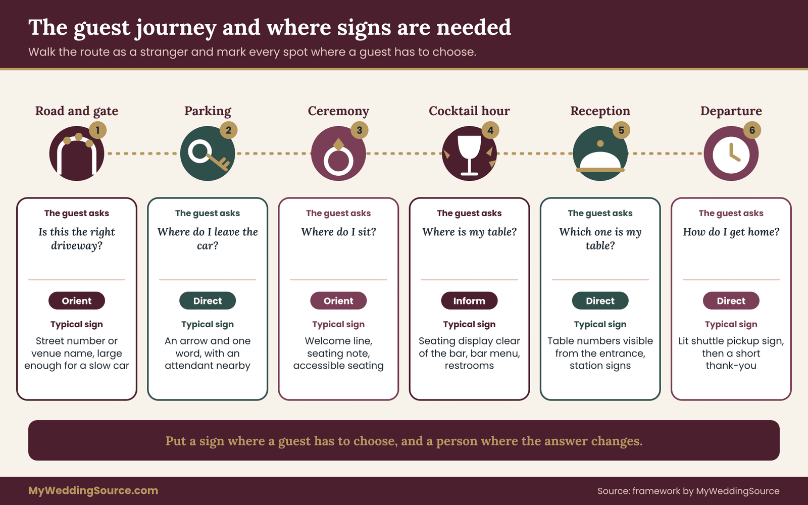
The most useful thing you can do before designing any sign is to walk the guest journey on paper. Draw it as a line from the moment a guest turns off the road until they sit down at dinner, and mark every place they might hesitate.
Start at the road. How does a guest know they are at the right driveway? Is there a number, a gate, a name on the mailbox? Move to parking. Where do they leave the car, and how do they know where to go next? Then the approach: from the parking area to the ceremony site, is there a single obvious path or several?
At each point, ask what a guest who has never been here needs to know. Mark a hesitation point wherever the answer is “which way?” or “is this the right place?” Those are your decision points, and each one is a candidate for a sign or a person.
Keep going through the whole event. The route from ceremony to cocktail hour, the route from cocktails to the reception room, the restrooms, the bar, the guest book, the gift table, the coat check, the spot for photos, the way out. For multi-day weekends, add the route between venues. If you are planning a rehearsal dinner and a welcome party at separate locations, the wedding weekend event planning guide covers how to coordinate the places, and each place gets its own short journey map.
When you finish, you should have a map with a line, a set of dots where people have to choose, and a rough count of how many signs or people you need. For a typical wedding at one venue, that count is smaller than most couples expect. The point is to place signs where decisions happen, not to cover every surface.
Building the wedding signage inventory
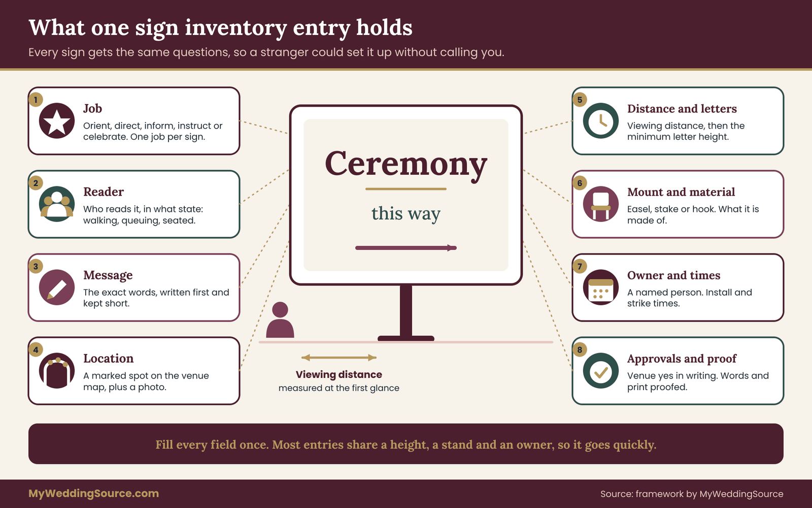
The wedding signage inventory is the one deliverable that turns a pile of ideas into a plan. It can live in a spreadsheet, a shared note or a page in a binder. What matters is that each sign has its own entry and that every entry answers the same questions. If a sign has a blank field, you have found something to work out before you spend money.
The fields every entry needs
Here is what each entry should record, in roughly the order you will fill it in.
- Name and number. A short label such as “Ceremony path arrow, second bend.” Numbers help when you give a printer or a helper a list.
- Job. Orient, direct, inform, instruct or celebrate. One job per sign.
- Reader. Who needs this, and in what state? “Guests walking from the parking lot in dress shoes” is a different reader from “guests seated at a table.”
- Message. The exact words, kept as short as you can. Write it first and design second.
- Viewing distance. How far from the sign the reader will be when they first need to read it. Not the distance when they are standing in front of it. The first glance is what counts.
- Mounting height. Where the center of the text sits, measured from the ground. A sign on a low easel and a sign on a tall post are read differently.
- Minimum letter height. Worked out from the viewing distance. The next section explains how.
- Size and material. The physical dimensions and what it is made of, since a foam board and a wooden post behave differently in wind.
- Location. A specific spot, ideally marked on the venue map, with a photo if you can.
- Mount or stand. Easel, stake, hook, clamp, a table, tape, a pole. This matters for permissions.
- Power or light. Does it need to be lit? Will it be in shade at six o’clock?
- Owner. The person responsible for putting it up and taking it down. A name, not a role.
- Approvals. Who has to say yes: you, the venue, the fire marshal, a landlord, a city office.
- Proof date and status. When the words were checked, when the print was checked, and by whom.
- Install and strike times. When it goes up and when it comes down.
Fifteen fields sounds like a lot. In practice most entries fill in fast, because much of your wedding signage shares the same height, the same stand and the same owner. You are not writing a legal document. You are making sure a stranger could set up your wedding signage without calling you.
Group wedding signage by zone, not by type
Sort the finished inventory by place. A zone is a stretch of the guest journey: arrival, ceremony, cocktail hour, reception, departure. Grouping this way makes it easy to see whether one zone is overloaded and another is empty, and it lets you hand each zone to one person.
It also reveals duplication. If you find a “Restrooms” sign in three zones, check whether guests really need three, or whether one at a decision point does the job.
A worked example: wedding signage for a garden wedding
What follows is an illustrative example, not a recommendation for any particular number of signs. It shows how an inventory looks when it is filled in and how the choices connect. Imagine a couple marrying at a garden estate with a ceremony lawn, a terrace for cocktails, and a tent for dinner. The venue has a gravel lot about two minutes’ walk from the lawn. Most guests have never visited.
Arrival zone
- Sign 1, driveway marker. Job: orient. Reader: drivers slowing at the road. Viewing distance: about 40 feet. Minimum letter height: close to five inches. Message: the venue street number only, plus an arrow. Mount: a stake at the gate, with the venue’s written permission, because the gate is on private property. The couple chose a number rather than words because a driver can read three large digits faster than a name.
- Sign 2, parking entry. Job: direct. Reader: drivers entering the lot. Viewing distance: 30 feet. Minimum letter height: about 3⅝ inches. Message: “Wedding parking” with an arrow. Owner: the parking volunteer, who also stands near it.
- Sign 3, welcome at the lawn. Job: orient and celebrate. Viewing distance: 12 feet. Minimum letter height: about 1⅜ inches for the functional line (“Ceremony begins at 4:30”), with the names in a larger decorative script that does not carry essential information.
- Sign 4, path arrows from the lot to the lawn. Job: direct. Viewing distance: 15 feet. Minimum letter height: 1¾ inches. Three signs placed at the two bends in the path and at the lawn edge. Mount: stakes pushed into soft ground, with the venue’s approval.
Ceremony zone
- Sign 5, unplugged request. Job: instruct. Viewing distance: 6 feet. Message: “Please keep phones away during the ceremony. Our photographer has it covered.” Short, warm, no scolding.
- Sign 6, seating note. Job: inform. “Sit anywhere on either side.” Viewing distance: 8 feet, so letters of at least seven-eighths of an inch.
- Sign 7, accessible seating. Job: direct. Reader: guests who use wheelchairs or need extra space. Placed at the end of the aisle on a flat, firm patch with a clear route to it. Details in the accessibility section below.
Cocktail zone
- Sign 8, bar menu. Job: inform. Viewing distance: 4 feet, read while standing in line. Letters of about three-quarters of an inch, with drink names in one weight and ingredients in a lighter one.
- Sign 9, seating display. Job: inform. This is the sign guests will queue at. It sits at the terrace exit, not at the bar, so the queue does not block drinks. Size and layout are covered in the seating chart guide; this article covers the legibility.
- Sign 10, restrooms. Job: direct. Viewing distance: 10 feet. Minimum letter height: about 1⅛ inches, with a simple pictogram so guests who read a different language can still follow.
- Sign 11, “Dinner this way.” Job: direct. Viewing distance: 20 feet. Minimum letter height: about 2⅜ inches, mounted at head height at the terrace steps.
Reception zone
- Sign 12, table numbers. Job: direct. Reader: guests looking for their table from the tent entrance. Viewing distance: up to 20 feet. Minimum letter height: about 2⅜ inches. Mount: on stands tall enough to sit above centerpieces.
- Sign 13, dessert and late-night stations. Job: inform. Viewing distance: 6 feet. Letters about one inch.
- Sign 14, “Staff only” at the catering tent. Job: instruct. Viewing distance: 10 feet. Plain, no decoration.
Departure zone
- Sign 15, shuttle pickup. Job: direct. Reader: guests leaving at night. Viewing distance: 30 feet, lit. Minimum letter height: about 3⅝ inches, with a light source so it can be read in the dark. Owner: the shuttle coordinator.
- Sign 16, thank-you at the exit path. Job: celebrate. Easy to read, but optional.
That is sixteen signs, with some repeated, such as three path arrows and a set of table numbers. The couple could have designed forty. The journey map showed which ones guests would actually need.
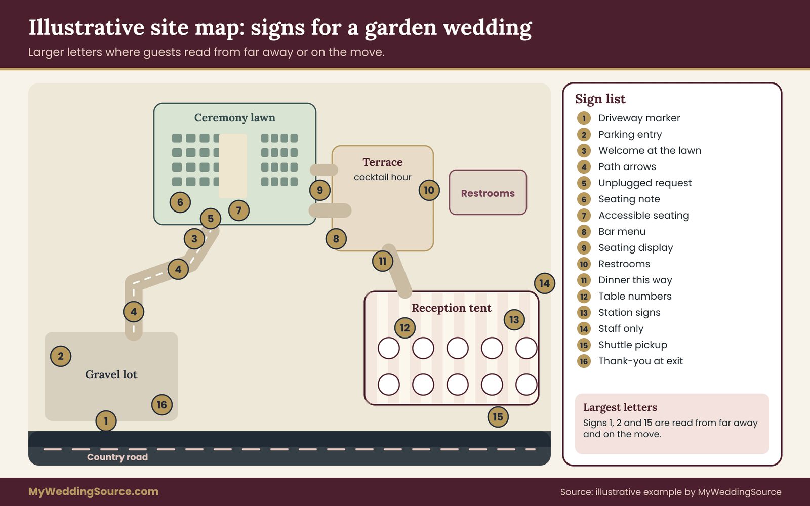
Notice the shape of the inventory. The largest letters belong to the wedding signage read from farthest away or by people in motion, such as the driveway marker and the parking entry. The smallest belong to signs read at arm’s length. This pattern repeats at every wedding, and it is the reason to calculate letter height instead of guessing.
Who writes the words on your wedding signage
The couple often writes the words and a designer or printer sets them. That works only if the words are final. Changing “Parking” to “Guest parking, please follow the arrows” after the layout is done means redoing the sign. Lock the message before you open the design file, and keep a single master list of text. When something changes, change it in one place and re-check every sign that uses it.
Readability: sizing a wedding signage system for the distance
Readability is the part of wedding signage that is easiest to measure and most often ignored. A sign is readable when a guest can understand it from where they will be standing, in the light they will have, in the time they will spend. Each of those three conditions can be tested.
A benchmark for wedding signage: the federal sign standard
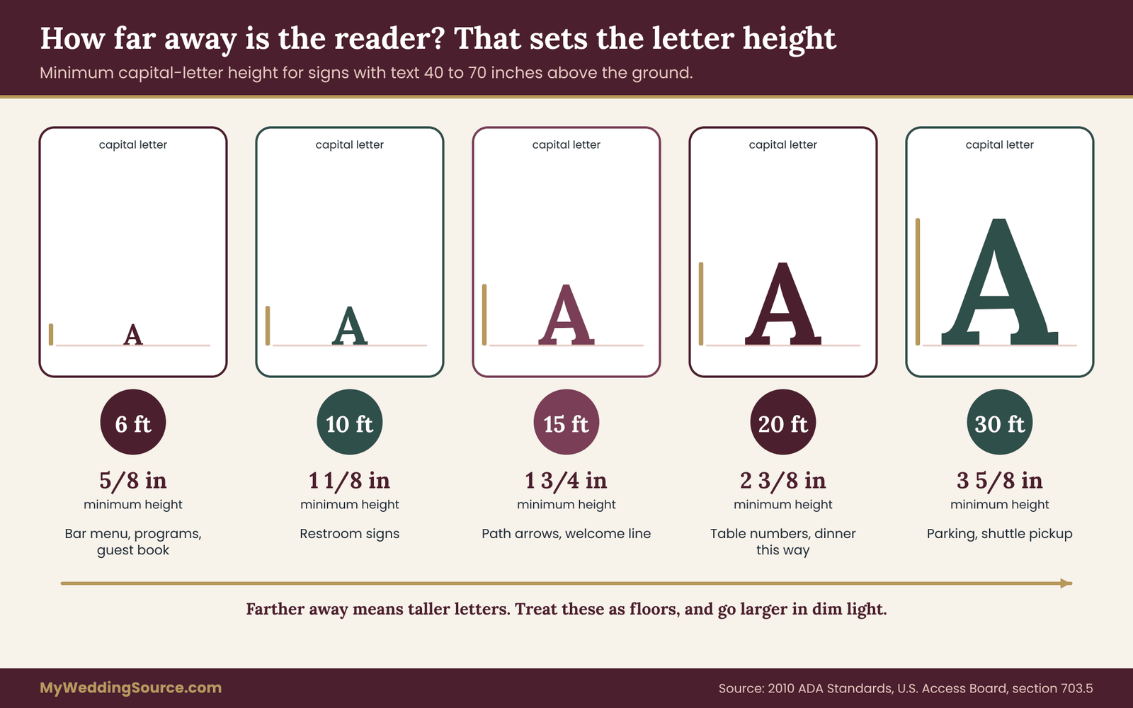
There is a published rule that ties letter height to viewing distance, and it is a useful benchmark even though it was written for permanent signs in public buildings. The 2010 ADA Standards for Accessible Design, published by the U.S. Access Board, set minimum character heights for visual characters on signs based on two things: how high the sign sits above the floor and how far away the reader is.
For a sign whose text baseline sits between 40 and 70 inches above the floor, which covers most signs on easels and posts, the minimum character height is five-eighths of an inch when the viewing distance is under 72 inches. Beyond 72 inches, add an eighth of an inch for every extra foot. For signs mounted higher, between 70 and 120 inches, the starting point is two inches at viewing distances under 180 inches, with the same eighth-of-an-inch increase per foot beyond that. Above 120 inches, it starts at three inches.
Two cautions. First, these standards apply to specific permanent signs in covered facilities, and whether and how they apply to a temporary sign at a private event is a legal question this article cannot answer. Treat them as a well-tested benchmark, not a rule you must follow. Second, “character height” in the standard means the height of an uppercase letter I, not the font size. They are different numbers.
Turning viewing distance into letter height for wedding signage
Here are the numbers for the most common case, text baseline between 40 and 70 inches off the ground. The minimum uppercase letter height at each viewing distance:
- Up to 6 feet: five-eighths of an inch.
- 8 feet: seven-eighths of an inch.
- 10 feet: about 1⅛ inches.
- 15 feet: 1¾ inches.
- 20 feet: about 2⅜ inches.
- 30 feet: about 3⅝ inches.
The pattern is simple. Beyond six feet, every additional foot of distance adds an eighth of an inch to the minimum height. Treat these as floors. For a sign that guests will read while walking, in dim light, or while holding a drink, go larger.
From letter height to font size
Printers and designers talk in points, not in capital-letter heights. The conversion depends on the typeface. For many common typefaces, the height of a capital letter is somewhere around seven-tenths of the font size, but the range is wide, and decorative faces can be much smaller than their nominal size. Do not trust a rule of thumb for the real sign.
The reliable method takes two minutes. Set the word “HI” in the typeface you plan to use. Print it at a size you guess will work. Measure the height of the capital I with a ruler. If it is shorter than your target, increase the size and print again. Once you have the number, write it into the inventory and give it to the printer as the minimum.
This test also reveals which of your favorite typefaces are poor choices for functional signs. A script font set at the right capital height can still be hard to read, because its connected, slanted letters lose clarity at a distance.
Typeface, spacing and stroke in wedding signage
The same standard describes what makes lettering easy to read, and the points hold up for any sign.
- Conventional letterforms. The standard rules out italic, oblique, script and highly decorative forms for visual characters. Use a plain upright face for anything functional, and keep script for names and welcome lines.
- Proportions. The width of a capital O should fall between about 55 and 110 percent of the height of a capital I. In practice, avoid very condensed or very extended faces for signs read at a distance.
- Stroke weight. The standard asks for a stroke between 10 and 30 percent of the character height. Thin hairline strokes disappear at a distance, and very heavy strokes fill in the counters of letters.
- Letter spacing. Space between characters should run from about 10 to 35 percent of the character height. Tight spacing blurs into a single shape.
- Line spacing. Baselines of separate lines should sit about 135 to 170 percent of the character height apart.
You do not have to measure these on every sign. Pick a typeface that already behaves, test it at the target size, and reuse it across your wedding signage. A plain sans-serif at medium weight is the dependable answer, with one decorative face for the names.
Contrast: the test most wedding signage skips
Pretty color pairings often fail the test for readability. Gold on ivory, blush on white, sage on cream: all can look lovely on a screen and be nearly invisible on a sign at a distance in daylight.
The standard measure is contrast ratio, a number that compares the brightness of the text to the brightness of the background. The Web Content Accessibility Guidelines from the World Wide Web Consortium ask for at least 4.5 to 1 for normal text and at least 3 to 1 for large text, which they define as 18 point or larger, or 14 point bold or larger. These are web standards, but the math applies to anything you can see, and they give you a number to aim at. The Access Board standard says something similar in plain language: use light characters on a dark background or dark characters on a light background, with a non-glare finish.
Here are examples worked out for a typical wedding palette, using the standard formula.
- Near-black on white: about 14.8 to 1. Excellent.
- Deep burgundy on ivory: about 12.3 to 1. Excellent.
- Dark teal on ivory: about 8.1 to 1. Strong.
- Plum on pale blush: about 6.3 to 1. Good.
- Gold on deep burgundy: about 5.0 to 1. Acceptable for large text, tighter for small.
- Gold on ivory: about 2.4 to 1. Fails for functional text.
- Pale gray on white: about 2.8 to 1. Fails.
- Dusty rose on blush: about 1.9 to 1. Fails badly.
- Blush on white: about 1.6 to 1. Almost invisible.
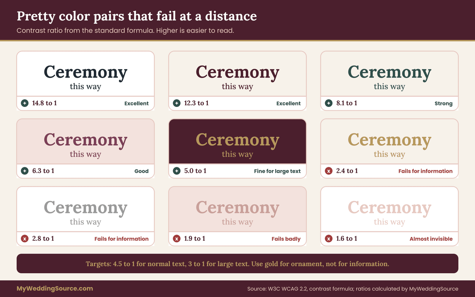
Gold is the one that surprises people. As a foil or metallic accent it is lovely. As the only color for words a guest needs to read, it often fails. A good approach is to use gold for ornament and for the names, and a darker color for the actual information.
You can check any pair of colors with a free contrast checker, but do not stop there. Print a test, put it on an easel, and walk away from it to the viewing distance you wrote in the inventory. If you squint, it fails.
Finish and glare on wedding signage
A sign that reads well on a screen can disappear under glare. Glossy acrylic, mirror signs, laminated surfaces and shiny metallic inks reflect sky, lights and guests. The Access Board standard calls for a non-glare finish for a reason. Matte paper, matte-coated board, chalkboard and brushed surfaces handle light better. If you love a mirror sign, use it for names and place it so it does not face the sun or a bright window.
Also consider the light at the hour of use. A sign that is fine at three in the afternoon may sit in deep shade by five thirty. In the evening, it may need its own light source. Our guide to wedding audio and lighting covers practical lighting options, and the same lights you plan for the dance floor may not reach your signs.
Never rely on color alone
Some of your guests will have a color vision deficiency, and you will not know which ones. If a sign distinguishes between two options only by color, such as a green path and a red path, some guests will not tell them apart. Pair color with a word, a shape or an icon. For multi-day weekends where each event has a color-coded sign, add a letter or a name as well.
Say less on every piece of wedding signage
The most effective way to improve readability is to cut words. Most signs work better with a line or two than with a paragraph. Use these habits:
- One message per sign. If a guest has to scan to find what applies to them, they will not.
- Put the action first. “Restrooms, left” beats “Guests seeking restrooms may proceed to the left.”
- Use arrows with words. An arrow alone can be ambiguous. An arrow with “Reception” tells the guest what is at the end.
- Keep to a few lines. If you need a paragraph, it is not a sign. Move it to a program.
- Use plain words. “Ceremony” is clearer than a clever name for it. Save the cleverness for a line underneath.
When a sign is read at a glance, every extra word costs you. When it is read standing in line, as with a bar menu, you have room for more, but the same discipline helps.
Placing wedding signage where decisions happen
A readable sign in the wrong place is a decorative object. Placement decides whether the sign works, and it is the one part of wedding signage you cannot judge from a design file. It has to be tested in the space.
The decision-point rule
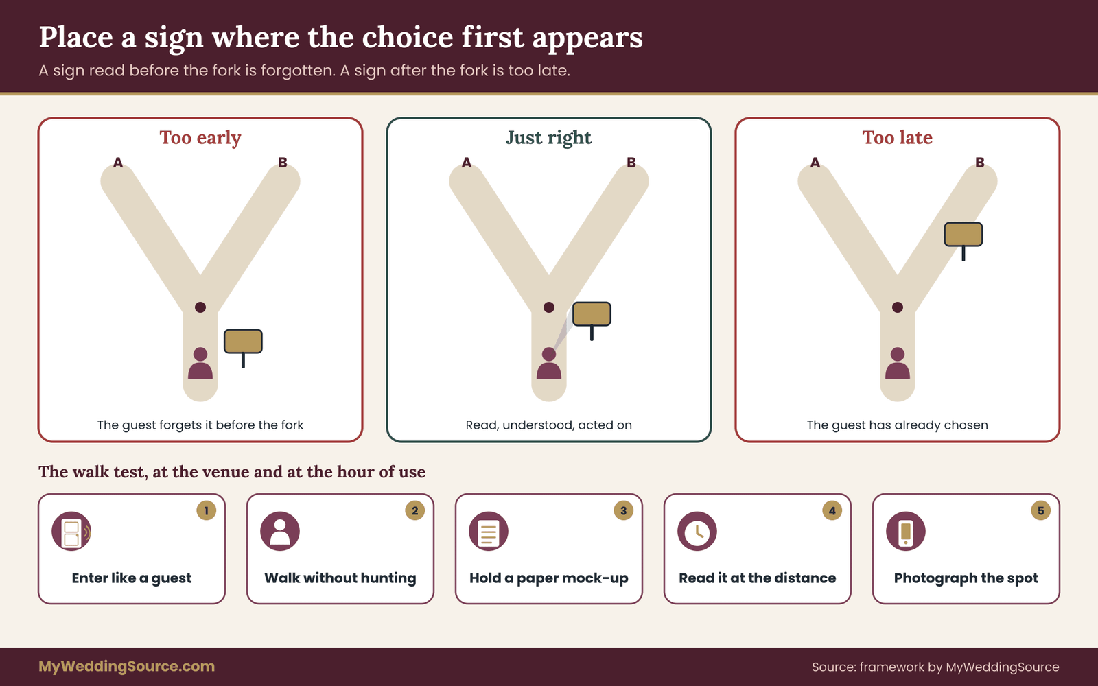
Guests need information at the moment they have to choose. That is usually a fork in a path, an entrance, a line, or a room with several doors. A sign placed fifty feet before the fork is forgotten by the time they reach it. A sign placed after the fork tells them they went the wrong way.
Put a directional sign where the guest first sees the choice, not where they reach it. At a fork, that means far enough back that the guest can read the sign, process it, and change their path without stopping short. At walking speed, a few seconds of lead time is enough, and slower groups, such as people with canes or small children, need more.
For a long straight path with no choices, a single reassuring sign near the start is enough. Guests who see the next landmark, such as the tent or the arch, do not need a reminder every twenty feet.
Heights, angles and sightlines
Most guests read signs at roughly standing eye level, so the center of the text should sit in a comfortable band. For signs read at distance, mounting them at or just above eye level lets the sign clear the heads of people in front, and keeps the letter-height calculation above valid. A very low sign, such as a small easel at knee height, may be hidden by a crowd and readable only from a few feet away.
People who use wheelchairs or scooters have a lower eye level, and the sightline from a seated position is different. A sign mounted high on a pole is fine for distance reading. A sign that is meant to be read up close should not require a guest to lean over, crouch or reach. The 2010 ADA Standards set a minimum of 40 inches from the floor to the baseline of characters for signs they cover, partly so that people can approach and read them. For a wedding, a practical approach is to keep close-reading signs between that height and about 60 inches, and give them clear floor space in front.
Angle matters too. A sign that faces the guest straight on is easier to read than one angled to the path. Where guests approach from two directions, such as at a fork, use a sign with two faces, or two signs back to back.
The walk test
The best check for placement is to walk it. Do this at the venue, at the time of day your event will use the space, with a helper holding a paper mock-up of each sign.
- Start at the point where a guest first enters, whether that is the road or the lobby.
- Walk the route at a normal pace, without looking for signs. Notice where you hesitate.
- At each hesitation, have your helper hold the mock-up where you propose to place the sign. Step back to the viewing distance in your inventory. Can you read it?
- Look behind you. Does the sign block a door, a sightline to another sign, or a path wider than it looks?
- Photograph each spot, with the mock-up in place. Add the photo to the inventory.
If you cannot visit the venue before the day, ask the venue manager for a floor plan and a few photographs of each area, and walk through the plan with them over the phone. It is not as good as being there, but it catches many problems.
Common wedding signage placement mistakes
- Signs that block signs. A welcome sign in front of a directional sign, or a tall floral arrangement hiding the table numbers.
- Signs that block paths. Easels on narrow walkways, stands with spread legs in a doorway. In a crowd, a tripping hazard is a safety problem.
- Signs at the bar. Seating displays near the bar make a queue where drinks are served. Put them where the queue has room.
- Signs facing the sun. A sign that faces west at five in the afternoon will be washed out and glaring.
- Signs read against clutter. A sign set against a busy hedge or patterned wall loses the edge of its letters. A plain background, or a sign with its own backing, reads better.
- Signs set too far from the thing they describe. A bar menu ten feet from the bar will be ignored.
Signs and guests who are carrying things
Weddings are full of guests holding drinks, plates, gifts, programs and children. A sign that requires two hands, such as a flip-through book of seating assignments, is hard to use in a crowd. A sign that is read at a glance, from a few steps away, is far easier. Put the seating display where guests can stand back and read, not where they must press forward.
Materials, mounting and weather for wedding signage
The physical sign carries its own risks. A beautiful design on a flimsy board fails in the first breeze, and the fix is usually in the material and the mount, not the design.
Material trade-offs
Each material has strengths and weaknesses, and it helps to know them before you order.
Foam board is light, inexpensive and easy to print on, which makes it good for indoor use and short-term signs. It bends, dents and catches wind. It does poorly in rain and damp grass.
Rigid plastic or composite board holds its shape better than foam and handles moisture. It costs more and can be glossy, which affects glare.
Wood has weight and character, handles light wind and looks warm. It can be heavy to transport and, if it is painted, the paint can chip. Rough surfaces may reduce legibility of fine lettering.
Acrylic gives a clean, modern look. It can reflect light, so ask for a matte or frosted finish. It scratches, and a large panel can act like a sail.
Chalkboard and painted boards have a handmade look and are easy to correct on the day. They can be hard to read at a distance unless the lettering is bold and neat, and chalk smudges.
Fabric banners move in the wind and are poor for fine text. They can work for a large single word.
Paper and cardstock suit small signs on tables. They are fragile outdoors.
For any sign that will be outdoors, ask your maker what the material is rated for. If the answer is vague, assume it will not tolerate rain or wind.
Stands and mounts
A sign is only as stable as what holds it. The usual choices are table easels, floor easels, stakes, posts, hanging cords and clamps, and each one needs the venue’s approval if it touches a surface. Weigh the following.
- Easels are quick to set up and fold flat for transport. A lightweight easel with a large sign is a likely casualty in the wind. Consider a heavier wood or metal easel, or add weight at the base.
- Stakes hold well in soft ground and poorly in gravel, sand or pavement. They also leave holes, which some venues and park agencies do not allow.
- Posts and stands with bases are stable on hard surfaces if the base is wide and weighted.
- Hanging signs save floor space and are visible over crowds. They need a rigid support and, indoors, a place to hang from that the venue approves.
- Tape and adhesives may mark walls, paint or wood. Ask first, and test on an inconspicuous spot.
If a sign needs to be level, stable and facing the right way, bring a small level and clips. They weigh almost nothing.
Wind, rain and sun: protecting wedding signage
Wind is the most common failure for outdoor signs. Large flat surfaces catch it, and signs fall over well before the winds reach the levels that weather agencies consider hazardous. As a point of reference, one National Weather Service forecast office issues a wind advisory when sustained winds reach 31 to 39 miles per hour for an hour or more, or when gusts reach 46 to 57 miles per hour. Criteria differ by office. A freestanding sign can topple in winds far gentler than that.
The practical approach is to plan for a stiff breeze. Weight the bases with sandbags or bags of gravel that can be hidden behind decor. Use stands with wide legs. Choose smaller signs on windy sites, or switch to signs that sit on tables or hang from a structure. Check the forecast the day before, and decide who is responsible for moving signs indoors or laying them down if the wind rises. For broader weather planning, our outdoor wedding rain plan guide explains trigger times and who makes the call.
Rain damages paper, foam board and some inks. Laminate or use water-resistant materials for outdoor signs, and bring a few spare prints indoors. Sun fades some inks and warps some boards. If a sign will sit in full sun for several hours, ask the printer about fade resistance.
Always keep a small backup kit, covered in the install-day section below.
Accessibility in a wedding signage system
Wedding signage that works for everyone works better for everyone. The same choices that help a guest with low vision, such as strong contrast and large plain lettering, also help a guest squinting in low light with a drink in hand. Build these in from the start.
- Contrast and size. Use the contrast and letter-height guidance above as a floor, not a ceiling.
- Plain language. Short words, simple structure, no jargon.
- Pictograms. A simple, widely understood symbol for restrooms, accessible seating, parking or a quiet space helps guests who do not read English well, guests with cognitive disabilities and children.
- Clear routes. Place signs so they do not narrow a path. Easels, stakes and cords across walkways can be hazards for guests who use canes, walkers, wheelchairs or have low vision.
- Accessible seating and restroom signs. Label the accessible route as well as the destination, so guests do not walk to a dead end. Confirm with the venue which restrooms and routes are step-free, and sign them accurately.
- A quiet space. If you offer a quiet room or corner for guests who need a break from noise or crowds, a simple sign and a mention in your welcome materials tell guests it exists.
- Large-print copies. Offer a large-print version of the program or the seating list on request, and tell people where to ask.
A short guide from the Access Board explains the federal signage rules in plain language, and the W3C’s accessibility pages explain contrast and legibility from the digital side. Both are listed in the sources. If your venue has been built or renovated recently, ask whether it has permanent accessible signs you should match or avoid blocking.
Venue permissions: who can say no to your wedding signage
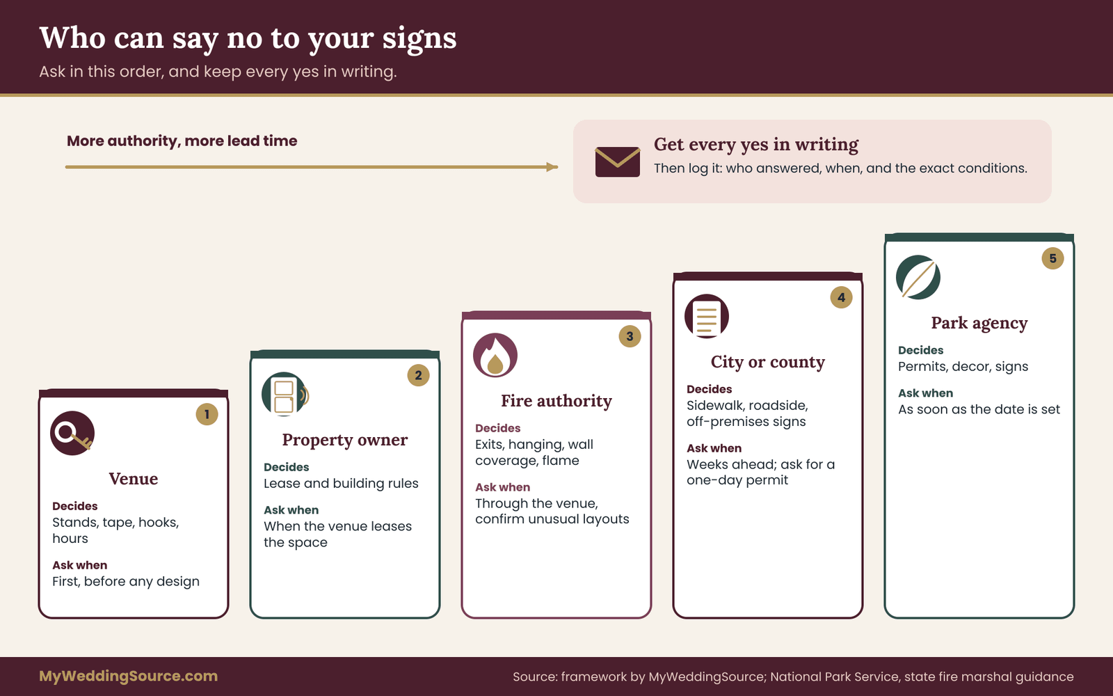
A sign you cannot put up is a wasted print run. Permissions are the dullest part of a wedding signage system and the most likely to cause a last-minute scramble. The good news is that nearly all of them can be settled with a few written questions, sent early.
Who might have a say
Depending on where you marry, anywhere from one to five parties may have a say over your wedding signage.
The venue. The first and most important. If you are still choosing one, our wedding venues guide lists the questions worth asking before you sign. Venues set rules about what can touch walls, floors and landscaping, what can be hung, where easels can stand, whether open flames are allowed and when you can install and remove things. Some venues also keep exclusive control over certain signs, such as parking or wayfinding.
The property owner or manager. If the venue is leased, such as a church hall, a community center or a space owned by an organization, the owner may add rules beyond the leaseholder’s.
The fire authority. Local fire codes govern what can hang where and what must stay clear. The venue usually knows the rules and can tell you, but the authority has the last word.
The city or county. Signs on or near public sidewalks, streets and parks are subject to local ordinances. Roadside signs, sidewalk A-frames and signs attached to utility poles or street furniture are commonly restricted.
A park or land-management agency. Public parks, beaches and protected lands often require permits for weddings and have specific rules for decor, signs and amplification.
If you work with a planner or coordinator, ask them to confirm these points. If you do not, treat the permission log, described below, as your own coordinator.
Questions to ask the venue
Send these in an email, and keep the reply. A phone call is good for a quick answer, but a written reply is what you will point to if someone on the day says, “I was not told about that.”
- May we place freestanding signs on easels, stands or stakes? Are there restrictions on where?
- May we attach anything to walls, doors, railings, trees or fixtures? If so, with what: tape, adhesive strips, hooks, ties? What is not allowed?
- May we hang signs from ceilings, beams, tent poles or sprinkler pipes?
- Are there limits on how much of a wall or surface can be covered?
- Are open flames, candles or lighted signs allowed? Are battery-powered lights allowed?
- Which exits, exit signs, emergency lights, fire extinguishers and doors must be kept clear and visible?
- Do you provide any signs yourselves, such as directional or parking signs? May we add ours, or replace yours?
- When can we install, and when must everything be removed? Who is allowed to do it?
- Are there damage fees, deposits or cleaning charges related to signs?
- Do you have a preferred or required process for approving signs in advance, such as sending images or sizes?
- Is there signage near the property, such as at the road or gate, that we may use or that we must not block?
- Are there any rules about signs for guests with disabilities, such as accessible routes that must stay clear?
You will not need every question for every venue. A hotel ballroom will care about walls, fire code and installation hours. A rural estate will care about stakes, ground and the road. A beach will care about the local authority.
A sample request
Here is a message you can adapt. It is short because venue managers are busy.
“Hi, we are planning signs for our wedding on June 14 and want to make sure everything we bring fits your rules. We will have about fifteen signs, mostly on easels and a few on stakes, with a couple of small signs on tables. Could you let us know: where we may place freestanding signs, whether stakes are allowed in the lawn, what we may use if we want to attach anything to a wall or door, and which exits and fire equipment must stay unobstructed? We would also like to know your installation and removal times. We can send photos and measurements for anything you would like to approve. Thank you for your help.”
Attach a simple site sketch or map with numbered locations if you have one. It lets the manager answer specific questions, such as “Number 4 is fine, number 7 is too close to the exit.”
What fire rules typically cover
Fire codes vary by jurisdiction, so the venue and the local fire authority are the final sources. Still, the same themes show up again and again, and you can plan around them.
Guidance from a state fire marshal’s office offers a typical example. It says decorations must not hide, block or narrow exits or exit paths, and that exit signs and emergency lights must not be covered, since they may be the only way to find an exit in an emergency. It advises against hanging decorations from sprinkler pipes or heads, because that can impair the system. It limits how much of a wall can be covered, with twenty percent given as the limit for most occupancies in that guidance, and it asks for fire-resistant materials in many decorations. Rules in your state or city may differ, and the venue can tell you which apply.
For your wedding signage, this means a few practical habits. Keep signs out of exit paths and away from exit doors. Never place a sign where it blocks or competes with an exit sign. Do not hang anything from sprinklers. Ask before covering large areas of a wall with prints or banners. Ask about candles or lighted signs, and use battery lights if open flame is not allowed.
Public land, parks and sidewalks
If your ceremony is on public land, the rules are tighter, and the surprises are bigger.
National parks and many state and local parks require permits for weddings and set conditions on what you may bring. The National Park Service page for one park, for example, says that signs, including roadside signs, are not allowed without a permit, that decorations and structures generally need administrative review and are often not approved, and that throwing items such as rice or petals is not allowed. Another park will have different rules. Yellowstone’s wedding page, for instance, asks for a special use permit request at least ten business days ahead and suggests that heavily decorated events may suit a venue outside the park.
If you are marrying in a public park, ask the managing agency early, ask in writing, and expect that your usual sign setup may not apply. A single printed program and a human greeter may serve you better than a set of stands.
City sidewalks and streets are governed by local ordinances. Sidewalk A-frame signs are commonly regulated: some cities require permits, set size limits, and require that a clear path remains for pedestrians. Signs attached to utility poles, trees or street furniture are often prohibited. If you plan to put a directional sign on a public sidewalk or roadside to help guests find a venue, check the rules of that city and ask whether a one-day temporary sign is allowed. One small city’s sandwich-board rules show how specific this can get: signs limited to a set size and height, off-premises signs not allowed, no placement that narrows the minimum accessible sidewalk width, and display only during set hours.
A wedding sign pointing to a venue from a corner would be off-premises under rules like those. Most city planning or zoning departments list a contact for sign questions.
Private roads, gated communities and homeowner associations have their own rules, and some forbid temporary signs. If your venue is within one, ask the venue manager what is customary.
Fonts, images and the legal side of wedding signage
While we are on permissions, a short word on the design files. The U.S. Copyright Office explains that typefaces and lettering are generally not protected by copyright, and that names and short phrases are not either. That does not mean every font is free to use. Font software is usually distributed under license terms, and some licenses limit commercial printing, embedding or use by a third party. If a printer or designer is setting your signs, ask which fonts they used and whether the license covers the job. Clip art, patterns and photographs also come with terms. A stock image that is free for personal use may not cover a print shop making your signs.
If you are using a design template from an online marketplace, read the terms. Some allow personal event use, others require a separate license for printing by a third party.
Keep a wedding signage permission log
A permission log is a one-page list that sits at the front of your inventory. For each place or authority, it records what you asked, who answered, when, and what they said. It also lists any conditions: “Stakes allowed in lawn only, not in the flower beds,” “Install after 1 p.m., remove by 11 p.m.” Paste the exact wording from the reply.
Give a copy to the person who sets up on the day. If a staff member says “you cannot put that there,” the person can show the email. This is not about arguing with staff. It is about resolving a misunderstanding in seconds instead of minutes.
When the answer is no
Sometimes the answer is no. A venue may forbid stakes, ban tape, or decline your directional signs. The inventory helps here, too, because it shows what each sign is for. If a sign is not allowed, ask what alternative the venue prefers. Common solutions include a freestanding easel instead of a wall mount, a hanging sign on an approved hook, a printed card at a table instead of a wall sign, a greeter instead of a roadside sign, or a venue-provided sign with your names added. Most venues would rather help guests find the right place than stand on a rule.
Proofing wedding signage: the words, the print and the placement
Proofing is where a good wedding signage system earns its keep. A misspelled name on a seating display or an arrow that points the wrong way is the kind of mistake nobody notices until the sign is in front of two hundred people. Proofing means checking three different things, in order, and it is easy to skip one.
Three passes, not one
Pass one: the words. Check the content before design. Read the master text aloud. Compare every name against a trusted source, such as the guest list or the RSVP data. Check dates, times and addresses. Check that the arrows describe the route from the guest’s point of view, not yours. Have a second person who did not write the text read it cold.
Pass two: the layout. Check the design with the words in place. Is the hierarchy clear? Is the most important line the biggest? Is the contrast as good on paper as on screen? Is anything cut off, too close to the edge or crowded? Does each sign use the same typeface, arrow and color as the others?
Pass three: the physical proof. Look at the printed piece or a physical sample. Colors shift between screen and print, especially pale tints and metallic inks. Fine lines can disappear. A sign that looked sharp at full-screen size may be unreadable at its real size. Ask your printer for a hard-copy proof or a small test run for any large or expensive sign. If a proof costs extra, weigh it against the cost of reprinting.
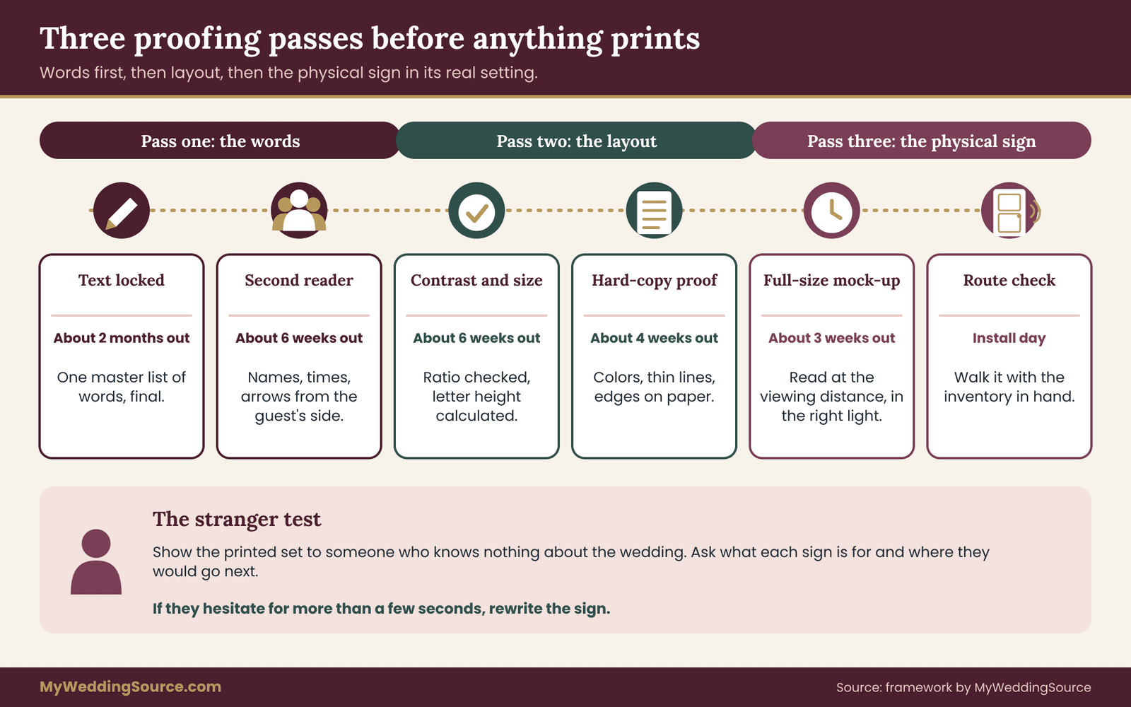
The stranger test
When your wedding signage is ready, find someone who knows nothing about the wedding. A neighbor, a coworker, a friend from another city. Give them the printed signs, or photos of them in place, and ask a few questions.
- What do you think this sign is for?
- If you were arriving, where would you go next?
- Can you read this from over there?
Do not explain anything. Watch where they hesitate. If they cannot answer in a few seconds, the sign needs work. This test costs an hour and catches problems that the people who made the wedding signage cannot see because they know too much.
The mock-up test at scale
Before final printing, print a mock-up at actual size on inexpensive paper. Tape it to a wall, a post or an easel in the actual space, or a similar one, and walk to the viewing distance in your inventory. Read it. Then do it again in the light you expect. If you can, repeat at the hour the event will use the space. It is the single most reliable way to confirm that your letter height and contrast calculations hold up in practice.
Names, spelling and the seating display
Seating displays carry the highest risk, because they contain the most names. Common errors include misspelled surnames, a guest listed under a nickname they never use, a person listed at two tables, a missing plus-one and a table number that does not match the chart. Check the display against the final seating chart, line by line, with someone reading aloud while someone else follows along. Do it again after any late change. Our seating chart guide covers the chart itself, and the final proof of the display should be the last step before printing.
If your display lists guests alphabetically, test it by looking up ten names at random, including a few with unusual spelling. If it lists by table, check that every table has a number visible from a distance.
Left, right, up and down
Directional signs are the easiest to get wrong. An arrow pointing “left” is left for the person facing the sign, so signs have to be proofed from the walking direction, not from the designer’s chair. When you place directional signs, stand where a guest will stand, facing the way they will face, and check each arrow. Two guests arriving from opposite directions may need different signs, or a sign that works for both.
QR codes on signs
Many couples add a QR code to a sign, for the wedding website, a live stream, a photo-upload page or the order of events. A code is useful, but it needs care.
A QR code is a pattern of small squares, and each square, called a module, must be big enough for a phone camera to resolve it. A QR-code maker, Denso Wave, notes that readable size depends on module size and printer resolution, and that larger modules scan more reliably.
A practical approach: test it. Print the code at the size you plan to use, tape it up at the height and distance a guest will use, and scan it with at least three different phones in the light you expect. If any phone struggles, make it bigger or simplify the link. Leave a clear empty border around the code, use dark on light, and avoid placing it on a pattern or a curved surface.
Also think about the page the code opens. Guests will scan it on mobile data, possibly with weak signal. A short, simple page loads faster than a heavy one. Add a short typed web address under the code, so guests who cannot scan can still reach it. If the code points to a page that will not exist after the wedding, plan to keep it live for as long as guests might need it.
Lock dates and change control
A late change is the usual source of proofing errors. Set three dates in your inventory.
- Text lock. The date after which words do not change without a full re-check.
- Design lock. The date after which the layout does not change.
- Print deadline. The date the printer needs final files, minus a buffer for errors and delivery delays.
When something does change, such as a guest dropping out, a time shifting or a venue updating a rule, write the change in the master text and re-check every sign that uses it. Keep a version number on each file so that nobody prints from an old copy.
Install day for wedding signage: a plan, a kit and a person
Wedding signage that is carefully made and carefully placed can still fail if no one knows who is putting them up. The install plan fits on a page.
The install schedule
Work backward from the first guest arrival. Install the wedding signage that guests see first, such as the driveway and parking, early, because they are needed before anyone else is there. Install ceremony signs before the ceremony set-up is done, so they are not blocked by chairs. Install reception signs once the tables and the tent are set. Keep a copy of the inventory map with numbers so the installer can work through it.
For each sign, record who places it, when, and who checks it. Then assign a second person to walk the route after install, with the inventory in hand, and confirm that each sign is where it should be and readable at its viewing distance.
What to put in the kit
A small kit solves most problems.
- Spare printed copies of key signs, especially directional ones and the seating display.
- Painter’s tape, clear tape and double-sided tape, tested beforehand on the surfaces you may use.
- Zip ties, clips and a few lengths of cord.
- A small level and a tape measure.
- Scissors, a marker and a few blank cards for last-minute notes.
- Sandbags, small weights or gravel bags for outdoor stands, and something to hide them.
- A few extra stakes and a mallet, if the venue allows them.
- A printed copy of the permission log and the inventory.
- A plastic sleeve or two for signs that may get wet.
Strike and storage
Decide at the start who takes signs down, and when. The most precious items, such as a hand-lettered welcome sign, should be collected first, so they do not get lost in the clean-up. Return any rented stands and easels as agreed. Remove all tape, adhesive and ties, and leave the venue as you found it. If you plan to keep signs, wrap them flat and label the box. Some couples reuse them for an anniversary or an event the next year.
Controlling wedding signage cost without hurting readability
Wedding signage can add up, and some cost-saving choices harm readability, while others do not. A few that help:
- Cut the count. Use the journey map to remove signs that guests would not use. The cheapest sign is the one you do not make.
- Make some signs do double duty. The welcome sign can also carry the order of events if it is large enough. The bar menu and the signature drink sign can be one.
- Use venue-provided signs where allowed. If the venue has permanent directional signs, use them and add only what is missing.
- Print standard sizes. Standard print sizes usually cost less than custom ones.
- Reuse. Easels and frames can be borrowed, rented or reused. Ask your planner or the venue what they hold in stock. Our guide to wedding rentals covers what to ask when you rent stands and frames.
- Do not shrink the letters. The cheap way to fit more on a sign is to shrink the type. It is also the way to make the sign unreadable.
For how signs fit into the overall plan, the wedding budget guide shows how to set a line for decor and printed materials, and how to keep a reserve for last-minute fixes.
A second worked example: wedding signage on a city rooftop
This second illustrative example shows how the same system adapts to a different venue. Imagine a couple marrying on a hotel rooftop with a ceremony area, a cocktail space and a plated dinner in an indoor ballroom. The hotel hosts several events a day, and the elevator is the only access.
The journey map is short but has two hard decision points: the hotel lobby, where guests must find the elevator, and the rooftop landing, where the ceremony and cocktail areas are visible but the restrooms are not. The hotel has strict rules. Nothing may be attached to walls or doors. Easels are allowed only in designated areas. Signs cannot block the elevator lobby or any exit, and the hotel supplies its own directional signs for guests in the lobby. Open flames are not allowed, and the fire inspector may check the room.
The couple therefore asks the hotel three things in writing: where easels may stand in the lobby, whether the hotel’s own signs can include the event name, and what the load-in window is. The hotel replies that it will place a hotel-branded easel with the event name at the elevator, will allow one easel for the couple’s welcome sign on the rooftop, and will allow signs only on easels or table stands. The couple moves the directional job to two greeters, one in the lobby and one at the rooftop landing, and uses one large sign on the rooftop, readable at about twenty feet, to point to restrooms and the bar.
Their inventory shrinks from sixteen signs to seven, each with a clear owner. The wedding signage costs less, the guests meet a person instead of reading a sign, and the venue has no surprises. The lesson is that a wedding signage system includes the option to use fewer signs when the venue calls for it.
Common wedding signage mistakes and how to avoid them
- Designing before listing. You end up with pretty signs and gaps. Fix: build the inventory first.
- Guessing letter height. The sign looks fine on the screen and is unreadable at the viewing distance. Fix: calculate it, then test with a mock-up.
- Low-contrast color pairs. Gold, blush, pale sage and light gray are the usual culprits. Fix: check a ratio and print a test.
- Too many words. Guests do not read paragraphs on a sign. Fix: cut to one message and move the rest to a program.
- No permission. Tape, stakes and hanging signs are not always allowed. Fix: ask in writing and keep the reply.
- Skipping the walk. Signs that block paths or face the sun. Fix: walk the route with mock-ups.
- Ignoring wind. A sign that falls over becomes a hazard. Fix: weight stands and have a plan to move signs.
- No owner. Signs that nobody is assigned to put up or take down. Fix: write a name in the inventory.
- Last-minute text changes. A name or time changes and one sign is missed. Fix: use a master text and lock dates.
- Forgetting the exit. Guests need directions to leave, too. Fix: sign the shuttle pickup and the parking return path.
A suggested timeline for wedding signage
These steps work for most weddings. Adjust them for the size of your event and the speed of your printer.
About three months before. Draw the guest journey. Visit the venue, or request a floor plan. Ask the venue about its rules in writing. Draft the inventory with message, job and location for each sign.
About two months before. Finalize the inventory and the master text. Set the text lock, the design lock and the print deadline. Choose the typeface, colors and material. Confirm the permissions. Commission the designs.
About six weeks before. Check the designs for contrast and letter height. Print a mock-up at full size and run the walk test with a helper, if you can visit the venue.
About four weeks before. Proof the words with two readers. Send the final seating details to the seating display designer. Request hard-copy proofs of large or expensive signs.
About two weeks before. Lock the text. Approve the final proofs. Print. Test any QR codes on several phones.
The week of the wedding. Check the weather forecast. Assemble the kit. Give the install plan, the inventory and the permission log to the person who will set up. Confirm the install window with the venue.
The day. Install, walk the route, adjust, and then enjoy the wedding.
FAQ
How much wedding signage does a couple need?
There is no standard number. It depends on the venue, the number of locations and how unfamiliar the place is to your guests. A single-venue wedding with an obvious path may need only a welcome sign, a seating display and a few direction signs. A multi-site weekend may need many more. Build the inventory from your guest journey map and count the decision points. If a spot has no decision, it probably needs no sign.
How big should wedding signage be?
Size depends on the distance the reader stands from the sign. As a benchmark, the 2010 ADA Standards set the minimum capital-letter height at five-eighths of an inch for text read under six feet away, then add an eighth of an inch for each additional foot for signs mounted at typical heights. Calculate from your viewing distance, then test a full-size paper mock-up.
Do I need the venue’s permission for wedding signage?
Yes, ask. Venues commonly have rules about tape, nails, stakes, hanging items, open flame and exit paths, and some control signs themselves. Ask in writing, keep the reply, and give a copy to whoever sets up. Public parks and city streets have separate rules, and some require a permit.
What font is best for wedding signage?
For anything functional, a plain, upright typeface with moderate stroke weight and open spacing reads best from a distance. Keep script and decorative faces for names and welcome lines. Whatever you choose, print a test at real size, measure the capital letters and read it from the viewing distance.
Can I put directional signs by the roadside?
Maybe, but check first. Many cities restrict signs on public property, utility poles and sidewalks, and some do not allow off-premises signs at all. Private property needs the owner’s permission. A venue marker at its own gate, approved by the venue, is the safest choice. Otherwise, consider a greeter, clear driving directions on your website and a note in the invitation.
How far ahead should I order wedding signage?
Allow time for the designer, a proof, any revisions and printing and delivery, plus a buffer. Many couples start the inventory about three months out and aim to lock the text a few weeks before the date. Custom or handmade signs often need more lead time, so ask your maker for their schedule at the start.
Do ADA sign rules apply to a wedding?
The ADA Standards govern specific permanent signs in covered facilities, and whether they apply to a temporary sign at a private event is a legal question. They are still a sound benchmark for letter height, contrast and finish. Your venue may have permanent accessible signs that you must not block. If in doubt, ask the venue or a qualified accessibility professional.
How do I keep outdoor wedding signage from blowing over?
Choose smaller signs or stands with wide bases, add weights such as sandbags hidden behind decor, and avoid large flat surfaces in open, windy places. Use table-top or hanging signs where possible. Check the forecast the day before, and name a person who will lay signs down or move them indoors if the wind picks up.
Your next steps
Start with the journey map. Take a sheet of paper and draw the guest path from the road to the last dance, marking every spot where a guest might hesitate. That sketch alone will cut your wedding signage count and show you where signs or people are needed.
Then write the inventory: one entry for each sign, with the job, the exact words, the viewing distance and the owner. Calculate the minimum letter height for each sign and test your color pairs for contrast. Email the venue with the questions above, and keep the reply. Print one full-size mock-up and walk it to its spot.
When the words are final, proof them with a second reader, lock the text and send the files to print. A few quiet hours of planning now are worth more than any last-minute fix.
Sources
- Chapter 7: Communication Elements and Features, 2010 ADA Standards, U.S. Access Board
- Guide to the ADA Accessibility Standards: Signs, U.S. Access Board
- Understanding Success Criterion 1.4.3: Contrast (Minimum), W3C Web Accessibility Initiative
- Web Accessibility Initiative home, W3C
- Fire Fact 087: Decorations, Kansas State Fire Marshal
- Weddings and commitment ceremonies, Acadia National Park, National Park Service
- Weddings and permits, Yellowstone National Park, National Park Service
- Warning and advisory criteria, National Weather Service Boston/Norton
- Circular 33: Works not protected by copyright, U.S. Copyright Office
- How to make a QR code readable, Denso Wave
- Sandwich board sign rules, City of Poulsbo, Washington
Large venues need more than a welcome sign. See how wedding directional signage builds a clear wayfinding route for guests.