

Invitation printing techniques decide how a wedding invitation looks, feels and survives the mail, and each one carries its own costs, limits and proof steps. This guide compares letterpress, foil stamping, embossing and their cousins with a hands-on sample test and a gated proof-approval routine, so you can choose a finish you will still like when the boxes arrive.
Choose invitation printing techniques in this order: decide what the invitation must do (inform, impress, or both), pick one hero finish rather than three, request physical samples on the exact paper you plan to use, run five touch-and-light tests on each sample, and approve the job through six proof gates before anything goes on press. Letterpress gives pressed texture, foil gives metallic shine, embossing gives raised relief, and each works best on paper chosen for it. Confirm size, thickness and postage with the post office before you approve final production.
Most couples meet specialty invitation printing techniques the same way: a photo of a cream card with a deep, soft impression, or a script name in gold, shared by a friend. The photo is persuasive, and it hides almost everything that matters. It does not show how the card feels, how the gold looks under a reception chandelier, how much the plate cost, or whether the finished envelope will clear the post office without a surcharge.
That gap between the photo and the finished piece is what this article closes. It is built around one idea: you cannot judge invitation printing techniques from a screen, so you need a repeatable way to judge them in your hands. The method below uses physical samples, five short tests and a set of approval gates. It works whether you spend a modest amount on one accent finish or a large amount on a full suite.
Where your question is what to say on the invitation or when to send it, start with the invitation etiquette basics. The general process of proofing, quantities and printer handoffs has its own guide, and this one stays on the finish itself.
A note on scope. This is general planning information, not legal, tax or financial advice. Printing methods vary by shop and by press, and postal standards, fees and dimensions change, so treat the post office and your printer as the final authority on the current version of any rule or price.
What invitation printing techniques actually change
Every invitation has three jobs. It carries information (who, when, where, what to do next). It sets a tone before the guest knows anything else about the day. And it has to arrive intact. Printing technique touches all three, though not equally.
For the information job, invitation printing techniques matter less than people expect. A clear layout in legible type on a flat digital print communicates the date as well as a hand-pressed card does. Where technique can actually hurt is legibility: fine script in foil that disappears at an angle, or letterpress ink that fills in small type, can make a detail harder to read.
For the tone job, the choice among invitation printing techniques matters a great deal. Texture and shine are the first things a guest notices, often before reading a word. A thick cotton card with a visible impression reads as quiet and deliberate. A mirror-bright foil name reads as celebratory. A smooth, flat sheet reads as modern and clean. None of these is better; they simply say different things.
For the arrival job, some invitation printing techniques can cost you. Raised areas can catch in sorting equipment. Heavy stock adds ounces. Square or rigid pieces can cost more to mail. This is why mailing belongs inside the printing decision rather than after it.
The vocabulary you need first
Printers use a handful of terms loosely, and shops sometimes use different words for the same process. Before comparing quotes, get these straight.
Impression means pressing something into the paper. Letterpress and debossing leave a recessed mark; embossing pushes the paper upward into a raised shape.
Plate or die is the metal or polymer tool that carries the design. Most specialty invitation printing techniques need one, and making it is a fixed cost that does not shrink when you order fewer invitations.
Substrate is simply the paper or card. The same technique looks different on a soft cotton sheet than on a coated, smooth one.
Proof is a preview. Proofs come in several kinds, from a screen image to a physical press sample, and which kind you approve changes how much risk you carry.
Run means the whole print job. A short run costs more per piece because setup is spread across fewer cards.
Why one hero finish usually beats three
Couples often ask for letterpress type, a foil monogram and an embossed border on the same card. Each can be lovely alone. Together they compete for attention, they multiply setup cost, and they multiply the chances of misregistration, which means two layers of printing landing slightly out of line.
A calmer rule for invitation printing techniques: pick one hero finish and let everything else stay quiet. If foil is the hero, set the rest in a plain, well-spaced ink. If letterpress is the hero, keep the layout simple enough that the pressed texture is the feature. The decision framework later in this guide formalizes this as a choice of one lead technique plus at most one supporting one.
The main invitation printing techniques in plain words
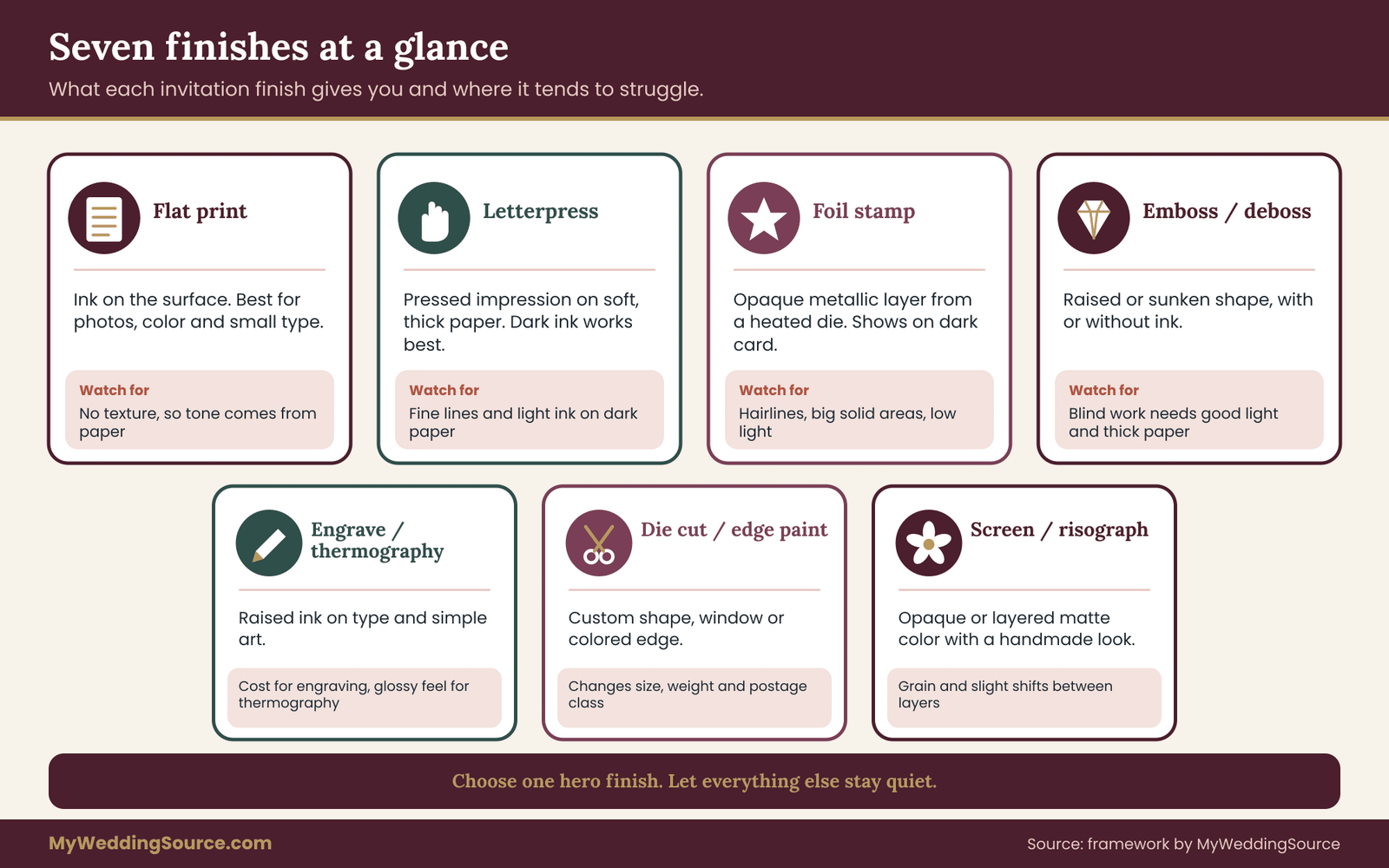
Here is what each of the major invitation printing techniques does, what it needs, and where it tends to go wrong. This section stays practical; the next one covers how to compare them physically.
Flat printing: digital and offset
Flat printing puts ink on the surface with no physical impression. Digital printing is common for short runs and fast turnaround. Offset printing uses plates and is usually chosen for larger runs or tighter color control. Either way, the surface stays smooth.
Flat printing is the baseline for comparing invitation printing techniques. It handles photographs, full-bleed color and tiny type better than any pressed or stamped method. If a design needs a photo or a color wash, flat printing is usually the right hero, with a finish added only to a small element.
Its weakness is only that it lacks tactile drama. That is not a flaw if the design does not call for it. A well-designed flat invitation on a good heavy stock is a perfectly sound choice, and it costs less to correct if a typo slips through.
Letterpress
Letterpress presses an inked plate into the paper under pressure. On soft, thick paper, the result is a visible, slightly recessed impression you can feel with a fingertip. It is often described as a quiet, handmade texture.
Letterpress works best on absorbent, thick sheets, commonly cotton-based, because the paper has to take the impression without cracking or flattening. On thin or very smooth coated paper, the effect weakens.
Ink behaves differently on press than on a screen. Light ink on a dark sheet usually will not show well, because letterpress ink is generally translucent. Printers often recommend dark ink on light paper for letterpress, and some will print a light color in two passes at added cost. Ask about it rather than assuming.
Fine detail is the main limit. Hairline strokes and very small type can fill in or lose crispness. Ask the printer for the minimum recommended type size and line weight on your chosen paper, and then check your own file against those numbers.
Foil stamping
Foil stamping presses a heated metal die against a thin foil sheet, which transfers the metallic or colored layer to the paper. Gold, silver and rose gold are common; matte, glossy, holographic and pigment foils also exist.
Foil is opaque, so unlike letterpress ink it can sit on a dark sheet and show clearly. That makes it a natural choice for dark or colored stock. It is also the technique most sensitive to artwork: large solid areas can show tiny pinholes or uneven coverage, and very fine lines may not transfer cleanly.
Foil costs include a die for each foil layer and often a separate setup per color. A design with gold and rose gold needs two passes and two dies. That is exactly where the one-hero-finish rule saves money.
Embossing and debossing
Embossing raises part of the design above the paper surface; debossing presses it below. Both use a shaped die pair, and both can be done with no ink at all, which is called blind embossing or blind debossing.
Blind work is subtle by nature, so it reads best in good light and on a sheet with enough thickness to hold the shape. It can also be combined with ink or foil in registration, meaning the raised area lines up with the printed area. Registration is where cost and risk rise, because the printer has to align two processes to a tight tolerance.
An embossed edge can catch or flatten in the mail. If your invitation has a raised element near the edge of the card, ask how it will be protected in the envelope.
Engraving and thermography
Engraving is the classic, old-fashioned method: a plate is cut with the design, ink fills the cuts, and the paper is pressed hard into them so the ink stands slightly raised on the surface and the back shows a dent. It is among the more expensive invitation printing techniques and is far less common now, so fewer shops offer it.
Thermography is often described as a lower-cost imitation of that raised look. A resin powder is applied to wet ink and heated so it swells into a slightly shiny, raised layer. The result feels raised and a little glossy rather than pressed and soft. Some people like that look, and some find it less refined. The honest way to decide is by touching a sample.
Neither method is a good fit for a photograph or a large block of color. Both suit type and simple line art.
Die cutting, edge painting and layered builds
Several finishes are about shape and edge rather than ink. Die cutting cuts the paper into a custom shape or window. Edge painting colors the thick edge of a card, which looks best on heavy duplexed stock. Duplexing glues two sheets together for thickness or a color stripe. Laser cutting makes fine openwork that a mechanical die cannot.
These builds share one risk, which is that they change dimensions and weight. A layered, windowed or oddly shaped piece can fall outside standard mailing rules. The postal section of this guide explains how to test that before you commit.
Screen printing and risograph
Screen printing pushes ink through a mesh and can lay down a thick, opaque layer, including light ink on dark paper. Risograph printing is a stencil-based process that produces slightly grainy, layered color with a distinct handmade look. Both are chosen for personality rather than polish.
They are worth knowing about because they solve a real problem: light type on a dark card, where letterpress struggles and foil may be more shine than you want. If you like a matte, graphic look, ask whether a shop in your area offers either one.
A one-paragraph map of what each technique is good for
Flat printing handles detail and photographs. Letterpress gives quiet pressed texture on soft paper with dark ink. Foil gives opaque metallic color on any shade of paper but is picky about fine lines. Embossing gives raised relief and works well blind or in registration. Engraving and thermography give raised ink on type. Die cutting and edge painting change shape and edge. Screen and risograph give opaque or layered matte color.
Keep this map of invitation printing techniques in mind as you move to the comparison method, because the question is never which technique is best in general, only which one suits your paper, your design and your mailing.
Why the choice among invitation printing techniques is rarely only about taste
It is tempting to treat this as a matter of style, but invitation printing techniques also differ in lead time, in how forgiving they are of a late change, and in who in your region can do them well. A technique that suits your taste but needs a shop three states away, a long lead time and a die that cannot be altered is a different decision from one a local printer can proof in person.
So before you fall for a finish, ask three plain questions. Who can produce it near me or reliably by mail? How long does it take from approval to delivery? What happens if a name changes after the die is made? The answers narrow the field faster than any mood board, and they keep the invitation printing techniques you shortlist realistic for your calendar and budget.
Why a screen can never settle invitation printing techniques
Most online galleries show you a photo of a finished piece in flattering light. That photo cannot show three things that decide whether you will be happy.
First, depth. A letterpress impression of a fraction of a millimeter looks dramatic in a raking-light photograph and nearly invisible in a flat-lit one. You can only judge it by running a fingertip across it and tilting the card.
Second, metallic behavior. Foil changes with the angle of light. A gold that looks warm in one photo can look flat or greenish in another. Reception rooms are lit differently from a photographer’s studio, and guests read invitations at a kitchen table, not in a studio.
Third, paper response. The same plate on two different papers gives two different results. A gallery photo shows the combination the shop chose. It does not show your combination.
This is why every serious decision about invitation printing techniques should include a physical sample. A sample is cheap compared with the cost of a full run, and it replaces opinion with evidence you can hold.
What to ask for when you request samples
Most printers will mail a sample pack or sell a small sample set, and some credit the cost against an order. Terms vary, so ask rather than assume.
Ask for samples on the specific paper you are considering, not a generic card. If the shop only offers samples on a different stock, say so in your notes, because the result may not predict your finished piece.
Ask for at least one sample that uses the technique at a size and line weight similar to your own design. A sample that shows only a large, bold shape tells you little about how a small date line will print.
Ask whether the sample is a real production piece or a mock-up. A mock-up is fine for judging paper and general feel. It is weaker evidence for how your specific artwork will behave.
If a sample arrives and the technique looks different from the gallery photos, believe the sample.
Setting up a fair comparison
Place the samples on a plain, neutral surface near a window and again under a lamp. Keep the lighting the same for each. Lay them out in the same orientation, and cover any labels that might bias you. Write down your first reaction before you analyze anything, because first impressions of tone are part of the evidence.
Then run the five tests described in the next section. Take notes. A short note such as “foil: lovely, but the script vanished at a low angle” is worth more than a month of browsing.
The five-test touch method for comparing samples
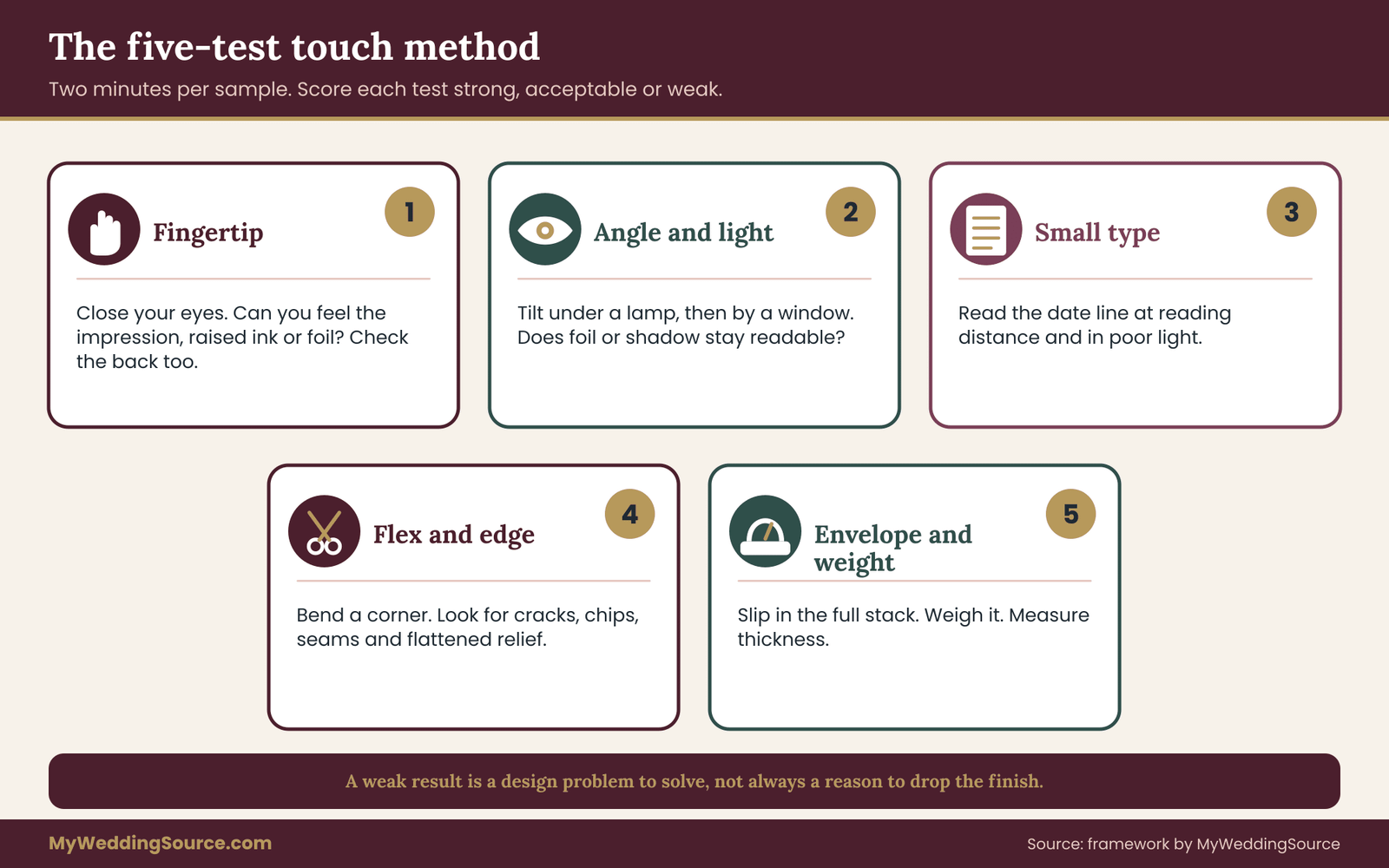
This is the core of the framework for comparing invitation printing techniques. It turns a vague preference (“I like the pressed look”) into a set of observations you can compare across techniques and across shops. Each test takes about two minutes per sample.
Test one: the fingertip test
Close your eyes and run a fingertip lightly across the printed area, then across the blank paper beside it. Notice whether you can feel the impression, the raised ink or the metallic layer, and whether the edges feel crisp or soft.
This test answers the basic question of whether the technique delivers the texture you imagined. Letterpress that you cannot feel is a flat print on soft paper, and that may not be worth a premium. If you can only barely feel it, ask whether the printer can press deeper on your paper, and what depth they recommend before the paper starts to crack or the back of the card shows a strong dent.
Also check the back. Some people love the visible dent on the reverse of a letterpress card, and some dislike it. If you plan to add a backing sheet or a liner, the dent will be hidden anyway, which affects how much the depth is worth to you.
Test two: the angle-and-light test
Hold the sample about arm’s length away and tilt it slowly under a lamp, then by a window. Watch how the foil or impression responds as the angle changes.
For foil, the question is whether the text stays readable at every angle or whether it flashes and then goes dark. For impressions, the question is whether the shadow in the impression helps or hurts legibility. Some designs rely on raking light to be readable at all, which is a risk in a dim reception room.
Repeat the test at a distance, around the length of a dining table. Details that vanish at that distance are details guests will not see.
Test three: the small-type test
Find the smallest text on the sample, ideally a date, a time or a website line. Read it at a normal reading distance without leaning in. Then read it in poor light.
This test catches the most common failure of specialty invitation printing techniques, which is that tiny text that looked fine on screen fills in, breaks up or loses contrast once it is pressed or stamped. If the sample has no small text, ask for one that does, or ask the printer for the minimum type size and stroke thickness they advise for your technique and stock, then compare it to your own file.
A practical rule of thumb from this test is to keep essential logistics, such as the date, the time and the response instructions, in a plain method and let the hero finish handle names and ornament. You can print the logistics on a separate card in a flat method without losing the feel of the suite.
Test four: the flex-and-edge test
Gently bend a corner of the card, then check how the surface and the edges respond. Look at foil along any bend for cracking or flaking. Look at the edges of thick, duplexed or painted cards for chips or a visible seam. Press a fingernail lightly into an embossed area to see how firmly the shape holds.
Your invitation will be handled by people, sorted by machines and probably stuffed into a box by a relative. A piece that shows damage from a gentle test will not improve in the mail. This test is also where thin paper often shows its weakness under a heavy technique.
Test five: the envelope-and-weight test
Slip the sample into an envelope of the size you plan to use, together with any inserts, liners or a response card if you have those samples. Weigh the stack on a kitchen scale and measure its thickness. Check for corners or raised areas that scrape the envelope when you slide the stack in and out.
This test is the bridge between design and the post office. A card that looks perfect alone may not fit with the inserts you need, or may weigh more than you expected. Write down the numbers, because you will use them in the postal checks later.
Scoring the results without a table
You do not need a spreadsheet. For each sample, write one line for each test using three words: strong, acceptable or weak. Then add a single sentence of overall reaction. Compare the lines across samples. If one sample is weak on the small-type test, the fix is usually to move the small type to another method, not to abandon the technique. If a sample is weak on the flex test, the fix is usually to change the paper.
The pattern you are looking for is not a perfect score. It is one of the invitation printing techniques whose weaknesses you can design around. A foil that struggles with fine lines is not a problem if your design uses a bold monogram. A letterpress that struggles on thin paper is not a problem if you choose a thick sheet.
Keeping notes you can compare later
Samples blur together after a few days, so write your notes the same evening you run the tests. Label each sample on the back in pencil with the shop, the technique and the paper. Photograph each one in the same light, flat and tilted, and keep the photos next to the notes.
When quotes arrive, the notes will remind you why one of the invitation printing techniques felt right and another did not. They also give you something concrete to send a printer, such as “the impression on your second sample was lighter than the first, can you match the first on this paper?” Notes turn a vague preference among invitation printing techniques into a request a printer can act on.
Matching paper to invitation printing techniques
Paper is half of every result among invitation printing techniques. A technique that looks dull on one sheet can look rich on another, so paper choice belongs inside the comparison, not after it.
How paper properties change each finish
Three properties do most of the work: thickness, softness and surface.
Thickness gives pressed and raised methods room to work. Letterpress and deep debossing need enough body to hold an impression without the back bulging or the sheet tearing. A thin sheet can take light pressure, but deep texture on it risks cracking. Printers often describe heavy stock by weight, and shops use different scales, so ask for the actual measured thickness of your sample as well as its label.
Softness matters for impression. Soft, absorbent, cotton-rich sheets take a deep, rounded impression. Hard, dense sheets resist it. If you love the soft look of pressed type, a soft sheet is part of the recipe.
Surface matters for ink and foil. A very smooth or coated surface holds fine detail and gives foil an even transfer. A rough, toothy surface gives a handmade look but can break up fine lines and make foil patchy. A coated sheet can also resist letterpress ink and show a different texture than an uncoated one.
Duplexing, layering and the thickness trap
Gluing two sheets together gives a thick card with a clean edge, and it allows a colored core that shows as a stripe. It also adds weight and thickness. A card that is lovely at one thickness may push the full stack past what the envelope and the post office will accept.
If you are tempted by an extra-thick card, run the envelope-and-weight test from the last section before you fall for it. Thickness that is delightful in your hand can become a postal problem once it has inserts alongside it.
Recycled and certified papers
Some couples want recycled or responsibly sourced paper. Certification programs such as the Forest Stewardship Council exist for that purpose, and a certified product normally carries a license code you can check with the program. Be careful with vague phrases such as “eco” or “green” that have no certification behind them. Ask the supplier which standard the paper meets and request the certificate or license number rather than relying on a label.
Recycled content can also change how a technique behaves, because fibers are shorter and the surface can be less even. That is not a reason to avoid it, only a reason to request a sample of that exact paper with your chosen technique.
A worked pairing example
Suppose a couple wants a soft, pressed look for names and a gold accent for a small monogram. Letterpress wants a thick, soft, absorbent sheet and dark ink. Foil is happy on that sheet but wants clean, bold shapes. Together they work if the monogram is simple and the names are set in a medium-weight typeface. They stop working if the monogram has hairline detail, or if the couple switches to a thin sheet to save weight.
The pairing logic is general. Start with the hero finish, choose the paper that serves it, and then check whether the supporting finish tolerates that paper. If it does not, drop the supporting finish before you change the hero.
A note on handmade claims and real variation
Several invitation printing techniques are done by machine and by hand together, so small variation from piece to piece is normal. Slight differences in impression depth, foil edge or ink density are part of what people pay for in letterpress and stamping, and a printer should be able to say how much variation is typical.
Ask to see two or three pieces from the same run, not one perfect sample. If the shop’s range of variation is wider than you like, that is useful to know before you order. Reasonable variation is not a defect, but you should agree on it in advance, because invitation printing techniques that press or stamp by hand cannot be made identical on every card.
Artwork rules that keep specialty invitation printing techniques readable
A surprising share of disappointment with invitation printing techniques comes from artwork, not from the press. A printer can only reproduce what the file asks for, and a file designed for screen may not suit a pressed or stamped method.
Type size and weight
Small, light type is the weak point of nearly every specialty method. Letterpress ink can spread slightly into the paper and fill the small counters of letters. Foil may not transfer cleanly into thin strokes. Embossed lettering needs enough width to hold a shape.
The remedy is straightforward. Ask your printer for the minimum point size and minimum line weight they recommend for your method and paper, and apply those numbers to every element in your file, including the borders. Where a detail falls below the minimum, thicken it, simplify it or move it to a flat method.
Script typefaces
Script fonts are the most common casualty. Their thin connecting strokes and tight loops are exactly what presses and foil dies handle worst. If you love a script for names, choose one with a sturdier stroke, increase its size, or reserve it for a large display line and set the rest in a clean serif or sans serif.
Test the script with the small-type test and the angle-and-light test. A name that is readable from across a table is doing its job.
Contrast and color
Good contrast helps every technique. For letterpress, that usually means dark ink on a light sheet. For foil, it means choosing a foil that contrasts with the paper rather than blending into it, so pale gold on cream can look washed out and can lose the very effect you are paying for.
For blind embossing, which uses no ink, contrast comes only from light and shadow. That makes it a poor choice for essential information, but a good choice for decoration, such as a border or a motif, where reading is not required.
Registration and layering
When two methods overlap, such as foil over a printed color or an emboss that frames a printed motif, they must align precisely. Printers speak of a registration tolerance, which is the small amount of drift they consider normal. Ask what tolerance they work to, and design with that in mind by avoiding hairline gaps and tight outlines that would make small drift obvious. A slightly bolder outline or a small overlap hides drift better than a razor-thin alignment.
Margins and edges
Leave generous margins around pressed and stamped areas. Pressure near an edge can distort a card or bring the paper close to tearing. Raised and painted edges also need room. If a design pushes elements very close to the trim, the printer may ask you to move them, and it is easier to leave space from the start.
Files and fonts
Provide vector artwork for any shape that will become a plate or die, and outline your fonts so nothing substitutes by accident. Ask the printer which file type they prefer and whether they create the plate or die from your artwork or redraw it. If they redraw it, ask to see that version, because a redrawn design can change small details.

Cost logic for invitation printing techniques
Pricing for specialty work varies widely, and any number printed in a guide like this one would be out of date quickly, so this section is about structure rather than figures. Once you understand where the cost comes from, you can compare quotes sensibly.
Fixed costs and per-piece costs
Specialty invitation printing techniques have two kinds of cost. Fixed costs are incurred once for a job: making a plate or a die, setting up the press, mixing a custom ink, and proofing. Per-piece costs scale with the quantity: paper, ink or foil, press time per sheet, and finishing.
Fixed costs matter most for small runs. If a die costs a fixed amount and you order a modest number of invitations, each card carries a large share of it. Doubling the quantity does not double the total, because the fixed part is paid once. This is why a short run of a specialty method can look expensive per card and still be a fair total.
Where extra cost hides
Several items catch couples off guard. A second color or a second foil usually means a second plate, die or pass. Hand assembly, such as gluing a liner or tying a ribbon, is labor and is often priced per piece. Rush production adds cost. Custom die shapes add cost. Special envelope sizes, liners and hand addressing add cost. Reprints add the whole job again, because fixed costs return unless the printer kept the plate and agrees to reuse it.
Ask each shop for a quote that lists these items separately. A quote with line items lets you see what a design choice really costs, and it lets you compare shops fairly.
Spare quantity and reprint risk
Order extras for keepsakes, vendors, corrections and mailing mishaps, and decide the number before the run, because adding pieces later can mean a new setup. If a name is misspelled or a date changes after printing, the fix is usually a new run or a correction method, which is why the proof gates matter so much.
Weighing cost against value
The right question is not whether specialty invitation printing techniques is worth it in general, but whether it is worth it for you. A useful test is to ask what you would cut to pay for it. If the answer is a vendor you care about, or a guest count you want, the finish may not be worth it. If the answer is a smaller extra you will not miss, it may be.
The broader budget conversation lives in the wedding budget guide, which helps you decide how much of the total any one category should take. The cost logic here only tells you how the invitation line behaves once you have decided.
Choosing the supporting piece wisely
If the budget is tight, apply the expensive one of your invitation printing techniques to the one piece that guests keep and see first, usually the main invitation card, and use flat printing for response cards, details cards and maps. This is the single most reliable way to keep the feel of the suite while holding the cost down.
Bringing paper, artwork and cost together
The three topics above are one decision seen from three sides. The paper decides what the technique can do, the artwork decides what it can show, and the cost decides how many pieces carry it. If any one of them is out of step, the result disappoints, however good the other two are.
A quick check helps. Say aloud which of the invitation printing techniques you are using, which paper it needs, what the smallest element in the artwork is and which pieces in the suite carry it. If you cannot answer in four short sentences, the plan is not finished. Many of the invitation printing techniques in this guide work well once those four sentences are settled, and fail when one of them is left vague.
Mailing invitation printing techniques without surprises
Specialty invitation printing techniques change the physical object, and the post office prices and sorts objects, not designs. This is the section that most often saves money, because a postage problem found after printing is expensive to fix.
What the post office looks at
The United States Postal Service publishes standards for letters and other mail pieces in its Domestic Mail Manual, available through Postal Explorer. In general terms, a mailpiece is judged by its size, its shape, its thickness, its weight, its flexibility and its contents.
Pieces that are square, unusually rigid, lumpy or uneven, or that fall outside the normal proportions, can be classed as nonmachinable and may carry an added charge. The exact limits and fees change, so look them up on the USPS site or ask a postal clerk instead of relying on a number from an article.
Raised embossing, a hard wax seal, a button, a thick ribbon or a rigid backing can all change how a piece behaves in sorting equipment. This section covers only the postal side of the job; proofing and printer handoffs sit elsewhere on this site.
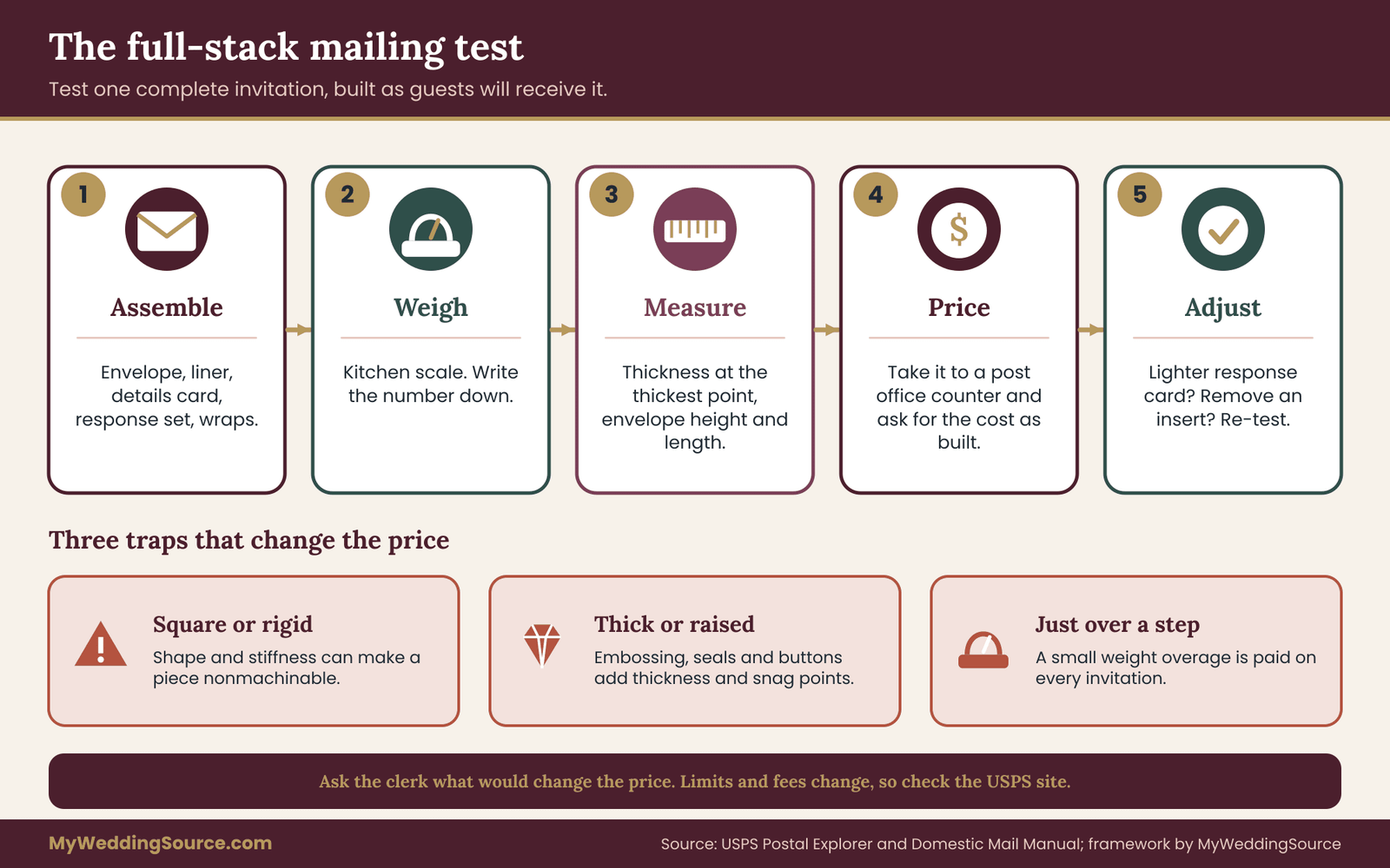
The full-stack mailing test
Do not test the postage with a lone card. Assemble one complete invitation exactly as guests will receive it, with the envelope, liner, details card, response card, response envelope and any tissue or belly band. Then do four things.
Weigh it on a kitchen scale and write down the result. Measure its thickness at the thickest point, including any raised area. Measure the envelope’s height and length. Check whether it bends easily or feels stiff.
Then take that physical sample to a post office and ask a clerk to price it. Ask for the price of the sample as built and ask what would change the price if you altered the envelope shape, removed an insert or switched paper. The clerk’s answer, on the day, is the most reliable evidence you can get, and it costs nothing.
Square, oversize and heavy: three common traps
Square envelopes look charming and are often more expensive to send than rectangular ones, so check before choosing one. Oversize pieces, including those that are a bit too tall or too long, can fall into a higher price class. Heavy stacks can tip into the next weight step, and that step is paid on every invitation.
The weight step deserves special attention. If your stack lands just over a weight limit, a small design change, such as a lighter paper for the response card or removing an insert, can keep you under it. Multiply even a small saving by your full mailing list, and it can be larger than the cost of the swap.
The return envelope and response cards
Guests often send response cards back, and those are mail too. A response card with a letterpress impression or a foil edge can be a thickness problem in the other direction. If you want a specialty finish on the response piece, test it. If you do not need one, a flat printed response card on a lighter stock keeps the return mailing simple. The RSVP etiquette guide covers the wording and timing side of that choice.
Hand-cancel and protecting raised work
For invitations with raised or delicate elements, some couples ask the post office to hand-cancel the stamps to avoid machine rollers. The service is not offered in every location and may require a visit during particular hours, so ask your local office what they offer, rather than assuming. Another option is to include a protective sheet, such as vellum or tissue, over the printed face, though that adds weight and thickness and should be part of the full-stack test.
Packing and bundling for transport to the post office
How you carry the invitations matters too. Stack them flat in a sturdy box, with the pressed face of each card protected from neighbors. Do not stack heavy boxes on top of each other. If you plan to mail in batches, keep batches consistent so that the postage you tested applies to every piece.
Timing the mailing around production
Specialty printing takes longer than flat printing, because plates or dies must be made, proofs approved, and ink or foil allowed to dry or set. Assembly and addressing add more time. Work backward from the date you want invitations in guests’ hands, and leave room for a reprint if a proof gate catches a problem. The wedding invitation etiquette guide explains how far ahead of the date invitations commonly go out, and the print-production timeline should fit inside that window with slack on either side.
Choosing among invitation printing techniques by design goal
Now that you have the vocabulary, the tests and the constraints, choosing among invitation printing techniques becomes easier. Think in terms of what you want the invitation to do, then see which technique fits.
If the goal is a quiet, tactile, classic feel
Letterpress on a thick, soft, light sheet with dark ink fits this goal. Keep the layout restrained and the typeface sturdy. Test the fingertip and small-type tests, and keep the logistics on a flat-printed card if the type is small.
If the goal is a bright, celebratory accent
Foil stamping fits, especially on dark or colored paper. Choose a bold monogram, a short name line or a simple border. Avoid hairline details and large solid foil areas that can show pinholes. Test the angle-and-light test in a dim room, because foil can flash and then fade.
If the goal is subtle, sculptural detail
Blind embossing or debossing fits. It needs thick paper and good light to read, and it is best for decoration rather than information. Pair it with a flat-printed text so that nothing essential depends on shadow.
If the goal is a vintage or formal look
Engraving or thermography fits. They suit type and simple art, and they show best on smooth stock. Engraving is the more expensive and less common option, so confirm that a shop in your region offers it and ask how long it takes.
If the goal is a modern, graphic look with dark paper
Screen printing or risograph may fit better than letterpress, because they can lay down opaque or layered color. Ask about sample results on your paper.
If the goal is photos or full-color artwork
Flat printing, either digital or offset, fits, with a small accent of foil or emboss if you want one. Specialty invitation printing techniques generally handle photographs poorly.
If the goal is a tight budget with a handmade feel
Use a single specialty technique on the main card only, and print everything else flat. Consider a smaller run for the specialty piece, with a digital print for the rest, so fixed costs stay small.
If the goal is a keepsake
Choose a thick, durable paper, and consider a method that will not flake or scratch over time. Check how foil and ink behave under repeated handling. A sample that survived the flex test is a good candidate for a keepsake.
When two goals conflict
Goals often collide: classic and bright, tactile and cheap, delicate and mailable. When they do, rank them. Write the three goals in order of importance and let the top one choose the hero finish. The second goal chooses the paper and the third chooses the supporting elements. This ranking is quick and prevents the usual outcome of paying for three finishes that cancel each other.
Putting the goal ranking to work
A ranked goal list is most useful when a quote comes back higher than expected. Instead of arguing with the price, return to the list. If your top goal was a tactile feel, protect the hero finish and trim elsewhere. If your top goal was a calm budget, keep a single accent among the invitation printing techniques you shortlisted and print the rest flat.
The same list helps when family members offer opinions. A parent who loves foil and a partner who loves pressed paper can both be heard, and the ranking shows which of the invitation printing techniques serves the goal you agreed on together. Settling on invitation printing techniques by goal, rather than by whoever feels strongest, is also kinder to everyone involved.
The six-gate proof approval routine for invitation printing techniques
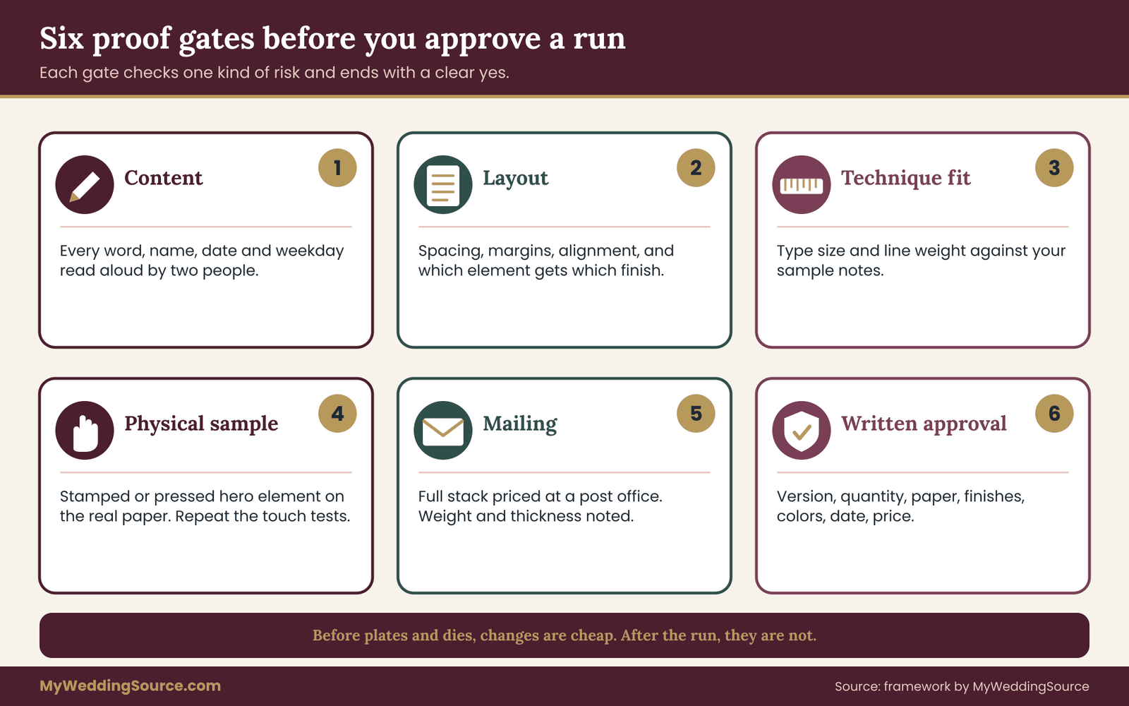
Choosing among invitation printing techniques is half the job. The other half is making sure the finished run matches what you chose. A proof is a preview, and the type of preview you approve decides how much risk stays with you. This routine uses six gates, each with a clear question and a clear person who says yes.
Why proofs fail without a routine
Many printing problems are not printer errors. They are approvals that were too quick. A couple glances at a screen image, replies “looks good” and discovers a misspelled street name when the boxes arrive. Once you approve, responsibility generally shifts to you for anything visible on the approved proof, which is why a vague approval is costly. Read your printer’s proof terms before you sign, and keep them with your records.
A routine for invitation printing techniques fixes this by making each look at the proof narrow and purposeful. You do not review everything at once. You review one kind of risk at a time.
Gate one: the content gate
The question here is whether every word, number and name is correct. Print the proof text on plain paper and read it aloud, with a second person reading along against the master wording. Check names, spellings, the date, the day of the week, the time, the address, the website and the response deadline. Verify the day and date match by checking a calendar rather than trusting memory.
Reading backward, one line at a time, catches errors that the eye skips. Ask the other person to check that the names match how each person wants theirs printed. If your guest list uses preferred spellings, confirm them against it now.
Nothing about the technique matters at this gate. It is purely about words. Do not move on until the text is locked, because every later change after plates or dies exist can cost a new setup.
Gate two: the layout gate
This gate asks whether the design on the proof is the design you approved in concept. Look at spacing, alignment, margins, line breaks and the position of every element. Check that nothing sits too near the trim. Check that the hero finish is applied to the elements you intended and that nothing else picked up foil or impression by accident.
Check each piece in the suite separately: invitation, details card, response card and envelope. Confirm the envelope return address, the liner and any belly band.
Gate three: the technique-fit gate
Here you compare the proof against your sample notes. The question is whether the minimum type size and stroke thickness recommended for your technique are respected, and whether any detail is at risk. Your five-test notes are the reference. If the sample was weak at small type and the proof still has small type in the specialty method, ask for a change or move it to flat printing.
Ask the printer to confirm in writing which elements are in which process. A line such as “name and monogram in foil, all other text in flat ink” removes ambiguity.
Gate four: the physical-sample gate
For specialty invitation printing techniques, ask for a physical proof or press sample of at least the hero element, on your actual paper. Some shops provide a printed or stamped sample of one piece before running the whole job, sometimes for an added fee, and some will show a press check in person or by video. Terms vary, so ask what is included.
When the physical sample arrives, repeat the touch tests. Does the depth match the sample you loved? Does the foil color match? Does the ink density look right? If it differs, say so before the run, and ask what can be adjusted.
A screen proof can confirm content and layout. It cannot confirm depth, foil tone or ink behavior. That is why this gate is the most valuable one for specialty work, and the one most often skipped.
Gate five: the mailing gate
Before you approve final production, confirm that the finished piece, as built, will mail the way you planned. Use the full-stack test from the postal section. Confirm weight, thickness, envelope size and any shape surcharge with a post office clerk, and write down the answer and the date.
Raise this gate before the run, not after. If the full stack is over a threshold, a small change at this stage costs little.
Gate six: the written approval gate
The last gate is the paperwork. Approve in writing, in a message that lists exactly what you are approving: the version name or number, the quantity, the paper, the technique for each element, the colors, the delivery date and the price. Keep a copy with your vendor contract.
Ask the printer to confirm receipt of the approval and to confirm that nothing will change without your sign-off. For a specialty run, ask whether the plate or die stays with the printer after the job, whether it can be reused for a reprint and for how long they keep it.
The wedding vendor contract guide explains what to look for in contract terms such as deposits, change fees and cancellations. Treat the approval message as part of that contract trail.
A short example of the gates catching an error
Imagine a proof that passes the content gate, then fails the technique-fit gate because the response deadline sits in thin type beside a foil border. Nothing is misspelled, and a quick glance would have approved it. Only the habit of checking the invitation printing techniques against your own sample notes revealed the risk.
The fix was small: larger type and a flat ink for that line. It cost a short email. Found after the run, the same fix would have cost a reprint. That difference is the whole reason to treat the gates as separate checks rather than one general look at the proof, and it applies to nearly all invitation printing techniques that press or stamp.
What a proof can and cannot protect
A proof protects against differences between the approved image and the final product. It does not protect against errors in the approved content, and it does not protect against the limits of the technique. If you approve a design whose small type will fill in, the printer will have printed what you approved. This is why gates one to three come before the physical sample.
Keeping version control simple
Name each proof by version and date, such as “invitation proof two, afternoon”. Delete or archive old versions so that only one is live. Confirm in each message which version you are discussing. Many costly mistakes are caused by a printer working from an earlier file than the couple remembered approving.
When the proof is wrong
If the proof or the final run does not match what you approved, act quickly and politely. Photograph the issue, compare it against the approved version, and write to the printer describing the difference. Ask what remedy they offer, such as a reprint or a partial credit. Remedies depend on the contract and on whether the error was theirs or yours. If the error was in the file you approved, the printer may not owe a fix, which is another reason to treat the gates seriously.
Matching gates to the size of the job
Not every job needs every gate at full depth. A short run of flat-printed cards can pass gates four and five quickly. A suite that uses several invitation printing techniques, a custom die and a heavy stack needs all six at full depth, because more can go wrong and fixing it costs more.
A useful habit is to ask, at each gate, what the next step would cost to undo. Before plates and dies, changes are cheap. After the run, they are not. Because invitation printing techniques that press, stamp or raise paper cannot be adjusted once they are done, the gates for those jobs should be slower and more careful than the gates for a flat print.
Vetting a printer for invitation printing techniques
Two printers can quote the same one of the invitation printing techniques and deliver different results. The difference is usually experience with your technique, honesty about limits and the quality of their process. A short set of questions reveals most of it.
Questions to ask before you request a quote
Ask which invitation printing techniques the shop does in-house and which they send to another vendor. Outsourcing is not bad, but it adds a handoff, extra time and sometimes a different contact if something goes wrong.
Ask how long they have worked with the technique you want, and to see physical work on paper similar to yours. Ask what minimum type size and line weight they advise. Ask what their proofing process includes and what each proof type costs. Ask how they handle corrections after approval, and who pays when an error is theirs and when it is yours.
Ask what the quote includes: paper, plates and dies, envelopes, liners, assembly, packaging and delivery. Ask whether the plate or die will be kept after the job.
“Could you list the quote line by line, including plates or dies, setup, paper, envelopes and any assembly, and tell us which proof types are included?”
A short script for the first call with a printer
Calls go better with a plan. Say what you are making, how many pieces, the date invitations must be in the mail and which invitation printing techniques you are considering. Then ask the shop which they recommend for your paper and design, and why.
Listen for plain answers about limits. A printer who volunteers that your script font is too fine for letterpress, or that foil will not suit your design, is protecting your result. A shop that says every one of the invitation printing techniques will work perfectly for everything is not telling you everything. Ask the shop to send its advice in writing so that the recommendations on invitation printing techniques are in your file.
Checking claims
Terms such as “letterpress” and “foil” are sometimes used loosely. A flat digital print on thick paper may be described as “letterpress-style” when no pressing took place. Foil-look inks are not the same as hot-stamped foil. This is not always dishonest, since some buyers want the look at lower cost, but you should know which you are buying.
Ask directly: is this printed on a letterpress with a plate, or is it a digital print that imitates the look? Ask whether the foil is hot-stamped with a die or printed with a metallic-effect ink. The answer affects feel, price and how the piece wears. A shop that answers plainly is a good sign.
The Federal Trade Commission has general guidance on truthful advertising, and a seller’s description of its own product should be accurate. If a description of a product seems vague or inflated, ask for specifics in writing before you pay. The vendor due-diligence checklist covers the broader questions of checking a business before you pay a deposit.
Comparing two quotes fairly
Put both quotes side by side in your notes and align them item by item: paper, plates or dies, setup, proofs, envelopes, assembly, delivery. A lower total may leave out a physical proof or charge separately for a die that the other shop includes. If the two quotes describe different invitation printing techniques for the same look, such as letterpress against a digital imitation, they are not comparable until you say so.
Ask each shop to restate its quote using the same list of items. The exercise is slow once, and it prevents the common regret of choosing the cheaper of two invitation printing techniques and then paying for the missing pieces afterward.
Reading reviews and portfolios carefully
Portfolio photos show a best case. Look for work on the paper and technique you want, and look for close-up photos of small type. Reviews that mention deadlines, proofs and problem handling tell you more than reviews that only praise appearance.
If you can, ask the printer for a reference from a recent customer, or ask to see a piece from a recent run, not only a sample card. Remember that a review is one person’s opinion of one job.
Deposits, schedules and cancellation
Specialty jobs typically need a deposit before plates or dies are made, because that is where the printer’s costs start. Read the terms on refunds and changes after approval. Ask what happens to the deposit if you change the date, the wording or the quantity. Ask for the production schedule in writing, with dates for proofs, approval, printing, assembly and delivery.
Paying by credit card gives you added dispute options under federal billing-error rules, though the rules have time limits and conditions. The Consumer Financial Protection Bureau explains how billing disputes work, so check its site rather than trusting a summary. Keep your invoices, approval messages and delivery records in one place.
Timelines that include a reprint buffer
A realistic timeline has slack in it. Work backward from the day you want invitations to land, then subtract mailing and delivery time, addressing and assembly time, production time, the physical sample gate, content and layout review, and the time for you to choose a technique. Then add a buffer for a reprint or a delayed proof.
If the schedule is tight, simplify the technique rather than skip a gate. A flat-printed invitation with one foil accent is much easier to reprint than a layered suite. Cutting a gate to save a week turns a small schedule problem into a larger error problem.

Common problems with invitation printing techniques and what to do
Even good jobs using well-chosen invitation printing techniques go wrong in small ways. Knowing the usual problems and the usual fixes keeps a hiccup from becoming a crisis.
Foil that looks uneven or flakes
Uneven foil, with tiny pinholes in solid areas, can come from the design, the paper surface or the die. Flaking along a bend can come from thin paper or a foil that was not suited to the sheet. The fix at the planning stage is to avoid large solid foil areas and to pick a smooth, sturdy paper. At the delivery stage, photograph the issue, compare it with your approved sample and ask the printer what they can do.
Letterpress ink that fills in or looks pale
Filled-in small type means the artwork was too fine for the method. Pale ink means the ink was light for the paper or the pressure was low. Both should be caught at the physical sample gate. If they appear in the final run, compare against the approved sample, because a difference from that sample is the printer’s issue and a feature of the approved sample is not.
Impression that is too deep or too light
Too deep can crack paper or show a hard dent on the back. Too light can look like a flat print. Agree on a depth target at the physical sample gate by pointing to the sample you liked and writing “match this impression” in the approval message.
Misregistration
Misregistration shows as a thin gap or overlap where two methods meet. A small amount is normal at the tolerance the shop works to. Anything noticeably larger than their stated tolerance is a conversation worth having. This is why designs with tight outlines are risky.
Color that does not match
Screens, printed samples and foil all show color differently. For color-critical elements, ask for a printed or stamped sample and judge in the lighting where guests will read it. Do not expect a screen match to be exact for a metallic or a pressed color.
Damage in transit
Raised work can flatten, and corners can bend. Protect the printed face, use sturdy envelopes and pack boxes carefully. If a shipment from the printer arrives damaged, photograph it before moving anything and contact the printer and the carrier promptly. Carrier claim windows are limited, so check the carrier’s terms on the day of delivery.
Late delivery
If production runs late, ask for a revised date in writing and ask what the printer can do to recover time, such as expediting a step. Compare the new date with your mailing window. If it will not work, decide quickly whether to accept, to switch to a faster method for part of the suite, or to cancel under the contract terms. Having your original schedule on paper makes this conversation much easier.
Corrections after the run
If you find a small error after printing, options include reprinting the affected piece, adding a small correction card, using a sticker or label, or handwriting a fix. The right choice depends on the error and on how many pieces are affected. Word any correction courteously, and see the print production guide for the wider process of print production.
Three illustrative cases of choosing invitation printing techniques
The cases below are invented to show how the method behaves. They are not reports of real customers, and the numbers are placeholders chosen only to show the reasoning. Your own quotes and postal answers will differ.

Case one: the soft-texture couple with a thin-paper problem
A couple wants letterpress for all text on a pale card. Their first sample arrives on a light, smooth sheet and the fingertip test finds almost no impression. The printer explains that the sheet is too thin and too smooth for a deep press, and offers a thicker, softer cotton paper.
The second sample passes the fingertip test but fails the small-type test: the response deadline in small gray type fills in slightly. The couple moves the logistics to a flat-printed details card, keeps names and a short invitation line in letterpress, and darkens the ink.
At the full-stack test, the thick card plus inserts weighs more than expected, so they ask the clerk what a lighter response card would do. The clerk says the lighter option keeps the stack under the next weight step. They choose it. The lesson is that one technique needed three adjustments (paper, type placement, response card) and none of them meant giving up the look.
Case two: the dark paper and the foil monogram
A couple falls for deep navy cards with gold type. Letterpress would not show well on that color, so they look at foil. The sample monogram is bold and looks wonderful. The date line in thin foil script fails the small-type and angle tests in a dim room.
They keep foil for a bold monogram and a short two-word name line, and set the date in a sturdier serif foil at a larger size. The printer recommends a matte gold that is easier to read at a distance than a mirror gold. The physical proof gate shows the die has caught the monogram well, with a few tiny pinholes in the widest area. The printer reduces the solid area slightly in the die, and the second proof looks clean.
The couple approves in writing, listing the foil type, the die version and the paper. The lesson here is that the gates caught a legibility problem before the run and a coverage issue before the whole job was stamped.
Case three: the budget-limited couple who wants a handmade feel
A couple has a modest invitation budget and a large guest list. They like blind embossing but see that the die and registration costs would be large per card at their quantity. They ask the printer what the minimum run is and learn that a short run of an embossed main card plus digitally printed details and response cards would stay in range.
Rather than embossing all pieces, they choose a simple embossed border on the main card only, in a paper thick enough to hold it. They add one extra step: a physical proof of the embossed border in the real sheet. The proof is almost invisible under flat light, so they ask for a slightly deeper die, and the second sample shows the border clearly when tilted.
On the mailing side, the embossed border sits well inside the card edge, and the clerk finds no surcharge. The lesson is that putting the specialty technique where guests will see and keep it, and using flat printing elsewhere, kept the budget calm without wiping out the handmade feel.
What the cases share
None of these couples chose the fanciest of the invitation printing techniques. Each used a sample test to find the weak point, made a design change instead of an expensive fix, and wrote down the approval. Notice also how often the answer was to move small, essential information to a flat method. That one move solves more problems than any other single choice in this guide.
A decision framework for choosing invitation printing techniques
Here is the whole method for choosing invitation printing techniques, compressed into a sequence you can follow in an evening. It works for a first pass and again when quotes arrive.
Step one: rank your goals
Write down what the invitation must do. Typical goals are readable, tactile, celebratory, formal, modern, affordable, mailable, keepsake-quality. Pick your top three and put them in order. The top goal chooses the hero finish.
Step two: choose one lead among invitation printing techniques
Match the top goal to the map of invitation printing techniques in the earlier sections. If two techniques tie, request samples of both. Allow one supporting technique at most, and only if it works on the same paper.
Step three: choose paper for the hero finish
Choose the paper that serves the lead technique, then check the supporting technique against it. If they conflict, drop the support.
Step four: request samples and run the five tests
Collect physical samples from at least two shops if you can. Run the fingertip, angle-and-light, small-type, flex-and-edge and envelope-and-weight tests, and write strong, acceptable or weak for each. Treat a weak result as a design problem to solve.
Step five: adjust the design
Move small essential text to a flat method. Thicken thin lines. Replace fragile script with a sturdier face. Add margin. Simplify layering. Reduce solid foil areas. Choose a contrast that suits the technique.
Step six: price the structure, not just the total
Ask for line items. Compare fixed and per-piece costs. Check extra quantity, reprint terms and plate retention. Decide what you would cut to pay for the finish.
Step seven: pass the six gates
Content, layout, technique fit, physical sample, mailing, written approval. Do not skip the physical sample for a specialty technique, and do not skip the mailing gate for anything heavy, raised or square.
Step eight: record everything
Save the samples, notes, quotes, approval messages, postal answer and delivery dates with your vendor records. If anything goes wrong, those papers are your evidence. If nothing does, they are a small keepsake of how the invitation was made.
When to stop and keep it simple
If the process is draining you, that is useful information. A single flat-printed invitation with one tasteful accent is a perfectly good outcome, and guests will remember who invited them far more than which press did the work. Specialty invitation printing techniques should add pleasure to the planning, not take it away.
A final check before you commit
Read your plan back as a short paragraph. It should name the lead technique, the paper, the pieces that carry the finish, the quantity, the mailing result and the approval date. If any of those is missing, the plan is still a wish.
Then ask one last question: would you still choose these invitation printing techniques if the finish cost a little more than quoted? If yes, the choice is sound. If the answer depends on the price staying exactly the same, you may be stretching, and a simpler finish is worth a second look. Choosing invitation printing techniques you can afford with room to spare is calmer than choosing the ones that depend on everything going perfectly.
Your next steps
Do these in order over the next week or two.
- Write your top three goals for the invitation and rank them.
- Pick one lead and, at most, one support from the map of invitation printing techniques.
- Request physical samples on the actual paper from at least two printers.
- Run the five tests on each sample and note strong, acceptable or weak.
- Assemble one full invitation stack and take it to a post office for a price.
- Ask each printer for a line-item quote, a proof list and a written schedule with a reprint buffer.
- Approve through the six gates, in writing, and file everything with your vendor records.
For the wording and timing of the invitation itself, see the wedding guest list guide for planning quantities before you order.
FAQ
What are the main invitation printing techniques for weddings?
The common invitation printing techniques are flat printing (digital or offset), letterpress, foil stamping, embossing and debossing, engraving, thermography, die cutting, screen printing and risograph. Flat printing suits detail and photographs. Pressed and stamped methods add texture or metallic shine. Each has its own paper needs, setup costs and mailing considerations, so compare physical samples before choosing.
Is letterpress worth the extra cost for wedding invitations?
It depends on what you value and what you would give up to pay for it. Among invitation printing techniques, letterpress adds a pressed texture that photos cannot show, and it works best on thick, soft paper with dark ink. If you cannot feel a clear impression in a sample, the premium may not be worth it. Compare a sample on your paper first.
Can foil stamping be read on dark invitation paper?
Of all invitation printing techniques, foil is opaque, so it generally shows well on dark or colored paper, unlike translucent letterpress ink. The weak points are fine lines and large solid areas. Test a sample under dim light and from a distance. Bold monograms and short name lines usually work better than thin script or small logistics text.
Do specialty invitation printing techniques cost more to mail?
They can. Raised areas, rigid backing, extra thickness, square envelopes or added weight may change how the post office classes your piece. Rules and fees change, so assemble one full invitation and ask a postal clerk to price it. Check the USPS site for current standards rather than relying on a printed article.
How many proofs should I approve before printing?
At least one for content and layout, and for specialty invitation printing techniques a physical sample of the hero element on your paper. Each proof should check one risk: wording, layout, technique fit, physical result, mailing and written approval. Ask what proof types each printer includes, and what extra proofs cost.
What is the difference between embossing and debossing?
Among invitation printing techniques, embossing raises part of the design above the paper surface, and debossing presses it below. Both use a shaped die and can be done without ink, called blind. Blind work is subtle and reads best in good light on thick paper, so use it for decoration rather than essential information.
How early should I start choosing invitation printing techniques?
Early enough to allow samples, proofs, production, assembly, addressing and mailing, plus a buffer for a reprint. Specialty work takes longer than flat printing. Work backward from the date invitations should reach guests and ask each printer for a written schedule so you can see where slack is available.
Can I mix several invitation printing techniques on one card?
You can, but it multiplies setup cost and the chance of misregistration, and the finishes often compete for attention. A calmer rule is one lead technique plus at most one support, on paper that suits both. Put small essential text in a flat method so nothing important depends on a delicate finish.
Sources
- United States Postal Service: mailing standards, prices and Postal Explorer access
- USPS Postal Explorer: Domestic Mail Manual standards for letters and flats
- USPS Frequently Asked Questions: current guidance on mailing and services
- Federal Trade Commission: truthful advertising and consumer protection guidance
- Consumer Financial Protection Bureau: credit card billing-error and dispute rules
- Forest Stewardship Council: certification standards and license verification for paper
- Sustainable Forestry Initiative: forest certification program information
- Library of Congress: guidance on preserving paper documents and keepsakes
- National Archives: preservation guidance for paper records