
Letterpress invitations are printed by pressing inked, raised plates into thick paper, so the type sits slightly below the surface and you can feel it with a fingertip. This guide shows how to decide whether that texture is worth the price for your wedding, using an original ink coverage and impression depth test sheet that you can hand to a printer before you commit.
Letterpress invitations are worth the extra cost when guests will actually hold the card, the design suits the process, and the budget can absorb the price without hurting a bigger priority. Before you order, have the printer run a test sheet on your actual paper and ink. If the smallest text stays crisp, the solids look even and the card still mails as a regular letter, the texture is justified. If not, change the design or choose another process.
Letterpress has a reputation that arrives before any quote does. People describe it as the most refined option for wedding stationery, and then the price list lands and the refinement suddenly needs a justification. That is a healthy reaction. A good decision here is not about whether letterpress is lovely. It is. The question is whether the particular card you are designing, on the paper you can afford, in the colors you picked, will show enough of what makes the process special to justify what it adds to your invitation budget.
Most advice stops at “ask for a sample.” That helps a little, but a generic sample shows the printer’s best work on the printer’s favorite paper. It tells you nothing about your thin script font, your pale gray ink on a cream stock, or the reversed monogram you saw on a mood board. The test sheet in this guide is built to answer those specific questions with something you can hold, measure and compare.
A note on scope. This is general information, not legal, tax or financial advice. Printer pricing, press capabilities and postal rules differ and change, so confirm the current details with your printer and with the U.S. Postal Service before you pay a deposit.
What letterpress invitations are, and what the texture is for
The word “letterpress” covers a family of relief printing. A raised surface is inked and pressed against paper. In the centuries when it was the only way to print, the goal was a clean, flat result, and a visible dent in the paper was a flaw that printers worked to avoid. Today the dent is the point. Modern letterpress invitations are usually made with plates that print a deliberately deep impression into soft, thick paper, and the result is a card that looks and feels different from anything produced by a flat process.
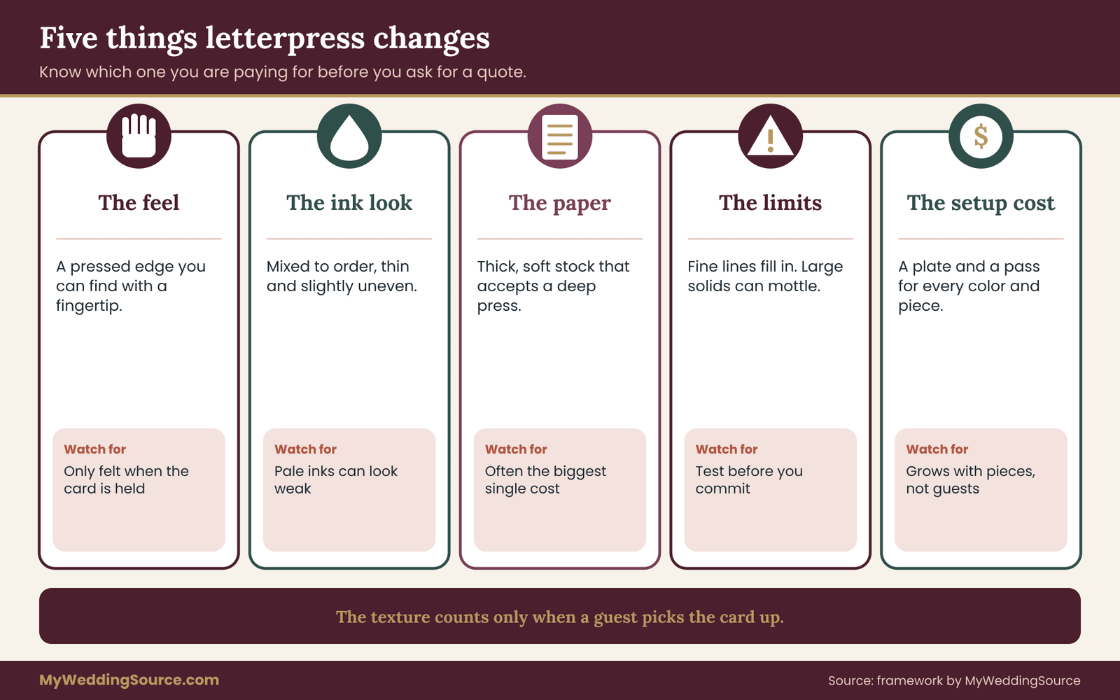
It helps to separate what that process actually changes from what people assume it changes. Five things really do differ, and they are worth keeping apart because each one has a different cost and a different payoff.
The feel. The impression creates a tactile edge that a flat print cannot reproduce. This is the one benefit that cannot be photographed well, which is why it is easy to overpay for it when you only see pictures.
The look of the ink. Letterpress ink sits in a pressed channel, and it is typically mixed to order and printed in a thin, controlled layer. Colors can look rich and slightly uneven in a way that reads as crafted rather than printed.
The paper. The process is usually paired with thick, soft stock, often cotton-based, because that stock takes a deep impression well. The paper itself contributes a large share of the experience and of the cost.
The limits. Fine details can fill in, large solid areas can print unevenly, and light ink on dark paper can look weak. These limits are the reason a test sheet is useful.
The production cost. Each color requires its own plate and its own pass through the press, and every separate card in the suite needs its own setup. The price grows with the number of colors and pieces more than with the number of guests.
The texture of letterpress invitations only counts if someone touches it
An impression is a private pleasure. It reaches the person who picks up the card, turns it over and runs a thumb across the lettering. It does not reach a guest who glances at a photograph of the invitation on a phone, and it mostly does not reach someone who opens an envelope, reads the date and sets the card on a counter.
That sounds discouraging, but it is a useful planning idea. Ask yourself how many people will really handle the physical card and for how long. A small wedding with a hundred invitations, where the guests are close family who may keep the card, suits letterpress invitations well. A large event where most invitations get a quick look and a place on the refrigerator uses it less well. Neither answer rules letterpress invitations out. The point is to name the audience before deciding that the audience is worth the money.
One common compromise follows from this. Some couples order letterpress invitations only for the main card, the piece that carries the names and the date and that people are most likely to keep, and print the reply card and the details card by a flat process. The guests who keep one card keep the best one, and the setup costs for the extra pieces disappear.
What this guide covers about letterpress invitations
This guide covers one decision: whether the texture justifies the cost for a wedding invitation suite. It does not repeat the full comparison of every specialty printing method, which the wedding invitation printing guide handles. It also does not cover wording, timing or etiquette in depth, which belong to the wedding invitation etiquette guide.
What it does give you is a repeatable method for judging letterpress invitations. You will learn what happens on the press in enough detail to ask intelligent questions, how to build and read the test sheet, how to price the suite by its real drivers, how to check that a thick card will still mail without a surprise surcharge, and how to approve proofs so that a problem is caught while it is still cheap to fix.
The method also stays honest about uncertainty. No guide can tell you what your printer charges or which stock they stock. Where a number matters, you will be asked to get it from the printer, from the Postal Service or from the vendor contract, in writing.
How letterpress invitations are made
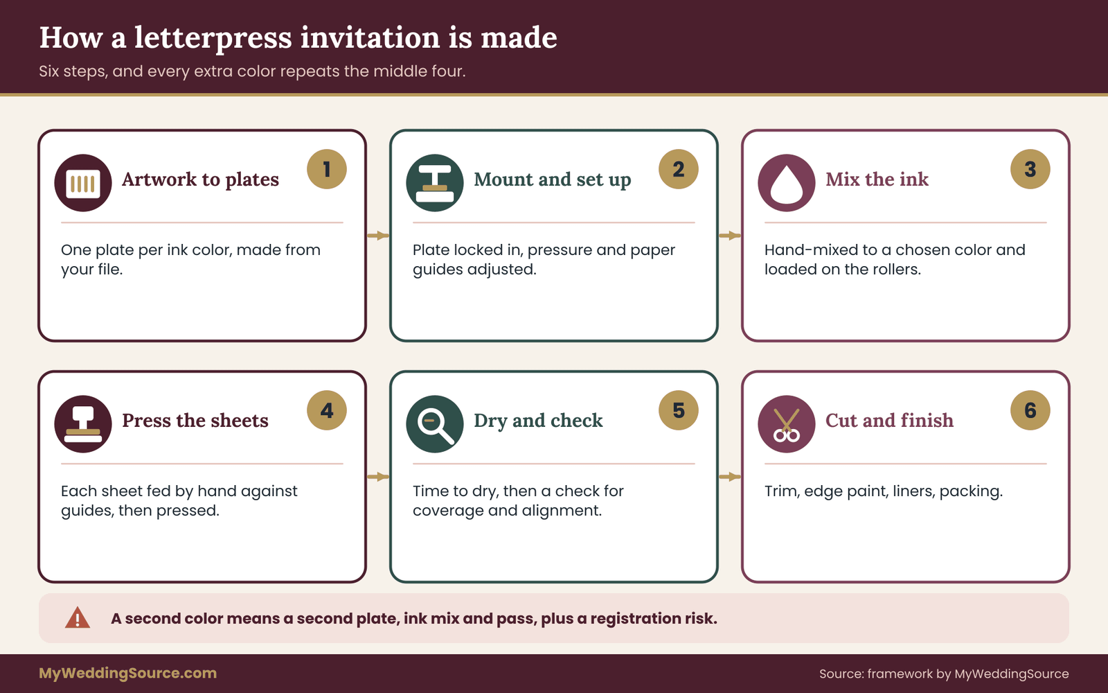
You do not need to run a press to buy well, but a basic picture of the steps explains almost every question you will ask later. The sequence is the same at most studios, with small differences in equipment and in how much is done by hand.
Artwork becomes plates. The printer takes your design file and makes one plate per ink color. Many studios today use photopolymer plates, which are made by exposing a light-sensitive material through a film negative of your artwork and washing away the unexposed parts. The raised parts that remain are what touch the paper. Some studios still set metal or wood type, or use engraved metal plates for certain jobs. Ask which method your printer uses for your design, because it affects how fine your lines can be.
Plates are mounted and the press is set up. The plate is fastened to a base and locked into the press. The printer adjusts the pressure and the position of the paper. This setup stage is slow and skilled, and it is why a short run costs more per card than a long one.
Ink is mixed and loaded. Printers typically mix ink by hand to match a color you chose, often from a standard color system. The ink is spread on the press rollers, which transfer a thin layer to the raised plate.
Paper is fed and pressed. Each sheet is placed against guides, and the press brings the plate and the paper together. The pressure that sets the impression depth is a decision, not a fixed setting. A shallow press leaves a faint mark. A deep press leaves a strong dent that you can see in raking light and feel from across the card.
Sheets dry and are checked. The ink needs time to dry before a second color or a second side can be printed, and the printer checks for uneven coverage, stray marks and registration.
Pieces are cut and finished. Large sheets are trimmed to the final card size, and any extras such as edge painting, envelope liners or assembly happen last.
Why each color of letterpress invitations is a separate job
A two-color design looks only slightly more complex than a one-color design, but on the press it is two separate print runs with two plates and two ink mixes. The paper has to go back through for the second pass, and the two passes have to line up exactly. Alignment between colors is called registration, and it is one of the places where a flat process and a process built for letterpress invitations behave very differently.
This is the reason experienced designers keep letterpress invitations to one or two colors. It is not a style rule. It is a cost rule and a quality rule at the same time. Every added color adds money, adds a chance of misalignment, and adds another pass that can mark the paper.
If you love a design with four colors, the honest question is which colors matter most. Often a single ink for the text plus a blind impression, which is a pressed design with no ink at all, produces most of the effect for a fraction of the complexity.
Why paper matters as much as the plate in letterpress invitations
A deep impression needs paper that can take it. Thin, hard, coated stock resists the pressure, and the result is a shallow mark or, if the pressure is forced, a card that bulges on the reverse side. Thick, soft stock gives the plate somewhere to go.
That softness has side effects. It affects how crisp the edges look, because soft fibers allow ink to spread slightly at the edges of a character. It affects how the card behaves in the mail, because thick paper makes the finished card stiffer. And it affects the price, because heavy soft stock costs more than ordinary invitation stock before any ink touches it.
When you compare quotes, compare the paper by name and weight as well as the price. Two quotes that look different may simply be quoting two different stocks. For letterpress invitations, this guide returns to thickness and weight in the mailing section, because thickness is where the printing decision meets the postal one.
The ink coverage and impression depth test sheet for letterpress invitations
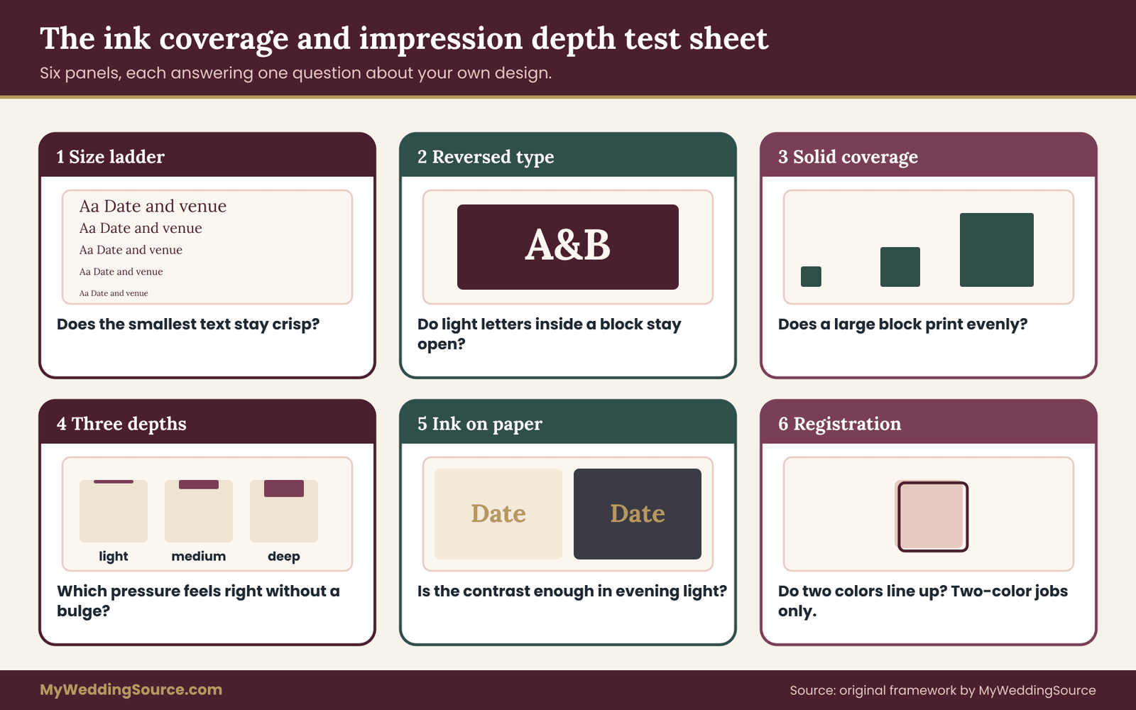
For letterpress invitations, a test sheet is a single piece of paper, printed on your intended stock with your intended ink, that deliberately includes the situations most likely to go wrong. Printers use test pulls and proofs all the time. What most couples lack is a list of what to put on the sheet and a way to judge the result. The version below has six panels. Each one answers a single question about your design, and each can be judged by a person with a ruler, a lamp and a clear head.
You do not need to design the sheet yourself. Send the printer the list, attach your real artwork where the panels call for it, and ask them to quote the test as a small separate job or as part of the proofing stage. Some studios include a test pull in the price. Others charge a modest fee, and that fee is the cheapest insurance in the whole project.
Panel one: the size ladder for fine type on letterpress invitations
This panel answers the question that causes the most disappointment: how small can the text be before it stops being legible?
Take the actual typeface from your invitation, the one used for the line of lowest importance such as the reception details or the website line. Set the same sentence in a descending ladder of sizes, from the size you planned down to roughly two points smaller in steps of half a point. Print the ladder on your paper with your ink and a medium impression.
Then look at the lines under a magnifier or with a phone camera zoomed in. For each size, note whether the thinnest strokes of the letters, usually the serifs and the crossbars of letters such as e and a, are still clear and unbroken. Note whether the small enclosed spaces inside letters such as e, a and g are still open or are filling with ink.
The rule that comes out of this panel is simple. Your smallest text should be at least one step larger than the smallest size on the ladder that still looks clean. That margin matters because the production run will not be identical to the test pull. Ink thickness, humidity, paper batch and pressure all shift a little, and a size that is borderline on the test will be a problem somewhere in the run.
Typefaces vary a great deal in how they behave on letterpress invitations. A sturdy, moderate-contrast serif usually survives well. A delicate script with hairline connectors often does not. If your chosen font fails this panel at the planned size, the cheapest fix is to enlarge the text, not to hope the production run behaves better.
Panel two: reversed type on letterpress invitations
Reversed type, sometimes called knockout type, means light letters appearing inside a solid block of ink, where the letters are left unprinted so the paper shows through. It looks striking on a mood board and is one of the harder things to do well on a press.
With letterpress invitations the challenge is that the letters are formed by the spaces between raised areas of the plate. Those narrow openings can fill with ink as the paper is pressed in, which closes the counters and blurs the thin parts of the letters.
Print a solid rectangle of your ink color with your text knocked out in a few sizes. Check each size for two things. First, are the letters still readable at the distance a guest would hold the card? Second, do the thin parts of the letters look intact or have they been bridged by ink?
For most designs the finding is that reversed type works at large sizes and fails at small ones. A reversed monogram or a short heading may be fine. A reversed paragraph is almost never a good idea. If you want that look, the safer approach is a large, simple shape with a few words, and a panel result that clearly passes before you commit.
Panel three: solid coverage on letterpress invitations
A large solid area of ink is a different kind of challenge. Instead of narrow details filling in, the issue is whether the ink lays down evenly over a broad surface.
Print three solid shapes in the intended color: a small square about the size of a stamp, a medium block roughly the size of a playing card back, and a large block covering a third or more of the card face if your design includes one. Hold the sheet at a slight angle under a window or lamp and look across it.
An even solid looks uniform. A solid that has trouble coverage shows mottling, which is a patchy look in the ink density, or faint ridges, or a slightly speckled texture. Some printers and some designers like a degree of this variation because it signals handmade work. Others consider it a defect. The test sheet lets you see which version you will actually get, so that nothing about the look comes as a surprise on delivery day.
If the large block looks uneven and you do not like the look, you have four options. You can shrink the block. You can replace it with an outline. You can use a blind impression in that area and no ink at all. Or you can accept that the area will look more textured than the sample photographs you admired.
Panel four: three impression depths
This is the panel that tests the very thing you are paying for. The same artwork is printed three times on the same stock at three pressures, which the printer might call light, medium and deep. Some printers use the terms kiss, standard and deep. The vocabulary is not standard, so ask the printer to describe what each setting means in their studio.
For each of the three, check four things.
How it feels. Close your eyes and run a fingertip across the letters. Can you tell it is pressed? A light setting may be barely noticeable, and a medium setting is often what people picture when they imagine letterpress.
How it looks in raking light. Hold the card nearly flat and light it from the side. The depth of the impression is easiest to judge here because the shadows inside the pressed letters show how deep they are.
What it looks like on the back. Turn the card over. Deeper pressure can push a slight bulge through to the reverse side. For some designs that is acceptable, because the back will be hidden or blank. If you plan to print the reverse side, the bulge matters a lot.
What happens at the edges. Look closely at the outline of each letter. A heavier press can squeeze ink toward the edges of the character and create a thin, darker outline called ink squash or an ink halo. Some people like the crisp, defined look it gives. Others find it too heavy on delicate type.
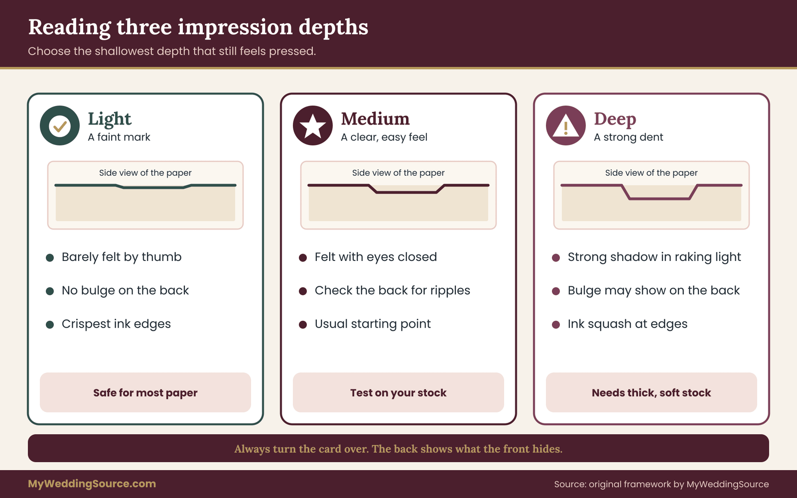
For letterpress invitations, choose the depth that gives you the feel you wanted without a problem on the back or at the edges. A deeper impression is not automatically a better one. The right choice is the shallowest depth that still gives a satisfying feel, because it is easier on the paper and usually on the budget.
Panel five: your ink on your paper
This panel is the one that most often rescues couples from an unhappy surprise. Ink color and paper color interact, and a color swatch on a screen tells you almost nothing about the result.
Print your chosen ink on the actual paper in the actual shade. If you plan to use a pale ink, a metallic effect, or a light color on a tinted or dark sheet, include those exactly. Inks for letterpress invitations are often more translucent than the inks people are used to seeing on flat prints. A light ink over a darker sheet may look muted, because the paper color shows through. Printers sometimes address that with a second pass or with specific opaque inks, and either approach has a cost.
Look at the sample in the lighting where the invitation will actually be read, such as indoor evening light, not only daylight at a window. And check the contrast between ink and paper by squinting. If the words nearly disappear when you squint, they will be hard for older readers and for anyone in dim light. Contrast is what makes small text readable, and no amount of texture makes up for low contrast.
Panel six: registration, only if you have two colors
If your design uses a second ink, this panel checks that the two passes line up. Include a thin outline in one color around a shape filled in the other color, and a hairline gap between two adjacent color areas.
Under magnification, look for uneven borders. Where the outline is thicker on one side than the other, or where the two colors touch or overlap when they should not, the passes were slightly out of line. Small variation is normal and is part of the look of hand-fed presswork. The question is whether the amount is acceptable for your design. A design that depends on a tight match between two colors, such as a fine outline around a filled shape, will show every shift. A design where the two colors sit apart from each other will hide them.
Panel six is often the argument for a one-color design. If the panel shows more movement than you can live with, the design should change so that the two colors never need to touch.
Using the panels for letterpress invitations without a custom sheet
If your printer does not offer a custom test, you can still use the panels as a checklist on whatever samples they will give you. Ask to see a past job that includes small type, a large solid and a reversed element, printed on the stock you are considering. A printer who has done such work will usually show it. A printer who has not may be telling you something about whether your design is a good fit for them.
How to read the test sheet and score your letterpress invitations
A test sheet for letterpress invitations is only useful if you decide in advance what counts as passing. Otherwise you will look at a handsome piece of paper, feel the impression, and approve almost anything. Do the scoring before you fall in love with the sample, and do it with your partner or a second person who has not been staring at the design for months.
The system has three steps. First, rank the elements of your design. Second, grade each panel against the elements it affects. Third, apply a decision rule that tells you whether to proceed, redesign or switch process.
Step one: rank what must survive on your letterpress invitations
List every element on the invitation and sort them into three groups.
Must be perfect. These are the elements a guest cannot do without: the names, the date, the time and the location. If any of these is hard to read, the invitation has failed no matter how beautiful it is.
Should be clean. Secondary lines such as the dress code, the reply deadline, the website address and any short phrases that guests will need but will not study.
May be rough. Decorative elements, borders, a background pattern, a monogram flourish. If these look slightly uneven or slightly heavy, the invitation still works, and a bit of variation can even help the handmade look.
For letterpress invitations, write the three lists on the back of the test sheet. The act of ranking changes how you look at the result. Couples often realize that the element they were worried about is in the third group and that the one they were ignoring, a thin line of small type with the website address, is in the second.
Step two: grade each panel
For each panel, give one of three grades. Keep the definitions plain.
Clear. The element is crisp and even at the planned size and depth. You would be glad to receive this card.
Acceptable. The element shows variation, fill-in or unevenness, but a guest would still read it easily and would be more likely to describe the look as handmade than as flawed.
Fails. The element is hard to read, visibly clogged, or looks like a mistake.
Then connect the grades to the ranked lists. A Fails grade on a must-be-perfect element is a hard stop. A Fails grade on a should-be-clean element is a prompt to adjust, usually by enlarging the text or switching typeface. A Fails grade on a may-be-rough element is usually a design edit, such as removing a solid block or simplifying a border.
Here is a short example. Suppose panel one shows that the planned seven-point script for the website line fills in, and panel three shows that a large floral block is mottled. The website line is in the second group, so it needs a fix. The enlarged text may work, or the line may move to a separate flat-printed insert.
The floral block is in the third group, so you can accept the mottling or swap the solid for an outline. Neither problem is a reason to abandon letterpress invitations. Both are reasons to change the design before the plates are made.
Step three: the three-question rule for letterpress invitations
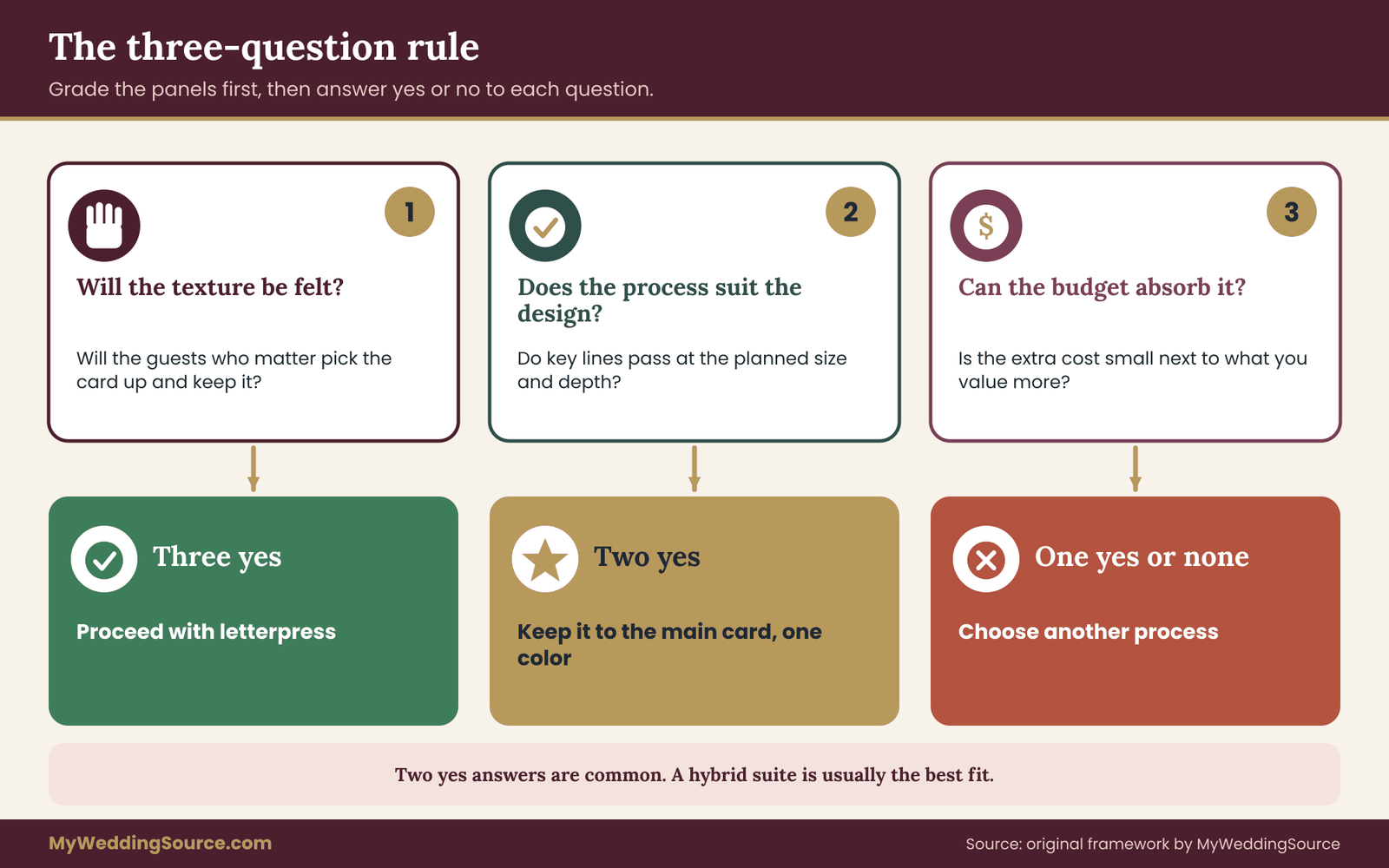
After grading, answer three questions with a plain yes or no. They are the center of the original method in this guide.
Question one: will the texture be felt? Will the people who matter most to you pick up the card and handle it? If the main invitation is going to a mix of close family and friends who may keep it, the answer is likely yes. If most guests will only see it for a moment, the answer is closer to no.
Question two: does the process suit the design? Looking at the panel grades, do all must-be-perfect and should-be-clean elements reach Clear or Acceptable at the planned size and depth? If so, the answer is yes. If you would need to shrink or remove important elements to make letterpress work, the answer is no.
Question three: can the budget absorb it? Take the full cost of the letterpress option, including paper, extra pieces, shipping and postage, and compare it with the next-best alternative. Is the difference small enough that you would not feel it in another part of the wedding budget? If the extra cost would pull money from something you value more, such as food, a venue deposit or travel help for a close relative, the answer is no.
The rule works like this.
Three yeses: proceed with letterpress invitations. The texture will be noticed, the design will print well, and the money will not cause regret.
Two yeses: proceed, but reduce the exposure. Order letterpress invitations only for the main card, use one color, and keep the other pieces flat. Or keep the full suite but choose a lighter impression and a less expensive paper.
One yes or none: choose another process and put the saved money somewhere guests will notice it more. This is not a failure. It is the test sheet doing its job.
Measurable checks that keep the letterpress invitations decision honest
Opinion about letterpress invitations drifts, so anchor it with measurements. A few of them take less than a minute each and need only a ruler and a kitchen scale.
Smallest element height. Measure the height of the smallest capital letter in your must-be-perfect and should-be-clean lines. Write the number down. When you compare the test pull with the final proof, the number should not have changed.
Stroke thickness. If your printer provides a magnified view or a scan, compare the thinnest stroke on the sample with the thinnest stroke in your design file. A visible thickening on the sample tells you that ink spread is real for this stock and press.
Coverage share. Estimate the share of the card face that is solid ink, roughly in thirds: under a third, about half, or more than half. Heavier coverage generally raises the chance of uneven solids and raises the cost of ink and makeready. A design that is mostly open paper with a few lines of text is the safest case for letterpress invitations.
Card thickness. Measure the thickness of the card. You will need that number again in the mailing section. A ruler with millimeter markings will not be precise, but if you have a caliper, use it, because the edge of a thick sheet is exactly where a postal rule might apply.
Assembled weight. Weigh a mock-up of the entire suite, including envelope, liner, reply card and reply envelope. Do this on a kitchen scale and write down the number. Weight affects postage, and a small addition such as a second insert can change the category.
A second opinion from an unbiased eye
Show the test sheet to someone who has not seen the design, at the distance and in the light a guest would use. Ask one question: what does this say? If they hesitate on the date or the venue, that is a Fails grade, whatever the printer says about technical quality.
Also ask an older relative to read the smallest line without glasses on, if that is how they usually read an invitation. Reading is the real test for letterpress invitations, and this is not a trick. It is the reading situation of many real guests. A line that is clear to a thirty-year-old with perfect close vision at a desk lamp can be unreadable to a grandparent holding the card in a dim hallway.
Texture can partially compensate for a small size, because touch gives a second way to recognize the edge of a letter. But it does not rescue a card that cannot be read, and pressure that is deep enough to show in the paper does not substitute for ink that is dark enough to see.
When the printer disagrees with your grading
Sometimes a printer will look at a test result you graded as Fails and say that it is normal for letterpress invitations. That may be true. Variation in letterpress is part of the character of the process. But the grade is about whether you will be happy, not about whether the work is technically within the printer’s standards.
If the printer says an issue is normal and you still find it unacceptable, ask for a written note on what to expect in the production run. If the printer will not commit to a result that matches the sample you approved, you have learned something important about how they will handle problems later. The section on proofs and contracts shows how to document the expected result so that both of you are working from the same piece of paper.
Design choices that letterpress invitations reward and punish
Once you can read a test sheet, you can design letterpress invitations for the press instead of fighting it. Experienced stationers tend to follow a handful of habits, and each one has a reason that comes back to ink, pressure and paper. The goal here is not a rulebook. It is a set of tradeoffs that help you decide which of your wishes to keep.
Typeface and size for letterpress invitations
Letterpress invitations reward typefaces with sturdy shapes and a moderate difference between thick and thin strokes. They punish typefaces with hairline strokes, tiny serifs and delicate connections, because those are the parts that disappear or fill in.
This does not mean you must pick a plain font. Many elegant serifs, and many clean sans-serif faces, print beautifully. It means the finest, most delicate faces need a larger size than the same words would need on a flat print. A line that looks comfortable at a small size in a digital proof may need a noticeable bump to stay clear on the press.
If you love a script typeface, treat it as an accent. Use it for the names or a short heading, set it large, and pair it with a simpler face for the practical details. The practical details are where a guest looks for the date, and they should never depend on a hairline stroke surviving.
Panel one of the test sheet settles this question for your exact font. If it fails at the planned size, you now have a measured reason to enlarge the text, and you can give the designer a number instead of a feeling.
Line spacing and tight text blocks
Tight spacing between lines of small text can cause a problem that is separate from fill-in. If the lines nearly touch, the squeezed ink at the edge of one line can bridge toward the next. Give small text a little more air than you would in a digital layout.
The same goes for the gap between letters. When letters are tightly kerned, the ink halo around each character can merge them visually. A light increase in spacing for small sizes is a normal tweak that printers and designers use for this exact reason.
Rules, borders and thin lines on letterpress invitations
On letterpress invitations, a line that looks fine in a design program has to be thick enough to survive the plate and the press. If a printer tells you the minimum line weight they can hold, believe the number and design to it. Do not assume your artwork’s hairline border will print as it appears on screen. If the printer does not publish a minimum, ask for it, and include a ruled-line sample in the test sheet.
Borders deserve extra thought for another reason. A border highlights the edge of the card, and any slight misalignment between the border and the cut edge becomes visible. A card without a border forgives a small cutting variation. A card with a tight border does not.
Solids, patterns and large shapes on letterpress invitations
Large solid areas are where the process is least predictable. If you choose one, expect some character in the ink, and decide whether you like that character. Panel three shows what you will get.
Patterns made of many small repeated elements, such as fine dots or a repeating floral, behave like a lot of small type. Every element has to survive the plate and the press. A pattern that mixes thick and thin parts will show uneven results because the thin parts fill and the thick parts do not.
If the design needs a large field of color for its effect, there are other ways to get it. Flat printing, a painted edge, a colored envelope liner or a colored backing sheet can supply the field of color while the letterpress ink handles only the text. That division of labor often gives the best result at a lower cost.
Reversed type and knockouts
As panel two shows, reversed type works at sizes that are large and shapes that are simple. Decide whether your design really needs it. If the answer is yes, put it where it will not carry critical information. A reversed monogram on the back of the envelope flap or on a decorative seal is safer than a reversed date line.
Blind impression, the quiet option
A blind impression is a pressed design with no ink. It produces a clean, tactile mark in the paper, and the effect is subtle and refined. Because there is no ink to fill in or squash, it often avoids several of the problems above.
Blind impression is a useful option for letterpress invitations when a couple who wants the feel without the risks. A monogram, a border, or a small motif can be pressed blind while the practical text is printed in ink. The impression can be as deep as the paper allows, and the contrast between the pressed mark and the inked text can be pleasing.
The tradeoff is visibility. A blind impression is easy to miss in a photo and in flat lighting. It shows well when the card is held and lit from the side. If the main purpose of your invitation is to look good on a phone, blind impression is the wrong investment.
Choosing ink color for letterpress invitations
Dark, saturated inks on light paper give the most reliable contrast and tend to show the impression well. Light inks, metallic looks and pastel colors are harder.
Pale colors can look washed out on cream or ivory paper, and metallic effects are usually handled with a different process. If you want a metallic look, the issue to keep in mind is legibility, which you can check with the same sheet. A metallic or pale ink should always go through panel five, in the real lighting where the card will be read.
One more practical point. Printers mix inks to a target color, and the result on your specific paper may differ from the swatch you picked. If an exact color matters, ask the printer to print a small color sample on your paper, approve it in writing, and keep it as the reference for the full run.
Pairing paper with letterpress invitations
Paper is a design choice, not just a surface. A few facts shape the decision.
Color of the paper. White and ivory papers give strong contrast with most inks. Tinted and dark papers change the ink color you see, and panel five exists to measure that.
Texture of the paper. A very textured paper can break up fine lines, because the surface has peaks and valleys that the ink does not reach evenly. A smooth, soft paper gives crisper lines. If you like a visible paper texture, you are accepting a softer look for small details.
Thickness of the paper. A thick sheet takes deeper impressions and feels substantial, and it also adds cost and stiffness. Paper can be made thicker by gluing two sheets together, which is sometimes called a double-thick or duplexed card, and that adds another cost and another factor for postal handling. Ask the printer how thick the finished card will be in a measurable unit, not just a description.
Fiber content. Cotton paper is widely used for letterpress invitations because it is soft and takes an impression well. Other fibers, including recycled content and tree-free options, can also work, and the choice may matter to you for environmental reasons. If so, ask for the sourcing claim in writing and read it as skeptically as any other green claim.
The one-color suite of letterpress invitations as a design strategy
If you decide that a one-color letterpress suite suits you, the design does not have to feel limited. One ink color with careful typography, a blind impression, a colored envelope and a colored liner can feel complete. The work shifts from color choices to layout and to the quality of the paper, which is where much of the pleasure of letterpress invitations already lives.
The practical benefit is large. A one-color suite means one plate per piece, one ink mix and one pass. Registration is no longer a question, so panel six drops out. The risk of misalignment falls away, and so does a good share of the cost.
Editing letterpress invitations before the plates are made
The cheapest moment to make a change is before the plates are made. Once the printer has produced a plate for each color, any change in the artwork means a new plate, and that cost lands on you.
Use the test sheet and the grading step to make a short list of edits before you approve the artwork. Each edit should have a reason you can state in one sentence, such as “enlarge the website line because it failed panel one” or “replace the large solid with an outline because panel three was uneven.” Giving the designer and the printer the reason, together with the panel, produces much better results than telling them you want it to look nicer.
Finally, keep the original file and the edited file. If a later dispute arises about what you approved, dated versions of the artwork are part of your evidence. The guide to the vendor contract covers how to keep approvals and changes in a form you can rely on.
What letterpress invitations cost, and how the alternatives compare
Price is where most conversations about letterpress invitations begin and where most of them go wrong. A single per-invitation number hides the structure of the cost, and that structure is what lets you change the total. This section describes the cost drivers in order of importance, then compares the realistic alternatives, then works through a clearly labeled invented example.
No dollar figures here are quotes or averages. Prices vary by region, studio, season and paper, and they change. Treat the logic as the useful part and get every number from the printers you are actually considering.
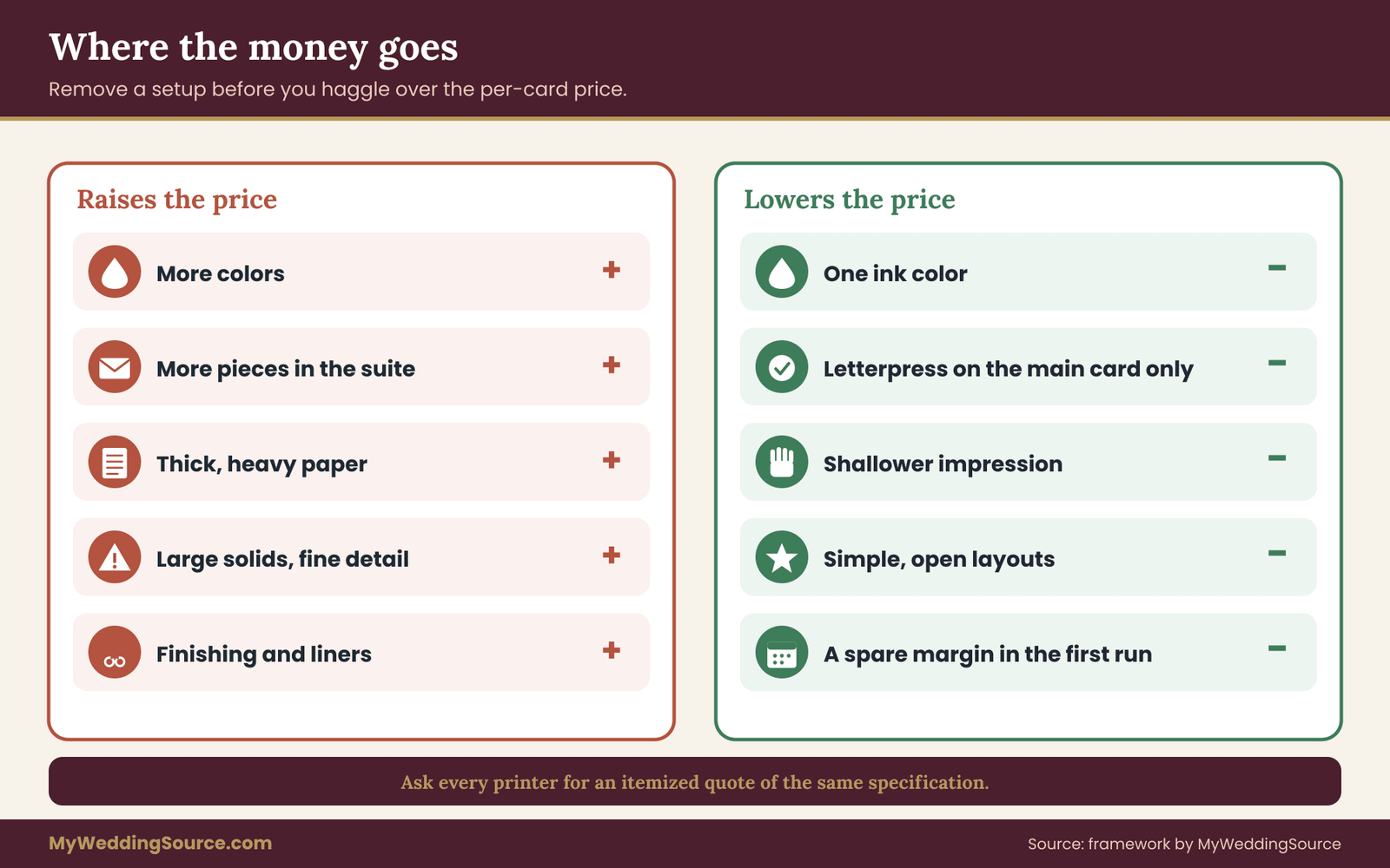
The cost drivers of letterpress invitations, from largest to smallest
Setup per piece and per color. Making a plate, mounting it, mixing ink and adjusting the press all happen before a single good card exists. That work is roughly the same whether the run is fifty cards or two hundred. This is why the cost per card falls as quantity rises, and why a very small run can feel disproportionately expensive.
Number of pieces in the suite. The main invitation, the reply card, the details card and any extras are separate jobs. Each has its own plates and its own setup. Cutting one piece from the suite often saves more than any other single decision.
Number of ink colors. Each added color adds a plate, an ink mix and a pass. It also adds the registration risk that panel six exists to check.
Paper. Thick cotton stock costs more than ordinary invitation stock, and the price depends on the weight and the brand. Because thick paper is one of the main ingredients of the process, it is one of the biggest line items in the quote.
Impression depth. A deeper impression needs thicker paper and more careful makeready. Choosing the shallowest depth that gives you the feel you want can reduce both costs and risk.
Design complexity. Large solids, fine detail and tight registration all slow the printer down and raise the chance of reprints. A simple design with generous spacing tends to cost less to produce.
Finishing. Edge painting, envelope liners, hand assembly and special envelopes add labor on top of the printing.
Design and artwork fees. If the studio creates the design or adapts yours into plate-ready files, that work may be billed separately.
Postage and shipping. Heavier, thicker or odd-shaped suites cost more to mail, and the printer’s shipping costs can be separate. The mailing section covers this in detail.
Why the per-card price of letterpress invitations misleads
Suppose two printers quote the same suite of letterpress invitations. One quotes a lower per-card price with a minimum order and separate plate fees. The other quotes a higher per-card price with plates included. The first quote looks cheaper until you add the plate fees and extras, and the second looks expensive until you notice that nothing else is coming.
The cure is to ask every printer for a fully itemized quote for the same specification: the same pieces, the same paper by name and weight, the same number of colors, the same quantity, the same finishing and the same delivery. Then put the totals side by side. The vendor purchase order checklist shows how to keep every line item in the same shape across vendors.
Also ask what happens if you add or remove ten invitations after the run is planned. Printers handle overruns and shortfalls differently, and a plan to order exactly the number you need may leave you with no margin for a late addition to the guest list.
Counting the right quantity of letterpress invitations
Letterpress invitations are priced by run, and a run is usually counted in invitations, not in guests. A couple of people live at each address, so the number of invitations is closer to the number of households than to the number of guests. The principle is simple: count households first, then add a modest margin for mistakes, keepsakes and late additions.
The spare margin is a real cost decision. Extra letterpress invitations are cheaper to include in the original run than to reprint later, because setup does not repeat. A late reprint of a few cards can cost nearly the same setup as the first run. On the other hand, a large surplus is money spent on cards nobody will use. A small buffer for envelope mistakes, address errors and last-minute guests is usually the practical middle.
The realistic alternatives to letterpress invitations
Letterpress invitations are one of several ways to get a dimensional, premium-looking invitation. Each alternative changes the tradeoff between feel, look, risk and cost.
Digital printing on thick cotton stock. The same paper, printed flat. You keep the soft, thick card and lose the impression. Fine type and large solids print more predictably, and small runs cost less because there are no plates. The tradeoff is that the card feels like a nice card, not a pressed one.
Flat offset printing. A conventional printing process that is economical in larger runs and handles detail and color reliably. It suits designs with many colors, photographs or fine lines. It does not give the impression.
Letterpress-style or digitally embossed effects. Some vendors use the word letterpress for a flat print with a simulated impression. The language is not always consistent, so ask directly how the card is produced. A fair description tells you whether the impression comes from a plate and a press or from another method. Material claims about how a product is made need to be truthful, and the Federal Trade Commission publishes general guidance on advertising claims for businesses and consumers.
Blind embossing or debossing. A dimensional effect made with a die, with or without ink. It can be combined with flat printing and gives a tactile accent at a different price structure from letterpress.
Foil stamping. A metallic or colored foil pressed onto the paper with a heated die. The look is distinct, and so are the legibility tradeoffs, which the guide to specialty invitation printing compares alongside other methods.
Thermography. A raised-ink effect produced by heating a special powder on wet ink. It gives a raised, slightly shiny text, not a pressed one, and it is sometimes chosen as a more affordable way to get a dimensional look. It behaves differently on the page and may not suit the soft, matte aesthetic that draws many people to letterpress.
Hybrid suites. Letterpress on the main invitation and flat printing on the rest. This is the most common budget-conscious choice and is the one the three-question rule recommends when you answer yes twice.
None of these is a lesser option than letterpress invitations in every case. An alternative is better whenever it matches what your guests will notice and what your design requires.
A labeled, invented cost example
The numbers below are invented to show the structure of a decision and are not prices you should expect. Imagine a couple with eighty households. They want a main invitation, a reply card and a details card, all in two colors, on thick cotton stock.
In the invented quote, setup and plates for three pieces in two colors make up a large share of the total, and the paper makes up another large share. The per-card press cost is a small slice. Now they test changes, one at a time.
If they drop to one ink color, the plates and passes for every piece fall by half, and registration risk disappears. If they move the details card to flat printing, an entire set of plates and a setup go away. If they keep letterpress invitations only for the main card and print the reply card flat, the setup cost is shared by only one piece. If they choose a slightly thinner cotton stock, paper cost falls and impression depth may need to come down.
None of these changes requires giving up letterpress invitations. Each one takes a different amount of money out of the total, and the largest savings come from removing setups, not from shaving the per-card price. A couple using the three-question rule would see all of this on a single page before they pay anything.
How to put the cost in context
A number looks large or small only next to something else. Compare the extra cost of letterpress invitations with other things your budget could do. The wedding budget guide shows how to set category ranges, and stationery usually sits among the smaller categories of a wedding. That does not mean you should ignore it. It means a modest percentage shift on the invitations can be a large share of the stationery line and a very small share of the total.
Ask the question the other way too. What would you buy with the difference? If the honest answer is something guests would value more, such as better food, a longer bar, or a travel stipend for a relative, then the third question in the decision rule has its answer.
Mailing letterpress invitations without a postage surprise
Letterpress invitations are lovely objects and awkward pieces of mail. Most disappointments at the post office come from three features that letterpress invitations encourage: thickness, stiffness and an unusual shape. None of them is a problem in itself. The problem is finding out at the counter, with a hundred assembled envelopes in a box, that the piece costs more to send than you budgeted.
Postal rules are set by the U.S. Postal Service, they are detailed, and they change, so this section is a map of what to check and not a statement of current rates. Rates, size limits and surcharge conditions are published by the Postal Service, and the Domestic Mail Manual is the formal source. Always check with a Post Office, using a fully assembled sample, before you order the final run.
What makes letterpress invitations hard to mail
Thickness. Letter-size mail has a maximum thickness, and a stack of thick cotton cards, a liner, a reply card, a reply envelope and a second insert can approach it faster than people expect. The thickness that matters is the whole assembled envelope, not the single card.
Stiffness. Mail that does not bend easily can be treated differently from ordinary letters. Postal processing machines pull envelopes along curved paths, and a rigid piece can jam. A very stiff suite is more likely to be flagged than a flexible one.
Shape. Standard rectangles with a certain proportion between length and height are the easiest to process. Square or very narrow envelopes commonly draw a higher price because they do not run well through the machines. A square envelope is a popular choice for invitations, and it is exactly where couples are surprised.
Weight. Postage depends on weight, and a heavy suite with a thick card and several inserts can push into a higher price band.
Closures and decorations. Items attached to the envelope, such as a wax seal, a button, a ribbon or a bulky closure, can make the piece lumpy and can be damaged in processing. The decision to add a decoration belongs in the same test as the card itself.
The three-measure mailing test for letterpress invitations
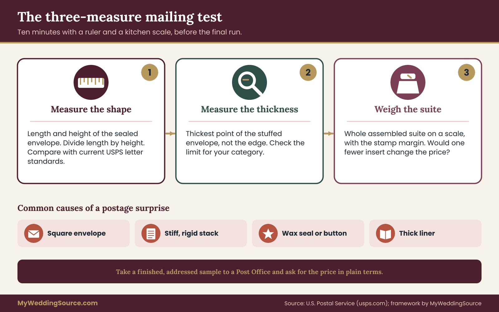
Before the final run, run a quick test that takes about ten minutes and uses things you already own.
Measure the dimensions. Use a ruler to measure the length and height of the sealed, addressed envelope, and divide the length by the height. Write the ratio down. Then compare the dimensions and the ratio with the current Postal Service standards for letter-size mail, which you can find at the Postal Service website or by asking at the counter.
Measure the thickness. Measure the thickest part of the stuffed envelope, not the edge. Compare the number with the thickness limit the Postal Service lists for the category you plan to use.
Weigh the suite. Put the whole assembled suite on a kitchen scale. Add a small margin for the stamp, and consider whether a small change, such as removing an insert, would move you to a lower price band.
If the suite passes all three measures, you have a reasonable expectation of regular letter pricing. If it fails one, you have three practical options: change the suite, change the envelope or accept the extra postage and budget for it. All three are fine. The only bad option is not knowing.
Taking a sample of your letterpress invitations to the counter
The most reliable test is a finished sample. Ask the printer for a complete assembled mock-up, addressed with a test address, and take it to a Post Office. Ask the clerk to confirm in plain terms whether it will be treated as an ordinary letter and what each piece will cost. If the answer is uncertain, ask whether the Postal Service can give you the answer in writing or whether a supervisor can check it.
This is a good moment to ask about the stamps themselves. If your plan includes particular stamps, find out whether they are valid for the price you will pay, because a mismatch between the stamp value and the actual postage is an easy error to make with a large batch.
Do this before the final run, not after. A card that is too thick can be thinned by a change of paper, and an envelope that is too square can be changed to a regular rectangle, but only before the paper is printed and cut.
The reply card question for letterpress invitations
Return mail adds its own constraints. If your reply card is printed on the same thick stock, the return envelope has to carry it back, and the same measures apply on the return trip. A heavy reply card for letterpress invitations in a small envelope may cost more to return than a flat card of regular weight, and guests who see an unexpected postage requirement tend to reply later or not at all.
Many couples choose a lighter flat reply card for exactly this reason. The reply card is the piece most likely to be handled once and discarded, so the case for spending on texture is weakest there. The RSVP etiquette guide covers the wording and the timing of replies, and an online reply option may remove the physical card entirely.
Protecting letterpress invitations on the way out
Thick, soft paper can mark in transit. Edges can crush, and corners can dent in a bin of mail. Ask the printer how they pack the cards, and consider ordering envelopes with a little extra stiffness or a protective backing card if the postal rules allow it. If you are mailing to an address far away or an apartment building with unreliable mail handling, consider hand delivery for a few of the most important invitations.
Think also about the envelope itself. A liner glued inside is attractive, but it adds thickness and weight. If the suite is close to a limit, the liner is often the easiest piece to remove or to replace with a thinner one.
Questions, proofs and contracts for letterpress invitations
A printer of letterpress invitations will usually tell you what you ask. This section turns the guide into a short set of questions, a proof process and a few contract points, so that problems are discovered while they are still cheap.
Questions to ask every printer about letterpress invitations
Ask these in writing so you can compare answers across studios and keep a record. They apply to any quote, and the wedding vendor due diligence checklist explains how to check a vendor’s track record more broadly.
- Will you print a test sheet with the six panels described above, on my actual paper and ink color, and what does it cost?
- Which plate method do you use for my design, and what is the smallest line weight and text size you can hold cleanly?
- What impression depths do you offer, and how do you describe light, medium and deep?
- What paper do you recommend, what is its weight and thickness, and where is it made or sourced?
- How are inks mixed and matched, and will you provide a printed color sample on my stock before the run?
- What is the tolerance for registration on two-color work?
- What is included in the price: plates, setup, ink, paper, cutting, envelopes, liners, packing, delivery?
- What is the overrun and shortfall policy, and what does a reprint cost if I add invitations later?
- How long is each stage, including proof approval, printing, drying, finishing and delivery?
- What happens if the finished work does not match the approved proof?
The proof process for letterpress invitations
A proof for letterpress invitations is a record of what you approved. Treat it that way.
Ask for a digital proof first, which shows layout, spelling, names, dates, addresses and sizes. Then ask for a physical proof or a press check when the budget allows, because only a physical proof shows impression, ink density and color. A digital proof cannot show texture, so it should never be your only approval for a texture-based product.
At the digital stage, read every word aloud, and have someone else read it too. Verify spellings of names against the people themselves, not against an old message. Check the date, the day of the week and the times. An error caught here costs nothing, while an error caught after printing costs a reprint.
At the physical stage, compare the physical proof against the test sheet, panel by panel. If the small type has changed, the ink looks different or the depth has shifted, say so at once, in writing.
Approve in writing, and keep the approval. The proof document should say what was approved, the date and who approved it. If you have approved a physical proof, ask the printer to keep it as the reference for the run.
What belongs in the order form for letterpress invitations
Your order document should be specific enough that a stranger could tell what you were promised. It does not need to be long. Check for these items, and see the wedding vendor contract guide for the broader checklist.
Specification. Quantity, pieces, sizes, paper name and weight, ink colors, number of colors, impression depth and finishing.
Proof and approval terms. What proofs are included, how many revisions are included, what each additional change costs and what counts as approval.
Price and payment schedule. The total, what is included, the deposit amount, when the balance is due and what is refundable. Know what the deposit buys, because custom printed items are often non-refundable once work begins.
Schedule. The proof deadline, the production time, the delivery date and what happens if the printer is late.
Quality standard. A statement that the finished work will match the approved proof within the stated variation, and a remedy if it does not.
Reprints and errors. Who pays for an error in the printer’s work and who pays for an error in the artwork that you approved. This is the point where your written approval matters most.
Overruns and extras. How many extra pieces you will receive or can buy, and at what price.
Paying in a way that protects you
Many studios take a deposit by card, bank transfer or an online payment service. If a problem arises, the payment method can affect your options. Credit card billing disputes have their own time limits, which the Consumer Financial Protection Bureau explains for consumers, and some other payment methods offer fewer protections. Keep the receipt and the order confirmation, and if a deposit is large relative to the order, consider whether a card payment makes sense.
This is not a reason to distrust a printer. Most studios are small, careful businesses. It is a reason to put the agreement in writing and to pay in a way that leaves a record.
When the finished run does not match the proof
Even with careful proofing, you may open the boxes and find a problem. The first step is to compare the finished cards with the approved proof and the test sheet in good light, and photograph the differences. The second is to contact the printer promptly and calmly, with the photos and the approval documents.
Keep the tone factual. Say what you ordered, what you approved, what you received and what you would like done. A printer who made an error will usually fix it. A printer who believes the work is within the normal variation will respond differently, and that is exactly why the contract should say what variation is acceptable.
If you cannot reach agreement, keep records and review your options, including the dispute process of your payment provider, before you send a public review. The principle is the same throughout: documents settle disagreements that memory cannot.
A worked example and the edge cases
Here is the method applied to an invented couple, so you can see how the panels, the rule and the cost logic fit together. The couple, the printer and the numbers are made up for illustration. Nothing here is a real test or a real quote.
The invented couple and their letterpress invitations
Marisol and Dev are planning a wedding for about seventy guests, which comes to roughly forty households. They have found a design they love. It has a script heading with their names, a serif body with the date and venue, a small website line at the bottom, a thin double border, and a large reversed monogram in a deep green block on the details card. They want it on thick cream cotton paper, in two colors, green and a warm gray.
They ask a studio for a test sheet using the six panels, attaching their real fonts and the monogram.
What the test sheet shows about the letterpress invitations
Panel one shows that the serif body stays clean down to a size well below the one they planned, so the date and venue lines are safe. The website line, which they set small in the gray, is borderline. The thinnest strokes in the letters look broken at the planned size and clear one step up.
Panel two shows that the reversed monogram is readable at the planned large size but that the inner details of the letters begin to fill. At half that size it would not be legible. The monogram is a decorative element, so they decide it is acceptable at the planned size and must not shrink.
Panel three shows the large green block, which covers close to a third of the details card. The coverage is uneven, with a mottled look in the center. The couple look at it for a while. Dev likes the character. Marisol thinks it looks like a mistake. They decide the block is in the may-be-rough group but that neither of them is happy.
Panel four shows three depths. The light setting is barely felt. The medium setting gives a clear feel with no visible change on the back. The deep setting makes the letters feel strongly pressed but pushes a visible bulge through to the reverse of the details card, where the monogram sits behind the text. They choose medium for everything.
Panel five shows that the warm gray on cream has lower contrast than the screen suggested. When they squint, the website line nearly vanishes. The green holds up well.
Panel six shows that the thin double border, printed in the second color, sits slightly off from the first color’s monogram by a small, visible amount. Because the border and the monogram never touch, they decide it does not matter.
Grading and the three-question rule
They rank their elements. The names, the date and the venue are must-be-perfect. The website line, the reply deadline and the dress code are should-be-clean. The border, the monogram and the green block are may-be-rough.
The grades come out like this. The must-be-perfect lines are Clear. The website line fails on both size and contrast, so it needs a fix. The border is Acceptable. The monogram is Acceptable at the planned size. The green block is disputed.
Now the three questions.
Will the texture be felt? Forty households, many of them close relatives who tend to keep a card, so yes.
Does the process suit the design? Almost. Three adjustments would fix it: enlarge the website line and darken its ink, drop the gray ink in favor of a single dark green throughout, and replace the large solid block with a thin outline of the same shape. Once those are made, the design passes. Yes, after edits.
Can the budget absorb it? This is the one that decides the outcome, and it needs numbers.
The cost comparison, invented numbers
The couple asks the printer for quotes on three versions, all with the same quantity and paper. To keep the example simple, the figures are expressed in invented units, where one unit is a small, round amount of money. These are not dollar quotes.
Version A is the original plan: three pieces, two colors, with letterpress invitations on every piece. The quote comes in at 100 units.
Version B is one color, three pieces, with letterpress invitations on every piece, with the green block replaced by an outline. The quote comes in at 72 units, because two color setups and passes disappear and the paper is unchanged.
Version C is one color, letterpress only on the main invitation and the details card, with a flat-printed reply card on the same cotton stock. The quote comes in at 61 units.
A fourth alternative, digital printing on the same cotton stock for all three pieces, comes in at 38 units, but there is no impression.
The couple then compare these with their own budget. The invitations line in their plan is set at a level that version A would exceed and that version C fits. They also notice that the mailing test showed their original square envelope would likely need extra postage, and they switch to a standard rectangle at no cost.
The decision: three yeses, with edits, for version C. They choose letterpress invitations for the main card and details card in a single green, with a lighter flat reply card, and they use the savings toward a printed menu they had expected to cut.
What the example teaches about letterpress invitations
The test sheet did not tell them to drop letterpress invitations. It told them which parts of the design would struggle and what the cheapest fix was for each. The grading step prevented the argument about the green block from turning into a personal disagreement, because the question became where the block belonged in the ranking. The cost comparison showed that the largest savings came from removing a color and a piece, not from negotiating the price per card. And the mailing check, which cost nothing, saved a surprise at the counter.
A different couple with the same design could reach a different decision, and that is fine. The method does not produce a verdict. It produces the information a good verdict needs.
Edge cases for letterpress invitations worth a second look
Dark paper. Letterpress ink is often more translucent than people expect, so light ink on a dark sheet may look weak. If you love dark paper, ask the printer about opaque inks, multiple passes and the cost of each, and treat panel five as the deciding test. A blind impression on dark paper is a quiet, reliable alternative.
Two-sided printing. Printing on both sides means the impression from one side may show through on the other, and a second pass risks marking the first. If you want a printed reverse, ask the printer how they handle it, and consider a thicker or duplexed sheet.
Very small runs. For a small guest list, the setup costs dominate and the per-card price will look high. This is where a hybrid suite or a single piece among letterpress invitations often gives the best value. It is also a case where hand-lettered or digital options can feel more personal.
Reorders and late additions. Plates can be stored, but ink and paper batches change, and a reprint may not match exactly. If a late addition is likely, order a buffer in the first run instead of planning a second.
Languages and special characters. Accents, non-Latin scripts and small marks put more detail on the plate. Include them in panel one, because a small accent can disappear first. Check proofs with a native reader.
Shared design with a bilingual layout. Two languages on one card often means smaller text, so the size ladder matters more, not less.
Environmental goals. If sustainability matters, ask about the paper fiber, the ink type and the plate material, and ask for any claims in writing. The Environmental Protection Agency and the Federal Trade Commission both publish general guidance on environmental claims and on paper recycling, and local recycling programs differ in what they accept.
Keepsake value. If the main reason for letterpress invitations is that you and your families will keep the card for decades, ask about the paper’s longevity, and ask the printer which stock they would choose for a card meant to be kept. Preservation guidance from the Library of Congress explains why paper type and storage matter.
Family expectations. Some families see letterpress invitations as a sign of seriousness, and others see it as a cost to avoid. If the decision involves a relative who is paying, show them the test sheet and the cost versions. A concrete comparison is much easier to discuss than a general preference, and the wedding invitation etiquette guide can help with who is expected to be on the list and how invitations are worded.
Your next steps
- Rank your elements. List everything on the invitation and sort it into must be perfect, should be clean and may be rough.
- Choose two or three printers and send each the same written request: the six-panel test sheet, your artwork, your paper and ink preferences, and the quantity.
- Ask for itemized quotes for three versions: the full suite, a one-color version and a hybrid with letterpress invitations only for the main card.
- Grade the test sheets panel by panel and apply the three-question rule with your partner.
- Run the three-measure mailing test with an assembled mock-up and, if possible, a visit to the Post Office.
- Edit the design before plates are made, and write down the reason for each edit.
- Approve a digital proof and a physical proof in writing, and keep the approved sample.
- Put the specification, proof terms, schedule, quality standard and reprint policy in the order document.
FAQ
Are letterpress invitations worth the money?
They are worth it when guests will handle the card, your design prints cleanly on the press and the extra cost does not pull money from something you value more. A test sheet on your actual paper and ink helps you check the middle condition. If you answer yes to only one of those three questions, a flat process on good paper is usually the wiser spend.
How do I know if my font will work for letterpress invitations?
Ask the printer to print a size ladder of your actual font on your paper and ink, then look closely at the thin strokes and small openings. If the smallest text you plan to use is at least one step larger than the smallest size that still looks clean, you have a reasonable margin. If not, enlarge the text or change the font.
Why is letterpress more expensive than regular printing?
Each color needs its own plate, ink mix and press pass, and each piece in the suite needs its own setup, so costs scale with colors and pieces more than with the number of guests. The thick, soft paper also costs more than ordinary invitation stock. Removing a color or a piece usually saves more than negotiating the per-card price.
Can letterpress print light ink on dark paper?
It can, but results vary. Inks for letterpress invitations are often translucent, so a light color on a dark sheet may look muted. Printers sometimes use opaque inks or a second pass, which adds cost. Print your exact ink on your exact paper as part of the test sheet and judge it in the lighting guests will read it in.
Will thick letterpress invitations cost more to mail?
They can. Thickness, stiffness, unusual shape and weight may change how the Postal Service classifies and prices a piece. Square envelopes are a common cause of added cost. Measure, weigh and take an assembled sample to a Post Office before the final run, and check current rules and rates on the Postal Service website.
What is the difference between letterpress and blind embossing?
Letterpress presses a raised plate into paper, usually with ink, and the impression is formed by the plate and press. Blind embossing uses a die to shape the paper without ink, often with a matching counter die. Both give a tactile effect, but they have different tooling, pricing and visual character, so ask which one the printer is quoting.
Should the reply card be letterpress too?
Often not. The reply card is handled briefly and then discarded, so the benefit of texture is smallest there. A thick reply card in a small return envelope can also cost more to return and may delay replies. Many couples order letterpress invitations only for the main card and use a lighter flat card for the reply.
What should I put in the contract with a letterpress printer?
Include the quantity, pieces, sizes, paper name and weight, ink colors, impression depth, proof and approval terms, payment schedule, delivery date, a quality standard tied to the approved proof, and the reprint and overrun policy. Written approval of a physical proof is the most useful single record if the finished work differs from what you expected.
Sources
- U.S. Postal Service
- USPS Postal Explorer, Domestic Mail Manual
- USPS Frequently Asked Questions
- Federal Trade Commission, business guidance on advertising
- Federal Trade Commission, consumer information
- Consumer Financial Protection Bureau
- U.S. Environmental Protection Agency, paper and paperboard recycling
- Library of Congress, preservation resources
- International Organization for Standardization
- Forest Stewardship Council