
A wedding website accessibility audit is a short, structured check of whether the guests you invited can actually read your site, tap its buttons, and finish your RSVP form on the device they own, and you can run a useful one yourself in an afternoon with a phone, a keyboard, and a free contrast checker.
Quick answer
Run your wedding website accessibility audit in three passes. Phone pass: open every page on a phone, zoom the text, and make sure nothing runs off the edge or hides the RSVP button. Contrast pass: check that small text has a contrast ratio of at least 4.5 to 1 and that buttons, field borders, and focus outlines reach 3 to 1. Form pass: make sure every RSVP field has a visible label, errors are explained in words, and the whole form works with a keyboard alone. Then fix what your website builder lets you change, and ask the builder about the rest. The standard behind these checks is WCAG 2.2, and this guide is planning help, not legal advice.
Most couples build a wedding website the way they choose a table runner: by looking at it on a laptop and deciding it is pretty. Guests meet it differently. A grandparent enlarges the text with two fingers, a cousin reads it one-handed in a parking lot, a friend with low vision uses a screen magnifier, and a coworker with a hand tremor tries to tap a small icon beside the venue address. A wedding website accessibility audit looks at the site from those seats instead of yours.
This guide gives you a complete method. In this wedding website accessibility audit you will learn what to test on a phone, how to measure text contrast on a real wedding palette, how to build an RSVP form that people can finish, and how to score what you find so you fix the right things first. It includes a four-part worksheet, questions for your website builder, and a plan for keeping the site accessible after you add new photos and pages. We name our sources in the Sources section and say plainly where a claim comes from a company rather than a standard.
What a wedding website accessibility audit is, and what it is not
A wedding website accessibility audit is a practical review, not a certification. It will not tell you that your site “complies” with anything. It will tell you which barriers your guests are most likely to hit, in what order to fix them, and which problems belong to your website builder instead of you.
The short definition
Think of a wedding website accessibility audit as a walkthrough with a checklist. You visit each page the way a guest would, you test a small number of things that cause the most trouble, and you write down what you find. The wedding website accessibility audit in this guide has three passes (phone, contrast, forms) and a final sweep for images, links, motion, and sound.
What the audit covers
This wedding website accessibility audit covers the parts of a wedding site that guests use to act: reading the schedule, finding the venue, following the travel notes, opening a registry link, and sending an RSVP. It also covers the visual choices that affect reading, such as palette, font size, and text laid over photos. It does not look at the inner workings of the platform you use, which you cannot see or change.
What a wedding website accessibility audit cannot tell you
The W3C’s own list of quick checks comes with a caveat: those checks cover only a few accessibility issues, and a page can pass them and still contain significant barriers. The same is true here. A wedding website accessibility audit run by a couple will catch the common, fixable problems, but it is not a substitute for testing with disabled users or for a professional evaluation if the stakes are high.
Why a wedding site needs one
A wedding website has an unusual audience. It is read by the widest age range of any website you will ever build, and many of those readers visit exactly once, under time pressure, to answer a question like “where do I park” or “what time does it start.”
Guests who arrive with different needs
Some guests use larger text or a screen magnifier. Some use a keyboard, a switch, or voice control instead of a mouse. Some read on small phones in poor light, and some are simply tired. The W3C describes target size, for example, as helping people who mainly use phones and tablets, people with hand tremors or other mobility impairments, people on shaky surfaces such as public transit, and people using one hand. That is a long list of ordinary guests.
The cost of a barrier on a wedding site
A barrier on a wedding site rarely looks dramatic. It looks like an RSVP that never arrives, a guest who cannot find the ceremony start time, or a relative who gives up and calls you. Fixing a barrier early is cheaper and kinder than answering the same question forty times. Our guide to the accessible wedding guest experience covers the in-person side of the same idea, and this article covers the website.
What the standard says
Most accessibility checks trace back to the Web Content Accessibility Guidelines, known as WCAG. They are written by the W3C’s Web Accessibility Initiative, and they are the reference people use when they say a site is accessible.
WCAG in plain language
WCAG groups its requirements under four ideas: content must be perceivable, operable, understandable, and robust. Its success criteria come in three levels, A, AA, and AAA, and AA is the level most people treat as the common target. WCAG 2.2 was published in October 2023 and updated in December 2024, and content that meets 2.2 also meets 2.1 and 2.0. When this guide says “AA,” it means that common target.
What the law does and does not say
In the United States, the Department of Justice says the Americans with Disabilities Act applies to the websites of state and local governments and of businesses open to the public. Its guidance also says there is no regulation setting detailed web standards, and it points to WCAG and Section 508 as helpful references. That guidance is dated March 2022, is informal, and does not reflect the April 2024 rule for state and local governments. A private couple’s personal wedding site is a different situation from a business, and whether any duty applies to you is a question for a lawyer. This guide treats WCAG as a good-practice yardstick, not as a legal claim.
Before you start: set up your audit
A little preparation makes the audit faster and the results easier to act on. You need a list of pages, a few free tools, and a clear idea of who can change what.
Pick the pages that matter
You do not need to give every page equal depth in a wedding website accessibility audit. Start with the pages guests must use, then sample the rest.
The five pages to test first
For a wedding website accessibility audit, test the home page, the schedule or events page, the travel and lodging page, the RSVP page, and the registry page. If your site has an FAQ or a dress code page, add those. These are the places where a guest has to read something specific or do something specific, so a barrier there costs the most. If you use a template with a single scrolling page, treat each section as its own page.
Pages that are easy to forget
Check the confirmation message that appears after someone submits the RSVP, the password prompt if your site is protected, the cookie or consent banner, and any pop-up. Also check emailed confirmations if your builder sends them. Guests meet these small screens at the moment of action, and they are often built separately from the pretty pages.
Gather free tools
Every check in a wedding website accessibility audit can be done without paid software. The point is to use the same devices and settings your guests use.
What to have on hand
You need a phone, a laptop with a keyboard, and your browser’s zoom command. You also need a contrast checker. The WebAIM Contrast Checker takes two hex color values and reports whether the pair passes the AA thresholds for normal text, large text, and user interface components. Have a notebook or the worksheet later in this guide open to record findings.
Why automated tools are only a start
Automated checkers are useful for catching missing labels and low contrast quickly. The Department of Justice’s guidance cautions that a clean automated report does not mean everything is accessible, and that a report with some errors does not always mean a barrier exists. The WebAIM Million analysis, conducted in February 2026, found detectable WCAG failures on 95.9 percent of the home pages it scanned, which suggests how easily problems slip through. Use automated tools as a second opinion after your manual checks, not as your wedding website accessibility audit itself.
Decide who fixes what
Findings fall into three buckets, and sorting them early saves frustration.
Content you control
Alt text, link wording, the colors you choose, the order of your schedule, the length of your text, and the questions on your RSVP form are usually yours. These are the fastest wins in any wedding website accessibility audit, because you can fix them in minutes without asking anyone.
Settings the builder controls
Most wedding website platforms limit what you can change. You may be able to pick a theme, a font size, and a color palette, but not the underlying code. When a problem lives in the platform, your options are to choose a different theme, work around it with simpler content, or ask the company to fix it. We cover the questions to ask in a later section.
Pass one: the phone and zoom audit
Most wedding website visits happen on a phone, so this pass of the wedding website accessibility audit comes first. It is also the pass where the most common layout problems show up, because a site built on a desktop screen can look fine there and fall apart on a narrow one.
Reflow: does the page fit a narrow screen?
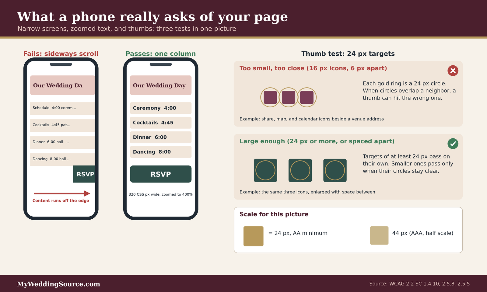
WCAG’s reflow requirement says that content which scrolls vertically must work at a width equivalent to 320 CSS pixels, without losing information or forcing the reader to scroll in two directions. At 400 percent zoom that corresponds to starting from a browser window 1280 CSS pixels wide.
How to run the reflow test
On a laptop, open a page, make the browser window about 1280 pixels wide if you can, and zoom to 400 percent. On a phone, simply open the page and scroll. In this part of the wedding website accessibility audit you are looking for one thing: do you ever have to drag the page sideways to read a line or reach a button? If you do, the page fails the test. Check the schedule, the hotel list, and the RSVP button, because wide tables and fixed-width blocks are the usual culprits.
What commonly breaks on wedding sites
Schedules built as wide tables, side-by-side photo grids, text boxes with a fixed width, and buttons placed in a row can all push content off the edge of a small screen. WCAG makes an exception for content that truly needs two-dimensional layout, such as maps, diagrams, and data tables, but even then the surrounding headings and text should still reflow. A schedule with four rows and two columns is rarely a good reason to scroll sideways.
Text size and spacing
Guests enlarge text for many reasons, and your wedding website accessibility audit should confirm that doing so does not break the page. Two requirements matter here.
Resize text up to 200 percent
WCAG says text must be resizable up to 200 percent without assistive technology and without losing content or functionality. Authors must not block the zoom tools that browsers provide, and one related test rule checks that a page’s viewport setting does not prevent zooming. Pinch to zoom on your phone, and use the browser’s text size setting if it has one. Confirm that the words get bigger, that nothing overlaps, and that buttons stay visible.
Spacing and clipped text
A second requirement covers users who override text spacing. WCAG says content should still work when line height is at least 1.5 times the font size, paragraph spacing at least 2 times, letter spacing at least 0.12 times, and word spacing at least 0.16 times. At those settings text should not be clipped or overlap other elements. You cannot easily change these settings by hand on every device, so the practical check is visual: look for fixed-height text boxes and buttons where words are already tight, since those are the first to clip.
Tap targets and thumbs
Buttons and links that are fine under a mouse can be hard to hit with a thumb. WCAG 2.2 sets an AA minimum for pointer targets.
The 24 pixel rule
Pointer targets should be at least 24 by 24 CSS pixels. A smaller target can still pass if a 24 pixel circle centered on it does not overlap another target or another small target’s circle. In practice that means small icons are fine if they have space around them, and they are a problem when they sit shoulder to shoulder. The enhanced AAA criterion asks for 44 by 44 pixels, which is a good aim for the main RSVP button even though it is not required at AA.
Where wedding sites cram tiny targets
Look at rows of small icons beside a venue address, such as share, map, and calendar icons. Look at footer links, social icons, and the tiny “x” on a pop-up. Also look at in-text links that sit on adjacent lines in a tight list, such as a hotel list with a phone link on every row. If you miss one on your first thumb tap, a guest with a tremor will miss it more often.
Orientation and overlays
The last phone checks catch problems that only appear in specific conditions.
Do not lock the orientation
WCAG says content should not be locked to a single screen orientation unless that orientation is essential. Rotate your phone and make sure the page follows. A guest may keep a device in one orientation for a reason you cannot see, and your page should follow the device rather than fight it.
Banners and sticky bars that cover the page
Sticky headers, cookie banners, and floating “RSVP” bars can slide over the element a keyboard user has just reached. WCAG 2.2 says a focused element must not be entirely hidden by author-created content. A banner can pass if it is modal, so the user must deal with it first, or if scroll padding keeps focused content clear. When you tab through a page in the next pass, watch for focus disappearing behind a bar.
Pass two: text contrast
In a wedding website accessibility audit, contrast is the measure of how strongly text stands out from its background, and it is where wedding sites most often lose readers. Soft palettes of blush, sage, dusty blue, and champagne are lovely in a photo and hard to read as small text.
How the ratio works
Contrast is expressed as a ratio between the lightness of two colors, from 1 to 1 (identical) up to 21 to 1 (black on white). You do not need to calculate it by hand, but it helps to know what the thresholds mean.
The thresholds that matter
WCAG’s AA level asks for a contrast ratio of at least 4.5 to 1 for normal text. Large text needs at least 3 to 1, and WCAG counts text as large at 18 point or larger, or 14 point bold or larger, which is roughly 24 pixels regular or 18.5 pixels bold. The WebAIM checker reports the same thresholds and also shows a higher AAA level of 7 to 1 for normal text. For a wedding website accessibility audit, aim for 4.5 to 1 on everything you expect a guest to read.
How to test a pair of colors
Get the text color and the background color as hex values from your builder’s theme settings or by using your browser’s inspector. Enter both into the contrast checker. WCAG warns against judging by eye, because anti-aliasing can make thin fonts look fainter than their color value, and it says not to round the result, so 4.499 to 1 fails. Test placeholder text and any text that changes on hover or focus, too.
Where wedding palettes go wrong
The colors couples love most are often the colors that fail. The figure below shows eight example pairs we chose and calculated using the WCAG formula. They are illustrations, not anyone’s actual palette, and the ratios are our own arithmetic.

Soft tones as text
In our examples, dusty rose on ivory comes out near 2.0 to 1, metallic gold on ivory near 2.1, sage on white near 2.4, and dusty blue on white near 2.6. Each is below even the 3 to 1 needed for large text. These are fine as decoration, as a divider or a background wash, but not as the color of a schedule line. A mid gray of #767676 on white measures about 4.5 to 1, which is why W3C uses it as an example of a border that passes.
Keep the mood, deepen the tone
The fix is usually to darken the same hue rather than abandon it. In the same calculation, a deeper rose on ivory comes out near 5.3 to 1, a deep sage near 5.5, and a burgundy on blush near 8.9. The figure shows how the same romantic look can survive when the small text gets enough weight to read. Save the pastel tones for large headings, shapes, and backgrounds.
Beyond body text
Contrast applies to more than paragraphs. A page can pass on its main text and still fail on the parts guests need to operate.
Buttons, borders, and focus outlines
WCAG’s non-text contrast requirement says user interface components and meaningful graphics need at least 3 to 1 against adjacent colors. W3C’s examples include a text input with a #767676 border on white, which passes, and a light gray #AAA border on an unlabeled input, which fails. A focus indicator set by the author must also reach 3 to 1, though browser default focus styles are exempt provided they stay visible. If your theme hides the default outline and replaces it with a pale one, you have probably created a failure.
Text over photos and color-only cues
Text laid over a photo has no single background color, so test the lightest and darkest areas behind the words, or place the text on a solid panel. Also check meaning that depends on color alone. WCAG says required fields marked only in red fail, and an error shown only as a red outline fails. Add the word “required” or an icon and a message. Links that differ from nearby text only by color need an underline or another cue.
Pass three: the RSVP and other forms
Forms are where a website asks something of a guest, so they deserve the most careful pass of a wedding website accessibility audit. The WebAIM Million analysis found missing form input labels on 51 percent of the home pages it examined, which makes labels the most common form failure that automated tools can detect.
Labels, hints, and required fields
A guest should never have to guess what a field wants. Three habits make most forms understandable.
Visible labels that stay put
WCAG’s labels-or-instructions criterion says labels or instructions must be provided whenever content requires user input, and it applies to optional fields as well as required ones. The most reliable approach is a text label tied to its field using the standard HTML label element. Placeholder text inside the field disappears when someone starts typing and is usually pale, so treat it as a hint at most, never as the only label.
Hints, formats, and required marks
Put short hints before the field, such as “As it appears on your invitation.” State the expected format with an example when it matters, for example for a phone number. Mark required fields in the label itself with the word “required,” and mark optional ones as optional, so no one has to decode an asterisk or a color. Our guide to RSVP wording covers what to ask, and this section covers how to ask it.

Errors that explain themselves
Errors are inevitable, and how they are shown decides whether a guest recovers or quits.
Say what went wrong, in words
WCAG’s error identification criterion says that when the page detects an input error, it must identify the item in error and describe the problem in text. Color or icons can add to the message but cannot replace it. The criterion does not prescribe a layout, so errors may appear in a list at the top, beside the field, or in an alert. An example from the W3C is a form that shows an alert naming each missing or incorrect field, and another is a field highlighted in yellow plus a text description.
Keep what the guest typed
If a submission fails, keep the entries. WCAG’s redundant entry criterion says a multi-step process must not ask for information the user already provided unless re-entry is essential, a security step, or outdated, and it gives the example of a checkout that keeps the card number in the form after an error. Test this by making a deliberate mistake on your RSVP and seeing whether the other answers survive.
Keyboard and focus
Many guests never touch a mouse. Some use a keyboard, a switch, or voice commands, and all of them rely on focus.
Walk the form with the Tab key
Click at the top of the page and press Tab repeatedly. You should reach every link, field, and button in a sensible order, and you should be able to operate each one with Enter or Space. If you get trapped in a widget, skip over a field, or jump around the page unpredictably, note it. The W3C’s easy checks also suggest looking for a skip link, a first control that lets keyboard users jump past repeated navigation to the main content.
Make focus visible
WCAG says any keyboard-operable interface must offer a mode where the focused element is visibly indicated, and the indicator must stay visible rather than vanishing after a moment. Tab through your page and ask whether you can always see where you are. Then check that a sticky bar or consent banner never covers the focused control completely.
Autofill, passwords, and verification
Some wedding sites ask guests to log in, enter a password to view the site, or confirm a code. These steps carry their own accessibility rules.
Let browsers fill in personal details
WCAG’s identify-input-purpose criterion says that when a field collects information about the user and its purpose is on the standard list, software should be able to determine that purpose, which in HTML is done with valid autocomplete values such as name, email, and tel. This helps people with memory, language, or executive function differences and people who find typing difficult. Many builders set this for you, so the question for your wedding website accessibility audit is whether your RSVP fields get filled in when you tap them on a phone.
Password gates and puzzles
WCAG 3.3.8 says a login step must not require a cognitive function test, such as remembering a password or solving a puzzle, unless an alternative exists. It adds that username and password fields can be the main method if they are properly labeled so browsers and password managers can autofill them, and that pasting must be allowed. NIST’s current password guidance also says verifiers should let users paste passwords and must allow password managers. If your site has a shared password, make it easy to type or paste, and avoid image puzzles. Our guide to wedding website privacy and security explains when a password is worth having.
The rest of the page: images, links, motion, and sound
After the three main passes, a final sweep of the wedding website accessibility audit covers the features that make wedding sites feel personal and that quietly shut some guests out.
Images and text in images
Photos carry much of a wedding site’s charm, so this is where a wedding website accessibility audit often finds the most small gaps.
Alt text for photos
WCAG says informative images need a text alternative that serves the same purpose, and purely decorative images should be marked so assistive technology skips them. For a photo of the two of you, a short plain description such as “Alex and Sam laughing on a porch swing” is enough. If a photo is just decoration, such as a background flourish, it needs no description. W3C’s easy checks list image alternative text as one of the first things to confirm.
Invitations and schedules saved as pictures
Many couples upload an invitation suite, a map, or a timeline as a single image. WCAG says an image that contains words is non-text content and needs a text alternative, and its images-of-text criterion says real text is better where the technology can produce the same look, because people can restyle text and because screen readers and magnifiers can only work with real text. Post the details as text on the page and offer the graphic as an extra. Our guide to wedding invitations is a good place to plan which details belong in both.
Links and headings
Guests who use screen readers often jump through a list of headings or links, which makes both a map of the page.
Link text that makes sense alone
WCAG says a link’s purpose should be clear from its text or its immediate context. A row of links that all say “click here” or “details” gives a screen reader user a list with no meaning. Write links that name the destination, such as “Directions to the ceremony” and “View the registry.” The same applies to links on your registry page.
Headings that outline the page
W3C’s easy checks note that headings should outline a page’s structure, since screen reader users rely on them to navigate. Use real heading styles from your builder instead of bold text. Keep the order logical, with one main title and subheadings beneath it, and give each page a distinct title, which is also the first thing a screen reader announces.
Motion, music, and video
Atmosphere features can turn into barriers when they run on their own.
Autoplay music and moving content
WCAG says audio that plays automatically for more than three seconds needs a way to pause or stop it, or a volume control independent of the system volume, and it discourages autoplay because it interferes with screen readers. For moving content that starts on its own, lasts more than five seconds, and sits beside other content, users must be able to pause, stop, or hide it. That covers carousels, slideshows, and countdown timers. The simplest fix is to remove autoplay music and use manual controls on slideshows.
Video captions and the page language
W3C’s easy checks list captions for videos, transcripts for audio, and descriptions of important visual information. If you post a proposal video or a hometown slideshow, add captions. Also confirm the page declares its language, since WCAG says a screen reader needs the language to load the right pronunciation rules. Most builders set this, but if your site includes passages in another language, ask whether it is marked correctly.
The wedding website accessibility audit worksheet
This is the working part of the wedding website accessibility audit. It turns the passes above into twenty-four checks you can mark as you go. Copy it into a notes app or print it, and test each row on the page where it applies.
How to score what you find
Keep the scoring of your wedding website accessibility audit simple, so you finish. You are not grading yourself, you are deciding what to fix first.
Pass, partial, or fail
Mark each check Pass if it works the way the “pass looks like” column describes on every page you tested. Mark it Partial if it works on some pages or devices but not others. Mark it Fail if a guest could not complete the task. Write the page name and a one-line note, such as “RSVP page, button off screen at narrow width.” Specific notes make the later fixes quick.
Severity by what the guest loses
Rank each Fail or Partial by what it costs a guest. A blocker stops a task, such as an RSVP that cannot be submitted by keyboard. A barrier makes a task hard, such as low-contrast schedule text. A nuisance is annoying but passable, such as a vague link name. Fix blockers first, then barriers, then nuisances. This ordering matters more than any score.
The worksheet
Four tables follow, one for each pass and one for the rest of the page. The “Ref.” column names the WCAG success criterion, so you can look up the wording if you want it.
Phone and zoom checks
| # | Check | How to test | Pass looks like | Ref. |
|---|---|---|---|---|
| 1 | Page fits a narrow screen | Open each page on a phone, or zoom a laptop browser to 400 percent | No sideways scrolling to read text or reach buttons | 1.4.10 |
| 2 | Text enlarges | Pinch zoom, or use the text size setting | Text grows to double size with nothing overlapping | 1.4.4 |
| 3 | Zoom is not blocked | Try to pinch zoom on every page | The page responds to zoom on each page | 1.4.4 |
| 4 | Tap targets are big enough | Tap each icon and link with a thumb | 24 pixels or more, or clear space around smaller ones | 2.5.8 |
| 5 | Orientation is free | Rotate the phone | The page follows the device in both directions | 1.3.4 |
| 6 | Banners do not cover controls | Tab through the page with a banner showing | Focused items are never fully hidden | 2.4.11 |
Contrast checks
| # | Check | How to test | Pass looks like | Ref. |
|---|---|---|---|---|
| 7 | Body and schedule text | Test text color against background | At least 4.5 to 1 | 1.4.3 |
| 8 | Large headings | Test headings about 24 pixels or bold 18.5 pixels | At least 3 to 1 | 1.4.3 |
| 9 | Buttons and field borders | Test the border or fill against the page | At least 3 to 1 | 1.4.11 |
| 10 | Focus outline | Tab to a control and look | Visible and at least 3 to 1 | 1.4.11, 2.4.7 |
| 11 | Text over photos | Check the lightest and darkest areas behind words | Enough contrast everywhere, or a solid panel behind text | 1.4.3 |
| 12 | Meaning not carried by color alone | Look for red-only errors or color-only links | A word, icon, or underline backs up color | 1.4.1 |
Form checks
| # | Check | How to test | Pass looks like | Ref. |
|---|---|---|---|---|
| 13 | Every field has a visible label | Look at the form before typing, then while typing | A text label stays visible, not only placeholder text | 3.3.2 |
| 14 | Required and optional are stated | Read the labels | The words “required” or “optional” appear | 3.3.2, 1.4.1 |
| 15 | Errors are explained | Submit with a mistake on purpose | Text names the field and the problem | 3.3.1 |
| 16 | Entries survive an error | Make a mistake in one field | Other answers are still there | 3.3.7 |
| 17 | Keyboard completes the form | Use Tab, Enter, and Space only | Every field and the submit button work | 2.4.7, W3C easy checks |
| 18 | Autofill works | Tap fields on a phone with saved details | Name, email, and phone can be filled by the browser | 1.3.5 |
Everything else
| # | Check | How to test | Pass looks like | Ref. |
|---|---|---|---|---|
| 19 | Photos have useful alt text | Inspect or use a checker | Meaningful photos described, decorative ones skipped | 1.1.1 |
| 20 | Key details are real text | Select the text on the schedule and venue | Words can be highlighted, not trapped in a picture | 1.4.5 |
| 21 | Links make sense out of context | Read each link on its own | The link names where it goes | 2.4.4 |
| 22 | Headings outline the page | Skim headings only | A logical outline with one main title | W3C easy checks |
| 23 | No surprise sound or motion | Load each page and wait | Nothing plays audio or moves without a stop control | 1.4.2, 2.2.2 |
| 24 | Language is declared | Ask the builder or check page settings | The primary language is set | 3.1.1 |
The reference column points to the WCAG success criterion we read for each row, or to the W3C’s easy checks page where the row comes from that list.
Triage and fix order
Once the worksheet is full, turn your wedding website accessibility audit into a short list of actions.
Sort the fixes by who can make them
Put every Fail and Partial into one of three piles: things you can fix in your content, things you can fix by changing a theme or setting, and things only the platform can fix. Do the first pile this week. Test the second pile by changing one setting at a time, so you know what helped. Send the third pile to the builder with the page, the device, and a one-sentence description.
Re-test after each change
After fixing a row, re-test it on the same device, then check one neighboring row, because changes often move other things. A darker text color can change a button’s contrast, and a larger font can push a button off a narrow screen. Record the date, so you can tell at a glance when each part was last checked.
Questions for your website builder
Most couples do not build a site from scratch. They use a template from a platform, and the platform decides much of what is possible. A short, polite set of questions often reveals more than any marketing page, and it belongs in every wedding website accessibility audit.
What to ask the platform
Ask in writing, so you have the answer later. Support teams can usually answer these in a sentence or two.
Questions to ask your website builder
- Which accessibility standard do you aim to meet, and for which parts of the site, the editor, the public wedding pages, and the RSVP form?
- Do the published wedding pages reflow on a narrow phone and respond to browser zoom?
- Can I set alt text for every photo, and can I mark decorative images?
- Do your RSVP forms have visible labels, written error messages, and full keyboard support?
- Are theme text colors tested for contrast, and can I change them to darker values?
- Is there a way to turn off autoplay music, slideshows, or animation?
- How can a guest or I report an accessibility problem, and who answers?
Read the company’s own statement carefully
Companies describe their own accessibility in different ways, and it helps to read what they actually claim. Zola’s accessibility page says the company aims to meet or exceed WCAG 2.0 Level AA, that it engaged the consultant Allyant to audit its website and mobile site, and that visitors who have difficulty can call a representative who can help review wedding websites, registries, and guest lists. The page does not describe accessibility features specific to wedding websites. The Knot’s accessibility policy says it aims to give all couples access to its tools and articles, directs readers to a separate statement, and gives an email address for questions, but the page itself does not name a conformance target. These are the companies’ own descriptions, not our testing, and platforms change, so check the current pages and ask your own questions.
What a good answer sounds like
A useful answer names a standard and a scope, says how the company tests, and offers a way to report problems. A vague answer, such as “our site is fully compliant,” is less helpful than a specific one that admits limits. The Department of Justice’s guidance recommends giving the public a way to report accessibility problems, so a clear contact path is a reasonable thing to expect.
Embedded tools and outside links
Your site is rarely one piece, which complicates any wedding website accessibility audit. It often embeds or links to a registry, a map, a photo gallery, a form, and a payment page run by someone else.
Check the handoff pages
Open every outside link and run the quick checks on the destination: zoom, keyboard, and contrast. You cannot fix these pages, but you can choose a different option or add a plain text alternative, such as the address as text beside the map and a phone number beside the booking link. Our registry guide and cash registry guide help you compare the options before you link to them.
Keep your own address and email accessible
If you buy a custom address for the site, the address itself becomes part of the guest experience, since it has to be typed, read aloud, or shared. Our guide to a wedding website custom domain covers choosing one that is easy to spell and say. Keep the email address you list as plain text, not only in a graphic.
Edge cases that change the audit
A few situations call for a slightly different approach, and they come up often enough on wedding sites to be worth planning for.
Privacy settings and accessibility together
Privacy and accessibility sometimes pull in opposite directions during a wedding website accessibility audit, and you can usually satisfy both.
Password-protected sites
A password keeps strangers out, but it adds a step that some guests find hard. Make the password short enough to type but not guessable, and put it on the invitation or save-the-date in plain text. Do not use an image puzzle as the gate, and confirm that the field accepts pasting and autofill. Our guide to save-the-date cards covers where to put the web address and password.
Collecting needs without exposing them
If you add an optional field for guests to share access or dietary needs, say why you are asking and who will see the answer, and ask for only what you need. Information about a person’s disability or health is sensitive, so keep it out of public pages and spreadsheets shared widely. Our accessible guest experience guide and dietary restrictions guide explain how to gather needs respectfully, and our guide to wedding RSVP data export covers handling the answers safely.
Content that lives outside the website
Not everything guests need is on the site, and your wedding website accessibility audit is stronger if it covers the pieces that point to it.
PDFs, printed items, and QR codes
If you link a PDF program or map, check that it contains real text and is not a scan. Where a printed invitation sends guests to the site with a QR code or a short web address, print the address in readable type as well. Our guides to wedding programs and wedding signage cover other printed pieces that may point to the site.
Scam messages that copy your site
Guests who are less comfortable online may be more likely to trust a message that looks like it came from you. The FTC’s scam pages advise caution with unexpected requests for payment by wire transfer, cryptocurrency, payment apps, or gift cards, and they explain how to report scams at ReportFraud.ftc.gov. Tell guests plainly that your site never asks for payment, and see our guide to wedding website scam messages.
Older devices and uneven connections
Your guests will not all be on the latest phone, and some will be on slow connections at a rural venue or in a hotel.
Keep the pages light
Large photos can take a long time to load on a weak connection. Resize images before uploading, and put the schedule and address in text at the top of the page so the essentials appear first, even before the pictures. Our guide to guest transportation is another place where plain, early text helps.
Offer a second route
For any guest who struggles with the site, provide another way to get the information or RSVP: a phone number, an email address, or a printed card. Say so on the site and on the invitation. A second route does not replace an accessible site, but it keeps one barrier from becoming a missed wedding.
Time, cost, and when to get help
A wedding website accessibility audit costs mostly time, and the tools are free. Knowing what to expect keeps the project from growing.
What this actually costs
Our estimate for a first wedding website accessibility audit of a five-page site is two to three hours, plus a short follow-up for fixes, a rough figure based on the number of checks above, not a measured one. The checks use free tools. Your costs, if any, come from changing themes, upgrading a plan for more design control, or hiring a professional reviewer, and those prices vary by platform and provider, so check the current pricing page or ask for a quote before you commit.
Where the time goes
Most of the time is spent opening pages on a phone and testing the form, not fixing things.
A realistic schedule
Plan one sitting for the phone and zoom pass, a second for contrast and the form, and a short third for the rest of the page. Splitting it up avoids fatigue and catches problems you missed the first time. If you share the site with a partner, divide it: one tests on a phone, the other on a laptop with a keyboard.
Ask a guest to try it
A fresh pair of eyes finds what you no longer see. Ask a relative who uses larger text, or a friend who uses a keyboard or screen reader, to try the RSVP, and offer something in thanks. Do not ask a person with a disability to do unpaid work for you if they would rather not, and respect their time and privacy.
When to bring in a professional
A couple can fix most common problems found in a wedding website accessibility audit, but some situations justify expert help.
Signs you have outgrown DIY
Consider a professional if you are building a custom site with unusual features, if you are taking payments or collecting sensitive information, or if a guest with a disability tells you they could not use the site and you cannot find the cause. A reviewer can test with assistive technology and explain what to change. Ask what standard they test against and what they will deliver.
What to ask a reviewer
Ask which version of WCAG and which level they use, whether they test with real assistive technology, whether the report lists fixes in priority order, and whether they will re-test afterward. Get the scope, deliverables, and price in writing, and read our vendor contract guide before you sign anything.
Keeping the site accessible after you launch
A site that passed in March can fail in June, because wedding sites change constantly as details firm up.
A simple maintenance rhythm
You do not need a formal program to keep your wedding website accessibility audit useful. A few habits keep the work small.
Re-check when you add things
Each time you add a page, a photo gallery, an embedded form, or a new color, run the relevant rows of the worksheet. New photos need alt text, new colors need a contrast check, and new forms need labels. This takes minutes when you do it at the time and an hour when you leave it to the end.
Do a final pass before invitations go out
Repeat the whole wedding website accessibility audit once before your save-the-dates and again before invitations are mailed, since those are the moments when traffic spikes. Put the dates in your wedding planning checklist, so it does not get forgotten. Our wedding planning guide shows where this fits in the larger timeline.
Invite feedback
Even a careful wedding website accessibility audit will not catch everything, so make it easy for guests to tell you.
Add a plain contact line
Add a sentence near the RSVP such as “If anything on this site is hard to use, tell us and we will send the details another way,” with an email address and, if you are comfortable, a phone number. The Department of Justice recommends giving the public a way to report problems, and the same courtesy suits a wedding.
Respond and record
When a guest reports a problem, thank them, fix it if you can, and note the change in your worksheet. If you cannot fix it, send the information another way and tell the builder. A short, kind reply goes a long way, and it shows guests that you meant the invitation.
Frequently asked questions
Starting the audit
What is a wedding website accessibility audit?
A wedding website accessibility audit is a structured check that guests can read your pages, use the buttons, and finish the RSVP on their own devices. It is not a certification. You test on a phone, check text contrast, work through the form, and record what fails so you can fix the most serious barriers first.
Do I need special software for a wedding website accessibility audit?
No. A phone, a laptop with a keyboard, your browser’s zoom, and a free contrast checker such as the WebAIM Contrast Checker are enough. Automated scanners can add a second opinion, but the Department of Justice cautions that a clean report does not guarantee accessibility, so manual checks still matter.
How long does the audit take?
For a five-page site, we estimate two to three hours for a first pass, plus time to fix what you find. That is our rough estimate, not a measured figure. Splitting it into a phone sitting, a contrast and form sitting, and a short final sweep keeps it manageable.
Colors, text, and phones
What contrast ratio does small text need?
WCAG’s AA level asks for at least 4.5 to 1 for normal text and 3 to 1 for large text, which is about 24 pixels regular or 18.5 pixels bold. Buttons, field borders, and focus outlines need at least 3 to 1. Test with hex values, and do not round, since 4.499 to 1 fails.
Are pastel wedding colors a problem?
Pastels are fine for backgrounds, shapes, and large decorative headings, but soft tones used as small text often fall well below 4.5 to 1. In our example calculations, dusty rose, gold, sage, and dusty blue text all measured about 2.0 to 2.6 to 1. Darken the same hue for text and keep the pastel for decoration.
How big should buttons be on a phone?
WCAG 2.2 sets an AA minimum of 24 by 24 CSS pixels for pointer targets, with an exception for smaller targets that have enough space around them. The AAA enhanced size is 44 by 44 pixels. Making the RSVP button at least that large is a sensible goal, although only the 24 pixel size is required at AA.
Forms and responsibility
How do I make the RSVP form accessible?
Give every field a visible text label, state whether it is required or optional in words, and explain errors in text that names the field and the problem. Keep entries after an error, and make sure the whole form works with the Tab, Enter, and Space keys. Let browsers autofill name, email, and phone.
Am I legally required to make my wedding website accessible?
We cannot give legal advice. The Department of Justice says the ADA covers the websites of businesses open to the public and of state and local governments, and it has no detailed web regulation, citing WCAG as a helpful reference. Whether anything applies to a private couple’s site is a question for a lawyer.
Your next steps
Start this week
Run the phone pass first
Open each page on your phone, pinch to zoom, rotate the screen, and tap every button with a thumb. Note anything that scrolls sideways or sits off screen. This single sitting usually finds the most serious problems of any wedding website accessibility audit, and it needs no tools.
Test the RSVP like a guest
Fill in your own RSVP with a deliberate mistake, then fix it, using only the keyboard. If you can finish without help, you are ahead of many sites. If not, you have your first blocker and a clear task. Our guide to RSVP etiquette explains what guests expect from the process.
Make it last
Fix, ask, and record
Use the worksheet from your wedding website accessibility audit to sort findings into content you can fix, settings you can change, and issues for your builder. Send the third group in writing with the page and device. Record the date of each re-test, and add the final pass to your wedding planning checklist.
Give guests a way to speak up
Add a plain line near the RSVP that invites guests to ask for the details another way. Read the broader picture in our guide to the accessible wedding guest experience, and keep guest information safe with our privacy and security guide.
Sources & methodology
How we built this guide
What we relied on
This guide draws on the W3C’s Web Accessibility Initiative pages for WCAG 2.2 and its explanations of individual success criteria, the W3C’s easy checks, the Department of Justice’s web accessibility guidance, NIST’s digital identity guidelines on passwords, the FTC’s scam pages, the WebAIM contrast tool and its annual analysis, and two wedding platforms’ own accessibility statements. Where a statement comes from a company, we say so, because it describes the company’s intent and not our testing. The contrast ratios in our figure and the time estimate are our own arithmetic or judgment, and they are estimates.
What we did not do
We did not test any wedding website platform, run assistive technology against a live site, or give legal advice. We did not read every WCAG criterion in full, so use the worksheet as a practical starting point and the linked pages for exact wording. We checked the sources below on November 12, 2026. Standards, product pages, and company statements change, so confirm anything important before relying on it.
Source list
Standards and government sources
- W3C Web Accessibility Initiative, WCAG 2 Overview: https://www.w3.org/WAI/standards-guidelines/wcag/
- W3C, Understanding SC 1.4.3 Contrast (Minimum): https://www.w3.org/WAI/WCAG22/Understanding/contrast-minimum.html
- W3C, Understanding SC 1.4.11 Non-text Contrast: https://www.w3.org/WAI/WCAG22/Understanding/non-text-contrast.html
- W3C, Understanding SC 1.4.10 Reflow: https://www.w3.org/WAI/WCAG22/Understanding/reflow.html
- W3C, Understanding SC 2.5.8 Target Size (Minimum): https://www.w3.org/WAI/WCAG22/Understanding/target-size-minimum.html
- W3C, Understanding SC 3.3.2 Labels or Instructions: https://www.w3.org/WAI/WCAG22/Understanding/labels-or-instructions.html
- W3C, Understanding SC 3.3.1 Error Identification: https://www.w3.org/WAI/WCAG22/Understanding/error-identification.html
- W3C, Understanding SC 3.3.8 Accessible Authentication (Minimum): https://www.w3.org/WAI/WCAG22/Understanding/accessible-authentication-minimum.html
- W3C, Understanding SC 3.3.7 Redundant Entry: https://www.w3.org/WAI/WCAG22/Understanding/redundant-entry.html
- W3C, Understanding SC 1.3.5 Identify Input Purpose: https://www.w3.org/WAI/WCAG22/Understanding/identify-input-purpose.html
- W3C, Understanding SC 2.4.11 Focus Not Obscured (Minimum): https://www.w3.org/WAI/WCAG22/Understanding/focus-not-obscured-minimum.html
- W3C, Easy checks, a first review of web accessibility: https://www.w3.org/WAI/test-evaluate/easy-checks/
- U.S. Department of Justice, Guidance on Web Accessibility and the ADA: https://www.ada.gov/resources/web-guidance/
- NIST, SP 800-63B-4 Digital Identity Guidelines, Authentication and Authenticator Management: https://pages.nist.gov/800-63-4/sp800-63b.html
- Federal Trade Commission, Consumer Advice, Scams: https://consumer.ftc.gov/scams
Tools, research, and company statements
- WebAIM, Contrast Checker: https://webaim.org/resources/contrastchecker/
- WebAIM, The WebAIM Million: https://webaim.org/projects/million/
- Zola, Web accessibility statement: https://www.zola.com/webaccessibility
- The Knot Help Center, The Knot Accessibility Policy: https://helpcenter.theknot.com/hc/en-us/articles/360042694152-The-Knot-Accessibility-Policy
Additional W3C criteria consulted
- W3C, Understanding SC 1.4.1 Use of Color: https://www.w3.org/WAI/WCAG22/Understanding/use-of-color.html
- W3C, Understanding SC 1.4.4 Resize Text: https://www.w3.org/WAI/WCAG22/Understanding/resize-text.html
- W3C, Understanding SC 1.1.1 Non-text Content: https://www.w3.org/WAI/WCAG22/Understanding/non-text-content.html
- W3C, Understanding SC 1.4.5 Images of Text: https://www.w3.org/WAI/WCAG22/Understanding/images-of-text.html
- W3C, Understanding SC 2.4.4 Link Purpose (In Context): https://www.w3.org/WAI/WCAG22/Understanding/link-purpose-in-context.html
- W3C, Understanding SC 2.4.7 Focus Visible: https://www.w3.org/WAI/WCAG22/Understanding/focus-visible.html
- W3C, Understanding SC 1.4.2 Audio Control: https://www.w3.org/WAI/WCAG22/Understanding/audio-control.html
- W3C, Understanding SC 2.2.2 Pause, Stop, Hide: https://www.w3.org/WAI/WCAG22/Understanding/pause-stop-hide.html
- W3C, Understanding SC 1.3.4 Orientation: https://www.w3.org/WAI/WCAG22/Understanding/orientation.html
- W3C, Understanding SC 3.1.1 Language of Page: https://www.w3.org/WAI/WCAG22/Understanding/language-of-page.html
- W3C, Understanding SC 2.5.5 Target Size (Enhanced): https://www.w3.org/WAI/WCAG22/Understanding/target-size-enhanced.html