
Alphabetical seating is a display format, not a seating plan: guests find their names in an alphabetical seating list and then learn a table number, while a table-grouped display shows each table with its guests listed underneath. This guide explains how to choose between the two by running a short look-up time trial with real people, so the decision rests on evidence instead of taste.
Choose alphabetical seating when the guest count is large, guests arrive in a steady stream and you can put an alphabetical seating list on a display they can read from several feet away. Choose table groups when the count is small, guests already know one another by table, or the display must double as a map of the room. Before you print anything, run a look-up trial: hand ten volunteers a mocked-up display and time how long each takes to find a name and say a table number. Print the format that is faster and produces fewer wrong tables.
Every couple who builds a seating chart eventually faces the same small design question. The chart itself, who sits where, is settled after weeks of negotiation. Then someone asks how guests will find out where they are sitting, and the answer turns out to matter more than it sounds. A display that takes ninety seconds to read creates a knot of people at the entrance, a line at the bar that starts early and a first hour that feels crowded for no reason. A display that takes ten seconds disappears into the evening, which is exactly what signage should do.
Most advice on this topic stops at taste. Alphabetical seating looks tidy, the advice says, while table groups look warm. Neither claim helps you decide, and neither says anything about how alphabetical seating performs with your own guest list. What helps is knowing what each format asks of a guest’s eyes and memory, how each one fails, and how to test the two against each other in an afternoon with a few friends. That is what this article covers.
A note on scope. This is general planning information, not legal, safety or accessibility-compliance advice. Venue fire codes, display placement rules and accessibility requirements differ by location, so confirm them with the venue and the relevant local authority before you finalize anything.
What alphabetical seating and table-grouped displays each mean
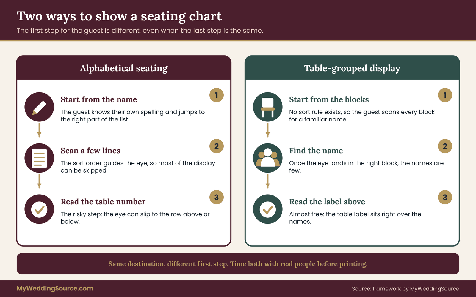
The two formats answer the same question in opposite directions. The question a guest brings to the entrance is simple: where do I sit? With alphabetical seating, the guest starts from a name, finds it in an alphabetical seating list, and reads off a table number or a seat assignment beside it. With a table-grouped display, the guest starts from a table, scans the groups of names until one contains theirs, and reads the table label above it.
Both formats usually end in the same place, a numbered or named table. What differs is the first step. Alphabetical seating makes the guest search by an ordering rule they already know, the alphabet. A table-grouped display makes the guest search by position, scanning an unordered collection of names. Cognitive effort is not the same in the two cases, and that difference is the whole subject of this article.
The alphabetical seating format in detail
In an alphabetical seating display, every invited guest appears once, in a single sorted sequence, usually by last name. Beside each name sits a table number. A guest who knows how to spell their own surname can jump to the right part of the list, check a few neighbors and be done.
The display can be a single large board, a set of panels split into letter ranges, a printed booklet or a screen. Panels split by letter range are common because one long column would be too tall to read. The split points matter, and a later section explains how to choose them.
The table-grouped format in detail
In a table-grouped display, each table gets a block. The block carries the table number or name and the names of everyone assigned to it, usually in a small column. The blocks are arranged on a board, on a wall or on separate easels. The guest has to find their own name somewhere in the blocks.
This format has one real advantage. A guest who finds their name has also seen who else sits there, which answers a question many guests silently ask: who am I sitting with? The format has one real cost. Finding a name means scanning many blocks with no sorting rule to guide the eye.
Names, tables and the step that follows
A display is only half of the guest’s route. After reading the table number, the guest has to walk to the table. If your tables are numbered in a confusing order across the room, even a perfect display creates a second delay. The wedding seating chart page covers how to build the assignments themselves, and the wayfinding side is covered in the wedding signage system guide. For now, keep the two jobs separate: one job is finding the name, the other is finding the table, and this article is about the first.
Keeping the jobs separate also protects you from a common mistake. When a seating display feels slow, couples often redesign the display. Sometimes the real fault is that table numbers on the floor are hard to read or arranged in a way that makes no sense to someone walking in from the door. A trial, described below, helps tell the two problems apart because it times each step on its own.
Why the display format changes how fast guests find a seat
Guests do not arrive one at a time with their full attention. They arrive in clusters, carrying a gift or a coat, often greeting someone as they walk. The display competes with all of that. A format that demands steady concentration loses to a format that rewards a quick glance.
What a name look-up asks of a guest
Finding a name takes three small acts. The guest decides where to look, finds the line that holds their name, and reads the table number without confusing it with a neighbor’s. Each act can go wrong, and the two formats go wrong in different ways.
In alphabetical seating, the first act is helped by the ordering: a guest named Okafor knows to look about two-thirds of the way through. The second act is helped by the narrow column of text, because the eye moves down a line instead of across a wall. The third act is the risky one. When the table number sits at the far right of a long row, the eye can drift to the wrong row, and guests report the table of the person above or below them. Good spacing and a visual guide such as alternating row shading reduce that error.
In a table-grouped display, the first act is hard because nothing says where to look. The guest scans from the top left like a page of text, and every block competes for attention. The second act is easier once the eye lands in the right block, because the names are few. The third act is nearly free, because the table label sits right above the names, which is the biggest advantage of the format.
The crowd effect
A display is a shared resource. While one guest reads, others wait or crane over a shoulder. The time one guest spends at the display therefore multiplies across everyone behind them. A format that is slow by a few seconds per guest becomes a visible queue once forty guests arrive in ten minutes.
This is why the question is better framed as flow than as taste. If the venue gives you a wide wall and the guests arrive over thirty minutes, almost any readable format works. If the display stands in a narrow corridor and guests arrive in a rush after the ceremony, the slowest format becomes a bottleneck. The reception guest flow guide explains how entry, seating and food service connect, and that context is worth reading before you decide where the display stands.
Who benefits from which format
Some guests find names quickly in any layout. Others struggle in one and not the other, and the pattern is worth knowing.
Older guests and guests with low vision often do better with fewer lines per panel and larger type, which favors a format with limited text in view at once. Guests who are not fluent in the language of the display do well with alphabetical seating when the alphabet matches their own, and badly when it does not. Guests whose names are spelled in more than one way, shortened, hyphenated or recorded under a household name, do better with a table-grouped display, because they can scan for a name that looks like theirs rather than guess how it was sorted.
None of this means one format is correct. It means the people you invited should influence the format. A guest list full of colleagues who share a language and a script is a different problem from a guest list built around a large extended family with many shared surnames.
What a faster display actually buys you
Speed is not valuable for its own sake. It buys three practical things. It shortens the line at the entrance, which keeps guests from drifting toward the bar or the exit while they wait. It lowers the number of people who ask the staff or the couple for help, which matters because the couple and the staff are the busiest people in the room at that moment. And it reduces wrong-table errors, which are the real cost of a bad display, because a guest who sits at the wrong table usually has to be moved, with an awkward conversation and a reshuffle of place cards.
Because errors cost more than seconds, the trial described later records both the time and the number of wrong answers. A format that is faster but produces more wrong tables is not a better format.
When the choice barely matters
Be honest about the cases where the decision does not matter much. A dinner for twenty people at two tables does not need a display at all, only a host who points. A wedding with assigned place cards on each table needs only a short list that tells guests which table to approach. In those cases, either format is fine, and the better use of your time is making sure the print is legible. The trial is worth its small effort when the guest count is large, when the arrival window is short or when a significant share of guests are likely to have trouble reading small print.
How alphabetical seating works on the day
Alphabetical seating has a reputation for being the simple option, and the reputation is half earned. The ordering rule is simple, but a surprising number of decisions hide behind it. Each one can add or remove seconds at the display.
Choosing the sort key
The first decision is what to sort by. Last name is the default, and for most guest lists it is the right one. Three situations push people toward a different key.
If a large share of your guests are better known by a first name, a first-name sort can feel friendlier, but it creates long runs of identical starting letters and makes the list harder to scan. If many guests are listed as households, such as a family sharing one surname, sorting by household name keeps the list short, but guests who do not share the household surname will not know where to look. If guests come from a naming tradition where the family name is written first, or where there is no fixed family name, sorting by the name the guest actually uses on the invitation is safer than imposing a Western last-name rule.
The practical rule is to sort by the name that appeared on the envelope or the response card. A guest tends to remember that spelling because they wrote it themselves. The RSVP etiquette guide explains how response cards capture names, which is the best source for your display list.
Handling households and plus-ones
Households are the most common source of alphabetical seating errors. A family of four who share a table could be listed once as “The Alvarez family” or as four separate lines. Four lines are easier for a guest to find if each person arrives separately. One line is easier for the display to read if every family member arrives together and knows the household name.
A reasonable middle path is to list every adult individually and to list young children only under a parent. Plus-ones deserve a line of their own, because a plus-one has no way of knowing which name the invitation used for them. If a plus-one’s name is not known when you print, a line such as “Guest of Jordan Lee” is clearer than leaving the guest unlisted, but it sorts under the host’s last name, so you must decide whether to alphabetize under the host or under the placeholder. Pick one rule and apply it everywhere. A rule used inconsistently is worse than either choice.
Setting the split points
If the list is too long for one board, you will divide it into panels. The split points should come from the data, not from an even division of the alphabet. A split between A through F and G through M assumes that names are spread evenly, which they are not. Real guest lists cluster. A wedding with a large family on one side may have twenty guests whose surnames begin with the same letter.
Start by counting the number of guests under each starting letter. Then group letters so each panel carries roughly the same number of lines. Label each panel with the first and last name it contains, not just a letter range. “Adams to Cho” is easier for a guest than “A to C,” because it tells the guest which panel their own surname falls in without requiring them to reason about the letters in between.
Line height, spacing and row guides
Because alphabetical seating is a long list, the problem becomes tracking across a row. Three things help. Set generous space between lines, so that adjacent rows do not blur. Put the table number close to the name, not at the far right edge of a wide panel. And use a subtle row guide, such as alternating light shading or a thin rule between rows, to keep the eye on one line.
Another trick is to bold the table number or set it in a color that contrasts with the name. A guest who has found their name needs to see the number immediately without re-reading. If the numbers use a different style from the names, the eye separates the two jobs naturally.
Ties, duplicates and look-alike names
Duplicate surnames are the quiet trouble of alphabetical seating. When a wedding has three guests named Kim or two named Garcia, the panel needs a clear way to separate them. Use the first name as the second sort key, and add an initial or a descriptor if two people share a full name. The descriptor should be something the guest would recognize and not find awkward, such as a middle initial or a short note. Avoid descriptors that comment on age, relationship or status.
Look-alike names cause a different problem. Smith and Smyth, or Lee and Leigh, sit near each other in the alphabetical seating list, and a guest scanning quickly may land on the wrong one. When you spot such pairs while proofing, check that their table numbers are visibly separate and, if possible, that they sit at different tables so that a confusion costs little.
A short script for the display checker
When you proof an alphabetical seating display, read it the way a guest would. Pick a name at random, say it aloud, find it, and say the table number. If you hesitate at any point, mark the spot. A few marks usually point to the same fixes: a split that falls in the middle of a crowded letter, a table number that sits too far from the name or a row that looks identical to the one above it.
Here is a workable sequence for a proofing pass.
- Print the display at final size on paper, even if the real one will be a board or a screen.
- Stand at the distance a guest will stand, which is usually several feet back, and read a sample of names.
- Check each panel’s first and last name against the list.
- Compare the table numbers against the final seating chart, line by line, not by memory.
- Ask someone who has not seen the list to find three names, and note where they hesitate.
The fifth step is the most revealing. It takes about two minutes and it shows problems the planners cannot see, because the planners have already memorized the list.
Late changes and the cost of reprinting
Seating changes at the last minute are normal. A guest cancels, a guest brings someone unexpected or a family conflict forces a move. With alphabetical seating, one change affects one line, but if a line is deleted from a printed board, the board shows a gap or an outdated name.
Plan for it. Some couples print the board a few days before the event and keep a small supply of stick-on corrections. Others use a format where each panel is an easily replaced sheet. A digital screen solves the problem, but it adds its own risks, such as power, glare and a dead display. The wedding signage guide treats readability and venue rules for signs more broadly, including who is allowed to place equipment, and it is worth reading before you commit to a screen.
What alphabetical seating does poorly
Be clear about the weaknesses so you can plan around them. Alphabetical seating hides table composition. A guest sees a number, not the people at the table, and that can feel impersonal at a wedding where seating is a social message. It performs poorly when many guests have names that do not sort cleanly under one convention. It is also harder to adapt on the spot, since every change must be traced to a specific line in a long list.
It performs best when the list is long, the audience is mixed and the venue gives you a clear wall or standing board. In those cases, a clean alphabetical seating display is hard to beat for sheer speed, as the trial in a later section helps you confirm.
How the format affects the couple
One more point is worth stating plainly. The display shapes how much of the first hour the couple spends answering questions. If guests cannot find their seats, they ask the nearest familiar face, which is usually one of the couple or a parent. A format that guests can read without help gives the couple back time for greeting guests, taking photos and eating. That is a practical gain, and it is one reason to treat the display as part of the day’s logistics instead of a decoration.
A note on printing a booklet instead of a board
Some venues have no good wall, and some couples prefer a printed booklet or a set of cards handed out at the door. Alphabetical seating suits this approach, since an alphabetical seating list is easy to flip through. The cost is a handling step: someone has to hand the booklet over, and guests carry it into the room. A booklet also gives guests more time to read without blocking others, which can improve flow.
A booklet works well when the list is long, but it introduces a risk. If one printed copy is wrong, every copy is wrong. Proof the master list twice, and print a small extra batch so that a spoiled copy is not a crisis.
How table-grouped displays work, and where they win over alphabetical seating
A table-grouped display looks friendlier and often feels more personal than alphabetical seating. It also hides a cost that is easy to miss until you test it: the guest has to search without a rule. This section looks at how to build the format well, and at the situations where it clearly beats an alphabetical seating list.
The anatomy of a table block
Each block has three parts: a label, a list and a boundary. The label is the table number or name, set larger than the names so a guest can spot it from a distance. The list is the guests assigned to the table, in a consistent order. The boundary is the visual edge that separates one block from the next, such as a border, a color band or empty space.
The list order inside a block deserves a decision. Sorting names alphabetically within each table gives the guest a small version of the alphabetical benefit, and it is cheap. Sorting by relationship, with couples and families together, reads more naturally but is harder to scan. For most displays, alphabetical order within each block is the safer choice, because a guest scanning a block of eight names can find theirs quickly if the names are in a predictable order.
Arranging the blocks
The blocks need an arrangement. Three layouts are common. A grid by table number lets guests who know the numbering find their neighborhood quickly. A layout that mirrors the room, with blocks placed where the tables actually stand, doubles as a map. A free arrangement, grouped by style rather than number, looks attractive but forces more searching.
If you choose the grid, number from top left to bottom right in the same direction as reading order, and keep the numbers in sequence. If you choose the room map, draw it from the entrance’s point of view, so that the guest standing at the door sees the room as they will see it when they walk in. A map drawn from the opposite wall confuses people, because left and right swap.
The scanning problem
Without a sorting rule, a guest uses visual search. The eye jumps from block to block, reading the first few letters of each name and rejecting it quickly. This works well when the number of names in view is small. It breaks down when the display carries a large amount of text, because every extra block is another set of names to reject.
A practical ceiling is useful here, though you should treat any number as a starting point to test, not as a fixed rule. A display with a dozen blocks of a few names each is manageable. A display with sixty blocks of ten names is a wall of text, and at that scale a table-grouped format is usually slower than alphabetical seating, because the alphabetical seating list lets the guest skip nearly all of it.
Where table groups clearly win
Table groups are better in several situations, and it helps to name them.
When the guest list is small, say under about eighty guests across a handful of tables, the whole display fits in a single glance. A guest can take in every block at once and find their own name almost immediately, with the bonus of seeing their tablemates.
When the seating is the social statement, as in a family dinner where who sits beside whom is meaningful, the grouped display lets guests see the arrangement. This can matter at a wedding where families have been carefully mixed or where a conversation is part of the design.
When many guests have names that sort unpredictably, a grouped display lets them recognize their name by shape instead of by position in an ordering. Guests who use a nickname, a married name or a shortened form find the right block by scanning for anything that looks like them.
When the display must double as a map, a layout that mirrors the room saves you a second sign. The guest learns the name, the table and the table’s location in a single step.
Where table groups lose
They lose when the list is long, when the arrival window is short and when the display has to be readable from several feet away. They also lose when text size shrinks to fit many names onto one board, because small type at a distance is the most common reason a guest cannot read a sign.
They are also harder to proof. In an alphabetical seating list, a missing name stands out because the alphabet has a gap. In a table-grouped display, a missing guest is easy to overlook, since nothing in the layout reveals the absence. The proofing step needs a separate cross-check: count the names on the display and compare the total with the guest count on your final list.
Using color and symbols without creating new confusion
Color can help the eye separate blocks. A different color per table seems helpful, but it has limits. Guests with color-vision differences may not tell certain colors apart, and a color-based system with many hues forces everyone to learn a key. A better pattern is to use one or two accent colors, repeated, and to rely on the table number as the main identifier.
Symbols or names for tables, such as flowers or places that matter to the couple, are a charming alternative to numbers. They also add a step, since the guest must map the name to a position in the room. If you use named tables, make sure the names appear both on the display and on the table in the same style, and consider keeping numbers in small type as a backup for staff.
Combining groups with a short alphabetical seating index
One practical hybrid is to keep the table-grouped display and add a compact alphabetical index beside it, listing every guest once with only a table number. A guest who spots their name in a block is done in seconds. A guest who cannot spot it can fall back on the index. The cost is space and proofing: two lists to keep consistent.
If you use the hybrid, generate both from the same source list, never by hand, and compare the totals. Errors creep in when two lists are edited separately.
Table groups and guests who arrive in parties
Many guests arrive with their group. When a family of six reaches a table-grouped display, one member finds the block, and the whole party follows. That is an advantage over alphabetical seating, where each family member may look up their own line and, if the household has several surnames, may look in different places. In a group-arrival crowd, a table-grouped display can feel faster even when a single guest’s look-up time is longer, because the work is shared.
This is exactly the kind of effect a trial can reveal, which is why the trial described next includes a party test as well as single-guest look-ups. A format that is slower for an individual but faster for a party may still suit your guests better.
Accessibility notes for table blocks
Table blocks tend to have smaller type than a single large list, since many names compete for space. For guests with low vision, that is a serious issue. Ask whether the smallest names are legible from the distance where guests will stand. The W3C Web Accessibility Initiative publishes guidance on text and contrast for digital content, and its principles about contrast and size carry over to printed signs, though this article does not cover legal requirements. Check venue and local rules for anything more specific.
If your display carries a lot of text and cannot be enlarged, add a second option for guests who need it: a large-print list at the welcome desk, or a person who can read a guest’s table number aloud. A quiet, respectful alternative serves guests better than a poster that only some can read.
When the display is also the place card
Some couples skip a separate display by giving each guest an escort card that carries the table number. The cards are arranged on a table, often alphabetically, and each guest picks up their card. This is alphabetical seating in a different form, with the list replaced by physical cards. It spreads the look-up across a long table and reduces crowding, though it adds work for whoever prepares and sets out the cards.
Escort cards are worth considering when the entrance is cramped, because they remove the need for guests to cluster around a single board. They add a risk: cards that are misplaced or taken by the wrong guest. Keep a master list at hand to resolve questions, and prepare a few blank cards for last-minute changes.
Running a look-up trial for alphabetical seating and table groups
The core of this article is a small test you can run before you print. Its purpose is to replace opinions with a measurement. You will build a rough version of each display, give each to a group of volunteers and record how long it takes them to find a name and report a table, and how often they report the wrong one. We will call it the look-up trial.
What the trial measures
The trial measures two things for each format: time and accuracy. Time is how many seconds pass between the moment a volunteer is shown a name and the moment they say a table number. Accuracy is whether the table number they say matches the real one. Both matter. A fast but wrong answer sends a guest to the wrong chair, which costs more than a slow, correct one.
The trial does not measure beauty, and it does not try to predict exact seconds at your wedding. Your guests will be distracted, dressed up and holding drinks. What the trial measures reliably is the difference between the two formats under the same conditions, and that difference is what you need.
The materials
You need a printed or projected mock-up of each format at the real size you intend to use, or as close as you can manage. Size matters because a format that looks fine on a laptop screen can be unreadable at the distance of a real display. If the final board will be large, tape several sheets together or print at a copy shop.
You also need a list of test names, a timer on a phone, a scoring sheet and a few helpers. The test names should come from your real guest list, since real names, with their quirks, are what the display must handle. Choose a spread: some names early in the alphabet, some late, some from large families, some with hyphens or unusual spellings, and some for guests whose households share a surname.
The volunteers
Ten volunteers is a workable size for a quick trial. More is better, fewer is risky, because one slow person can distort a small sample. Choose people who resemble your guests rather than people who know the seating. A cousin who has never seen the list is more useful than the maid of honor who helped build it.
Try to include a range. Ask at least one older relative, one person who wears glasses and does not have them on, and one person who is not a native reader of the language on the display. These volunteers expose problems that quick readers hide.
Tell volunteers it is a test of the display, not a test of them. People who feel judged hurry, and hurrying changes the result.
The procedure
Here is a procedure that takes about forty minutes for ten volunteers.
- Prepare two short lists of five test names each, called list A and list B, with similar mixes of early, late and tricky names.
- Split volunteers into two groups. Group one uses the alphabetical seating display for list A and the table-grouped display for list B. Group two does the reverse. This balance prevents the order of testing from favoring one format.
- Stand the volunteer at the distance a real guest will stand. Do not let them move closer than that.
- Say a name aloud, start the timer and let the volunteer search.
- Stop the timer when the volunteer says a table number. Write down the time and the number they said.
- Compare the number they said with the true number. Mark it correct or wrong.
- Repeat for the remaining names and then for the other format.
Record every result, including the strange ones. If a volunteer walks forward to read the display, note that too, because it means the type was too small at the planned distance.
The party test
After the single look-ups, add a short party test. Group three volunteers as a family and ask them to find the table for all three as a unit, using each format. Time how long until the first person says the table number and how long until all three agree. This tests the benefit of shared work that table groups can have, and it reveals whether alphabetical seating confuses a family with different surnames. It also shows whether alphabetical seating slows a group that arrives together.
Scoring the results
For each format, calculate the average time per look-up and the number of wrong answers, and look at the slowest times as well as the average. The slowest times matter because a queue is formed by the slow cases, not the average ones. A format with a fast average and a few very slow outliers can create more of a bottleneck than a format with a slightly slower average and no outliers.
Then apply a simple decision rule. Compare the formats in this order: wrong answers, slowest times, average time and, last, how the volunteers felt. If one format produces clearly more wrong answers, it loses. If wrong answers are similar, the format with the shorter slowest times wins. If both are similar, choose the one volunteers preferred or the one that is easier to update.

What counts as clearly different
With ten volunteers, small differences are noise. A difference of a couple of seconds on average is unlikely to matter at a real event. A difference of many seconds, or a clear gap in wrong answers, is worth acting on. You do not need statistics to see this. If one format has a few wrong answers and the other has none, the result is meaningful even in a small sample. If the results are mixed, treat the formats as roughly equal and decide on other grounds, such as space, printing cost and the feel you want.
Be honest about the limits. A trial with friends and relatives cannot capture everything. People who know you may try harder, and a quiet room is gentler than a crowded entrance. To make the test more realistic, add distraction: ask a helper to talk to the volunteer while they search, or stand two other volunteers behind them to simulate a line. Expect times to rise for both formats, and watch whether one format suffers more.
Recording the stress version
A short stress round is worth the extra ten minutes. Place three people behind the volunteer, ask the volunteer to hold a coat or a cup, and say the name. The volunteer will hurry, the people behind will lean in and the format will be tested under conditions closer to the real arrival. A display that survives the stress version holds up on the day.
If the stress round reveals problems that the calm round hid, such as guests losing their place after a glance away, the fix is often small: larger row spacing, bolder table numbers or a thin guide line. These changes cost little and help in both formats.
Choosing test names that expose weaknesses
The names you test shape what you learn. If every test name is easy, the trial will make both formats look good. Pick names that stress each format in its weak place.
For alphabetical seating, test a name in the middle of a long run under one letter, a name with a hyphen or a prefix such as “de” or “Mc,” a name that appears twice with different first names and a name that sits at a panel boundary. For table groups, test a guest at the bottom of a large block, a guest whose name is short and easily overlooked, a guest at a table far from the entrance and a guest whose table label might be confused with a neighbor.
Include one or two names for guests who are not on the list. This sounds odd, but it measures how long a guest takes to realize they are missing, and how clearly the display signals that they should go to a person at the welcome desk. The ability to fail gracefully is part of a display’s design.
Writing down the lessons
After the trial, spend ten minutes writing three notes: what slowed people down, what confused them and what they liked. Those notes are as valuable as the timings, because they point to specific fixes. Typical findings include type that is too small, table numbers too far from names and a split in the alphabet that falls in the middle of a crowded letter.
Keep the scoring sheet. If you later change the display, repeat a shortened version of the trial with the new mock-up and compare it with your notes. The point is not to run an experiment for its own sake. It is to avoid printing a large, expensive board and discovering at the venue that guests cannot read it.
Worked example: alphabetical seating versus table groups for one invented wedding
Numbers help, so here is a fully invented example. The couple, Dana and Marcus, do not exist, and the figures below are made up to show how to read a trial, not to describe how long real guests take. Treat them as a worked problem.
The situation
Dana and Marcus are planning a reception for 140 guests at sixteen tables. About forty guests come from one large extended family, and several of those share a surname. A handful of colleagues have hyphenated names. The entrance is a narrow hallway about eight feet wide, and guests will arrive over roughly twenty-five minutes after the ceremony. The venue has a wall that can hold a board about six feet wide.
They build two mock-ups at final size. The first is alphabetical seating split across three panels. The second is a table-grouped display with sixteen blocks in a four by four grid. Then they recruit ten volunteers, including two older relatives and one friend who reads small print poorly without glasses.
The invented results
Each volunteer looks up five names on each format. Dana records the time and the table number said. In this made-up trial, the alphabetical seating display produces fast, steady times for most names. The slowest look-ups there involve two names in the crowded family run, where volunteers hesitate between rows. One volunteer reads the table number from the row above and gives a wrong answer.
The table-grouped display produces a wider spread. Some volunteers find their block at once, because the sixteen blocks fit in one glance. Others scan the grid twice. The two older relatives are slowest here, because the type had to shrink to fit ten or so names per block. No one gives a wrong table number, since the label sits directly above the names.
The party test shows a different pattern. A family of three finds their table faster as a unit on the table-grouped display, because one person finds the block and the others follow. On the alphabetical seating display, two of the three look up their own lines, and one family member has a different surname and wastes time hunting in a different panel.

Reading the invented results
Apply the decision rule from the previous section. Start with wrong answers. The alphabetical seating display produced one wrong answer, caused by a row-tracking error in the crowded family run. The table-grouped display produced none. That favors table groups, but one wrong answer in fifty look-ups is a small signal and the cause is fixable.
Next, look at the slowest times. The slowest alphabetical seating look-ups were slower than the typical ones, but a fix is available: wider row spacing and a visible guide. The slowest table-group look-ups belonged to the older volunteers and traced to small type. That is a harder problem to fix, because larger type means fewer names per block and a bigger board than the wall allows.
Then compare averages. In this invented trial they are close. Finally, consider the party test, where table groups did better, and the real venue, where a narrow hallway makes a long queue worse than a single slow look-up.
The decision
Dana and Marcus choose a hybrid. They keep alphabetical seating as the main display, because it holds up better with large type at the distance the wall allows, and they fix the row tracking by increasing the spacing and adding alternating row shading. They add a small table-grouped map near the dining room door, so guests who want to see tablemates can look once they have a number. The map has fewer names per block, since it only shows household names, and it is read after entering the room, away from the hallway queue.
They also decide to place the alphabetical seating panels on two easels at different points in the hallway, so that guests split across them instead of queuing at one. That choice follows from the stress round, which showed that people behind a reader slowed everyone down.
What the example teaches
Three lessons carry over to any wedding. First, the formats are not exclusive. A display near the entrance and a second display deeper in the room can do different jobs. Second, a single wrong answer is more useful than an average time, because it points to a concrete flaw. Third, the setting matters as much as the format, so alphabetical seating that wins in one hallway can lose in another: an eight-foot hallway, a six-foot wall and a twenty-five-minute arrival window shaped the answer more than any preference for one look.
Decision rules for choosing between alphabetical seating and table groups
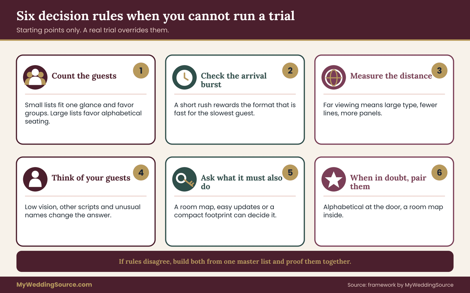
A trial is the strongest evidence, but you may not have time to run one. The following rules of thumb help you choose when a trial is impossible. They are starting points, and a trial should override them whenever you can run one.
Rule one: count the guests
Count the guests who need a seat assignment. Below roughly sixty, a table-grouped display usually works well because the whole display is readable at once. Between roughly sixty and a hundred and twenty, either format can work, and the setting decides. Above that, alphabetical seating tends to win, because an alphabetical seating list scales better than a grid of blocks. These ranges are judgment calls, not laws, and a good trial will tell you if your event is an exception.
Rule two: look at the arrival pattern
If guests arrive in a steady trickle over half an hour, a slower display does little harm. If they arrive in a short burst, the display needs to be fast for the slowest guest, not the average one. In a burst, prefer the format that did better in the stress round, which is most often alphabetical seating with large type and wide spacing.
Rule three: check the viewing distance
Measure the distance from where guests will stand to the display. The farther the distance, the larger the type must be, and the fewer lines a panel can carry. Large type suits an alphabetical seating list in several panels better than a dense grid of blocks. If your display must be read from across a lobby, favor a format with large, spare text.
Rule four: think about who your guests are
If many guests are older, have low vision or read the display language as a second language, favor the format that puts the fewest characters in view at once, then test it with exactly those guests. If many guests have names that sort poorly, such as those with particles, compound surnames or different naming conventions, lean toward table groups or a hybrid.
Rule five: ask what the display must also do
If the display needs to double as a map of the room, table groups arranged like the room are the obvious fit. If it must be updated often, choose a format that lets you replace one panel or one line. If the display must be compact, because the entrance is small, alphabetical seating in a booklet or on escort cards uses less wall.
Rule six: when in doubt, pair alphabetical seating with a map
When the rules disagree, a hybrid is usually safe. Use alphabetical seating for the main entrance display and offer a table-grouped view somewhere guests can look after they have found their table. The hybrid costs extra printing and extra proofing, but it handles both kinds of guests. Keep both generated from one list.
A quick scoring approach for when time is short
If you cannot run a full trial, run a ten-minute version. Ask three people to find five names each on each mock-up, and write down hesitations instead of seconds. A hesitation is any moment when the person stops, looks back or asks where to look. Count them. The format with fewer hesitations is probably the better choice, and the notes about where the hesitations happened will tell you what to fix.
Even this short version beats choosing on appearance alone. A format can look elegant on the table at your desk and fail in a hallway. Three people and ten minutes are enough to catch the worst problems.
When the venue decides for you
Sometimes the venue limits your choices. A venue may ban wall-mounted signs, restrict the size of freestanding signs, require that exits and aisles stay clear or insist that all easels stay inside a certain area. A venue with a tight coat check and entrance may prefer escort cards to a large board. Ask early, in writing, what the venue permits, and design inside those limits. The wedding vendor timeline page is a useful place to find when to bring up display needs with the venue and the printer.
If the venue asks you to keep the entrance clear, a display inside the room, at the end of a short line, may be your best option, even if it is not your first choice for looks. A display no one can reach is not a display.
Making alphabetical seating readable: type, contrast, height and placement
Whichever format wins your trial, it fails if guests cannot read it, and alphabetical seating is no exception. Readability is a separate job from format choice, and several of its rules are the same for both. The details below apply directly to alphabetical seating displays and carry over to table blocks with small changes.
Type size and viewing distance
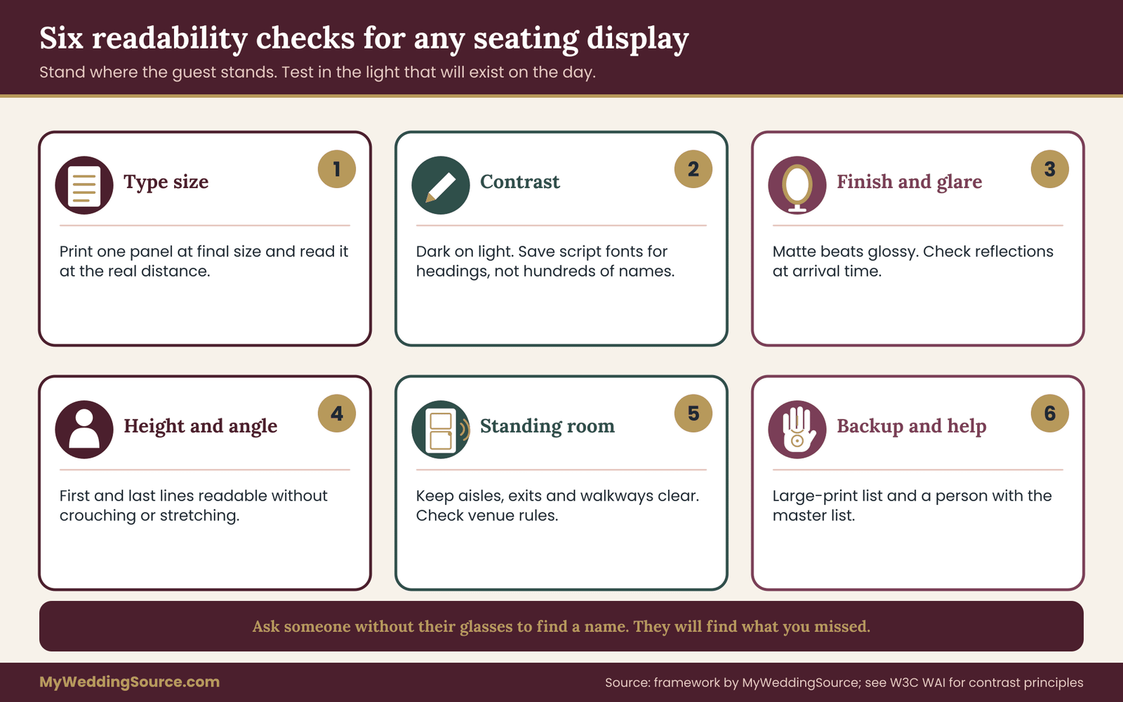
A common starting point for signs is that type should grow with the distance from which it is read, which is why a board read from several feet away needs much larger letters than a page held in the hand. Rather than rely on a formula from memory, test it: print one panel at final size, stand where a guest will stand and read it. If you must squint, the type is too small. If a volunteer from your trial walked forward to read, the type is too small.
Large type has a cost in panel count. A longer alphabetical seating list in large type needs more panels, and more panels need more wall or more easels. That is a design trade-off you can see in the mock-up. A common outcome is that alphabetical seating in three or four tall panels, each with a narrow list, reads better than one wide board with small text.
Contrast and finish
High contrast between text and background matters more than the elegance of the typeface. Dark text on a light, plain background is easiest to read. Pale gray on white, gold on cream and script fonts at small sizes are the usual culprits when guests cannot read a sign. Decorative script is fine for a heading and a poor choice for hundreds of names.
Finish matters too. Glossy boards and acrylic can create reflections from windows and lighting, making names disappear at certain angles. A matte finish avoids most of the problem. If you are considering a reflective or mirrored material, test it in the venue’s lighting at the time of day the guests will arrive. The guide to signs that stay readable and permitted at the venue covers readability, placement, proofing and venue permissions together, and it is worth reading before you order a board.
Height and angle
Place the display so that the first line is easy to read without stooping and the last line is easy to read without stretching. A list that starts too low forces guests to crouch, and a list that ends too high forces them to look up, which slows reading and is harder for guests who use wheelchairs or have limited neck movement. If a panel is tall, consider splitting it so the lines fall within a comfortable band of eye level.
Tilt matters. A flat board on a tall easel often catches glare from overhead lights. A slight backward tilt, or a position away from direct light, can solve it. Check the angle from where guests will stand, not from where you stand while setting it up.
Lighting
A beautiful display in a dim entrance is a bad display. Ask the venue about lighting in the entrance at the time of arrival, and walk through at the same hour if you can. If the area is dim, ask whether a light can be added, or place the display where light falls on it. Do not rely on a phone flashlight as a plan.
Lighting also affects whether a screen is a good idea. Screens can be crisp in a dark room and washed out in a bright lobby. If you want a screen, test it where it will stand.
Clear paths and crowd space
A display needs standing room in front of it. If it sits in a corridor, a queue will block the path to the ceremony space or to the restroom. Guests should be able to read the display without stepping into a walkway used by staff, wheelchairs or strollers. Many venues have rules about aisles and exits, so ask what they require, and never place a board or easel where it narrows an exit route.
For guests using mobility devices, make sure the display can be approached and read from a seated position, or provide a second copy at a lower height, or a person who can look up a name. This is a courtesy and, depending on your location and venue, may be a requirement, so check with the venue.
Accessible alternatives that cost little
A few inexpensive additions help many guests. A large-print version of the alphabetical seating list at the welcome table helps guests with low vision and anyone who prefers a close look. A person standing near the display, who can look up a name from a master list, helps guests who struggle with any format. A short, clear instruction near the display, such as “Find your name, then your table number,” helps guests who are unsure what the board is for.
These additions also catch the unexpected cases: a guest whose name was misspelled, a guest who was added late or a guest who is not on the list. A person with a master list turns these cases into a thirty-second conversation instead of a scene.
Proofing for readability
Proofing for readability is a separate pass from proofing for accuracy. For accuracy, you compare the list against the final seating chart. For readability, you stand back and test the display as a guest would.
Walk through a short routine. Stand at the viewing distance and read the first and last lines. Read a line in the middle. Check that the table numbers can be read without effort. Look at the display at an angle, because guests will not always face it squarely. Look at it in the lighting that will exist at the event. Ask someone who wears glasses to take theirs off and see whether they can find their name, or ask them to find a name while standing a bit farther back. The results will tell you more than your own eyes can.
Print production questions
If you are ordering a printed board, ask the printer specific questions. What is the maximum size and what is the material? Can they send a proof at final size, or at least a proof of one panel? How long does a reprint take if a name is wrong? What happens if you need to change one line after printing? A printer who can supply a corrected sheet in a few days offers more safety than one who must reprint the whole board.
Order from a printer after the final headcount is settled, but not so late that you cannot fix a mistake. The invitation printing guide covers proofing and production handoffs that apply to signage as well, though this article keeps the focus on the display itself. Build in time between the final proof and the date you need the board in hand.
Digital displays
A screen can make alphabetical seating dynamic: guests type a name and see a table. That can be fast and flexible, and it handles late changes well. It also introduces dependency on power, a network or a device, and on a person who can restart it when it freezes. A touchscreen in a busy entrance will be touched by many hands and may stop working at the worst moment.
If you use a screen, keep a printed backup of the full list, and make sure the screen is a supplement to the printed list, not a replacement. A power failure should not leave guests with nothing. Also ask the venue whether it permits freestanding equipment and who is responsible for it.
Maintaining the master list
All the displays, large-print copies and booklets must come from the same master list. Keep one file as the source of truth, label it with a date and version, and generate every display from it. When a change comes in, update the master first, then regenerate each display. Editing a printed copy by hand while leaving the master untouched is how the booklet and the board come to disagree.
A simple habit helps: write the date and time of the last update in small type on the back of every printed copy, and discard older copies. On the day, only one version should be in circulation.
A hybrid layout: alphabetical seating plus a room map
If your trial or your rules point to both formats, a hybrid is the answer, and the hybrid should be designed on purpose, not as an afterthought. Here is how to structure it.
The two jobs
Give each display one job. The alphabetical seating display answers the question “which table am I at?” The room map answers the question “where is my table, and who is near it?” Keep each display simple and avoid mixing the jobs. If the alphabetical seating display shows tablemates and the map shows an alphabetical seating list, you have built two confusing boards instead of two clear ones.
Where each one stands
Place the alphabetical seating display where the crowd forms, near the entrance, and the room map where guests pause after they know their number, such as just inside the dining room. This separates the first look-up from the second and spreads the crowd. If both stand in the same spot, the hybrid defeats its own purpose, because guests will linger at both.
The room map
The map shows the room from the entrance’s point of view, with table numbers large and names of tables or households small. The map does not need every guest’s name. It only needs enough for a guest to recognize the neighborhood of their table and spot the tablemates they care about. If you choose to show names, show household names only, and keep the type large enough to read from a few feet.
The wedding seating chart guide covers how to arrange tables and assignments, and the map should reflect the final arrangement exactly. Check the map against the venue’s floor plan, because a map drawn before the venue moved a table is a map that sends guests to the wrong side of the room.
Keeping the hybrid consistent
Both displays must use identical table numbers or names, identical spellings and the same guest list. Build the room map and the alphabetical seating list from one spreadsheet. Proof both against it. When a change arrives, update the spreadsheet and regenerate both.

Edge cases where alphabetical seating needs a second look
Most weddings fit one of the patterns above, and alphabetical seating suits many of them. A few do not, and the format decision should adapt to them instead of forcing them into a mold.
Names that do not sort the way you expect
Alphabetical seating assumes a family name that guests know how to spell and place. Several naming patterns break that assumption. Compound surnames may be filed under the first or the last part. Names with particles such as “van,” “de” or “al” may sort under the particle or under the main name, depending on convention. Some guests have a single name, some use a different name professionally than socially and some have changed their name since the invitation went out.
The safest approach is to sort by the name written on the response card, and to add a cross-reference line for guests whose names may be sought under another spelling. A cross-reference reads like “Van Dijk, see Dijk.” It adds one line and saves a guest a minute of confusion. Ask a few guests with these naming patterns how they would look for themselves, and you will usually learn the right sort key in a short conversation.
Mixed scripts and languages
If the guest list includes names written in more than one script, a single alphabetical order may not exist. Options are to print each name in the script the guest uses on a separate panel, to transliterate and show both forms or to switch to a table-grouped display, where each guest finds their own script by shape. If guests read different scripts, give a helper at the display who can read both, and keep the master list in a form that lets you reprint in either.
This is a case where a trial matters. Include volunteers who read each script, and measure the look-up for them separately. A format that is fast for most guests and slow for one group may be unacceptable if that group is a large part of the family.
Children, infants and non-guests at tables
Children seated at their own tables, or at the parents’ table, need a decision. Listing a child by first name only, under the parent’s name, keeps the list shorter and avoids a line for every young guest. If a child has a separate table, list the adults at the parents’ table and the children at the children’s table, and make the link clear. For infants in carriers, a seat is usually not needed, but a space may be. The guest care guide discusses families with babies and children, and the display list should match it.
Vendors and staff
Vendors such as the photographer and the band may need meals and a place to sit. Decide whether they appear on the public display. A separate list held by the catering captain keeps the public display shorter and avoids confusing guests with names they do not know. If vendors appear on the display, list them under a clearly marked table, so guests do not wonder who they are.
Last-minute additions
A guest arrives with a plus-one who was never on the list, or a guest who did not respond appears on the day. A display cannot show a name that was never printed. Keep a small stack of blank cards, a marker and a master list at the welcome desk, and give a person the authority to add a seat if a space exists. A graceful way to handle it is more important than a perfect display.
Cancellations and no-shows
If a guest cancels, their line remains on a printed display unless corrected. A removed line in an alphabetical seating list is hard to hide, but a leftover name harms no one beyond a small puzzle for a guest who wonders where that person is. For a table-grouped display, a stale name can mislead guests into thinking someone is coming. Correct the master and any copy you can reprint cheaply, and ignore small leftovers on a display that is too costly to redo.
Rooms with unusual layouts
Long banquet tables, round tables of different sizes, a head table and a cocktail section with high tops all complicate the display. If the table numbering follows an odd path, label the room map clearly, and consider placing table numbers where guests can read them from the door. If the room has two or more levels, or two separate rooms, the display must say which one each table is in. A guest who finds the right number on the wrong floor loses minutes, and a good display makes the location explicit.
When alphabetical seating is the wrong choice
Some couples are drawn to alphabetical seating because it looks organized, and then discover that it does not suit their event. The signs are usually visible early.
It is the wrong choice when the guest list is small enough that a single glance covers everyone, and the sorting adds nothing. It is the wrong choice when seating is a conversation piece, and guests want to see who they are sitting beside. It is the wrong choice when many guests use names that do not follow a common ordering rule, or when guests read several scripts. And it is the wrong choice when the entrance cannot hold a tall, narrow panel, because a cramped arrangement forces small type.
Table groups can be the wrong choice too, and the symmetric list is worth stating: a large guest count, a short arrival window, a long viewing distance or many guests with low vision. Neither format is correct in general. The trial exists because the right answer depends on your guests, your entrance and your room.
Questions to ask yourself before you commit to alphabetical seating
Spend a few minutes with these questions before you order anything.
- How many guests need a seat assignment, and how many tables is that?
- How many guests will arrive in the first fifteen minutes?
- How far back will guests stand, and what is the lighting like at that spot?
- Who among my guests is likely to struggle with small type or with the sort order?
- What does the venue allow for freestanding signs, easels and screens?
- Who will hold the master list on the day, and who can change it?
- Do I want the display to show tablemates, or only a number?
If you cannot answer one of these, that is the thing to find out first.
Day-of setup: placing the display and the backup
The best display fails if it is set up in the wrong place or if no one owns it. Assign one person to set up, check and stay near the display during arrival.
The setup routine
Arrive early enough to set up before guests, and give the display a final read-through at viewing distance. Check that the easels are stable, that panels are in the right order and that no panel hides behind a door or a plant. Place the large-print copy and the master list at the welcome table. Put a small pen and card stock there for last-minute names. Test the lighting.

The owner of the display
Name a person, such as a trusted friend or a planner, as the owner of the display. This person knows the master list, can answer a guest’s question, can fix a name that is wrong and can tell the caterer about any change. Do not make the owner one of the couple, who will be busy. The guest flow guide discusses roles at the entrance, and this person fits into that plan.
Handling a queue
If a queue forms, the owner can ask a guest to step aside to look up a name for a group, or can direct people toward a second panel. A queue at the first minute is a signal that one display is not enough, and the response is to open a second position, not to hurry guests. If the queue persists, the owner can read tables aloud to guests who have trouble.
After the event
Keep your scoring sheet and your notes about how alphabetical seating performed. If you ever help a friend plan a wedding, or plan another large event, the notes will save time. A short record of what worked is the most reusable part of the process.
Your next steps
Start with the number of guests and the shape of your entrance, since both limit your options for alphabetical seating or any other format. Then build two rough mock-ups at final size, one for alphabetical seating and one for table groups, from the same master list. Recruit ten volunteers who resemble your guests, run the trial, and apply the decision order: wrong answers first, slowest times second, averages third.
When the trial gives a clear winner, proof the display for accuracy and for readability, assign an owner and keep a large-print copy and a master list at the welcome table. When the results are close, choose the format that is easier to update, or build the hybrid. Before you print, confirm what the venue permits and allow time for a reprint.
FAQ
Is alphabetical seating better than a table layout for a large wedding?
For large guest counts, an alphabetical seating list usually scales better than a grid of table blocks, since guests can skip most of the text. A look-up trial will confirm it for your room. Distance, type size and arrival timing can change the result, so run a short test with a few volunteers before you print the final display.
How many volunteers do we need for a look-up trial?
About ten is a practical size. More gives a steadier picture, and fewer lets one slow volunteer skew the result. Include an older relative, someone with low vision and someone who reads the display language as a second language, because these guests reveal weak points that fast readers miss.
Should we sort by first name or last name?
Sort by the name that appeared on the response card, which is usually the last name. That spelling is the one a guest remembers writing. If your list includes compound surnames or names with particles, add cross-reference lines so guests can find themselves under more than one spelling.
Can we use both formats at once?
Yes. A common hybrid puts the alphabetical seating list near the entrance and a room map with table groups just inside the dining room. Give each display one job, and generate both from one master list so that spellings and table numbers always match.
What type size should the display use?
Larger than you expect. The right size depends on how far guests stand, so print one panel at final size, stand at the real distance and read it. If you squint, or a volunteer steps forward, enlarge the type or add panels. Check the venue lighting too.
How do we handle guests who are not on the display?
Keep a master list, blank cards and a marker at the welcome table, and name one person who can look up a name and add a seat if there is room. A calm, quick answer matters more than a perfect printed list, because last-minute changes happen at nearly every event.
Do screens work better than printed boards?
Screens handle late changes well, but they depend on power, glare control and someone who can restart them. A printed backup of the full list is wise. Ask the venue whether it permits freestanding equipment before you plan around a screen.
Does the venue have a say in where the display goes?
Often yes. Venues may limit wall mounting, easels, screens and anything that narrows an aisle or exit. Ask early and in writing what is allowed, and check local rules for placement. Fire and accessibility requirements vary by location, so confirm them with the venue.
Sources
- Web Accessibility Initiative, World Wide Web Consortium
- Contrast and color guidance, World Wide Web Consortium
- ADA.gov, U.S. Department of Justice Civil Rights Division
- ADA Standards for Accessible Design, U.S. Department of Justice
- U.S. Access Board, accessibility guidelines and standards
- Section 508, Accessibility resources, GSA
- National Institute on Aging, health and aging information
- National Eye Institute, vision health information
- National Fire Protection Association, codes and standards