

Bilingual wedding invitation design is less a graphic design problem than an editing problem: two texts, two kinds of reader and one small piece of paper that has to treat both fairly. This guide gives you a one-page style sheet, a way to choose among six layouts, a fair test for reading order and a verification chain that catches translation mistakes before the printer does.
Before you open any design file, write a two-language style sheet: which text is the source, how every block of text is treated, how each name is spelled in each script, and how dates and times are written. Pick the layout for your bilingual wedding invitation design from your readers, not from a mood board. Decide reading order with a short fairness test. Then send the translation through a chain of separate people (translator, independent reader, typeset check, host sign-off) and approve the printer’s proof only after someone who reads each language has read the actual file.
Most couples who attempt bilingual wedding invitation design start with a good instinct and a weak process. The instinct is generous: they want a grandmother in one country and a college roommate in another to open the same envelope and feel invited. The process is usually a free online translation tool, a template with two text boxes and a deadline. Then a printed proof arrives with a missing accent, a date that reads as a different day in the second language, or a name that an aunt would never spell that way.
Bilingual wedding invitation design rewards a different order of work. Language decisions come first, layout decisions second and visual style last. When couples reverse that order, they end up forcing translated sentences into boxes that were sized for the shorter language, and then trimming the translation until it fits. That is how a polite invitation turns into a clipped one, or how a line that said “please reply by” quietly becomes a line that says nothing about a deadline.
This guide covers the parts of bilingual wedding invitation design that are specific to two-language stationery: how to set up the editorial rules, how to choose a layout, how to settle which language comes first, how to handle different scripts, how to check a translation properly, and how to hand a clean file to a printer.
It does not repeat the general mechanics of proofing, paper and quantities, which the wedding invitation printing guide already covers in detail. Think of this article as the bilingual wedding invitation design layer that you add on top of it when a second language is involved. For host lines, wording conventions and who should be named, wedding invitation etiquette is the place to start.
A scope note. This guide is general information, not legal, tax or financial advice, and it cannot replace a professional translator, your printer’s own requirements or the current postal rules, which you should confirm with the people who issue them.
What bilingual wedding invitation design actually involves
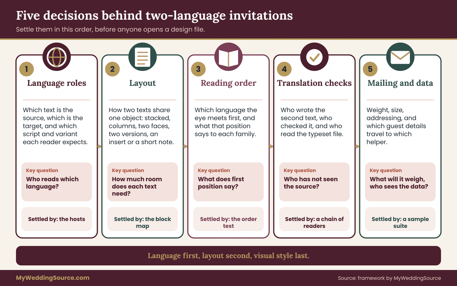
It helps to separate five decisions that tend to get tangled together. Each one has a different owner and a different deadline, and each one can be settled on paper before any design work begins.
Language roles. Which language is the source, meaning the text that was written first and that settles any disagreement? Which language or languages is each recipient group meant to read? Are there script or dialect variants inside a language, such as Simplified or Traditional Chinese, that change which version a household can read comfortably?
Layout. How do two sets of words share a physical object? On one face, on two faces, on two cards, or on one card plus an insert? The layout decides how much room each language gets and how a reader moves through the piece.
Reading order. Which language does a reader meet first, and does that position say something unintended about whose wedding this is? Order is partly a layout question and partly a family question.
Translation quality. Who produced the second-language text, who checked it, and who confirmed that what was printed is what was approved? Translation errors on invitations are rarely dramatic. They are small, public and permanent, which is exactly why they are worth catching early.
Mailing and data. How do two languages change the weight, size and addressing of what goes into the mail, and what guest information (names, addresses, language preferences) has to travel to a translator or printer to make it work?
Seen this way, bilingual wedding invitation design is a short project with five checkpoints, not a vague aesthetic goal. The checkpoints come in a sensible order, and the next section gives you the single document that holds them together.
When two languages are the right call, and when they are not
Not every household on your list needs a second language, and not every second language needs to be on the main card. The honest test is practical. Ask who would struggle to understand the date, time, place and how to reply if the card were in one language only.
If the answer is a small number of people, a single-language card plus a well-made translated insert for those households may serve them better than a redesign that changes the card for everyone. If the answer is a large share of your guests, or if the second language is part of the identity of the wedding itself, then a fully bilingual card is the more honest choice.
There is a third reason, which has nothing to do with comprehension: a bilingual card is sometimes a statement. A couple may want both of their cultures visible to everyone, including guests who read only one. That is a perfectly good reason. It just changes what “done well” means, because the second language is now doing decorative and symbolic work as well as practical work, and the design should be honest about which job each line performs.
Whatever the reason, write it down in one sentence that finishes the phrase “Our bilingual wedding invitation design exists so that…” The sentence is useful later, when a relative asks why the card looks the way it does, and when you need to decide whether a particular line really needs translating.
Who needs to be in the room
You do not need a large team to do bilingual wedding invitation design well, but a few roles should be named before work starts. Someone from the couple owns the style sheet and answers questions from everyone else. At least one person, ideally two, reads each language at a native or near-native level and can review text without having written it.
The printer or stationer needs to know early that two languages are involved, because it affects how they build files, which fonts they use and how many proof rounds to schedule. If the families have strong opinions about order or wording, the person who can speak for each family should be included before the first draft, not after the proof.
If decisions about wording or order are likely to become family decisions, the framework in wedding decision rights is a useful way to agree in advance who has the last word on what. A settled owner for each choice saves more time than any template.
The two-language style sheet: the document behind bilingual wedding invitation design
A style sheet is a short document that records editorial decisions so that nobody has to make them twice. Professional publishers use them to keep spelling, punctuation and tone consistent across many contributors. For a wedding, a single page is enough, but it must exist before layout begins, because it is the thing that keeps the card, the reply card, the details insert, the envelope and the website consistent with each other.
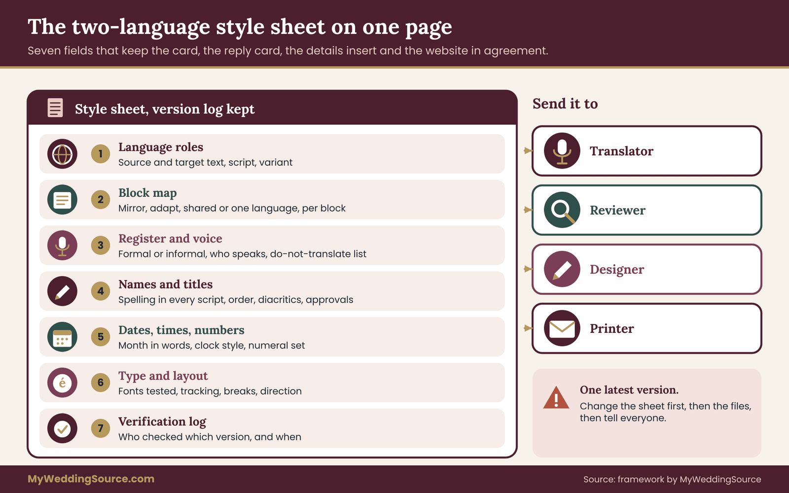
The style sheet below, which anchors bilingual wedding invitation design from first draft to final proof, has seven fields. You can write it in a plain document, a spreadsheet or a shared note. What matters is that it is versioned, that everyone works from the latest copy and that nobody edits the printed text from memory.
Field one: language roles
Name the source text and the target text. The source is the version in which the wording was originally written and approved by the hosts. When two versions disagree, the source decides what was meant, and the translator, not the designer, decides how to express that meaning in the other language.
Also record, for each language, the script and the variant. “Chinese” is not a complete instruction. Simplified and Traditional characters are different written forms, and a household that reads one may find the other slow or unfamiliar. Spoken variety matters too: a family may speak Cantonese at home and read standard written Chinese, and the invitation will follow the written standard. Serbian can be written in Latin or Cyrillic, and Punjabi in Gurmukhi or Shahmukhi. Ask a person who reads the language, not a search engine, which form their relatives expect.
Field two: the block map
List every block of text that will appear on every printed piece. On a typical suite those blocks are the host line, the invitation sentence, the names, the date, the time, the venue name and address, the reception line, the dress line, the reply instruction, the reply deadline, any website or contact line and any note about children, lodging or transport.
Then give each block one of four treatments.
- Mirror. The block is translated in full and appears in both languages with the same meaning and the same prominence.
- Adapt. The block is rewritten for the second audience rather than translated word for word, because a literal version would sound stiff or because a custom needs different phrasing.
- Shared. The block appears once, in a form that both audiences read the same way, such as a venue name, a street address in local format or a date written with a spelled-out month.
- One language only. The block appears in a single language on purpose, and the style sheet says why.
The block map is where most of the real work of bilingual wedding invitation design happens. It prevents the common slip of translating a venue name that should stay as it is, and the opposite slip of leaving the reply deadline in one language because it “looks the same.” It also gives you an honest picture of how much text each language really needs, which feeds directly into the layout choice in the next section.
Field three: register and voice
Every language has choices that English hides. Spanish, French, German, Portuguese, Hindi, Korean, Japanese and many others distinguish between formal and informal ways of addressing “you,” and some mark respect through verb endings and word choice. An invitation to a great-aunt and an invitation to a cousin may call for different registers, and a single printed card cannot easily do both. Decide on one register for the card and write it down, so the translator is not guessing and the reviewer has a standard to check against.
Also decide who is speaking. An English card might say “Together with their families,” which is easy to carry into Spanish or French. Other languages handle the wording of hosts and families differently, and some traditions name parents first. Record the voice (the couple, the parents or both) and let the translator suggest how each language usually expresses it.
Finally, keep a short list of words that do not get translated at all: proper names, the name of a venue, a family name, a ceremony name with no good equivalent. The next field handles names in detail, but the do-not-translate list belongs here, where the translator will see it first. ### Field four: names and titles
Names are the most personal text in any bilingual wedding invitation design and the least forgiving. Record every name exactly as the person writes it, in every script it will appear in. That includes diacritics, hyphens, family-name order and any title or honorific the person wants or does not want.
For names that will appear in a second script, ask the person how they want it written. A romanized form of a name in Arabic, Cyrillic, Chinese, Korean or Devanagari script is often not unique, because several systems exist and families have their own habits.
The Library of Congress publishes romanization tables used by libraries, and they are useful as a reference, but the best source is still the person, or a parent, who can say “that is how we write it.” Passports are another practical check, since they show the spelling a person uses for official purposes.
Name order is part of the same decision. Many East Asian languages put the family name first, as do some others. When an English-language line says “Ethan Park,” a Korean-language line may read the family name first, and the two forms are both correct in their own context.
Decide whether each language follows its own convention or whether names stay in one order everywhere, and write the rule down so the layout does not “fix” it later. The W3C’s guidance on personal names around the world is a good short reminder of how many assumptions English-speaking forms and databases make.
Field five: dates, times and numbers
Dates cause more quiet errors in bilingual wedding invitation design than any other block. In the United States, 6/12 means June 12. In many other countries it means 6 December. A card that prints only numerals invites a wrong guess, so spell the month in words in every language.
Also decide on the weekday, the ordinal style and the capitalization that each language expects. English capitalizes weekdays and months. Spanish and French generally do not, and German capitalizes nouns but writes dates in its own pattern. A translator will know these rules; the style sheet makes sure the designer does not undo them with an automatic capitalization setting.
Times need the same care. A twelve-hour clock with “p.m.” is common on American cards, and a twenty-four-hour clock is common elsewhere. Pick one form per language, write it in the sheet and make sure the time on the reply card and on the details insert matches the one on the main card. If the ceremony and the reception are in different places, note whether each time is a start, an arrival time or a guests-seated time, because that distinction does not travel well between languages unless somebody states it.
Numerals can also differ by script. Arabic-script languages use more than one numeral set depending on region and style. Decide which one the card uses and keep it consistent across all pieces. Phone numbers, postal codes and street numbers should follow the format of the country they belong to, not the format of the card’s language.
Field six: type and layout rules
This field records the visual rules of your bilingual wedding invitation design that protect the text: the font for each script and the confirmation that it contains every character the text needs, the type size and weight for each language, whether tracking (extra letter spacing) is allowed, line-break rules and the direction of each text block. The typography section later in this guide explains why each rule exists.
Field seven: the verification log
Last, keep a running log. For each version of each block, note who translated it, who reviewed it, when, and which printed or digital proof it appeared on. A log sounds formal for a wedding, but it takes one line per round and it answers the question that will otherwise come up at the worst moment: “Who approved this, and was that before or after the change?”
Keeping the sheet alive
A style sheet for bilingual wedding invitation design is only useful if it governs the files, not just the conversation. Send it to the printer or designer along with the first text. Ask them to flag anything in the design that conflicts with it, such as a font that lacks an accent or a line break that splits a name.
When a decision changes, update the sheet first, then the files, and send the new version. If two people each hold a private copy of the “latest” wording, the printed card will eventually disagree with the website, and nobody will be able to say which one is right.
Choosing a layout for bilingual wedding invitation design
The layout question is how two sets of words share a physical object. There are six workable answers in bilingual wedding invitation design, and the right one depends on a handful of facts you can establish from the block map. The infographic below pairs each layout with the question that usually selects it.
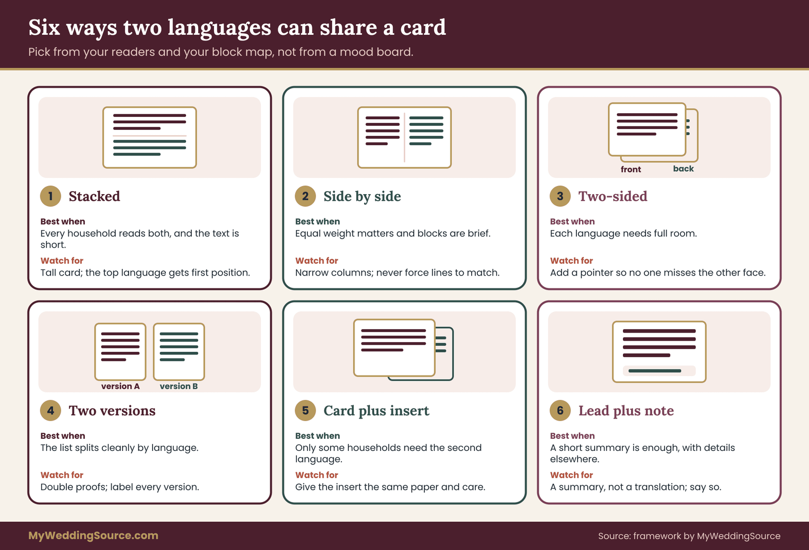
Stacked. One language sits above the other on the same face of the card. Both texts use the full width of the card, so line lengths stay comfortable, and a reader moves down the page without choosing a column. The cost is height. Two full texts one above the other make a tall card or a small type size, and the language on top gets the first-impression position, which is the reading-order issue discussed in the next section. Stacked layouts suit short texts of similar length.
Side by side. Two columns, one per language. This puts both texts at the same height and gives them equal weight, which feels fair. It also halves the width available to each, which produces short lines and awkward breaks, particularly in languages with long words.
Lines in the two columns will almost never match one for one, and trying to force them to match is how translations get trimmed. Align blocks, not lines. Side by side works best for the host line, the invitation sentence and the reply instruction, and less well for long paragraphs.
Two-sided. Each language owns one face of a flat card, or one inside panel of a folded card. Every text gets the room it needs, and the design can use the same structure on both faces. The risk is discovery.
A reader may not realize there is a second face, so add a small, clear pointer in each language, such as a line that says the other language is on the reverse. Printing on both sides can also change the cost and the paper choice, and a printer can tell you what applies to your stock.
Two versions. The suite is produced twice, once per language, and each household receives the version it reads. Every reader gets a clean, uncluttered card, and each language gets the full design treatment. The price is practical: two sets of files and proofs, two quantities to estimate, and a real chance of mailing the wrong version to a household. This option makes sense when your list splits cleanly by language and you can label each address record with the right version before anything is stuffed into an envelope.
One card plus an insert. The main card is in one language and a separate translation card, tucked behind it, is in the other. This is economical when only some households need the second language. It also creates a hierarchy: the insert looks like an add-on. If you choose it, give the insert the same paper, the same typography and the same level of care as the main card, so the households that receive it do not feel they got the afterthought.
Lead plus note. The card is in one language and carries a short line in the second language summarizing the essentials. Treat this as a supplement, not a translation. It is honest only if it says what it is and points to where the full details exist in the second language, such as a bilingual website or a printed details card.
Core and panels: a way to cut duplication
Many bilingual cards repeat information that does not need repeating, which makes cutting it the quickest improvement in bilingual wedding invitation design. A cleaner approach is to build the layout as a core and two panels. The core holds what is the same for everyone: the names, the date with the month spelled out, the venue name and the address. The panels hold only the language-specific sentences, such as the invitation line, the dress note and the reply instruction.
The core appears once, at full weight, so neither language seems to be the main one. The panels are shorter than two full texts, so type can stay larger and the card stays calmer. And the shared block is the one place where mistakes cannot differ between languages, because it exists only once.
Five tests to pick a layout
Use the facts you already have to choose a layout for your bilingual wedding invitation design.
- Who reads what? If nearly every household reads both languages, stacked, side by side or two-sided all work. If households split cleanly into one language or the other, two versions is the cleanest. If only a minority needs the second language, one card plus an insert is usually fairer and cheaper.
- How much text is there? If the block map shows only host line, names, date, place and reply, a single face can carry both languages. If it includes a schedule, lodging, transport and dress guidance, move the long material to a separate details card in both languages and keep the main card short.
- Which scripts are involved? Two left-to-right scripts can be stacked or placed in columns without much trouble. Mixing a right-to-left script with a left-to-right one needs deliberate handling, discussed in the script section, and a two-sided or two-version layout often avoids the problem.
- What will the post office see? Extra cards, thicker stock and larger formats change weight and sometimes size. Ask the printer to assemble a complete sample suite, weigh it and confirm it against current postal standards before the layout is final.
- What can you proof? Every layout multiplies proof work. Two versions mean two full proof rounds with native readers for each. Be honest about how much checking you can actually do.
Reading order in bilingual wedding invitation design: who comes first, and how to keep it fair
Position communicates in bilingual wedding invitation design whether you intend it to or not. In a left-to-right reading culture, the language at the top or on the left is read first, and many readers take that as the main language, the language of the host family, or the language of the larger side. In a right-to-left reading culture the same signals run the other way. Whether or not anyone intends it, order will be read as a message, so decide it deliberately.
The order test
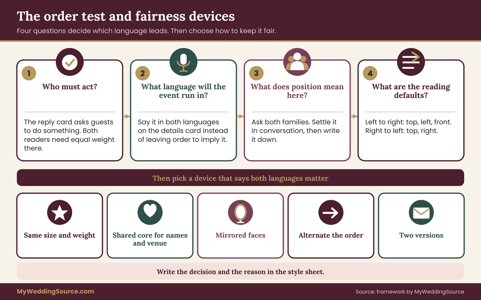
Four questions settle most reading-order cases in bilingual wedding invitation design, in this sequence.
First: who must act on this piece? The reply card is the part of the suite that asks guests to do something. The reader of each language must be able to understand the instruction, the deadline and the options without help. If one reply card serves both groups, both languages need equal weight on that piece, whatever the card above it does.
Second: what language will the event run in? If the ceremony is in one language and the reception in both, a guest should be able to see that before arriving. Put that information in the block map as an “adapt” block, in both languages, rather than leaving it to be inferred from the order.
Third: what does position mean in these families? Ask directly, and ask both sides. In some families the language of the elders should come first as a sign of respect. In others, the couple’s shared language is the natural lead. If the two families disagree, do not settle it in the design file. Settle it in conversation, then write the result into the style sheet.
Fourth: what are the physical defaults? For left-to-right scripts, the first position is the top, the left column or the front face. For right-to-left scripts it is the top, the right column and the face a right-to-left reader would turn to first. Whatever you choose, apply it consistently across every piece in the suite.
Fairness devices
If the outcome of the test is “both languages matter equally,” several choices in bilingual wedding invitation design can say so without words. Use the same type size and weight for both texts, or match them optically when different scripts look larger or smaller at the same point size. Give both languages the same amount of white space.
Use a shared core so the most important facts do not belong to either language. On a two-sided card, mirror the layout so each side has the same structure. Or alternate the order across pieces: the main card leads with one language and the reply card leads with the other. Alternation can look deliberate and generous, as long as the reasons are clear and the content of each piece stays identical in meaning.
Two versions is the most direct way to settle order, because each household sees its own language first and the other language, if present at all, as support. That choice trades fairness in position for fairness in experience, and it is worth considering whenever the families cannot agree on a single order.
What to say when a relative objects
Objections to order in bilingual wedding invitation design tend to be about respect rather than design, and they are best answered in plain, warm words that do not defend the layout. Something like this works:
“We thought about the order carefully. We wanted both languages to be easy to read, so we gave each equal size and space, and the one that comes first is just where the eye starts.”
If the objection comes from a family elder whose language is second, a personal call before the invitation is mailed, with a proof in hand, usually settles more than any explanation afterward. ## Typography that keeps bilingual wedding invitation design readable
Wedding stationery leans on decorative type: script lettering for names, widely spaced capitals for headings, thin hairline strokes. Those habits were developed for English and a few related languages, and several of them break when a second language arrives. The rules below are the ones that most often decide whether a bilingual wedding invitation design reads cleanly.
Check that the font contains every character
Every bilingual wedding invitation design starts with a simple fact: a font is a finite set of drawn characters. If a character is missing, design software usually substitutes a different font without warning, and the result is a name set half in a decorative script and half in a plain fallback, or an empty box where an accent should be.
Decorative script fonts are the most common culprits, because many cover only the basic Latin alphabet. Characters such as ñ, é, ü, ç, ø, ł and ő may be absent or drawn poorly.
The test is simple and should be done early. Type every name and every sentence in the final font, at the final size, and look at the result at high zoom. Do not rely on a font preview that shows only the alphabet. Ask a reader of each language to confirm that every accent, mark and special character looks right. If a font fails, change the font for that language rather than removing the character, because an accent is part of how a name is spelled.
Also check the font license. Fonts are licensed for particular uses, and printing a suite may require that the printer has a licence or receives artwork with the text converted to outlines. A printer who handles stationery regularly will know the question. Keep the live, editable text file as your master either way, because outlined artwork cannot be corrected.
Pair by weight and proportion, not by style
In bilingual wedding invitation design, two languages in two different fonts will look like two different documents unless the fonts share a visual “colour,” meaning the overall darkness of a block of text. Match x-height (the height of lowercase letters), stroke contrast and weight before worrying about whether the styles look like relatives. One family per script is plenty. If the second script has a font from the same designer or type family as the first, that is usually the easiest route, because they were drawn to sit together.
Sizes in bilingual wedding invitation design need optical matching, not numerical matching. Chinese, Japanese and Korean characters fill a square and usually look larger and denser than Latin letters at the same point size, while some Arabic and Indic scripts have tall strokes and marks that need more line height. Set the two texts, print a proof at actual size and adjust until neither looks smaller or louder than the other. Your eyes, and a reader of each language, are better instruments here than a size table.
Leave room for marks
Several scripts stack marks above or below the main letters. Vietnamese can stack more than one mark on a single vowel. Thai places vowels and tone marks above and below consonants. Devanagari hangs letters from a headline bar and adds vowel signs on several sides. Arabic can carry short vowel marks. Tight line spacing makes the marks of one line collide with the next, so give these languages more leading than the English text beside them, even if that means the two blocks occupy different heights.
Be careful with capitals, tracking and italics
All-capitals headings with generous letter spacing are a wedding classic, and they cause trouble in bilingual wedding invitation design.
- Capitals. Spanish keeps accents on capital letters, and a design that strips them to “tidy” the look changes spelling. Turkish has a dotted capital İ and a dotless capital I, which an automatic uppercase function usually gets wrong. Let a person who reads the language approve any text you set in capitals.
- Tracking. Extra letter spacing is a normal choice for Latin capitals. In scripts whose letters connect, such as Arabic and Devanagari, it breaks the joins and makes words look damaged. Turn tracking off for those scripts.
- Italics. Chinese, Japanese, Korean and Arabic do not have italic forms. A slanted version produced by software is a distortion, not a style. If you use italics for emphasis in English, choose a different tool in the other language, such as a change of size or weight within a real font family.
Break lines by meaning, and treat punctuation as part of the language
Centered text is standard on invitations, and in bilingual wedding invitation design it puts line breaks in a spotlight. A name split across lines, a date broken between the month and the day or a time separated from “p.m.” all look careless. Turn off automatic hyphenation for the card, set line breaks by hand, and keep names, dates and times together with non-breaking spaces.
Each language also has its own punctuation habits. Spanish opens questions and exclamations with inverted marks. French uses guillemets for quotation and traditionally puts a small space before a colon, a semicolon, a question mark and an exclamation mark. German often uses low opening quotation marks. East Asian languages use full-width punctuation. Straight “typewriter” quotation marks and mismatched apostrophes are a sign that nobody who reads the language looked at the proof. A short punctuation note in the style sheet, written by the translator, solves most of this in one step.
Mixing scripts: right-to-left, East Asian, Indic and accented Latin
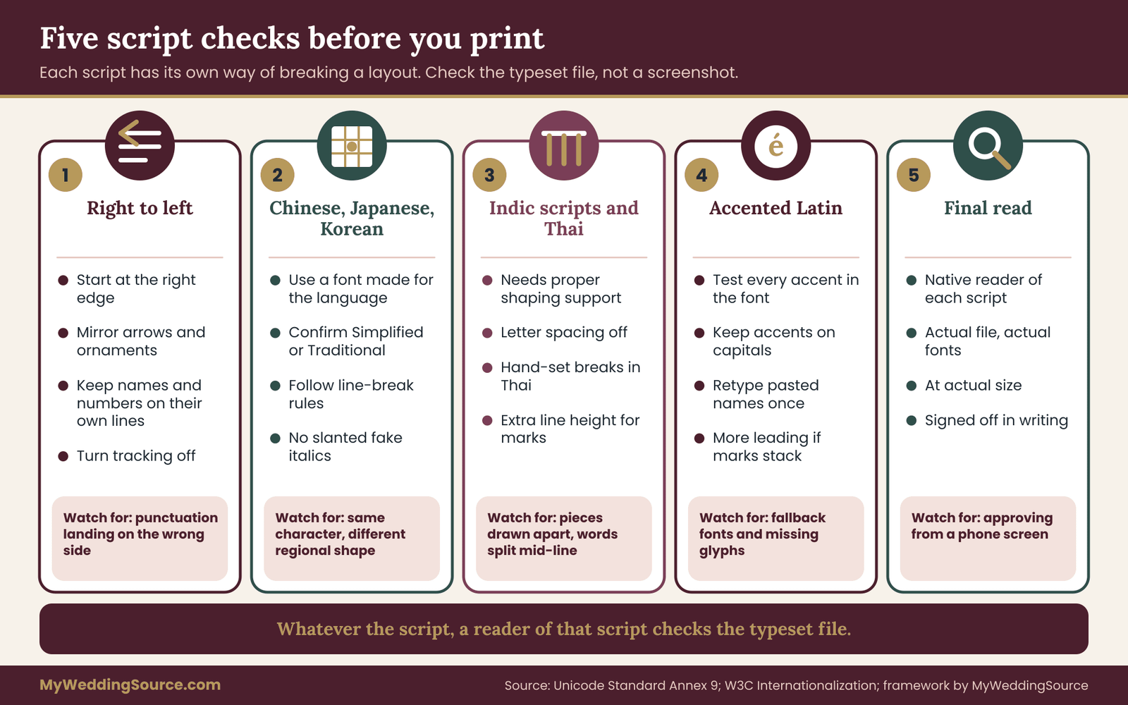
Two Latin-alphabet languages are the simple case of bilingual wedding invitation design. Pairing English with a language in another script changes the work, and the issues are different enough to deserve their own look. The infographic summarizes the five checks, and the sections that follow explain each one.
Right-to-left languages
Arabic, Hebrew, Persian and Urdu run from right to left, and bilingual wedding invitation design for them is more than flipped text. Paragraphs start at the right edge, ornaments that point in a direction should usually be mirrored, and a column pairing a right-to-left language with English normally puts the right-to-left text on the right, so that each reader’s eye begins at the outer edge of their own column.
The hard part is mixed content. The Unicode bidirectional algorithm decides how runs of text in different directions are ordered when they sit in the same line, and its rules are documented in the Unicode Standard’s annex on the topic.
The practical consequence is that a Latin name, a number or a punctuation mark inside a right-to-left sentence can land in a surprising place. Brackets, full stops and commas are called neutral characters, and they take on the direction of their surroundings, which sometimes puts a closing bracket on the wrong side of a phrase.
Guard against this in four ways. Use design software or a printer’s workflow that has proper right-to-left text support turned on, since pasting Arabic into a tool without it can produce reversed or disconnected letters. Put names and numbers on their own lines where you can. Avoid pasting text from messaging apps, which can carry invisible direction marks. And have a native reader check the typeset file itself, not a screenshot or a plain-text version, because the error often appears only after layout.
Digits need a decision as well. Western digits and Arabic-Indic digits are both used in Arabic-script writing, depending on region and taste. Pick one for the card, confirm it with your reviewer and apply it to every date, time and number in the suite.
Chinese, Japanese and Korean
Bilingual wedding invitation design with East Asian text has to allow for the fact that Chinese and Japanese have no spaces between words, and that line-breaking rules prohibit certain punctuation marks from starting or ending a line. Software that does not know these rules can produce breaks that a native reader notices at once. Full-width punctuation, correct quotation marks and a font designed for the language matter, and so does the choice between horizontal and vertical setting, which some families prefer for formal occasions.
A less obvious point is that the same underlying character can be drawn differently in Chinese, Japanese and Korean fonts, because the characters share code points. A Chinese name set in a font intended for Japanese may show forms that a Chinese reader finds slightly off. Use a font made for the language and the written standard, and mark the text with the right language in the design file where the tool allows it. For Chinese, confirm Simplified or Traditional with the household before anything else.
Korean uses spaces between words, which makes line breaks easier, but honorific levels in the verbs are an editorial matter that only a good translator can settle.
Indic scripts and Thai
Devanagari and related scripts build syllables by combining consonants into conjunct forms and attaching vowel signs before or after the consonant. A font without a proper shaping engine behind it displays the pieces separately, which looks wrong to readers. Letter spacing should be off. Thai has no spaces between words, so a software line break may fall in the middle of one. Hand-set the breaks for short invitation text and ask a Thai reader to check each line.
Accented Latin and copied names
For languages written in the Latin alphabet with many accents, such as Vietnamese, Polish, Czech or Hungarian, the usual traps are missing glyphs and copied text. The same accented letter can be stored as one character or as a base letter plus a combining mark, and some fonts draw the second form badly. If a name looks wrong after pasting, retype it from one consistent source, or give the printer the name in a plain text file and ask for a test render.
One practical rule for all scripts
Whatever the script, the final check in bilingual wedding invitation design is on the actual typeset file, read by a person who reads the language, with the actual fonts and the actual line breaks. Everything before that point is preparation. The next section describes how to organize that reading. ## Briefing a translator and building the verification chain
The most common translation failure in bilingual wedding invitation design is not a bad translator. It is a good translator who was handed a sentence with no context and no reviewer. A translator needs to know what the text is, who reads it, how formal it should be and what must stay untouched. And whoever produced the translation should never be the only person who checks it.
What a good brief contains
Send the translator a short package for your bilingual wedding invitation design instead of a pasted paragraph. It should include the approved source text, broken into the blocks from your block map, so they can see which blocks are mirrored and which are adapted. It should include your style sheet, or at least the register, the name list and the do-not-translate list.
It should say that the text is for a printed wedding invitation, who the readers are, and which regional variety they expect. Spanish read in Mexico, Spain and Argentina differs in vocabulary and in how “you” is addressed, and the same is true of Portuguese in Brazil and Portugal, French in France and Quebec, and Arabic across regions.
Add the space constraints in plain terms, such as “this block sits under the names and should be roughly the same length as the English.” Ask for the output in an editable text file, not an image or a screenshot, and ask the translator to mark anything they changed in meaning for a reason, with a note.
Leave out what the translator does not need. A translator does not need your guest list, your addresses or the household notes that say who prefers which language. A short, privacy-conscious brief is easier for everyone to handle, and the section on guest data later in this guide explains why it matters.
“We are preparing a formal printed wedding invitation and need it in your language. Please use a respectful, warm register, keep the names exactly as listed and flag any phrase where English and your language differ in meaning.”
A note like that tells the translator what kind of text they are dealing with in two sentences, and it invites them to speak up when something does not translate cleanly.
Questions worth asking before you hire
You are choosing a person to be responsible for a few dozen carefully chosen words, so ask a few practical questions before you commit your bilingual wedding invitation design to anyone. Who revises your work? Professional translation standards describe a process in which a second qualified person checks the translation against the source, and the international standard for translation services, ISO 17100, treats that check as a core step.
Can you work in the regional variety my readers use? Will you review the typeset proof, not only the text file? How do you charge for a very short job, and does the quote include a revision round? Many translators price short projects with a minimum fee, so the cost of a short invitation is often a small portion of what the printing will cost. Ask for a quote rather than guessing.
A national professional association such as the American Translators Association publishes a directory of translators and describes how to work with them. A directory will not guarantee a good fit, but it lets you start from people who have chosen translation as a profession.
The verification chain
Think of the review in bilingual wedding invitation design as a short relay with five hand-offs. Nobody in it checks their own work.

One: freeze the source. Before translation begins, the hosts approve the source text and the date is locked. Changes made after translation starts are the main cause of mismatches between the two languages, because the original gets edited and the translation does not follow.
Two: translate. The translator works from the frozen source and the style sheet. The output is an editable text file, with notes.
Three: independent review. A second person who reads the target language at a high level compares the translation with the source, line by line. This person looks for errors of meaning, for wording that does not sound natural, and for departures from the style sheet. They classify each comment, as explained below.
Four: the cold read. A third reader, who has not seen the source, reads only the target-language text and writes down the essentials in their own words: what the event is, the date, the time, the place, what the reader is asked to do and by when. Compare that summary with the source. Any difference is a defect, even if the sentence is grammatical. A cold read finds ambiguity that a line-by-line comparison misses, because the person is reading as a guest would, not as a checker.
Five: the typeset check and sign-off. Once the text is in the layout, a reader of each language checks the proof, and the hosts sign off in writing. The next section describes the proof checks, and the section after it covers the printer hand-off.
Sorting reviewer comments into three kinds
Two reviewers will rarely agree on every word, and wedding timelines do not have room for long debates. Sort every comment into one of three categories and treat each differently.
- Error. The target does not say what the source says, or contains a spelling, grammar or punctuation mistake. These are fixed without discussion.
- Convention. The wording is understandable but unusual for invitations in that language, or does not match the style sheet. The translator proposes a change, and the style sheet decides.
- Preference. Both versions are correct and the difference is taste. The hosts choose, and the choice is recorded so it is not reopened.
This triage keeps bilingual wedding invitation design moving. It also shows when a disagreement is really about authority, not language, in which case the families need to agree who decides, a point the earlier discussion of decision rights covers.
Back-translation for the lines that matter most
In bilingual wedding invitation design, a back-translation means that a different translator renders the target text back into the source language without seeing the original, and you compare the result with the source. It is slow and imperfect, and it is not worth doing for the whole invitation.
It is worth doing for the few lines where a misunderstanding would cost a guest something: the reply instruction and deadline, the date, time and place lines, any statement about children or plus-ones, and any line that changes what a guest should bring or wear.
Treat differences as prompts for a conversation, not as verdicts. A back-translation will often differ in word choice from the original while meaning the same thing. What you are looking for is a difference in substance, such as a deadline that became a suggestion or a “please” that became a command.
Machine translation and bilingual relatives: what each can and cannot do
Most couples doing bilingual wedding invitation design will meet two shortcuts. One is a machine translation tool, and the other is a relative or friend who speaks the second language and offers to help. Both have a legitimate place in the process, and neither should be the last line of defense.
Machine translation as a drafting aid
Machine translation is fast and can be useful in bilingual wedding invitation design for understanding a draft in a language you do not read, or for producing a rough text that a translator then improves. It is a poor final source for formal stationery. It tends to fail in predictable ways.
It often guesses the register, picking an informal “you” for a card that should be formal. It translates idioms and stock phrases literally, so a phrase that works in English as a polite formula may read as an odd instruction in the other language.
It may change the gender or number of a phrase when the source does not specify it. It sometimes drops a negative or a conditional. And it can translate proper names that happen to be common words, so a surname that matches a noun turns into the noun, or a venue name gets rendered as a description of the building.
Date and time lines need special suspicion. A tool may reorder a numeric date, convert a time format without telling you or leave a month in the wrong case. If you used a tool to produce a draft, flag that fact to the translator and ask them to treat it as an unverified draft, not as the source of truth.
A privacy note applies too. Free online tools differ in what they do with pasted text, and their terms change. Do not paste guest lists, addresses or private notes into a tool you have not read the terms for. The invitation wording alone is safe to translate with a tool, because it contains no private data beyond the couple’s own names.
A bilingual relative or friend
A person who grew up speaking the language is a valuable reviewer for bilingual wedding invitation design, and often the best cold reader you could ask for. They may be a weaker translator than you assume, though, for two reasons. Speaking a language fluently is a different skill from writing formal prose in it, and many heritage speakers learned the spoken register at home and never studied formal written conventions. And they are close to the family, so they may be reluctant to say “this phrase sounds wrong.”
Use relatives for what they do best. Ask them to do the cold read, to check names and kinship terms and to say whether the card sounds like something a person in that family would be comfortable receiving. Ask a translator to produce the text, and ask the relative to check it. When the roles are named like this, nobody’s feelings are hurt if the relative disagrees with a phrase, and the final text gets the benefit of both people’s knowledge.
When to pay for a professional, and when to be careful with a free option
A useful decision rule for bilingual wedding invitation design is to match the effort to the reach of the text. A line on a website can be corrected in a minute. A printed card goes to every guest, gets kept and photographed, and cannot be corrected without a reprint or a correction card. The more people who will read a line and the more permanent it is, the more it justifies a paid, independent translator and a separate reviewer.
If the budget for bilingual wedding invitation design is tight, protect the highest-stakes blocks first. A professionally translated and revised core (names, date, place, reply instruction) with a lighter review of the decorative lines is a more sensible split than an even but unchecked treatment of everything. And if you must use a volunteer, set up the chain anyway: a volunteer translator, a different volunteer reviewer and a cold read. ## Proofs, files and postal checks for bilingual wedding invitation design
Once the text of a bilingual wedding invitation design is approved, a different kind of risk takes over. Files get rebuilt, fonts get swapped, line breaks move and somebody makes a last-minute edit to one language only. Careful hand-offs reduce all of that. The general mechanics of proof rounds, quantities and printer instructions are covered in the guide to proofing, quantities and printer hand-offs. What follows is the extra layer that a second language adds.
What to send the printer
Give the printer one package for your bilingual wedding invitation design rather than a series of emails. It should contain the approved text for each language in an editable file, the style sheet, a list of the fonts you intend to use and who holds the license for each, and a plain description of each piece in the suite: which languages appear on it, in which layout and in what order. If you are producing two versions, give each a clear name and say how many of each you need.
Then ask the printer a few direct questions. Have you set these scripts before? Will you typeset from my text or from a design file I supply? Can you give me a proof at actual size as a PDF before anything is printed?
What happens if I find an error after I approve the proof? Will the person who sets the type be able to see the language, or are they copying shapes? A printer who answers these questions easily has probably done this before. One who hesitates may still do good work, but you will need to be more involved in proofing.
Three proof rounds, each with a different job
A single proof of a bilingual wedding invitation design, asked to do everything, usually does nothing well. Splitting the checking into three rounds makes each pass faster and sharper.
Round one is a text round. Compare every line on the proof with the approved text, character by character, in both languages. The reader checks names, spelling, accents, numerals, dates and times. They are not judging the design.
Round two is a layout round. Now the reader looks at line breaks, the position of names, whether any text has been substituted with a fallback font, whether text direction is correct, whether the two languages have equal weight, and whether any block is cramped or crowded. For right-to-left or East Asian text this round is where most problems show up.
Round three is a comparison round. Place the final proof next to the previous one and confirm that the only differences are the ones you asked for. Late changes have a way of causing unrelated changes: a font update that shifts a line, a reflow that moves a word. This round exists to catch those side effects.
If the printer can supply a physical sample, look at it. Fine strokes in some scripts can fill in or break up in letterpress, foil or embossed finishes, and a thin hairline that looks elegant on a screen may disappear on paper. A sample also shows whether the text is large enough for an older reader, who is often exactly the person the second language was added for.
Change control after sign-off
Once the hosts have signed off on the bilingual wedding invitation design, treat every later change as a new proof round. A correction in one language triggers a check of the other, and it also triggers a check of every other place where the same text appears: the reply card, the details insert, the website, the program, the signs and the envelope.
Keep one shared list of the exact wording of names, dates and recurring phrases, so the invitation, the programs and the signs do not drift apart. The article on wedding signage as a system shows how that kind of shared wording list works for printed signs, and the same idea applies here.
If you are producing two versions, add a version label to every file name, every proof and every carton. Add a “version” column to the address list too, so the people stuffing envelopes can see which version each household gets. Mailing the wrong version is a simple mistake and a hard one to fix.
The envelope and the address
The envelope is where a bilingual wedding invitation design meets the postal system, and the post office does not care about your layout. Its sorting equipment and carriers need an address block they can read.
For mail inside the United States, the USPS publishes the addressing standards in Publication 28, which describes how an address block should be structured and where each element goes. The decorative choices that suit invitations, such as script lettering, unusual line breaks and dark envelopes, can interfere with automated reading. Keep the delivery address in a plain, consistent form, and put any bilingual flourish on a separate line above or beside it, such as a name line that appears in both scripts.
For mail going abroad, the USPS International Mail Manual explains how to address items for other countries, and the Universal Postal Union provides information on member countries’ postal practices. The general idea is that the delivery address follows the format of the destination country, and that the country name appears on the last line in a form that the sending postal service can process, typically in English.
Some destination countries accept or prefer addresses in Latin letters for international mail even when the local script is different. Check the rules for each destination rather than assuming, and ask your guests how they want to be addressed. Many will happily tell you which spelling and format works for their local carrier.
Weight, size and a test mailing
A suite built on bilingual wedding invitation design often weighs more than a monolingual one. It may have an extra card, a thicker stock or a larger format to hold two texts. The postal standards for letters and flat mail set limits on size, thickness and shape, and an item that falls outside them can cost more to mail or be handled differently. These rules change, so rely on the current Domestic Mail Manual and on a post office clerk who can weigh and measure an actual sample.
Ask the printer to assemble a complete sample suite, with every card and insert in the final order, and take it to the post office before you approve production. Have it weighed and measured, and ask what postage it needs. Then mail a second sample to a nearby friend, and check how it arrives. Seeing how the envelope arrives, including how the address was read, is better evidence than any table of rules.
Reply cards and the overseas guest
The reply card in a bilingual wedding invitation design deserves its own consideration, because it asks the guest to act. A prepaid return envelope addressed in the standard US format works for domestic guests. It does not work for guests mailing from other countries, because US postage stamps are generally not valid for mail posted abroad.
If you have international guests, give them another way to reply, such as an online form or a phone number, and say so in their language. The guidance on RSVP etiquette covers how to word the reply request and set a deadline. For a bilingual wedding invitation design, the added task is to check that the deadline and the reply method read identically in both languages.
If you use a website or a QR code, make the destination a page that offers each language through a clear link, and print the short web address in plain characters next to the code, so a guest without a scanner can type it in. Test the page on a phone, because that is how most guests will reach it.
Guest language data: privacy, consent and who should see what
Bilingual wedding invitation design creates a small new category of personal data: which guests get which language. It is easy to collect carelessly, and a little care at the start prevents awkward moments later.
Ask, don’t assume
A person’s surname does not tell you which language they read. Many people with surnames from one language community read and speak a different one at home, and others are fluent in several. Assuming a preference from a name is both unreliable and slightly rude. The better method is to ask. A line on a save-the-date, a message to a family contact or a quick call can ask which language a household would prefer for the invitation and whether they would like both.
Record only what you need. “Invitation language: English, Spanish or both” is enough. You do not need to record anyone’s ethnicity, religion, country of origin or the reason for the preference, and a language field can imply some of those things. Keep the field in the same list as the addresses, and limit access to the couple and whoever addresses the envelopes. The guidance on building a wedding guest list covers how to build and maintain the list itself.
Share the minimum with each helper
Different helpers in a bilingual wedding invitation design need different pieces. A translator needs the invitation wording and the style sheet, and nothing else. A designer needs the text, the names and the style sheet. A printer who also addresses envelopes, or a calligrapher, needs names and addresses. Send each person only what the job requires, through the vendor’s own secure upload or a password-protected file, not through a thread that gets forwarded around.
Ask each vendor, in writing, how long they keep your files and what they do with them afterward. Ask, too, whether they plan to photograph or post the finished suite. Stationers sometimes show finished work in portfolios and on social media, and a photo of a suite can show names, a date and a venue. If you would prefer they did not, say so before production, or ask them to blur the details. The guidance on vendor contracts explains where a clause like this belongs and how to ask for it politely.
Consent for names and titles
When a name appears in a second script, or a title or kinship term is added, the person it belongs to should know and agree. This matters most for relatives who may have strong feelings about how they are named, such as an elder who uses a particular honorific, a person whose name has been transliterated several ways, or a family where the parents have separated and the host line needs careful wording.
A short message that says what will appear and asks for any correction avoids a small hurt that takes a long time to repair.
Finally, remember that your bilingual wedding invitation design will travel. Guests photograph the cards and share them online, often within hours. If a line on the card contains information you would not want public, such as a private address for a home reception, consider moving it to a details card sent only to confirmed guests or to a password-protected page. ## A worked example of bilingual wedding invitation design: the Reyes and Park suite
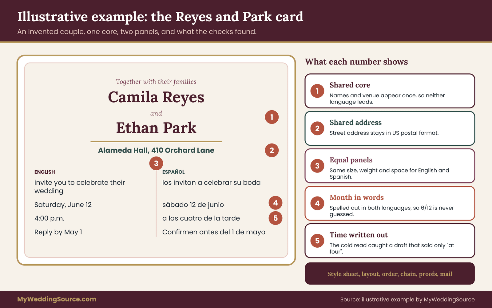
The following example is invented. The couple, the venue and the details are made up to show how the pieces of bilingual wedding invitation design fit together, and none of it describes a real event. The languages are English and Spanish because both use the Latin alphabet, which keeps the example readable, and a later paragraph says what would change with a different script.
Camila Reyes and Ethan Park are planning a wedding for a Saturday in June and want a bilingual wedding invitation design to match, with a ceremony at four in the afternoon at a venue called Alameda Hall. Ethan’s family reads English. Camila’s family is mixed: many relatives read both languages, a group of older relatives reads Spanish only, and a few households live in Mexico. Her parents, Inés and Javier Reyes, are hosting alongside the couple.
Step one: the style sheet
The couple write the style sheet for their bilingual wedding invitation design in an evening, using the seven fields.
Language roles. English is the source, because the couple drafted the wording together in English. The target is Spanish as read in Mexico and the United States, in a formal register. The couple note that they are not asking for a text that reads like a translation, but for a card a Spanish-reading grandmother would find natural.
Block map. The couple list ten blocks on the main card and the reply card. The host line, the invitation sentence, the date, the time and the reply instruction are mirrored. The dress line is adapted, because the English phrase has no tidy equivalent and the translator suggests a different wording.
The names of the couple and the venue name are shared and appear once. The street address is shared, in United States format. The website line is one language only, because the website itself has an English and a Spanish version and offers a language link on its first screen.
Register and voice. Formal, warm and plural. The host line says “together with their families,” so the translator is asked to find the usual way to say it in Spanish, and to choose a wording for “you” that works for a household with older and younger members. The translator suggests one that does not assume the sex of the readers. The couple keep that decision in the sheet.
Names. Inés is spelled with the accent everywhere. The couple confirm each relative’s preferred form with a short message, since the card will include a line for the grandparents, and one grandparent prefers a nickname-based form of her name on informal items but her full name on the card.
Dates and numbers. The month is spelled out in both languages. English says Saturday, June 12, with the year written out. Spanish uses the lowercase weekday and month and the pattern day, month, year. Time is “4:00 p.m.” in English and “four in the afternoon” in Spanish, written out. The sheet gives the year in both languages, so the card can be read months later.
Type and layout. The couple choose a script typeface for the names of the couple and the hosts and a plain serif for everything else, in both languages. The sheet says to test every accent in the script font and to switch to a different font if any character fails.
Verification log. A blank log, to be filled in round by round as the work goes.
Step two: the layout decision
The couple run the five tests on their bilingual wedding invitation design.
On who reads what, the list divides into households that read English only, households that read both, and a group that reads Spanish only. A single bilingual face serves everyone, and a minority-insert approach would give Camila’s older relatives the add-on, which the couple do not want.
On text volume, the main card is short, so both languages fit on one face. The schedule, lodging and transport notes are long, so they move to a details card.
On scripts, both are Latin, so side-by-side columns are an option without direction problems.
On postage, the couple ask the printer to assemble a full suite with the main card, the reply card, the details card and the envelopes, and take it to the post office. They note the weight and the postage, and they know a household abroad will need a different stamp or a different route.
On proofing capacity, they have one paid translator and a few volunteers, so the layout should not multiply proof work.
Their bilingual wedding invitation design becomes a core-and-panels main card. The names and the venue sit in the center at the same size. Below them, two equal panels sit side by side, English on the left and Spanish on the right. Each panel holds the invitation sentence, the date, the time and the reply line. The details card is two-sided, with English on the front and Spanish on the back, and a line on each face that points to the other.
Step three: the order test
The first question is who must act, and the answer is every household, so the reply card must be equal in weight. The second question is the ceremony language, and the couple decide to hold the ceremony in both languages, so the details card says so in both. The third question is what position means.
Camila’s parents worry that English on the left will read as English first. Ethan’s parents say it is only a matter of reading direction. The couple ask each set of parents for their preference, and agree to keep the columns equal and to let the reply card lead with Spanish, so the order alternates across the suite. They write the decision and the reason in the style sheet, so that the bilingual wedding invitation design carries its own explanation.
Step four: the chain
A paid translator translates the text from the frozen English source, with the style sheet and a note about regional variety. Camila’s cousin, who teaches Spanish, reviews the translation against the source and sorts her comments into error, convention and preference. She finds one error, a verb that does not agree with its subject, and two conventions, one about the formal “you” and one about a phrase that sounds too literal. The translator accepts all three and the couple decide the one preference, a choice between two equally good words for “celebrate.”
Then comes the cold read of the Spanish half of the bilingual wedding invitation design. A neighbor of Camila’s grandparents in Mexico reads only the Spanish text and writes down what it says. Her summary gets the day, the place and the reply method right. But she writes that the ceremony is “at four,” without saying whether that is morning or afternoon, and she says that the deadline “is at the start of the month,” when the source says by a specific date.
The first draft had said “a las cuatro” without “de la tarde,” and the deadline line was vaguer than the English. Neither was an error a line-by-line reviewer would flag, because both are grammatical. The translator revises both lines, and the couple add a back-translation check for the time and deadline lines. It matches.
Step five: the proofs
Round one is a text round, and the cousin and the translator compare each line to the approved text. Round two is a layout round for the bilingual wedding invitation design, and it finds two problems. The script typeface does not contain the accented é, so “Inés” in the host line appears in a fallback font that looks different from the rest of the name line, and the printer sets the host names in the plain serif instead.
A line break also splits “Orchard Lane” across two lines in the Spanish panel, and the printer sets it with a non-breaking space. Round three compares the final proof with the previous one, and the only differences are the two fixes.
Step six: the data and the mailing
Camila’s mother calls the older relatives to ask which language they would like, and the couple record “English, Spanish or both” in a column of the guest list. The translator sees only the wording. The printer receives names and addresses through its secure upload, and the couple ask in writing that the finished suite not be photographed for the printer’s portfolio. International households receive the card with a note in Spanish about replying by phone or on the website, because a stamped return envelope would not work for them.
What would change with a different script
If Camila’s second language were Arabic, three things would change in this bilingual wedding invitation design. The panels would still sit side by side, but the Arabic panel would go on the right, and the whole card would need to be checked for direction.
The couple would pick fonts for the Arabic text that were designed for it, turn off letter spacing, and have an Arabic reader check the typeset file for the order of names, numerals and punctuation. The cold read and the back-translation would stay the same, because those are about meaning, not script.
The example of bilingual wedding invitation design is deliberately modest. It uses no tool the couple could not find and no step that needs special skill. What makes it work is the order of the decisions and the habit of having someone who did not write a line read it. ## Common mistakes, edge cases and the limits of this guide
Most problems with bilingual wedding invitation design come from a short list of habits. Knowing them in advance is cheaper than fixing them on a proof, or after mailing.
Mistakes that show up again and again
Designing before editing. In bilingual wedding invitation design the file is too often built around the shorter language, and the longer one is trimmed to fit. The fix is to set the longer text first and build the layout around it, and to treat any request to “shorten the translation” as a question for the translator, not the designer.
Letting one person translate and check. A translator reading their own work sees what they meant, not what they wrote. Any chain that has the same person at two points has a gap in it.
Correcting one language only. A late fix to the English text that does not trigger a check of the Spanish text, or the other way around, is the most common cause of two versions that quietly disagree. Every change goes through both languages and every piece.
Trusting the printer to proofread a language they do not read. A printer can check that the file matches what you sent. They cannot tell you that the text is right. Spelling checkers in design software are usually set to one language and flag correct words in the other.
Approving a proof on a phone. A small screen hides line breaks, accents and spacing. Look at the proof at actual size, on a larger screen or printed on paper.
Translating what should stay. Venue names, street names and family names are the usual victims. If a name in your block map is marked as shared, nobody should translate it, and the style sheet should say so.
Mixed formats across pieces. The card says “June 12,” the reply card says “12 June” and the website says “6/12.” Pick the format for each language and use it everywhere.
No pointer to the other side. On a two-sided card or an insert, a line in each language that points to the other prevents the guest who never turns the card over.
Mailing the wrong version. In a two-version plan, the address list needs a version column and the cartons need labels. Check the first ten assembled envelopes before the rest.
Edge cases
More than two languages. The core-and-panels approach strains beyond two panels, and the order question multiplies. A better path is usually a card in the two languages most households need, plus language-specific inserts or a web page for the rest, with the choice of which languages go on the card made by who needs to act and not by who would be most pleased to see their language.
Languages that are spoken more than written. Some guests speak a language or dialect at home but read mainly in a different written standard. A card in the dialect they speak may not exist in written form, and a card in the standard may feel formal and distant. A phone call from a family member, a short voice message or a conversation at a family gathering may serve them better than a printed translation. Ask the person, not the printer.
Ceremonial and sacred text. A verse, a blessing or a ceremonial phrase in a liturgical or heritage language needs verification from the officiant or from someone with authority in that tradition, not only from a general translator. The same goes for the exact wording of how a ritual is named. The guide to planning an interfaith wedding ceremony discusses how to settle who owns each ritual, which is a useful first step before you print its name.
A partner who does not read the second language. The person whose own invitation it is should be able to sign off on all of it. If one partner does not read the second language, give them the back-translation of the key lines in their own language, so they can confirm the meaning, and a short list of what each line is for.
Readers who need larger type or another format. An older relative may be the reason the second language exists, and may also need larger print. Test a proof at actual size with the intended reader, and offer a digital copy to anyone who uses a screen reader. If you build a web version, mark the language of each block so assistive technology pronounces it correctly.
A correction after mailing. If an error reaches guests, a small correction slip or a message to the affected households is better than silence. Treat the correction text with the same chain as the original: translate, review, cold read, proof. A rushed correction in one language is how a second error enters.
The limits of this guide
This guide to bilingual wedding invitation design cannot replace a qualified translator, and it does not pretend to cover every language or script. The examples are invented and simplified. Conventions inside a language vary by region, generation and family, and a good translator will tell you when the choice is not obvious.
Postal rules, size and weight limits, and fees change, so confirm them with the USPS or your local post office, and with the destination postal service for mail going abroad. Printer capabilities vary too, particularly for right-to-left, East Asian and Indic scripts, and the only reliable test is a proof read by someone who knows the script.
Your next steps
Begin your bilingual wedding invitation design with one evening of editorial work, before any layout time. Write the style sheet: the source text, the language roles, the block map with one of four treatments for every block, the register, the names in every script, the date and time formats and the type rules. Ask both families who will have a say on order and wording, and settle it now.
Then choose the layout with the five tests, brief a translator with the package described above and book a separate reviewer and a cold reader. Send the printer the style sheet with the first text, schedule three proof rounds and take a complete sample suite to the post office.
When each step is done, record it in the verification log. If you do those things in that order, your bilingual wedding invitation design will have been checked by the people best placed to catch its mistakes, and the guests who open the envelope will find a card that reads as if it was written for them.
FAQ
How do I decide which language goes first on a bilingual wedding invitation?
In bilingual wedding invitation design, start with who must act on each piece, then consider the ceremony language and what position means to both families. If both languages matter equally, give them the same size and space, use a shared core for names and venue, or alternate the order across the suite. If the families cannot agree, two versions let each household see its own language first. Write the decision and the reason into your style sheet.
Can I use machine translation for a wedding invitation?
Use it as a drafting aid in bilingual wedding invitation design, not as the final text. Machine translation often guesses the wrong formality, translates stock phrases literally, mishandles dates and sometimes translates names that look like common words. Have a professional translator produce or revise the text, then have a second reader check it and a third read only the translation. Do not paste guest lists or addresses into free tools.
Should I use one card with two languages or two separate cards?
In bilingual wedding invitation design, one card works when most households read both languages and the text is short. Two versions work when the list divides cleanly by language and you can label every address correctly, though they double the proofing. One card plus a translation insert is economical when a minority needs the second language, but give the insert equal quality so it does not feel like an afterthought.
How do I combine a right-to-left language with English on one card?
For bilingual wedding invitation design that mixes scripts, put the right-to-left text on the right side of a side-by-side layout, mirror directional ornaments and use fonts designed for the script with letter spacing turned off. Names, numbers and punctuation inside right-to-left sentences can land in the wrong place, so keep them on separate lines when you can. A native reader should check the final typeset file, not a screenshot or a plain-text copy.
Who should proofread the second language?
A bilingual wedding invitation design needs at least three people who do not check their own work: the translator, an independent reviewer who compares the text with the source, and a cold reader who sees only the second-language text and writes down the date, time, place and reply instruction in their own words. After typesetting, a reader of each language checks the proof at actual size, and the hosts approve it in writing.
Do I translate the venue name and address?
Usually not, in bilingual wedding invitation design. Venue names, street names and family names are proper nouns, and the address should stay in the format the postal service reads. You can add a short descriptor in the second language beside the venue name if guests need it, such as a word explaining what kind of place it is. List the decision in your block map so no one translates it later by accident.
Will a bilingual invitation cost more to mail?
It can, because bilingual wedding invitation design often adds a card, thicker stock or a larger format, and those change weight and sometimes size. Ask the printer to assemble a full sample suite with every insert, and have a post office clerk weigh and measure it against the current Domestic Mail Manual standards. Mail a second sample to a friend to see how it arrives.
When should I start the language work?
Before the layout work on a bilingual wedding invitation design, and well before the printing deadline. The translation, independent review and cold read take time, and each proof round needs readers who may have other commitments. Work backward from your mailing date, finish and freeze the text before layout, and add proof time for each language. A short delay at the start is far cheaper than a reprint.
Sources
- Domestic Mail Manual, USPS Postal Explorer
- Publication 28, Postal Addressing Standards, USPS Postal Explorer
- International Mail Manual, USPS Postal Explorer
- Universal Postal Union
- Unicode Standard Annex 9, Unicode Bidirectional Algorithm, Unicode Consortium
- Personal names around the world, W3C Internationalization
- ISO 17100, Translation services, requirements for translation services, International Organization for Standardization
- ISO 8601, Date and time format, International Organization for Standardization
- ALA-LC Romanization Tables, Library of Congress
- American Translators Association