
A wedding logo is a small, reusable mark made from your names, initials or a simple symbol, and it only earns its place if it works the same way on an invitation, a directional sign and a cocktail napkin. This guide covers the process of briefing a designer for one: what to write, which rights to secure, which files to request, and how to prove the wedding logo reproduces before you order anything.
Treat the wedding logo as a small production project. List every place it will appear, write a one-page brief around those uses, and agree in writing who owns the artwork and what you may do with it. Ask for a file kit (vector master, print-ready PDF, SVG, transparent PNGs, and four color versions) rather than one picture. Before the final payment, print a reproduction proof at the smallest and largest real sizes, in one color and on a dark background. Then hand every printer and maker the same packet.
Most couples meet their wedding logo as a pretty picture on a save-the-date. The trouble starts weeks later, when the stationer wants a one-color version for foil, the venue wants a sign, a friend offers to embroider napkins, and the only file anyone has is a small JPEG with a white box around it. Each of those problems is cheap to prevent at the start and slow to repair at the end.
This article is about that start. It does not decide whether you should use initials or an illustration, it does not teach you to choose fonts, and it does not walk through commissioning a heraldic crest. Those are separate decisions. Here the question is narrower and more practical: once you have decided you want a wedding logo, how do you brief the person who makes it so that you receive something every vendor can actually use?
A note on scope. This is general information, not legal, tax or financial advice. Ownership of artwork, license terms and local printing practices differ, and designers write their own contracts. Where a rule matters, the sources at the end point to the agency or standards body that publishes it, so you can confirm the current version yourself.
What a wedding logo is, and what it is not
A wedding logo is a fixed piece of artwork. It does not change from item to item. That sounds obvious, but it separates a logo from a general look. Your colors, your type choices, your photography style and your paper stock together make a visual identity. The wedding color palette guide covers the color side of that wider picture. The logo is one component inside it: the single mark that appears over and over, like a signature.
In practice a wedding logo takes one of a few shapes. It may be your initials joined in a custom lettering. It may be both names set in a particular arrangement, with or without a date. It may be a small symbol, such as a botanical sprig or a simple outline of a place that matters to you, paired with names. Or it may be a full lockup, meaning an arrangement of symbol, names and date that has a stacked version, a horizontal version and a compact version.
What it is not matters as much. It is not a template you adjust in a free design app for each new item, because every adjustment drifts a little further from the first. It is not a photograph or a raster image that was drawn once at one size. And it is not a license to use someone else’s artwork, such as a stock illustration or a well-known brand’s mark, without their permission.
Why the process matters more than the picture
Two couples can hire designers with equal skill and end up in very different places. One receives a pretty mark, a single file and a vague promise that “you can use it for the wedding.” The other receives the same mark with a written license, a vector master, color variations and a one-page usage note. Six months later, the first couple is paying a rush fee to have the wedding logo redrawn for a sign. The second is emailing the same packet to the sign maker.
The difference is rarely talent. It is whether somebody asked, early, what the wedding logo would need to do and what the couple would need to receive. That is what the rest of this guide turns into a sequence you can follow.
When a wedding logo is worth the effort
A wedding logo is worth commissioning when it will appear in many places and in many materials. Think of a celebration with a save-the-date, a full invitation suite, a welcome sign, a bar menu, favor tags, a wedding website and perhaps a custom stamp or glassware. The more variety of materials, the more the wedding logo needs to be built for reuse.
It is probably not worth a formal brief when the plan is a small celebration with a single printed card and a simple sign. In that case a clear piece of lettering from your stationer, with a one-line note about reuse, may be plenty. The test is plain: count the places the wedding logo will appear.
If the count is under four and all of them are paper, keep the process light. If it is above six, or if it includes anything stitched, etched, cut, stamped or lit, follow the full process below.
The cost of getting the mark wrong
The cost rarely shows up as one big bill. It shows up as small ones. An extra hour of a designer’s time to build a one-color version after the invitations are already printed. A reprint of favor tags because the fine lines in the wedding logo disappeared on kraft paper. A sign that looks fuzzy because someone enlarged a small raster file.
A stationer who cannot proceed because the license does not mention printing by third parties. None of these is a disaster. Together, they are a reasonable chunk of a stationery budget, and the wedding budget guide is a good place to set aside a modest line for artwork so that these small bills do not land on top of everything else.
Start with a use inventory
Before you write a single line of brief, make a list of every place the wedding logo might appear. This is the use inventory, and it is the most valuable page in the entire process, because every other decision follows from it. A designer who knows the wedding logo must work on a metal sign and as a small stamp will draw it differently from one who thinks it is only for paper.
Do not worry about being exact. Write down what you know, mark what you are unsure about, and keep the list open until the brief is finished. A good inventory has five groups.
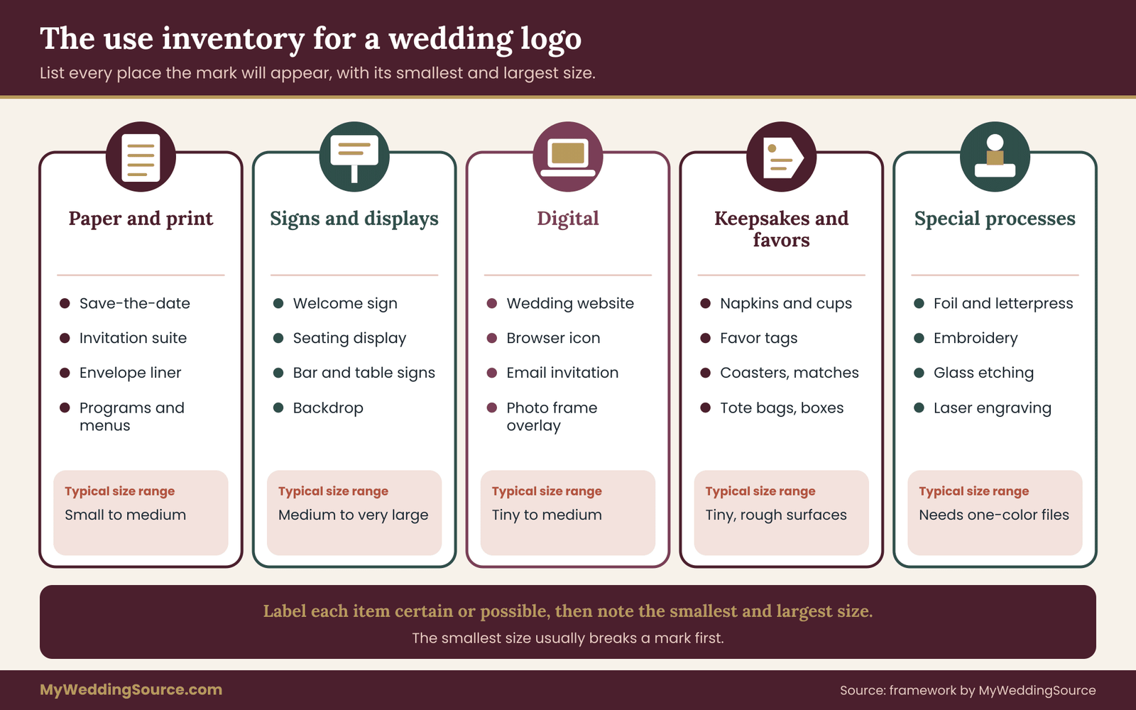
Paper and print. The invitation printing guide covers the production side of these. Save-the-date, invitation, response card, details card, envelope seal or liner, place cards, programs, menus, thank-you cards. Add anything your stationer has mentioned.
Signs and displays. Welcome sign, seating chart, directional signs, bar sign, table numbers, memorial or photo display, and any large backdrop. Signs are where size stretches the furthest. The wedding logo that was lovely at two inches wide must now work at several feet. The wedding signage system guide explains how a full set of signs fits together, which tells you how many different sizes your mark will need to survive.
Digital. Wedding website header and favicon, email invitations, social profile images if you plan any, a livestream overlay, a photo booth frame. Digital uses need small raster files and, in some cases, a square or circular crop.
Keepsakes and favors. Napkins, cups, matches, coasters, stickers, favor tags, candles, boxes, bags, tote bags. These are the items where the wedding logo meets unusual materials and low-detail printing methods.
Applied and special processes. Embroidery, glass etching, laser engraving, foil stamping, letterpress, embossing, a rubber stamp, a cake topper, a neon-style sign. Each process has its own limits on line thickness and small detail, and each must be named in the brief if you expect it.
Record the smallest and largest size for each use
Next to each item, write the smallest and largest size you can imagine the mark appearing. You do not need precision. “Smaller than a postage stamp” or “about as wide as a door” is enough for now. The real values come out of the reproduction proof later. What matters now is that the designer sees the range.
The smallest size is usually the one that breaks a mark. Fine hairlines, tight gaps between letters and tiny decorative dots all vanish at small sizes or fill in with ink. If the smallest use is a stamp on a favor box, tell the designer so they can test it early.
Mark what is certain and what is only possible
Use two labels. “Certain” means you have already decided to buy it. “Possible” means you might. This helps a designer decide how much to invest in unusual versions. A one-color embroidery version is worth building if napkins are certain and a waste of time if they are only a daydream. You can always return later and ask for an extra version, but a designer who knows the plan at the start can build the wedding logo so that the extra version is a small step rather than a redraw.
Who else needs to see the inventory
Show the inventory to your stationer and to anyone who will make a physical item, even informally. They often know of a limit the designer does not. A printer may mention a minimum line weight. A signmaker may want a file in a specific format. A friend with a cutting machine may need a single closed outline. Catching these now means the designer can solve them in the first round instead of the last.
Writing the wedding logo brief
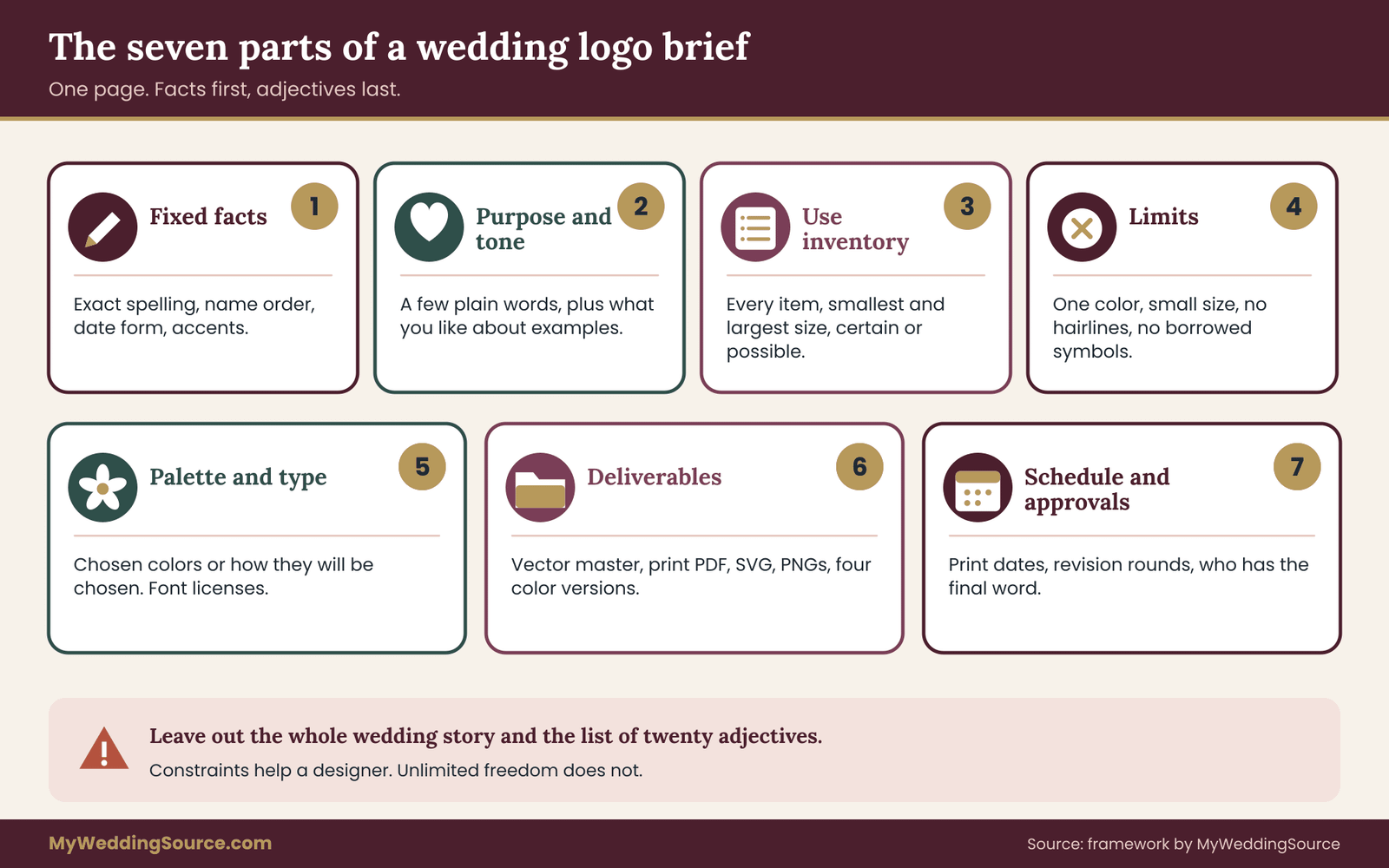
A brief is not a mood board with a deadline attached. It is a short document that lets a designer make decisions without guessing. One page is plenty. Longer briefs tend to bury the facts that matter beneath adjectives. A good wedding logo brief has seven parts, and each answers a question the designer would otherwise have to ask in an email chain.
Part one: the facts that must not change
Start with spelling. Write each name exactly as it should appear, including accents, hyphens, middle initials if used, and the order of the names. Write the date in the exact form you want, or say that no date should appear. If a name is spelled differently in different documents, decide now which version the wedding logo will use, because changing it after printing is expensive. The same discipline applies to the venue name or city if either is part of the wedding logo.
Part two: purpose and tone, in plain words
Say what the wedding logo is for and what it should feel like, using a few concrete words rather than a stack of adjectives. “Quiet and a little formal, closer to a bookplate than a poster” tells a designer more than “elegant, timeless, romantic.” If you have two or three examples you like, name what you like about each: the proportion, the weight of the line, the way the letters sit.
Do not send examples with the instruction to copy them. Part of the reason to commission a wedding logo is to avoid looking like something else.
Part three: the use inventory
Paste the inventory from the previous section, with the smallest and largest sizes and the certain-or-possible labels. This is the part most briefs skip, and it is the part that decides whether the work is reusable.
Part four: constraints and limits
List anything the wedding logo must do or must avoid. Examples include: must work in one color; must be readable at a small size; must avoid thin hairlines because of a planned embroidery; must not include a religious or cultural symbol unless you have chosen to; must avoid imagery tied to a particular brand; must leave room for the date.
If your venue has a strong visual character, such as ornate plasterwork or a very plain barn interior, mention it only if you want the wedding logo to respond to it.
Constraints are a gift to a designer. A mark with clear limits is easier to design than a mark with none. If you are unsure which limits to set, the use inventory usually suggests them.
Part five: palette and type direction
State your colors if they are already chosen. If they are not, say so and mention how the final colors will be decided, since a mark designed in one palette can look flat in another. A good color guide helps you settle on colors before the artwork is finished, which avoids a second round of changes.
If you already own a font license for a wedding typeface, tell the designer. If you do not, ask the designer to name any typeface used and explain how it is licensed, because that affects what you may do with the files later. The rights section below explains why.
Part six: deliverables
Name the files you expect to receive. This part of the brief is unusually important and unusually often missing. The file kit section below gives the full list. In the brief, simply say: “Deliver a vector master, a print-ready PDF, an SVG, transparent PNGs at several sizes, and one-color, reversed, black and white versions. Include a one-page usage note.” Specifying it at the start makes it a normal part of the job rather than an add-on.
Part seven: schedule, rounds and approvals
State the dates that matter. When does the save-the-date have to be at the printer? When is the website going live? Add the number of revision rounds you expect and who approves. If two people must agree, say so and say who has the final word when they disagree. A brief that names the approver prevents the common stall where each partner assumes the other is replying.
A short example of how the sections read
Imagine an opening paragraph in a brief. It might read: “Names: Amara Osei and Daniel Reyes, in that order, no middle names. Date: 9 May, no year. Purpose: a mark for printed paper, signs and a few stitched or etched keepsakes. Tone: quiet, slightly formal, closer to a bookplate than a poster.” That is four short sentences, and it already prevents three rounds of questions. The rest of the brief is built the same way, in plain sentences rather than a form.
What to leave out of the brief
Leave out your whole wedding story, unless the story is what the wedding logo should draw on. Leave out a list of twenty adjectives. Leave out instructions about technical drawing methods, which the designer knows better than you. And leave out a promise of “exposure” or “portfolio credit” as part of payment. Those are not a fair substitute for a fee, and they muddy the question of who owns what.
Choosing a designer and comparing quotes
Where you get a wedding logo from changes what you should ask. There are five common routes, and none is automatically best. The right choice depends on your use inventory, your timeline and how much control over the files you want.
A template from a design marketplace. Fast and inexpensive. You usually receive a license to use the design, not the copyright. The artwork may be sold to many other people, so your mark may not be unique. Read the license closely, because some marketplace licenses restrict use to digital items, or forbid printed merchandise, or require a higher tier for commercial printing, which can include certain favors.
Your stationer’s lettering or custom design service. Convenient, because the person who designs the wedding logo is the person who prints it. The risk is that the files stay with the stationer. Ask early whether you will receive the vector master and whether another printer may use it.
An independent freelance designer. You can specify the exact deliverables and the license, and you work with one person from first sketch to final files. Quality varies, so look at work that resembles what you need and ask about reuse across materials.
A small design studio. Often more process, more review and a higher fee. Worth considering if the wedding logo needs to be built as a whole system with many versions.
A friend or family member. Warm and often generous, but it still needs a brief and a plain agreement. The same rights questions apply, and a skipped conversation can quietly strain the friendship later.
Questions to ask every designer
Whatever route you choose, ask the same short list. Which files will I receive, and in what formats? May I give those files to any printer or maker I choose? Does the fee include the vector master? How many revision rounds are included, and what does an extra round cost? Who owns the copyright, and what license do I receive?
Will you use any stock elements, fonts or templates, and how are they licensed? Can the artwork appear in your portfolio, and may I ask you not to? What is the timeline, and what happens if I need a change after approval?
A designer who answers these clearly, in writing, is usually a designer who has done the work before. A designer who finds them irritating is giving you information too.
Comparing quotes without a spreadsheet of surprises
Quotes for a wedding logo are hard to compare because they bundle different things. One includes three concepts and two rounds. Another includes one concept and unlimited minor edits. One covers the vector master; another charges for it separately. Before comparing prices, rewrite each quote into the same shape: concepts offered, rounds included, files included, license type, price of extra rounds, price of extra files.
When you do, a low quote often turns out to leave out the very files you need, and a high quote sometimes proves to include everything.
The principle is the same one used for other vendors, and the wedding vendor due diligence checklist gives a broader way to check who you are hiring: confirm identity, ask for examples of relevant past work, and read the agreement before paying.
How much time to allow
Do not plan the artwork for the week before the save-the-date goes out. Allow time for a brief, a first round, feedback, a second round, file preparation and a reproduction proof. Rather than quote a typical duration that depends entirely on the designer, ask each one for a schedule and work backward from your first printed item. Add a buffer, because couples take longer to give feedback than they expect, and because the proof can reveal a fix.
Usage rights for a wedding logo in plain terms
Rights are the dull part of the process and the part that causes the most grief afterward. You do not need to become a copyright lawyer. You need to understand four ideas well enough to ask the right questions and to notice when an answer is missing.
Who owns the artwork by default
In the United States, copyright generally belongs to the person who creates an original work, from the moment it is fixed in a tangible form, and that is true without any registration or notice. The U.S. Copyright Office explains this on its website, and it is the primary source for the basics. For a commissioned wedding logo, the default owner is usually the designer, not the person who paid. Paying for a design does not by itself transfer ownership.
That surprises many couples, and it is not a trap. It simply means ownership and permission to use are two separate questions. Most designers expect you to use the work widely. What you need is for that expectation to be written down.
Ownership and license are not the same thing
There are three common arrangements, and each is acceptable if you know which one you have.
A license, non-exclusive. The designer keeps ownership and grants you permission to use the artwork in defined ways. They may in theory grant similar permission to others, though for custom work that is unusual.
A license, exclusive. The designer keeps ownership but agrees not to grant the same permission to anyone else. You alone may use the mark for the agreed purposes.
An assignment. Ownership transfers to you. U.S. copyright law generally requires a transfer of ownership to be in writing and signed by the person giving it up, so a friendly email saying “it’s yours” is better than nothing but a signed sentence in an agreement is better still.
For a personal wedding, an exclusive license that clearly covers your needs is usually enough. An assignment matters more if you might later want to adapt the artwork, sell items bearing it, or build it into something longer lived, such as a family business or a recurring annual event.
The words that matter in a license
Whatever form you choose, look for these points and make sure each is addressed. The plain summary of any agreement should answer them.
What you may use it for. Personal wedding use should cover printed stationery, signs, digital use and keepsakes. If a license says only “print,” ask whether a wedding website counts.
Who may produce items. Can a printer, signmaker, embroiderer or engraver reproduce the artwork on your behalf? If the license limits production to the designer, you have a practical problem the first time someone else needs the file.
How long it lasts. A license “for the event” might stop after the wedding, which matters if you plan anniversary prints, a photo album cover or a framed piece.
Where and in what quantity. Some licenses cap print runs. For a wedding this rarely matters, but a cap is worth noticing.
Whether you may modify it. Resizing and recoloring are usually allowed. Redrawing, adding a date or changing the arrangement may need permission. If you expect a later version with a new date for an anniversary, ask now.
Credit and portfolio use. A designer may reasonably want to show the work. If you prefer privacy, say so before you sign.
If the agreement is silent on any of these, ask for a sentence of clarification. A one-line email reply that you save is valuable evidence of what was meant. The wedding vendor contract guide covers the habit of getting changes in writing, which applies as much to a small art commission as to a venue booking.
Fonts, stock elements and anything borrowed
A wedding logo often contains pieces the designer did not draw from scratch: a typeface, a decorative flourish, a stock botanical. Each piece has its own license, and your rights to the finished mark cannot exceed the rights to its parts.
Fonts are the most common trap. A font license may allow use on a printed invitation but not in a logo, or may require a separate license for web use, or may forbid embedding in files delivered to third parties. Designers usually convert lettering to outlines in a logo, which turns the letters into shapes and removes the font file from the picture, but the font license can still govern whether that is allowed.
Ask each designer one direct question: “Does this mark use any typeface or element that has licensing terms I need to follow?” If the answer is “everything is custom-drawn,” ask that it be stated in the agreement.
Stock illustrations deserve the same question. A mark built on a stock element that many people can license is not exclusive, however the rest is drawn, and the stock license may restrict printed merchandise.
Copying, resemblance and borrowed marks
Do not ask a designer to produce something that looks like an existing brand, a famous crest or another couple’s published design. Resemblance is a risk to you as well as to them. Names and short phrases are generally not protected by copyright on their own, and the U.S. Copyright Office says so in its public guidance, but the particular artwork around them can be, and a lookalike of a protected design can cause trouble.
A related point is trademark. A personal wedding logo does not need trademark protection. But if you might later sell items with the wedding logo, or use it for a business such as a recurring event, the U.S. Patent and Trademark Office is the agency to consult, and a licensed attorney can advise on your situation. For a wedding alone, the practical rule is simpler: do not borrow another organization’s mark, and do not accept a mark that closely echoes one.
Artwork made with automated tools
Some designers use image-generation software in their process, and some couples try it themselves. The U.S. Copyright Office has published guidance on works that include material generated by artificial intelligence, and its position centers on human authorship: material generated purely by a tool without sufficient human creative control is generally not eligible for protection. For a wedding logo this has two practical meanings.
First, if you want exclusivity or a clean assignment, you want to know how much of the wedding logo a human actually drew. Second, an agreement should state whether automated tools were used and under what terms. The guidance is evolving, so read the current version on the agency’s site before relying on it.
A rights checklist you can paste into an email
Before paying a final invoice, you should be able to answer yes to each of the following, based on a sentence in writing.
- The agreement says whether I receive a license or an assignment, and which kind.
- It lists the uses I may make, including print, signs, digital and keepsakes.
- It allows printers and makers to reproduce the wedding logo for me.
- It says how long the permission lasts.
- It states whether I may resize, recolor and add a date.
- It tells me whether any font, stock element or automated tool was used, with its terms.
- It states whether the designer may show the work publicly.
- It says what I receive: which files, in which formats.
- It says what happens if I need a change later, and what it costs.
- It is signed or confirmed in writing by both sides.
Nothing here requires a long contract. Many agreements for this kind of work fit on one page, and a clear one is a good sign. If a designer will not put basic answers in writing, that is a reason to pause before paying.
What to do when rights are unclear
Sometimes you inherit an unclear situation. A friend drew the wedding logo months ago, or a stationer included artwork in a package with no written terms. The practical fix is to write down the permission now. Send a short message that states what you understand, such as, “Thanks again for the artwork.
To confirm, you are happy for us and our printers to use it on stationery, signs, our website and keepsakes for our wedding and afterward for personal use.” Ask for a reply that says yes. It is not a formal contract, but it is a clear record, and it prevents later disagreement.
The wedding logo file kit to request
This is the section to keep open when you talk to a designer. A wedding logo delivered as a single image is a draft, not a finished product. A finished delivery is a small folder of files, each with a job. The folder does not need to be large. It needs to be complete and clearly labeled.
Vector and raster, in plain language
Most trouble with files comes from one distinction. A vector file describes a shape with lines and curves, so it can be enlarged to any size without getting blurry. A raster file is a grid of colored dots, so it looks sharp only at or below the size it was made for. Enlarge a raster too far and the edges turn soft and blocky.
A wedding logo should start life as a vector. From a vector master, you can make a raster at any size you like, and you can never do the reverse without redrawing. The World Wide Web Consortium maintains the SVG standard, which is the vector format built for the web. For print, designers commonly deliver vector artwork in PDF, and some printers still ask for EPS or for the designer’s native working file.
The master files
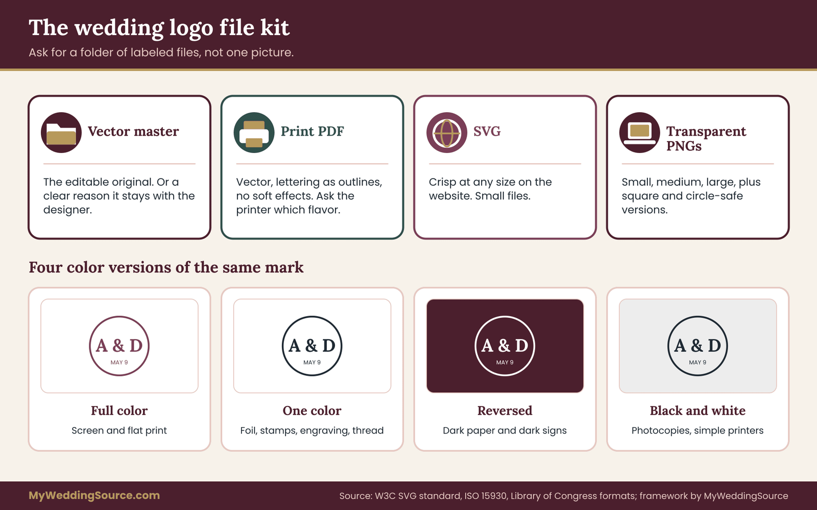
Vector master (the designer’s working file). This is the original, editable artwork. Ask for it, or for a clear statement of why you will not receive it. If the designer keeps it, you depend on them for every future change. Some designers include it in the fee, some charge for it, and some simply decline. Knowing which one before you hire is useful.
Print-ready vector PDF. A PDF with the artwork as vectors, lettering converted to outlines, and no raster effects such as soft shadows. Many printers prefer this. Some ask for a specific print-industry flavor of PDF, and the ISO standard behind those requirements, ISO 15930, is the reference printers mean when they say a file must meet PDF/X rules. You do not need to produce that yourself. Ask your printer which one they want, and ask the designer to deliver it.
SVG. For your wedding website and for any digital use where crisp scaling matters. SVG files are small, and they can include transparency.
EPS, if a printer or signmaker asks. An older vector format still requested by some shops. Ask the designer whether they can provide it, and do not insist unless someone actually needs it.
The raster files
Raster files are what most people will use day to day, so ask for a sensible set.
Transparent PNGs in several sizes. PNG supports transparency, so the wedding logo can sit on any background without a white box. Ask for at least a small, a medium and a large version, and say the pixel dimensions you want if you have them. A website header, an email and a social profile image all need different sizes.
A square version and a circular-safe version. Social profiles and many apps crop to a square or circle. A mark that was designed as a wide horizontal line can lose its edges. A compact version solves it.
JPEG only as a convenience. JPEG has no transparency and tends to blur sharp edges, so it is a last resort, useful for sending a quick preview but not for production.
The color versions
This is the part that surprises people most. A single full-color mark is only one of the versions a wedding logo needs. Ask for these four as a minimum, each in the vector and raster formats above.
Full color. The version you saw during design.
One color. The wedding logo in a single ink color, with no gradients or tints. This is the version used for foil, letterpress in one ink, embossing, stamps, laser engraving, embroidery with one thread and anything printed on a colored or dark material.
Reversed (light on dark). A version made to sit on a dark background, usually white or a light tint. A mark that looks balanced in dark ink on white can look heavy or thin when reversed, so it deserves its own check.
Black and white. Pure black and pure white versions for situations where color is not controllable, such as a photocopied program or a single-color printer.
If your inventory includes a very small use, ask for a simplified small-size version too. Designers sometimes call this a compact mark: the same idea with the finest details removed and the spacing opened slightly. It is a normal professional courtesy, not a favor.
Color information, written down
Each color in the wedding logo should be recorded in more than one color system, because different tools understand different ones. Ask for a short color sheet that lists each color’s values for screen use and for print use, and, where a printer works with spot inks, the name of the closest spot color.
You can then pass the sheet to any printer. If you chose your colors with a palette planning guide, copy the same names so that the logo and the rest of the stationery stay matched.
Be honest about what the sheet can and cannot do. Printed color varies with paper, ink and press, and a screen is not a printed page. The sheet gives everyone the same starting point; it does not guarantee identical results, and the reproduction proof later in this guide is where you see the real difference.
Spacing and size rules in a one-page usage note
A good designer adds a short usage note to the file kit. It should cover four things in plain language. Clear space: how much empty room must surround the wedding logo so that nothing crowds it. Minimum size: the smallest width at which the wedding logo stays legible, ideally tested rather than assumed. Do-nots: stretching, rotating, recoloring or adding effects. And which version to use where, for instance “use the one-color version on kraft paper.”
If the designer does not provide a note, write one yourself after the proof, using the sizes that actually worked. Even a half page is enough for a printer to stay consistent.
File naming that prevents mistakes
Ask that every file name say what it is. A folder with fifty files called “final,” “final2” and “final-real” invites the wrong one being sent to the printer. A simple pattern works: the project name, the version, the color treatment and the format, for example a name that reads “logo-onecolor-plum.svg.” Ask the designer to put the files in labeled subfolders, such as “print,” “web,” “one-color,” “reversed” and “source.” Keep the original download untouched, and copy from it when someone asks for files.
The Library of Congress publishes information about digital file formats and their long-term usefulness, which is a good reference if you want to keep the artwork usable for decades.
Checking the delivery before you pay
Open every file. This takes ten minutes and is the single best guard against surprises. Confirm that the vector files open in a viewer and that the artwork is sharp when zoomed in far. Confirm that transparent files have no white box when placed over a dark color. Confirm that the one-color file really has one color. Confirm that the spelling matches your brief, letter by letter, including accents. And confirm that the file count matches the list in the agreement.
If something is missing or wrong, say so politely and specifically. Designers fix small file issues quickly, and the fix is easiest while the project is still open and the final payment is still pending.
Revision rounds, approvals and payment gates
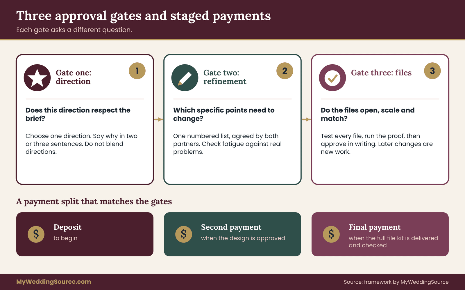
Design projects go wrong less often from bad taste than from muddy decisions. A clear structure for feedback keeps a wedding logo on schedule and keeps the relationship with the designer pleasant. The structure has three gates, and each gate has a different question.
Gate one: direction
At the first presentation, the designer shows one to three rough directions. Your job is not to pick the prettiest one. Your job is to decide which direction fits the brief. Go back to the brief and ask: does this respect the spelling, the tone and the constraints?
Does it look as if it could work at the smallest size on the inventory? Say which direction you choose and why, in two or three sentences. Vague feedback such as “make it pop” produces a second round that looks like a coin toss.
Resist the urge to combine pieces of several directions. Combining often produces a mark that has the weakness of each. If you like one element of a direction you did not choose, say so, and let the designer decide whether it fits.
Gate two: refinement
The second round refines the chosen direction. This is where you comment on proportion, spacing, line weight and the exact arrangement of names. Give feedback in a single message with numbered points, signed off by both partners, so the designer is not chasing two voices. Keep each point specific: “the ampersand feels too large compared to the names” is useful; “something is off” is not.
Be careful at this stage with tastes that shift as you look. After staring at a mark for a week, everyone wants to change something. Ask whether the change addresses a real problem in a real use, or whether it is simple fatigue. A good check is to put the wedding logo away for a day and look again.
Gate three: file approval
The final gate is not about the design. It is about the files. Approval here means you have opened and tested the file kit, and the wedding logo is frozen. Say so plainly: “We approve the design and files as delivered on this date.” After that point, changes are new work and may cost extra. Many designers state this in their agreement, and it protects both sides.
Staging the payment
A common arrangement is a deposit to begin, a second payment when the design is approved, and a final payment on delivery of the complete file kit. The details are the designer’s to set, and there is no single right split. What matters is that the last payment is tied to something you can check, namely the full set of files.
If the whole fee is due before any files are delivered, you have no leverage if something is missing. If the whole fee is due at the end and the designer has not been paid anything, the designer has the same worry in reverse. A split that matches the gates is fair to both sides.
For a broader approach to staging payments and tracking what is due when, a good vendor contract guide describes how deposits and balances are usually structured and what to look for in the wording.
Change fees and what counts as a change
Ask in advance what counts as a revision and what counts as a new request. A revision adjusts what already exists: a slightly different spacing, a different shade, a smaller flourish. A new request changes the premise: a different name order, a new symbol, a different concept. Most designers include a number of revisions and charge for the rest. The distinction is easier to accept when it is stated before the work starts.
One scenario comes up often. A partner’s name is spelled differently from what appeared in the brief, or a date changes after a venue conflict. Both are real reasons for a change and neither is a revision of taste. Tell the designer immediately and ask for a fair quote rather than waiting until the final files are ready.
The reproduction proof
A reproduction proof is the original piece of this guide: a short test you run on the finished wedding logo before approving it, to prove it survives every process on your inventory. It costs very little, and it replaces optimism with evidence. Think of it as a test sheet, not a formal procedure. You can do it at home.
What the proof is for
Screens flatter artwork. They light it from behind, they smooth edges and they hide differences in size. A printed page, a sign, a stitched napkin and an etched glass each strip away something. The proof shows what is stripped. If the wedding logo holds up, you proceed with confidence. If it does not, you have found the problem while a fix is still a minor change.
The six checks
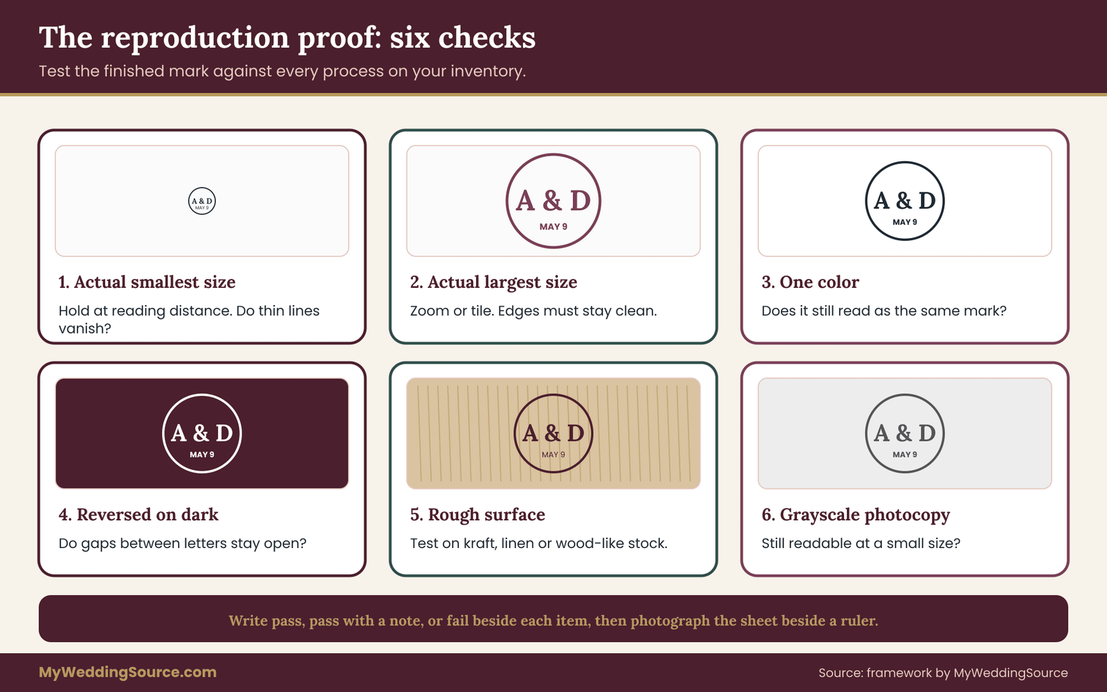
Check one: actual smallest size. Print the mark at the smallest size on your inventory, on the kind of paper you plan to use if you can. Hold it at reading distance. Can you read every letter without leaning in? Do any thin lines vanish? If a hairline disappears, it will disappear on the finished item.
Check two: actual largest size. Enlarge the vector version to the biggest size on your inventory, ideally by viewing it zoomed in on a screen at that scale or printing a tile of it. Edges should stay clean. If you see blocky edges, you are looking at a raster file, not a vector, and you should go back to the file kit.
Check three: one color. Print the one-color version in black. Does the wedding logo still read as the same mark? Anything that relied on a tint, a gradient or a subtle overlap of colors may fall apart. The one-color version should be a deliberate design, not an automatic conversion.
Check four: reversed on dark. Place the reversed version on a dark background, on screen or on a dark paper swatch. Light-on-dark artwork can look bolder than dark-on-light, so fine lines may seem to bloom and gaps may close. Check that the spaces between letters stay open.
Check five: rough surface. If your inventory includes kraft paper, linen, fabric or wood, test on something similar. A quick rubber-stamp or marker trace is not accurate, but a print on textured stock is. Rough surfaces eat fine detail, and this is the check that most often reveals a problem.
Check six: grayscale photocopy. Copy the wedding logo in grayscale at a small size, the way a program might be duplicated at the last minute. The copy should still be readable.
Recording the results
Write the result of each check beside the item it relates to: pass, pass with a note, or fail. A pass with a note might read, “reads well but the date line is too thin below a certain width.” Those notes become the minimum-size line in your usage note. A fail triggers a conversation with the designer about the compact version or a thicker line.
Using the proof to decide between versions
Once you have results, you can assign a version to every item. Large signs use the full-color or one-color master. Small stamps and favor tags use the compact version. Dark items use the reversed version. Anything stitched or etched uses the one-color or simplified version. This mapping turns a folder of files into a plan, and it keeps volunteers and vendors from grabbing the wrong one.
When a process is too demanding
Occasionally a process is simply wrong for a particular mark. A very fine script may never embroider well. A design with a gradient may not foil. Rather than forcing it, change the item. Use a printed label in place of embroidery, or a simpler secondary symbol from the same family. It is better to adjust the product than to degrade the wedding logo.
Keeping the evidence
Photograph the proof sheet next to a ruler, and save the photo with the file kit. If a vendor later produces something that looks wrong, you can compare it with the proof and have a calm, factual conversation about whether the problem lies with the artwork or with the production.
Applying the wedding logo across invitations, signs and keepsakes
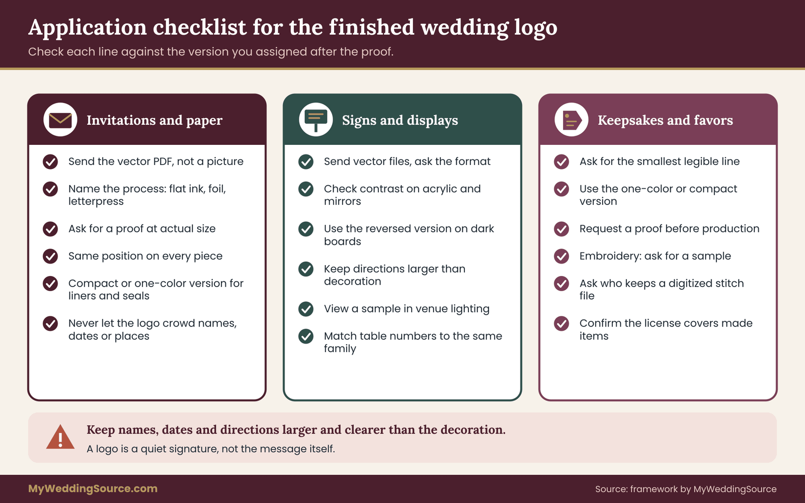
With a tested file kit in hand, the work becomes a checklist. Each category of item has its own habits, and each tends to break the wedding logo in a particular way. Use the checklist below as a final pass before orders go out, and tick each line against the version you assigned after the proof.
Invitations and printed paper
Invitation printing is where most couples first use their wedding logo, and the guide to wedding invitation printing covers proofing, quantities and printer handoffs in depth. For the logo itself, the checks are narrow.
Give the printer the vector PDF, not a picture of it. Say which process is planned, since a mark that prints well in flat ink may need a heavier line for foil or letterpress. Confirm whether the printer will convert colors, and ask to see a proof with the logo at actual size. Check the position of the wedding logo on every piece: the save-the-date, invitation, response card, details card and envelope should place it consistently, and the envelope liner or seal may need the compact version.
Think about the back of each piece too. A reply card often carries the wedding logo small. A details card may carry it in one color to keep the cost down. Decide in advance, so that each piece is deliberate rather than a leftover.
Keep legibility in mind for older readers and for people with low vision. A mark used as a small decorative header is fine; a mark that replaces the actual text of a name or date is not. The wedding invitation etiquette guide covers what information every invitation must carry, and no logo should crowd it out.
Signs and displays
Signs magnify every flaw. A welcome sign, a seating display and a bar menu each use the wedding logo at a very different scale from the invitation. Always send the vector file to a sign maker and ask what format they prefer, since some cutting and engraving machines need a single closed outline and others accept a PDF.
Check contrast against the surface. A mark in a mid-tone color can vanish on a mirror, on acrylic or against a flower arrangement behind it. The same mark in the reversed version, or in a darker one-color treatment, may stay clear from across a room. Where a sign carries the logo plus information, such as table numbers or directions, keep the information larger and clearer than the decoration.
Keep the signs consistent as a set, so the wedding logo can be a quiet signature rather than the main message.
Also remember lighting. A sign photographed under warm string lights or in a dim barn reads differently from a screen proof. If you can, view a sample under conditions close to the venue.
Digital uses
On a wedding website, use the SVG for the header where the platform allows it, and a transparent PNG where it does not. Test on a phone, because the header often shrinks to a very small width. Provide a square compact version for the website’s browser icon and for any social profile. Email invitations may strip images or show them with a white box, so a transparent file placed on a matching background, or a version with a built-in background color, avoids an awkward look.
If you create a guest photo frame, an overlay for a livestream or a filter, remember that the artwork will sit over moving, busy images. A simple one-color version in white with a subtle shadow tends to hold up best, and the designer can prepare it if it is on the inventory from the start.
Keepsakes and favors
Keepsakes are where a wedding logo meets the strangest materials. Napkins, cups, coasters and matchboxes are often printed in one or two colors by methods with generous tolerances. Ask the maker for a proof and ask what the smallest legible line weight is on that product. Candles, wooden boxes and glassware may be engraved, etched or hot-stamped, and each wants its own file, usually a simplified one-color vector.
Textiles deserve particular care. Embroidery turns lines into thread, and thread has thickness. A thin script becomes a lumpy smear, and a tight gap fills. Ask an embroiderer to produce a sample, since they often have to digitize the wedding logo, meaning convert it into a stitch file. The digitized file is a new piece of work that the embroiderer may own or charge for, so ask whether you may keep it for future orders.
For items given to guests, think about what stays after the day. A mark on a durable item, like a glass or a tote, will be seen again and again. A mark on a paper napkin is seen once. Spend effort accordingly.
Cake, flowers and décor
Some uses do not involve the artwork directly. A cake decorator may copy the wedding logo in icing, a florist may echo it in a wreath, and a rental company may produce a neon-style sign. In these cases, give the decorator the one-color version and a printed copy at actual size, and clarify that the result will be an interpretation, not a duplicate. Your license should cover this kind of use, and a quick message to the designer is a reasonable check.
Photography and video
Photographers and videographers may place the wedding logo on albums, on a preview gallery, on a film title card or on a print order page. Share the vector files and the reversed version, and explain where the logo may and may not appear. If you would rather it did not appear on your photos at all, say so in writing, since many photographers add a studio watermark by habit and some will happily use a couple’s mark instead.
The wedding photography consent guide covers how permissions around images are usually handled.
The handoff packet for printers and makers
Every time you send the wedding logo to someone, you risk a different file, a different crop or a different misunderstanding. A handoff packet reduces that risk to nearly zero. It is a single folder, or a single zip file, that you send to every printer and maker, with the same contents every time.
What goes in the packet
Include the print-ready vector PDF, the SVG, the one-color and reversed vector files, a transparent PNG at a large size, the color sheet, the usage note and a photo of the reproduction proof. Add a short text file or email body that states the item, the version to use, the size, the colors and the process. Leave out files you do not want used, such as old drafts and rejected directions. A packet with a clear name, a date and a version number is easy to refer to later.
The message that travels with it
Keep a short template for the covering message. It should name the item and quantity, say which file to use, state the size range, give the color instructions, ask for a proof before production, and ask the maker to confirm that they received the artwork and that they will not alter it. A message like this is polite, and it makes vendor work faster, since the vendor starts with everything they need.
Questions to ask a maker before they begin
Ask what file type they need and whether they will convert the artwork. Ask whether they add any fee for preparing artwork, and whether they will keep your file afterward. Ask whether they will send a proof, in what form, and how many changes are included. Ask what the smallest legible detail is for their process.
And ask whether they will use the artwork for anything other than your order, such as a portfolio or sample. These questions mirror the ones in the due diligence checklist and give you a record of what was agreed.
Keeping one source of truth
Choose a single place where the master file kit lives, and name one person as its keeper. Send packets from there, never from a phone gallery or a forwarded email. When the designer fixes a file, replace the folder and note the date, so a printer does not receive an outdated version. Keep a short log of who received what and when. If anything is reprinted or reordered a year later, the log tells you which version was used and which vendor produced it.
After the wedding
The wedding logo does not need to disappear after the day. Keep the file kit with your other wedding records. If you want to use the wedding logo on an anniversary print, a photo book cover or a framed piece, the license decides whether you need to ask. If you plan to retire it, that is fine too, and a note to your future self about the license terms saves a search later.
A worked example: one wedding logo, start to finish
The following is an invented example, built to show how the steps fit together. The couple, the designer and the numbers are made up, and no real results are implied.
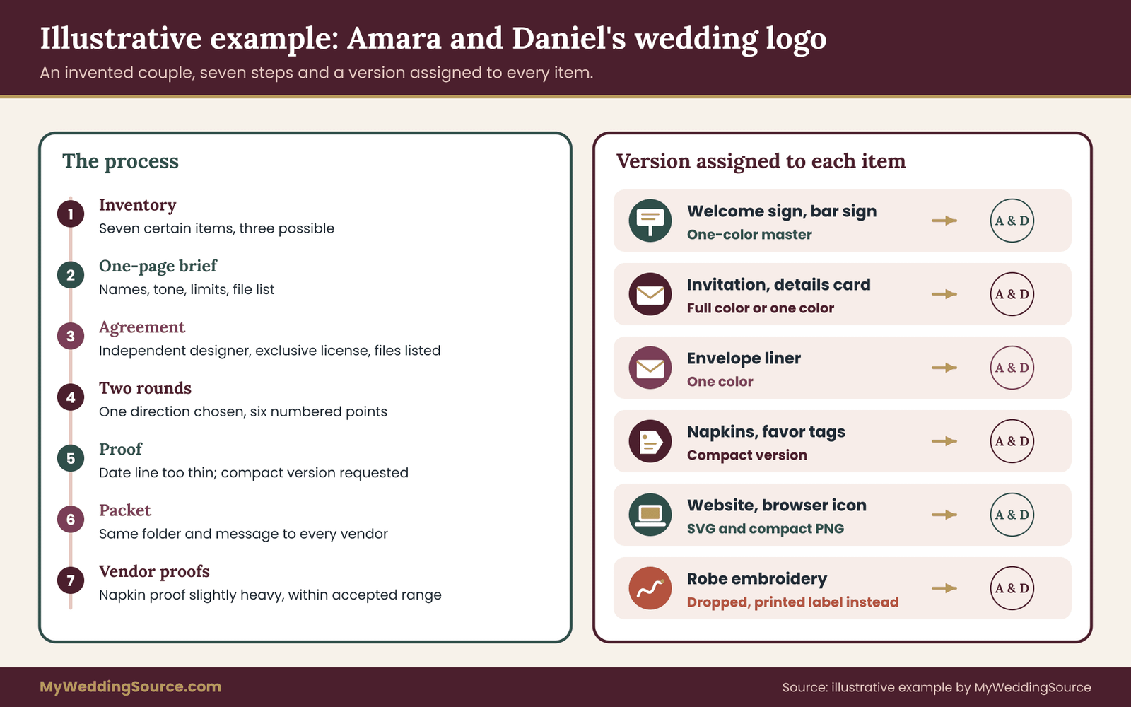
Imagine Amara and Daniel, who are planning a spring wedding with about a hundred guests. They begin with a use inventory. Certain items: a save-the-date, an invitation suite with an envelope liner, a welcome sign, a bar sign, table numbers, a wedding website and cocktail napkins. Possible items: favor tags, an etched glass for the head table, and an embroidered robe for a getting-ready photo. The smallest use is the napkin corner and the largest is the welcome sign.
They write a one-page brief. It lists both names as they appear on their passports, the date without a year, and a tone described as “quiet, a little formal, closer to a bookplate than a poster.” It states that the wedding logo must work in one color, must survive a napkin print, and should avoid hairlines because of the embroidery that might happen. It names the deliverables: a vector master, a print PDF, an SVG, transparent PNGs, four color versions, a color sheet and a usage note.
Choosing and agreeing
They compare three routes. A marketplace template costs the least but the license excludes printed merchandise, which would rule out napkins. Their stationer offers lettering as part of a package, but the files would stay with the shop. An independent designer quotes a higher fee with a vector master, an exclusive license for personal wedding use and two revision rounds.
The couple compares the three on the same shape: concepts, rounds, files, license and price of extra rounds. The independent designer is the only one that covers every item on the inventory, so they hire that designer, and they save the agreement and a short email confirming the license wording.
Rounds and the proof
At gate one, the designer shows two directions. The couple chooses the one that matches the brief and says why in three sentences. At gate two, they send a single numbered list with six points, including a request to open the gap between the first and second initials. After the refinement, the designer delivers the file kit.
Now the couple runs the reproduction proof. They print the mark at napkin size on uncoated paper. The date line, in a thin weight, almost disappears, so they ask for a compact version with a heavier date. They try the reversed version on dark green card, and the gap between the letters closes slightly.
They ask for slightly wider spacing in that version only. The one-color version works well in black, and the grayscale photocopy is readable. They write the results on a sheet, photograph it beside a ruler and save it with the files.
The application pass
With the proof results, they assign a version to each item. Large signs use the one-color master. The napkins, favor tags and the website icon use the compact version. The envelope liner uses the one-color version because their printer recommends a single ink for that piece. The embroidered robe is dropped from the plan, because the embroiderer’s sample turned the date line into thread clumps, and a printed label replaces it.
They assemble a handoff packet, send it to the printer, the sign maker and the napkin supplier with the same covering message, and ask each for a proof. Two proofs come back correct. The napkin supplier’s proof shows the wedding logo a little heavier than expected, and a quick comparison with their saved proof sheet shows it is within what they accepted. They approve it and move on.
What the example shows
Nothing in this story is clever. The couple did a handful of ordinary things in a sensible order: listed uses, wrote a short brief, agreed on rights in writing, requested a full file kit, tested before approving and sent the same packet to everyone. The wedding logo itself could have been any style. What made the result reliable was the process around it.
Edge cases and how to handle them
Real projects rarely follow a straight line. These situations come up often enough to plan for.
The designer cannot be reached
Life happens, and designers move, get busy or close a business. The best protection is to receive the full file kit and written license at delivery and to store both safely. If the designer disappears before delivering everything, send a clear, polite message listing what is outstanding, give a reasonable date and keep the thread.
A written record of what was paid and what was promised is your best evidence if a payment dispute arises. If you paid by credit card, the Consumer Financial Protection Bureau explains how billing disputes work, and the window for reporting a problem is limited, so act promptly.
Someone else will produce the logo from your files
A friend with a cutting machine or a cousin who runs an embroidery shop may offer to help. Treat them like any maker: send the packet, ask what they need, and confirm that your license allows third parties to produce items. A gift of time is generous, but the artwork rights still apply.
A name or date changes late
If a spelling error is found after printing, or a date shifts, stop ordering. Tell the designer, ask for a quote for the correction and ask whether the new files will be delivered in the full kit. Do not edit a vector file yourself unless the license allows it, since an amateur edit can break the spacing and produce a version that no longer matches anything printed.
The mark looks different between vendors
Color and weight vary by process, and that is normal. The question is whether the variation stays within what you accepted at the proof stage. Keep your saved proof sheet and the approved vendor proofs for comparison. If a vendor’s final product differs sharply from the approved proof, raise it right away with photographs, before payment is complete where possible.
You want to reuse the mark for something larger
Anniversary prints, a family event, a small business that grew out of the wedding: each is a different use. Check the license first. A license written for personal wedding use may not extend to selling items, and a business use may involve trademark questions. For those, the U.S. Patent and Trademark Office publishes information on how trademarks work, and a licensed attorney can advise on your situation.
A guest or vendor wants to use the logo
Vendors sometimes want to show their work. Guests sometimes want to make something nice. If you are comfortable with it, say yes in writing and describe the limits, such as “for your portfolio, with our names removed” or “for one personal photo book.” If you are not, say so kindly. The license you hold may decide how far you can go.
The mark was created with automated tools
If automated image tools were used at any stage, record which parts and under what terms, and check the Copyright Office’s current guidance on works containing machine-generated material. You may still use the artwork. You should simply know that the rights you hold may differ from what you would hold for work a human drew entirely.
A very small or very informal event
Not every wedding needs a full process. If your celebration is small and your use is a single card and sign, write a shorter brief, ask for a vector file and a one-color version, and get a one-line permission. The principles scale down gracefully, and a lighter version of the process is still better than none.
Your next steps
Work through these in order. Each takes an evening or less.
- Write your use inventory, with the smallest and largest size and a certain-or-possible label for each item.
- Draft the one-page brief using the seven parts, and have both partners read it.
- Shortlist designers and send each the same brief and the same eight questions.
- Rewrite the quotes into the same shape and compare concepts, rounds, files, license and extra costs.
- Get the license and the file list in writing before work begins.
- Approve at three gates: direction, refinement and files.
- Run the reproduction proof, record results and assign a version to every item.
- Build the handoff packet and send it, with the same covering message, to every printer and maker.
- Store the file kit with your wedding records and name one keeper.
FAQ
What is a wedding logo, and do I really need one?
A wedding logo is a fixed mark, usually initials, names or a simple symbol, used on many items. You do not need one for a small event with a card or two. It becomes useful when the same mark will appear on stationery, signs, digital items and keepsakes, because consistency and reusable files then save time, money and avoidable reprints.
How many files should a designer deliver?
Ask for a vector master or a clear explanation of why not, a print-ready vector PDF, an SVG, transparent PNGs in a few sizes, and one-color, reversed, and black and white versions. Add a color sheet and a short usage note. The exact count matters less than the set being complete, labeled and tested before you pay the final invoice.
Do I own the artwork if I pay for it?
Not automatically. In the United States, copyright generally belongs to the creator unless it is transferred in a signed writing, so payment alone may give you only permission to use the work. Ask for either an assignment or a license that clearly covers printing, signs, digital use and keepsakes, and confirm it in writing. The Copyright Office website explains the basics.
Can any printer use my wedding logo?
Only if your agreement allows third-party production. Many licenses are silent on this, which creates trouble when a printer, signmaker or embroiderer needs the file. Ask the designer to state that printers and makers may reproduce the artwork on your behalf, and save the reply. A single clear sentence prevents most problems before they start.
Why does my logo look different on each item?
Materials and processes change how a mark looks. Paper texture, ink, fabric, glass and light all alter weight and color. A reproduction proof catches the worst differences before you order, and versions built for small sizes, dark backgrounds or one color keep results closer to each other. Some variation is normal, so decide in advance how much you will accept.
Is a template from a design marketplace a safe choice?
It can be, if you read the license. Check that it permits printed items and favors, not only digital use, and that you can give the files to printers. Remember that templates may be sold to others, so the wedding logo may not be unique. For a simple event, a template with the right license can be a sensible, economical choice.
What if I only have a small image file?
Ask the designer or source for the vector original first. If none exists, a designer can redraw the wedding logo as a vector, which takes time and may cost something. Do not enlarge a small image for a sign, since blur and blocky edges will show. For small digital uses, the image may be fine as it is.
How long should the whole process take?
It depends on the designer and on how quickly you give feedback, so ask each designer for a written schedule and work backward from your first printed item. Allow time for a brief, two rounds, file preparation and a reproduction proof, plus a buffer. Rushing usually costs more than starting a few weeks earlier would have.
Sources
- U.S. Copyright Office: basics of copyright ownership, transfers and licenses, and registration.
- U.S. Copyright Office, What is copyright: plain explanation of what copyright protects and who owns it.
- U.S. Copyright Office, Copyright and artificial intelligence: guidance on human authorship and works containing machine-generated material.
- U.S. Patent and Trademark Office, Trademarks: how trademarks work if a mark will be used for a business.
- World Wide Web Consortium, Scalable Vector Graphics: the standard behind the SVG vector format.
- International Organization for Standardization: publisher of ISO 15930, the standard behind PDF/X print files.
- Library of Congress, Digital formats: information on digital file formats and their long-term usefulness.
- Consumer Financial Protection Bureau: guidance on credit card billing disputes and consumer rights.
- Federal Trade Commission: guidance on advertising and consumer protection.