
A textured bouquet is one where the surface of the flowers, not only their color, does the work: ruffled petals, papery heads, woolly leaves, spiky seed pods, beaded berries. Whether a textured bouquet survives a camera is a separate question, and this guide gives you a way to answer it. You build a small sample board, run a photo-angle test on it, score the results and only then write the florist order.
Gather one or two stems from each of seven surface families and mount them on a plain board. Photograph the board from four angles in three kinds of light. Score each family on six reads: distance, glare, edge, shadow, hold and shed-and-snag. Keep the families that pass, fix the ones that nearly pass, and retire the rest. A textured bouquet built from two or three passing families usually photographs better than one built from every interesting stem you liked on a mood board.
Most advice about texture in wedding flowers stops at the mood board. You collect images of ruffled dahlias and feathery grasses, you tell the florist you want “texture,” and the florist translates that word into whatever is in season and in the cooler. The trouble comes later. A velvety bloom that looked rich in a styled shoot turns into a dark blob next to a black suit.
A waxy flower throws a white highlight that a flash turns into a hole. A papery stem sheds bits across a satin bodice. None of this is visible on a mood board, and all of it is visible in an afternoon of testing.
This article is about that afternoon. It does not replace a full botanical style brief or a color plan, and it assumes you already have a rough idea of the look you want. If you are still choosing a palette, start with the wedding color palette guide, because texture reads very differently against a warm palette than against a cool one. The aim here is narrower: plan a textured bouquet by deciding which textures to buy by checking how they behave in photographs, in hands, and over a long day.
A note on scope for textured bouquet planning. This is general planning information, not legal, safety or medical advice, and plant safety statements need to be checked stem by stem with the sources named at the end.
What makes a textured bouquet photograph well
Photographs are flat, small and often cropped. A textured bouquet has to communicate depth on a surface that has none, usually at a distance, and usually while moving. That is a harder job than looking good on a florist’s workbench, where you can lean in, turn the textured bouquet and watch the light slide across the petals.
Four things decide whether texture shows up in a photograph of a textured bouquet. The first is scale: how large each textural element is compared with the whole bouquet. The second is contrast: how much lighter, darker or more saturated one element is than its neighbor. The third is light direction, because texture is mostly shadow. The fourth is condition, because a wilted or bruised surface reads as damage rather than character.
Scale decides what survives distance
In a textured bouquet, fine texture, such as the tiny buds of baby’s breath or the fuzz on a stem, is wonderful at arm’s length and often disappears at ten feet. At that distance, which is roughly where guests and many ceremony photographs sit, the eye sees a soft cloud, not individual parts. That is not a flaw. A cloud of fine texture can be a deliberate soft edge. But if you are paying for fine texture because you want to see it, test whether it is visible at the distance your photographs will use.
Bold texture, such as a large ruffled dahlia or a sculptural protea, survives distance easily. It can also dominate. A single bold head in a small bouquet photographs as a focal point. Five of them photograph as a mass with no focal point, and the texture turns into pattern. The sample board lets you see that difference before you spend money.
Contrast separates texture from background
Texture is visible when parts of a surface differ from each other. Tone-on-tone designs, such as ivory ruffles against an ivory gown, have very little contrast between flower and background. Photographers can sometimes rescue this with side light that creates shadow, but the result depends heavily on conditions you do not control on the day.
This is where your color decisions and your texture decisions meet. A textured bouquet in the same value as the dress needs more surface depth to read, while a textured bouquet with strong color contrast against the dress can use calmer surfaces. If you have not yet pinned down what the dress, venue and attendants will look like in photographs, resolve that first, and bring any palette work from your color notes into the test.
Light direction does most of the work
Texture is shadow. A raised ruffle, a spike or a bead shows up because light from one side makes a lit edge and a shaded edge. Flat front light removes shadows and flattens texture. Hard overhead sun creates deep shadows that can look harsh but do reveal surface. Soft window light or open shade gives gentle shadows that read as depth in most flowers.
You cannot choose the light on the day. You can choose flowers that survive more than one kind of light. That is the core idea of the photo-angle test described later in this guide: instead of asking whether a flower is beautiful, ask whether it stays readable across the lighting you are likely to get.
Condition is part of the texture
Fresh texture and tired texture are different things. A ranunculus that opened fully by morning will have lost much of its layered look by the evening portraits. Papery flowers hold their shape for hours but can crack at the edges if the textured bouquet is squeezed. Woolly leaves can mat with humidity. A good test therefore includes time, not only angle, and the hold read in the scoring section handles that.
The seven surface families on a texture sample board
Naming texture precisely is half the work. “Textured” covers everything from velvet to thorns, and a florist who hears the word has to guess which end of that range you mean. The sample board sorts stems into seven families, each defined by how the surface looks and how it behaves in a photograph. The families are a working vocabulary for this guide, not a botanical classification.

Airy and fine. Small parts with gaps between them: grasses, wispy sprays, tiny-flowered stems, thin branches. These add movement and a soft outline. They read as haze at distance, they catch backlight beautifully and they tangle easily.
Soft and velvety. Surfaces that absorb light: lamb’s ear leaves, some celosia, certain roses and ranunculus, woolly stems. They look rich up close and can go dark in photographs, especially in shade.
Papery and dry. Crisp, matte, sometimes translucent: strawflowers, statice, honesty pods, dried grasses, preserved stems. They are stable and light, and they hold up over long days, but they can shed or crack and they react to humidity.
Waxy and smooth. Glossy petals and leaves: calla lilies, tulips, anthurium, magnolia leaves, some orchids. They give clean shapes and strong highlights, and highlights are the main risk under flash or hard sun.
Spiky and architectural. Points, bristles and sculpted heads: sea holly, thistle, proteas, pincushion flowers, some seed pods. They give the strongest shadows and the sharpest silhouettes, and they can snag fabric and skin.
Ruffled and layered. Many overlapping petals: dahlias, peonies, ranunculus, double tulips, garden roses. They give depth and a sense of abundance, and they open and drop petals during the day.
Beaded and clustered. Small round forms in groups: berries, hypericum, pepper berries, scabiosa pods, some succulents. They add rhythm and small points of color, and some are stain risks or have toxicity concerns that need checking by name.
Why families work better than flower names
A flower name is a purchasing decision, and availability changes with season, region and supplier. A family is a design decision that survives substitution. If you know your design needs a ruffled lead with a spiky accent and an airy edge, a florist can propose three different ruffled leads in your price range, and you can test each one against the same board. That flexibility matters most for a textured bouquet, where a single unavailable stem can break the whole look if the design was tied to one name.
The limit of three
A useful rule for the whole guide: a single textured bouquet should rarely use more than three families. One leads, one supports and one accents. Four or more families in one hand-tied arrangement tends to read as clutter in photographs, because the eye has no hierarchy to follow. The board exists partly to help you cut. Seven families go in and, with luck, two or three come out as your textured bouquet vocabulary, the short list every later choice draws from.
Building the board: stems, swatches and a fixed scale
The sample board for a textured bouquet is a physical object. It can be a sheet of plain card, a foam board or a tray lined with neutral cloth. What matters is that every sample sits under the same conditions, so that differences in the photographs come from the flowers and not from the setup. You do not need a florist’s workshop. You need a table near a window, a phone, a few hours and a modest budget for stems.
Think of the board as the cheapest textured bouquet mockup you will ever make. A florist’s full mockup of a textured bouquet costs labor and flowers and is usually done once, late in the process. The sample board is done earlier, costs a handful of stems and can be repeated. If you are working with a florist, they may be glad to supply samples or run this with you. If you are not, a local flower market, a grocery store floral counter and a craft store’s dried section cover most families.
What to gather
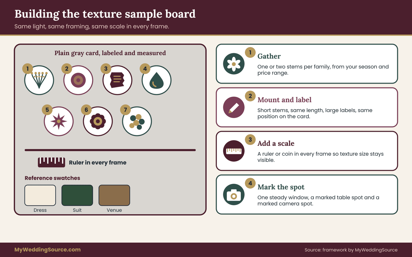
Aim for one to two stems per family, so seven to fourteen stems in all. Choose stems that are plausible for your season and budget, because a sample you could never afford teaches you nothing. If your wedding is in spring, test spring stems, and if a family has no stems available at the time of testing, use a dried or preserved stand-in and mark it clearly as a stand-in.
For each family, gather one “everyday” stem and, if you can, one “premium” stem. A garden rose and a spray rose both belong to the ruffled family, but they photograph differently and cost differently. Seeing both side by side is exactly the comparison you will want when the florist’s quote arrives.
Also gather three reference materials that stand in for your real wedding. A swatch of fabric matching your dress or as close as you can find, a swatch of the suit or attendant dress color, and a small piece of the venue’s likely background, such as a wood board, a stone tile or a painted card. These let you test edge contrast honestly instead of imagining it.
Mounting the samples
Cut each stem to a short, consistent length, around the size of a hand, and fix it flat or upright with tape or a small clip on the board. Label every sample with its family number and its common name in large print that will not be mistaken in a photo. Use the same label position for every sample.
Include a scale reference in every frame. A ruler works, but a coin or a pen works too. The point is to make visible how large each textural element is. A photograph of a texture without a size reference is hard to judge later, because the scale is the first thing you forget.
Why plain backgrounds matter
Use a neutral background, such as mid-gray or plain white card, for the first round. A busy or colored background changes how both color and texture read, and you will not know what caused a difference. After the first round, repeat the best candidates against your reference swatches, which is the closer match to the real day.
Do not style the board. It is tempting to arrange a pretty composition, but a styled arrangement hides weaknesses. For a textured bouquet test you want each family to stand alone, under the same light, with the same framing. Styling comes later when you build the real textured bouquet.
Setting up a repeatable photo spot
Pick one spot and mark it. A table by a north-facing or otherwise steady window works well for the soft-light condition. Mark where the board sits and where you stand, so that each angle can be repeated. Use a tripod or a stack of books for the phone if you can, because handheld shots drift and make comparisons harder.
Turn off any automatic filters and beauty modes. Shoot at the phone’s standard camera setting, not portrait mode, since portrait mode blurs the background and changes edge detail. If your phone offers an exposure lock, use it, and if it does not, take each shot twice and keep the one closest to what your eye saw. The goal is consistency, not artistry.
Timing the sample board
When should you run it? Run it after you have a rough design direction and before you commit to a florist’s proposal. In practice that means a few months ahead of the wedding for most couples, early enough that the findings can change the order, late enough that you know what season’s stems you are actually working with. Check with your florist about their ordering deadlines for specialty stems, since some textures, especially imported ones, need lead time.
If you have already signed with a florist, run the test anyway and bring the results to the next meeting. A florist usually prefers a concrete request, such as “these two families passed and this one failed in shade,” over a general wish for texture. If you are still comparing florists, the board also becomes a fair way to compare their suggestions, in the same spirit as the comparable quotes described in the wedding vendor contract guide.
A budget logic for the board
No numbers are needed here, just a rule. Spend on the samples roughly what you would spend on a few small posies, not on a full bouquet. Buy the minimum count per stem that lets you judge the surface, which is often one or two stems, because you are testing texture, not building arrangements. Keep receipts with the stem names. When a florist later quotes a price per stem, you can compare it with what you saw at retail, with the understanding that wedding florists buy wholesale and charge for design, labor and delivery as well.
If a family would be costly to sample, such as a rare protea, test a cheaper member of the same family first. A pincushion bloom and a thistle share a spiky silhouette, and a thistle can tell you whether the family passes before you ask for the expensive one.
What the board will not tell you
Be honest about its limits as a textured bouquet planning tool. Your samples are a few stems, not a full design, and your phone is not your photographer’s camera. The board tells you how each surface behaves relative to the others. It does not predict the exact photograph. Treat results as ranking information: this family reads clearly at distance, that one glares, this one sheds. You can then ask your photographer to confirm with their own experience, which the vendor questions section covers.
The board also cannot test quantity, which matters in a full textured bouquet. Three ruffled stems in a posy behave differently from fifteen in a full bouquet, where overlapping heads shade each other. Plan to confirm the final proportions in a florist’s mockup. The sample board narrows the options so that the mockup is a refinement, not a rescue.
Recording what you see
Keep a simple record for each shot. Write the family, the stem, the angle, the light and one sentence about what you notice. Notes such as “texture gone at ten feet” or “white glare on upper petals” are more useful than ratings alone, because you will use them verbatim when you talk to the florist. A shared note or a printed sheet works fine, and the scoring section later gives you a layout for it.
One practical habit helps: name the photo files by family, angle and light, such as “4-spiky-side-shade.” A folder of fifty untitled images becomes unreadable by the second evening. A short naming rule takes a minute to set and saves hours when you review the results together.
Who should help with the textured bouquet test
Involve one other person if you can. A partner, friend or bridesmaid can hold the stems at different angles while you shoot, and a second pair of eyes catches problems you stop seeing. Ask them to judge each photograph without knowing which sample it is, if you want an honest read of which textures register. Their first reaction is useful data, since your guests will have the same quick reaction in a gallery.
Include whoever will carry the textured bouquet in at least one round. Weight, balance and how the stems feel in the hand are part of whether a textured bouquet works, and the person holding it will notice what a camera cannot. A stem that scratches the inside of a wrist during a long ceremony is a problem worth knowing about now, not on the day.
The photo-angle test for a textured bouquet: four angles, three lights
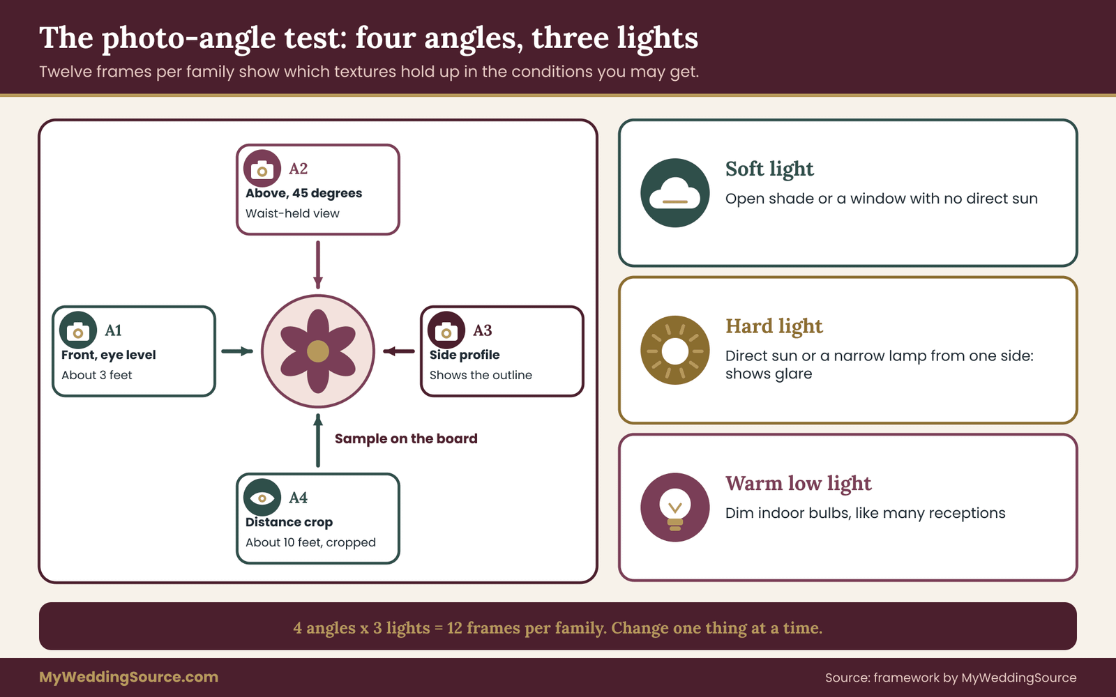
This is the center of the method for choosing a textured bouquet. You photograph each family on the board from four angles in three kinds of light, which gives twelve frames per family. That sounds like a lot, but with seven families it is a single focused session, and a phone makes it quick. For a textured bouquet, the point of repetition is to find out which textures hold up across conditions and which only work in one.
The angles and lights are chosen to match how a textured bouquet is actually photographed on a wedding day. Wedding photographs of flowers fall into a few repeating situations: close detail shots, handheld portraits, walking shots and group frames where the textured bouquet is a small part of the picture. The test reproduces each one in miniature.
The four angles
Angle one: front, eye level, arm’s length. This is the detail-shot angle, roughly three feet from the sample. It shows the texture at its best and is the baseline for comparison. If a family does not look good here, it will not look good anywhere.
Angle two: from above at about forty-five degrees. This approximates the view of a textured bouquet held at the waist and photographed from slightly higher, which is how a lot of portraits and ring-and-bouquet detail frames are shot. Gaps, depth and overlap show clearly from this angle, and it exposes fine stems that look dense from the front but sparse from above.
Angle three: side profile, at the level of the flowers. This shows the silhouette. Spiky and airy families shine here, because the outline carries the texture. Ruffled and waxy families can look surprisingly flat from the side, which is useful to know when the textured bouquet will be photographed at an angle during the ceremony.
Angle four: distance crop, about ten feet away. Take a photograph from roughly ten feet, then crop it on the phone so the sample fills about a quarter of the frame. This imitates a guest’s photo or a wide ceremony shot enlarged later. It is the harshest test of fine and low-contrast texture, and it is the one most couples skip.
The three lights
Soft light. Open shade outdoors, or a spot a few feet from a large window with no direct sun. This is flattering, low in shadow and the condition many photographers aim for during portraits.
Hard light. Direct sunlight or a bright, narrow lamp from one side. It creates sharp shadows and highlights and shows how much glare each family gives. Outdoor ceremonies in the middle of the day and some flash photography produce something close to this.
Warm low light. A dim indoor setting with warm bulbs, similar to many reception rooms. Most phones struggle here, and that is part of the point. If a family reads clearly in warm low light, it will probably survive an evening reception, while dark velvety textures often turn muddy.
The sequence that keeps the test fair
Work in this order to avoid confusion. Set up one light. Shoot all seven families at angle one, then angle two, and so on. Then change the light and repeat. Do not move a sample between lights in the middle of a round, and do not move the board once placed. Rotate the camera, not the flowers, because moving a stem changes its shape and shadow.
After each light round, quickly flip through the photos and check that every frame is usable. Re-shoot anything that is blurred or mislabeled while the setup is still in place. Re-creating a setup an hour later never matches exactly, and a half-matching frame is worse than none.
Add the reference swatches
After the first full pass, take a second, shorter pass with your reference materials. Lay the dress swatch beside the leading candidates and photograph angle one and angle four in soft and hard light. This is the edge test. A ruffled ivory flower beside ivory fabric in hard light, for instance, may separate well because of the shadows, or may merge into a pale mass. You find out in minutes.
Then do the same against the suit or attendant dress swatch. A textured bouquet is rarely photographed only against the gown. It is also held beside suits and dresses of other colors, and against greenery, walls and sky. If your venue is known, add a piece of its background, even a photo printed small, behind the samples for one more round.
What to look for in each frame
Resist the urge to judge beauty first. Ask a sequence of plain questions about each frame. Can I tell what kind of surface this is? Does the surface look the same as it did in person? Are there areas with no detail, either blown out white or dropped to black? Does the sample stand apart from its background, or blur into it? Does it look fresh and intentional, or messy?
These questions line up with the six reads in the next section. You do not need to score during the shoot, since scoring comes after you review the images together. Just make sure each frame is clean enough to answer them. Notes made on the spot, like “tiny fuzz invisible here,” make scoring faster later.
How a florist or photographer can improve the test
If a photographer is already booked, ask whether they would shoot the sample board in a quick session or review your phone images and mark what would change with a real camera. Many photographers have strong opinions about which flowers hold up in their usual conditions. Their input does not replace your test, but it refines the lighting assumptions. If you are comparing photographers, a sample board session offers a more specific question than asking about their style in general.
If a florist is involved, bring the photographs and ask them to point out where a stem would behave differently in their hands. Florists know which flowers keep their shape out of water and which collapse, and they know which stems can be conditioned or wired to hold a look. A textured bouquet is partly a construction problem, and the person who builds it should see the evidence.
Common mistakes when testing a textured bouquet
The first is changing too many things at once, such as moving the board while changing the light. Keep one variable moving at a time. The second is using stems at different freshness levels. Buy all the fresh stems on the same day and keep them in water until shooting, and note any that were already opening.
The third is trusting the phone’s automatic processing. Newer phones brighten shadows and smooth detail, which can hide exactly the weaknesses you are testing. If you can, turn off enhancement features. If you cannot, treat the result as a rough guide and rely on the physical checks in the next section, such as shake and snag tests, which no camera setting can change.
The fourth is testing only the best specimens. Pick average stems, not the one perfect bloom from the bucket, because a florist will order by the bunch and the average is what arrives. A sample that only works when it is perfect is a risk, not a pass.
Time and effort for a textured bouquet test
Plan about two to three hours for the shoot, including setup, and an evening to review and score. If that feels like a lot for flowers, compare it with how much of the day’s photographs include the textured bouquet and how long the images will matter. A short, structured session replaces weeks of vague discussion and guesswork, and the findings also protect your budget, since texture-rich stems are often among the pricier choices in a florist’s quote.
Six measurable reads for judging a textured bouquet
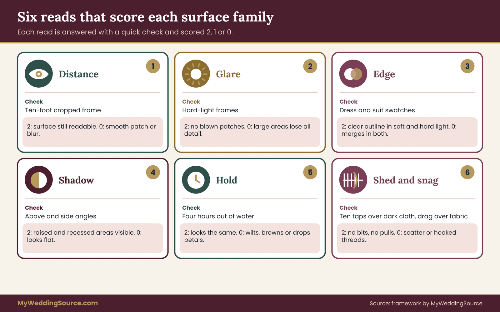
Photographs invite opinions, and opinions drift, so a textured bouquet needs a fixed scoring method. To keep the review honest, each family gets six reads, each answered with a short, checkable test and scored zero, one or two. The reads are distance, glare, edge, shadow, hold and shed-and-snag. None needs special equipment, and each ties to something you can count, time or compare.
Read one: distance
Look at the angle-four crop, the one taken from about ten feet. Ask whether you can still name the surface: ruffled, spiky, papery. Score two if the surface is clearly readable and the family looks different from its neighbors. Score one if it reads as texture but not as a particular kind. Score zero if it reads as a smooth color patch or a blur.
Distance is where fine and tone-on-tone textures fail most often. A zero here is not automatically a reason to drop a family. An airy family may be there to soften the outline, and a cloud-like edge is the job. But if you are paying for visible texture and it disappears at the distance of a guest’s phone, that is worth knowing before the order.
Read two: glare
Look at the hard-light frames and count patches where the surface has gone white or featureless. Score two if there are none or only tiny catchlights. Score one if there are a few small patches that would be easy to fix by turning the textured bouquet. Score zero if large areas lose all detail.
Waxy and smooth families are the usual culprits, along with glossy foliage and some satin-like petals. Glare can be managed with positioning, a photographer’s lens hood or a polarizer, and with softer light, but you cannot rely on that. If a family scores zero for glare in hard light and the ceremony is outdoors at midday, either shift the family to a supporting role or plan for shade.
Read three: edge
Look at the frames with the dress swatch behind or beside the sample. Does the outline of the flower separate from the fabric, or does it merge? Score two for a clear outline in both soft and hard light. Score one if it separates in only one. Score zero if it merges in both.
Edge is about value and shadow, not only color. A pale flower against a pale dress needs strong surface shadow to stand out, and a dark flower against a dark suit needs highlights. When a family fails edge against the dress, the fix is often to place it near the center of the textured bouquet where other stems frame it, not to drop it altogether. Your color notes from the wedding color palette guide help decide what to pair with what.
Read four: shadow
Look at the frames from angle two and angle three. Does the surface show depth as light and shade, or does it look like a flat print? Score two if you can see distinct raised and recessed areas. Score one if depth is visible in one angle only. Score zero if the texture looks flat, regardless of angle.
Shadow is the quality most people mean when they say a flower is “textured.” A ruffled dahlia usually scores two. A very smooth tulip usually scores one at best, which is fine, because it is there for form. Remember that a textured bouquet does not need every stem to score two, but it needs at least one family that does, or the whole arrangement reads as smooth.
Read five: hold
Hold is the time test. Take a fresh sample and leave it out of water, on the board, for four hours at room temperature. Photograph it at the start and at the end under the same light. Score two if it looks essentially the same. Score one if it has softened but still looks intentional. Score zero if it wilts, browns, drops petals or loses its shape.
Four hours is a stand-in, chosen because a long wedding day often puts a textured bouquet through hours between photos, with stretches out of water. Your florist may use water tubes, a wrist corsage cooler or damp wraps that extend life, and a good florist can condition stems for hold. This read tells you which families need that help. Ask your florist directly, since stem behavior varies with variety, season and how the flowers were handled before they reached you.
Read six: shed and snag
This is a physical test, not a photographic one. For shed, hold the sample over a piece of dark cloth, such as a black swatch, and tap the stem ten times with a fingertip at a steady pace. Count the pieces that fall: petals, bits, seeds, pollen. Score two for none or one or two small bits. Score one for a few. Score zero for a visible scatter.
For snag, take a scrap of fabric similar to the dress or a delicate overlay, such as tulle or satin, and draw the sample across it gently. Score two if nothing catches. Score one if you see fuzz or minor pulls. Score zero if it hooks threads or leaves marks. Also test your own skin on the inside of the wrist, since holding a textured bouquet for an hour is long enough for a stiff or prickly stem to hurt.
Papery and spiky families most often score low here. That does not remove them. Florists can wrap, strip, trim or place sharp stems away from the hold, and they can substitute softer-looking relatives. But it does decide where on the textured bouquet and on the day those stems belong. A snag-prone stem is a poor choice for the area against the bodice and a fine choice for the outer edge facing away.
Recording the reads without a table
Keep the scoring in a plain list, one family per paragraph in your notes: family name, stem, then six numbers in the order distance, glare, edge, shadow, hold, shed-and-snag, then one sentence of comment. For example, a note might read, “Spiky, sea holly: 2, 1, 2, 2, 2, 0, great silhouette, scratches wrist, wrap stems.” The format is compact, and each number points back to a photograph or a physical check you can show someone.
Scoring the board and writing the textured bouquet recipe
The scores exist to make textured bouquet decisions, so decide the rules before you look at the results. Otherwise it is easy to bend the thresholds around the flowers you already love. A fixed rule is not a law. It is a way to notice when you are about to override the evidence, and to do so deliberately.
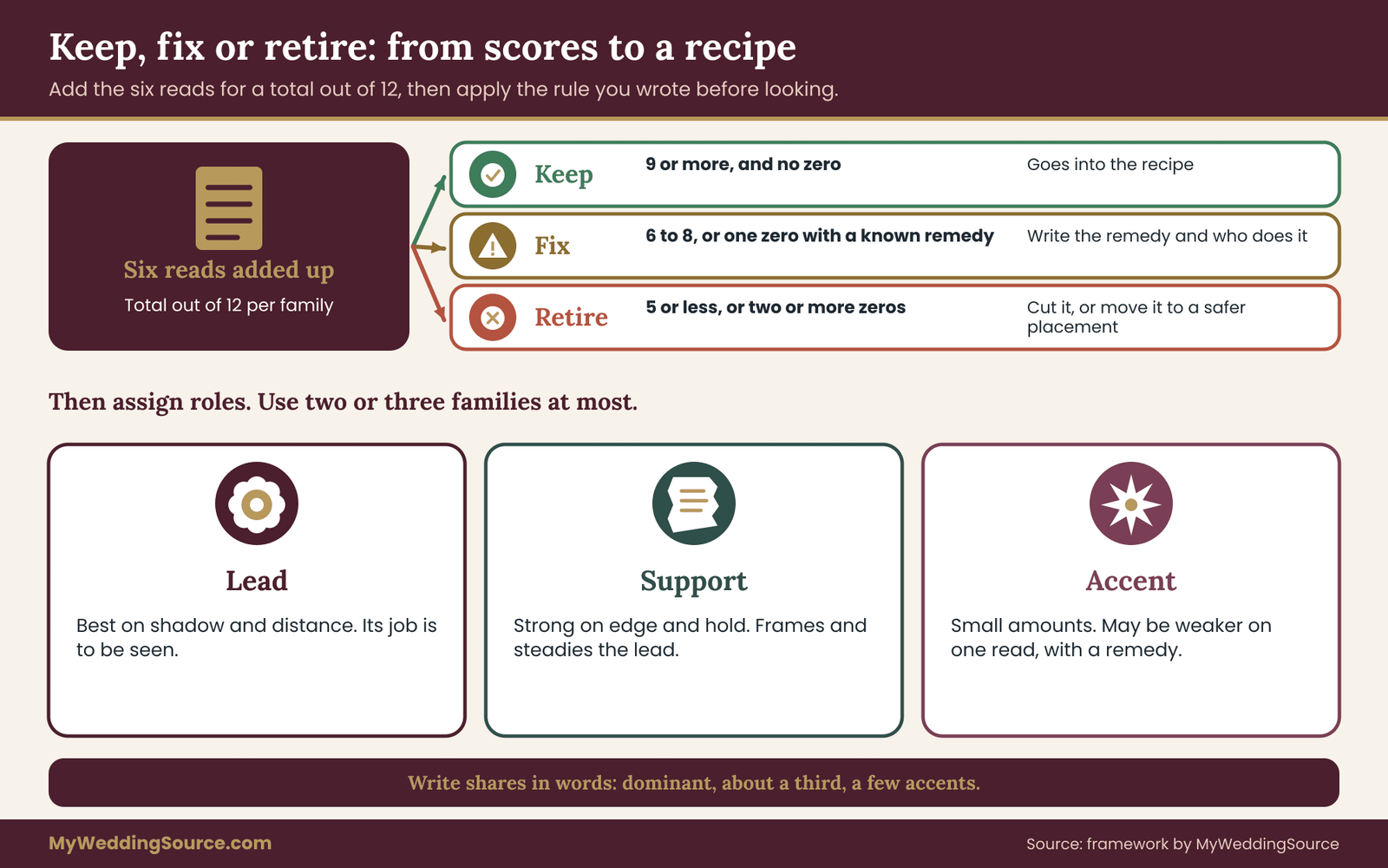
The keep, fix or retire rule for textured bouquet stems
Add the six scores for each family, for a total out of twelve. Then apply this rule, which is original to this guide and can be adjusted to your taste. Keep a family if its total is nine or more and it has no zero. Fix a family if its total is six to eight, or if it has a single zero that a known remedy could address. Retire a family if its total is five or less, or if it has two or more zeros.
“Fix” is the most interesting category, because it asks a question: what remedy, and is it worth the cost? A glare problem might be solved by placing the stems in shade or lower in the textured bouquet. A shed problem might be solved by choosing a preserved variety or spraying with a florist-approved sealant. A snag problem might be solved by wrapping or placement. Write the remedy next to the family, with the name of whoever will carry it out.
The texture quota: lead, support, accent
Once you know which families pass, assign them roles. Choose one lead family that scores best on shadow and distance, because its job is to be seen. Choose one supporting family that scores well on edge and hold, to frame and steady the lead. Choose at most one accent family, which can have a weaker score in one read because it appears in small amounts.
This is the quota in practice. A textured bouquet with a ruffled lead, an airy supporting edge and a spiky accent has a clear hierarchy. The same bouquet with a ruffled lead, a velvety second lead, a waxy third and a papery accent has none. If your passing families number more than three, rank them and cut the weakest, even if they are lovely.
Turning roles into a recipe
A recipe lists the roles, not the whole order. For each role, write the family, your first-choice stems, two acceptable substitutes from the same family, and the share of the textured bouquet each takes, expressed in words such as “dominant,” “about a third” or “a few accents.” Shares in words are enough, since a florist will convert them to stem counts based on size and price.
Add a short list of conditions. For example, hold stems in water until the last moment, keep spiky stems away from the bodice, wrap the handle, avoid the stem that scored zero on shed. These conditions travel with the recipe to the florist, and they are the difference between “we want texture” and a brief that a florist can build and defend.
When the scores conflict with what you love
Sometimes the stem you love scores poorly. Do not hide the result, and do not necessarily obey it either. Ask what the low score costs. A flower that scores zero on glare but is the reason you chose the whole look may deserve a plan, such as using it in a ceremony arrangement that sits in shade rather than a handheld bouquet. A flower that scores zero on snag but is irreplaceable might go in a boutonniere or a table piece, where fabric contact is less of an issue.
The rule helps you move the stem, not delete it, and that is the right instinct. The board is a way to place each family where it works, so the same textured bouquet vocabulary can appear in several places at once.
Keeping the textured bouquet test honest
If you notice that you are re-scoring to make a favorite pass, stop and ask a second person to score the same photographs independently. Compare notes. Where you differ by two points or more, look at the frame together and decide what you each saw. Disagreement is information, because a guest’s eye will also disagree. A family that two people score very differently is probably sensitive to conditions, and that sensitivity is itself a risk.
Plant safety, allergies and comfort in a textured bouquet
In a textured bouquet, texture often comes from the exact features that raise safety questions: sharp points, fine dust, milky sap, small hard berries. This section does not replace advice from a plant safety specialist or your doctor. It shows what to check, in what order, and which sources settle each question. Botanical toxicity statements are plant-specific, so never rely on a family label or a general claim like “all dried flowers are safe.”
Identify every stem by its full name
Start by writing the botanical name beside each common name on your recipe. Common names are unreliable: the same word can mean different plants in different regions, and florists sometimes use trade names. A botanical name, genus and species, lets you look the plant up in a reference such as the USDA plants database or a botanical garden’s plant finder, and lets you check it against toxicity lists.
Ask your florist to confirm the names in writing for every stem in your textured bouquet, including foliage and fillers. If a stem arrives under a different name because of availability, the substitution clause in your contract should require that you be told, a point covered further in the section on briefing the florist.
Check toxicity where it matters to you
Whether toxicity matters depends on who and what will be near the flowers. Pets at home or at the venue, young children who might chew a stem or berry, and anyone who handles the flowers, from the couple to the cleanup crew, all change the answer. The ASPCA publishes a searchable list of plants that are toxic or non-toxic to dogs, cats and horses, and a poison control center can advise if someone has actually eaten or handled something unusual.
Several popular texture stems appear on pet-toxicity lists, depending on the species, so check yours by name. Lilies are a well-known concern for cats, and the ASPCA lists a range of other garden flowers and foliage as toxic to at least some animals. The absence of a stem from a list is not proof of safety, and the presence of a stem on a list does not always mean serious risk. The list tells you what to ask about and how to arrange where the flowers sit and who cleans up.
If the design includes berries or seed pods in reach of small children, consider whether they could be mistaken for food. Beaded and clustered families deserve a second look for that reason. Choose a different family or place the stems out of reach, and tell whoever will handle the flowers afterward.
Allergies and the fine-pollen families
Pollen and plant dust affect people differently. Airy, papery and dried families can release fine particles, and strongly scented ruffled flowers can bother sensitive noses. If anyone close to the textured bouquet has allergies or asthma, ask them or their doctor which plants are a concern, and consider low-pollen choices for the stems closest to their face. The American Academy of Allergy, Asthma and Immunology offers general information on plant-related allergies.
Do not guess on behalf of a guest. A courteous short question to the people who will stand beside you, such as parents or attendants, is better than a surprise at the altar. If a stem you love turns out to be a problem, the board makes substitution easy: you test a relative from the same family and compare scores.
Sharp, stiff and prickly stems in a textured bouquet
Spiky texture is attractive and has a physical cost. Thistle-like heads, holly, some seed pods and rose thorns can scratch skin, snag a gown and puncture a glove. Ask the florist to strip thorns and trim spines where practical, and to wrap the handle so the stems are comfortable to hold. Test by holding the finished bouquet for several minutes, and if possible walk with it.
For children carrying flowers, whether as part of a processional or as a keepsake, choose soft families by default, and keep spiky or fragile stems in arrangements that adults handle. The same logic applies to anyone with a reason to avoid scratches, such as sensitive skin or a medical condition.
Invasive or regulated plants and sourcing
Some ornamental grasses and wild-harvested stems are considered invasive in certain regions, and moving plant material across borders can be regulated. If your design includes foraged, imported or specialty stems, ask the florist where they come from and whether any rules apply to them, and check with the relevant agency. In the United States, the Animal and Plant Health Inspection Service of the U.S. Department of Agriculture explains rules for importing plants and plant products, and your state agriculture department can explain local restrictions.
Foraged stems add another layer. Picking from public land or someone else’s property may be restricted, and unidentified wild plants can be toxic. Do not forage for your own wedding flowers unless you can identify every plant with certainty and have permission.
Fire and venue rules for dried stems
Dry and preserved stems burn more readily than fresh ones. If your venue allows candles, lanterns or heaters, ask whether there are rules about decor near flames, and keep dried or sprayed materials well away from them. Fire safety guidance from organizations such as the National Fire Protection Association explains general risks of decorations near open flame, and your venue manager will know local requirements.
Check venue rules for other texture-related items too: confetti-like shedding, wet or stain-prone petals on floors, and installation methods. A textured bouquet is rarely a problem for a venue, but larger dried arrangements and installations can be, and it is better to ask early. The wedding vendor contract guide covers what to look for in the paperwork when vendors and venues share responsibility for such rules.
Fresh, dried, preserved or faux: comparing the alternatives
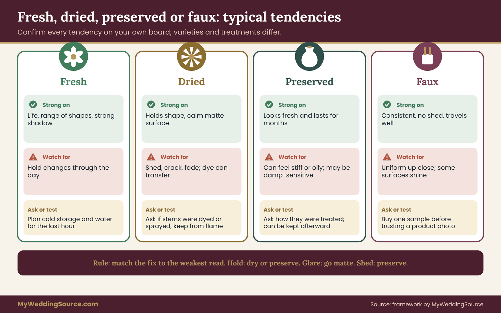
Many couples planning a textured bouquet reach for dried or artificial materials because they hold their shape. That is a fair instinct, and the sample board lets you compare the alternatives honestly. The same four materials can fill the same family, and their scores will differ on different reads.
Fresh stems in a textured bouquet
Fresh stems give the strongest sense of life and the widest range of shapes. Their weakness is hold: they change over the course of a day, and they depend on cold storage and handling. They score well on shadow and often on distance, and unevenly on hold. If your design leans on fresh ruffled or velvety stems, plan the delivery and storage with the florist and treat the textured bouquet’s last hour in water as part of the design.
Dried stems
Dried stems, such as straw flowers, grasses, seed heads and pressed material, hold their shape for hours and days, and they often photograph with a calm, matte surface. They tend to score well on hold and glare and poorly on shed and snag. Their color can also be muted or can fade in strong light over time. Ask whether the stems were dyed or bleached, since dye can transfer to skin or fabric when damp, and check how the florist plans to keep them from crumbling.
Preserved stems
Preserved flowers, treated to stay soft for months, offer a middle path. They can look fresh and hold well, but treatment methods differ, some feel stiff or oily, and some can transfer color or scent. Ask the florist how the stems were preserved and whether they can be damp-sensitive. Preserved materials can also be reused or kept after the wedding, which fits a keepsake goal, and the wedding waste reduction planning guide covers what to do with materials afterward.
Faux or artificial stems
Faux stems can be convincing in photographs and consistent from one batch to the next, which makes them useful for a textured bouquet that must survive a long day or travel. They tend to score high on hold and on shed, and variably on glare, since some plastics and fabrics are shiny. Their weakness is the close view, where the texture can look uniform. Test them on the board under the same lights; some perform well and others reveal themselves at once under hard light.
If you buy or rent faux materials, check what the seller claims about them and whether the return policy fits a test. A fair seller will let you buy a sample stem first. A good rule is to buy one before you trust a photo on a website, since product photos are lit and edited to look their best.
Mixing materials in one textured bouquet
Many professional designs combine materials, such as fresh blooms with dried or preserved accents. It can work well when the materials are matched in tone and scale, and poorly when a bright artificial stem sits beside a muted dried one. If you plan a mix, put the combination itself on the board and run the angle test on it, since the combined texture is what the camera will see.
Document which stems are which. If you keep the textured bouquet afterward, the mix will age unevenly, and knowing what is fresh, dried or faux helps you decide how to store or display it. If you plan preservation, the fresh components matter most, and that is a separate decision from the one the board addresses.
A decision rule for materials
Use this short rule when the board shows a family performing differently by material. If the main risk is hold and the day is long or hot, shift to preserved or dried stems for that family. If the main risk is glare, move to a matte material or change the position. If the main risk is shed, move to preserved or fresh stems that do not shed. If the main risk is the close view, keep that family fresh. The rule keeps you from changing everything at once and lets the board point to specific fixes.
A worked example: an invented couple tests a textured bouquet
The following case is invented to show how the method flows. The people, flowers and scores are illustrative, not measurements from any real wedding, and your own results will differ with your stems, light and camera. What matters in this textured bouquet example is the sequence of decisions.
Priya and Tom are planning an October wedding at a converted barn. Priya’s gown is ivory crepe with a smooth finish. The ceremony is outdoors at about four in the afternoon, the reception is indoors under warm string lights, and Tom’s suit is dark green. They want a textured bouquet with a wild, collected look, and their photographer works in natural light.
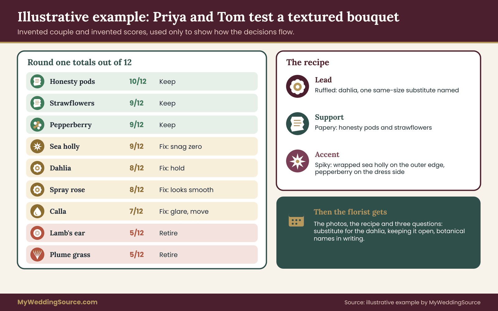
Round one: the board for the textured bouquet
They gather ten stems across the seven families. For the airy family they use a pampas-like plume grass substitute and a thin flowering spray. Velvety: lamb’s ear foliage and a dark celosia. Papery: strawflowers and honesty pods. Waxy: a calla and a tulip. Spiky: sea holly. Ruffled: a spray rose and a dahlia. Beaded: pepperberry. They mount each on gray card with a ruler, label them and shoot in soft window light, hard afternoon sun on the porch and a dim kitchen with warm bulbs.
At the review, they sit with the photos side by side and write the six reads. Here are their illustrative notes, in the order distance, glare, edge, shadow, hold, shed-and-snag.
Round one results
The dahlia scores 2, 2, 1, 2, 1, 2: lovely depth, its edge against the ivory swatch is clear in hard light only, and it softens after four hours. The spray rose scores 1, 2, 1, 1, 1, 2: fine, but it looks smooth next to the dahlia. The sea holly scores 2, 1, 2, 2, 2, 0: strong silhouette, a few bright highlights, and it scratched the wrist and caught the crepe swatch.
The strawflower scores 1, 2, 2, 1, 2, 1: readable, matte, holds well, with a few bits shed. The honesty pod scores 2, 1, 2, 2, 2, 1: translucent and lovely from behind, glare on the shiny faces in sun.
The calla scores 2, 0, 1, 1, 1, 2: elegant form, large white patches in hard light. The lamb’s ear scores 0, 2, 0, 1, 2, 2: invisible against the green suit and dark in shade. The pepperberry scores 1, 2, 2, 2, 1, 1. The airy plume scores 0, 2, 1, 1, 2, 0: charming at arm’s length, gone at ten feet, and it sheds on dark fabric.
Applying the keep, fix and retire rule
Totals out of twelve are 8 for the dahlia, 8 for the spray rose, 9 for the sea holly (but with a zero), 9 for the strawflower, 10 for the honesty pod, 7 for the calla, 5 for the lamb’s ear, 9 for the pepperberry and 5 for the plume. Applying the rule: keep the honesty pod, the strawflower and the pepperberry. Fix the dahlia, the sea holly, the spray rose and the calla. Retire the lamb’s ear and the plume.
The dahlia is on the border at eight, and the fix is clear: place it so that shadows fall across it in the late-afternoon ceremony, and confirm hold with the florist. The sea holly has a zero in snag. The fix is to wrap the stems, keep it on the outer edge and away from the crepe, and the couple decide it is worth it for the silhouette. The calla has a glare problem, so it moves to the table arrangements that sit in shade.
Round two: the edge test against the suit and the barn
With the survivors, they repeat angle one and angle four against the dress swatch, the suit swatch and a piece of barn wood. The honesty pods separate well from the dress in soft light and from the wood in warm light. The pepperberry makes a dark accent against the dress but vanishes against the suit. The strawflower holds well against everything. They note that the pepperberry should sit on the dress side of the textured bouquet, away from the suit, in portraits where the two stand together.
They also repeat the test with a small bunch rather than a single stem, since combined stems shade each other. The honesty pods and strawflowers together produce a lovely layered haze. The dahlia reads much better with a nearby paler stem that lifts it from the background.
The textured bouquet recipe
Their lead family is ruffled, in the form of the dahlia, with a note to try one substitute with a similar head size in case it is unavailable. The supporting family is papery: honesty and strawflowers, which frame the lead and hold well. The accent is spiky: the sea holly in small amounts, wrapped, on the outer edge. They add a small cluster of pepperberry on the dress side. The roles are “dominant, about a third, a few accents.”
Conditions: dahlia stems in water until the last moment, sea holly stems wrapped and kept away from the bodice, strawflowers conditioned, honesty pods placed with the pale side outward, and no plume or lamb’s ear. They add a sentence on the allergy and pet check, which they ran against the ASPCA list by botanical name for the home where the textured bouquet will be stored.
The florist conversation
They send the photographs and the recipe to the florist, with three questions: what would you substitute if the dahlia is unavailable, how will you keep the dahlia open through the portraits, and can you confirm botanical names in writing? The florist answers each in an email, and mentions that two of the stems are best ordered early. Priya and Tom note the dates in their planner and save the exchange with their vendor paperwork.
The result is not a guarantee of a perfect photograph, and the example makes no such claim. What it gives Priya and Tom is a decision trail. If something on the day goes differently, they know what they chose, why, and what the fallback was, and the florist has a concrete brief instead of a feeling.
Carrying the textured bouquet idea to boutonnieres, crowns and tables
Once you have a vocabulary, you can carry it through the rest of the flowers without repeating the whole test. The board already told you which families pass and where each belongs. The remaining job is placing them in smaller pieces and larger arrangements so that the textured bouquet and everything around it look related.
Boutonnieres and corsages
Small pieces are close to cameras, clothing and skin. They favor families that score well on shed and snag, and on edge against the particular garment. A dark suit needs lighter texture on the lapel, and a patterned or textured fabric competes with busy surfaces. Use a smaller, tighter version of the lead or supporting family rather than introducing a new family, and test the piece against the actual fabric if you can.
Pin placement matters too. Spiky stems should not poke the wearer, and heavy heads can droop on a lightweight jacket. The wedding day accessories planning guide covers compatibility and movement for items worn on the day, and the same checks apply to flowers worn as accessories.
Crowns, combs and hair flowers
Hair pieces are photographed close and from many angles, and they stay on for hours. They favor hold and shed-and-snag above all, since a falling petal or a scratch from a stem is far more noticeable on the head than in the hand. Papery, preserved and some faux materials do well here. Check with your hair stylist about weight and attachment, and test the piece by wearing it for as long as the photographs will last.
Ceremony arrangements and installations
Larger arrangements have different physics. They sit still, they are photographed from further away, and they are often placed in fixed light. They favor families that score well on distance and shadow, such as ruffled and spiky, and they can use fine and airy families as softening layers. They also raise venue and installation rules, including weight, anchoring and what can be attached to what, which depend on the venue.
If a family scored zero on glare, use it in a spot you know is in shade, or choose a matte relative. If a family scored zero on hold, make sure the arrangement is placed late and kept in water, or shift to a material that lasts.
Table pieces
Table arrangements are seen at close range by seated guests and at a distance in wide photographs, so they need both fine and bold texture. They also sit near candles, glassware and food, which brings the fire and stain checks back. Low and tall pieces affect sightlines, and the point of the board is not to design them but to confirm that the textures chosen for them photograph well in reception lighting, which is usually warm and low.
If you plan to repeat a texture across tables, buy for the average stem, not the best, and ask the florist how they will keep the pieces consistent. A pattern repeated twenty times shows its weaknesses twenty times.
Keeping the textured bouquet language consistent
Write one line for each placement: the lead, the support and the accent used in the textured bouquet, and how each appears in the others. A florist can then see how a textured bouquet recipe translates into a small boutonniere, a ceremony piece and a centerpiece without a separate design for each. It also keeps the order manageable, since reusing the same few families reduces how many different stems must be sourced, stored and processed.
If a placement needs a new family, run the board again with just that family and the relevant lights. A short extra test of a single stem takes minutes and prevents a surprise that would be expensive to fix.
Briefing the florist and the photographer about a textured bouquet
The sample board matters only if its textured bouquet results reach the people who build and photograph the flowers. Turn the findings into a one-page brief and a short list of questions. The brief states the recipe, the conditions and the evidence. The questions test whether the vendor can deliver it and what happens if they cannot.
What goes on the page
Include the roles (lead, support, accent), the first-choice stems and two substitutes per role, the shares in words, the conditions from the scoring section and three or four of your best photographs, labeled by angle and light. Add the plant safety notes: pets, children, allergies and venue rules. Keep it to a single page so that it gets read, and attach the photographs separately.
State what you do not know. If you have not tested a stem in your final proportions, say so and ask for a mockup. If you have a question about a stem’s name or origin, ask it. A brief that admits its limits is easier for a florist to trust and to answer.
Questions for the florist
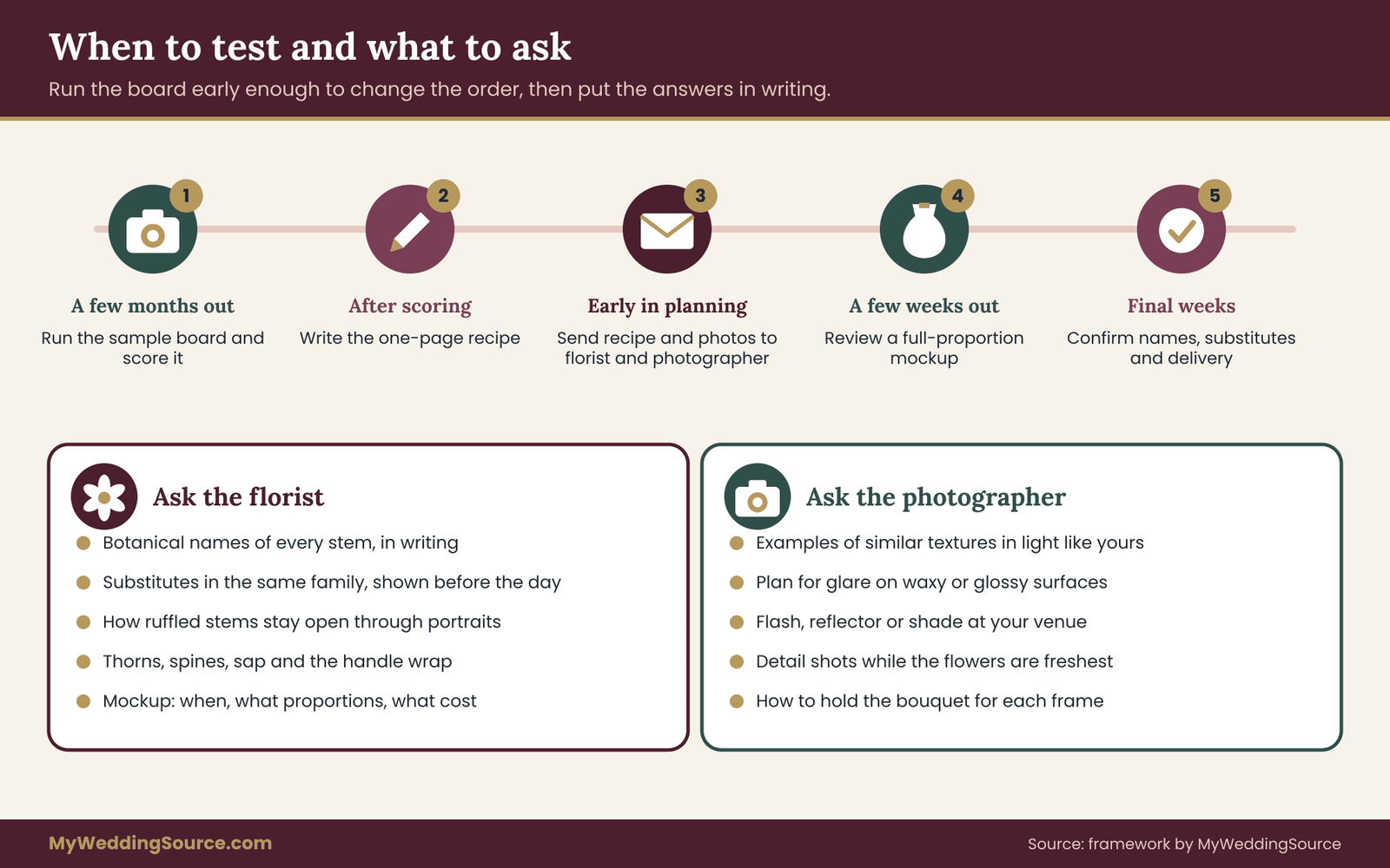
Ask these in writing, so the answers sit with your vendor paperwork. Can you confirm the botanical names of every stem in the recipe? Which of these stems are reliably available in my season and region, and which are at risk? What would you substitute for each, and will you show me the substitute before the day? How do you keep stems with a weak hold, such as ruffled petals, open and fresh through the portraits? How do you handle thorns, spines and sap on the handle? What is the price difference between the first choice and the substitute?
Also ask how and when you will see a mockup, who approves it, and what it costs. If a mockup is part of the package, make sure it uses the actual proportions and a similar stem count. A pared-down mockup that omits the lead stem proves little. The wedding vendor purchase order checklist shows how to confirm quantities, substitutions and delivery details in a form both sides can sign.
Questions for the photographer
Ask the photographer for examples of bouquets with similar textures in lighting like yours, not only highlights from their portfolio. Ask how they handle glare on waxy or glossy surfaces, whether they use flash or reflectors at your venue, and how they like the textured bouquet held for detail shots. Ask whether they plan detail photographs of the textured bouquet before the ceremony, when the flowers are freshest.
If your photographer asks you to hold the textured bouquet a particular way, check that it suits your stems. A spiky accent on the wrong side of the hand can scratch or catch, and a ruffled lead held low is hidden from the camera. Some photographers will also photograph the textured bouquet on a neutral surface in a quiet moment; confirm timing so the flowers are not left out of water longer than the hold read allowed.
Photographs of guests and family where the textured bouquet is only a small part follow different rules. Your guest boundaries and image use, covered in the wedding photography consent guide, apply to those frames as much as to the detail shots, and your family portrait plan in the wedding family photo list determines when the textured bouquet appears in a group.
What to put in the contract for a textured bouquet
Contracts for flowers vary, and no template fits everyone. Check that the agreement names the recipe or a design description tied to your photographs, states how substitutions are approved, sets delivery time and location, and says what happens if flowers arrive in poor condition. The questions in the wedding vendor due diligence checklist help you ask about insurance, backup plans and what the vendor will do if a stem fails.
Be wary of vague language such as “similar flowers” with no approval step. Ask for “substitutions in the same family, approved by the couple in writing where time allows.” Whether a florist accepts that depends on the market and the season, and you can reasonably ask for it.
Timing the textured bouquet conversation
Bring the board results to your florist early enough that specialty stems can still be ordered, and late enough that you know what the design needs. Many couples do the board a few months out, a mockup a few weeks out and a final confirmation of names and deliveries in the last couple of weeks. Check the actual deadlines in your own contract, since they differ by florist and season.
Edge cases: when the textured bouquet test gives a surprising answer
No method covers every situation. These edge cases show where the framework bends and what to do.
Every family scores low in the textured bouquet test
If nothing reaches the keep line, check the setup before blaming the flowers. A cluttered background, a camera in automatic mode or flowers past their best can drag scores down. Re-run a round under cleaner conditions. If the scores stay low, your lighting may be genuinely hostile, such as a dark venue with flash. In that case consider matte, mid-value stems with strong form, and ask the photographer how they plan to light the textured bouquet.
One family wins everything
A family that scores very high may tempt you to use it alone. A single-family bouquet can work, but it removes contrast. Consider adding a quiet supporting family anyway, chosen for edge and hold rather than interest, so the lead has something to stand against.
The stem you love is unavailable
Availability changes. If the first-choice stem cannot be sourced, test the substitute on the board, not only on a florist’s description. Two ruffled flowers can differ greatly in hold and glare. A day or two of lead time for a one-stem test is a better trade than discovering the difference at the final fitting.
Hot weather, humidity or a long travel day
Heat and humidity change hold and shed. Papery stems can soften and droop, and fresh flowers can go quickly. If your wedding is outdoors in summer or in a damp climate, repeat the hold read in conditions closer to the day, such as a warm room or outdoors in the shade, and ask the florist about cooling and water supply. If guests or the wedding party travel with flowers, add a transport test: pack the sample as it would be carried and check what arrives.
Black-and-white or film coverage
If photographs will be in black and white, color separation disappears, and only value and texture remain. Squint at your frames, or convert a few to grayscale, and check whether each family still separates from its background. Film and some editing styles also render highlights and shadows differently, so ask your photographer how they handle bright whites and deep darks.
A very small or very large bouquet
Scale changes everything. A small posy cannot carry three families without clutter, and two is a sensible limit. A large cascade can carry more variety but needs a stronger hierarchy to avoid mush. Run the distance read with a stem group that matches your planned size, not a single stem.
Conflicts with guests’ needs
If a guest with a strong allergy is part of the wedding party, you may need to change the recipe regardless of the scores. Treat that as a design constraint, not a failure. A preserved or faux replacement for a high-pollen family can pass the board with the same texture and fewer problems, and a short conversation with the guest, or their doctor, is better than guessing.
Budget pressure
If the quote is higher than planned, use the scores to decide where to cut. Reduce the share of the most expensive family before dropping a whole family, and trade premium stems for everyday ones where the board showed little difference. Keep the lead intact if possible, since the lead carries the photograph.
Your next steps
Pick a weekend. Gather one or two stems from each of the seven surface families, mount them on plain card with a ruler and shoot them from four angles in three kinds of light. Score each family on distance, glare, edge, shadow, hold and shed-and-snag, then apply the keep, fix and retire rule.
Write a one-page recipe with a lead, a support and one accent, send it with your best photographs to your florist, and ask the questions in this guide in writing. Confirm botanical names, check plant safety with the sources below, and save the answers with your vendor paperwork. A textured bouquet planned this way rests on evidence you gathered yourself.
FAQ
What is a textured bouquet?
A textured bouquet is a textured bouquet designed around how the flowers’ surfaces look and feel, such as ruffled, spiky, papery or beaded, rather than only around color. It usually mixes a few surface families with a clear lead. The goal is visible depth in photographs and in person, which is why testing under real light is useful.
How many textures should one textured bouquet use?
Usually two or three surface families: a lead that carries the look, a supporting family that frames it and, if wanted, one small accent. More than three tends to look cluttered in photographs because the eye has no hierarchy to follow. The sample board helps you cut by showing which families perform and which only look good on a mood board.
Do I need a professional camera for the photo-angle test?
No. A phone on a tripod or stack of books is enough, as long as you keep the setup the same for every sample and turn off beauty and portrait modes. The test ranks families against each other. It does not predict your photographer’s exact images, so share the results and ask them how a real camera would change things.
Which textures photograph worst?
It depends on conditions, so test rather than assume. Fine, airy stems often vanish at a distance, dark velvety surfaces can turn muddy in shade, and glossy or waxy petals can glare in hard light or flash. Tone-on-tone designs against a matching dress can merge. Each of these has fixes, which is why the board scores both the problem and the remedy.
Are dried flowers safe to use in a textured bouquet?
Dried flowers are not automatically safe or unsafe. Check each stem by botanical name against a source such as the ASPCA plant lists if pets or children are involved, ask whether stems were dyed or sprayed, and keep dried materials away from open flames. Dried stems often hold shape well but can shed or crack, which the shed-and-snag read measures.
Should I test before or after hiring a florist?
Either works. Before hiring, the board gives you a fair way to compare florists’ suggestions against the same evidence. After hiring, it gives you specific feedback for the florist instead of a general wish. Check the florist’s ordering deadlines for specialty stems, and run the test early enough that results can still change the order.
How do I stop spiky or papery stems from snagging my dress?
Test first with a scrap of similar fabric. Then ask the florist to wrap or trim stems, strip thorns, place spiky accents on the outer edge away from the bodice and use softer relatives where possible. Hold the finished bouquet and walk with it. For a delicate fabric, you may decide a snag-prone family belongs in a boutonniere or table piece instead.
What if my favorite flower fails the test?
Move it before you drop it. A flower with a glare problem might work in a shaded ceremony arrangement, and one that sheds might suit a table piece or a preserved version. Ask what the low score costs and whether a remedy is available. If not, test a relative from the same family and compare. The aim is to place each texture where it performs.
Sources
- Toxic and non-toxic plants, ASPCA
- Animal poison control, ASPCA
- Poison Control, national help line and plant information
- Allergies and plants, American Academy of Allergy, Asthma and Immunology
- Plant imports, Animal and Plant Health Inspection Service, U.S. Department of Agriculture
- PLANTS database, Natural Resources Conservation Service, U.S. Department of Agriculture
- Postharvest Technology Center, University of California, Davis
- Plant Finder, Missouri Botanical Garden
- Fire safety and decorations, National Fire Protection Association
- Advertising and marketing guidance, Federal Trade Commission