
A wedding mood board is a collection of images that shows the feeling you want your wedding to have, but a vendor cannot order, build or cook a feeling. This guide shows how to turn a wedding mood board into a short, annotated creative direction brief that florists, rental companies, stationers, photographers and caterers can read the same way, with a contradiction tracker that catches conflicts before they reach an invoice.
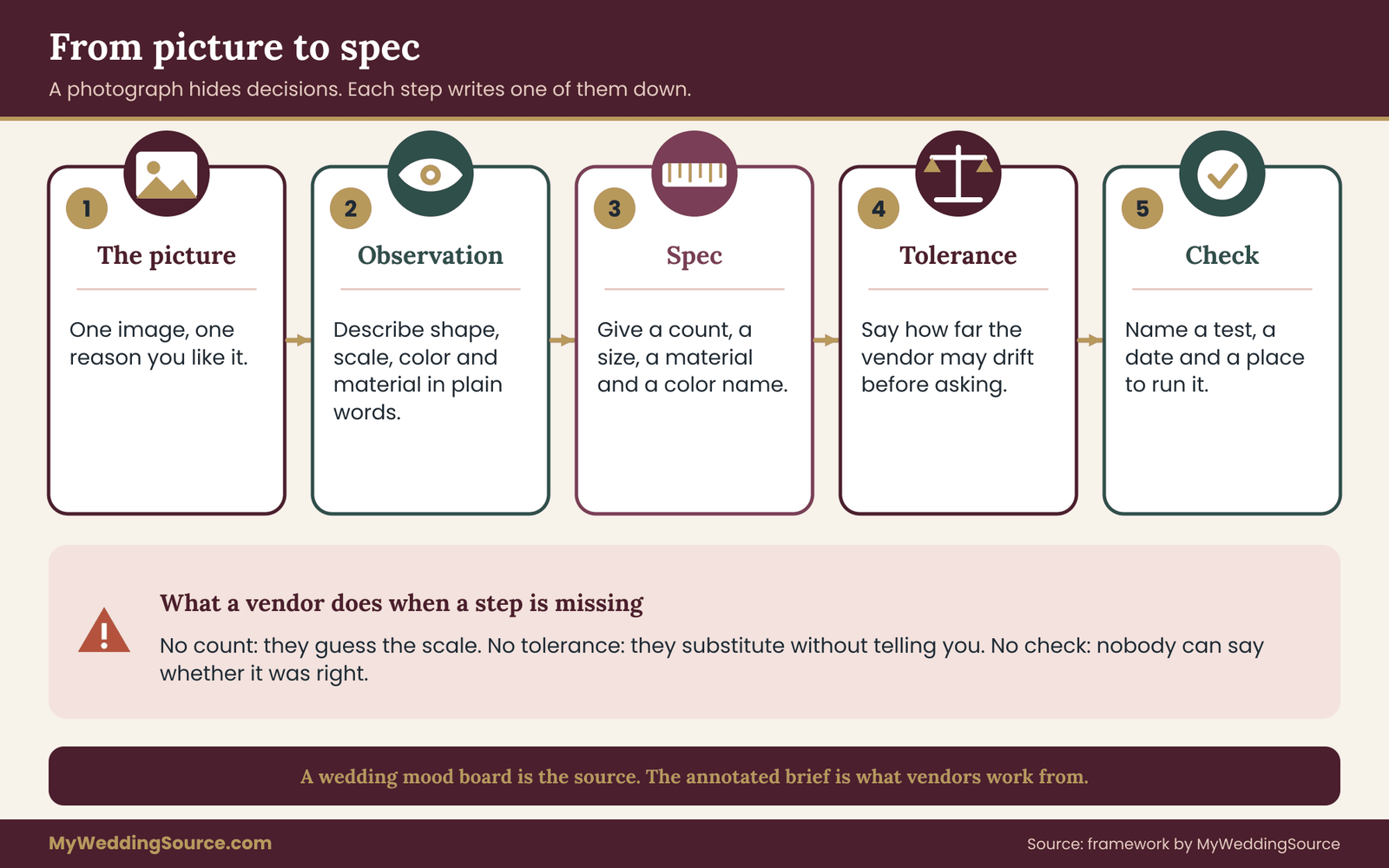
Keep the wedding mood board to a small set of images, then annotate every image with five fields: what you see, the spec it implies, how far a vendor may drift from it, which vendor owns it, and how you will check it. Next, list every place two images disagree, rank your priorities, and resolve each conflict in writing. Finally, split the result into one page per vendor. The wedding mood board stays as inspiration. The annotated brief is what vendors actually work from.
Almost every couple who builds a wedding mood board enjoys the process, and almost every vendor who receives one has the same quiet reaction: it is beautiful, and it does not say what to do. A wedding mood board might hold forty photographs of tables, arches, gowns and desserts, pulled from a dozen sources, with three or four different color moods and at least two incompatible budgets. The couple sees a coherent feeling. The vendor sees a puzzle.
The gap is not a taste problem. It is a translation problem. A picture contains dozens of decisions that nobody wrote down: the stem count, the linen weight, the distance between place settings, the color temperature of the light, the paper stock, the amount of white space around a name. When a vendor guesses at those decisions, they guess from their own habits, and their habits may not match yours.
This guide is about the translation step. It is not a guide to choosing colors, which the wedding color palette guide on this site covers, and it is not a guide to building a whole visual identity. It focuses on one task: moving from a wedding mood board that you love to written specifications that a stranger can carry out.
A note on scope. This is general planning information, not legal, tax or financial advice, and contract terms, copyright rules and vendor policies vary, so confirm anything that matters with the vendor and the issuing agency.
What a wedding mood board can and cannot say
A wedding mood board is good at three things. It shows relationships: how warm and cool tones sit together, how much space an arrangement takes up, whether the overall feeling is crisp or loose. It shows a range of acceptable results, because a set of images implies a family rather than a single outcome. And it gives two people a shared reference so they can argue about something concrete instead of adjectives.
It is poor at four other things. It cannot give quantities, because a photograph does not tell you whether an arrangement used twelve stems or forty. It cannot give constraints, because nothing in a picture reveals the budget, the venue rules or the weather the room in the photograph never faced. It cannot rank. Every image on a wedding mood board looks equally important, so a vendor cannot tell which detail is the point and which is background. And it cannot show what you dislike, unless you add that on purpose.
The difference between inspiration and instruction
Think of the wedding mood board as a source document and the brief as the working document. Inspiration answers the question “what do we like?” Instruction answers “what should this person make, how close does it need to be, and how will we know?” A vendor who receives only inspiration has to do the instruction work themselves, and most will, quietly, using assumptions you never saw.
This matters most for items that are expensive to change. A florist can adjust an arrangement the morning of the wedding. A stationer who has already printed two hundred invitations cannot. A rental company that delivers the wrong chair finish on Friday may not have another one. The more irreversible the item, the more precisely the wedding mood board needs to be translated before anyone commits.
What a vendor is actually looking for
Imagine yourself on the receiving end. A vendor opens your files and has about ten minutes before the next client. They are looking for a few things. What is the style family, so they can tell whether they are the right fit? What is the scale, so they can quote? What are the hard limits, such as colors that must not appear, materials that cannot be used, a venue that bans open flame? And what is flexible, so they can substitute when a flower is out of season or a fabric is backordered?
A wedding mood board answers only the first of those questions. The annotated brief in this guide answers all four, and it does so in a format a busy person can scan.
A quick test before you start
Before building anything, run a test with the wedding mood board you already have. Send it, with no explanation, to a friend who has never seen your plans. Ask them to write down five things they think you want, and five things they think you would never choose. Compare their answers with your own. Where they match, the wedding mood board is already doing its job. Where they differ, you have found the places a vendor will also go wrong.
This test is quick, free and humbling, and it gives you a baseline. Everything in the rest of the guide aims to raise the number of matches.
Why vendors misread a wedding mood board
Vendors do not misread boards out of carelessness. They misread them because pictures are ambiguous in predictable ways. Knowing the five most common ambiguities makes them easier to fix.
The photograph is a finished result, not a recipe. A table in a photograph was styled by a team, lit by a professional, shot from a flattering angle and probably edited. The vendor knows this. They also know that the finished result in the photograph depended on conditions your venue may not offer: a ceiling height, a window orientation, a table size, a budget. When they cannot tell which conditions mattered, they either copy the surface or move away from it.
One image carries several ideas. A single photograph of a reception might include a long table, low candles, wild greenery, dark linen and a hanging installation. You pinned it because of the greenery. The vendor, looking at the same image, may assume you want all of it, or may decide the candles are the point. Without a note, nobody knows.
Words mean different things in different trades. “Rustic” tells a rental company to bring farm tables and a florist to skip formal arrangements, while a caterer may hear it as casual food. “Romantic” can mean candlelight, soft pink, heavy fabric or all three. “Modern” might mean minimal, or geometric, or monochrome. A single adjective applied to a whole wedding mood board almost never survives contact with a specific trade.
Color shifts between screens, paper and rooms
Color is the ambiguity people notice last and regret most. A screen image is lit from behind and can look different on every device. A printed proof uses ink on paper, and the same color may appear warmer or cooler. Flowers and fabric change under warm indoor bulbs, cool daylight or colored uplighting. A shade of dusty rose on your wedding mood board will not look identical in a bouquet, on a napkin and on a printed invitation, even if each item is correctly matched to the same swatch name.
This is why the later sections push you toward physical samples and written tolerances rather than a single hex code. A code is a useful label, but it is a label for a screen color, not a promise about a room. Where the site’s color guide shows how to choose and combine colors, this guide concentrates on how to specify them so different vendors can match each other.
Scale and cost are invisible
A wedding mood board rarely shows what anything costs. A hanging floral installation and a single bud vase can both be described as “greenery overhead” or “simple stems.” A vendor reading your wedding mood board has to guess whether you expect the first or the second, and the quote they send back may land far from what you pictured. Then the conversation becomes about money, when the real problem was that nobody ever stated the scale.
The fix is to attach a size and a quantity note to anything with a large cost swing. You do not need to know the price. You need to say “one installation over the head table, about the width of the table” or “five low arrangements, no taller than a wine bottle.” Those two sentences do more for a quote than ten extra images.
Seasons, supply and substitution
A wedding mood board assembled from magazines, social posts and other couples’ weddings includes items from every season and region. A vendor who sees peonies in a December wedding, or a fabric that is only made in small runs, has to decide whether to tell you or to quietly substitute. Some will tell you. Some will not. You get a better result if the brief states, in advance, what counts as an acceptable substitution and what does not.
The compounding problem across vendors
Each of these ambiguities is manageable with one vendor. The trouble appears when several vendors each interpret the same wedding mood board independently. The florist reads the wedding mood board as soft and loose. The rental company reads it as clean and structured. The stationer reads it as traditional. Each interpretation is defensible. Together they make a wedding that feels like three different weddings on one day.
This is the problem the rest of the guide solves. The annotated brief gives every vendor the same facts, so their separate work lands in the same family. The wedding vendor timeline page on this site covers when each vendor needs information. This guide covers what the information should say.
Who should be reading the wedding mood board
It also helps to remember that vendors are not the only readers. Your partner, your parents, your wedding party and the venue coordinator may each see the wedding mood board at some point. They will each assume it represents a commitment. A wedding mood board that works as a brief for vendors but also reads clearly to family spares you several awkward conversations later, because the ranked priorities and the “not this” list are right there in writing.
With that in mind, the next section covers the step many couples skip: choosing the images themselves, so the wedding mood board you annotate is one worth annotating.
Choosing images for a wedding mood board that has a job
The most useful change you can make to a wedding mood board is to give it a job before you add a single image. A wedding mood board that has a job is shorter, easier to annotate and much easier for a vendor to read. A wedding mood board without one grows until it contains everything you have ever liked.
Start by writing the job in one sentence. For example: “This wedding mood board tells our florist, rental company and stationer what visual family the reception belongs to, and what to avoid.” Or: “This wedding mood board shows our photographer the light and color range we want in the portraits.” The first covers many trades at a moderate level of detail. The second covers one trade in depth. Both are legitimate. Mixing them is how boards get muddy.
How many images, and in what groups
Keep the working board between twelve and twenty-four images. That is not a magic range, just a practical one. Below twelve, you probably have not shown enough variety for a vendor to see the family. Above twenty-four, nobody can annotate every image properly, and you will end up annotating only the favorites, which defeats the purpose.
Organize the images into groups that match how vendors work rather than how you browse. A sensible set of groups is: tables and tablescapes, florals and greenery, paper and printed pieces, lighting and atmosphere, attire and beauty, and food and drink. Some couples add a seventh group for ceremony structure and a final group for “not this.” You do not have to use all of them. Use the ones your vendors will actually need.
The one-reason rule
Allow each image onto the wedding mood board for exactly one reason. Write that reason in a few words next to it: “the greenery shape,” “the cloth drape,” “the candle height,” “the paper color.” If you cannot name one reason, the image is decoration and should come off. If you find yourself naming three reasons, split the image into three notes, or find a cleaner example for each.
This rule is the single biggest improvement to a wedding mood board, because it forces you to find out what you actually like about an image before a vendor has to guess. Many couples discover that two or three images they thought were central are in fact attractive for the same detail, which means the others can go.
Where images come from, and what to leave out
Collect from a mix of sources, but be careful about one trap: wedding photographs staged by professionals as styled shoots. These are designed to look extraordinary in a single frame and are often built with materials, light and budgets that a real reception cannot match. They are useful for color and shape. They are poor evidence for quantity, because nothing in the frame tells you what was borrowed, what was edited and what was removed outside the picture.
Real weddings, restaurant interiors, gardens, paper-goods shops, fabric swatches and museum rooms are all fair sources. A photograph of a restaurant table can tell a rental company more about glass and flatware than a styled-shoot image. A photograph of a hedge or a field can tell a florist more about the loose shape you like than a bouquet. A wedding mood board does not have to be made only of weddings.
Leave out images that are mostly about people, faces or clothes, unless you are briefing attire vendors, because a vendor will tend to read a person’s presence as part of the style. Leave out images with heavy text or logos. And leave out any image you only like because other people liked it.
Add the negative set on purpose
A short “not this” group is more valuable than most positive images, because it marks the edges of your taste. Three to six images is enough. Include things a vendor might plausibly offer you in good faith: a color that is close to yours but wrong, a florals style that is too formal, a fabric that photographs well but feels stiff. The aim is to tell a vendor where the fence is, not to describe everything outside it.
“Here are three arrangements we love, and two we would turn down. The two are close in color but much tighter in shape, and we would like to avoid that look.”
A note like this takes a vendor thirty seconds to read, and it prevents the most common disappointment, which is receiving something nearly right.
Check the wedding mood board as a set
Once you have twelve to twenty-four images, view them together at small size, about the width of a phone screen. Squint. A coherent board shows two or three clear tones, one or two repeated shapes, and a consistent level of formality. If you see a clash at this size, it is a real clash, and a vendor will see it too. Later sections give you a tracker to record and resolve those clashes. For now, simply notice them.
Then check the wedding mood board in light and in print. Look at it once on a phone in a bright room and once printed on ordinary paper. The colors will not match, and the difference is information. If a color you rely on looks completely different in print, you need a physical sample for that color.
Keep the wedding mood board and the brief separate
Resist the urge to turn the wedding mood board into the brief by adding captions in tiny text over the images. Captions on an image are hard to edit, impossible to search and easy to lose when the image is cropped. Keep the wedding mood board as a clean visual set and put the annotations in a separate document, one row or paragraph per image, numbered to match. The numbering lets a vendor say, “Image seven, the candle height, is fine, but image nine’s cloth looks heavy for August,” and you both know exactly what they mean.
Who to include in the choosing
A final point on the process. If two people are building the wedding mood board, each should add images separately first, then compare. When both people add to the same shared board in real time, the images that survive tend to be the ones the more assertive partner likes. Working separately and then merging shows you early where your tastes differ, which is far cheaper to discover now than during a vendor meeting.
If family members or a wedding party are adding images, give them a single group or folder of their own. It keeps their suggestions visible without letting them dilute the core set. The wedding decision rights guide on this site covers how to share input without handing over control, and the same principle applies here: invite ideas, then choose deliberately.
The five-field annotation: from picture to spec
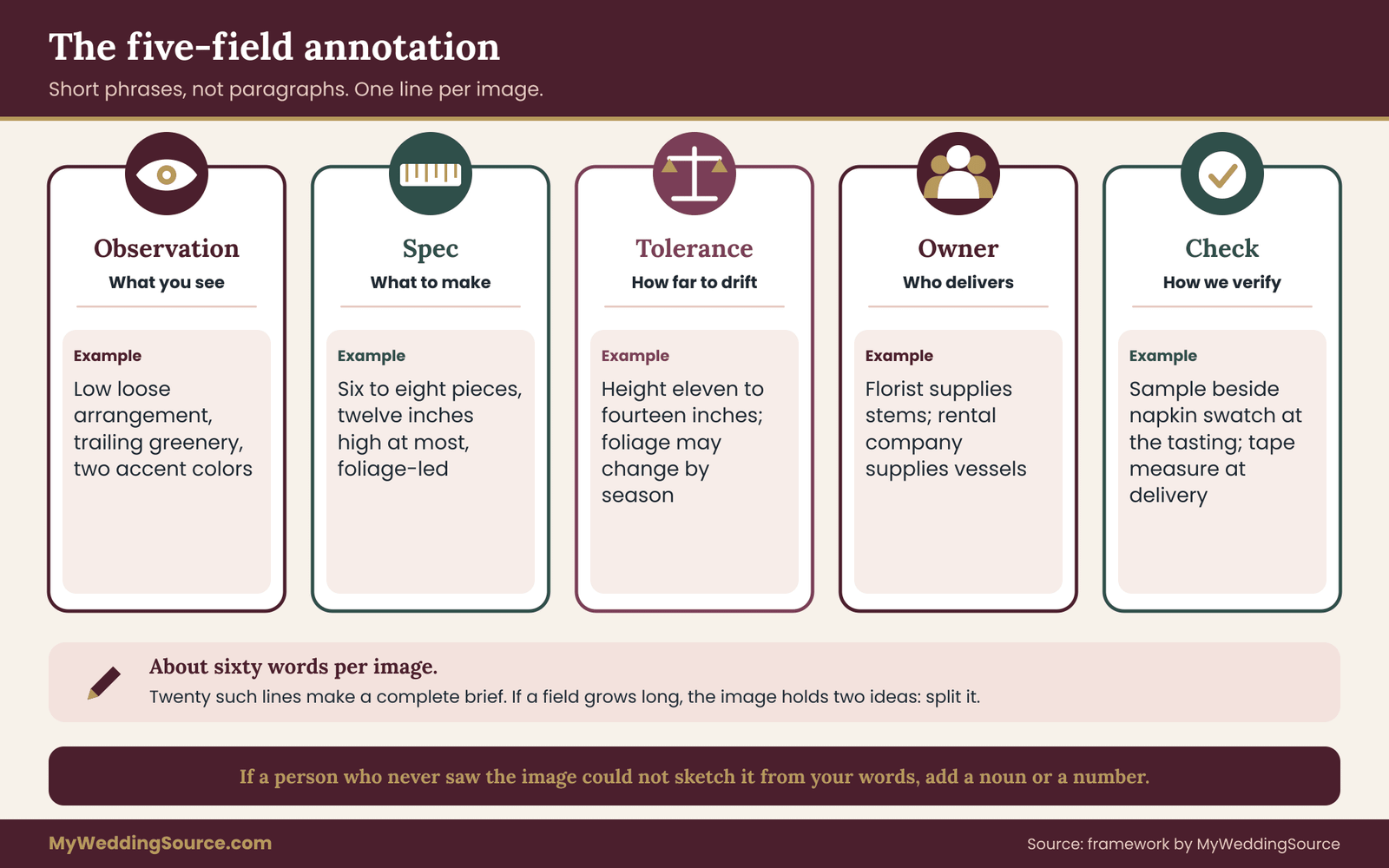
The core method in this guide is simple. For each image on the wedding mood board, you write five short fields. Together they turn a picture into a specification a vendor can act on. The fields are Observation, Spec, Tolerance, Owner and Check.
Field one: Observation
Observation is a plain description of the one thing you like, in neutral words. Not “gorgeous romantic centerpiece,” but “low, loose arrangement in a short ceramic vessel, mostly green with two accent colors.” Describe shape, scale, color, material, light and arrangement. Avoid adjectives that need a dictionary of your tastes.
A good test is whether a person who had not seen the image could sketch it from your words. If not, add a noun or a measurement. Observation is the cheapest field to write and the one most often skipped.
Field two: Spec
Spec says what the vendor should produce, in terms they can quote and build. This is the field where the picture turns into units: how many, how tall, how wide, what material, what color name or swatch, what finish. A spec for the arrangement above might read: “Six to eight low arrangements, no taller than twelve inches including the vessel, foliage-led, with no more than two flower colors.”
You do not need to know the right numbers. A rough range is acceptable, and vendors can correct you. Writing a first guess gives them something to react to, which is faster than starting from nothing. Say “about” and “no more than” freely. The point is to get numbers on paper.
Field three: Tolerance
Tolerance says how far the vendor may drift from the spec before they need to ask you. It is the field most couples have never heard of, and it is the most useful. Without it, every vendor decision becomes either a unilateral substitution or a stream of questions.
A tolerance can be a range (“eleven to fourteen inches tall”), a rule (“any green foliage is fine, but no silver tones”), a ranking (“color matters more than flower type”) or a yes-no (“substitute freely if a stem is unavailable”). Match the tolerance to how much the detail matters. Items at the heart of your wedding should have tight tolerances. Background items should have wide ones.
Field four: Owner
Owner names the vendor responsible for the item. This sounds obvious, but images often straddle trades. A candle on a table might be supplied by the florist, the rental company, the caterer or the venue. If nobody owns it, nobody brings it. Writing the owner next to the spec also reveals overlaps, where two vendors might both deliver something similar, and gaps, where nobody has been asked.
Field five: Check
Check says how you will verify the result and when. It is a measurable, observable test: “compare the sample swatch to the napkin in daylight at the tasting,” “measure the tallest arrangement at the delivery check,” “view the printed proof beside the fabric swatch before approving.” A check that cannot be performed, such as “should feel romantic,” is not a check.
Place a date or a stage next to each check. Some checks happen at the quote stage, some at a sample stage, some at a proof stage and some on the day. Putting the timing in the field turns the annotation from a description into a small plan.
One worked line
Here is the whole thing for a single image. Observation: low arrangement in short ceramic vessel, mostly green, two accent colors. Spec: six to eight arrangements, twelve inches maximum height including the vessel, foliage-led, two flower colors from the palette. Tolerance: height eleven to fourteen inches; foliage may change by season; flower colors fixed. Owner: florist; the vessels come from the rental company. Check: photo of one finished sample beside the napkin swatch at the tasting, and a tape-measure check at delivery.
That line is about sixty words. It tells a florist what to make, a rental company what vessel to bring, and you what to look for. Twenty such lines are a complete brief.
Keeping annotations short
Resist writing paragraphs. Each field should usually be a phrase or a single sentence. If a field is growing long, you are probably annotating more than one idea, and the image should be split. Short annotations are read. Long ones are skimmed, and skimming defeats the purpose of writing them down.
With annotations in place, the wedding mood board is no longer just a wedding mood board. It is a set of linked instructions. The next section shows how those instructions change depending on which vendor is reading.
Turning a wedding mood board into specs by vendor
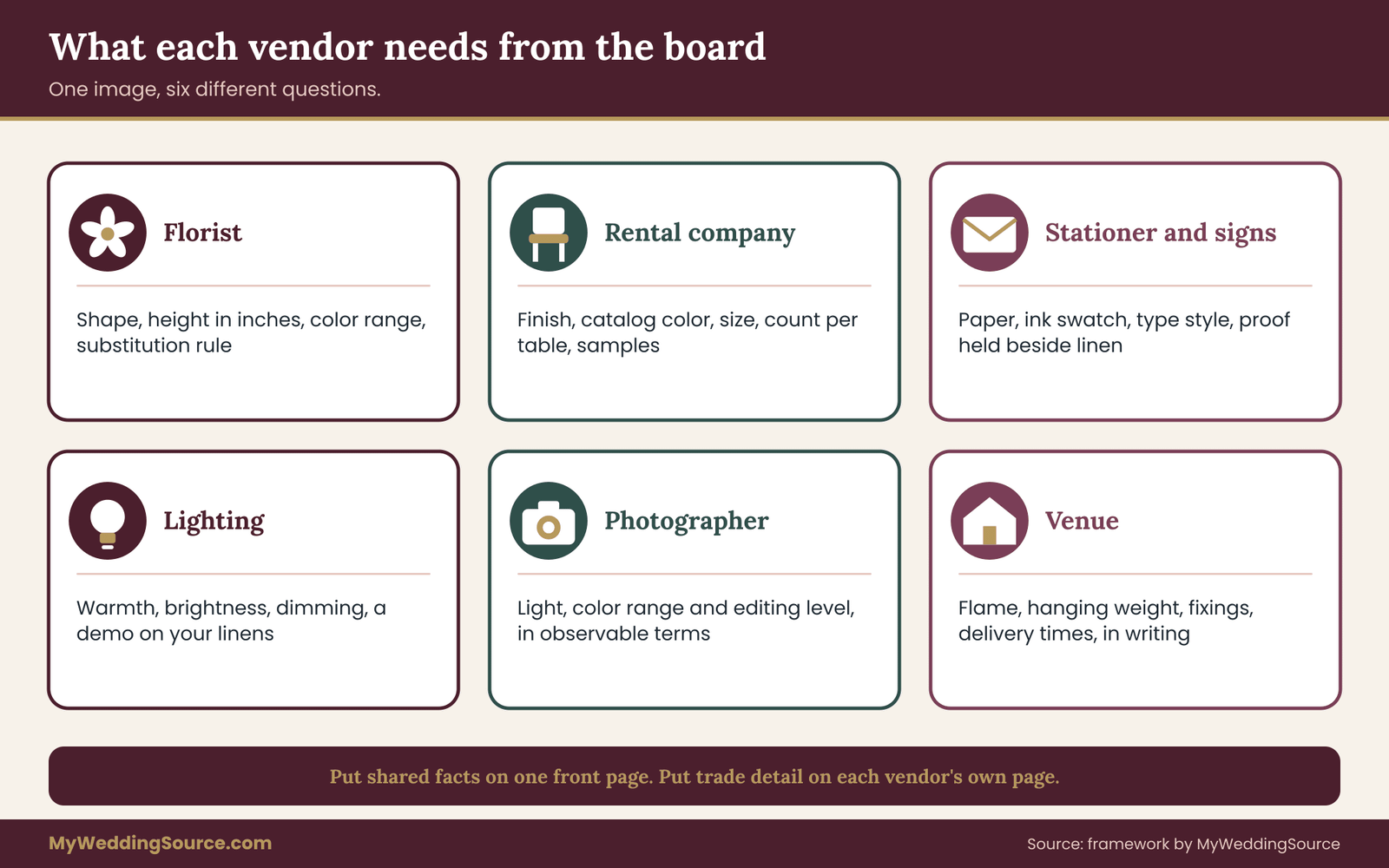
The same image asks different questions of different vendors. A photograph of a dinner table gives the florist a height and a color, the rental company a linen and a chair, the caterer a plate style, the lighting vendor a warmth, and the stationer a paper tone. When you annotate, you are splitting one image into the questions each trade needs answered. This section lists those questions by trade, so you can see what to write for each.
Florist: shape, count, color range and substitution
For florals, the useful specs are shape (loose, tight, trailing, upright), scale (height and width in inches), density (sparse or full), color range (named, with an allowed spread), and a substitution rule. A wedding mood board usually shows the finished look but not the count, so give a range. If you want a loose, garden-style look, say so, then say how tall the tallest piece may be so it does not block faces across a table.
Add one sentence about what happens when a flower is unavailable. Many florists substitute routinely, and the only question is whether you hear about it. “Substitute within the same color and texture, and send a photo if the change is large” is a perfectly good tolerance. If a particular flower matters for personal reasons, mark it as fixed and expect to discuss availability early.
Rental company: finish, scale and what the photograph hides
Rentals deal in objects that have names and catalog numbers, which makes them the easiest trade to specify and the most frequently wrong. Useful specs are finish (matte, glossy, brushed, raw), color name from their catalog, size, quantity per table, and the layout. A picture of a long table with mixed chairs tells a rental company very little, unless you say “mixed chairs, two finishes, no more than three styles.”
Ask for physical samples where color or texture is central. Catalog photographs are shot under studio light. A linen that looks cream on the website may read as pale yellow in a candlelit room. The rental planning checklist covers counts, delivery and returns. For your brief, add the one thing a checklist cannot know: which detail in the photograph is the reason you chose it.
Stationer and signage: type, paper, ink and proofs
Printed pieces need the most precise specs because printing is the hardest category to reverse. Write the paper color and weight if you know them, the ink color as a physical swatch, the type style described by features (high contrast, rounded, monoline), the layout density, and the number of pieces. A wedding mood board with a beautiful invitation in soft cream script is a good start, but the stationer needs to know whether you like the cream, the script, the spacing or the thickness.
Ask for a printed proof, held against the other items it must match. Legibility is a separate spec from beauty: very light ink on textured paper, or ornate script at a small size, can become unreadable at a reception entrance in dim light. The wedding signage system guide on this site covers readability, placement and proofing in depth, and your brief should defer to it for any sign guests must actually read.
Lighting: warmth, level and control
Lighting is the trade where a picture is most misleading, because a photograph’s light is partly produced by the camera. For your brief, state the warmth you want (warm, neutral, cool, or a named example such as “candlelight”), the level (bright enough to read a menu, or dim enough to feel intimate), and the controls (dimming, color changes during the night). A vendor can match warmth and level closely only if you say whether faces, food or the ceiling is the priority.
Be especially careful with colored light. It changes the apparent color of everything under it, including the flowers and linens you have so carefully matched. If your wedding mood board shows a colored wash, ask the vendor to demonstrate it on your actual linens before the event.
Photographer and videographer: light, color range and editing
For photography the most useful specs describe light and editing: bright and open or dim and dramatic, warm or cool in the shadows, soft or contrasty, naturally colored or heavily graded. These are the same terms a gallery review uses afterward, which makes them doubly useful. Photography is a trade that deserves its own detailed brief, so keep this part of the main document to a few lines and a pointer to the longer one.
Hair, makeup and attire
Beauty and attire boards suffer from a special problem: the person in the photograph is not you. Skin tone, face shape, hair type and fabric behave differently on different people. Rather than asking for “this exact look,” annotate the elements: the finish (dewy or matte), the intensity (natural or defined), the hair shape (loose, sleek, structured) and the hold (should it last through humidity and dancing?).
Schedule a trial, and judge the result against your annotation instead of against the original photograph. The bridal hair and makeup planning guide covers trial timing and logistics.
Caterer and bar
Food and drink bring the wedding mood board into an area where taste and appearance both matter. Specs are plating style (spare or abundant), portion size, garnish rules, glassware and serving format. Remember that a photograph of food was styled to be photographed, and the real version, served to a hundred people in a tent, will look different. Ask the caterer what is achievable at your service style, and adjust the spec to match.
Venue: the quiet veto
The venue is not a creative vendor, but it holds a veto over most of your specs. Open flame, hanging weight, wall fixings, floor protection, delivery times and sound limits are all venue decisions. A hanging installation from your wedding mood board may be impossible if the ceiling cannot take load. Put a short “venue limits” line in the brief, then ask the venue to confirm it in writing before the creative vendors commit.
Many hands, one fact sheet
Notice that each trade asks for slightly different things, but a handful of facts apply to all of them: the color list with swatch names, the formality level, the “not this” images, the ranked priorities and the venue limits. Put those in a shared front page that every vendor sees. Put trade-specific detail on a separate page for each. That structure is covered later in this guide.
The contradiction tracker
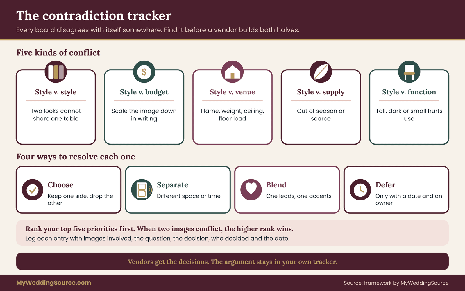
Every wedding mood board contradicts itself somewhere. That is normal. People like several things that do not fit together, and the wedding mood board is where those preferences first sit side by side. The problem is not the contradiction. The problem is not noticing it until a vendor builds both halves.
The contradiction tracker is a short list where you record every conflict between two or more images or specs, decide how to resolve it, and write the decision down. It is the part of this method most couples have never tried, and it tends to produce the most visible improvement.
Five kinds of contradiction
Style versus style. Two images belong to different visual families: a clean, minimal table next to a lush, abundant one. A vendor cannot do both on the same table. Decide which family leads, and where the other may appear as an accent.
Style versus budget. An image shows something much larger or more elaborate than your budget supports. The honest approach is to mark the budget on the image: “love this, scaled down to one-third.” The wedding budget guide covers how to set limits, and the tracker is where you apply them to specific images.
Style versus venue. The image shows a feature the venue cannot support: a high ceiling installation in a low room, an open-flame centerpiece in a no-flame venue, a heavy backdrop in a space with no floor load. These need an early check with the venue.
Style versus season or supply. The image shows items that are out of season, unusually scarce or priced by availability. Mark these as “inspiration only” or name an in-season equivalent.
Style versus function. The image looks beautiful but hurts something practical: tall centerpieces that block conversation, dark linen that stains visibly, a sign too small to read. Function usually wins, and the tracker records how you adapted the look.
The tracker format
Use a simple list with five columns’ worth of information, written in lines rather than a table. For each contradiction, write: the images involved by number, the kind of conflict, the question to settle, the decision, and the person who decided. Keep the decision in plain words. A tracker entry might read: “Images 3 and 11, style versus style. Question: loose or structured table? Decision: structured table with loose florals as the contrast. Decided by both of us, June.”
Date each entry. The date matters later, when a vendor asks why you changed your mind, and you can point to the moment and the reason.
How to find the contradictions
Lay the wedding mood board out in its groups and go through it in three passes. First, compare images within each group: do all the florals share a shape, do all the tables share a formality? Second, compare across groups: does the dress fit the room, does the paper match the linen? Third, compare the wedding mood board against hard facts: budget, guest count, venue, season, date.
Mark each mismatch on the wedding mood board with a small number and add it to the tracker. A wedding mood board of twenty images will usually surface several entries. If you find none, either the wedding mood board is unusually coherent or the review was too gentle.
Ranking your priorities
Contradictions can only be resolved if you know what matters most. Before filling in the tracker, rank your top five priorities for the day’s look. They might be color, lighting, table feel, paper pieces and attire. Write them in order. When two images conflict, the higher-ranked priority wins, and the vendor can follow the same rule when something goes wrong on the day.
Ranking is uncomfortable because it admits that some things will lose. That is exactly the point. A florist who knows color outranks flower type will substitute a different bloom in the right shade. A florist who does not know may do the reverse.
Resolution options
For each contradiction you have four choices. You can choose one side and drop the other. You can separate them in space or time, such as the ceremony in one style and the reception in another. You can blend, with one style leading and the other as an accent. Or you can defer, which is valid only if you write down a deadline and a person responsible for the decision.
The deferred option needs care. “We will decide later” without a date is how contradictions reach vendors unresolved. If you defer, say when the decision is due, based on the lead time of the vendor affected.
What the tracker gives each vendor
Vendors do not need the tracker itself, and some of its entries are private: budget conflicts, family sensitivities, a preference you changed your mind about. What they need is the outcome. Each resolved entry becomes either a sentence in the brief or a line in the tolerance field of an annotation. Keep the tracker as your own working record and publish only the decisions.
Assembling the annotated creative direction brief
With annotations and a resolved tracker, you have everything needed for the brief. Its job is to present those facts in an order a vendor can scan. This section lays out a structure that works for most weddings, from a small backyard event to a large venue celebration.

The front page: facts every vendor shares
The first page is common to every vendor and should fit on one side of paper. It holds six things.
First, a one-sentence statement of the overall feeling, in plain words and no more than twenty. Second, the color list (the site’s color palette basics cover how to choose one): four to six named colors, each with a swatch description, a physical sample reference if you have one, and a role (main, supporting, accent).
Third, the ranked priorities, from most to least important. Fourth, the “not this” list, with image numbers. Fifth, the formality level, described by what guests will do and wear, not only by a label. Sixth, the venue limits that affect creative work, with the date the venue confirmed them.
Anyone who reads only this page should be able to avoid the worst mistakes. That is the page vendors are most likely to read fully, so keep it clean.
The trade pages: one per vendor
After the front page, each vendor gets one page of their own, containing only the annotated images relevant to their trade, the open questions for them, and the dates attached to their checks. A florist should not need to read the lighting notes, and a stationer should not wade through the catering preferences.
Each trade page follows the same layout: a short list of the numbered images, each with its five fields, then a line for “decisions you may make without asking,” then a line for “decisions to ask us about first.” That last pair is a compact tolerance statement for the whole page. It gives the vendor permission to act on small matters and a clear trigger for questions.
The change log
Add a small final section at the end of the document, called a change log. Each time a decision changes, add a line with the date, the item and the new decision. This avoids the common situation where one vendor works from last month’s version and another from this month’s. Number the versions, put the version number in the file name, and send the newest to everyone when it changes.
The wedding vendor purchase order checklist on this site covers how to tie agreed scope to payment and acceptance. A brief is not a contract, but an agreed brief can be attached to one, and the change log is the part that keeps both honest.
Format, length and file handling
Aim for one front page plus one page per vendor, so a wedding with five creative vendors produces a document of about six pages. If it is far longer, you are probably adding explanation where a decision would do. If it is much shorter, you may be relying on images alone.
Save the final document as a PDF so layout and numbering do not shift between devices, and keep an editable copy for yourselves. Embed the images in the PDF at modest size, and link to full-size copies if a vendor needs detail. Name the file with the wedding date and a version number. Avoid asking vendors to open a live social board as the primary source, because boards change, links break, and a vendor cannot tell which version you meant.
Writing style for the brief
Use short sentences and concrete nouns. Prefer numbers to adjectives and examples to abstractions. Avoid trade jargon unless you are certain of its meaning, because a misused term can cost more than a plain description. Avoid commands. A brief is a conversation starter with a professional, so phrases such as “we would like,” “our priority is” and “please tell us if” keep the tone collaborative.
Avoid describing your feelings about a vendor’s past work. The brief should talk about the wedding, not about anyone’s performance. If you need to say that a past experience shaped a preference, say it in one neutral sentence.
Where the brief sits in the planning sequence
Timing matters. A brief is most valuable before vendors quote, because it lets them price the real scope. Send the front page and the relevant trade page with your first inquiry, so that quotes reflect the actual wedding. Update the brief after each vendor meeting. Freeze a version when you sign contracts and attach it, or reference it, in the agreement.
If you have not hired some vendors yet, do not wait. A partially complete brief with clear gaps is better than a late one. The wedding vendor contract guide covers what to look for in the agreement itself, including how changes to scope are handled. Check that the version of the brief you send is the one named in the contract.
What the brief is not
A brief is not a script for a vendor’s creative work. Professionals bring skill and judgment, and a brief that tries to control every decision invites resentment or gives you a result that is exactly what you asked for and not what you wanted. Aim for clear boundaries, clear priorities and room inside them.
It is also not a place to settle family disagreements. If two relatives want different things, resolve that between yourselves first, using the tracker, and put only the outcome in the document. The brief shows decisions, not negotiations.
A short checklist, in prose
Before you send the brief, read it as though you were the florist, then as though you were the rental coordinator. Does each page make sense without the others? Is every image numbered and every number used? Does every annotation have an owner? Does the front page list the colors, priorities, “not this” images and venue limits? Is the version number visible? If you can answer yes to all six, the brief is ready to send.
Comparing ways to hand over a wedding mood board
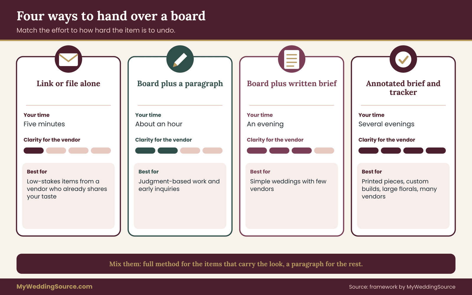
Not every couple needs the full method. The right amount of translation depends on the vendor, the budget and how much the result matters. This section compares the four main ways couples hand over a wedding mood board, so you can choose deliberately instead of by default.
Option one: the link or the file, sent alone
The simplest approach is to share a link to a social board or a PDF of images. It takes five minutes. It works for low-stakes items where the vendor already shares your taste, such as a baker you hired because of their portfolio. The cost is the whole ambiguity problem described earlier: no quantities, no priorities, no limits, and no way to tell which image matters.
Linked boards add a second risk. They can change after you send them, a vendor may open a different version than you meant, and the people involved may lose access. If you must use a link, add a dated PDF copy so everyone can see the same thing.
Option two: board plus a paragraph of description
Adding a short written description helps. A paragraph of five or six sentences on feeling, colors and things to avoid costs perhaps half an hour. It works well for vendors whose work is largely judgment, such as a photographer, and for early inquiries. Its weakness is that prose is hard to check against. “Soft and organic” will still be read two ways.
Option three: board plus a written brief without annotation
A written brief of one or two pages, with ranked priorities, colors, and a “not this” list, is a big step up. It is a good fit when the wedding is relatively simple, with a small number of vendors and a venue that comes with most of its own decor. Without the five-field annotation, though, the brief still cannot say which image is the reason for which instruction, so a vendor may over-copy some details and miss others.
Option four: the annotated brief with a tracker
The full method costs more time up front, commonly a few evenings for a wedding with several creative vendors. In exchange, it produces specs a vendor can quote against, tolerances they can act on, and a record of decisions. It fits weddings with many vendors, heavy custom production, printed pieces, large floral work, or a tight budget where misunderstandings are expensive.
How to choose
Use three questions to decide. How irreversible is the item? Printed goods, custom builds and large floral installations are hard to undo, so they justify the full method. How many vendors must match each other? When color and shape must align across florals, paper, linens and light, the shared front page is worth the effort. And how much does the vendor already know your taste? A vendor you chose after seeing their work needs less translation than one you picked on price.
Many couples mix the options. Use the full method for the three or four items that carry the look, and a paragraph for the rest. That is a sensible compromise. The point is to choose it on purpose.
The cost of each option
None of these options has a fixed price, and any figures would depend on your vendors, your region and your time. Think about cost in two ways. The up-front cost is your time: roughly a few minutes for a link, an hour for a paragraph, an evening for a brief and several evenings for the full method. The back-end cost is the risk of a rework, a return, a reprint or a disappointing result, which is paid in money, stress and sometimes the quality of a photograph you cannot retake.
The more expensive and irreversible the item, the more the full method repays the time. For a small, cheap, reversible item, a link and a sentence is plenty.
What to do when a vendor prefers their own process
Some vendors have their own intake forms, mood-board templates or design meetings. Use them. Treat your annotated brief as an attachment and a reference, not a competing process. Say so politely: “We have prepared a short brief that may answer some of your questions; please tell us if your form needs anything else.” A vendor who sees that you have done the thinking will usually welcome it.
When a vendor says they do not need one
Occasionally a vendor will say they never use briefs and prefer to “feel it out.” That is a legitimate working style for a designer with a distinctive vision and a long record. If you choose that route, keep the front page anyway. A designer who works by instinct still needs your color list, limits and “not this” images, and it protects you if the result drifts. Ask them to confirm, in writing, the few decisions you cannot afford to leave open.
A worked example with an invented couple
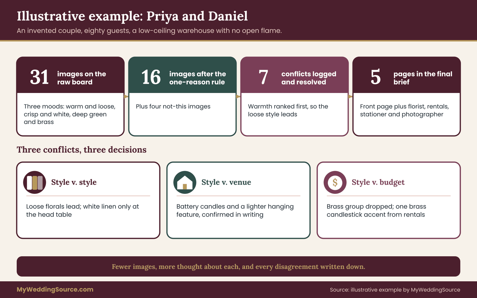
The following example is invented to show the method in motion. Priya and Daniel are not real people, and the numbers are chosen only for illustration. They are planning a reception for about eighty guests in a converted warehouse with a low ceiling and a strict no-open-flame rule. They have a florist, a rental company, a stationer and a photographer.
Step one: the raw board
Priya and Daniel each collected images separately for two weeks, then merged them into a wedding mood board of thirty-one. Viewed together, it fell into three moods. One group showed warm, candlelit, loosely styled tables with trailing greenery. Another showed crisp white linen, clean lines and sparse arrangements. A third showed deep green and brass, with heavy fabric and dark wood. Each partner loved a different group.
They applied the one-reason rule. Nine images had no nameable reason and came off. Six more were attractive for the same detail, a trailing vine shape, so they kept the clearest two. That left sixteen images, plus four in a “not this” set.
Step two: the five fields on three images
For image four, a long table with a low trailing arrangement, they wrote: Observation, low loose arrangement, trailing greenery, two accent colors. Spec, six arrangements along an eight-foot table, no taller than ten inches, foliage-led. Tolerance, height nine to twelve inches, foliage seasonal, accent colors fixed. Owner, florist. Check, one sample beside the napkin swatch at the tasting.
For image nine, a menu card on cream paper, they wrote: Observation, thick cream card, small dark green type, wide margins. Spec, one card per place, heavy cream stock, dark green ink matching the swatch, type at least ten points. Tolerance, any cream within the swatch family, type size not smaller than spec. Owner, stationer. Check, printed proof held next to the linen sample in the venue’s light.
For image twelve, a hanging candle arrangement, they wrote: Observation, many hanging candles at varied heights. Spec, an overhead feature above the head table. Tolerance, none yet. Owner, undecided. Check, ask the venue. That unfinished line is useful. It is the start of a tracker entry.
Step three: the tracker
Priya and Daniel found seven contradictions. Three are worth walking through.
The first was style against style. The warm, loose group and the crisp, white group could not share one table. They ranked their priorities: warmth first, then paper quality, then lighting, then table structure, then attire. Warmth outranked crispness, so the loose style led. The crisp style survived as accents: white linen on the head table and a clean, spare layout for printed pieces.
The second was style against venue. The hanging candles in image twelve broke the no-open-flame rule, and the low ceiling made a large overhead installation awkward. The venue confirmed in writing that battery candles were allowed and that lightweight pieces could hang from existing rails. They changed image twelve’s spec to battery candles in a smaller feature.
The third was style against budget. The dark green and brass group needed heavy fabric and custom brass pieces. They chose to drop the group and keep a single brass detail, candlesticks from the rental catalog, as an accent. The budget guide helped them set the ceiling before the tracker was finished.
Step four: the brief
Their final brief ran to five pages: a front page and one page each for the florist, rental company, stationer and photographer. The front page listed four colors with named swatches and physical samples, five ranked priorities, a “not this” list of four numbered images, a formality sentence (“dressed up, relaxed, dinner served at tables”) and the venue limits with the date of the venue’s written confirmation.
They sent the front page and the relevant trade page with each inquiry, and the whole document to vendors once they signed. They saved it as version three, with a change log showing two edits.
What the example shows
Priya and Daniel did not use more images. They used fewer, with more thought about each. They did not remove their disagreements. They recorded and resolved them. And the vendors, reading five pages instead of thirty-one pictures, could quote, ask targeted questions and build to the same family. The method does not guarantee a perfect result, but it moves the likely misunderstandings from the day of the wedding to the planning stage, where they are cheap to fix.
Questions to ask vendors and measurable checks
A brief works best when it opens a conversation. These are the questions that tend to be most useful, grouped by when you ask them, along with checks you can measure.
Questions at the inquiry stage
Ask each vendor what they need to quote accurately. Some will send an intake form, which tells you what they consider essential. Ask whether they have worked in your venue, since venue experience often matters more than style experience. Ask how they handle substitutions and whether they report them before the event. And ask what formats they prefer for design files.
“We have a short brief with colors, priorities and a few images we want to avoid. Would it help to send it before you quote, and what else would you like to see?”
Questions at the proposal stage
When you receive a proposal, compare it line by line against your spec. Ask where their quote assumes a different scale. Ask what is included in the quoted price and what is billed separately, such as delivery, setup, breakdown and rental damage. Ask what the proposal changes from your brief and why. A vendor who explains a deviation is showing expertise. A vendor who deviates without saying so is a risk.
Questions at the sample stage
Where samples exist, use them. Ask to see a physical sample of the key color or material, in daylight and in the lighting the venue will use. Ask for a proof or a mock-up where they offer one. Ask what changes are possible after approval and by when. For anything printed or custom-made, approval is often the last point at which a change is free.
Questions in the final week
Confirm delivery times, setup locations and who will be on site. Ask who has the final copy of the brief and who will make any day-of substitutions. The vendor timeline guide lays out when to confirm each item; for creative work, use the final call to check the brief’s version number against what the vendor holds.
Measurable checks
A check should be something you can observe and write down. A few useful ones follow.
Color match. Hold the swatch beside the delivered item in the same light and compare. Note whether it is within the tolerance you wrote. Photograph the comparison, since your memory of color is unreliable.
Dimension. Measure the tallest and widest piece with a tape measure and compare with the spec range. Height is the most common surprise, and the easiest to check.
Count. Count the delivered quantity against the spec and the contract. A quote may list “centerpieces” with no number, so the brief’s count is your reference.
Legibility. Stand where a guest would stand and read the printed piece at arm’s length, then at the distance the sign will be viewed. The W3C’s Web Content Accessibility Guidelines offer a well-known contrast threshold for text on a background, and it is a useful benchmark for printed pieces as well as screens.
Consistency across vendors. Place the napkin, the menu card, the flower and the linen together and view them as a set. If any one stands out for the wrong reason, note which and why.
Recording the results
Keep a short result line for each check: date, item, result within tolerance or not, photo reference, action. A result log takes a few minutes and gives you evidence if a vendor needs to correct something, as well as a record for the final payment decision. It also feeds your next brief if you plan any further events.
What to do when a check fails
Work out first whether the miss is inside your tolerance. If it is, accept it and move on. If not, tell the vendor promptly and politely, with your photo and the spec line. Ask what they can offer: a swap, a correction, a credit. The earlier you raise the issue, the more options exist, which is why timing is part of each check. Keep the tone factual. The brief already shows what both sides agreed to.
If a vendor delivers something that does not match the agreed spec and cannot fix it, the contract controls remedies. The contract guide covers the clauses worth reading before you sign, and this is exactly where an attached brief earns its place.
Copyright, credit and usage terms for wedding mood board images
A wedding mood board is usually a private planning document, and private planning use is the lowest-risk use. The questions start when the wedding mood board leaves your hands: sent to vendors, shared online, or used by a vendor to produce something. A few plain principles keep you on the right side.
What copyright means for the images you collect
Most images on the internet belong to someone: the photographer, the designer or the artist. The U.S. Copyright Office explains that copyright protection attaches automatically when an original work is created and fixed in a form, and the creator does not need to register it first. That means a picture you saved is almost certainly someone’s protected work, even if no notice appears on it.
Gathering images for your own reference is generally treated differently from reproducing or publishing them, but the line between the two depends on facts and context, and fair use is decided case by case. This guide cannot tell you where the line falls for a specific use. The Copyright Office’s website explains the general rules and the factors it considers, and it is the right place to start for current information.
Showing the wedding mood board to vendors
Sending a wedding mood board to a vendor so they can understand your taste is an ordinary part of planning, and vendors expect it. The more sensitive step is asking a vendor to reproduce a specific protected piece. That is where the wedding mood board should shift from “this is the look” to “make something in this family.”
For a florist, copying the general shape of an arrangement is normal craft. For a stationer or a signmaker, copying the specific artwork, illustration or lettering of another artist can raise real problems. A hand-drawn monogram, a custom illustration or a distinctive typeface on someone else’s invitation is a creative work, and a vendor may decline to reproduce it. A good brief asks for “the same feel” instead of “an exact copy,” and credits the original when you can.
Credit, where you know it
If you know who made an image, note the source in your annotation: the photographer, the venue, the designer. It costs a few words, helps the vendor look up the original context and shows good faith. If the source is unknown, say so. “Source unknown, found on a public board” is a more honest note than silence, and it signals to the vendor that they should not treat the image as clear to copy.
Do not remove watermarks or crop out credits to make a wedding mood board look tidier. A watermark may be a signal that the image is not meant for reuse, and removing it can create problems of its own.
Images that include other people
Photographs of real people, especially guests, children and other couples, raise privacy points beyond copyright. Using them in a private board is generally low risk, but sending them to several vendors or posting them publicly is a different matter. If an image shows someone’s face, ask yourself whether it needs to be there. Often the detail you like is the table or the dress, and a closer crop does the same job.
The site’s guide to wedding photography consent covers image use for your own wedding guests, which is a separate question from the images on your wedding mood board.
Vendor usage terms for your brief and their work
Rights run in the other direction too. When a vendor creates something for you, such as custom artwork, a layout, a logo or photographs, the contract usually says who owns it and what you may do with it. Read those terms before you ask a vendor to create new work from your wedding mood board. In particular, check whether you receive the files, in what format, and whether you may reuse the artwork on other items such as signs, a website or thank-you notes.
If a vendor needs permission to show your wedding in their portfolio, that is a separate point to agree in writing. A short sentence in the brief or the contract is enough: “Photos and design details may or may not be shared by the vendor; please confirm in writing.”
Templates, platforms and their terms
If you build the wedding mood board or the brief in an online design tool or on a social platform, the platform’s own terms govern what you may upload, share and download. Read those terms for anything you plan to publish or print. Stock images, template elements and fonts inside design tools often carry their own licenses, and not all of them allow commercial or printed use. Check the platform’s current license page before you hand a file to a printer.
Fonts deserve particular care. A font that looks free in a design tool may need a separate license for printing, signage or embroidery. Ask the vendor who will produce the item to confirm that they have the right license for the file they will use.
Disclosure and commercial relationships
If any vendor or planner recommended in your research has a commercial relationship with a platform or a product, that relationship should be disclosed by the party making the recommendation. The Federal Trade Commission publishes guidance on endorsements and disclosure. You do not need to read it for ordinary planning, but it helps explain why honest vendors tell you when a suggestion comes with a referral arrangement. Treat any recommendation that comes without that information with the same care you would give a quote.
A short rule to carry
Use the wedding mood board freely for planning. Ask vendors to match a feel, not copy a finished work. Credit what you can. Keep faces out where you can. And read the terms for anything you will print, publish or reuse.
Edge cases and judgment calls
No method covers every wedding. These are the situations where the standard steps need adjusting.
You have a planner or a designer
If a planner or designer is involved, the brief becomes a communication tool between you and them, and they will likely translate it for the other vendors. Give them the full method, ask how they prefer to work, and agree who sends the brief to whom. Be clear about which decisions they may make on your behalf and which need your approval. Their tolerance for your annotations will be generous or tight depending on how much creative control you want them to have.
You are doing much of it yourselves
For a couple doing flowers, signage and decor themselves, the brief is a plan for helpers rather than for professionals. The same method applies, but the “owner” field names friends and family, and the “check” field becomes a setup checklist. Because volunteers have no experience reading specs, write the instructions even more plainly, and include a photo of one finished example for each item. A single finished sample is better than a paragraph.
A very small wedding or a courthouse celebration
A guest count of ten or twenty, or a civil ceremony followed by dinner, rarely justifies several pages. Use a front page, a few annotated images and a short tracker. The core idea still works: say what matters most, say what to avoid, and give a vendor something they can check. Scale the document to the event.
The venue supplies most of the decor
Some venues include furniture, linens, lighting and even florals. In that case your brief becomes an editing tool. Annotate what you want changed, what you will keep, and what you will add. Start with a walk-through and photograph what already exists, so you do not duplicate it or contradict it. Ask early about restrictions on changes, because your wedding mood board may rely on things the venue will not allow.
Two cultures, two traditions
If the wedding combines cultural traditions with distinct visual elements, the contradiction tracker is especially valuable. Elements that carry meaning, such as particular colors, fabrics, ritual objects or arrangements, should be flagged as fixed, not decorative, and described with the help of the family members who understand them. A vendor unfamiliar with a tradition will do better with a clear note and a person to ask than with a guess. Invite those family members to review the relevant pages before they go out.
Partners who disagree, family who weigh in
When the two of you disagree, resolve it in the tracker with the ranked priorities before involving vendors. Vendors who receive conflicting messages from two people will either pick one or split the difference, and neither is what you wanted. Agree on one person to be the vendors’ contact for design questions, and have that person check with the other before answering.
Family members who weigh in can be handled with a “reviewed by” step: show the front page and ask for comments by a date. Then decide. The decision rights guide covers how to share input without losing control.
Color accessibility and readability
Some guests may have color vision differences, low vision or difficulty reading small type. A palette that relies entirely on two similar hues, or printed pieces with pale text on a pale ground, may be hard for them to read. Add a “legibility” line to any printed spec and choose contrast deliberately. W3C’s accessibility guidance on contrast is a practical reference, and the signage guide covers sign readability more fully.
Weather and last-minute changes
An outdoor wedding or a tent can change the look on the day: wind, rain or heat can wilt flowers, flatten fabric and shift light. Your brief should include a short “if conditions change” line for each key item. For florals, it might name a sturdier alternative. For lighting, it might say which setting to use if the sky turns dark early. For paper, it might say which pieces move indoors. This is the tolerance field applied to weather, and it is easier to write calmly in March than in a downpour in June.
A shortage, a recall or a backorder
Sometimes a vendor cannot deliver an item because the supplier ran out, a flower failed or a fabric is delayed. A brief with ranked priorities makes this manageable. The vendor can check the rank, pick the closest match and tell you what changed. Ask every vendor to let you know about a substitution as soon as they know, with a photo, and agree in advance how quickly you will answer. Slow answers cause rushed choices.
A vendor who disagrees with your spec
Occasionally a vendor will say a spec will not work: the arrangement will not hold its shape, the fabric will not drape, the color will not survive the printing method. Treat that as useful information. Ask them to explain, and ask for an alternative that keeps the reason you chose the image. The five fields give you a shared language: “The observation is the loose, trailing shape. What can you offer that keeps that?” Then update the annotation and the change log.
You change your mind
You will, at least a little. The change log makes this safe. Record the change, send the new version, and confirm the vendor received it. Be honest about cost: late changes can cost money, and vendors set their own deadlines for them. Check the contract for the final date on which a change is free, and treat that date as your design lock. A wedding mood board is allowed to evolve. The brief is allowed to change. The only rule is that everyone works from the same version.
Using the brief after the wedding
Keep the final version of the brief and the change log with your wedding records. If a vendor delivers something that differs from the agreed spec, the brief is evidence. If you ever host another event, a family celebration or an anniversary, it is also a template. Keep it with your other contracts and receipts.
When to stop
There is a point at which more annotation adds little. If every key item has a spec, a tolerance, an owner and a check, the tracker has no open entries, and each vendor has confirmed they understand their page, you are done. Resist the urge to keep refining. A brief that is clear and finished beats one that is perfect and late.
Your next steps
Work through these in order. Each takes an evening or less.
First, run the friend test on your current wedding mood board. Send it without comment and compare what your friend guesses with what you want. Note where the answers diverge.
Second, cut the wedding mood board to twelve to twenty-four images using the one-reason rule, and add a “not this” set of three to six images.
Third, write the five fields for the images that matter most. Start with whatever is hardest to reverse: printed pieces, custom builds and large floral work. Leave background items for later.
Fourth, build the contradiction tracker. Go through the wedding mood board in three passes, rank your top five priorities, and resolve each conflict in writing with a date and a decision-maker.
Fifth, ask the venue to confirm its limits in writing, and add them to the front page.
Sixth, assemble the front page and one trade page per vendor, save the result as a numbered PDF, and send it with your next inquiry or proposal review.
Seventh, schedule your checks: a sample or proof for each key item, a measurement at delivery and a final comparison in the venue’s light. Put those dates on your calendar next to each vendor’s deadline.
FAQ
How many images should a wedding mood board have?
For a wedding mood board that vendors will actually read, twelve to twenty-four images works well. Fewer than twelve may not show enough variety for a vendor to see the family of looks you like. More than twenty-four makes it hard to annotate each image, and unannotated images are open to guesswork. If you have more, keep them in a private folder and send only the working set.
Is a wedding mood board enough for a vendor?
Usually not by itself. A wedding mood board shows the feeling you want but not quantities, limits, priorities or how much a vendor may deviate. A vendor can still work from it, but they will fill the gaps with their own assumptions. Adding short annotations and a front page of colors, priorities and things to avoid turns the wedding mood board into something a vendor can quote and build from.
Should I use hex codes or color names for vendors?
Use both, but neither alone. A hex code describes a screen color and can look different on every device, and a name can mean different things to different vendors. Add a physical sample, such as a fabric swatch or paint chip, and say how much variation is acceptable. Ask the vendor to compare the sample with their materials in daylight and in the venue’s lighting.
Can I send a Pinterest or social board instead of a PDF?
You can for early inquiries, but a dated PDF is safer for decisions. Online boards can change after you send them, links can break, and a vendor may not know which version you meant. If you share a link, also send a PDF copy of the same set with image numbers, and note the date. Use the PDF as the version you both refer to.
What if my images contradict each other?
That is normal, and it is worth fixing before vendors see the wedding mood board. List each conflict, decide which style or priority leads, and write the decision down. You can choose one side, separate the styles by space or time, blend them with one leading, or defer with a deadline. Vendors need the outcome, not the whole argument.
Can vendors copy an image from my board exactly?
Often they should not. Copying a general look or shape is normal craft, but reproducing a specific protected work, such as another artist’s illustration, lettering or custom design, can raise copyright problems, and some vendors will decline. Ask for the same feel, credit the source where you know it, and read your vendor’s terms. The U.S. Copyright Office explains the basics.
How early should I send the brief to vendors?
Send the front page and the relevant trade page with your first inquiry, so quotes reflect the real scope. Update it after each meeting and freeze a numbered version when you sign. Attach or reference that version in the contract. Printed and custom items need it earliest, because they are the hardest to change after approval.
What do I do if the delivered result does not match the brief?
Check first whether it falls inside the tolerance you wrote. If it does, accept it. If not, contact the vendor promptly with a photo and the spec line, and ask what they can offer, such as a swap, a correction or a credit. Your contract controls the remedies, so read it for how changes and problems are handled.
Sources
- U.S. Copyright Office
- U.S. Copyright Office: fair use index
- Federal Trade Commission
- FTC: endorsement guides and disclosure
- W3C Web Accessibility Initiative
- ADA.gov, U.S. Department of Justice
- Library of Congress: personal digital archiving
- Pinterest policies and terms
- Canva: license agreements and content terms
- Pantone