
Invitation paper weight is the number printers use to describe how heavy and stiff a sheet is, and it is quoted in at least three different ways that do not line up. This guide explains how to compare gsm and cover stock honestly, how to score paper samples in your hands, and how to turn an invitation paper weight into postal ounces before you order.
Convert every quote to grams per square meter (gsm) so you compare like with like, and ask whether a pound figure means cover, text or bond. Request physical samples of the exact stock, score them on a short worksheet (feel, print result, folds and edges, envelope fit, postage, cost), then weigh a full assembled sample suite on a kitchen scale. Pick the lightest invitation paper weight that still passes your hands-on test, because every extra gram is paid for twice: once at the printer and once at the post office.
Most couples meet invitation paper weight as a line on a quote. “110 lb double-thick cotton.” “300 gsm uncoated.” “Cover stock, available in three weights.” The words sound precise, yet each one hides a decision that changes how the invitation feels, how the ink or foil behaves, and what the suite costs to mail. Two sheets both described as “heavy” can differ by a third in actual mass.
This article is built around one practical idea: invitation paper weight is a measurement you can verify, not a marketing adjective. You can convert it, calculate it, hold it and put it on a scale. Once you do that, comparing printers and papers becomes a short, calm exercise instead of a guess.
A note on scope. This is general information, not legal, tax or financial advice. Postal prices, size limits and surcharges change, so every postal point here comes with a pointer to the agency that publishes the current rule, and you should confirm it with your printer and your local post office before you order.
What invitation paper weight actually measures
Paper weight answers a simple question: how much does a sheet of a given size weigh? Everything else you associate with invitation paper weight, such as stiffness, thickness, opacity and that satisfying heavy feel, is a consequence of the mass plus the way the paper was made. That distinction matters because the two things often get blurred in sales conversations.
Think of invitation paper weight as three separate properties that travel together but are not the same.
Mass per area. This is the true weight: how many grams one square meter of the sheet would weigh. It is the number behind every other label, and it is the one the post office will care about indirectly, because the weight of your suite is the sum of its sheets.
Thickness. This is how deep the sheet is, called caliper. Two papers of equal mass can have different thickness if one is fluffy and the other is dense. A bulky sheet feels substantial for its mass. A dense, coated sheet can feel thin and stiff at the same invitation paper weight.
Stiffness. This is how much the sheet resists bending. It rises quickly with thickness, which is why a slightly thicker card feels much more rigid. Stiffness also depends on fiber type and on which direction the fibers run.
So when you read a quote, ask yourself which of the three the number is really describing. Most of the time it is mass, written in an unfamiliar unit, and the stiffness you feel will depend on what else is going on in the sheet.
Why the label on an invitation paper weight quote is not the whole story
Printers inherit their vocabulary from different parts of the paper trade. Offset commercial printers think in pounds and in paper grades. Digital and international suppliers think in grams per square meter. Letterpress and cotton-paper studios often speak in “double-thick” and “triple-thick,” which describe how sheets are layered, not how heavy a single sheet is.
None of these vocabularies is wrong. The trouble starts when a couple collects three quotes written in three dialects and tries to rank them by price. A cheaper quote may simply describe a lighter sheet. A more expensive quote may describe a heavier sheet than you actually need. You cannot tell which without translating them to one unit, and that translation is the first job of this guide.
What invitation paper weight does not tell you
Invitation paper weight alone does not describe color, texture, coating or how the paper takes ink. A smooth coated card and a soft cotton card can share an invitation paper weight and behave completely differently under a press. If you only compare numbers, you will miss the qualities that make an invitation feel the way you imagined.
That is why the method later in this guide pairs a number with a hands-on score. The conversion keeps you honest about mass and cost. The sample scoring keeps you honest about the experience. Neither one works without the other.
Reading the numbers: gsm, pounds and caliper
Three units show up again and again on invitation quotes. You do not need to memorize conversion tables to use them, but you do need to recognize each one and know what question to ask when it appears.
Grams per square meter
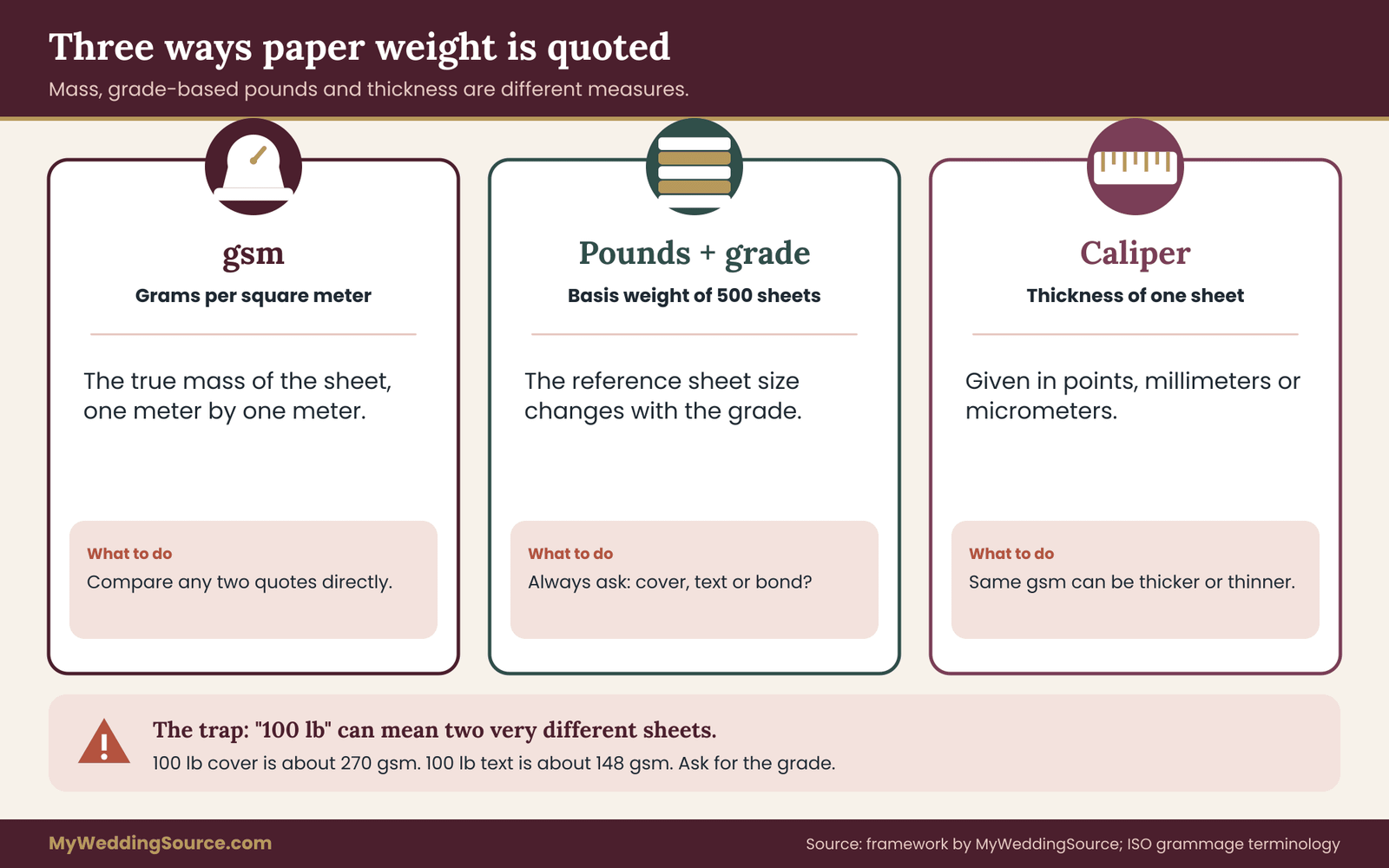
Gsm is the cleanest measure. It is the mass in grams of a sheet that measures one meter by one meter, regardless of the actual sheet size. Because it does not depend on a grade or a standard sheet size, a 300 gsm sheet is the same weight whether it comes from a mill in one country or another. International standards bodies publish the test method for measuring it, and the International Organization for Standardization lists it under the term grammage.
If a printer quotes in gsm, you can compare it directly with any other gsm figure. If a printer quotes in pounds, you will need the grade before you can convert, which is the subject of the next section.
Pounds, and why the same number means different things
In the United States, invitation paper weight is often labeled by basis weight in pounds. A basis weight is the weight of 500 sheets cut to a standard size for that grade of paper. The standard size is different for each grade. That is the whole trap: a “100 lb” sheet of cover stock is much heavier than a “100 lb” sheet of text-weight paper, because the cover grade is defined on a different reference sheet.
The reference sizes you will meet are bond, text, cover, index and bristol. You only need to remember that the number alone is incomplete. A pound figure should always be followed by a grade word, such as “100 lb cover” or “80 lb text.” If your quote leaves the grade off, ask for it before anything else.
“Your quote says 110 lb. Can you confirm whether that is cover or text, and give me the gsm for the exact sheet you are quoting?”
Caliper: the thickness measure
Caliper is the thickness of a single sheet. In the United States it is often given in points, where one point is a thousandth of an inch, and elsewhere it is given in millimeters or micrometers. A heavier sheet is usually thicker, but the relationship is loose. Two stocks at the same gsm can differ in caliper by a visible margin depending on how much air is in the sheet.
Caliper is the number to ask about when stiffness or the slot fit in an envelope matters. For plain letter-sized mail, thickness also sits behind several postal rules, which is covered in the postal section. If a supplier lists both gsm and caliper, you get a picture of density as well as mass, and that is worth having.
A small habit that prevents most mistakes
Before you compare any two quotes, write each one on a sticky note in the same form: the grade, the pound figure if there is one, the gsm, the caliper, the finish and the sheet size. If any of those is missing, put a question mark on that line and ask. After the third quote you will notice that the missing lines are where the surprises hide. A price that looks high may include a heavier paper or a premium finish. A price that looks low may be missing the one detail that explains it.
Keep that note card beside your sample pile. Every later step in this guide, from scoring to postage, refers back to the same few facts about each candidate, and an invitation paper weight written in gsm is the fact you will use most. If you share the planning with a partner or a stationer, send them the same note so that everyone is comparing the same sheet.
Cover stock versus text weight: the conversion trap
Cover stock is the heavier family of papers made for covers, cards and invitations. Text weight is the lighter family made for interior pages, letterhead-style sheets and inserts. Both are measured in pounds, and both can be printed on beautifully. The reason to separate them is that the same pound number points to very different masses.
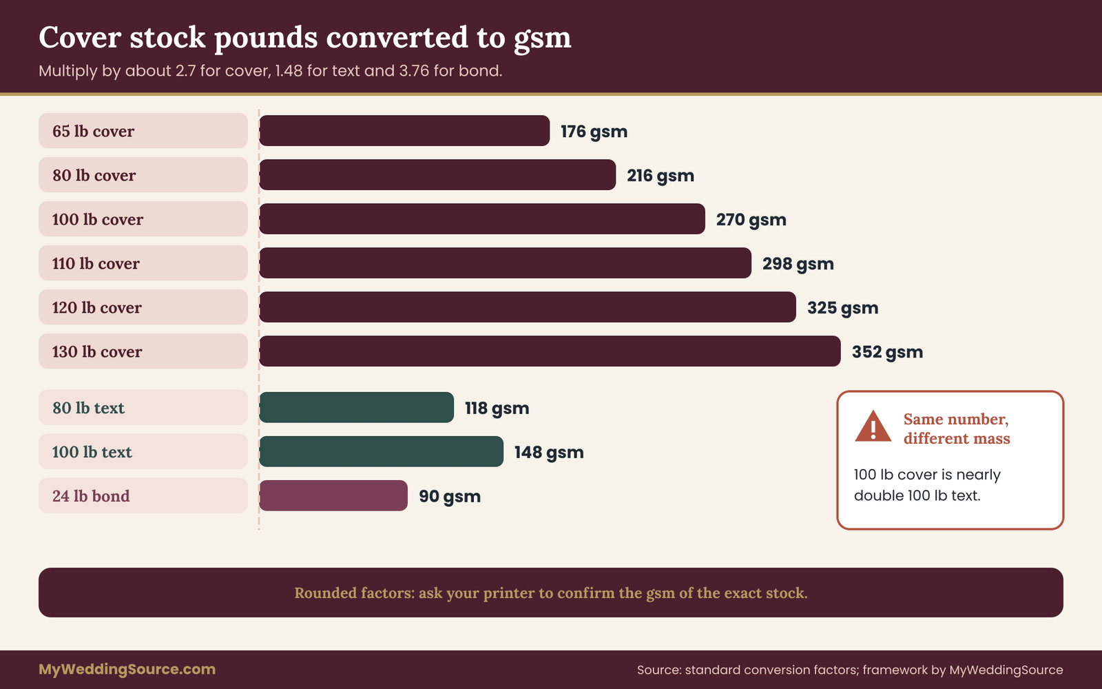
Here is the multiplier approach, which you can do on a phone calculator. For cover stock, multiply the pound figure by about 2.7 to get gsm. For text weight, multiply by about 1.48. For bond, which is the grade used for ordinary office paper, multiply by about 3.76. These are rounded conversion factors, and mills round their published gsm figures, so expect a small difference between your arithmetic and a spec sheet.
Run a few through. An 80 lb cover sheet comes out near 216 gsm. A 100 lb cover sheet comes out near 270 gsm. A 110 lb cover sheet lands near 298 gsm, and a 120 lb cover sheet near 325 gsm. Now compare with text: an 80 lb text sheet is about 118 gsm, and a 100 lb text sheet is about 148 gsm. A quote that says “100 lb” could therefore mean roughly 148 gsm or roughly 270 gsm, which is nearly double.
What this looks like in practice
Imagine two printers quoting for the same 5 by 7 inch flat invitation. Printer one writes “100 lb,” Printer two writes “100 lb cover.” If you assume both mean the same thing, you will think Printer one is the better value because the price is lower. If Printer one actually means 100 lb text, the sheet is roughly 148 gsm, and the card will feel closer to a thick flyer than an invitation.
This is not a trick by either printer. It is an ordinary shorthand that works inside the trade, where everyone knows which grade a given product uses. The risk appears when a customer reads the number without the context.
The remedy is a single sentence in your email. Ask each printer to restate its quote as “gsm, grade, and caliper if available.” Most can answer in minutes, and the answer is the same unit across every quote you have.
Common weights and how they are usually used
The following descriptions are starting points drawn from how these weights are commonly described, not rules. Paper varies by mill and by fiber, and your printer’s own samples are the final word.
Around 176 gsm, which is 65 lb cover, is a light invitation paper weight. It folds easily and feels like a sturdy greeting card inside an envelope, though it can feel slight as a stand-alone invitation.
Around 216 gsm, which is 80 lb cover, is a common mid-range choice for response cards, details cards and flat invitations on a budget. It is stiff enough to hold a corner and light enough to keep postage predictable.
Around 270 gsm, which is 100 lb cover, is a frequent choice for flat invitations where a substantial feel is the goal. It handles most digital and offset printing well.
Around 300 to 350 gsm, which spans 110 lb to 130 lb cover, begins to feel properly heavy in the hand. Folding without scoring becomes risky, and the extra mass starts to matter for postage.
Above that, you are in specialty territory: double-thick and triple-thick constructions, cotton sheets and layered cards, discussed below.
The “ply” and “double-thick” vocabulary
Many luxury invitation suppliers build thickness by bonding two or three sheets together. A “double-thick” card is two layers laminated into one. The result can be a very heavy, very rigid card with a clean edge, and in some cases a contrasting color layer in the middle that shows on the edge.
When a quote uses the word “double-thick,” ask for two numbers. One is the weight of each layer and the other is the total weight or caliper of the finished card. Without those, you cannot compare it with a single-sheet quote. A double layer of a 110 lb cover sheet is a very different object from a double layer of a lighter sheet, and neither equals a “220 lb” single sheet in the way the number suggests.
“For the double-thick option, what is each layer’s gsm, and what is the finished weight and thickness of one card?”
Why a higher invitation paper weight is not always a better invitation
It is easy to treat invitation paper weight as a quality score: more is better. That assumption costs couples money and sometimes produces a worse result. A heavier sheet can be right for the design, and it can be wrong for the same design on a different day.
Where heavier paper helps
A heavier sheet carries a sense of occasion. A flat invitation with a large margin and little text can use stiffness the way a frame uses a mat. Heavier sheets also resist curling in humid mailboxes, show less show-through of the envelope liner, and hold deep impressions from letterpress better, since the paper has enough body to be pressed without tearing.
A heavy sheet is also useful where the card will be handled repeatedly. Seating cards, menus and programs that live on a table through a long evening benefit from a stiffer sheet, because limp paper wilts when a guest picks it up.
Where heavier paper hurts
A higher invitation paper weight adds cost at every stage. The paper is more expensive, the shipping from the supplier is heavier, the printer may need to run at slower speeds, and the finished suite weighs more at the post office. A heavy sheet can also be harder to fold cleanly, can crack at the fold on a printed solid, and can jam in a printer that is not rated for it.
Some papers are simply too stiff for their job. A response card that is rigid enough to resist bending can be hard to tuck into a small reply envelope. A heavy card in a thin envelope can leave visible bulges, strain the flap, and tear the paper during sorting. The envelope has to match the card.
There is also a cultural dimension. In some circles a very heavy invitation reads as lavish, which suits a black-tie evening and may feel out of tune with a relaxed garden party. Invitation paper weight is a design decision as much as a technical one, and it should match the tone you set in the wording and the style of the event. The wedding invitation etiquette guide covers how formality shows up in wording and presentation, which helps you decide how heavy you want the paper to speak.
A better question than “how heavy”
Replace “how heavy should it be?” with “what must this piece do?” A flat invitation has to look substantial, accept the printing method you chose, and fit the envelope. A reply card has to be easy to fill in, mail back and sort. A details insert has to be readable and light enough to stay out of the postage conversation. Each job has a different answer, which is why this guide treats the suite one piece at a time rather than choosing a single invitation paper weight for everything.
Another measure to know: opacity
Opacity describes how much light passes through a sheet. Lighter sheets are more transparent, so text on the back can ghost through, especially with dark ink or heavy coverage. If you plan to print on both sides, ask about opacity or print a double-sided test. For single-sided cards in the heavier range, opacity is rarely a problem, but for lighter text-weight inserts it can be the deciding factor.
Understanding paper stock beyond the invitation paper weight number
The invitation paper weight of a sheet is only part of its personality. Fiber, finish and direction of the grain all influence how the same gsm behaves. You do not need to become a paper specialist, but a few terms will make sample comparisons more meaningful.
Coated and uncoated
Coated paper has a thin surface layer that makes it smooth and often glossy or silky. Ink sits on top, colors look crisp, and photographs print sharply. Uncoated paper is absorbent, with a natural texture that suits letterpress and handwritten additions. For the same gsm, a coated sheet can feel thinner and slicker, while an uncoated sheet feels warmer and a little softer.
Cotton and wood-based papers
Many premium invitation papers are made partly or wholly from cotton fiber rather than wood pulp. Cotton sheets are soft, fibrous and absorbent, and they tend to take a deep letterpress impression. Wood-pulp papers cover everything from budget to high quality, and many are made with recycled content. Ask for the fiber content and for any recycled-content claim in writing, and see the print production guide for how proofs and handoffs work when you ask a printer to back up a claim.
Grain direction
Paper fibers line up in the direction the paper machine ran, and the sheet folds more cleanly along that grain than across it. A card folded against the grain is more likely to crack at the fold, especially on heavier stocks with a printed solid. Ask your printer to run the grain parallel to the fold, and to score before folding any card heavier than a light cover.
Finish and texture
Finishes such as smooth, felt, laid, linen and vellum change how a sheet feels and how a design prints. Texture affects fine details: a very fine serif can break up on a rough sheet. If your design relies on thin lines or small type, sample it on the textured stock you like before you commit.
How invitation paper weight changes feel, folds and print results
Invitation paper weight shows up in three moments: when the invitation is lifted out of the envelope, when it is folded or scored, and when ink, foil or an impression is applied. A good sample test checks each moment separately, because a paper can pass one and fail another.
The first touch
The first touch is what guests remember. They lift the invitation out and register stiffness, surface and edge in about a second. A card that flops over the thumb reads as light. A card that stays flat and returns to shape reads as substantial. A card that is so stiff it will not bend at all can read as heavy-handed, or even awkward, if it has to be tucked into a pocket or a reply envelope.
A fair way to test this is to hold the card by one short edge and let it hang. Note how far it droops. Then hold a different sample the same way. Droop is a rough, visible measure of stiffness, and it lets you compare candidates without needing instruments. Try it with a printed sample if you can, because ink coverage and coatings change stiffness slightly.
Folds, scores and edges
Folded cards behave differently from flat ones. As invitation paper weight rises, the outer surface of a fold stretches more, and if the sheet is not scored first, the fibers can break and show white lines or cracks along the crease. Heavier cards, and any card with a dark printed solid across the fold, are the most at risk.
Ask these questions about any folded design. Will the card be scored before folding? Is the grain parallel to the fold? Has the printer folded a sample of the actual stock, printed with the actual design? A printed sample is the only reliable answer. A blank fold in a similar paper may behave differently from your finished card.
Edges are the other place invitation paper weight shows. A thick, uniform edge looks clean and deliberate, especially when painted or when a layered card reveals a contrasting center. A thin sheet has little edge to show. If you plan on edge painting or a visible core color, thickness is part of the design, and the printer should quote the finished caliper of the card, not only the weight of the sheets.
Printing methods and invitation paper weight
Each printing method has its own relationship with invitation paper weight, and a stock that works for one may not suit another. The detailed trade-offs between methods belong in the invitation printing guide, so here is only the invitation paper weight angle.
Digital printing generally works within a range of weights and thicknesses set by the press. Very heavy or very thick stocks may exceed that range or need special handling, and a printer who is honest will say so. Offset printing is more tolerant of a wide range of stocks but is usually priced around larger runs.
Letterpress and other impression methods reward soft, thick, absorbent stock, because the paper needs enough body to take a deep impression without cutting through. Foil stamping depends on a surface that bonds with the foil, and some very textured or very soft papers can give patchy results. Engraving and embossing both stretch the paper locally, and thin sheets can tear or show the impression on the back.
The practical point is the same for each method. Ask for a test print on the exact stock and the exact design, and judge the result with your own eyes. A paper that looks perfect in a swatch book may behave differently once your artwork is on it.
Envelope fit
A card is only as good as the envelope that carries it. Invitation paper weight and thickness both affect fit. A heavy card in an envelope that is cut too snugly can scuff on the way in, buckle the flap, or show as a rectangle bulge from the front. A light card in a large envelope can slide around and arrive creased.
Test fit with the full contents. Put every piece you plan to include into the actual envelope, close the flap, and look at it from both sides. Tilt it. Slide the contents out and back several times, the way a guest will. If anything catches, the envelope or the card needs to change.
Envelope liners add a fourth layer to the invitation paper weight sum. A lined envelope is heavier than an unlined one, and a very thin liner can wrinkle. If you want a liner, include it in the sample you weigh.
Measurable checks of invitation paper weight you can run at home
A good paper comparison uses a few cheap measurements instead of adjectives. You do not need lab equipment. A kitchen scale, a ruler and a printed sample are enough.
Check one: confirm the invitation paper weight yourself
Weigh a stack of identical sheets, divide by the number of sheets for the mass of one, then divide by the area in square meters. For a 5 by 7 inch card, the area is about 0.0226 square meters. If a stack of ten cards weighs 68 grams, one card is 6.8 grams, and 6.8 divided by 0.0226 is about 300 gsm.
This check is rough, because trimmed cards lose a little to rounding and scales vary, but it is accurate enough to tell 216 gsm from 300 gsm and to catch a quote that says one thing and delivers another. If your scale only reads whole grams, weigh a larger stack for better precision.
Check two: stack thickness
Stack ten cards on a flat surface and measure the height with a ruler, then divide by ten. Stacking reduces measurement error, and it gives you a caliper figure you can compare between samples. If a printer’s sample card and your final production sheet differ in stack height, you have discovered a substitution before it was printed.
Check three: the bend and hang test
Hold the sample by one short edge, hold it flat, and see how much it droops. Then flex it gently along the short and long directions. A sheet that bends easily one way and resists the other is showing you its grain direction. If your design includes a fold, the fold should run along the easy direction.
Check four: the rub and scuff test
Rub a printed area gently with a clean fingertip, then with a dry cotton cloth. Look for smearing, rub-off or burnishing, especially on dark solids and on coated stocks. Slide two printed samples face to face, as they would in a stack in a box. If the ink marks the other card, ask about drying time, coating or sealing.
Check five: the light test
Hold a printed card up to a window. If the printing on the back shows through clearly, a double-sided design will be harder to read. If the paper looks patchy or cloudy, the fibers are uneven, which is a normal quality of some handmade or cotton papers and a flaw in others. Know which you are looking at before deciding.
Check six: the envelope test
Slide the full set in and out of the real envelope at least five times, close the flap, and then look at the face for ridges. A suite that looks smooth with the flap open can show bumps once sealed. Weigh the sealed sample afterward.
Compare the same invitation paper weight across different papers
It is tempting to compare only across weights. A second useful comparison holds invitation paper weight constant and changes the paper. Put a 270 gsm uncoated sheet beside a 270 gsm coated sheet, and a 270 gsm cotton sheet beside both. Because mass is equal, the differences you notice come from fiber, finish and thickness. That tells you which of those qualities you actually care about, and it often reveals that you were attributing to weight something that belonged to the surface.
Recording your results
Write each result next to the sample’s name on a simple sheet. Use words you will understand in a month: “droops about a finger-width,” “cracks at the fold, no score,” “slides easily.” Specific notes beat stars, and they will be useful when you talk to the printer. The next section turns those notes into scores.
A scoring worksheet for invitation paper weight samples
Samples are the most reliable way to choose paper, and they are also the easiest way to get lost. After the third swatch book, everything starts to feel “nice,” and the decision drifts toward whichever sample you touched last. A worksheet fixes that by deciding what matters before you touch anything.
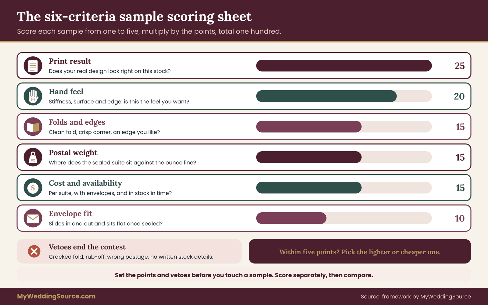
The invitation paper weight worksheet below is a framework built for this guide, not an industry standard. It has six criteria, each with a points value, a one-to-five scale and a plain-language question. You can adjust the points to suit your priorities, but set them before you look at the samples, not after.
The six criteria and their default weights
Hand feel, 20 points. Does the sample feel the way you want the invitation to feel? This is the criterion about stiffness, surface and edge. It is subjective, so it gets a meaningful share of points but not the largest.
Print result, 25 points. Does your actual design look right on this stock? Judge fine type, solids, photographs, foil or impression. This gets the largest share because a beautiful paper that prints poorly is the wrong paper.
Folds and edges, 15 points. Does it fold cleanly, hold a crisp corner and show an edge you like? For flat cards with no fold, score the corners and edges only, and redistribute the unused points to hand feel and print result.
Envelope fit, 10 points. Does the full set slide in and out smoothly and sit flat when sealed?
Postal weight, 15 points. How does the assembled suite weigh against the postal ounce break points, and does the shape and rigidity look safe for ordinary mail? The next section shows how to compute this.
Cost and availability, 15 points. What does it cost per suite, including the envelope and any upgrades, and can the printer get the exact stock in time? A stock that is out of stock or on a long back-order is a risk to your timeline.
How to score
Give each sample a score from one to five on each criterion, where one means “fails the test” and five means “exactly what we want.” Multiply the score by the points value and divide by five to get the points. A five in print result earns the full 25 points. A three earns 15. Add the six results for a total out of one hundred.
For example, suppose a 270 gsm uncoated sample gets a four on hand feel (16 points), a five on print result (25), a four on folds and edges (12), a four on envelope fit (8), a four on postal weight (12) and a three on cost and availability (9). The total is 82.
A 350 gsm cotton sample gets a five on hand feel (20), a four on print (20), a two on folds and edges (6), a three on envelope fit (6), a two on postal weight (6) and a two on cost and availability (6), for a total of 64. The numbers do not decide for you, but they show you where the second sample lost its lead.
Add vetoes before you add scores
Some results should end the contest no matter how good the other scores are. Decide your vetoes in advance. Reasonable examples include cracking at the fold on the printed sample, ink that rubs off, a suite that cannot be mailed at the ordinary rate you planned, or a supplier who cannot confirm the stock in writing. A vetoed sample is out, whatever its total.
Vetoes protect you from the halo effect, where one lovely quality hides a real problem. They also give you something clear to tell a printer: “We love the feel, but the fold cracked on the printed sample, so we need a scored fold or a lighter option.”
Score blind if you can
If you have a partner, family member or planner helping, ask each person to score separately before comparing. Lay out the samples with a letter on the back instead of the name, so nobody scores the brand. After everyone has finished, compare the numbers and talk about the biggest differences. Disagreement on hand feel is normal and useful. Disagreement on print result usually means someone has looked at a different design file or lighting.
Use the same light and the same surface
Score under the same light, preferably daylight near a window, and on the same surface. Warm bulbs make cream papers look yellow, and cool bulbs make them look gray. Look again at a different time of day, because paper color shifts.
What to do with a tie
If two samples finish within about five points of each other, the difference is smaller than your scoring noise. Break the tie with the cheaper or lighter option, or with the criterion you would regret most if it failed. For most couples that is the print result, since it determines what the invitation looks like to every guest.
Adjust the points to your own priorities
The default points suit a couple who cares about the printed result first. Other priorities justify other splits, and the point is to choose before you look. A budget-first couple might raise cost and postal weight to 25 points each and trim hand feel. A couple planning a very formal evening might raise hand feel and edges. A couple mailing many invitations overseas might give postal weight the largest share, since an invitation paper weight that crosses an international band can multiply the cost across the whole mailing.
Write the split on the worksheet and date it. If you change it later, write down why. A worksheet that quietly shifts toward the sample you already liked is a justification, not a test, and the invitation paper weight you pick will reflect your mood rather than your evidence.
Keep the worksheet short
You can add a seventh criterion if your event needs one, such as sustainability or a requirement for recycled content. Resist adding more than that. A long worksheet becomes a chore, and chores get skipped. The point is to see differences, not to produce a spreadsheet.
How to request samples that tell you something
The quality of your scoring depends on the quality of your samples. A paper swatch book is useful for color and texture, but it will not show how your design prints, how the card folds, or how it mails. Request more than a swatch when the budget allows.
Ask for the exact stock
A printer’s sample pack often contains a representative stock rather than the exact one in your quote. Ask them to confirm in writing, with the mill name, the product name, the color, the finish and the invitation paper weight. If a mill discontinues a color, your printer may substitute a similar one, and you should hear about it before the run.
Ask for a printed sample, not only a blank one
Many printers offer a sample of your actual design on the actual stock, sometimes for a fee that is credited against the order. This is often the single most informative purchase in the whole process. It shows you the print, the fold, the edge and the feel together, and it can be weighed.
Ask for a mock suite
If the invitation will have several pieces, ask for a mock suite: one of each piece, in the real envelope, with any liner and inserts. You will use it for the envelope fit and the postal weight, and it will show the real stacking order.
Ask for two invitation paper weights of the same paper
If a paper is available in two invitation paper weights, ask for both. Comparing the same fiber and finish at 270 and 350 gsm isolates the effect of invitation paper weight alone. It removes the noise of different fibers and finishes, and it quickly shows whether the heavier version is worth what it costs.
How many samples is enough
Two to four serious candidates is usually plenty. Fewer than two gives you nothing to compare. More than four turns the exercise into a memory test. If you start with ten swatches, use one quick pass to cut to three, then run the full worksheet on the survivors.
What to say if a printer charges for samples
Sample fees are common, particularly for printed and mock-suite samples, and they are a fair cost of a proper test. Ask whether the fee is credited toward the order and how long the sample takes. If a printer refuses to provide any physical sample of the stock you are paying for, treat that as information. The vendor contract guide explains why it is worth getting stock details into the signed paperwork.
“Could you send a printed sample of our design on the exact stock in the quote, plus a mock suite in the real envelope? We would also like the gsm and caliper in writing, and to know whether the sample fee is credited to the order.”
Postal math for invitation paper weight: from gsm to ounces
A beautiful suite that arrives with postage due, or comes back for insufficient postage, is an avoidable failure. The fix is arithmetic you can do before ordering, followed by a measurement you can do the day the sample arrives.
The United States Postal Service prices letter-size mail by weight in ounces and by shape. Prices, size limits and surcharges change, so this section gives you the method and tells you where to confirm the current figures. The USPS Postage Price Calculator and the Domestic Mail Manual are the official places to check, and your local post office can weigh a finished sample.
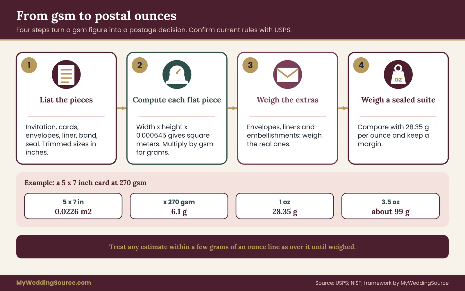
The postal-weight worksheet in four steps
Step one: list every piece and its size. Write down the invitation, response card, response envelope, details card, any map or insert, the outer envelope, any liner, and any belly band, ribbon or seal. Use finished trimmed sizes in inches.
Step two: compute each flat piece. Multiply width by height in inches, convert to square meters by multiplying by 0.000645, then multiply by the gsm. A 5 by 7 inch card has an area of 0.0226 square meters, so at 270 gsm it weighs about 6.1 grams. Do the same for each flat piece.
Step three: add envelopes and extras by weighing them. Envelope weight depends on paper and construction, and is not worth guessing. Weigh a real envelope, a real liner and any embellishment. Add these to your running total.
Step four: compare the total with the ounce break points, then weigh the real thing. One ounce is about 28.35 grams. Compare your estimate with that line, and then confirm by weighing a fully assembled sample, sealed, with the actual stamps on it.
Why you need a safety margin
A calculation is an estimate. Paper weight varies slightly by sheet, trimmed sizes may differ a little from your math, glue and ink add small amounts, and a scale can read a gram or two off. If your estimate lands within a few grams of an ounce line, treat it as over the line until a real weighed sample shows otherwise.
Keep a line in your notes for the margin itself. For example, write “invitation paper weight estimate 22.5 g, line 28.35 g, margin 5.8 g, extras budget 4 g.” Seeing the margin as a number makes it easy to decide whether a ribbon, liner or seal fits, and it makes it obvious when a late design change has used up the room.
A comfortable margin is the difference between a suite you can stamp with confidence and one you need to re-weigh whenever the printer changes an envelope. A margin of several grams is a practical target for a sample that will be hand-assembled.
Where the weight lines fall
Standard-size letter mail is priced from one ounce upward, with additional ounces adding to the cost, and letters can be mailed up to 3.5 ounces before they move into a different pricing category. Those limits and the amounts attached to them are set by the Postal Service and can change, so confirm them on the USPS site before you buy stamps.
For most couples the relevant question is whether the suite fits under one ounce, or falls into the next band. Crossing that line is not a disaster, and sometimes it is the right choice, but it should be a decision you make with a price in hand, not a surprise at the counter.
Shape and rigidity matter as well as weight
Invitation paper weight is only one reason a letter might cost more. The Postal Service also looks at the size, the thickness and the shape. Letters have minimum and maximum dimensions and a thickness range. Pieces that are square, unusually proportioned, rigid, or uneven in thickness, for example because of a lump of wax, a button or a thick ribbon knot, can be priced as nonmachinable and cost more than a standard letter stamp.
Because of this, a very stiff, very heavy card can be a postal problem even at a low total weight. If your design leans toward rigidity, thickness or unusual shape, take the finished mock suite to the post office and ask them to price it. The wedding invitation printing guide also covers how printers handle mailing prep, quantities and handoffs, which is useful background for this step.
Thickness and the response card
If your response card goes back by mail, it is a mail piece in its own right, and the rules for postcards differ from the rules for letters. Postcards have their own size range and a thickness range, so a card that is too thin or too thick for postcard pricing can force a response envelope. A response card on 216 gsm stock is common; a very heavy response card is harder to mail back as a postcard.
Ask your printer which size and thickness they recommend for a mailable response card, and check the current postcard rules with the Postal Service before you finalize it. The RSVP etiquette guide explains how couples handle reply methods, which can be a good reason to choose a simpler response piece.
Check at the counter, not only online
An online calculator tells you the price for the weight and shape you enter. A post office clerk can look at the physical piece. For a mailing of a hundred or more pieces, an afternoon at the counter with the real sample is a small investment. Ask how they would price it, ask whether it passes as a standard letter, and ask whether any element will cause a surcharge. Write down the answer and the date, since rules and prices change.
“We are mailing about this many invitations in this exact assembled form. Could you weigh and measure this sample and tell us whether it prices as a standard letter, and at what weight band?”
A worked example of invitation paper weight: three illustrative suites
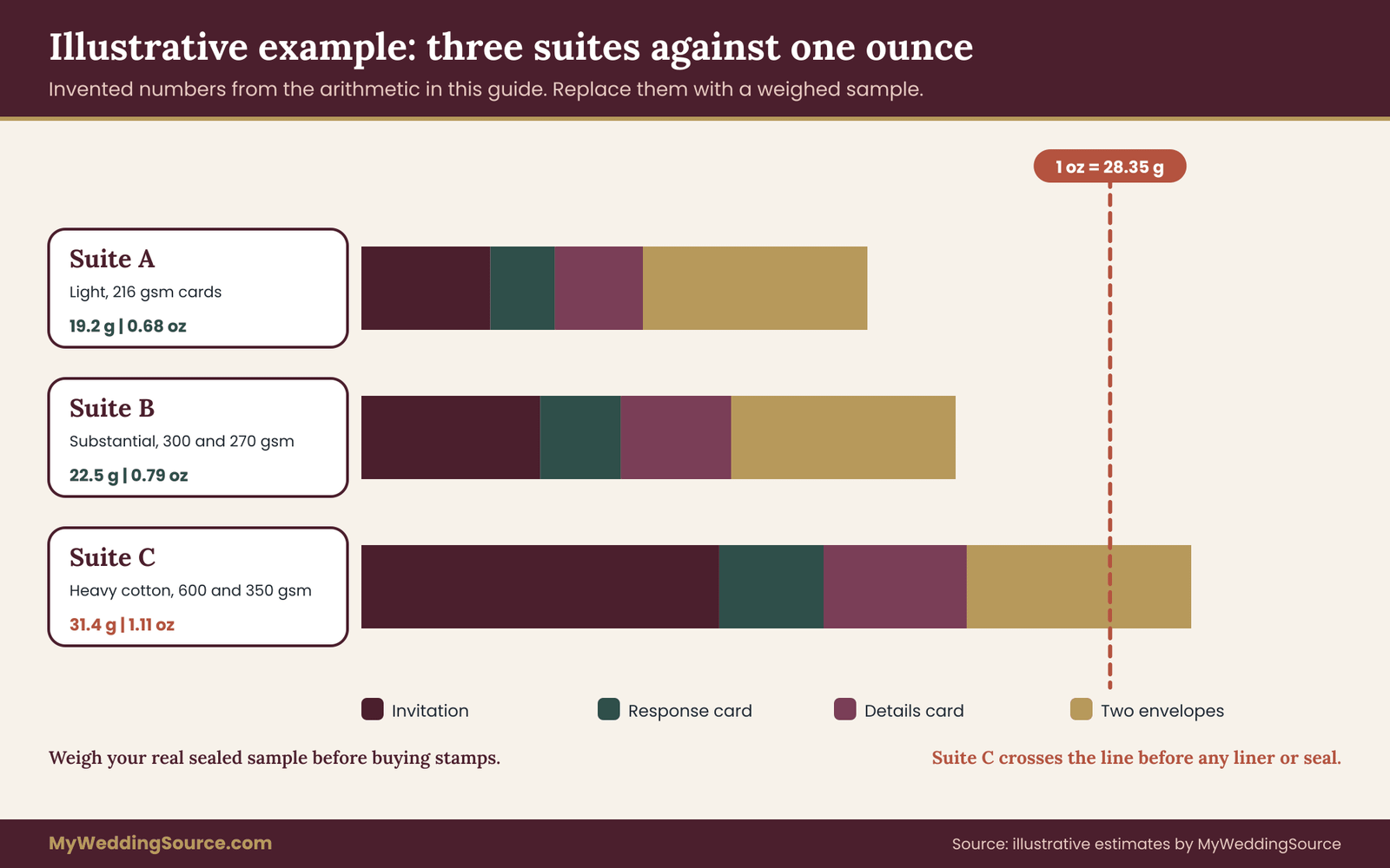
The numbers below are an illustration built for this guide. They are estimates from the arithmetic above, with placeholder envelope weights, and they are not measurements of any product. Your own weights will differ, and you should always replace these with a weighed sample.
Imagine a suite of five pieces: a 5 by 7 inch invitation, a 3.5 by 5 inch response card, a 4 by 6 inch details card, an outer envelope and a small response envelope. Assume the outer envelope weighs about 6 grams and the response envelope about 2.5 grams.
Suite A: light and budget friendly
All three cards at 216 gsm. The invitation is about 4.9 grams, the response card about 2.4 and the details card about 3.3. Add the two envelopes and the total is about 19.2 grams, or roughly 0.68 ounces. There is a wide margin under one ounce, so a liner, a ribbon or a small insert will not change the postage category.
Suite B: substantial and still safe
The invitation at 300 gsm is about 6.8 grams, and the response and details cards at 270 gsm are about 3.1 and 4.2. With the same envelopes, the total is about 22.5 grams, or roughly 0.79 ounces. That leaves about 6 grams before the one-ounce line. A thin liner and a ribbon would probably fit. A heavy wax seal might not, which is exactly why you weigh the real sample.
Suite C: heavy cotton, double layer
The invitation at 600 gsm, roughly a double-thick construction, is about 13.6 grams, and the two other cards at 350 gsm are about 4.0 and 5.4. With the same envelopes the total is about 31.4 grams, or roughly 1.11 ounces. This suite lands over the one-ounce line before any liner or embellishment, and a heavier envelope would push it a little further.
What the example teaches
The jump from Suite A to Suite C is less about the invitation and more about the layers around it. Each added piece multiplies the effect of the invitation paper weight you chose. The invitation card alone accounts for a little over two fifths of the heaviest suite’s mass, which is why it is the first place to look when you want to bring a total down.
Notice also that the middle suite is not “cheap paper.” It is a considered choice that keeps a generous hand feel and leaves room for extras. For many couples, finding that middle is the actual goal of the whole worksheet.
Matching invitation paper weight to each piece in the suite
A common mistake is to choose one invitation paper weight and apply it to everything. A suite is a set of jobs, and each job has its own best answer. Choosing piece by piece usually gives you a better feel at a lower invitation paper weight than a single heavy choice would.
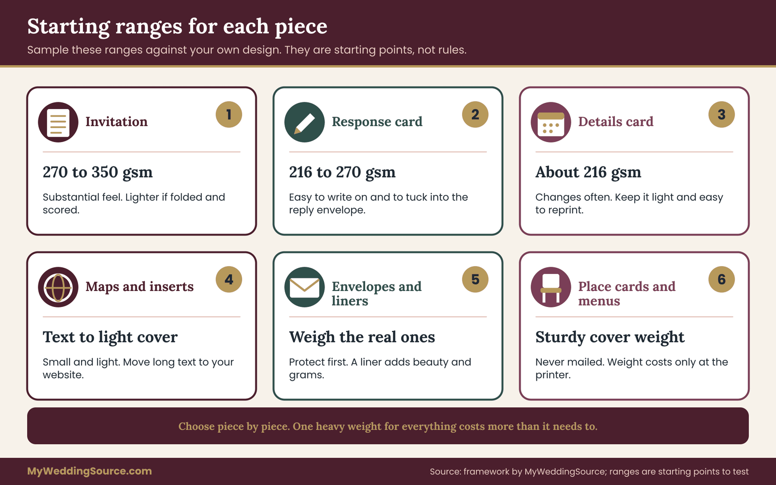
The ranges below are starting points to sample, not rules. They come from how these pieces are commonly built, and your printer’s stock list and your design will move them. Treat every range as an invitation to test.
The main invitation
This is the piece that carries the occasion, so it earns the most weight. A flat card in the 270 to 350 gsm range, roughly 100 to 130 lb cover, covers most preferences for a flat invitation. Go heavier if the design is minimal and the printing method calls for body, as with deep letterpress. Go lighter if the invitation is a folded card, because the fold itself adds stiffness and a high invitation paper weight risks cracking.
The response card
The response card has to be easy to write on, easy to tuck in, and light. A mid-range invitation paper weight, around 216 to 270 gsm, is a typical starting range. If it will be mailed back as a postcard, check the current postcard thickness range with the Postal Service. If it goes into a small envelope, the card should slide in without catching.
The details card
The details card carries directions, accommodations and schedules, and it is the piece most likely to change. Lighter stock keeps it economical and easy to reprint. Around 216 gsm is common. If your details are long, consider a folded card or a booklet in lighter text weight, and check readability, since light paper allows show-through.
Maps, enclosures and inserts
Small inserts such as maps, parking notes or an accommodation list can sit comfortably at a lighter weight, often in the text or light cover range. They add invitation paper weight to the suite, so keep them small and consider moving long information to the wedding website instead of printing it. That reduces both the invitation paper weight and the number of reprints when plans change.
Envelopes and liners
Envelope paper is usually lighter than the cards it carries. A sturdy outer envelope protects the contents in the mail. A liner adds beauty and a little weight. Because liners are glued in, they can wrinkle on a very thin outer envelope. Choose the envelope for protection first, then add the liner if the weight margin allows.
Belly bands, wraps and ribbons
A belly band keeps a stack together and gives a place for color or a monogram. It adds a few grams and some thickness. Ribbons add bulk at the knot, which is where thickness limits and machine handling cause problems. If you want a ribbon, test the sealed mock suite at the post office.
Place cards, menus and programs
Day-of paper has a different job. These pieces sit on a table in a candlelit room, get picked up, and are read at arm’s length. They do not travel by mail, so weight costs you only at the printer. Place cards in a sturdy cover weight stay upright when folded as tents, and a menu on a medium weight lies flat and survives a glass of water better than thin paper. For the print production side of these pieces, the wedding vendor timeline is useful for working out when proofs and deliveries need to land.
Edge cases that change the answer
The method above covers the common case. A few situations deserve a separate look, because they change either the invitation paper weight, the postage or both.
Handmade and botanical papers
Handmade papers and papers with embedded petals or fibers vary from sheet to sheet. The nominal invitation paper weight on the quote is an average, and individual sheets can be heavier or lighter, with uneven thickness and torn edges. That unevenness can create postal and machine-handling problems, since thickness is not uniform. Weigh several samples rather than one, and ask for the range, not just the average.
Dark and saturated stocks
A dark or colored paper may be dyed through the sheet, or it may be coated. Light inks and foils behave differently on dark stocks, and printers often use white ink or foil for contrast. These effects belong to the print method, but invitation paper weight comes in as well: some printers add an extra pass for white ink, and a very absorbent dark sheet may need testing for rub-off.
Translucent overlays
Vellum and similar translucent sheets are often used as overlays or wraps. They are usually light, but they have unusual stiffness and can crinkle. They also show the glue or tape used to secure them. Check how they hold up through mailing, and weigh them with the rest of the suite.
Square and unusual shapes
Square invitations and other unusual shapes are popular, but they can change postal pricing, because pieces with an unusual proportion are priced differently from standard letters. Check shape against the current postal rules before choosing a size, and treat the post office’s answer on the finished sample as the final word.
International and destination mailings
If guests live outside the United States, postage follows different rules and different weight steps, and prices are set per destination. Ask your post office how many pieces will go abroad and what the weight and size rules are. A heavy suite that fits one domestic band may fall in a different band abroad.
Metric sizes are common outside the United States. If you work with an overseas printer, ask for sizes in both systems and double-check the envelope fit, since standard card and envelope sizes do not map one-to-one between systems.
Digital and hybrid invitations
Some couples send a printed invitation to a core group and a digital invitation to everyone else. Invitation paper weight matters only for the printed set, and you can order those on a higher-quality stock because the quantity is smaller. Keep the design consistent so both groups see the same visual identity.
When two pieces want different weights
Sometimes the right invitation paper weight for one piece fights the right weight for another. A heavy invitation may call for a heavier response card so that the set feels coherent, while the postal margin argues for a light one. The practical compromise is to keep the invitation heavy and make the response card one step lighter, not two. Guests handle the invitation once and the reply card briefly, and the sense of quality comes mostly from the first piece.
If the contrast looks odd when you lay the set out, try a smaller card at the same weight instead of a lighter card at the same size. A smaller card has less area, so it weighs less without feeling flimsy. This is a case where the arithmetic from the postal section does design work, and a mock suite settles the question in minutes.
Reorders and mixed lots
Paper is made in lots, and color and thickness can shift slightly between lots. If you order a second run later for late additions, the stock may not match the first. Order a small overage on the first run, as your printer recommends, and ask whether the stock is available in the same lot. A mismatch in invitation paper weight or color is far more noticeable when one guest’s invitation sits beside another’s in a family photo.
Weather and storage
Paper responds to humidity. In damp conditions, cards can curl or absorb moisture, and in very dry conditions, edges can become brittle. Store your printed suite flat, in a cool and dry place, in the box it came in, until it is time to assemble and mail. If you assemble in a humid space, give the cards time to settle flat first.
Allergies, fragrance and finishing
Some finishes, laminates and scented coatings are added after printing. These finishes add weight and sometimes odors that guests with sensitivities notice. If you are sending to guests who are sensitive to fragrance, ask about the finishing method and choose an unscented option.
Questions to ask the printer about invitation paper weight
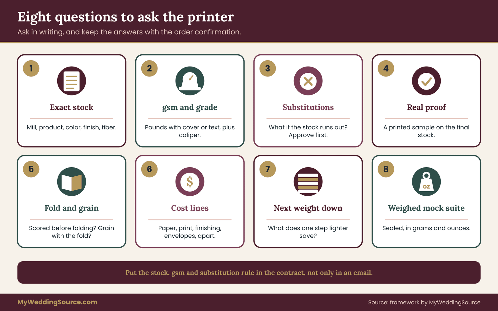
A good printer is glad to answer precise questions, and the answers are the best protection you have against a mismatch between what you chose and what arrives. Ask in writing, so that you can refer back to the reply if something differs on delivery.
Questions about the stock and its invitation paper weight
Ask for the mill and product name, the color, the finish, the fiber content, and the weight in gsm and in pounds with the grade. Ask for the caliper of the finished card. Ask whether the stock is in the printer’s inventory or has to be ordered, how long that takes, and what happens if the mill is out of stock.
Also ask what substitution policy applies. A printer may swap in a similar stock if the original is unavailable. You are entitled to know in advance, to approve a replacement, and to see a sample of it before the run.
Questions about the process
Ask whether the stock suits the printing method in your quote, and whether the printer has run this stock with this method before. Ask about scoring and grain for any fold, about drying time for heavy ink coverage, and about whether the printer will provide a printed proof on the final stock.
A proof on a different stock is a color proof, not a paper proof. If the stock matters, ask for a proof on the real thing.
Questions about the numbers behind invitation paper weight
Ask for a quote broken into paper, printing, finishing and envelopes, so that you can see where your invitation paper weight choice shows up in cost. Ask what the price difference would be between your chosen invitation paper weight and the next one down. Ask what the overage policy is and whether extras are priced at the same rate.
Questions about mailing
Ask whether the printer will assemble and weigh a mock suite before you buy stamps. Ask if they offer mailing services, and whether those include checking the postage with the post office. If they do not, ask how they recommend you verify it.
“Before we approve, could you assemble one complete suite in the final envelope and weigh it? We would like the weight in grams and ounces, and a note of anything that could affect postage.”
Put the answers in the paperwork
The stock, invitation paper weight and any substitution rule belong in the contract or order confirmation, not only in an email. The wedding vendor due diligence checklist lists what to verify before you pay a deposit, and it applies to a stationer as much as to any other vendor.
Common mistakes and how to avoid them
Most paper problems are small and preventable. They tend to cluster around the same few habits.
Comparing quotes without translating them
The most frequent invitation paper weight mistake is ranking quotes written in different units. Convert everything to gsm, note the grade and compare. If a printer will not tell you the invitation paper weight of the stock you are paying for, that is a reason to look elsewhere.
Choosing from the swatch book alone
A swatch tells you about color and texture. It does not tell you about folds, print or postage. Ask for a printed sample for at least your top choice.
Forgetting the envelope
The envelope is half the object. Many couples choose the card with care and treat the envelope as an afterthought, then find that the envelope is the heaviest or most awkward piece in the set.
Skipping the scale
The one measurement that settles postage is a real assembled suite on a scale. It takes five minutes and prevents a large mailing from going out wrong. Stamps are cheaper than a second print run, and both are cheaper than a mailing returned for postage.
Letting the weight decision happen last
Invitation paper weight interacts with printing method, size, fold, envelope and postage. If you decide it after the design is final, you may discover that the design needs to change. Choose the paper family early, confirm the invitation paper weight when you have a printed sample and finalize it before approving the proof.
Overweighting your own hands
Your fingertips are good judges, and also biased ones. The invitation paper weight that feels best in a quiet showroom may feel excessive when multiplied by a hundred and fifty guests and an extra ounce of postage. Keep the worksheet scores in view when the heavy sample is tempting.
Ignoring sustainability claims you cannot verify
If recycled content, a forest certification or a similar claim matters to you, ask for documentation. The Federal Trade Commission publishes guidance on environmental marketing claims, and a certification body such as the Forest Stewardship Council publishes how its labels work. A printer who can back a claim will show you the paperwork. For the broader question of reducing waste across the event, the wedding budget guide shows where paper spending sits next to everything else, and a lighter suite often means a cheaper one.
A decision framework you can follow in one weekend
Putting the pieces together, here is a sequence you can finish in a weekend once samples are in hand. It is the process behind everything above, in order.
Saturday morning: translate. Rewrite each quote in gsm, grade and caliper. Mark anything missing and send one email asking for it.
Saturday afternoon: stage the samples. Lay out your two to four candidates in daylight with letters on the back. Print your own design on a plain sheet to remember the layout, and bring in your partner or helper.
Saturday evening: score. Each person fills in the six criteria separately. Compare, discuss the biggest gaps, and apply your vetoes.
Sunday morning: run the home checks. Do the hang test, the fold test and the rub test on printed samples, and slide the full set into the real envelope.
Sunday afternoon: weigh and calculate. Weigh a sealed mock suite, compute the estimate, and compare both with the one-ounce line, keeping a margin. Note the shape and rigidity questions for the post office.
Sunday evening: decide and write it down. Pick the lightest option that passes your hands-on test, write the stock and invitation paper weight in an email to the printer, and ask them to confirm it in the order.
What the cost logic looks like
Invitation paper weight touches the budget in four places, and it helps to name them. The sheet itself costs more as it gets heavier or more specialized. Printing may cost more if the stock needs a slower press setting, a special setup or a hand-fed pass. Finishing, such as scoring, edge painting or layering, adds labor. Postage rises when the assembled suite crosses an ounce line. Ask your printer to separate these lines in the quote, so you can see which part of the price comes from your invitation paper weight choice.
Run the multiplication yourself before you decide. If stepping up one weight adds a certain amount per suite, multiply by your invitation count and compare with what else that money could do, such as a better envelope, a printed proof, or a second round of samples. Spending on the sample stage often returns more than spending on the final sheet. None of this needs invented averages. It needs your own quote and a calculator.
The rule behind the process
The rule to keep is simple: choose the lightest invitation paper weight that passes the test you set before looking. A higher invitation paper weight is a decision you make for a reason, such as a deep impression or a certain formality, not a default. Lighter is not a compromise when the sample proves it works.
Your next steps
- Gather every quote and sample. Rewrite each invitation paper weight in gsm with the grade and caliper, and ask the printer for anything missing.
- Decide your six criteria points and your vetoes before you open the samples.
- Request a printed sample of your actual design and a mock suite in the real envelope for your top two choices.
- Score the samples separately with a partner, then run the hang, fold, rub and envelope checks.
- Weigh the assembled suite on a kitchen scale and compare it with the one-ounce line, keeping a margin of several grams.
- Take the sealed sample to the post office, ask how it prices, and note the answer and date.
- Put the exact stock, gsm, caliper and substitution rule in writing before you approve the proof.
- Revisit the wedding invitation etiquette page when you finalize wording and format, so the paper and the message match.
FAQ
What is a good invitation paper weight for a wedding?
There is no single right number. Many flat invitations use a cover stock somewhere around 270 to 350 gsm, roughly 100 to 130 lb cover, while response and details cards often use lighter sheets. A better approach is to sample two or three invitation paper weights, score them against your design and printing method, and choose the lightest one that passes your hands-on test.
How do I convert pounds to gsm for invitation paper weight?
You need the grade first. For cover stock, multiply the pound figure by about 2.7, so 100 lb cover is roughly 270 gsm. For text weight, multiply by about 1.48, so 100 lb text is roughly 148 gsm. Bond uses about 3.76. Mills round their published numbers, so ask your printer to confirm the gsm of the exact stock.
Is 300 gsm too heavy an invitation paper weight?
Not usually. A flat card at 300 gsm is a common, substantial invitation paper weight. It can be too heavy for a folded card unless it is scored, for a response card that must fit a small envelope, or for a suite already close to an ounce. Weigh a complete sample before deciding, because the whole suite sets the postage, not one card.
Does a higher invitation paper weight always cost more to mail?
Not always. Postage depends on the weight of the whole assembled suite, along with its size, shape and rigidity. A heavier card may still fit under the same ounce band if the other pieces are light. The reliable method is to weigh a sealed mock suite and have your post office confirm how it prices before you buy stamps.
What is the difference between cover stock and text weight?
Cover stock is a heavier family of paper used for cards and covers, and text weight is a lighter family used for inserts and interior pages. Their pound numbers are defined on different reference sheets, so the same number means very different masses. Always ask for the gsm or for the grade written next to the pound figure.
Does gsm tell me how thick the paper is?
Not exactly. Invitation paper weight in gsm measures mass per area, while thickness is called caliper. Two papers with the same gsm can differ in thickness depending on how dense or fluffy they are. If stiffness or envelope fit matters, ask for the caliper in points, millimeters or micrometers, and compare stack heights of real samples.
Should I choose double-thick cards for invitations?
Double-thick cards bond two layers into one heavy, rigid card with a clean edge, and some show a contrasting center. They suit a formal look and impression printing, and they cost more and weigh much more. Ask for each layer’s gsm and the finished weight and caliper, then weigh a complete suite to see whether it crosses an ounce line.
How can I check invitation paper weight myself?
Weigh a stack of identical cards on a kitchen scale, divide by the number of cards, then divide by the card’s area in square meters to estimate gsm. For postage, seal one full suite with its real envelope and embellishments and weigh it. Compare the result with the ounce lines on the Postal Service price calculator.
Sources
- United States Postal Service: official home for mailing rules, price information and letter and postcard standards.
- USPS Postal Explorer: hosts the Domestic Mail Manual and current mailing standards.
- USPS Postage Price Calculator: calculates domestic and international postage by weight, size and shape.
- NIST Office of Weights and Measures: guidance on units of measurement and weighing in the United States.
- International Organization for Standardization: publishes paper and board test standards, including grammage and paper sizes.
- American National Standards Institute: coordinates United States standards that relate to paper and printing.
- Forest Stewardship Council: explains how forest certification labels on paper products work.
- Federal Trade Commission: publishes guidance on environmental marketing claims and advertising.
- U.S. Environmental Protection Agency: provides information on paper recycling and recycled content.
- PRINTING United Alliance: the printing industry association, with print production resources.