
Foil stamped invitations look their best in a photograph and their worst in a dim hallway, and the difference is the whole story. This guide gives you a placement and lighting proof you can run at home on a printer’s sample: where to put foil, where to keep plain ink, and how to tell in one evening whether the names and the date will still read when the room, the angle or the lighting changes.
Use foil for display and ink for information. Foil the monogram, the border and perhaps the names, and keep the date, place, times, reply details and address in ink unless a test says otherwise. Ask the printer for a physical foil sample on your actual paper, then read it in five lights (window, warm lamp, dim evening, phone flash and outdoor shade) and from three angles. Score each foil zone from zero to two. A zone that carries essential information stays in foil only if it scores well in every light.
Foil stamped invitations are judged twice. The first time is the moment of delight: the envelope opens, a gleam of metal catches a window, and the card feels expensive. The second time is quieter and more important. A guest at a kitchen counter, a grandparent without reading glasses, someone checking the date under a car’s dome light, a friend who photographs the card and posts it to a group chat.
Each of them needs to read the same facts, and each is looking at a different surface, because metallic foil is not one color. It reflects whatever is around it.
Most advice about foil stamped invitations stops at taste: gold is classic, silver is cool, rose gold is soft. That advice is fine, and this guide does not try to replace it. It answers a narrower question that couples usually discover late, after the deposit is paid: when does the metallic finish get in the way of the words, and what can you do about it before the proof is approved?
The approach is simple and a little unglamorous. You build a one-page proof from the printer’s own sample, you put the foil in the zones you are considering, and you read it under the lights your guests will actually use. You score what you see with three numbers, apply a short decision rule, and fix what fails. None of it needs equipment beyond a lamp, a phone, a tape measure and two friends who have never seen the invitation.
A note on scope. This is general information, not legal, tax or financial advice. Printer terms, foil options and postal rules vary and change, so where a rule or a price matters this guide sends you to the printer or to the United States Postal Service to confirm the current version.
What foil stamped invitations ask of the reader
Hot foil stamping is a printing process, and it helps to picture it plainly. A metal die in the shape of your artwork is heated and pressed against a thin ribbon of foil, a layer of color on a carrier film. Heat and pressure move that layer from the film onto the paper wherever the die touches. The result is a smooth, sharply edged shape that sits on the surface and looks like metal or, with other foil types, like a solid, flat pigment.
That description tells you three useful things about foil stamped invitations. The foil is a layer on top of the paper, not ink soaked into it, so it has its own surface and reflects light on its own terms. The shape comes from a die, so very fine lines depend on how well the die holds detail and how well the foil releases around it. And each foil color is a separate pass, which affects cost and, as later sections show, affects how many zones of the card can sensibly be foiled.
What does a reader ask of an invitation? Strip away the design and the answer is short. They need to know who is marrying, when, where, and what to do next. Those facts have to survive a quick glance, because most guests read an invitation in a few seconds before putting it on the fridge, and they have to survive a second, more careful reading when the guest is working out travel or a reply. Anything that slows either reading is a cost, even if it is beautiful.
Foil is excellent at the first job and unreliable at the second, and that tension runs through every set of foil stamped invitations. A bright metallic monogram announces itself from across a room. A line of small metallic script giving the street address may do the opposite, because small, thin metallic shapes lose contrast easily, and a reader has to squint through a shifting glare to find the number of a building.
The proof in this guide exists to find those borderline cases in foil stamped invitations while changing them is still cheap.
Where foil stamped invitations tend to go wrong
Four patterns account for most disappointments, and each one is predictable once you know to look for it.
The first problem with foil stamped invitations is low contrast in bright light. A pale gold or silver foil on ivory or white paper can look wonderful in a shaded room and nearly vanish in a sunlit one, because the foil reflects the bright surroundings and ends up close to the color of the paper beneath it.
The second is black-out at the wrong angle. Glossy foil acts a little like a mirror. If the guest holds the card so the foil reflects something dark, such as a dark window at night, a shadowed hand or the inside of a dark envelope, the lettering turns dark and flat. Tilt the card and it flashes bright again. A reader who has to tilt a card to read the date has been handed a small chore.
The third is fine detail filling in. Hairline strokes in script typefaces, small serifs, tiny accent marks and narrow gaps between letters can close up or break when foil is stamped at small sizes. The words look slightly fuzzy or broken, and the problem shows up at the proof stage only if the sample used your real artwork at your real size.
The fourth is the photograph. Foil under a flash tends to throw a hot white spot or a gray blur, and many invitations are photographed for social posts, a wedding website or the photographer’s detail shots. A design that reads in person and fails in a phone camera has a real, if secondary, legibility problem.
Why metallic foil changes with the room
To plan around foil, you need one idea: metallic foil does not have a fixed color. A printed ink is fairly stable, and a dark gray ink looks dark gray in sun, shade and lamplight, with modest shifts. A metallic surface is closer to a small mirror with a tint. What it looks like depends on what it reflects, and that depends on where the light sources and dark surfaces are relative to the card and to the reader’s eyes.
Think about what a reader’s surroundings usually offer. Near a window in daytime, the foil mostly reflects a bright, broad source and tends to look light. Under a single warm lamp, it picks up a hot spot where the lamp reflects and stays darker elsewhere, so the reading changes as the hand moves.
In a dim room it reflects very little and can look dull, brownish or dark, sometimes close to the shade of the paper if the paper is dark. Under a phone flash, it reflects the flash straight back, and a camera exposes for that bright spot, leaving the rest dim.
The paper makes this worse or better. Foil on a light paper is most at risk when the foil is also light, as with silver on white. Foil on a dark paper is often more readable because the foil is the lightest thing on the card in almost any lighting, though it can still dull in very low light. Matte or satin foils reflect less and in a wider cone, which smooths out the flashing, but they give up some of the glow that people choose foil to get.
This is not an argument against foil stamped invitations. It is an argument for testing, and for treating the lighting a guest will use as part of the specification rather than an afterthought. A couple choosing a font checks that it is readable. A couple choosing foil stamped invitations should check that it is readable in more than the one light the printer’s sample was photographed in.
A useful way to hold the idea is to separate two things that people tend to merge. Decoration is whatever a guest can enjoy even if they cannot read it. Information is whatever a guest must read to act. Foil reflects variable light, so it belongs in decoration by default, and it moves into information only after earning that place in your proof. The rest of this guide builds that proof.
The foil placement and lighting legibility proof, in outline
The proof is a method for deciding, zone by zone, whether foil stamped invitations can carry the words on your card. It has three ingredients and one rule. The ingredients are five placement zones, five lighting conditions and a three-point score. The rule is that decoration may fail gracefully, but information may not fail at all.
It sits inside the larger job of getting any invitation printed and mailed, which the site guide to wedding invitation print production covers from proofs to quantities. This proof adds one specific check to that process. It does not replace the printer’s own proof, and it does not decide which printing method suits your wedding, only whether the foil you have chosen will serve your guests.
The five placement zones
Divide the invitation, in your mind and later on paper, into five zones. Every piece of foil you are considering belongs to one of them.
Zone one is the mark. The monogram, crest, border, flourish, small icon or any ornament with no wording that a guest has to read. If this zone fails, the card looks slightly less impressive and nothing else happens.
Zone two is the display line. The names of the couple, usually the largest type on the card. Guests read these first and usually recognize them even from a poor look, because they already know the people. That recognition makes the display line more forgiving than it first seems.
Zone three is the essential facts. The date, time, venue name and city. A guest who cannot read these has to ask someone, and a surprising number of them will simply guess.
Zone four is the supporting text. The small print: dress code, parking notes, a line about hosts, the wording about reception to follow. It is often set small, and foil at small sizes is where problems concentrate.
Zone five is the working elements. The reply card, the response deadline, the website address, and everything on the envelope, including the return address and, most important, the delivery address. These must be readable by people, by sorting equipment and by an overworked reader at a doorstep.
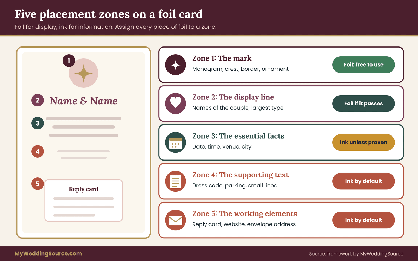
Not all foil stamped invitations have every one of the five zones, and some pieces combine them. A single flat card may carry zones one to four together. A suite may spread them across an invitation, a details card, a reply card and an envelope. The categories are about function, not about the number of pieces, so assign each piece of foil to the zone whose job it does. What wording belongs on an invitation in the first place is a separate question, which the site guide to wedding invitation etiquette covers.
The five lights for foil stamped invitations
The second ingredient is the set of lights you will read the sample in. They were chosen because they are the situations in which a guest is most likely to read or photograph the card, and because they stress foil in different ways.
Light one, window daylight. A table near a window in the daytime, no lamps on. Broad, bright and soft. This is the light in which most invitations are opened and photographed.
Light two, a warm lamp. One incandescent-style or warm LED lamp, a couple of feet away, shining from the side. It makes a hot spot on glossy foil and tests how much the reading changes as the hand moves.
Light three, dim evening. One low lamp across the room, or the dimmed lights of a living room at night. Foil tends to lose its glow, and this tests how far it falls toward the paper’s color.
Light four, phone flash. A photograph taken with the phone’s flash on, at the distance someone would stand to photograph a card on a table. It tests the shared-photo scenario.
Light five, outdoor shade. A card held in the shade of a porch or a mailbox on an overcast day or at dusk, or simply in the shade of a building. This reproduces the doorstep and mailbox moment.
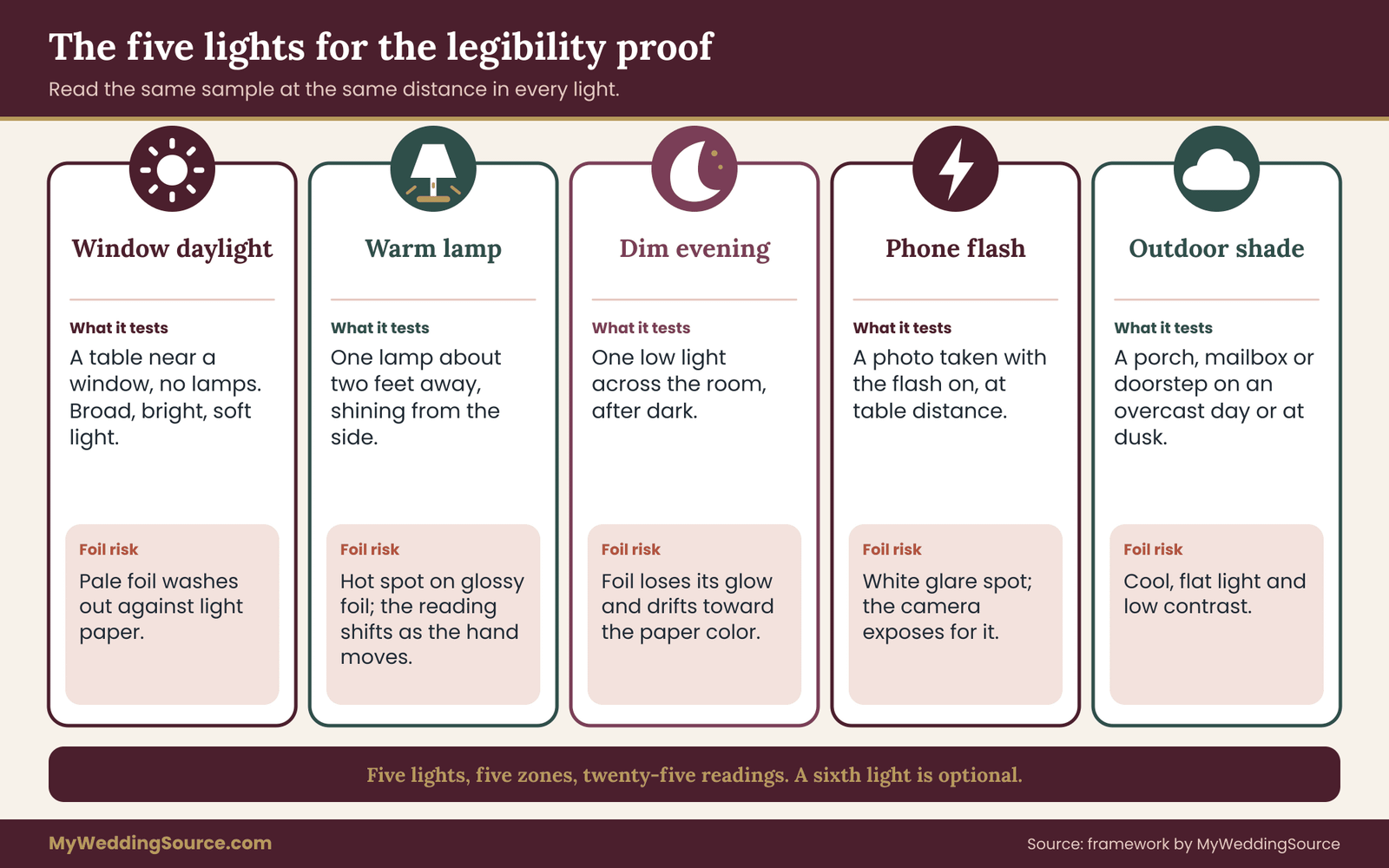
You can add a sixth light if your wedding invites it. A venue with a famous candlelit dining room might justify testing the sample by candle, because guests may well consult their invitation there. Keep the set small, though. Five lights times five zones gives twenty-five readings, which is about the most a person will score carefully in one sitting.
The three-point score
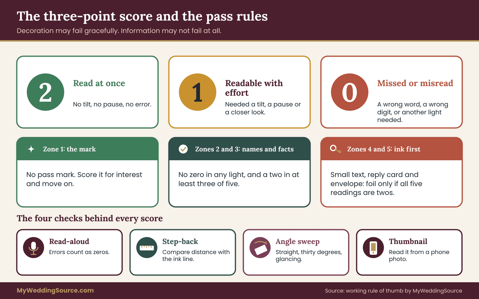
For each zone and each light you give one score. A two means the zone read at once, with no tilt and no pause. A one means it was readable but took a tilt of the card or a moment of effort. A zero means someone could not read it, or read it wrongly, or needed another light.
Three points are enough because the question is practical: can a guest get the information without trouble? A finer scale invites false precision. Whether foil scored seven out of ten in dim light does not matter. Whether a guest had to hold the card under a lamp to find the date does.
The next section covers how to build the sheet and how to run the readings, but the decision rules deserve stating now, so they are not shaped by what you see.
Zone one has no pass mark. Score it for interest, and move on. Zones two and three are held to the strictest standard: foil stays only if the zone scores a one or two in all five lights and a two in at least three of them. Zones four and five default to ink.
Foil enters only if every reading is a two, and even then you should ask whether the gain is worth the risk. These thresholds are a working rule of thumb, written by this site for the purpose, not an industry standard. Adjust them if your guest list calls for it, for example by making the standard stricter if many of your guests are older.
Building the proof sheet for foil stamped invitations
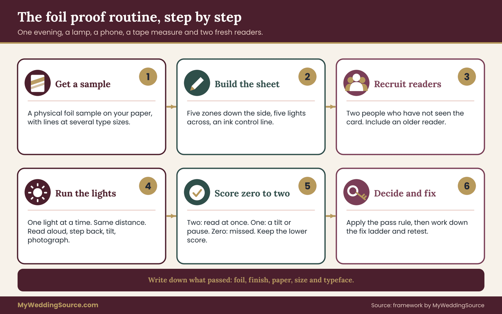
A proof of this kind for foil stamped invitations is only as good as the sample it is based on. The most common mistake is testing the wrong thing: a glossy catalog photograph, a swatch on a different paper, a printer’s mockup made in design software. None of these show what your guests will hold. So the first job is to get a physical sample that is as close to the real thing as the printer will make.
What to ask the printer for
Ask for a foil sample on the same paper stock, in the same foil color, finish and type size you are considering. The paper matters as much as the foil because texture, color and thickness change how the foil sits. A foil that is crisp on smooth cover stock may look different on a soft cotton paper with a visible grain, where the surface is uneven and the foil follows it.
Printers handle this in different ways. Some keep a library of ready-made samples and send them for free or for a small fee. Some produce a custom foil sample from your artwork, which usually costs money because it needs a die. Some will show only a digital mockup unless you pay for a press proof.
All three are legitimate business practices, and none is a red flag on its own. What matters is that you know which one you are getting before you decide. The section on questions and contracts, later in this guide, lists what to ask, and the guide to the wedding vendor contract explains how to get the answers into writing.
If a custom die is out of budget, there is a practical workaround. Ask for stock samples of the same foil on the same paper, containing text of various sizes, and test those. They will not carry your names, but they show how the foil behaves at small sizes, which is usually the biggest unknown. You can then place your own type next to the sample by sizing a printout to match and comparing the stroke weights.
Making the sheet for foil stamped invitations
Use one plain sheet of paper or a note card. Tape the foil sample to it, or lay the sample on it, so you can move everything together. Write the five zone names down the left side, and the five lights across the top, as a simple grid you draw by hand. This is a working paper for your own use, not an illustration, and a pencil is fine.
Then create an ink control. If your invitation will include any ink printing, which it nearly always does, take the printer’s ink sample, or a printout from your home printer in a dark ink on the same paper if you must, and put a line of text of similar size and style beside the foil. The control gives you a baseline. Foil does not need to match ink, but you need a reference to know what a reading of two looks like in each light.
Mark the readers’ distance as well. Decide, before you start, how far away a guest holds an invitation. A reasonable default is about the distance of a card held in one hand, roughly an arm’s length. Measure it once with a tape measure, write the number down, and use that distance for every reading. It keeps the proof honest, because people unconsciously move closer when something is hard to read.
Choosing your readers
Do not rely on your own eyes. You know what the card says, and your brain fills in the gaps. Recruit two people who have not seen the invitation and, if possible, differ from you in age and eyesight. A parent or an older relative who wears reading glasses is ideal. Ask them to read the zones aloud and to say when they are unsure. Do not coach them, and do not tell them what the words are. If they read the date wrongly, that is a zero, and an informative one.
If you cannot find readers, a single friend helps a good deal. If you are on your own, read the sample, then step back for a few minutes, do something else, and read it again cold. It is a weaker test, but it is better than none.
Setting the stage for each light
Prepare the five lights before the readers arrive, so the session moves quickly. For window daylight, choose a time of day and a spot near a window and put a mark on the table. For the warm lamp, place a lamp about two feet from the card, off to one side, and leave the room’s other lights off.
For the dim evening, wait until it is dark outside, and use one low light across the room. For the phone flash, have your phone ready with the flash set to on and a plain table. For shade, plan to take the sample outside or to the shaded side of a building, at a time when the sun is not directly on it.
The sample is delicate. Handle it by the edges, keep it flat, and do not rub it. Foil can scratch or scuff, and you may still want the sample as a reference for the approved version. If you need to test scuffing, ask the printer for a second, spare sample that you do not mind destroying.
Running the five lights and scoring foil stamped invitations
With the sheet built, scoring your foil stamped invitations takes about an hour. Work through one light at a time rather than one zone at a time. Changing lights is the slow part, and it is the variable you most want to compare cleanly. In each light, every reader looks at every zone, and you score as you go.
The four measurable checks
Scoring foil stamped invitations should rest on things you can observe and write down, not on impressions. Four checks do most of the work.
The read-aloud check. Ask the reader to read each zone aloud without prompting. Note any word they get wrong, skip or hesitate over. A misread date, a swapped digit or a skipped name is a zero for that cell, no matter how confident the reader sounded. Errors are the most reliable evidence you will collect, because they show what the foil actually communicated, not what the reader was polite enough to say.
The step-back check. Have the reader hold the sample at the agreed distance, then move the card slowly farther away until they can no longer read a given line. Measure that distance with the tape and write it down.
Do the same for the ink control line. If the foil line fails at, say, half the distance of the ink line in a given light, that tells you how much legibility the foil is costing. You do not need a threshold from a textbook. The comparison with your own control is the information.
The angle sweep. Hold the sample flat, facing the reader, then tilt it away to about thirty degrees, then to a shallow glancing angle. At each angle ask whether the zone is still readable. Make a note of any angle at which the foil blacks out, flares or turns the same color as the paper. A zone that is fine straight on and unreadable at thirty degrees is a one at best, since real readers do not hold cards at perfect right angles.
The thumbnail check. Photograph the sample on a table with your phone, once with the flash off and once with it on. Then shrink the photograph to the size it would appear in a group message or a social feed, which means looking at it on the phone’s screen at normal viewing size. Ask someone to read the names and date from that thumbnail. This is the check that comes closest to how foil stamped invitations will be seen by the friends who never receive the paper copy.
A fifth check, in grayscale
One extra step is worth doing for every sample. Convert the flash-off photograph to black and white, using the phone’s built-in editor or a photo filter, and look at it again. Wherever the foil nearly disappears into the paper in grayscale, there is little brightness difference between them, and people with low vision or some kinds of color-vision difference will find the zone hard to read, because they rely on contrast in brightness more than on color.
The Web Content Accessibility Guidelines publish contrast ratios for screens, and the National Eye Institute describes low vision and its effect on everyday reading. Neither applies directly to printed metallic foil, whose brightness changes with the angle, but both support the same simple instinct: brightness contrast, not hue, is what keeps text readable.
Recording the scores for foil stamped invitations
Draw the grid on your sheet and fill it in as you go: zones down the side, lights across the top, one score from zero to two in each box. Use a second color or a small mark for readings where the reader needed an angle change, so you can tell a “one because of the tilt” from a “one because of the glare.”
When two readers disagree, keep the lower score. The aim is to protect the worst-case guest, not the average one. If the disagreement is large, a zero and a two, the foil is probably angle-sensitive, and that is worth noting even if you decide to keep it.
Write short notes beside any cell that surprises you. “Date blacked out at the lamp’s reflection angle” or “script hairlines broke on the second line” are the sort of observations that will turn into specific requests to the printer. Notes like these are what make the proof useful afterward, when you are on the phone with the printer and need to say exactly what you saw.
Reading the pattern
Once the grid is filled in, look at it before you add anything up. Three patterns recur.
A column of low scores, where one light drags every zone down, points to a lighting problem rather than a zone problem. If every zone fails in dim evening, the foil is simply too dull in low light, and the fixes are about foil finish, foil color or paper, not about individual lines.
A row of low scores, where one zone fails in most lights, points to a design problem in that zone: too small, too thin, too ornate or too light for its paper. The fix usually lies in type size, weight or typeface, or in moving that zone to ink.
Scattered low scores that appear and disappear with the angle point to glare. Glossy foil is the usual cause, and a satin or matte finish is the usual remedy, at some cost to the shine.
Applying the decision rule to foil stamped invitations
Now apply the rule from the outline. For each zone, add up the five scores. Zone one needs no pass mark. Zones two and three keep foil only if no light scored a zero and at least three scored a two. Zones four and five keep foil only if all five scored a two. Everything else is a candidate for a fix, which the later sections cover.
An example of how the arithmetic plays out may help. Suppose the display line, zone two, scored two, two, one, two and one across the five lights. The total is eight, no zeros, and three twos, so the names pass and can stay in foil. Suppose the essential facts, zone three, scored two, one, zero, one and one. That zero in dim evening fails the rule, even though the total is five, because a guest who cannot read the date in dim light has not been served. Zone three needs a fix.
Suppose the supporting text, zone four, scored one, one, one, two and one. It fails the all-twos rule for small text and goes to ink. That is not a failure of the foil, just a good use of it elsewhere. The fixes cost far less now than after approval.
The decision rule for foil stamped invitations is deliberately a little conservative. It trades some of the foil’s presence for dependable readability. If you disagree, as some couples will, adjust the rule before you run the test, not after, so the thresholds do not bend to fit the result you were hoping for.
When your readers are not typical
The proof of your foil stamped invitations reflects the readers you chose, so choose with your guest list in mind. If a large share of your guests are older, bring in an older reader and treat their scores as the minimum. If a guest has told you about a vision condition, ask whether they would be willing to look at a sample, and ask what helps them, rather than assuming. A single, specific answer from someone who actually reads the card is worth more than a general rule.
There is also the question of what a reader is allowed to bring. Reading glasses, a phone’s magnifier and a phone flashlight are normal tools, and many guests will use them. The proof should not require them for essential information, but it is reasonable to note whether they help, because that tells you how much of the legibility problem can be solved by the reader and how much has to be solved by the card.
When a zone passes, write down what it passed with: the foil, the finish, the paper, the size and the typeface. That note becomes the written specification you will ask the printer to match when the real proof arrives. A pass on a sample is only worth anything if the finished foil stamped invitations are made from the same ingredients.
Where foil belongs on foil stamped invitations
The proof will tell you what your own sample does. This section gives you the starting hypotheses for foil stamped invitations, so the sample you request and the zones you test are the sensible ones. Think of these as defaults to confirm, not laws.
Foil for display, ink for information on foil stamped invitations
The default rule for foil stamped invitations is the one in the quick answer: foil for display, ink for information. It works because the two kinds of content tolerate failure differently. If a monogram flashes or dulls, a guest loses a little delight. If a date flashes or dulls, a guest loses a fact. By putting foil where failure is cheap and ink where failure is expensive, you get the glow and keep the reliability.
In practice this yields a familiar and attractive layout for foil stamped invitations. The monogram, border or crest is foil. The names are foil, if the proof allows, or ink with a foil monogram above them. The date, time and venue are ink. The small text is ink. The reply card is ink, and the envelope’s delivery address is ink or printed by the printer’s usual process. The suite still looks like a set of foil stamped invitations, because the eye reads the metal first and the black text second.
Some designers push in the other direction and foil everything on their foil stamped invitations, which looks dramatic in a photograph. If you love that look, the proof is how you check it. Foil can carry a full text block when the foil is dark enough against a light paper, or light enough against a dark one, in large enough type. Those are the conditions to look for, and a pass in every light is the evidence that you have found them.
The names are the interesting case
Zone two deserves a closer look in foil stamped invitations because it is where couples most often want foil and where the answer is most often yes. Names are large, they are familiar to the reader, and they are the part of the card that people want to look special. A reader who knows the couple recognizes the names even when the letterforms are imperfect, which gives the display line a built-in cushion.
That cushion is not unlimited. Guests who are friends of the hosts, not of the couple, or who are meeting a partner’s family for the first time, may not know the names well. Names with unusual spellings, diacritics or long compound forms benefit from clarity more than most. A name containing accent marks, tildes or apostrophes needs special care, because those small marks are the first things to close up or fall off in foil.
Ask the printer to show those exact characters in a sample. The more the card depends on one accent mark being read correctly, the more reason to check it, and the site’s guide to wedding signs and wayfinding makes a similar point about legibility at distance for anything guests must read quickly.
The date line
Zone three, the essential facts, is where foil stamped invitations most often fail the proof and where the stakes are highest. Dates combine small numerals, similar shapes and little context. A six and an eight, a one and a seven, and a three and an eight are easy to confuse when shapes blur, and a guest cannot tell from context which is right. A month written in words helps, since the word gives a second chance to read the number.
If you want foil in the date line, the safest versions are larger type, a heavier weight, a plain typeface without hairline strokes, and the foil with the strongest contrast against the paper. Those four changes are the ones that move scores from one to two in most proofs. If that makes the date line look heavier than the design wants, consider foil for the names and ink for the date, a pairing that nearly always looks intentional.
Small text, reply cards and envelopes
Zones four and five default to ink for a plain reason. Small text is where foil’s weaknesses combine: the strokes are thin, the gaps are narrow and the reader is often skimming. A reply card is a working document, and a guest has to write on it, which is harder on some foils than on a plain card surface. The response date, the website address and the name lines are all things guests must act on.
Envelopes deserve their own paragraph. The delivery address has to be read by people and by postal sorting equipment, and the United States Postal Service publishes standards for the address area, including that it should be clear and have good contrast against the background. Foil, with its variable reflection, is a poor choice for the delivery address and anything near it.
A foil return address, a foil liner or a foil pattern on the front can be fine, but the address block and the area around it should be kept simple, and you should confirm the current requirements with the Postal Service or the printer before you commit. The mailing section later in this guide returns to this.
The reply card also connects to a task covered elsewhere, the response itself. The site’s guide to wedding RSVP etiquette covers how to word and time the request, and it is worth reading before you decide how much design the reply card should carry.
Matching finish and color to the paper in foil stamped invitations
Choosing the color for foil stamped invitations is usually a matter of taste. The proof adds a second consideration: how much brightness difference the foil keeps against the paper across the five lights. This section does not rank colors in general, because the right choice depends on your paper, your palette and your type. It gives you the questions to ask of any combination.
The finishes you are likely to meet
Printers offer foils for foil stamped invitations in a range of finishes, and the names vary from one supplier to another. Four broad types are common enough to be worth knowing.
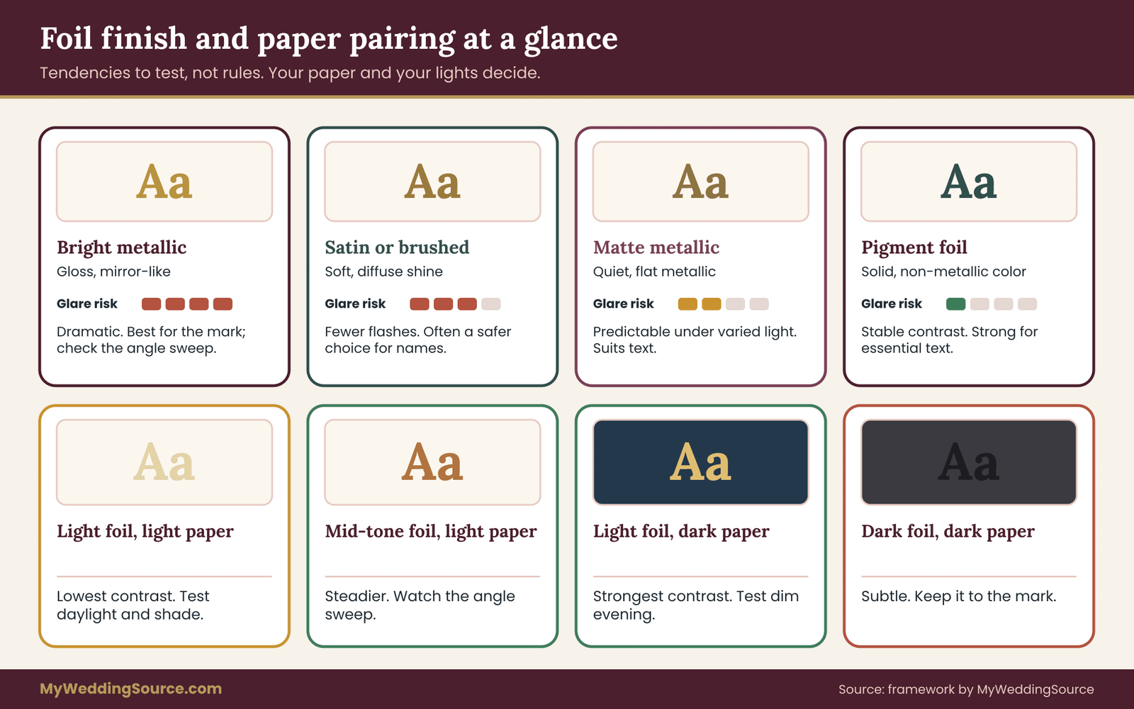
Bright metallic foil has a high-gloss, mirror-like finish. It is the most dramatic and the most sensitive to angle and light. It is also the type most prone to blacking out when the reader holds the card so that it reflects something dark.
Satin or brushed metallic foil has a softer, more diffuse shine. It reflects light in a broader pattern, which reduces the sharp flashes and dark spots of gloss foil. It is usually easier to read, and it looks more refined to many people, though it has less sparkle.
Matte metallic foil is quieter again, and it reads more like a flat metallic ink. Matte foils suit text, since they behave more predictably under varied light.
Pigment foil, sometimes called opaque or color foil, is a solid, non-metallic color: white, black, navy or blush. It does not reflect the surroundings the way metal does, so its contrast is stable. It is often the most readable option for essential text, and it can still look rich on a heavy, textured paper.
There are also holographic and patterned foils, which are decorative effects and belong in zone one. Their appearance changes dramatically with angle, which is the point of them and the reason not to ask them to carry words.
Pairing foil with paper
The paper sets the brightness baseline against which the foil is read. A few pairings recur, and each has a tendency worth checking in your proof.
Light foil on light paper, such as silver on white or pale gold on ivory, has the lowest brightness contrast to begin with. It looks elegant in shade and can lose definition in bright light. If you love the combination, test it in window daylight and outdoors in shade, where it is most likely to struggle, and consider a satin finish or larger type.
Mid-tone foil on light paper, such as a deeper gold, copper or rose gold on ivory, has more room. These foils usually stay darker than the paper in most lights, which keeps a steady difference. Still, a glossy copper foil can flare to near-white at a reflected highlight, so the angle sweep matters.
Light foil on dark paper, such as gold on navy, burgundy or forest green, usually has the strongest contrast. The risk is low light, where the foil may look dull, and thin type, where dark paper tends to make light strokes look slightly heavier but can also swallow them if they are too fine. Give it the dim-evening reading in particular.
Dark foil on dark paper, for example black foil on charcoal, is a subtle look that can disappear in low light. If you want that mood, it belongs in zone one.
Texture matters too. A paper with strong grain or a soft, fibrous surface gives the foil an uneven base, and fine lines may break up on it. Ask the printer to show the foil on your actual paper, and pay attention to the edges of the letters under magnification, such as a phone camera’s zoom.
Coordinating foil stamped invitations with your palette
Your foil is part of your color scheme, and a foil that fights the rest of the palette will look wrong in the photographs even if it reads well. The site’s guide to choosing a wedding color palette is a useful place to settle the broad colors first.
Then use the proof to test the foil within that palette. If the palette’s best foil turns out to be a risk for the essential facts, you do not need to give up the foil. You can use it in zone one and in the names, and let the rest of the card carry the facts in an ink that belongs to the palette.
Type, line weight and artwork prep for foil stamped invitations
Once you know which zones can carry foil, the next lever in foil stamped invitations is the artwork itself. Most legibility problems in foil stamped invitations are solved or caused here, and they are cheaper to fix on a screen than on a press. You do not need design software for this section. You need to know what to ask for and what to look for on a proof.
Why foil stamped invitations are less forgiving than ink
Ink is absorbed into or laid onto the paper in a thin film, and a fine line printed with it can be very fine indeed. Foil is transferred by a hard die under heat and pressure, and its edges depend on how cleanly the foil releases from the carrier around the shape.
Fine details are possible, but the limits differ with the die, the paper and the foil. Printers have their own minimums for line weight and type size, and they differ, which is why the right move is to ask your printer for theirs instead of relying on a number from the internet.
Two things happen when the artwork is too fine. Thin strokes can fail to transfer fully, leaving broken or patchy lines. And small gaps, such as the counter of an “e” or the space between two close letters, can fill in, so that letters look blobbed. Neither effect is dramatic at large sizes, and both can be unpleasant at small sizes, which is another reason zones four and five default to ink.
Type choices that help foil stamped invitations
A few type decisions improve foil’s odds without changing the look much.
Choose a typeface with moderate contrast between thick and thin strokes. Classic high-contrast serif faces have hairline strokes that are the first to break up. Script faces vary, and those with uniform stroke weight survive better than those with extremely thin connecting strokes.
Prefer larger sizes for essential text. If the proof shows a zone scoring a one because of small size, a modest increase in size often turns it into a two, and you may be able to recover the space by shortening wording.
Open the spacing. Slightly looser letter spacing gives the foil room and keeps counters from closing. Many foil designs use generous spacing for this reason, and it also helps legibility under glare, because a letter edge is easier to find when the gap beside it is clear.
Consider a medium or semibold weight instead of a light weight. A light weight in foil can look delicate on a screen and wiry in the hand. A step up in weight usually looks more balanced when the strokes are metal.
Avoid all capitals for long lines. Words in all capitals have uniform height and are harder to recognize at a glance, and foil’s glare makes it harder still. Reserve them for short lines such as a header.
Reversed and solid areas in foil stamped invitations
Foil stamped invitations sometimes use large solid shapes, such as a band across the top of a card or a filled panel with reversed type, meaning paper-colored letters inside a foil block. Large solid foil areas can show small variations, pinholes or uneven coverage, depending on the die and the foil, and reversed type inside them is a small-detail challenge in disguise. If your design includes this, ask the printer about its experience with large foil areas on your chosen paper and request a sample of exactly that.
Registration, or how close is close enough
Registration refers to how precisely one printed element lines up with another. When foil sits beside or over ink, as with a foil outline around an ink shape, or foil letters on a printed band, the alignment between the two has a tolerance, and small misalignments show as a white gap or an overlap.
Printers can tell you what their tolerance is. Designs that depend on perfect alignment, such as a thin foil outline exactly around an ink shape, are riskier than designs with a generous gap or a deliberate overlap. If the zone you are testing is near an ink element, ask about this.
Diacritics, numerals and special characters
Names and addresses with accent marks, cedillas, tildes, umlauts or non-Latin characters need a particular check. These marks are small and sit close to the main letter, so they are among the first things to fill in or break. If your names or your venue contain them, ask for a sample showing those exact characters at the size you plan to use, and treat them as part of zone two or three in your proof.
The same goes for numerals in the date, which should be checked individually and not as part of a general look at the line.
Flat artwork and the foil layer
Printers usually need the foil portions of the artwork as a separate layer or file, so that the die can be made from them. This is the printer’s request and not yours to second-guess, but it matters to you in one way: the foil shape is made from the artwork exactly as supplied.
If the file has tiny details, they go into the die. Before the artwork goes to the printer, view it at the real size on a printout and check whether any detail would be a struggle in metal. A detail that is hard to see on paper at actual size will not become easier to see in foil.
When a zone fails: the fix ladder
Some zones of foil stamped invitations will fail the proof, and that is useful news, not bad news. A fix is a decision, and it is better to make it from a ladder of options than to improvise at the last minute. The ladder is ordered from the smallest change to the largest, so you give up as little of the original design as you can.
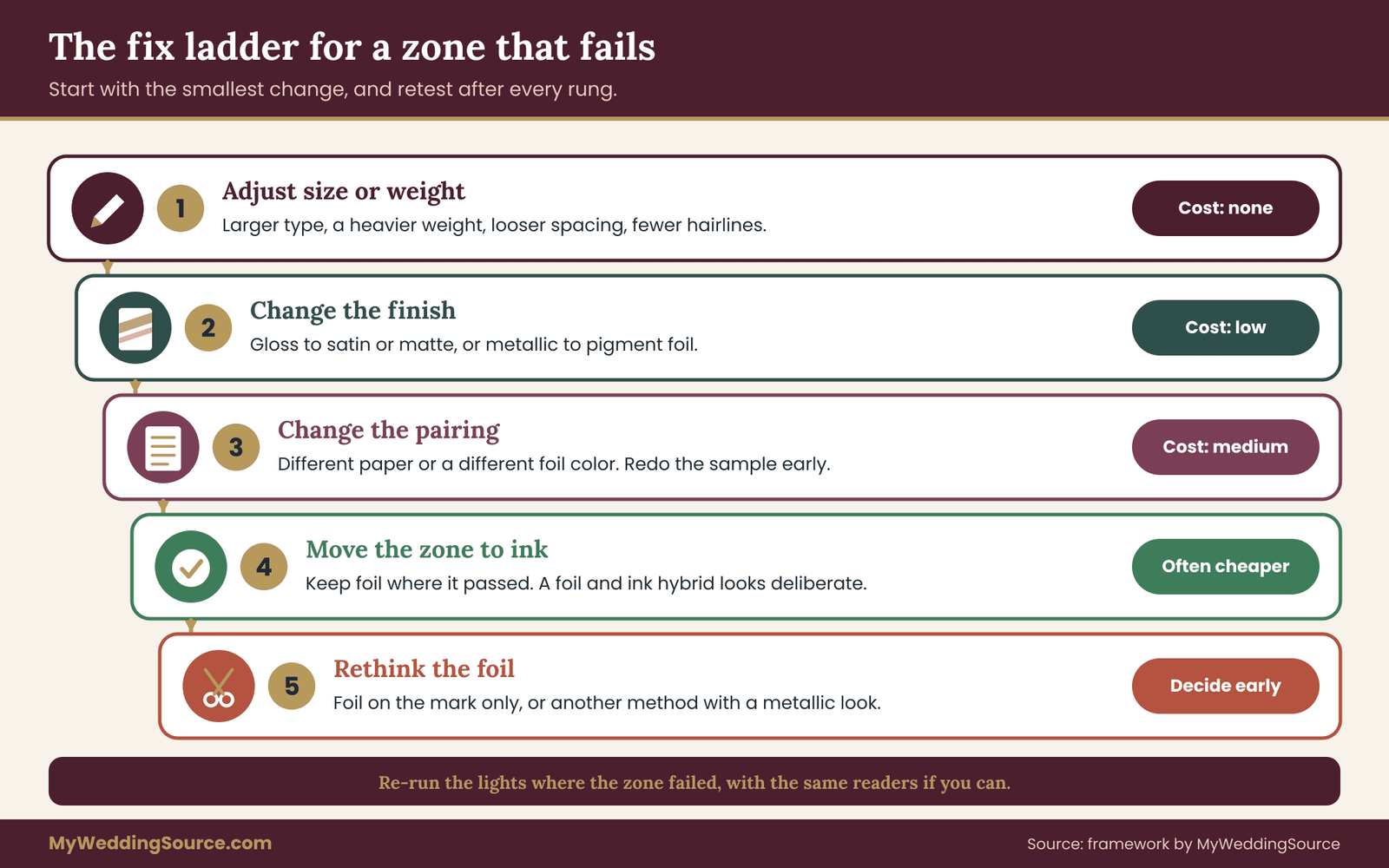
Rung one: adjust size or weight. Enlarge the type, step up a weight, open the spacing or simplify the typeface. This costs nothing in materials, and it fixes a large share of one-point scores. Re-test the zone on a new sample or on a printout and a stock sample before you decide it worked.
Rung two: change the finish. Move from gloss to satin or matte, or from metallic to pigment foil. This reduces glare and angle sensitivity. It changes the look, so check that you still like the result, and note that a different finish may be a different foil from the same supplier with a slightly different price.
Rung three: change the pairing. Keep the foil color and change the paper, or keep the paper and change the foil. A pale foil that failed on ivory may succeed on a deeper cream, or a dark paper may rescue a light foil. This is more expensive, because the proof has to be redone, and it should happen early.
Rung four: move the zone to ink. If the zone is essential information and it still fails, give it to ink. Keep foil in the zones that passed, and accept the hybrid. Many printed suites are hybrids by design, and a restrained foil with crisp ink often looks more deliberate than an all-foil card with fragile text.
Rung five: drop the zone from foil entirely and reconsider the card. If foil cannot carry any of the important zones in your chosen paper and color, you may want to rethink the foil. Options include foil limited to the mark and the border, a different method that gives a metallic effect, or a different paper. The section on alternatives, later in this guide, lists the options in plain terms.
Test after every change
Each fix changes the sample, so each fix needs a retest. It does not have to be the full twenty-five readings. Re-run the lights in which the zone failed, with the same readers if possible, and record the new scores beside the old ones. Keep the grid with both sets of scores. A change that cures one light and breaks another, which happens, shows up in the comparison.
Do not let a fix creep past the proof. A common pattern is to approve a revised design from a digital mockup that was never tested in the lights. If the printer cannot show the new version in a physical sample, ask whether the proof can include a small test strip with the revised foil, or whether a physical press proof is available for a fee. The money is usually well spent relative to the cost of printing a full run with a defect.
Keeping notes on foil stamped invitations the printer can use
When you go back to the printer, describe what you saw, not what you want. “The date line was unreadable in dim light and at a thirty-degree tilt, and two readers read the six as an eight” gives the printer something to act on.
“Can you make the foil look better?” does not. Printers know their materials, and a precise observation lets them suggest a remedy from their own experience, which may well be better than yours. Send the notes in writing, so the conversation is on the record along with the proof.
Questions, proofs and contracts for foil stamped invitations
A proof is only useful if the printer commits to making the finished foil stamped invitations resemble it. That commitment lives in the quote, the proof approval and the contract, and foil stamped invitations raise a few questions that ordinary printing does not.
What to ask before you order
Ask these early, ideally before you request a sample, so that the sample is made on the right terms.
Which foil colors and finishes can you stamp on this paper, and can you show them on this paper? A printer who answers with a general catalog is answering a different question.
What is your minimum line weight and minimum type size for foil, and does it change with the paper? Write down the answers. They tell you whether zones three and four are even eligible.
Is the sample a physical foil sample, a press proof or a digital mockup, and is it included in the price? You want to know in advance whether the fee for a physical sample is credited toward the order if you go ahead.
How many foil colors, dies or passes are in this quote? Each extra color is usually an extra die and an extra pass, and a quote that mentions only “foil” may hide that.
How is the foil registered to ink or to other printed elements, and what is the tolerance? This matters for any design where foil and ink sit side by side.
What happens if the finished foil does not match the approved proof? Ask for the answer in terms of reprint, partial credit or refund, and ask who decides what counts as a match.
Can the foil be stamped on the envelope or liner, and does that change the mailing? This leads to the postal questions further on.
A short script
You do not need to be elaborate. A message such as the following covers most of it. “We are considering foil for the names and the monogram, and we would like the date and venue in ink unless a test shows foil can carry them. Could you send a physical foil sample on the actual paper, in the finish we discussed, with sample lines at a few type sizes?
Please let us know the cost, whether it is credited to the order, and your minimum line weight and type size for foil.” It is polite, specific and easy to answer, and it makes clear that you are testing, which most printers respect.
What a good proof approval looks like for foil stamped invitations
When the real proof arrives, whether physical or digital, run the proof again. If it is a physical foil proof, repeat the lights and the angle sweep on the actual artwork, with your own names and date. If it is a digital proof, use it only to check spelling, spacing and layout, since a screen cannot show foil’s behavior, and ask about a physical sample if the foil carries anything important.
Check the details that a screen can verify: every name spelled correctly, the date and day of the week matching the calendar, the venue’s name and address, the time, the wording of the reply request and the website address. The site’s guide to wedding invitation print production has a fuller proofing routine, and a proof for foil stamped invitations should be read through it in the usual way before the foil-specific checks begin.
Get the approval in writing, and make sure that what you approved is named: the artwork version, the paper, the foil colors and finishes, the zones that carry foil and the quantity. If you changed the design after the sample, the approval should say that the foil and finish were confirmed on a physical sample of the revised design, or say plainly that they were not.
Putting it in the contract
Most printers send an order form or a quote with terms, and the terms usually say something about proofs, tolerance for color variation and responsibility for errors that the customer approved. Read those terms with foil stamped invitations in mind. Some state that foil appearance may vary from samples within a tolerance, which is reasonable, since foil is a manufactured material, but you should know the language.
Ask how a significant difference from the approved proof is handled, and keep the written answer with your order. The site’s guide to the wedding vendor contract explains what clauses to look for and how to ask for a change politely.
None of this is a reason to expect trouble. Most foil stamped invitations come out well. The aim is that, if the foil comes out darker, duller or more fragile than the sample, you and the printer already agree on what happens next.
What foil costs, what the alternatives are, and how it mails
How foil stamped invitations add cost
The price of foil stamped invitations is built from a few parts, and understanding them tells you which design choices are expensive. A die has to be made for the foil artwork, and it is made for your design, so it is a one-time setup cost for each foil area.
Each foil color usually needs its own die and its own pass through the press, which adds setup and handling. The stamping itself takes press time per piece, so a larger quantity costs more in the stamping, though the setup is spread across more cards. Foil on several pieces, such as the invitation, the details card and the envelope, multiplies the passes.
This explains why design decisions and price are connected. Foil stamped invitations with a single foil color on one piece cost less than three colors across a suite. Fewer, larger foil elements generally cost less than many small ones. And a hybrid, with foil in zones one and two and ink elsewhere, is likely to be cheaper than all-foil, as well as safer to read.
These are relationships, not prices. Ask for a written quote for your specific design, and compare versions: foil on the monogram only, foil on the monogram and names, and foil on everything. Seeing the three quotes together is the best guide to what the extra foil buys. The site’s guide to wedding budget planning shows where stationery sits among the other costs.
The alternatives that give a metallic look
If your foil stamped invitations fail the proof, or the cost is high, other methods give a metallic effect, each with its own trade-offs. Ask your printer which of these they offer, because availability varies.
Metallic ink is printed like other ink and can be used for text. It is usually less reflective than foil and more stable under changing light, and it will not have foil’s mirror finish. It can be a good choice for zones three and four if you want a hint of metal.
Digital foil and cold foil are variations that apply foil by methods other than a heated metal die, for example through a printing process that bonds foil to toner or adhesive. Their appearance and their limits differ from hot stamping, and they may suit small runs or fine detail. Ask for a sample, since the look varies.
Foil on a limited area means keeping hot foil to the mark and a border and printing everything else in a metallic or dark ink. It keeps most of the effect and removes most of the risk.
Foil plus a second layer is a design where foil sits on top of or beside a printed shape that provides contrast, such as a dark ink band under a light foil. Ask the printer whether it helps your design, because it depends on the stock and the artwork.
Because this guide is about the legibility of foil stamped invitations, it does not compare these methods against letterpress or embossing, which are different decisions with different trade-offs. If you are still choosing among them, settle that first, and then use the proof here for the foil you pick.
Mailing foil stamped invitations
Mailing is the stage at which beautiful foil stamped invitations meet sorting machines, conveyor belts, rubber rollers and weather. Three points deserve a check.
First, the address area. The Postal Service publishes standards for how a mailpiece should look, and sorting equipment reads the delivery address and barcode areas automatically. Keep the address area clean, with a plain, high-contrast address and no decoration inside or behind it, and do not use foil for the address.
Postal Explorer, the Postal Service’s online resource, hosts the Domestic Mail Manual, and the Postal Service’s own pages explain the rules for letters. Confirm the current rules and any extra postage for unusual sizes or rigid pieces with the post office before you finalize the suite. A complete assembled sample, weighed and measured at the counter, answers most questions.
Second, rubbing and scuffing. Foil is a surface layer, and mail is handled roughly. Foil on an envelope’s front can rub against other mail and show scuffs, and foil on an inner card can rub against a liner or its envelope.
Ask the printer whether the foil is well adhered, and whether a tissue sheet, a liner or a wrap is advisable. A spare sample is the best place to test this, by sliding it in and out of an envelope a number of times. Do it to the spare, not the approved sample.
Third, loose foil. Occasionally a little foil flakes at an edge, and the flakes show up on the inside of an envelope. It is usually minor, and a printer who sees it often can tell you what they do about it. Ask.
A worked example and the edge cases
Here is the proof for foil stamped invitations applied to an invented couple, so you can see how the zones, the lights, the scores and the fix ladder fit together. The couple, the printer and the scores are made up for illustration. Nothing here is a real test or a real quote.
The invented couple and their foil stamped invitations
Imani and Theo are planning an autumn wedding. They love the look of foil stamped invitations in pale gold on soft white cotton paper, and their first idea is to foil everything on the invitation: monogram, names, date, venue and the small line about the reception. Their printer sends a physical sample of bright pale gold foil on their paper, with their names set in a fine script and sample lines in a smaller serif.
They build the sheet, recruit Imani’s father, who wears reading glasses, and a friend who has not seen the design, and run the five lights over one evening.
What the first sample showed
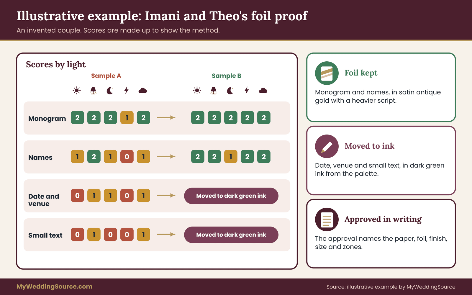
The monogram scored well everywhere except the phone flash, where a white hot spot swallowed one letter. Because it is zone one, they note it and move on.
The names, set in the fine script, scored one in window daylight, two in the lamp, one in dim evening, zero in the flash photograph and one in shade. The zero came from the thumbnail check: in the flash photograph, the friend read the second name as a different name because the hairline connecting strokes vanished. Under the rule, a zero in zone two fails the zone.
The date and venue scored zero in window daylight, one in lamplight, one in dim evening, zero in the flash photograph and one in shade. Imani’s father misread a numeral as another in daylight. In the grayscale photograph the date line nearly disappeared. Under the strict rule for zone three, it fails twice over.
The small reception line scored zero in three lights and one in two. It goes to ink without further discussion.
The fixes, in order
Imani and Theo work down the ladder. For the names, they try rung one first: the printer enlarges the script slightly and offers a heavier cut of a similar script, with fewer hairline joins. For the date and venue, they accept the result of the rule and move to rung four: the date, time and venue go to a dark green ink, which suits their palette. The small text stays in ink too.
Then rung two. The printer suggests a satin finish in a slightly deeper antique gold, which is likely to hold contrast better on their cream-white paper. The printer makes a second, smaller physical sample with the names and the monogram only, which costs a modest fee that the printer credits to the order.
They re-run the lights that failed. The names now score two in window light, two in lamp light, one in dim evening, two in the flash photograph and two in shade. That is nine points, no zeros and four twos, which meets the rule. The monogram’s flash hot spot is much reduced with the satin finish and is, in any case, only decoration.
Notice what the process did. It removed foil from the date and venue, saved the cost of extra foil on the small text, kept foil in the two zones where it earns its place, and gave the couple a written note of what they approved. The finished suite is still a set of foil stamped invitations, and nobody who receives it needs to tilt it to find the date.
There is also a financial reason they are glad about the date in ink. When a venue offers a Friday in place of the Saturday they booked, or a date has to change for any reason, a printed ink date can be reprinted far more cheaply than a foil one, which needs a new die. Few couples expect a date change, but ink gives them an inexpensive way out of an unlikely problem.
Edge cases for foil stamped invitations
Some situations do not fit the standard run for foil stamped invitations, and a few of them are common enough to plan for.
Evening and candlelit weddings. If most guests will consult their foil stamped invitations in low light, put more weight on the dim-evening reading and consider adding a candlelight reading. A matte or pigment foil or a dark paper with light foil is often the safest in these conditions, though the proof will tell you.
Photographer detail shots. Wedding photographers often photograph the invitation suite flat, with professional lighting, and foil can look beautiful in those pictures. If detail photographs of the stationery matter to you, tell the photographer which pieces have foil, since they can adjust their light to handle the reflections. The photograph is for you, though, and not for guests, so it does not alter the readability rules.
The wedding website. If you plan to show the invitation online, photograph it in window daylight with the flash off, and put the key facts on the page as ordinary text, not just in the image. That way the information survives any problem with the image, and it is accessible to people using screen readers.
Guests with low vision. If you know a guest has low vision, an ordinary-ink version of the key details, or a call or message with the date and place, serves them better than any foil choice can. Ask what format helps. This is a courtesy that costs little and that guests tend to remember.
Names with special characters. If a name or the venue has marks that will not hold in foil, ask for a sample, and be ready to set that name in ink even if the rest of the display line stays in foil. A well-matched hybrid is better than a misspelled-looking name.
Foil on both sides. If a double-sided card has foil on the reverse, the card is pressed twice, and registration, indentation and cost all matter. Treat each side as a separate proof.
Different print runs. If you order extra pieces later, for late additions, ask the printer how they will match your foil stamped invitations to the first run. Foil lots can differ slightly, so the written spec of foil name, finish and paper is what makes a later match possible.
The whole routine in brief
If you want a one-paragraph version of the method for foil stamped invitations to keep beside your calendar, here it is. Decide which parts of the card are decoration and which are information. Ask the printer for a physical foil sample on your paper. Build the sheet, with five zones and five lights, and recruit two fresh readers.
Score each cell zero to two, using the read-aloud, step-back, angle and thumbnail checks. Apply the rule, with no zeros on essential information and mostly twos on the names. Fix failures by size, finish, pairing and then ink. Retest, write down what passed, and get the approval in writing with the physical sample named.
Your next steps
Start with a single email. Ask your printer for a physical foil sample on your chosen paper, in the finish and colors you like, with sample lines at several sizes, and ask for the minimum line weight and type size for foil. In the same message, ask whether the sample fee is credited to the order. Then choose your two readers and a quiet evening.
While you wait, list every piece of foil you are considering and assign it to one of the five zones. Decide in advance what pass mark you will use, and write it down.
Check the wording on the card against the site guide to invitation etiquette at the same time, so the proof is spent on the final text. When the sample arrives, run the five lights, score honestly, and apply the fix ladder to whatever fails. Keep the grid, the notes and the written approval together with your other printing paperwork, since they are the record of what you agreed.
If the process leads you to a hybrid card, with foil on the mark and the names and ink for the facts, that is a good outcome, not a compromise. Your foil stamped invitations will still look special, and the guests who open them will know exactly when and where to come.
FAQ
Are foil stamped invitations hard to read?
Not by nature, but foil stamped invitations are less predictable than ink. Metallic foil reflects its surroundings, so it can look bright in one room and dull in another. Large, bold text on a well-matched paper usually reads well. Small, thin text is the risk. A short proof in several lights, with two fresh readers, shows you which parts of your card are safe in foil.
What should be foil and what should be ink on foil stamped invitations?
A good default is foil for decoration and display, and ink for information. The monogram, border and perhaps the names suit foil. The date, time, venue, reply details and the address are safer in ink unless your own proof shows the foil reading clearly in every light. Many printed suites combine the two and look intentional.
Does gold or silver foil read better on foil stamped invitations?
Neither is always better. Legibility depends on the brightness difference between the foil and the paper in the light your guests use. Silver on white tends to have low contrast, while gold on a dark paper is usually strong. A mid-tone or satin foil on a light paper often holds up well. Test your actual pairing instead of relying on color alone.
Is matte or glossy foil easier to read on foil stamped invitations?
Matte and satin foils usually read more consistently because they scatter light and flash less. Glossy foil is more dramatic but can black out or glare at some angles. Pigment foil, which is a flat, non-metallic color, is often the most stable. Check any finish on your paper, since texture and color change the result.
Can foil stamped invitations carry the date and time?
Sometimes, if it passes your proof. Dates are made of small, similar-looking numerals, so use larger type, a heavier weight, a plain typeface and the foil with the strongest contrast. If any light gives an unreadable result, put the date in ink. Ink is also much cheaper to reprint if the date changes.
How can I test foil stamped invitations without paying for a custom die?
Ask the printer for stock samples of your exact foil and paper that include text at several sizes. They will not carry your names, but they show how the foil behaves at small sizes. Compare them with a printout of your own type at the same size. A paid custom sample is worth it when foil carries important words.
Do foil stamped invitations cause problems in the mail?
It can if it is near the address. Automated sorting equipment reads the address and barcode areas, which should be clean and high-contrast, so avoid foil there. Foil can also rub or scuff in transit. Ask the printer about adhesion and protective liners, and confirm current rules with the Postal Service by taking a complete, assembled sample to the counter.
Will foil stamped invitations show up well in photographs?
Foil can photograph beautifully in soft window light and poorly under a direct flash, which can produce a hot white spot. If photographs matter, take them in daylight with the flash off, and put the key details on any website as plain text. Check your sample with a flash and without one as part of the proof.
Sources
- United States Postal Service
- Postal Explorer and the Domestic Mail Manual, U.S. Postal Service
- Frequently asked questions about mailing, U.S. Postal Service
- Web Content Accessibility Guidelines overview, W3C Web Accessibility Initiative
- Low vision information, National Eye Institute
- Federal Trade Commission
- Consumer Financial Protection Bureau
- PRINTING United Alliance, printing industry standards and resources
- International Organization for Standardization, graphic technology standards
- National Institute of Standards and Technology