
A pocket square works best when it echoes the tie instead of copying it. This guide gives a groom a repeatable method for pairing a tie and pocket square so they look chosen together, with a contrast and texture lookbook you can fill in at home, a worked example, fabric checks and questions to ask a seller.
Do not buy the tie and pocket square as a matched set. Pick one shared note, either a color, a pattern motif or a fabric feel, and let the other two qualities differ. Check the pair in a black-and-white photo to confirm the pocket square is visibly lighter or darker than the tie, make sure the two do not use the same weave, and keep the pocket square’s visible edge to about half an inch. Write the result on a one-page lookbook card so you can compare options calmly before you pay.
Walk into almost any formalwear shop and the easiest thing to buy is a tie with a pocket square cut from the same bolt of fabric. It is sold as a set, it is sure to match, and it takes about a minute to decide. It is also the pairing that most often looks flat in photographs, because the chest ends up with two patches of identical color and texture sitting about ten inches apart.
The alternative is not complicated, but it does need a method. “Just make them coordinate” is advice that falls apart when you are holding two swatches under shop lighting and your best man says both look fine. This article replaces that feeling with a short list of checks. By the end you will have a way to describe any tie and any pocket square in the same terms, compare them on paper, and explain your choice to a tailor or a seller without guessing.
A note on scope. This is general styling and shopping information, not legal, tax or financial advice, and prices, return terms and stock vary by seller, so confirm them with the seller before you pay. Everything here is written for a groom, but the method works for any wedding party member who wears a tie and a pocket square.
Why a matched pocket square set looks flat
A matched tie and pocket square set has one real problem. It removes the decision that makes an outfit look considered. When both pieces share a color, a pattern and a weave, the eye reads them as one object cut in two. The tie says one thing, the square repeats it, and nothing else in the outfit gets a chance to respond.
Contrast is what gives a jacket front its shape. A white pocket square on a navy jacket is a bright accent. A patterned silk one over a plain knit tie adds a second layer of interest. A cotton square beside a satin tie introduces a second surface. In each case the difference between the two pieces is doing work. Remove the difference and you remove the work.
There is also a practical reason. Sets are made to match under one dye lot and one weave, which is why they feel safe. But the groom’s jacket, shirt and the wedding palette are not under that dye lot. A tie that matches its own pocket square perfectly may sit slightly off from a shirt in daylight, and then the matched set draws attention to the mismatch rather than hiding it. A pair that coordinates loosely tolerates small color shifts far better.
This is not an argument against all sets. Some couples want the formality of an exact match, especially for a very traditional ceremony, and that is a legitimate choice. The point is narrower: if you want the groom’s neckwear to look deliberate, the choice should be made on purpose and not by default because the set was on the shelf.
What people actually mean by “matching”
The word hides three different ideas, and mixing them up is where most disagreements begin.
The first is exact matching, where the two items are the same color, pattern and fabric. The second is color matching, where they share a hue but may differ in pattern and texture. The third is coordinating, where they relate through one or two qualities and differ in the rest. Most advice about avoiding “matchy-matchy” really means moving from the first toward the third.
When someone in your family says the pocket square “doesn’t match,” ask which of the three they mean. Often they are worried about a visible clash, which is a coordination problem, and they do not actually need the pieces to be identical. That small clarification saves a long argument at the fitting.
The idea of coordinating without exact matching
Coordinating means deliberately linking two items while leaving them room to differ. The link is what makes the pair look intentional, and the difference is what keeps it from looking like a costume set. A good link is easy to name in one short phrase: “both pick up the dusty blue,” “both are small geometric prints,” “both have a matte, knitted feel.”
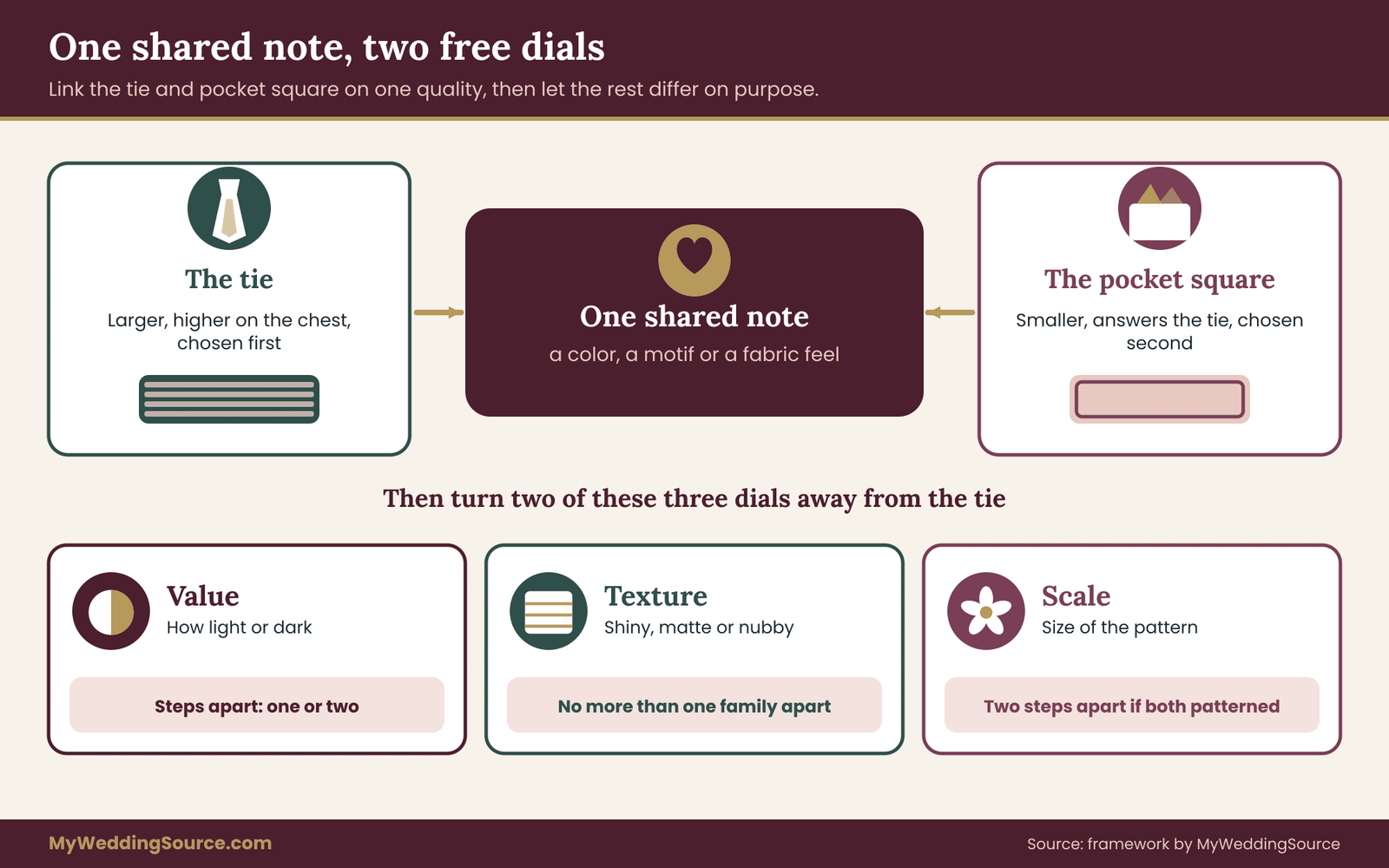
The rule this guide uses is the one shared note, two free dials rule. Choose one thing the tie and pocket square have in common. Then let the other qualities differ on purpose. The notes you can share are a color family, a pattern motif and a fabric character. The qualities you can vary are the three dials described in the next section: value, texture and scale.
This is not a mathematical formula, and it will not make a mismatched pair look good. It is a decision aid. It stops you from changing everything at once, which produces chaos, and from changing nothing, which produces a set. Working from one shared note also makes shopping faster, because you can reject most candidates in seconds.
Why a lookbook beats a mental picture
Imagining how two small swatches will look together, in a jacket front you cannot see yet, is unreliable. Lighting changes color. A swatch on a table does not behave like a fold in a breast pocket. And during wedding planning you are juggling many other decisions, so the details drift.
A lookbook card solves this by forcing a written comparison. For each candidate pair you record the same facts: the tie’s color, value, weave and pattern scale, the pocket square’s same four facts, the shared note, and a pass or fail on a few measurable checks. Three or four cards take less than an hour to fill out and give you something to hand to the person who will help you buy or fit them.
You are not writing for anyone but yourself, so keep it plain. The goal is a record that makes tomorrow’s decision easier than today’s.
Who this method is for
The method suits a groom in a suit or a tuxedo who wants the neckwear to look considered without costing much extra. It works for a bow tie as well, with the adjustments covered later. It also helps if you are dressing a whole wedding party and want the groom to stand out slightly from the groomsmen without introducing a new color.
It is less useful if the dress code or the family tradition requires one exact outfit, such as a uniform, a regimental tie or a cultural garment with its own neckwear rules. In those cases follow the code, and use this guide only for the details the code leaves open. If you are still deciding between a suit and a tuxedo, the question of formality comes first, because it changes which fabrics and colors are appropriate.
Start from the outfit, not the tie
Before you compare a single tie and pocket square, write down the fixed items. Neckwear is the last decision in a groom’s outfit and the cheapest to change, so it should respond to everything else instead of leading it.
List four things on the card. The jacket color and fabric, since a charcoal wool and a navy mohair-blend behave differently next to silk. The shirt color, because it frames the tie and sets the base the square will be read against. The boutonniere, which sits almost directly above the square and competes for the same patch of chest. And the wedding palette, so the neckwear can pick up one of its colors without repeating the full scheme.
If your wedding has an established palette, the wedding color palette guide explains how to choose a scheme and keep it from overpowering the clothes. The groom’s tie and pocket square should draw from that palette, but they do not need to use all of it. One or two of its colors, or a quiet neutral that sits well beside them, is plenty.
Fix the order of decisions
A reliable order looks like this. Jacket and shirt first. Then the tie, because it is larger and more visible. Then the pocket square, chosen against the tie and the jacket together. Then the boutonniere, which should not repeat the pocket square. Buying in a different order, for example the square first, tends to produce items that are good alone and awkward together.
One practical consequence: do not order a square before you have the tie in hand. Photographs of ties online shift color between screens, and a pocket square chosen against a screen image can look wrong in person. When you can, hold the real tie, or a swatch from the seller, against the real jacket before deciding.
Know your constraints early
Three constraints save time. The first is budget. A silk tie and a silk pocket square from a good maker cost more together than most people expect, and a pocket square is easy to replace with a cheaper cotton or linen one if the tie is the main purchase. The wedding budget guide helps you decide how much of the clothing line to give to small items.
The second is lead time. Custom ties and printed pocket squares can take weeks, and returns on made-to-order items are often limited. The third is the photographs. If the wedding is outdoors in bright light, very pale or very glossy fabrics can lose detail on camera, which is covered in a later section on lighting and photography.
The three dials: value, texture and scale
Once you have chosen your shared note, the pairing comes down to three qualities you can adjust. Think of them as dials on a small panel. Each one has a few settings, and a good pair usually turns at least two of them away from the tie’s own setting. The three dials are value, texture and scale.
Using the same words for every candidate is what makes the lookbook useful. “A bit different” tells you nothing. “The tie is mid value with a smooth finish and a small pattern; the square is light value with a matte finish and no pattern” tells you exactly what you are comparing.

Dial one: value
Value means how light or dark something is, regardless of its color. A navy tie and a burgundy tie can have nearly the same value, even though their colors are very different. A navy tie and a pale blue one share a color family but sit far apart in value.
Value is the dial that decides whether a pocket square is visible and whether it competes with the tie. Use a simple five-step scale for the card: 1 is white or near white, 2 is light, 3 is medium, 4 is dark and 5 is black or near black. This scale is a planning tool of our own, not a measurement standard, but it is consistent enough to compare items.
The working rule is that the tie and the pocket square should differ by one or two steps. If they sit at the same step, the square disappears into the tie visually, and the pair looks matched even when the patterns differ. If they differ by four steps, such as a black tie and a white square, the contrast is strong, which is fine for formal evening wear but can feel stark in daylight.
White is a special case. A white or ivory pocket square sits at step 1 and works with almost any tie, which is why it is a classic. If you choose white, the lookbook decision shifts to the fold and the fabric, because the color question is already answered.
How to check value without guessing
Photograph the tie and the square together on the jacket, in the light you expect on the day, then switch the photo to black and white using any phone’s photo editing tool. In grayscale, color distractions disappear and you can see whether the two pieces are separate shades or one blur.
Hold your phone at arm’s length and look again. Can you tell where the tie ends and the pocket square begins without squinting? If the answer is no, the value difference is too small. This is a quick check and not a laboratory test, but it catches most of the pairs that fail.
The Web Content Accessibility Guidelines use a luminance contrast ratio to judge whether text is readable against a background. You do not need to calculate a ratio for neckwear, but the idea carries over: two colors that look different in hue can still have nearly the same luminance, and the eye reads that pair as low contrast.
Dial two: texture
Texture is the surface you see and feel: shiny, matte, ribbed, nubby, crisp or soft. It is the dial most often ignored in off-the-shelf pairings, and it is the one that makes a pair look expensive or cheap.
For the card, sort fabrics into three families. Smooth and glossy covers satin, silk twill with a sheen and many polyester ties. Matte and fine-grained covers grenadine, cotton, fine wool challis and silk with a dry hand. Rough and nubby covers linen, knitted silk, wool flannel, tweed and shantung.
The rule is to change by at most one family. A smooth tie with a matte pocket square works. A knit tie with a linen pocket square works, since both have visible grain. A satin tie with a nubby linen square can look like two outfits. Two very glossy pieces together, such as a satin tie and a satin pocket square, add shine to shine and photograph as a bright patch under flash.
Dial three: scale
Scale is the size of a pattern’s repeat. The categories are solid, micro, small, medium and large. A micro pattern, such as a pin dot, reads almost as a solid from conversation distance. A medium pattern, such as a regular stripe or a bold paisley, is clearly visible from across a room.
The rule here is the simplest of the three. If both pieces have a pattern, the scales should differ by at least two steps, for example a micro dot tie with a medium paisley pocket square. If the scales are close, the patterns fight each other. If one piece is solid, the other may have any scale.
Patterns also differ in motif. A stripe tie with a floral pocket square mixes straight lines and curves, which is a pleasant contrast. A stripe tie with a stripe pocket square is risky unless the stripe widths and directions differ clearly. When in doubt, make one of the two pieces solid and let the other carry the pattern.
How the dials work together
Nobody should adjust all three dials every time. Turning every dial away from the tie’s setting produces a pocket square that has nothing in common with the tie, and the shared note then has to carry the entire pairing. Leave at least one dial close to the tie’s setting, and the pair keeps its footing.
A useful way to think about it is that the shared note and the dials form a budget. You have one shared note and two to three dials. If the shared note is a color, you should change two of the three dials so the pair has enough variety. If the shared note is a fabric feel, the color and scale dials should differ. If the shared note is a pattern motif, then value and texture should do the differing.
Three example settings
Take a mid-blue satin tie with a fine twill weave, a medium value, and no pattern. A square in cream cotton with a tiny blue border keeps the blue as a shared note, shifts value lighter by two steps, and moves the texture from smooth to matte. That is two dials changed and one shared note, which is a sound pair.
Take a burgundy wool knit tie, medium-dark, nubby, solid. A pocket square in light gray silk with a faint burgundy dot picks up the color in a small way, moves value lighter, and moves texture from nubby to smooth. Scale becomes the tie’s solid against a micro dot, which are close, so that dial stays put. Again, two dials changed.
Take a navy tie with a small geometric pattern, dark value, matte. A solid pale pink linen pocket square shares no color with the tie but links through the wedding palette. That works only if the pink really appears elsewhere in the wedding, such as the boutonniere or the bridesmaids’ flowers. Otherwise the pocket square looks random.
When a pair fails
Pairs fail in recognizable ways. The first is the value collision, where the two pieces are the same shade and fade into each other. The second is the shine stack, two glossy fabrics side by side. The third is the pattern fight, two patterns at similar scale. The fourth is the orphan, a square that shares nothing with anything else in the outfit.
Each failure maps to one dial or the shared note. That is the real use of the framework: when a pair looks wrong, you can name the problem, and naming the problem tells you what to swap. If it is a value collision, change the pocket square’s lightness. If it is a shine stack, move the square to cotton or linen. If it is an orphan, add one shared note.
The contrast and texture lookbook card
The lookbook card is a single page, printed or handwritten, with a section for each candidate pair. You can draw it on paper in a few minutes. For each pair, record the same fields in the same order so that pairs can be compared quickly.
The fields are: the tie’s color name, value step, texture family, pattern scale and width at the widest point; the pocket square’s color name, value step, texture family, pattern scale and size; the shared note in a few words; the dial differences, written as “value two steps lighter, texture one family matte”; and the checks, which are described in later sections.
Then give each pair a simple verdict: buy, hold or reject. Hold means you like it but want a second opinion or a look in different lighting. Keep the cards for the whole planning period, because your tastes shift between the first tie you consider and the last, and the cards show why you decided what you did.
Keep three cards, not thirty
The point of the card is narrowing, not collecting. Limit yourself to three candidate pairs at a time. If you find a fourth that you like, it has to replace one of the three. This rule sounds strict, but it prevents the endless browsing that makes a ten-minute decision take a month.
If you are working with a tailor or a seller, give them the cards. A card with specific facts leads to a better conversation than a request to “find something that goes with this,” and it makes it easier for the other person to say, honestly, that a pair will not work and why.
Pairing a pocket square by tie type
The dials work for any tie, but the starting advice changes with what the tie looks like. Here is a practical way to begin with each common type. In every case, finish by checking the pair against the three dials and the lookbook card instead of trusting the starting rule alone.
A solid tie
A solid tie is the easiest to pair and the easiest to get bored with. Because the tie carries no pattern, the square can carry it. A patterned pocket square in a related color gives the jacket front its only point of interest, so it can be a little bolder than usual.
Choose a pocket square that shares the tie’s color in a small way, perhaps as a border, a minor stripe or a motif, and let the main body of the pocket square sit lighter or darker. A solid navy tie with a cream pocket square edged in navy is a very low-risk choice. A solid burgundy tie with a pale gray square carrying thin burgundy lines is a little more interesting.
The trap with a solid tie is the solid pocket square in a slightly different shade. Two solids that nearly match look like a mistake rather than a choice. If both are solid, make the difference obvious, at least two value steps, or choose a clearly different texture.
A striped tie
A striped tie already contains direction and rhythm. The usual advice is to keep the square plain or give it a very different pattern, such as a small dot or a floral. Two striped pieces can work only if the stripe widths clearly differ and the stripes run in different directions or contexts.
A practical method is to pick one color from the tie’s stripes, ideally the quietest or the one that matches the shirt, and use that color as the square’s dominant color. A navy and silver striped tie with a solid pale blue pocket square lifts the lighter stripe color without repeating the lines. Check that the pocket square’s value sits one or two steps from the tie’s overall impression, not just from one stripe.
Regimental or club stripes carry meaning in some settings. If the tie belongs to a school, a military unit or a club, keep the pocket square neutral and check whether the group has conventions about how its colors are worn.
A knit or textured tie
Knit ties are matte and nubby, with a squared bottom and a casual, slightly retro feel. They pair well with smooth pocket squares in silk or cotton, because the contrast in surface is strong while the color link can be quiet.
Avoid pairing a knit tie with a second nubby item such as a coarse linen square, unless you want a deliberately rustic, relaxed look. A knit tie with a square of crisp white cotton is a neat, balanced result. A knit tie in a bold color with a muted floral silk square works as long as the florals include a small amount of the tie’s color.
Knit ties are often narrower than woven ones and have a flat end. That affects the proportions covered in the sizing section: a narrow tie suggests a slimmer lapel, and a smaller, simpler fold of the square usually looks better beside it.
A patterned tie: paisley, floral or geometric
A busy tie needs a quiet partner. The simplest approach is a solid pocket square in one of the pattern’s secondary colors, which is a common way to give the eye somewhere to rest. If the tie has navy, pink and cream in its pattern, a cream or pale pink solid can anchor the whole front.
If you want both pieces patterned, apply the scale rule strictly: two or more steps apart. A medium paisley tie with a micro dot pocket square works. A medium paisley tie with a medium floral square usually does not, because the two sets of curves are the same size and compete.
Pattern density matters as well. A tie with a very dense, multicolored pattern leaves little room for any other pattern. In that case treat the tie as the pattern and keep the pocket square as quiet as possible.
A bow tie
A bow tie is smaller than a necktie, sits higher on the chest and is usually paired with a more formal jacket. The pocket square sits well below it, so the two pieces are visually separated, and the pairing question becomes more about overall balance than about direct contrast.
The common choices are a white pocket square with a black bow tie in evening dress, and a colored or patterned bow tie with a plain white or cream square for daytime. If the bow tie is patterned, keep the square plain. If the bow tie is solid and bold, a patterned pocket square in a related color gives the front some life.
A bow tie also affects the fold. Because the front of the shirt is more exposed with a bow tie, a puffed or loosely folded square can look busy. A clean, flat fold keeps the formality.
Fabric pairings for a pocket square
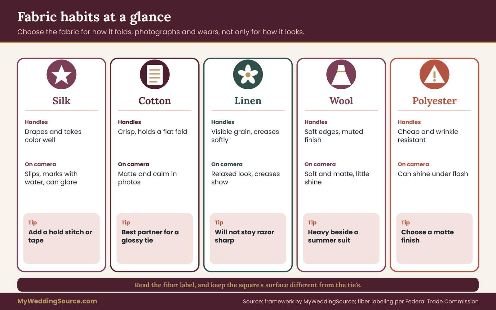
Fabric decides how a pocket square folds, how it photographs and how it holds up through a long day. The five fabrics below cover most of what you will find. Each has habits worth knowing before you commit to a pair.
Silk
Silk is the usual choice because it is light, takes color well and drapes smoothly. Printed silk can carry detailed patterns. Woven silk, such as twill or grenadine, adds texture. Satin-finish silk is very glossy, so it tends to photograph bright.
Silk is slippery, which means a pocket square can slide down into the pocket during the day. If you choose silk, consider a fold that sits on a rolled hem, or a small stitch or a bit of fold tape to hold it in place, discussed in the next section. Silk also marks easily with water, so keep it away from drinks and cake.
Cotton
Cotton is matte, crisp and forgiving. A plain white cotton pocket square is the traditional neat choice and holds a straight fold well. It is also relatively easy to launder, though the care label, where there is one, should decide how you clean it, and a seller should be able to tell you the care instructions for any square you are buying.
Cotton pairs well with silk ties because the surface contrast is clear. It also pairs with wool and knit ties, where its crispness balances their softness. Printed cotton is usually less vivid than printed silk, which is useful when the tie is already colorful.
Linen
Linen has a visible grain and wrinkles easily, which is part of its appeal in warm-weather weddings. A linen pocket square looks relaxed and slightly textured, so it suits a beach, garden or barn wedding, and a linen or lightweight wool suit.
Do not expect a linen pocket square to stay perfectly crisp all day. If the groom wants a sharp fold, linen will disappoint. If the look is relaxed, the soft creasing helps. Linen pairs with silk ties, knit ties and cotton ties alike, and its matte grain gives a strong texture contrast with satin.
Wool and wool blends
Wool pocket squares, often flannel or challis, are suited to cold-weather weddings and wool suits. They have soft edges and a muted finish. A wool pocket square pairs well with a silk tie in a deeper color, giving a clear texture contrast, and with a knit tie when the color link is strong.
Wool does not fold as sharply as cotton, so it suits a casual puff fold. It also reads as heavy in summer, so match the season to the suit, not only to the tie. The fabric’s weight should feel consistent with the jacket.
Polyester and blends
Polyester and polyester blends are common in affordable sets. They resist wrinkles and are cheap, but they can have a plasticky shine, particularly under flash. If a polyester pocket square is the only option, choose a matte finish and avoid pairing it with another shiny piece.
Textile products sold in the United States generally have to carry a fiber content label, with some exemptions, and the Federal Trade Commission publishes guidance on textile labeling. Reading the label tells you what you are actually buying, which matters when a listing calls a fabric “silky” without saying whether it is silk.
Which fabrics clash
The most common clash is two glossy fabrics, such as a satin tie and a satin square, which stack shine. The second is a very rough fabric next to a very smooth one at a very formal level, such as a rough linen square with a black satin bow tie, which looks like two outfits. The third is seasonal mismatch, a heavy wool pocket square with a lightweight summer suit.
None of these are rules in the sense of laws. They are patterns that tend to look off in photographs, and they come straight from the texture dial. If your lookbook card shows a shine stack or a two-family jump, the pair needs a second look.
A quick view of fabric weight and drape
Weight affects how a square sits. A heavy fabric holds a structured shape. A lightweight fabric collapses into a soft puff. The thinner and softer the square, the easier it is to fold into a pocket without bulk.
If your jacket has a narrow chest pocket, a heavy square will bulge and pull the jacket open. A tailor can tell you whether the pocket will accommodate it, and the wedding dress fit and alterations guide explains how to approach a fitting appointment in general, including what to bring and what to ask. For a groom, the same habits apply: bring the actual tie and pocket square to the fitting, not photos of them.
A note on dye and colorfastness
Brightly dyed fabrics can bleed when they get wet, which matters if a drink spills or if the groom sweats on a hot day. A dark dye can transfer to a light fabric, so a deep red pocket square folded against a white shirt is a small risk. Textile standards bodies such as AATCC publish test methods for colorfastness, and a reputable seller can tell you whether a fabric has been tested.
You do not need to run these tests yourself. You can ask the seller a plain question: “Is this dye colorfast to water and perspiration, and can I return it if it bleeds?” The answer, and the way the seller answers it, tells you a lot.
Colors that link a pocket square to the tie
Color is the shared note most people reach for first, and it is also the one that goes wrong most often. The trouble is rarely that two colors are far apart. It is that they are close but not close enough, so the eye sees a near miss. This section gives you four reliable ways to link colors, and a way to avoid the near miss.
Link by borrowing, not repeating
The safest link is to take one color that already appears in the tie and place it in the other piece as a small accent. If the tie is a navy and rust stripe, a cream square with a thin rust border borrows the rust. If the tie is a solid green, a square with a small green motif on a light ground borrows the green. In both cases the colors are the same color, not similar, so there is no near miss.
The accent should be small. A border, a thin line or a small motif is enough. If the borrowed color covers most of the square, you are back to color matching, which is fine but removes the contrast you were trying to keep.
Link by neighbors
The second way is to pick a neighboring hue, such as blue with a slightly greener teal, or burgundy with a warm rust. Neighboring colors share an undertone and feel related without being identical. This link is more subtle and gives a richer look, but it demands care, because neighbors that are almost the same can look like a failed match.
The test is to make the difference obvious. A navy tie and a teal square are clearly different. A navy tie and a slightly lighter navy square are a near miss. If you cannot decide whether two colors are the same, they are too close, so change one by at least a full step in value or hue.
Link by a neutral bridge
The third way uses a neutral, such as cream, ivory, gray or soft white, that is tied to the jacket or shirt instead of the tie. The pocket square is neutral, and the tie carries all the color. The link is then through the neutral, which already appears in the shirt, so everything feels connected.
This is the most forgiving approach and the one that suits grooms who are unsure about color. It does not make a bold statement, but it never clashes. A white or ivory square is the classic example, and a pale gray or soft champagne square can do the same job with a bit more warmth.
Link by the wedding palette
The fourth way connects the groom’s pieces to the wedding’s colors. If the palette is sage, blush and ivory, the tie might be sage and the pocket square blush, with the boutonniere in ivory. The groom ends up tied into the larger design without anything matching exactly.
This works well but depends on the palette being real, which means the colors appear in the flowers, the bridesmaids’ dresses or the décor. The wedding color palette guide walks through how to turn a loose idea into named colors and how to check them in daylight, which is the same step you need to take for the neckwear.
Undertone: the hidden cause of near misses
Colors have undertones, a warm or cool lean. A blue can lean green or lean purple. A red can lean orange or lean blue. Two reds with different undertones sit badly together even when they are the same lightness.
A simple check is to hold both pieces against a white sheet of paper in daylight. Warm undertones look slightly yellow or orange against white, and cool undertones look slightly blue or pink. If the pieces lean in opposite directions, change one. Do this before you buy, because store lighting is usually warm or tinted and flatters nearly everything.
Color vision differences
About one in twelve men has some form of color vision deficiency, according to the National Eye Institute, which is a common enough number that a groomsman, a parent or the groom may well be among them. Red and green are the pair most often confused. If the pairing depends on distinguishing a red from a green, ask someone with typical color vision to check it, and lean on value and texture as the main differences instead.
This is a good reason to keep the value dial in the process. Value contrast is visible to almost everyone, whereas subtle hue differences are not.
Standing out from the groomsmen without a new color
A common request is for the groom to look slightly different from the groomsmen without making the group look unrelated. The square is the cheapest way to do it, because it is small and does not require a new suit.
There are three reasonable options. The first is a different tie fabric in the same color, for example a silk tie for the groom and a knit or cotton tie for the groomsmen. The second is a different pocket square, with the groom in a patterned square and the groomsmen in plain white or the palette color. The third is a small change of value, the groom’s tie one step lighter or darker than the others.
Keep the family look
The group should look related. A group where every member has a different color tie and a different pocket square looks accidental. A better approach is to set the party’s neckwear as a base and let the groom adjust one dial. If the groomsmen wear navy knit ties and white squares, the groom can wear a navy silk tie with a white square carrying a thin border. Same color, same family, one change.
Where the party’s clothes are rented as a package, you may not control the neckwear at all, and the groom’s pieces may be the only room for variation. In that case, check what the rental company supplies and whether it allows substitutions, a topic the wedding vendor contract guide covers for vendor agreements in general.
Fathers and other family members
If fathers, stepfathers or grandfathers are wearing ties and pocket squares too, decide the rule early. A common arrangement is for the fathers to follow the groomsmen’s pattern with a small difference, so they look part of the group without being mistaken for the groom. Deciding this at the same moment as the groom’s neckwear saves a second round of discussion.
A short written note works well. Put the groom’s tie and pocket square on one line, the groomsmen’s on another and the fathers’ on a third, then share it. People appreciate knowing the plan, and fewer will turn up in a surprise color.
The boutonniere, the pocket square and the lapel
The boutonniere sits on the lapel, a few inches above the square, and the two compete for the same space. They should not repeat each other. If the pocket square is white, the boutonniere can carry color. If the pocket square is colorful, the boutonniere should be quieter, usually greenery with a small white or neutral bloom.
Check the sizes together. A large boutonniere above a puffed pocket square can look crowded, especially on a narrow lapel. Often it helps to choose a smaller fold when the flower is large, or a smaller flower when the fold is full.
Ask the florist early
The florist builds the boutonniere, so share the lookbook card with them. A florist who knows the tie color, the square color and the jacket fabric can choose stems that complement without duplicating. It is also worth asking about timing, since a boutonniere pinned too early can wilt, and a pin or magnet can mark delicate fabrics. The wedding day accessories planning guide covers how small items fit together on the day and what backups to carry.
The shirt collar and the tie knot
The tie sits against the shirt collar, and the collar’s shape affects how the tie looks. A wide spread collar suits a larger knot and a wider tie. A narrow collar suits a smaller knot. If the collar gapes or the tie knot floats away from the neck, the tie looks off no matter how well the square is chosen. Fix that before spending more on neckwear.
A well-tied knot with a small dimple under the knot looks deliberate. A loosely tied or twisted knot makes even a perfect pairing look careless. Practice the knot a few times in advance, wearing the actual shirt, and take a photograph of the result as part of your lookbook record.
How lighting changes the colors
The wedding venue’s lighting alters colors. Warm indoor lighting, such as incandescent bulbs or candles, shifts blues toward gray and whites toward cream. Cool LED lighting makes warm colors look flatter. Bright sunlight washes out pale colors and makes glossy fabrics glare.
You cannot control the lighting entirely, but you can test for it. Look at your pair in the same kind of light as the ceremony and reception: outdoors in the afternoon, in a dim restaurant, under venue uplighting if that is planned. If you are planning colored uplighting, check how it will fall on the groom’s clothing. The pair that looked right in a shop may need a value adjustment under strong colored light.
Photographs add another layer
Cameras handle highlights and shadows differently from the eye. A white pocket square on a dark jacket can lose all its detail in a bright flash, turning into a flat white patch. A very dark pocket square on a dark jacket may vanish. Both are fixable by moving the square a step toward the middle of the value scale, such as ivory instead of pure white, or a medium color instead of near black.
If you have an engagement photo session or a test shoot planned, wear the pair then. Photographs of the real items in real light are better evidence than any swatch.
Size, show height and tie proportions
A good pairing in color can still look wrong if the proportions are off. Three measurements matter: the width of the tie, the width of the lapel, and how much of the square shows above the pocket. All three can be checked with a ruler in a few minutes, which is why they belong on the lookbook card.
Tie width against lapel width
As a working guide, the widest point of the tie should be close to the width of the jacket lapel at its widest point. They do not have to be identical, but a very wide tie under a slim lapel, or a skinny tie under a wide lapel, looks mismatched. Measure both. If the numbers are within about half an inch, the proportion is comfortable, and if they differ by more than an inch, consider another tie or a different jacket.
This is a rule of thumb, not a standard. Fashion moves between slim and wide, and a tailor will have a view on what suits the groom’s frame. If you are altering the jacket, ask the tailor to measure the lapel so you have a real number to work with.
Tie length
The tip of a necktie should end near the belt buckle, or at the top of the waistband for high-waisted trousers. A tie that stops well above the belt looks short, and one that hangs below it looks long. If the groom is tall or large around the neck, a standard-length tie may end up short, and an extra-long size may be needed.
Tie length is worth checking on the actual shirt and the actual jacket. A shirt collar that sits higher or lower changes where the tie falls. If you are buying online, confirm the stated length with the seller and ask whether returns are accepted if it does not fit.
How much of the pocket square should show
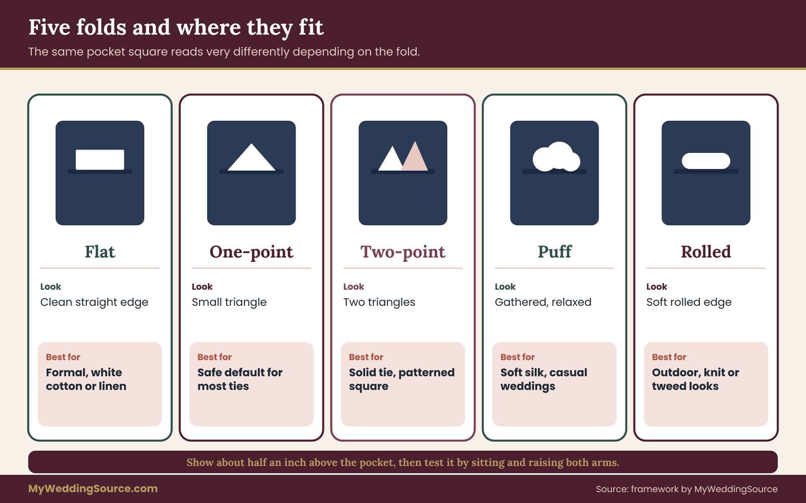
The visible portion is called the show. A common guide is about half an inch above the pocket edge for a flat fold and a little more for a puff or a pointed fold. Too little and the pocket square looks like a mistake. Too much and it looks like a handkerchief on the verge of falling out.
Measure the show with a ruler on the real jacket. Write the number on the card. If you are using a tailor’s help, tell them the number you want. The show should also look in proportion with the tie: a very wide tie suggests a bigger show, and a thin tie suggests a smaller one.
The size of the square itself
Pocket squares are sold in a range of sizes, and makers do not agree on a standard. A larger square allows a fuller fold but takes up more space in the pocket and may bulge. A smaller square suits a flat fold and a narrow pocket. Check the listed dimensions before ordering, and if possible place a square of the same size in the jacket pocket to see how it sits.
If the square is too big, you can adjust the fold. If it is too small, there is little you can do, so measure first. A seller who does not state the size at all is leaving out information you need, and that is worth asking about.
Folds for a pocket square
A fold changes how the same pocket square looks. The right fold depends on the fabric, the formality of the occasion and the pattern. Here are the most useful ones, along with what they do to the pairing.
The flat fold
The flat fold, sometimes called the presidential or television fold, produces a clean rectangular line with no points. It suits white cotton or linen squares and formal settings. Because it shows only a straight edge, it keeps attention on the pocket square’s color and not its shape, so it works well beside a patterned tie.
It does not suit slippery silk without some help, since the fold can slip. It also needs a crisp fabric. A soft wool square will not hold a flat line.
The one-point fold
The one-point fold, a triangle pointing up, is a step more relaxed than the flat fold but still tidy. It works with most fabrics and most ties. It is a good default if you are unsure, because it shows a clear shape without looking fussy.
The point should be small, not a tall spike. If the triangle is too large it competes with the tie knot above it, and the pair looks busy.
The two-point and multi-point folds
These show two or three triangles, usually at slightly different heights. They add detail and suit patterned squares, since the folds reveal different parts of the print. They also add formality to a plain colored square.
With a patterned tie, a multi-point fold can be too much, so keep to a flat or one-point fold. With a solid tie and a solid jacket, a multi-point fold in a patterned square gives the front its focal point.
The puff fold
The puff fold, in which the square is gathered and pushed into the pocket with the top left loose, is the most relaxed. It suits soft silk, linen and cotton, and it looks natural with a casual or outdoor wedding. It works well with knit ties and textured jackets.
It is the least precise fold, so the show varies from person to person. If you want a puff, practice it, and check it again after the groom has sat down and moved around. It can flatten or fall.
Keeping the fold in place
A square that moves during the day undoes the whole pairing. There are small fixes that cost little. A tailor can sew a small stitch inside the pocket that catches the square. Double-sided fashion tape holds the fold against the pocket lining. Some makers sell squares with a stiffened card insert, and some jackets have a sewn-in pocket square holder. All are easy to test during a fitting.
Test the hold with a movement check. Sit down, stand up, raise both arms, hug someone and bend to pick something up. If the square stays put, it will probably survive the reception. If it creeps, adjust it before the wedding, and keep a spare square with the best man in case something happens.
Ironing and folding in advance
Pressing a square before folding gives a sharper line, but fabrics differ, so check the care label first. Silk needs low heat, and cotton and linen tolerate more. Fold the square at home several times before the day, since folds improve with practice, and photograph the best attempt so the groom or best man can copy it on the day.
Measurable checks before you buy
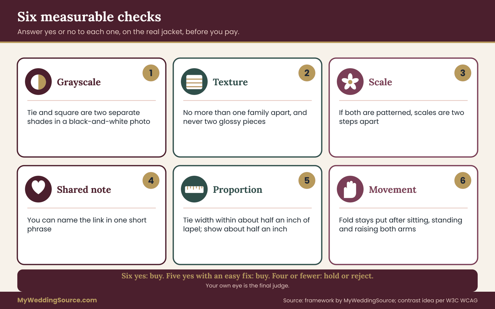
Everything so far can be turned into a short list of checks that you can answer with a yes or no. This is what makes the lookbook useful. A pair that passes all of them is very likely to work, and a pair that fails one or two gives you a precise place to adjust.
The six checks are these. First, the grayscale check: the tie and the pocket square are separate shades in a black-and-white photo. Second, the texture check: the two pieces are no more than one family apart, and they are not both glossy. Third, the scale check: if both are patterned, the scales differ by two steps or more.
Three more complete the set. Fourth, the link check: you can state the shared note in one short phrase. Fifth, the proportion check: the tie width is within about half an inch of the lapel width and the show is about half an inch. Sixth, the movement check: the fold stays put after sitting, standing and raising both arms.
How to score a pair
Count the checks passed. Six out of six is a buy. Five out of six is a buy if the failed check is easy to fix, such as the show height. Four or fewer is a hold or reject, because more than two fails usually indicates a structural problem rather than a detail.
Do not take the scoring too literally. It is a way to organize your thinking, and your own eye is the final judge. But if the numbers say one thing and your gut says another, look again at which check you are overlooking.
Record the evidence
Photograph each pair on the jacket and attach the photo to the card. Note the lighting. If you used a swatch rather than the real item, say so, because swatches can differ from finished items. This takes a minute per pair and gives you a record to compare against the delivered goods.
If the delivered items look different from the listing, you have evidence for a return. The Federal Trade Commission’s mail, internet and telephone order rule requires sellers to ship within the time they promise or to give you a chance to cancel, and the agency’s site explains what you can expect.
What the lookbook costs and what it saves
A lookbook costs almost nothing, a few sheets of paper and an hour of time. The savings are in avoided mistakes. Returning a mismatched tie costs shipping and time, and rushed replacements before the wedding cost more. Keeping the process organized also keeps the groom’s neckwear from becoming a source of stress in the final weeks.
Budget for the neckwear as two items with a spare. A backup pocket square is inexpensive and can be a lifesaver if the first one is stained or lost. It is also easy to hand to someone else to hold during the day.
A worked example: one groom, three candidate pairs
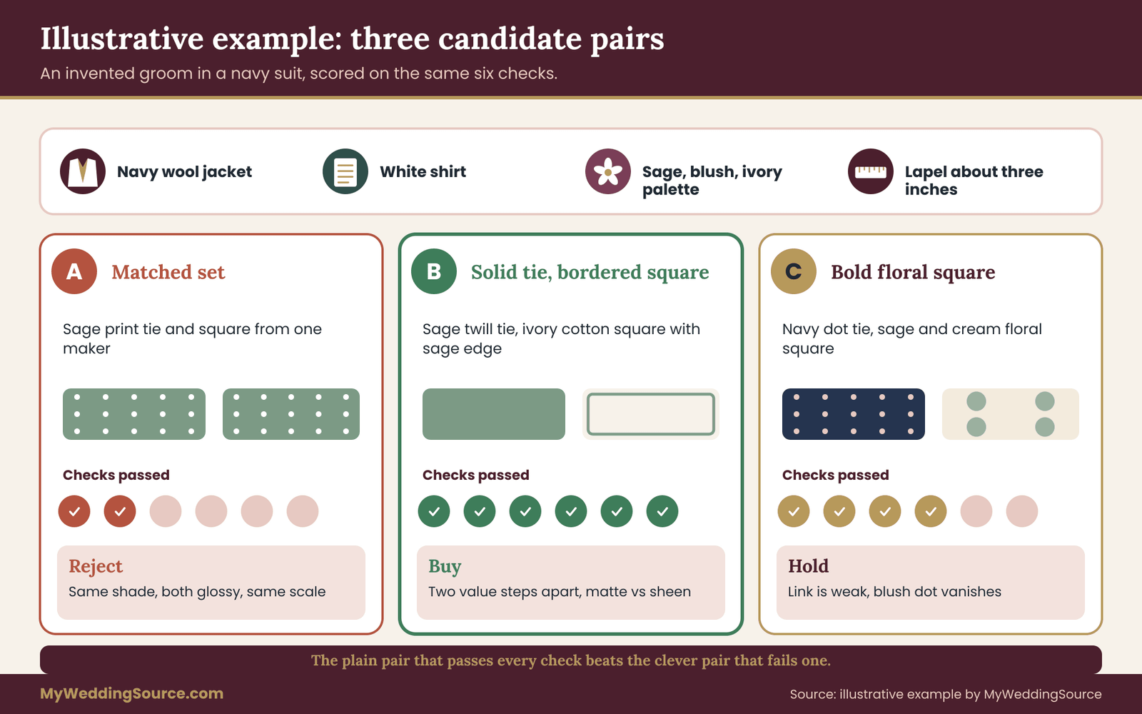
The example below is invented to show the process, and every number in it is illustrative. Imagine a groom, here called Marcus, who is marrying outdoors on an October afternoon with a reception that runs into the evening. He is wearing a navy wool suit and a white shirt. The wedding palette is sage green, blush and ivory. His groomsmen are in navy suits with sage knit ties and white pocket squares.
He has a budget he is comfortable with and no wish to look like the groomsmen’s twin. He starts with the fixed items on the lookbook card: navy wool jacket, white shirt, sage and blush palette, a boutonniere of greenery with a small ivory bloom. The lapel measures about three inches at its widest. That gives him his frame.
Candidate one: the matched set
The first option is the one the shop suggested, a silk tie and pocket square set in a sage and navy small geometric print. It takes about a minute to choose. On the card, the tie is mid value, step 3, glossy silk, small scale. The square is the same in every way.
The grayscale photo shows the problem at once. The tie and the square are one patch of gray, and the square reads as a continuation of the tie. The texture check fails, since both are glossy, and the scale check fails, since both are the same small print. The link check passes only because the pieces are identical. Score: two of six. Reject, although the set is perfectly fine as a set.
Candidate two: a solid tie with a patterned square
The second option is a solid sage silk twill tie, medium value, with a faint sheen, paired with an ivory cotton pocket square that has a thin sage border. The shared note is sage. The tie is step 3 and the square is step 1, so value differs by two steps. Texture moves from smooth silk to matte cotton. Scale is a solid against a solid with a border, so no pattern conflict.
Marcus measures the tie at about three inches, matching the lapel, and sets the show at half an inch with a flat fold. The grayscale photo shows two clearly different shades. The movement check passes after a small stitch is added inside the pocket. Score: six of six. Buy.
Candidate three: a bolder choice
The third option is a navy tie with a tiny blush dot, paired with a printed sage and cream floral pocket square. The shared note is the wedding palette. The tie is step 4, the square is step 2. The texture is matte for both, which fails the “one family apart” idea only in the sense that there is no difference, so it earns a half mark. Scale is a micro dot against a medium floral, which passes with two steps.
The pair looks interesting, but the blush in the tie is so small that it disappears at conversation distance, and the shared note is weak. Score: four of six. Hold. Marcus keeps it as a back-up if his first choice has supply trouble.
What the example shows
The decision was not made by taste alone. Candidate two won because it passed every check, and it also happened to be the plainest. Candidate three was more adventurous but gave less back. That is common: the plain, well-linked pair beats the clever pair that fails a check.
The example also shows the order of work. The fixed items come first, the candidates second, the checks third, and only then the purchase. Nothing was bought until the pair had been photographed on the real jacket.
Rewriting the card for your own wedding
To use the same process, copy the headings, not the answers. Your jacket, shirt and palette will give different fixed items, and your candidates will differ. The only constants are the three dials, the shared note and the six checks.
Comparing the alternatives to buying separates
Separates are not the only way to get a pocket square and a tie. Four other routes are common, and each has trade-offs you should weigh against your time and budget. Weigh each against your own time and budget.
A matched set from one maker
A set is the cheapest in time and often in money, and it guarantees that the colors match. It is a reasonable choice for a very formal ceremony, for a groom who prefers a traditional look, or for a rental package where coordination is handled for you. Its weakness is the flatness described earlier, and the fact that you cannot change one piece without breaking the set.
If you buy a set and want some contrast, you can still change one piece. Wearing the set’s tie with a plain white pocket square turns it into a pair with one shared note. This costs little and often works.
Separates from different makers
Separates give you the most control and usually the best result. The cost is time and the risk that colors do not agree between makers. Dye lots differ, and a “navy” from one maker may be a slightly different navy from another.
To reduce the risk, order from sellers that offer returns, check the stated colors against swatches if available, and photograph the pair on the real jacket. The Federal Trade Commission’s pages on the mail, internet and telephone order rule explain what shipping promises sellers must keep, and the Consumer Financial Protection Bureau explains how to dispute a charge if a seller fails to deliver.
Made-to-order or custom neckwear
Custom neckwear can be matched to the wedding palette exactly, from a fabric chosen from a sample book. It is the best way to get a precise color link, but lead times can be several weeks, and returns on made-to-order goods are often limited or excluded.
If you go this way, ask for a physical swatch before the order is placed, confirm the delivery date in writing and allow a buffer of at least a few weeks before the wedding. The wedding vendor contract guide covers the habits that protect you: written terms, stated deadlines, and clear refund conditions.
Rented neckwear
Rental packages usually include a tie and sometimes a square, with a limited choice of colors. The convenience is real, and so is the limit on choice. You can often bring your own pocket square even if the tie is rented, which gives you one dial to adjust.
Ask the rental shop what colors are in stock on the date you need them, how they are cleaned and what happens if an item is damaged. Rental shops can also tell you whether a pocket square is included or only offered as an extra.
A family or vintage piece
A relative’s tie or pocket square carries meaning that no new item does. Vintage pieces can also be beautiful, but they come with practical risks: age-related fragility, stains that return when the fabric is handled and colors that have faded unevenly.
Test the piece before relying on it. Check the fabric for weak spots, and have it cleaned by someone who works with vintage textiles, if appropriate. Make a card for it as you would for any other piece, and keep a backup in case it is not usable on the day.
Edge cases that change the plan
Most weddings fit the standard approach. A few situations do not, and it is worth knowing in advance where the advice bends.
Tuxedos and black tie
For a black tie wedding, the neckwear is usually a black bow tie, and the pocket square is white. The room for creativity is small, so the dials mostly change in texture and fold. A white linen or cotton square with a flat fold and a black silk bow tie with a matte finish is a safe and attractive result.
Some couples choose a colored bow tie or a velvet one. In that case, keep the square white and use the groom’s lookbook card to confirm the bow tie’s value against the jacket. If you are still deciding between a tuxedo and a suit, the wedding day accessories planning guide can help you think through the small items that go with each.
No breast pocket
Some jackets, such as certain cultural garments or minimalist designs, have no breast pocket. A pocket square is then not an option, though a lapel pin, a boutonniere or a different accessory can take its place. If the groom wants a similar effect, a tailor can sometimes add a pocket, but that is an alteration that needs time.
In this case the tie, if worn, is the only neckwear, and the lookbook can concentrate on the tie, the shirt and the boutonniere. The same dials apply to the relationship between the tie and the boutonniere.
Heat and humidity
In hot weather, a groom perspires more, and silk shows moisture. A cotton or linen pocket square absorbs moisture better, and a lightweight tie in a less delicate fabric holds up. A wool tie is heavy for a summer wedding.
Keep a spare pocket square in a pocket or with the best man. A hot day makes folds droop and can turn a crisp fold into a limp one. A small stitch inside the pocket helps keep the shape.
A patterned shirt or a vest
A patterned shirt adds a pattern to the stack, and the rule of scale applies again: the tie and the shirt should differ clearly in scale, and the pocket square should be solid or very quiet. A vest adds a block of color or fabric between the tie and the jacket, so it can take the shared note, and the square can carry the contrast.
With a three-piece suit, check the vest, jacket and tie together on the card. A vest in the tie’s fabric, with a different pocket square, is a classic example of a shared fabric note.
Children and ring bearers
If a ring bearer or a young relative wears a tie and pocket square, the groom’s pieces need not match them. A small shared note, a color in a bow tie or a square, is enough to show the connection. Children’s accessories are often pre-tied or clip-on, so check how they sit and how comfortable the child is, since a child who is uncomfortable will pull at them.
Questions to ask a seller or tailor
Whether you buy online, in a shop or through a tailor, the same short set of questions protects you. They are specific on purpose. Vague questions get vague answers, and specific ones either get a clear reply or show that the seller does not know the product.
Questions for a seller
Ask what the fabric is and what percentage of each fiber it contains. A legitimate seller can answer this from the label, and the Federal Trade Commission publishes rules on fiber content labels for textile products in the United States. Ask for the dimensions of the tie at its widest point and its length, and the size of the pocket square. Ask how the color was photographed and whether a swatch is available.
Ask about returns before you pay, in plain words: “If the tie and pocket square do not look right together on my jacket, can I return them, and who pays for the shipping?” Ask about delivery: “When will this arrive, and what happens if it comes late?” Keep the reply in writing, in an email or an order confirmation, so you have the promise on record.
“Could you confirm the width of this tie at its widest point, the size of the pocket square, and whether I can return both if they do not coordinate with my jacket?”
Questions for a tailor
A tailor can tell you whether the chest pocket will hold a particular square without bulging, whether a hold stitch is practical, and whether the lapel width suggests a certain tie width. Bring the real jacket, the real shirt and the real tie and square, along with your lookbook card.
Ask whether any adjustment to the pocket is possible, what it costs and how long it takes. Ask what the tailor sees as the most noticeable problem with the pair, since a trained eye often spots a proportion issue you missed. The approach to the fitting appointment itself is covered in the wedding dress fit and alterations guide, and much of that advice about timing and communication carries over to a groom’s fitting.
“Does this pocket hold a silk pocket square flat without pulling the jacket, and can you add a small stitch to keep it in place?”
Questions for a rental shop
Ask which neckwear colors are in stock for your date, whether a square is included and whether you may bring your own. Ask how damage and stains are handled, and what the replacement charge is for a lost item. Get the answers in the rental agreement, not just by phone.
Questions for the florist and photographer
Tell the florist the tie and pocket square colors, and ask which boutonniere stems will complement without repeating them. Tell the photographer what the groom will wear and ask whether any color or fabric causes trouble in their experience, such as very bright white or very glossy fabric under flash. A short conversation costs nothing and can prevent a surprise in the gallery.
Watching for sales pressure and weak claims
Be careful with “best pairing” lists and rankings that earn the publisher a commission from links. The Federal Trade Commission’s guidance on endorsements says material connections should be disclosed. This guide has no commercial relationship with any seller, and the pairing rules here do not depend on any product.
Be equally careful with claims that cannot be checked, such as “a color that will match any suit.” No seller can promise that, since the suit’s color and your screen’s display are outside their control. Trust measurements, return terms and swatches over adjectives.
The day-of kit for neckwear
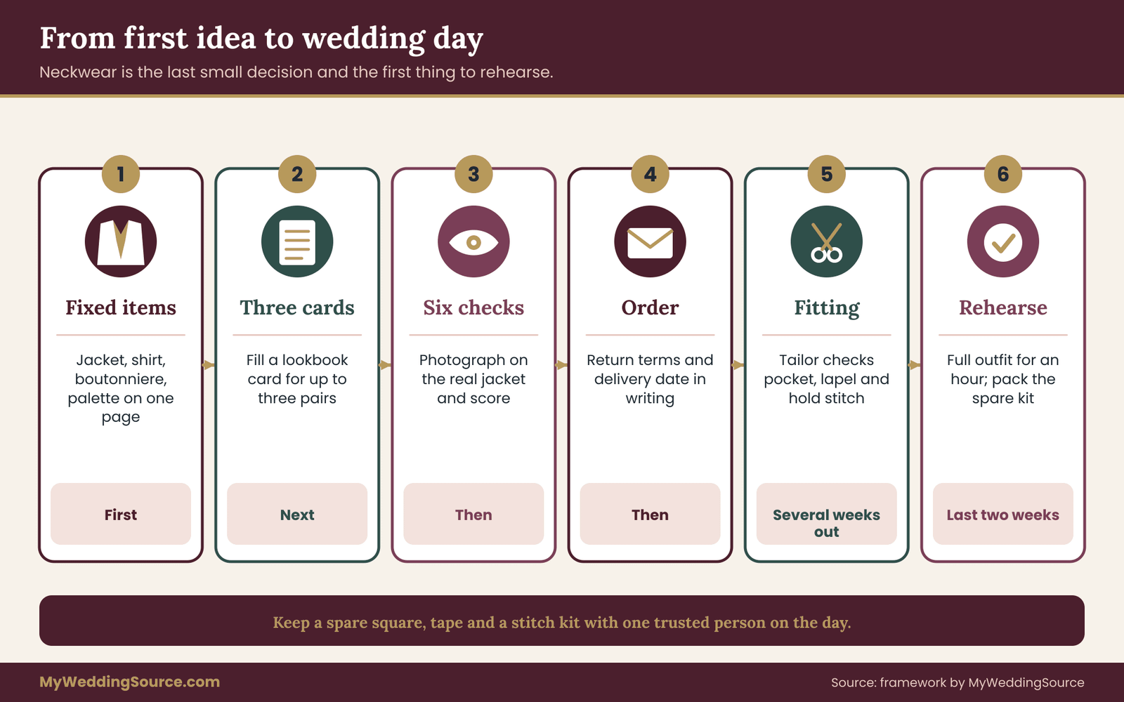
A small kit takes away most day-of stress. It does not need to be elaborate, and the best man or a trusted family member can hold it.
The kit holds a spare pocket square in a neutral color, a few small safety pins and some double-sided fashion tape. It also holds a small lint roller, a stain remover pen that is safe for the fabric, and the written fold instructions with a photograph of the finished look. A clip or a small mirror is a useful extra.
Give the kit to one person, and tell them what is in it. During photographs, ask that person to check the fold and the tie before each group shot. The groom should not have to think about it.
Do a dress rehearsal
A week or two before the wedding, put on the full outfit, tie the tie, fold the pocket square and wear everything for an hour. Sit, walk and move as you would on the day. Take photographs in natural light and look at them next day. Problems show in photographs that you miss in the mirror, such as a tie that is a half inch too short or a fold that sits too high.
If something is wrong, there is still time to adjust it, which is the entire point of doing the rehearsal.
Your next steps
Start with the fixed items. Write the jacket color, shirt color, boutonniere and palette on a single page. Then choose up to three candidate pairs and fill out a card for each, with the value step, texture family, pattern scale and shared note. Use the six checks to score them, photograph the finalists on the real jacket and decide.
After that, order with return terms in writing, add a stitch or tape to hold the fold and practice the fold until it is routine. A week or two before the wedding, do the dress rehearsal and pack the day-of kit. If you need to see how neckwear sits within the larger plan, the wedding decision-making guide offers a way to settle small choices without letting them take over. Choose a pocket square that answers the tie instead of copying it, and the neckwear will look settled without anyone wondering why.
FAQ
Should a groom’s tie and pocket square match exactly?
No. An exact match is the safest choice but it often looks flat, because the two pieces become one patch of color and texture. Aim for coordination instead. Pick one shared note, such as a color, a motif or a fabric feel, and let value, texture and scale differ. A white or ivory square is a dependable fallback with nearly any tie, particularly for formal weddings.
What if I like the matched set from the shop?
Buy it if you prefer a traditional, formal look, and there is no rule against it. If you want some contrast, wear the set’s tie with a plain white or ivory pocket square, or the square with a different tie. That turns the set into a pair with one shared note, at little extra cost, and you keep the option of using the original square elsewhere.
How do I tell whether two colors are too close?
Photograph the pair on the jacket in the light you expect, then convert the photo to black and white and hold the phone at arm’s length. If you cannot separate the two pieces without squinting, the value difference is too small. Colors that look nearly the same but not quite are a near miss, so change one by a clear step.
Can both the tie and the pocket square be patterned?
Yes, if the scales differ by at least two steps, for example a micro dot tie with a medium paisley square. Two patterns of similar size compete. Stripes against stripes are risky unless the widths and directions differ clearly. When unsure, make one piece solid and let the other carry the pattern, which is the most reliable arrangement.
How much of the pocket square should show above the pocket?
About half an inch is a common guide for a flat fold, with a little more for a puff or pointed fold. Measure it on the real jacket and write the number on your lookbook card. Check that it stays put after sitting, standing and raising both arms, and use a small stitch or tape to hold it if needed.
What fabric is best for a pocket square?
It depends on the tie and the setting. Cotton holds a crisp fold and pairs well with silk. Linen suits relaxed, warm-weather weddings. Silk drapes well but slips and marks easily. Wool suits cold weather. Whatever you choose, keep the surface different from the tie’s, and avoid two glossy pieces together, since shine stacks and photographs bright.
What if the groomsmen wear similar neckwear?
Let the groom differ by one dial, not by a whole new color. If the groomsmen wear knit ties and white squares, the groom might wear a silk tie in the same color with a white square that has a thin border. The group looks related, and the groom stands out slightly. Share a written plan with the whole party early.
Do I need a pocket square if the jacket has no breast pocket?
No. Some jackets have no breast pocket, and a pocket square simply is not an option. A boutonniere, a lapel pin or a well-chosen tie can fill the same role as a point of interest. If you want a pocket added, ask a tailor early, since the alteration takes time and has to be planned around fittings.
Sources
- Consumer advice and business guidance, Federal Trade Commission
- Business guide to the Mail, Internet, or Telephone Order Merchandise Rule, Federal Trade Commission
- Color blindness, National Eye Institute
- Understanding contrast, Web Content Accessibility Guidelines, W3C Web Accessibility Initiative
- Textile test methods and colorfastness, American Association of Textile Chemists and Colorists
- Textile standards, ASTM International
- Consumer tools and complaint resources, Consumer Financial Protection Bureau
- Consumer protection resources, USAGov
- International standards for textiles and clothing, International Organization for Standardization