
Wedding fonts that look lovely on a full-size invitation often fall apart on a place card, a table number or a bar sign. This guide gives you an original size ladder print test, a three-role pairing method and a set of vendor questions, so you can pick wedding fonts that stay readable at the smallest size you will actually print.
Do not judge wedding fonts on a screen. Give each wedding font a job (a voice for mood, a working face for information, a number face for table numbers), match their x-heights, then print a test sheet at actual size on your real paper in your real ink color. Read it cold from the distance guests will really stand. Your minimum size is the smallest step the weakest reader gets right, plus one step of margin. Put that number in writing for your designer and printer.
Most couples choose wedding fonts the way they choose a paint color: by looking at a sample under good light and imagining the finished room. That works for a headline on a 5-by-7 invitation, where the words are large, the paper is held at arm’s length and the guest has time. It works much less well for a three-inch place card in a dim reception room, where a guest is looking for a name while holding a drink and a conversation.
Small signs are where lettering gets punished. The surface is small, so the letters are small. The reading distance is short but the light is often low, the guest is often moving, and the words matter: a table number read wrong sends someone across the room, and a name misread is awkward for everyone. A beautiful hairline script that looked delicate at full size can turn into a gray smudge of loops at the size a place card allows.
This article is narrow on purpose. It does not cover your overall look, your color story or your whole signage layout. If you want the larger picture, the guide to a wedding signage system covers placement, proofing and venue permissions across every sign, and the wedding color palette guide covers choosing the colors that your type will sit in. Here the question is smaller and more practical. Which typefaces, in which combination and at which minimum size, will still read on the smallest signs you plan to print?
A note on scope. This is general planning information, not legal, tax or financial advice, and font licenses and vendor terms vary, so confirm the current terms with each supplier before you pay.
The method has four moves. First, name the small signs you actually have and the distance each one is read from. Second, understand a handful of letter features that predict readability, so you are not guessing. Third, assign each wedding font a job and pair them by those jobs. Fourth, run the size ladder print test and write down the minimum size it gives you. The rest of the article works through each move with scenarios, scripts and edge cases, and finishes with checklists you can hand to a designer or printer.
Why wedding fonts fail first on small signs
Type does not scale gracefully downward. When you shrink a design by half, the letters do not simply get smaller; the relationships inside them break. Thin strokes may fall below what a printer can hold cleanly. The gaps inside letters such as e, a and s close up. The space between letters, which looked comfortable at large size, now looks either cramped or loose depending on how the wedding font was built. Details that make a wedding font feel elegant are the first things to go.
Three forces work against wedding fonts at small sizes, and it helps to separate them, because each has a different fix.
Size. The letter simply subtends a smaller angle at the eye. Below a certain size, even a perfectly drawn letter is hard to resolve, and what counts as “certain” depends on the guest’s eyesight, the distance and the light. You cannot fix a size problem with a better font choice alone, although a wedding font with larger lowercase letters will buy you some room.
Construction. Some fonts are drawn with very thin strokes, very small lowercase letters, tight openings and ornate shapes. These features are charming at display size and costly at text size. Two fonts at the same point size can look very different in size on paper, because point size describes the invisible box around a letter, not how large the letter appears. That is why we measure, rather than trust, a number in a menu.
Reproduction. Printing adds its own loss. Ink spreads slightly into paper. Foil and letterpress add or take away edges. A pale ink on a pale paper loses contrast. A glossy surface throws light back. A laser engraver burns a line with a certain minimum width. Whatever the digital file shows, the physical sign shows less, so small signs need a margin that large signs do not.
What counts as readable here
Readable is not a single quality, so it helps to break it into three levels, which the test later in this article uses.
- Glance. The guest identifies the sign from a distance in a second or two. This is the standard for table numbers, directional arrows and the single word on a bar sign. The shape of the number or word has to carry it.
- Read. The guest reads a full line or short block comfortably, without leaning in. This is the standard for menu cards, bar signs with several items, programs and favor tags with a short message.
- Decode. The guest correctly tells apart characters that look alike: a capital I and a lowercase l, a zero and an O, a 1 and a 7, an rn and an m, an a and an o in a low-contrast script. This is the standard for names and numbers, where a wrong guess has a consequence.
A wedding font can pass the first and fail the third. A flowing script usually gives you a pleasant glance at a place card and then fails at decoding, because the guest has to work out whether that was a “Jo” or a “Jc” before deciding whether the card is theirs. Decorative scripts are most trustworthy when the reader already knows the word. They are least trustworthy for names, which a reader does not already know.
The reader is not the designer
The person choosing the wedding font has seen the words for months. They know the names, the table numbers and the menu. Their brain fills in the gaps so smoothly that the lettering seems clear. A guest arrives with none of that knowledge. This single difference explains most small-sign failures: the couple and the designer proof the sign with prior knowledge, and the guests read it cold.
That is why the test in this article insists on a cold read, by a person who has not seen the text and does not know what it should say. It is also why you should not run the test on yourself alone, even if you are careful. Your prior knowledge is the one thing you cannot switch off.
The small signs that cause the trouble
Before comparing wedding fonts, list the small signs you actually plan to print. Not every sign is a problem. A large welcome sign at the entrance, read from ten feet away at a generous size, is forgiving. The risk concentrates in a handful of formats, and each has its own reading situation.
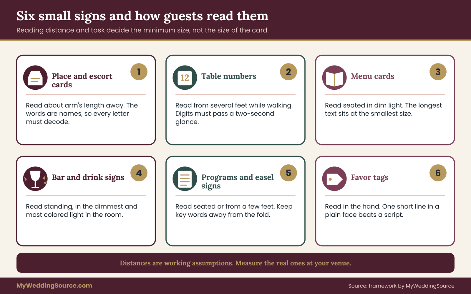
Place cards and escort cards. Read at about the distance of a hand to eye, usually a foot or two, often in a crowd around a display table. The words are names, which are the least forgiving content you will print. Escort cards are picked up from a long table where the guest is scanning many cards for one name, so scanning speed matters as much as legibility. The guide to the wedding seating chart covers how those cards fit into the seating process itself.
Table numbers. Read from further away, often from several feet and while walking, sometimes while the guest is still looking for the right area of the room. A table number needs the Glance level at a distance the card’s size can barely support, which is why numbers deserve their own treatment, covered later.
Menu cards. Read seated, in room light, from about an arm’s length. These carry the longest text at the smallest size, with dish names and sometimes allergen notes. A menu card with a fine, pale script gets held up toward a candle, which is a sign it has already failed.
Bar and drink signs. Read standing, from about arm’s length to a few feet, in lighting that is often the dimmest and the most colored in the venue. They carry prices, names of drinks and sometimes which drinks are included. The ideas in the cocktail hour guide pair naturally with a sign that guests can read without asking the bartender.
Programs, favor tags and small signs on easels. Programs are read seated, often in daylight, which is forgiving, though a folded program means the text is small and may sit near the fold. Favor tags are tiny, usually carrying a name or a short thank-you, and are read in hand. Small easel signs for a guest book, a card box or a memory table sit somewhere in between.
Name the distance, not just the object
A “table number” is not one reading task. A card on a low, centered stand is read from three feet by someone seated at the table. The same card on a tall stake in a garden might be read from twenty feet by a guest approaching across grass. Each distance changes the minimum size.
For each small sign, write down three facts before you choose type: the farthest distance a guest will realistically read it from, the lighting at that spot, and what the guest is doing while reading. These three facts, not the size of the card, set the target. The next section explains the letter features that decide whether a wedding font can meet it.
What makes wedding fonts readable at small sizes
You do not need design training to judge a wedding font. You need to know five or six features that predict how it behaves when it is small, and a way to check each one with a ruler or your own eyes. None of these features is a taste question. They are observable properties, and you can compare candidates on them the way you would compare two cameras on resolution.
Measure the x-height, not the point size
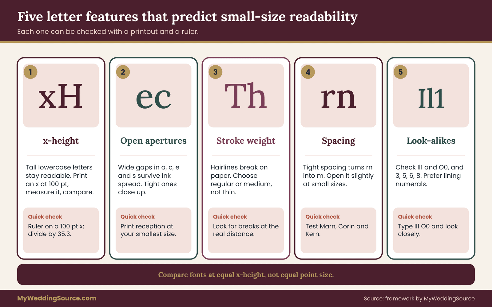
The x-height is the height of a lowercase x, which stands for the height of most lowercase letters without their ascenders or descenders. It matters because a reader recognizes words mostly by the shapes of lowercase letters, and a tall x-height makes those shapes bigger at the same nominal size. Point size, by contrast, describes the type designer’s invisible box around the letters, and designers fill that box very differently.
Here is a way to see it for yourself. Type a lowercase x in each candidate font at 100 points, print it, and measure its height in millimeters with a ruler. A hundred points is about 35.3 millimeters, so dividing your measurement by 35.3 gives a ratio. A wedding font whose x measures 18 millimeters has a ratio of roughly 0.51. A wedding font whose x measures 15 millimeters has a ratio near 0.43. At the same stated size, the first font’s lowercase letters are about a fifth taller on paper.
That difference decides a lot. Many elegant display serifs and most flowing scripts have small x-heights, which is part of why they look refined, and it is also why they shrink badly. A humanist sans-serif with a larger x-height may look plainer at big size but hold up well on a place card. When you compare wedding fonts, compare them at equal x-height, not equal point size, or you will reward the wedding font that is simply drawn larger.
Look at the openings
The openings in letters such as a, c, e and s are called apertures. In an open design, the gap is wide, so even when ink spreads a little the letter keeps its identity. In a tight design the gap is narrow, and ink spread or low light closes it, turning e into o and c into o. Check this by printing the word “reception” or “association” at your smallest size and looking at whether the e and c stay open. Words with many a, e, c and s are good stress tests.
Check the thinnest stroke
Every wedding font has thick and thin strokes. The ratio between them is called stroke contrast. High-contrast fonts, often elegant Didone-style serifs, have hairline strokes that can be a fraction of the thick ones. On paper at small sizes those hairlines can break up or vanish, especially in a pale ink, in foil or in a laser engraving.
You do not need to know the exact width. Print the sample at your smallest size, hold it at the real distance and check whether any part of any letter breaks. If a letter disappears in part, the wedding font fails at that size no matter how beautiful it is at large size. Light weights of a family, labeled thin, extra light or hairline, nearly always fail small signs, even when the regular weight of the same family passes.
Check spacing and the “rn” trap
Spacing between letters, called tracking when you adjust it, has a smaller sweet spot at small sizes. Tight spacing makes letters merge, with the classic example being r and n reading as m. Very wide spacing breaks words into pieces and slows reading, although a little extra spacing helps small text and especially helps capitals. A common beginner’s error is to track out all-caps lettering far too much to look fancy and then wonder why guests have to sound out a name letter by letter.
Test it with a name that includes these pairs: “Marn,” “Corin,” “Thorn,” “Kern,” “Lynn,” “Wm.” If your couple’s guest list holds names like these, use them in the test, because the test should use the real words you will print, not placeholder text.
The characters that get confused
Some letters and numerals look too similar in some fonts. The standard check is to type a short string and see whether each character stays distinct:
Il1 (capital i, lowercase L, numeral one) and O0 (capital o, zero). In several popular sans-serif faces, the capital i and the lowercase L are almost identical. That is a minor annoyance in a sentence and a real problem in a table number such as “11” or an access code. Some fonts add a slashed or dotted zero, a serif on the numeral one or a curved tail on the lowercase L to avoid this.
Numerals. Check these especially: 1 and 7, 3 and 8, 5 and 6, 6 and 8, 0 and 9. In scripts, numerals can be oddly drawn, and in some fonts the numerals are old-style, meaning they have varying heights and descend below the baseline. Old-style numerals look graceful in a paragraph and are poor for table numbers, because a 3, 4, 5, 7 and 9 sit lower than a 1, 2 or 0 and the number looks uneven. Look for a setting called lining or tabular figures, or choose a different font for numbers.
Weight, width and case
A regular or medium weight is the dependable range for small signs. Light weights lose strokes and bold weights fill their counters, which are the enclosed spaces inside letters like e, a and o. Semibold is often a good choice for table numbers and short headings.
Extended and condensed widths each carry a cost. Very condensed fonts squeeze the letters and reduce the gaps, and very extended fonts waste space on a small card and force a smaller point size. Normal widths are safer.
All capitals are acceptable for short labels such as “BAR” or “TABLE” and tiresome in longer text, because capitals have uniform shapes and the eye loses the word silhouette that lowercase provides. Names in all capitals at small sizes are harder than names in mixed case. If you love the all-caps look, use it for the single word that tells the guest what the sign is, and keep names in mixed case.
Italics, obliques and scripts
A true italic is often a good small-size choice, because it is drawn to be read, and fine italics at medium weight can be quite legible. Scripts are different. They are drawn to imitate handwriting, with connected letters, variable slants and looped ascenders. Monoline scripts, where the stroke has one even thickness, hold up better than high-contrast brush scripts, which have both hairlines and heavy strokes. Still, for names and numbers that a guest has to decode, scripts are a risk. The article’s pairing method handles this by limiting the script to words that carry mood.
A ten-minute pocket check
Before you run the full print test, run this quick elimination on any wedding font you like. It will remove most of the weak candidates in ten minutes.
- Type “Il1 O0 rn m 3 8 5 6” in the wedding font and check that every character differs from its neighbor.
- Type one real guest name that you know is awkward, and a table number such as “14”, and look at both at a small size on screen at one hundred percent.
- Print a single line at your smallest size and look for broken hairlines and closed apertures.
- Print the lowercase x at 100 points and note the ratio.
- Look for a regular or medium weight in the family. If the only weight you like is thin or extra light, drop the wedding font.
A wedding font that survives all five checks is a candidate worth the full test. A wedding font that fails two or more is better saved for the large welcome sign or the invitation header.
Contrast, paper and light change the letters
A wedding font is not read in a vacuum. It is read as ink on paper under a specific light, and the same font can pass in one setting and fail in another. This is worth a section of its own because the weakest link on many small signs is not the typeface, it is the color or the surface.
Contrast between letters and background
Contrast is the difference in lightness between the ink and the paper behind it. It is not about how different the colors look; two colors of very different hue can have nearly the same lightness, and then the letters are hard to read even though the colors seem to differ. Dusty blue on sage, or blush on cream, are typical wedding combinations that look soft and read poorly.
The Web Content Accessibility Guidelines, published by the World Wide Web Consortium, give a numeric target for screens: a contrast ratio of at least 4.5 to 1 for normal-size text and 3 to 1 for large text. Those rules were written for screens, and a printed card is not a screen.
Still, they are a useful reference point. If your chosen text color and paper color fail the screen thresholds when you check them with a free contrast checker, they will probably fail on a dim reception table too, since printed ink usually reaches less contrast than the digital file.
This is where your color decisions and your wedding font decisions meet. If you have already chosen a palette, as described in the wedding color palette guide, choose one dark tone from that palette for all small-sign text and one light tone for backgrounds. Keep the lighter accent colors for decoration, borders and the big words.
Ink on paper behaves differently from ink on a screen
Several surface effects matter at small sizes.
- Ink spread. On uncoated, textured or handmade paper, ink spreads along the fibers and thickens strokes slightly while closing apertures. Fine type can look slightly blurry. A heavier regular weight often prints better here than a light one.
- Texture. Heavily textured paper breaks up thin lines. Test on the real paper, not on a smooth substitute.
- Gloss and sheen. Glossy cards reflect light and can turn dark text pale at certain angles. Matte stock is the more reliable choice for small signs.
- Foil, metallic ink and embossing. These look wonderful on large type and can wipe out detail at small sizes. A rule that works is to keep foil and metallic effects to large, simple elements and keep necessary information in plain dark ink.
- Reverse type. Light letters on a dark background look dramatic, but small light letters on dark fill in poorly when ink spreads, because the background spreads into the letters. If you want reverse type, use a heavier weight and a larger size than you would for dark on light.
Light in the room
Receptions are often lit warmly and dimly. Candles add flicker. Colored uplighting changes the apparent color of both ink and paper, sometimes eliminating contrast between two colors that seemed different in daylight. Outdoor signs face the opposite problem, with bright sun that washes out pale ink and throws shadows from the sign’s own frame.
You cannot control the light fully, but you can test for it. When you run the print test later, run at least one round in something like the real light: a dim lamp for a candlelit dinner, a shaded outdoor spot for a garden sign. If the sign reads at a desk and fails in the evening, the evening is the one that counts.
Guests photograph signs
One more reading condition is easy to forget: guests will photograph the signs and read the photograph later. A sign that depends on a fine detail may disappear in a phone picture taken at an angle. A sign that is clear to the eye but unreadable in a quick photograph is, in a practical sense, less useful. The photography test for glare in reflective materials is a topic of its own, but for ordinary paper signs, a quick phone photo at arm’s length is a useful bonus check. If the words survive the photo, they are generally robust.
Pairing wedding fonts by job, not by mood
Most advice on font pairing talks about mood: a romantic script with a classic serif, a modern sans with a handwritten accent. Mood matters, but it is a poor guide for small signs, because it tells you which fonts look good together and nothing about which can be read together at five feet. The method here starts from a different question. What work does each line on the sign have to do?
The three-role method
Almost every small wedding sign can be built from three roles. You rarely need all three on one sign, but you should assign all three across the whole set before choosing any wedding font.
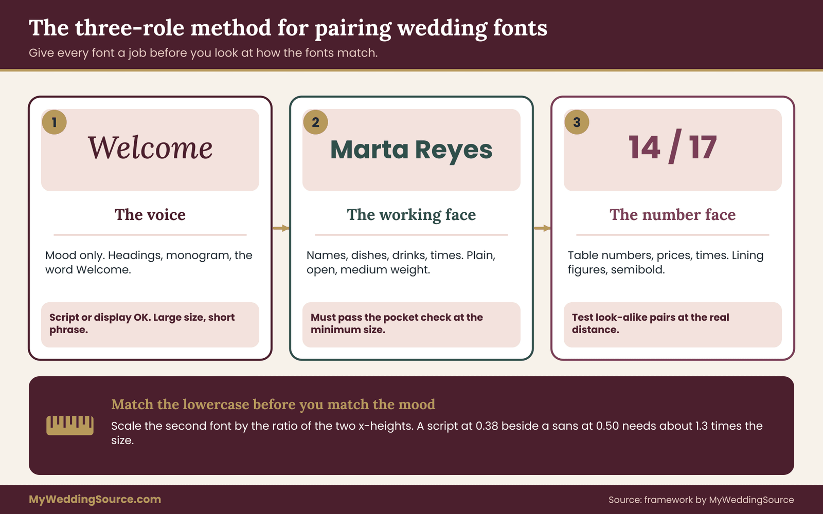
The voice. This is the expressive font. It carries mood and nothing a guest must decode. Examples are the couple’s names on a menu header, the word “Welcome,” a monogram, the heading “Cheers” on a bar sign. The voice can be a script, a decorative serif or a display face, and it is the only role where thin strokes and flourishes are allowed. It is used large, in short phrases, and only where the reader already knows what it says or can lose it without harm.
The working face. This font carries information: guest names, dish names, drink names, times, instructions. It is the one the test above is mostly about. It needs a generous x-height, open apertures, medium weight, plain shapes and distinct characters. It can be a sans-serif or a sturdy serif, as long as it passes the pocket check. This is where most of your small-sign words live, so most of your attention belongs here.
The number face. This font carries table numbers, prices, times and anything else made of digits. Often it is the same as the working face, provided the working face has clear lining numerals. If not, choose a separate font whose numerals are unmistakable, a semibold weight and tabular, even-height figures. Numbers deserve their own role because a wrong digit is a worse failure than a wrong letter. A reader can often guess an unclear word from context, but a digit has no context.
Notice what this method does. It permits you to love a delicate script, because the script is only allowed to do decorative work. It keeps the risky letters away from the words that cannot afford a misread. And it gives your designer a clear brief, because each wedding font has a defined job.
Use two fonts, sometimes three, almost never four
Two fonts, one voice and one working face, cover most small-sign sets. A third, for numbers, is justified only when the working face has weak numerals. A fourth rarely adds anything and often adds clutter, along with more licenses to manage and more things for a printer to get wrong.
If you feel the urge to add a fourth, ask what job it would do. If the answer is “it would look nice with the invitation,” that is a style answer, and it belongs on the invitation. For the small signs, simpler is safer.
Match the x-heights before you match the mood
Two fonts at the same stated size usually look unequal because their x-heights differ. Place a small-x-height script beside a large-x-height sans at the same point size and the sans will look huge and the script tiny. Designers often fix this by eye. You can fix it with arithmetic, using the ratios you measured earlier.
The rule is to scale the second font by the ratio of the first font’s x-height to the second’s. Suppose your working face has an x-height ratio of 0.50 and your voice font has 0.38. To make the lowercase letters of the voice appear the same size as the working face’s, set the voice at about 1.3 times the point size, since 0.50 divided by 0.38 is about 1.32. If you set the working face at 12 points, the voice font at about 16 points will look matched.
You will not always want matched sizes. The voice is meant to stand out, so you might set it larger on purpose. The point is that you are making that choice knowingly, rather than letting two arbitrary type designers decide how big your words look.
Contrast the structure, not the noise
A good pairing contrasts in structure. A script and a plain sans-serif contrast clearly: one is flowing and connected, the other is upright and separate. A serif and a sans-serif can also contrast clearly. What does not work is pairing two fonts that are similar but not the same, such as two different serifs with slightly different proportions, because the eye reads the difference as a mistake instead of a choice.
Another warning sign is two decorative fonts together. Two scripts compete, and two display faces cancel out. One decorative font per sign is a reliable limit.
A few categories that tend to work
The following are categories of font, not endorsements. Test any candidate with the pocket check before you commit, and check the license on the supplier’s own page.
- A monoline or lightly contrasted script for the voice, with an open construction and a medium stroke, rather than a high-contrast brush script with hairlines.
- A humanist sans-serif for the working face, meaning a sans with open apertures, varied stroke width and distinct characters. Families such as Source Sans or Lato are widely used examples of the category, and each has a regular and a semibold weight.
- A sturdy text serif for the working face, with a generous x-height and moderate stroke contrast, for a more traditional look. Lora is one example of that category.
- A semibold sans with lining numerals for the number face, which can simply be the semibold weight of the working family.
Categories that need caution at small sizes include very high-contrast display serifs, hairline weights of elegant serif families, ornate blackletter used for names, and all-capital wide-tracked scripts. Any of these can be right for a large heading. For a small card, they need to prove themselves on the print test.
Why one family can be the safest choice
If you do not want to manage pairings at all, consider a single family with several weights and an italic. A good family offers a regular, an italic, a semibold and sometimes a light or a display cut, all designed together, with matching x-heights, consistent spacing and a single license. You can use the display cut or the italic as the voice and the regular as the working face. The result looks coordinated, because it is, and it removes the x-height mismatch problem altogether.
The cost is less contrast between roles, so the voice may feel less special. If your overall wedding identity is already carried by color, paper and layout, a single family on the small signs is a quiet, dependable choice. If the voice font is a major part of your look, as with a hand-lettered monogram or a custom script, keep it and pair it with a working face by the rules above.
Choosing wedding fonts when you are working from a template
Many small signs are not designed from scratch. They come from an online template, an invitation suite, a printable bundle, a stationer’s standard layout or a sign shop’s catalog. Templates change the process in a few ways, and they are worth handling separately.
Fonts in templates are often chosen for the thumbnail
Template makers choose fonts to make an attractive preview, and previews are shown at a size where nearly any wedding font looks good. That means template fonts lean toward fine scripts and thin serifs. Treat the pairings in a template as a starting suggestion, not a tested solution. You are generally free to change the wedding font, and you should if the working text fails the ladder test.
Replacing a wedding font in a template safely
Replacing a wedding font in a template can reflow the text. A wedding font with a larger x-height will often be wider as well, so a name that fit on one line may wrap, and a line that was centered may break awkwardly. Plan to re-check every sign after the swap, not just a sample. In particular, check the longest name, the longest dish and the largest number, since those are the ones that overflow first.
Check what the template actually permits
Some template platforms include fonts under their own licenses that cover use inside the platform but not in files you send to an outside printer. Others allow printing at home or at a commercial shop. Terms vary, so read the template’s license and the wedding font’s license before you finalize anything. The section on vendor questions later in this guide lists the specific questions to ask. If you are commissioning custom lettering, the license is a separate matter again, since the artist’s work has its own terms.
When a template’s font is not available to your printer
A recurring failure is that the file looks right on your screen and prints in a substitute font at the shop, because the printer’s computer does not have the wedding font. The fix is simple. Ask your designer to supply a PDF with fonts embedded or converted to outlines, and review the proof at actual size. The details come up again in the vendor section.
A worked pairing decision
To see the three roles working together, take an invented couple, Marta and Dev, planning a dinner for eighty with a candlelit reception room. They are not real people and the numbers are illustrations, not data. They want a hand-lettered feel, and they need table numbers, place cards, a menu card and a small bar sign.
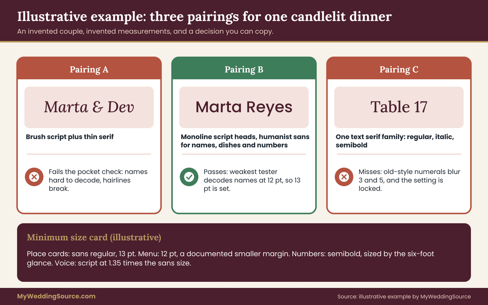
They start with three candidate pairings, which the next sections test. Pairing A uses a high-contrast brush script for everything on the place cards, with a thin serif for the menu. Pairing B uses a monoline script for headings only, a humanist sans in regular and semibold for the names, dishes and drinks, and the semibold for numerals. Pairing C uses a single serif family in regular, italic and semibold.
Before any printing, they apply the pocket check. Pairing A fails at once on two counts: the script’s names are hard to decode in the string “Marn, Corin, Kern,” and the thin serif breaks at small size. They keep A only for the large welcome sign. That leaves B and C for the full test.
Their reasoning at this stage is the model for how you can use the roles. They did not ask which pairing looked prettiest. They asked which fonts could do each job, assigned the jobs, matched the x-heights by measurement and eliminated the ones that failed a quick check. The full ladder test then decided the sizes, which we turn to now.
The size ladder print test for wedding fonts
The size ladder is a simple, original procedure for finding the smallest size at which your chosen wedding fonts are still safe. It uses a printer, your real paper and two or three willing people. It takes about an hour, including printing, and it replaces guessing with a number you can write down and hand to a vendor.
It rests on one idea: a minimum size is not a property of a wedding font. It is a property of a wedding font, on a surface, in a light, at a distance, for a reader. Change any of those and the minimum changes. So the test fixes all of them to match your real wedding, and varies only the size.
Step one: build the test sheet
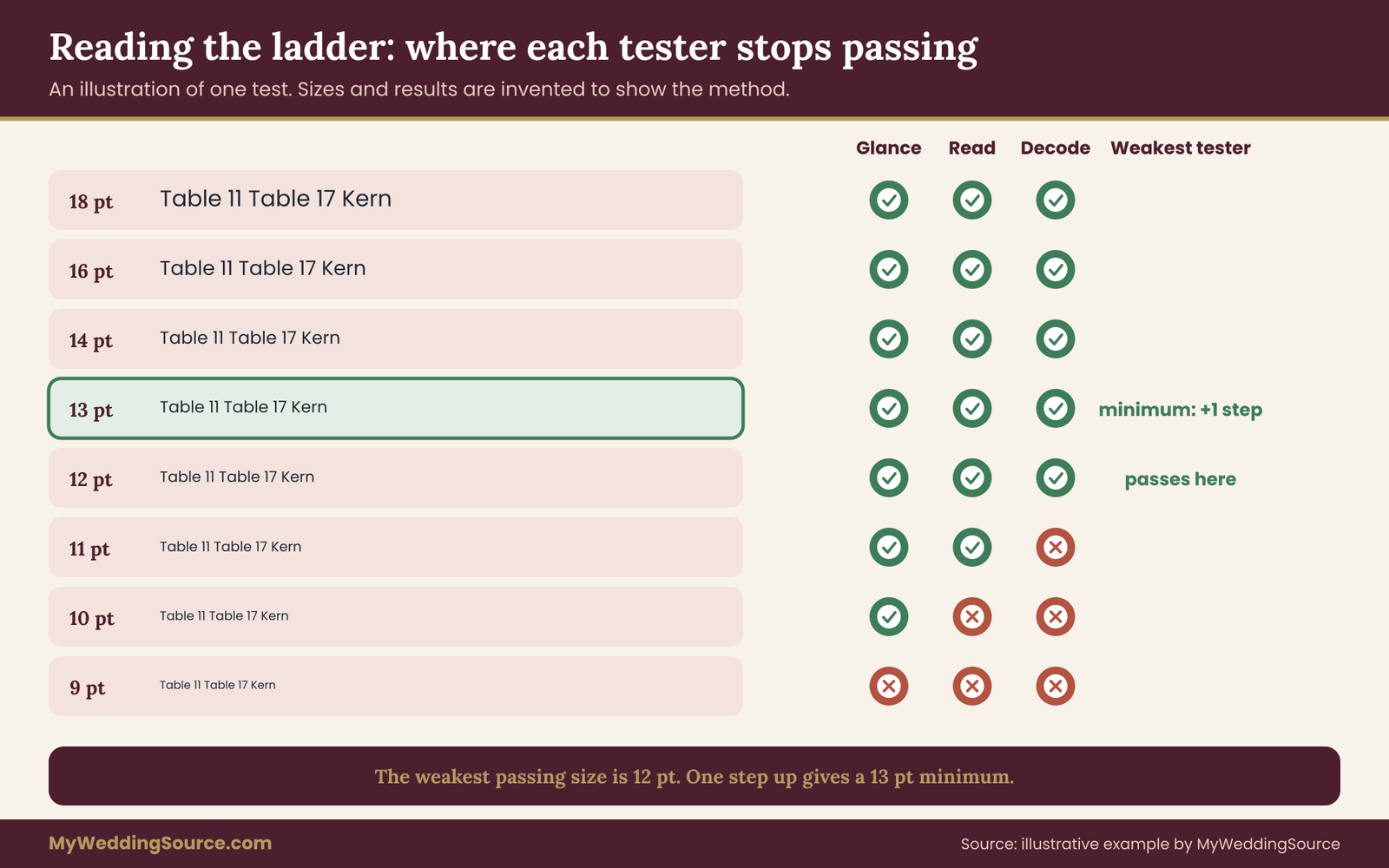
Make a single page, or a few, containing one block for each candidate pairing. Each block holds the real content from your signs, set in the real fonts, at a ladder of sizes, stepping down from comfortable to uncomfortable. A workable ladder for text is eight to ten steps, for instance 20, 18, 16, 14, 13, 12, 11, 10 and 9 points for the working face, with the voice and number fonts scaled by the x-height ratio so they match.
Include these strings in every block, because each one tests a different failure.
- The longest guest name and an awkward name. Names with rn, ll, il, ij or similar pairs, and one name with an accent or unusual letter. Use real names from your list.
- A similar-number pair. For example “Table 11” and “Table 17,” or “Table 8” and “Table 3,” placed next to each other so a misread shows up.
- A dish line with an allergen note. Something like “Roasted carrots, tahini, gluten-free,” which has small words and commas.
- A drink line with a price or a label. Such as “House red, included” next to “Signature cocktail, 12,” so the digits and the small words are both tested.
- The confusion string. “Il1 O0 rn m” in the wedding font, as in the pocket check.
Do not use placeholder text such as “lorem ipsum” or “Guest Name.” Placeholder words are familiar and tell you nothing about decoding.
Step two: print it the way the real sign will print
This step is where most home tests go wrong, so slow down here.
- Print at actual size. In the print dialog, choose “actual size” or one hundred percent, not “fit to page.” A scaled print gives you a false minimum.
- Use the real paper. If your cards will be on textured cotton stock, print on that stock, or a sample of it, from the printer’s sample pack. If the printer cannot send a sample, ask for a small test print. A smooth office paper hides problems that textured paper shows.
- Use the real ink color. If the final text is dark plum on cream, print dark plum, not black. If the final ink will be foil or metallic, ask the printer how fine a line that process can hold, and test with a stand-in dark ink while you wait for an answer.
- Match the finish. If the cards will be matte, test matte. If they will be glossy, test glossy, and look at them under the same light.
A home inkjet or laser printer is not a perfect stand-in for letterpress, digital press or screen printing, and it will not show you how a commercial process holds a fine line. That is acceptable. The test finds the minimum for readability, and the printer’s proof then confirms that the process can reproduce it. Treat the home print as the first gate and the printer’s proof as the second.
Step three: test at the real distance, in the real light
Place the sheet on a wall or table and have each tester stand at the reading distance for that sign. Use a tape measure rather than a guess. For a place card, that may be an arm’s length, around two feet. For a table number, it may be five or six feet. For a bar sign, perhaps three or four feet. These are working assumptions for planning, so replace them with what you measured at your own venue.
Match the light as well. For an evening reception, dim the room, or use a lamp that approximates a candlelit table. For a morning garden sign, test outdoors in shade, with the paper held in the position it will stand.
Step four: have a tester read it cold
The tester should be someone who has not seen the content and does not know what the sign should say. A friend who has not been involved in planning is ideal. For useful results, include at least three testers, and make sure at least one wears reading glasses or struggles with small print in dim light. Their trouble spots are the ones some of your guests will share.
Ask the tester to do three tasks, from the largest step down to the smallest, and record where each one first fails.
- Glance. Show a table number or one-word label for two seconds, then cover it. Ask what it said. The first step at which the tester is wrong or unsure is the glance limit.
- Read. Ask the tester to read a full dish or drink line aloud at a natural pace. Note the step at which they hesitate, lean forward or slow down.
- Decode. Ask them to read the names and similar-number pairs aloud. Note the first step at which they mix up any pair or guess a letter.
These thresholds are criteria for this test and not scientific norms. They are useful because they are consistent: you apply the same standard to every wedding font and every tester, so the comparison is fair.
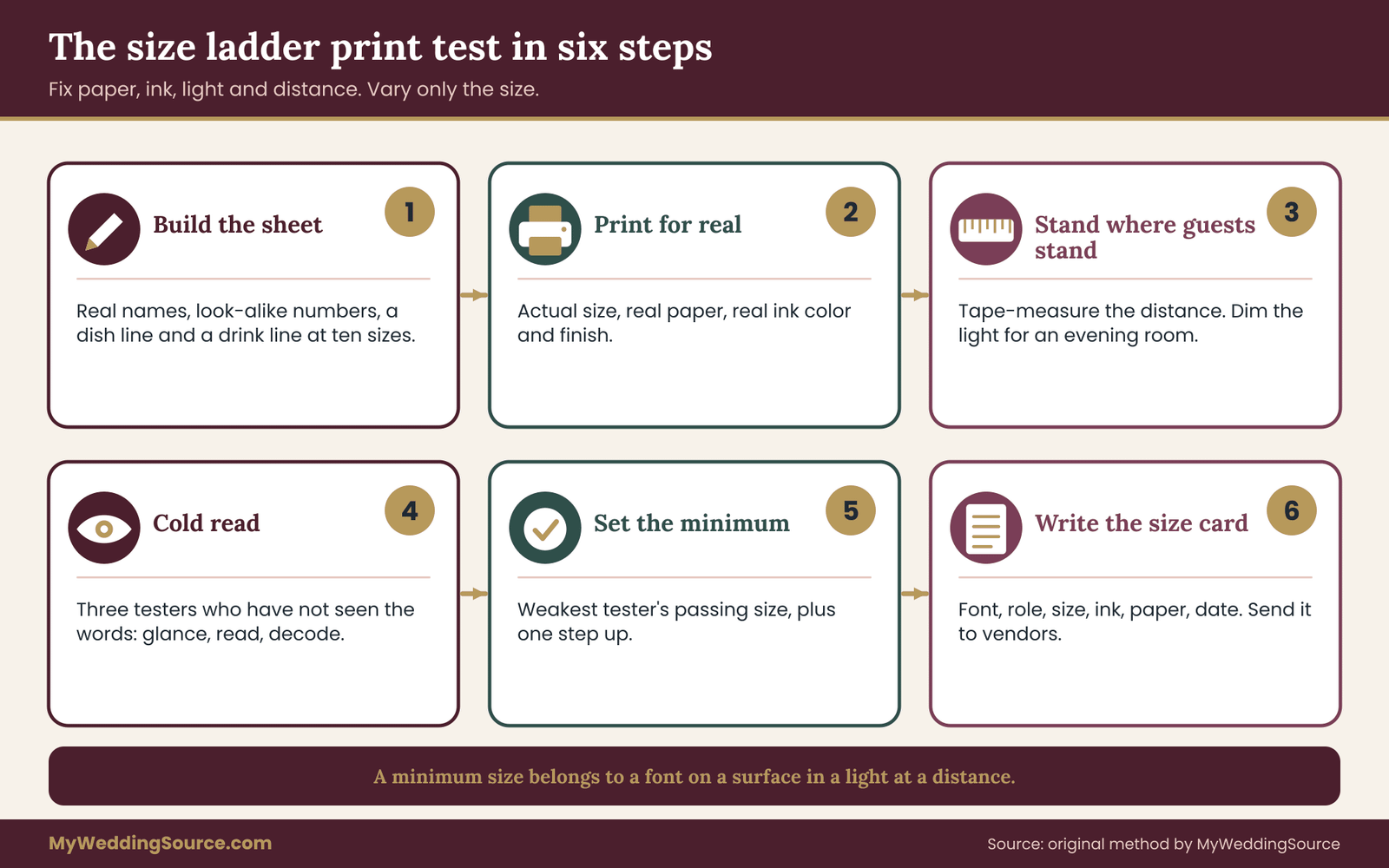
Step five: set the minimum with a margin
For each pairing and each role, you now have a failure step for each tester. Take the smallest step that the weakest tester passed on all three tasks, and then go up one step to the next larger size. That is your minimum size for that font in that role.
The extra step is the margin. It covers things your test cannot fully reproduce: the guest who is tired at the end of the evening, the lighting that turns out dimmer than you tested, the ink that prints a little lighter than the proof, the guest who left reading glasses at the table. A margin of one ladder step is a modest price for those risks.
If the weakest tester passes only at the top of the ladder, the wedding font fails for that role at the card size you have. At that point you have three honest options: use a larger card, use fewer words, or use a different font. The section on what to do when the test says no returns to this decision.
Step six: write the minimum size card
Finish by writing a short sheet, one per sign type, that you can send to your designer and printer. It has five lines:
- The sign and its reading distance.
- The wedding font for each role, with weight and style.
- The minimum size for each role, in points, with the x-height ratio.
- The ink and paper the test used.
- The date of the test and who read it.
This card is the deliverable of the whole method. It is what makes a wedding font decision enforceable, because a designer cannot quietly drop the size to make a name fit when the card says that size is the floor. It also protects you in a dispute: if a printer delivers a sign below the stated minimum, you have a written standard to point to, as described in the wedding vendor contract guide.
Reading the results without fooling yourself
The test is only as good as your honesty with it. A few habits keep the results reliable.
Do not coach the tester
If you tell the tester what the sign says, you have thrown away the cold read. If you cannot resist hinting, ask a friend to run the test while you stay out of the room. The most common failure of this test is the helpful planner who says “it’s the one with the third table” and turns a decoding task into a confirmation task.
Test the worst case, not the average
Pick the longest name, the busiest line and the most similar numbers. A wedding font that handles an average line handles the average guest. You are looking for the one name that wraps, the one dish that crowds and the one table number that gets confused. The worst case sets the minimum, because a guest will meet it.
Look at the whole set, not each sign alone
Run the final sheet again with the minimum sizes applied, and view it as a set. Small signs sit side by side on a table or a wall, and inconsistency between them looks accidental. If the table number is set far larger than the place card for good reason, that is fine. If the bar sign and the menu use different working faces for no reason, that is a flaw that the test did not catch.
Re-run after any change
Any change to font, paper, ink, size or text invalidates the earlier result. If the printer swaps the paper for a similar stock, if the venue changes a menu item to a longer name, or if you decide to switch the ink from black to a softer plum, run at least a short version of the test again. A five-minute re-check is far cheaper than a reprint.
What a pass does not prove
Passing the ladder means the wedding font is readable at the tested size by the testers you used under the conditions you set. It does not prove that every guest will read it easily. It does not cover guests who rely on assistive tools, or on sign-reading help from companions, or who read in another script. It reduces the risk, and the margin step reduces it further. For a deeper look at accessibility choices, the broader signage guide on this site places this test within the full set of sign decisions.
A worked example: three pairings through the size ladder
Return to Marta and Dev, the invented couple from the pairing section. Everything in this example is an illustration of the method. The names, measurements and results are made up to show how the reasoning runs, and they are not data from any real event or study.
They have a dinner for eighty at ten tables in a candlelit room. Their small signs are ten table numbers on stands, an escort card display, a place card for each guest, a menu card at each setting and a small bar sign. After the pocket check, two pairings remain.
Pairing B. A monoline script for headings, a humanist sans in regular for names and dishes, and the same family’s semibold for table numbers and prices.
Pairing C. A single text serif family in regular, italic and semibold, with the italic used as the voice.
They print one sheet for each, on the actual cotton stock sample the printer sent, in the actual dark plum ink color approximated by their printer, and read it in a dim room lit by a single lamp.
Measuring first
They measure the x-height at 100 points. Pairing B’s sans gives them an x of 17.5 millimeters, a ratio near 0.50. The monoline script gives 13 millimeters, a ratio near 0.37. To make the lowercase letters match visually, they scale the script by 0.50 divided by 0.37, about 1.35 times the sans size. Pairing C’s serif family measures about 16 millimeters, a ratio near 0.45, and its italic is close to the regular’s, so no scaling is needed.
The three tasks
Three testers read the sheets cold, standing where the cards will be read. Dev’s sister, who wears reading glasses, is the weakest reader by design.
For the place cards at two feet, Pairing B’s sans passes Glance and Read at all ladder steps down to 11 points for all three testers, and decoding the awkward names passes down to 12 points. The weakest tester fails decoding at 11 points, mixing up “Kern” and “Kem.” Pairing C’s serif passes Glance down to 11 points and Read down to 12 points. The weakest tester fails decoding at 12 points, mistaking an italic “Corin” for “Cohn.”
For the table numbers at six feet, the semibold sans digits pass Glance at all sizes down to a number about three times the height of the place card’s lettering. The testers confuse “11” and “17” in the lighter regular weight and not in the semibold. Pairing C’s numerals are old-style by default, and the tester misreads the 3 and the 5 at a distance. They would need a feature setting for lining figures, which their template does not expose.
For the menu card at arm’s length in low light, the sans at 11 points passes for two testers and fails for the weakest, who passes at 12. The serif at 12 points passes for all three but the line looks crowded in the allergen note.
What they decide
Their minimum size card sets the following. Working face on place cards: the sans, regular, at 13 points, which is one step above the weakest tester’s 12-point decoding pass. Working face on the menu: the sans at 12 points, since the weakest tester passed at 12 and the room will be lit with a little more light at seated tables than at the entrance.
This is a case where they decide to accept a smaller margin on the menu, and they write down that decision, so they know it. Numbers: semibold sans, at a size set by the six-foot Glance result. Voice: the monoline script, at about 1.35 times the sans size, restricted to names in headings and the word “Welcome.”
Pairing C is not discarded as bad; it is discarded for this room and these signs, because the template’s old-style numerals cannot be switched and the weakest tester’s decoding limit is higher. It might work well in a brighter daytime wedding with larger cards.
What the example shows
Three features of this decision generalize.
First, the decision came from measured differences, not from taste. The two pairings looked equally attractive, and the test broke the tie.
Second, the minimum was set by the weakest reader, not the average. That is deliberate. A sign the weakest reader can use is a sign everyone can use.
Third, the couple recorded a decision to accept a smaller margin on one sign. They did not treat the margin as a law. They treated it as a default they could override with a reason and a note, which is how a rule should work for real people with real budgets.
Sign-by-sign rules for wedding fonts
The method applies the same way to every sign, but each format has its own habits. The rules below are working defaults to begin the test, not substitutes for it.
Place cards and escort cards
Use the working face for names, in mixed case, at the size your test supports. Put the table number or the seat in the number face, not the voice. Avoid scripts for names, or set the script large and print the table number in a plain face beside it, so that a guest who cannot decode the name still knows where to go. If you have guests whose names include accents or non-Latin letters, check that the wedding font includes the characters, since a missing character is silently replaced with a different font’s glyph or a blank box.
On escort cards that guests scan from a long table, keep the first letter of the surname or the sort key easy to see. Guests find their name by scanning the alphabet, and a flourished capital can turn a K into an R in a rush. The seating process itself belongs to the seating chart, and the type just needs to make the sorting key obvious.
Table numbers
These get the number face in semibold or regular, lining figures, at the largest size the stand allows. Resist ornament around the number. A number inside a decorative wreath is fine if the wreath stays quiet and the number stays large. If you write “Table” beside the number, keep the word small and the digit large, since the digit is the information. Test pairs of adjacent numbers, such as 6 and 8, 3 and 8, 1 and 7, at the real distance.
Consider number words instead of digits where the style allows, such as “Eleven” and “Seventeen,” because the shapes are very different. Words are slower to read at distance, however, so test them. A name for each table, such as a street or a flower, avoids the digit problem entirely and brings its own test: the names should differ in their first letters and lengths.
Menu cards
The menu card carries the longest text at the smallest size. Use the working face for every dish line, and keep the voice for the heading and perhaps the course names. Keep the line short, since long lines at small size cause the eye to lose its place. Set a comfortable space between lines, because tight line spacing on a small card makes ascenders and descenders touch.
Put dietary notes in the same working face, at the same size as the dish, and not smaller in light gray, because the allergen note is the part where a misread matters most. The guidance about wedding invitation etiquette offers a useful starting point on how formal wording flows, and the menu can borrow that tone without borrowing its small, formal type.
Bar and drink signs
Bar signs often fail because they combine a decorative font, a small size, and low light. Put the drink names in the working face and the prices or “included” labels in the number face. Keep the list short. If you offer both free and paid drinks, the wedding font choice should make the difference clear at a glance, by weight rather than by color alone, since colored lighting can alter colors.
Programs, tags and easel signs
Programs are read seated and often in daylight, so they tolerate slightly smaller type, but the fold is a hazard: do not put the key words near it. Favor tags are small and read in hand, so a short message in the working face beats a long one in a script. Easel signs for a guest book or card box are read from a few feet and should follow the table-number logic, with large type and few words.
Vendor questions and file checks for wedding fonts
A good test result is worth little if it does not survive the handoff to the people who make the signs. Between your decision and the finished card sit a designer, a printer or sign maker, and sometimes a calligrapher or a laser shop. Each can change your wedding fonts without meaning to. The questions below keep the minimum size card intact.
Questions for your designer or stationer
Ask these before you pay for design work, and get the answers in writing.
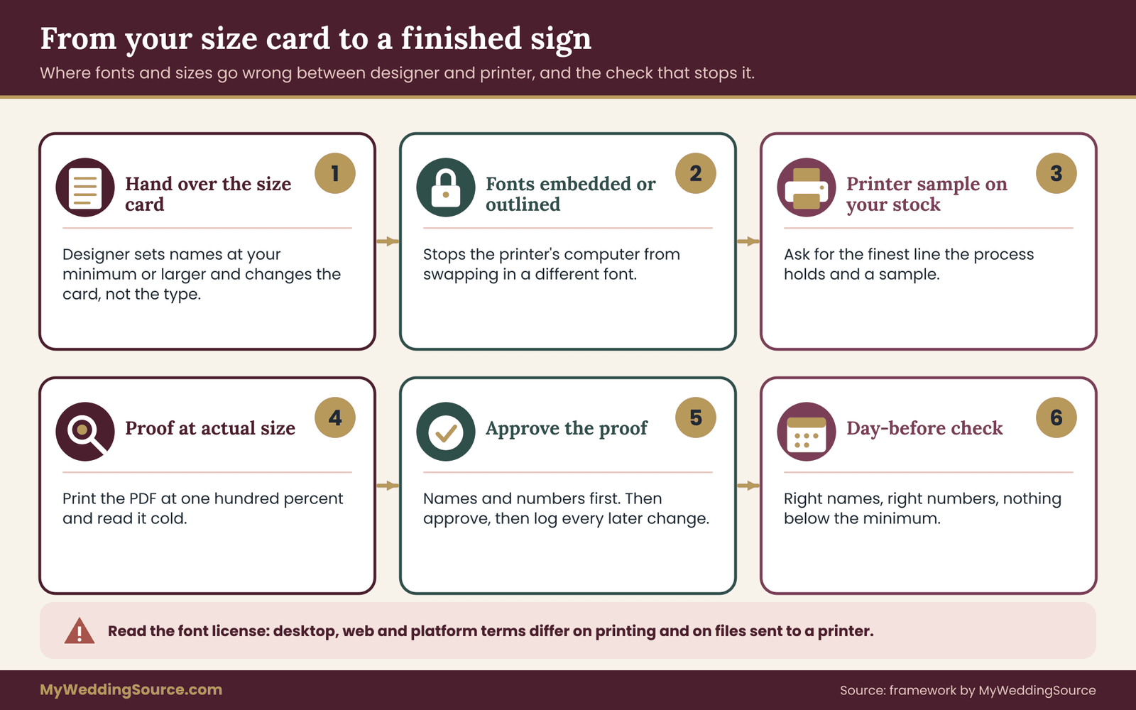
- “Which fonts will you use, and for which roles?” A good designer can name each wedding font, its weight and its job. If the answer is “I’ll pick something that matches,” ask for a specimen first.
- “Can you set the sizes to my minimum size card?” Hand over the card. If a name or a dish will not fit at the minimum, ask the designer to adjust the layout or the card size and not the type size.
- “Will you send a proof at actual size?” A proof viewed on screen at fit-to-window is not a proof of small type. Ask for a PDF that prints at one hundred percent, and print it yourself.
- “How many rounds of changes are included, and what does a wedding font change cost?” A wedding font swap after approval can mean redoing every sign, so it is worth knowing when the price changes.
- “Who holds the font license, and does it cover commercial printing?” Covered in the licensing section below.
A script that keeps the conversation friendly: “We tested these fonts on our real paper, and the smallest size our readers could decode was twelve points for the working face. Could you set all the names at thirteen or larger, and tell us if any card needs a bigger format to fit?” That is specific, polite and gives the designer a clear constraint to design around rather than a vague complaint to react to.
Questions for the printer or sign maker
The printer controls how the letters turn into ink or material. Ask:
- “What is the finest line or smallest text size your process holds cleanly?” For foil, letterpress, engraving and laser cutting, there is a technical floor, and it may be larger than your minimum.
- “Can I see a printed sample on this stock?” A sample from the same press, paper and ink is the best proof. The wedding invitation printing guide explains how proofing and handoffs typically work, and the same logic applies to small signs.
- “Do you need outlined fonts or embedded fonts?” A printer that opens your file on a computer without your wedding fonts will substitute others, and the substitute may be larger, smaller or wider. Ask for a PDF with fonts embedded or converted to outlines.
- “Will you print a proof at actual size before the full run?” For a small run of place cards, a single proof sheet is inexpensive compared with reprinting everything.
- “What happens if the final product is below the agreed size or unreadable?” This is a contract question, and the answer decides who pays if the cards must be redone.
Outlined fonts, embedded fonts and the substitute problem
Font substitution is the most common technical cause of a sign that looks different from the proof. It happens when a file refers to a wedding font by name and the computer opening it does not have that font. The software quietly uses another one, and every width and spacing changes.
There are two reliable fixes. Embedding places the wedding font inside the PDF, so any viewer shows it correctly. Converting to outlines turns the letters into shapes, so no font is needed at all, though the text can no longer be edited. Either way, review the final PDF yourself on a different computer or at least in a PDF viewer, and look at whether the fonts match the approved version.
If a name is misspelled, outlined text means a new file, which is another reason to run the name checks before outlining. The rule is simple: approve a proof only after the last text change.
Calligraphers and hand lettering
Hand-lettered place cards are a special case, because there is no font to test. The test is still possible. Ask the calligrapher for a sample of the same style, at the same size, on the same paper, writing a few of your hardest names. Then run the same cold read on that sample. Some calligraphy styles read well at small size; others, such as heavily flourished or very slanted hands, do not. A calligrapher will usually welcome a request for a readability sample, and one who objects to it is telling you something.
If a calligrapher will scan and digitize writing for printing, ask who owns the files and what the license allows, since the digital version of their handwriting is their work.
Keep a change log
Small signs change often. A guest cancels, a name is corrected, a dish changes. Keep a simple log of each change, the date and the version of the file, so the printer is always working from the current one. Tie each change to a written approval, so nobody has to remember who agreed to what.
Font licenses, copying and what you may use
Fonts raise questions that most wedding materials do not, because a wedding font is both a design and a piece of software, and the rules for each differ. This section is a plain orientation, not legal advice. For specific decisions, read the license that comes with your wedding font and ask the supplier.
A typeface design versus font software
In the United States, the Copyright Office’s circular on works not protected by copyright says that typeface designs as such are not registrable, though the computer files that produce the fonts can be protected as software. In practice, this means the shape of letters is generally not protected, but the digital font file is, and its license controls what you may do with it. The Copyright Office’s website explains these distinctions, and its guidance is the right place to confirm current treatment.
For a couple, the practical point is simple. You usually cannot copy or share a font file, and you must follow the license that came with it. Whether you may print the wedding font on a product sold commercially is a license question and not a copyright question.
The common license types
Terms differ, so treat this as a map and read the real terms.
- Open licenses. Some fonts are released under open licenses that allow use in print, including commercial printing, and permit sharing under conditions. Many fonts offered through large free libraries fall into this group. Read the specific license for the specific font.
- Desktop licenses. A typical paid font license allows you to install the wedding font on a certain number of computers and use it to create documents, including printed ones. Check whether printing for a one-time personal event is covered, and whether there is a limit on the number of copies.
- Web and app licenses. These apply to fonts on websites or apps, and they are separate from print licenses. A wedding website font license does not automatically cover printed signs.
- Platform licenses. Online design platforms and template marketplaces offer fonts under their own terms, which often cover printing from the platform or through their print service but may not cover exporting a file to a different printer.
Ask the font supplier or the template seller in writing if the terms do not clearly cover your use. For monograms and custom lettering, the same questions apply, and the answers should be in writing.
Do not copy protected artwork
A friendly reminder that sits next to licensing: do not copy someone else’s logo, crest, illustrated lettering or distinctive artwork to build your signs, even if you like it, unless you have permission. A well-known brand’s lettering style may be protected as a trademark or as artwork. Choose a wedding font that evokes the feel you like, rather than reproducing a particular brand’s wordmark. If a designer offers to “match” a famous logo, ask what they will actually use.
Where the money question lands
Licensing costs are small beside the cost of a reprint, but they are not zero, and the decision is easy to get wrong in both directions. Using a pirated or mislicensed font to save a little invites a takedown notice or a printer who refuses the job. Paying for a premium family when a free, well-made family would pass the test spends money for a look the guests will not notice.
The test result is the tiebreaker: choose the cheapest font, including a free one, that passes at your minimum size, and pay for a premium one only when the test shows that it solves a real problem.
Edge cases that change the answer
The ladder test handles most situations. The following cases need a small adjustment.
Long names and long dish titles
A long name forces a choice among a smaller size, a wider card, a second line and a different font. Rank those in that order of preference: wider card, two lines, different font, smaller size. Shrinking the type is the last resort because it attacks the thing the test protects. A narrower or condensed version of the working face is acceptable if it passed the test at the size you will use.
Names with accents, diacritics and non-Latin letters
Many decorative fonts lack accented characters, or draw them poorly. When a wedding font does not have a character, software may swap in another wedding font for that letter, producing a visible mismatch, or print a box. Include these names in the test sheet and check each glyph at the printed size. Where the voice font lacks a character, set that name in the working face. A name that is misspelled by a wedding font limitation is a failure of the sign, however pretty the rest.
Left-to-right and right-to-left scripts together
If a sign carries two languages or two scripts, test each at its own minimum, since the same point size can look very different across scripts. A sign with Latin and another script needs a wedding font for each, chosen with the same role logic. Ask a reader of the second language to run the cold read, and avoid judging it yourself. A sign set up this way is a case where one fluent tester matters more than three casual ones.
Very small tags and favors
At the size of a gift tag, the minimum size may exceed what the tag can hold in a script. Use a plain face and a single short line, or print the name in the working face and leave the voice for a small ornament. If the tag is the only place for a name, test it even more strictly than a place card.
Curved text, rotated text and vertical text
Text on a curve, text set sideways and stacked vertical lettering all slow reading. Reserve them for decorative words, set the necessary information horizontally and test any curved text at the real distance.
Dark backgrounds, photos and busy artwork
Text laid over a photo, a pattern or a gradient loses contrast unpredictably. If you must put words over an image, add a plain panel behind the text and test again. A background that looks quiet on a screen may carry heavy texture in print.
Handwriting by guests
Chalkboards, signing boards and guest-written cards are outside the font method, though a similar logic helps. Give the writer a simple guide, such as printing instead of cursive and one idea per line, and test a sample.
Guests with low vision or reading differences
Some guests need larger type, higher contrast and plainer letterforms than the typical reader. The ladder’s margin step helps, though it does not replace thoughtful placement, lighting and a large-print alternative where needed. A simple help is a larger-print copy of the menu available on request. Mention it to the caterer so staff can hand it over easily. For more on sign placement choices, the wedding signage system guide is the wider reference.
When wedding fonts and the test disagree
Sooner or later the test will tell you something you do not want to hear. The script you love fails at decoding. The foil you paid a deposit for cannot hold the working text. The place cards your mother-in-law wants in her favorite hand will not pass. This section gives you a decision order and some language for those moments, because the hard part of the method is not running the test, it is acting on it.
The decision order
When a wedding font fails at the size you need, work down this list and stop at the first fix that works.
- Change the role of the wedding font. If the failing font is a script you love, keep it, and demote it to the voice role. Print the names in a working face next to it. This costs nothing and keeps the look.
- Change the weight or the setting. A regular instead of a light, a semibold instead of a regular, lining numerals instead of old-style, a looser tracking value. These are small edits that often rescue a wedding font.
- Make the card or the type area larger. A slightly bigger place card or a larger sign allows the type to grow without a smaller word count. Check what that does to the price and the layout of the table.
- Cut the words. Fewer words allow bigger letters on the same card. The dessert description does not need to be on the place card, and the table card does not need the full venue address.
- Change the wedding font. If the first four do not work, pick another wedding font from your shortlist and run the ladder again.
- Change the method of reproduction. If the sign is foil or engraving and the process cannot hold the minimum, ask the printer for a plain ink version of the same design.
- Accept a documented exception. Occasionally you may decide to keep a wedding font that fails, such as a decorative name on an entry sign that no one needs to decode. Write down why.
Notice that changing the wedding font is fifth. Most couples reach for it first, and it is often the least necessary fix. Roles, weight and size solve most of the problems at lower cost.
Cost logic without invented numbers
You will not find a universal price for a failed small sign here, because costs depend on your printer, your quantity and your paper. The reasoning is still worth doing with your own quotes.
A reprint of every place card involves the printing cost, the design time for the revision, a rush charge if the date is close, and the stress of coordinating a re-delivery. A test sheet involves paper and a few minutes of a friend’s time. Put your own printer’s reprint quote beside the cost of a test print, and the comparison usually settles itself.
The costs are also uneven across the signs. A single bar sign is cheap to reprint. Eighty place cards on handmade paper with foil are not. Spend the most testing effort where reprinting would hurt the most, and run a shorter test on the cheapest items. This is the reasoning behind the margin rule as well: a one-step margin costs little in layout and covers a lot of risk.
Writing down the exception
Occasionally you will choose style over the test, and that is allowed. The point is to do it with open eyes. For each exception, write one sentence in your notes: which sign, which font, which minimum it failed, and why you accepted it. Examples:
- “Entry sign uses the script for ‘Welcome’ at a large size. It failed at the small size and is not used small. Guests do not need to decode it.”
- “Escort cards use the script for names. Failed decode at twelve points, so names are printed at fifteen points with the table number in the plain face beside them.”
This single sentence prevents later arguments and helps the designer, and it makes it easier to see, if something goes wrong on the day, that you did make an informed decision.
Talking to family and friends who have opinions
Fonts attract opinions. A parent may want the formal script from the invitation on every sign, or a friend who is a designer may disagree with your choices. You do not have to win a debate about taste. You can use the test as a neutral third party. A line that works: “We tested the script on our real paper in the room light, and our test reader could not decode names below fifteen points, so we use it for headings and a plain face for names.” That reframes the conversation from preference to evidence, and invites the person to run the test themselves.
If they read the sheet cold and do better than your testers, you have learned something.
If you are printing at home
Home printing makes the ladder test cheap, since your test and final prints use the same machine. The risks are different. Home printers vary in how they handle small type, and cheaper stock may absorb ink differently from the stock you will finally use. Do the test on the final paper, print the final cards a few at a time and check the first set against the test sheet. If the first set looks lighter or blurrier than the sheet did, stop and adjust before printing the rest.
A last check on the day before
Even a thoroughly tested set deserves one final look. The day before the wedding, or when the signs arrive, lay the full set out in the order guests will meet them, view each from its reading distance, and check three things: every name and number is correct, nothing has printed below the minimum, and nothing fell off a stand or smeared in transit. This takes twenty minutes and finds problems while there is still time to fix a few of them.
Your next steps
Work through these in order. The first four take an evening, and the rest take an hour or two spread over a couple of weeks.
- List every small sign you will print, with its reading distance, its lighting and what the guest is doing while reading it.
- Choose two or three candidate pairings and assign each wedding font a role: voice, working face or number face.
- Run the pocket check on every wedding font and drop those that fail two or more items.
- Measure the x-height of each remaining font at 100 points and scale the pairings so the lowercase letters match.
- Build a test sheet with real names, similar numbers and your real dish and drink lines, in a ladder of sizes.
- Print it at actual size on your real paper in your real ink, and read it cold with three people at the real distance and in similar light.
- Set each minimum as the weakest tester’s passing size plus one step, and write the minimum size card.
- Send the card and the font license questions to your designer and printer, and ask for an actual-size proof with fonts embedded or outlined.
- Approve the proof only after the last text change, and keep a log of every later edit.
- Lay out the finished set the day before and check names, numbers and sizes once more.
FAQ
What is the smallest font size that stays readable on a wedding place card?
There is no single number, because it depends on the wedding font, paper, ink, light and reader. That is why this guide uses a size ladder test. Print real names at stepped sizes on your real paper, have a few people read them cold at arm’s length in similar light, then use the weakest reader’s passing size plus one step. Plain, open fonts will pass at smaller sizes than thin scripts.
Can I use a script font for guest names?
You can, but it is the riskiest place for one. Guests do not know the word they are decoding, so a loop that looks like an l or an e can send them to the wrong table. If you love the script, set it large and print the table number beside it in a plain face. Or use the script for headings and a plain face for names.
How many fonts should I use on small wedding signs?
Two is usually enough: a decorative voice for mood and a plain working face for information. A third for numbers is only needed if the working face has weak numerals, and a fourth seldom adds anything. A single family with several weights and an italic is also a dependable choice, since the pieces are designed to match.
Why does my font look smaller than the same point size in another wedding font?
Point size describes the invisible box around a letter, not the visible height of lowercase letters. Fonts with a small x-height look smaller at the same stated size, and fonts with a large x-height look bigger. Print a lowercase x at 100 points, measure it in millimeters, and divide by about 35.3 to compare fonts fairly and match pairings.
Do I need to worry about font licenses for printed wedding signs?
Yes, briefly. The font file is software with its own license, and desktop, web and platform licenses differ on printing and on sending files to an outside printer. Open licenses are often permissive, and paid licenses vary. Read the terms for the specific font, ask the supplier in writing if they are unclear, and avoid copying protected artwork or logos.
Why does a sign look fine on screen but fail when printed?
A screen is lit from behind, has smooth edges and lets you zoom. Paper reflects light, ink spreads into the fibers, textured stock breaks up thin strokes, and you cannot zoom. Foil, glossy finishes and pale inks can also reduce contrast. That is why the test uses actual size, your real paper and your real ink, and not a screen preview.
What should I ask the printer about fonts?
Ask what the finest line or smallest text their process can hold cleanly, whether they need fonts embedded or converted to outlines, whether they can print a sample or proof on your stock, and what happens if the final result is below the agreed size. Get the answers in writing, and share your minimum size card so they can plan around it.
What if a wedding font fails the test but I really love it?
Keep it for the role it can do. Use it large for headings, monograms or a welcome sign, where guests do not need to decode anything, and use a plain working face for names, dishes and numbers. If you still decide to use it for something that failed, write down the reason, so the choice is deliberate and recorded.
Sources
- U.S. Copyright Office: guidance on what copyright does and does not protect, including its circular on works not protected by copyright, and information about typeface designs and software.
- U.S. Access Board: accessibility standards for signs, including requirements on character style, proportion, finish and contrast for covered permanent signs.
- ADA.gov: Americans with Disabilities Act information and guidance on accessible communication and signage.
- W3C Web Accessibility Initiative: the Web Content Accessibility Guidelines, including contrast ratio targets for normal and large text.
- National Eye Institute: information on low vision and everyday visual function from the National Institutes of Health.
- Google Fonts: font library with license information for each family and the Open Font License terms.
- SIL Open Font License: the text and FAQ of the Open Font License used by many free fonts.
- Adobe Fonts: official font service whose licensing terms describe what its fonts may be used for.
- USA.gov: federal government portal for locating the official agency that handles consumer and licensing questions.