

Planning for low vision means making every wedding sign readable by a guest who cannot see fine detail, even with glasses or contacts. This guide gives you a five-pass check for typeface, size, contrast, glare and placement, and a venue walk-through you can finish in an afternoon before anything goes to print.
Choose a plain, open typeface in heavy-enough strokes, set the text much larger than looks elegant on a mockup, and use dark ink on a light matte background (or the reverse) with strong contrast. Avoid glossy, mirrored and busy surfaces. Place each sign at a decision point, at a height a person can approach, with light that does not fade the letters. Then walk the real venue at the real hour with a test reader, and fix anything that fails before the final print order.
Most wedding signs are designed on a laptop, approved from a photo, and judged by people who see well. That process produces beautiful signs and a quiet problem. A guest with low vision may walk past the welcome sign, miss the seating chart entirely, or stand three inches from a table number and still not be sure it says nineteen instead of eighteen. They will not complain. They will usually ask someone, or guess, or hang back.
This article is about making those signs work for those guests without making your wedding look like a hospital corridor. It is practical, specific and built around one idea: a sign is readable only when it has been tested in the place where it will stand, at the distance where it will be read, in the light that will be falling on it. Everything else is preparation for that test.
A note on scope. This is general information, not legal advice, and it is not a substitute for talking with the people who will actually use your signs. Your venue, your sign maker and the guests themselves know things about your event that no guide can. The broader system of sign types, inventory and permissions lives in the wedding signage system guide on this site, and this article stays focused on one question: can a guest with low vision read and use what you put up?
What low vision means for wedding signs
Low vision is not blindness, and it is not the same as needing reading glasses. The National Eye Institute describes it as vision loss that makes everyday tasks difficult even with regular glasses, contact lenses, medicine or surgery. The practical meaning is that corrective lenses do not fully fix the problem, so the usual advice, “they can just wear their glasses,” does not apply.
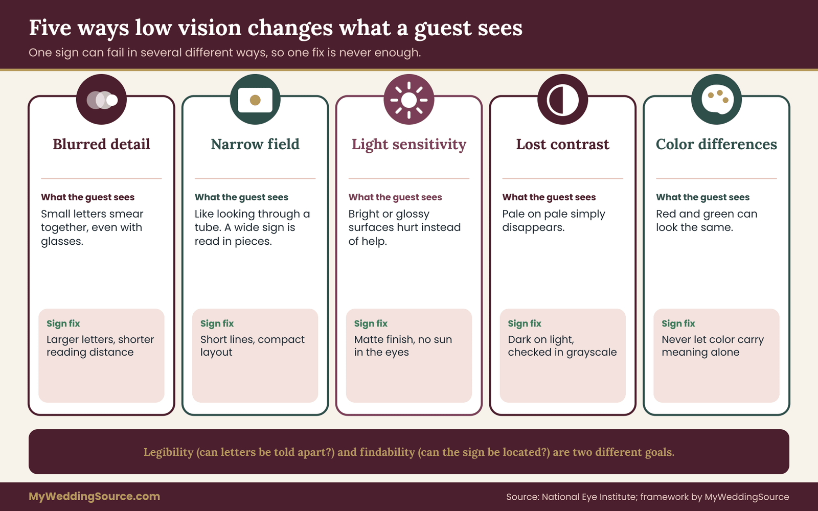
People with low vision see in many different ways, and that is the first thing a planner has to absorb. One guest has blurred central vision and sees the edges of a room clearly but cannot read a name on a card held at arm’s length. Another has a narrow field, like looking through a paper tube, so a wide sign must be scanned in pieces. Another is very sensitive to bright light and squints outdoors at noon. Another loses contrast, so pale gray on white simply disappears. Another sees color differently, so a red-on-green palette turns to mud.
You do not need to know the medical details of any guest. You need to know that the same sign can fail in several different ways, and that no single fix covers all of them. A large sign helps the guest with blurred detail and may do nothing for the guest with a narrow field. A high-contrast sign helps the guest who loses contrast and may glare painfully for the guest who is light-sensitive. This is why the check later in this article runs five separate passes instead of asking one question.
It also helps to separate two goals that often get blended. The first is legibility: can the letters be told apart? The second is findability: can the guest locate the sign at all? A guest can read a sign perfectly well once they are standing in front of it and still never find it across a ballroom. Typeface, size and contrast mostly serve legibility. Placement, lighting and background mostly serve findability. A good plan handles both.
One more framing point. Designing for low vision is not charity toward a small group. It is the same work you would do for a grandparent in dim candlelight, for a guest who left their glasses in the hotel, for a person reading in the last minutes of daylight, and for anyone squinting through a camera flash. Signs that survive a low vision test are the signs that everyone reads fastest. Most of what follows will make your event smoother for every guest, and none of it requires giving up a look you love.
Who you are planning for, and what you can actually find out
Before you decide anything, find out whether you are planning for a specific person or for a general possibility. The two situations call for different approaches, and mixing them up wastes either money or goodwill.
A named guest. If you know a relative or friend has low vision, you have a better resource than any checklist: you can ask them. Keep the question short and practical, and do it by whichever channel they prefer. Something like: “We’re printing the seating chart and welcome sign now. Is there a size, a color combination or a format that works well for you? We would rather ask than guess.” People with low vision have usually worked out what helps them, and most are glad to be asked before the event instead of accommodated awkwardly during it.
Offer specifics they can react to. Many guests can tell you whether they read better with dark text on a light background or the reverse, whether they use a phone camera to zoom, and whether they want a large-print seating list they can hold. If a guest would like a printed copy of the seating chart sent ahead, or a person to walk them to their table, treat that as a normal request and say yes.
An unknown possibility. If you do not know of anyone, you are still planning for guests you have not met, because the invitation list does not tell you who has low vision, and some guests will not mention it. In that case you design the signs to a standard that a wide range of guests can use, and you add one inexpensive way for anyone to ask for help.
Your RSVP card or wedding website can carry a line such as: “Tell us if there is anything that would make the day easier for you to see or move around.” That single line does more than any sign size will.
Guests who will not say anything. Some guests will not tell you in advance and will not ask on the day. Planning to a legible standard handles most of this. A greeter or usher who is briefed to offer a hand to anyone who lingers at the seating chart handles the rest. Offer help the way a good host offers a drink: lightly, without announcing why.
It is worth being clear about what not to do. Do not guess at a guest’s condition from their age. Do not make seating decisions on someone’s behalf without asking. Do not assume a guest with a cane or a guide animal cannot read a sign, or that a guest who reads a sign well can find it. Ask, offer, and let the guest decide what they need. The accessible venue red flags guide covers the building side of accessibility, such as steps, doors and restrooms, and this article does not repeat it.
There is a small budget conversation hiding here too. Couples sometimes worry that planning for low vision means reprinting everything larger. In practice, the cost comes from deciding late. A sign designed at a legible size from the first draft costs about the same as one designed at a decorative size. A sign remade after a failed venue walk-through costs a second print run and a rush fee. The cheapest low vision plan is the one that tests early, while a change is still a file edit.
Finally, think about the guests who are not guests: the vendors. A caterer who cannot find the service entrance, a DJ who cannot read the load-in sign, a photographer squinting at a dim table number all slow the day. The same legibility discipline helps them, and it costs nothing extra.
The five-pass legibility check for low vision wedding signs
This is the working method of the whole article, so it is worth learning before the details. Instead of asking “is this sign readable?”, which people answer by looking at a proof on a screen, the five-pass check asks five narrower questions in a fixed order, and it asks them at the venue. Each pass catches a different kind of failure. A sign has to clear all five to be called done.
The five passes are Find, Read, Contrast, Glare and Act. The order matters, because an early failure often makes the later passes pointless. If a guest cannot find the sign, its contrast does not matter yet.
Pass one: Find. Stand at the decision point where a guest will need the sign, such as the top of the entry steps or the spot where the path splits. Without being told where to look, can the test reader spot the sign within a few seconds? If you have to point, the sign has failed. The usual fixes are moving it, raising it, giving it a larger surface or putting it against a calmer background.
Pass two: Read. Have the test reader approach the sign until they can read every word comfortably, then measure that distance. Compare it with the distance the guest will realistically have. If the table cards can only be read at one foot and guests will be standing three feet away because of a flower arrangement, the sign fails. Fixes are larger letters, fewer words or moving the sign closer to where people actually stand.
Pass three: Contrast. Judge the sign in the light that will be on it, at the hour it will be used. Contrast is not a property of the printed file. It is a property of the file, the material and the light together. A sign with excellent contrast on a computer screen can fade in shade, wash out in sun or go muddy under warm candlelight. Fixes are changing ink or background colors, thickening strokes or adding light.
Pass four: Glare. Walk side to side in front of the sign and look for reflections. Glossy surfaces, laminate, glass and mirrors throw back windows, sky and string lights, and reflections cut across letters. A guest with light sensitivity may find a glaring sign painful rather than merely hard to read. Fixes are matte finishes, a changed angle or a changed position.
Pass five: Act. This is the pass people skip. After reading, can the guest do what the sign asks? A seating chart that is readable but arranged in a long unsorted list forces a guest to scan for a name they cannot easily spot. A directional sign that is readable but points ambiguously sends the guest the wrong way. Act asks whether the content, not just the letters, is usable, and whether there is a backup route for a guest who cannot use the sign at all.

How to record the result so it can be fixed
A check you do not write down is a feeling. Keep one line per sign in a shared note, spreadsheet or even a page of paper, with the same fields each time: the sign’s name, where it stands, the reading distance you want, the distance the test reader actually managed, the letter height, and a result for each pass. Use three results only: pass, fix, fail.
Pass means the test reader cleared it with no hesitation. Fix means they cleared it but slowly, or only after a small change such as turning the sign a few degrees. Fail means they could not do it. The three-way split is deliberate. A binary pass or fail tempts people to round a hesitation up to a pass, because everyone is tired and the venue closes at five. “Fix” is the honest middle, and it gives you a short list of small edits instead of a pile of worries.
A few decision rules keep the list from turning into a debate.
- Any fail on Find or Read means the sign gets remade or moved. Do not try to rescue it with a clever workaround.
- Any fail on Contrast means a change to the colors or the material, not a request for guests to look harder.
- A fail on Glare means a change to the surface or the position. Matte finish first, angle second, and shade as a last resort.
- A fail on Act means rewriting or reorganizing the content, and adding a human backup if the content cannot be simplified.
- Three or more “fix” marks on the same sign should be treated as a fail, because small problems stack up for a guest who has no spare effort to give.
Who should be the low vision test reader
The test reader matters more than the test. Ideally, it is a person with low vision who offered to help, because they know what they see. If you do not have one, ask someone who is simply different from you in how they see: an older relative, a friend who wears strong lenses and takes them off for the test, or someone who is comfortable saying “I can’t read that” without politeness.
Do not use yourself as the only test reader. You have seen the sign for months and your brain fills in the words. You also should not rely on a sighted person wearing a simulator or smeared glasses as a stand-in for real low vision. Simulations can show that blur makes things hard, and they can be a reasonable early check on contrast, but they cannot reproduce the way a particular condition changes what is visible. Treat a simulation as a way to spot obvious problems, never as proof that a sign works. Real feedback from a person who lives with low vision outranks any trick.
If a volunteer tester is not available, a decent substitute is a staged set of readers: one person standing at the intended reading distance in the right light, one person with their glasses removed, one person squinting. Between them you will find most of what matters. Pay the volunteer in thanks, a meal or a ride; it is a real favor.
Why the order is fixed
The reason for the fixed order is that late problems are cheap and early problems are expensive. Finding a placement problem on the venue walk-through, before the print order, costs you an edit. Finding it on the wedding morning costs you a scramble. Starting with Find forces the largest decisions, placement and scale, to happen first, while the remaining passes tune details. If you run Contrast first, you may polish a color pairing for a sign that will end up in the wrong place at the wrong height anyway.
There is a second reason. The five passes mirror how a guest meets a sign. They notice it (Find), approach until they can read it (Read), make out the letters against the background (Contrast), cope with whatever is reflecting off it (Glare) and then use the information (Act). If you test in the order a guest experiences the sign, you test the real thing.
What the low vision check does not cover
The five-pass check does not replace conversations with your venue about permanent signage rules, fire exits and accessible routes, and it does not certify that a sign meets any legal standard. The Americans with Disabilities Act and the Access Board’s standards set requirements for permanent signs in public buildings, and they are written for permanent room signs, not for temporary wedding signs. They are useful as a benchmark for what clear signage looks like, but they are not a rulebook for your welcome easel. For anything about the building itself, ask the venue and read the Access Board’s guidance directly.
The check also does not guarantee that every guest will read every sign. People with low vision vary enough that no design works for all of them. The goal is a large improvement and a human backup, not perfection. A greeter who knows to offer help is part of the design. So is a printed seating list at the entry, a sign with a clear spoken equivalent and a phone number for questions.
A quick pre-check you can do at your desk
Before you spend an afternoon at the venue, you can catch many problems at home in about twenty minutes. Print the sign at actual size on plain paper, tape it to a wall, and step back to the distance you plan. Take a photo with your phone, turn the photo to grayscale, and look at it at a small size. Does the text still stand apart from the background? Grayscale throws away color, so any pair that depends on hue alone to be told apart will vanish. Then squint. If the words become a smear and the shapes of the letters are indistinguishable, the weight or spacing needs work.
This desk check does not replace the venue visit, because it does not include the real light, the real surface or the real approach. It only filters out the signs that were never going to pass. Treat it like proofreading a spelling error before the lawyer reads the contract: a way to arrive at the real test with fewer embarrassing failures.
One more habit helps: print every proof at full size. A design that looks crisp at fifty percent on a screen can look thin and pale at actual size on a stand. Full-size proofs on the actual paper stock, or a sample of the actual material, are the only proofs that count for a low vision review.
Typeface decisions that help guests with low vision
Typeface choice for low vision readers is where wedding taste and legibility collide hardest. The trend in wedding stationery leans toward thin scripts, delicate serifs and wide-spaced capitals, and almost all of those fail the Read pass for a guest with low vision. You do not have to abandon your style. You have to decide which words carry information and which carry mood, and then give them different treatments.
Split the sign into two jobs
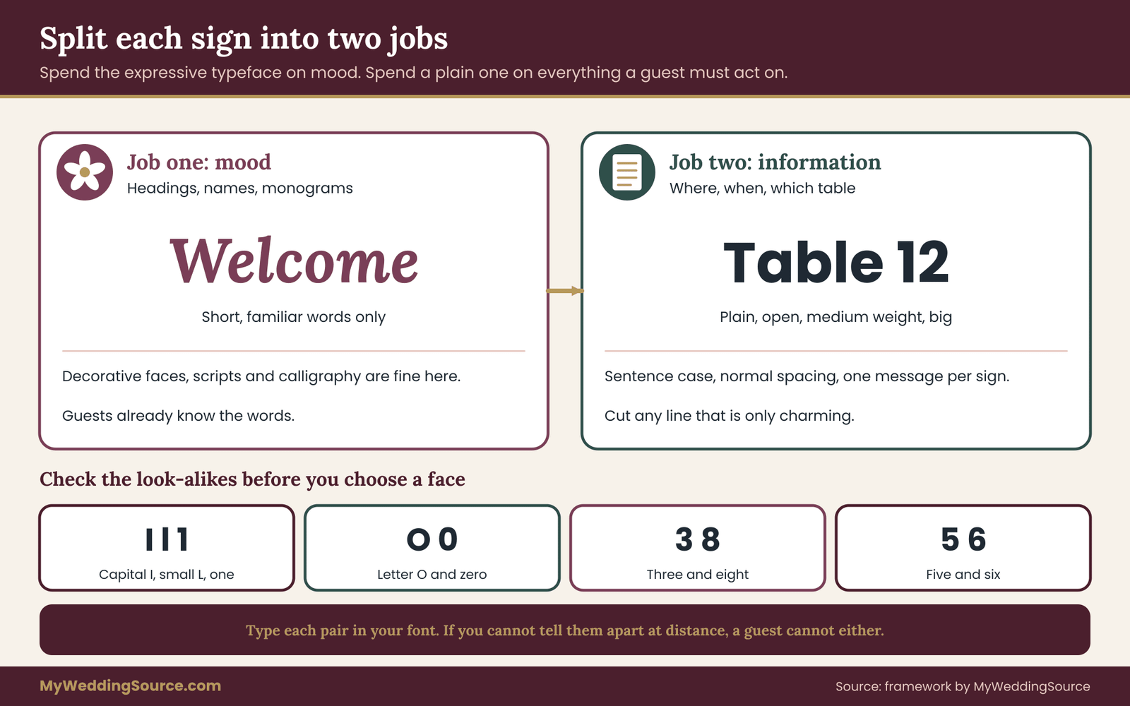
Every wedding sign does two things at once. It sets a tone, and it passes on information. The tone belongs in the decorative parts: a heading, a monogram, a flourish, the couple’s names. The information belongs in the working parts: where to go, which table, what is in the dish, what time. The practical rule is to put your expressive typeface on the decorative parts and a plain, open typeface on every piece of information a guest must act on.
This one decision rescues most designs. A welcome sign can keep a flowing script for “Welcome” because a guest does not need to decode a word they already understand from context and from the shape of the sign. The line below it, “Ceremony begins at four, seating on either side,” should be in a clear letterform at a generous size. The guest who cannot read the script loses nothing important. The guest who can read it gets the beauty.
What makes letters easy to tell apart
Low vision often blurs edges and loses detail, so the letters have to carry their identity in their overall shapes. Several features help.
- Open shapes. Letters like c, e, a and s have openings, called apertures. In some typefaces the openings are narrow, so when the eye blurs, an e looks like an o and a c looks like an o. Choose a face with wide, clear openings.
- Distinct characters. In some sans-serif faces, a capital I, a lowercase l and the number one look nearly the same, and the capital O and zero can be confused. That matters for table numbers, room numbers and times, which are exactly the things a guest cannot afford to guess. Check these characters by typing “Il1 O0” in the font you like and seeing whether you can tell them apart.
- Even, medium-heavy strokes. Hairline strokes vanish under blur, and very heavy strokes fill in the counters of letters. A regular or medium weight, sometimes a semibold, is the dependable range. Extra-light and ultra-black weights are both risky.
- Generous x-height. The x-height is the height of lowercase letters like x and a. Faces with a larger x-height look bigger at the same point size and read better at a distance.
- Moderate width. Very condensed letters squeeze together under blur, and very wide ones stretch the line out so a narrow field cannot take in a whole word. A normal width is safest.
Fonts differ so much within the same category that the labels “serif” and “sans-serif” are only a start. There are sans-serif faces that are excellent for signs and ones that are poor, and serif faces drawn for signage that read well. Look at the specific font, test it, and do not assume.
Scripts, calligraphy and ornamented faces
Script faces fail for several reasons at once. Connected strokes make the boundaries between letters unclear. Thin hairlines disappear. Slants and swashes change a letter’s shape from one place in a word to another. A guest who reads a script sign by recognizing each letter individually will struggle, and a person with low vision often reads that way, because they cannot take in the whole word shape at a glance.
That does not mean scripts are banned. It means they are suited to short, familiar, non-critical text at a large size. A name in script on a welcome sign is fine, because the guests know the names. A menu of ten dishes in script is not fine. Do not set a seating chart in calligraphy, even if a calligrapher offers a beautiful sample, unless you also provide a clear printed version of the same list.
The same caution applies to blackletter, ornate display faces, faces with outlines or shadows, and faces with textures such as distressed edges or chalk-like fills. They add visual noise on top of the shapes a guest is already struggling to resolve. If you love a chalkboard look, use real chalk-style lettering in a plain letterform, large and with heavy strokes, and avoid imitating dusty texture.
Capitals, lowercase and the words themselves
Long lines in all capitals are harder to read than mixed case, because words in capitals all have the same rectangular outline, and people use word shapes as clues. Short labels in capitals, such as a single word or number, are fine and often look good. For a sentence or a list of names, use sentence case or title case.
Letter spacing, called tracking, deserves attention because stationery habits fight legibility here. Wide-spaced capitals look refined on an invitation and fall apart on a sign, since a blurred guest sees separate marks instead of words. Use normal or slightly open spacing, and make sure the space between words is clearly larger than the space between letters.
Write the words for a reader who has no extra effort to spend. Prefer short lines. Prefer the plain word. “Bar” beats “Libations.” “Restrooms” beats a pun. Keep to one main message per sign, with a second line only when needed. Cut any line that exists only to be charming. The charming line costs the guest time and rewards only those who see well.
Names on a seating chart deserve a special note for low vision readers. Sort them the way a guest will search. Alphabetical by last name is usual, and large type with lines of space between each name does more than any typeface choice. Avoid setting the list in a narrow column of tightly stacked small names. A guest who has to scan for their own name across forty entries at a small size is facing the hardest reading task of the day. The wedding seating chart guide covers how to design the chart itself, and this article only asks that it be legible at the reading distance you measured.
Numerals and table identifiers for low vision
Table numbers and table names are small pieces of text that cause a lot of confusion. Numerals vary a lot between typefaces. Some old-style numerals have varying heights that make a three look like a five at a glance, and some decorative numerals are hard to tell apart. Choose lining numerals of uniform height and test the pairs that get confused: three and eight, five and six, one and seven.
Another approach is to give each table a name instead of a number, such as a river, a color or a flower, so a guest can say “I’m at the Maple table” aloud. This works well as a backup but has its own risks. Two table names that look alike in print, such as Birch and Beech, are a problem in the Read pass. Pick names with different first letters and different lengths. And if you use both a number and a name, make sure the number is the larger and clearer of the two, since it is the thing a server will say.
A practical way to choose and compare
Do not choose a typeface from a specimen page. Set your real text, in actual size, in three candidate typefaces, and print the three versions on the same paper. Tape them to a wall, step back to the planned reading distance and read them aloud. Then ask someone else to do the same without telling them which you prefer. The one that takes the least time and has the fewest stumbles is the winner. If your favorite loses, you can use it for the decorative parts and give the winning face the working text.
When you hire a designer or a printer, tell them early that the information text must pass a legibility test. A good designer will welcome the constraint and often have strong opinions about which faces work. If a sign maker pushes back, offer the choice in terms they will understand: “We need the practical lines in a plain face at this size, and we are happy to use your decorative face for the heading.” Most will agree, because a legible sign is also a better advertisement for their work.
Last, keep the number of typefaces small. One decorative face and one plain face is plenty. Three or four faces across a set of signs make guests re-learn how to read at every stop, and that costs more effort than any single sign saves. Consistency is a kindness: once a guest has learned to read your plain face at the welcome sign, they will read every later sign faster.
Size, contrast and color for low vision wedding signs
Size and contrast do most of the work in making a sign usable for low vision readers. They are also the two things people most often get wrong by judging a mockup on a screen, where everything is lit from behind and sized to fit the window. A screen proof gives false comfort. The sign has to be judged at full size, on its real material, at the distance it will be read.
Setting size from distance for low vision
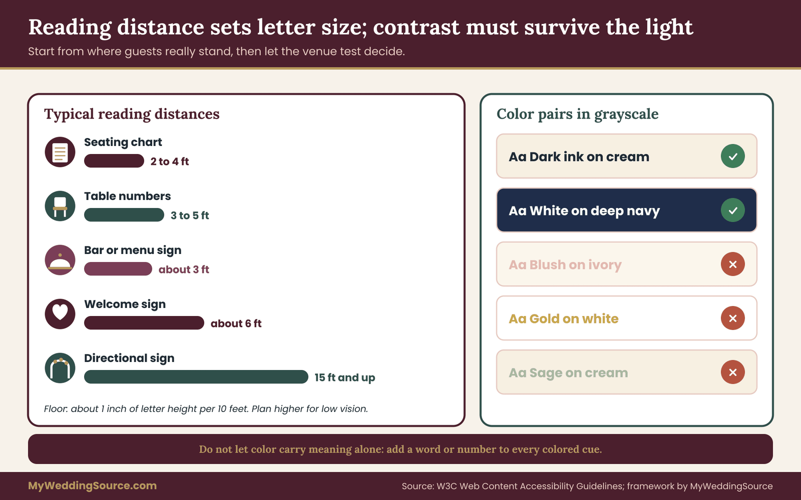
The question to ask is not “what point size looks good?” but “how far away will the guest stand when they read this?” Reading distance sets letter height. Sign makers often quote a rule of thumb of about one inch of letter height for every ten feet of viewing distance, under good conditions. Treat that as a floor for a person with typical sight, not a target for a person with low vision, and treat it as a starting estimate to be proven by the Read pass instead of a standard.
For low vision, a sensible plan is to start from that floor and then increase the size generously, because blur and reduced contrast sensitivity make letters effectively harder to resolve. A common-sense approach is to plan for roughly twice the floor height and then let the venue test tell you whether to go larger or can stay there. That multiplier is a planning habit, not a published requirement, and the walk-through is what decides.
A second strategy is better than making everything enormous: shorten the distance. A guest with low vision will happily walk closer to a sign if the path allows it. So instead of a huge seating chart on a distant wall, put a moderate-sized chart where guests can approach to about three feet, with clear floor space in front of it and no flower arrangement blocking the approach. Reducing the reading distance is cheaper and looks calmer than a billboard.
Here is how the logic works for a few typical signs, using round numbers that you should replace with your own measurements.
- Welcome sign at the entrance. Low vision guests may first see it from fifteen feet or more and read it from about six. Plan the main line for the six-foot reading distance and make the headline larger for the first sighting.
- Seating chart. Guests read this at two to four feet because they must find a name. Letters on names should be large enough to read at that distance without bending close, and the layout should let a person scan in one direction.
- Table numbers. Read at about three to five feet from a standing position, often across a centerpiece. Make the number large and keep the height of the stand and the arrangement from hiding it.
- Directional signs. Often read from a distance while walking, so these need the biggest letters and the fewest words. An arrow and one word beats a sentence.
- Bar or menu signs. Read at about three feet while a line moves. Short items, big letters, and the most common choices at the top.
Contrast, in plain terms
For low vision readers, contrast is the difference in brightness between the letters and what is behind them. It is not the same as difference in color. Dark blue on black is a different hue pairing and a terrible contrast pairing. Red on green is two different colors with nearly the same brightness, which is why it fails for many people. When a guest has low vision, the first thing that often goes is the ability to detect small brightness differences, so contrast has to be strong, not merely present.
The Web Content Accessibility Guidelines from the World Wide Web Consortium offer a useful benchmark. They define a contrast ratio between text and background and set a minimum of 4.5 to 1 for normal-size text, and 3 to 1 for large text. Those guidelines are written for digital content and do not govern printed signs, but the ratio is a clear, measurable standard, and free contrast checkers will calculate it from two color values. If your sign colors cannot clear it on a screen, they will not clear it in the real world, where light will make things worse.
Treat the minimum as a floor. For a wedding sign that will be read by dim candlelight or by a guest with low vision, aim well above it. Black or very dark ink on white or cream is the strongest everyday pairing. Very dark green, navy or burgundy on cream is almost as good and looks softer. White on a very dark background can work well, especially for guests who are sensitive to glare from bright white surfaces, though thin white letters can bleed into a dark background and look thinner than they are, so use heavier strokes.
Colors to avoid on low vision signs
Some pairings that look lovely together fail the contrast test. Blush on ivory, sage on cream, dusty blue on gray, gold on white and silver on any light color are common wedding palettes, and all of them can be too low in contrast for text. Use them for decoration, borders and backgrounds, and put the working text in a darker color. Metallic ink is a particular risk, because foil and metallic paint change in brightness depending on the angle, and can turn nearly invisible when it catches the light the wrong way.
Avoid pairs that depend on telling red from green, and avoid pairs that depend on hue alone, such as orange on pink or purple on blue. Do not use color as the only carrier of meaning. If the vegetarian dishes are marked in green and the nut-containing dishes in red, add a word or a symbol too. The same applies to table assignments: do not rely on a color ribbon to tell a guest which table is theirs unless a number or name is also clear.
A grayscale check is the quickest filter. Take a photo of the sign, convert it to grayscale and look at the result. If the text is clearly separate from the background in gray, the contrast is probably good. If it blends, change it. This catches most of the problems before you ever bring in a test reader.
Backgrounds and borders on low vision signs
Anything behind or around the letters competes with them. Textured paper, floral illustrations, photographs, greenery wrapped around a frame and patterned borders all add visual noise. A guest with low vision cannot always separate letters from a pattern the way a sighted guest does, so a design that “reads fine” to you might become a field of marks.
The fix is a plain panel. Put the text on a solid, quiet area, with a generous margin around it, and let the decoration live outside that panel. If the sign is a floral piece, put the words on a plain card at the center. If the sign has a photograph, put the words in a solid band across it. Leave open space around every line. White space is the cheapest contrast tool you have.
Surfaces, glare and light
Glare is where a low vision sign that passes on paper fails in the room. A guest with low vision may find glare more disabling than a sighted guest does, because it scatters light across the eye and washes out contrast. Some conditions make guests sensitive to bright light, so a glaring sign can be actively uncomfortable rather than just hard to read.
Matte beats glossy
The simplest rule is to choose matte finishes. Matte paper, matte-coated board, wood with a flat finish, chalkboard, fabric and powder-coated metal diffuse light, so letters stay readable from most angles. Glossy laminate, high-shine acrylic, glass, mirrors and polished metal behave like reflectors and show whatever is in front of them, including windows, lamps and the guest’s own face.
Mirror and acrylic signs deserve a separate mention because they are popular and tricky. A mirror sign reflects the room, and its lettering has to fight the reflection. If you love the look, test mirror and acrylic signs for contrast and glare at the real hour before you commit. For a guest with low vision, a matte alternative for the information text is usually safer.
Check the printed finish as well as the base material. A matte board with a glossy spot-varnish headline throws a bright patch in the middle of the sign. A foil edge catches light and distracts. If the printer offers a matte or soft-touch finish, ask to see a sample in the same light you will have at the event.
Light changes everything
A sign does not have a fixed contrast. It has the contrast that the current light gives it. Walk through the day of the event in your head and list the lighting conditions each sign will see.
Bright midday sun can bleach pale signs and create harsh shadows from nearby branches that cut across words. Shade is gentler but can make a dark sign nearly vanish. Late-day sun at a low angle shines directly into a guest’s eyes if they face the sign, and a sign in front of a window becomes a silhouette, because the guest’s eyes adjust to the bright background. Evening and indoor light is dim and often warm, and warm light can flatten the difference between cream and pale gold. Candlelight and string lights are lovely and nearly useless for reading small text.
Each of those conditions suggests a placement or lighting decision. Do not face a sign toward a window or a setting sun. Do not put a seating chart in a dim corner. If a sign must be in a dim spot, plan to light it with a soft, even source, such as a small clip light or a floor lamp aimed so the beam does not reflect back into the guest’s eyes. Ask the venue what lighting they allow, and whether the lights can be dimmed or switched on at the right moment.
Lighting should be even rather than dramatic. A single spotlight on a sign creates a bright center and a dark surround, and a guest with low vision may find the surround hard to adjust to. A pair of soft sources from either side produces a more even field. Whatever you choose, test it at the hour of the event, not at noon with the venue manager.
A simple glare test for low vision
Hold a sample of the actual sign material in front of you at the height it will stand. Move your head from side to side and up and down. At some angles, you will see the letters clearly, and at others you will see a bright reflection. If any reasonable viewing angle shows a reflection that hides letters, the finish is wrong or the placement is. Tilt the sign a few degrees downward, because a gentle forward tilt on an easel often sends overhead reflections away from the eye. Then repeat the test with the real lighting on.
Finally, ask a person who uses a wheelchair or who is shorter than average to repeat the glare test at their eye level, because reflections move with the viewer’s height. The best glare test is not yours alone. It is a person from each of several heights, each standing where a guest will stand.
Placement decisions for low vision guests
Placement decides whether a perfectly legible sign gets used by low vision guests. It governs findability, the first of the two goals described earlier. Most low vision placement problems share a root cause: the sign was positioned for how the room looks in a floor plan, not for how a guest moves through it.
Put signs at decision points, not along the way
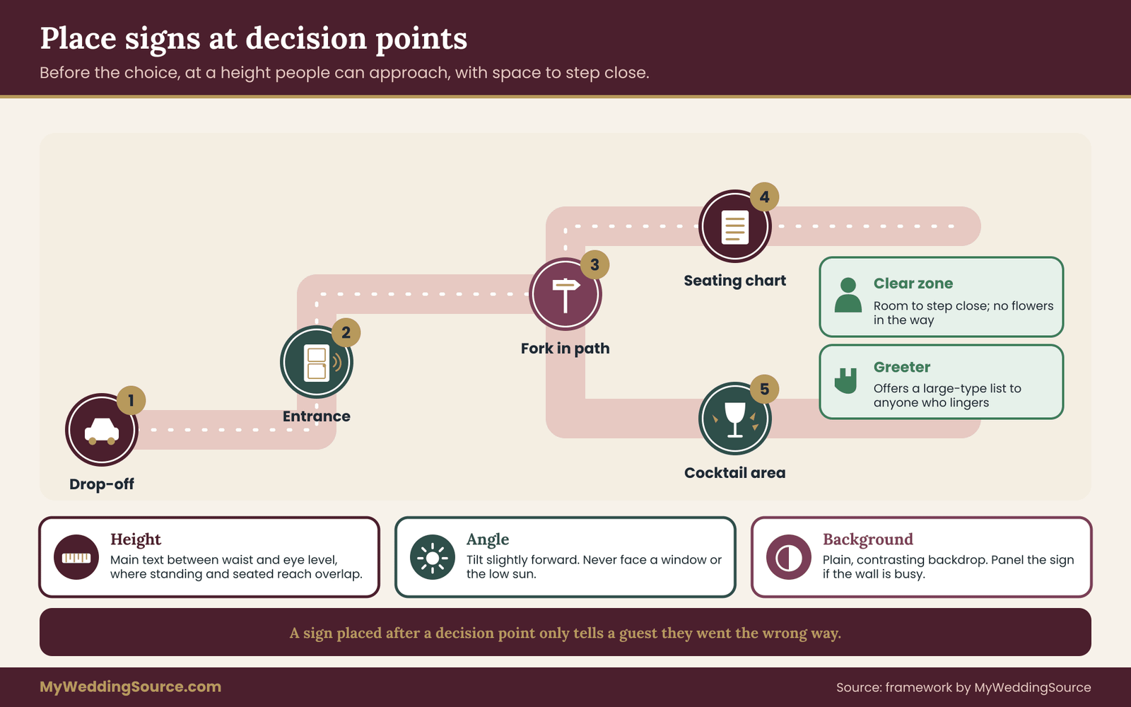
A decision point is a place where a guest has to choose, or has to confirm, something. The front door, the fork in a path, the foot of the stairs, the entrance to the reception room, the edge of the bar queue. Signs belong at those points and a little before them, so a guest can read, decide and turn without backtracking. A sign placed after a decision point is a sign that tells a guest they went the wrong way.
Walk the guest journey with a pencil and mark every point where a person might hesitate. Typically that includes the parking or drop-off area, the path from the car, the main entrance, the check-in or program table, the ceremony seating, the transition to the cocktail area, the seating chart, the table, the restrooms and the exit. You do not need a sign at every one. You need to know which ones have no other cue, such as a person standing there or an obvious door.
For a large site, the directional signs deserve their own plan, and the broader guide to planning signs as one system covers how to inventory and sequence the full set. For this article, the question at each decision point is narrower: could a guest with low vision find the sign, and if not, what can replace it?
Height and angle for low vision readers
Signs are usually placed to look nice in photographs, and for low vision readers that often means too high or too low for easy reading. For a guest standing or walking, the most comfortable zone for text is roughly between waist and eye level, and a guest with low vision who needs to step close prefers the sign to be in the middle of that range, not at the very top where they would have to tilt their head. For a guest who is seated, including a wheelchair user, the range is lower, so there is a sensible overlap zone in the middle where both can read.
Choose a height for the main lines of text that sits in that overlap zone, and avoid setting any key information on the bottom or top edge of a tall sign. A tall easel with the seating names starting at the very top is a classic problem: the first names are above a short guest’s eye line, and the last names are below a tall guest’s comfortable reading line. Condense the layout or reduce the height of the sign.
Angle matters as well. A sign leaning back on an easel catches overhead light and glares. A sign tilted slightly forward often reads better. A sign that is flat on a table is awkward for a standing guest, who must bend and then block their own light with their head.
Clear space and the approach path
Keep a clear zone in front of every sign that matters to low vision guests. A guest with low vision will want to get close, so give them a place to stand, and keep that place out of traffic. Do not put a seating chart in a narrow hallway where a queue will form behind the reader, and do not place it where guests will step backward into a flower display.
The approach path should be level, free of cables, and wide enough for a guide, a cane or a wheelchair. Check that nothing sits on the path at shin height, such as a low planter, a sandwich board or a sign stand’s legs. Guests with low vision are especially at risk from low obstacles that sit below the line of sight. Also look overhead. A hanging sign or a swag of greenery at head height is a hazard for a guest who cannot see it until they touch it.
Signs placed in a stream of traffic should be set back from the main flow. A seating chart beside the entrance door rather than in the middle of the lobby lets guests pause without causing a pileup. A greeter standing near the chart can help anyone who needs it.
Backgrounds behind the sign
Look at what is behind each sign from the guest’s eye position. A dark wall behind a dark sign hides it. A busy wall of greenery behind a sign full of text makes it harder to find. A bright window behind a sign turns it into a silhouette. A sign against a plain wall, fence or screen in a contrasting tone is easiest to find.
If the background cannot change, put the sign on a panel of contrasting color so that its edges are clear. A bold frame or an even border helps a guest locate the sign as an object, which is the first step toward reading it.
Repetition and consistency
Guests with low vision rely on patterns. If the welcome sign, the program and the seating chart share a consistent size, color and layout, a guest who has found one can find the next. Keep directional signs in one color and one shape, put them at the same height, and use the same arrow style. Do not decorate each sign differently to be charming. The consistency is the wayfinding.
Consistency for low vision guests also applies to location. If the seating chart is always to the right of the entrance in your plan, and the program table is always on the left, you can brief greeters with a simple rule. Guests also learn quickly, so a sign in the same position at each stage becomes easy to predict.
Placement and venue rules
Where you can place signs is not always your choice. Venues commonly control what can be attached to walls, which signs can stand in an exit route, whether tape and stakes can be used, what hangs from ceilings and how far a sign may extend into a corridor. Local rules and fire codes may also limit what can be placed near exits and in egress paths. A sign that blocks a route to an exit is never acceptable, however readable it is.
Ask the venue about each sign position in writing before you commit to it. Ask where they allow easels and stands, which surfaces can take adhesive, whether there are power outlets for lighting, and which areas must stay clear. If you want a sign in a public area such as a park, a sidewalk or a rented street frontage, ask the owner or the local authority what is allowed and whether a permit applies. Rules differ between places, and the current rules come from the venue or the city, not from this article.
If a venue restriction pushes a sign to a worse position, treat that as a Find fail and decide again, perhaps by choosing a different sign type. A floor stand might replace a wall mount. A larger sign might replace two small ones. A greeter might replace a sign entirely.
Running the venue walk-through for low vision
The low vision walk-through is the five-pass check taken to the real place. Most couples can do it in two to three hours at a venue of average size, and it is the single most valuable step in this article. The venue’s own technical walk-through, covered in the venue technical walkthrough guide, can share a visit with this one, but the signage check needs its own attention and its own notes.
What to bring to a low vision walk-through
Bring a small kit and keep it light.
- Full-size printed proofs of every sign, or samples of the real material with the real text.
- Tape that is safe for the surfaces you will test on, and a few clips.
- A tape measure, to record reading distances and heights.
- A camera or phone, and a way to take a grayscale photo.
- Your one-line-per-sign record sheet, with columns for each pass.
- A test reader, ideally a person with low vision who has agreed to help.
- A contact at the venue who can open doors, switch lights and answer questions about rules.
If the proofs are not ready, bring placeholder boards at the intended size with the real text. A placeholder at real size teaches more than a final sign at the wrong size.
Choose the right hour
The walk-through should happen at the time of day the sign will be used. A ceremony sign for a four o’clock ceremony should be tested at about four o’clock. A reception sign for an evening event should be tested at dusk or after dark, with the lighting you plan to use. If you can only visit once, choose the hour that will be hardest: usually late afternoon for outdoor signs because of low sun, and evening for indoor ones because of dim light.
If you cannot be on site at the right hour, ask the venue for photos taken at that time, or ask how the light falls on a given wall. Photos are a poor substitute for standing there, but they are better than guessing, and they let you plan a second visit only for the signs that matter most.
The walk-through, in order
Follow the guest’s route from the first sign to the last, in the order a guest meets them. This keeps the test honest and shows you whether the signs work as a sequence, not only one at a time.
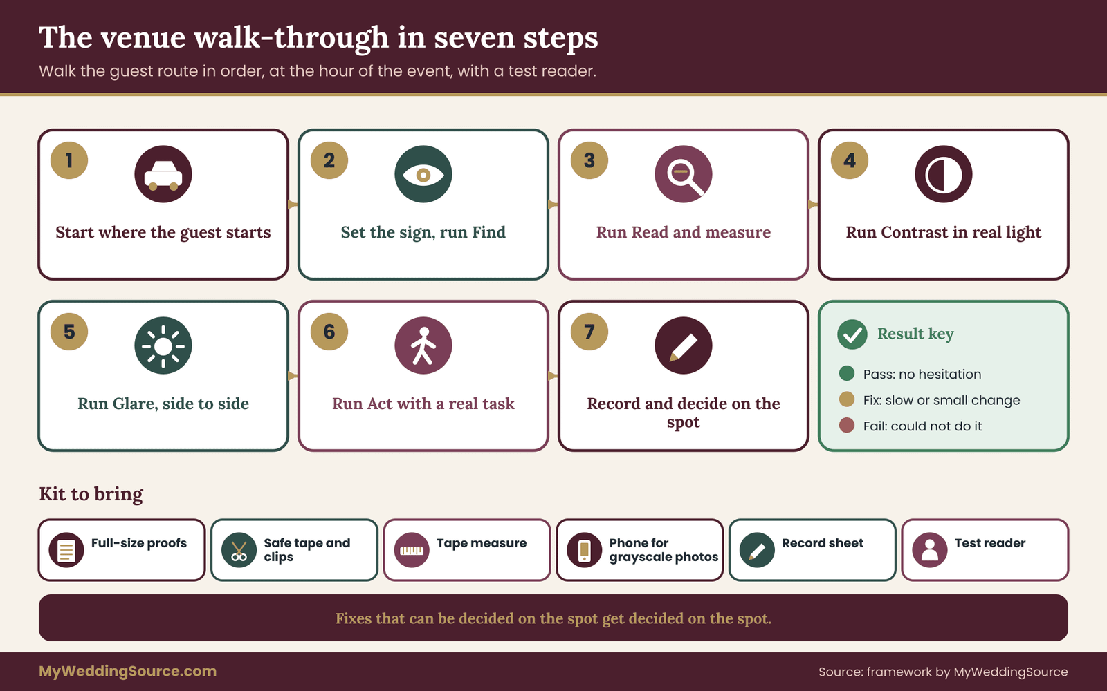
Step one: start where the guest starts. Stand at the drop-off or the parking area and look toward where the first sign should be. Do this before putting anything up. Ask the test reader what they notice first. Often the answer is the building, a doorway or a bright patch, and that tells you where attention naturally goes. Place the first sign where the guest’s attention already is.
Step two: set the sign and run Find. Put the proof in its planned position. Walk away to the distance a guest would first see it, turn around and ask the test reader to say when they notice it. Do this from two or three approach directions. Record the distance at which they first noticed it, and whether you had to point.
Step three: run Read. Have the test reader walk toward the sign until they can read the main line without effort, and measure that distance. Then ask them to read the secondary lines and stop where those become readable. Compare both distances with the distance the guest will actually have. Write the numbers down, because they decide the letter height for the final print.
Step four: run Contrast. Look at the sign in the real light. Ask the test reader whether anything seems faint, and ask them to point to any word they find harder to read. Take a grayscale photo for the record. If a part fails, note exactly which part: the heading, the body text, the small print, or the border.
Step five: run Glare. Move your viewpoint side to side and up and down while looking at the sign. Ask the test reader to do the same. Mark any spot where a reflection hides letters, and note what is causing it. Often it is a window, a bright lamp or the sky, and the fix is a tilt, a shift of a few feet or a matte surface.
Step six: run Act. Ask the test reader to use the sign to do the task, not just read it. Hand them a name and ask them to find the table. Ask them which way the restrooms are. Watch for hesitation. If they read it perfectly and still pause, the content, not the lettering, needs work. Note what slowed them.
Step seven: record and decide on the spot. Mark pass, fix or fail for each pass and write the small fix beside it. Do not leave the venue with unresolved “I’ll think about it” notes. Fixes that can be decided while you are standing there get decided there, because that is when you can see the problem.
Things that commonly go wrong during the walk-through
A few patterns come up repeatedly, and knowing them saves time.
The first is testing a proof that is smaller than the real sign. People bring letter-size printouts to stand in for a large board, then judge the reading distance as if the sign were full size. Always test at the real size or scale the result honestly.
The second is testing in a flattering hour. A venue visit at noon on a cloudy day makes everything easy. The real event may be at dusk. If the venue visit is at the wrong hour, treat all contrast and glare results as provisional and plan a second look.
The third is letting the venue contact or the sign maker act as the test reader. They know what the sign says, and they see well. Their help is valuable for rules and logistics, but they are not a test of legibility.
The fourth is treating a pass at one position as a pass everywhere. A sign that reads well at the main entrance may fail at the side door, where the light differs. Test each sign at each position it may occupy, especially if you plan to move a sign between the ceremony and the reception.
The fifth is skipping the back-of-house and vendor signs. A load-in sign, a restroom sign and an exit sign are all part of the guest experience. They need not be pretty, but the exit signs that the building already has must not be blocked or covered by your decor.
A worked example: low vision signs at an invented garden wedding
To see how the five passes work together, here is an invented example. The couple, a bride named Maya and a groom named Tomas, are holding a garden wedding for about ninety guests, with a late-afternoon ceremony and an evening reception on the same grounds. Maya’s uncle Reza has low vision, and she has asked him whether he would be willing to be a test reader. He agrees and says he reads best with dark text on a light matte background and cannot read anything small on a glossy surface. These details are made up for this example, and a real guest will tell you something different.
The first draft
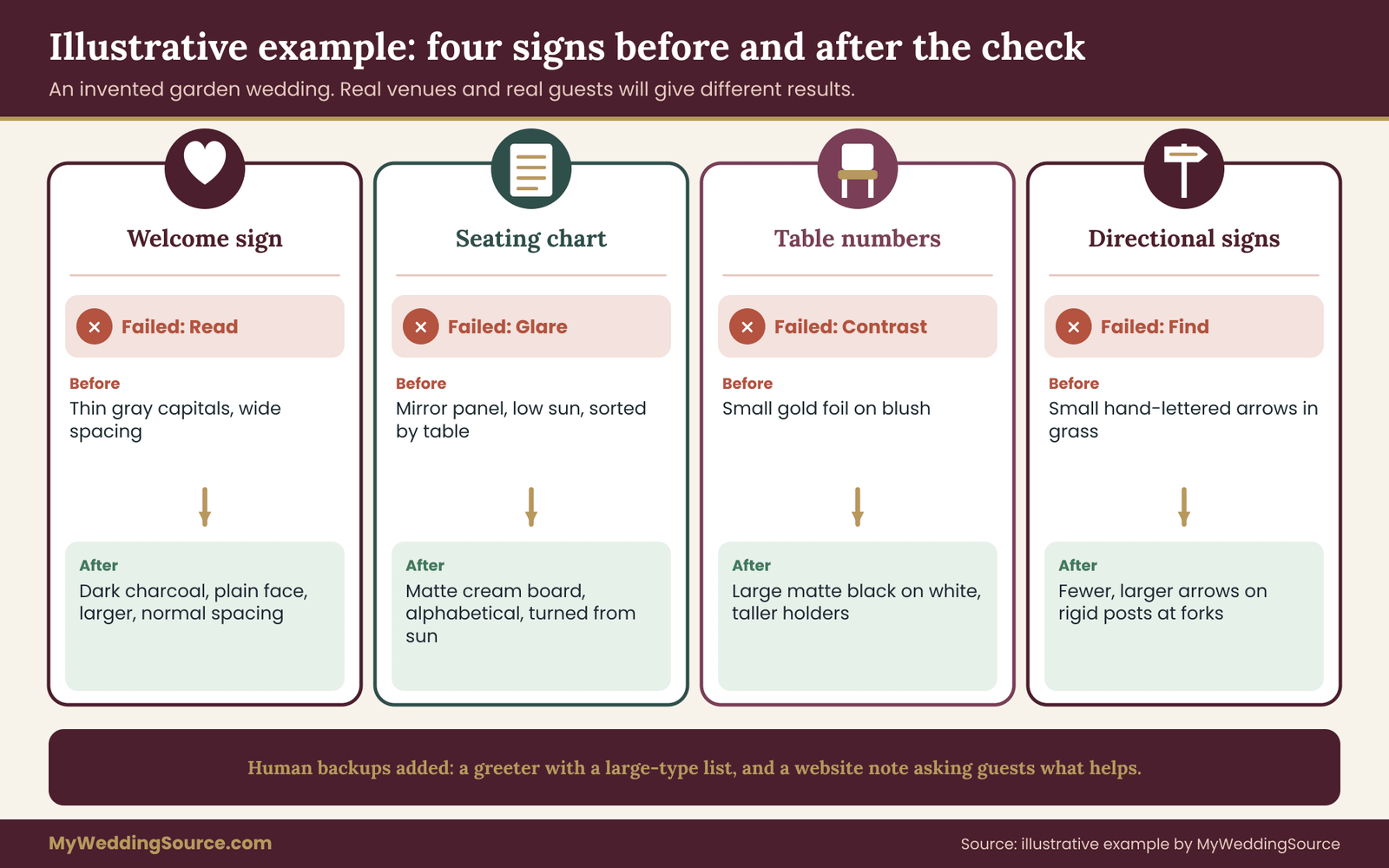
Maya’s designer proposes a set of signs on whitewashed wood. The welcome sign has a script heading and a line in thin gray serif capitals with wide spacing. The seating chart is a mirror panel with names in white vinyl lettering. Table numbers are small gold-foil numerals on blush cards. Directional signs are small hand-lettered wooden arrows tied to stakes with ribbon. In photographs, the set looks lovely.
Running the check
At the venue, three weeks before the print order, Maya and Tomas bring full-size proofs and Reza. It is four-thirty in the afternoon, the same hour as the ceremony.
Welcome sign. Find: passes, since the whitewashed board stands out against the dark hedge. Read: Reza reads the script heading from twelve feet, but the thin gray capitals only from about two feet. The planned reading distance is six, so that line fails.
Contrast: the pale gray on white is weak, and in the grayscale photo it nearly disappears. Glare: no issue on the matte wood. Act: the line says when the ceremony starts, and Reza hesitates because the wide spacing breaks the words apart. Verdict: keep the script heading, replace the body line with dark charcoal in a plain, regular-weight typeface at a larger size, in sentence case with normal spacing.
Seating chart. Find: the mirror panel is easy to find because it flashes. Read: Reza cannot read it at all from where he stands, because the low sun throws a bright reflection across the left half. Glare: fail, clearly.
Contrast: the white vinyl letters over a reflective surface change from line to line. Act: the names are sorted by table number, not alphabetically, so a guest would have to scan the whole panel. Verdict: replace the mirror with a matte board in cream, set the names in dark ink in alphabetical order by last name, and move the chart so it does not face the low western sun.
Table numbers. Find: passes, because they stand on tall holders. Read: the small gold numerals are readable by Reza only at about one foot, and guests will be three or more feet away across a centerpiece. Contrast: gold foil on blush fails in the grayscale photo. Glare: the foil catches the sun and flashes. Verdict: remake as large matte black numerals on white cards, mounted on taller holders at a height above the centerpiece, with the table name in smaller text below.
Directional signs. Find: the small arrows in the grass are missed entirely from the path. Read: the hand lettering is readable only at arm’s length. Act: the arrows point in a direction that depends on how the stake is turned, and one has already swiveled. Verdict: replace with fewer, larger arrow signs on rigid posts, one word each, at the two forks in the path, and set at the same height.
What changed and what stayed
The final set keeps the whitewashed wood and the script headings, so the garden look survives. The information text moved into a plain typeface in dark ink on cream. The mirror panel became a matte board, and the gold foil moved to the card borders, where it adds sparkle without carrying meaning. The number of signs fell by two, because the two small arrows were combined into one larger sign at each fork.
Maya also adds two non-sign measures that came out of the Act pass. A greeter, her cousin, will stand near the seating chart with a printed large-type list sorted by last name, and will offer it to anyone who lingers. And the wedding website now has a short note inviting guests to ask for a printed seating list in advance. Reza thinks the greeter and the list are the best parts, and says the sign changes are a bonus. That is a common outcome: the human backup does as much as the redesign.
The cost logic
None of the changes here are expensive when decided early. Changing a typeface and a color is a file edit. Moving a seating chart is free. Swapping a mirror panel for a matte board costs the price of a board, which is often less than the mirror. Remaking table numbers costs a second small print order. The expensive version of this story is the one where the failures are found at the venue on the wedding morning, when the only options are to remake signs on a rush order or accept that some guests will not find their seats.
The honest limit of the example is that it is one invented couple at one invented venue. A real garden will have different light, different rules and different guests. The method travels, but the results do not. The numbers in the example, such as twelve feet and two feet, show how a record sheet looks, and they are not targets. Your own test reader will give you your own numbers.
Verifying with your venue and your sign maker
A walk-through gives you a list of changes. Verification is the step in which the people who will produce and host the signs confirm they can deliver them. Skipping it is how a clean decision turns into a surprise.
What to ask the sign maker for low vision signs
Send the sign maker the record sheet, not just a request for “bigger.” Give them the reading distance, the measured letter height, the colors that passed and failed, and the finish you want. Ask them to confirm in writing that the stated material is matte, the stated size matches your numbers, and the colors will print as specified.
Ask for a physical proof on the real material, at the real size, in the real colors. A digital proof is not enough for a low vision review, because screens glow and paper does not. If the proof arrives and the contrast is weaker than on the screen, ask for a correction before the full run. Reputable sign makers expect this request.
Ask about the policy for corrections too: is a reprint free if their error caused the problem, and what does a reprint cost if the change comes from your design? Put the answers in the contract. The wedding vendor contract guide covers what a contract should state about proofs and revisions.
Also ask how the signs will be delivered and installed, who sets them up, and whether the maker can adjust height and angle on site. A sign maker who installs their own work can fix a tilt or a glare problem in minutes.
What to ask the venue about low vision signs
Confirm placement permissions for each sign, the stands and easels they allow, the lighting they can provide or allow, and any areas that must remain clear. Ask whether they have their own signage rules, such as limits on size in a lobby or on wall attachments. Ask when you can access the space to set up, and whether the lights can be set to a level you choose.
If you need extra light on a sign, ask whether you can bring your own lamps, whether there are outlets nearby, and whether cords must be taped down. Guests with low vision are especially at risk from loose cords, so a taped cord is not a formality.
Write down the answers and keep them with your records. If a venue contact tells you something by phone, send a short note afterward restating it. This is not about distrust. It is how two busy people avoid a misunderstanding.
Who has the final word
There are three authorities in a signage question, and they do not overlap. The venue decides where signs may go. The sign maker confirms what they can produce. The guest, through the test reader or a direct request, tells you whether it works. The couple’s job is to bring those three pieces together and to decide when a trade-off is acceptable.
If the venue’s rule forces a compromise, such as no signs on the entrance wall, write down the compromise and its fix. If the sign maker cannot deliver a matte finish at the size you need, ask for alternatives instead of settling for a glossy one. And if a test reader tells you something does not work, treat that as the answer, even when you would prefer the opposite.
Day-of setup and common mistakes with low vision signs
A low vision signage plan can pass every test and still fail on the day because of how it is set up. The final stage is a short, specific installation plan and a person who owns it.
Assign one person to the signs
Pick one reliable person, a family member, a coordinator or a friend who is good with details, to own installation. Give them the record sheet, the placement notes, a map and the venue contact. Their job is to place each sign where the notes say, at the stated height and angle, and to walk the guest route once when they finish. Ask them to run Find and Glare one more time with the real light, since conditions may have shifted since the walk-through.
Give them a small authority: permission to move a sign a few feet if a reflection or an obstruction appears, without asking you. On the wedding morning, you should not be the person deciding where an easel stands.
Pack a repair and backup kit
Bring a small kit with spare tape, clips, a few blank cards in the same stock, a marker that matches your ink, a small flat lamp, a few extra stands and a printed large-type copy of the seating list and the schedule. The large-type list should be in the same plain face you used on the signs, in dark ink on matte paper, sorted for easy scanning. If a sign blows over or a reflection appears at the wrong hour, the kit turns a crisis into a five-minute fix.
Brief the people low vision guests will ask
Tell your greeters, ushers, servers and coordinator a short, plain script. Something like: “If you see someone standing at a sign for more than a few seconds, say hello and offer to read it or walk them over.” Keep it low-key. The aim is a host’s courtesy, not an announcement. Tell them to offer an arm only if the guest asks for it or accepts the offer, and to describe where things are in simple terms: “The bar is straight ahead, past the tall flower arch, on your right.”
The venue staff and the caterer should know where the large-type lists are and where the seating chart stands, so a guest who asks a server gets a useful answer.
Common mistakes and how to avoid them
Some errors appear again and again in event signage, and low vision guests feel them first.
Choosing signs from a photo. A photo of a sign in a wedding gallery shows the sign under flattering light and from a flattering angle. It tells you nothing about how it reads at real distance. Judge a sign only from a full-size sample.
Relying on one fix. A larger sign does not cure poor contrast, and good contrast does not cure glare. The five passes exist because one improvement rarely covers all problems.
Letting decor sit in front of signs. Flowers, candles, signs for other things and even people in a queue can block the view. Check clear space in front of each sign when the room is dressed, not only when it is empty.
Forgetting the second half of the day. Signs placed for the ceremony may be moved to the reception. Re-test them in the new place and the new light.
Over-labeling. Too many signs make the important ones hard to find. If a sign repeats what an obvious door already says, it is clutter. Fewer, clearer signs help every guest.
Skipping the human layer. Signs are one tool. A greeter, a printed list and a clear way to ask for help catch the guests whom no sign will reach. Planning only the signs and ignoring the people leaves a gap.
Treating accessibility as a separate corner. A special large-print sign tucked in a corner is less helpful than making the main signs usable. Put the accessible version where everyone will see it, not in a side location that labels a guest.
If something fails on the day
If a sign turns out to be unreadable despite your planning, do not panic. Move it closer to the guests, turn it away from the glare, add a lamp, or have someone stand next to it and read it aloud for a few minutes. The large-type list and the greeters are your backup. Afterward, note what failed and why, since that note helps if you hold a rehearsal dinner, a brunch or a second event with the same signs.
Limits of this approach and when to ask an expert
No guide can promise that every guest will find every sign easy. Low vision covers a very wide range of experiences, and a sign that works well for one person may not work for another. The five-pass check improves your odds a great deal, and it is worth doing, but it is a planning method, not a certification.
What the method cannot do
It cannot replace a conversation with a guest who has specific needs. It cannot stand in for the venue’s own accessibility obligations, which concern the building and are not something a couple can fix with signs. It cannot tell you about local codes for exits and egress, which are set by local authorities and venue managers. And it cannot make a sign readable in conditions that are simply too dark or too bright. In those cases the answer is a change of lighting or a change of position, not a better font.
The method also depends on the quality of your test reader. A reader who wants to be agreeable will say a sign is fine when it is not. Make it easy for them to say no. Tell them that a “can’t read it” is the most helpful answer they can give.
When an expert is worth paying
Most weddings will not need a consultant. A few situations might. A very large or complex venue with many routes may benefit from a wayfinding designer who works on public spaces. A venue with a permanent signage system that you want to supplement may have its own accessibility staff. A guest with a complex need may do best with a call between you and their own vision rehabilitation specialist or orientation and mobility instructor, if they are willing, and only at the guest’s invitation.
Stationery designers and sign makers are the experts for production, and the better ones will have experience with legibility. For accessibility questions about a building, ask the venue first, and use the Access Board and the Department of Justice’s ADA resources for the official language. For vision information, the National Eye Institute and the American Foundation for the Blind publish plain-language material. Verify current rules with the issuing agency, since standards change and this guide was written in November 2026.
Keep low vision planning proportionate
It is easy to overcorrect. You do not need to turn the venue into a terminal. You need your key information signs to be readable, findable and usable, and you need a human backup. The decorative pieces, such as a monogram, a photo display or a framed quote, can be as pretty and as small as you like, because no guest needs them to get through the day. Protect the working signs, and let the rest be beautiful.
Your next steps
Here is a short order of work that fits most timelines. Adjust the dates to your own schedule.
- List your working signs. Write down every sign a guest must use to act: welcome, program, seating chart, table numbers, directions, bar or menu, restrooms and exit. Everything else is decoration.
- Ask early. Add a line to your website or RSVP asking if anything would make the day easier to see or move around, and ask any guest you know has low vision what works for them.
- Choose the typefaces. Pick a plain, open face for information and use your decorative face for headings only. Test your real text in three candidates at actual size.
- Set size from distance. For each sign, decide the reading distance, set the letter height from it, and plan to adjust after the walk-through.
- Check contrast and finish. Use dark ink on a light matte background, check the pair in grayscale, and choose matte surfaces for the information text.
- Schedule the walk-through. Visit the venue at the hour of the event with full-size proofs and a test reader, and run the five passes in order.
- Confirm with your vendors. Send the sign maker your record sheet, ask for a full-size physical proof, and get placement permissions from the venue in writing.
- Plan the human layer. Prepare a large-type list, brief greeters and assign one person to set up and check the signs on the day.
If you are still choosing your venue, the wedding venues guide can help you compare options, and the reception guest flow guide shows how signs fit with the way guests move through the evening.
FAQ
What typeface is best for low vision wedding signs?
There is no single best face, but the safest choices are plain, open letterforms in a regular or medium weight, with clear differences between similar characters and a generous x-height. Use a decorative or script face only for headings and names that guests already know. Test your real text at actual size, at the real reading distance, before you commit to any font.
How big should the letters be for guests with low vision?
Start from the distance a guest will actually stand when reading. A common sign rule of thumb is about one inch of letter height per ten feet of distance, which is a floor for typical sight. For low vision, plan for noticeably larger, then let the venue walk-through decide. Moving the sign closer is often better than enlarging it.
Is a mirror or acrylic sign a bad choice?
Not always, but mirrors and glossy acrylic reflect windows, lamps and sky, and that glare can hide letters and bother light-sensitive guests. If you love the look, use it for decoration and put the information on a matte surface, or test it at the exact hour and angle first. A matte alternative is the safer option for seating charts and directions.
Do I need to follow the ADA for wedding signs?
The ADA and the Access Board standards set requirements for permanent signs and facilities, and they are not written for temporary wedding signs. They are still a helpful benchmark for clear signage. For anything about the building, ask your venue what applies, and check the current rules with the issuing agency instead of relying on a summary.
What colors work best for low vision signs?
Strong contrast in brightness matters more than the specific hue. Dark ink on a light matte background is the most dependable pairing, and light text on a very dark background can work with heavier strokes. Avoid pale-on-pale pairs such as blush on ivory or gold on white, and never use color alone to carry meaning. A grayscale photo is a quick check.
How do I find out what a guest with low vision needs?
Ask them directly, briefly and privately, by the channel they prefer. Offer a few concrete options, such as a large-print seating list sent ahead or a person to walk them to their table. Many people have worked out what helps, and most appreciate being asked before the event. Do not guess from age or appearance, and do not decide on their behalf.
Can I just provide a large-print list instead of fixing the signs?
A large-print list is a valuable backup, but it works best alongside readable signs, not instead of them. A guest should not have to ask for a special version to find the basics. Make the main signs usable by everyone, then add the large-type list and a friendly greeter for anyone who wants more help. The two together cover far more guests than either alone.
When should I test the signs at the venue?
Test after you have full-size proofs and before the final print order, at the hour of day the signs will be used. That timing lets you change a file instead of remaking a sign. If the event runs from afternoon into evening, test the outdoor signs in late-day light and the indoor ones after dark. Plan a second quick look for any sign that was marginal.
Sources
- Low vision overview, National Eye Institute
- Web Accessibility Initiative, World Wide Web Consortium
- Web Content Accessibility Guidelines overview, W3C
- Accessibility standards for signs, U.S. Access Board
- ADA information and technical assistance, U.S. Department of Justice
- Vision loss resources, American Foundation for the Blind
- Vision health, Centers for Disease Control and Prevention
- Blindness and vision impairment, World Health Organization