
Mirror wedding signs look elegant in a showroom and can turn unreadable the moment a guest walks up in real light. This guide gives you a contrast test sheet you can run across four lighting conditions, a photo test for the camera side, and a simple way to decide where a mirror or acrylic sign belongs and where it does not.
Quick answer
A mirror has no color of its own, so the contrast of mirror wedding signs changes with whatever the surface reflects. Dark lettering reads well against a bright reflection and fades against a dark one, and white lettering does the opposite. Print a test sheet at real size, put a sample of the actual material in four lights (open shade, direct or low sun, indoor ceiling light, evening), and ask people who have not seen your wording to read it from the real distance. Then photograph it from three angles. Keep the sign only where it passes every light it will meet.
A sign has one job, which is to be read by a guest who is walking, carrying a drink, and thinking about something else. Most signage materials stay the same from morning to night. Mirror wedding signs do not. They show a guest the sky, the nearest window, the person standing behind them and sometimes the photographer, and the words you paid for have to compete with all of it.
Acrylic is a cousin of the problem that mirror wedding signs create. Clear acrylic shows whatever sits behind it, glossy acrylic throws back lights, and even a frosted panel can look different from a chair at the back than it did on the proof. The good news is that all of this is testable in an afternoon, with paper, a sample of the material and a few friends.
A note on scope. This is general planning information, not legal, safety or accessibility advice. Venue rules, fire-safety rules and sign standards differ by place, and they change, so confirm the current version with your venue, your sign maker and the agencies named in the sources.
This guide is deliberately narrow. If you are still deciding how many signs you need, how big the letters should be for a given distance, or who has to approve them, read the wider guide to planning wedding signage as one system first. Everything below assumes you have already chosen a mirror or acrylic look and want to know whether it will actually work.
Why mirror wedding signs are hard to read
Start with how a mirror works, because every problem later in this guide comes from it. A matte sign scatters light in all directions, so it looks about the same from any spot. A mirror reflects light in one direction, like a ball bouncing off a wall. The ball leaves at the same angle it arrived. Light does the same thing, and a smooth surface that behaves this way is called specular.
That single rule explains most of the trouble with mirror wedding signs. Whatever is in front of the mirror, at the matching angle, appears in it. Walk a few steps to one side and the mirror shows a different part of the room. The sign has not changed, but what it reflects has.
Three things a guest sees on mirror wedding signs
When a guest looks at a mirror sign, three images arrive at the same moment. The first is your lettering, which is fixed. The second is the reflection of the scene behind the guest: the sky, the tent roof, a wall of windows, the string lights. The third is any bright source that happens to line up, such as the sun or a bare bulb, which appears as a hot spot or a streak.
Your lettering has to win against the second and third. It cannot do that by being pretty. It wins by being much lighter or much darker than the reflection behind it, and the reflection keeps changing. This is why a sign that looked crisp when the maker photographed it in a studio can look muddy by the entrance of an outdoor ceremony.
Why the maker’s photo does not tell you much
A sign maker’s product photo is usually shot under soft, controlled light, often with a plain neutral background reflected in the glass. That is a fair way to show craftsmanship. It tells you very little about how mirror wedding signs will behave at your venue.
Your venue will have a specific sun direction at a specific hour, a specific ceiling and a specific color of wall across from the sign. Two of those three can be checked before the wedding. That is the idea behind the test sheet in this guide.
Gloss is not the same as mirror
Not every shiny sign is a mirror, and the difference matters when you read a quote for mirror wedding signs. A true mirror reflects a clear image. Gloss acrylic reflects a clear image faintly, and mostly shows you bright lights and windows. A satin or frosted surface scatters the light, so you see a soft glow instead of a picture. A brushed surface is somewhere between.
When a vendor sells mirror wedding signs and says “mirror finish,” ask whether they mean glass with a silvered back, acrylic with a mirrored coating, or a metallic print on a glossy sheet. Each one behaves differently, and the next section lays out how.
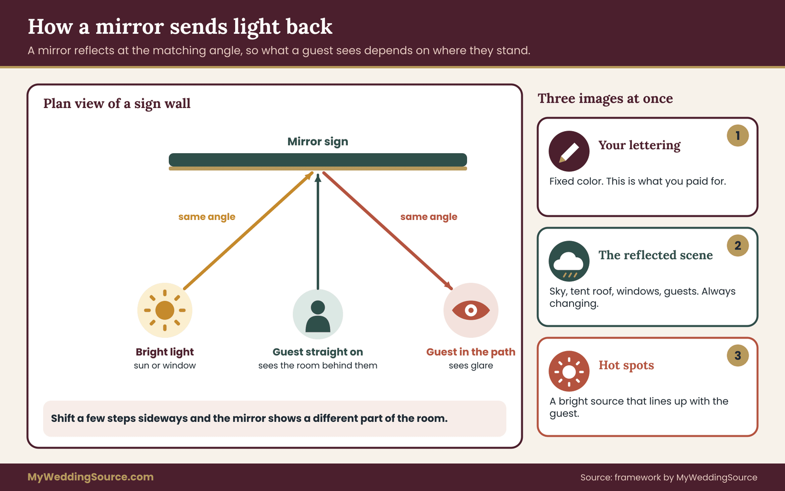
The diagram above shows the plan view of a sign wall. A guest approaches from one side, the sun or a window sits on the other, and the mirror sends light along the matching angle. If your guest’s eyes are anywhere near that path, mirror wedding signs show them glare. If they stand well away from it, they see the room instead. Neither view is the sign.
The honest trade-off
Mirror wedding signs are popular for a reason. They look luxurious, they bounce candlelight, they suit modern and formal weddings, and a seating display on a mirror can be a handsome centerpiece. None of that is a mistake.
The trade-off is that a mirror sign asks more of its planning. A matte board forgives a wrong guess about the light. A mirror does not. You can still choose one, and many couples do. You just want to know in advance which signs will carry real information and which will be decorative.
Mirror and acrylic: what each material does to light
Before testing, sort the materials, because a test result only means something for the material you will actually use. The names vendors use overlap, so it helps to think in terms of what the surface does with light rather than what it is called.
Glass mirror
A glass mirror has a reflective coating on the back of the glass, and it is the classic material for mirror wedding signs. It gives the sharpest, most accurate reflection, which is exactly the trouble for text: the reflected scene is as crisp as the lettering. Large glass panels are also heavy and can break, which affects stands, transport, wind and venue rules. If a sign maker offers safety-backed mirror, that refers to a film on the back that helps hold fragments together if the glass breaks. Ask what is actually on the panel you are buying, not what is typical.
Mirrored acrylic
Mirrored acrylic is a plastic sheet with a reflective coating. It weighs far less than glass, does not shatter the same way, and is easier to cut into shapes. The reflection is usually a little less perfect, and large thin sheets can show slight waviness, so a straight window frame may look bent. It scratches more easily than glass, and surface dust and fingerprints show strongly. Mirrored acrylic is a common choice for mirror wedding signs because it is light, but light also means it can catch the wind like a sail.
Clear acrylic
Clear acrylic has no reflective coating, yet it is not invisible. Light passes through, so the sign shows whatever stands behind it. A clear panel with lettering on it, set in front of a patterned wall or a busy buffet, forces the eye to separate the words from the clutter. A clear sign works best with a solid, plain backdrop, or with a white or colored layer printed behind the lettering.
Frosted and satin acrylic
Frosted acrylic scatters light. It trades the sharp reflection for a soft glow, which is why it is the usual answer when a couple likes the look of acrylic and needs it to be readable. Frosting can be on one surface or both, it can be a full-sheet treatment or applied as a pattern, and the lettering can be printed, vinyl, etched or painted. Ask which surface the lettering sits on, because it changes the look.
Opaque acrylic
Black, white and colored opaque acrylic acts like a matte or semi-gloss board. If the surface is glossy, it still reflects bright lights, but the color of the panel stays stable, so the lettering contrast stays predictable. For a sign that must be read from a distance, opaque acrylic with strongly contrasting lettering is the most dependable of the family.
UV-printed and layered signs
Some makers print directly on acrylic with UV-cured ink. When the lettering is printed on clear acrylic, the printer often lays down a white layer under the color so the ink does not vanish against the background. Ask whether a white underlay is included and on which side the printing sits. Printing on the back surface, viewed through the panel, gives a smooth look with a slight depth. Printing on the front gives crisper edges but is exposed to scratching.
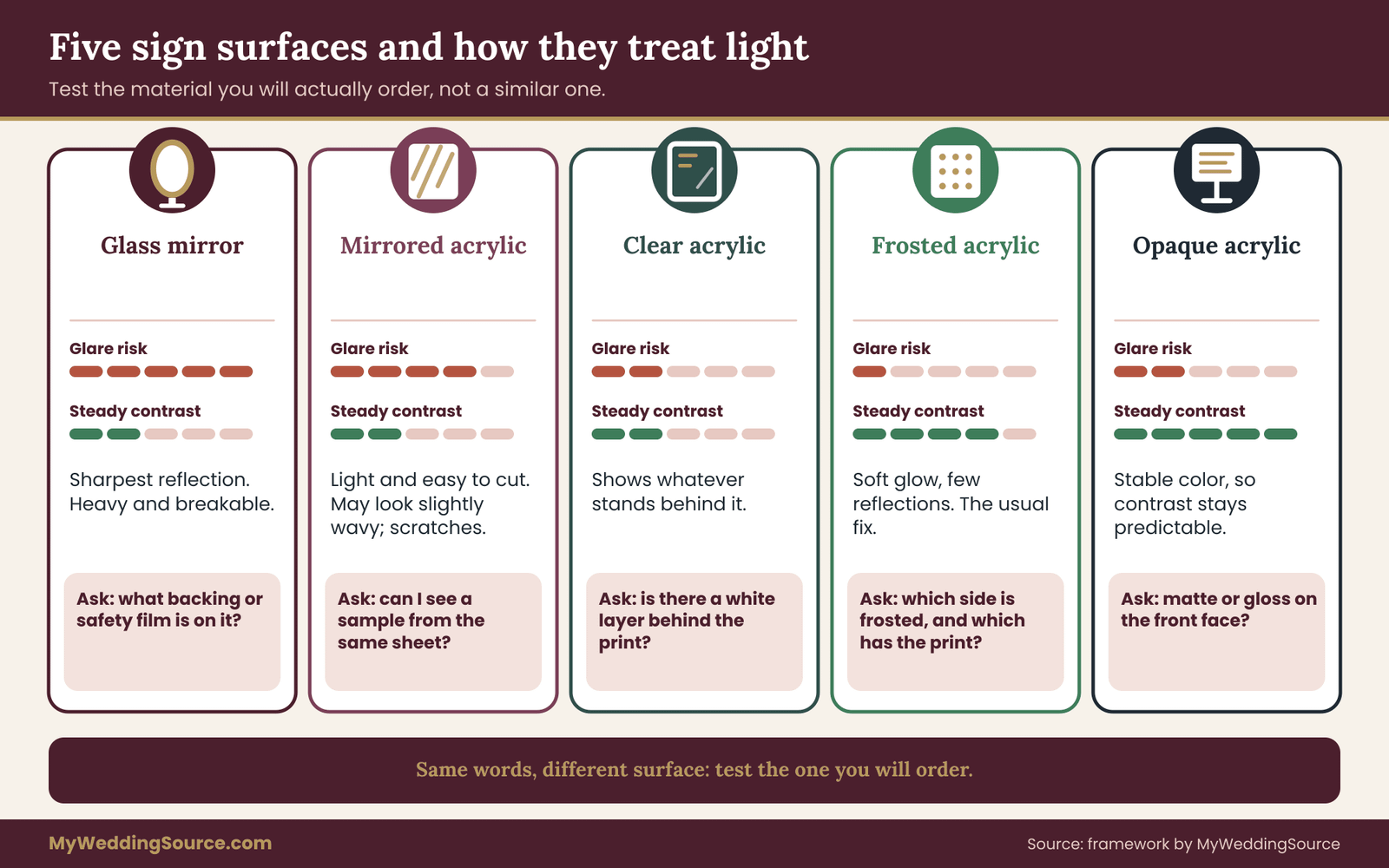
The comparison cards show how each material behaves. The point is not that one is right. It is that the same words will read differently on each, which is why the test uses the actual material or a sample from the same sheet. A sample cut from another batch with a different coating can mislead you.
What this guide does not decide
This guide does not choose a style for you, and it does not tell you what a sign should cost. It also does not replace the sizing work: letter height for the viewing distance is covered in the wider signage guide. What it adds is a way to judge one specific risk with mirror wedding signs, which is whether the surface itself keeps the words legible in the light your guests will really have.
Contrast on mirror wedding signs: why the ratio keeps changing
Contrast is the difference in brightness between the lettering and what sits behind it, and it matters more on mirror wedding signs than on almost any other sign. The Web Content Accessibility Guidelines from the World Wide Web Consortium turn that into a number called the contrast ratio. The ratio runs from one to one, which means no difference at all, up to twenty-one to one, which is black on white.
The guidelines ask for at least four and a half to one for normal text and three to one for large text. They were written for screens, but the arithmetic describes brightness in general, and it gives you a target that is better than “looks fine to me.”
For a printed sign on matte board the background is a fixed color, so you compute one ratio and you are done. For mirror wedding signs the background is whatever the mirror reflects, so there is no single ratio. There is a range, and the range depends on the light.
A worked example with invented reflections
To see how wide the range is, take four lettering colors and three things a mirror might reflect. The reflected tones below are illustrative picks, not measurements: a bright overcast sky, a mid-tone patch of shade, and a dim interior. The ratios use the standard formula for relative luminance.
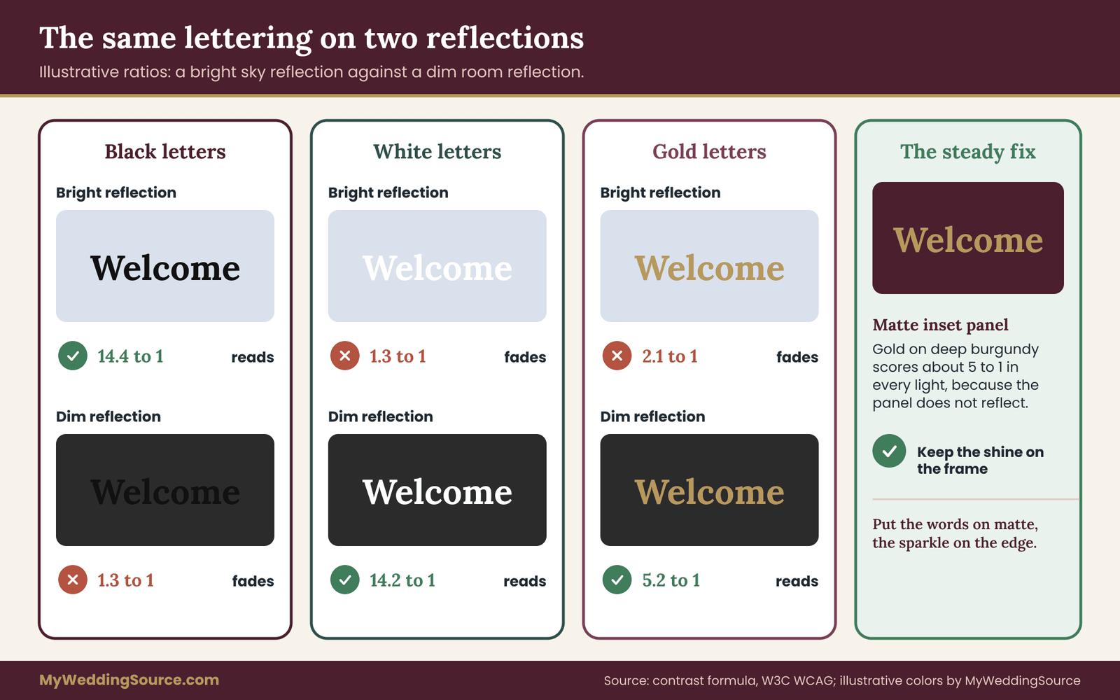
Black lettering, a very dark gray, on a bright sky reflection gives about fourteen to one. Strong. The same black lettering on a mid-tone reflection gives about five to one, which still passes for normal text. On a dim interior reflection it drops to about one and a third to one. The words are almost gone.
White lettering behaves in the opposite direction. On the bright sky it is about one and a third to one and nearly invisible. On the mid-tone shade it is about three and a half to one, a pass for large text only. On the dim interior it is about fourteen to one, and the letters leap out.
Gold lettering, a favorite for weddings, does poorly nearly everywhere. It scores about two to one on the bright reflection, about one and a third to one on the mid-tone and about five to one on the dim interior. It only works against a dark reflection, and only for large words.
What the numbers tell you
Two lessons come out of that example. First, no single lettering color is safe on a mirror in all lights. Black is the most flexible, because most real scenes are brighter than black, and it fails only when the mirror reflects something very dark. White is the mirror image of that: it works where the reflection is dark and fails in sunlight and open sky.
Second, the lettering color should be chosen for the lightest and darkest reflections the sign will really meet, not for the average. If a sign stands outside near the entrance at two in the afternoon and again in the evening when the doors are lit from inside, it will meet both. The test sheet in the next section is how you find out which.
Where the contrast formula stops helping
A ratio is a good first filter and a poor final judge for mirror wedding signs. The formula treats the lettering and background as flat colors. A mirror adds three things the number cannot see: edges and shapes in the reflection that compete with letter shapes, moving reflections as guests pass, and glare spots where a bright source lines up with the mirror and the guest. A sign can pass on paper and still be hard to read because a window frame cuts across the second line.
The World Wide Web Consortium also publishes guidance on non-text contrast and on not using color alone to carry meaning. Those pages are useful for thinking about icons and arrows on a sign. The takeaway is simple: use the ratio to rule things out, then rely on a live test to rule things in.
Choosing a lettering method for mirror wedding signs
How the words get on the surface of mirror wedding signs matters as much as their color. There are four common methods, and they behave differently on a reflective panel.
Opaque vinyl lettering applied to the face. The lettering stays one color, so it follows the rules above. Black on a mirror works in most daylight. The edges are crisp, and the vinyl sits on the surface where it can be scratched or peeled by a careless hand.
Frosted or etched lettering. The letters are made by removing or roughening the mirror coating, so the lettering is a pale, matte shape on a reflective ground. In bright light the letters often read as lighter than the reflection, and in a dark room they glow faintly against it. Contrast is subtle, and the sign can look elegant but quiet. It often needs larger lettering than a bold vinyl would.
Reverse-printed or second-surface lettering. On acrylic, the printing can sit on the back, so the guest reads through the clear sheet. The look is smooth and protected. With a mirrored sheet, the lettering is printed on a surface that the guest sees through the reflective layer, so ask what the finished sample looks like rather than guessing.
Paint pen or hand lettering. A calligrapher writing directly on a mirror gives a soft, personal look with variable stroke width. Thin strokes are poor at a distance, and the lettering cannot be easily changed afterward. Treat it as decoration, not information.
Add a solid panel behind the words
A practical fix, if you still want mirror wedding signs, is to avoid putting the key words on the reflective area at all. A mirrored border with a matte center panel gives you the shine at the edge and a stable background for the lettering. A clear acrylic sign mounted over a plain white or dark backing does the same thing, and the backing can often be removed after the event.
This is also a handy way to keep the mirror for a name or monogram, which is decoration, and put the seating instructions, the bar menu or the schedule on matte boards nearby.
Size matters more on mirror wedding signs
Lettering on a matte sign may be readable at a modest size. Lettering on a mirror or a glossy sheet has to fight reflections, so a larger size and heavier strokes help. Thin script is the hardest case. Hairline strokes break up when a reflection crosses them, and the guest’s brain has to guess the missing parts.
The wider signage guide explains how to work out letter height from viewing distance. As a rule for this test, if one of your mirror wedding signs is borderline at the planned size, enlarging the lettering or switching to a bolder typeface almost always beats trying to fix the lighting.
Contrast within the lettering itself
There is one more case to know: lettering that has two parts, such as a name in bold and a date in light. The lighter part is the one that fails first. When you run the test, check each line separately. A sign passes only if its smallest, thinnest line passes. If a line fails, you have three options: enlarge it, thicken it or move it to a different sign.
Photograph the problem before you fix it
As you run the contrast check on mirror wedding signs, keep a phone handy. A quick photo of the sample in each light is a record you can show your sign maker, and it is easier to talk about “the second line disappears when the sun is behind the guests” with a picture than with a memory.
How to check a pair of colors yourself
You do not need to do the math by hand, because free contrast checkers do it for you, but it helps to know what the tool is doing. It converts each color to a relative luminance, a number between zero for black and one for white that reflects how bright the color looks to the human eye. It then divides the lighter value plus a small constant by the darker value plus the same constant. That is the ratio.
For mirror wedding signs, run the check three times for each lettering color: once against a pale color that stands in for bright sky, once against a mid-gray for shade, and once against a dark gray for a dim room. Write the three results next to each other. A color pair that passes in all three is rare, and a pair that passes in two of the three tells you which lights to avoid.
Color pairs to treat with suspicion
Some pairings are common in wedding design and weak on mirror wedding signs and other reflective surfaces. Gold or rose gold lettering on a mirror is the most common case. Pale blush, champagne and white lettering fall into the same group, because they sit near the brightness of a daylit reflection. Thin script in any light color is the weakest of all.
On the other side, deep burgundy, charcoal, black and dark teal lettering give you room. They fall short only against a dark reflection, which in daytime is the less likely case. If your palette is soft and pale, think about using the palette on borders, flowers and backing, and a dark neutral for the words. The wedding color palette guide covers how to build a palette that includes a readable dark.
The guest’s own reflection
One more reflection is easy to forget: the guest. One of the mirror wedding signs at eye level shows the reader their own face and clothing, usually right where the words are. A guest in a pale dress or a white shirt puts a bright patch in the middle of the sign. Dark lettering handles that better than white lettering, which disappears under a bright shirt.
This is also why placement matters. A mirror sign that stands at a height where it reflects the sky or a ceiling, not a crowd, is steadier than one at chest height in a busy corridor. You will test this directly in the walk-up step of the test.
Stroke weight and spacing
Heavier strokes survive reflections better than thin ones, and open spacing between letters stops the reflection from joining them into a blur. A sturdy sans-serif or a bold serif is a safer choice than a fine script for any line that carries information. If you love a script, use it for the couple’s names at a large size and put the details in a plainer face below.
When a sign maker proofs the layout, ask for the proof printed at real size. A proof on a screen shrinks everything and hides how thin the strokes really are.
Matte backing as a fallback
If the test shows that the lettering on mirror wedding signs fails in one light, a matte backing is the simplest fix and it is reversible. A sheet of plain white or dark board placed behind clear acrylic, or a matte inset panel placed in the frame, gives the words a steady background. It changes the look, and it keeps the shine at the edges. Try it before you rebuild the whole sign.
The four-light contrast test sheet for mirror wedding signs
Here is the working tool of this guide. It is a single printed sheet, a physical sample of your material and a short routine you repeat in four kinds of light. The idea is to hold the words steady and let the light change, so that any difference you see comes from the surface and not from the design.
The sheet suits mirror wedding signs and acrylic panels alike. It is not a certified measurement and does not claim to be one. It is a structured, repeatable comparison that lets you see problems before your guests do. Treat the result as strong evidence about your sign in your light, not as a guarantee.
What goes on the sheet
Print the sheet on plain matte paper at real size. Use the same typeface and the same color as the sign. The sheet carries six items.
The main line. The most important words on the sign, at the planned letter height. For a welcome sign, it might be the names and the date. For a seating display, it might be the heading and the first few names.
The smallest line. The thinnest, smallest text anywhere on the sign, such as a date in light script or a line of fine print. This is the line that fails first, so it earns its own spot.
The hardest real content. A line of the real content that is the easiest to misread: a run of names with similar spellings, a list of table numbers, a time. Use the actual words, not a placeholder, because a reader’s brain fills in familiar placeholders.
An arrow or icon, if the sign uses one. Arrows and symbols have to be recognized, not read, and they fail differently from words.
Two fallback colors. The same main line printed in black and in a dark neutral from your palette, so you can see whether changing color would fix a failure.
Three reference patches. A white square, a mid-gray square and a black square, each a few inches across. They are not for reading. They give you something to compare when you photograph the sheet and the sample in each light, so you can tell whether a photo is brighter or darker than the eye saw.
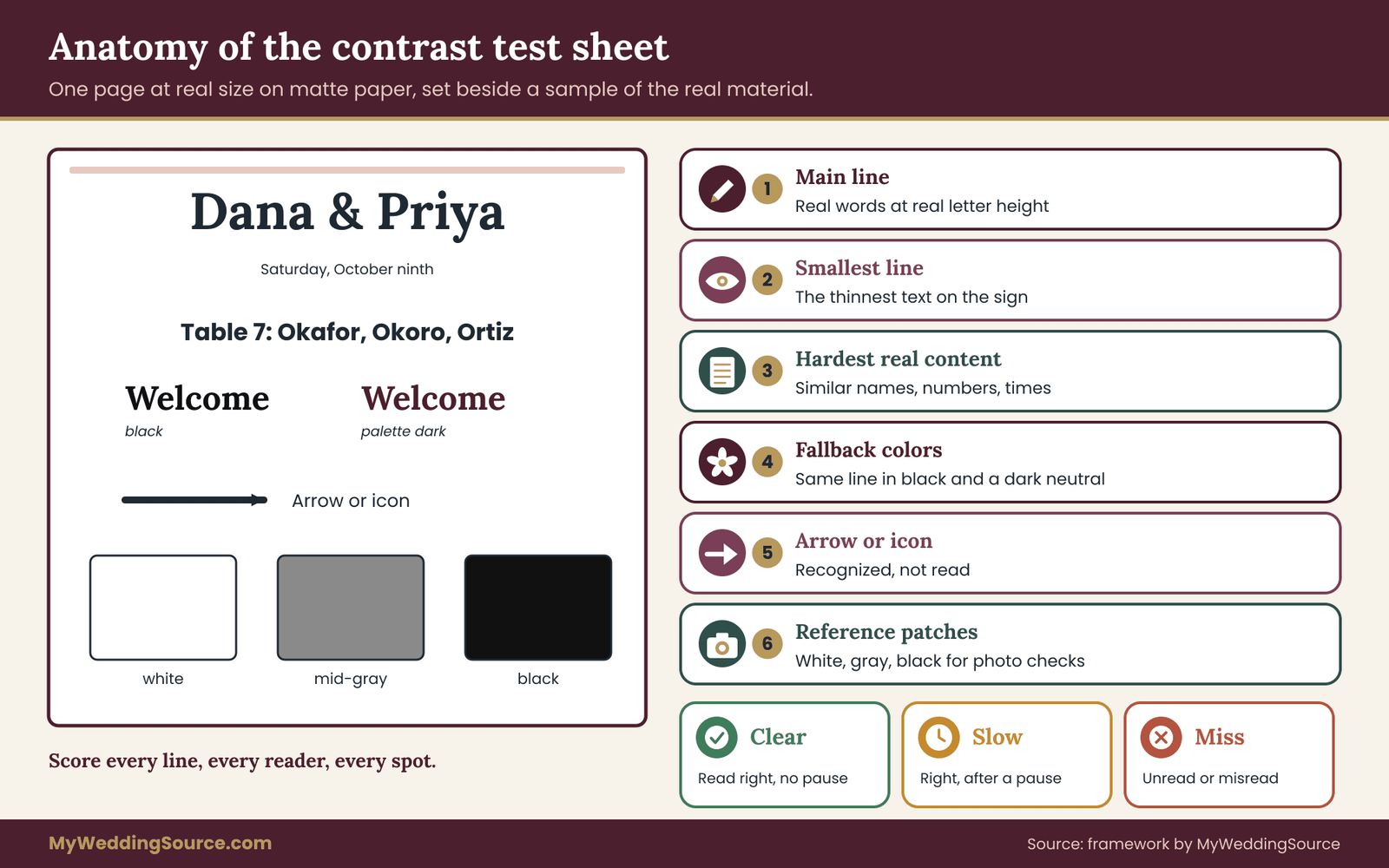
The sample of the real material
The sheet is only half of the test. The other half is a piece of the actual sign material with the lettering applied in the actual way. Ask the maker for one of these three things, in order of preference: the real sign, a proof piece cut from the same sheet and lettered the same way, or a small swatch with the same finish and lettering method.
Pay attention to the phrase “same sheet.” Mirrored acrylic from two suppliers can differ in tint, in how sharp the reflection is and in how it scratches. Frosted acrylic can be frosted more or less. A sample from a different product is a different test. If the maker will not provide a sample, ask whether they have a recent finished sign in the same material that you can look at in person or in a photo taken in daylight.
Why the control sheet matters
Put the matte paper sheet and the sample side by side in every test. The paper is your control, because it shows what the words look like with no surface problem at all. When the sample is harder to read than the paper in the same light, the extra difficulty comes from the material and its reflections. Call that the material penalty.
A small material penalty is fine on mirror wedding signs, and a large one is a decision to make. It turns a vague feeling into a concrete comparison: “the sample is as readable as the paper in shade and much worse in direct sun.”
The four lights
You will test in four lighting conditions. They map to the places where signs in fact spend their time.
Light one: open shade. Outdoors, out of direct sun, with a clear or bright sky above. This is the typical condition for a welcome sign near a garden entrance or for signs under trees. Mirror wedding signs reflect the sky strongly here, so bright reflections are the main risk for light lettering.
Light two: direct or low sun. The sun on the sample, or the sun at a low angle behind the reader. This is the harshest test. Hot spots, washed-out lettering and the reader’s own shadow all appear here. Repeat the test at the hour when the sun will be low for your ceremony or cocktail hour.
Light three: indoor ceiling light. Typical room lighting from above, with the curtains closed or the windows far away. Ceiling lights create small bright points in a mirror, and the contrast with a dim room can be strong in the opposite direction from outdoors.
Light four: evening or dim light. Low ambient light, string lights, candles or uplighting, as a guest would see it after sunset. This is the condition most often skipped, and it is the one in which a sign can need its own light source.
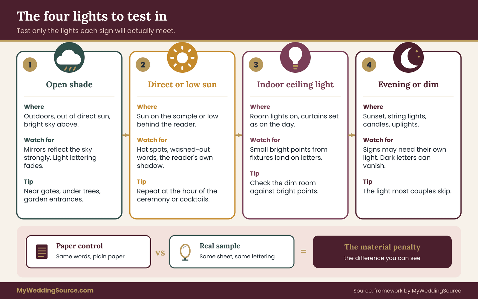
You will not need all four for every sign. A sign that is only used indoors during dinner may need only lights three and four. A welcome sign by the road may need one, two and four. The next section helps you decide.
Match each sign to the lights it will meet
Before running anything, write one line per sign saying where it will stand and when guests will read it. A welcome sign at the entrance is read from the arrival time until the ceremony starts. A seating display is read during cocktail hour and again by latecomers. A bar sign is read all evening. A memorial sign by a candle table might be read only in dim light.
For each, circle the lights it will meet. That is the sign’s test list. This step keeps the test short and keeps you from fixing a problem that never occurs. A sign that is tested only in the lights it will meet gives you a fair answer, and mirror wedding signs deserve that fairness. A sign tested in every light gives you a long list of failures, most of which do not matter.
The reading spots
For each light, you will read the sample from three spots at the real viewing distance. One is straight in front, one is about thirty degrees to the left and one is about thirty degrees to the right. If the sign will mostly be read from a long walkway, add a fourth spot at the far end of the walkway.
Thirty degrees is not a scientific threshold. It is a practical stand-in for where guests will drift as they approach, queue or move around. The point of the side spots is to move through the reflection path, which is where mirror wedding signs hide their problems. One of your mirror wedding signs may look fine straight on and still throw glare at a guest standing a little to one side.
How to score what you see
Use three marks for each line, for each spot and each reader.
Clear. The reader says the words correctly without a pause.
Slow. The reader gets the words right but pauses, leans in, squints or moves their head.
Miss. The reader cannot read the words, or misreads a name, a number or a time.
A light is a pass when every information line scores clear from the straight spot and at least one side spot, for every reader. It is borderline if any line scores slow, or if one reader misses once. It is a fail if any line is missed from the straight spot, or if any number or name is misread by any reader.
The rule is strict on purpose. A guest who misreads a table number is a guest who walks to the wrong table, and a seating sign has no second chance to correct them. A slightly looser rule is fine for a purely decorative sign, which is the next thing to decide.
Information signs and decorative mirror wedding signs
Not every sign needs to pass at full strength. Sort each sign into one of two groups before you test.
An information sign tells the guest something they need to act on: where to sit, where to go, when something starts, what a drink contains. These signs have to be read quickly by a cold reader. The strict rule applies.
A decorative sign adds atmosphere: a monogram, a quote, the couple’s names in a calligraphy panel. These signs have to look good and be recognizable, but a guest who cannot read them loses nothing. The test for these signs is lighter: check that the main words are readable from a few feet away and that the glare does not make the display unpleasant.
Sorting early frees you to use mirror wedding signs where they shine and use matte where information counts. Many weddings end up with a single mirrored showpiece and several quiet, readable boards, and that is a good balance.
Running the test for mirror wedding signs, step by step
Testing mirror wedding signs takes about an hour of active work, spread over a few days because you need different light. None of it needs special equipment. You need the printed sheet, the sample, a tape measure, a phone camera, a notebook or a shared note, and two or three helpers who have not seen your wording.
Step one: collect the kit
Gather the printed sheet, the material sample, a roll of tape or a small easel to stand the sample upright, a tape measure and a pen. Add a second sample if you are comparing finishes, such as mirrored and frosted, or black lettering against white. Keep the samples clean. Fingerprints and dust on a mirrored or glossy sample show up strongly in side light, and they can make a good sign look bad.
Step two: choose readers who have not seen the words
A reader who already knows the wording will read what they expect, not what is on the sign. Choose people who have not seen the names, the numbers or the layout. A friend who is not in the wedding party is ideal. A relative who is likely to attend, and who reads with glasses, is also a useful choice, because wedding guests include people at every stage of eyesight.
Two to three readers is enough. More readers give more opinions without giving you much more information. Do not coach them. Ask them to read each line aloud, and note what they say.
Step three: set the real viewing distance
Measure the distance from where a guest will first need to read the sign to where it hangs. If you do not know, use the working number from the sign inventory in the wider guide, or pace it off at the venue. Mark three spots at that distance: straight on, left at about thirty degrees and right at about thirty degrees. A tape and a few pieces of tape on the floor are fine.
Step four: set the sign at its real height and tilt
Stand the sample at the same height and angle the real sign will have. Mirror wedding signs leaning slightly back on an easel catch different reflections from ones standing vertical. A sign on a table is lower than a sign on a stand. If the final height is not known, test the two likeliest and keep both results.
Step five: run light one, open shade
Take the sample and the sheet outside into shade, ideally at the venue and around the hour guests will arrive. Have each reader stand at each spot and read the lines aloud. Mark clear, slow or miss for each line. Then take a photo of the sample and the sheet side by side from the straight spot, with the three reference patches in the frame.
Step six: run light two, sun on mirror wedding signs
This is the step to schedule carefully. The sun’s position depends on the date, the time and your location, and a mirror cares about the angle. The National Oceanic and Atmospheric Administration publishes a free solar calculator that gives the sun’s elevation and direction for any place and time. Enter your venue, your wedding date and the hour guests will read the sign, and you will know roughly where the sun will be.
You do not need to be precise. What you need to know is whether the sun will be low and in front of the guests, behind them, or to one side. Run the test with the sample in the real position at roughly the real hour, or on a day near it. If the venue visit is at a different season, the sun will sit at a different height and the result is only a rough guide.
Step seven: run light three, indoor
Move indoors to a spot with the same kind of lighting as the planned location. Turn on the overhead lights. If the sign will stand near a window, pull the curtains as you would on the day. Repeat the reading and photograph. Look especially for bright points from ceiling fixtures reflected in the sample, because they are small and bright and can land right on a letter.
Step eight: run light four, evening
Finish with the dimmest condition. If you can visit the venue after sunset, with the lights set as they will be, that is ideal. If you cannot, put the sample in a room with only lamps or string lights, with the same sort of brightness the venue will have. Check whether the lettering can be read without a dedicated light, and whether a candle or an uplight on the sign produces a hot spot.
Step nine: write the result on one page
For each sign, write a short result: the sign name, the lights tested, a pass, borderline or fail for each light, the worst line and the reason in plain words. “Fails in sun, thin date line disappears under sky reflection” is a good note. “Looked okay” is not.
Keep the photos with the page. They are the proof you will show your sign maker or venue if you need to explain a change.
When the venue will not let you in
Many venues will not allow a long visit before the wedding, which makes testing mirror wedding signs harder, and some are in use on the day you wish to test. In that case, run the test in conditions that match. A window with the same compass direction at home gives you a rough match for sun direction. An outdoor spot near you with similar open sky gives you a match for shade. The result is weaker than an on-site test, and you should say so in your notes.
If you can, ask the venue for a short slot on the morning of the wedding to walk the signs before guests arrive, and plan to make small changes then, such as tilting a sign or moving it a few feet.
How to read a mixed result
Real results for mirror wedding signs are rarely clean. A sign might pass in shade and indoors, borderline in evening and fail in low sun. That is useful. It tells you the sign works in most places and times, and it tells you what to do about the exception: move it, shade it, change the lettering, or accept that the sign will be read mostly after the sun has dropped.
The key question for a mixed result is whether the failing light is one the sign will meet when guests are actually reading it. A sign that fails at noon on a day when the doors open at five is a documented, harmless note. A sign that fails at five is the one to fix.
Fixing a failed result on mirror wedding signs
A failure does not mean you abandon mirror wedding signs. It means you pick the least expensive change that solves the specific problem. The causes are few, and each has a usual cure.
Diagnose the failure before choosing a fix
Look at the photos and your notes and sort the problem into one of four types.
Washed out. The lettering is the same brightness as the reflection, so it fades. The cure is a change in lettering color or a matte backing.
Hot spot. A bright light, such as the sun or a ceiling fixture, lands on or near the lettering. The cure is a change in angle, position or shade.
Busy reflection. The reflection shows shapes, like window frames, branches or people, that break up the letters. The cure is a different position, a different height or a matte panel.
Too dim. In low light the lettering, or the whole sign, is not visible. The cure is a light source, a lighter or darker color, or a different material.
The fix ladder
Work up the ladder from the cheapest and most reversible change.
First, move or turn the sign. A small change in position or a few degrees of tilt can move a hot spot off the lettering. Tipping a mirror slightly downward so it reflects the ground, not the sky, can help. It costs nothing, and it is the first thing to try at the venue.
Second, shade or relocate it. A sign under an awning or beside a wall that blocks the sun may be fine in conditions that defeated it in the open. Moving a sign inside a doorway is often enough.
Third, change the lettering color or weight. If black fails in a dark reflection and white fails in a bright one, choose the one that fails only in lights you will not meet. Increase the size or the stroke.
Fourth, add a matte backing or a solid panel behind the words. This is the most dependable fix and keeps the look at the edges.
Fifth, swap the finish. A frosted or satin surface in place of a polished mirror scatters the light and removes most of the glare. This changes the look, so show your partner and the maker a sample first.
Sixth, add light. A small clip-on light or a lit stand can raise a sign above its surroundings in the evening. It must be cleared with the venue, since power, heat and cables raise their own rules.
Seventh, reclassify the sign. If a gorgeous mirror will never read in the light it faces, make it decorative and put the information on a matte board beside it.
What to say to the sign maker
A short, specific message is more useful than an open complaint. Something like this works well.
“We tested your sample in open shade, afternoon sun and indoor light. The lettering reads clearly in shade and indoors, but the second line fades in the afternoon sun. Could you show us the same lettering in black vinyl, or with a matte backing behind the text?”
This tells the maker exactly where the problem is and offers two options. Makers who do this work regularly have seen the problem before and often have a standard solution. If they push back, ask them to show you a finished sign in similar conditions.
Retest after every change
A fix to mirror wedding signs is a hypothesis until you test it. After each change, repeat the failing light with the same readers or fresh ones. Keep a log of what you changed and what happened, so you can see which fix worked and stop when the sign passes. Stopping is part of the method. A sign that passes is finished, and extra tweaks only add cost.
Do not fix what does not need fixing
Some couples, after a failed light, rebuild their mirror wedding signs for a condition that will not occur. Return to the list of lights the sign will meet. If the failure belongs to a light that is not on the list, note it and move on.
Photography tests for mirror wedding signs
Mirror wedding signs have two audiences. The first is the guest standing in front of it. The second is the camera, which will be pointed at it many times, by the photographer, by guests with phones and by the couple posing beside it. A sign that reads well to the eye can still photograph badly, and a mirror makes that more likely than any other material.
Cameras differ from eyes in ways that matter here. A camera exposes for a whole scene, and a phone chooses its exposure automatically. When a bright reflection fills part of the frame, the camera may darken the entire image to compensate, and the lettering goes with it. A flash fires a strong, short burst straight toward the subject, and a mirror sends it straight back.
What goes wrong in a photo of mirror wedding signs
There are four common failures, and each is predictable.
The photographer appears in the sign. Standing straight in front of a mirror and shooting it head-on puts the camera, and often the photographer, in the middle of the reflection. In a wide shot of a couple beside the sign, the sign may show the crowd, the tent or a line of parked cars.
The flash makes a white blotch. A direct on-camera flash aimed at a flat reflective surface bounces back as a burst of white. The lettering under it disappears.
The sign reflects something you did not choose. A mirror behind a couple during portraits doubles the background. It can show a messy buffet, a loading area or a wall of exit signs. The photo looks fine from the front and strange from the sign.
The lettering vanishes at small size. On a phone screen a photo is a thumbnail. Fine lettering and weak contrast that were barely readable in person are completely gone in a post. If you hope guests will share a picture of the welcome sign, the words need to survive being shrunk.
Talk to the photographer early
Photographers see signs from the camera’s side, and many have strong views on mirror wedding signs. Bring the sample of your mirror wedding signs to a conversation before the wedding and show them where it will stand. Ask three plain questions. Where would you stand to photograph it? Would you use flash near it? Is there a position where it would show a poor background?
Take their answer seriously, and do not script their work. A photographer who says “I would shoot from an angle and keep it away from the buffet” has just told you where to put a marker. A photographer who says “I would rather not photograph it” has told you something too. If photos of the signs matter to you, put them on the shot list, as the wedding family photo list guide shows for other planned pictures.
The three-angle photo test
Run this test with the sample or the finished sign, in the real position, at the same hour you tested for sun.
Angle one: straight on. Stand directly in front of the sign at about the real distance and take a photo at the height of a standing adult. Look at what the photo shows in the mirror. If you see yourself and the phone, you have found the reflection of the camera.
Angle two: slightly off. Move to your left, about fifteen degrees, and take another. Then move right. Notice how the reflection changes. Often the camera disappears and the lettering becomes clear, and the reflected scene changes to something to the side.
Angle three: more off. Move to about thirty degrees on each side and photograph again. This is closer to how guests will often shoot a sign as they pass it, and how a photographer will frame a couple beside it.
Repeat from a higher and a lower position. A phone held at chest height and one held above the head see different reflections. Pick the angle that gives you the clearest lettering and the least distracting reflection, and write it down as the sign’s good photo angle.
The flash test
Take one photo with flash and one without, from straight on and from the side. A few things can happen. With the flash from straight on, expect a white burst. With flash from the side, you may see a bright streak instead. Without flash, the sign may look dim but readable.
The takeaway for mirror wedding signs is not to ban flash. It is to know what it will do. A photographer who uses bounced or off-camera flash can handle a mirror easily, and a guest with a phone flash will make a mess no matter what you do. If the welcome sign is going to be the most photographed object at the wedding, think about whether a mirror is the right choice for it. A matte sign takes a flash without drama.
The thumbnail test
Take your best test photos, put them on your phone, and look at them at the size of a social media post. Can you read the main line? Can you read the second line? If not, the sign will not read in a shared photo either, however good it looks in person.
This test is also a fast check on contrast, because the thumbnail strips away fine detail. If the lettering is clear at thumbnail size, it is probably robust.
The reflection audit
Walk to the spot where a photographer would stand to shoot the sign, and look at what the mirror reflects from there. It reflects what is behind you, so turn around and look. Note the sky, any bright windows, vehicles, trash cans, exits and people. If the reflection is attractive, such as trees, a garden or string lights, the mirror adds to the picture. If it is unattractive, either move the sign or place something pleasing behind the photographer’s spot, such as a plain hedge or a draped fabric panel.
Mirrors and guests who prefer not to be photographed
Mirror wedding signs can put a guest in a picture even when the camera is pointed elsewhere. A person standing near a mirror sign may be reflected into a photo taken from the opposite side. If your day includes guests who have asked not to appear in photos, or children whose parents want them kept out of shared images, keep that in mind when you place a mirror near a gathering area. The guide to wedding photography consent covers how couples set boundaries around guest images, and the same thinking applies to reflections.
Video and live streams
Moving cameras make reflections move on mirror wedding signs. In video, a mirror sign near a doorway will flicker with passing guests and sweeping lights. If a videographer will film the entrance, ask whether they want the mirror in the shot or out of it. If a live stream is planned, a matte sign is calmer for a viewer.
Photography checklist for mirror wedding signs
Here is the short list for one sign, in the order to do it. Set the sign in its real spot. Shoot it from three angles and two heights. Try flash and no flash. Look at the thumbnail. Walk behind the camera spot and note the reflection. Choose a good photo angle and mark the spot on the ground if the photographer agrees. Share the notes with the photographer in the final briefing.

When acrylic is the photography-friendly choice
Frosted and opaque acrylic solve most of these photography problems at once, because they scatter light and show no reflections. A frosted panel with dark lettering photographs cleanly from almost any angle, and it takes a flash well. If photography is the main reason for a sign, and the couple likes the look of acrylic, consider the frosted version for the sign that will be in the most pictures, and keep mirror wedding signs for a corner where the reflection is flattering.
A worked example: mirror wedding signs at an invented garden wedding
Here is how the test plays out for an invented couple, Dana and Priya. They are not real, and the numbers are illustrative, but the sequence is the one you would follow. They plan a ninety-guest wedding at a garden venue, with a late-afternoon ceremony, a cocktail hour on the terrace, dinner in a tent and dancing after dark. They want a polished, modern look, and they have fallen for mirror wedding signs in mirrored acrylic.
The signs and the first sort
Their sign maker has proposed four pieces. A welcome sign at the garden gate, in mirrored acrylic with white script lettering. A seating display near the terrace, in a large mirrored panel with gold lettering and table names. A bar menu, on clear acrylic with white text. A small mirror by a candle table, with a handwritten line in memory of a grandparent.
Dana and Priya sort them first, and they lean on a seating chart guide to decide how guests will find their tables. The welcome sign and the seating display are information signs, because guests need to act on them. The bar menu is also information. The candle table sign is decorative and personal. Only the first three get the strict test.
They then write each sign’s lights. The welcome sign will be read from about three in the afternoon to the start of the ceremony at five, in open shade and then low sun. The seating display will be read between five-thirty and seven, around sunset, and by latecomers in dusk. The bar menu will be read from cocktail hour until the end, from open terrace daylight to full dark. The candle table sign will be read after dark only.
The test sheets
For each sign the sheet carries the main line, the smallest line, a hard real line, two fallback colors and three reference patches. The welcome sheet has the couple’s names, the date and a short line of welcome. The seating sheet has the heading, six real guest names with similar spellings, and the table numbers. The bar sheet has the drink names and a line of allergen notes.
The maker sends a swatch cut from the same mirrored sheet for the welcome and seating tests, with the real lettering applied. The clear acrylic is tested with the real white print and a plain dark backing, since the bar stands in front of a shelf of bottles.
Three helpers who have not seen the wording volunteer: a neighbor, a coworker and Priya’s aunt, who wears bifocals.
The welcome sign in light
In open shade at the gate at three o’clock the sample reflects a bright sky. The white script reads slowly. Two of the three readers pause on the date, and the aunt misses it. The paper control, in the same light, is easy to read, so the difference is the material penalty.
By five, the sun is low and in front of the guests. A hot spot lands on the center of the sample from the straight spot. From the side spots the hot spot moves off the words, but the reflection of the gate and a parked van runs across the second line. Result: fail in both outdoor lights. White would read well at dusk against a dim sky, but this sign is not read at dusk, so that pass is irrelevant.
Using the contrast arithmetic from earlier, white lettering on a bright sky reflection is around one and a third to one. The failure is no surprise. They consult the fix ladder.
Changing white lettering to black raises the ratio on a bright reflection to about fourteen to one. They try black vinyl on the same sample, in a bold serif, a little larger.
Shade: clear for all three readers. Low sun: the hot spot is still there from the straight spot, so they tilt the sign down about eight degrees on the stand. The hot spot moves up and away from the lettering. Result: pass in shade, pass in low sun from the straight spot and one side. The sign is finished.
The seating display in light
The gold lettering is the real problem. Against a bright reflection gold scores about two to one, and against a mid-tone reflection about one and a third to one. All three readers miss a table number in shade. The seating display is read only at dusk, but even at dusk the reflected terrace lights make hot spots on the first column of names.
The couple loves gold, so they try a compromise from the fix ladder. The maker offers a matte deep burgundy inset panel inside a mirrored frame, with the gold lettering on the burgundy. Gold on that burgundy scores about five to one, which is workable for large text. They also swap the thin script for a bolder serif and increase the size of the names. The retest in shade and at dusk passes with all three readers from all three spots. The mirrored frame still catches the terrace lights and looks beautiful, and the lettering stays readable because it no longer sits on the mirror.
The bar menu in light
The clear acrylic with white print looks wonderful in the shop. On the terrace in daylight, it shows the bottles behind it, and the readers lose the drink names in the clutter. In the evening, with a dark tent behind, it reads well. Since the bar stays open into the afternoon light, this is a fail in a light the sign will meet.
The maker proposes a black opaque panel with white lettering. The ratio is high, the color does not change, and a frosted finish removes most reflections. The retest passes in every light. The couple loses the see-through look and gains a menu everyone can read.
The candle table sign
The mirror by the candle table is decorative and only read in the dark. The couple holds it to the lighter test: from a few feet away in dim light, can the handwritten line be read, and does the candle make a harsh hot spot? The line reads, and the candlelight produces a soft glow, not a flash. They keep it as it is and mark it as a decoration only.
The photo test
The welcome sign is going to be the most photographed object in the garden. In the three-angle test, a straight-on photo shows the photographer and the parking lot. From about twenty degrees to the right, the reflection shows the garden, which is the setting they want. A flash test from straight on makes a white burst across the middle of the sign. The photographer, consulted in advance, says she will shoot from the right and avoid direct flash at the sign.
Dana and Priya mark the photo spot with a small stone just off the path. They also place a plain hedge screen near the parking lot side, so the mirror does not show the cars.
What they decided
After a few rounds, they end up with four signs, each in the material that suits its job. The welcome sign is mirrored acrylic with black vinyl, tilted slightly. The seating display is a mirrored frame around a matte burgundy panel with gold lettering. The bar menu is black opaque acrylic with white print. The candle table sign is a small mirror, decoration only.
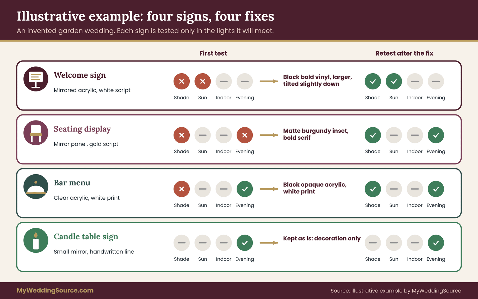
Their use of mirror wedding signs is smaller than they imagined, and the signs are more readable. They also have a record of the tests, with photos, which they send to the sign maker with the corrections.
Why this example of mirror wedding signs works
The example turns on three habits. The couple sorted signs by job before testing. They tested only the lights each sign would meet. And they used the cheapest fix that solved the specific problem, in order. None of these takes special skill. You can do all of them with paper, a swatch and a few helpers, and you can copy the method for your own signs.
Verifying mirror wedding signs with the sign maker and the venue
Testing gives you evidence. Verification turns it into agreements. Two parties have a say in your sign: the maker, who controls the material and the lettering, and the venue, who controls where the sign goes and what can be brought in.
Questions to ask the maker of mirror wedding signs
Ask these in writing, and keep the answers. They are easier to compare when you ask every maker the same set.
What exactly is the material: glass mirror, mirrored acrylic, clear acrylic, frosted acrylic or an opaque sheet? What is the thickness, the size and the weight? What finish and lettering method will be used, and on which side of the sheet? Can you provide a sample cut from the same sheet, with the same lettering, before the order is placed? Is a white underlay included for printed lettering on clear acrylic? How is the sign protected for transport, and what happens if it arrives scratched or cracked?
What is the lead time, and when is the final proof approved? Will the proof be printed at real size?
Add one question that few couples think to ask: what lighting conditions was your sample photo taken in? It tells you how much weight to give the picture.
Put the terms in the contract
If you are paying a deposit, the terms of the order belong in writing. The guide to wedding vendor contracts covers what a good agreement includes, and a sign order is a small version of the same thing. Make sure the contract names the material and finish, the lettering method, the size, the proof approval step, the delivery date and the process if the sign arrives damaged or does not match the approved proof.
Ask whether the maker will accept a change after the test. Some makers allow one revision of lettering color before production, and some charge for each change. It is far cheaper to ask before you sign than after the sheet is cut.
Renting instead of buying
Some couples rent signs, particularly large mirrors and stands. Renting changes the conversation. A rented sign is what it is, so the test happens at pickup or in a photo, and the question is whether to take it. The wedding rental planning checklist explains how to check condition, pickup, damage terms and returns. For mirror wedding signs, ask how scratches and cracks are assessed, and who is responsible if a guest knocks it over.
Questions to ask the venue
The wider signage permissions and proofing steps apply to every sign, and the questions below add the mirror-specific ones.
Venues vary widely in how they treat mirror wedding signs. Some welcome decor, and others limit what can be brought in. Ask these questions in writing.
Is glass allowed in the space where the sign will stand, or only plastic? Are there limits on the size, weight or height of freestanding signs? Can signs be placed on walls, windows, doors or railings, and with what attachment? May a sign stand on the grass, on gravel, on a terrace or at the road?
Does anything about the lighting of the space, such as a fixed light level or a lighting plan, affect the signs? Are there fire-safety rules for decor near exits, which may limit where a sign can stand? If the venue uses a fire marshal’s approval, who contacts them? Who is responsible for setup and for taking the sign down?
The National Fire Protection Association publishes codes that local authorities adopt in varying forms, and your venue or local fire official can tell you which rules apply. The right source for your sign is the venue, in writing.
Accessibility check
The U.S. Access Board standards for signs ask for a non-glare finish on characters and their backgrounds, and for light characters on a dark background or dark characters on a light background. They apply to certain permanent signs in covered buildings and not to a wedding sign as such, but the reasoning applies. A guest with low vision is the guest most hurt by glare and by weak contrast, and the venue may care if it is a public place.
If any of your guests have low vision, ask them, kindly and without making an issue of it, whether a sign is easy for them to read. The guide to red flags in accessible wedding venues lists other things to check on the venue side, since signs are only one part of an accessible day.
Who checks on the day
Name one person to carry out a final check before guests arrive. They carry the test sheet, stand at the viewing spots, look for hot spots in the actual light, tilt or move the sign if needed and wipe fingerprints. This takes about ten minutes, and it is the point at which the test turns from a paper exercise into a real result.
Limits of the test and when to skip mirror wedding signs
No test removes all risk, and a guide that claims otherwise should not be trusted. The four-light sheet is a structured way to catch most problems early. It has limits, and knowing them keeps you from over-trusting a pass.
What the test cannot tell you
It cannot predict weather. A cloudy test day and a bright wedding day are different tests, and a sign that passed under clouds may meet harsh sun on the day. If the forecast changes, rerun the sun check at the venue in the morning.
It cannot cover every guest. Two or three readers give you a fair sample, not a population. People vary in eyesight, in how well they cope with glare and in how tired they are by evening. The strict scoring rule builds in margin for that, but margin is not immunity.
It cannot see the future condition of the sign. Dust, fingerprints, scratches and humidity change a surface during setup and the event. A mirror cleaned at noon can have a dozen smudges by cocktail hour, and smudges catch light and hide letters.
It cannot replace the venue’s rules. A sign can pass every readability test and still be refused at the door because it is glass, too heavy or too close to an exit.
Cases where mirror wedding signs are the wrong material
Some situations are poor fits for mirror wedding signs, and it is kinder to the budget to say so early.
A sign that carries critical information for a large crowd, in an unpredictable light, wants a matte surface. A seating display for a hundred and fifty guests who all arrive at once is a good example, because there is no time for a reader to move around the glare.
Mirror wedding signs on an open lawn on a windy day are a poor fit for a large, thin mirrored panel, whatever the light. The panel catches the wind, and a broken mirror is a hazard around guests. The Consumer Product Safety Commission is the federal agency to consult for general consumer safety questions about glass products, and your venue will have its own view on glass.
A sign that stands in front of a busy background, such as a crowded buffet or a bar shelf, loses its words in the clutter. Clear acrylic in particular needs a calm backdrop.
A sign in a narrow corridor, where guests pass at a close angle and a fast pace, gives little time to read around reflections.
A sign that will be handled by many guests, such as a signing board or a message mirror, picks up marks quickly. Choose a surface that hides them, or provide the right pen and a cloth.
Cases where mirror wedding signs are a good fit
Mirror wedding signs work well as a statement piece for names, a monogram or a short welcome that guests read slowly, in a place where the light is predictable. A mirrored frame with a matte inset suits a seating display. A small mirror at a candle table, read in dim light, can look lovely. An evening bar or lounge, with controlled lighting and no direct sun, may be the most natural place for a mirror at the whole wedding.
Choosing by job
A short rule helps when you are unsure. Ask what the sign has to do, then pick the material by the job, not by the look.
If the job is to direct or inform, choose matte or frosted surfaces with high-contrast lettering, and use mirror only as a border. If the job is to welcome and delight, mirror wedding signs are a fair choice, provided it passes the light it will meet. If the job is to remember or honor, a mirror in soft light is often lovely and the test is gentle. If the job is to appear in photographs, test the angles first, and consider frosted acrylic for the sign that will be pictured most.
Cost logic without invented numbers
Prices change by region, size and maker, so this guide gives no figures. The logic is more useful anyway.
Mirror wedding signs usually cost more than a matte board of the same size, and the difference grows with size and with glass. The cost to avoid is the late one. A change after production, such as new lettering or a new panel, costs the whole sign again, while a change after a swatch test costs only the swatch. Paying for a sample before the order is nearly always cheaper than remaking a sign.
A rented mirror may look cheaper, and it can cost more in deposit, damage terms and delivery. Ask for the total, including pickup and return, before comparing.
Reducing the number of mirror wedding signs lowers cost and risk together. The example earlier ended with one mirror used as a statement, one as a frame and one as a decoration, and the rest on matte surfaces. That is often a good shape for the whole set.
Mistakes that appear again and again with mirror wedding signs
Choosing the lettering color to match the palette and not to match the light. Testing indoors when the sign will stand outside. Testing at noon when the sign will be read at five. Using placeholder names on the test sheet. Having readers who already know the wording. Asking for opinions (“do you like it?”) instead of readings (“read me the second line”). Fixing a failure in a light the sign will never meet. And forgetting that the guest’s own reflection will be in the middle of the sign.
A timeline for testing mirror wedding signs
Start testing mirror wedding signs six to eight weeks before the wedding if you can, because a swatch and a possible revision need time. Order the sample first. Run the shade and indoor tests when it arrives. Schedule the sun test for a day and hour close to the wedding, or at the venue on a walk-through. Make any changes, retest, and approve the proof only after a pass. In the last week, confirm the venue’s rules in writing, and brief the photographer. On the day, do a ten-minute final check.
If the wedding is sooner, shorten the process but keep the order: sample, test in the real lights, fix, then approve.
Your next steps
Start with a list of every sign you plan, and sort each into information or decoration. For each information sign, write the lights it will meet. Ask the maker for a swatch cut from the same sheet, with the real lettering applied.
Print the test sheet at real size on matte paper, with the real words and the three reference patches. Run it on your mirror wedding signs in the lights on your list with two or three readers who have not seen the wording, and score each line as clear, slow or miss. Photograph the sample from three angles, with and without flash, and look at the thumbnail.
Then apply the cheapest fix that solves each failure, retest, and put the result in writing with the maker and the venue. The point of all this effort is small: on the day, a guest walks up to your sign, reads it without thinking about it, and moves on to the party.
FAQ
Are mirror wedding signs hard to read at a wedding?
They can be, because a mirror reflects its surroundings, and the reflection competes with the lettering. Dark lettering reads well against bright reflections, and light lettering reads well against dark ones. The result depends on the light, the angle and the lettering color. A short test with a sample, in the lights the sign will meet, tells you whether yours will work.
What lettering color works best on mirror wedding signs?
For mirror wedding signs, black or another very dark color is the most flexible, because most daytime reflections are bright. White works where the reflection is dark, such as in a dim room or in the evening. Gold, blush and champagne often fail on mirrors outdoors. Check any color against a bright, a mid-tone and a dark reflection, and choose the one that passes in the lights you will meet.
How do I reduce glare on mirror wedding signs or acrylic ones?
Change the angle or position first. Tilting the sign slightly down, turning it away from the sun or moving it into shade often removes the hot spot. If that is not enough, choose a frosted or satin finish, add a matte panel behind the words, or switch to an opaque acrylic sign. A small test with the sample will show which change works.
Is frosted acrylic easier to read than clear acrylic?
Usually, yes. Frosted acrylic scatters light, so it shows fewer reflections and does not show a busy background through the sheet. Clear acrylic is fine when it stands in front of a plain, solid backdrop or has a white or colored layer behind the lettering. Ask the maker for a sample of each and compare them next to a paper control in real light. Frosted panels are the usual alternative when mirror wedding signs prove too reflective.
How will mirror wedding signs look in wedding photos?
They may show the photographer, the camera flash or an unflattering background. A photo from straight on often reflects the camera, while a shot from about fifteen to thirty degrees off usually shows the scene beside you. Try the three-angle photo test, with and without flash, and share the best angle with your photographer before the wedding.
Do I need the venue’s permission to use mirror wedding signs?
Often yes, because venues set rules about glass, weight, size, placement, attachments and fire-safety clearances. Some do not allow glass at all. Ask in writing before you order, and keep the reply. If the venue is a public site, such as a park, check the managing agency’s rules, which may be stricter than a private venue’s.
How many readers do I need to test mirror wedding signs?
Two or three is enough. Choose people who have not seen your wording, and ask them to read each line aloud from the real distance. More readers give more opinions without much more information. If any guests are known to have low vision, ask one of them to try the sample too, with their consent.
Can the contrast ratio alone tell me if mirror wedding signs will work?
No. The ratio compares two flat colors, but a mirror has no fixed background color. The reflection changes with the light, adding shapes and hot spots the number cannot see. Use the ratio to rule out weak color pairs, then run a live test with a sample in the real lights to confirm that the sign is readable.
Sources
- Chapter 7: Communication Elements and Features, 2010 ADA Standards, U.S. Access Board
- Guide to the ADA Accessibility Standards: Signs, U.S. Access Board
- Understanding Success Criterion 1.4.3: Contrast (Minimum), W3C Web Accessibility Initiative
- Understanding Success Criterion 1.4.1: Use of Color, W3C Web Accessibility Initiative
- Understanding Success Criterion 1.4.11: Non-text Contrast, W3C Web Accessibility Initiative
- Web Content Accessibility Guidelines 2.2, W3C
- Web Accessibility Initiative home, W3C
- NOAA Solar Calculator, National Oceanic and Atmospheric Administration
- U.S. Consumer Product Safety Commission
- National Fire Protection Association