
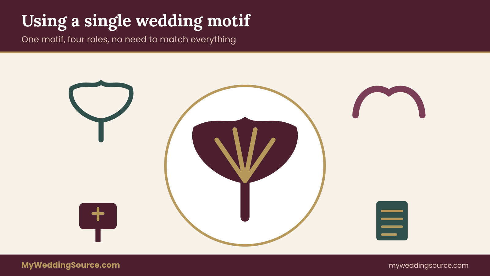
A wedding motif is one repeated shape or image, such as a leaf, a wave line or a small crest, that ties your invitation, signs, flowers and tables together without forcing every object to match. This guide gives you an original placement map and a repetition restraint worksheet, so the wedding motif appears where guests will notice it and rests everywhere else.
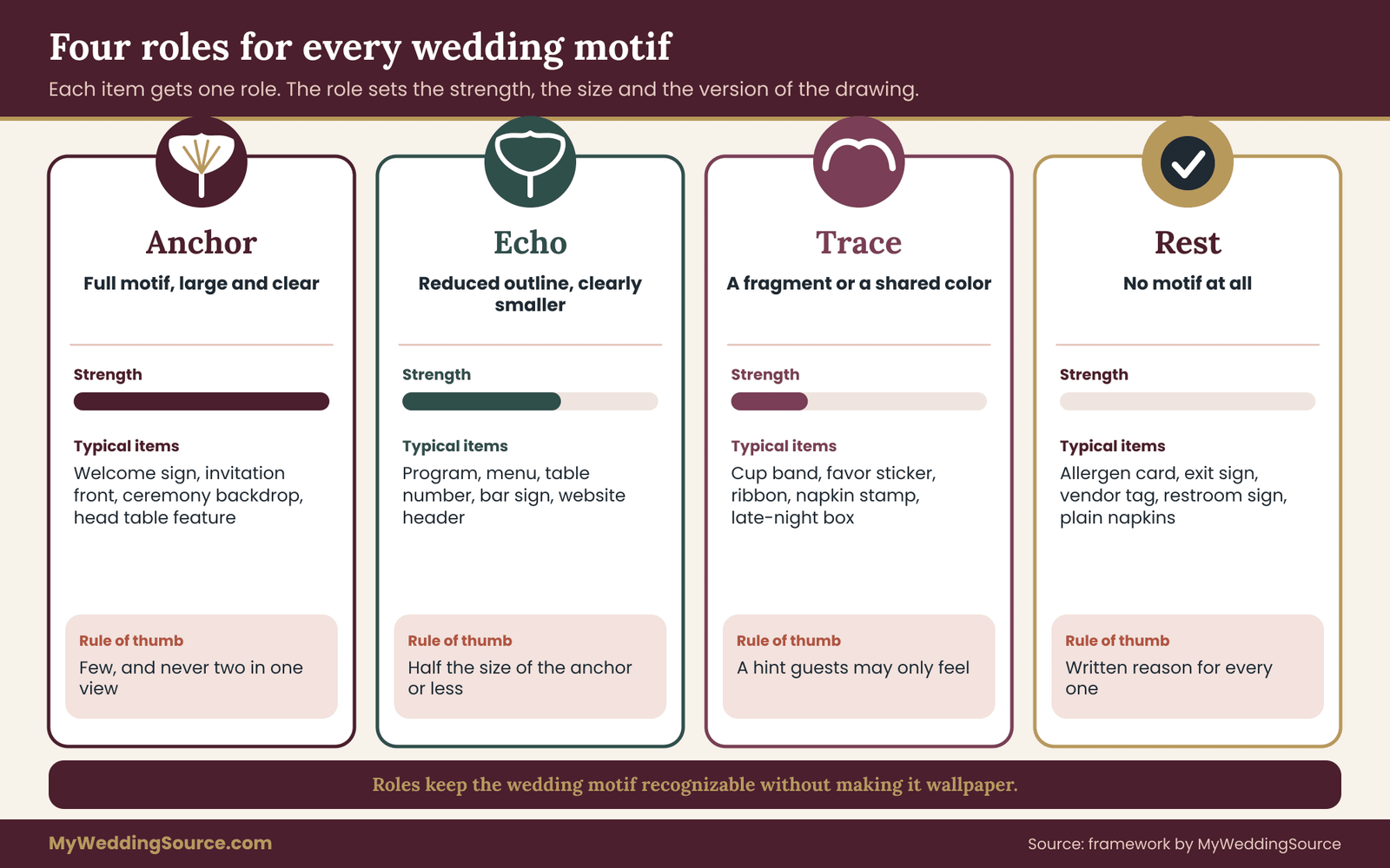
Choose one wedding motif and give every item on your list one of four roles: anchor (the full motif, large and clear), echo (a simplified version, clearly smaller), trace (a hint such as one line or a shared shape), or rest (no motif at all). Allow one anchor per sightline and only a few echoes near it. Then check the plan with measurable tests: a sightline count, a scale ratio and a ten-second photo test. Matching everything is not the goal. Recognition is.
Most couples who pick a motif start with real enthusiasm. They find a hand-drawn olive branch, a scalloped edge or a simple geometric frame, and they love it. Then the vendors start asking questions, and the answer to every question becomes “put the branch on it.” By the time the wedding arrives there is an olive branch on the napkins, the cups, the cake, the coasters, the aisle runner, the restroom sign and the favor tag. Guests stop seeing it. The wedding motif has become wallpaper.
A better wedding motif works the way a good refrain works in a song. It returns often enough to be recognized and rarely enough to still feel like something. Getting that balance right is mostly a placement problem, not an art problem. You do not need a better drawing. You need a decision about where the drawing goes and, just as important, where it does not.
This article builds that decision into a worksheet you can fill out in an evening. It covers what a wedding motif is and is not, the four roles an item can play, how to make three strengths of one drawing, how to map the wedding motif across a guest’s whole day, how to compare alternatives, what to ask vendors, and how to check the result with numbers you can actually measure. Along the way it includes one invented worked example, so you can see the worksheet filled in.
A note on scope. This is general information, not legal, tax or financial advice. Copyright, trademark and vendor terms depend on the specific artwork, supplier and contract, so where a rule matters the article points you to the agency or the document that governs it.
What a wedding motif is, and why matching everything backfires
A wedding motif is a small visual idea that repeats. It can be a drawn object (a ginkgo leaf, a lemon, a compass), an abstract shape (an arch, a scallop, a diamond lattice), a line quality (a single continuous line, a dotted outline) or a monogram-style mark. It is smaller than a theme and more specific than a color palette. A theme says “garden party.” A palette says “sage and cream.” A wedding motif says “this particular leaf, drawn this particular way.”
That specificity is why it is useful. Colors are shared by thousands of weddings, and guests cannot recognize your wedding by sage green alone. A drawn shape that returns across the day gives people a quiet sense that the pieces were chosen together. If you want the broader picture of how a motif sits next to type and color, the guide to choosing a wedding color palette covers the color side, and this article stays with the motif itself.
Matching everything fails for three reasons.
First, repetition without variation reads as decoration, not design. When every surface carries the same image at the same size, nothing is the focal point. Guests cannot tell the important item (the welcome sign, the cake table, the place where they will take photos) from the trivial one (a napkin ring). The eye needs a hierarchy, and a motif at identical strength everywhere removes it.
Second, matching everything is expensive and fragile. Every custom item with the wedding motif on it needs artwork files, a proof, a lead time and a vendor who can reproduce it. Each extra item multiplies the chance of a wrong color, a stretched image or a missed deadline. A motif on forty items means forty small places for something to go wrong.
Third, some items should not carry decoration. An allergen label, an accessible-route sign, a fire-exit marker and a vendor’s food-safety tag exist to be read quickly. Putting a leaf behind the words does not help anyone. A good placement plan decides in advance which items are exempt, so nobody argues about it on the day.
The difference between consistent and identical
Consistency means a guest can sense the relationship between objects. Identity means the objects are copies. Weddings that feel cohesive almost always rely on the first and avoid the second. A table number with a small leaf, a large leaf on the welcome sign and a leaf-shaped cut in the menu card are consistent. Eleven identical leaves in a row are not.
Think of it as volume control. The wedding motif has a loud version, a medium version, a whisper, and silence. A wedding where everything is loud is tiring. A wedding where everything is a whisper is forgettable. A wedding that moves between the four, on purpose, feels designed.
Where this article sits in the larger design work
This guide assumes you already have a motif, or a short list of two or three candidates. It does not teach you how to choose one from scratch, and it does not try to cover type, color roles or the whole style brief. It answers a narrower question: once you have a motif, how do you spread it across a real wedding without overusing it?
If you have no motif yet, spend an evening collecting references and choose one drawn shape that you can still like after seeing it a hundred times. Then come back to the placement work below.
The placement map: four roles for every wedding motif
The placement map is a single list with one line per item. Each line gets exactly one role. The four roles are simple enough to hold in your head, and they cover everything from the invitation to the exit send-off.
Anchor. The full motif, drawn at its best, at a large size, in a place where guests pause. An anchor is the loudest version. Typical anchors are the welcome sign, the invitation front, the ceremony backdrop or the cake table card. An anchor earns its place because people stand near it for a while or photograph it.
Echo. A simplified, smaller version of the same motif. It might be the outline only, a single repeated element from a pattern, or the wedding motif at a fraction of the anchor’s size. Echoes sit where guests glance rather than study: menus, programs, place cards, napkin bands, the wedding website header.
Trace. A hint rather than a picture. A trace is one curve borrowed from the motif, a shared shape in a cutout, a texture, or a color pulled from it. Traces live on items that are mostly practical: cups, coasters, favor stickers, the back of a program, a ribbon.
Rest. No motif. Rest items stay plain on purpose. They include functional signs, food labels, vendor tags and anything where clarity matters more than style. Rest also covers some very large surfaces, such as a venue wall or a big floral installation, where the wedding motif would fight with something already strong.
Why four roles and not a long list of rules
A short set of roles is easier to apply than a style guide. When a florist asks “do you want the wedding motif on the ribbon?” you do not need a debate. You look at the map, see that ribbons are trace items, and say “a color match only, no print.” When a printer asks whether the dessert labels should carry the drawing, the map says rest, and the answer takes five seconds.
The roles also make cost visible. Anchor items usually need the most careful artwork and proofing, so you know where to spend your attention. Trace items need almost none. Rest items need none. Instead of treating all forty items as equal, you treat three as important, ten as moderate and the rest as light.
How many items go in each role
There is no universal ratio, and no study you can cite for one. As a working rule for your own list, anchors should be the smallest group by a clear margin, echoes the next, and traces and rest together the largest. If you find that most of your items are anchors, the map is telling you the wedding motif is being used at full volume too often. If you find that nothing qualifies as an anchor, you may be undervaluing the one or two places where guests will actually look.
A useful starting point is to ask how many places a guest would describe if you asked them to tell a friend about the wedding. Those are your anchor candidates. Usually there are three to six, and some of them share a sightline, which matters for the next rule.
The one-anchor-per-sightline rule
A sightline is what a guest sees from one spot without turning. Standing at the ceremony entrance, a guest might see the welcome sign, the aisle and the backdrop. Standing at the bar, a guest might see the bar menu, the nearest tables and the dance floor edge.
The working rule is one anchor per sightline. If two full-strength versions are visible at once, they compete, and each one weakens the other. You can place a second anchor behind the guest, around a corner or far enough away that it cannot be seen together with the first. The rest of the sightline is filled with echoes and traces. The worksheet below turns this rule into a procedure, and the checks section turns it into a measurable test.
For now, the takeaway is simple. The motif does not need to be everywhere. It needs to be somewhere guests will notice, at a strength that matches the importance of the place, with room around it to breathe.
Building a wedding motif kit: three versions of one drawing
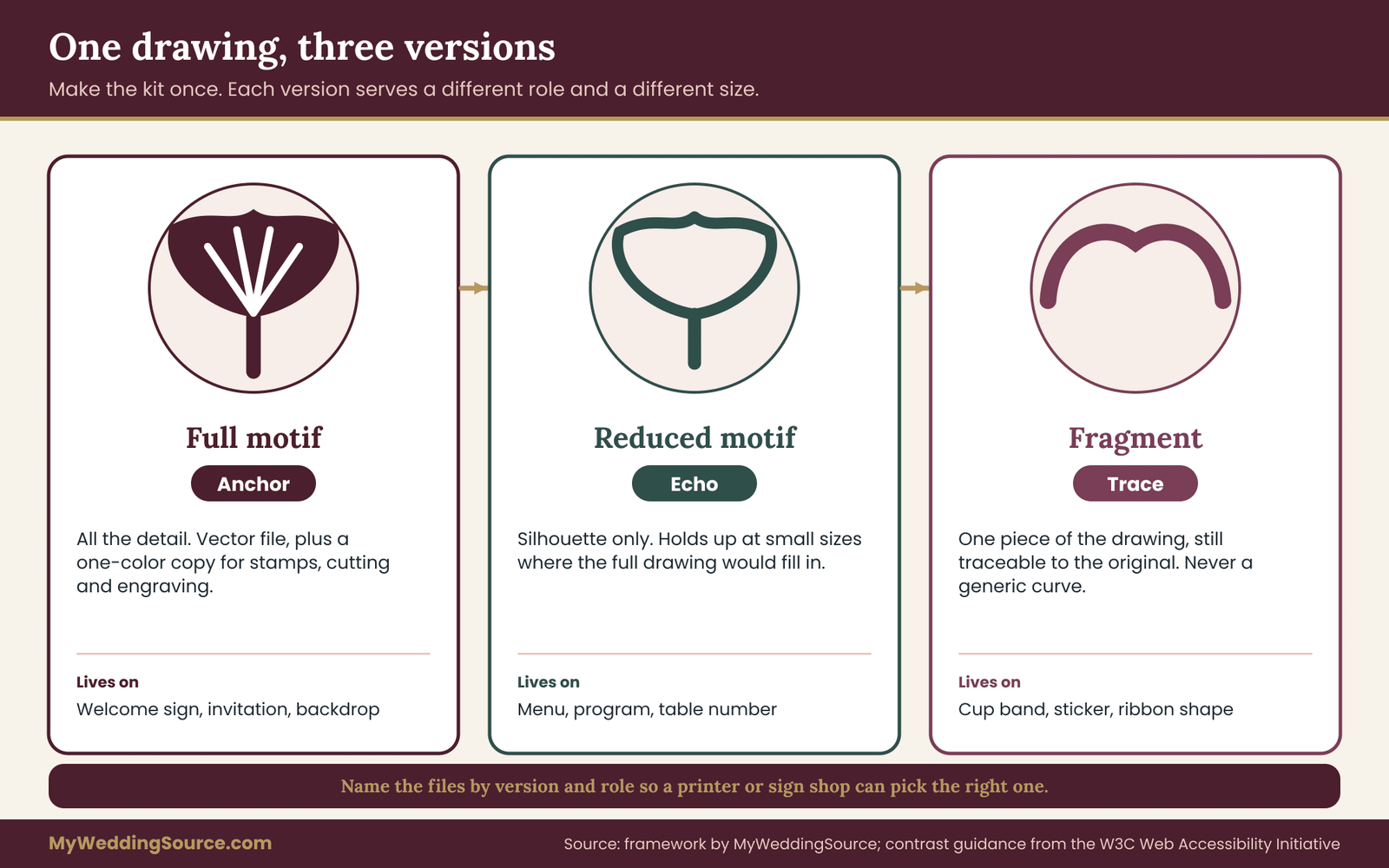
The placement map assigns roles, but roles need artwork to match. If you only have one finished drawing, every item either gets the full detail or gets nothing, and you are back to the problem of identical repetition. The fix is a small kit: three versions of the same wedding motif, made once, then reused.
Version one: the full motif
This is the drawing at its best. It has all its detail, whatever that means for your wedding motif. A leaf has veins, a wave has several lines, a crest has its inner shapes. The full version is the anchor. It should be delivered as a vector file (a format that can be enlarged without blurring, such as SVG, PDF or AI) plus a high-resolution image, in your main color and in one-color black or white.
Ask for the one-color version early. A full-color drawing that falls apart when a printer can only use a single ink, or when a sign shop cuts it from one sheet of acrylic, is not finished. The one-color file is the version that will survive stamps, laser cutting, engraving and embossing.
Version two: the reduced motif
The reduced version keeps the silhouette and drops the detail. A leaf with veins becomes a leaf outline. A scallop pattern of twelve repeats becomes a single scallop and a pair of lines. A crest with inner shapes becomes the outer shape only. The point is that a guest who has seen the full version will recognize the reduced one immediately, even though it carries far less information.
This is the echo. It works at small sizes where the full version would fill in with ink or look muddy. A practical test is to shrink the full motif until it becomes unclear, then note the size where it fails. The reduced version should be designed for sizes below that point.
Version three: the fragment
The fragment is a piece of the wedding motif, not a smaller copy. It might be one curve of the leaf, the stem alone, a corner of the frame, or the repeating dot from a pattern. Fragments are the traces. Used well, they feel like the wedding motif is present just out of view, which gives the guest a small pleasure of recognition.
A fragment should still be traceable to the original. If someone laid the fragment against the full drawing, they should be able to point to where it came from. When the fragment becomes generic (a plain curve that could belong to anything), it has stopped working as a trace and has become a decorative line.
Who makes the three versions
If you are drawing the wedding motif yourself or working with a designer, ask for all three at the start. It costs far less to produce the reduced and fragment versions while the designer is already inside the drawing than to ask a different person later to simplify someone else’s art. If you are using licensed stock artwork, read the license before you modify it, because some licenses allow editing and some do not. The final section of this guide covers rights in more detail.
If a vendor will make some of the items, such as a florist shaping a branch or a baker piping a leaf, you can show them the three versions as a reference sheet. A single page with the three drawings, their names and the roles they play (“anchor, echo, trace”) gives a vendor more usable direction than a mood board of loosely related images.
A simple naming system
Name the files so nobody has to guess. Something like motif_full_color, motif_full_black, motif_reduced_color, motif_reduced_black and motif_fragment_black is enough. Put them in a shared folder with a one-line note about which role each serves. Your printer, your sign maker and your cake artist can then each pick the right file without sending you a question at eleven at night.
Scale, spacing and contrast: keeping a wedding motif readable
A motif that is lovely on a screen can fail in the room. Three practical variables decide whether it works: how big it is, how much empty space surrounds it, and how much it contrasts with what is behind it.
Scale ratios between roles
When you assign roles, give each a relative size, not just a label. A usable working rule is that an echo should be no more than about half the visual size of the nearest anchor, and a trace should be smaller or less prominent than that. This is a design habit, not a standard, and you can adjust it. The reason to write it down is that without a rule, echoes tend to creep upward in size until they look like a second anchor.
Visual size matters more than measured size. A thin line motif of the same height as a bold filled one looks smaller. Judge by how much of a guest’s attention each takes, not just by inches.
Breathing room
The motif needs empty space around it. A common mistake is to fill an item edge to edge because “it would be a waste not to.” Space is what makes the anchor look like an anchor. If a menu card has the wedding motif at the top, the name of the dinner below it, and plenty of margin, the wedding motif holds the page. If the wedding motif tiles across the whole card, nothing is central.
For echoes, a clear margin of at least the height of the motif itself is a sensible target. This is a rule of thumb you can use while you look at proofs, not a standard.
Contrast and legibility
A motif should not reduce the legibility of text. If a drawing sits behind words, check that the words are still easy to read from the distance a guest will stand. For a general benchmark, the Web Content Accessibility Guidelines from the World Wide Web Consortium recommend a contrast ratio of at least 4.5 to 1 between normal-size text and its background. Those guidelines were written for screens, but the same idea carries over to printed signs and menus, and free contrast checkers let you test two colors in a few seconds.
Contrast matters for low vision and for dim rooms. Evening receptions often use warm, low light. A pale gold motif on cream paper may look crisp in daylight and disappear at nine o’clock. The wedding signage guide covers readability, placement and proofing for signs in more detail, and it is worth reading before you finalize any item that guests must read, not just admire.
Material changes the motif
The same drawing behaves differently on different materials. Fine lines vanish when they are cut from acrylic, blur when printed on rough kraft paper and fill in when piped in frosting. Letterpress and foil need heavier line weights than ordinary printing. Embroidery cannot reproduce hairlines at all.
Before approving an item, ask which version of the wedding motif the material can actually carry. If the sign maker can only cut thick shapes, the anchor on that sign may have to be a bolder variant than your full drawing. That is acceptable, provided the shape is still clearly the same motif. If the material cannot carry even the reduced version, the item is probably a trace or a rest item, whatever you originally hoped.
Color use inside the motif
A motif does not have to appear in every color in your palette. One or two colors usually suffice, and a clean one-color version often reads better than a version with five shades. When you use the wedding motif in a different color on a different item, the connection holds because the shape is the same. A consistent shape in two colors is more cohesive than two different shapes in the same color.
This also gives you a helpful lever on cost. Single-color printing and cutting are usually cheaper and simpler than multicolor work, though prices vary by supplier, so get quotes from the vendors you are actually considering instead of assuming. The point is not that cheaper is better. It is that a motif designed to work in one color gives you more choices about where to put it.
A quick example of the three variables together
Imagine a leaf motif. On the welcome sign, the anchor leaf is large, drawn with veins, in deep green on cream, with a wide margin on all sides. On the program, the echo is a leaf outline about a third as tall, in the same green, above the title. On the cocktail napkin, the trace is a single curve of the leaf stamped in one small mark. On the allergen card at the buffet, there is nothing but clear black text. One shape, four strengths, and each of them readable where it sits.
Mapping a wedding motif across the guest journey
The most useful way to fill in the placement map is to walk through the day as a guest would, stage by stage. This stops you from thinking in categories (“stationery,” “florals,” “tableware”) and starts you thinking in moments. A guest does not experience a category. A guest experiences an arrival, a seat, a toast and a dance floor.
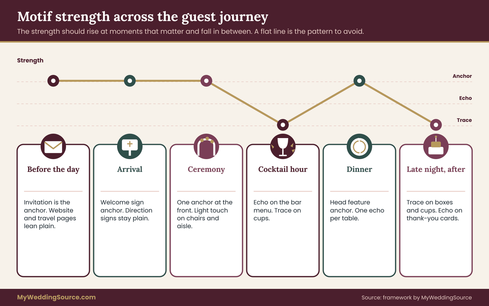
The result of the walk is a rhythm. Think of the wedding motif’s strength as a line that rises and falls over the day. It should rise at the moments that deserve attention, fall back where people need to eat, talk or find the restroom, and rise again for the next moment that matters. A flat line, loud or quiet, is the pattern to avoid.
Before the day: invitation, website and travel details
Guests meet the wedding motif first on paper or on a screen, long before the room exists. The invitation is the obvious anchor, because it sets expectations and people keep it for a while. The save-the-date, if you send one, can be an echo or a smaller anchor, but not a second full-strength anchor, since guests see both within a few months of each other and may keep them side by side.
The wedding website header is a natural echo. The travel information, the hotel details and the schedule page are mostly functional, so they should lean toward rest or trace. A guest booking a flight at midnight wants dates and addresses, not a decorated background. If you build a printed insert for hotels or welcome bags, treat it as an echo at most, and keep the printed text clear.
For printing details such as paper, proofs and quantities, the invitation printing guide explains how the handoff to a printer works. For your wedding motif, the key question at this stage is a decision about strength: does the invitation use the full motif, or does it use the reduced version so that a bolder anchor can be saved for the day itself? Either choice is valid. The important thing is to choose deliberately.
Arrival and welcome
Arrival is where the first anchor usually belongs. A guest stepping out of a car or off a shuttle is looking for confirmation that they are in the right place. A welcome sign with the full motif gives that confirmation and doubles as a photo spot. This is one of the strongest anchor candidates in most weddings.
Directional signs along the route to the ceremony are different. They exist to move people. They should usually be rest items or very light echoes, with large, plain text. Putting the full motif on every directional sign dilutes the welcome anchor and slows reading. The signage guide mentioned earlier is the right companion here, and the placement map simply tells you which of those signs get a small echo and which stay clean.
Guest books, programs and welcome bags handed out at this stage can carry echoes. A program with a reduced motif above the order of service is a classic example. The anchor is already behind the guest, so the program does not need to compete with it.
The ceremony
The ceremony space usually needs one anchor and very little else. The anchor might be the backdrop, the arch, the altar table, or a large floral shape that repeats the wedding motif. Once the guest is seated, they will look in one direction for most of the ceremony, so that direction is the sightline that matters.
Aisle markers, chair signs and reserved-seat cards are the places where restraint helps most. A motif repeated on every chair back competes with the real focal point at the front. If you want a trace along the aisle, use a color-matched ribbon, a shared shape in the stems or a small fragment on the reserved cards. The ceremony’s job is to make people look forward, and the motif should help that, not scatter attention along the sides.
For ceremony order and cues, the ceremony cue sheet guide is a better reference. For the wedding motif, the question is only where the one anchor stands and how everything else supports it. If the venue itself is ornate, with carved panels or patterned carpet, you may decide the ceremony is a rest zone and put the anchor elsewhere.
Cocktail hour and transition
Cocktail hour is a time of movement. Guests stand, walk, collect drinks and meet each other. Signs here are mostly practical: a bar menu, a note about the guest book, a mention of the photo corner. This is a good place for echoes on the bar menu and traces on cups or stirrers, with at most one anchor, such as a larger bar sign or a display table card.
Avoid duplicating the arrival anchor. If the welcome sign was a large leaf, a second large leaf on the bar sign makes the day feel repetitive. Consider changing the format of the anchor instead of the wedding motif: the welcome sign can be a printed board, while the bar anchor is a neon-style line version, a cut metal piece or a flower arrangement shaped like the wedding motif. The motif stays recognizable, and the format keeps it fresh.
Dinner and reception
The reception room is where the highest number of items can accumulate: place cards, menus, table numbers, centerpieces, napkins, charger plates, signage for the cake, the dessert, the gift table and the photo area. This is also where overuse usually happens, because there are so many surfaces.
The usual approach that works is to make the room’s anchor the item guests see from every seat, such as a head table feature, a large backdrop or the cake table. Every guest table then gets one echo, usually on the table number or the menu, and the rest of the table stays plain. Place cards and napkins become traces or rest. If each of twelve tables has the same echo, the room feels unified without feeling crowded.
The guide to reception guest flow covers entry, seating, food and exit, and it pairs well with the placement map. Walk the floor plan, mark where each guest will actually sit, then count the wedding motif appearances visible from there. The checks section explains the count.
Dance floor and late night
By the late evening, people care about comfort, light and a good time. Anchors here are optional. A lit sign, a projected shape on a wall or a printed dance-floor decal can serve, but only if there is no competing anchor in the same sightline. Many couples decide the late night is a trace-only zone: a small fragment on the late snack boxes, a matching sticker on the take-away cup, nothing else.
If you offer an exit send-off, a take-home favor or a late-night snack, these are good places for a small final echo. Ending with a quiet echo is often more memorable than ending with another large anchor, because it feels like a reminder rather than a performance.
After the day: thank-you cards and albums
The wedding motif’s last appearance is often on a thank-you card, and this is a good place for an echo that mirrors the invitation. It closes the loop without needing to be loud. If you create an album or a gallery cover, a reduced version is usually enough, since the photos are the content.
Turning the walk into a list
Once you have walked the guest journey, write down every item you encountered, with its stage, and then assign each one a role. A list of thirty to fifty items is common for a full wedding, and it is fine. The map exists to keep the list manageable, not to shrink it. What matters is that you can see all of it at once, decide where the peaks are, and notice when you have placed three peaks back to back.
The repetition restraint worksheet for a wedding motif
The placement map tells you what the roles are. The worksheet is the procedure that fills the map in without relying on gut feeling or on whichever vendor asked last. It has six steps and it is meant to be done on paper or in a shared spreadsheet, in one or two sittings. You do not need design skills. You need a list and a willingness to say “rest” more often than feels natural.
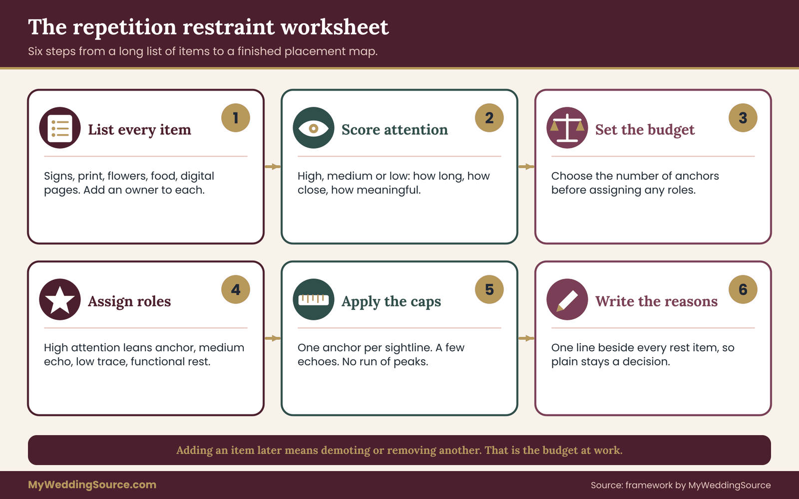
Step one: list every item with a surface
Write down every object, sign, printed piece, digital page and edible item that could carry the wedding motif. Do not filter yet. Include things nobody has ordered, such as restroom baskets or parking signs. A long, honest list is more useful than a short, polite one. Group items by the guest journey stage from the previous section, so that you can see them in order.
For each item, add the name, the stage, and the vendor or person responsible. If nobody owns it, mark it “unowned” in capitals. Unowned items are the ones that end up improvised on the morning of the wedding, and improvised items are where the wedding motif tends to be used badly.
Step two: score the attention each item receives
Give each item a simple attention score: high, medium or low. Three questions decide it. How long will guests look at it? How close will they be? Does it carry meaning, such as a welcome, a name or a toast, or is it purely practical?
A welcome sign is high: people stop, read and photograph it. A menu card is medium: people glance at it twice. A napkin is low: people use it. Do not overthink the scores. You are sorting, not measuring. If you cannot decide between two levels, choose the lower one. The map should lean toward restraint when you are unsure.
Step three: set the repetition budget before assigning roles
Before you give any item a role, set a budget for anchors. A reasonable starting point is a number you can count on one hand: three to five anchors for the whole wedding, spread across different stages. This is your own working number, not a standard, and a very small wedding may need fewer. The purpose of the budget is to make you choose. When a new idea appears later, such as a custom cocktail napkin or a flower wall, you cannot simply add it. You have to remove or demote something else.
The budget is where the worksheet differs from a plain checklist. A checklist asks “have we covered everything?” The budget asks “have we covered enough, and nothing more?”
Step four: assign provisional roles from the scores
With scores and a budget, give each item a provisional role using these decision rules.
High attention items are anchor candidates. If there are more than your budget allows, choose the ones that are in different sightlines first, since two anchors in the same view will compete. The rest of the high-attention items become strong echoes.
Medium attention items default to echo. A menu, a program, a place card or a table number takes the reduced version and sits in a clean layout.
Low attention items default to trace if they are visible and custom, or rest if they are not. A napkin that guests unfold and discard is rest. A cup that guests carry around all night might be a trace.
Functional items, those that must be read quickly or that guard safety, default to rest, whatever their attention score. Allergen cards, accessible-route signs, fire-exit markers, vendor tags and any item a venue requires in a standard format belong in this group.
Step five: apply the caps and resolve conflicts
Now check the provisional map against three caps. First, one anchor per sightline. Second, no more than three echoes in the same sightline as an anchor, a working number that keeps the area from filling up. Third, no more than two consecutive stages with a peak. If the arrival and the ceremony both have anchors and the cocktail hour does too, one of them has to drop to echo.
Conflicts will appear, and the worksheet gives you three ways to resolve them. You can demote one item (anchor to echo). You can separate two items by moving one out of the shared sightline. Or you can change the format instead of the motif, so that one item is a print and the other a three-dimensional piece, which can read as a different element in the same view. Choose whichever costs the least and keeps the better photo spot.
Step six: write a reason for every rest
This is the step most couples skip, and it is the one that prevents arguments. For every item you assign to rest, write a one-line reason. “Safety label, must be plain.” “Venue wall already patterned.” “Food table is busy enough.” “Photographers will shoot here, keep background calm.”
The reason does two things. It reminds you later, when you have forgotten why the item looked bare, that the plainness was a decision. And it gives you words to use with others. When someone suggests adding the wedding motif to something, you can show the list and say, “We marked that one as rest because of the line on the sheet.”
What a finished row looks like
A completed row has seven pieces of information: item, stage, owner, attention score, role, motif version file, and the check that will confirm it. For example: “Welcome sign, arrival, signmaker, high, anchor, full motif in green, sightline count at the entrance.” Another: “Dessert labels, reception, caterer, low, rest, none, readable from arm’s length.” The last column matters because it tells you how you will know the item is done, and the checks section describes them in more detail.
Handling requests from family and vendors
Weddings attract suggestions. A relative wants to make hand-stitched pouches with the wedding motif. A friend with a cutting machine offers to make forty custom cups. A vendor’s package includes engraved glasses. Treat each offer as a new row on the worksheet and run it through the same steps.
If it fits the budget, accept it with thanks. If it does not, you have several kind ways to say no or to adjust. You can offer a different role: “We would love the pouches as a plain version in our green, and we will put the wedding motif on the welcome sign.” You can offer a different place: “Could they go on the gift table, where nothing else is competing?” Or you can decline plainly: “We have a short list for the motif so it stays special. Thank you for thinking of us.”
The map works as a shared document. When everyone can see the list, the conversation is about the list, not about whose taste wins.
When to revisit the worksheet
Do the first pass early, before ordering anything custom. Revisit it when a major vendor is booked, when the guest count shifts enough to change the room layout, and again about three weeks before the wedding, when you have proofs in hand. At each revisit, check three things: has the anchor count changed, has any sightline gained a second anchor, and has any rest item quietly acquired a motif. These are the three most common drifts.
A short script for the vendor handoff
When you send the worksheet to a vendor, include a single paragraph so they do not misread it. Something like: “The attached list shows where our motif appears and at what strength. Items marked anchor use the full drawing, echo means the reduced version, trace means the fragment, and rest means no motif.
Please tell us if any item cannot be made at the strength shown, and propose the closest alternative before you start work.” That one paragraph moves the conversation from “what do you want on it?” to “can you do this, and if not, what is closest?”
Comparing four ways to use a wedding motif
The placement map is one approach among several. Before you commit, it helps to see the alternatives side by side, because the right choice depends on your budget, your venue and how much time you have. The four approaches below cover most of what couples actually do. None is wrong. Each has a cost, and the cost is mostly attention and effort, not money.
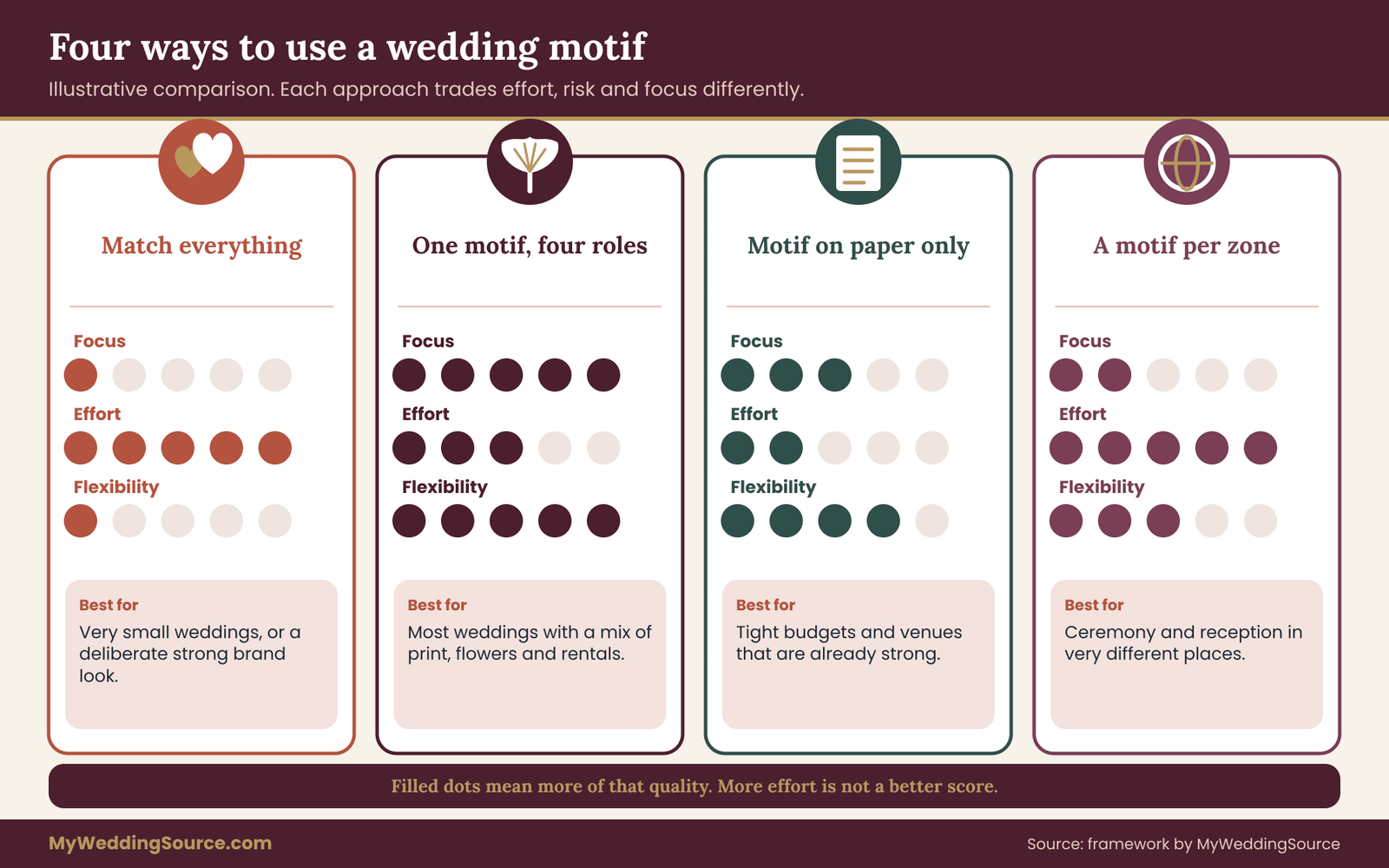
Approach one: match everything
Here the wedding motif appears on every custom item at full strength. It is the simplest rule to state and the easiest to explain to vendors: “put it on everything.” It produces the clearest branding effect, in the way a company logo does, and some couples like that.
The downsides are the ones already described. The wedding motif loses its focal points, the cost and the proofing workload rise with every item, and the functional items suffer. It also leaves little room to adapt. If a vendor cannot reproduce the drawing on one material, there is no fallback role, and the couple must either accept a poor version or leave the item bare. This approach suits very small weddings with few items, or couples who deliberately want a strong, unified look and accept the work involved.
Approach two: one motif, four roles
This is the placement map. The same motif appears at four strengths, with a hard limit on anchors and a written reason for every rest item. The effort is front-loaded: you need the three artwork versions and the worksheet. After that, decisions are fast, and vendors receive clear instructions.
Its strengths are focal points, flexible fallbacks (if an item cannot carry the reduced version, it moves down a role without breaking the system) and lower proofing volume. Its weakness is that it asks the couple to be disciplined. When a sixth anchor sounds appealing, someone has to say no. It suits most weddings of moderate size with a mix of printed, floral and rented items.
Approach three: motif on paper, palette everywhere else
In this approach the wedding motif lives only on printed pieces: the invitation, the program, the menu, the signs. Everything three-dimensional, such as flowers, rentals and food, follows the color palette and nothing else. It is a clean, low-risk way to get recognition without asking florists, bakers and rental companies to reproduce artwork.
The advantage is simplicity and a short vendor list for artwork. The drawback is that the room itself can feel disconnected from the paper, since guests see the wedding motif on a card but not in the space. A few traces can help: a florist might echo a curve of the wedding motif in the shape of a garland, with no print at all.
For color decisions that carry the rest of the room, the wedding color palette guide gives you more to work with. This approach suits couples with a tight budget, a venue that is already strong visually, or a mostly rented setup where customizing objects is difficult.
Approach four: a different motif in each zone
Some couples choose a separate motif for the ceremony, the dinner and the party. This can work if the three share a strong underlying rule, such as the same line weight, the same color or the same drawing style. Without such a rule, the wedding reads as several smaller events stitched together.
The advantage is variety, and it can suit a wedding that moves between very different spaces, such as a church ceremony and a warehouse reception. The disadvantage is that it removes the repetition that makes a motif a motif. By definition, a wedding motif recurs. If it does not, guests have nothing to recognize. This approach suits venues in different locations on the same day, or couples who consciously want contrasting moods. It also needs the most design effort, since each zone needs its own kit.
How to choose between the four
Ask three questions in this order. First, how many custom items are you realistically ordering? If fewer than about ten, approach one or three is manageable and the full worksheet may be more than you need. If you expect more than that, approach two pays for its setup time.
Second, how many vendors need to handle artwork? Each additional vendor who must reproduce the motif adds a handoff, a proof and a point of failure. If you have three or more such vendors, the roles and fallbacks of approach two are worth having.
Third, how strong is the venue? A room with heavy patterns, ornate ceilings or strong architecture is already speaking. In that case, approach three, or approach two with a generous number of rest items, usually looks better than adding another layer.
A tie-breaker if you are still unsure: choose approach two but set the anchor budget to the low end. You can always add an anchor later. It is much harder to remove printed items that have already been delivered.
Questions to ask vendors about your wedding motif
Vendors rarely refuse a motif. They simply interpret it differently, and the interpretation often goes unexamined until the item arrives. A short set of questions, asked at the start and written down, prevents most surprises. Bring the three-version kit and the placement map to every conversation.
Printers and stationers
Ask which file types they accept, and whether they will check artwork for resolution before printing. Ask how thin a line they can print reliably on the paper you chose, and whether the reduced version holds at the size you need. Ask for a proof that shows the actual size and color, not just a screen preview, and ask how many rounds of changes are included.
Ask what happens if your drawing is found to have a problem after proofing. The invitation printing guide covers proof stages in more detail, and the same habits apply to any printed item.
Sign makers and laser or engraving shops
Ask for the minimum line weight and the smallest detail they can cut or engrave in the material. Ask whether they work from vector files, and whether they will convert your drawing or require you to. Ask whether the sign will be viewed from a distance and what they recommend for letter height. If the full motif is too detailed, ask them to show you the closest bold variant before they cut.
Florists and decor designers
Florists do not print, but they can echo a shape. Ask whether they can shape stems, garlands or an arrangement in the outline of the wedding motif, and which flowers hold that outline over a full evening. Bring the fragment version, since a curve or a repeated element is often easier to reproduce in plants than a whole drawing. Ask about lead time, since custom shapes or frames may need extra build time.
Bakers and caterers
Ask whether the wedding motif can be piped, stenciled, cut from fondant, printed on an edible sheet or applied as a topper. Each method has limits on line detail and on color. Ask how the wedding motif will hold up in the room’s temperature, and who delivers and places the piece. Also ask about labeling: allergen and ingredient information should remain clear, so ask the caterer to confirm that decorative cards never replace required labels.
Rental companies and the venue
Ask whether rented items can be altered at all. Most cannot be painted, stamped or taped, and some fees apply for damage or residue. Ask the venue what may be attached to walls, ceilings or floors, whether open flame or hanging decor is allowed, and whether any fire-code limits apply to drapery or signage. These are questions for the people who run the building, and the answers can change what the anchor can physically be. The rental planning checklist is a good companion for this conversation.
Photographers, videographers and lighting
Ask the photographer which areas they will shoot most, so the anchors fall where the images will be taken. Ask whether any glare, reflection or low light will affect the motif at certain times of day. If a lighting vendor can project a shape, ask whether the projection can be a simple version of the wedding motif and whether it will wash out nearby signs.
Put the answers in writing
Whatever vendors say, the contract and the order confirmation are what count. Make sure each item with the wedding motif on it names the file version, the size, the color and the proof approval step. The vendor contract guide explains what to look for in terms and revisions. If the vendor offers a verbal promise that does not appear in the paperwork, ask them to add it. A single line such as “Anchor sign uses full motif file, version two, approved proof required before production” costs the vendor nothing and saves you an argument.
A worked example: one invented wedding motif, thirty items
The couple below is invented, and so are the numbers. The example exists to show how the worksheet behaves, not to suggest a result you should expect. Leila and Owen are planning a wedding for about one hundred guests. The ceremony is in a garden and the reception is in a rented tent next to it. Their wedding motif is a single hand-drawn ginkgo leaf. Their palette is deep green, cream and a little brass.
The kit and the budget
Their designer delivers three versions. The full motif is the leaf with its fan of fine lines and a short stem. The reduced version is the leaf outline with a stem and no inner lines. The fragment is the scalloped top edge of the leaf, a gentle curve that is recognizable once you have seen the whole leaf. They set an anchor budget of four, since the wedding has three main stages and they want a small reserve.
The list and the first pass
They walk the guest journey and list thirty items. Attention scores sort the list quickly. Four items score high on every question: the invitation, the welcome sign, the ceremony backdrop and the reception head table feature. Those become the four anchors, one in each of four different sightlines. The invitation is viewed at home, the welcome sign at arrival, the backdrop at the ceremony and the head table feature at dinner.
Nine items become echoes: the save-the-date, the website header, the program, the menu, table numbers, the bar sign, the seating chart (after the change described below), the dessert table card and the thank-you card. Eight become traces: cocktail napkin stamp, favor sticker, cup band, aisle ribbon color, a curve in the garland, the late-night box label, the guest book spine and a fragment on the shuttle sign.
Nine become rest: allergen cards, restroom signs, the parking sign, vendor tags, the escape-route sign the tent supplier requires, the napkins themselves, charger plates, the gift table sign and the bathroom basket labels.
That is thirty items, with four anchors, nine echoes, eight traces and nine rest, by their count. Nobody has to defend the numbers. They are simply what the scoring produced, and the worksheet lets Leila and Owen see the shape at once.
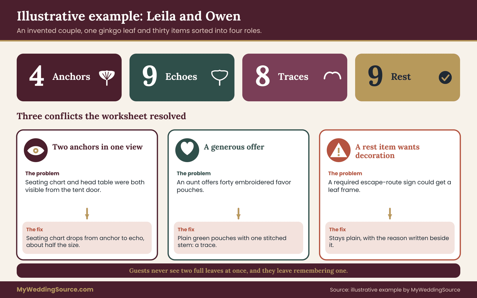
Conflict one: two anchors in one view
When Leila walks the tent floor plan, she notices that the seating chart, planned as a large printed board near the entrance, sits directly across from the bar. Both are in the same sightline as the head table feature, with the three of them visible from the tent door. The seating chart was provisional as an anchor candidate, since guests will stop and read it. But the head table feature is the bigger moment.
They apply the caps. One anchor per sightline means the seating chart drops to echo. It keeps the reduced leaf outline at about half the height of the head table feature, and the layout is clean, with plenty of margin. The room still has a clear focal point, and the seating chart still looks like part of the same wedding.
Conflict two: a generous offer
Owen’s aunt offers to sew forty cloth favor pouches with the leaf embroidered on each. Under the old approach, that would have been a fifth anchor-level item, loud and repeated forty times. They run it through the worksheet. Embroidery cannot hold the fine lines of the full leaf, so the reduced outline is the closest version. The favor table is low attention, so the role is trace.
They answer warmly: the pouches would be lovely in plain green cloth with a single small stitched stem, which uses the fragment. The aunt agrees, the item stays within budget, and the favor table gets a quiet trace instead of a competing anchor.
Conflict three: a rest item that wants decoration
The tent supplier requires a posted escape-route sign. The wedding designer suggests a printed leaf frame around it. The worksheet has the reason written beside the item: “Safety sign, required format, keep plain.” They keep it plain. A decorative frame could reduce clarity, and the venue and tent provider are the people to consult on sign format. If in doubt about code requirements, they ask the venue or the local fire authority rather than guessing.
What the final map looks like in the room
A guest arriving sees the large welcome sign with the full leaf and a green shuttle sign with a small curve. At the ceremony, they sit facing a backdrop of branches whose overall shape mirrors the leaf, with the program in hand carrying an outline above the order of service. At cocktail hour, the bar sign has a reduced leaf and the cups wear a small curve.
At dinner, each table has a number card with the outline, plain napkins and chargers, and a head table feature with the full leaf cut from brass. At the end of the night, the take-away boxes carry a tiny curve.
Guests never see two full leaves at once. They see the wedding motif at different strengths, at different moments, and they leave remembering a leaf. That is the entire point of the exercise.
Measurable checks before you approve a wedding motif plan
A plan feels good when you make it and may behave differently in the room. Six simple checks turn the feeling into something you can verify. None of them needs special equipment. Use them on proofs, on photos of mock-ups and, ideally, on the real space.
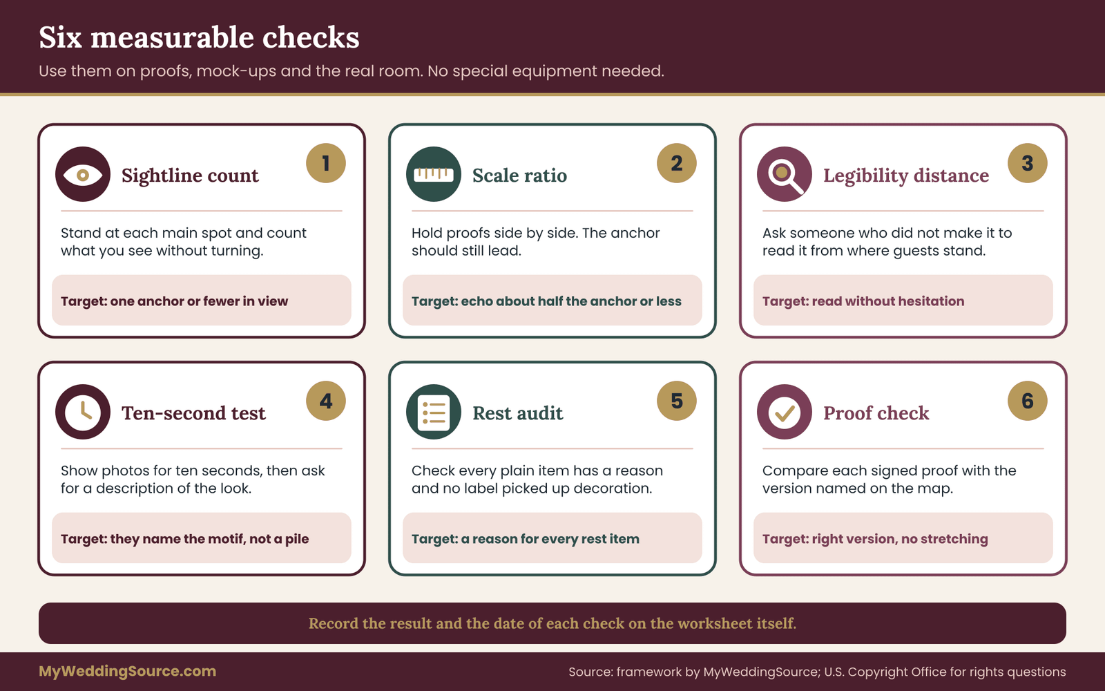
Check one: the sightline count
Stand at each main guest position: the entrance, the ceremony seats, the bar, a table at the back, a table at the front and the dance floor edge. At each one, count how many full-strength anchors you can see without turning your head. The target is one or fewer. Then count echoes within the same view. The working cap from the worksheet is three. Record the counts on the map. If a position fails, decide whether to demote, move or change format.
If the room does not exist yet, use the floor plan and the venue’s photographs, and repeat the count on the day of the walkthrough. The wedding signage guide explains how to proof signs in place, which makes this count easier.
Check two: the scale ratio
Measure, or compare on the proof, the size of each echo against the nearest anchor. The working target is that no echo is larger than about half the visual size of the anchor. A quick method is to hold printed proofs next to each other on a table and see whether the anchor still looks like the clear leader. If an echo looks equal to the anchor, it is functioning as a second anchor, whatever the label says.
Check three: the legibility distance test
For any item guests must read, such as menus, signs and seating charts, ask someone who did not make the item to read it from the distance guests will stand. If they hesitate, the wedding motif or the type is too busy. This test takes a minute per item, and it catches contrast problems before they are printed. The contrast guidance mentioned earlier gives you a benchmark for text against background.
Check four: the ten-second description test
Take four to six photos of different parts of the room, or of the mock-ups, and show them for about ten seconds to a person who has not seen the plan. Then ask them to describe the look of the wedding. If they mention the leaf and the green, the motif is recognized. If they describe a pile of different things, the repetition is either too weak or too scattered. If they say “lots of leaves,” the repetition is probably too heavy.
Check five: the rest audit
Count the items marked rest and confirm that each has a written reason. A rest item without a reason is a candidate for drift. Also check that no functional item, such as an allergen card, has picked up decoration that was not in the plan. This takes five minutes and prevents the most common last-minute additions.
Check six: the file and proof match
For each custom item, compare the approved proof to the version named on the map. A common error is a printer or a sign shop using the full motif where the map says echo, or a stretched file that distorts the shape. Check proportions: the wedding motif should not look squashed or stretched. If the artwork was supplied in several versions, confirm that the right one was used, and keep the signed proof with your records.
How to record the results
Add a column to the worksheet for the result of each check and a date. When a check fails, write what you changed. By the end, the sheet is both the plan and the evidence that the plan works, and anyone who steps in to help on the day can read it without a briefing.
Edge cases, rights and cultural care when using a wedding motif
Most weddings fit the placement map without trouble. A few situations bend it. This section covers the ones that come up most, along with the copyright and cultural questions that deserve a careful look before artwork is printed or cut.
A venue that already has a strong pattern
Ornate ballrooms, tiled courtyards and historic buildings may carry their own motifs in carpet, ceiling or wall coverings. A new wedding motif placed against them can look cluttered. In these rooms, reduce the anchor count, make the remaining anchors larger and calmer, and lean on rest. Put the wedding motif on items that stand against plain surfaces, such as a freestanding sign, and keep it away from busy walls. It can also help to choose a motif whose shape complements the venue’s, for example a straight-edged geometric mark in a room full of curves.
A very small wedding
With twenty guests around one table, a list of thirty items does not exist. You might have an invitation, a menu and a sign. In that case, one anchor and one echo are enough, and everything else is rest. The worksheet still helps, but it shrinks to a few lines. Spend the effort on the quality of the one anchor rather than on filling out roles.
Several families, several traditions
When two families bring different traditions, a motif can become a place to show both, or a source of disagreement. If you intend the wedding motif to carry meaning, such as a flower, a symbol or a pattern from a family’s heritage, talk to relatives who know its significance before it appears on many items.
Some patterns and symbols have religious or ceremonial uses and are not meant for napkins or cups. When you are unsure, ask someone from that community and be ready to adjust. Using the motif as an anchor in a place of honor and keeping it away from disposable items is often a respectful compromise.
A motif that clashes with the flowers
Florists work with what is in season and what holds up in heat. If the seasonal flowers do not suit your wedding motif, the trace role is the safest. A florist can echo a line or a silhouette in the arrangement, without trying to reproduce the drawing. Do not force a literal copy in petals if it will wilt by the time guests sit down.
A mid-plan budget cut
When money gets tight, the placement map shows what to cut first. Remove or downgrade echoes and traces before touching anchors, since anchors carry most of the recognition. Remove custom printing from low-attention items first, and keep color matching, which costs little. The map itself ranks your items by importance. Often the wedding looks nearly the same after cutting a third of the traces, which is a sign they were not doing much.
Color vision and low light
Some guests have color vision differences or low vision. Do not rely on the wedding motif’s color alone to tell guests something, and keep text contrast high. A leaf motif in pale green on cream may vanish for some readers. The U.S. Access Board and the Department of Justice publish accessibility guidance, and the ADA site is a good starting place if you need to confirm how accessible-route signs should look. Decorative frames should never stand in for a required sign.
Food, favors and small parts
If the wedding motif appears on edible items, such as cookies, cake or chocolates, confirm ingredients and allergens with the baker and keep labels separate and plain. If it appears on favors, think about whether small detachable pieces could reach young children. The Consumer Product Safety Commission publishes information about small parts and children’s products, and it is worth checking if children will be among the guests. For open flame, hanging decor and anything near exits, follow the venue’s fire rules and ask the venue directly.
Rights and ownership for a wedding motif
A drawing feels like yours once you have chosen it, but ownership depends on who made it and what license applies. Sort this out before you pay for production.
Original artwork you commissioned
If a designer or illustrator made your wedding motif, the contract decides who owns what. In many cases the artist keeps the copyright and gives you a license to use the work for stated purposes. Ask whether the license covers printing, engraving, embroidery, digital use, and use by every vendor on your list, and whether your vendors can modify the artwork to produce the reduced and fragment versions. If you want to reuse the wedding motif on a baby announcement or an anniversary gift later, ask now. Put the answers in a short written agreement.
Stock images, clip art and marketplace files
Many marketplaces and stock sites sell drawings with licenses that limit use. Some allow personal projects only. Some forbid physical products made in quantity, or require credit. Some prohibit editing in ways that create new versions, which would affect your reduced and fragment versions. Read the license text, not just the product description. If it is unclear, ask the seller in writing before you buy.
Images from the internet
A picture found through a search engine or a social platform is not free to use just because it is easy to copy. The U.S. Copyright Office explains that copyright protection exists automatically when an original work is created and fixed in a tangible form, and that the owner generally has the right to control copying. The Office’s website also notes that ideas and facts are not protected the same way as the expression of them.
In practice, that means you can take inspiration from a style, such as a loose botanical line drawing, but you should not copy a specific artist’s drawing. If you love someone’s work, ask them to license it or to draw something new for you.
Logos, brand names and team marks
A motif based on a brand logo, a sports team, a film character or a famous design is likely to raise trademark or copyright questions, even for a private event. The United States Patent and Trademark Office explains what trademarks are and how they are used. For a private wedding, the risk is modest, but vendors may refuse to reproduce a protected mark, and a printer may ask for permission. If the motif matters to you, choose something original.
Friends who draw
A friend who draws your wedding motif as a gift still owns it unless you agree otherwise. A short email that says “you hold the copyright, we may use the drawing for our wedding materials, including printing by our vendors, and keep copies for our records” prevents confusion later. Keep that message with your files.
Keep the rights paperwork with the order
For each custom item, keep a record of the artwork source, the license or agreement, the vendor’s order confirmation and the signed proof. This is the same kind of file you would keep for any vendor, and it takes only a few minutes. If a question comes up later, you can answer it from your records.
Your next steps
Pick one evening this week. First, write your wedding motif in one sentence and ask your designer, or yourself, for the three versions: full, reduced and fragment. Second, list every item that could carry the wedding motif, grouped by the guest journey, and score each one high, medium or low for attention. Third, set an anchor budget, assign roles, write a reason beside each rest item and run the sightline count on your floor plan.
Then share the map with your vendors, with the single-paragraph note from the worksheet section, and ask each one to confirm what they can make. Revisit the sheet when major vendors are booked and again three weeks before the wedding. If the wedding motif is doing its job, guests will remember one thing clearly, and nobody will notice how many things you left plain.
FAQ
How many places should a single wedding motif appear?
There is no standard number, and no research gives one. Count by role instead. A typical plan has a few anchors, a moderate group of echoes, a larger group of traces and a set of plain items. If most items carry the wedding motif at full strength, it is too many. If guests would struggle to point to even one place they noticed it, it is too few.
What is the difference between an anchor and an echo?
An anchor is the full version of the wedding motif, large and clear, placed where guests pause, such as a welcome sign. An echo is a simplified, smaller version, such as an outline, used where guests glance, such as a menu. A good working rule is that an echo is no more than about half the visual size of the nearest anchor.
Should functional signs carry the motif?
Usually not. Allergen cards, accessible-route signs, restroom signs, fire-exit markers and anything with required wording should stay plain, because clarity matters more than style. If you want a link to the look, use the color or a very small trace away from the text. Venues, caterers and local authorities may require specific formats, so ask them before you design.
Can I use a motif I found online?
Only if the license or the owner’s permission allows it. Finding an image online does not mean you may print it. The U.S. Copyright Office explains that protection generally exists automatically for original works. Use a licensed stock drawing, commission an original or ask the artist in writing. Read the license for limits on physical products, editing and quantity before you buy.
How do I stop family or friends from adding the motif to everything?
Show them the placement map. When everyone can see that the wedding motif has a short list of anchors and a written reason for each plain item, the conversation moves from taste to the plan. Offer a different role or place for generous ideas, such as a trace on a favor, and decline kindly when the budget is full.
What if a vendor cannot reproduce the motif well?
Ask the vendor for the closest version they can do, and move the item down one role if needed. A sign that cannot carry fine lines might use the reduced outline or a bold variant. If even that fails, treat the item as a trace or rest and match the color only. Get the change confirmed in writing before production begins.
How do I test the plan before the wedding?
Use measurable checks. Count the anchors visible from each main position, compare the size of echoes to anchors, ask someone to read key signs from the planned distance, and show a few photos or mock-ups to a fresh viewer for about ten seconds. Ask them to describe the look. If they name the wedding motif, the repetition is working.
Does a single motif work with a palette and a theme?
Yes, and they do different jobs. A theme sets the mood, a palette sets the colors and the wedding motif gives guests one repeated shape to recognize. The motif does not need to use every palette color. One or two are usually enough, and a consistent shape in two colors holds together better than two different shapes in the same color.
Sources
- U.S. Copyright Office
- What is copyright? U.S. Copyright Office
- Copyright frequently asked questions, U.S. Copyright Office
- Trademark basics, United States Patent and Trademark Office
- Americans with Disabilities Act information, U.S. Department of Justice
- U.S. Access Board
- Web Accessibility Initiative, World Wide Web Consortium
- U.S. Consumer Product Safety Commission
- National Fire Protection Association