
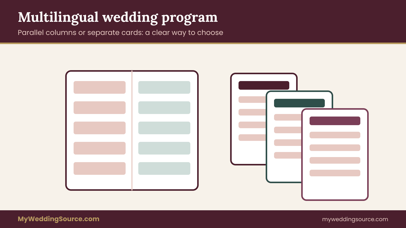
A multilingual wedding program is the printed guide that lets guests who read different languages follow the same ceremony at the same moment. This guide helps you decide the one layout question that shapes everything else: should the languages sit side by side in parallel columns, or should each language get its own separate card?
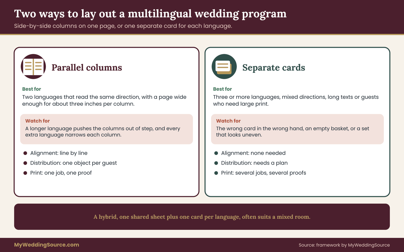
Use parallel columns when you have two languages, both read left to right, and a page wide enough to give each column about three inches. Use separate cards when you have three or more languages, mixed reading directions, long texts, or guests who need large print. Use a hybrid (one shared sheet with the order of events, plus one card per language) when the room is mixed. Run the five-gate test in this guide before you choose, because the layout of a multilingual wedding program fails in predictable ways.
Most couples who need a multilingual wedding program start with a design picture in their heads. It is usually a handsome folded page with English on the left and a second language on the right, each line matched to the line beside it. That picture is sometimes exactly right. It is also the layout that breaks first when the second language runs longer, when a third language appears, or when one of the languages reads from right to left.
The question of columns versus cards looks like a design choice, but it is really a reading problem. Who will hold the paper, in what light, for how long, and in which language? A guest in the fourth row who reads one language and glances at the program twice during twenty-five minutes has different needs than a cousin who will read along with every line. A good multilingual wedding program serves both, and the layout is the tool that decides whether it does.
This article is about that layout decision only. It does not re-teach translation review, timing cues or the full ceremony order, because other guides on this site cover those jobs, and the wedding ceremony step by step guide explains how a ceremony is ordered. Instead it gives you a way to choose, a set of build rules for each layout, two worked cases with the arithmetic shown, and a list of the conditions under which each layout fails.
A note on scope. This is general planning information, not legal advice, and it does not replace a qualified translator or your officiant’s guidance on ceremonial wording. Where a rule or standard matters, the article points you to the organization that publishes it.
What a multilingual wedding program actually has to do
Before comparing layouts, name the jobs. A multilingual wedding program is not one document doing one thing. It does four separate jobs for four kinds of reader, and a layout that serves one job well can quietly fail another.
The first job is orientation. A guest should be able to look down at any moment and know where the ceremony is: the processional has finished, the readings are underway, the vows come next. This job needs very little text. It needs a clear order of events, ideally readable at a glance even by someone who does not read the language well.
The second job is comprehension. Some guests need the content of what is said: the welcome, the readings, the blessing, the meaning of a ritual. This is where translation matters and where text length matters. A multilingual wedding program does this job only if each guest can find their language quickly and read it without hunting.
The third job is participation. If guests are asked to respond, stand, or repeat a line, they need the words, in their own script, at the point where they will speak. This is the job people forget, and it is the one that exposes layout problems. A response printed in a column on the far side of the page, in a language the guest cannot read, is no help at all.
The fourth job is keepsake. Many families keep the program. Grandparents tuck it into a book, a cousin photographs it, a couple frames it. A keepsake wants to look balanced and respectful. It should not suggest that one language is the real one and the others are footnotes.
Equal status, and why layout signals it
Layout carries social meaning whether you intend it or not. In a side-by-side layout, the language on the left is read first by anyone who reads left to right, and the language on the right can look like an addition. In a stack of separate cards, whichever card sits on top of the pile looks like the default. Neither is wrong, but you should make a choice rather than inherit one.
Common ways to signal equal status are simple. Use the same typeface family and the same point size for every language where the scripts allow it. Give each language the same amount of white space. Alternate which language goes first across sections if you use columns, or rotate the order of cards in the usher’s basket.
If two families are involved, ask a person from each side to look at the draft and say whether it feels even. People notice this faster than designers do. Whatever you choose, ask whether a guest from each family would call the multilingual wedding program fair to their language.
The reader who changes language mid-page
A real guest list includes people who read two languages unevenly. A teenager may read English fluently and a grandparent’s language slowly. An aunt may read the second language easily but prefer the first for anything formal. These guests are the strongest argument for parallel columns, because they can check one language against the other.
They are also the guests most irritated when a layout hides the match. If your list has many of them, say so in the first gate of the test later in this guide. Counting these readers early tells you how much a multilingual wedding program must support checking across languages.
What the layout cannot fix
A layout cannot repair a weak translation, an unclear ceremony order or a ceremony that runs far past the printed schedule. If a line is wrong, side-by-side placement makes the error visible to more people. If the officiant improvises, the printed text will drift away from the spoken words in both languages.
Treat the layout choice as one decision among several, and finish the text before you finish the design. A calm review pass by a qualified translator, ideally a member of a professional body such as the American Translators Association, belongs before the layout is locked. A multilingual wedding program is only as good as the text and ceremony order that go into it.
Parallel columns and separate cards, defined
The two layouts get described loosely, so it helps to fix the terms. The rest of this guide uses them in a specific way.
Parallel columns means two or more languages printed on the same page or spread, in adjacent columns, with the text arranged so that matching passages sit across from each other. The key idea is alignment. A good parallel-column program lets the eye travel across from one language to its match. A weak one just puts two blocks of text next to each other and hopes the lengths work out.
Separate cards means each language has its own printed piece. Every guest receives the card for their language, or sometimes two. There is no side-by-side comparison on one sheet. The key idea is independence. Each card can be sized, typeset and read on its own terms, and each can use the best layout for its script.
Where the real differences lie
The common description of the difference is aesthetic: columns look elegant, cards look practical. The real differences are about five working properties.
Alignment. Columns allow line-by-line matching, but matching is possible only if both languages take roughly the same space. Cards make no claim about matching, so they never fail on it.
Space. Columns divide the page width. Every extra language narrows every column. Cards use the full width of whatever size you choose, so each language gets as much room as the card allows.
Distribution. Columns put a single object in every hand. Cards require a system: someone has to hand the right card to the right guest, or guests have to pick their own.
Cost and print runs. Columns mean one print job and one proof. Cards mean several print jobs, several proofs and a spreadsheet of quantities. The unit cost of the cards may be low, but the coordination cost is not.
Keepsake value. Columns give a single, complete object. Cards can feel scattered, though a matched set tied with a ribbon or slipped into a folder can look intentional. Score your own multilingual wedding program against these five properties, not against a photograph of someone else’s.
The two layouts are not a strict either-or
Some of the best programs mix the two. A single shared sheet can carry the order of events in numbers and simple icons, which need little language, while separate cards carry the text each language group needs.
Another mix puts two languages in parallel columns on one page and adds a third language on a loose card. The hybrid options get their own section later. For now, keep the pure forms in mind, because the test in the next section starts from them. Many a successful multilingual wedding program is a blend of both.
A short vocabulary for talking to your printer
When you brief a designer or printer, a few terms avoid confusion. A spread is two facing pages, as seen when a folded program is open. A gutter is the space between columns or pages. A row band is a horizontal strip across all columns that contains one passage in each language, used to keep matching passages level.
A spine is a shared strip of content, such as a numbered order of events, that every guest sees no matter which language card they hold. A proof is the version you check before the print run, and you should read it on paper, not only on a screen.
Using these terms in your brief saves a round of emails. It also helps you describe your needs to a translator, who may not know how the page will be laid out and who can often warn you early about a passage that will run long. The wedding invitation etiquette guide covers the stationery that surrounds a program, including how to word notes about language. With these words, a brief for a multilingual wedding program fits in a short email.
The Column or Card test for a multilingual wedding program
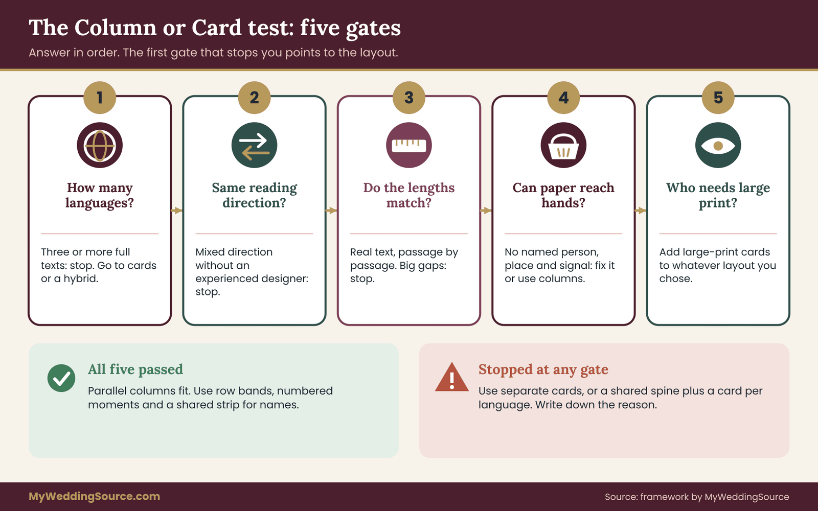
This is the decision framework. It has five gates. Each gate is a plain question with a stop rule. You pass the gates in order, write down your answer at each one, and the first gate that stops you tells you which layout to use. Work through it with a pencil and the guest list in front of you, because several gates need real numbers.
Gate one: how many languages, and how many readers in each
Count the languages that need a printed text, not the languages that are spoken in the family. A grandmother who speaks a language at home but reads the majority language comfortably does not need her own card. Then, working from your guest list, estimate how many guests in each group need the text in order to follow the ceremony. A rough count is enough.
The stop rule is simple. If you have three or more languages that need full text, parallel columns on a normal program page stop here. Three columns on a half-letter page leave each column too narrow to read comfortably, and the page starts to look like a spreadsheet. You can still use columns on a larger format, but most couples do not want a program the size of a menu card. Go to the card or hybrid path.
If you have two languages, you pass gate one, and you move to the next question. Write the language count at the top of your notes, since every later gate depends on it for the multilingual wedding program.
Gate two: do the scripts read in the same direction
English, Spanish, Korean, Vietnamese and many other languages read left to right. Arabic, Hebrew, Persian and Urdu read right to left. Some languages can be set in either direction depending on the tradition. If your two languages read in different directions, side-by-side placement is possible but delicate, because the eye of each reader travels toward the middle of the page from opposite sides. The columns can still be done well, and the build rules for that case appear later, but it raises the bar for the designer.
The stop rule: if your languages differ in direction and you do not have a designer who has set mixed-direction text before, choose cards or the hybrid. A mistake in mixed-direction typesetting, such as a misplaced number or a punctuation mark on the wrong side, is easy to make and easy for a native reader to spot.
The W3C’s internationalization pages are a useful reference for what can go wrong when direction changes inside a line. Direction is the gate that most often surprises a couple planning a multilingual wedding program for the first time.
Gate three: do the texts match in length
Take the two drafts and compare their length passage by passage, not for the whole document. Do this honestly, with the actual text, not with a guess. A passage of three lines in one language and six lines in the other will push the columns apart, and then you have to choose: leave a gap in one column, shrink the type in the longer one, or cut. All three have costs.
The stop rule: if more than a few passages differ by a large amount, columns will look uneven or force a small font in the longer language. A rule of thumb that many designers use is to allow some extra room for the longer language, and the next section turns that into a space budget. If the budget does not fit, go to cards. Measure first, because a multilingual wedding program built on guessed lengths usually has to be rebuilt.
Gate four: can you get the right paper into the right hands
This gate tests the practical side of cards, so it matters for any path that involves them. Who will hand out the programs? A greeter, an usher, a basket at the entrance? Will guests know which language to take? Will there be enough copies of each language, including a margin for guests who change their minds? Is there a person responsible for refilling the basket?
The stop rule: if you cannot name a person, a place and a signal for distribution, cards will fail even if they are the better reading format. In that case, either appoint the person or pull back to columns that put one object in every hand. A distribution plan that depends on goodwill and good memory is not a plan. Delivery is part of the design, and no multilingual wedding program succeeds on paper alone.
Gate five: who needs more than the standard format
Look at your guest list for people who will read with difficulty: older relatives who need large print, guests with low vision, guests who use screen readers and would prefer a digital copy, guests who read with a magnifier.
The Americans with Disabilities Act sets out obligations for venues and public services, and the ADA site at ada.gov explains effective communication in plain terms. A private wedding is not the same as a public service, but the practical lesson transfers: a format that works for most people can still shut out a few.
The stop rule: if any guest needs large print or an accessible digital version, plan one anyway, and note that large print will force a bigger type size that columns on a small page cannot easily support. Large-print versions are often best done as separate cards, one per language, even when the main program uses columns. Plan this early, since a multilingual wedding program with a large-print edition needs more room in the schedule and the budget.
Reading the result
If you passed all five gates, parallel columns fit your multilingual wedding program. If you stopped at gate one, two or three, you are looking at cards or a hybrid, depending on whether you want a shared sheet. If you stopped at gate four, you can solve the problem rather than the layout: appoint the person, or choose columns. If you stopped at gate five, add large-print cards to whatever layout you chose.
Write the result at the top of your planning notes, with the reason. Six months from now, when someone asks why the multilingual wedding program is three cards in a folder and not one handsome folded page, the note answers the question.
A common mistake: deciding from a mockup
Designers often show a mockup, and a mockup with filler text always looks good. Latin filler text does not reveal that your second language runs longer, that its script needs a bigger size, or that its punctuation behaves differently.
Insist on seeing a mockup with your real text, even a rough translation, before you choose a layout. If the text is not ready, delay the layout decision. The gates cannot be answered honestly without the text. A multilingual wedding program should be judged on its real words, not on its borders and monogram.
Length, expansion and the space budget
Text length is where the first layout plans usually collapse, so it gets its own section. The idea is to treat page space as a budget and the languages as claims on that budget, then see whether the claims fit before anything is typeset.
Why one language can fill more space than another
Different languages take different amounts of room for the same meaning. Some languages use longer words and more function words than English, so a passage may run noticeably longer. Some scripts pack a lot of meaning into each character, so a passage may be shorter in characters but need a larger type size to remain legible. Some scripts need extra line spacing for tall or stacked marks. None of this is a flaw. It is a property of the language, and the layout has to absorb it.
The honest version of this advice is that nobody can give you a single reliable ratio. The right number depends on the specific text, the language pair and the translator’s choices. The useful move is to measure your own draft rather than borrow a ratio from a blog. This is the reason a multilingual wedding program cannot be planned from the English draft alone.
A simple way to measure your own text
Paste each passage of the ceremony into a word processor in the font you plan to use, at the size you plan to use, in a text box as wide as the column will be. Look at how many lines each language takes. Write the line counts beside each passage in a short list. The list is your space budget. A passage that takes four lines in one language and seven in another is a warning.
Then sum the lines for each language. The total for the longest language, plus the headings, plus the spacing between passages, must fit inside the page height. If it does not, you have three honest choices: cut text, reduce the type size, or spread over more pages.
Cutting is almost always the best first move, because a ceremony program does not need to reproduce every sentence of a long reading. Summarize the reading in a line and print the full text only where guests will participate. The list takes an evening, and it is the most useful page in the folder for a multilingual wedding program.
Setting a planning allowance
When you plan before the translation is finished, you need a placeholder. A planning allowance is a deliberate extra margin that you add to your estimate of the longer language, so the layout does not break when the real text arrives. Many couples use a generous allowance, and some use none and regret it. The allowance is not a statistic. It is a safety margin that you choose, and you should tighten it when real text replaces the estimate.
A sensible habit: choose the allowance, build the layout with it, and then check the real text against the layout when the translation comes back. If the real text is shorter than the allowance, the extra space becomes pleasant white space. If it is longer, you learn early, while there is still time to cut. Treat the allowance as a planning tool for a multilingual wedding program, never as a claim about how languages behave.
What the budget tells you about the layout
If the longest language fits with room to spare in a column at least three inches wide, columns remain on the table. If it fits only in a narrower column or at a smaller size, switch to cards. If it needs more than one page, think about whether a booklet or a card is a better home.
Some couples find that a two-page booklet, with the shared order of events on the first page and the language text on later pages, works well, and that falls under the hybrid path. The budget is what turns a hunch about a multilingual wedding program into a decision.
The minimum size you can accept
Pick a minimum type size for the whole program and hold to it. Many designers consider small print a risk for older readers and for readers in dim light, and a ceremony in a church or at dusk is often dim.
If any language would need to drop below your minimum to fit, the layout has failed. Resist the temptation to shrink one language to rescue the design. A multilingual wedding program that is comfortable in one language and strained in another sends the wrong message to the guests who read the strained one.
For guests who need large print, common accessibility guidance from organizations such as the American Foundation for the Blind treats a size of around eighteen points or larger as large print. Use it as a starting point and ask the guests concerned what works for them, because needs vary.
Scripts, direction and fonts in a multilingual wedding program
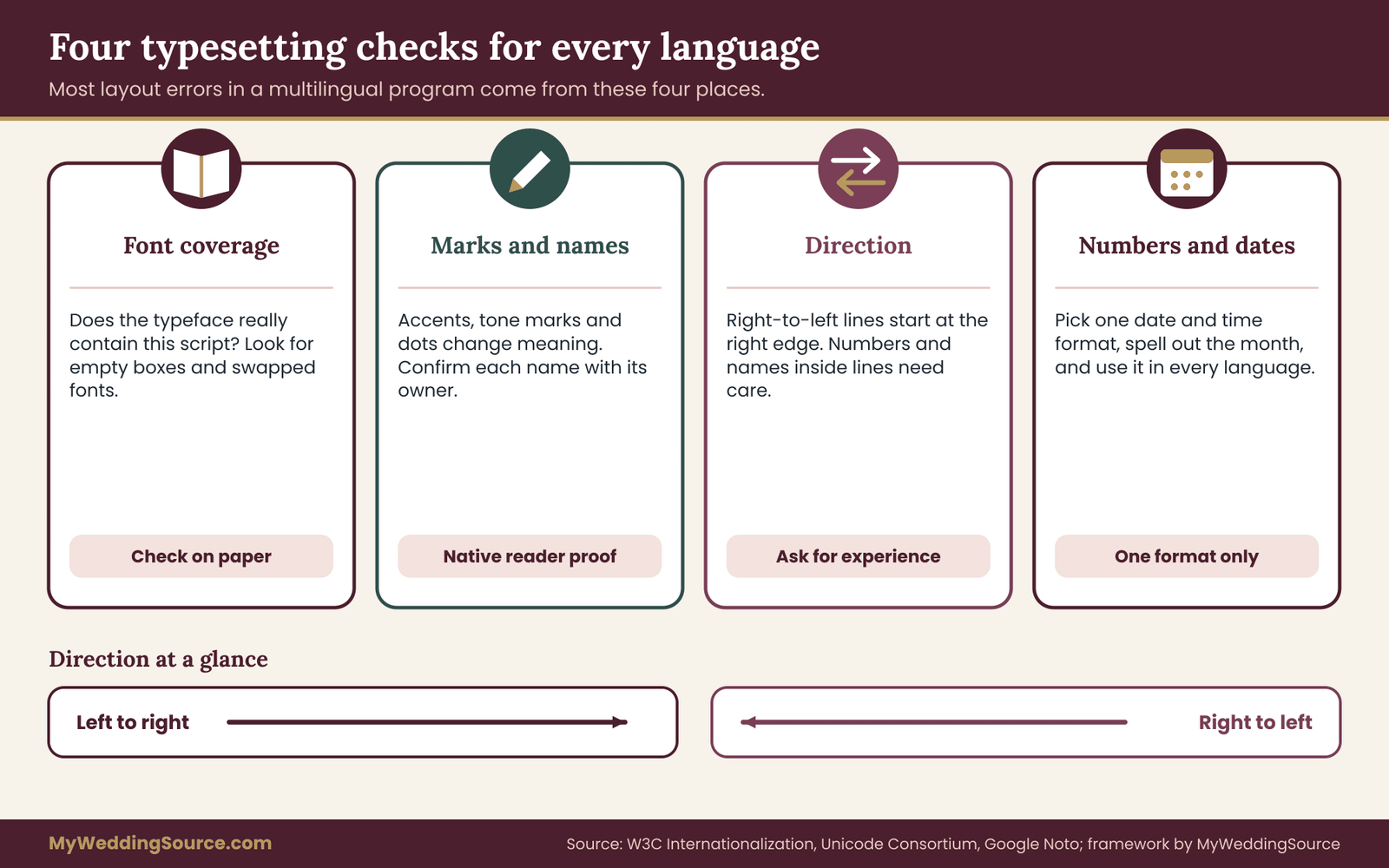
Typography is where a multilingual wedding program either looks respectful or looks like a mistake. Most of the problems come from three places: the font does not cover the script properly, the text direction is handled wrongly, or the designer treats every language as if it were English.
Font coverage comes first
A font is designed for a set of scripts. A beautiful script font chosen for the English heading may have no glyphs for the second language, and the software will quietly substitute another font. The result is a heading in one style and the same heading in another language in a mismatched style, sometimes with missing characters shown as empty boxes. Check coverage before you fall in love with a typeface.
For many scripts, an open font family designed for broad coverage can serve as a plain, even-handed base. Google’s Noto project, for example, was created with the aim of covering the scripts in the Unicode standard with a consistent look, and its pages describe the scripts each font supports.
Using a family designed for coverage lets you set every language in related letterforms, which supports the equal-status goal. For formal headings you can still use a decorative face in a script that it fully supports, as long as you check every language.
Ask a native reader to look at the proof, not only the translator. A reader who sees the page as a guest will notice a wrong-looking letter shape, a missing mark above a vowel or a stray box faster than anyone else. Pick the typeface family before the paper, because the family decides how far a multilingual wedding program can go.
Marks, accents and special characters
Many languages rely on small marks that change meaning. An accent in one language, a tone mark in another, a dot beneath a letter in a third: remove them and the word changes or becomes wrong. Names are especially sensitive. A person’s name printed without its proper marks can feel careless to the family, even if everyone knows who is meant.
Two checks help. First, make sure the document is saved and exported in a way that preserves these characters, because some older workflows strip them silently. Second, confirm the spelling of every name in each script with the person who owns it, not with a relative who thinks they know.
Treat a name as a fact that must be confirmed, in the same way you would confirm a date. Small marks carry real weight in a multilingual wedding program, and a proof is not finished until a native reader has seen them.
Left to right and right to left in one document
When a language reads right to left, the whole layout of the text block changes. The line starts at the right edge. Alignment is flush to the right. Bullets and numbers sit on the right. A page that mixes a left-to-right language and a right-to-left language has two opposite flows, and the designer must decide where they meet.
There are two safe patterns. In parallel columns, mirror the layout so that the two languages face each other with their starting edges toward the outside, or toward the middle, and apply the choice consistently on every page. In separate cards, set each card in its own natural direction with no compromise at all. The second pattern is simpler, and this is why mixed direction often tips a decision toward cards.
Problems appear inside lines, too. A name, a date, a number or a word in the other script embedded in a sentence can end up in the wrong order or with punctuation on the wrong side. The W3C’s internationalization guidance describes how the Unicode bidirectional algorithm treats such text and where manual control is needed.
You do not need to master it. You need to ask the designer whether they have handled mixed-direction text before, and you need a native reader to check every line that contains a name or number. Mixed direction is the single biggest technical risk in a multilingual wedding program.
Numbers, dates and times
Printed times and dates look simple and are not. A time may be written with a colon or a dot, in twelve-hour or twenty-four-hour form. A date may begin with the day, the month or the year. Some families use a different calendar for religious events and the civil calendar for the schedule. Choose one format for the document, state it clearly, and use the same one in every language, unless a translator advises that a particular convention would confuse the readers of that language.
When the program lists the ceremony time, write it in the form that every group will read correctly. If in doubt, spell out the month in words, which removes the day-month ambiguity. One consistent format keeps a multilingual wedding program from sending two groups of guests to two different start times.
Line breaks, justification and hyphenation
Narrow columns tempt designers to justify the text, stretching spaces so both edges are straight. In narrow columns, justified text creates uneven gaps and rivers of white space, and in some scripts it can break words in ways that look wrong or alter meaning.
Left-aligned text (or right-aligned for right-to-left languages) with a ragged edge is almost always more legible in a ceremony program. Do not turn on automatic hyphenation without checking, because the rules differ by language and software defaults are made for English. In a multilingual wedding program the safe default is plain alignment and no automatic hyphenation.
Size and weight across scripts
Two scripts at the same nominal point size do not look equally large. Some scripts have a small apparent size because their letterforms have a low height relative to the type’s body. Others have a large apparent size. The practical rule is to compare by eye on paper and adjust until the languages look comparable, instead of forcing an identical number. Equal point size is a starting point, not the finish line.
For a multilingual wedding program, the aim is that a reader of any language feels the text was set for them on purpose. That feeling comes from small, specific choices: the right font, the right marks, the right direction, the right line spacing. Judge sizes on paper, by eye, in a multilingual wedding program, and have a native reader confirm that the scripts feel comparable.
Building parallel columns that stay in step
If your test points to columns, the build matters more than the idea. A parallel layout has one hard job: keep matching passages level. Here is how to build it so it works.
Choose the page format first
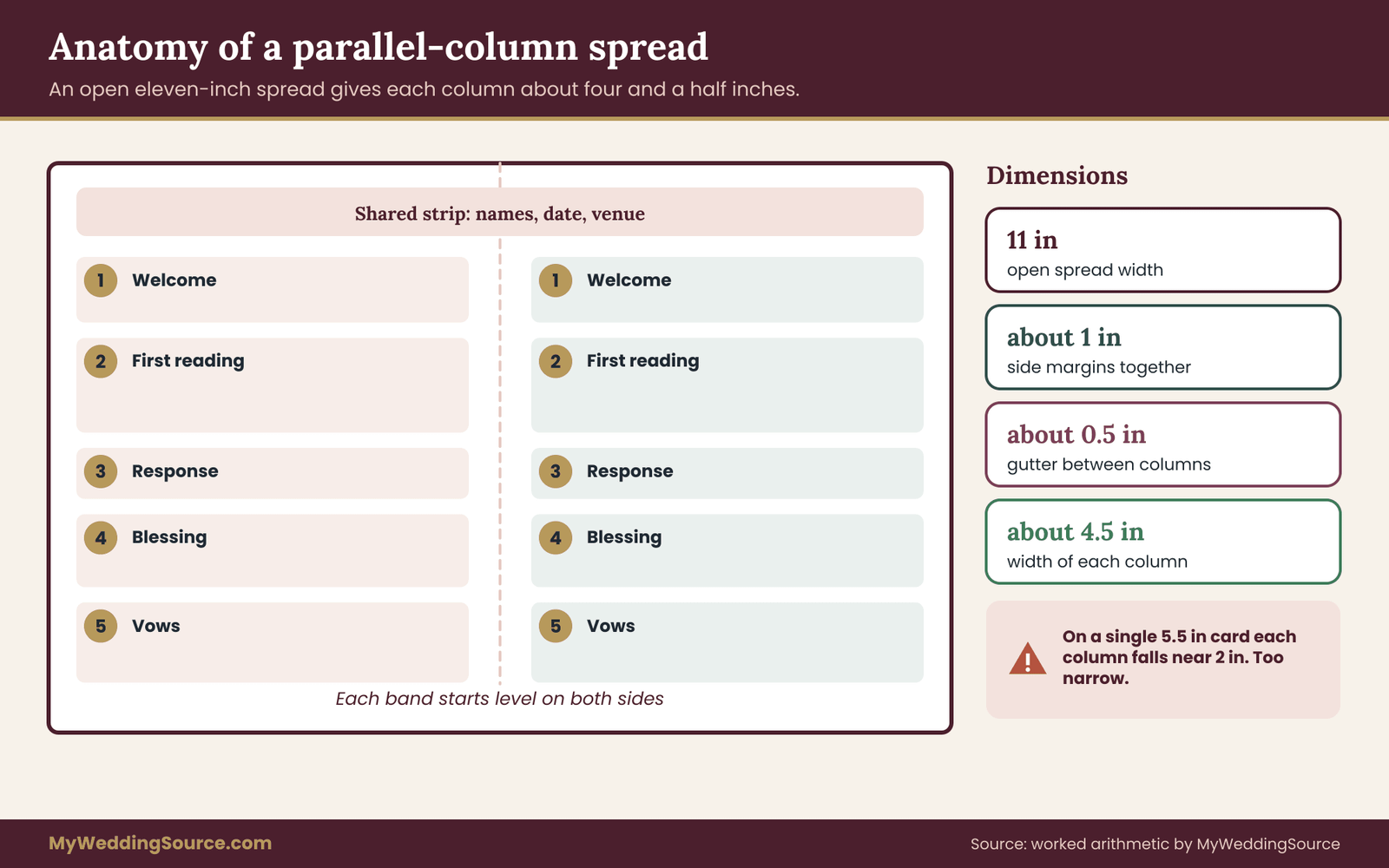
A folded program opens to a spread, and a spread gives each column room. A single flat half-letter card gives each column very little. Do the arithmetic early. If the open spread is eleven inches wide, side margins take about one inch in total, and the gutter between columns takes about half an inch, then each column has about four and a half inches.
That comfortably holds a readable line. If the page is a single five-and-a-half-inch card, the same margins leave about two inches per column, which is too tight for most text.
A practical minimum is about three inches per column for running text at a comfortable size. Below that, lines become short, words break awkwardly and the page looks crowded. If your layout cannot reach three inches per column, columns are the wrong tool for that page. Choose the physical format of the multilingual wedding program before you choose the typeface.
Use row bands
A row band is the key technique. Divide the ceremony into passages, and give each passage a band that spans both columns. Within the band, the first language sits on one side and its match on the other. The band’s height is set by the longer of the two texts. The shorter text leaves white space beneath it. This is what keeps the matching passages level: each band starts at the same height on both sides, so the eye never loses its place.
The cost is white space. Some bands will look half empty. That is acceptable, and it is far better than the alternative, in which the columns drift out of step and the reader has to search for the match. If white space bothers you, balance it by choosing where to break the passages. Two short passages can be combined into one band, and a long passage can be split into two bands. Row bands are what make a multilingual wedding program of parallel columns work as a matched pair.
Give every band a short label
A band label, such as a number or a simple title, helps readers who skip around. The same label appears in both columns, ideally a number, because numerals are shared across many languages. Number every passage.
In a multilingual wedding program, a number is a simple and neutral way to say “this is the same moment in both languages.” If your ceremony order has twelve moments, number them one to twelve across the entire program, and repeat the number in each column. Numbered bands also give the officiant a simple way to cue a multilingual wedding program aloud.
Mark who speaks and what the guests do
Use consistent visual cues for roles. For example, set the officiant’s words in a regular weight, set responses that guests say in bold, and use a small symbol for “please stand” and “please be seated.” Repeat the same cues in every language so that a guest who reads only one column still sees when to stand. These cues also help with participation, the third job of the program. The cues are the part of a multilingual wedding program that a guest reads without noticing, which is the point.
Handle responses carefully
When guests respond aloud, the response should appear at the point in the band where it is spoken, in the guest’s own script, and optionally with a transliteration if many guests will say words in a language they cannot read. A transliteration is the sound of the words written in another script.
It should be a separate, smaller line under the response, and it should be checked by a native speaker, because it is easy to get wrong. If you are unsure whether transliteration is wanted, ask a few guests from the group concerned. Participation lines are where a multilingual wedding program is most likely to be tested in public, so give them extra proofing.
Keep the columns visually equal
Use the same column width, the same margins, the same heading size and the same spacing. A thin vertical rule between the columns can help the eye, and it also signals that the two sides are partners. Avoid giving one language a colored background or a bolder heading unless you do the same for the other. Equal treatment in the visual details supports equal status in the message. Visual parity costs nothing and makes a multilingual wedding program look like it was made for everyone.
Where to put the shared items
Some items are the same in every language and do not need translation: the names of the couple, the date, the venue’s name, the names of people in the wedding party. Put them in a shared strip across both columns, above the first band, instead of repeating them in each column. This saves space and removes one chance for a spelling mismatch. The same goes for a thank-you line at the end, if it is brief. A shared strip keeps the multilingual wedding program shorter and removes duplicate spellings.
Building separate cards that reach the right hands
Separate cards solve the space and script problems at once, and they create a logistics problem in exchange. Treat the cards as a small distribution project, and they work well. Treat them as a design project only, and a guest ends up holding the wrong card at the start of the ceremony.
Decide the card size and format
A card can be a single sheet printed on both sides, a folded card or a short booklet. For a ceremony of about twenty-five minutes, a single double-sided card at a common size such as five by seven inches is often enough, and it fits in a hand with a purse or a child’s hand in the other.
Larger cards give more room for long scripts or large print, and smaller cards are easier to carry. Choose the size from the longest language’s space budget, as in the previous section, and then use that same size for every language, so the set looks intentional and the printer’s job stays simple. For a multilingual wedding program built from cards, the size decision is also a budget decision.
Give every card the same skeleton
The cards should be recognizably siblings. Use the same grid, the same typeface family where possible, the same band numbers and the same cues for standing, sitting and responding. A guest who has seen the English card and who is handed the second language card should see the same structure.
That consistency also makes it easier for guests to help one another: a person holding one card can point to “number five” and the neighbor with another card will find the same moment. A common skeleton turns several cards into one multilingual wedding program that happens to be printed in several parts.
Make the language obvious at a glance
The language should be identifiable before the guest reads a word of text. The simplest tool is a large label in the language itself at the top of the card. Color is a second tool, but never the only one.
A color band on the edge of each card helps an usher sort the stack quickly, yet a guest with color-vision difference may not rely on it, and a printed card under yellow candlelight can shift in hue. Use a color band plus the language name, in its own script, on every card. A guest should know which card of the multilingual wedding program is theirs before reading a single sentence.
Plan quantities with a margin
Count guests by language group, not by household. Add a margin for guests who will want two languages, for guests who change their minds at the door, and for a few spare cards for the officiant, the musicians, the photographer and the planner. Do not guess the margin from a percentage found online. Look at your own guest list, estimate which groups read more than one language, and round up. The cost of a few extra cards is small compared with the awkwardness of running out of one language.
If you have a mixed group, such as families who read both languages, consider giving them one of each in a single hand-off. A simple slip or card sleeve that holds the pair keeps the cards together. Counting carefully is what keeps a multilingual wedding program of several cards from running out in one language.
Design the hand-off
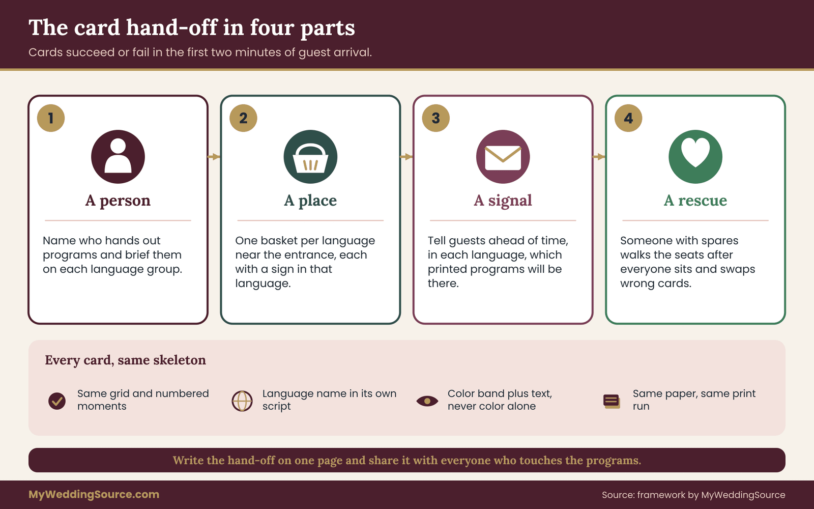
Cards fail at the door. A plan with four parts covers most of it.
A person. Name the individual or the small team who will hand out the programs. Brief them on the language groups.
A place. Put the cards where guests will pass them, at a table near the entrance or in baskets at the foot of the aisle, one basket per language, each with a clear sign in the language itself.
A signal. Tell guests in the invitation or on the wedding website which language cards will be available, so they expect to pick one. The wedding website can state, in each language, that printed programs will be provided. An invitation or website note ahead of time prevents confusion at the door.
A rescue. Appoint someone to move through the seats after the guests are seated, with spare cards in each language, so a guest who got the wrong one can swap quietly. This is the step most plans skip, and it is the step that catches most errors. Write the hand-off plan on one page and share it with everyone who touches the multilingual wedding program on the day.
Seat-back and chair placement
Some couples place a card on every chair. That works if the seating is assigned by language group, which is unusual for a ceremony, and risks guests sitting where they do not belong. A more flexible approach is to put a small stack of every language on the end of each row, with a sign at the row end.
Guests take what they need and pass the rest along. For a ceremony with open seating, baskets at the entrance and rescue at the seats are usually simpler. Open seating usually favors baskets over chairs for a multilingual wedding program of several cards.
The digital companion
Cards can be paired with a digital version that guests open on their phones through a link or a printed code. A digital version helps guests who need larger text or screen-reader support, and it allows late fixes. It also has costs: phones may be asked to stay silent during the ceremony, venues sometimes have weak reception and some guests do not carry a smartphone.
Treat the digital version as a companion, not a replacement, and make it simple enough to read without scrolling through a long page. If the digital version links to the wedding website, check that the links work from a phone, and have every page tested in each language.
For guests who use assistive technology, plain documents that are structured with real headings work better than a flattened image of the program. The federal Section 508 site at section508.gov explains how accessible documents are built, and the same practices help in a private setting. A digital edition is a useful companion to a multilingual wedding program, provided it never becomes the only way in.
Card cost and print logistics
Several languages mean several print jobs, several proofs and several sets of corrections. Ask the printer whether the cards can be produced in one run with the same paper and the same finishing, which keeps the cost per card low and the color consistent.
Ask how corrections are handled: a correction to one language should not require reproofing all of them. A shared template with locked layout and swappable text makes corrections safer, because the designer changes only the text. If the cards share a single set of printed elements, such as a border or a monogram, the printer can print those in one pass.
If the stationery is being produced alongside invitations, the wedding invitation printing guide on this site explains proofing and printer handoffs, and those habits carry over directly to program cards. Ask early how the printer handles several languages, because the answer shapes the price of a multilingual wedding program.
Hybrids and other paths for a multilingual wedding program
Between pure columns and pure cards are several practical options. They deserve a fair look, because many mixed rooms are served best by a combination.
The shared spine with language cards
This is the most flexible hybrid. One shared sheet, printed once, carries the order of events as numbered moments with simple icons and very short labels, perhaps a single word or a symbol. Every guest gets the spine. Language cards, one per language, carry the full text for each numbered moment. A guest holds both: the spine tells them where the ceremony is, the card tells them what is being said.
The strength of this path is that it handles three or more languages, mixed directions and different lengths. The weakness is that every guest holds two pieces of paper, which can be awkward with a bouquet, a baby or a cane. Sizing helps: make the spine a narrow strip, about the size of a bookmark, that tucks under the card or into the fold. For many mixed rooms this is the most forgiving multilingual wedding program, because the spine absorbs the differences.
The folded program with a language insert
Here the main program is a folded page in the host language or in two parallel columns, and a loose insert holds the third language. This suits a ceremony with two main language groups and a smaller third group. The insert is easier to produce than a full set of cards and costs little.
The risk is that the third language is visually less important than the first two, so make the insert match the main program’s design and mention it on the main page, in the third language, so that its readers know it exists. The insert keeps a multilingual wedding program affordable when the third language group is small.
The alternating program
In an alternating layout, the program is a single column and the language changes by passage: the welcome in one language, the first reading in another, the vows in both. This follows the way many bilingual ceremonies are actually spoken. It saves space and gives each language a fair share of the ceremony. It does not give anyone a complete text in their language, so it suits guests who need only an outline.
Because this path is about how the ceremony is spoken as much as how it is printed, this guide treats it as outside the column-or-card choice, and recommends confirming it with your officiant. If the two traditions in the room each own part of the ritual, the interfaith ceremony planning guide explains how to divide who says what. Treat this as a decision about the ceremony itself, and only then as a decision about the multilingual wedding program.
The summary plus key moments
A short program gives the order of events in each language at a summary level, and prints full text only for the moments where guests take part: a response, a shared reading, a blessing. This path trades completeness for brevity. It can be laid out in parallel columns because the texts are short, even when the full ceremony would not fit. A short multilingual wedding program of this kind is often the right answer for a brief civil ceremony.
The screen or the whispered interpreter
Some venues allow a screen that displays text in each language as the ceremony proceeds, and some families arrange a person to whisper an interpretation to a few guests. Both paths have uses and both have limits. A screen needs a technician, power and a plan for when the connection fails.
A whispered interpretation needs a quiet, trained interpreter and a seating plan that puts the guests who need it near that person. Neither replaces a printed program, though either can support it. The ceremony step-by-step guide on this site explains how the order of a ceremony is built, which helps when deciding what any interpreter or screen must cover. Either one supports a multilingual wedding program and does not replace it.
Choosing among the hybrids
Use a short rule. If the problem is too many languages, choose the shared spine. If the problem is one small extra language, choose the insert. If the problem is a very short ceremony, consider the summary. If the problem is that the ceremony itself switches languages, consider the alternating pattern and agree it with the officiant. In each case, return to the five gates and check that no gate is quietly failing. None of these hybrids is exotic; each is a recognizable form of a multilingual wedding program.
The role of the officiant and the ceremony director
The person leading the ceremony needs a copy that matches what guests hold, in the order they hold it. If the officiant uses a different version, the printed program drifts from the spoken one. Give the officiant, the readers and the ceremony director the final text and the numbered bands, and ask them to read the numbers aloud in rehearsal.
The wedding officiant requirements guide on this site covers who can lead a ceremony, and the ceremony cue sheet guide covers how timing and cues are handed to the people running the day. The people running the ceremony need to hold the same multilingual wedding program as the guests.
A worked prototype: two invented couples, two different answers
The best way to see the test at work is to run it twice on made-up cases that point in different directions. Both couples below are invented for illustration. The numbers are planning figures chosen to show the method, not data from real weddings, and they are not benchmarks.
Case A: Lena and Mateo, English and Spanish, ninety guests
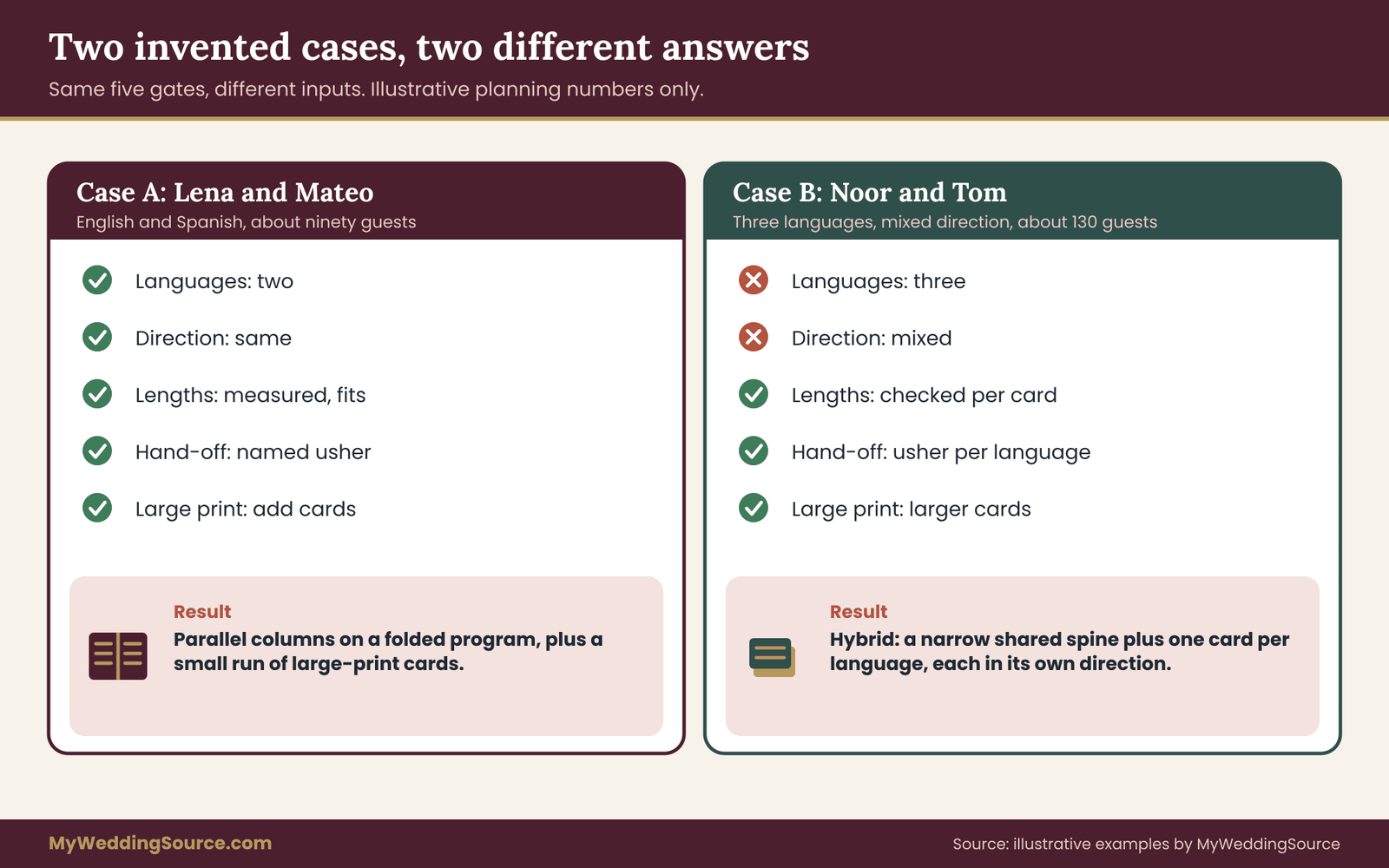
Lena Whitfield and Mateo Ruiz are planning a twenty-five-minute ceremony in a garden. They expect about ninety guests. They estimate that around fifty guests need English, around thirty-five need Spanish and the rest read both comfortably. Their two languages both read left to right. Mateo’s grandmother prefers large print.
Gate one. Two languages, so columns stay on the table. Gate two. Same direction, pass. Gate three. They paste the draft ceremony into a word processor at eleven points in a column four and a half inches wide. The Spanish draft runs longer in most passages. Counting lines, the welcome takes five lines in English and six in Spanish, the reading takes nine and eleven, and the blessing takes four and five. The longest language is about a fifth longer overall.
The whole ceremony needs eleven numbered bands, and the longer language fills a little under two-thirds of a page of the open spread. That fits, so they pass. Gate four. Distribution is simple with columns, because one folded program goes into every hand.
They name Mateo’s cousin as the person at the entrance. Pass. Gate five. The grandmother needs large print. That is a card, not a column, so they add one large-print version of each language, printed at a larger size as a single double-sided sheet, to be handed to the guests who ask.
The result: parallel columns on a folded program, with row bands, numbered moments and a shared strip for the names and date, plus a small run of large-print cards. The prototype page order is simple. The front shows the couple’s names, the date and the venue. The inside spread holds the eleven numbered bands in two columns. The back holds a short thank-you in both languages and a line that says large-print copies are available from the usher.
Notice what the test did. It did not simply confirm the original picture. It added the large-print cards, which the couple had not considered, and it protected the design from the one language that ran longer by checking the lines first. The lesson is that the multilingual wedding program of two same-direction languages can use columns once the longer language is measured.
Case B: Noor and Tom, three languages, mixed direction
Noor Haddad and Tom Becker are planning a ceremony of about thirty minutes, with a guest list of about one hundred and thirty. Three groups need text: English, Arabic and a smaller group that reads Spanish. Arabic reads right to left. Many older relatives on Noor’s side read Arabic most comfortably. Tom’s aunt and uncle read Spanish and prefer it for formal documents.
Gate one. Three languages needing full text. Columns on a program page stop here. Gate two. Mixed direction, which would raise the bar for any layout that puts the languages side by side. Even if the first gate had passed, this one would have stopped the column layout unless an experienced designer was engaged.
Gate three. Not needed for the decision, though they check it for the cards. Gate four. They name an usher for each language group and place three baskets with clear language labels. Pass. Gate five. Several older relatives want large print. They plan a larger card size for all three languages instead of a separate large-print run.
The result: a hybrid. A narrow shared spine lists the thirteen numbered moments with simple icons for stand, sit, rings and music, and with a single-word label in each of the three languages. Three language cards carry the full text, each set in its natural direction, each with the same grid and the same numbered bands. Cards are a larger format so the type size can be generous.
In the prototype, the spine slides into a slit at the top of each card, so a guest holds one object. That slit idea is optional. A simple paper clip works too, but a clip catches on clothing and sometimes scratches the paper, so test it.
Alternatively, print the spine as a narrow panel on the left or right edge of each card and trim it on the printer’s cutting line, which means the spine travels with the card and removes the two-pieces problem. That multilingual wedding program is a hybrid because three languages and two directions leave no safe column width.
What the two cases teach
The same five gates gave two different answers because the inputs differed. Case A was a two-language, same-direction case that columns served well once the long language was measured. Case B had a third language and a mixed direction, and neither could be served by columns without more risk than benefit.
A second lesson is that the gates are not a verdict on taste. Case B could have been forced into columns by an ambitious designer. The test does not say that is impossible. It says the risk is high and the margin for error is small, and it asks whether the couple wants to spend their effort there. Run your own multilingual wedding program through the gates the same way, with your own numbers.
A prototype checklist you can copy
Once you have chosen, build a prototype before the print run. A prototype is a full-size mock-up on ordinary paper, with real text, that you can hold and read. Work through this list in prose, in order.
First, print the draft at actual size on plain paper. Not a screen, and not a scaled-down preview. Second, fold or stack it exactly as it will be used. Third, take it to a place with dim light, as a ceremony room might have at dusk, and read the smallest text.
If you cannot read it comfortably at arm’s length, the type is too small. Fourth, hand it to someone who reads only one of the languages and ask them to find a specific numbered moment. Time how long it takes. Fifth, ask them to point to the place where they will stand or respond. If they hesitate, add a cue.
Then change what the prototype taught you. This stage is cheap. Changes after the print run are not. Keep the finished checklist with the files for the multilingual wedding program.
How long should the test take
A first prototype needs about an hour once the text exists, and a second round with feedback needs about the same. The process is less about elaborate testing and more about forcing the program into the real world a few times, with a real reader, before it is printed in quantity. Even two readers and one dim room will find most of the problems that matter.
Recording the decision
Keep a one-page note with the gate results, the layout chosen, the reasons and the file names of the final texts. When a relative asks months later why the multilingual wedding program took that form, or when you want to reuse the files for an anniversary or a family event, the note saves a long search. It also helps the person who might step in if you are unavailable on the day, such as a planner or a friend who has been asked to reprint a damaged card.
When a professional designer is worth it
Case A can be built in a standard layout program or word processor by a careful couple. Case B involves mixed-direction text, three scripts and a large print run, and the cost of a mistake is high.
A designer with experience in multilingual typesetting is a sensible expense in that case, and a native reader of each language should check the proof. Ask the designer directly whether they have worked with the specific scripts and to show examples. If a designer is hesitant about right-to-left text, that tells you something useful before any money is spent.
Failure conditions: when each layout breaks and what to do
A decision framework is more honest when it says where it stops working. These are the conditions that most often break each layout, with a plain remedy for each. Read them before you print, and check your own plan against them.
Columns fail when one language outgrows its column
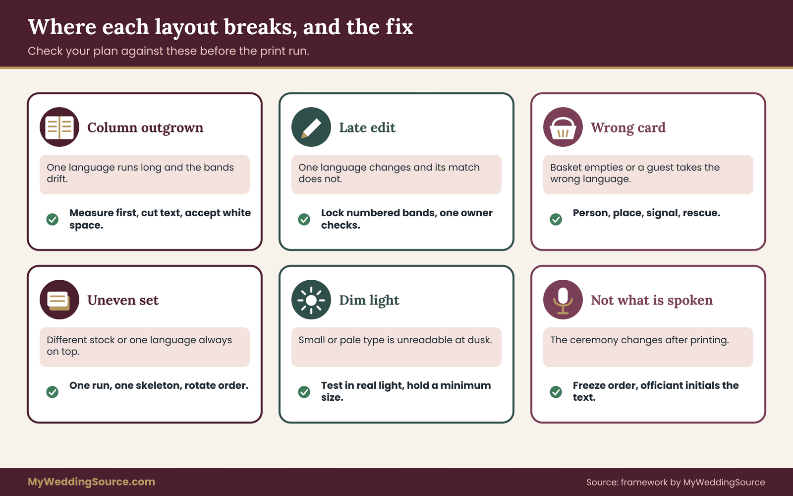
The classic failure. The second language arrives from the translator and runs a third longer in the reading. The bands now have large gaps on one side, or the designer shrinks the type to keep the page tidy. The remedy is to measure before designing, as in the space budget, and to cut or summarize in the source text.
If the gap remains, accept the white space in the shorter column rather than shrinking the longer one. If neither is acceptable, move to cards. This is the most common reason a multilingual wedding program is redesigned after the first proof.
Columns fail when the page is too narrow
A column under about three inches looks cramped, and a line of only a few words leaves ragged breaks and awkward hyphenation. The remedy is to move to a spread, a larger page or a booklet, or to reduce the amount of text per language. If the format cannot change, change the layout.
Columns fail when someone edits one language late
A line is changed in the English text on the final day, the layout is not updated in the other column, and the two sides no longer match. This is common and quiet.
The remedy is a version rule: the numbered bands are locked once the translator signs off, and any change to one band triggers a check of its match in every other language. Put one person in charge of that check and tell the officiant who it is. Late edits are a leading cause of mismatched text in a multilingual wedding program.
Cards fail at the door
The most common failure. The wrong card is handed out, a basket empties, or guests cannot tell which stack is theirs. The remedy is the four-part hand-off plan: a person, a place, a signal and a rescue. If any one of the four is missing, name it before the day. A multilingual wedding program of cards succeeds or fails in the first two minutes of guest arrival.
Cards fail when the set looks uneven
One card is printed on thicker stock, another has a darker color band, the order in the basket always puts one language on top. Guests read these as signals about status. The remedy is a single print run on the same stock, the same skeleton, and a deliberate rotation of the order in which the cards are displayed. When the cards are shown on a table, alternate the language order by row.
Cards fail when guests need two
Guests who read both languages want both cards, and then hold two pieces of paper and a bouquet, or a baby, or a program and a phone. The remedy is a bundled pair in a sleeve, or a hybrid with a shared spine so that most guests need only one card. For guests who want both, offer them together from the start so they do not have to ask.
Hybrids fail when the spine says too much
A spine meant to be a glance becomes a second program, with sentences in each language and a crowded look. Then it stops being a spine and starts competing with the cards. The remedy is to keep every spine entry to a number, an icon and one or two words. If you need a sentence, it belongs on the language card.
Any layout fails in dim light
Ceremonies at dusk, in churches, in tents or in candlelit halls are common, and small type, pale ink and glossy paper all lose legibility. The remedy is a real-light test of the prototype, a minimum type size that you hold to, strong contrast between ink and paper and a matte finish where possible.
Foil, pale gray ink and fine script type can look good in daylight and unreadable in the room where the ceremony takes place. Test the multilingual wedding program in the real light of the room, not at a desk.
Any layout fails when it is not what is spoken
If the ceremony changes after printing, the program becomes a guide to a ceremony that did not happen. The officiant adds a reading, a family member declines to speak, a song is cut for time.
The remedy is to freeze the ceremony order well before printing, to have the officiant and ceremony director initial the final text and to bring a small stack of blank cards for handwritten notes on the day, only for emergencies. If a change affects many passages, print an insert slip in each language instead of marking up the programs. A multilingual wedding program has to describe the ceremony that actually happens.
Any layout fails when the translation is wrong
Layout choices cannot rescue a bad translation. A cousin who translates over a weekend is a risk, and a machine translation passed off as final is a larger one. A translated ceremonial or religious passage often carries meaning that a plain translation misses, and a mistranslation can offend. Use a qualified translator for ceremonial text, ask a second native reader to check, and ask the officiant to confirm any traditional wording.
Machine translation can be a rough check, but do not present it as an authoritative or ceremonial translation. If you need help finding a qualified translator, the American Translators Association is a reasonable starting point, and the federal language access site at lep.gov describes why accurate translation matters for people with limited English proficiency.
A last failure: nobody owns the program
A multilingual wedding program has many hands on it: translators, a designer, a printer, an officiant, an usher. Without one owner, small errors pass between them. Name one person as the owner of the final version, and give that person the authority to say “this is the file.” It can be a planner, a family member or one of the couple, but it must be one name.
Proofing and talking to the people who build it
The last stage is review and communication. This is where most of the avoidable errors are caught, and where the briefing language you use matters.
The proofing sequence
Proof in a fixed order, with a different reader at each step. First, the translator checks the text for meaning, as a separate job from layout. Second, a native reader of each language checks the typeset proof, on paper, for characters, marks, direction and line breaks.
Third, a person who does not read the language checks the structure: are the numbers in order, are the bands level, are the cues present in every language. Fourth, the officiant checks the text against what will be said. Fifth, the owner of the final version signs the file and sends it to print.
Each reader should check only their kind of problem. A reader who is asked to “look at everything” tends to skim. A reader asked to “check every name and number” finds the one that is wrong. Give the multilingual wedding program a fixed review order and put the sign-off in writing.
Names deserve their own pass
Collect every name and title in one list, confirm each with its owner in the script it will appear in, and compare the list against the proof. This pass catches transposed letters, missing marks and a name that is placed in the wrong band. It takes twenty minutes and prevents the error that families remember longest. A single misspelled name can overshadow the rest of a careful multilingual wedding program.
The aisle test
Before the print run, take a prototype to a place that matches the ceremony: dim, with a person standing at arm’s length. Ask the reader to find the vows. Ask a guest with weaker vision to try, with their usual glasses. If the answer is slow or uncertain, increase the size, increase the spacing or simplify the cues. This test costs almost nothing and tells you more than another hour of screen review. Run it once with a real reader before the multilingual wedding program goes to print.
What to say to the translator
A short, clear brief makes the layout easier. You might say: “This text will be printed in parallel with the other language, passage by passage, so please keep each numbered passage as one unit. If any passage will run much longer than the source, tell me and suggest a shorter version. Please mark any line where you made a judgment call.” That one paragraph reduces rework later.
What to say to the designer
You might say: “We are choosing between columns and cards and need to test both with real text. Please set the first three numbered passages in both layouts at the same size, and send a printable proof. Tell us which scripts you have set before, and whether any of our languages reads right to left.” The designer’s answer tells you how much of the work they can take.
What to say to the printer
Ask for a proof on the actual stock, ask what the minimum legible size is for the chosen finish, and ask how a correction to one language will be handled. Ask how the cards will be packed, so that they arrive sorted by language and counted, and ask for the shortest realistic turnaround, in case a correction is needed. The invitation etiquette guide on this site covers the paper trail around stationery, and the same careful sequence applies to programs.
What to say to the ushers
Give each usher a short written card: which languages are on offer, where the baskets are, the sentence to say in each language, and the rescue plan for a guest who has the wrong card. A greeting in the guest’s own language is warmer than a handed card, and it signals which stack to reach for. If an usher does not speak a language, give them the phrase on paper and a native speaker to practice with.
What to say to guests ahead of time
A line on the wedding website and the invitation suite helps, in each language: “Printed programs will be provided in these languages.” If a guest needs large print or a digital version, invite them to say so in advance through the RSVP or a contact form. The wedding invitation guidance on this site explains where such information belongs. Do not make guests ask in public.
Signs at the entrance
A small sign at the basket in each language tells guests which stack is which. Keep the wording short, use the same layout for every sign and apply the same font choices as the programs. If you have many signs across the day, the wedding signage system guide covers legibility, placement and proofing, and the same principles hold for entrance signs.
Respect and humility
Even a careful multilingual wedding program will have imperfections. A guest may prefer a different word, a grandparent may notice an old-fashioned phrase, a friend may spot a small slip. Invite correction kindly, accept it with thanks and keep a corrected file for next time. The point of a multilingual wedding program is not perfection. It is that guests from different families feel they were expected, welcomed and thought of, and that the paper in their hand said so in a language they love.
Your next steps
Start with the text, then the test, then the prototype. In that order the decisions are cheap, and out of order they are expensive.
First, freeze a draft of the ceremony order and number each moment. Second, get real translations, even rough ones, of three passages: a welcome, a reading and a response. Third, run the five gates with those passages and your guest list, and write the result and the reason at the top of one page.
Fourth, print a prototype at actual size on plain paper and read it in dim light with someone who reads only one of the languages. Fifth, appoint one owner for the final version and one person for the hand-off.
Then give the translator, designer and printer the short briefs from the previous section, and schedule the native-reader proof a few weeks before the print date. If a gate stops you, change the layout, not the ceremony. A well-built multilingual wedding program is quiet. Guests find their place, follow along and look up at the couple, and that is the whole job.
FAQ
Is a multilingual wedding program better as parallel columns or separate cards?
Neither is better in general. Parallel columns suit two languages that read in the same direction and fit comfortably side by side, about three inches per column or more. Separate cards suit three or more languages, mixed reading directions, long texts or guests who need large print. When the room is mixed, a shared one-page order of events plus one card per language is a reliable middle path.
How many languages can fit in parallel columns?
Two is the practical limit on a normal program page. Three columns on a half-letter spread leave each one narrow, and every extra language shrinks the type or the line length. A larger format or a booklet can carry three, but most couples find the page looks crowded and prefer separate cards or a shared sheet with one card per language.
Can I mix left-to-right and right-to-left languages on one page?
Yes, but it takes care. Direction changes the starting edge of every line, the alignment, the position of numbers and where punctuation falls. Ask the designer whether they have set mixed-direction text before, and have a native reader check every line with a name, date or number. If the designer is unsure, set each language on its own card in its natural direction.
How much extra space does the longer language need?
There is no single reliable figure, because it depends on the language pair, the text and the translator. Measure your own draft: set each passage in your chosen font, at your chosen size, in a box as wide as the column, and count the lines. Then add a deliberate safety margin while the translation is unfinished and tighten it once the final text arrives.
Do I need large-print versions?
Plan one if any guest asks or if you know a relative will struggle with small type. Large print is commonly described as eighteen points or larger, but ask the guests concerned what works for them. A separate large-print card in each language is often easier than enlarging the whole program. The ADA site at ada.gov explains effective communication in general terms.
How many cards should I print for each language?
Count guests by language group, then add a margin for guests who read two languages, guests who change their minds at the door and spares for the officiant, musicians, photographer and planner. Round up rather than using a percentage from a website. A few extra cards cost little, while running out of one language at the entrance is hard to fix.
Is machine translation acceptable for a wedding program?
Use it only as a rough check after a qualified translator has done the work, never as the translation itself for ceremonial or religious text. Tools can miss tone, register and traditional wording. Ask a second native reader to review, and ask the officiant to confirm any traditional passages. The American Translators Association can help you find qualified professionals.
When should the layout decision be made?
After the ceremony order is settled and rough translations exist, but before the designer starts. Deciding from a mockup with filler text hides length, script and direction problems. Allow time for a prototype, a native-reader proof and one round of corrections before the print run, and keep a short note recording the decision and the reasons.
Sources
- Americans with Disabilities Act, U.S. Department of Justice
- Effective communication, ADA.gov, U.S. Department of Justice
- Section508.gov, U.S. General Services Administration
- LEP.gov, Federal Interagency Working Group on Limited English Proficiency
- PlainLanguage.gov, Federal plain language guidelines
- American Translators Association
- W3C Internationalization Activity, World Wide Web Consortium
- Unicode Consortium, The Unicode Standard
- Noto fonts, Google Fonts
- American Foundation for the Blind