

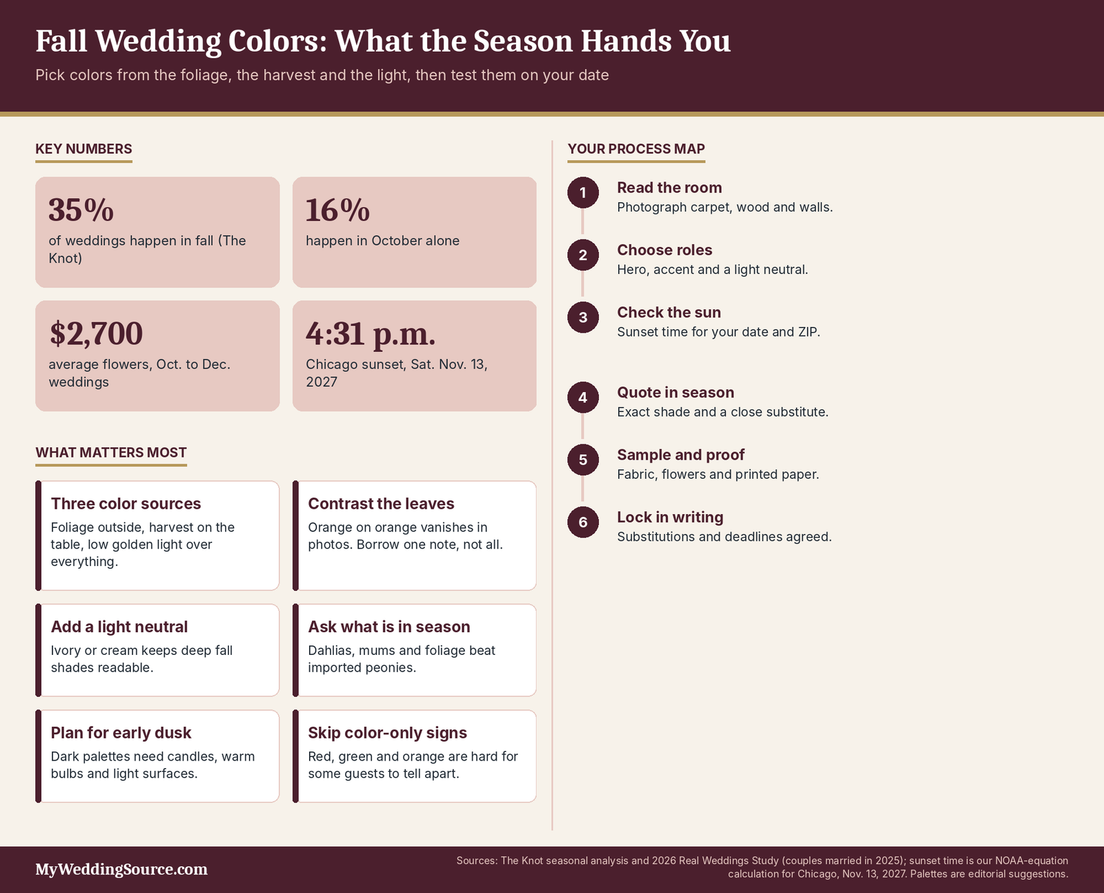
Fall wedding colors work best when you choose them from three things the season hands you for free, the foliage outside, the harvest on the table and the low golden light, and then check each shade against your venue, your flowers and the sunset time on your date.
You have a Saturday in October or November, a Pinterest board that is mostly burgundy, and a nagging suspicion that every other couple booked for the same weekend has the same board. Fall is the most popular wedding season in the country, which means your colors will be seen against crowded venue calendars, busy florists and a backdrop that changes week by week. The foliage you picture behind your ceremony may peak a fortnight before your date, and the sun you are counting on for photos may set before your cake is cut. Choosing a palette for this season is partly an aesthetic decision and partly a scheduling one.
This guide is the seasonal companion to our general method for choosing a wedding color palette, so we will not repeat the color-wheel basics or the proportion rules here. Instead, it covers eight fall palettes and what each one asks of you, how to pair them with an indoor or outdoor venue and with real foliage, how early sunsets change what the camera sees, which flowers and materials are in season, and where the money goes. It also names the clichés worth steering around and the execution mistakes that cause rework.
Prices are national averages or published price guidance, not quotes, and the color combinations are editorial suggestions rather than rules.
How does fall change the way you choose wedding colors?
Most color advice treats the season as a mood. In practice, fall changes three concrete things: what is growing and therefore cheap, what the light does between the ceremony and the dessert course, and how many other couples are competing for the same vendors and rentals. A palette that ignores those realities can look lovely on a screen and still arrive with the wrong flowers, a muddy photograph or a dark room. This section explains what the season adds, how your month and region shift the picture, and what to decide first.
What makes fall color different from other seasons?
Why does fall give you three palettes to work with at once?
Fall is unusual because the season supplies a color source at three scales, and a good palette lets each one do a different job. The first is the landscape: foliage, fields, vineyards and rusted-out leaves that your guests see on the way in and that will sit behind your portraits if you marry outdoors. The second is the harvest: dahlias, chrysanthemums, berries, grasses, squash and figs, which can show up in your flowers and on the dinner table.
The third is the light, which turns lower, warmer and more golden than it is in July, and which changes how every color on your tables reads in photographs. Treat the landscape as the backdrop you cannot control, the harvest as the supply you can order from, and the light as the filter on everything. That framing keeps you from trying to compete with the trees by adding more orange.
How crowded is fall, and why does that matter for color?
Very, and the crowd affects your choices more than most couples expect. The Knot’s seasonal analysis reports that fall accounts for 35 percent of weddings, with October alone at 16 percent, and its 2026 Real Weddings Study read-out forecasts October as the most popular month of 2026. Popular months mean florists, rental companies and photographers have the least room to accommodate a special request, and they mean the venue’s calendar fills first.
For color, the consequence is that a palette needing something unusual, such as an unusual napkin shade from a specific rental company or a rare dahlia variety, is competing with every other couple’s special requests. Ask early which of your shades each vendor can reliably deliver on your date, and let the answers shape the palette instead of the other way around.
How does your month change the palette?
What shifts between September, October and November?
The season is not one thing, and the same palette can feel different across ten weeks. The table below is an editorial generalization for much of the northern United States, and your region and year will move the dates. Early fall still carries the last of summer’s flowers and warm evenings, peak fall has the loudest outdoor color, and late fall is quieter, darker and earlier to end. Reading your date against the table helps you decide whether to echo the outdoors or build a palette that holds its own inside.
| Window | Typical outdoor backdrop | Light and evening | Flowers and materials | Palette lean |
|---|---|---|---|---|
| Mid-Sept to early Oct | Green turning; first color in cold regions | Long evenings; sunset near 6:45 to 7:15 p.m. in northern cities | Dahlias, zinnias, late hydrangea | Warm and bright: marigold, rust, sage |
| Mid-Oct | Peak color in many northern areas | Golden hour; sunset near 6:10 to 6:30 p.m. in northern cities | Dahlias, mums, celosia, grasses | Deep and saturated: burgundy, plum, olive |
| Late Oct to early Nov | Leaves dropping; browns and bare branches | Dusk arrives during dinner | Mums, berries, dried and foliage | Rich and moody: cranberry, teal, copper |
| Mid to late Nov | Mostly bare; evergreens stand out | Sunset near 4:15 to 4:45 p.m. in northern cities | Evergreen, dried, imported blooms | Warm neutrals, candlelight, gold |
Does where you live change what “fall colors” means?
Yes, and it changes whether your palette should echo the landscape at all. In parts of the Northeast and upper Midwest the trees do most of the color work, so a palette can lean quiet and let the outdoors supply the drama. In the Southeast the leaf change tends to arrive later, in much of the Southwest and desert it is subtle or absent, and in the Pacific Northwest rain and evergreens dominate, which makes your own colors the main event.
We do not have a reliable national map of peak dates to cite, and the timing moves from year to year, so check a state tourism or forestry foliage tracker about a month before you commit to an outdoor backdrop. If your region has little foliage, a deeper palette will carry more weight, and your florist’s greenery will do the seasonal signaling.
Which fall wedding color palettes work, and what does each one ask of you?
Naming a palette is easy. Living with it is a matter of what it needs from your venue, your flowers and your lighting, so this section pairs each of eight combinations with its roles, its best settings and its most common trap. The roles shown are suggestions, with a hero, a supporting color and an accent, and every palette assumes a light neutral nearby to keep it readable.
Pinterest’s 2026 Wedding Trends Report and The Knot’s September 2026 color trends are cited where they back up a direction, but a trend is a reason to look at a color, not a reason to choose it. Our general palette guide explains how to test any of these against skin tones and attire.
| Palette | Suggested roles | Works especially with | Watch for |
|---|---|---|---|
| Burgundy, blush and ivory | Burgundy hero; blush support; ivory neutral | Ballrooms, historic and hotel venues | Dark linens swallowing a dim room |
| Terracotta, rust and sage | Terracotta hero; sage support; cream neutral | Barns, gardens, courtyards | Brownish drift if sage is too gray |
| Mustard, marigold and forest | Forest hero; marigold accent; cream neutral | Farms, orchards, outdoor tents | Yellow reading harsh under cool bulbs |
| Olive, plum and fig | Olive hero; plum support; ivory neutral | Vineyards, wineries, lodges | Plum and olive blending in low light |
| Midnight teal, navy and copper | Teal hero; copper accent; cream neutral | Industrial spaces, evening receptions | Teal turning near-black after dark |
| Cranberry, evergreen and gold | Evergreen hero; cranberry accent; gold metals | Late-season, indoor and lodge venues | Tipping into holiday decor |
| Mauve, taupe and warm neutrals | Taupe hero; mauve support; ivory neutral | Greenhouses, minimalist and modern spaces | Looking flat without texture |
| Chocolate, champagne and dusty orange | Champagne hero; chocolate support; orange accent | Black-tie rooms, wood-paneled venues | Browns merging with wood and carpet |
Which warm harvest palettes are the most flexible?
How do burgundy, blush and ivory work in fall?
Burgundy is the default deep red of the season, and it earned the position because it reads as rich without being orange. Pinterest’s 2026 report lists merlot wedding among its color-related growth terms at +370 percent, and The Knot’s September 2026 trends article names deep reds, so vendors will be fluent in the shade. Blush and ivory keep the palette from becoming heavy, and they flatter most attire colors because they are soft and neutral.
The trap is lighting: burgundy linens in a dimly lit ballroom can look almost black, so use burgundy in napkins, flowers, candles and ribbon while keeping the table surface light. Order a sample of the actual fabric, because “burgundy” ranges from brownish wine to a bluish plum depending on the dye.
How do terracotta, rust and sage work together?
This is the palette that most strongly echoes the landscape without copying it. Pinterest lists muted terracotta at +545 percent in its 2026 report, which suggests it has moved from a niche idea to something many florists and rental companies have seen. The combination works because sage, a gray-leaning green, cools the warmth of terracotta and keeps it from feeling like a costume. Terracotta and rust suit natural venues such as barns, courtyards and gardens, where clay, wood and stone already supply the same tones.
The risk is drift: if the sage is too gray or the terracotta too brown, the whole table can look dusty, so pair them with cream linen and a few fresh, bright greens.
When do mustard, marigold and forest green make sense?
They make sense when you want the season at full volume, and they photograph well outdoors where the low sun brings out yellow. Forest green as the hero keeps the palette grounded, while marigold stays an accent in a few flowers, napkins or a signature cocktail garnish. A strong yellow is also the kind of color that can feel tied to a moment, which is one reason to keep it in the 10 percent that is cheapest to change.
Yellow can turn harsh under cool white bulbs and slightly sickly under some uplighting, so test the shade in the venue’s own light. If your venue is an orchard or a farm, this palette will look at home beside real harvest color.
Can a warm palette still feel fresh and not rustic?
It can, and the trick is contrast, not subtraction. Swap brown wood tones for white or glass, keep the napkins one shade of the warm color, and let candles and greenery carry the rest. A palette of terracotta, cream and olive on white plates reads modern, while the same palette on burlap and wood reads rustic, so the setting does as much of the work as the color. If you like the warmth but not the barn, choose a venue with clean lines and let the palette supply the season. That one choice often changes the whole impression more than any color swap.
Which deep and quiet palettes suit fall?
What do olive, plum and fig bring to a fall wedding?
Pinterest’s 2026 report lists plum and olive wedding at +1,380 percent, plum wedding theme at +630 percent and fig wedding at +515 percent, which makes this the most talked-about cluster on that platform. These are cool-leaning dark colors that sit comfortably in vineyards, wineries and lodges, where the surrounding colors are already earthy and dark. They also bring a mature, slightly romantic mood without the pumpkin associations of orange. The Knot reported that 36 percent of couples married in 2025 used light green and 26 percent used dark green, so olive-adjacent palettes are not far from what couples already choose.
The main risk is that plum and olive can merge in low light, so keep ivory or champagne nearby to separate them.
How do midnight teal, navy and copper work after dark?
This palette is a strong evening option because the cool, dark teal makes copper and warm candlelight glow by contrast. Pinterest lists midnight teal at +470 percent, and French blue appears in The Knot’s September 2026 trend list, so cool colors are present in the season’s conversation too. It suits industrial spaces, galleries and receptions that start at dusk. The trap is that teal and navy can turn nearly black when the sun sets, and photographs may lose their detail, so use lighter flowers or metallic accents to keep the table readable. A cream or ivory napkin will do more for the palette than a darker shade.
Is cranberry, evergreen and gold a November-only palette?
Mostly, because it leans toward the holidays and arrives with a mood that is cozy and candlelit. Evergreen and cranberry work well in late-season lodges, wood-paneled rooms and smaller indoor weddings, and gold metals make the lower light feel warm. The risk is tipping into Christmas decor, which can feel off for a mid-November date, so keep the greens natural and the reds closer to wine than to bright holiday red. If you are marrying close to Thanksgiving, think about how a palette will sit between the harvest season and the holiday season. Our guide to November wedding flowers covers the blooms and substitutes that fit this late window.
What if you want something quieter than the season expects?
Mauve, taupe and warm neutrals are the answer, and they work because fall already supplies drama outdoors. Pinterest lists muted mauve at +365 percent, and the palette suits greenhouses, modern venues and couples who prefer tone-on-tone to contrast. The weakness is flatness: a quiet palette without texture can look washed out in photographs, so lean on varied materials such as linen, velvet, matte ceramics and dried grasses. Add one deeper note, such as a plum ribbon or a dark candle, so the eye has a place to rest.
Chocolate, champagne and dusty orange is the formal cousin of this idea, and it suits black-tie rooms if you keep the browns from merging with the wood.
How do you pair fall wedding colors with your venue and the foliage outside?
A venue is the largest object in your color scheme, and it arrives with colors you did not choose: carpet, wood, brick, drapes, a wall that someone once called “greige.” In fall the venue question has a second layer, because outdoor spaces also come with a changing backdrop of leaves. This section shows how to read a room’s built-in colors, how common fall venue types tend to interact with a palette, and what to do when the trees are the loudest thing in the picture.
How do indoor and built venues affect a fall palette?
How do you read a room’s built-in colors before you choose?
Start by photographing the room, not by imagining it. Take pictures of the carpet, the walls, the wood, the chairs and the window light at the hour of your reception, and put them next to your swatches, because those fixed colors count toward the palette whether you like them or not. A burgundy carpet and a burgundy napkin can cancel each other, while a gray carpet makes the same napkin look vivid.
Ask the venue coordinator for photos of recent events in the same room, and check whether a different room or ceremony space is on offer if the first one fights your colors. If you are still comparing spaces, our wedding venues hub lists the questions that belong in a site visit.
What do barns, vineyards and other rustic spaces need?
Wood, stone and exposed beams already supply the warm browns of fall, so these spaces usually want contrast more than echo. A palette of terracotta, rust and wood can fade into the room, while sage, cream, glass and a darker accent such as plum make each element readable against the wood. Add lighter linens and clear or metal candle holders so the tables do not sink into the background, and use greenery for the cool note. Rustic venues also tend to be dim, so choose colors with enough value difference to remain visible after sunset.
The most common mistake here is stacking brown on brown, which looks cozy in person and flat in photographs.
What works in ballrooms, hotels and historic venues?
Neutral walls and patterned carpet make these rooms a blank canvas with a few fixed constraints. Deep palettes such as burgundy, plum, midnight teal and cranberry look polished here because the venue supplies the formality and the colors add warmth. Ask about carpet and drapery colors, because a hotel carpet with red in it can make burgundy flowers look muddy, and ask whether the room has windows, since daylight changes the whole scheme. Historic buildings sometimes limit what you can attach to walls, candles or open flame, so confirm decor rules before you design around hanging installations.
If a room feels too heavy, a light neutral on the table surface and a few brass or champagne metallics can lift it without changing the palette.
What if the outdoor foliage is part of your picture?
Should your colors match the leaves or contrast with them?
Contrast usually does more for you than a match. If your ceremony site has orange and red maples, an orange and red palette can disappear against them in photographs, while deep green, plum, navy or ivory will stand out and still look seasonal. If your site is mostly green and evergreen, as in many parts of the Pacific Northwest or the South, warm palettes bring the season that the trees do not. The practical test is to look at your aisle and arch location in a photo and ask where your flowers and attire will sit against the background.
A palette that lives in the same color family as the backdrop will have less presence than one that borrows only one of its notes.
What if the leaves peak early, late or not at all?
Plan as though the foliage might be absent, and treat any leaves as a bonus. Peak color shifts from year to year with temperature and rainfall, and it can land a week or two on either side of your date, so a palette that only works against orange leaves is a gamble. Build a palette that holds up in front of green, bare branches and a gray sky, then enjoy the leaves if they arrive. Ask your photographer to scout the location in the two weeks before your date if possible, and check a regional foliage tracker for the trend.
If your date is late in the season, evergreens, bark and dried grasses will do more for you than leaf color.
How does a rain plan change the colors?
A tent, a covered patio or an indoor backup changes the light, the backdrop and sometimes the colors themselves. The Knot’s fall wedding guidance notes that fall brings more frequent rain, damp and slippery ground and crisp breezes, with early snow possible in November, so a backup plan is a design decision as well as a safety one. Translucent tent tops can tint the light, and white sidewalls will bounce it, so ask for a sample photo of the tent at the same time of day.
Dark linens and heavy fabrics can also absorb moisture and mud, and light hems drag through wet grass. Our outdoor wedding rain plan guide covers the contingency decisions in more detail, and our fall wedding weather and seasonal costs guide explains how fall conditions affect the budget.
How does fall light change your colors in photographs and in the room?
Light is the part of a fall palette that couples forget to plan, and it is the part that changes the most between September and November. The sun is lower in the sky for longer, the golden hour arrives earlier, and the room you saw at 2 p.m. during a venue tour is not the room your guests will sit in at 6. This section shows when the sun sets on typical fall Saturdays in six cities, what low sun and candlelight do to deep colors, and how to test a palette before the day.
How does daylight change what the camera sees?
How early does the sun actually set on a fall Saturday?
Earlier than most couples expect, and the drop is fast. The table below shows sunset times for four 2027 Saturdays, calculated with standard NOAA solar equations, and the times in the last column fall after daylight saving time ends on November 7, 2027. Chicago, for instance, goes from a sunset near 6:54 p.m. in mid-September to about 4:31 p.m. by mid-November, a loss of nearly two and a half hours. Treat the figures as accurate to within a few minutes and confirm your exact venue and date with a sunrise-and-sunset calculator.
Our November wedding timeline guide, planning around earlier sunsets, shows how to build a day schedule around the numbers.
| City | Sat. Sept. 18 | Sat. Oct. 9 | Sat. Oct. 30 | Sat. Nov. 13 |
|---|---|---|---|---|
| Chicago | 6:54 p.m. | 6:18 p.m. | 5:47 p.m. | 4:31 p.m. |
| Atlanta | 7:40 p.m. | 7:11 p.m. | 6:47 p.m. | 5:35 p.m. |
| Denver | 7:03 p.m. | 6:29 p.m. | 6:00 p.m. | 4:45 p.m. |
| Boston | 6:48 p.m. | 6:12 p.m. | 5:40 p.m. | 4:24 p.m. |
| Seattle | 7:15 p.m. | 6:32 p.m. | 5:54 p.m. | 4:35 p.m. |
| Phoenix | 6:30 p.m. | 6:02 p.m. | 5:38 p.m. | 5:26 p.m. |
Where should the ceremony sit relative to golden hour?
Aim to have your portraits fall in the hour before sunset, which is the low, warm light that makes burgundy, rust and mustard glow. If the sun sets at 6:12 p.m. in Boston on October 9, a 4:30 p.m. ceremony leaves a comfortable window for family photos and a few minutes of couple portraits before the light fades. A ceremony at 5:30 p.m. in the same city could leave you photographing in dusk, which is flattering in a different way but harder on dark palettes.
Ask your photographer where the sun will be at ceremony time and which direction the arch should face. A first look before the ceremony is a common way to protect portrait time when sunset comes early, and it is worth discussing alongside the palette.
How do candlelight and room lighting change the colors?
What do warm bulbs, candles and uplighting do to your palette?
They shift every color toward amber, which helps some palettes and hurts others. Warm light flatters terracotta, rust, gold and burgundy, and it can make olive and teal look browner and muddier than the swatch. Uplighting adds a colored wash to walls and ceilings, and The Knot’s uplighting guidance puts typical pricing at roughly $25 to $50 per light, so a ballroom wash is an extra line item that needs a color decision.
Ask the lighting vendor for a sample photo in the hue you plan to use, and do not match the uplight to the napkins exactly, since complementary or neutral warm light usually reads more naturally. A warm amber light will bring out brass and copper, while a rose wash can turn burgundy into pink.
How do you keep dark palettes from disappearing at dinner?
By building in contrast and layers of light, not just a darker color. Deep palettes need light surfaces, metallic details and enough candlelight that guests can see food, faces and menu cards, and they need a brightness plan if the room is dim. Put light napkins, clear glass or ivory candles on dark linens, and consider whether the ceremony site needs aisle or step lighting. Text on dark backgrounds needs enough contrast to be readable, and the Web Content Accessibility Guidelines’ 4.5-to-1 contrast ratio for normal text is a handy benchmark for signage and menus.
Photographers also work harder in dim rooms, so ask whether they bring their own lighting and how that interacts with your venue’s lighting rules.

Which flowers and materials carry fall colors, and what is actually in season?
Flowers are where a palette meets the calendar, and fall is generous but selective. A number of the season’s best-known blooms are at their peak, while some spring favorites are scarce or imported. This section maps colors to flowers that are commonly in season, explains how foliage, berries and dried materials add color affordably, and describes what to do when your favorite bloom is not available or the weather interferes.
Which flowers carry each fall color?
Which blooms are in season from September through November?
Florist seasonal guides are consistent on the core list, though regions vary. Poppy Flowers’ seasonal guide lists dahlias at their peak in September and October, chrysanthemums through November, marigolds, celosia, amaranthus and scabiosa in the same stretch, hydrangeas through October and cosmos until frost, with roses available all year. The Knot’s fall flower guide, updated in 2023, adds alstroemeria, astrantia, calla lilies, gerbera daisies, yarrow and foliage such as seeded eucalyptus, snowberry and hypericum, and suggests pairing burgundy dahlias with yellow chrysanthemums.
Those lists come from one florist and one editorial team, so treat them as a starting point and ask a local florist what is growing nearby. A flower grown in your region is usually fresher and often cheaper than one shipped across the country.
| Color family | Commonly in-season options | What to confirm with your florist |
|---|---|---|
| Burgundy and deep red | Dahlias, celosia, amaranthus, roses | Exact shade; dahlia heat tolerance and vase life |
| Terracotta, rust and orange | Chrysanthemums, marigolds, gerbera, dahlias | Variety names; whether a peach or coral will substitute |
| Mustard and gold | Marigolds, yellow chrysanthemums, yarrow | Shade accuracy under venue lighting |
| Plum and mauve | Dahlias, scabiosa, lisianthus, roses | Whether the exact plum is local or imported |
| Olive and sage greens | Seeded eucalyptus, hydrangea, foliage | Greenery type and how it dries or droops |
| Blush and ivory | Roses, chrysanthemums, calla lilies | Delivery and conditioning for pale blooms |
How do foliage, berries, grasses and dried materials add color affordably?
They add texture and color at a lower stem cost, and they are often what makes a fall arrangement look expensive. Seeded eucalyptus, berries and grasses give you olive, rust and gold tones, and The Knot notes that dried flowers are often cheaper than fresh ones. Dried and preserved materials can be prepared weeks ahead and do not wilt, which reduces day-of stress. They do shed, and they are generally more flammable than fresh stems, so check the venue’s open-flame policy before you place them near candles or heaters.
A mix of fresh focal flowers with dried and foliage fillers is a sensible middle path for cost, season and look. Our wedding centerpieces guide breaks down how to build tables with these materials.
What if your favorite bloom is not available in fall?
What happens if you want peonies or ranunculus in October?
You can usually get them, but at a price that has little to do with the palette. Poppy Flowers’ seasonal guide estimates that in-season flowers cost 30 to 50 percent less than the same variety out of season, and its example is peonies at roughly $5 to $8 a stem wholesale in May versus $15 to $25 imported in October. Those are one florist’s figures, not market data, but the direction matches what most florists will tell you. A garden rose is a common substitute for a peony because it has a similar ruffled shape without the import premium.
Ask your florist to quote the exact variety and a close in-season alternative, and see whether the difference is worth paying for.
How do frost, heat and rain affect fall blooms?
Fall weather can be fickle, and flowers respond to it. Poppy Flowers’ outdoor guide says dahlias struggle above 85 degrees Fahrenheit, which can matter for a warm early-fall day, and the Society of American Florists describes dahlias’ short vase life as a known challenge with handling tips from researcher John Dole. In colder regions, a hard frost can end the field-grown season early, which our November wedding flowers guide notes for late dates. Rain can also bruise pale petals, and wind can topple tall arrangements, so ask your florist how pre-set arrangements will be covered overnight.
A florist who has a backup shade and a substitution plan is worth more than one who promises an exact match.
How do you carry fall colors into attire, linens, paper and signs without it looking like a costume?
A palette becomes real when it moves from flowers into things people wear, touch and read. Fall adds its own wrinkles here, because the season’s colors are deep and warm, the fabrics are heavier, and the color pairs that look best in autumn, red with green and orange with brown, are exactly the pairs that some guests have trouble telling apart. This section covers attire, tabletop and paper in turn, with attention to the places where fall palettes most often go wrong.
How do attire colors fit a fall palette?
What suit and attendant colors suit fall palettes?
Deep, slightly muted shades are the usual choices, and they work because they sit within the same family as the flowers without matching them exactly. Navy, charcoal, forest green, burgundy and warm browns all photograph well in low light, and our guide to groom’s wedding attire explains how to choose suit styles, colors and accessories. For attendants, dress colors such as burgundy, deep green, plum and dusty rose are common fall choices, and a mix of tones within one family is a way to avoid the exact-match problem.
Heavier fabrics such as velvet, satin and crepe read as seasonal, and they also look richer than lighter fabrics in early-evening photographs. Choose the attendant colors from the same swatch card your florist and stationer will use, so nobody is matching from memory.
How do you keep dye lots and fabric shades from clashing?
Order everything from one lot, in one batch, whenever you can. Kennedy Blue’s dye-lot page explains that dye lots are batches of fabric colored together and that a color can vary slightly from lot to lot, which is why one brand offers a six-month matching guarantee. For deep fall shades such as burgundy and plum the variation is easier to see than in light colors, because a bluer or browner batch changes the whole read.
Ask every attendant to order within the same window, send a physical swatch to anyone buying separately, and confirm what the retailer’s policy is if one dress arrives off-color. A small difference in tone often looks intentional when the group wears one family of colors, and looks like a mistake when the group is meant to match exactly.
How do you carry the palette through tabletop and paper?
How do linens, napkins and candles carry fall colors?
Use linens for the neutral base and napkins, candles and flowers for the color. The Knot says white linens cost less than colored ones and that polyester is the most budget-friendly fabric, so a white or ivory table with burgundy or rust napkins is a cost-aware way to carry a deep palette. A colored tablecloth in a dim room can also absorb light, while a light base lets candles, glassware and flowers show.
Rental lead times matter in a crowded season: Allied Party Rentals advises booking linens four to six months ahead and notes that a 50 percent deposit is common. Ask for a physical sample before you commit, and ask the rental company what it does when a shade is out of stock.
How do you keep stationery and signs readable?
Print colors and screen colors do not match, so ask for a printed proof. HelloPrint explains that screens use RGB light while printers use CMYK ink, which is why a vivid screen color can print duller, and that a proof is the way to catch the difference. Deep burgundy and forest green can be hard to read on dark backgrounds, so use a light background with dark text for menus, seating charts and welcome signs, and use the Web Content Accessibility Guidelines’ 4.5-to-1 contrast ratio as a benchmark for body text.
The National Eye Institute says about 1 in 12 men have a color vision deficiency, with red-green the most common type, and fall palettes are full of red, green and orange. Do not use color alone to carry information, such as meal choices or table assignments: add a number, a symbol or a word. The Knot’s 2026 study reports stationery at an average of $510, so a printed proof is a small cost relative to a reprint.
What do fall wedding colors cost, and where does the money actually go?
A color costs nothing by itself, and the bill arrives through what you buy, rent, print and rework to show it. Fall adds a seasonal layer: the in-season flowers can be good value, while demand for rentals and vendors is at its peak. This section sets out where the money goes, with national averages and one clearly labeled illustrative example, and then looks at the choices that save money without costing the look.
Where does the money go in a fall palette?
Which budget lines does a fall palette touch?
Four lines carry most of the palette: flowers, rentals, lighting and decor, and stationery. The Knot’s 2026 Real Weddings Study, covering couples married in 2025, reports an overall average wedding cost of $34,200, with flowers at $2,800, event rentals at $2,000, lighting and decor at $1,900 and stationery at $510. The flower figure varies only modestly by season in that data: $2,900 for January through March and April through June, $2,800 for July through September and $2,700 for October through December. That narrow spread suggests the season changes what you can buy more than the total you spend.
These averages describe many couples across the country, so they are a reality check and not a quote for your city.
| Budget line | National average (2025 weddings) | How a fall palette touches it | Where to look for savings |
|---|---|---|---|
| Flowers | $2,800 ($2,700 for Oct.-Dec.) | In-season dahlias, mums and foliage | Quote exact shades and substitutes |
| Event rentals | $2,000 | Colored linens, napkins, candle holders | White base, colored napkins |
| Lighting and decor | $1,900 | Uplighting, candles, dried installations | Candles and warm bulbs before washes |
| Stationery | $510 | Deep inks, textured paper, foil | One printed proof, simple signage |
What do seasonal choices change about the price?
They change availability first and price second, and the effect depends on how specific you are. Poppy Flowers’ seasonal guide estimates that in-season flowers cost 30 to 50 percent less than the same variety out of season. As an illustrative example, not a quote: if a set of in-season stems costs $1,000, that rule of thumb implies the same varieties out of season could run about $1,430 to $2,000, which is the arithmetic behind a florist saying “ask me what is growing.”
The same logic applies to uplighting, where a ballroom wash of 10 lights at $25 to $50 each would be $250 to $500 before delivery and setup. The takeaway is that flexibility on variety is worth more than flexibility on color name.
How do you save money without losing the look?
Should you rent, buy or make it yourself?
It depends on the item, and the honest answer is to run your own numbers. Rented linens and candle holders avoid storage and leftovers, bought items such as napkins can double as favors or be resold, and DIY works for dried materials and paper but is risky for fresh flowers. Poppy Flowers says DIY savings on bud vases are often only $0 to $400 before labor, and that fresh flowers need 24 to 48 hours of conditioning and a larger order to allow for waste.
Dried stems, candles and greenery can be prepared weeks ahead, which fits a fall palette well. Our wedding flowers cost guide walks through how to read florist quotes line by line, and the same method works for rentals.
When is an exact shade worth paying for?
When it is a color that carries your identity, such as a specific plum in the bouquet, or something that appears in photographs many times. For everything else, ask the florist and the rental company to quote two ways: the exact shade and a close in-season alternative. The difference tells you what you are paying for specificity, which is often small for linens and sometimes large for out-of-season blooms. Put the approved substitution in writing, along with who decides if an item is unavailable on the day.
If your palette is flexible, a florist can use what looks best in the cooler that week, and that often produces fresher flowers than a rigid specification.
Which fall color clichés should you steer around, and which mistakes cause rework?
Fall has a short list of visual habits that photograph as “autumn” without saying anything about the couple, and a longer list of practical mistakes that show up after the order has been placed. This section names both, and then lays out a timeline for locking decisions in the order that avoids rework.
Which fall color habits are worth rethinking?
Is an orange-and-brown palette the problem?
Not by itself, but the combination without contrast tends to read as a theme and not a design. When every surface is a warm mid-tone, from burlap to pumpkin to wood, the room can look like one color and the photographs flatten. The fix is a cool counterweight, such as sage, deep green, navy or teal, and a light neutral that separates the warm shades. Replace literal props with color: a few well-chosen napkins and flowers say fall more gracefully than a table of gourds. That is editorial judgment, not a rule, and a couple who loves pumpkins should have pumpkins.
How do you borrow a trend without dating your photos?
Keep the trending shade in the accent and the lasting colors in the base. The Knot’s September 2026 color trends article names deep reds, French blue, plum, wasabi green and muted pink, and Pinterest’s 2026 report lists plum and olive, muted terracotta, fig and midnight teal among its fastest-growing color terms. Pinterest does not state the period, geography or metric behind those percentages, so we treat them as directional platform signals, not search volume or a count of real weddings.
Pantone’s 2026 Color of the Year, Cloud Dancer, is a soft white that can serve as a warm neutral in a fall palette. If you love a trending shade, let it live in napkins, paper and a flower variety, where it is cheap to change.
Which mistakes cause the most rework, and when should you lock each decision?
What goes wrong after the order is placed?
Most problems are mismatches between what was approved and what arrived. Dye lots differ between batches, printed colors look duller than screens, and a flower that looked right online is not available on your weekend. Dark linens vanish in dim rooms, light linens pick up mud in a rainy fall, and dried material placed near candles creates a fire concern. Color-coded information fails for guests with color vision deficiency. Most of these are caught by the same habits: physical samples, printed proofs, written substitution rules and a walk-through of the room at the same hour as the event.
What is a sensible timeline for locking fall colors?
Work backward from the date, and expect deposits to be taken earlier in fall than in other seasons. The table below uses a Saturday, October 9, 2027 wedding as an illustration, with the roughly 10-month palette lock we suggest in our general palette guide and the four-to-six-month rental window that Allied Party Rentals advises. Adjust the months for your own date, and confirm every deadline with the vendor in writing.
| When (for Oct. 9, 2027) | Decision to lock | Why it matters in fall |
|---|---|---|
| Dec. 2026 (about 10 months out) | Hero, accent and neutrals; sunset check | Popular weekends book early |
| Feb. 2027 | Florist and rental company with shade confirmation | Peak-season demand for both |
| Apr. to June 2027 | Linens and napkins booked; attire swatches ordered | Rental lead time of four to six months |
| July to Aug. 2027 | Printed proofs approved; signage readable | Paper and print proofs take time |
| Early Sept. 2027 | Foliage and forecast check; rain-plan colors | Peak dates shift with weather |
| 1 to 2 weeks out | Final swatches, flower substitutions in writing | Last chance to adjust without rush fees |

FAQ: fall wedding color questions couples ask
Choosing fall colors
What are the most popular fall wedding colors right now?
No one source measures what couples actually book, so the honest answer is what the trend sources are naming. The Knot’s September 2026 color trends article lists deep reds, French blue, plum, wasabi green and muted pink, and Pinterest’s 2026 Wedding Trends Report lists plum and olive, muted terracotta, fig, merlot and midnight teal among its fast-growing color terms. Burgundy, rust, olive and mustard remain the familiar seasonal anchors. Choose from what suits your venue and light first, and treat trend lists as vocabulary for your florist.
How many colors should a fall palette have?
Two to five is the range The Knot’s editors recommend, and fall palettes usually work best near the low end because the season’s colors are already rich. A good starting point is one deep or earthy hero color, one supporting color and one small accent, plus a light neutral such as ivory or cream. Count your neutrals and the venue’s fixed colors in the total. If you cannot name every color in one breath, the palette probably needs trimming.
Can I use fall colors for a September or November wedding?
Yes, and the palette should lean toward the date. In September, brighter shades such as marigold, rust and sage suit the longer evenings and late summer flowers, while November favors deeper, candlelit palettes such as cranberry, evergreen, teal and gold. The harvest colors are not tied to one calendar month, but the flowers and light are, so check availability and sunset time for your exact date. A palette that works in both the warm light of October and the dark of November is usually one with a strong neutral base.
Cost, vendors and timing
Do fall wedding colors cost more than other seasons?
Colors themselves do not carry a surcharge in any data we found; The Knot’s flower cost article does not say that specific colors raise or lower prices. What changes is demand and availability: fall accounts for 35 percent of weddings in The Knot’s analysis, so popular weekends are booked early, and out-of-season blooms cost more. The Knot’s 2026 study shows flowers averaging $2,700 for October through December weddings against $2,800 for the full year. Ask each vendor for itemized quotes and for any peak-season minimums.
When should I order linens, flowers and paper for a fall wedding?
Book the florist and rental company as early as your venue and date are confirmed, since fall weekends fill first. Allied Party Rentals advises booking linens four to six months ahead, so for an October wedding that means roughly April through June, and printed proofs should be approved well before invitations go out. Flowers are usually finalized closer to the date, but shade preferences and substitution rules should be agreed in writing at booking. Confirm each deadline with the vendor, because policies differ.
What if the leaves are not changing on my wedding date?
Plan a palette that works without them. Peak color shifts year to year, so choose colors that stand out against green, bare branches or a gray sky, and let any leaf color be a bonus. Ask your photographer to scout the site shortly before your date, and check a regional foliage tracker. A palette with a strong neutral and one or two deep colors will look intentional with or without the trees.
Your next steps
A fall palette is mostly a sequence of small confirmations, and each one is cheaper to settle in January than in September. The steps below are ordered by urgency, starting with things you can do at your desk this week and ending with the questions to ask before any money changes hands.
This week
Write a one-page palette sheet
List your hero color, supporting color, accent and neutrals, with a name and a swatch for each and a note on which items must match and which can vary. Add your date, your venue, the sunset time and a line about whether the setting is indoor, outdoor or both. Send the same sheet to every vendor so nobody works from a different description. If you have not yet settled the method, our guide to choosing a wedding color palette walks through the steps.
Check the sunset and the room
Look up the sunset time for your exact date and venue, then compare it with your ceremony and dinner times. Photograph the venue’s carpet, walls and wood, and place your swatches beside those photos. If the evening runs dark, note where you will need warm light, candles or aisle lighting. For a broader checklist of the planning calendar, see our wedding planning hub.
Before you pay a deposit
Get shade confirmation and substitutions in writing
Ask the florist which of your colors are reliably available on your date and what the substitution rule is if a flower is not. Request quotes for the exact shade and a close in-season alternative, and ask who decides if something is unavailable on the day. Put the answers in the contract or an email thread you can refer back to. General education only: terms and state laws vary, so read your own contract.
Request samples, proofs and refund terms
Ask rental companies for physical linen and napkin samples, ask the stationer for a printed proof on the real paper, and ask attire retailers about dye lots and order windows. Check the deposit, cancellation and change policies before you pay, since a 50 percent deposit is common for linens. If a vendor cannot show you a sample or a similar past setup, ask what they can show instead. A short list of written answers is worth more than a long list of verbal reassurances.
Sources & methodology
- The Knot Real Weddings Study overview — scope of the 2026 study: couples married in 2025, published February 2026.
- The Knot Real Weddings Study data read-out (PDF) — 10,474 couples; light and dark green usage; October 2026 popularity forecast.
- The Knot, average wedding cost — $34,200 average; vendor averages for flowers, rentals, lighting and decor and stationery.
- The Knot, average cost of wedding flowers — $2,800 average and averages by season ($2,700 for October through December).
- The Knot, is there an off-season for weddings — fall 35 percent of weddings; October 16 percent.
- The Knot, fall wedding guide — fall rain, soft ground, breezes and November snow risk.
- The Knot, fall wedding flower trends — fall flowers and foliage (2023; older trend material).
- The Knot, how to choose wedding colors — two to five colors and season as a filter.
- The Knot, 2027 wedding color trends — named color trends, September 2026.
- The Knot, wedding linens — white versus colored linen cost; polyester as budget fabric.
- The Knot, wedding uplighting — uplight pricing and hue-matching cautions.
- Pinterest Wedding Trends Report 2026 — color-related search-term growth figures (methodology not stated on the page).
- Smithsonian Magazine on Pantone’s 2026 Color of the Year — Cloud Dancer as a soft white.
- Poppy Flowers, wedding flowers by season — fall flower availability and the 30 to 50 percent in-season price effect (vendor estimates).
- Poppy Flowers, outdoor vs. indoor wedding flowers — dahlia heat tolerance and covering arrangements overnight.
- Society of American Florists, long-live dahlias — dahlia vase-life challenges and handling tips.
- Kennedy Blue, dye lots — what dye lots are; one brand’s six-month matching guarantee.
- HelloPrint, why print looks different from your screen — RGB versus CMYK and proofs.
- Allied Party Rentals, table linen rentals — four to six months lead time and 50 percent deposit.
- W3C, Understanding Success Criterion 1.4.3 Contrast (Minimum) — 4.5:1 contrast threshold for normal text.
- National Eye Institute, color blindness — about 1 in 12 men have color vision deficiency; red-green is most common.
- NOAA Global Monitoring Laboratory, solar calculator — the solar equations behind our sunset calculation and a tool for checking your own date.
Methodology: Cost averages, seasonal shares and percentages are survey findings or published price guidance from the sources named above and describe national figures, not quotes for any city or vendor. Flower availability and the 30 to 50 percent in-season price effect come from florist guides and are vendor estimates. The palettes, role splits, color-to-flower mapping, the sample timeline and the arithmetic in the illustrative example are editorial judgment. Sunset times are our own calculation with standard solar equations for four 2027 Saturdays and are accurate to within a few minutes.
Pinterest growth figures are reported search-term growth on one platform, and the page does not state the period, geography or metric. Contract points are general education, not legal advice.
Freshness note: recheck The Knot’s cost averages and seasonal shares when the next Real Weddings Study appears each February, the trend articles each autumn, Pinterest’s next wedding trend report, regional foliage trackers a month before your date, sunset times for your venue and any vendor policy before you sign. Prices, deadlines and venue rules change, so confirm them directly.