
Holiday Wedding Invitation Design Ideas for Every Winter Style
An invitation is the first physical object your guests hold that belongs to your wedding. It arrives before the hotel block is booked, before anyone knows what to wear, and often before they have decided whether to travel. That gives it more work to do than most couples expect, and it explains why the design decisions that feel purely aesthetic — paper color, type size, envelope shape — turn into practical consequences at the mailbox.
Holiday wedding invitation design adds a specific complication. December weddings sit inside a season with a very loud visual language of its own, and guests receive your envelope in the same week they receive twenty holiday cards. Lean too far into seasonal cues and your invitation reads as a Christmas card that happens to mention a wedding. Ignore the season entirely and you lose a genuine opportunity, because winter has an aesthetic vocabulary — frost, candlelight, evergreen, deep night, warm interiors — that has nothing to do with a holiday brand.
The difficulty is that design and logistics are the same decision here, and they are usually made by different people. A stationer designs the suite; the postal system decides whether it arrives intact and at what cost. A square envelope, a wax seal, a thick handmade paper, or a rigid vellum wrap can each push a suite into a higher postage category, sometimes doubling the mailing cost across 100 households. Meanwhile the same holiday weeks that make your design feel timely are the weeks with the highest mail volume of the year.
The stakes are moderate but real. Stationery typically represents a small share of a wedding budget and a large share of the decisions guests act on. An invitation that is beautiful and unreadable produces a month of text messages asking what time the ceremony starts. One mailed two weeks late during the holidays produces declines from people who had already committed elsewhere.
This guide works through what the suite has to accomplish, how printing methods and paper actually differ in cost and appearance, how to keep type readable for every guest, and then compares sixteen clearly differentiated design directions across elegant, modern, minimalist, botanical, celestial, black-tie, rustic, and nonreligious winter styles. It closes with envelopes, postage and holiday mailing timing, three sample briefs you can hand to a designer, and the mistakes that produce reprints.
What a Holiday Invitation Has to Do Before It Looks Like Anything
The three jobs of the suite
Every design decision should serve at least one of these. When a suite fails, it is usually because it served the first and neglected the other two.
It signals the tone and formality of the wedding. Guests read formality from materials and typography faster than from any wording. Heavy ecru card stock with engraved script and a lined inner envelope tells people to expect something formal. A single flat-printed card in a simple sans serif tells them to expect something relaxed. Neither is better, but the signal should match the wedding, because guests use it to decide what to wear and what to expect.
It delivers information people will act on. Date, time, location, dress code, RSVP method and deadline, and where to find everything else. In a holiday wedding this list grows, because guests are making travel decisions inside an expensive season.
It has to survive the mail. Thickness, rigidity, weight, and envelope shape all affect whether a suite arrives flat, arrives crushed, or arrives with additional postage due. Design that ignores this becomes expensive at the exact moment you can no longer change it.
What the season specifically changes
Holiday weddings compress your guests’ decision window. People book flights, request time off, and commit to family plans for late December well in advance, often by early autumn. The practical consequence is that your invitation timeline moves earlier than it would for a wedding in a quieter month, and your save-the-date carries more weight than usual.
The season also affects the physical mail. Late November and December are the heaviest mailing weeks of the year in the United States, which affects both transit times and the odds that your envelope arrives in a stack of twenty others. That is an argument for two things: mailing earlier than the standard advice, and designing an envelope that does not look like a greeting card.
The anatomy of a suite, and what each piece is for
- Invitation card. The formal announcement: who is inviting, who is being invited, what, when, where. Keep it uncluttered; it sets the tone.
- Details or information card. Where the practical content lives: website, accommodations, transportation, dress code, weather notes, timing. This is the piece guests photograph and keep.
- RSVP card and envelope, or a website RSVP instruction. A printed reply card with a stamped envelope adds meaningful cost per household but produces reliable responses from guests who do not use websites comfortably.
- Outer envelope, which carries the address and the postage, and does most of the first-impression work.
- Inner envelope, optional and traditional, used to clarify exactly who is invited. Useful when plus-one boundaries need to be unambiguous.
- Envelope liner, the cheapest way to add a second color or a pattern to the suite.
- Vellum wrap, belly band, ribbon, or wax seal, which hold the suite together and add texture — and weight, and postage risk.
A useful constraint
Decide early how many pieces you want per envelope. Every added piece multiplies across your household count and raises both printing and postage. A two-piece suite with an excellent details card frequently communicates more than a five-piece suite with information spread thin.
Printing Methods and What Each One Actually Costs
Printing method affects both the look and the price more than almost any other choice. These are the methods you will be offered, roughly from least to most expensive.
Flat digital printing
Ink applied to the surface with no impression. It handles full color, photographs, gradients, and detailed illustration, and it is by far the most flexible for complex artwork. Modern digital printing on good paper looks excellent, and it is the reason a beautiful suite no longer requires a large budget.
Where it is limited: it does not produce texture, and it struggles on very dark or heavily textured papers, where ink can look dull or sit unevenly.
Thermography
Raised ink produced with heat and powder, once used widely as an affordable alternative to engraving. It gives a raised feel at a modest price. It has fallen out of fashion in wedding stationery, partly because the shine reads differently than engraving, but it remains a reasonable middle option if a raised surface matters to you.
Letterpress
The plate presses into thick, soft cotton paper, leaving a visible impression. It reads as craft and quiet luxury, and it pairs particularly well with minimal type-led designs. Costs rise with each ink color, since each color requires its own plate and press run, and it is not suited to photographs or fine gradients.
Foil stamping
Metallic or pigment foil pressed into the paper with heat. Gold, champagne, copper, and silver foil do something no ink can: they catch candlelight and change as the card moves. Foil is the single most effective way to make a winter invitation feel considered without adding any seasonal motif at all. It also works beautifully on dark paper, where standard ink fails.
Cost is driven by the number of foil colors and the coverage area. A foil monogram or a foil line rule costs far less than a fully foiled card.
Engraving
The most traditional and most expensive method, producing crisp raised type on the front and a slight indentation on the back. It signals formality unmistakably and suits black-tie weddings. Its costs are high enough that most couples reserve it for the invitation card alone and print the remaining pieces flat.
White ink and dark paper
Printing light ink on dark paper is technically harder than it sounds. Digital white ink can look chalky or slightly translucent depending on the press and paper. If you want white or pale type on a dark card, ask for a physical sample on your exact paper before committing, or use foil instead, which is more reliable on dark stock.
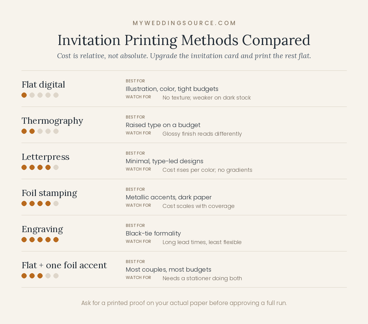
Printing methods compared
| Method | Relative cost | Best for | Limitations |
|---|---|---|---|
| Flat digital | Lowest | Illustration, color, photography, tight budgets | No texture; weaker on dark or rough stock |
| Thermography | Low to moderate | Raised type on a budget | Glossy finish reads differently than engraving |
| Letterpress | High | Minimal, type-led designs on cotton paper | Cost rises per color; no gradients |
| Foil stamping | High | Metallic accents, dark paper, winter warmth | Cost scales with coverage and color count |
| Engraving | Highest | Black-tie and traditional formality | Long lead times; limited artwork flexibility |
| Mixed (flat + one foil accent) | Moderate | Most couples, most budgets | Requires a stationer comfortable with both |
If you can upgrade only one thing
Upgrade the invitation card and print the rest flat. Guests spend their attention on the main card, and a suite with one letterpressed or foiled invitation plus flat-printed details and reply cards costs substantially less than a fully specialty-printed set while reading almost identically. The second most effective upgrade is paper weight, and the third is an envelope liner, both of which are felt immediately and cost little relative to a printing method change.
Paper Color, Weight, and Texture
Paper color changes every other decision
Bright optic white reads modern, clean, and slightly cool. Ecru, cream, and ivory read traditional and warm, and they flatter gold, brass, and warm neutral palettes. Grey, taupe, and putty read contemporary and quiet. Deep colors — midnight, forest, oxblood, charcoal — read dramatic and require light-colored ink or foil.
The important part is that paper color and your wedding palette should be chosen together, since the paper is the background behind every color in the suite. A cream card makes a cool grey look brown, and a bright white card makes an ivory dress in the accompanying photograph look yellow. If your wedding palette leans warm, choose warm paper.
Weight, ply, and the feeling of quality
Paper weight is where guests physically feel your budget, more than in any printing method. Standard commercial card stock feels ordinary in the hand; heavy cotton stock feels substantial. Double-thick or duplexed papers, where two sheets are bonded, feel exceptional and are frequently used for letterpress.
Weight has consequences. Heavier paper raises both printing cost and mailing cost, and thick or rigid suites can move into a higher postage category. Ask your stationer what a finished suite weighs before you commit to duplexed stock across 120 households.
Texture, deckle edges, and handmade paper
Cotton and handmade papers with soft, irregular deckle edges have a strong tactile quality that suits winter well. They also absorb ink differently, which softens fine detail: very thin serifs and small type can lose crispness. If you want handmade paper, keep the type slightly larger and simpler than you otherwise would.
Vellum and translucent layers
A vellum wrap or overlay adds a frosted, atmospheric quality that is nearly perfect for winter conceptually, and it introduces two practical issues. Printing on vellum requires the right process, since ink can smudge or take a long time to cure, and a vellum layer adds rigidity that affects mailing. Ask for a printed sample and confirm postage before ordering.
Typography, Readability, and Accessibility
Typography is where beautiful invitations most often fail their guests. The design goal and the communication goal pull against each other, and the communication goal should win on the pieces that carry information.
Script has a legibility ceiling
Formal scripts and calligraphy are lovely for names, the couple’s names, and short lines. They become genuinely difficult when used for addresses, times, dates written in words, or a paragraph of accommodation details. Guests may not tell you they could not read it; they will simply write the wrong time in their calendar.
A reliable structure: use script for emphasis and a clear serif or sans serif for information. Names in script, everything else in a legible companion face. This is not a compromise; it is the reason the pairing exists.
Hierarchy does more than decoration
Guests scan an invitation in a predictable order: whose wedding, what date, where. Design that order deliberately. The date and the city should be findable in under two seconds. If your layout requires reading every line to locate the date, the hierarchy is not doing its job.
Accessibility is a design decision, not an add-on
Some of your guests have limited vision, and older guests are frequently the ones who most want a printed invitation. A few choices make the suite usable for everyone without changing its character:
- Keep body type at a comfortable size. Very small type on a details card is the most common accessibility failure in wedding stationery.
- Maintain real contrast. Pale grey ink on cream paper looks refined on screen and disappears in a dim room. Metallic foil on light paper also has lower contrast than it appears.
- Avoid long passages in all capitals or in script, both of which slow reading considerably.
- Put the same information on the wedding website, where guests can enlarge it. Include the website address in a size that can be read without effort.
- Consider a digital copy on request for guests who use screen readers or need larger text.
A two-minute test
Print the proof at actual size, put it on a table, and read it standing up in normal room light. Then hand it to someone over sixty and ask them to tell you the date, the time, and how to RSVP. If any of the three takes more than a few seconds, adjust the type before approving the order.
Sixteen Holiday Wedding Invitation Design Directions
These are complete directions rather than templates: each one names a paper, a printing approach, a type pairing, a motif strategy, and an envelope treatment, because those five choices together are what produce a coherent suite. Hex values are starting points for a conversation with your stationer, since screen color and printed ink behave differently.
Elegant and classic
1. Ivory and gold foil
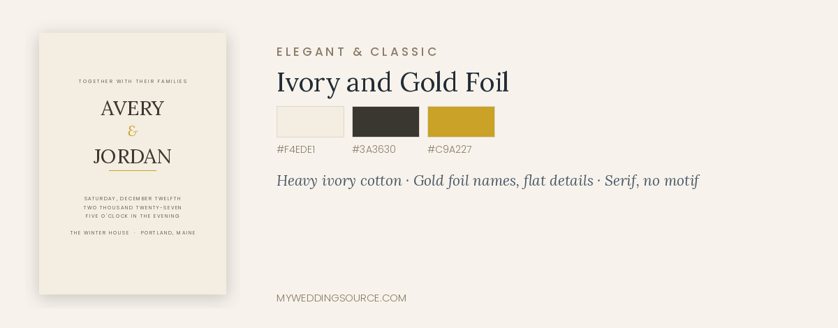
#F4EDE1 · #C9A227 · #3A3630
Paper: heavy ivory cotton. Printing: gold foil for names and rules, flat charcoal for everything else. Type: a high-contrast serif for names, a smaller serif for details. Motif: none needed; a thin foil rule or a small monogram does the work. Envelope: ivory with a gold-flecked or deep-toned liner.
Cost note: moderate to high. Limiting foil to the invitation card and a monogram keeps this within reach; a fully foiled suite does not.
Works less well when: your wedding is casual. This suite promises a formal evening, and guests will dress for it.
2. Deep green and cream, traditional
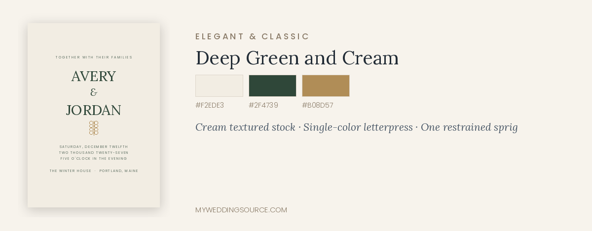
#F2EDE3 · #2F4739 · #B08D57
Paper: cream, soft-textured. Printing: flat or letterpress in deep green, brass foil accent optional. Type: classic serif with generous letter spacing. Motif: restrained — a single sprig, a fine border, or nothing. Envelope: deep green outer with cream ink addressing, or cream outer with a green liner.
Cost note: moderate. Single-color letterpress is the most affordable way into that method.
Works less well when: paired with red accents and berry illustrations, which pushes the whole suite toward a holiday card.
3. Wine and brass heritage
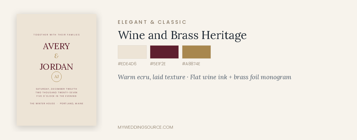
#EDE4D6 · #5E1F2E · #A8874E
Paper: warm ecru with a subtle laid texture. Printing: flat wine ink with antique brass foil for the monogram. Type: an old-style serif with small caps for headings. Motif: a crest, monogram, or venue silhouette rather than seasonal imagery. Envelope: ecru with a patterned liner drawn from the crest.
Cost note: moderate. A custom monogram or crest is a one-time design fee that carries across signage, menus, and napkins later.
Works less well when: the crest is over-detailed. Fine linework closes up at small sizes, particularly on textured paper.
Modern and minimalist
4. Type-only on warm white
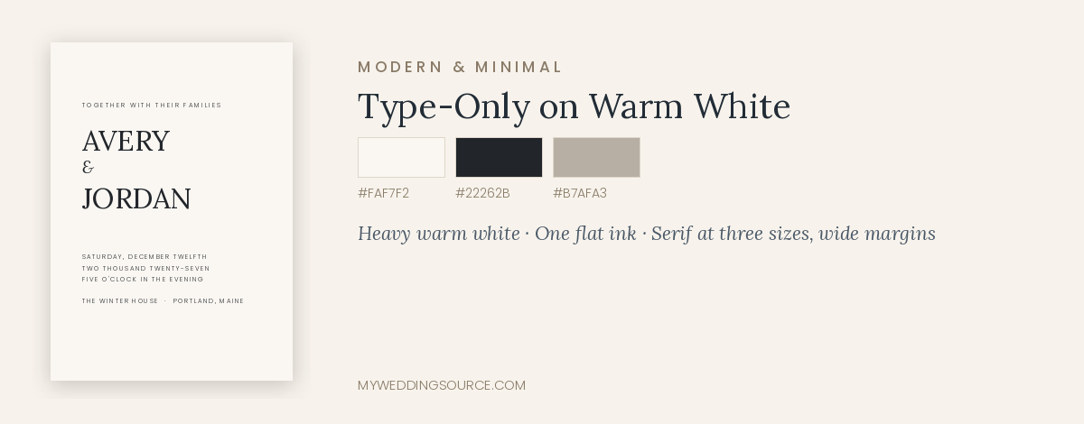
#FAF7F2 · #22262B · #B7AFA3
Paper: heavy warm white, smooth. Printing: flat digital in one ink; letterpress if the budget allows, since impression is the whole effect here. Type: one serif family used at three sizes, generous margins, asymmetric layout. Motif: none. Envelope: matching warm white, addressed in the same face.
Cost note: among the least expensive directions, and one of the most current-looking. Type-led minimalism is where a modest stationery budget goes furthest, because quality comes from paper and spacing rather than production.
Works less well when: the type is not genuinely well set. With nothing else on the card, every spacing decision is visible.
5. Editorial monochrome
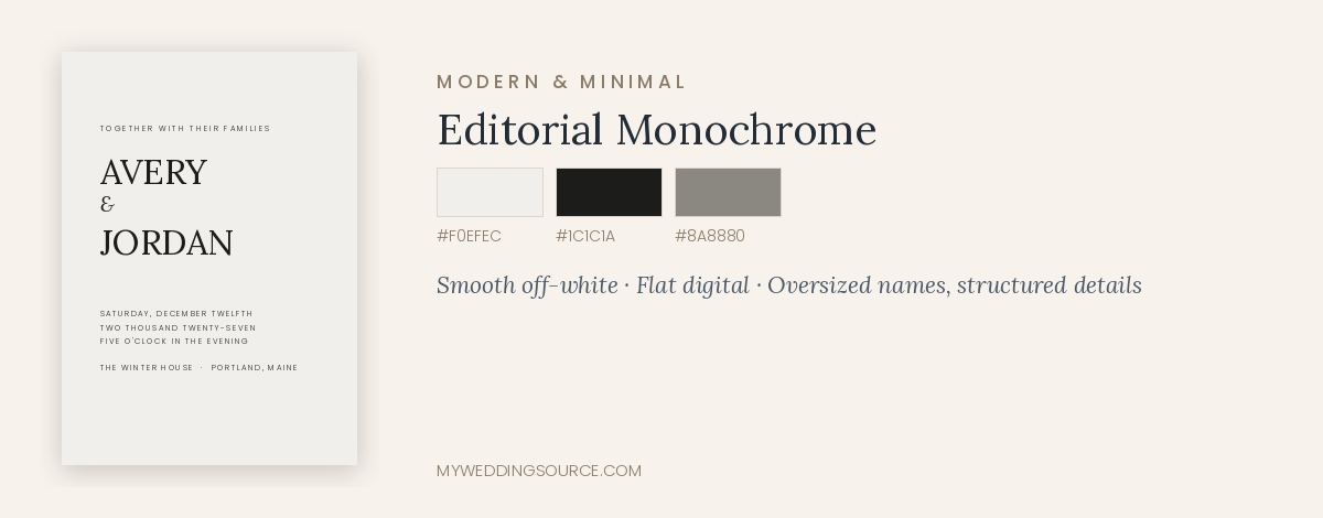
#F0EFEC · #1C1C1A · #8A8880
Paper: smooth off-white or pale grey. Printing: flat digital, one or two inks. Type: oversized names set at the top edge, small structured details below in a neutral sans. Motif: none; scale and negative space are the design. Envelope: pale grey with black addressing, or the reverse for a bolder suite.
Cost note: low. This direction reads as designed rather than expensive, which is exactly its appeal.
Works less well when: your wedding is traditional or your guest list skews toward guests who read formality from ornament. The tone here is confident and contemporary.
6. Tonal cream with vellum
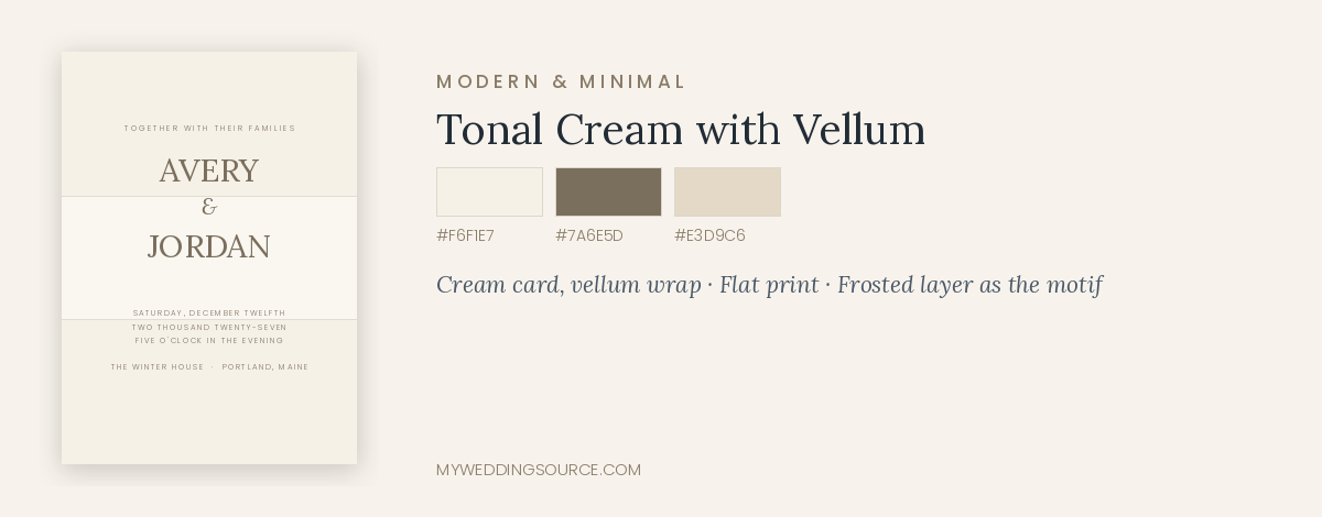
#F6F1E7 · #E3D9C6 · #7A6E5D
Paper: cream card with a translucent vellum wrap. Printing: flat on the card, minimal printing on the vellum. Type: light serif, wide spacing. Motif: the frosted vellum layer itself. Envelope: cream, sealed with wax in a soft neutral.
Cost note: moderate, and higher than it looks once assembly labor is counted. Vellum wraps are usually hand-assembled.
Works less well when: postage matters. A vellum wrap plus a wax seal frequently makes a suite non-machinable, which raises the postage cost on every envelope.
Botanical and natural
7. Evergreen line art
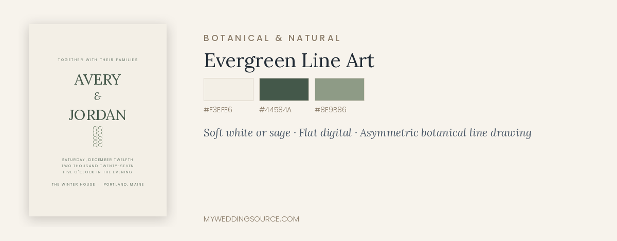
#F3EFE6 · #44584A · #8E9B86
Paper: soft white or pale sage. Printing: flat digital, which handles fine illustration well. Type: a light serif with a delicate script for names. Motif: single-line botanical drawings of cedar, olive, eucalyptus, or fir — drawn as line art rather than as a wreath. Envelope: white with a full botanical liner.
Cost note: low to moderate. Illustration is a one-time cost that can be reused across signage and menus.
Works less well when: the botanicals become a circular wreath with berries, which reads immediately as a holiday card. Line art in an asymmetric corner placement avoids that entirely.
8. Pressed winter botanicals
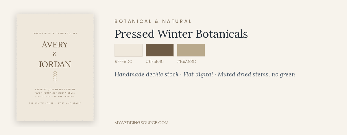
#EFE8DC · #B9A98C · #6E5B45
Paper: handmade or deckle-edged, warm toned. Printing: flat digital, since the artwork carries soft tonal detail. Type: a quiet serif; let the artwork lead. Motif: muted dried grasses, seed heads, and pressed stems in bone and taupe rather than green. Envelope: natural or oatmeal-toned.
Cost note: moderate. Handmade paper carries a premium and adds weight.
Works less well when: the wedding is formal. This direction reads relaxed and organic regardless of the wording.
Celestial and winter night
9. Midnight and silver constellation
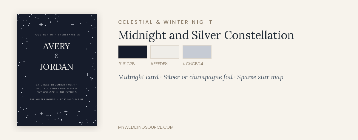
#161C2B · #C6CBD4 · #EFEDE8
Paper: midnight card stock. Printing: silver or champagne foil, which performs far better than white ink on dark paper. Type: a refined serif with wide tracking. Motif: a fine star map or scattered points, ideally the actual sky on a date that matters to you. Envelope: pale grey outer, addressed in dark ink, with a midnight liner so the drama appears on opening.
Cost note: moderate to high, driven by foil coverage.
Works less well when: the star pattern becomes dense enough to compete with the type. Keep the sky sparse behind text.
10. Frost watercolor
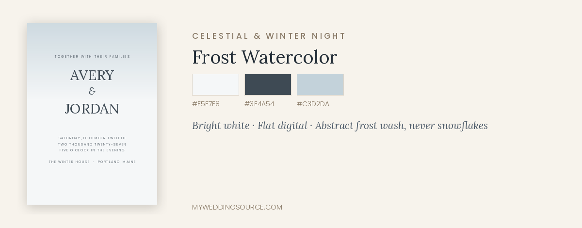
#F5F7F8 · #C3D2DA · #6E8494
Paper: smooth or lightly textured bright white. Printing: flat digital, which reproduces watercolor washes accurately. Type: a fine serif in a deep slate, never in the palest wash color. Motif: abstract frost or a soft wash gradient rather than literal snowflakes. Envelope: white with a watercolor liner.
Cost note: low. Digital printing makes painterly artwork inexpensive.
Works less well when: contrast is sacrificed for softness. Pale blue type on pale blue wash is the most common readability failure in this style.
Black-tie and formal
11. Ecru and black, engraved
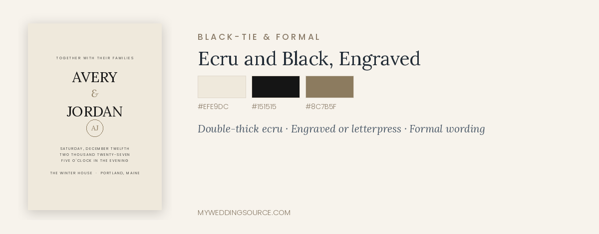
#EFE9DC · #151515 · #8C7B5F
Paper: heavy ecru, ideally double-thick. Printing: engraved or letterpress in black. Type: a traditional serif, centered, formally worded, with the date and time spelled out. Motif: none, or a small engraved monogram. Envelope: ecru outer and inner, calligraphed addressing, tissue lining.
Cost note: the highest in this list. Engraving plus double envelopes plus calligraphy is a significant per-household cost.
Works less well when: the wedding is not actually black tie. This suite makes a promise guests will honor.
12. Midnight blue with white ink
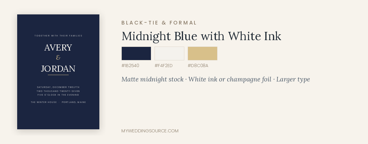
#1B2540 · #F4F2ED · #D8C08A
Paper: midnight blue, matte. Printing: white ink or champagne foil. Request a sample of white ink on your exact stock before ordering. Type: clean serif, slightly larger than usual to preserve contrast. Motif: none needed. Envelope: cream outer for legibility in the mail, with a midnight liner.
Cost note: moderate. Colored stock plus specialty ink costs more than dark ink on light paper.
Works less well when: the outer envelope is also dark. Dark envelopes make addressing harder to read and can complicate automated mail processing, so keep the drama on the inside.
Rustic and textural
13. Warm kraft and wool
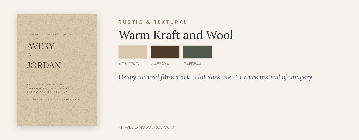
#D9C7AC · #7B5E43 · #4E5B4A
Paper: warm natural stock with visible fiber, heavier than typical kraft. Printing: flat dark brown or deep green; white ink reads poorly on rough natural paper. Type: a sturdy serif or a warm slab, avoiding thin strokes. Motif: texture rather than illustration — a woven pattern on the liner, a fabric ribbon. Envelope: natural, with a wool-toned or plaid-adjacent liner used sparingly.
Cost note: low, provided you resist ribbon and twine, which add assembly time and postage.
Works less well when: the paper is thin. Lightweight kraft is what makes this style look inexpensive; heavier natural stock does not.
14. Deckle edge and wax seal
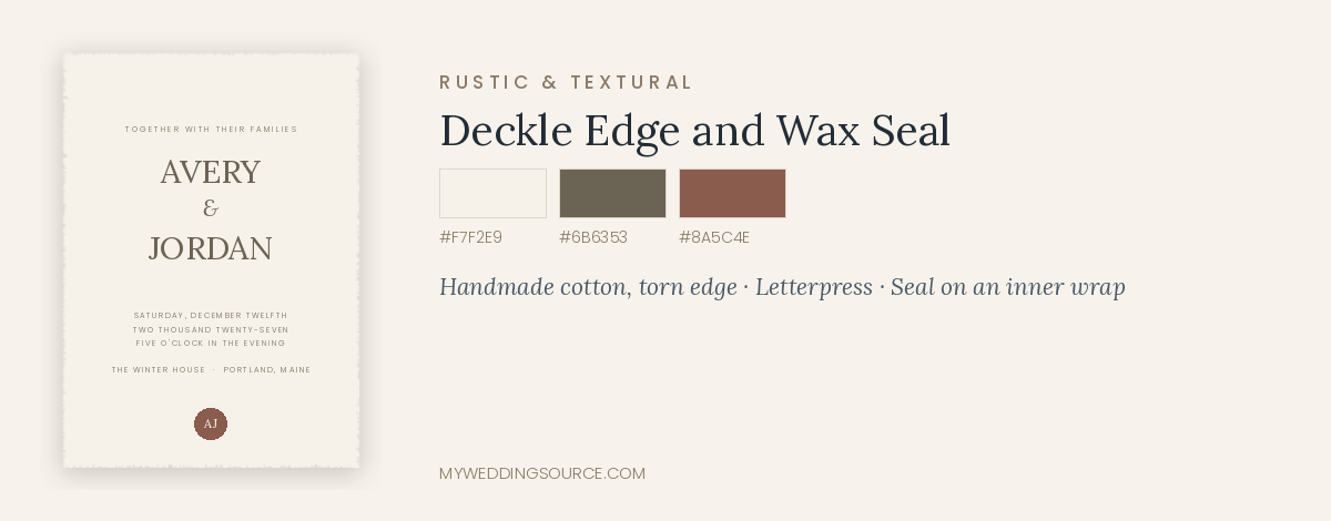
#F7F2E9 · #8A5C4E · #6B6353
Paper: handmade cotton with a torn deckle edge. Printing: letterpress, which suits soft paper. Type: a modest serif at slightly larger sizes, since fine detail softens on this stock. Motif: the edge and the seal are the design. Envelope: natural, sealed with wax in a muted color.
Cost note: high per suite, and higher again once hand assembly and non-machinable postage are counted.
Works less well when: the seal is applied to the outer envelope flap, where it can be crushed or torn in transit. Consider sealing an inner wrap instead, or hand-delivering sealed suites where possible.
Nonreligious winter and seasonal-neutral
15. Frost neutrals, no motif
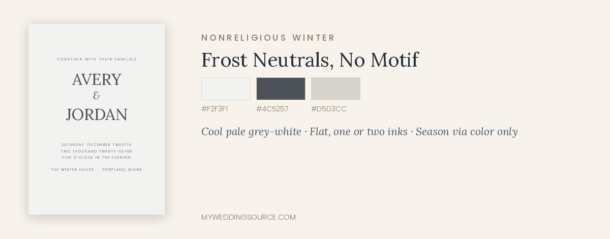
#F2F3F1 · #D5D3CC · #4C5257
Paper: pale grey-white with a cool undertone. Printing: flat, one or two inks. Type: a modern serif with a clean sans for details. Motif: none, deliberately. Envelope: pale grey with a soft silver-toned liner.
Cost note: low. This is the most budget-efficient way to signal winter.
Why it matters: a suite with no religious or holiday imagery lets every guest read it as a wedding invitation first, which is worth considering when your guest list includes people who do not celebrate the same holidays. It reads as seasonal through color temperature alone.
16. Modern deep red
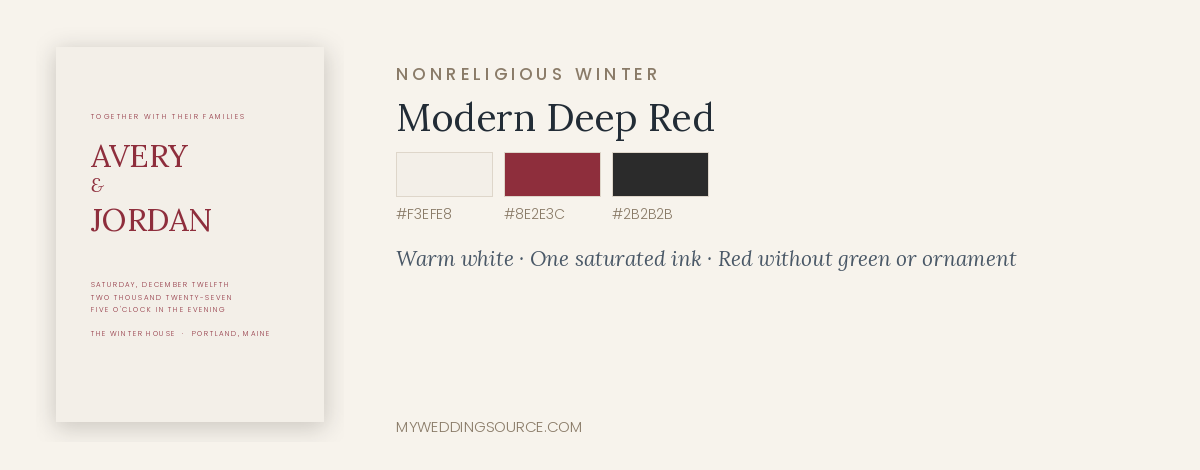
#8E2E3C · #F3EFE8 · #2B2B2B
Paper: warm white, or a deep red card with cream ink for a bolder version. Printing: flat, one strong ink. Type: large contemporary serif names, small structured details. Motif: none. Red without green, holly, or ornament reads as confident color rather than as a holiday.
Cost note: low. A single saturated ink on good paper is inexpensive and striking.
Works less well when: green is added at similar weight, or when the red drifts toward bright postbox red. Keep it deep — wine, oxblood, or brick.
Envelopes, Liners, Addressing, and Assembly
The envelope is the first design decision guests see
Everything inside is invisible until the envelope is opened, which makes it the highest-leverage piece in the suite. A colored envelope with a well-set address does more visual work than an expensive printing method on the card inside. It is also the piece that determines whether your suite looks like a wedding invitation or like a holiday card in a stack of holiday cards.
Two practical considerations sit against each other here. Colored and dark envelopes look striking, and they make addresses harder to read for both carriers and sorting equipment. A mid-tone or light envelope with dark addressing is the safest choice for reliable delivery, with the color saved for the liner.
Liners are the cheapest upgrade in stationery
An envelope liner typically costs a small amount per envelope and delivers a full second color, pattern, or illustration at the moment of opening. If your budget only stretches to one non-essential element, this is often the one with the highest visible return.
Addressing options and what they cost
- Hand calligraphy. The most beautiful and the most expensive, commonly priced per envelope and rising with complexity. Budget time as well as money; calligraphers book early for the holiday season.
- Digital calligraphy printing. A calligraphic typeface printed directly onto envelopes. Far cheaper, quite convincing, and much faster.
- Printed labels. Practical and inexpensive, though they read less formally. A well-designed label on a good envelope is better than rushed handwriting.
- Handwriting them yourself. Free, personal, and genuinely time-consuming. Estimate two to four minutes per envelope and multiply by your household count before committing.
Whichever you choose, confirm the addressing is legible to a stranger. Ornate scripts with unusual numerals cause delivery problems, and a returned invitation is a much bigger problem than a slightly less elegant address.
Assembly takes longer than couples plan for
A five-piece suite with a vellum wrap, a wax seal, a liner, and an inner envelope can take five to ten minutes per household to assemble. At 110 households, that is a full weekend. Decide consciously whether you want to spend it. If you do, invite two or three people, set up a table, and do it in one session rather than in fragments.
Postage, Mailing, and Holiday Timing
This is the section that most often produces an unwelcome surprise, because postage is decided by physical characteristics rather than by how much the suite cost to produce.
What pushes a suite into higher postage
- Weight. Each additional card, liner, and envelope adds up. Multi-piece suites frequently exceed the base rate.
- Thickness and rigidity. Thick cotton stock, duplexed paper, and vellum wraps can make a piece unable to bend through automated equipment.
- Square envelopes. Square shapes are not machinable and carry a surcharge in the United States, on every envelope.
- Clasps, ribbon, wax seals, and uneven contents, which make the envelope irregular.
- Dark or low-contrast envelopes, which can slow or complicate automated address reading.
Take a fully assembled, sealed sample suite to the post office and have it weighed and measured before you buy stamps. This single step prevents the most common stationery budget error, which is buying 120 stamps at one rate and discovering the suite requires another. If your suite is delicate, ask about hand-canceling, which some locations will do for a limited number of pieces.
Timing: when to mail a holiday wedding invitation
Standard guidance for a wedding invitation is roughly six to eight weeks before the date, with save-the-dates sent much earlier. For a holiday wedding, move both earlier. Guests are booking travel and committing to family plans months ahead, and December mail volume is at its annual peak.
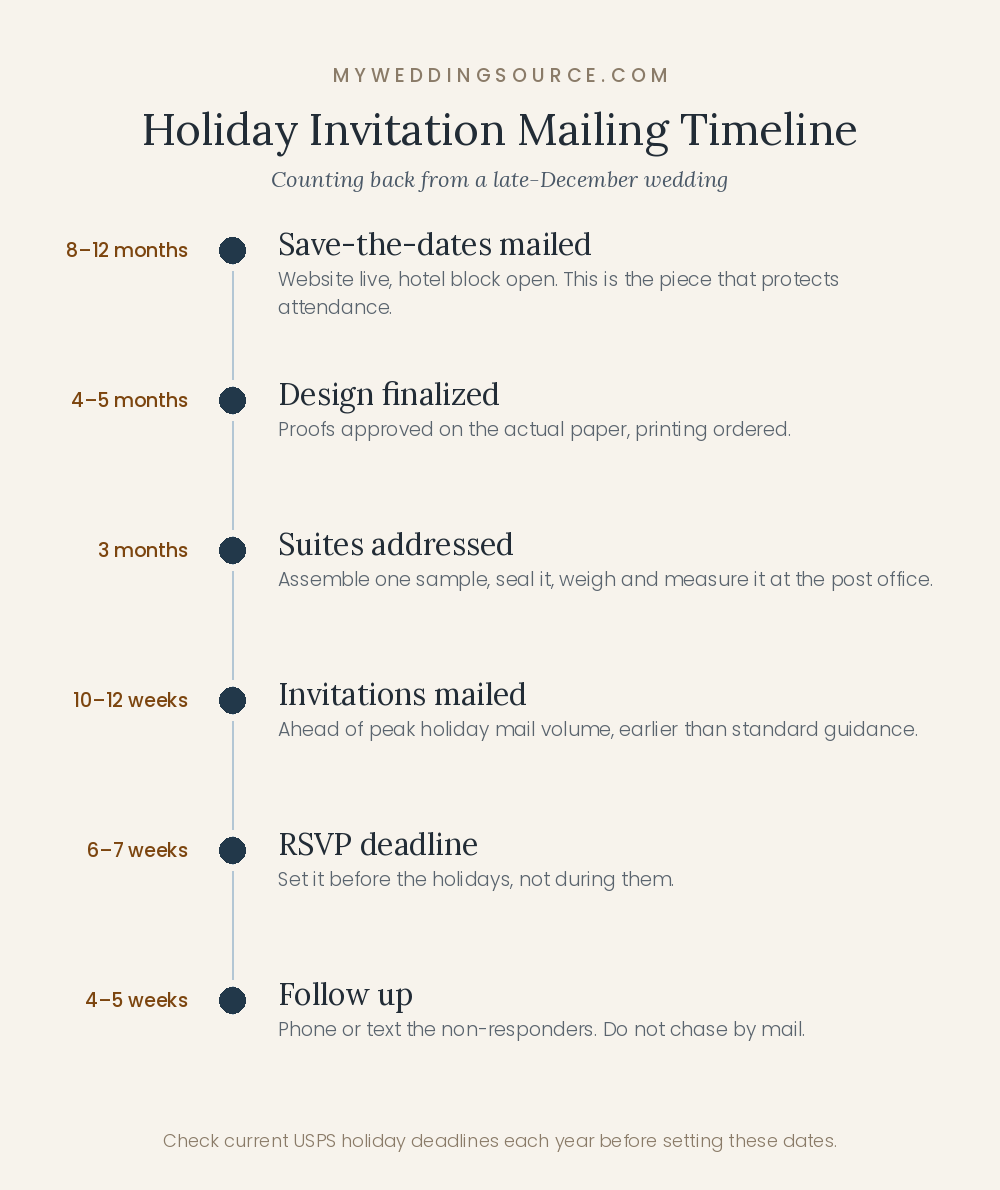
A workable schedule for a late-December wedding:
| When | What happens |
|---|---|
| 8–12 months out | Save-the-dates mailed, with the wedding website live and hotel information available |
| 4–5 months out | Design finalized, proofs approved, printing ordered |
| 3 months out | Suites received, addressed, sample weighed at the post office |
| 10–12 weeks out | Invitations mailed, ahead of peak holiday mail volume |
| 6–7 weeks out | RSVP deadline, set before guests scatter for the holidays |
| 4–5 weeks out | Follow-up with non-responders by phone or text, not by mail |
Two seasonal details worth building around. First, mailing before the peak weeks reduces the chance your envelope is buried or delayed; the USPS publishes holiday shipping deadlines and seasonal guidance each year, which is a useful reference point for how compressed the period becomes. Second, set your RSVP deadline before the holidays rather than during them, since replies sent during the last two weeks of December tend not to arrive on schedule.
International and out-of-state guests
International mail takes longer and costs more, and customs handling can damage delicate suites. Mail international invitations two to three weeks before the domestic batch, and consider a simplified suite for those households. For guests who will need to travel domestically during the holidays, a save-the-date with the hotel block information is worth more than an early invitation.
Three Sample Design Briefs You Can Hand to a Stationer
Stationers work faster and quote more accurately from a brief than from a folder of screenshots. Each of these can be sent as-is and adapted.
Brief 1 — Formal evening, December, budget-conscious
120 households. Formal evening wedding in a hotel ballroom, black-tie optional. Tone: classic, warm, not ornate. Ivory cotton stock, gold foil for our names and one thin rule on the invitation card only; details and reply cards flat printed in charcoal. Serif typography, no script for information. Ivory outer envelope with a deep green liner, digital calligraphy addressing. Three pieces total. Please quote the suite fully assembled, and confirm the mailed weight and whether it is machinable.
Must include: wedding website, hotel block, shuttle note, and a line about the ceremony being indoors.
Brief 2 — Modern minimal, seasonal without holiday cues
85 households. Restaurant wedding, cocktail attire, relaxed but designed. Tone: contemporary, quiet, no seasonal imagery. Heavy warm white stock, flat printed in one near-black ink, oversized names, generous margins, asymmetric layout. One sans serif for details. Matching envelope with a pale grey liner, printed addressing. Two pieces plus a website RSVP. Please show two typographic options and quote letterpress as an alternative on the invitation card only.
Accessibility note: details card body type no smaller than 10 point, real contrast, no all-caps paragraphs.
Brief 3 — Winter night, celestial, mid budget
100 households. Evening wedding in a historic venue, semi-formal. Tone: atmospheric winter night, no snowflakes. Midnight blue invitation card with champagne foil type and a sparse star pattern behind the names only. Details and reply cards on cream stock, flat printed in navy for legibility. Cream outer envelope with dark addressing and a midnight liner. Please confirm foil coverage cost at two densities, and provide a physical proof of the foil on the dark stock before the full run.
Timeline: proofs by early August, delivery by late September, mailing in the first week of October.
Where the Money Goes, and Where to Spend It
Stationery costs are driven by four things in roughly this order: household count, number of pieces, printing method, and hand work. Design fees sit alongside these, higher for fully custom work and lower for semi-custom collections you personalize.
The levers that actually reduce cost
- Count households, not guests. One suite per household is the single biggest saving available and is standard practice.
- Reduce pieces. Moving accommodations, transportation, and schedule details to your wedding website removes an entire printed card.
- RSVP online rather than by mail, which removes a card, an envelope, and a stamp per household. Offer a printed alternative for the few guests who need it.
- Upgrade one piece only. Specialty printing on the invitation card, flat printing on everything else.
- Choose a standard envelope size and shape, avoiding squares and unusual dimensions.
- Use a semi-custom collection. Many designers offer their own artwork with your wording and colors at a fraction of a custom design fee.
Where spending is usually worth it
Paper weight, envelope liners, and a legible, well-set details card. These three are noticed by every guest and are inexpensive relative to a printing method change. The least efficient spending is usually on additional pieces that repeat information already on your website.
Common Mistakes
Designing the suite before checking postage
Wax seals, vellum, ribbon, square envelopes, and thick duplexed stock all have postage consequences. Weigh and measure a finished sample before ordering stamps, and ideally before finalizing the design.
Using script for information
Names in script are lovely. Times, dates, addresses, and instructions in script produce confusion that arrives as messages to you for the next three months.
Letting the season take over the design
Wreaths, berries, plaid, snowflakes, and metallic sparkle are the four fastest routes from wedding invitation to holiday card. If you want seasonality, get it from paper color, ink temperature, and foil rather than motif.
Skipping a physical proof
Screens are backlit; paper is not. Colors print darker and flatter than they appear on a monitor, white ink behaves unpredictably, and foil looks different in hand. Order a printed proof on your actual paper before approving a run of 120.
Proofreading only for typography
The most damaging errors are factual: the wrong date, a transposed time, a misspelled venue, an incorrect RSVP deadline. Have three people read the proof independently, and have one of them check only the facts against your contracts.
Mailing during peak holiday weeks
Your envelope competes with the highest mail volume of the year. Mail before the peak, and set the RSVP deadline before the holidays begin.
Forgetting extras
Order 10 to 15 percent more than your household count. Reprints of small quantities are disproportionately expensive, and you will need spares for addressing errors, late additions, and your own keepsakes.
Making the wedding website address hard to read
It is the piece of information guests will use most. Set it in a legible face at a comfortable size, and choose a short address people can type from memory.
Frequently Asked Questions
When should we mail invitations for a December wedding?
Earlier than the standard six-to-eight-week guidance. For a holiday wedding, ten to twelve weeks before the date works better, because guests are booking travel and committing to family plans months ahead, and because December is the heaviest mail period of the year. Send save-the-dates eight to twelve months out with hotel information, since that is the piece that actually protects your guest attendance. Set the RSVP deadline before the holidays rather than during them, so replies are not competing with everyone’s travel.
How do we make an invitation feel seasonal without looking like a Christmas card?
Carry the season in the materials rather than the imagery. Paper color, ink temperature, and metallic foil signal winter effectively; wreaths, holly, berries, plaid, and snowflakes signal a holiday. Deep green with brass foil on cream reads as a winter wedding. The same green paired with red and a berry wreath reads as a greeting card. If you want a motif, choose an asymmetric botanical line drawing or an abstract frost wash rather than a centered circular arrangement.
Is letterpress worth the cost?
It depends on the design. Letterpress is most effective on minimal, type-led suites where the impression in soft cotton paper is the entire point, and it is least effective under complex illustration, which it cannot reproduce. If your design is illustration-led, spend on paper weight and flat printing instead. A practical middle path many couples take is letterpress or foil on the invitation card only, with details and reply cards printed flat, which preserves the impression where guests notice it.
What is the least expensive way to make invitations look expensive?
Heavier paper, an envelope liner, and generous margins. Paper weight is felt immediately in the hand and costs far less than upgrading a printing method. A liner adds a second color at the moment of opening for a small amount per envelope. Generous white space around well-set type is free and does more for perceived quality than added ornament. Beyond that, a semi-custom design from a good stationer costs a fraction of custom work and often looks better than a fully custom suite designed on a tight budget.
Do we need an inner envelope?
No, though it has a practical use beyond formality. The inner envelope is where you name exactly who is invited, which resolves plus-one and children questions before they become conversations. If you are not using inner envelopes, address the outer envelope precisely and make the invited names unambiguous, and state your policy clearly on the wedding website. Inner envelopes add cost, weight, and assembly time, so use them where the clarity is worth it rather than by default.
Can we skip printed RSVP cards and collect replies online?
Yes, and most couples now do. Online replies remove a card, an envelope, and a stamp per household, and they are easier to track. Two adjustments make it work well: print the website address in a size and typeface that is genuinely easy to read, and offer a phone number or email as an alternative for guests who prefer not to use a website. For a guest list with many older relatives, consider printing a small number of traditional reply cards for those households only.
How much extra postage should we expect?
It depends entirely on the physical suite, not on its price. Multi-piece suites often exceed the base one-ounce rate; square envelopes carry a non-machinable surcharge on every piece; wax seals, vellum wraps, and ribbon can make an envelope irregular and push it into a higher category. The only reliable method is to bring a fully assembled, sealed sample to the post office and have it weighed and measured before buying stamps. Do this before you finalize the design if postage is a meaningful part of your budget.
What should be on the details card versus the invitation?
The invitation card carries the announcement: hosts, names, date, time, and location. Everything actionable belongs on the details card: the wedding website, accommodations and hotel block, transportation and shuttle times, dress code, RSVP method and deadline, and any weather or timing notes that affect what guests bring. For a winter wedding, a short line about the ceremony being indoors, about walking distances, or about shuttle service prevents a large share of the questions you would otherwise field individually.
How do we handle guests who do not celebrate the same holidays?
Choose a design that reads as winter rather than as a specific holiday, and be careful with wording as well as imagery. A frost-neutral or celestial suite lets every guest read the invitation as a wedding invitation first. If your wedding falls on or near a religious holiday, it is also worth noting the date’s proximity in your details card or website so guests can plan around their own observances, which is a practical courtesy rather than an apology.
How many invitations should we order?
Count households rather than guests, then add 10 to 15 percent. The extras cover addressing errors, late additions to the guest list, replacements for anything damaged in the mail, and keepsakes for you and your families. Reordering a small quantity later costs disproportionately more than including extras in the original run, because setup costs are the same whether you print ten or a hundred.
Design the Suite Around What It Has to Do
The strongest holiday wedding invitation design is not the most decorated one. It is the one that signals your wedding’s tone accurately, delivers the information guests need in type they can read, and arrives on time and intact for a predictable cost. Everything else — the foil, the liner, the deckle edge, the wax seal — is worth having when it serves those three jobs, and worth cutting when it only serves the mood board.
The decision sequence that keeps this simple: choose your formality first, then your paper color and weight, then a printing approach you can afford across the whole run, then type that stays readable at actual size, and finally a motif strategy — usually a restrained one. Let winter arrive through color temperature, foil, and paper rather than through holiday imagery, and your suite will still look like a wedding invitation when it lands in a stack of seasonal cards.
If your budget is limited, put it into paper weight, a liner, and a details card that answers questions before guests have to ask them. Those three are noticed by everyone and cost very little.
Your next step
Before you approve any design, do two things in the same week: order a printed proof on your actual paper and read it standing up in normal room light, then assemble one complete sample suite, seal it, and take it to the post office to be weighed and measured. Those two checks catch nearly every expensive stationery mistake while it is still free to fix.
