
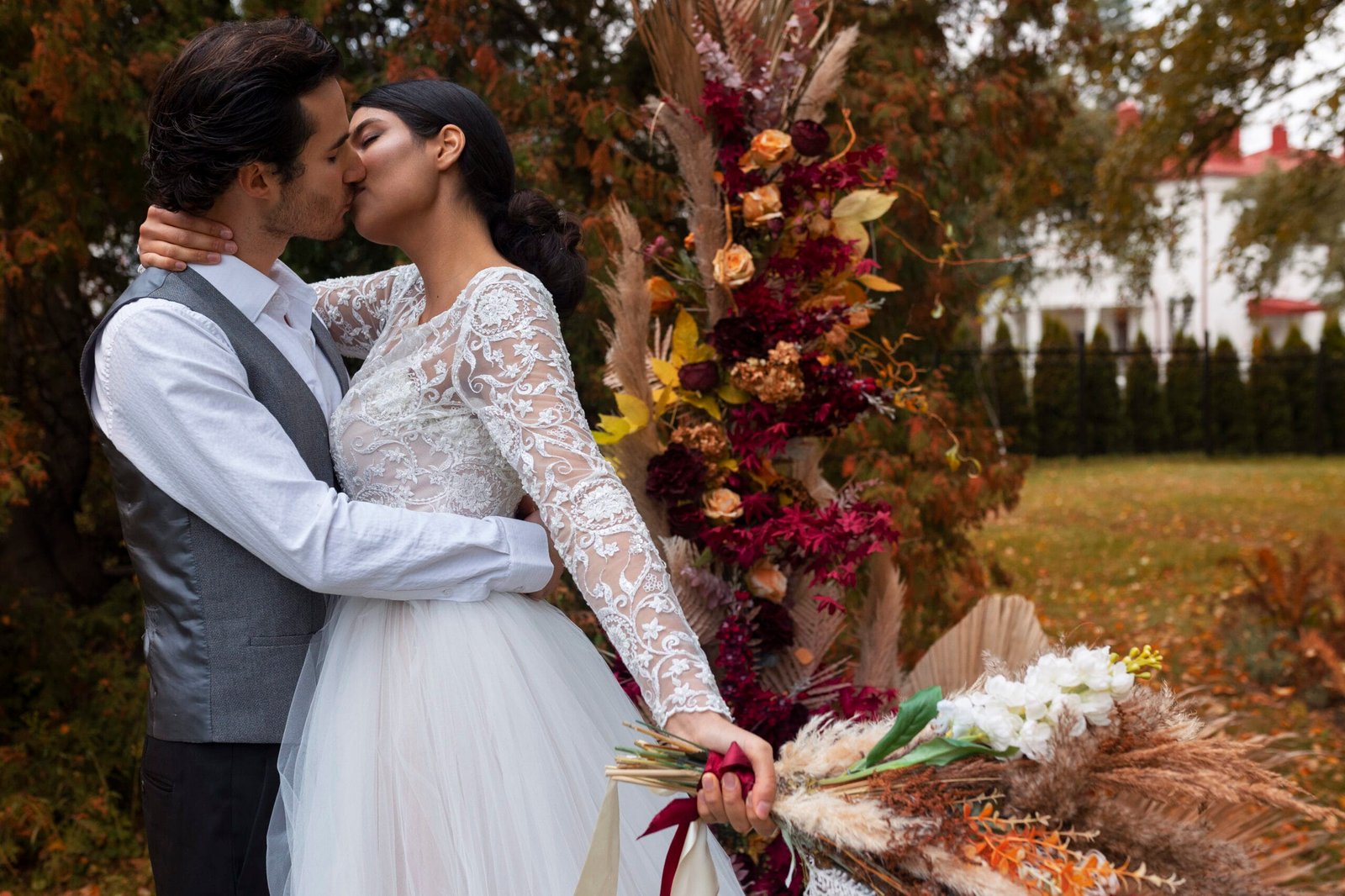
November Wedding Colors That Feel Seasonal Without Looking Themed
Color is one of the first decisions couples make and one of the last ones they can actually verify. You choose a palette months before you see it in the room, and by the time linens, flowers, attire, stationery, and lighting arrive together for the first time, every one of those elements has been ordered. That is why a palette that photographs beautifully on a mood board can look flat, muddy, or unintentionally festive on the day.
November wedding colors carry an additional complication. Late autumn has an unusually strong visual vocabulary attached to it — burnt orange, deep red, gold, plaid, pumpkin — and a second, louder set of associations arriving right behind it. Push a few shades in one direction and the room reads as a harvest display. Push in another and guests start looking for a Christmas tree. Neither result is a disaster, but neither is what most couples mean when they say they want their wedding to feel seasonal.
The practical difficulty is that a palette is not really a set of colors. It is a purchasing plan spread across seven or eight vendors who never see each other’s work until the day. Your florist orders stems in a color range, your rental company ships linens from a dye lot, your attire arrives from three different manufacturers, your stationer prints on paper with its own undertone, and your venue contributes a carpet, a wall color, and a wood tone you cannot remove. The palette is whatever those things add up to under the lighting in the room at the hour you are actually there.
Getting it wrong is rarely catastrophic, but it is expensive in a specific way: the fixes happen late and cost more than the original choice. Reordering linens two weeks out, adding uplighting to correct a dull room, or asking a florist to substitute a color they did not source is where the money goes. The consequences also show up permanently in your photographs, which is where most couples notice a color problem for the first time.
This guide works through how venue materials, lighting, floral supply, attire, linens, and photography each pull on your palette, then compares fifteen November directions across warm neutrals, jewel tones, earthy combinations, monochrome designs, and holiday-adjacent options that do not tip into holiday decor. It closes with the cost trade-offs behind each element, the mistakes that produce late reorders, a worksheet for locking the palette, and a testing method you can run in an afternoon at your venue.
Why a Palette That Looks Right on Screen Can Fail in the Room
A palette is a purchasing plan, not a mood
Mood boards work in a controlled environment: consistent lighting, flattering photography, and images cropped to show only the part that worked. Your reception is the opposite. The color appears at different scales, in different materials, under mixed light, next to a floor and a wall you did not choose.
The useful shift is to stop asking “do I like these colors together” and start asking “where does each color physically appear, in what quantity, and in what material.” Velvet, silk, matte paper, fresh petals, painted wood, and glass all render the same nominal color differently. A deep green in velvet reads rich; the same green in a shiny polyester linen reads cheap; in a fresh leaf it reads almost blue by candlelight.
Seasonal is not the same as themed
This is the distinction that separates the two outcomes couples describe when they say they want November colors without a November theme. A palette reads as seasonal when it borrows the season’s light and depth; it reads as themed when it borrows the season’s props and its most predictable combinations.
In practice, the theme signal usually comes from three things rather than from the hues themselves: high saturation, expected pairings, and recognizable motifs. Deep russet with cream and brass reads as late autumn. The same russet at full saturation, paired with bright orange and yellow, arranged around pumpkins and wheat sheaves, reads as a harvest festival. Neither is wrong, but they are different decisions, and only one of them is usually intended.
Do a surface-area audit before you choose anything
Most palettes fail because a color appears at the wrong scale. A color that is charming as a napkin becomes overwhelming as a full-length tablecloth on twelve tables, and a color chosen as the main event often ends up appearing on almost nothing.
List the surfaces where color actually lands, in rough order of visual weight: walls and floor (fixed), table linens, chairs, floral arrangements, attire for the wedding party, candles and glassware, napkins, stationery and signage, and lighting. Then assign your palette to that list. If your primary color has nowhere large to live, it is not your primary color, and you will spend the planning months quietly frustrated that the wedding does not look like the board.
A quick reality check
In a typical reception, the largest color surfaces are the floor, the walls, and the tables. Flowers usually account for far less visual area than couples expect, even at a generous floral budget. Plan the palette from the biggest surfaces down.
How Your Venue Decides Half of Your Palette
Before you choose a single color, catalog what the room already contributes. These elements are usually non-negotiable, they cover more surface area than anything you will add, and they will either support your palette or fight it for the entire evening.
The fixed elements to write down
- Wall color and material, including whether walls are warm white, cool white, cream, exposed brick, wood, or a saturated color.
- Flooring: patterned hotel carpet, dark hardwood, pale oak, concrete, stone, or grass.
- Chairs, which are often the second-largest repeated color in the room after linens.
- Wood tones: beams, bars, doors, and trim, which range from honey to grey to near-black and set an undertone.
- Metals: chandeliers, hardware, railings, and light fixtures in brass, chrome, black, or bronze.
- Drapery, upholstery, and any permanent art.
- Existing seasonal decor, which matters enormously in November, since many venues install holiday decorations in the second half of the month.
Ask this before you sign, and again in October
“When do you install holiday decorations, what exactly goes up, and can any of it be removed or relocated for our date?” A venue that installs a twelve-foot tree and red garland on November 15 has effectively chosen part of your palette for you. Some venues will remove or store items; some will not, and some charge for it. Get the answer in writing.
How different venue types behave
| Venue type | What it contributes | Palettes that tend to work | Where couples struggle |
|---|---|---|---|
| Hotel ballroom | Patterned carpet, gold or crystal fixtures, neutral walls, banquet chairs | Jewel tones, ivory-and-gold, tonal neutrals with strong texture | Carpet undertone fights cool palettes; overhead light flattens everything |
| Barn or rustic | Warm wood everywhere, low light, exposed structure | Earthy tones, warm neutrals, tonal browns, deep greens | Cool greys and icy blues turn dull; pastels disappear |
| Restaurant or private dining | Strong existing design, fixed upholstery and lighting | Tonal palettes that defer to the room; one accent color | Competing with the interior instead of borrowing from it |
| Industrial or gallery | Concrete, white walls, black steel, high ceilings | Monochrome, high-contrast, saturated single colors | Warm rustic palettes can look accidental against cool concrete |
| Historic house or club | Wallpaper, patterned rugs, dark wood, brass | Deep classic tones drawn from the existing pattern | Introducing a fourth pattern the room did not ask for |
| Tented or outdoor | White or clear top, bare ground or flooring, all light is added | Anything, since you control the environment | Underestimating how much lighting the palette needs after dark |
Working with a room you cannot change
When a venue has a strong existing color, the reliable move is to pull one color out of it rather than to introduce a competing scheme. A dining room with deep green upholstery and brass fixtures gives you a ready-made anchor; a ballroom with a burgundy-and-gold carpet is telling you what it wants. Borrowing from the room costs nothing and reads as intentional, while overriding it usually requires lighting, floor-length linens, and a budget you would rather spend elsewhere.
Where the room’s color is genuinely difficult, focus your palette on the surfaces closest to guests — tables, napkins, glassware, florals, and place settings — and let the distance carry the venue’s own color. Guests see the table for four hours and the far wall in glances.
Lighting: Why the Same Palette Looks Different at 4 p.m. and 8 p.m.
Lighting has more influence on how a palette looks than any purchase you make. In November it also changes fast, which is why a color plan that works at your site visit can behave differently on the day.
Early sunset changes the whole evening
Across most of the United States, sunset in November falls somewhere between roughly 4:30 and 5:30 p.m., and it moves earlier by about an hour over the course of the month once clocks change. Practically, that means most November receptions happen entirely after dark, lit by whatever you and the venue provide. Daylight, which flatters almost any palette, may be present only for the ceremony and portraits.
This has a direct consequence for color choice: colors chosen for how they look in daylight photographs are being chosen for the smallest part of the day. Judge your palette under the light that will actually be in the room at 7:30 p.m.
Warm light, cool light, and undertone
Most venue and event lighting is warm, in the 2400K to 3000K range, which is flattering to skin and to warm palettes. Warm light amplifies reds, oranges, golds, and browns, and it mutes cool colors: a soft blue reads grey, a cool grey reads beige-brown, and a crisp white reads cream. Cool white or daylight-balanced lighting does the opposite, sharpening blues and greys while making warm neutrals look flat or slightly pink.
The practical takeaway is not that one is better. It is that your palette should be chosen with the room’s color temperature already in mind, particularly if you are set on cool tones, icy neutrals, or crisp whites in a warmly lit space.
Uplighting and colored light
Uplighting is the cheapest way to change the color of a room and the easiest way to damage a palette. Colored uplighting at high saturation spills onto skin, white attire, food, and florals, and cameras record that spill even when eyes adjust to it. Amber and soft warm white generally read as ambience. Magenta, deep purple, and strong blue read as the dominant color of the room and appear on every face in the photographs.
If you want colored light, ask your lighting vendor for the lowest saturation that still creates the effect, keep it off the areas where people are photographed closely, and look at it in person during a walkthrough rather than approving it from a rendering.
Candlelight is a color decision
Candlelight is very warm and very low. It flatters warm palettes, deepens reds and browns into something richer, and can make cool colors nearly disappear. It also concentrates attention at the table, which raises the importance of napkin, glassware, and centerpiece color and lowers the importance of anything further away.
Confirm your venue’s rules on open flame before building a palette around candlelight, since many venues require enclosed flames or prohibit them entirely, and battery candles have a different, cooler color quality that changes the effect.
Test the palette in the actual room
This is the single most useful hour you can spend on color, and it is free. Ask your venue for access at roughly the same time of day as your reception, ideally with the lighting set as it will be. Bring physical samples: linen swatches from your rental company, a napkin, a fabric sample of the attire color, a printed invitation sample, and a few real flower stems if you can get them.
Set them on a table in the room, look at them, and then photograph them with a phone using no flash. The phone photograph is the important part, because it shows you what the palette looks like through a camera rather than through eyes that are compensating. Do it once in the ceremony space and once at the reception table.
november-wedding-color-palettes
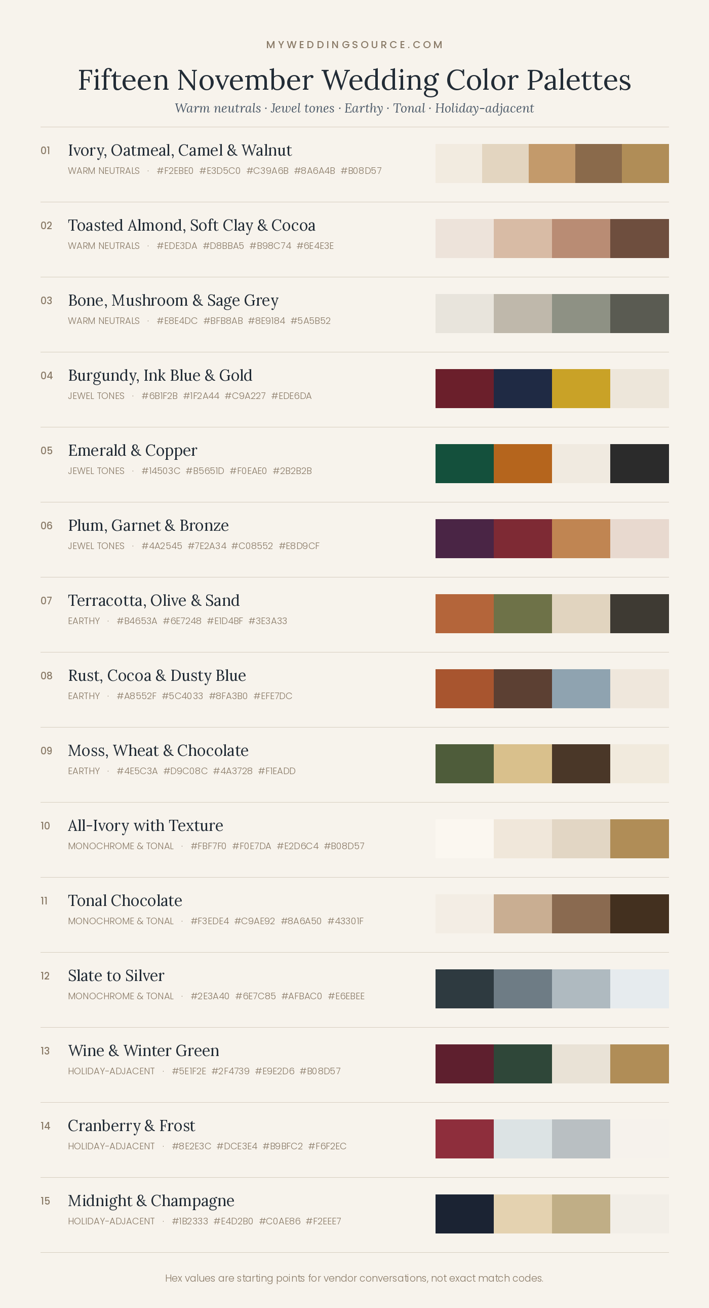
Fifteen November Wedding Color Palettes, Compared
These are directions rather than prescriptions, grouped by the mood they produce. Each includes where the colors should physically live, what the direction tends to cost, and the conditions under which it works less well. Hex values are starting points for conversations with your florist, stationer, and rental company, not exact match codes, since dye lots and screens both vary.
Warm neutrals: quiet, flexible, and photograph-forgiving
Warm neutrals are the most adaptable November direction. They borrow the season’s warmth without any of its props, they suit almost every venue with wood or cream in it, and they photograph well in low light because nothing competes with skin tones. The risk is flatness, which is solved with texture and contrast rather than with more colors.
1. Ivory, oatmeal, camel, and walnut
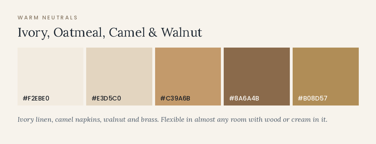
#F2EBE0 · #E3D5C0 · #C39A6B · #8A6A4B · brass accent
Where it lives: ivory floor-length linens, oatmeal or camel napkins, walnut wood in signage and chargers, brass candlesticks and flatware. Attire in camel, taupe, or ivory rather than a single matched color.
Cost profile: moderate. House linens are frequently ivory or white, so the upgrade cost is limited to napkins and a few textured pieces. Brass is the expensive part if rented at scale.
Works less well when: the venue’s walls and carpet are already beige, which produces a room with no contrast. Add depth with walnut, dark greenery, or near-black candles.
2. Toasted almond, soft clay, and cocoa
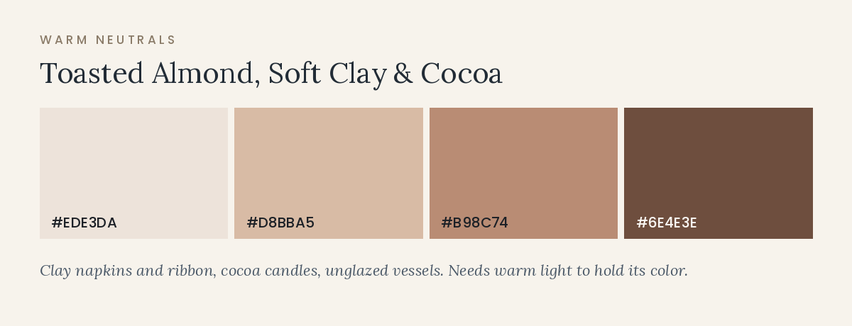
#EDE3DA · #D8BBA5 · #B98C74 · #6E4E3E
Where it lives: clay-toned napkins and ribbon, almond linens, cocoa candles and menu cards, terracotta or unglazed ceramic vessels. Flowers in cream, blush-brown, and soft peach with dried grasses.
Cost profile: moderate to low. Clay and blush-brown florals are widely available in November, and much of the effect comes from vessels and paper rather than stems.
Works less well when: the room is lit with cool white light, which turns clay tones grey. This palette needs warm light to hold its color.
3. Bone, mushroom, and sage grey
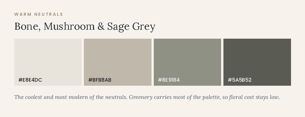
#E8E4DC · #BFB8AB · #8E9184 · #5A5B52
Where it lives: bone linens, mushroom napkins, sage-grey attire, olive and eucalyptus foliage, antique gold or pewter metals. This is the coolest of the neutral options and the most modern-feeling.
Cost profile: low to moderate, because greenery is one of the least expensive floral elements and carries much of this palette.
Works less well when: the venue is heavily honey-toned wood, where these greys can read as dusty rather than deliberate.
Jewel tones: depth, formality, and the strongest evening presence
Jewel tones suit November because they hold their richness under low light, which is when most of the reception happens. They also read as formal, so they pair naturally with a black-tie or near-formal dress code. The risks are two: high saturation across too many surfaces becomes heavy, and certain combinations edge toward holiday decor.
4. Burgundy, ink blue, and gold
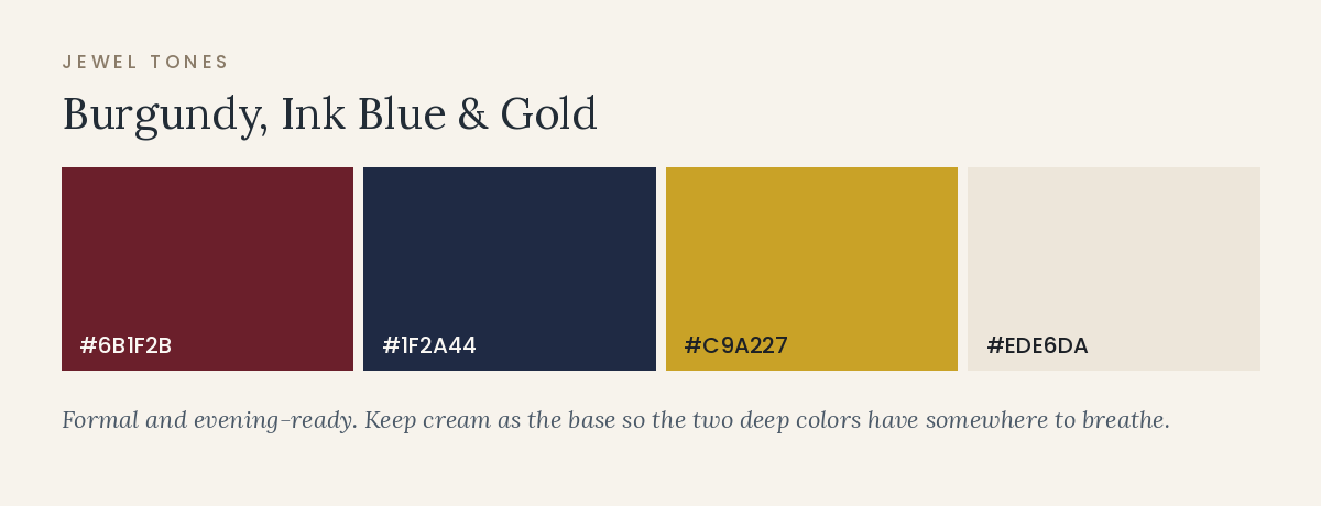
#6B1F2B · #1F2A44 · #C9A227 · #EDE6DA
Where it lives: burgundy in florals and napkins, ink blue in attire, gold in candlelight, flatware, and stationery foil, cream as the linen base that keeps the room from closing in.
Cost profile: moderate. Burgundy florals are among the most available late-autumn colors. Gold foil printing and specialty linens are where costs rise.
Works less well when: both deep colors are used at full-length linen scale in a dark room. Keep one of them as the base and the other as accent.
5. Emerald and copper
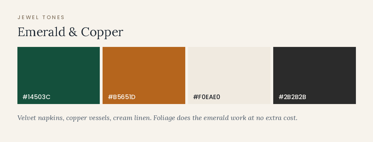
#14503C · #B5651D · #F0EAE0 · #2B2B2B
Where it lives: emerald velvet napkins or runners, copper vessels and candleholders, cream linen, black in attire and menu type. Greenery does much of the emerald work at no extra cost.
Cost profile: moderate. Velvet napkins are a common upgrade in the $4 to $8 per napkin range in many markets; copper vessels rent inexpensively.
Works less well when: the venue already has strong green or copper elements, which can produce a room that reads as one color at three different qualities.
6. Plum, garnet, and bronze
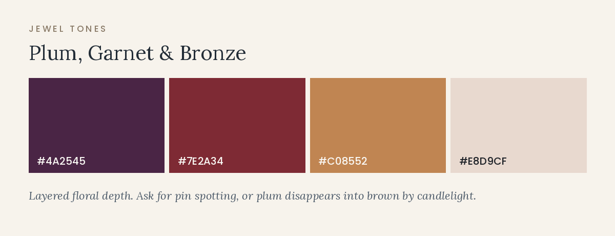
#4A2545 · #7E2A34 · #C08552 · #E8D9CF
Where it lives: plum and garnet layered in florals, bronze in vessels and flatware, blush-taupe as the base linen so the deep colors have somewhere to breathe.
Cost profile: moderate to high, since layered multi-tone floral work is labor-intensive. The color range itself is well supplied in November.
Works less well when: lighting is dim and warm without any accent lighting. Plum can disappear into brown by candlelight; ask for pin spotting on centerpieces.
Earthy palettes: the season without the holiday
Earthy directions read as late autumn most directly, which makes them the ones most at risk of tipping into a harvest theme. The control is saturation: earth tones behave elegantly at 60 to 70 percent of full intensity and become costume-like at 100 percent.
7. Terracotta, olive, and sand
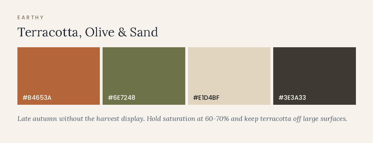
#B4653A · #6E7248 · #E1D4BF · #3E3A33
Where it lives: terracotta napkins and ribbon, olive foliage, sand linens, dark charcoal in type and candles. Keep terracotta off large surfaces so it stays a note rather than a theme.
Cost profile: low to moderate. Foliage-forward arrangements with a small number of focal stems are among the most cost-efficient floral designs.
Works less well when: combined with pumpkins, wheat, gourds, or plaid, which is where this palette becomes a harvest display.
8. Rust, cocoa, and dusty blue
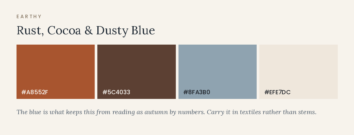
#A8552F · #5C4033 · #8FA3B0 · #EFE7DC
Where it lives: rust in florals and ribbon, cocoa in attire or leather details, dusty blue in napkins or groomsmen’s ties, cream as the base. The blue is what keeps this from reading as autumn-by-numbers.
Cost profile: moderate. True blue flowers are scarce and expensive, so carry the blue in textiles rather than stems.
Works less well when: the room is lit very warm, which desaturates the blue until the palette collapses into rust and brown.
9. Moss, wheat, and chocolate
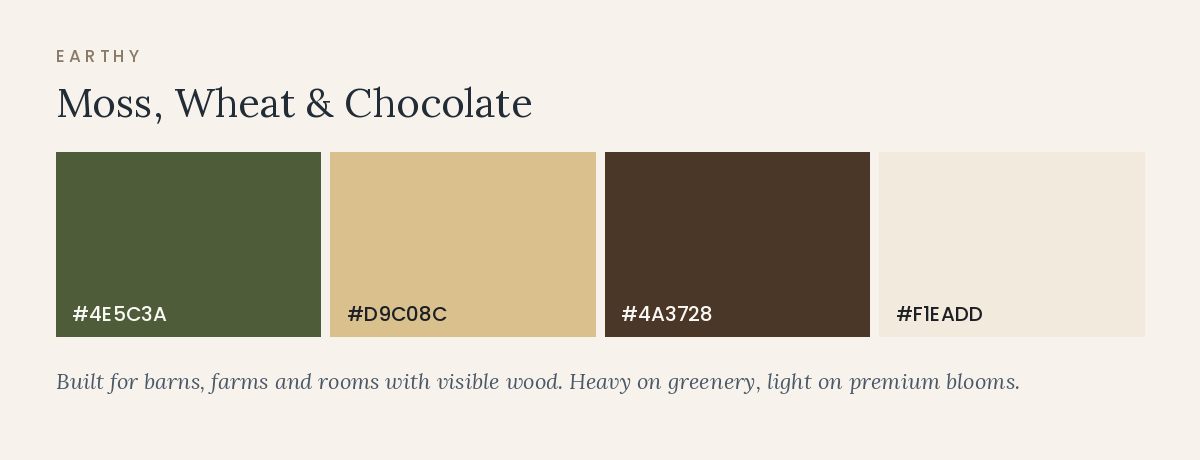
#4E5C3A · #D9C08C · #4A3728 · #F1EADD
Where it lives: moss in foliage and attire, wheat tones in linen and candles, chocolate in chargers, signage, and menu paper. This palette suits barns, farm venues, and rooms with a lot of visible wood.
Cost profile: low. Heavy on greenery and neutral textiles, light on premium stems.
Works less well when: the reception space is a white-walled modern room, where these tones can look muted rather than rich without warm lighting.
Monochrome and tonal: the most modern-looking direction
A tonal palette uses one color family across many values and textures. It photographs well, it removes most coordination problems between vendors, and it looks deliberate rather than decorated. It also demands more from materials, since texture is doing the work that contrast usually does.
10. All-ivory with texture
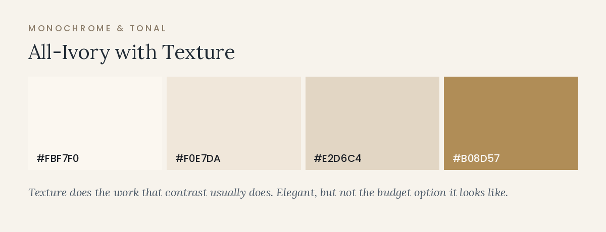
#FBF7F0 · #F0E7DA · #E2D6C4 · brass or wood accent
Where it lives: everywhere, with variation carried by material: textured linen, ribbed glass, ivory taper candles, cream roses and ranunculus, raw silk ribbon, unfinished wood or brass.
Cost profile: deceptively high. An all-white design shows every flaw, so it usually requires better linens, more candles, and more floral density than a palette with contrast.
Works less well when: the room is beige or lit unevenly. Without warm light and texture, ivory-on-ivory reads as unfinished.
11. Tonal chocolate
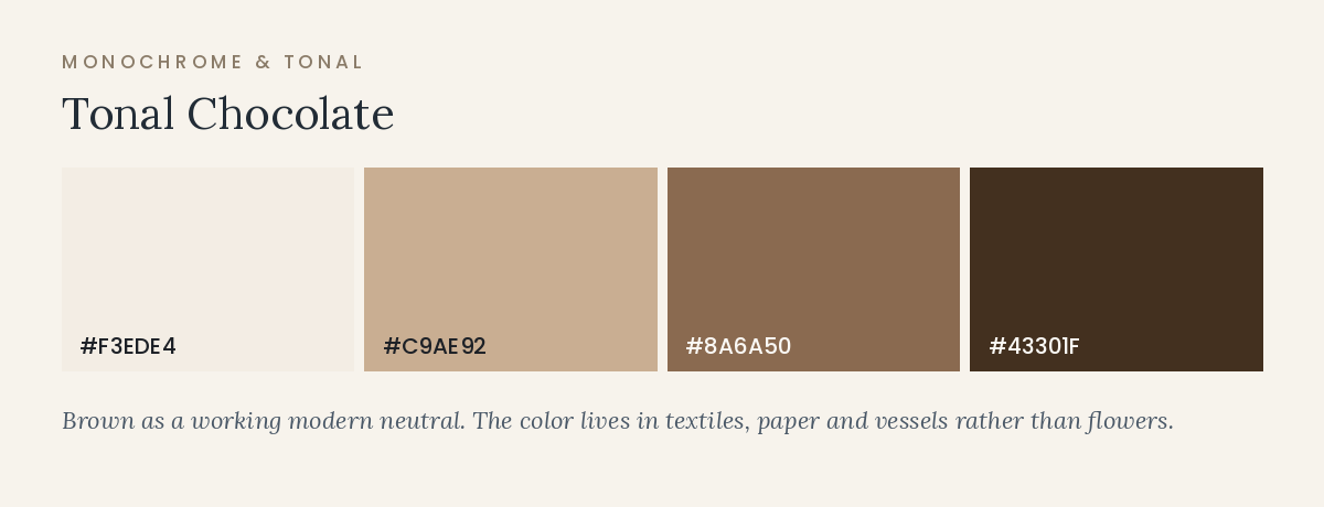
#F3EDE4 · #C9AE92 · #8A6A50 · #43301F
Where it lives: brown has become a working neutral rather than a dated one. Use the darkest value in attire, menu paper, and candles; the mid tones in napkins and ribbon; the palest as the linen base.
Cost profile: moderate. Brown florals are limited, so this palette usually carries its color through textiles, paper, and vessels, which is generally cheaper than stems.
Works less well when: lighting is very dim and the room is also dark wood, in which case the whole space flattens. Add cream at table level.
12. Slate to silver
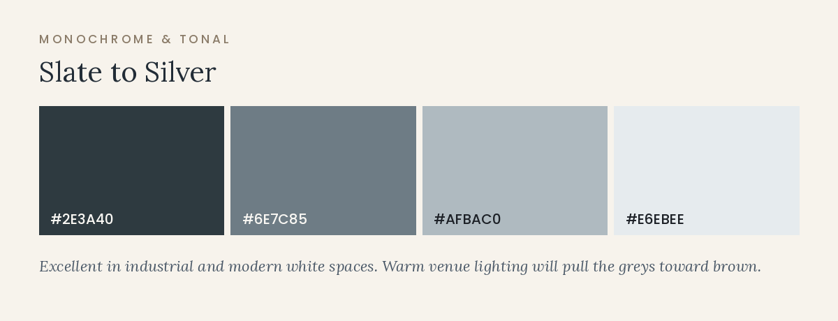
#2E3A40 · #6E7C85 · #AFBAC0 · #E6EBEE
Where it lives: slate attire, silver-grey linens, white florals, mercury glass or pewter. This is the coolest palette on this list and the one most dependent on lighting.
Cost profile: moderate, but it usually requires a lighting budget, since warm venue lighting will pull the greys toward brown.
Works less well when: the venue is warm wood or has amber fixtures. In an industrial or modern white space, it is excellent.
Holiday-adjacent without becoming holiday decor
Late November weddings sit close enough to the holidays that certain combinations carry unavoidable associations. You can use those colors deliberately, but the execution matters. The Christmas read comes mainly from three things: bright true red, red and green in roughly equal amounts, and recognizable motifs such as berries, pine, glitter, and plaid. Shift any one of those and the association loosens considerably.
13. Wine and winter green
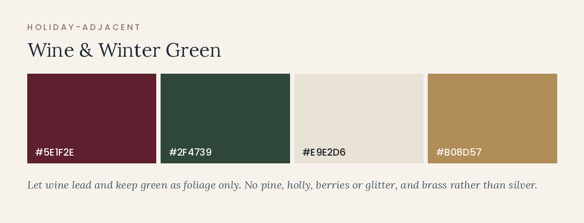
#5E1F2E · #2F4739 · #E9E2D6 · brass
How to keep it a wedding: use wine as the dominant of the two and green as foliage only, rather than splitting them evenly. Avoid pine, holly, red berries, and anything glittered. Brass rather than silver moves the palette toward heritage and away from tinsel.
Cost profile: low to moderate; both colors are well supplied in November.
Works less well when: the venue has already installed holiday decor, in which case your palette merges with theirs and the wedding becomes part of the display.
14. Cranberry and frost
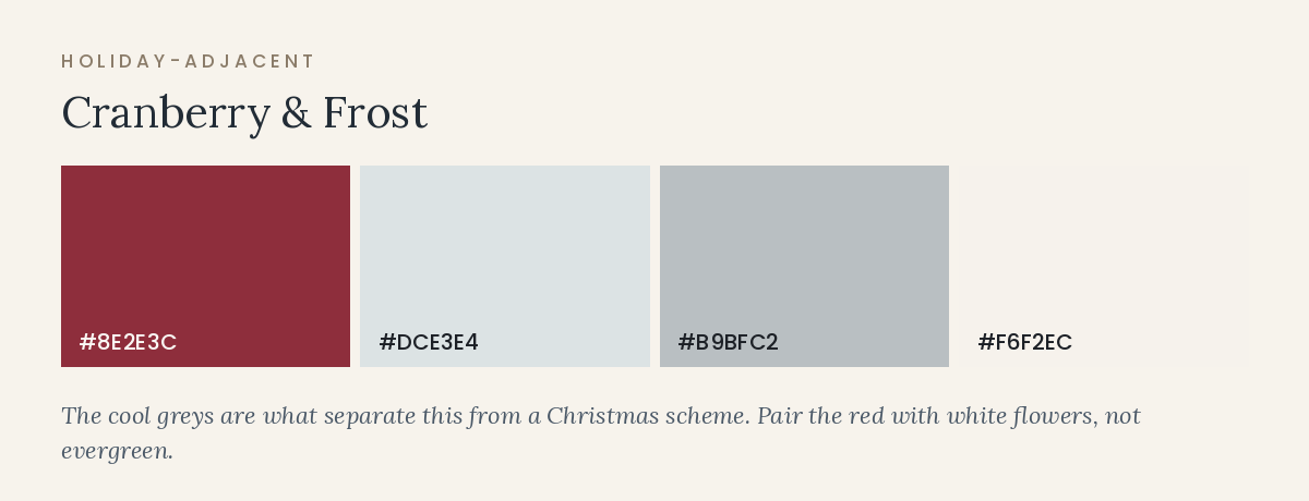
#8E2E3C · #DCE3E4 · #B9BFC2 · #F6F2EC
How to keep it a wedding: the cool greys are what separate this from a holiday scheme. Keep the red slightly muted rather than bright, and pair it with white flowers rather than evergreen.
Cost profile: moderate. White and deep red florals are both widely available; the greys live in linens and attire.
Works less well when: the room is lit very warm, which erases the frost tones and leaves you with red and cream.
15. Midnight and champagne
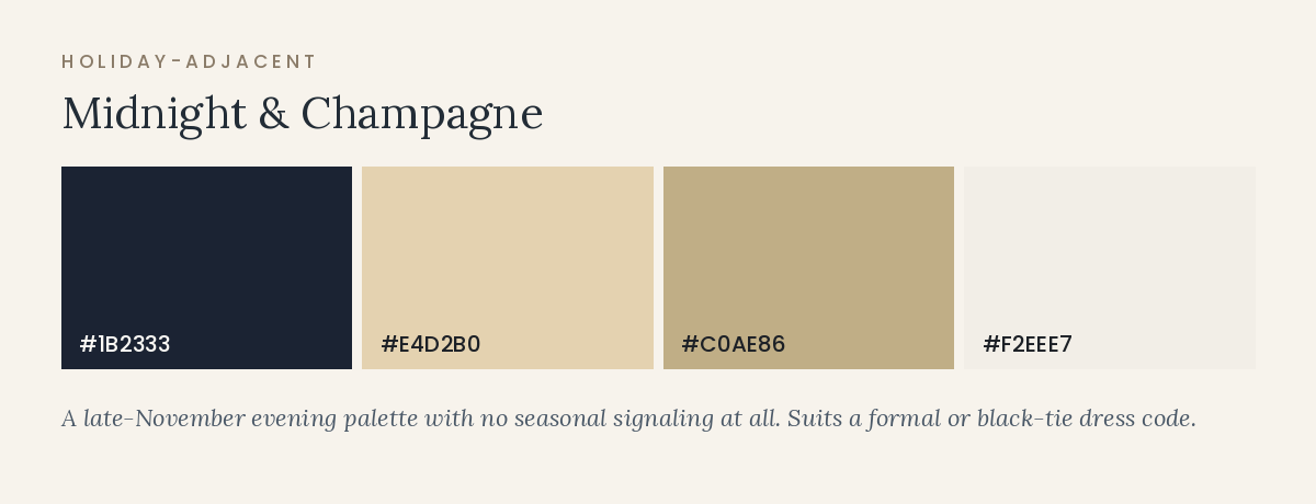
#1B2333 · #E4D2B0 · #C0AE86 · #F2EEE7
Where it lives: midnight in attire and linens, champagne in candlelight, glassware, and stationery, ivory in florals. It suits a late-November evening reception and a formal dress code without any seasonal signaling at all.
Cost profile: moderate to high if you use dark floor-length linens across many tables, which are usually a specialty rental rather than house stock.
Works less well when: the room is dim and has dark walls, which can make the space feel smaller than it is. Balance with plenty of candlelight at table height.
Floral Availability and What Your Palette Costs in Flowers
Flowers are where a palette meets supply. Some colors are abundant and inexpensive in November; others require imports, dye, or a substitution conversation you would rather have now than three weeks out.
Colors that are straightforward in November
Deep reds, burgundies, wine tones, rust, terracotta, cream, white, blush, soft peach-brown, gold, and every shade of green are well supplied in late autumn across most of the country. Dahlias run until the first hard frost in many regions, chrysanthemums are excellent and badly underrated, roses are available year-round from greenhouse and import supply, and carnations have quietly become a designer favorite in tonal work.
Foliage is the most cost-efficient color in the palette. Eucalyptus, olive, ruscus, italian ruscus, magnolia, and seeded varieties give you volume, movement, and green tones for a fraction of what focal blooms cost.
Colors that carry a premium
- True blue. Genuinely rare in flowers. Most blue in wedding photos is either dyed, a purple-blue such as delphinium or anemone, or a textile. Carry blue in linens, ties, or glass instead.
- Bright coral, hot pink, and clear yellow. Available, but they read as spring or summer and may need imports to reach the shade you want.
- Black. Almost always a very deep burgundy or purple, or a dyed stem. Ask what your florist means when they show you black.
- Very specific pastels. Matching a pale, exact shade across dozens of stems is harder than matching a deep tone, because pale colors show variation more clearly.
Let the palette decide, not a single flower
The most common floral cost problem is designing the whole scheme around one variety in one shade. Weather, harvest timing, and shipping all affect what arrives, and a florist who can substitute within a color range rather than matching one exact stem can protect both your budget and your design. Give them the palette and the feeling, then ask which stems they would commit to and which they would prefer to keep flexible.
Carrying color without buying more flowers
Candles, vessels, ribbon, napkins, dried elements, fruit, and painted or wood signage all carry color at a lower cost than fresh stems. A table with generous candlelight, a good napkin, and a modest floral arrangement usually reads richer than a table with more flowers and nothing else. If your budget is tight, this is the most efficient trade available in decor.
Attire, Linens, and Rentals: Where a Palette Gets Expensive
Wedding party attire
Attire is where color coordination fails most visibly, because fabrics from different manufacturers rarely match even when the color name is identical. Chiffon, satin, crepe, and velvet in the same nominal shade will read as three different colors side by side in photographs.
Two approaches work reliably. Order everything from one brand in one fabric and one dye lot, which produces an exact match, or choose a deliberate tonal range within a color family and let the variation be the design. The approach that causes problems is asking people to find “burgundy” independently, which produces four burgundies with different undertones. If you use the tonal approach, give people a swatch photo and a shade range rather than a single word.
For suits and separates, the practical version of the same principle applies: agree on a shade and a source, or accept a considered range. Brown, taupe, olive, and slate all work well in November and photograph better in low light than very light colors do.
Linens are the biggest color purchase in the room
Table linens cover more square footage than anything else you buy, and their pricing varies enormously. House linens included with your venue are usually white, ivory, or black. Upgraded specialty linens commonly run somewhere between $18 and $50 per table in many markets, and premium velvet, textured, or designer fabrics can run well past that. Napkins typically fall between $1.50 and $6 each.
The most cost-efficient color move is to keep the base linen neutral and put your palette in the napkin, since a napkin is a fraction of the cost and appears in every table photograph. If you want a dramatic colored tablecloth, price it across your real table count before committing, because the difference between twelve and twenty tables is significant at $45 each.
Chairs, glassware, chargers, and candles
Chairs are the second-largest repeated element in a room. If your venue’s chairs clash with the palette, ask what a swap costs before assuming you need one: chair rentals commonly run several dollars each plus delivery, and covers are usually a worse-looking solution than simply choosing a palette the existing chairs can live with.
Colored or textured glassware, chargers, and candles are the affordable end of palette expression. Amber, smoke, or ribbed glass changes the character of a table for a few dollars per setting, and taper candles in a palette color are one of the cheapest ways to introduce a hue at eye level.
Stationery and print
Paper is where color reproduction is most exact and most literal. Screens are backlit and printers are not, so a color that looks rich on a monitor can print noticeably darker or duller. Ask for a printed proof or a paper sample before approving anything, particularly for deep or saturated colors, and confirm whether your printer works from a standard color system so your stationer, your rental company, and your florist can all reference the same shade rather than a screenshot.
How Palettes Behave in Photographs and Video
Your photographs will outlive every other element of the decor, so it is worth knowing how each direction behaves through a camera.
Dark palettes need light
Deep, saturated palettes look rich in person and can look muddy in photographs if the room is underlit. Cameras need light to resolve the difference between plum, garnet, and brown; without it, three distinct colors collapse into one. If you are choosing a dark palette for an evening reception, budget for candlelight, pin spotting on tables, or additional ambient lighting.
Color casts land on skin
Colored uplighting, strongly colored walls, and even large expanses of a saturated linen reflect onto faces. Green and magenta are the two most noticeable offenders. Your photographer can correct some of this, but correction has limits when the color is on skin and clothing at once.
Whites are not one color
Ivory, cream, oyster, and optic white photograph as clearly different colors when placed next to one another. If your attire, linens, and florals are all “white,” bring physical samples together before ordering, because a bright optic-white linen can make an ivory dress look yellow in photographs.
Video adds motion and mixed light
Video is less forgiving of mixed lighting than still photography, because the camera cannot be adjusted shot by shot in the same way. If you have a videographer, tell your lighting vendor, and be more conservative with saturated colored light than you might be otherwise.
A Working Method for Building the Palette
This sequence takes an afternoon and prevents most of the expensive corrections.
Step 1: Inventory what you cannot change
Photograph your venue in the light your wedding will have. Note wall color, flooring, chairs, wood, metals, and any seasonal decor. This is your starting palette whether you chose it or not.
Step 2: Choose one anchor color
Pick the single color you want the room to read as, and confirm it has a large surface to live on. Everything else supports it. Choosing three equal colors is the most common way a palette becomes noise.
Step 3: Build the supporting structure
A workable structure for most weddings is one anchor, one or two supporting colors, one neutral base, and one metal. If you want help finding supporting shades that sit correctly against your anchor, a color wheel tool such as Adobe Color lets you test analogous, complementary, and monochromatic relationships and gives you hex values you can share with vendors. Treat the output as a starting point to test in materials rather than a final answer, since screen color and fabric color are different things.
Step 4: Assign proportion, not just color
Decide roughly how much of the room each color occupies. A useful working ratio is around 60 percent neutral base, 30 percent anchor, and 10 percent accent, adjusted for the room. Proportion is what separates a palette that feels designed from one that feels decorated.
Step 5: Test in materials, in the room, at the right hour
Collect physical samples, place them in the venue at the reception hour, look, and photograph. Then adjust. This step is where a palette either confirms itself or reveals that one color has to change, and it costs nothing at this stage.
Step 6: Distribute one reference to every vendor
Send your florist, stationer, rental company, planner, and attire group the same document: hex values, physical swatch photos in the venue, and a note about which colors are flexible and which are fixed. Vendors matching to a shared reference produce a coherent result; vendors matching to their own interpretation of “dusty rose” do not.
Common Mistakes
Choosing colors before seeing the venue at the right time of day
This happens because couples often choose a palette while excited and early in planning. The consequence is a palette selected for daylight conditions that the reception will never have. Visit at the reception hour before ordering anything.
Ignoring the venue’s holiday decorations
Particularly relevant after mid-November. Ask what goes up and when, and either work with it or negotiate its removal in writing. Discovering a red-and-gold garland during your final walkthrough is a bad week to find out.
Picking three equal colors
Without a clear anchor and proportion, three colors compete rather than combine. One dominant color, one support, one accent, and a neutral base is a more reliable structure.
Matching attire colors by name instead of by swatch
Color names are not standardized across brands or fabrics. Match by physical swatch or by dye lot, or choose a deliberate tonal range and communicate it with images.
Building the entire palette on one flower variety
Supply varies with weather and shipping. Design around a color range and let your florist substitute within it.
Approving colored uplighting from a rendering
Renderings show the wall, not the faces. See it in person, at low saturation, before signing off.
Forgetting that the palette also appears in photographs of people
A palette that looks striking on a tablescape can be unflattering when it lands on skin. Consider what each color does next to your guests, not only next to the flowers.
Treating white as a single color
Optic white, ivory, cream, and oyster read differently side by side. Compare physical samples of every white in your wedding before ordering.
Color-Selection Worksheet
Fill this in before placing any order that involves color. If a line is blank, that is where a late change is most likely to come from.
1. What the venue already gives you
- ☐ Wall color and material: ____________
- ☐ Flooring: ____________
- ☐ Chair color and style: ____________
- ☐ Dominant wood tone: ____________
- ☐ Dominant metal: ____________
- ☐ Holiday decor installed on our date? What, and can it be moved? ____________
- ☐ Lighting: warm, cool, or mixed; dimmable or not: ____________
2. The palette itself
- ☐ Anchor color and hex: ____________
- ☐ Supporting color(s) and hex: ____________
- ☐ Neutral base and hex: ____________
- ☐ Metal: ____________
- ☐ Rough proportion (base / anchor / accent): ______ / ______ / ______
3. Where each color physically appears
- ☐ Table linens: ____________
- ☐ Napkins: ____________
- ☐ Florals and foliage: ____________
- ☐ Candles and vessels: ____________
- ☐ Wedding party attire: ____________
- ☐ Stationery and signage: ____________
- ☐ Glassware, chargers, place settings: ____________
4. Cost and supply checks
- ☐ Specialty linen cost per table × number of tables: ____________
- ☐ Napkin cost each × guest count: ____________
- ☐ Florist confirmed the palette is achievable in November here: ____________
- ☐ Colors that are flexible vs. fixed: ____________
- ☐ Lighting needed to support the palette, and its cost: ____________
5. Verification
- ☐ Physical swatches viewed in the venue at reception hour
- ☐ Phone photographs taken of swatches in that light
- ☐ All whites compared side by side
- ☐ One shared color reference sent to every vendor
- ☐ Printed paper proof approved
Frequently Asked Questions
How many colors should a wedding palette have?
Three to five works for most weddings, structured rather than equal: one anchor, one or two supports, a neutral base, and a metal. The number matters less than the proportion. Two colors used at 50 percent each often look less intentional than four colors used at 60, 20, 15, and 5 percent. If you are struggling, reduce rather than add. A tonal palette in a single color family with strong texture reads as more considered than a broad palette with no hierarchy.
Can we use orange without the wedding looking like a harvest party?
Yes, with two adjustments. Lower the saturation toward terracotta, rust, or burnt clay rather than a bright pumpkin orange, and keep it off large surfaces such as full tablecloths. Then avoid the props that complete the association: gourds, wheat, hay, plaid, and scattered leaves. Terracotta with cream, olive, and brass reads as modern late autumn; the same orange with those props reads as a seasonal display. The hue is rarely the problem, and the combination almost always is.
What if our venue puts up Christmas decorations before our wedding?
Ask now what goes up and when, since many venues install in the first half of November and some earlier. Then choose one of three paths: negotiate removal or relocation in writing, which some venues will do and some will charge for; adapt your palette so their decor reads as intentional, which usually means leaning into deep greens, wine tones, and brass; or focus your own color at table level where guests spend the evening and let the perimeter belong to the venue. What tends not to work is ignoring it and hoping it will not appear in photographs.
Do our wedding party outfits have to match exactly?
Not at all, and exact matching is harder than it sounds because fabrics take dye differently. Two approaches work: one brand, one fabric, one dye lot for a precise match, or a deliberate tonal range within one color family so the variation looks designed. What causes trouble is asking people to source a color name independently, which reliably produces mismatched undertones. If you choose the tonal route, send a swatch photograph and a small range rather than a single word.
Are dark or moody palettes a bad idea for a November evening?
They suit the season well, but they have a lighting requirement. Cameras need enough light to distinguish between deep tones, so a plum, garnet, and chocolate scheme in a dimly lit room can photograph as one brown mass. If you want a dark palette, plan for candlelight on tables, pin spotting on centerpieces, or ambient warm lighting, and keep some cream or ivory at table level to give the eye and the camera contrast. Ask your photographer directly how they would light the room.
How do we make sure our florist, stationer, and rental company use the same shade?
Send all of them one reference document containing hex values, photographs of physical swatches taken in your venue, and a note about which colors are fixed and which are flexible. Screenshots and Pinterest images are interpreted differently by each vendor because screens vary. If exact matching matters for print, ask your stationer whether they can work from a standard color system and request a physical proof. For fabric, physical swatches passed between vendors are the only reliable method.
What is the cheapest way to change how a room feels with color?
Napkins and candles, followed by lighting. A napkin covers a small area but appears in nearly every photograph of the table, and it typically costs a few dollars. Taper candles in a palette color add hue at eye level for very little. Warm ambient lighting or a few pin spots change the character of an entire room for less than a linen upgrade across twenty tables. The most expensive way is specialty floor-length linens, and the second most expensive is adding more flowers.
Should we choose our colors before or after booking the venue?
After, in most cases. The venue contributes the largest color surfaces in the room, so choosing a palette first means you may spend the rest of planning working against a carpet, a wall color, or a set of chairs you cannot change. If you already have a palette you love, take it with you on venue tours and hold your swatches up in the room. That single act eliminates a surprising number of venues from consideration for reasons that would otherwise appear at the walkthrough.
Is white-on-white too plain for a November wedding?
It can be very effective, but it is not the budget option couples sometimes expect. An all-ivory design relies on texture, candlelight, and floral density to create interest, which usually means better linens and more candles rather than fewer purchases. In a warmly lit room with wood or brass, it reads as elegant and quietly seasonal. In a cool, evenly lit space with beige walls, it can read as unfinished. Look at the room before deciding.
How early do we need to finalize the palette?
Work backward from the longest lead time among your color-dependent purchases, which is usually attire. Wedding party attire frequently needs three to five months for ordering and alterations, stationery typically needs a decision two to three months before mailing, and linens and florals can often be finalized four to eight weeks out. Practically, that means the anchor color should be settled once attire is being ordered, while accents, napkins, and candle colors can stay flexible considerably longer.
Choose the Room First, Then the Palette
A November palette works when it borrows the season’s warmth and depth rather than its props, and when it fits the room you have rather than the room in the reference photograph. The colors that fail are rarely bad colors. They are colors chosen in daylight for an evening reception, chosen on a screen for a printed page, or chosen at equal proportion so that none of them leads.
The decision principle that resolves most of it: start from what you cannot change, choose one anchor color with a large surface to live on, assign proportion deliberately, and verify the whole thing in physical materials under the light your wedding will actually have. Every element after that — flowers, napkins, attire, paper, candles — becomes a straightforward question with a clear answer, and your vendors can all work from the same reference instead of their own interpretation.
If the budget is tight, put the color where guests are looking: the table. Napkins, candles, and glassware carry a palette further per dollar than anything else in the room.
Your next step
Ask your venue for one hour of access at the same time of day as your reception, with the lighting set as it will be. Bring linen swatches, a napkin, an attire fabric sample, a printed paper sample, and a few real stems if you can get them. Set them on a table, photograph them with your phone, and look at the photo rather than the swatches. That single hour will tell you more about your palette than any mood board, and it costs nothing to run.
